 Rolling around now twice a year is the Affordable Art Fair, the first of which (and in my view the better) takes place in May, on Hampstead Heath. It finishes on 13th May so chances are you've missed it. Buying tickets to attend is surprisingly expensive, but there are quite a few free one's sloshing around and if you buy something at the fair you usually get sent a free ticket for the next year. I went last year and so this happened to me. If you go to allot of these fairs, which I have a tendency to do, then you do see the same things again and again. When I first entered the fair, the first few stalls provoked a feeling of severe de-ja-vu. However by the time I past my first dog that was more expensively dressed than me, my eyes had adjusted and I began to see new and interesting things. There were many old favourites but I shall concentrate in this post on those I had not seen before, or was especially pleased to see again. 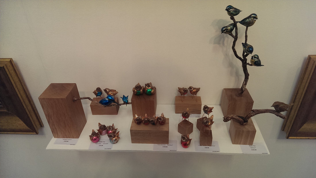 The first thing to catch my eye were these very sweet little bird sculptures (above) by the appropriately named Robin Fox. They are well wrought playful little things, with attractive metallic colours. I especially like the little blue couple perching on the branch which emanates from the block on the left. They are full of personality and I like them.
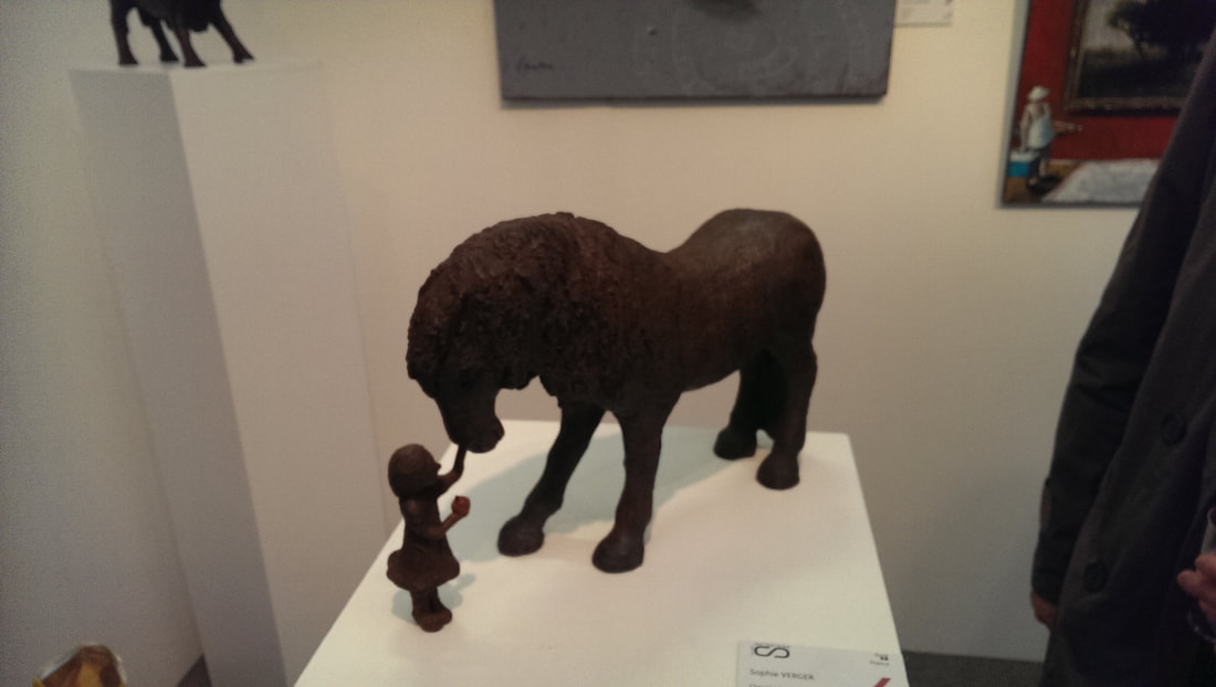
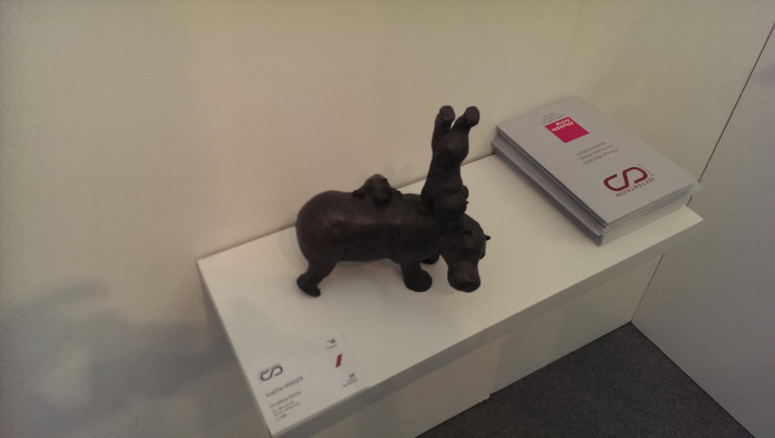
The line between sweet and twee is a thin one (and a subjective one) but if you can stay on the right side of it then your work can be terribly effective. As with Robin Fox, so is Sophie Verger who produces these very playful sculptures in clay (above left) and bronze (above right). Two subjects interacting in a sculpture is often a good idea, it helps to fire you imagination and animate the sculptures in your mind. 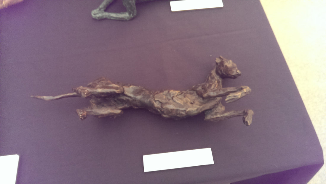 It doesn't have to be two subjects though. A single subject such as this greyhound (above) , the provenance of which is sadly lost because I didn't note down who it is by. Useful isn't it?
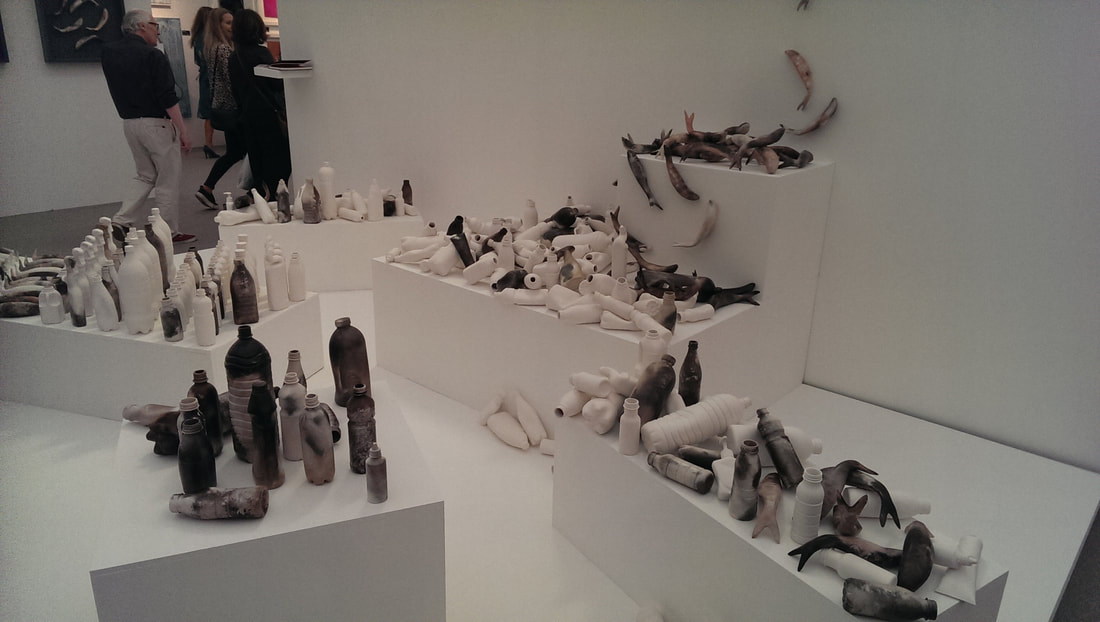
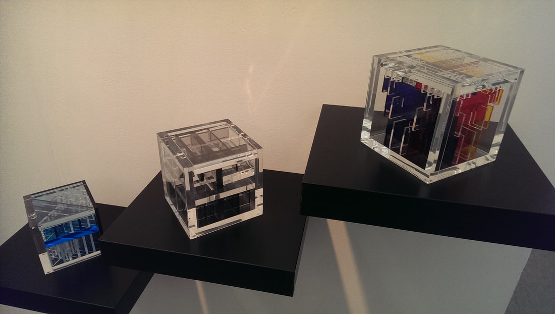 Objects in a series benefit from being well displayed so these three acrylic glass (above) by Haringa + Olijve owe a debt to their gallery, Galerie Nummer40 for having arranged them as you see them. They are in themselves interesting and attractive objects and as with all such sculpture reward you from being viewed at different angles. My favourite is the far left one. 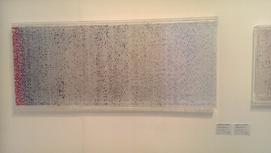 The same gallery had large glass based works by a Freddie M Soethout (above). The glass is flecked with colour but depending on which angle you look at it, different flecks, and different quantities of them can be seen, so you get a shifting image as you walk past. 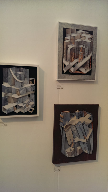 If you like Escher then you will like Stefan MAS Persson (above). It has the same impossible topography that you have with Escher however with two distinctive differences. The first is that, as you can see it is rendered in colour. The second which is not quite so obvious is that the pieces themselves are slightly 3D. The main work is in wood I think and stands proud of the frame, with elements jutting out. This adds a whole new layer of confusion. An addition to this year's show that I don't remember them having before was the presence of larger installations, of which you could buy elements. So for example there was a phalanx of little robot men in the entrance. My favourite of these though was the one by Mella Shaw which you can see at the top of the blog. They are ceramics, and ceramics of plastic bottles and fish interspersed with each other. The meaning is obvious but it is well done and I like the grey smoky tones of the pieces. 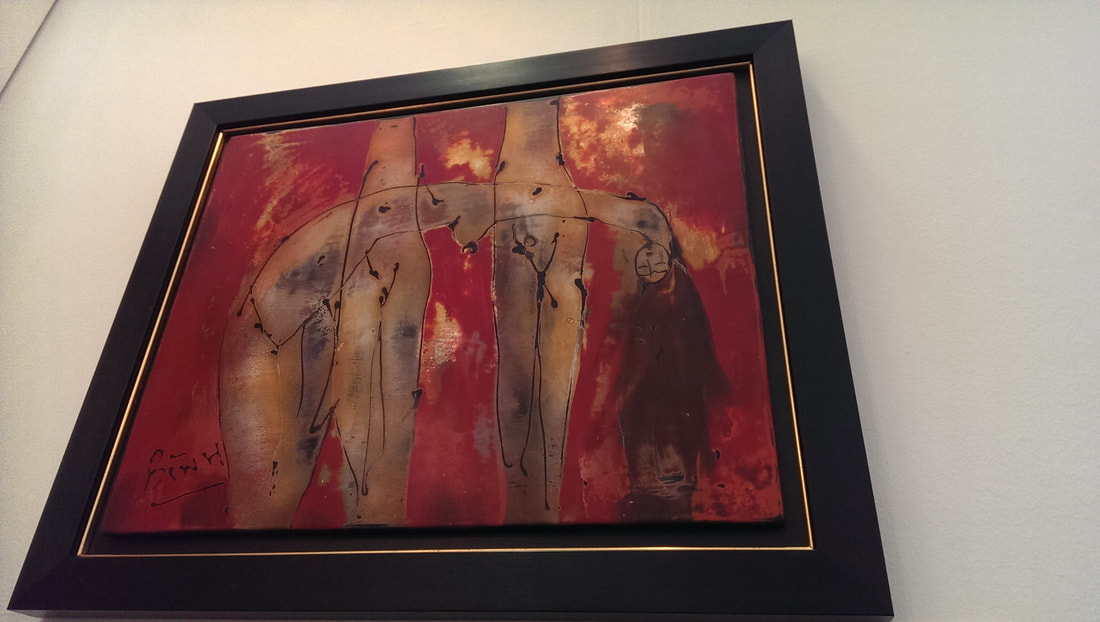 One thing that shows like this do well is bring you art from different places that you might not otherwise see. So it was this time and probably my favourite stand of the show, Akartasia, showed a number of different artists from Asia. The painting above, a disturbing rendition in pinks and red is called feminine and is by Phoung Binh a Vietnamese artist. It has visceral bloodiness that I like, and I think the flow of hair down the right hand side is particularly effective.
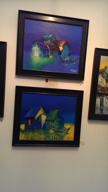
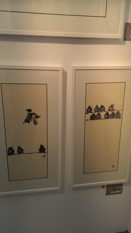
Two other artists from the same stand caught my eye. One was Dao Hai Phong (above left). Again Vietnamese their work is this super colour saturated land and sea scapes, dominated by this deep deep blue. I find this colour palette particularly arresting. At the other end of colour scale you have the ink paintings of Pu Yu (above right). His name apparently has the charming translation of SImple Rain and I really like his simple, almost spare ink drawings of birds. They are somehow very expressive. I nearly bought this. I might still, there is still time. 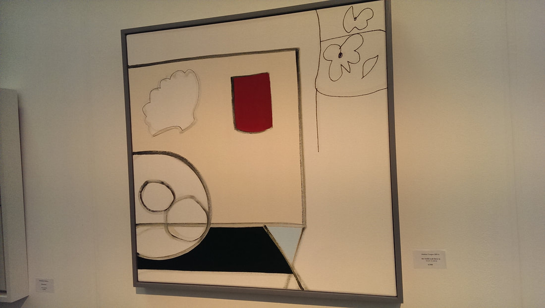 I am sure Jessica Cooper (above) is a name I have seen before. Even if not it is a name I look forward to seeing again. She has produced an abstracted still life. At least I assume that is what it is. It has the rather pretentious title of "the Truth is all there is". Not sure about that but anyway, I like the painting. The sparseness of the lines and shapes contrasting with the red shape. Very good. 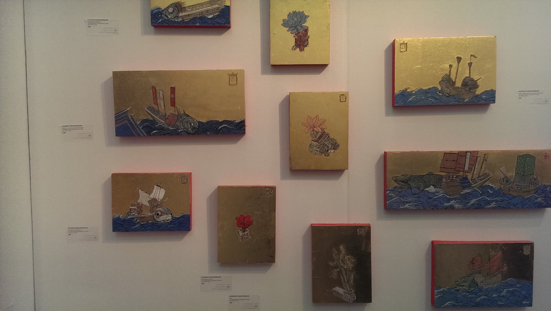 Another in vogue style is the gold leaf backed painting. Gold is gold as my uncle would say (at least he would if I asked him to). If you get the subject right it can really work. You can either go the icon route or use it to change up a familiar stlye. This is what Konstantinos Papamichalopoulos (above), winner of the longest name in the show (Pu Yu having won the shortest), has done with these Chinese looking sea scenes brought to glittering light by the gold. 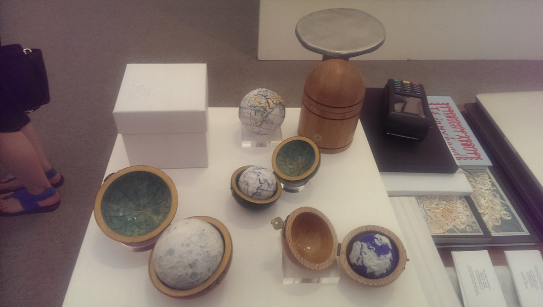 Globe conkers! Little Ceramic globes (or moons) in attractive wooden cases (above). The carefully taken photo I have of the artist is so blurry that I cannot make out their name. Nice though aren't they. I though seriously about walking off with the one you can see at the top of the picture. I still might. I think they are very nice. I imagine if I did some googling I could find out who did them for you but there is limited time in the world. 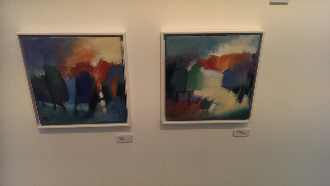 Ingegerd K Westin has the best name in the show and also some of the best painting. They are quite small, probably about 30 by 30 cm and in many ways are simple abstract pieces, but the composition is good both in terms of shape and colour. I particularly like the looming black figures in the one on the left. These two also work well as a pair. These made my short list of things I might buy. Sadly I can only afford one and to my mind these two should stay together. 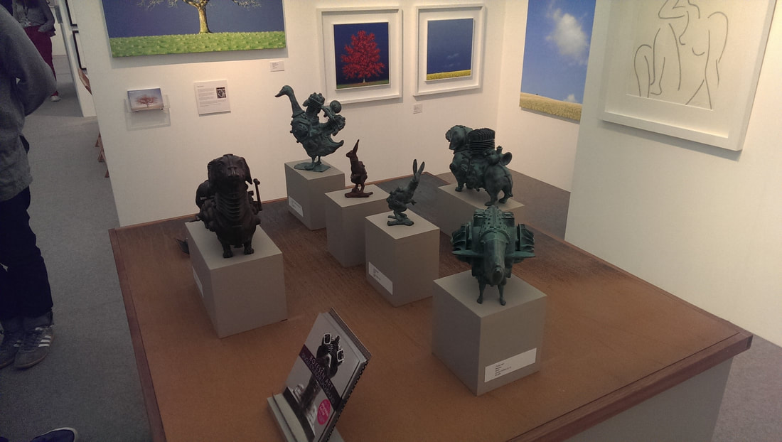 Steam punk animals is the theme of Sebastien Boyesen's work (above) going under the evocative name of Single Cylinder Dachshund and other unfeasible imaginings. It is a neat idea, the combination animals and engine but they are also attractive pieces. They made me smile, they made me think. You can't ask for much more of that. My favourite of them all is the duck you can see at the back. 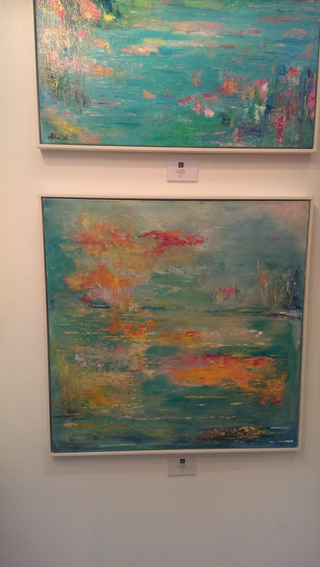 Linda Franklin (above) is again a name that chimes distant bells. They have a Monetish quality but are individual enough to not be derivative and once you get close enough are quite distinct. I like the colour palette, I like the dreamy composition, I like the way it suggests shapes without defining them.  Long whispy figures, against foggy backgrounds are the work of Mario Angel, (above) which is appropriate enough as the figures do have a sort of angelic quality, shifting across the landscape. 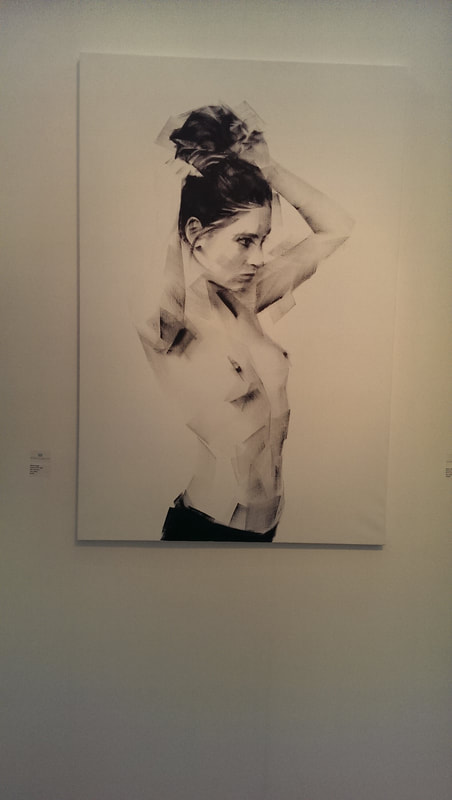 Few pictures of figures make my list, but my favourite of them is this blocky almost pixelated portrait of a woman by Marion Cadet (above). It shows fine technique and you get a real sense and feeling of the subject. This is a requirement of mine if you are going to do a nude or semi nude, especially of women. I hate those pictures of a nude female torso with the head obscured with something trite like a storm troopers helmet. This is the opposite of that, this is not a sex object, this is a person, although they are not named.
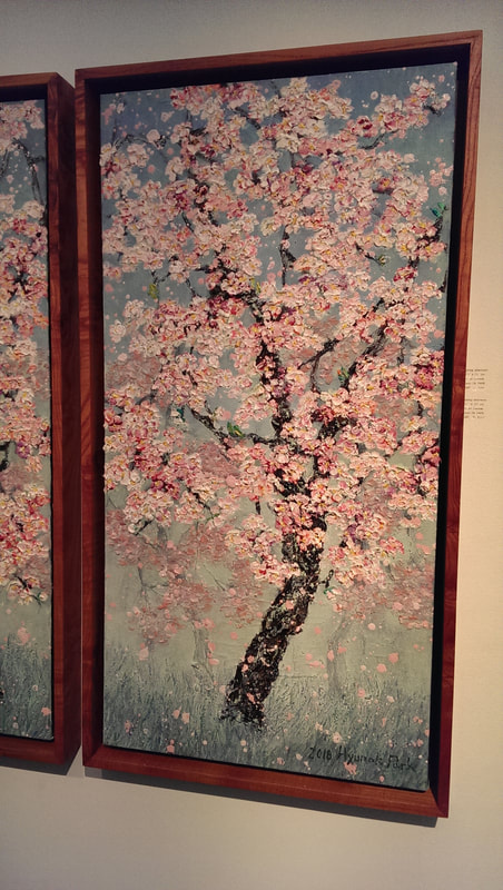
This was one of my favourite galleries last year and it was again this year. I was particularly attracted to two artists. Above left, is a glorious depiction of blossom by Hyun Ok Park. I like the way the blossom busts out the canvas and then fades back in as it falls to the grey and misty grass. They also also have who was last year, and is again this year my favourite artist of the show, and had I the financial means I would definitely buy some. Tae Hoo Park (above right) is his name and his depiction particularly of birds very much appeals to me. They are cute evocative things. 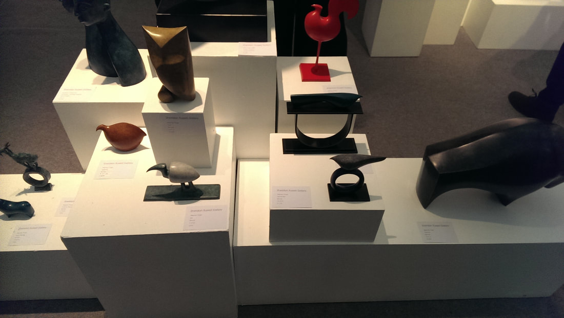 Bronze is an attractive thing and it interesting, depending on how you treat it and shine it, how different you can make it look. Stephen Page (above) renders it to look a little like wood. He produces these almost Egyptian looking animal forms, either standing on there own or perching on top of these large rings. I have centered on my favourite the odd slightly white beetle looking Ibis.
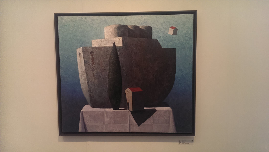
Keith Athay (above left) storms along atop another current trend, that of simplified, naive, slightly shiny and colourful landscapes. He rises above the heard by using things mixed media, so you can just about see in the sky what looks like newspaper used as the surface. His colours, textures and composition all compliment each other very well, and I like the flat surface of the buildings contrasting with the rugged sky. Slightly similar in style but much more abstract is the work of Matthias Brandes (above right). However it looks very different. You have the concentration on just the building, depicted on a strange table cloth and solidly granite in depiction.
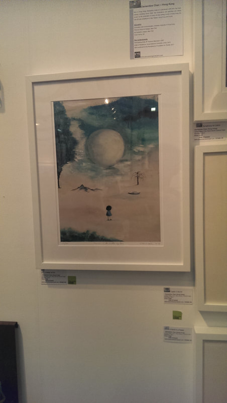
I shall leave you with two utterly contrasting pieces, pared together because they were both available for under £500 and thus tempted my strained wallet. The one above left is by the poetically named Clementine Chan who has produced this very sweet picture of the lonely female figure in a dessert landscape.
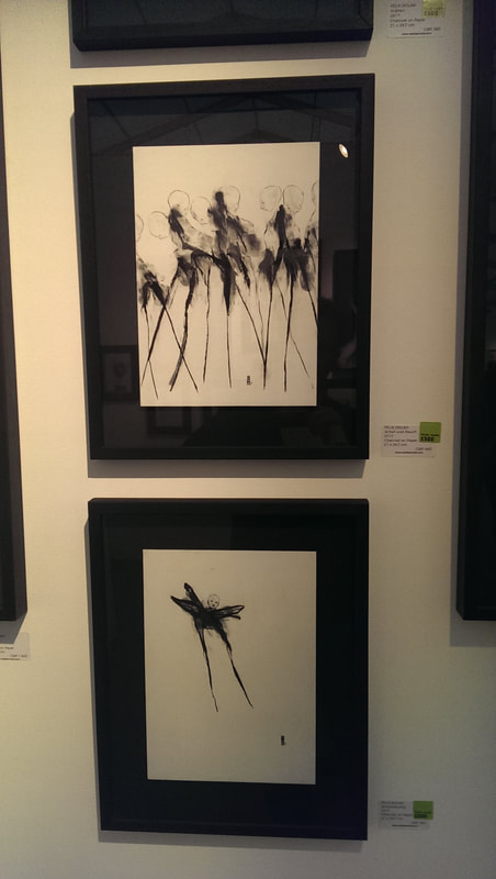
Contrasting with this are this horrific spidery ink drawings by Felix Dolah. They are quite horrible but they are well done and they have strange pull and appeal to me, although I wouldn't want to see it every day. That's it. There were many others I saw and liked and no doubt other good things I missed. I would recommend going along. Its an interesting show, and there is free booze.
1 Comment
|
William John MackenzieI am an artist with a specialism in landscapes and still life. My contact details are here. Archives
April 2024
Categories |
 RSS Feed