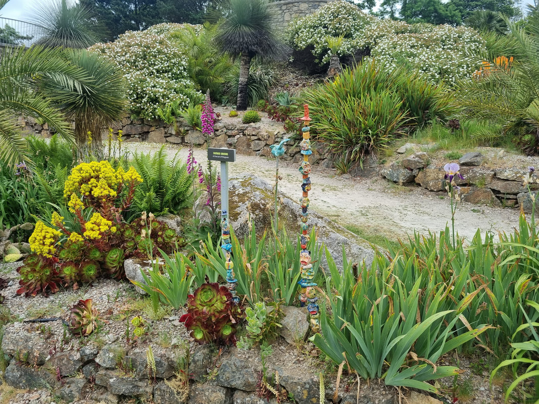
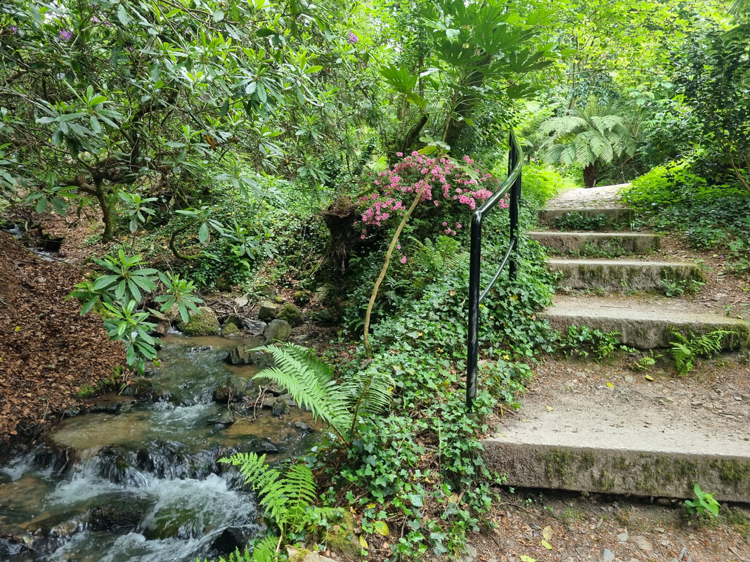
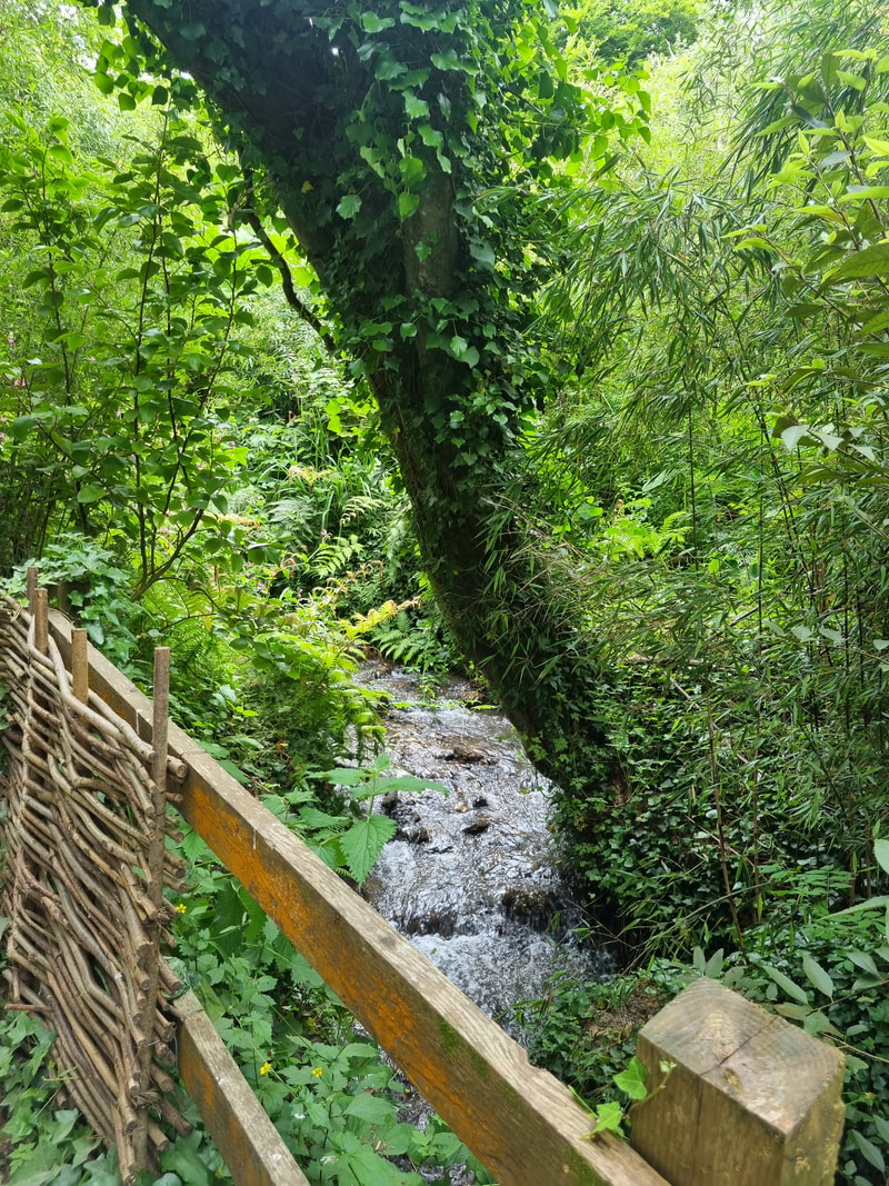
 Last September I attended my first weekend of the Studio Practice Course at Newlyn School of Art. My attendance had been recommended to me by Hugh Mendes, I applied earlier in the year but July was the first lesson. I loved it from the first minute, as I suspected I would. The first lesson was all about using different surfaces, and it lasted all weekend. The weekends were once every two months and focused on a different theme, paint and pigments, time spent on paintings, and scale. All of it building to 1st June when our end of year show opens. Coincidentally, my birthday, so a nice birthday treat. By the time I have finished this post and put it up the show will be over. 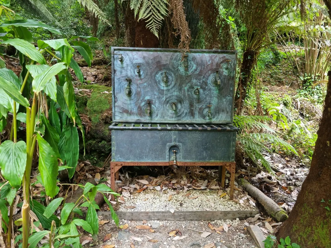 The show took place at the Tremenheere Gallery, part of the Tremenheere Sculpture Gardens. And I have called this blog setting the scene because it is a spectacular place that I wanted to write more about, before in a future post I talk about the show itself. Tremenheere Sculpture Gardens are in Cornwall, about 10 minutes east of Penzance and just outside the village of Gulval. You have to wind down a couple of single track roads (but you have to do that everywhere in Cornwall but it is well worth it. As the title of the venue might suggest it has sculpture. About 42 pieces I believe. These sculptures are scattered around a large fabulous garden that stretches up the hillside from the entrance. At the entrance is the gallery to the left, and a cafe and plant nursery to the right. 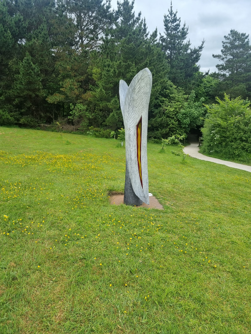 After depositing my pieces for the show, I decided to explore and was so entranced I decided to stay for a couple of hours and sketch some of the place. It is hard work being a piece of sculpture in this setting as you have to compete with the spectacular plants and scenery. The way to deal with this is not to compete but to complement. 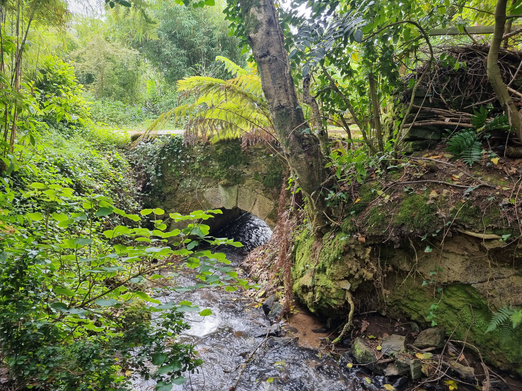 Forming the left hand boundary is a stream, that pours down the hillside, forming several ponds, making mini rapids and passing under bridges. Its banks are covered in tropical plants that thrive thanks to Cornwall's microclimate and give a rain forest feel. It is cool and shaded here and every so often you round a corner to encounter a piece of sculpture, or a spectacular plant, or indeed both.
The path continues up quite a steep hill, the stream following you up and every so often round the corner surprising sculptures appear. One my favourites is the wall of taps you can see further up this blog. Slightly terrifying Greek myth based sculptures also make an appearance, and a constant companion is the verdant plants. On this path it is quite cool, the shade protects you from the sun.
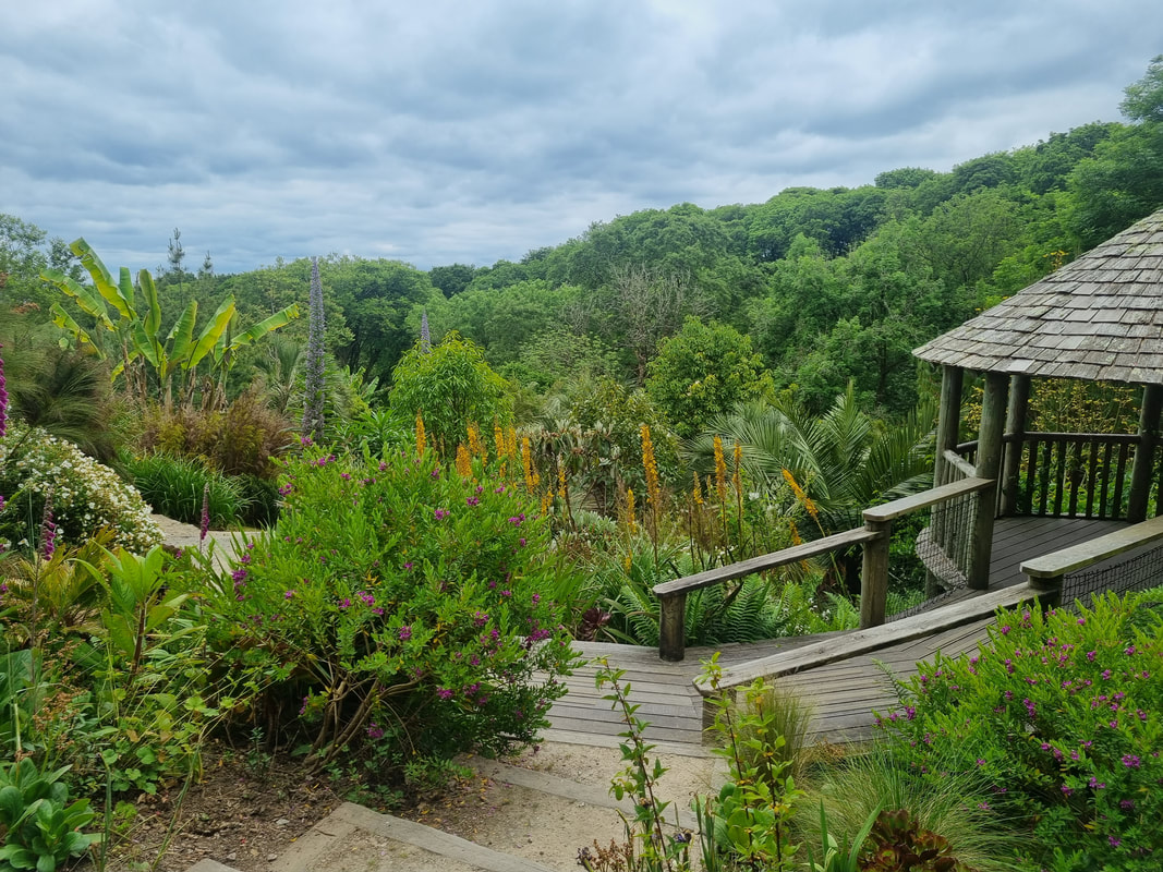
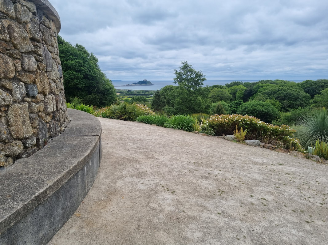
As you go up the hill gantries and platforms give views of the trees below. If you look the other way you can see the English Chanel and St Michael’s Mount. Here, at the top of the gardens is a large round stone structure. You go inside and it opens to an oval chamber, lined with a bench. You can sit in there and just look up at the sky. I highly recommend you do, and see what else the garden has to offer. 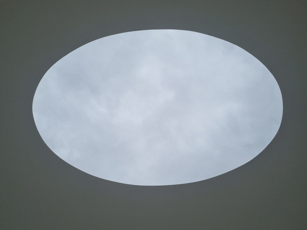
0 Comments
 I am teaching Oil Painting at Norden Farm. The first one is 24th May. If you would like to sign or find out more then please go here.
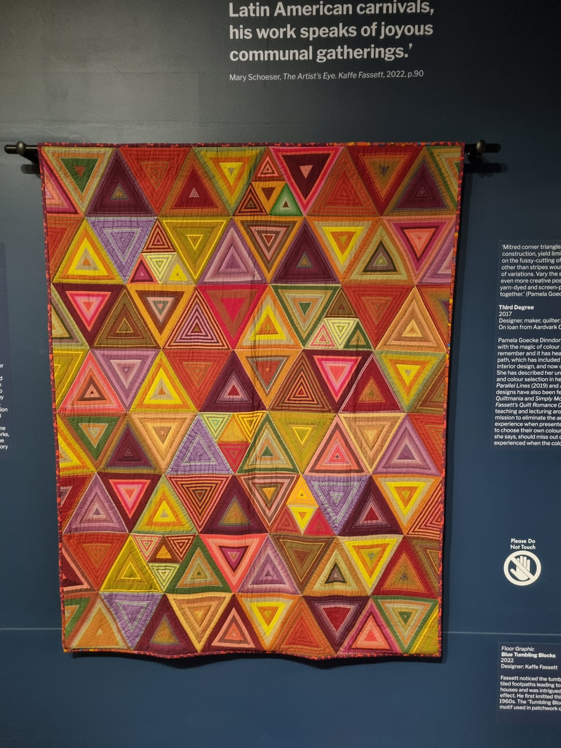
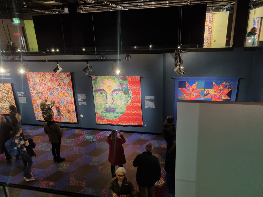 The Fashion and Textile Museum is quite a small museum. It's not really a museum as it doesn't have (as far as I can tell) any kind of permanent display. It is more of an exhibition space. It is located on Bermondsey Street, near London Bridge, one of my favourite spaces in London (it contains the London Glassblowing Studio which I have blogged about before and will no doubt do again). Until last week I had never been. In fact before a couple of weeks ago I had never heard of Kaffe Fassett. My partner had though. She is an embroidery, fabrics, knitting and all things associated fiend and it was her idea to go. I am very glad I did as it opened up a whole new world to me. Chances are if you haven't been to the show yet, you will miss it as it closes 12th March. So who is Kaffe Fassett. Well he is a fabric designer. He designs and makes extremely colourful patterned fabrics, which have a strong pattern in them. He uses bold, unlikely colours, often in strange combination to produce something eye catching. The fabrics are in themselves wonderful things. However what this show, The Power of Pattern, had on display were quilts made by other people using Fassett and Fassett Co-operative fabrics. There were some of his fabrics on display. The first room you go into, which shows an introductory video is bedecked in a red flower patterned fabric. Throughout the exhibition the floor is decorated with a version of one of his designs. Various stools are upholstered in his fabric and towards the end are some of Fassett's cushions and a room showing the original design drawings.
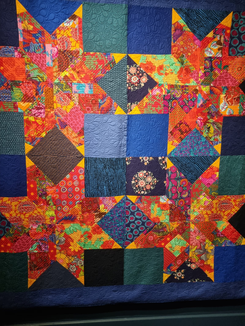
They are though not the main events. The main event is, these amazing quilts. They hang on the wall like harlequin war banners. A riot of colour and shapes. Using different Fassett fabrics in different combinations to different effects. I know almost nothing about quilting so it was useful to have my partner show me how the stitching of the various different elements, how the quilt stuffing was stitched in for example, was used to enhance the shapes and the designs being displayed. Some of them were abstract geometric shapes. The simple concentric interlocking triangles (above left) really appeals to me. I like its simplicity but also the bold colours. In terms of pattern it is probably the simplest in the show. The cross shapes (above right) are a lot more complex).
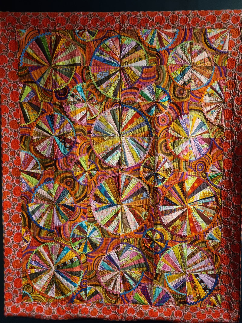
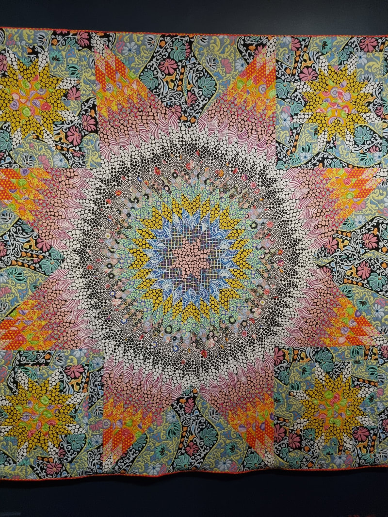
Then it gets more complex still with use of circles of different coloured fabrics, some of the circles are slightly off set (above left). It is almost an overload of colour and here is a good example of the stitching used to highlight the circular shapes. Some of the pieces are insanely detailed (above right) and have a sort of magic eye like quality. I looked at them expecting to see some kind of mystery revealed to me. What adds to all this, is the gentle breeze in the exhibition space causes the quilts to move and stir. It creates a feeling and an effect that you don't often get with art. Most art is static, or deliberately in motion. The accidental motion appealed to me. Not shown here but probably the star of the show was a large rectangular quilt. Circular swatches of coloured fabrics sat against a dark blue stary background. It looked like a constellation of planets. The stitching was waves of shiny spider’s web like silk which added to the effect. It was wonderful.
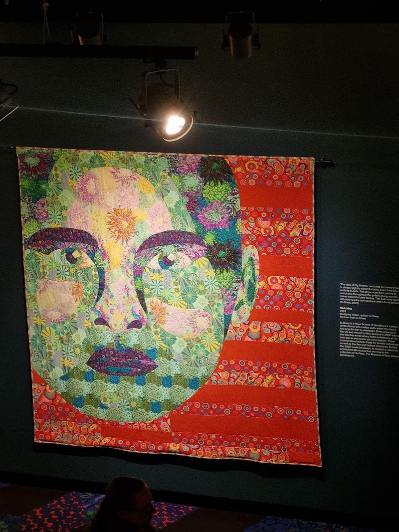
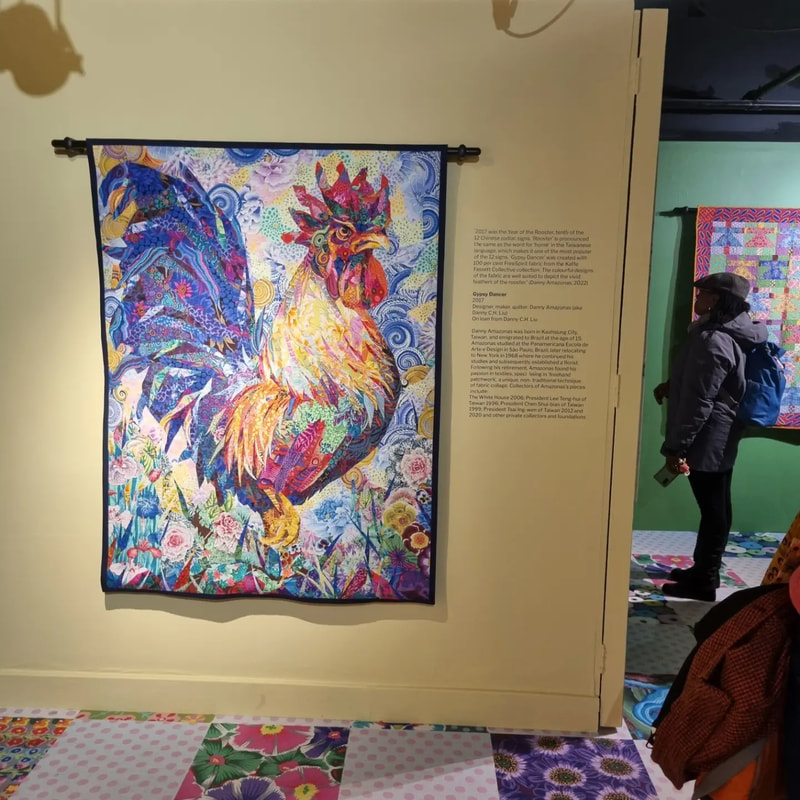
Not all of the pieces were abstract. Some were representational. There was a giraffe and an elephant. A rosy pink rhino made out of cabbage patterned fabric. My two favourites were a face (above left) and a Cockrell (above right). The face was difficult to see close up. Fortunately the museum has a mezzanine level. I like this as it allows you to look at the pieces in a different way and the face certainly benefit from being viewed further away. Then you have a very angry Cockrell strutting through a field (above right). He is by the same artist as did the planets quilt mentioned earlier. He has a properly furious look which I greatly appreciated. I came away with a tea towel (the same pattern as on the floor - below). It was a great show. I shall be looking out similar things in the future. 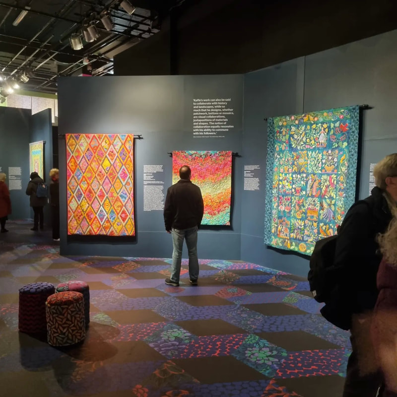 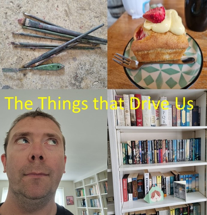 I am slightly obsessed with what people do and why they do this. Partly this relates to artistic endeavours. Not just where people get their inspiration from but where do they get their motivation from, how do they sustain it and how on a practical level do they do things.
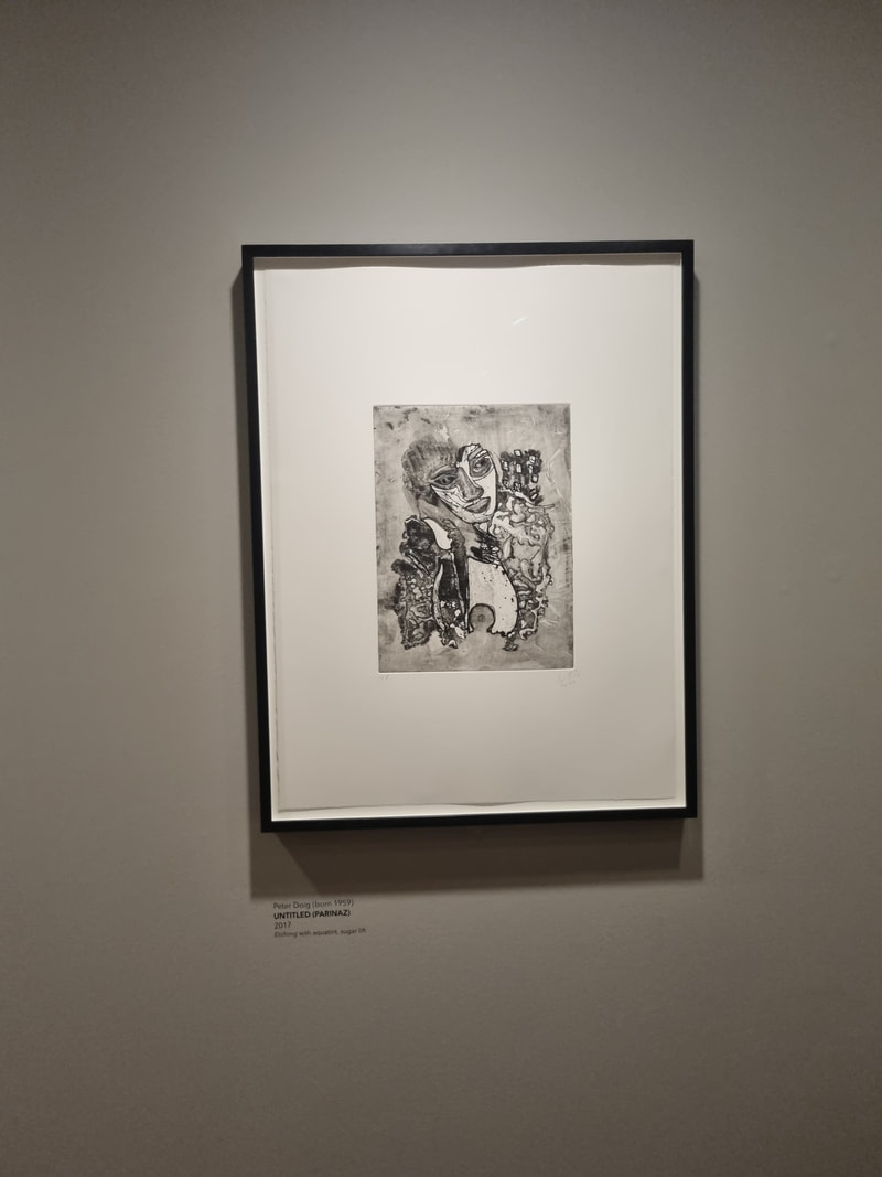
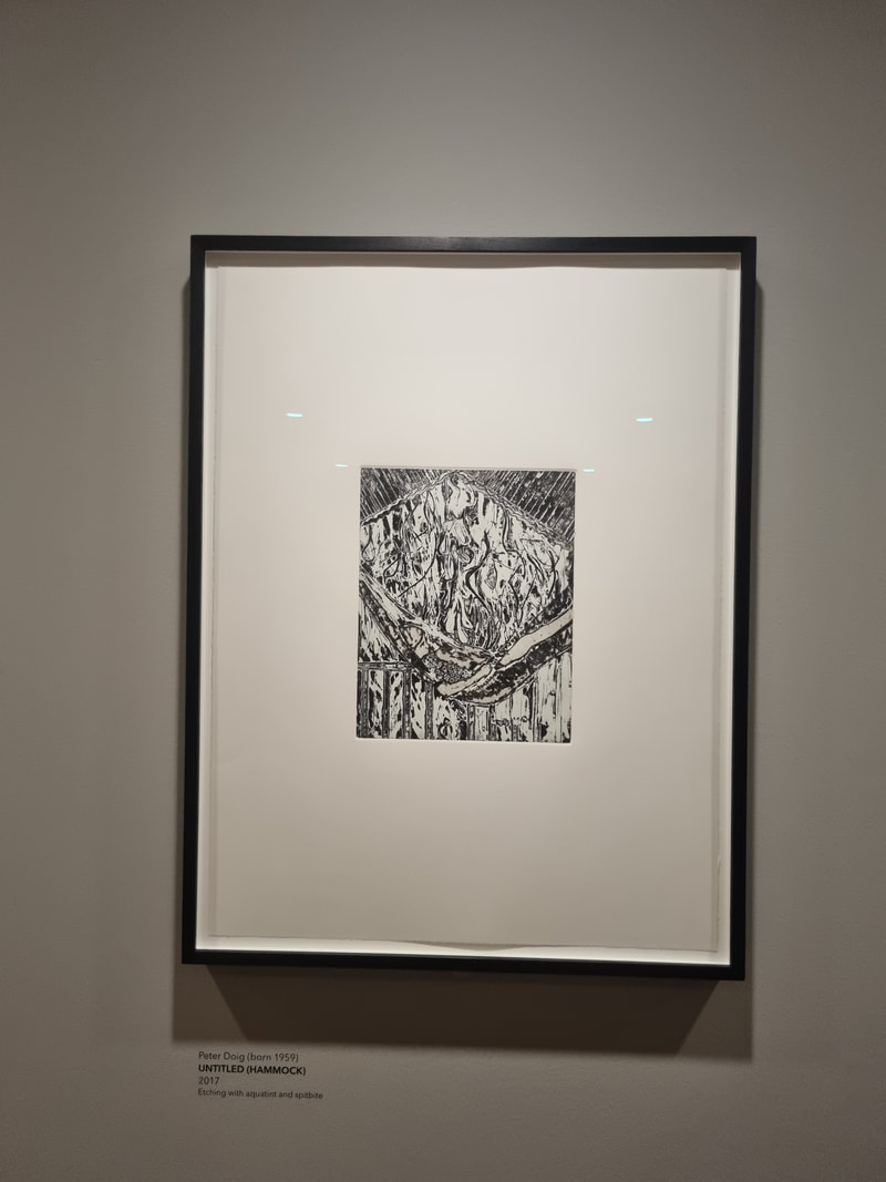
This is why I started my podcast series the Things that Drive Us which explores exactly this. Where it gets really interesting for me at least is the ethic, moral and philosophical drivers behind what and how people do things and it is always interesting to me when these intersect with what they actually produce. So for example with Alistair Gordon the artists who talked very candidly about his faith and how this comes out in his art, and Matthew Pennington of Profound Decision and how his sense of fairness in relation to the people who volunteer for his events drives how he sets the whole things up. I suppose one of the reasons I am interested in this, is that I wonder the same question quite frequently about myself. What is it that drives me? What is it that drives you? Answering this question or at least exploring this question seems to me one of the fundamentals of human existence. Working out what your drivers are, what your purpose and centre is and tying what you do as closely as possible to this, seems to me one of the prime goals of existence. So I batter around the internet and bookshops looking at Stoic philosophy, Buddhism, mindfulness, Christianity, Islam and the schools of therapy and am struck by the similarities between them. How often conscience and the a core purpose is the main thread of all of these things. Theory is all very well and interesting but of course life is tricky so what really interests me is how people, different people manifest this, channel it into their life. How do people realise their drives? Of course much more difficult is once you have worked out what they are, to act on them. And acting on them is both easier and more difficult than you think. These drivers are not static either, changes in life, in perspective, in your needs and the needs of those around you can cause them to shift. Do you agree? How are you going to respond to yours? 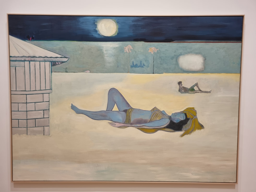 Peter Doig is one of my favourite contemporary artists and so when I discovered they were showing his work at the Courtauld, one of my favourite galleries, I scampered off to see it. I wasn't disappointed and let me tell you why as I suspect you will not be either. Doig has reached the level of fame where his work is in the Tate, if you are into art you've probably heard of him, but he is yet to hit the Banksy level of fame. But go check it out, I urge you. It is on until 29th May so you have time. The temporary exhibitions in the Courtauld are always quite small, in a couple of rooms at the top of the gallery. I highly suggest you give yourself more time than you think as the top floor is incredible as in the permanent exhibition they have many, many excellent impressionist paintings (including the Van Gogh with the bandage over his ear). More on that later. Doig's work is probably most typified by it's sort of slightly magical realist quality. Dreamy, lose textured backgrounds, lots of whites and very ethereal. There is that here but the work on display at the Courtauld seems on the whole a lot more grounded and sometimes more aggressive. Night bathers for example (the one above), definitely has the dreamy quality and the oddness. The back stripe of sort of light blue is presumably meant to be the sea but that weird white splodge makes it sit up and look like a wall. The central figure has a strange blue colour and sometimes appears to be floating but then the whole thing is grounded by the geometric building on the left. It is a calming piece and I like it.
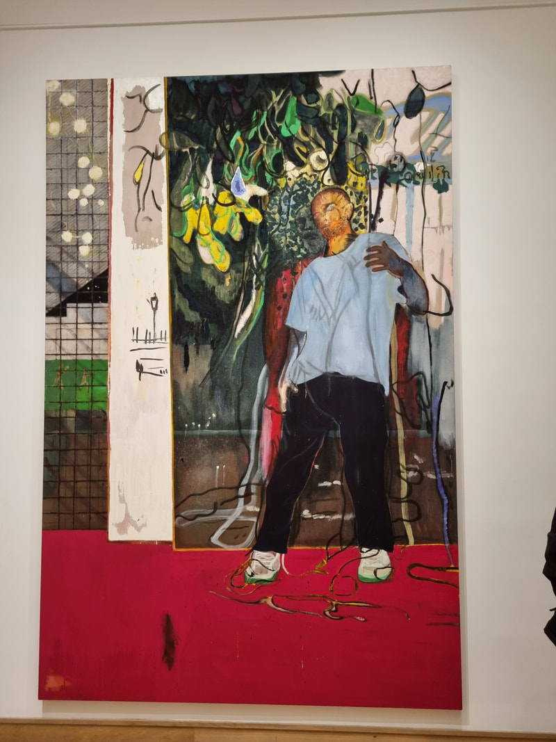
What is not calming, indeed seems downright confrontational is Night Stall (above left). It has the block of vivid red, at the bottom, the figure himself has quite an aggressive or positive posture. It comes across aggressive because of that weird orange head which reminded me of the vampires from Buffy the Vampire Slayer. Then you have the odd arc of foliage. I was looking at it for quite some time before I saw another figure sketched out behind the first one. And again like Night Bathers you have a geometric element on the left, what is presumably part of window. This work seemed much more Francis Bacon like than Doig's other works. It is good, and I like it and the same time don't like it. It intrigues me but I can't warm to it. Much more relatable/ approachable (something like that) is a self portrait (not pictured). Done at night so like the figure in Night Bathing, Doig has painted himself in muted colours, dark blues and purples. The painting is quite lose and patches of bare canvas can be seen. The blocks of colour are never as simple as they seem with other colours blended andwoven into them. Like for example in Painting of an Island (above right) which has more what I think of as Classic Doig, a dark mottled sky and sea, glowing white landscape, figures and a dreamy quality. For some reason I particularly like the swirling purpley hair. But again we have a jarring element with the bright yellow flame at the bottom right. It doesn't seem to provide warmth or light to the rest of the picture, it is there. It focuses your eye and I think is a bit of a mis-step. I think the picture would be better without it. 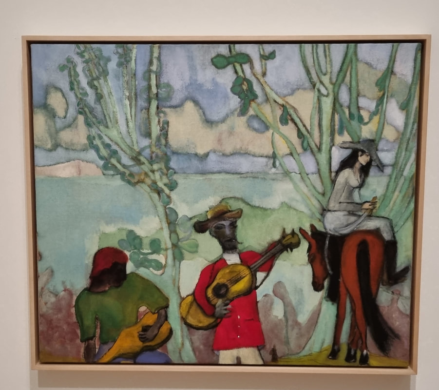 I had three favourite pieces in this show (and it's not a big show) and this was one of them. It is the smallest piece on display and is called Music (2 Trees) (above). I love everything about this. I love the colour scheme. I love the strange ghostly trees, I like the indistinct foliage. I like the bold colours of the musician. I like the grump looking horse who has an almost cartoonish feel, and then the mysterious grey woman on it (Doig's wife apparently). I particularly like the hats. Doig is good at hats and they often appear. The main central figure is ghostly and weird but somehow to me, not sinister. A sort of Puck like figure. The paint is all quite thin and loosely applied and the whole thing has a movement to it. Contrast this with the Alpinist (not pictured). The largest piece in the show and my least favourite. It is literally monumental, with a central harlequin clad ski figure. You can't see their face as it is obscured by googles and hat. Their skis form a cross behind them, a crucifixion motif if ever I saw one. And towering in the background is the Matterhorn. It is mainly blues and whites. It is a good picture don't get me wrong but it didn't seem to have quite the life and vibrancy of Doig's other work. It seemed to me like he had thought about it too much. Too considered. Too still. 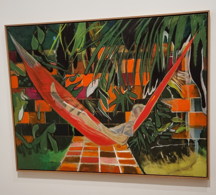 Alice (above) took Doig about 8 years so you might think that would be too considered as well but somehow for me it really works and is another favourite piece. It seems intimate as well as striking. Perhaps not suprising when you realise the figure is his daughter. She is portrayed in his characteristically ghostly style and there are patches of this in the setting (particularly the foreground greens). Other than that though it is uncharacteristically poppy. The bright orange tick of the hammock (that reminded me of his hats in other pictures but also the Nike swoosh), and the almost cartoony foliage. Speaking of hats opposite this piece is another piece called Music Shop (not pictured). It consists of a large man (with hat) and a guitar slung over his shoulder. It looks more like he is carrying a weapon that an instrument. The ghostly outline of a skeleton is painted on his trench coat (a detail I think is a step too far). He is striding past a music shop but through the windows and the door you see the sea. Again this mixture of the odd and the mundane. Doig obviously likes painting musical instruments as they appear several times in this show. 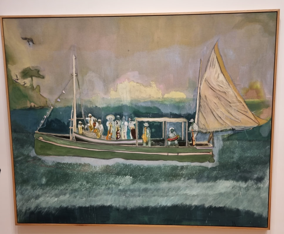 They appear for example in another of my favourites the Music Boat (above) where they are probably the most colourful elements. I find this piece very calming. I really like the way Doig does his blues with this blurring of greens, turqoise and blue and the dashes of different whites. In the top left we have hovering this twisted bird figure. The background islands almost dissapear. It gives me a dreamlike feeling that I like. 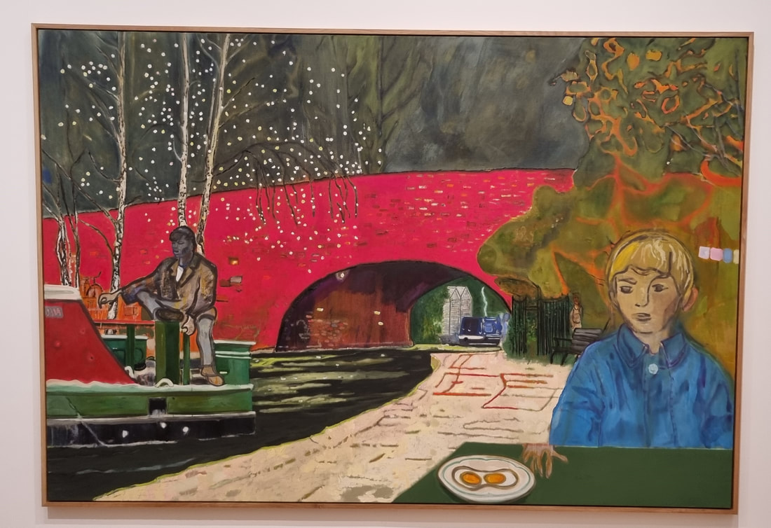 Finally (well not quite there is another painting but I didn't like it so not going to talk abot it) we have this picture of a Canal (above). I had a sort of sinking feeling when I saw this. I love canals, I love painting them, it is one of my favourite subjects. A lot of my early work, before I left London is of the Regent's canal. Last thing I need is to be competing with Doig. Who knows though, maybe he will make the subject more popular. The red bridge forms a bold almost alienating strike. The figure in the foreground is his son. For me the elements I like most are the contrast between the dark green water, the red bridge, and the deep blue of the rear most canal boat. It caused me again to consider whether I should put figures in my paintings. They do change the piece and I think I would have preferred this scene without any (although I think Doig nearly always has figures).
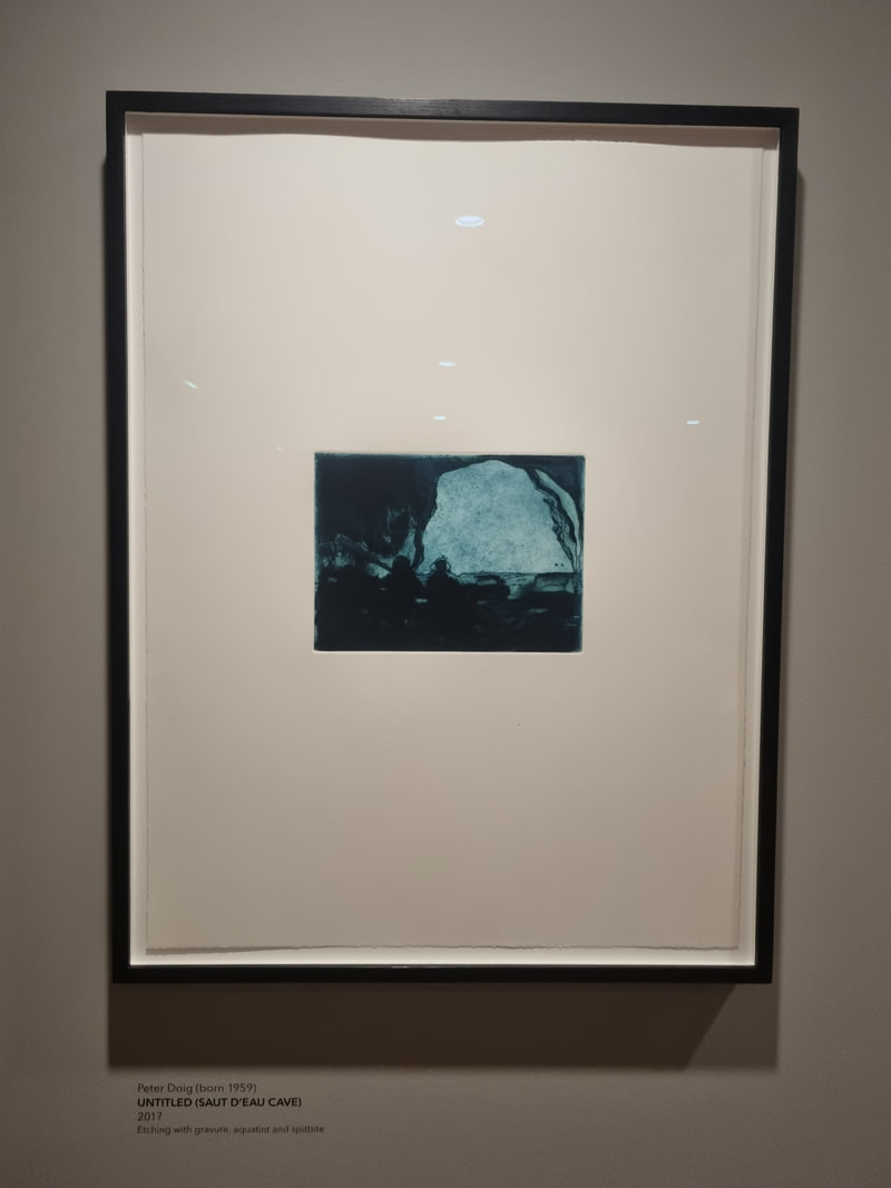
Apart from the paid show proper there are on the first floor a series of etchings. Some of them like the one on the far left refer to the paintings above. Others are something different. They contrast between very sparse (like the ghostly cave on the left) to super detailed.
If all of this doesn't coax you then there is, as I said the famous impressionist paintings. The Courtauld has also put in a modern British gallery and I was pleased to see David Bomberg (above right), Peter Lanyon and Patrick Heron (above left), all of whom I really like.
Also go to the Watch House, its in the courtyard of Somerset House and the coffee is really good. 
This week I talk to the excellent Paul Wicks
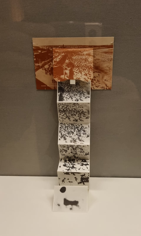
An unweildy title but a very good show at the British Museum and its free! Its hidden away a bit at the top of the curling stair case that ascends the central cupola. It runs until March 2023 so you have plenty of time to see it. It is however in my view worth a view, let me explain why and what I got out of it. 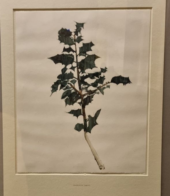 Works on paper often have a reputation as being less important, less interesting, more ephemeral. They labour under the sway of canvas and other proper surfaces of art. I suppose that this is because paper work and sketches are often see as the preparatory work for a more important work. This is of course because often it is true and there are some examples of this in the exhibition. But there are some other complete works which are very beguiling in their own right. I am a big fan of botanical art. I find it peaceful and contemplative as well appreciating the scientific accuracy of it. The one above, of Holly by Charlotte Verity produced in 2020 shows that the form is still alive and well, which pleases me. So some of the work on display is figurative and realistic but much of it is more abstract. 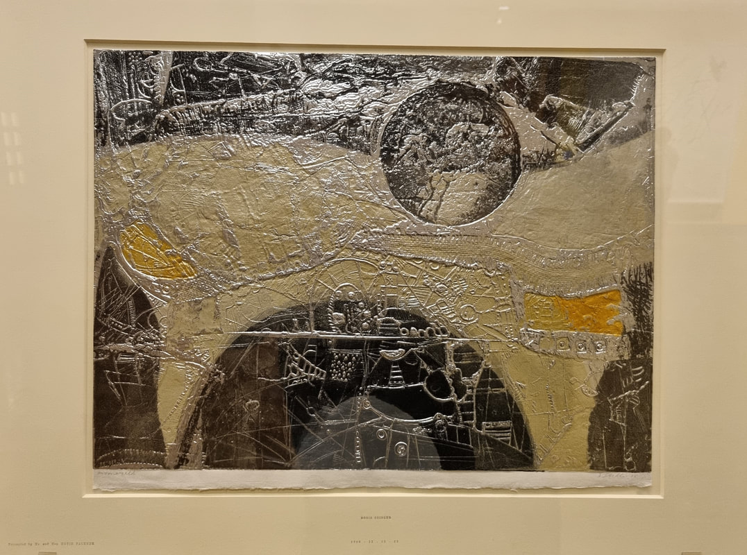 Doris Seidler's Moonworld (above) is one such abstract work. I love the shiny surface and the mapped-like texture of it, the building or streets that seem to be there. It is not only physically attractive but it allows you imagination to run. Is this perhaps a future moonscape? I found this quite inspiring, and I particularly like the ideas it gives me about material and this made me want to run off and play with Japanese paper (on which this is painted).
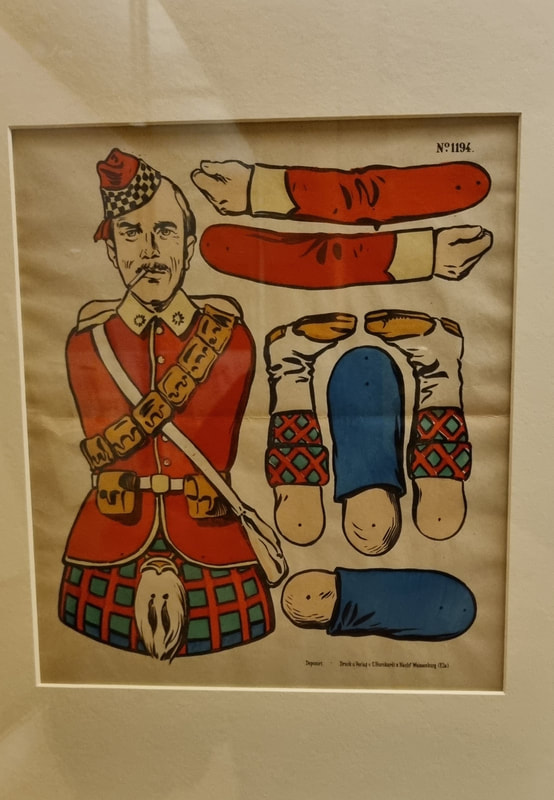
I do love a bit of humours in art. It is (as is humour in culture more generally, no comedy film has ever won the Oscars for examples) lacking in the same cache as more "serious" artistic subjects. So when I see it and it is done well, I do enjoy it. Particularly when it has a certain wistful air to it. Some of the works have a flippant feel that appeals to me and two such examples are above. The one above left is deceptively so in that it looks first of all like a tongue coming out of the picture, a gimmick almost. But then you look closer and realise it is perhaps a beach invasion scene. The one above right has a certain amount of personal relevance. My father is obsessed with military history and so a deconstructed soldier, particularly one with such excellent knees was always going to appeal. 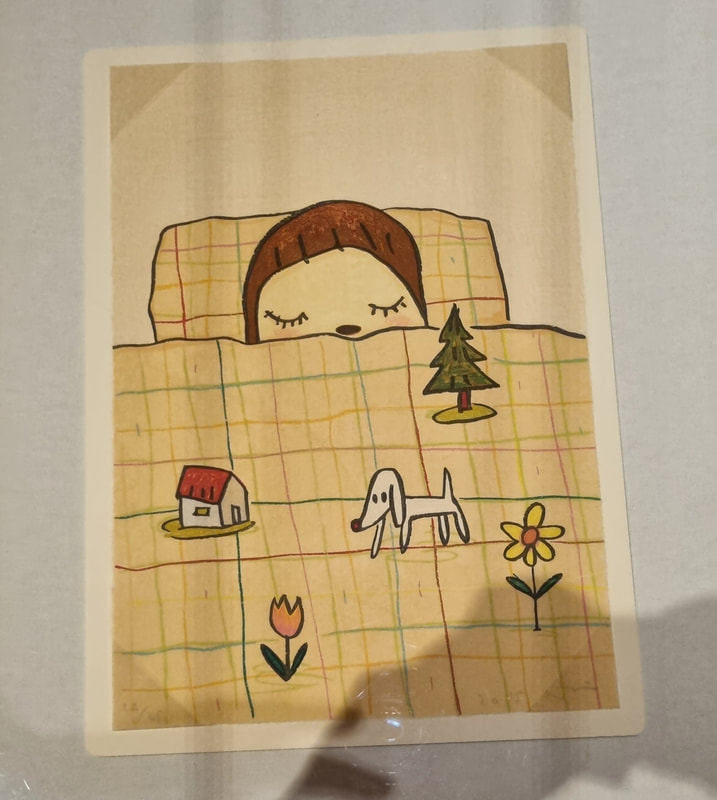 Cuteness has a similar problem as humour but there are works by Nara Yoshitomo such as Dream Time (above) that combine both but with a very beguiling effect. It has a great balance of colour and I like the geometric patterns on the duvet cover that set off the childlike images that are, presumably, being dreamed by the main character. You immediately identify with the central figure, or I do anyway. They look very peaceful.
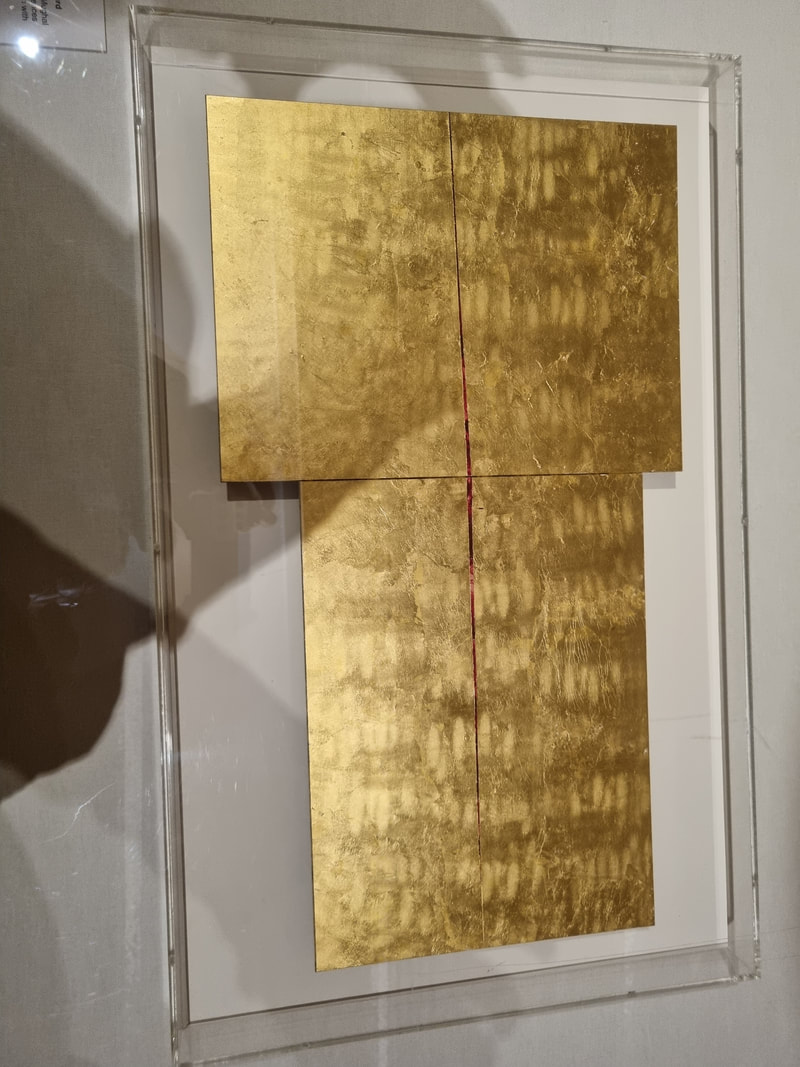
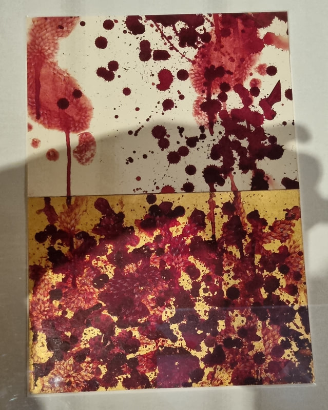
When you think of works on paper you have ideas like sketch and minimal, but like with Seidler, Imran Querishi produces these two sumptuous pieces (above). The patterned gold on the left is very striking. It shines and sparkles and you can't help but be drawn in. It has organic patterns in it that maintain the eye. The one of the right is more violent with these blood like spatters. I do like the way the pieces is divided between the gold and the white. You could project your own story onto that (as you can with all good art). 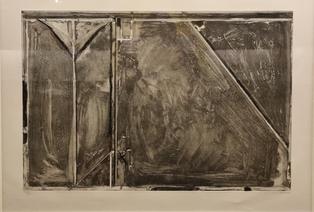 Richard Diebenkorn is famous for his sort of flat planar landscapes and you can read this piece above as one, as indeed the title of it says you should. It is quite simple just washes of gray with stripes of white and black dissecting it. The different intensities of wash with the bold lines make for a very interesting image. I particularly like the smaller shapes at the top, but there is something about the whole thing which I got lost in for quite a while. 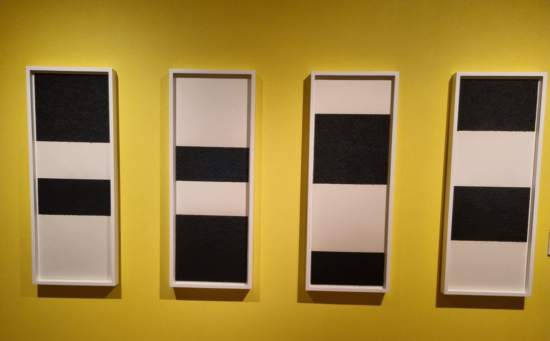 Simplicity can be extremely effective. People like patterns. I like patterns (I'm a big fan of Agnes Martin) and so Richard Serra's Reversal series (above) does this extremely well. It is an example of how just one of the series (these 4 of a series of at least 10) would not work as well. Although they are quite stark on themselves its the way they pay of each other and take your eye up and down that really works. I often wonder with series like this to what extent the artist intended them all to be displayed together or whether they were just enjoying riffing on a theme. I would quite like to see all of the series together that would be even more impressive. 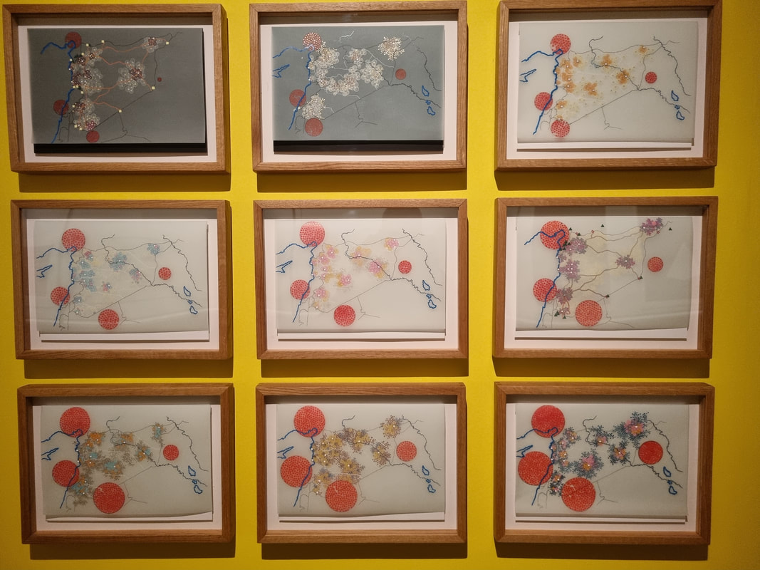 Another series that benefits from being together is Tiffany Chung's series (above). the changing patterns and lines, play off each other. In this case though each work of the series would stand well on its own. The interplay of red, god and blue makes for a sort of abstract flower like arrangement that reminded me slightly of Chinese flower paintings. When you read the label though your perception of the work completely changes. Its called UNCHR Red Dot Series- tracking the Syrian Humanitarian crisis. The work in fact shows the mass movement of people called by the civil war in Syria. And just like that what was just quite a pretty collage turns into something else. I like that. I often enjoy how knowing what a piece of work is about can completely change how you perceive this. Sometimes it can ruin it (and I have ranted about poor labelling before). It does not in this case.
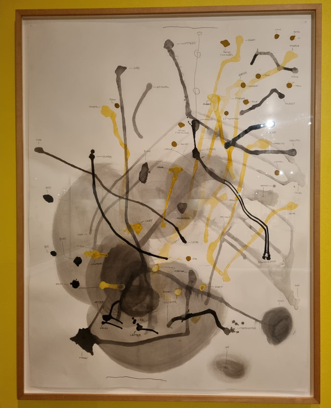
This is called trompe l'oeil a fancy work for optical illusion. Its difficult to do and I am always impressed when I see it. Very different to this is Al Taylors Peabody group. I like the image. I like the lines, the smudges of wash, the contrast between gray, yellow and black. I also like maps and particularly imagined maps and this is what this is. You can just about see the feint names marking parts of the image. These are made up names and create a sort of imagined connection and map. I like this very much and may steal it. 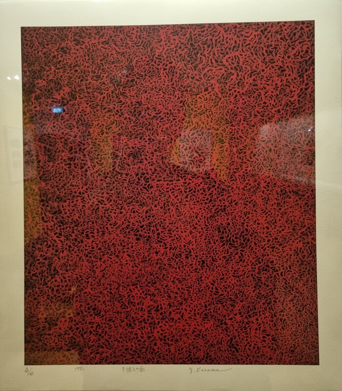 I will leave you with Kusama Yayol's sumptuous Rain in Evening Glow (above). Which is somehow comforting and calming, at least I found it so. This and the others featured here are just my personal highlights from what I think is an excellent show. Go along, decide for yourself.
This week I talk to Rob Leigh about his kickstarter campaign for his latest RPG- the moon hangs low. A lovely chat with Matt Pennington of Profound Decisions where we talk about the motivations and ethics of a LARP game that relies on volunteers for its success. This week I speak to the fine artist Ellie Verrechia. We chat about art and how to be bold to put yourself out there. Ellie's website can be found here. If you want to find out more about Newlyn art school then their website is here. |
William John MackenzieI am an artist with a specialism in landscapes and still life. My contact details are here. Archives
April 2024
Categories |
 RSS Feed