|
Episode 5 of the Things That Drive Us is with the marvelous Amy Dudgeon. Amy is a writer, poet, yoga teacher and lawyer. We talk about how all these things intereact in this, the last episode of the current series. Amy's website is https://www.amydudgeon.co.uk/ I hope to be back in the not to distant future with some more.
0 Comments
I am pleased to announce that Episode 4 of the The Things That Drive Us is up. This week it is with the excellent Alastair Gordon. Alastair is an artist based in South East London, painting mainly in oils. He is also the co-director of faith based art charity - Morphe Arts
In this episode I speak to Afroja of the Law and Justice Podcast about the law, legal and political activism, podcasting and fashion design.
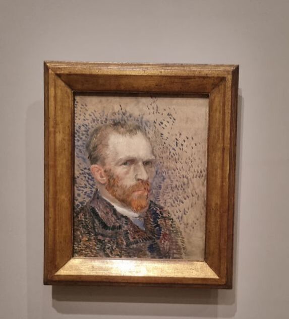
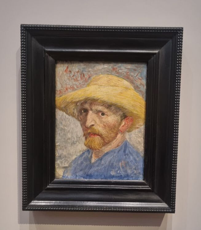
Links for Afroja https://www.linkedin.com/in/afroja-k-84a777209 Podcast on Instagram: https://www.instagram.com/thelawandjusticepodcast/ Instagram bio link for podcast: https://maelt.co/thelawandjusticepodcast Fashion Cults On Instagram: https://www.instagram.com/fashioncultsuk/ Carbon Neutral NFTs on Voice by Fashion Cults https://www.voice.com/fashioncults FashionCultsNFTs on OpenSea: https://opensea.io/FashionCultsNFTs Ukrainian Dress By Fashion Cults (Digital modest dress by Fashion Cults to support Ukraine-available on DressX-The leading meta fashion marketplace) https://dressx.com/collections/support-ukraine-collection/products/fashion-cults-dress Instagram bio link for business: https://linktr.ee/FashionCults  The Courtauld is one of my favourite London Galleries. You have to pay to enter but it is totally worth it. It nestles in the arch that leads into Somerset House (incidentally the coffee at the Watch House in the courtyard is amazing). I was in London the other week so had booked myself to go along and see the Van Gogh self portrait exhibition. The Courtauld has been closed while it undergoes a revamp, so this was also an opportunity to see the renovated space. They were both well worth it. The renovation has been very well done. The basement vaults have been opened up to form a free locker space and a large and well stocked shop. I remember the walls being red but they are now a creamy grey, which makes the pictures easier to see. The pictures themselves are also better arranged. I ascended to the top floor first to view the Van Gogh self portrait show. It is I am afraid to say already finished so you have missed it. It was quite a small show, over a couple of rooms but the quality is very good. You may have seen my thoughts on the Bacon show. My reaction to this one was very different. Whereas with Bacon I couldn’t wait to get out, with this show I didn’t want to leave and circulated around the rooms several times. 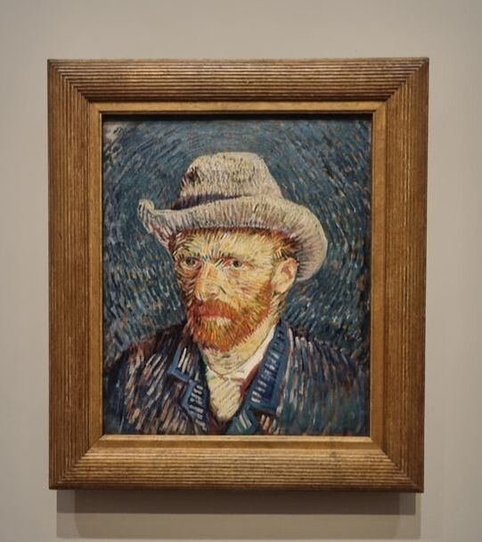 You can see the development of his style and as more colour and more radical use of colour, with a particularly mad one where he looks like and angry acid trip of a hedgehog. It uses the swirling vortex style of painting that would be made famous by Stary night. 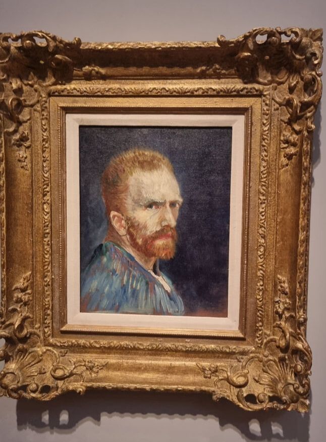 He doesn’t look like a happy man. People often don’t in self portraits as the act of painting yourself means you often adopt a concentrated and earnest facial expression. This is because you are being concentrated and earnest. Rarely do you see self portraits where people look actively happy. Maybe its because we know what happened to Van Gogh but he does seem particularly mournfull. One painting with its deep blue background and his, hard determined stare seemed especially powerful to me.
The curator of the Courtauld was in the gallery showing some people round and explained that in many of the paintings, the paint had faded, particularly the red paints which was less stable, leaving a much plainer painting. I tagged along behind, shamelessly earwigging. It was very interesting. Once you know this , you then look at some of the paintings, like this self portrait with what now appear to be quite a bland background with just odd splotches of red, and wonder what it would have looked like in its first condition. 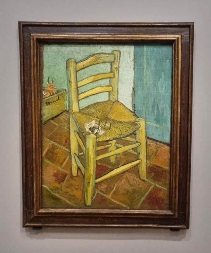 My favourite painting though was Van Gogh’s stool. Stretches the self portrait things but it is an excellent painting. The vibrant colours, the odd perspective and the empty and loneliness of the scene are quite evocative. The exhibition takes you through various stages of Van Gogh life, before during and after his stay in mental hospital. While the subject and events depicted are quite painful, they are not made horrible. There is a humanity and, because of the colour scheme a strange joy which makes them engaging. Sadly you can see none of this as the exhibition is now over. Sorry about that I meant to write this up much sooner. However there is an Munch exhibition which looks good and if you haven’t seen it yet the rest of the refurbished Courtauld is well worth a look. I have written about the Courtauld itself before. Refurbs of museums can often be for the worse but not this time. It looks, feels and is much better. There seems to be more space. The paintings seem to be less cluttered and have room to breathe. The red wall scheme has gone to be replaced by a pale creamy grey in which, frankly, the art sits much better. The Courtauld itself is blessed with some fairly spectacular ceiling frescos and these are still in place, and presumably have been restored. The basement has been opened up into the arches to provide free locker space and a very nice, cosy shop with really quite expensive stuff in it. Good stuff but expensive. I won’t write here again about the classics of the Courtauld. They have a large impressionists collection which is well worth seeing if you haven’t already. Instead I shall concentrate on the new work that was on display. 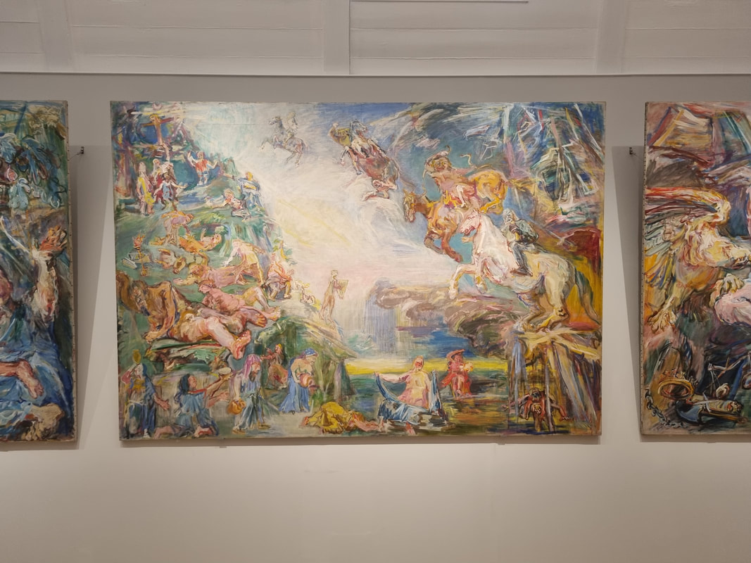 Oskar Kokoscha was new to me and there was a room dedicated to his art. I suspect that this might be a room where the subject changes from time to time. I really liked his stuff though. There was an enormous triptych up on the wall depicted mythical scenes. I liked the brightness of it and the fluid and indistinct nature of the painting which are set off by these sort of scratchy lines that move throughout the painting. His style works particularly well for coastal landscapes and there was a nice jagged rocky bay, with two angry seagulls in the foreground that I liked.
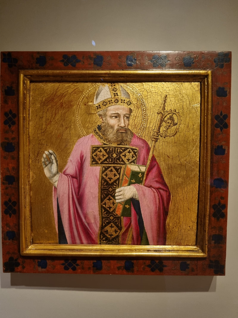
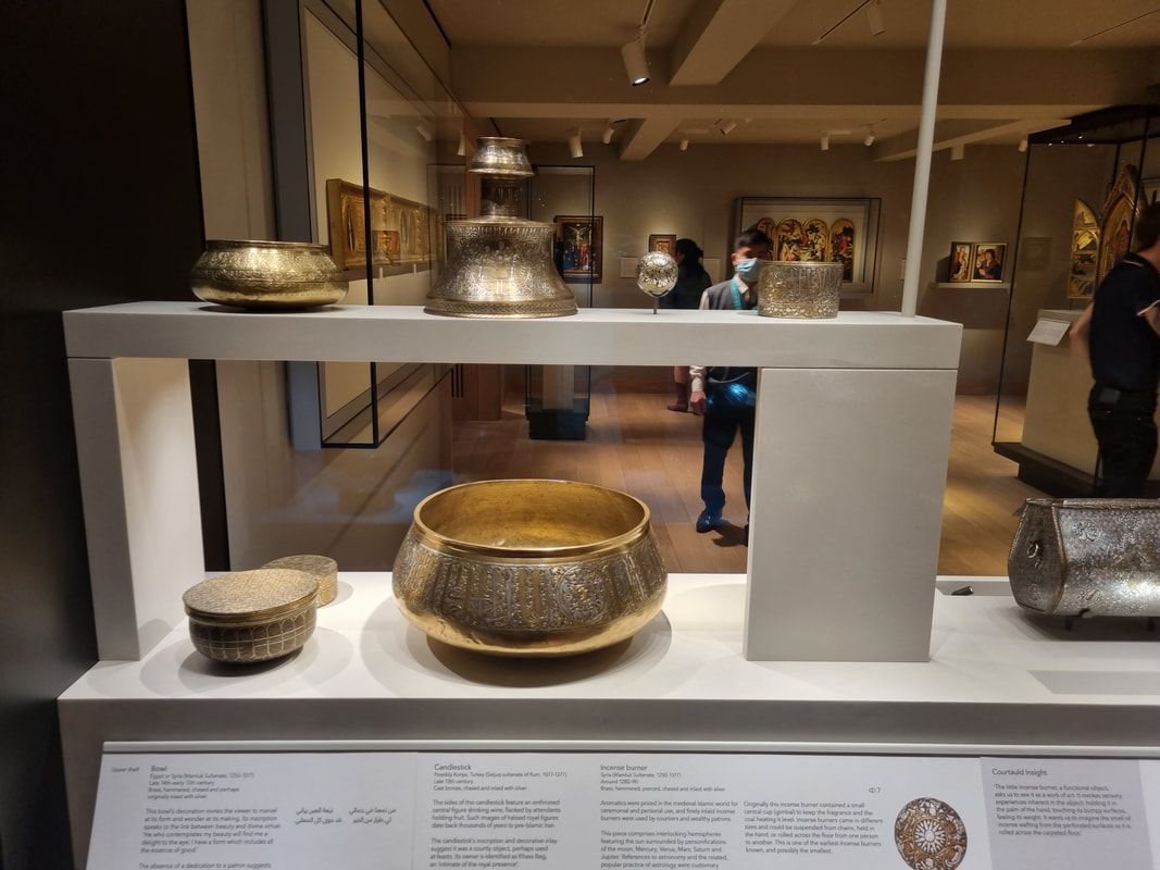
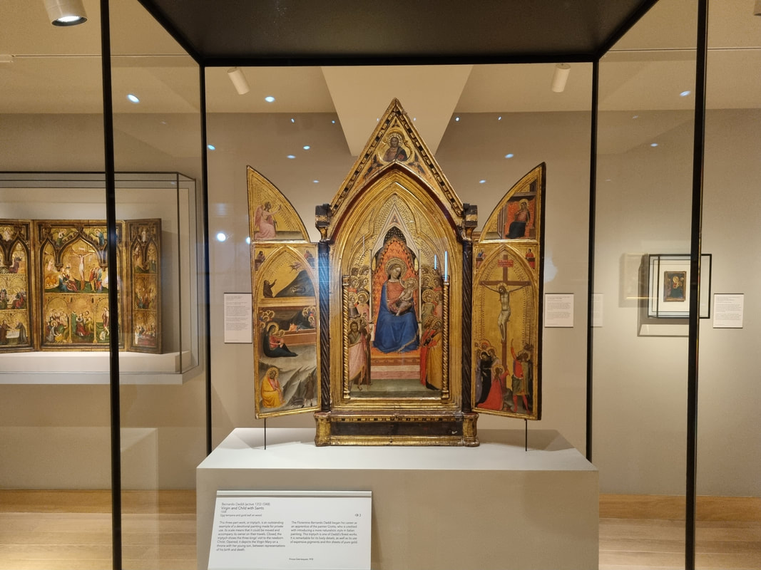
The main change is to the medieval room, with its grumpy icons. This used to sit on the ground floor and felt slightly like and after-thought. It has been moved up a floor, and been given a bigger space in which it is better presented. The Islamic silver here is quite something, but my favourite is a grumpy saint, sitting in his gold background.
Go, have a look for yourself. And well done to the Courtauld and all those involved in its refurbishment. 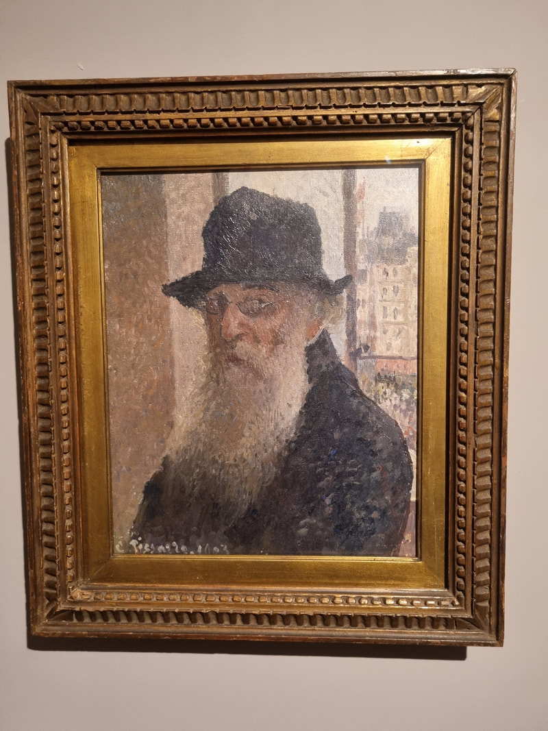 The tides of life have washed me up onto the shores of Oxfordshire and as such, shows I would have previously discounted are now accessible. The Ashmolean is a museum I think I last attended about the age of 13 on a school trip. I was drawn there again more recently by the Pissarro show. I am quite a fan of Pissarro but what I hadn’t clocked until this show is that are in fact two of them, father (Camille the subject of this show) and son (Lucien). Well there are two famous ones anyway. Lucien I had previously encountered as he lived in London and I had greatly admired his pictures of Kew Garden which had been shown at the Tate, but until now they had all just been lumped into my head under Pissarro. 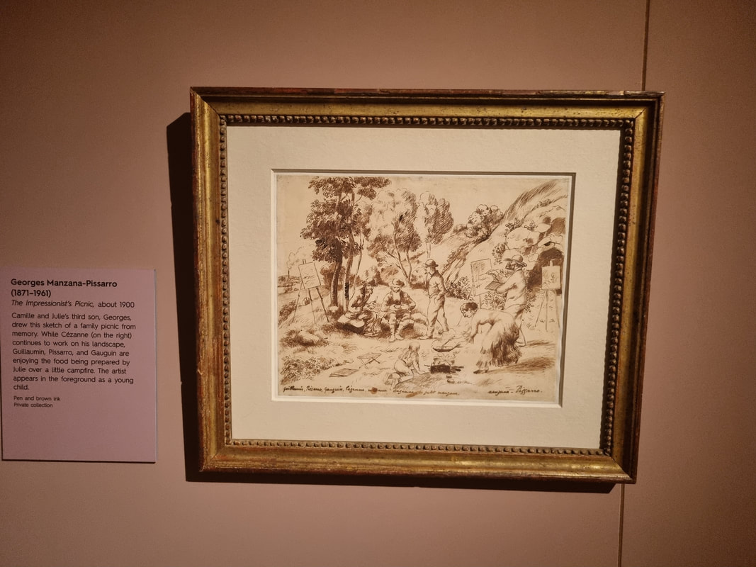 Some of junior’s work is here, as is work by other of the children including a very charming sketch by George his dad with all the famous artists of the day, Cezanne (etc - see above). But the focus of the show is dad, Camille. Someone more French looking than Camille Pissaroo it is hard to imagine with his beret and great big bushy beard (see the self portrait at the top of the blog). He sired a large family and an equally large painting family. 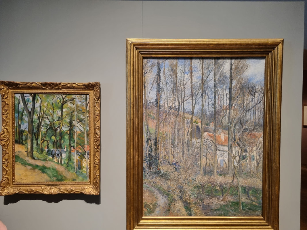 Sometimes with shows like this the other artists work are shoe-horned in a little under the heading of – inspired by. In this one there is much more direct relevance in that Pissarro often directly mentored, or painted with them. There is one very revealing pair of paintings where Pissarro and Cezanne paint the same view, at the same time. That was quite a striking thing to see. It is interesting to see in which there styles are different, and the way in which they are similar. Cezanne does the better trees in my view. There are a number of examples of things in a similar vein snow scene by Pissarro and Monet for example. 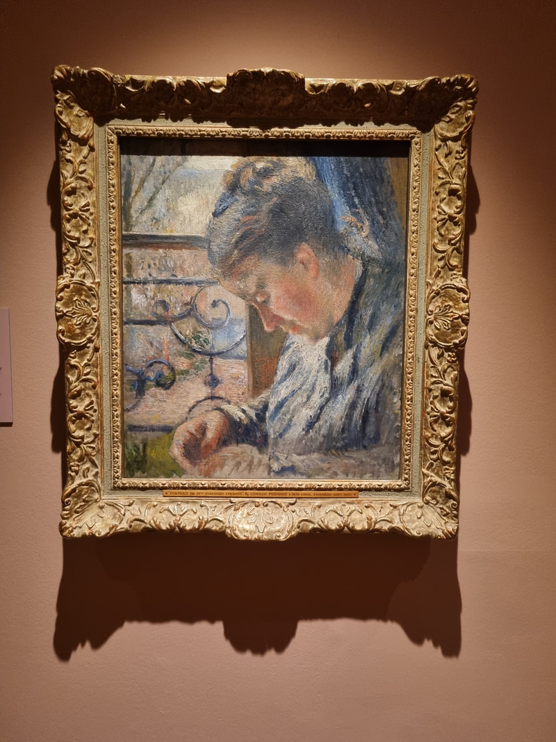 The Pissarro paintings themselves are pretty spectacular. One of my favourites is a portrait of his wife, which is very closed off and intimate and seems to radiate love. Pissarro seems to be a rare example of an Impressionist with a stable family life. He had a large brood (including the aforementioned Lucien) most of whom became artists. And as previously mentioned he acted as mentor to many of the impressionists themselves. I have to say I envy this station. I would like to have acolytes. I guess well all would. 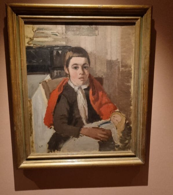 He encouraged his children to paint and draw and they produced annual albums together some of which are on display. It is in this context that another one of my favourite paintings really backs a punch. It is a portrait of one of his daughters. In the painting she has short hair because she has a fever and they are trying to keep her cool. She did not survive the fever and died aged 11. The painting seems to have a sad mournful quality anyway, but once you know this and look at the painting again it really hits you in the gut. A theme I go on and on about is labelling of an exhibition. In this one they don’t tell you what to make of the painting. They do tell you the context though, and this alone can radically change how I at least perceive a painting. I always like to play with this by looking at a painting, reading the label and then looking back. History is fine, what the artist is trying to achieve is also fine. What the curator thinks it all means is not. 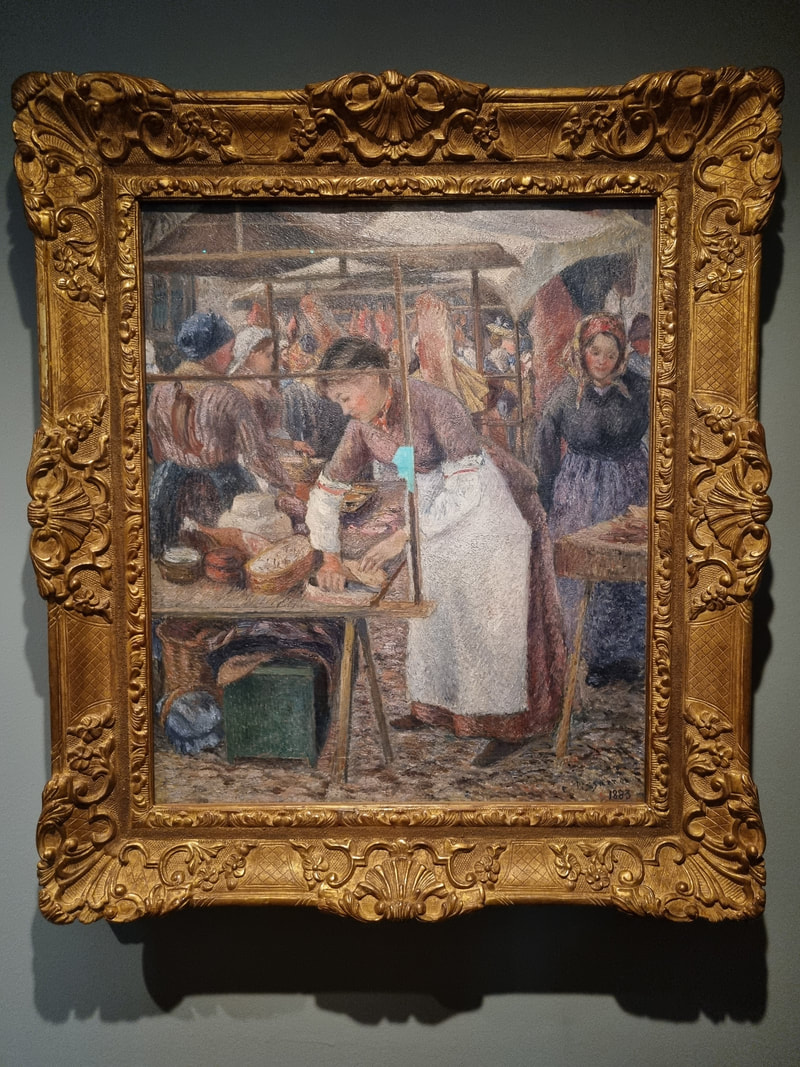 The exhibition explores Pissarro’s main subjects of rural life, and rural working people. These scenes in his hands take on an idyllic quality. I particularly like the fishmarket with it’s bustle of people. Like many impressionist paintings there is a dreamy quality to Pissarro’s work, particularly his where the border between different subjects and the background of the painting is often blurred or indistinct, marked by colour and tone rather than by a hard line. 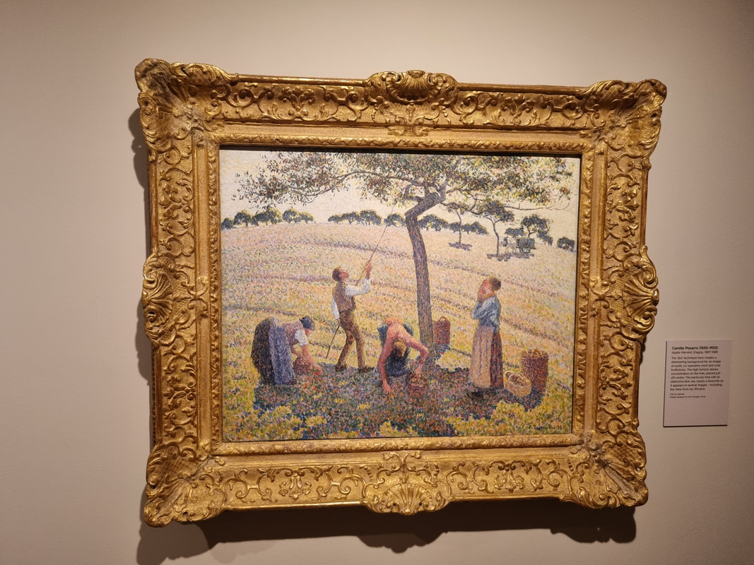 The exhibition goes on to explore his pointillism phase, where he produced again some wonderful rural scenes but abandoned due to the fact he find it to time consuming and constraining. It is a strange thing to observe those how these little dots of contrasting colours can merge to form a consistent image, of a very different colour.
The finest piece in the show cannot be pictured here. It had a “no photo” sign next to it. It is of a Paris bridge at dusk with the lamps lit and the lights of the carriages and the buildings flaring. All orange and dark. I loved it. I suspect you will too so go and have a look. You have until the 12th June 2022 to do so. 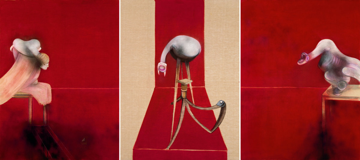 I don’t like Bacon I went to the Francis Bacon show at the RA. It’s a big show, with a big name. His paintings fill several of the large rooms in the Royal Academy. There is a lot on display there and you could spend a long time there. I did not. Bacon is a big name in modern art, in British art, famous throughout the world. His paintings are in most of the modern galleries. He is or was also properly a genius, a truly talented art who produced a body of work like no one else. 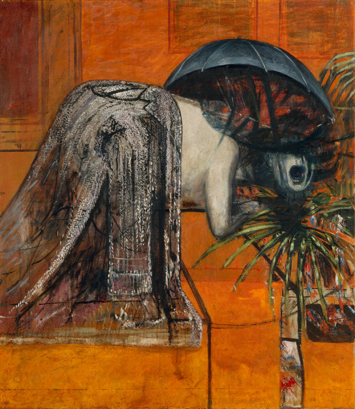 However I find his work truly horrific. As in actually horrifying. Yes the bold use of background colours like red and oranges that contrasts with the almost monochrome figures is impressive. Yes his command of paint and form is excellent, but the subject matter that all this is put to, I just find too off-putting.
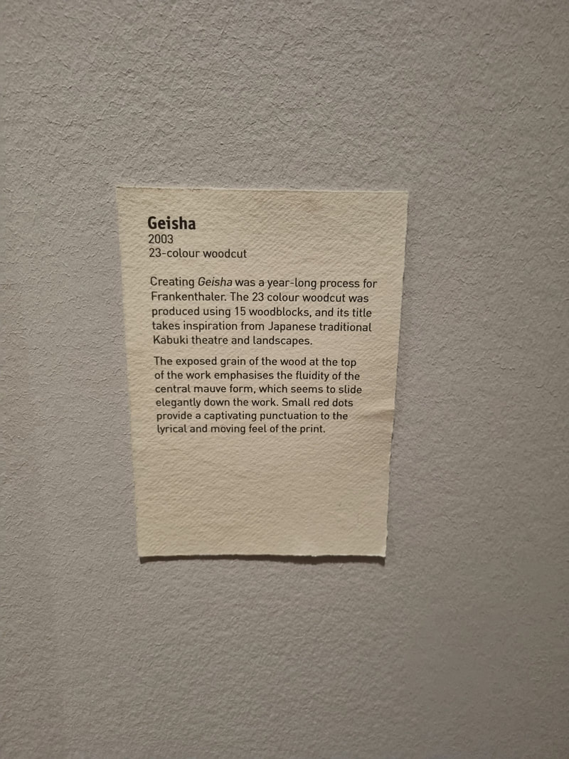
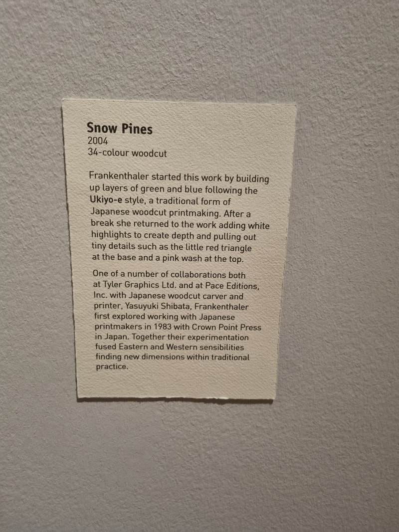
Usually you only encounter one or two of Bacon’s work but here there was nothing but Bacon and it felt like being trapped in some kind of lesser hell. Awful twisted visions wherever you look. It repulsed me, I felt actually physically sick and so after only about 40 minutes I stumbled out and rushed off to the pub. I won’t be going back. 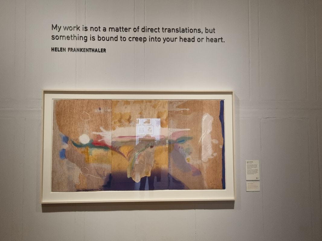 It has been a while since I last posted, life has intervened as it often does. I finally made it to see a show and was moved sufficiently by it to write a blog. As with many of my blog posts this will be most helpful in that by the time it is published the show will have either finished or almost finished. The show is Helen Frankenthaler at the Dulwich Picture Gallery (https://www.dulwichpicturegallery.org.uk/. Dulwich is an excellent gallery, being only cursed by being (for most people) difficult to get to. It is set in the idyllic surroundings of Dulwich Village with its parks, large houses and plush spaces. The gallery itself was the first bespoke art gallery in Britain. Its permanent collection is excellent (Rubens being prominent) and so I highly recommend you go in any event. It has been hosting since September 2021 a show of the artist Helen Frankenthaler. The show finishes on 17th April (see what I mean?). I had not heard of Frankenthaler before but numerous people raved about the show and encouraged me to go. I have relatives near by so summoned them to the gallery and we went together. 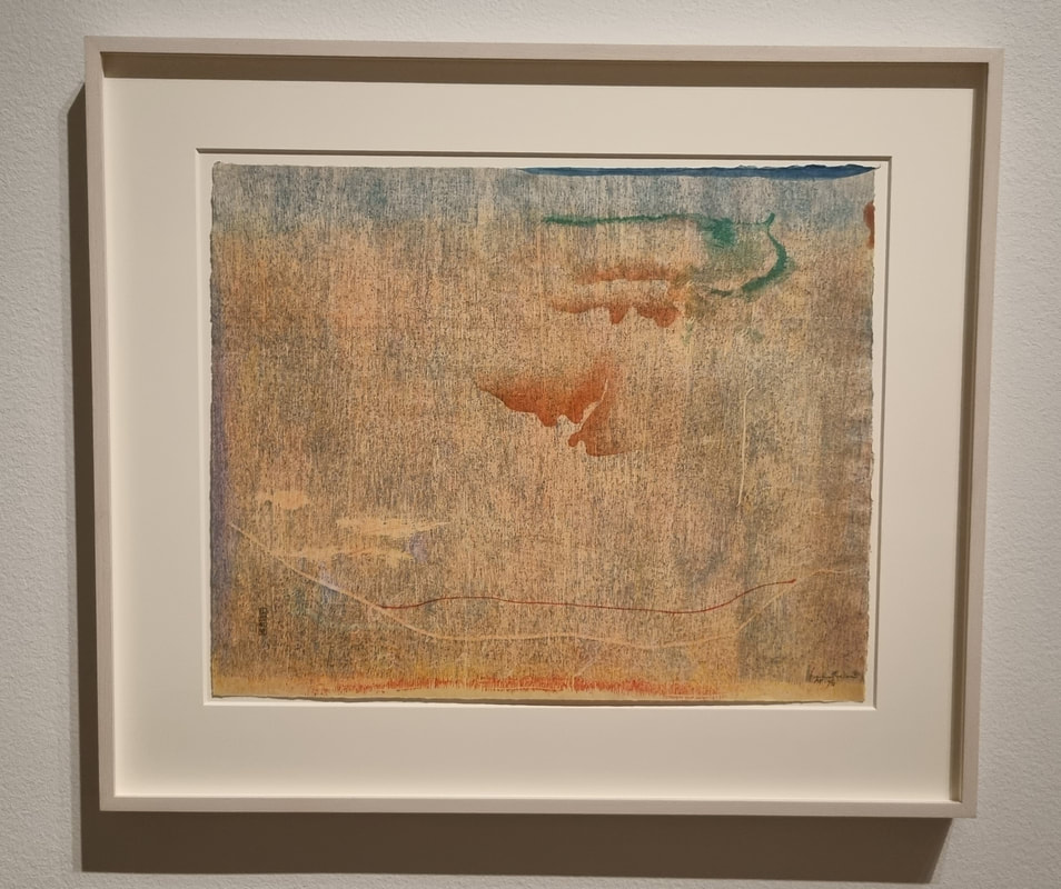 It is, excellent. The show is of Frankenthaler’s wood block prints. Unlike most other wood block prints (or indeed in my case all other wood block prints I have seen) these are abstract. Areas of soft and deep colours overlayed on each other to create these peaceful and dreamlike patterns. What is also great is that in most of them you can see the woodgrain of the printing blocks, in the painting which adds and extra texture and dimension. 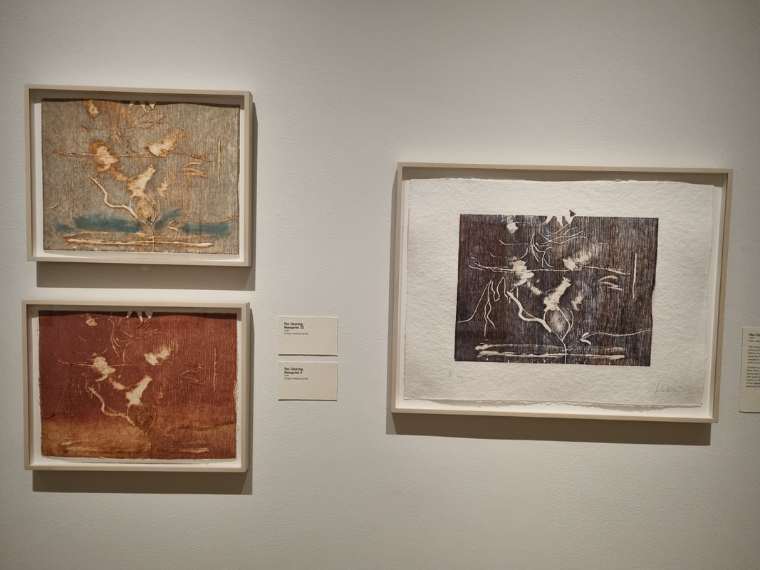 The other element about this show that I really liked was that it showed various different versions (or proofs as they are titled) of the same piece as Frankenthaler worked towards the finished article. These are fascinating. It is interesting to see an artist’s process and how they develop an idea, go one way and then go back. Sometimes I preferred some of the earlier proofs to the finished article as with Savage Breeze. On one of them “Essence Mulberry” there are pencil annotations from Frankenthaler to the printer with alterations and comments which would be very interesting if they were not mostly completely baffling. She would also riff on a theme producing a number of different related works on the same subject, Tales of Genji being the main one on display. My favourite of these was Tales of Genji V, which has a sort of portal like structure in the middle surrounded by what appears to me to be two indistinct figures peering at it. The colour contrast between the deep blue of the back ground and the soft tan and pink of the foreground really does it for me. Many of the works reminded me of Alistair Gordon’s work and if you like Frankenthaler you will like him. One of the things I found inspiring about this exhibition was the tale of co-operation it gives. This is not just Frankenthaler’s work. She worked with printers and wood block cutters to achieve the pieces and the description of how they interacted made me want something similar in my art. It caused several such ideas to come bubbling up. 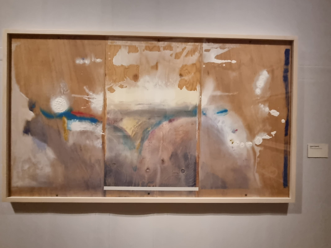 The exhibition culminates with a display of one of Frankethaler’s later works, the large and magnificent Madame Butterfly. It is produced using a breath-taking 102 woodcuts to produce the final piece. Again you can see early drafts on display but in this case I think the final work is the best. This then is an excellent show. Interesting both intellectually in terms of seeing an artist’s process at work and how they worked with others, and artistically in that it looks amazing. Also look out for the Monet X Frankenthaler room in the main gallery. That I found absorbing. For me the best art sets off an ASMR type reaction in me, and this certainly did that. I shall however end this post on a rant. The curator here copped for one of what I consider to be the worst sins in labelling of the work in that they would, too often, tell me what I should be feeling and what the work means. No. That is for me to decide not you to tell me. They did not always do this. The best labelling tells you 1) what the work is made of 2) when and how it was made and 3) what the artist was trying to do (although 3 is optional and needs to be handled with care).
I do not need and frankly resent being told what various marks mean etc. It shows a lack of confidence in the work that people feel the need to do this. Put it up and let it speak for itself. If people need a label to relate to it then the art work has, for them, failed. Do you agree?
Life takes you in strange directions, it has taken me from London and by way of pandemic lockdown to living in Henley. Maybe one day I will tell you why. I like life drawing. I used to go regularly to Candid Arts in Islington. During the lockdown I did try a zoom life drawing class, but I found it weird and sordid. When the first thing you see when you log on, is a naked women, boobs flapping, adjusting the camera it makes you feel like you are doing something quite different. So I was very pleased when Henley School of Art recently re-opened its studio to in person classes and I was able to sign up for a 10 weeks course. Two hours every week. Its great. The tutor is the wonderfully gregarious Jo Harris who as well as running the school for art is an accomplished illustrator. She is engaging and enthusiastic as well as knowledgeable. She had a very interesting approach. To get us out of the zone of trying to produce a good drawing and instead focus on just the act of drawing and trying out the technique, we had to rip up all of our drawings after we had finished them. This was very interesting. I can really see the psychological benefits of this. It frees you. You can, to a certain extent, let yourself go and try new things if you know it is not going to survive the process. 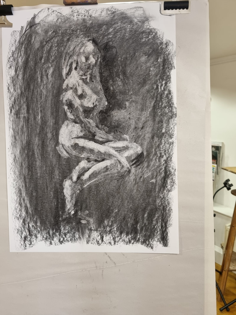 The end of week one involved covering paper with a layer of charcoal and then using a putty rubber to generate highlights, create a sketch of the model. This was quite a challenge and involved thinking to a similar way of drawing in areas of tone (as taught to me at the Brambles Art Retreat). I was quite pleased with the results (above). 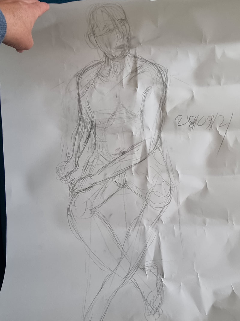 Week two, was pencil week. Using pencils we were encouraged to draw fast loose lines. The idea is that thick lines form too much of an impression on the mind. You don’t want to rub them up. Whereas light lines allow you to see the errors and correct them much more. You draw more and more lines as you correct and correct the shape until it is right. We also tried the classic draw with your non-dominant hand technique. Actually looking, see the shapes and form that were actually there, rather than the ones you think are there. 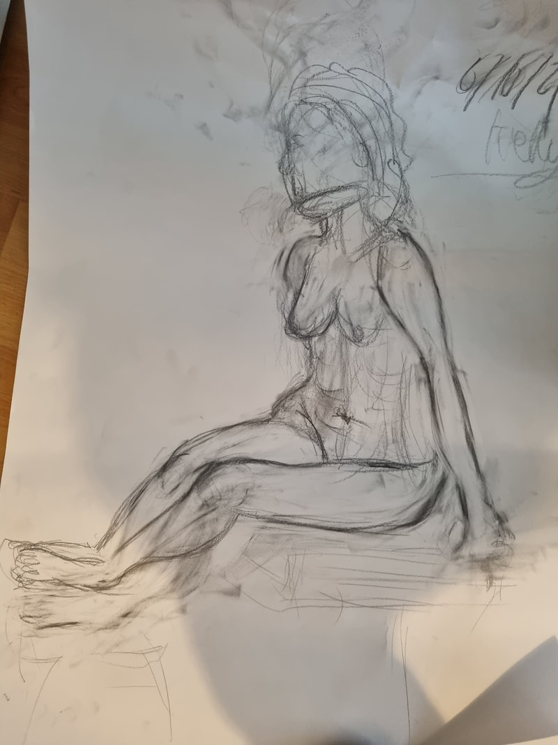 Week three was learning to embrace chaos. Exercises such as drawing without being able to look at the page, short poses were all designed to breakdown the barrier that is your mind telling you what should be there rather than what is there. My problem it turns out is applying two dark at line at too early a stage. You then become invested in that line and cannot see past it to see that it is wrong. A psychological resistance builds up to changing it. Jo gently persuaded me to get rid of those lines and look again. The mantra as always was paint what you see, not what your brain tells you is there. This is particularly difficult with issues like foreshortening, and odd angles. In the picture from week then I started off with far to tall a torso and had to reduce this but the main issue was the angle and position of the legs, which came towards me and slope away again. So the final drawing in this of those elements is Jo’s. 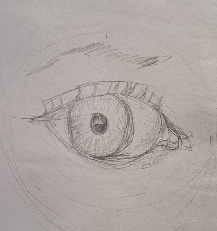 We have now just finished week four. Eyes, face and facial features were the subject of today. There was no model. We used each other as the model for the first exercise. It is a very intense but oddly emotionally satisfying experience to have someone look at you really intensely and try to draw you. I suppose it is because they are really look at you but with no judgement. I can see why people like being models. After that using mirrors we used ourselves as the model. Started off with eyes. The key is here that eyes are three dimensional, not as big as you think, and also shiny. Capturing all of these elements is quite tricky. A nice tip Jo gave for the eyes, is rather than drawing the Iris, draw the negative shape of the whites of the eye as this will give you a more accurate shape. This really works. 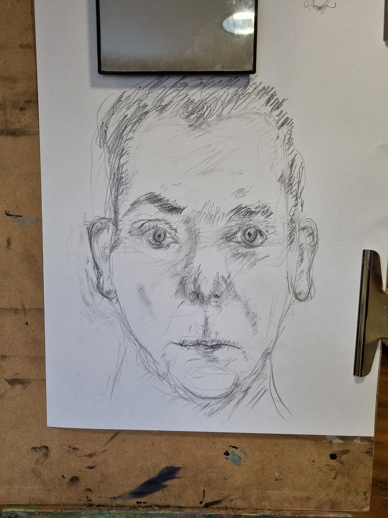 We were also encouraged when drawing the rest of the face, particularly the nose and mouth, not to draw outlines. Instead to use crosshatch shading to suggest the shape. It is more difficult but once you get the hang of it much more convincing and satisfying. We concluded with a full face self portrait. I left the glasses off mine but for 30 minutes its pretty good (you always look grumpy in a self portrait as you are concentrating so hard on the drawing). Having finished week 4 I am very much looking forward to the remaining 6 weeks.
One of the things it has made me think about is making progress in any discipline. You reach a level at which you are quite good. You can produce or perform something in a why in which you are comfortable and to a pleasing standard. But if you want to progress you have to, to a certain extent, abandon what you are used to, are comfortable with and embrace a new technique. This can be difficult because initially, and indeed sometimes for quite a long time, the standard of what you produce can seem to dip. This can be discouraging and for me has been in the past and I have simply retreated to what I am comfortable with. If you did in though and press on you can achieve something more. 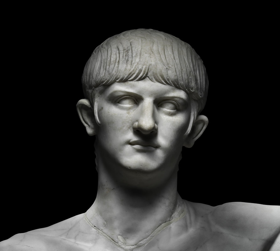 Until 24th October the British Museum are hosting an excellent exhibition on Nero. I went along recently. It was very busy, like pre covid busy, which was quite nice to see. Although I must say I had enjoyed and been quite spoiled by the covid exhibition experience, where there almost no one there and you get to look at things, unobscured and unruffled by other people. So tip for busy exhibitions. Everyone goes in at roughly the same time, what with timed tickets and all and people bunch up in the first few rooms. Skip them. Start room 3 or 4, work your way to the end then go back. By this time everyone will have shuffled on and you can peruse things to your hearts content. This is what I did. 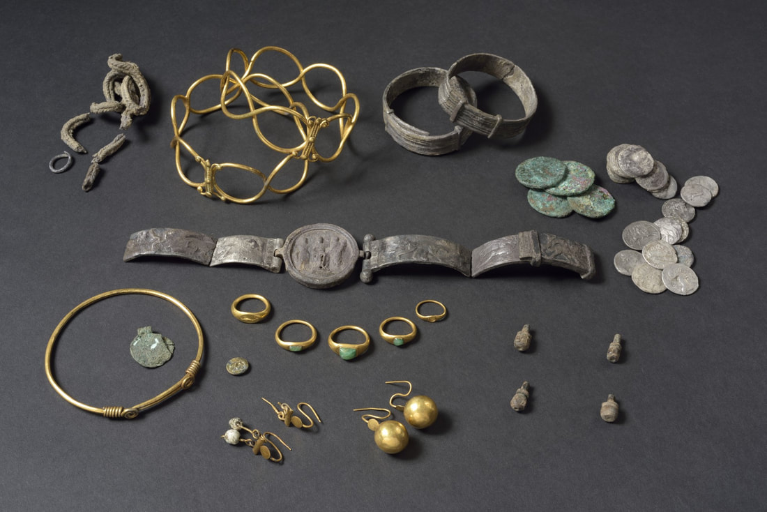 I am interested in history. Very interested in fact but my the main way I related to this exhibition was artistically. And it is the ephemera that I found the most fascinating like this collection of bracelets, earrings and coins (above). It is interesting how similar the designs in the jewellery from the ancient world are to the modern. There is no photo of it here but the exhibit I found most fascinating where these two large lead ingots. They were like massive metal Toblerone’s, stamped with roman sigils and text. One was mined in Cornwall and one in Wales. Somehow they were fascinating. 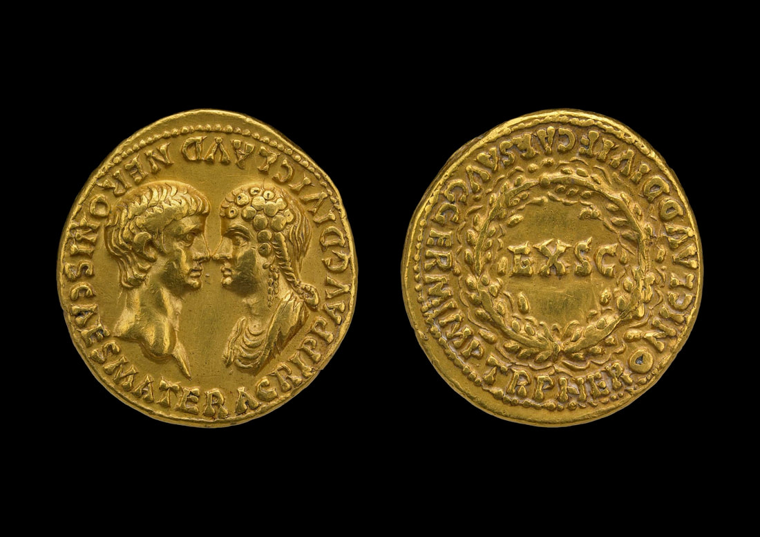 When you think ancient Rome, you think coins. And of course you have lots of coins. Nero came to power at the ridiculously young age of 16. He effectively shared power with his mother and she appears on several of the coins with him (like in the above). I found this fascinating and she is virtually the only female to appear on such coinage from the Roman period. Nero eventually tired of sharing power with his mother and had her killed (as he did to his mentor Seneca) 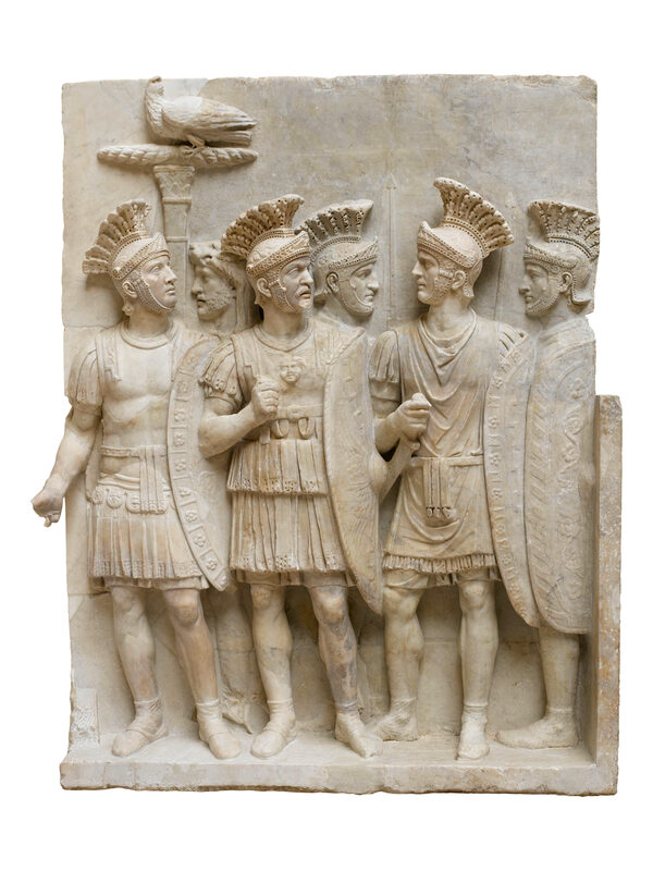 The main thesis of the exhibition is was Nero as bad as he is popular reputed to be. One of the issues explored is Nero's popular appeal and how there were idols to him around the empire. Much is made of Nero appearing on stage, his building of a massive personal palace and of course the fire of Rome, which burnt down a large portion of the city. A fine object on display was this twisted and distorted iron grill, buckled by the heat of the fire. The popular myth is that Nero fiddled while Rome burnt but some sources indicate that he arranged efforts to try and put out the fire and housed people in his palaces. The idea they posit is that Nero was unpopular with the Roman elite and the Senate in particular. Certainly Nero used the Pretorian guard to safe guard his position of power. They do appear surprisingly camp (above). 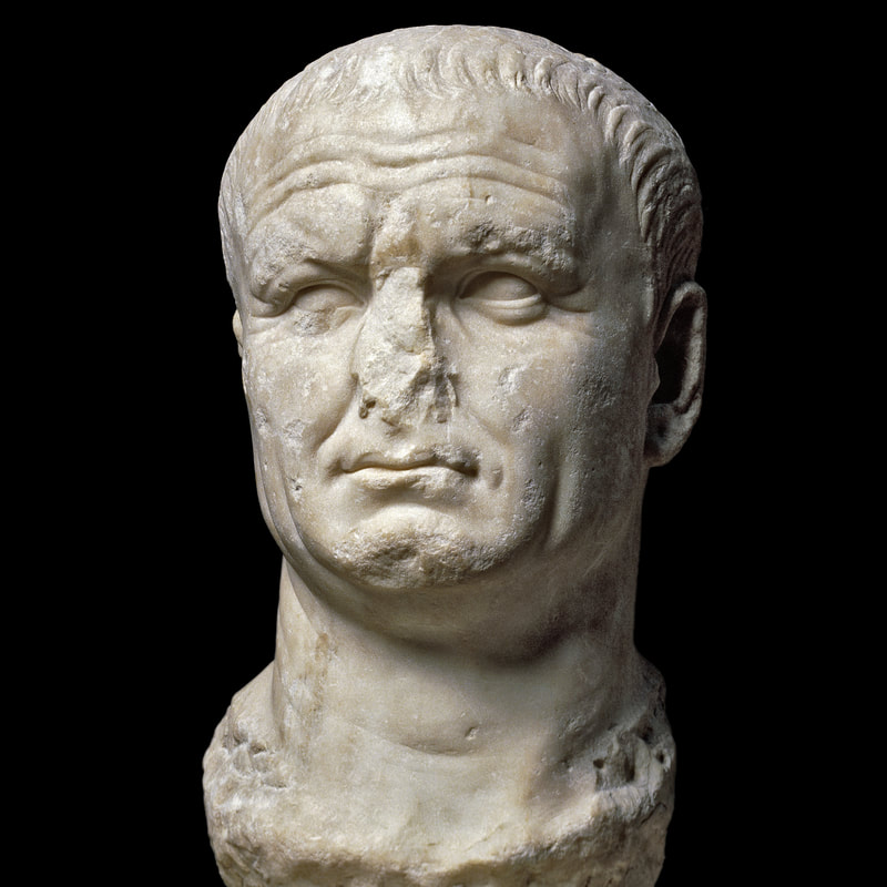 Nero lost his grip on power and eventually committed suicide, about the age of 30. After a violent interregnum he was eventually replaced by the pugnacious Vespasian. A concerted effort was made to erase the image of Nero and many were repurposed into statues of Vespasian like to the one above, which is also one of my favourite objects from the show. It was an excellent show.
|
William John MackenzieI am an artist with a specialism in landscapes and still life. My contact details are here. Archives
April 2024
Categories |
 RSS Feed