 I often forget that if a show is going to be popular, and anything with the word Impressionists in the title, at Tate Britain is going to be popular, then going to see it on a Saturday morning is a rubbish idea. I was brutally reminded of this fact when I went to see this on a cold wet Saturday morning in November. It was very crowded, the first room especially and so seething was the crowd it was almost impossible to look at the paintings. This I realise is first world problems writ large and I could, if I was feeling more fortright, simply elbowed my way to a good view. There is no doubt though, that the quieter times are better. I wonder if Tate Britain will follow Tate Modern and do late night showings. That would be nice. This show is open until 7th May.
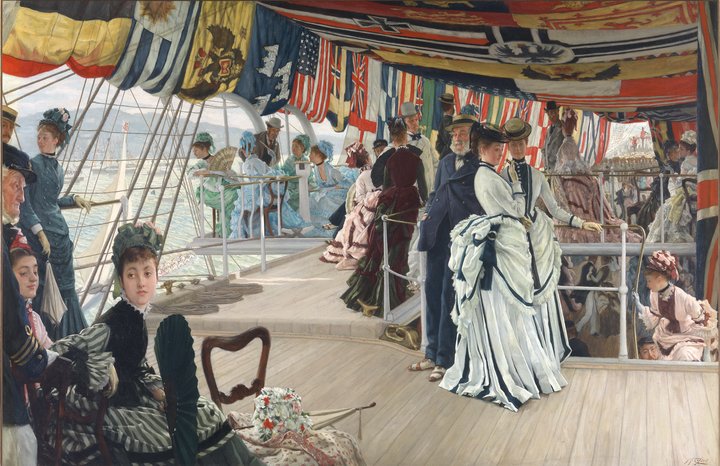
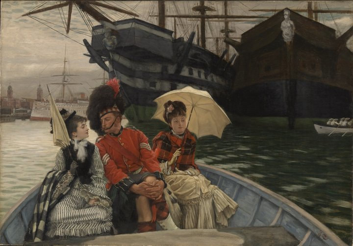
Fortunately after the first room the crowd dissipated and you could see, and there were verily some things worth seeing. Firstly though this show is not just Impressionists but French artists in London generally. The impressionists are the best thing in the show though. There were many Tissot paintings. I am never sure if Tissot is an impressionist or not, his colour palette has much of the same themes but his paintings are far more formal and posed than most impressionist works. One of my favourite paintings of his, which I had seen before at the Guildhall museum, Too Early, was there. There were some other fine ones to including a portrait of the Empress Eugenie .
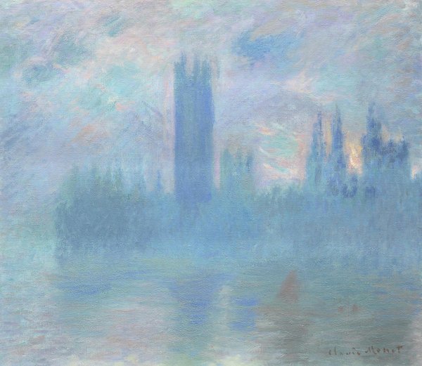
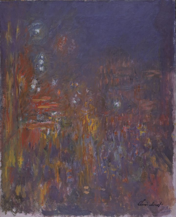
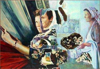
There were Monet’s abounding, including quite an interesting one of blurry, coloured view of Picadilly Circus, it looks like its raining (above left). This is one of those Monet paintings where the subject matter doesn’t really matter it is the whirling coloured effect that is important, at least to me, and you can lose yourself in it trying to determine some patterns. There is also a whole room of different paintings of the Palace of Westminster (see first picture of the blog) and Charing Cross bridge subjected to different light effects. So you get the distinctive pastelley, ghostly blue with this dark shape looming out of it, but more impressive are the darker ones with burning yellows and oranges coruscating across the water. Having them all in one space is both effective, while at the same time after a while you are like, meh, another Monet of Westminster. Spoils you, you see. Some are certainly more accomplished and effective than others. Gave me some firm ideas of the power of a series. There was also Whistler, who you don’t see much. I don’t really like Whistler, it is all dark dank murky Blues and I find it difficult to get anything from them.
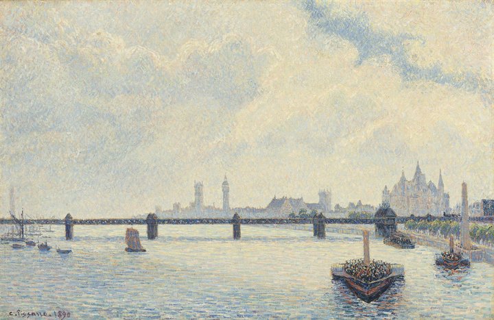
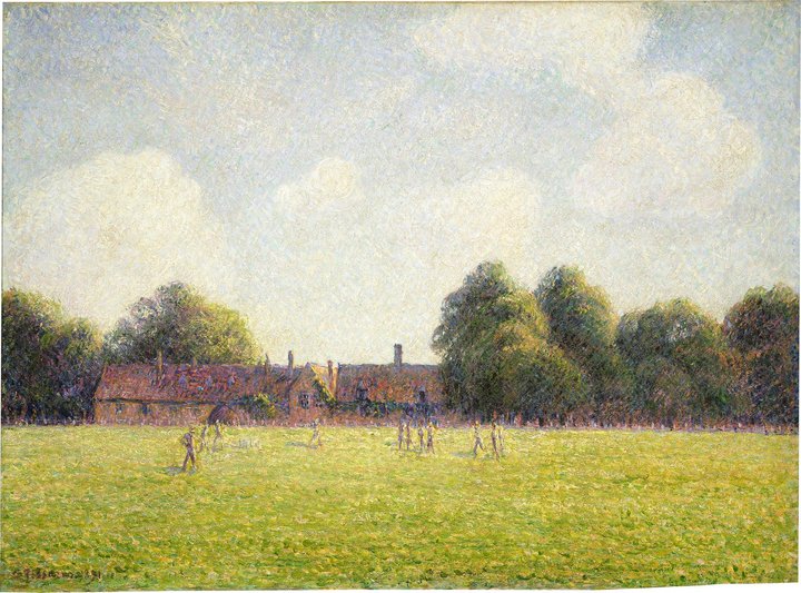
There was also Whistler, who you don’t see much. I don’t really like Whistler, it is all dark dank murky Blues and I find it difficult to get anything from them. For me though there were two stars of the show. The first was Pissarro. Pissarro it would seem spent some time in Kew and there were many fine paintings of the surrounding area including one of the gardens itself, the Rhododendrons in fact, which hits you in the eyes from across the room but is in fact quite delicate and subtle, the flowers against the green and the path leading off around the corner. A couple of others I liked was one of Charing cross bridge with this great wedge like boat, full of people cutting through the water (above left). The water effect, with not just blues, but different reds and purples is particularly engaging. Almost all the painting is sky. It is interesting to me how a picture with so much space, with so little of the actual subject matter in it can work so well. The next was a square a Kew, a square thronged with people, all quite quickly drawn which gives them a nice animated feel.  The other star, and this was a new discovery for me, was Andre Derain. Derain does the thing of heightening the reality, in other words making things super colourful with vivid red, blue, yellows etc. None of the pastelly shade for him. They are very eye- catching and I think very good. I liked them very much. He has this nice technique of representing say a boat in a block of one colour and then cutting across the field of that colour with simple figures all made of a different colour, say red. An age old technique but done well. There is then much to like about this show. Who knows you might even like the non-Impressionist stuff (there was a good statue of a woman breast feeding a baby but I forget who it was by). It is on until 7th May 2018 and I suggest you go, just not on a Saturday. Finally some self promotion. The law society art group annual show in in January. Details below. 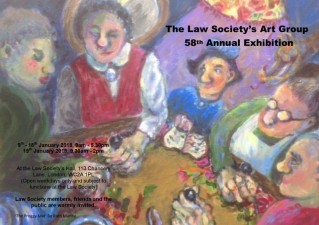
0 Comments
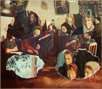
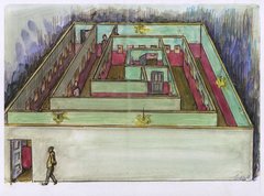
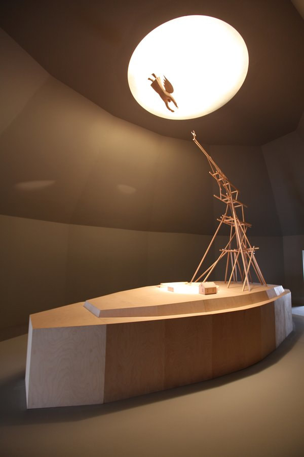
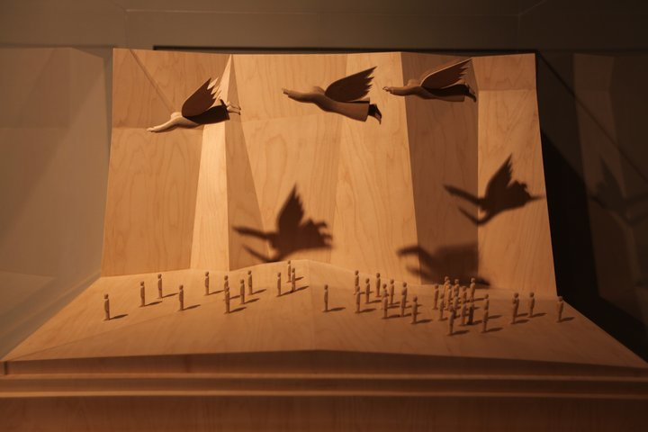
 Or as I now think of them the wonderful Kabakov. That rare thing in art of a husband (Ilya) and wife (Emilia) team. I am also impressed when museums put on big shows involving people I’ve never heard of. It is a core of their purpose I think and all the London museums do it well. Tate has done this to me a number of times. So the Kabakovs. The story starts with Ilya who until the late eighties resided in the then Soviet Union. Not being an official artist he did most of his work in private and showed it only to his friends. Despite this encumbrance he produced some great and interesting things. 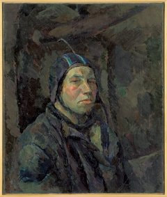 The show is sort of but not really chronological. Just wander round and enjoy it. The first room is strange paintings, a sort of football player and a strange face. For me it really takes off in the next room with sculpture models in them. In a corner a pile of clothes with small cut out white figures. Opposite this in another corner a cabinet with two cut out holes in the middle shelves. Wires pass through the shelves and ascending and descending on the wires again the little white figures. In front of these two models for installations. One showing giant legs coming through the ceiling while the “normal” people wander round their feet. The other a very intriguing design for a multilevel opera to be staged in the New York Guggenheim. It never came to pass. 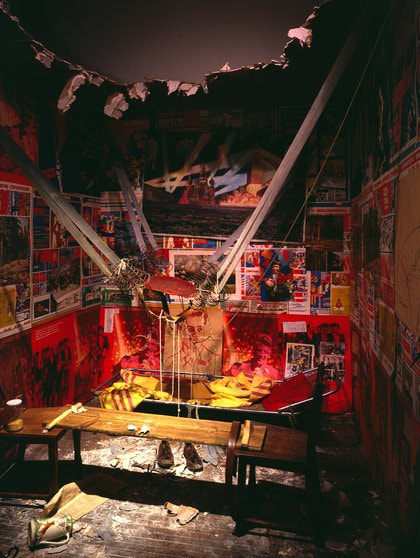 After that the big stuff appears. Set in a large aperture is the installation that is the poster piece for this show. Its call the man who shot himself into space from his apartment. I loved this thing. Really loved it. It shows a room, a small cramped room, covered in soviet posters and in the centre a sort of catapult spring thing and a large jagged hole in the ceiling. It is joyful, it is technically superb, it is well done, it has a message and meaning. Conceptual artists should take note. This is how you do it. I won’t describe all of the installations just some of them. 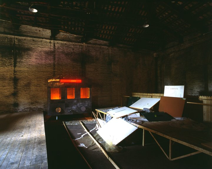 The title piece is a joint work (most of the stuff in the show is), called Not Everyone Will be Taken Into the Future (above). There is a large dark room. At one end a departing train with on the back the an electronic sign which scrolls the name of the title. On the track behind it spilling of the platform are several canvasses. Great image, smacks you in the eyes.
The Kabakov’s can paint to which they show off in the next room, a series of sort of mashed up images of soviet era scenes interspersed with other scenes. All of them have another message. In between these are some really intriguing wooden sculptures. Many of them mock ups of planned or past installations.
So hope you enjoyed the blog. Have a very merry Christmas, or perhaps you already have. If you are in London in January perhaps you could pop along to the Law Society Art Group annual show. Details below.  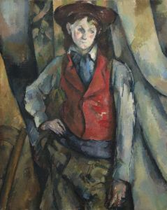 For the first time in a long time I have come across art I don’t really like and that is Cezanne’s portrait. Bold statement to open with but let me explain why.
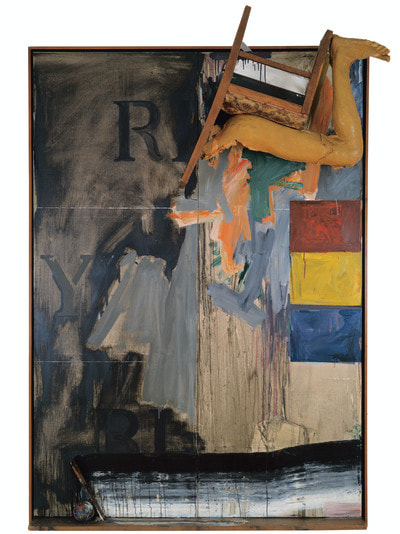
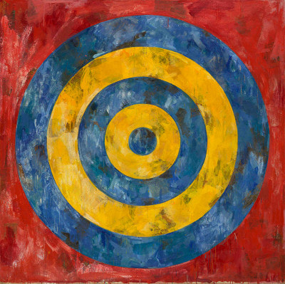
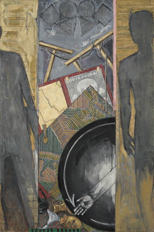
The National Portrait Gallery is currently holding a display of Cezanne’s portraits and various people had said good things, to be honest I’d have gone even if they hadn’t. It is on until 11th February 2018. However I had the curious experience of liking the pictures when I first went in but the longer I stayed there, the less and less I liked them. Let me explain why. Cezanne’s portraits oscillate between the dark and brooding like the mad picture of his sister, or his self-portraits, to the colourful. They all have the same feature though and that is the sour pose of the sitter. There are some interesting conundrum around his portraits. He never took commissions for them, sold very few, completed very few and only a couple of people ever go their finished portrait. Most of them remained at his home until after his death. I think I know why. Some of the portraits are very fine. The one’s of his father and his uncle, the self portraits of him in a bowler hats. They have a real affection to them and painted as if there is a real personality there. The one’s of his uncles where the paint is whacked on in great swathes with a pallet knife. Similarly the one of Victor Choquet (who actually go the picture) actually makes you feel like you are seeing a person. The rest have something slightly unsettling about them, something off putting and it took me a while to work out what it was. Don’t get me wrong these are in many way’s brilliant paintings. The use of composition, of colour, the way the paint is applied. All of this is masterful. For example Madame Cezanne in a blue dress with the interesting hues on the dress and the way the left of the painting is dark brown and the right light blue to give more of a 3d effect. Similarly different fields of colour are used to great effect, like the famous painting of the boy in the red waistcoat, with the red waistcoat sitting starkly on a mostly blue background. So far, so a genius at work. They are excellent paintings, but they are rubbish portraits. Look at the eyes, if you go. For all but a few they are dead and empty, often just empty dark blobs. At look at the way the paintings are constructed particularly woman with a coffee jug. It is person as object. The blurb about Cezanne’s philosophy hints at this in that he didn’t want a psychological portrait he just wanted to paint what was there. Thus you get a person used just as a device, a piece in a composition in the painting. These are paintings of people at all, people are just used because they are an interesting shape. Once I noticed this I couldn’t unsee it. It made me not like the paintings, it made me find them cold and alien. I think this is why he never sold any, or did commissions. There is a sort of hate, distaste of the person behind all of this, thus it seems to me. The few times he lets himself go, and paints the actual person, you get a good portrait. The rest are just pretty paintings. Still you may not agree and there is much to learn here in turns of superb technique and the use of colour. I though, didn’t like it. 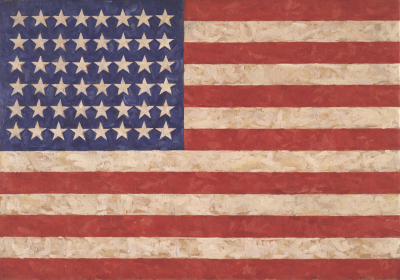 I had of course heard of Jasper Johns, he of the American flags but as well having it recommended to me by others (mainly Hugh Mendes) and being intrigued I went along at the same time as making it to the Matisse show. Jasper Johns uses encaustic allot which is basically melted coloured wax and produces as you would expect a waxy textured surface which is not something you see too often. That in itself is interesting. The first rooms are a number of American flags and targets. There are themes that occur again and again with Jasper Johns, Flags and Maps of the USA, the three primary colours (red, blue, yellow) and the numbers 0 to 9. With occasional exceptions these themes continue through his entire career. He is still alive, being now in his late 80s and still producing work). 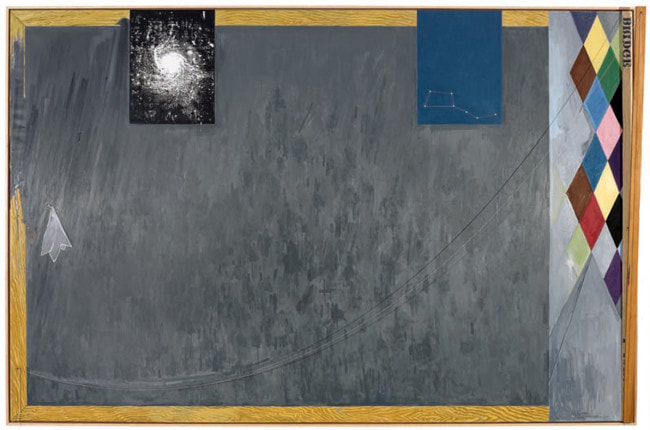 There are other features of his work that I really like. So for example there is a work called No, which uses the shadow of the word “No” dangling on a piece of string against the canvas. He does this a few times and has a habit of sticking things like cutlery to the side of paintings. Another trick is to stick hinged pieces to the side of paintings, so they look like windows, or at least they look like that to me. 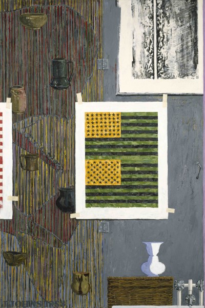 He also can do Tromp Loil well, particularly showing masking taped images within the paintings, incidentally something that this man does very well. Ventriloquist (above) is a good example of this.
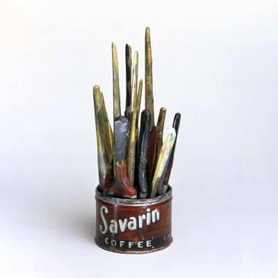
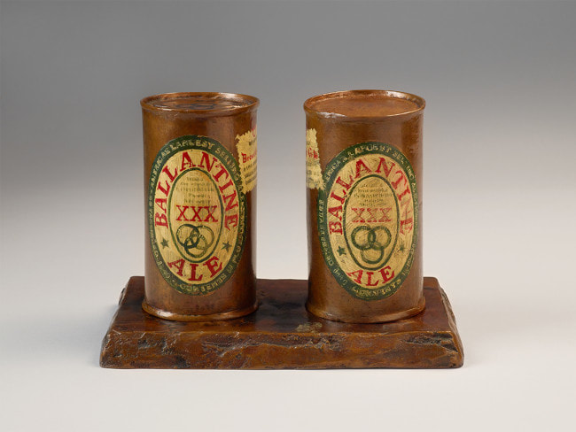
In a much more sensitive version of pop art he does drawings, paintings and bronze sculptures of larger cans and also paint brushes in a Savarin tin. My favourite of these is a black and white graphite sketch of the self same tin.
The numbers 0-9 appears in his early works. It appears in paintings and drawings sometimes with the numbers drawn on top of each other. The best of these was a series of bronze castings of the numbers with subtle details imprinted on the bronze, and different bronze colourings. In a similar way he plays with red yellow and blue, the colours and also the words (in their own colours or one of the other primary colours) appearing again and again. There was even a three dimensional version with the words appearing vertically using various different media. The Red for example was in neon and the switch, to turn it on, was incorporated on the left hand of the picture, as part of the piece.
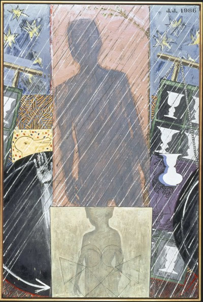
One of the stand out pieces is a series of four works depicting the four seasons but in characteristic Jasper John style with this strange shadow figure and arms pointing as if like a clock. 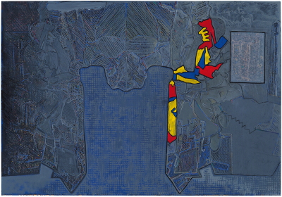 To show that he can still knock ‘em out there are some recent works called Regrets. They are based on a picture of Lucien Freud and there are a series of aquatint prints of differing intensity and contrasts in which the figure leers at you like a weird alien. Opposite this on one wall is a large mainly blue painting showing the same thing in scratchy marks and highlighted around one side in the three primary colours, shapes reminiscent of the US east coast.
I’ve been thinking about that show a lot since I went. I recommend you do to. It is on until 10th December so chances are that by the time you read this, you will have missed it. Also I am supper happy as one of my paintings is up in the Indo bar in Whitechapel as part of a winter group show. 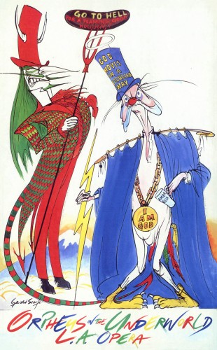 And other terrible puns, inspired by the latest exhibition at the House of Illustration. This one shows the excellent illustrations of Gerald Scarfe. You will almost certainly recognise his work from the Times and the New Yorker, (although don’t confuse him with Ronald Searle with whom he shares some similarities).
An anarchic vicious, subversive and loose style it is very recognisable and somehow very British. Makes use of some of the tropes of caricature. This show focuses on two elements of his work that I knew less well that of designing for the stage and for screen. He worked for both the opera and the ballet designing sets and also whole shows. So you have his excellent designs for the Nutcracker complete with terrorist mice and bumptious toy soldiers all made somehow threatening. In opera there were designs for Orpheus and the Underworld, my favourite of which was the entry into hell consisting of a slide coming out of a ghastly creature’s bottom and into a demon’s mouth. Most amusing. What I didn’t know, or had forgotten was that Scarfe was artistic director for the Disney film Hercules. Que various designs, concepts and storyboards for the film, including instructions from him on how to draw less Disney and more Scarfe. It is along time since I have seen the film but Hades was always my favourite character and judging by the care and attention lavished on him by Scarfe probably his to. There were sketches in detail showing Hades long jagged arms and a concept of him getting very cross (which he does frequently in the film). What I really didn’t know was that Scarfe did the animation for the Pink Floyd Film, The Wall. Again you had various concept sketches such as the marching hammers and the Germanic eagle and some clips from the film. As with all such shows one of the most interesting aspect beyond the artistic is showing the thought process of someone grappling with an idea, coming up with the concepts, developing them and then the final finished work. You get to see this a number of times in different context with this exhibition and very interesting it is too. |
Archives
June 2024
Categories |
 RSS Feed