|
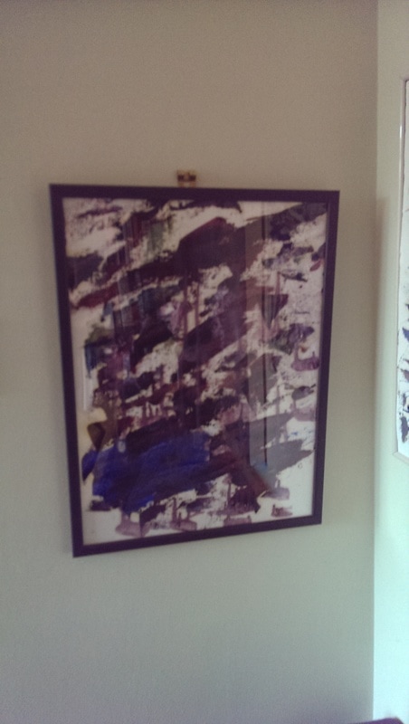
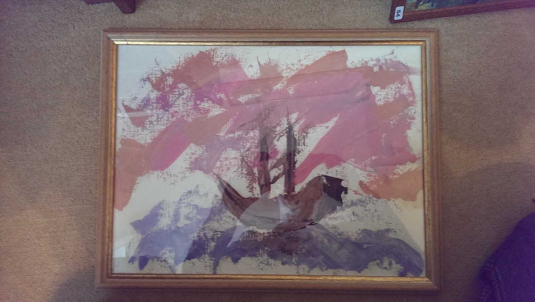
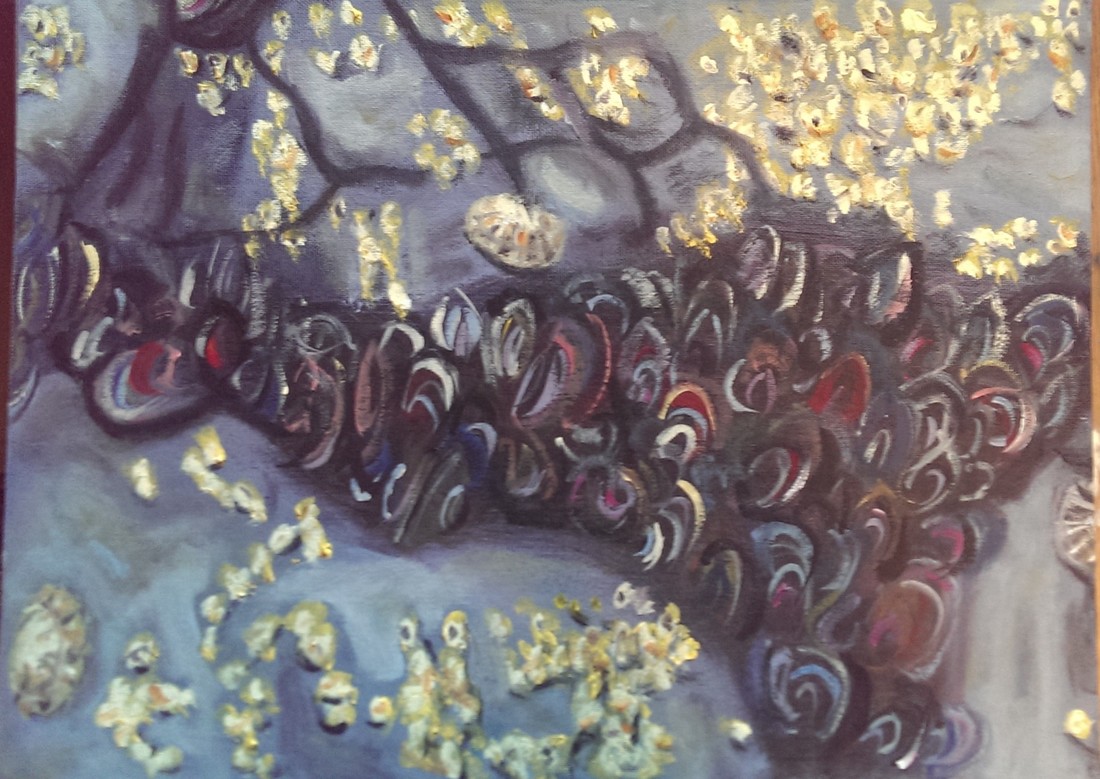
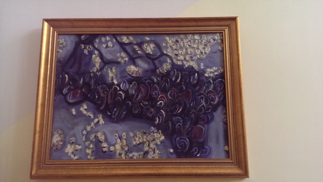
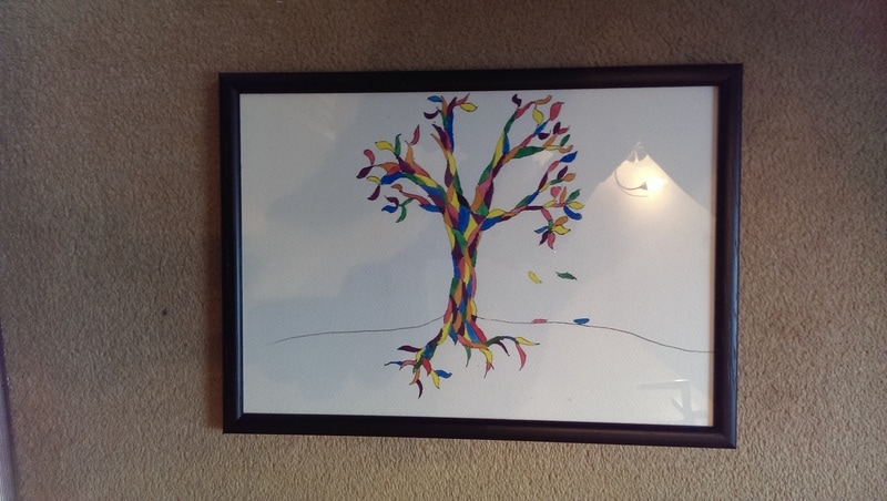
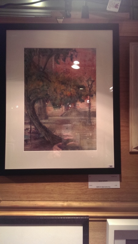
One of the things that, as a relatively new artist, is a certain amount of trepidation about framing your work. Framing can be eye-wateringly expensive. Especially for large canvases. If your lucky you can manage it for £100 or so. However if you paint on board, or paper then your options are significantly expanded and you get a decent frame for under £30. Some of the basic ones can come in under £15. I get mine from Eze Frame which provides a wide range and of frames with a very well designed feature that allows you to customize your frames. Other similar websites are available but I find this the easiest to use. Examples of effect of cheap frames can be seen with some of my Left-Over paintings.
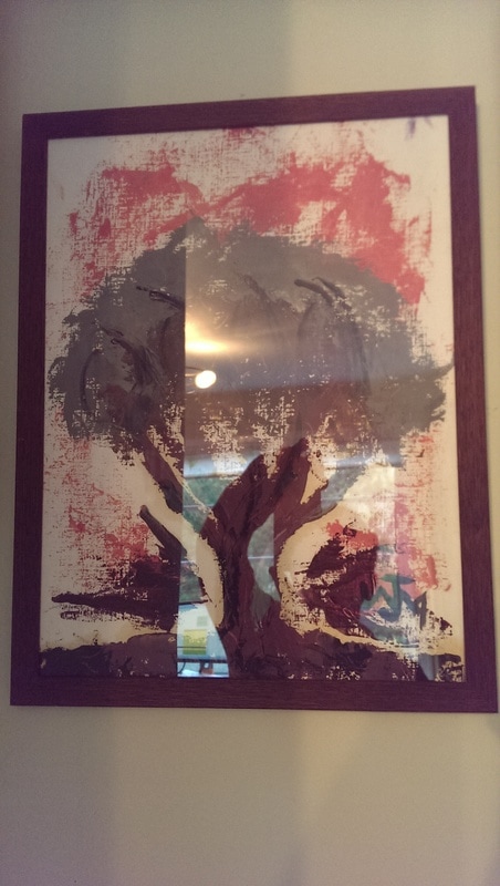
The frame on the left activates the painting nicely whereas the one on the right gives it more substance and dignity. I think so anyway. It appears to be a proper painting. You could see someone buying that. One day, here's hoping. Because I'm an idiot i bought frames that were the wrong size for their intended recipients however they made for very good frames for more left over paintings.
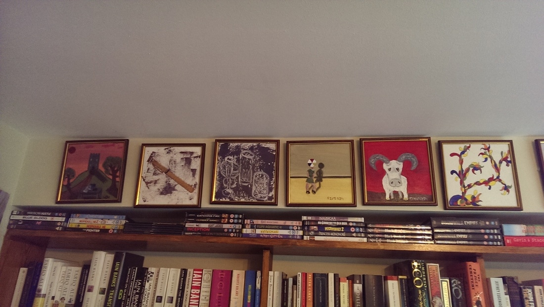
These are painted on oil paper. The frames come with an MDF backing board and a free perspex cover. You can upgrade this to glass if you choose. Backing them with the board and fronting them with the perspex gives a rigidity the piece. The colours of the frame also compliment the colours in the painting. Again it gives a solidity to the pieces. I like looking them in their frames. Makes me feel like a proper artist. My wife like gold. The small frames are cheap and so I have framed a number of my mini-mix paintings. Of course this produces the additional benefit of allowing you to put the paintings on the wall.
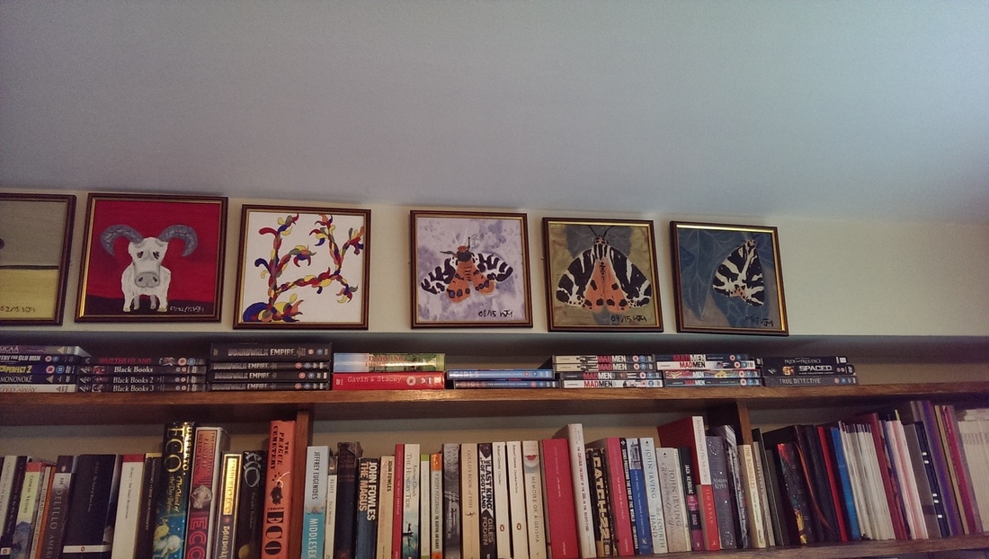
Look nice don't they? I particularly like the moths. All of this is building somewhere, trust me. I have been wanting to better display some of my maxi-mix paintings so I can put them up around my house. If they work, I might role this out to some kind of exhibition. You can judge the effect from the pictures below.
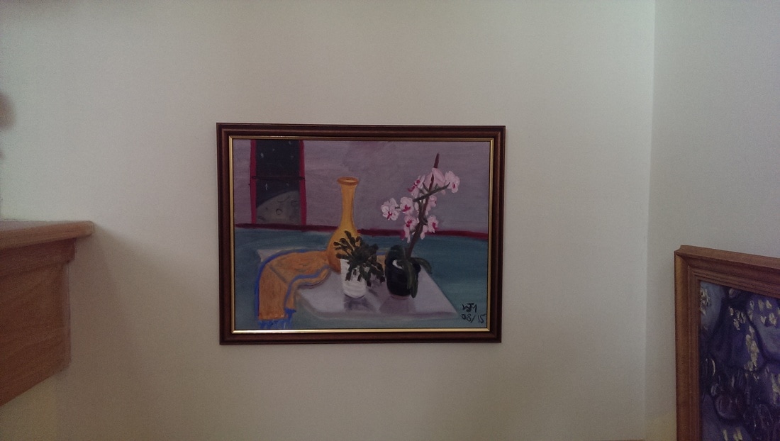
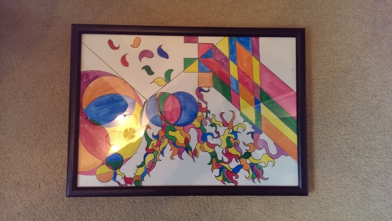
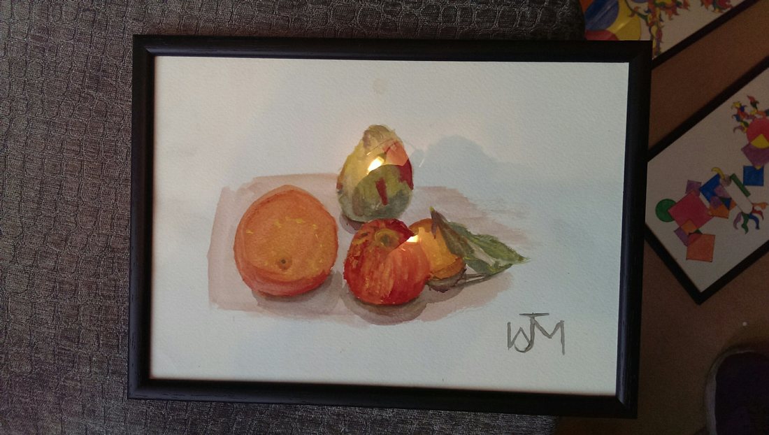
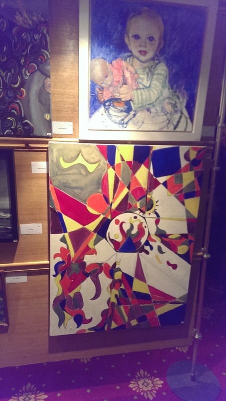
I also dabble in goache patterns and the occasional watercolour still life. My wife is often telling me that the former are quite commercial and I should frame them and look to sell them. So I bought a few simple black frames to see how they look. They look good but it makes me think about composition in that the pictures work better if they don't encroach to near to the edge of the page.
Even the basic white frames, which I use to transport paintings around, it helps keep them safe, make the pictures look good. Try it for yourself. 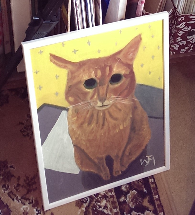
0 Comments
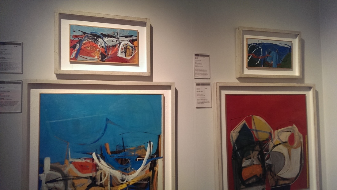
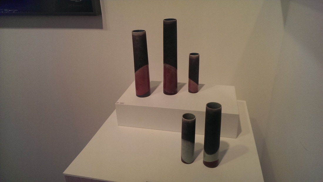
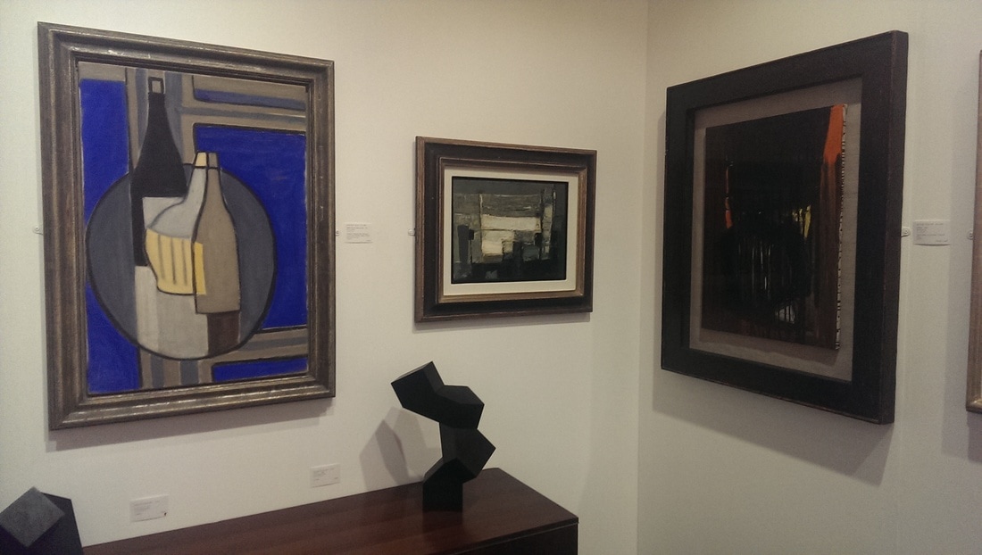
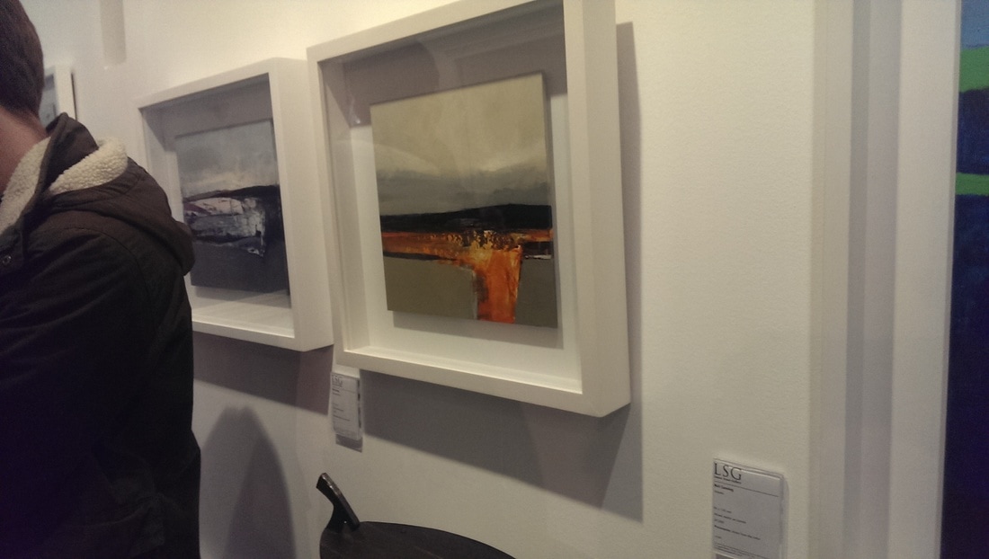
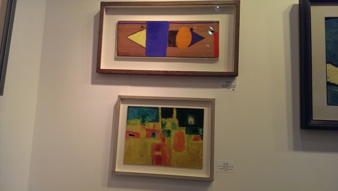
I have been to the London Art Fair a few times now. I like it for a number of reasons. Firstly it is relatively easy to score free tickets, as I did this year courtesy of the Law Society Art Group. Secondly I can walk there from my house. Thirdly it is large, but not too large, and lastly it is one of the few places where you can see a large selection of post war British Art, a period I am liking more and more. 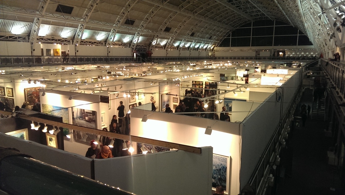 Held in the lofty, airship hanger like space of the business design centre there are basically four zones to the fair. The first zone, which you enter is where the eye wateringly expensive galleries are and you can, if you have the wherewithal snaffle yourself a small Henry Moore.. Then onto the main promontory (pictured above) where you will find people like Phillip Lanyon, Winifred Nicholson and the prices drop into the £10,000. You will also find the higher end of the more contemporary market (including Charlie Smith, the gallery for Hugh Mendes). The cheapest items tend to be high end modern pottery like the excellent Japenese style vases seen below left.
A balcony surrounds the main arena and again the prices drop into the thousands and occasionally below. These galleries tend to display contemporary still active artists.
A Finally, emanating off the balcony is what I would call the project area. This contains more installation type work, more outre media, younger and newer artists and varies greatly in quality. This year they had managed to double the area in size and I have to say I didn't make it round it all. There is a way, at least one way, to see a show such as this . To go round in detail is too much, takes to long. The museum feet set in and after a while all you see is colour and noise. Start in the project area, walk round gently and go into the galleries where something catches your eyes. Then the balcony and then the lower areas. If you start at the bottom and work up the work of the modern masters will spoil you for everything else, and also the price anchoring will make you think that £2,000 is a modest price, when of course it is not. Mind you I have yet to buy anything from the fair. The things I like cost to much. A word then on the things I liked.
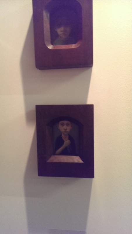
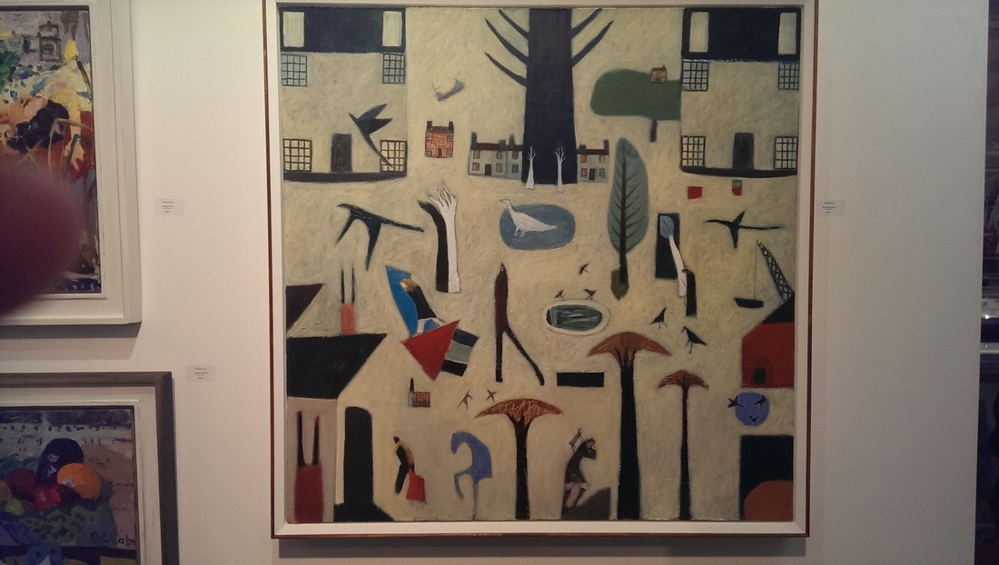
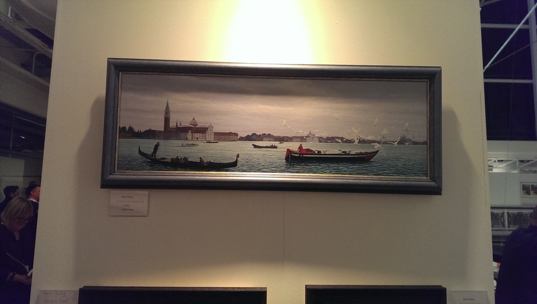
obbie Russon produces these spooky miss-formed portraits. The ones I liked most were these tiny little portraits (above left). Quite pricey at £900 a through. A sort of religious iconic quality to them. A man to watch I suspect. He had much bigger work on display at considerably higher prices. The three pieces on the bellow right are by Steve Easby. I have a soft spot for old fashioned painting done by modern artists done well and with something about them. The one top right is a sort of Egyptian Lowry, and I like it very much. I particularly like the mushroom like trees and the person with the axe at the bottom. It is a picture that reveals more the more you look at it. It is by Heath Hearn.
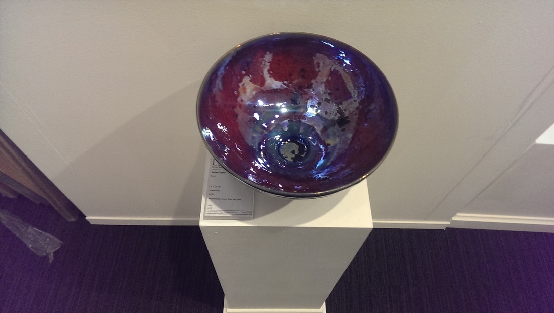
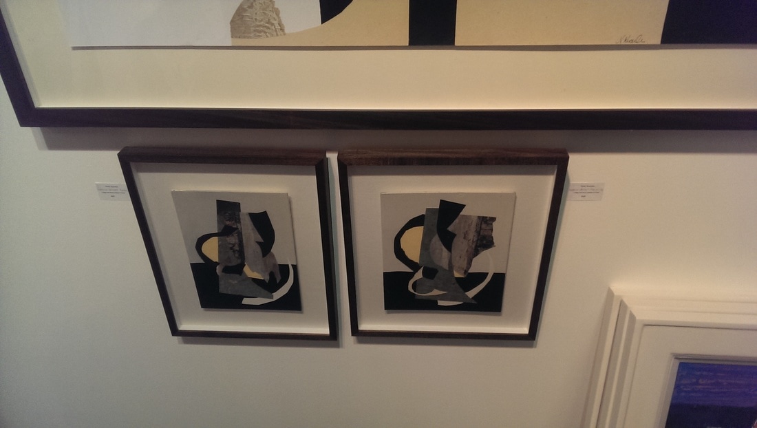
Everyone likes a lustorous bowl. I have lost my note of the artist, zooming into the label reveals it to be by Sutton Taylor . I like the way the reds and blues meld into each other. Pottery always catches my attention. These two small paintings did there best to hide from everyone being shamefully hidden under a much bigger piece at approximately knee level. Apologies for the bad photo. Nicky Knowles is the artist. She doesn't seem to have her own website. Why don't you have your own website? Maybe its hidden on page 2 of google. Anyway, these two little sweet paintings are very well constructed and appealing in their simplicity. Like all good abstracts they invite you to see shape. I see an elephant in the one on the right.
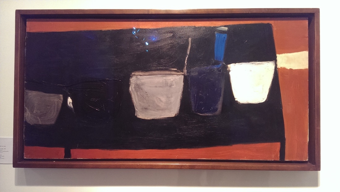
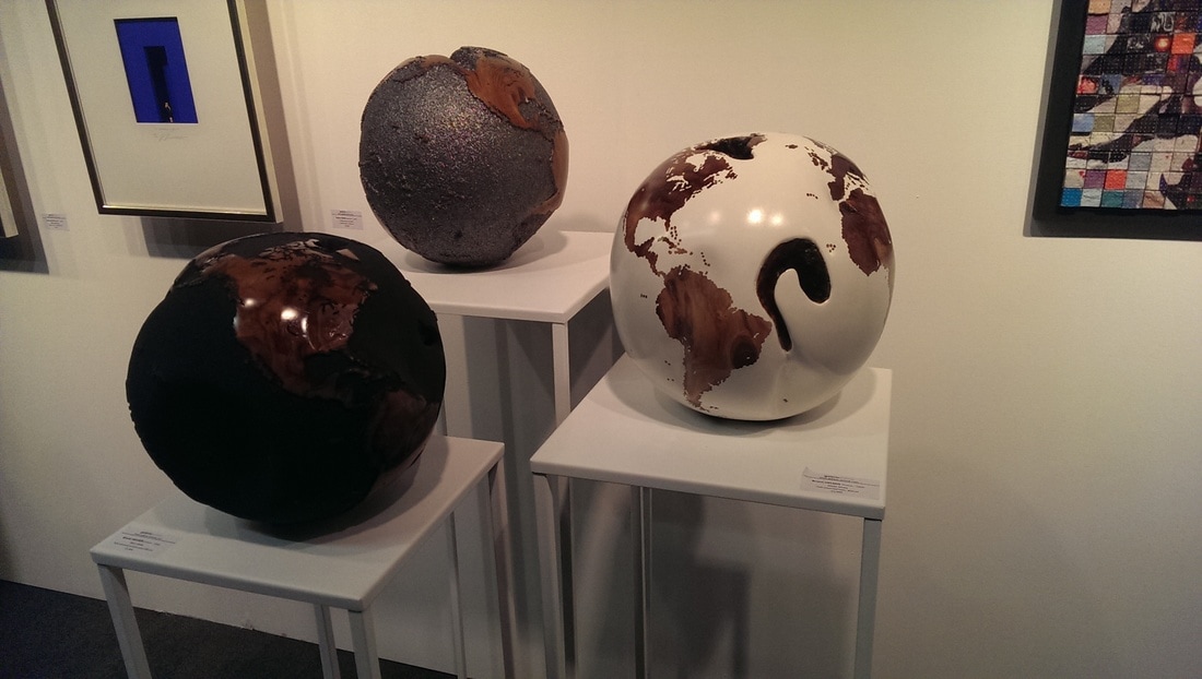
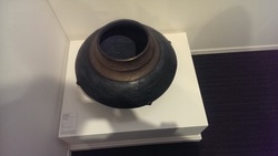
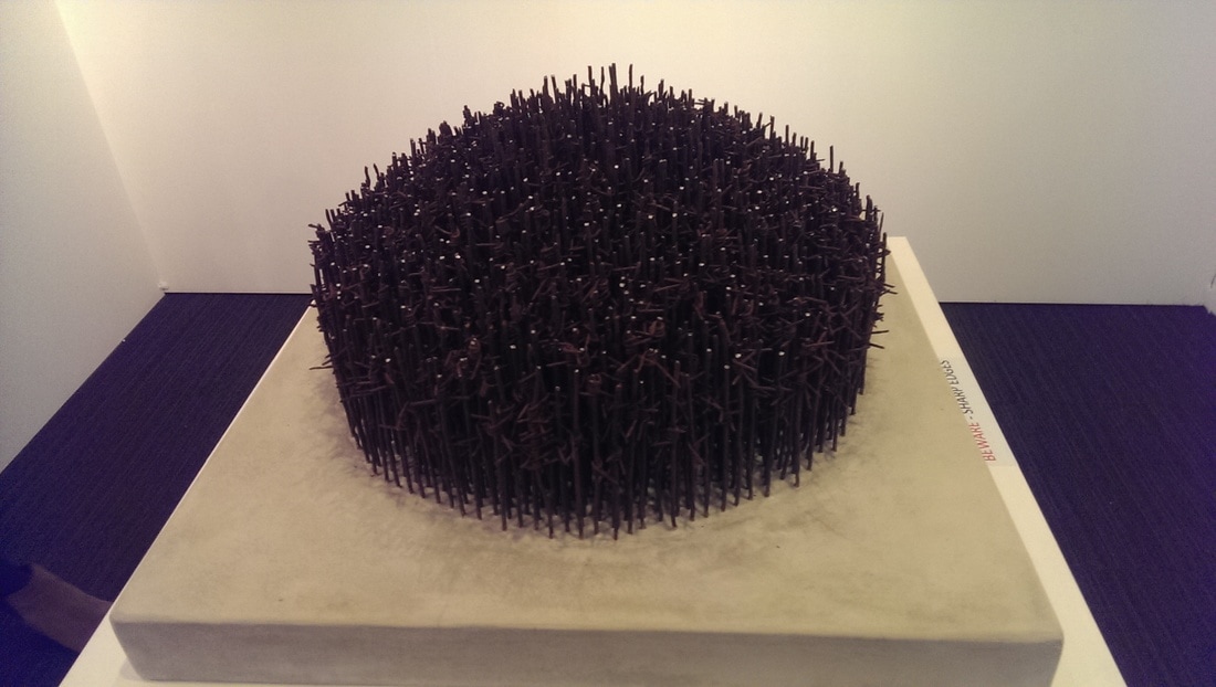
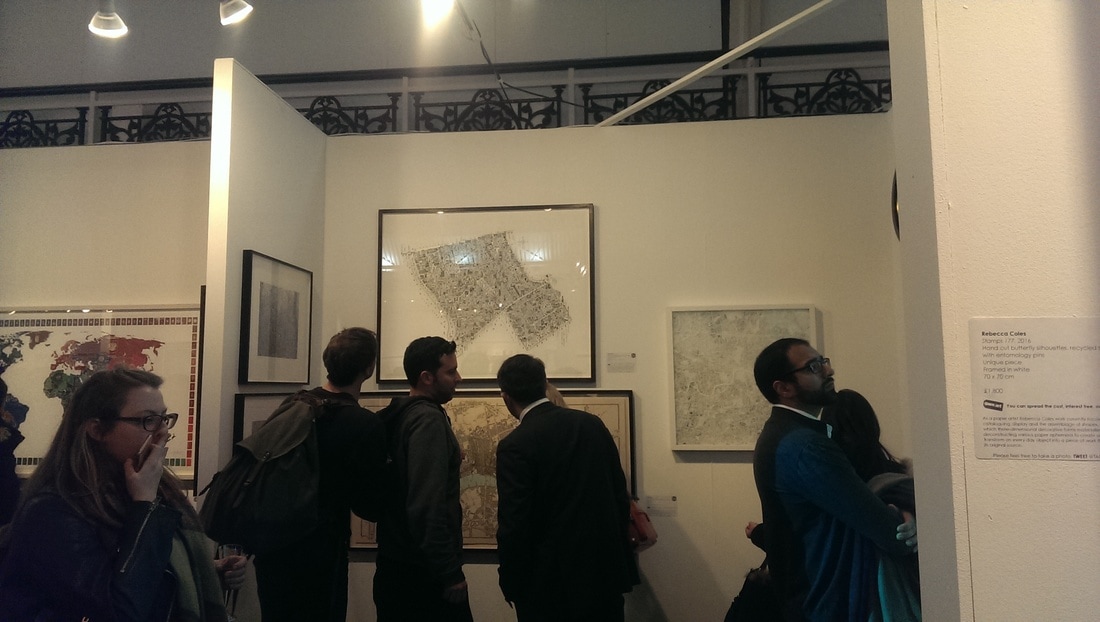
Not just lustorous puts attach my attention but also this vaguely earn like severe and ominous bowl by Jason Wason. Incidentally the LSG is one of the most consistently good galleries at the fair and always worth a look. I would like that thing on some enormous plinth in the centre of the substantial hall that I don't have. It was a good fair and I enjoyed it. Maps got allot of attention as they always do (below right) and I found a spiky thing I thought was good. Speaking to a few people afterwards though it was not a good fair for the galleries. The number of sales was small and a number of galleries sold nothing at all. Given that you need to sell quite a bit to break even this is not good news. The uncertainty of the dreaded brexit was most often blamed.
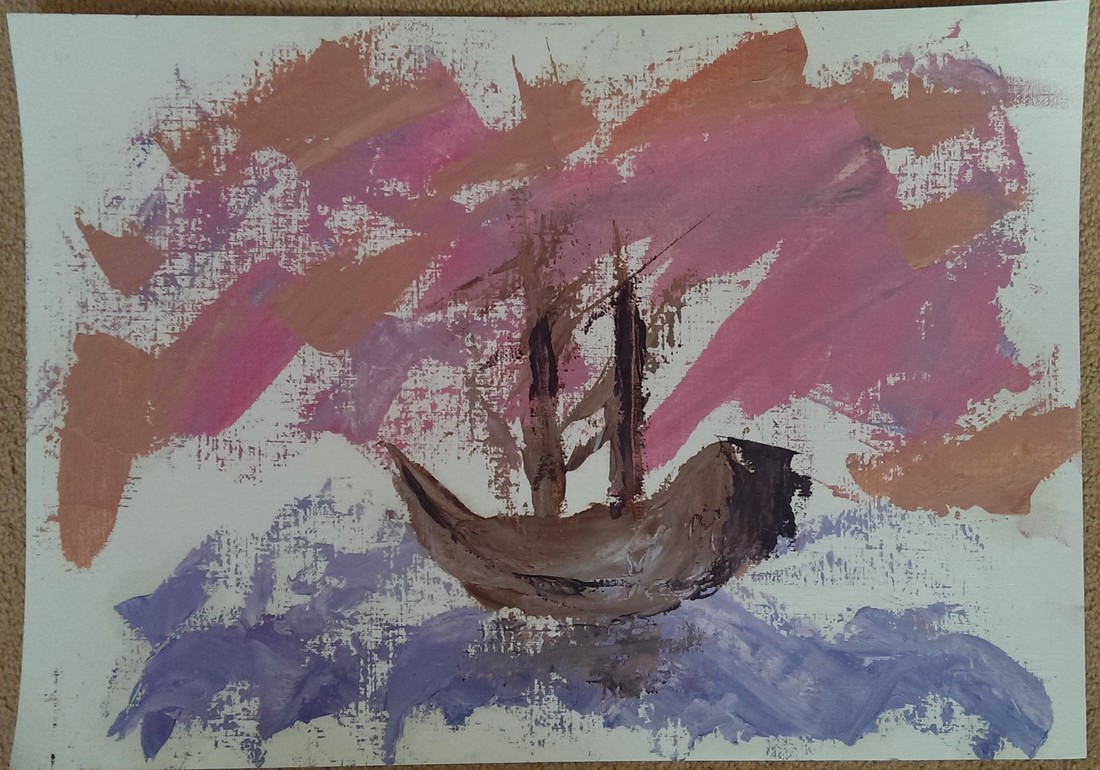
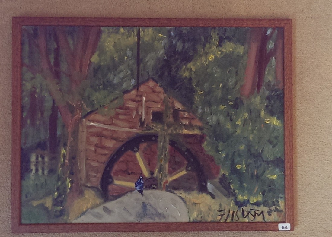
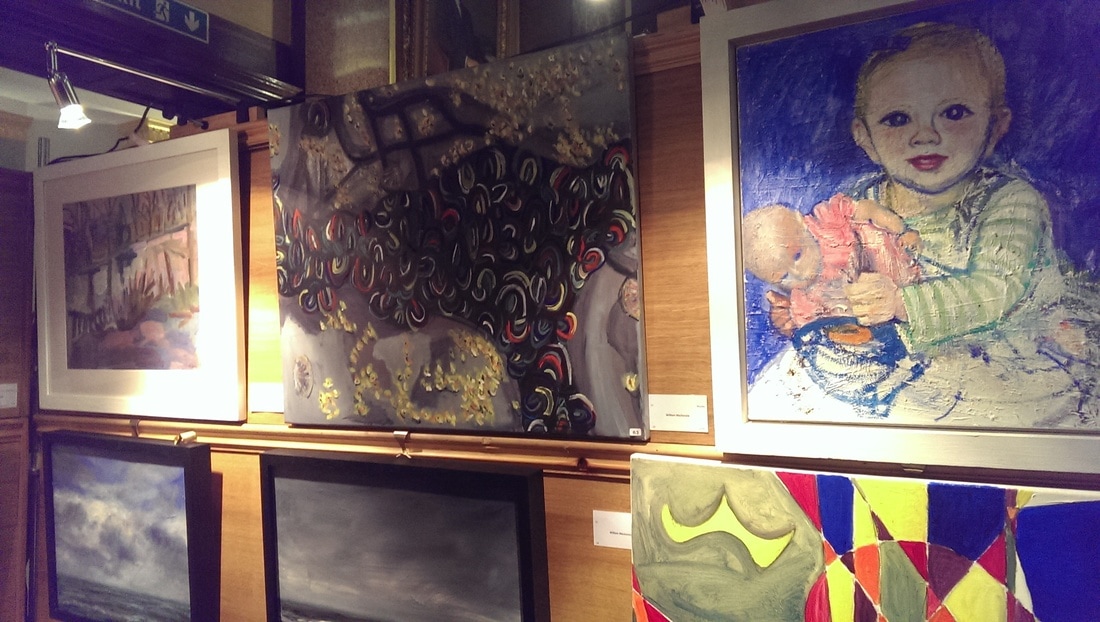
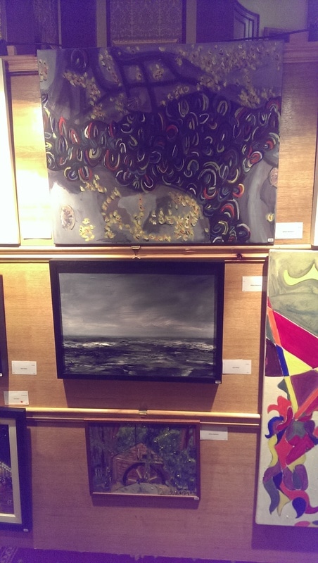
Apologies for the lack of activities recently. I have been laid up with a terrible post Christmas cold. Partly because of that my involvement in the law society art group annual exhibition was limited. I managed to deliver my work and sneak in and out to the private view. Here then is my brief run down. I put in four works. Muscles, Fireplace, The Mill and Glasses.
Can you guess which is which? Well let me tell you. Fireplace is the big multi-coloured abstract one. The muscles is the swirly colours on the dark background. In the bottom left is the Mill and then bottom right Glasses. Even though I was not present for the hanging I was quite pleased with how they were arranged. Yet again though I learned some interesting and useful things about how to sell and display and art. The standard this year was higher than last year. I have to say I didn't think my work compared very well. This is partly because my style is very different from basically everything else does. Also the work I presented didn't work well as a collective whole. One of the problems is you have to choose what to submit several months in advance and I didn't really think it through properly. Next year I will choose works that compliment each other. I'm never going to fit in with the tone of the exhibition but it is still nice to have somewhere to exhibit in public. I need better frames. Some people spend crazy money on frames. Also I priced everything way to high.
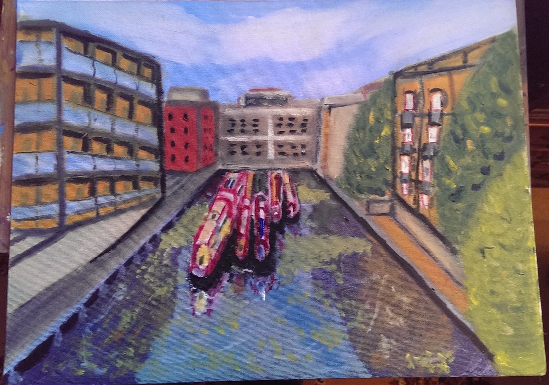
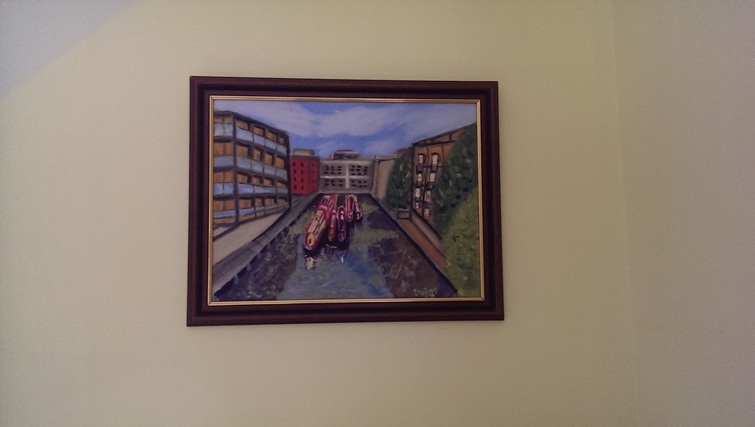
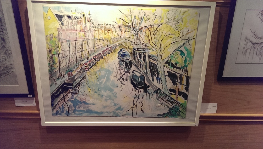
The event was well attended. Prizes were given out by the portrait painter Tai Shan Schreinberg who said a number of complimentry things about the exhibition generally. My favourite piece in the show was the above right goache painting of Regent's Canal. I like the composition and the lines.
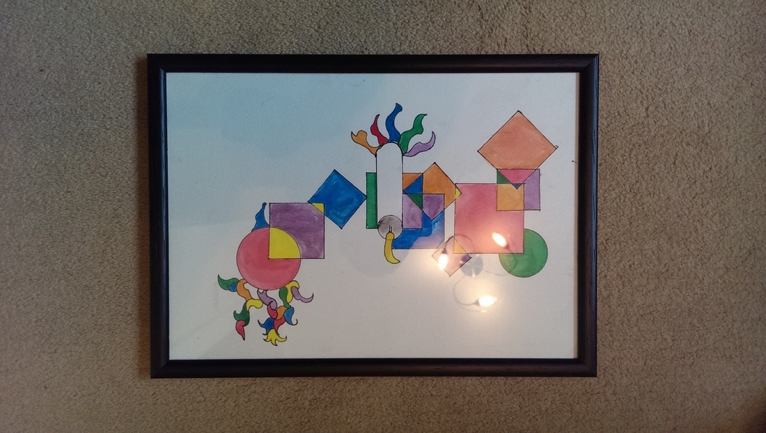
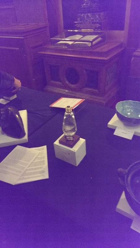
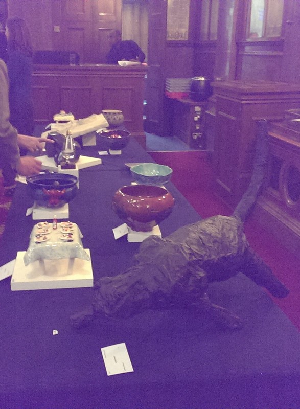
Particularly impressive were the 3d works of art. I thought the best of them was the one in the top left called bulb. Its a bad photo buts it is a simple and elegant piece. Tai obviously agreed as it won best 3d piece.
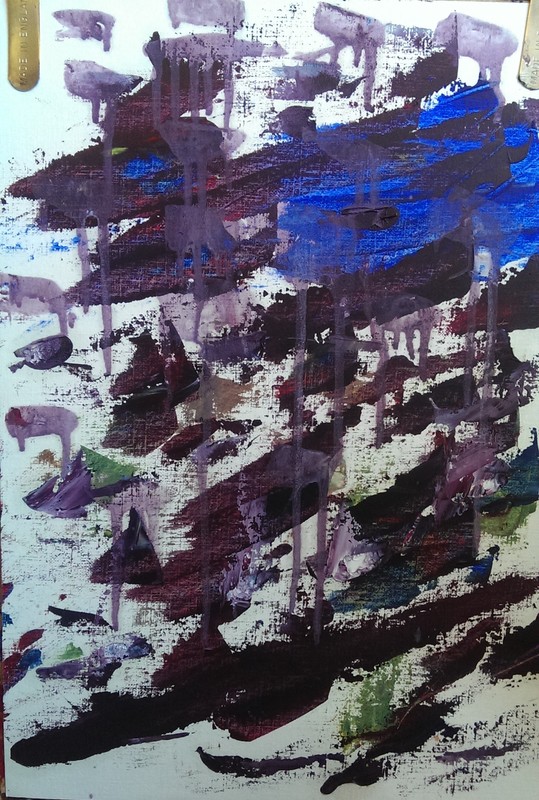
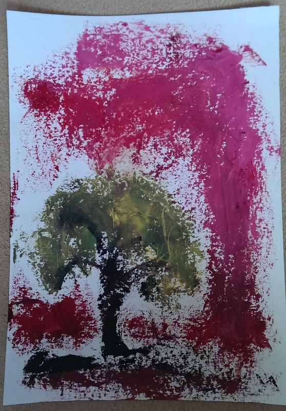
A tradition that is forming in the strange zone between Christmas and new years is the stash shop. This is where I get out and go through all my paintings, drawings, sketches and other works in part to tidy them up but also to remind myself what I've got. There are always a few pieces I'd forgotten about and am pleasantly surprised to see. 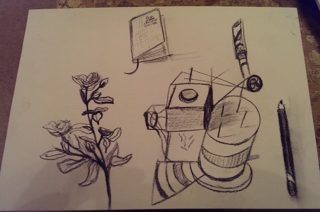 I do quite a bit of sketching just in front of the t.v, sketching whateer happens to be lying around. One of my favourite things to use is charcoal pencil (which is what I've used here). What I'm please about here are bothe the quality of the figurative sketches but also the abstract cake type thing in the middle. This is entirely concucted as there has been no such cake in the house. I also like how it works as a composition. I also have no memory at all of doing it. This is a common theme. 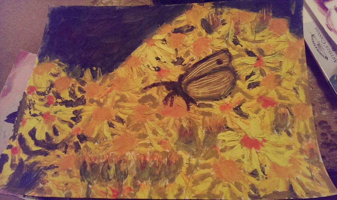 Some pictures photograph well and others don't. This is a subject that interests me quite allot. David Hockney for example photographs well where as Caravagio does not. The top left corner of this painting is in fact green. It is acrylic on acrylic paper. Lots of lumpy accrylic. Once I found this I did in fact remember doing it back at Cockpit arts. Lumping yellow orange and green acrylic onto each other. It is a very colourful piece and quite unlike my usual style. 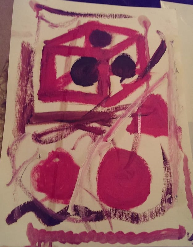 I'm not sure how I think about this one. Sometimes I like it, sometimes I think it is rubbish. As in the above one it looks better in person as it where. It is oil on acrylic paper, done at great speed. It is a a Left Over Painting, but I can no longer recall which painting I did it afterwards, whatever it was I must have had a substantial amount of red left and was feeling in somber mood. 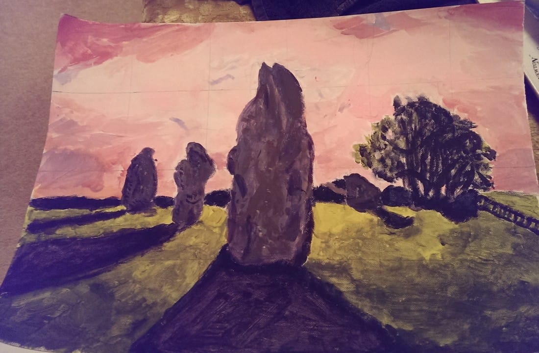 One of the things that slightly obsesses me is stone circles. I have never been there but one of the places that looms large in my imagination is Avebury. The above is a painting, again in acrylics of a phote of Avesbury stone circle, or part of it anyway. The whole thing is miles across. There are two things that I am particularly proud of, the textures of the stones and the pink sky.
Nice to be re-united with these pieces. I was also plesently suprised by just how much I'd produced in the last year. |
Archives
June 2024
Categories |
 RSS Feed