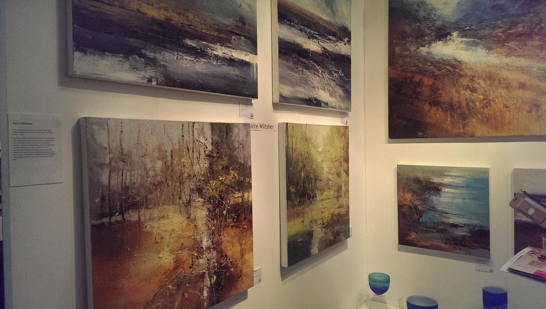
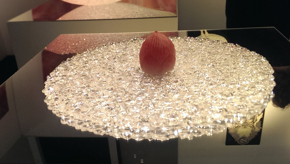
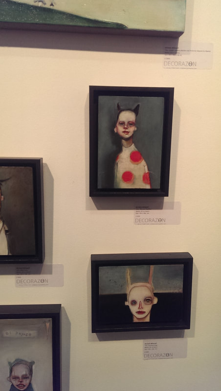
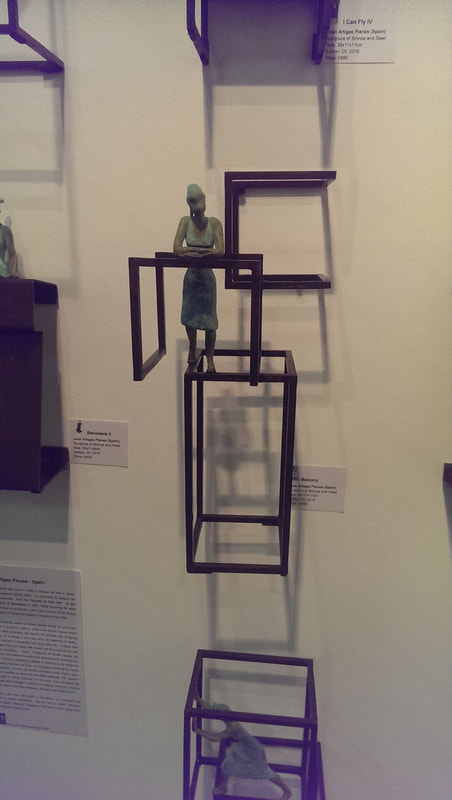
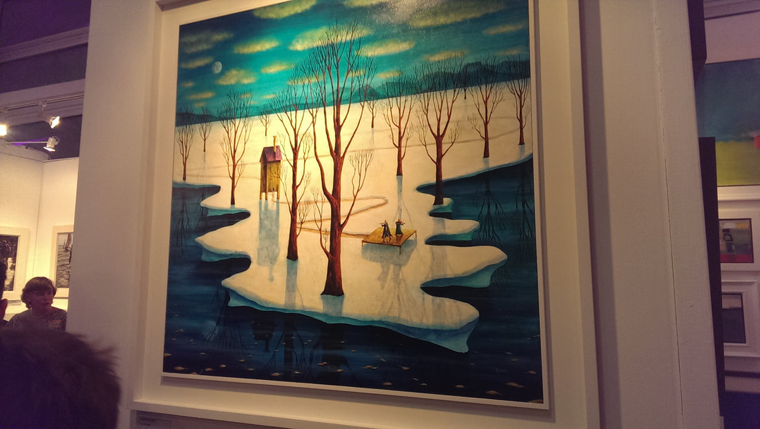
I went to the Affordable Art Fair in Hampstead in the spring, after a hiatus of several years. As a result of purchasing things I got a free private view invite, so it being free along I went. If you are going to choose between the two, based on this year’s outings the Hampstead fair is much better. There was a great preponderance of “graphic art”, you know sardonic colourful emoji type dogs, slogans and so on, generally printed, photos and not very good conceptual art. Very commercial but not particularly interesting. They are strange beasts the Affordable Art fairs. You can be guaranteed to see a dog better and more expensively dressed than you are. There were a few things that peaked my interest however. You will have to forgive some of the poor photography, the show was quite crowded and often angles difficulty. 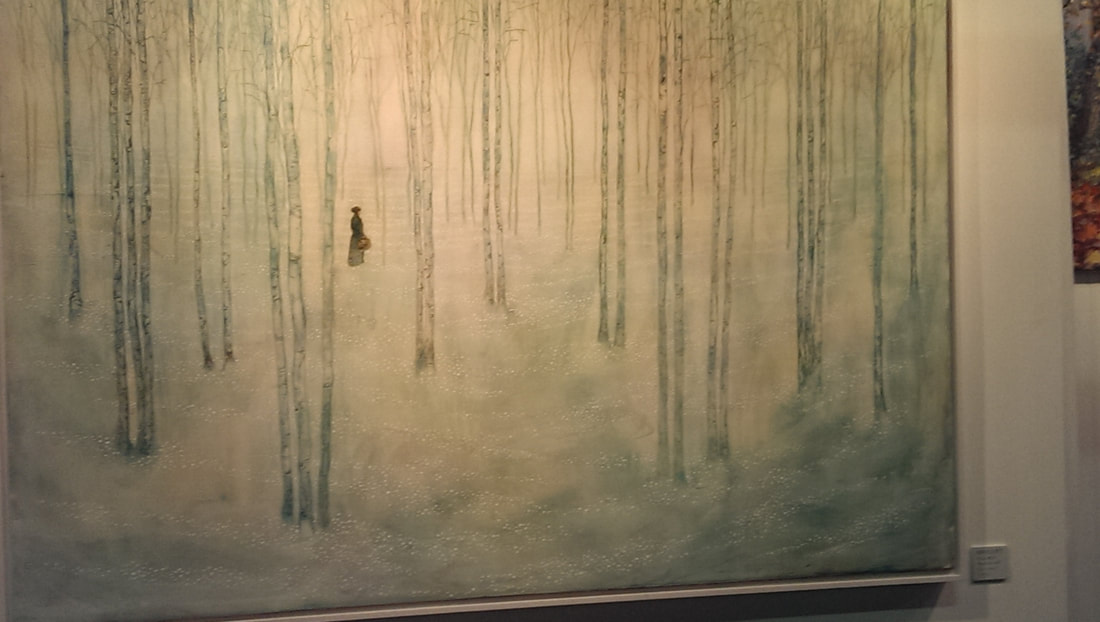 The above is by Daniel Ablitt, presented by the Hayloft gallery. I like the sparsness of it, the long spindly trees and the more colourful than it first appears sparkling snow. It is of course all made by the lonely victorian type figure. There is a Peter Doig like quality (Doig is a favourite of mine) so it appealed. 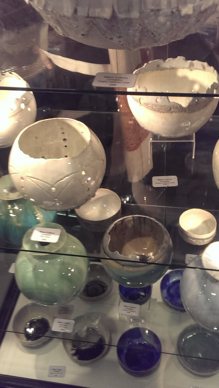 I am a sucker for ceramics and in this show (as you will see) many of the things I thought the best were ceramics and glass. The best of the bunch was Hilary Laforce (above), very well displayed in a glass vitrine, drawing you into the gallery. I like her crinkly edges and deep lusturous colours, so much in fact that I purchased one of the magnificent blue tea bowls on the bottom. I am very glad I did.
Glass as I have said another prize in the show and amongst the top contenders are these exquisite pieces by Akiko Noda. The ones above left are called moon and sun, and have been very craftily displayed, lit from above on a black pedestal so they glow with an internal luster. They are very desirable little hemispheres and above my price range. Showing versatility is the one the right which if memory served is called water lily. This is where shows like this really show their worth, introducing you to people you would never have otherwise seen.
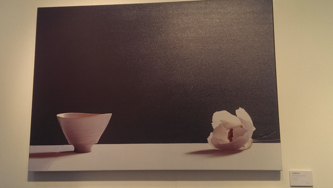
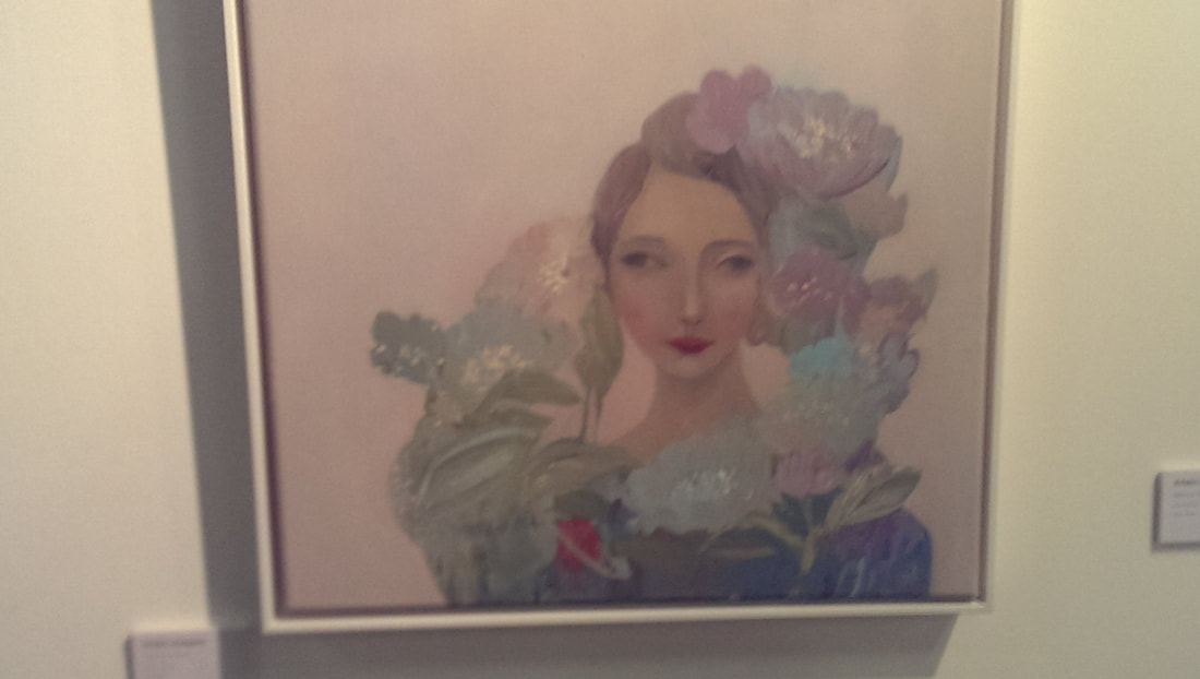
Time for some painting and not everything is shouty and garish, there is subtlety which holds it own, simplicity too. The one above left, a simple looking bowl and bloom by Jo Barrett. In simple pinks against a dark background it is a calming delicate piece that I really like. More iconic and romantic are the works by Kirstin Vestgard with her pastel colours and soft focus that gently draws you in. I also like in this piece how the whole composition forms and interesting overall shape that swirls round the central face. Very nice.
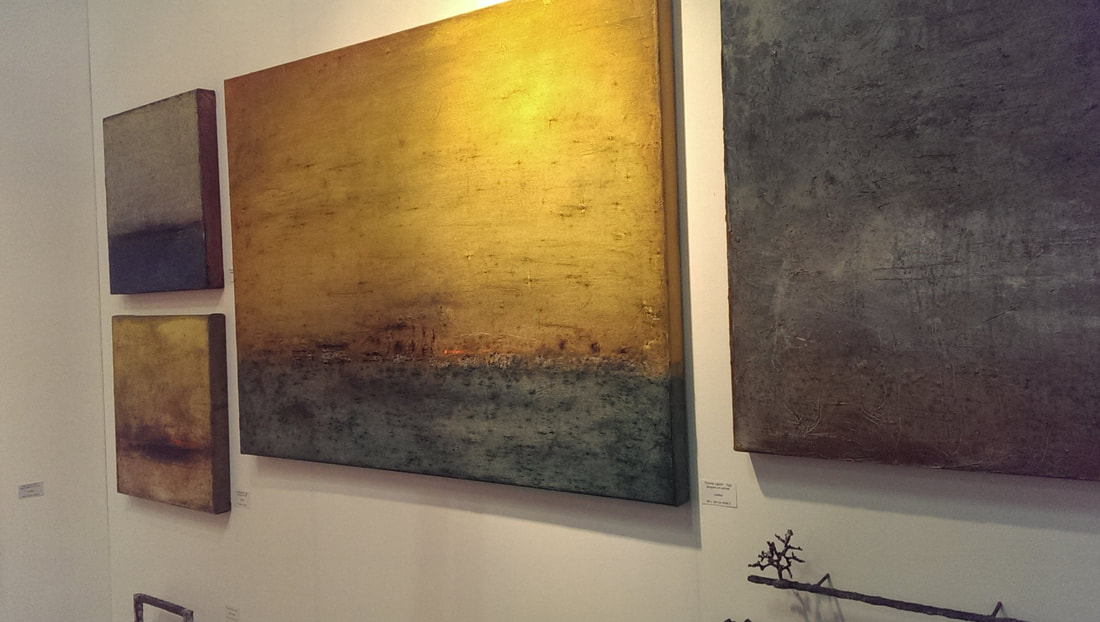 Another common and long lasting trend is the miasmic landscape. Usually there is a horizon line, often there is a sea and there is swirling colours, Turneresque sunsest and semi abstraction. This is a style that appeals to me especially when it is done well and in a slightly different way as by Thomas Lippick in the above. Grey and gold is always a good combination they have been expertly used (it is egg tempera by the way) with interesting colour and shade contrasts as well as textures. Like these, very good.
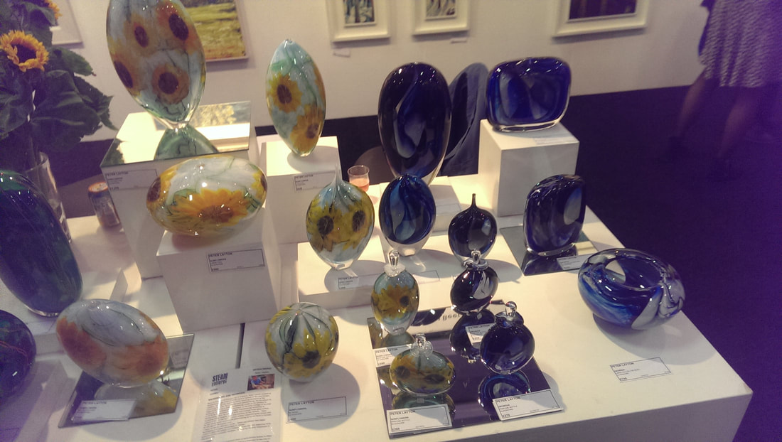
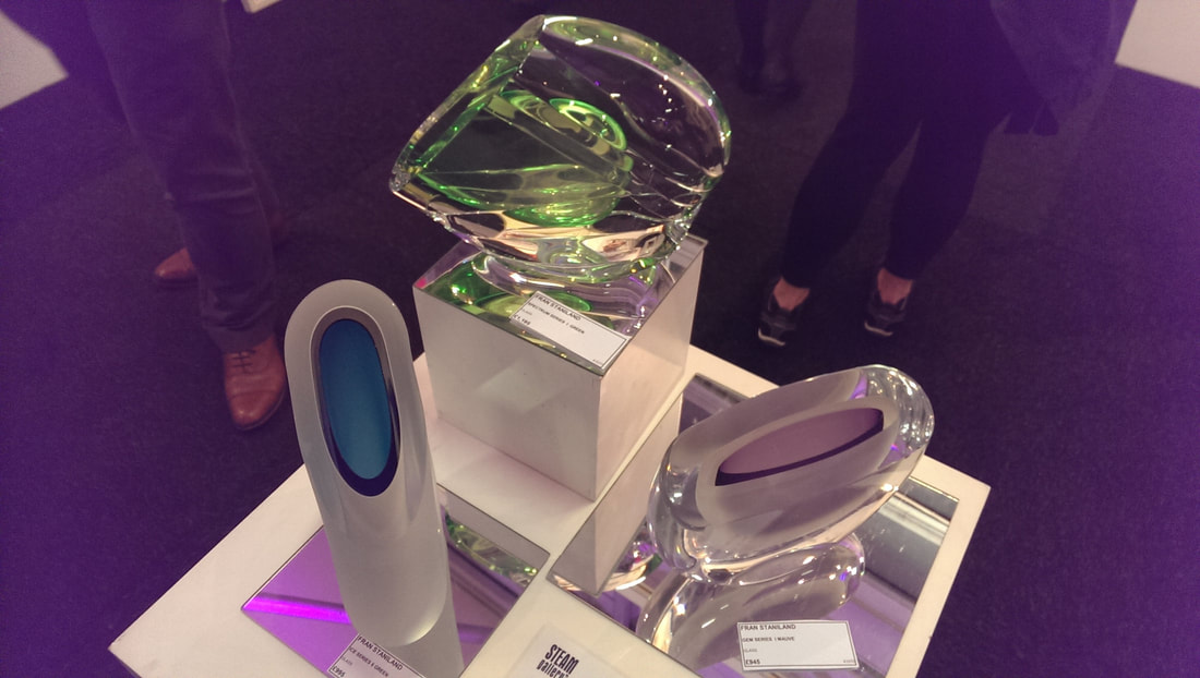
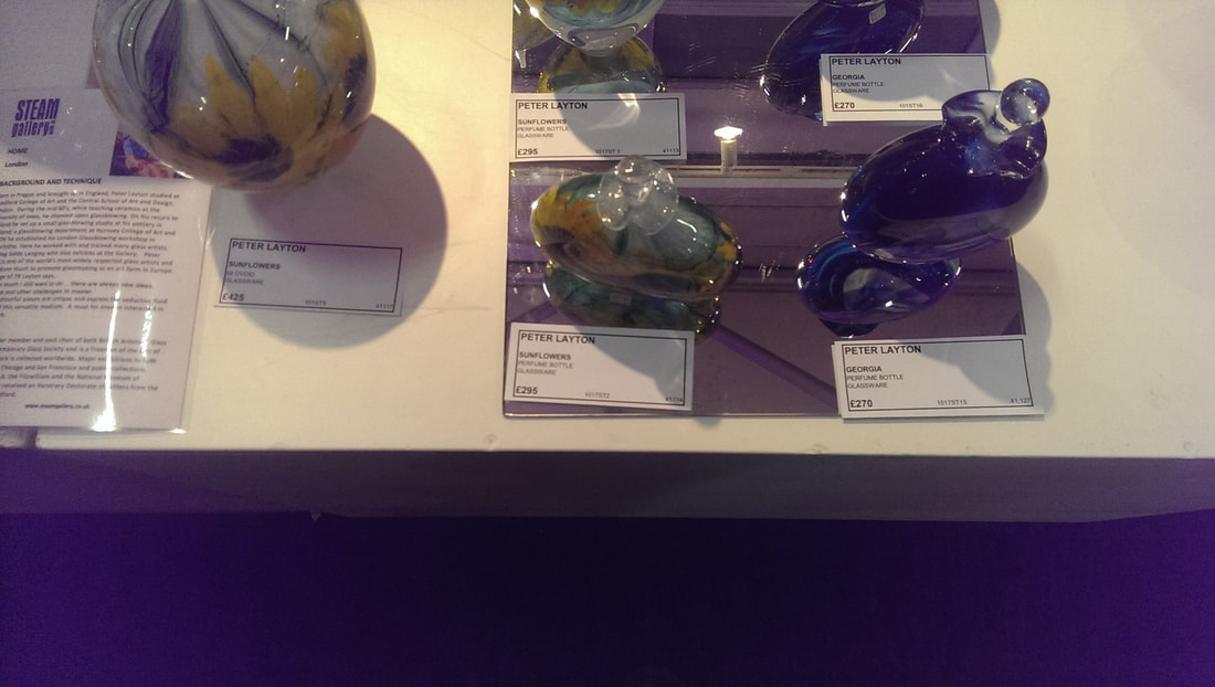
Gallery of the show went to the Art in Beer stand. Beer is a town on the south coast and now I want to visit. It was a large well set out and and attractive stand. It was creating allot of attention not least with a very attractive display of Peter Layton glass (above right and the very top right of the blog). I am a fan of his glass and often go to his studio in Bermondsey (where you can watch glass being blown). I very nearly purchased some, aided by the fug of free booze. Fran Staniland was another glass artist (above, middle) whose beautiful glass sculptures were sadly above my price range. I actually prefer the more opaque ones (such as the white and blue of the trio you can see). Not just glass but also paintings my favourite of which was Adrian Sykes' work (above left). there is a strong use of light and shade to focus on the middle of the piece, around that central tree, joined with the rest of the painting by the meandering course of the sledge, which echos the shore line. Nice strong colours too. Similar to the theme I identified earlier. Again a slightly Doigish feel to it.
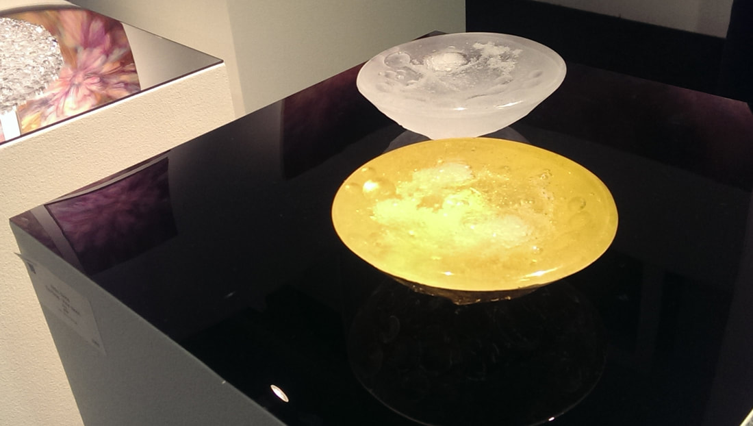
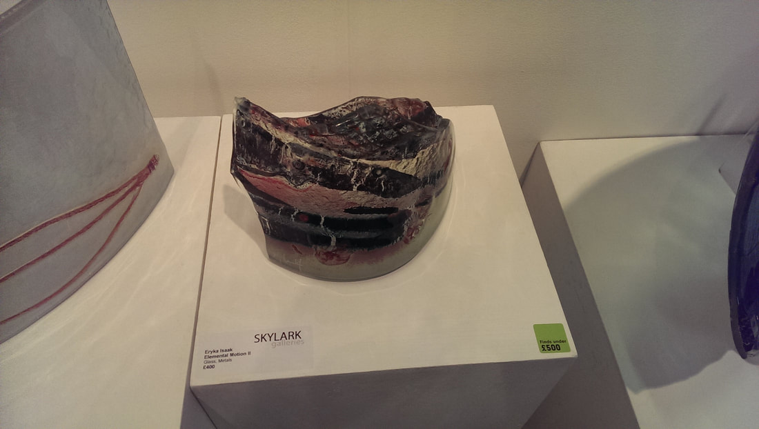
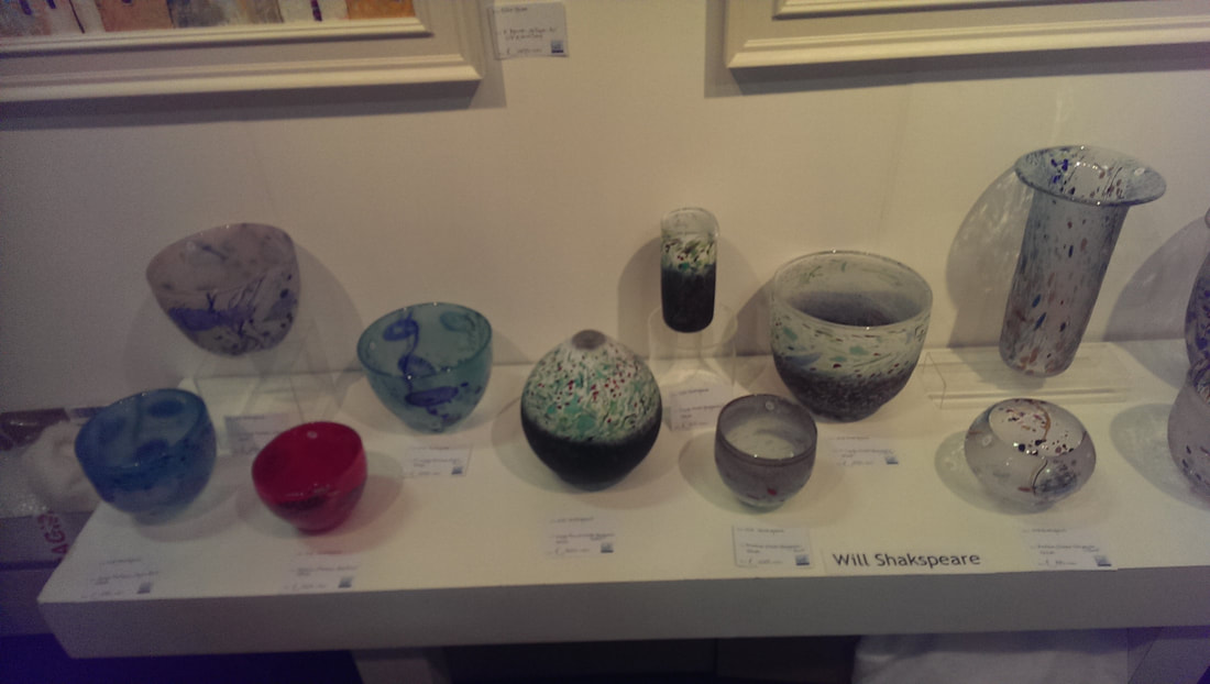
Final two pieces of glass. The photo of Eryka Isaak's glass sculpture (above left) is not very good and makes the work look to much like an enormous toe-nail. Actually it is much more lustrous and interesting than that with metal imbued in the glass to give a sort of of gnarley feel to the whole thing. Above right is one of the two shelves of the art of Will Shakespeare who produces very nice pieces. Can you see in the middle a small blue and dark vase. Again I very nearly went off with this. I liked allot of his work, he has good designs and a good touch. I shall keep my eye on him.
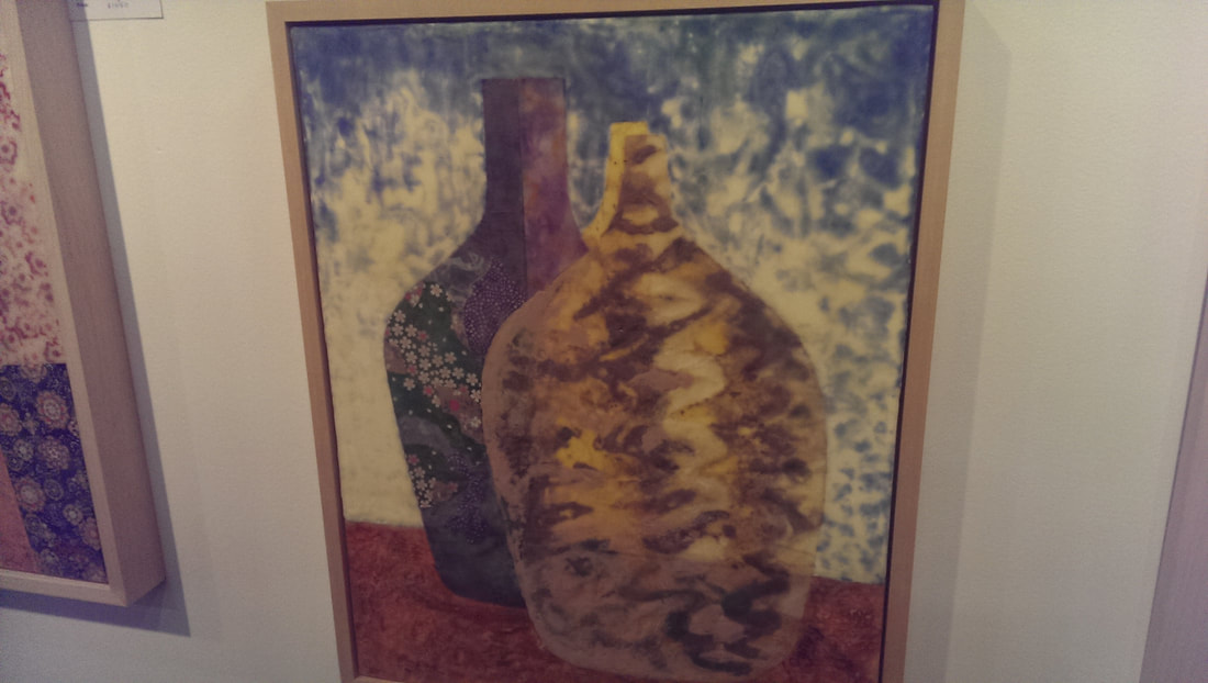
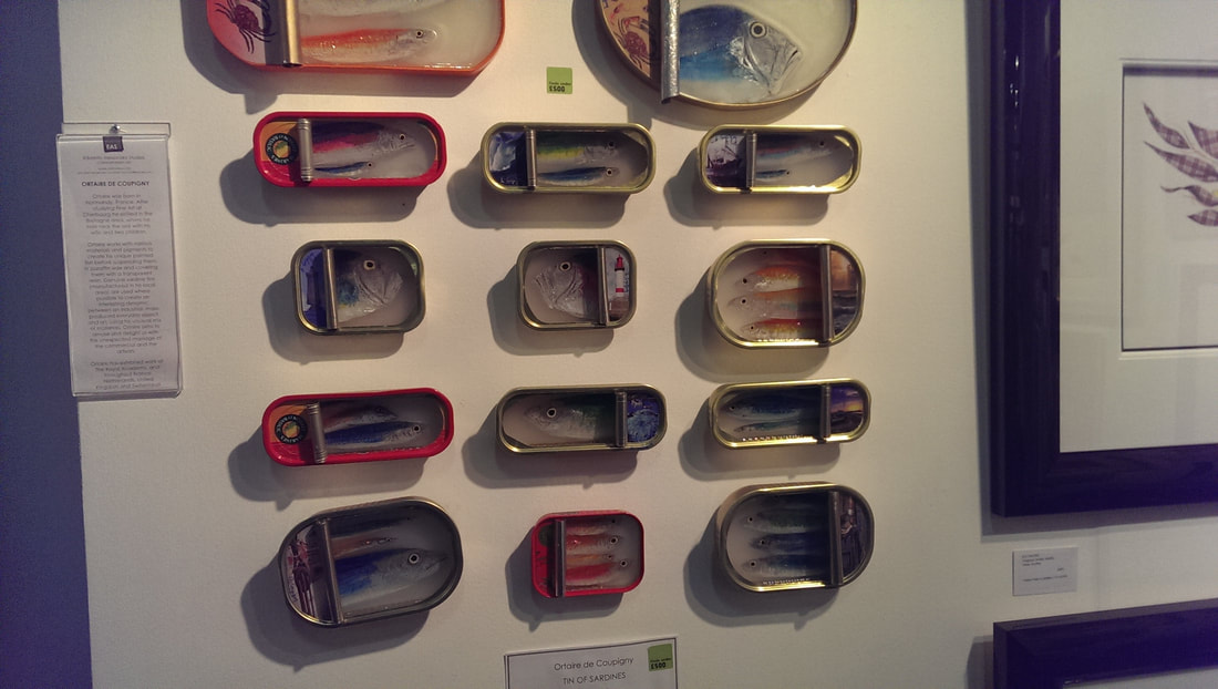
Apart from the lovely bowl I bought my two favourtie pieces in the show are above. The one above left is an encaustic (wax basically) and collage painting of two pots by Jill Ogilvy. They have a visceral texture to it , nice swirls and lumps making these pots seem somehow very real. In a completely different tone the piece above right are fish tins, in which are rendered these flourescent fishes. These imaginative pieces are the work of Ortaire De Coupigny. Interesting, attractive, well done and also affordable. I seriously thought about wandering off with a couple, but restrained myself. Finally a bit of self promotion. I have a group show on 11th November at the Brookmill Pub in Deptford from 17:00. It is called Liminal Boundaries. Come along. 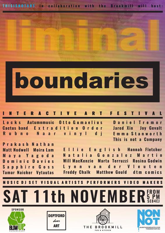
0 Comments
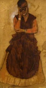
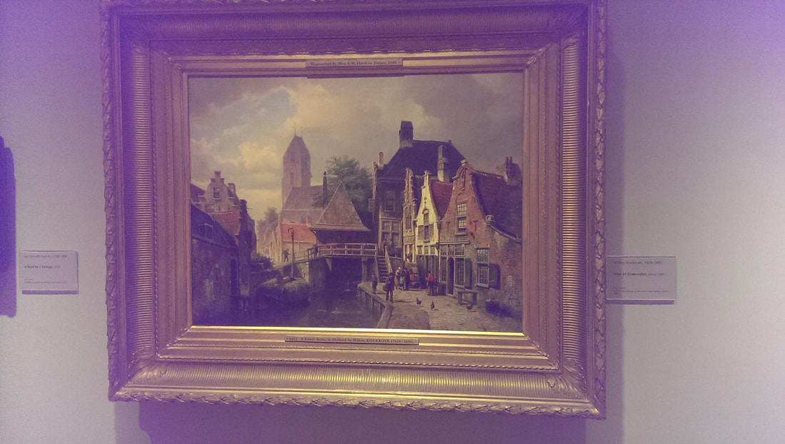 The National Gallery has started doing a fine line in small, free exhibitions. They have also expanded. In room B, one of the new rooms slightly hidden on the ground floor, beyond the cafe they have displayed in one room a chronological selection all in one room. I always forget, until I go there again, how large and epic the National Gallery’s display is but this really hammered it home. Of the plethora on display I particularly enjoyed Willem Koekkoek’s View of Oudewater (seen above). This was just an unexpected bonus. Two things had drawn me back and that was Leonardo Michalengelo and Raphael , and Drawn in Colour: Degas From the Burrell.  The first was one room of several of paintings from the two great masters. All religiosity and unnecessary dizzying heights of talent. I have to say though I find the religious subject matter difficult to relate to. It inspires awe a little but no great connection, at least not in me. Therefore of the three I find Leonardo whose people all seem more human and accessible, the more pleasing to me. 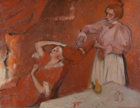 Distracted only by basically everything between that exhibition and Degas, I eventually made it. The Burrell collections usual home is being renovated so a substantial number of Degas are on loan to the National Gallery and are well worth seeing. It displays in either oils, or pastel’s Degas’ main subjects of women (particularly dancers) and horses. Of the two he does women better. One of my favourites which I have seen before is Combing the Hair (above) where it is all rendered in shades of red to give this warm intimate scene. 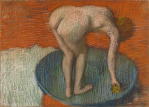
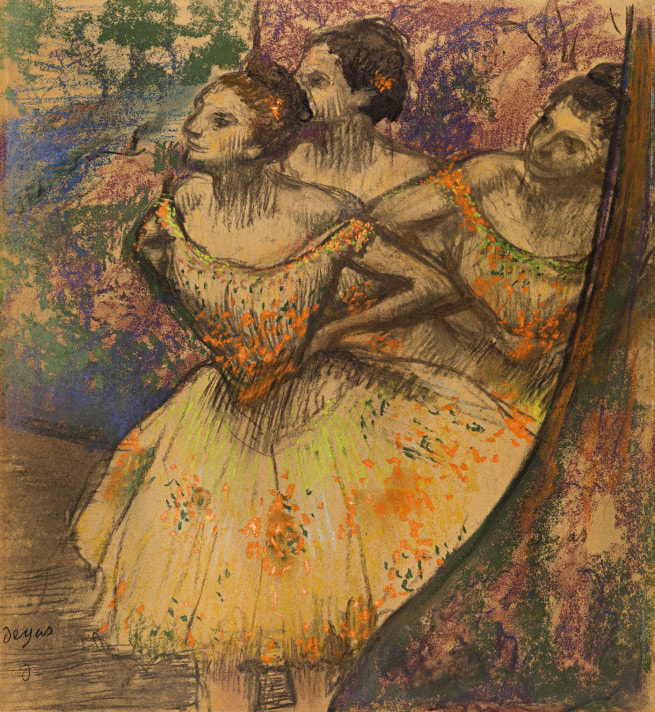
My two favourite pieces were Three Dancers and Woman Looking through Field Glasses. I was interested to see that Three Dancers (above right) was done on Tracing Paper. I once accidently did a pastel drawing, not on the paper but on the thin sheer sheet that protected it and it was much more effective than usual. Tracing paper has a similar texture so it was interesting to see it being used for pastel. This painting also shows quite well how actually most of Degas’ faces are very similar and pointy. They are only loosely sketched out, the whole thind being more about the stance and the movement. Woman Looking through Field Glasses (above left) is exactly that. Again you can see almost nothing of her face and it is all about the contemplative almost challenging stance and the tone and texture of her outfit. It is quite a powerful piece. He prepared this (and others) for use in later pictures and would apparently use the same stock drawing several times in larger works. This is a good idea I might steal. 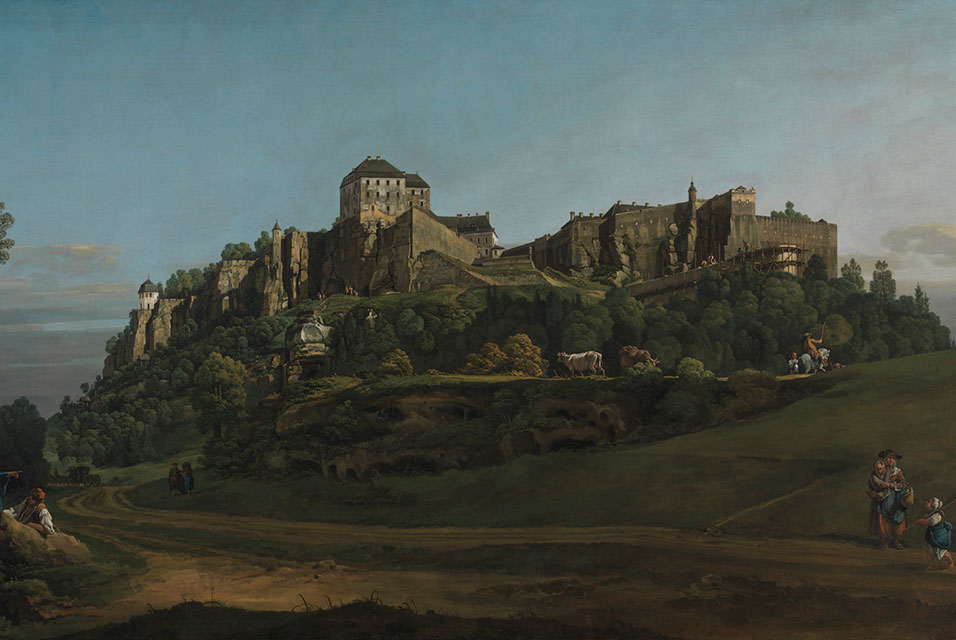 It's a good show and I would recommend it. I would also recommend on your way out stopping to admire the new acquisition by Belotto of the Fortress at Konstein (above) from the North. It is a large impressive piece with slightly oddly proportioned cows but also this massive and literally fantastic looking fortress looming at you from atop an escarpment. It is a good picture in of itself but also fired my imagination and sent if scampering off on Ruritanian tracks. A good purchase.
 The Society of Botanical Artists exhibition is one of my favourite of the year. My tip for artistic fashions is that this type of art is due for a comeback. There is something very modern about the sparseness and simplicity of the work against white paper. I am a big fan of Japanese art and this reminds me of this in a way. It has an old fashioned, amateur reputation which is entirely undeserved. There is a very high standard of talent and skill on display. I first went last year and bought the below by Sandra Wall Armitage, who is the president of the society and who I happened to meet when I went this year. 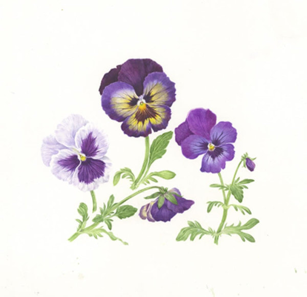 No doubt due to my patronage I was invited to the private view this year, so along I went. The theme this year was Change of Seasons and the standard is as high as ever. I was instantly gripped with a desire to purchase something and there was much to choose from. Interesting things happen when you go to a specialist show such as this. Because the style and subjects are similar it causes you to really focus. Slowly you begin to see the things you prefer, how the subject is set out, how depicted, the use of colour, the size, the application of paint. From all this preferences form. This show has the extra level of interest in that the society also judges on scientific merit, so how accurate is your picture compared to the plant. Awards are given to this. It therefore has two avenues of appeal. Unlike most shows, women are in the majority of artists. Who then did I like. You cannot take photos at the show so I have taken pictures, where available from the artists bio on the societies website. The pictures are often not the pictures I saw but give you an idea. If you want to see them, and I suggest you do, then go on down to Central Hall, in Westminster. The show is on until 17:00 on 22nd October. 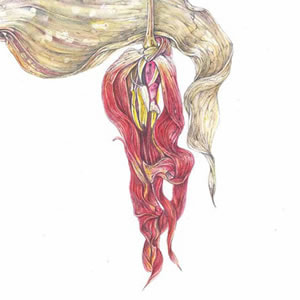 First out of the blocks, and we are going in alphabetical order, is Vicoria Braithwaite with a lovely picture of Tulips, or as the naming convention is to give the scientific name Tulipa 'Vaya Con Dios'. A sumptuous, large piece and at £3,450 pretty much the most expensive thing in the show and the quality is there to justify the price. Next we have Lynne Buckler, an example of whose work is above. She is interesting in that she combines pencil with watercolour. Actually the piece of hers that I liked best was this very succinct black and white picture of Italian Alder. It had a sort of warm, sparse simplicity and made my shortlist of things to buy. Indeed I am slightly regretting that I didn't.  Gill Cann (example above) does a fine line in seeds, leaves and leaf debris. What attracted me more though was her Eucalyptus. It has a nice sort of spiky contrasted with soft quality which I think Gill does well. By the way not all the artists appear on the website, so for example Helen Cavalli's globe artichoke and Giovanni Cera's Labruso di Grasparossa (grapes) both of which are rendered such as to make you actively want to go out, buy such things and eat them, must go unlinked and un-illustrated. Hopefully though these snippets will tempt you to go and look them up for yourself. Likewise Helen Cousins who delicately renders the intricate folds of her Peony in Bloom with skillfully applied shades of pink. Not easy to do that.  I can show you Angeline de Meester (see above), although the pictures in the exhibition that attracted me were a Rose, Gertrude Jekyll, and a Dahlia, Karma Chocolate. As possibly the picture above and the names give away her style is a single bloom is you like with lots of white space around it and then colour contrast. Particularly the Karma chocolate where you have this brown moving to purple. Mally Francis enticing, waxy Lemon must tantalise you as indeed must Sandra George who can wield a colour pencil to bring to life in this case Gladioli.  Have you heard of Iokta paper? Neither had I before I came across Amber Halsall's work, particularly her piece Autumn rain. The style and feel is very similar to the picture hyou see above with this sort of dirt and moss extending out from the subject matter. The paper itself has this yellowish quality, like velum but more so which aids the presentation. 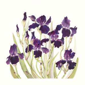 Irises make good paintings and Alice Harman had two such on display (above). They are a deep purple and this makes for a good contrast both with the blank white of the paper and the more subtle colours of the plant. Additionally they are an interesting shape. As such they are quite a common subject but if you are adept at your purple tones and your composition you can produce something quite special. 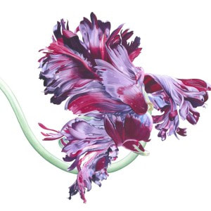 Elizabeth Hellman has a thing for Parrot flowers (like the above). She had several such on display indeed all five or her paintings were of excellent quality and had this vivid bright colour, focusing almost exclusively on the bloom. They are very eye catching but for me almost too bright. 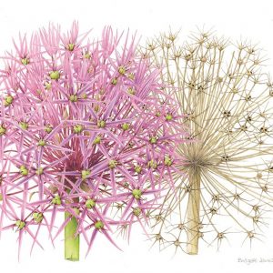 Bridgett James was another who made it onto my almost purchased list and this time I can actually show you a portion of the actual picture (See above). The original is wider and you can see the entire plants. I like the pinks and the shape but what I especially like, and made this picture stand out is the juxtaposition with the dead flower and the way one is arranged in front of the other. It is a clever piece of composition. 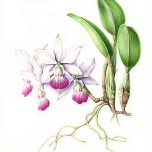 Tomoko Nakamoto produced this piece called Amethyst Dream, it is not the picture above but that is an example of her work. Knowing almost nothing about plants I don't know what an Amethyst dream but purple flowers are a popular choice and that is because they work so well as mentioned before. You can see in the picture above how she has contrasted purple with some of the rest of the flower and you get a real sense of a growing thing.  Almost all the paintings on display are plants on a white background. Occasionally you come across an exception and of these I think Julia Patience's Agapanthus was the best. You can see how it might work from the picture above. Rendering the plant this way allows you to make different stylistic choices but also if you are produce a picture of a mostly white flower it is often the only viable way. It also allows you to put it in context. The bright, solid colours are achieved by using watercolour and ink. 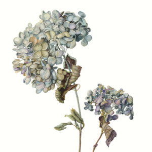 I did in the end buy something. I bought a picture of an Iris by Gael Sellwood, an example of her work is pictured above. What was interesting about the piece I bought was that the Iris was different from normal, it was towards the end of the bloom and done in soft purples and oranges, slightly raggedy at the edges. The picture above is quite a good example of the sort of end of bloom decay thing that I think she does really well. The picture is still there, adorned with a red dot, and I am looking forward to the end of the show when I pick it up. 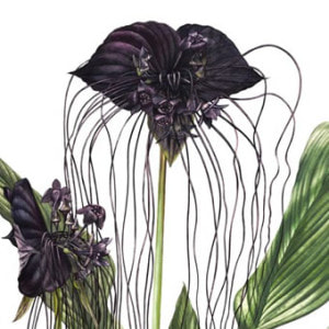 There is no doubt that one of the stars of the show is Billy Showell who is due to become president of the society next year. An example of her work is above. She had 5 pieces on display my favourite of which was the Black Pearl. She has won numerous prizes and you can see why. Not only are these extremely skillful with a depth of colour and a surity of line but the composition is excellent. The one above for example where the central flower is well framed in that v shape.
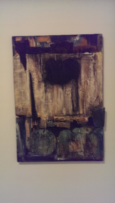
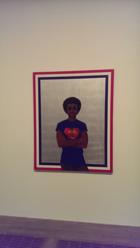
There were many more I could mention, mainly I have left them out because they are not on the society website but look out for Nessie Ramm, Doreen Taylor, Hwee Lee Debbie Teo and Heidi Venamore, all of them excellent. It is a very good show and I highly recommend it. 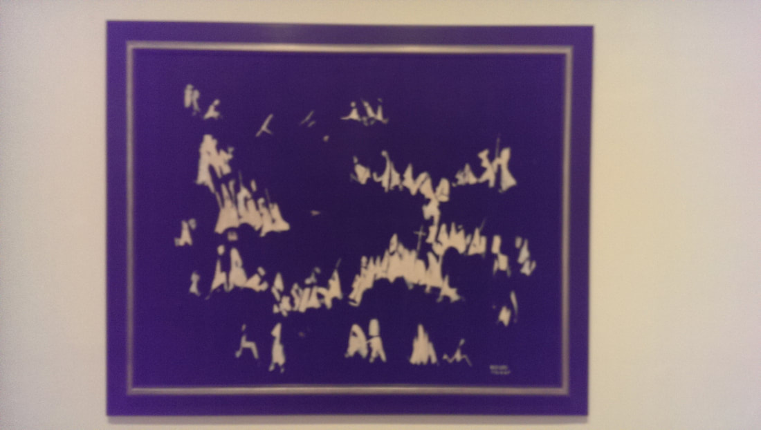 There is a very good show on at the Tate until 22nd October, Soul of A Nation, Art in the age of Black Power. I highly recommend it. It will however make you furious. It will do so in two ways. Firstly as a depiction of the repression of black people in the USA in the 20th century it will make you seethe with the injustice of it all. Secondly you are suddenly exposed to all of these top tier artists, almost all of whom you will have never heard of or seen before . How are these people not more famous? The answer is depressingly obvious. Credit then to the Tate Modern for putting on this show and bring both these things to more prominence. Credit also to all of the artists who gave permission for photos to be taken inside the exhibition. There were a couple of pieces I did recognise but none of the artists name. Who then did I discover? One of the first pieces you encounter is Norman Lewis’s America The Beautiful (see above). The background is black and then soft focus in white is Klu Klux Klan figures. What they are up to is not clear but it doesn’t look good. This vague element adds to the power of the pieces.
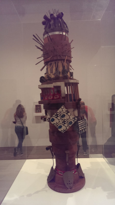
In one room there are a number of what are called assemblages, sculptures and art from found objects basically, by Noah Purifoy. Very powerful pieces, a more soulful and desperate version of Rauschenberg but a very different message. I particularly liked one piece, hanging on the wall with the wood in it scared by scorch marks (above).
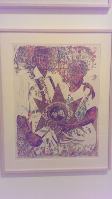
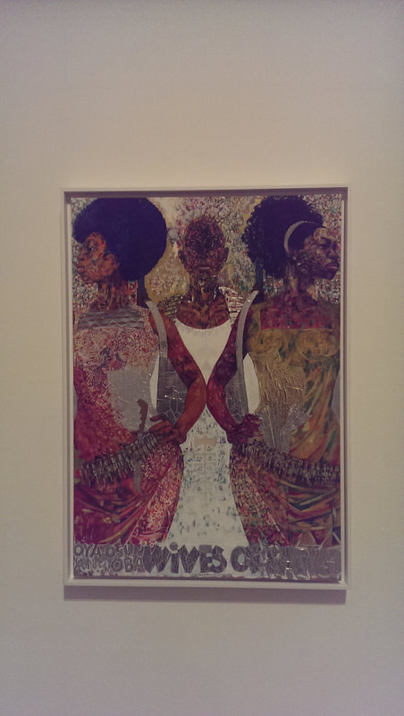
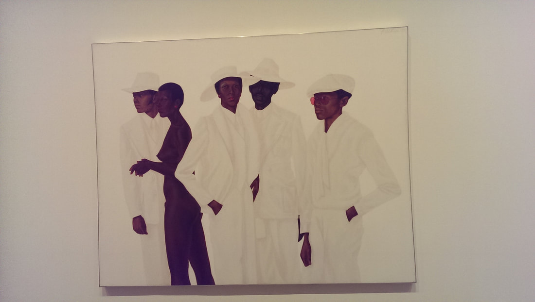
Jeff Donaldson produces these very brightly coloured pieces. The figures and the landscape made up of a kaleidoscope of colours highlighted by gold and silver foil to show things like glasses. This is used in great effect in pieces like Victory in the Valley of Eshu (above left) and also my favourite of his pieces the Wives of Sango (above right), showing this 3 strong battle women projecting powerfully out of the picture. 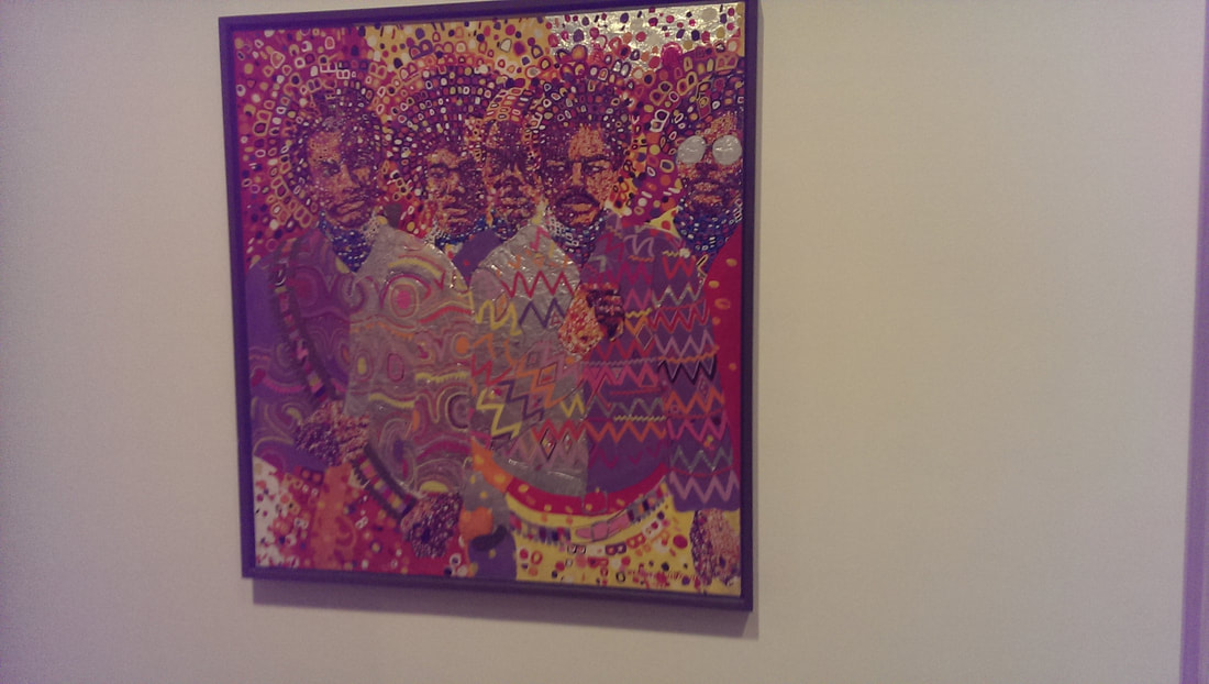 Wadsworth Jarrel has a similar style but more of a mosaic quality like in Liberation soldiers (above). 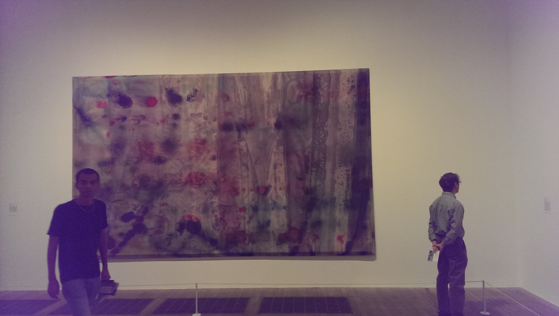 Sam Gilliam 1969 is a large pieces hung along most of one wall in the far room (above). It has a grey background and washes of colour and from a distance looks very attractive and complantative but as you get closer you realise it is depicting blood on a road or pavement and the meaning of the whole thing shifts on you. I am not sure if this effect was intended but it works very well.
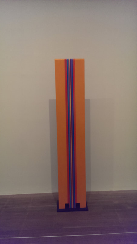
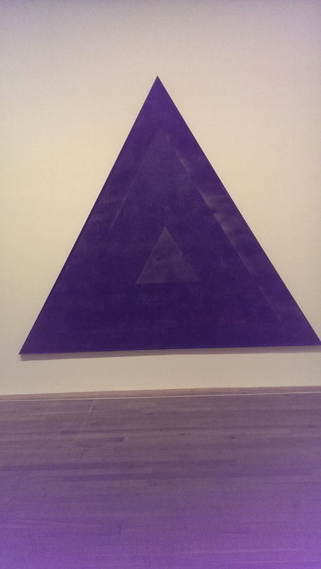
In the same room are two other abstract artists I liked very much. William T Williams produces these almost graphically designed geometric pieces. The one that looks like a metronome (above left) I am sure I have seen before and the name of the artist range vague bells. Opposite these is a black triangle, inside of which is an almost black triangle made up of dark reds, greens and blues. It is a Homage to Malcolm (I.e. Malcolm X) by Jack Whitten (above right) and is a very fitting and powerful memorial piece.
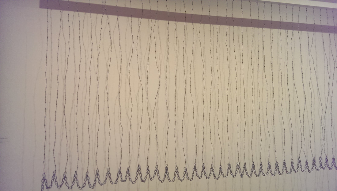 Back into abstraction Melvin Williams Curtin for William and Peter (above) is a barbed wire curtain. Simple can be good and this is both of these. 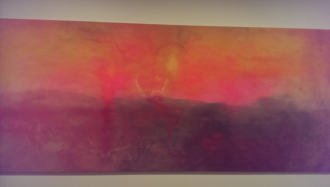 Opposite it in washes of orange, peach and yellow is Frank Bowling’s Texas Louise (above). It is a beautiful piece that hypnotises you with the way the continent of America morphs out of the background. 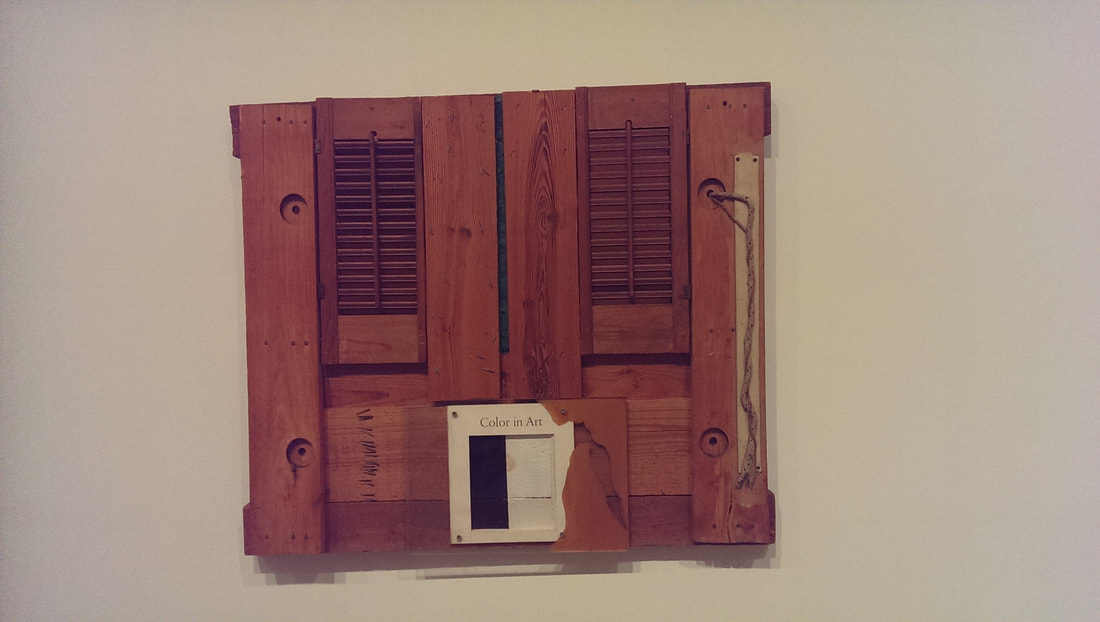 In the final room there were another series of assemblages, my favourite of which and another highlight of the show was Color in Art by Randy Williams (above). It is the contrast between the shapes, the way it sort of looks like a window that I enjoyed. 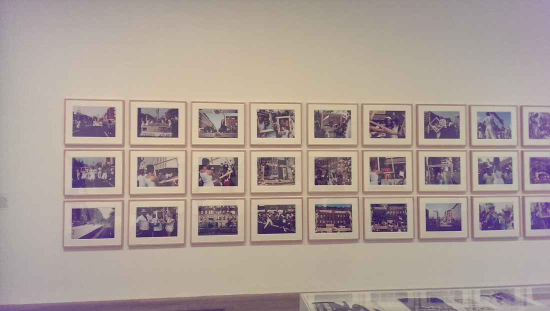 The show can be a bit, well depressing but I think a genius move is to leave you on a high and with a feeling of hope and this they do very well with Lorraine O’Grady’s series of photographs Art Is (above). What she did is during a parade got some dancers to go round the crowd with golden frames and photograph people interacting with those frames. Everyone is so enthusiastic and happy, it made me smile and lifted my soul. One thing though. If you go, look at the policemen. What do you notice?
This is an excellent show, both artistically, policitically and culturally. I highly suggest you go.
Continuing the grand tradition of public service this is a review of two exhibitions that have now finished. I have been catching up on my art viewing having spent most of the summer preparing for my show. There is a tenuous link between these two shows which I shall shortly reveal.
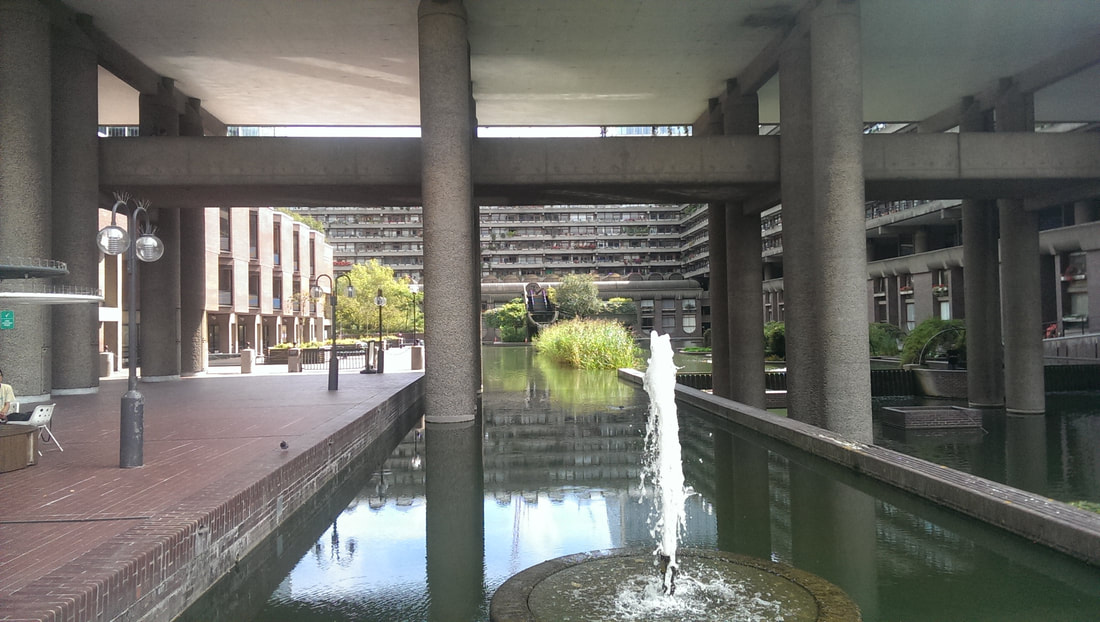
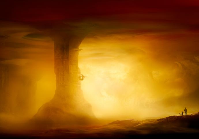
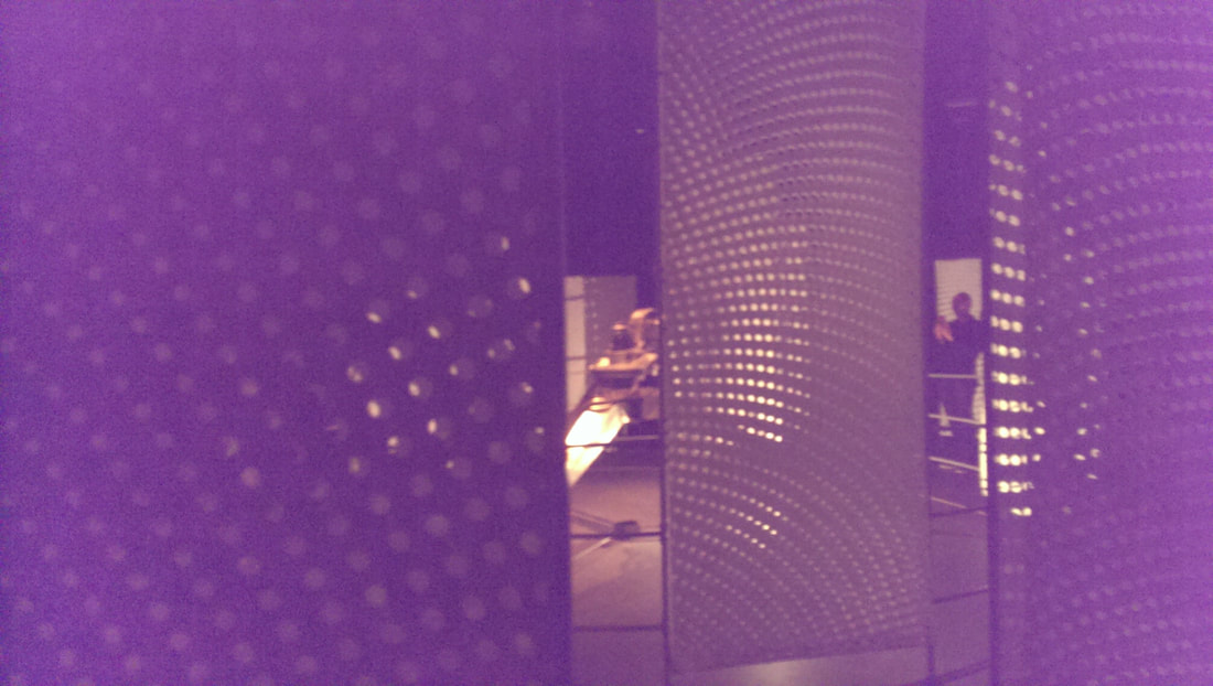
I have not been to the Barbican for years and never before to the gallery. I was lured their by the Into the Unkown, a journey through science fiction exhibition. The barbican with its modernist brutalist lines, appearing like something from the set of 2001 or Total Recall is a very good venue for such a show. It is a cool, dark, cavernous space, with great concrete pillars and wall (as shown above for example).
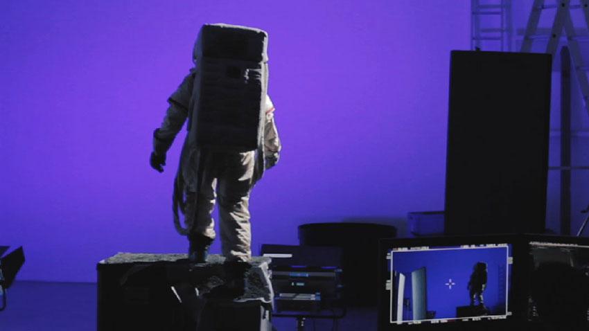
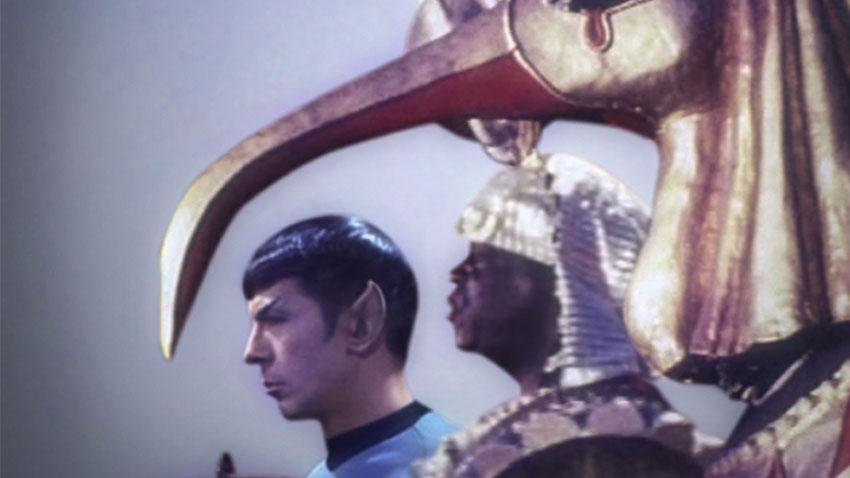
 If you are a fan of sci-fi and films the exhibition was very interesting. There were original props and costumes from films such as Moon, Star-Wars, Star Trek and Inception. There were miniatures and more interesting to me concept art and designs for the film and the sets. One of the most interesting was HR Geiger designs for a Dune film that was never made. What a film would that have been. In addition to this there were sci-fi book covers from various eras (see above). 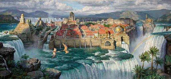 The bit I most enjoyed was the art, book covers and models from the Victorian era of Sci-fi. Models of the Nautilus, great cities with bi-planes flying through, airships and my favourite Dinotopia, a fantasy land of people living with Dinosaurs (see above). I really like these very complex city pictures and they used to fire my mind in my youth.
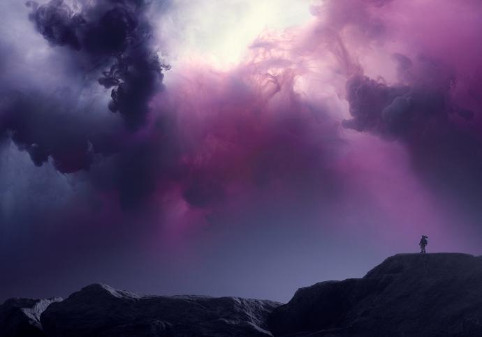
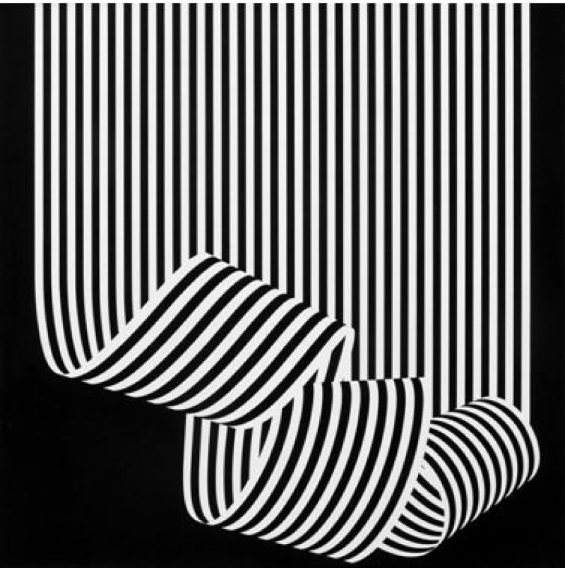
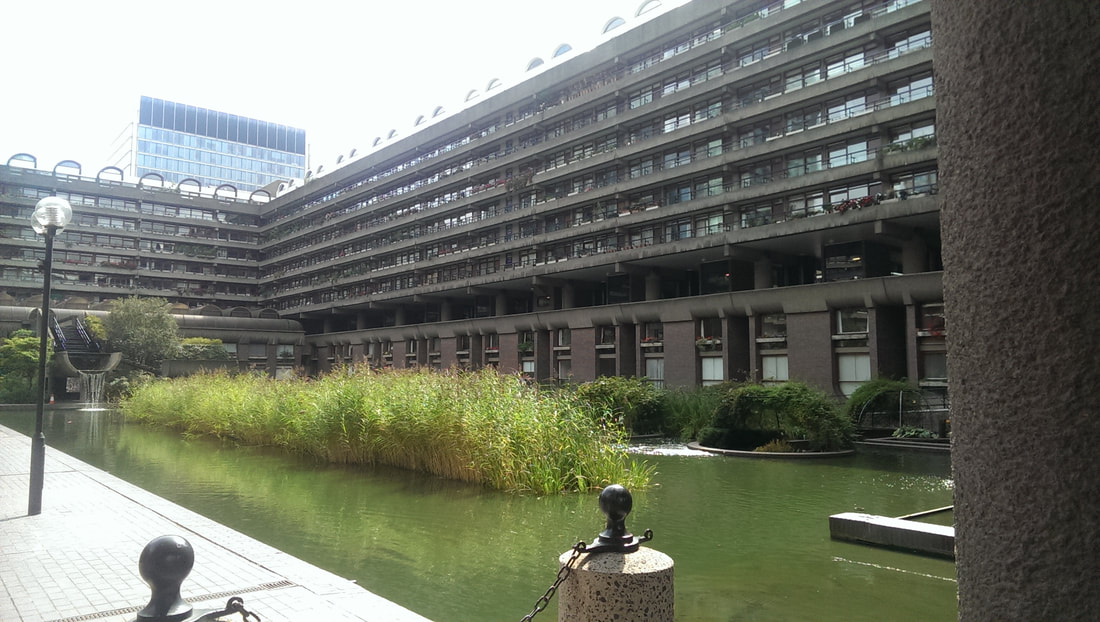
As well as all this there is some art commissioned espsecially for the show. Several works by Dan Tobin Smith (above left and top of the blog, left), dusty, misty pictures of fantastic or futuristic landscapes. Then down in the basement an installation by Conrad Shawcross called the Light of the Machine (above right) in which a very sci-fi looking robotic arms moves a light which cast interesting shadows through the paper screens that surround it. Not an easy thing to find though as the Barbican is a fair old maze. After the show I wondered outside to the lakeside. A most pleasant aspect and various elements of it like the be-flowered balconies and the waterfalls running out of the building reminded me of the Dinotopia picture I had just seen. 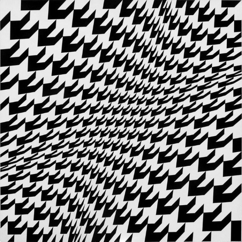 Now onto Franco Grigani at the Estoric. You will almost certainly know his work as he came up with the woolmark logo (above right). He was chair of the committee to decide on it but they were different times. It’s a good logo though. His work is mostly of a similar style. Black and white geometric lines and designs several of which do funny and alarming things to the eyes (above). All impressively designed and eye catching but don’t give you much more than that. I can appreciate the mathematics thing in art but after a few moments of appreciating the idea there is nothing else left for me. 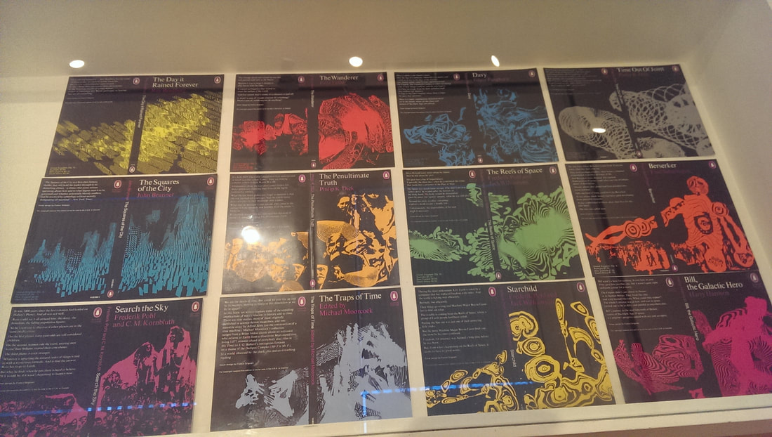 What is the link I here you ask. Well at the Sci-Fi show were several book coves. I was therefore amused to see that Grigani had designed several Sci-Fi book covers all of which I liked (above). They were the best things in the show.
|
Archives
June 2024
Categories |
 RSS Feed