|
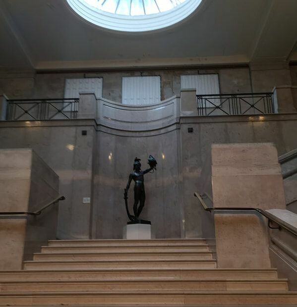
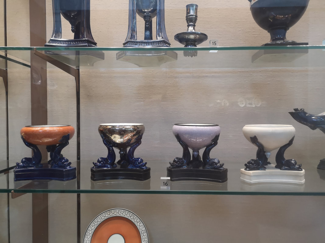
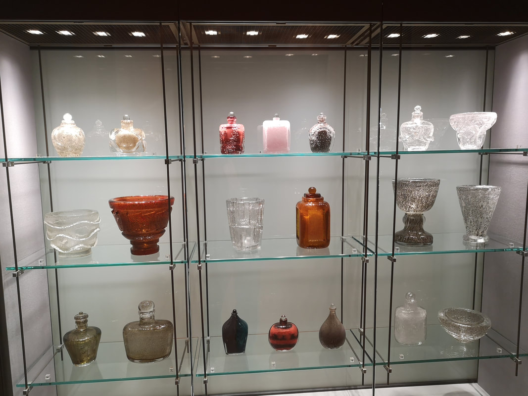
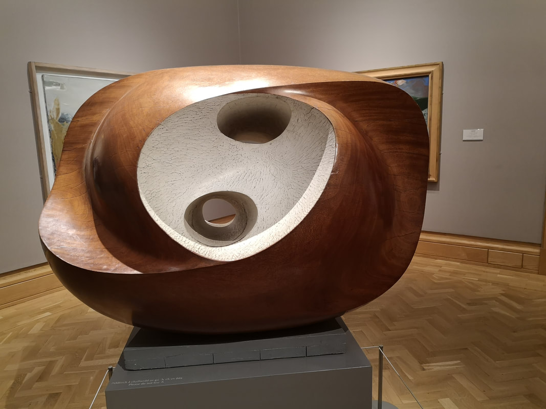
Brace yourself people, this one is going to be a long one, about the surprisingly brilliant National Museum Cardiff. Specifically the art gallery. It is located on the upper floor of the museum (the ground floor is a natural history museum, which unfortunately I didn't have time for). You ascend these quite grand steps (above) to a balcony and then into the gallery. I only had an hour or so, which was a shame, and I deliberately missed out the Leonardo exhibition, I am saving that until it comes to London. Scatted around the gallery, including in a little room of their own are various pottery and glassware. You would be wondering around the picture gallery and suddenly there would be pottery. Including hidden off in a side room was some Asian pottery. I was drawn to this collection of four pastel burners (above left) with the hand like structures rising up and cupping the burner, with the different muted colours. There is also glassware and in particular this vitrine of glass by Maurice Marinot (above right) which are these quite solid quite thick inscribed glasses. They seem very solid and satisfying.
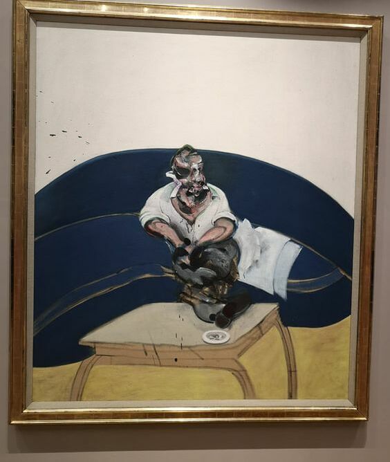
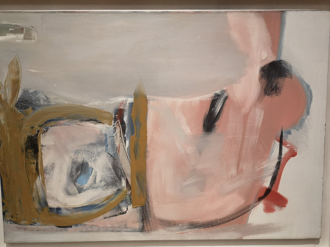
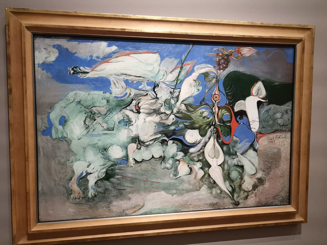
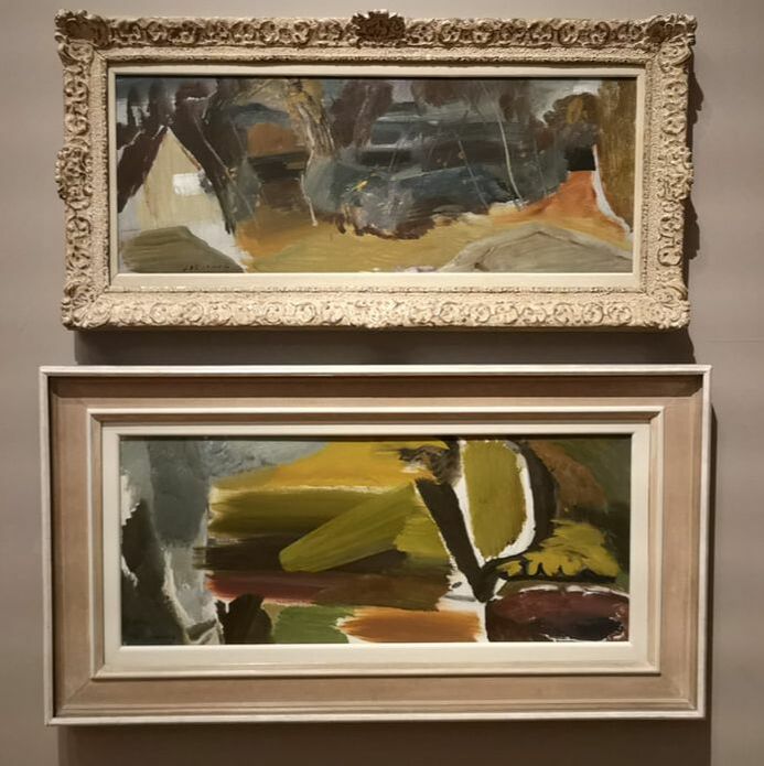
Right next to it, is this large Francis Bacon picture (above right), a self portrait I believe. I have seen another version where the back wall is coloured green like the surface of a snooker table. The white background though makes this very stark, particularly with the t shirt and cushions. Feels like he's in a doctor's surgery or something. Then of course you have this twisted body and face. I like Bacon allot but I could never have it in the house. Philip Lanyon also appears with his characteristic fields of pastel colour, in this case a mainly pink and brown swirling number. One of those pieces that invites you to insert your own conscious onto the picture. Unsurprisingly it being the National Museum Cardiff (the National Museum has several branches such as the Coal Museum and they are scattered around the country) there are a number of welsh artist, some of which were new to me. One of the ones I had heard of but not seen before is Ceri Richards with Cycle of Nature (about right). I see it is as a panoply of armoured knights thundering across the landscape. Lots of energy. Another name who had crossed both my brain and my eyes is Ivor Hitchens (above) who has some similarity to Philip Lanyon in some respects with the fields of colour, but Hitchens is more vegetative. He is also on occasion more figurative as you can see from the top painting which you can see is a cottage with trees. There is a loose and flowing and have a speed about them.
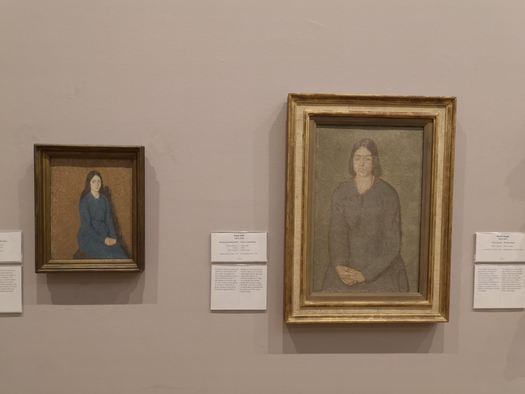
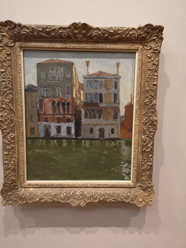
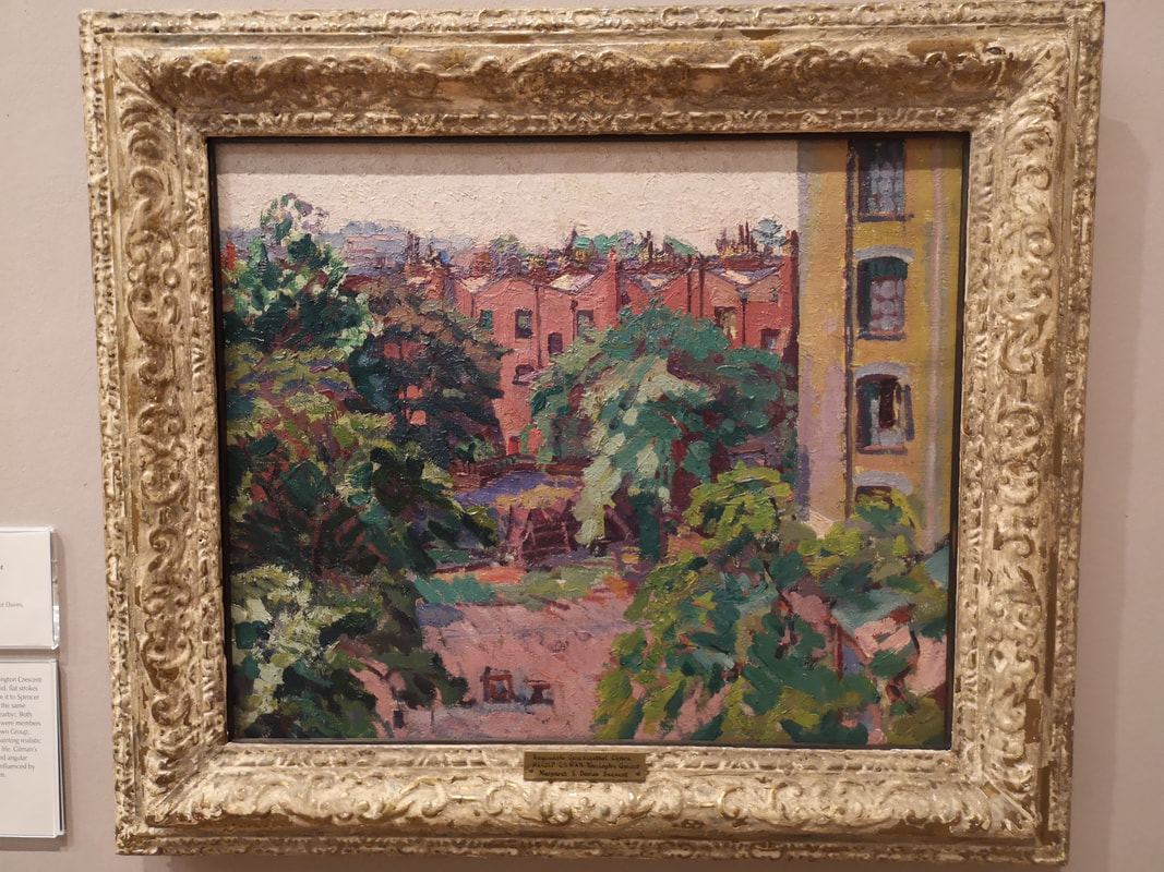
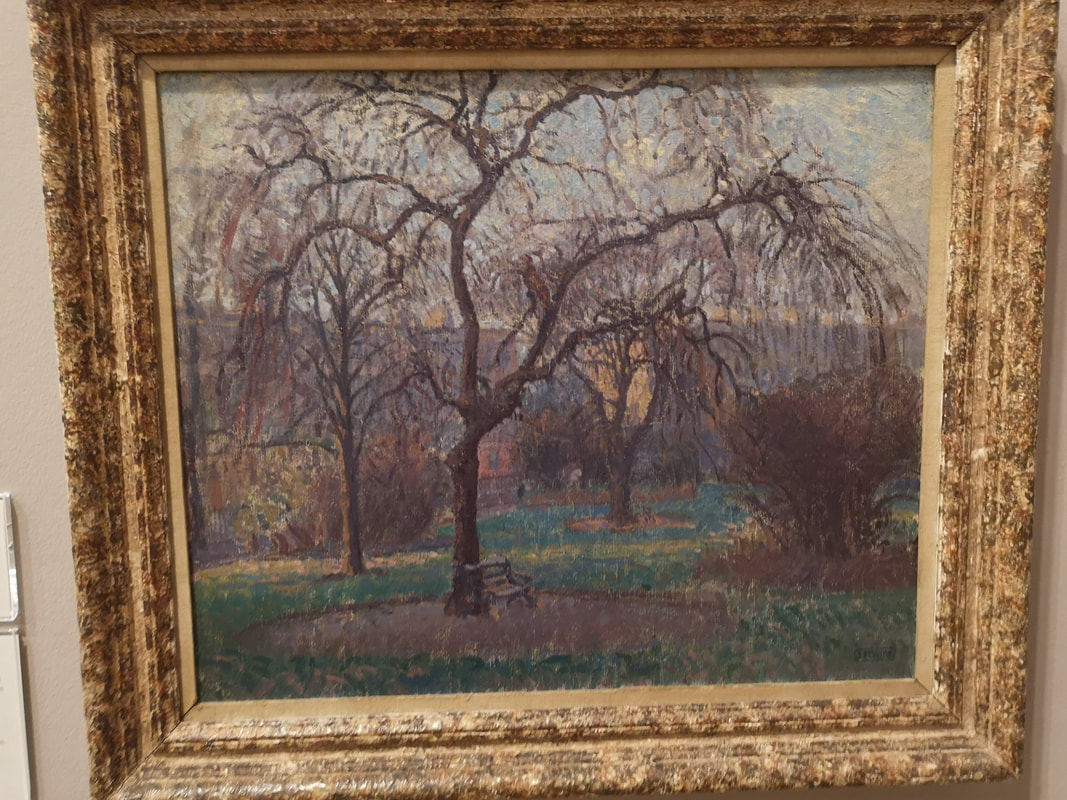
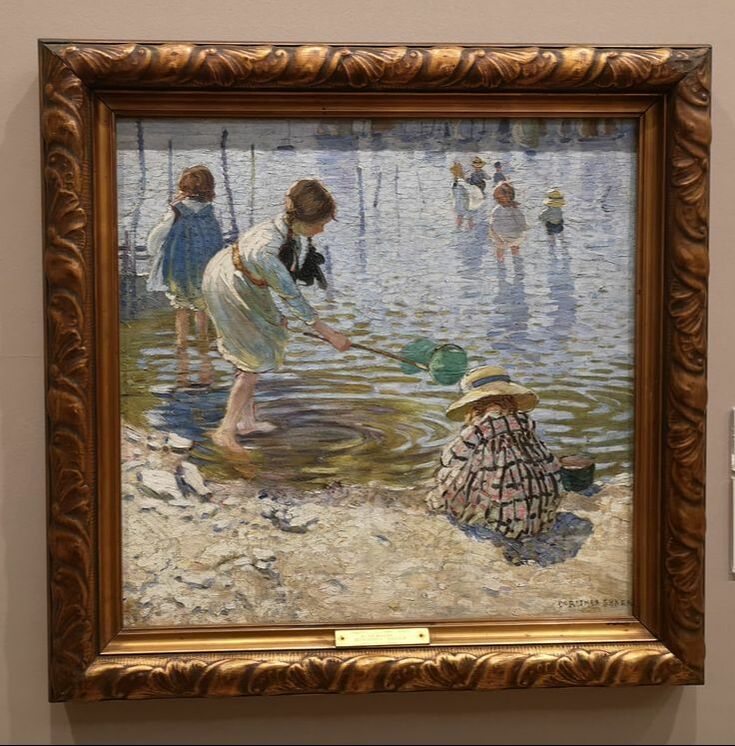
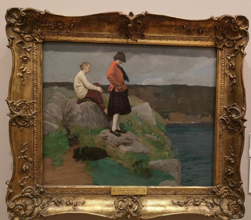
This display is housed in a couple of galleries and starts, at least for me with Walter Sickert (above) who like everyone feels they have to paint Venice. Sometimes I get sick of Venice but I can see why people paint it. I am drawn to canals and buildings. They work well together and you have this allot in Venice after all. Sickert is more muted and his buildings have a battered and dilapidated quality and the water murky and thick. You will get to see here British impressionist painters you don't often see elsewhere, at least not very often. Having said that Harold Gilman (above left) with his painting of Mornington Crescent. These similar red/pink building with this large yellowish building holiding up the side of the building and the trees sitting in front. Spencer Gore (above right) is a name I do know but you don't see him that often. He also paints Mornington Crescent but a very different view. The buildings mainly just colour the background (I wonder if the yellow building you can see through the trees is the same as the tower in Gilman's painting). Gore's painting appeals to me more to me. I like the skeletal tree, and the grass with the shafts of sunshine across the grass. I'm sure they do exist. This painting is nice, has a quality that speaks to you across the room and doesn't come across well in the photograph. Has a nice sense of the place. The gender balance is better in this gallery than most (although of course men still dominate particularly in the more historic section) and there are women artists (life for example Gwen John) that you don't often see. Above right is Dorothea Sharp with At the Seaside. It is a delightful piece, very intimate with a good sense of place and time. The clothing has been very well done. As has the water texture and I particularly like the circles emanating from the main girls feet. I'm a big fan of Laura Knight (above). Her self portrait in the National Portrait Gallery is one of my favourite paintings. It is also one of the sexiest paintings you are likely to see. Go and have a look and you will see what I mean. Again you don't often see her elsewhere so it was nice to see her work. I particularly like the dog and the textures on the rocks.
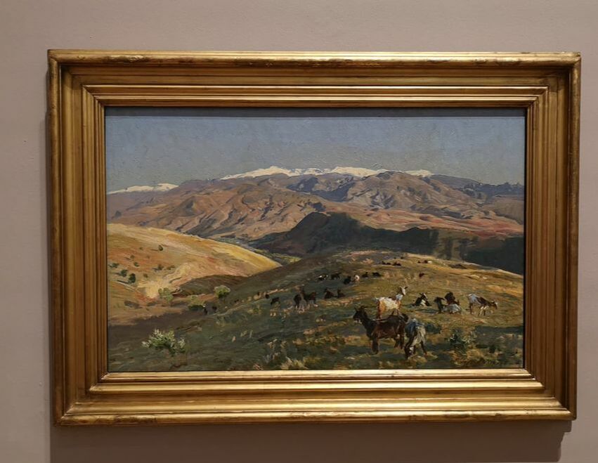
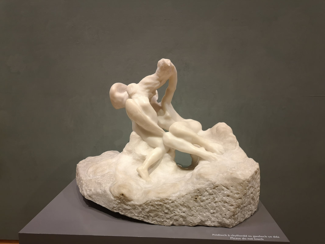
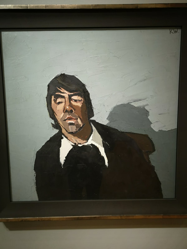
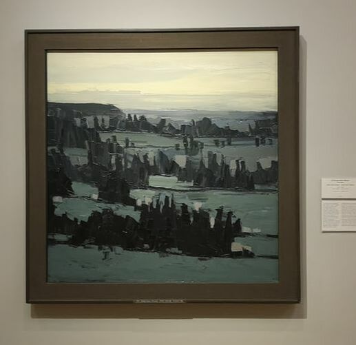
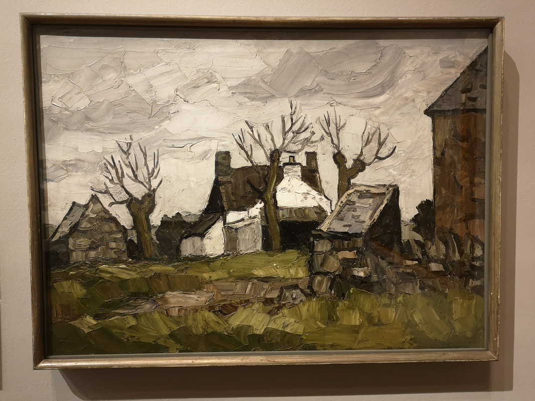
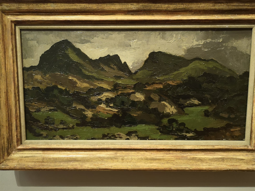
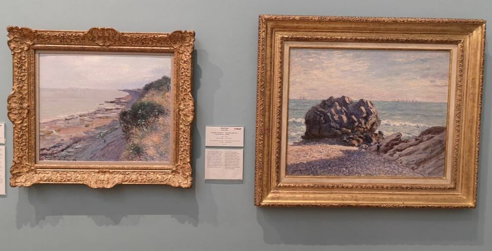
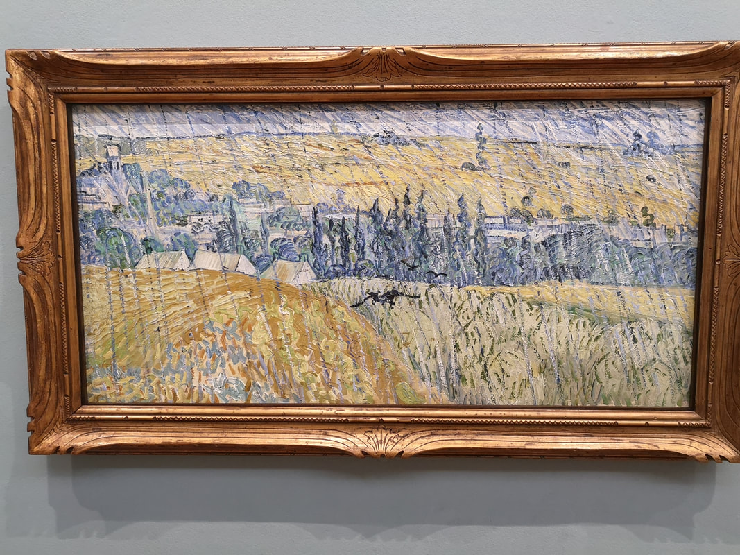
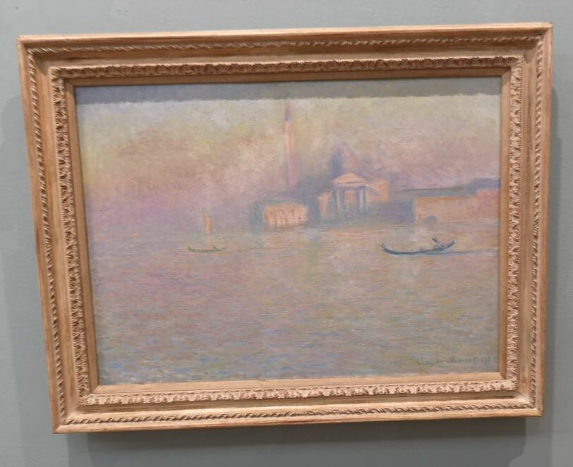
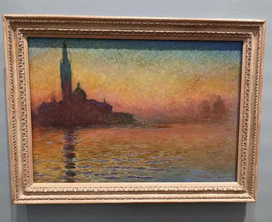
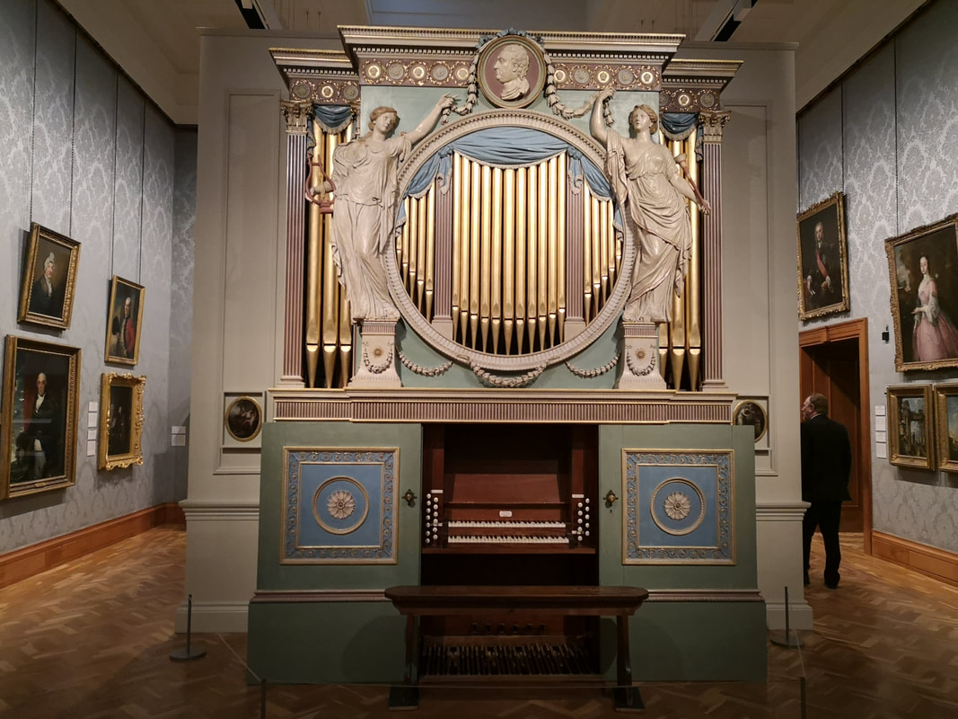
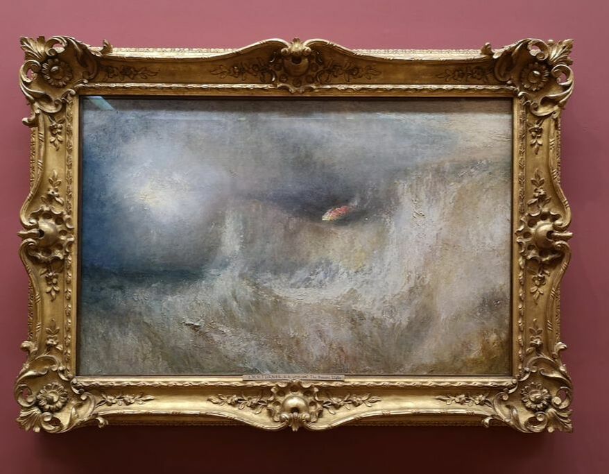
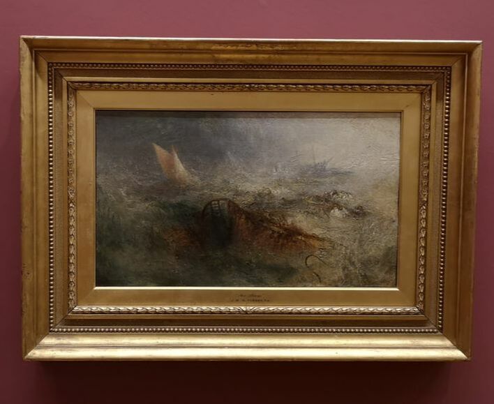
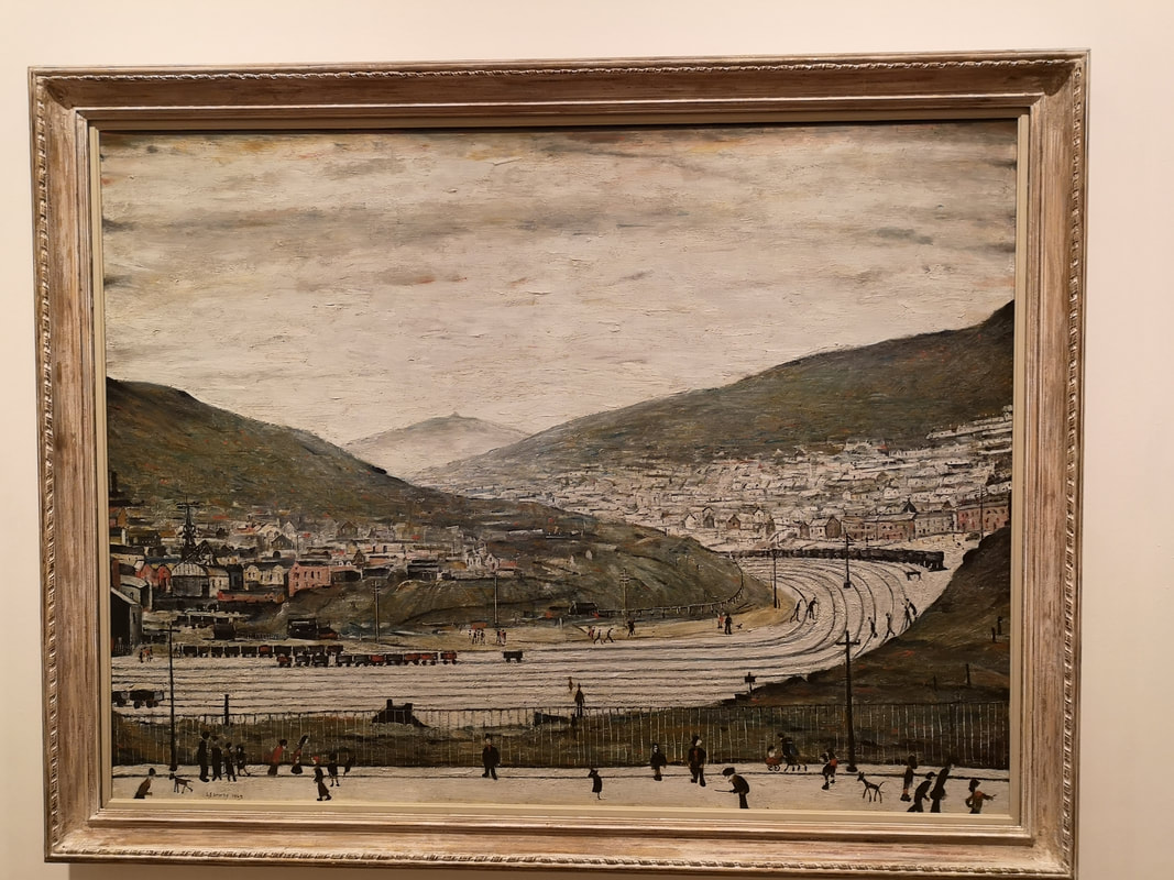
It is his landscapes though that I very much enjoy. It is not easy to see from these photographs but he paints in these large slabs of paint. He manages somehow to give the paint this oily sheen that makes the paint look wet and glow slightly. Given how damp Wales is it gives the landscape a wintery storm drenched look. The painting above right is a good example. This technique is perfectly pitched to rendering the Welsh landscape. The way he uses this to make the building especially the shacks is particularly effective (above left) but it can also be turned to depict the rocky sides of Welsh mountains (above right). Earth tones is what we are seeing here and I like it. Onto the Impressionist proper and we open with two Alfred Sisley. They are both of the Welsh coast (at least I think so) with that lovely impressionist purple flecked sea and sky. I particularly like the gnarly bulbous rock on the right hand painting with its shadow and flecks of light. They set the scene for the room. And then Boom! Van Gogh (above) and a Van Gogh I had never seen before anywhere. I have also never seen a Van Gog where it is raining before. The strikes slanting down the painting make a very impressive rain effect, you feel wet and cold just looking at it. Compositionaly the division of yellow field on the left, green on the right with this line leading to the blue and green trees. The inclusion of the crow in the middle is a stroke of genius. More muted than his usual work and interesting for that. Monet, there are at about 5 of them, hanging there in there glorious colours. My two favourites are of course of Venice (although there is one of London) one in the soft pastel murkiness that Monet as famous for, contrasted with this much more bold and striking piece with its burnt oranges and blue. I particularly like the purple and moave horizon. There are more impressionist on display including others like Pissaro. I like Pissaro. I left the room and was admiring this enormous organ (above) when the man you can just see wandering off round the corner informed me that the gallery was closing and 15 minutes and perhaps sir would like to see the Turners that we have. Sir would like to. And so sir did so and very impressive they were too. All glorious swirling stormy seas and sky, crashing boats and in the one on the right a burning beacon. I of course like this very much. I won't show them all go and see them. In the same gallery was a fine Rossetti. The final gallery I went round was dedicated to Welsh Landscapes. There was a number of fine pieces and again a surprising his in a Lowry (above left). It is called SIx Bells, Abertillery south Wales with his leaning stick figures scampering around, and across the railway lines!
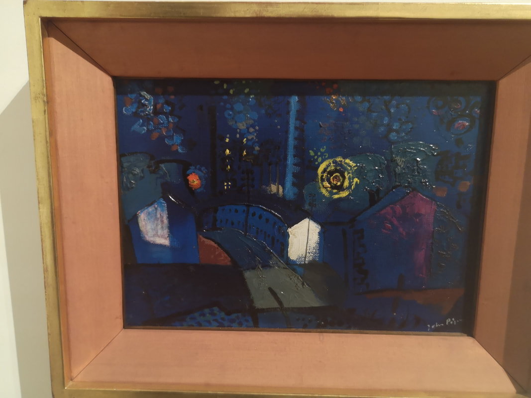
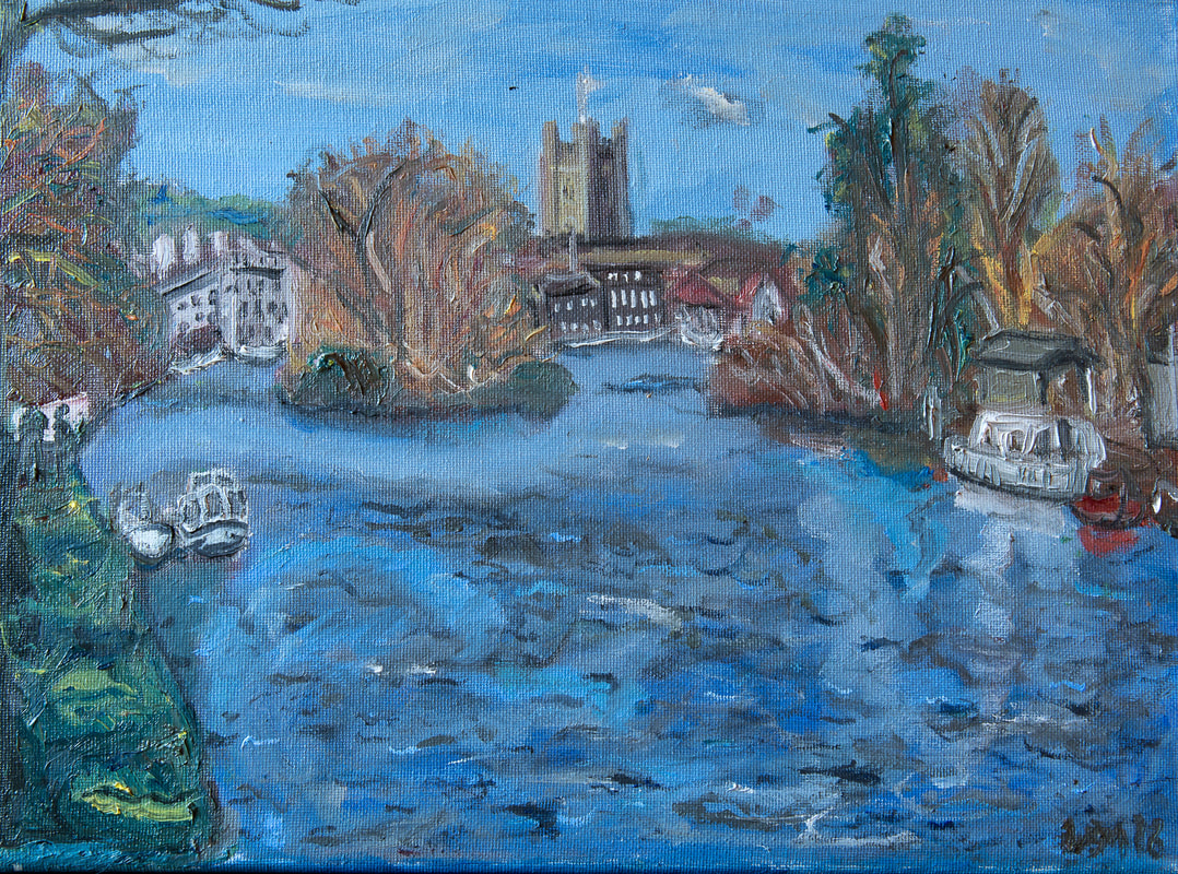
The other picture I really liked was by a name I hadn't heard before, called John Piper with Ebbw Vale at Night with these lovely blues and greens and this strange segmented yellow sun. I really like it. Other people on display include Graham Southerland and Ceri Richards. And I shall leave you with a self serving announcement. I have another show coming up: ‘Upstream and Downstream’ The Old Fire Station Gallery, Henley-on-Thames, 52 Market Pl, Henley-on-Thames RG9 2AG 9.30am to 6pm: Daily from Thursday 18th to Tuesday 23rd April 2019- Easter Weekend. Come if you can.
0 Comments
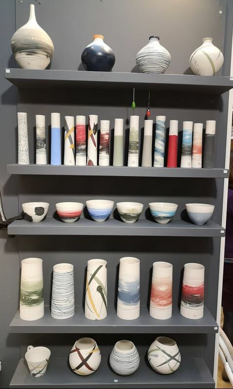
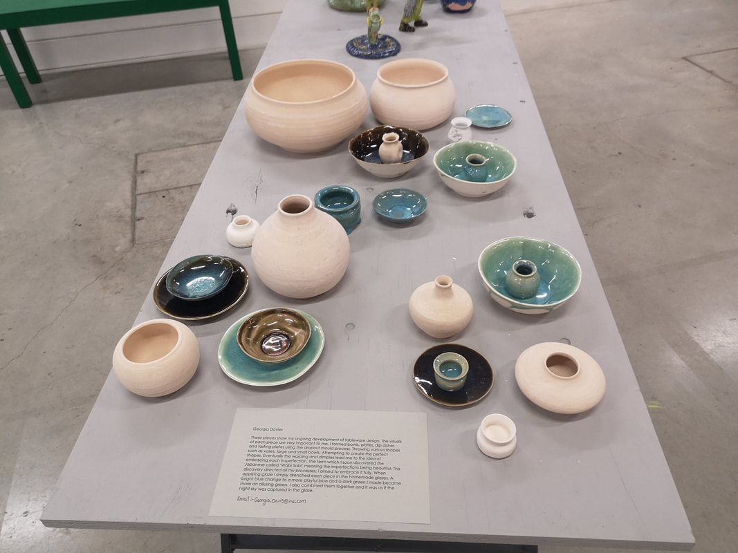
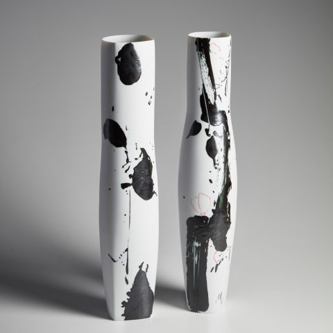
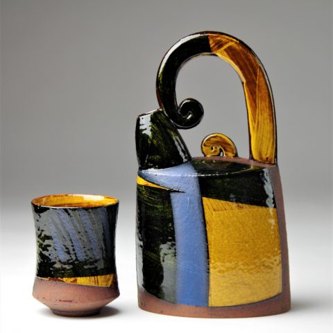
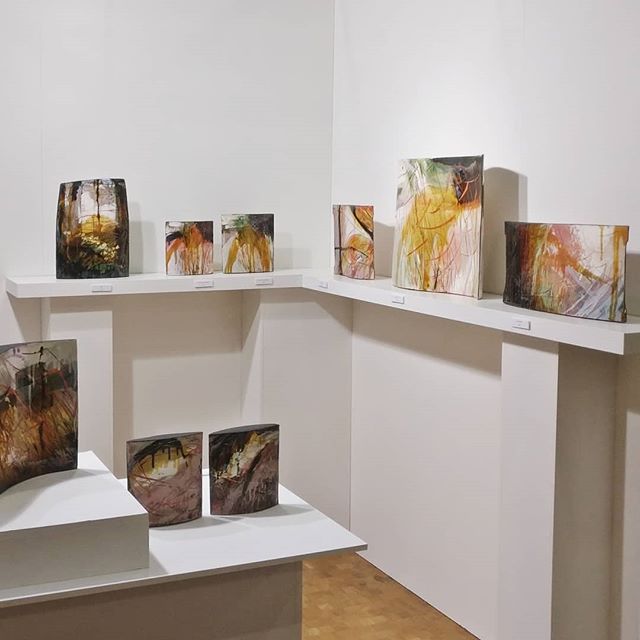
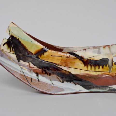
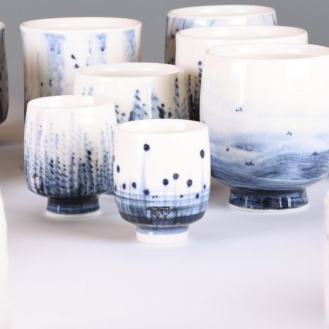
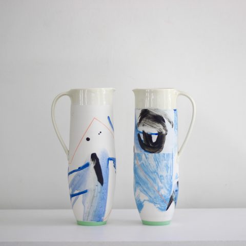
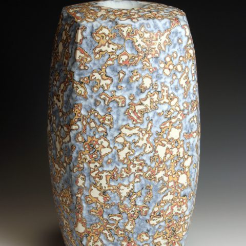
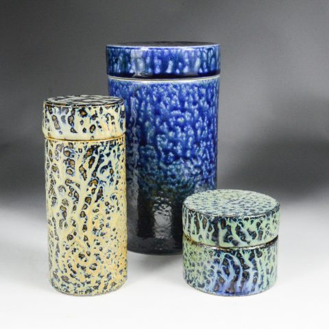
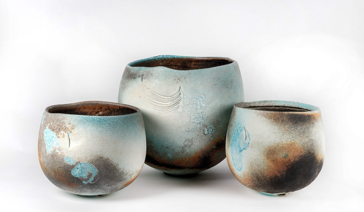
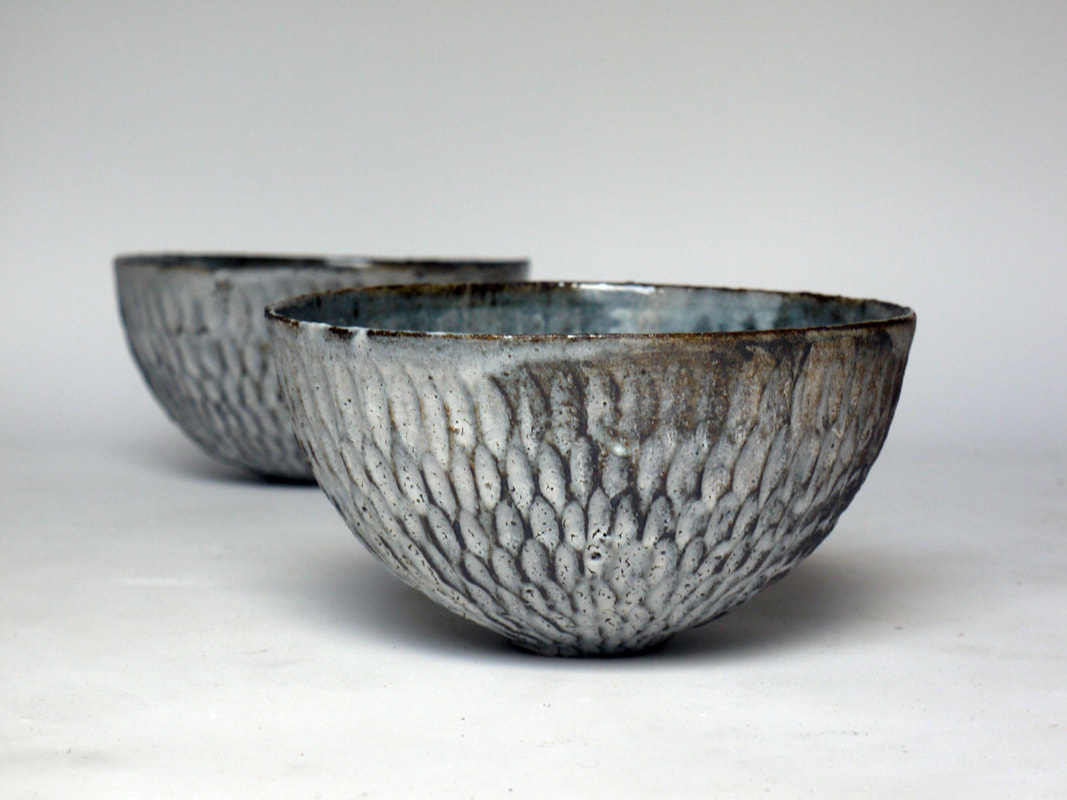
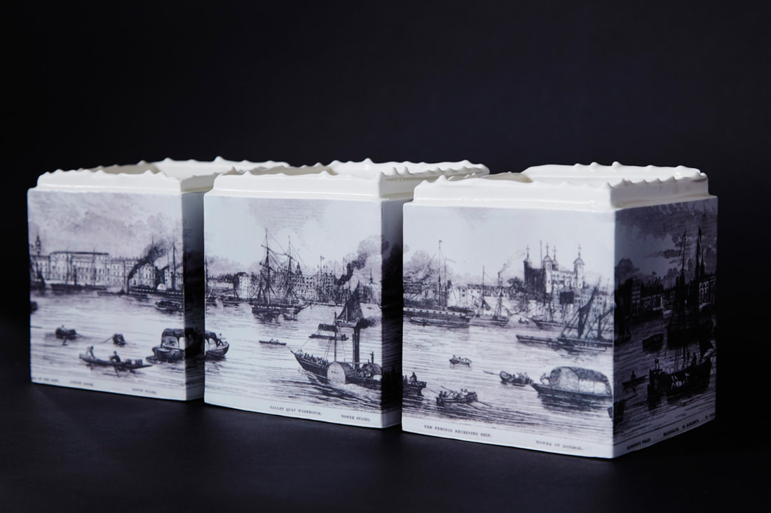
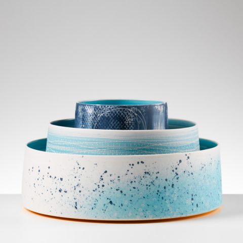
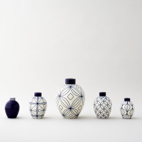
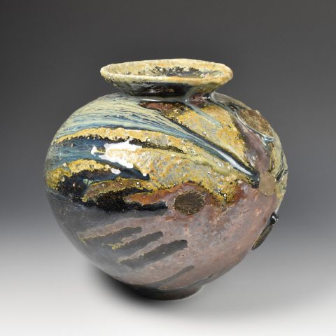
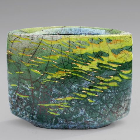
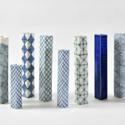
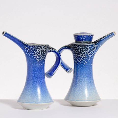
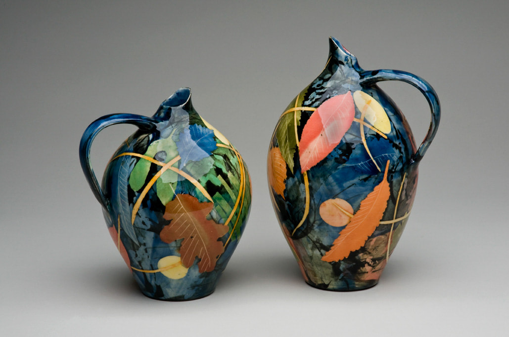
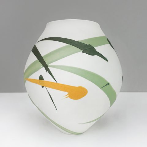
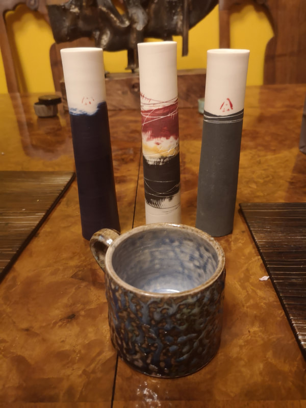
Over the weekend 22nd - 24th March at Central St Martins in Kings Cross (what I still think of as the new development but has been there at least 6 years now) has been the rather fabulous Ceramic Art London. So of course I went and of course I bought thing. In this blog I have gathered together the people I liked. The photos, where they are any good I got from the Ceramic Art London website. Those that are rubbish I took myself. There were various activities and lectures and if you timed your visit right, which of course I did not, you could observe various kiln firings. If not there is still all the exhibitors to see, of which there were 80. Actually there were slightly more than that because off the main concourse in a side room was what they had charmingly termed "Future Masters". These were students in their final year of the ceramics degree. There were I think about 8 of them but the one I liked the most and was instantly drawn to were by Georgia Davis (above). The pink ones are presumably bisque fired (that means have been fired once, ready for glazing and the final firing). Davis has some nice shapes going on there but it is the lustre on the finished products I really like. There are 2 elements that particularly appeal to me and that is the blue tones in the small bowl sitting on top of the plate on the left, and the turquoise veins on the bowl on the right. Davis might indeed be a future master and it was only a shame that none of her work is for sale. I will try to remember to go the degree show later and the year and maybe they will be then. Back to, as it where the main event. There were lots of high quality things on display. Some of it was well done and well executed but not to my taste for various reasons. This is a personal take and so I have included things here that appealed to me or caught my eye for some reason. To begin with we have some long vases that look like legs of Dalmatians who have been let out in the rain before their spots have dried (above left). It is fact the work of Karin Bablok. I like both the dripping black patterning, slightly Rosharc test like and the tapered shape with the squared mouth. Next to this we have the work of Richard Phethean (above right) has a colour scheme that works very well, this combination of black, blue, yellow and pink. It is the pink that works well, sitting there as a back ground on which the other colours sit. I also like the curling ends to the teapot, a feature that occurs on other pieces as well. One of the stars of the show was Kristy Macrae (above left and right). Her work is sculpture, paintings on ceramics, rather than functional objects but they are glorious. I was very drawn to them but she was having a good show and my favourite pieces (the large one at the back on the left, and the one nearest one on the right), had already been sold. The stripes and streaks of black, yellow, pink on a background of white and grey. The more successful ones suggest figurative elements, flowers and trees, that kind of thing. I shall keep an eye on Macrae. Another stand out for me and who made my nearly bought list is the augustly titled Richard St John Heeley (above left). Indeed he might have made a sale if his stand wasn't abandoned for such a long period. It has a Japanese feeling. The ones that most appeal to me are of the type you can see in the picture. These subtle blue shades on white. The darker blues really hit. Adam Frew (above right) makes slim jugs with soft blue scrubbing on the surface. The light green base sets it off well and the geometric lines particularly the red right angle on the left. Peter Beard (above left) produces very finely wrought, beautiful quite delicate pieces, with this bubbled patterned surfaces. They are very nice but expensive. He has these fluted vases which were among my favourite. Another start, and in fact someone who made my buy list is Daniel Boyle (above right). The patternation is produced by a salt glaze apparently. The containers that you see here are very nice and tactile and there was a piece of stacked containers that appealed to me greatly. Deep blue really works for me. I went away with a lovely mug. Jack Doherty's (above) work is like washed stone, or burnished if you will. The combinations of black and orange that orbits the bottom of two of the pots set up the piece well. The variation of the surfaces make each piece individual as does the scratches indentation, those feathery marks in the middle piece for example, and the bumps and lumps make them stand out. Akiko Hirai was the one of only two people in the show that I had seen before. Indeed I have a small beautifully turquoise blue interior (that I brought from her at a studio sale), which is what is inside the bowls that are picture here (above left). I do have a preference for abstract decoration on my pottery but every so often figurative works do catch my eye. One example of this is the work of Raewyn Harrison (above right). I like the way they work as set and the square serrated tops. An oldy timey scene of ships in a busy port (is it London) fits the general ascetic. Reminds me of Turner. Nested! A smart way to display your wares, particularly if they match or grade in colour i the way Juliet MacLeod does (above right). There is more detail to each one than you might expect, you can just about make out the hatching on the centre piece in the photo. If you want to really spoil your dog maybe get them a large one to sup out of. Of course you really do want to get a set and they certainly benefit from the cheerleader effect. Rhian Malin produces mainly vases, both cylindrical and more bulbous like the ones depicted above right. It is these bulbous ones that I prefer particulars where you have the contrast between the blue caps and white body. It is also very clever how the line colour change your perception of the whole piece, so for example the ones with the red lines have a very different feel and look to the blue ones. I like also the way the lines take you round the piece. More substantial and earthy and scored with claw like slashes is the work of Matthew Blakely (above left). Firm and solid, with drip like decorations and smudges that are reminiscent of paleolithic hand prints. The vases feel like they have been unearthed from an ancient archaeological site. Another stand out artists for me is Martin Mindermann (above right), and made my almost bought list, and indeed might have gone further if the budget hadn't been spent elsewhere. They have a luminescent quality, often gold flecked, or with gold plated interiors. My favourite of these are like the one depicted above have an undersea feeling, like waving seaweeds. Very nice. Maybe at some point in the future. Blues in this segment. Starting with the small square vases by Miju Kurihara (above left, although not all blue). They are simple almost stark object and where they are decorated with repeating geometric shapes. An example where simplicity works well, and again they work well in a set. Arabic styled are the sweeping curved crescented blue pieces. Sometimes they can be a bit spikey but I prefer the more curved elements, even if they are quite sharply curved. The rising darkening blue emphasises the shapes of the pieces. I knew when I walked by Alison Thomson's stand (top of the blog and above right). Simple, plain shape, decorated either with blurred edged fields of colours or simple brush strokes of colour across the pieces. They look better I think against the grey background in which she displayed them. After strolling around the fair I returned, and after much erring and an interesting discussion with the lady herself, I came away with three small slim vases (below), which are my favourite of her works. I also as you can see got myself a small Daniel Boyle cup. I shall leave it there. There were many fine people there who I haven't mentioned. In the event that you are reading this on 24th and still have time then I recommend going along. There are other events going on as I mentioned.
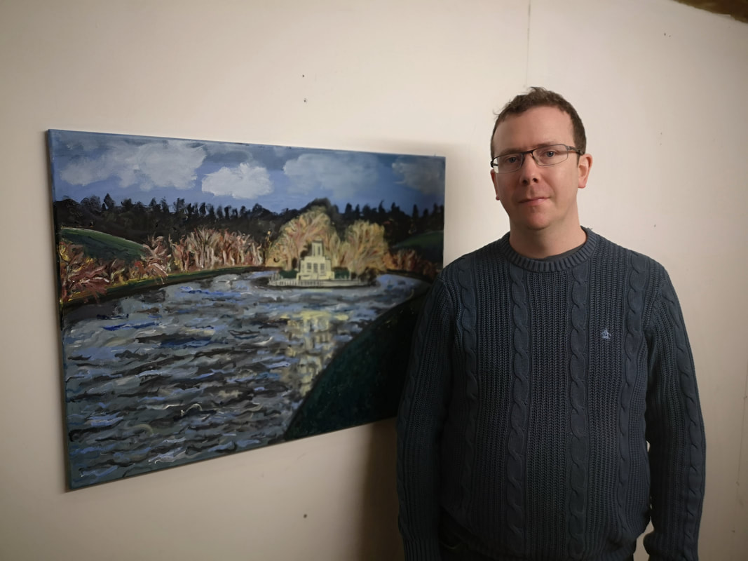
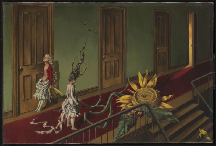
Also if you are interested in seeing a chubby middle-aged white man and his art come and see my show ‘Upstream and Downstream’ The Old Fire Station Gallery, Henley-on-Thames, 52 Market Pl, Henley-on-Thames RG9 2AG 9.30am to 6pm: Daily from Thursday 18th to Tuesday 23rd April 2019- I like Dorothea Tanning, as does my wife. The sunflower (above) is one of her favourite pictures, one that we have both admired in the permanent connection in the Tate along we went to the Tanning show at the Tate Modern. We were not disappointed. Its a great picture, with the weird skinny elfin figures and the enormous sunflower. The picture itself is quite small, but still packs a punch.
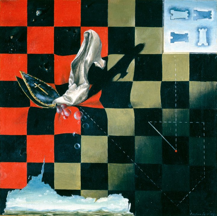
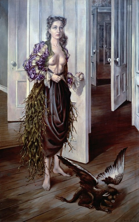
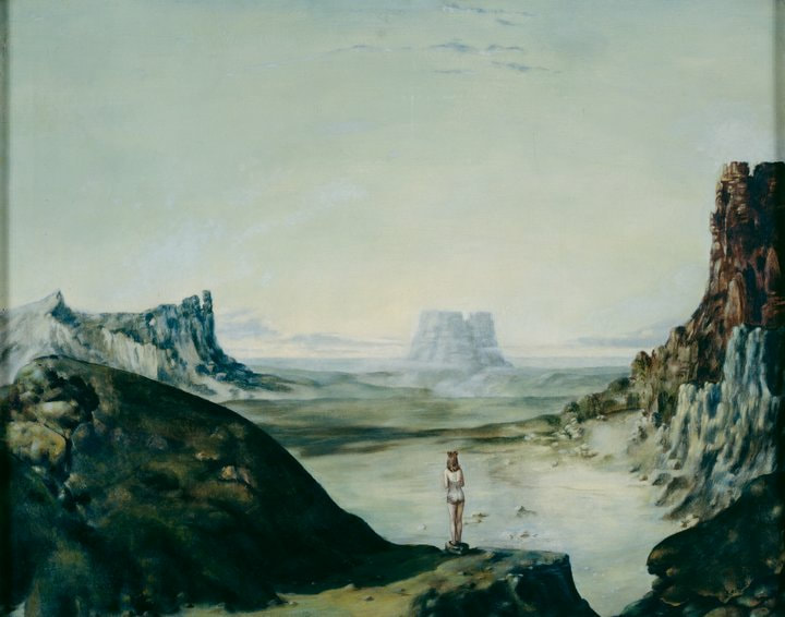
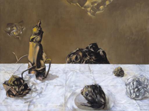
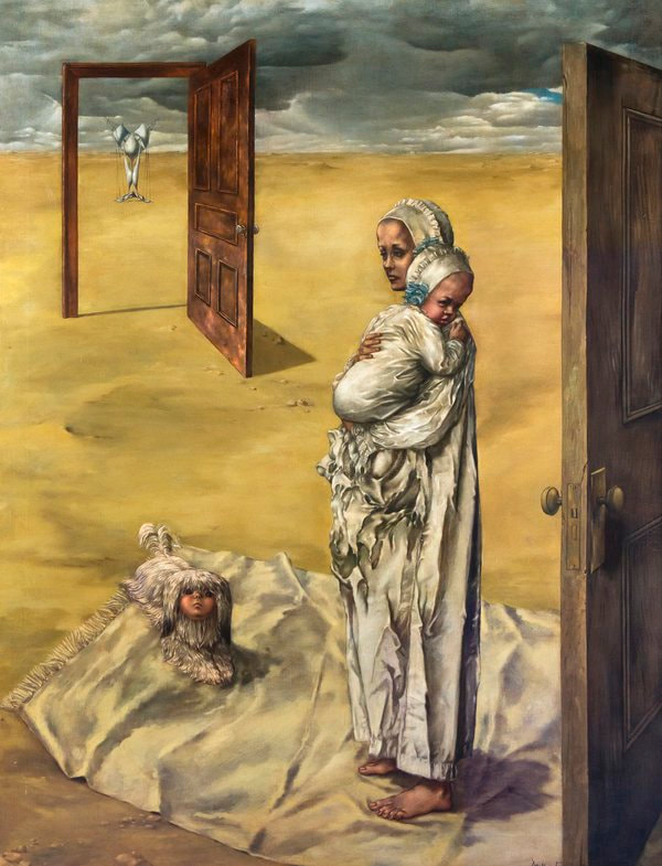
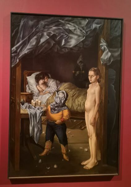
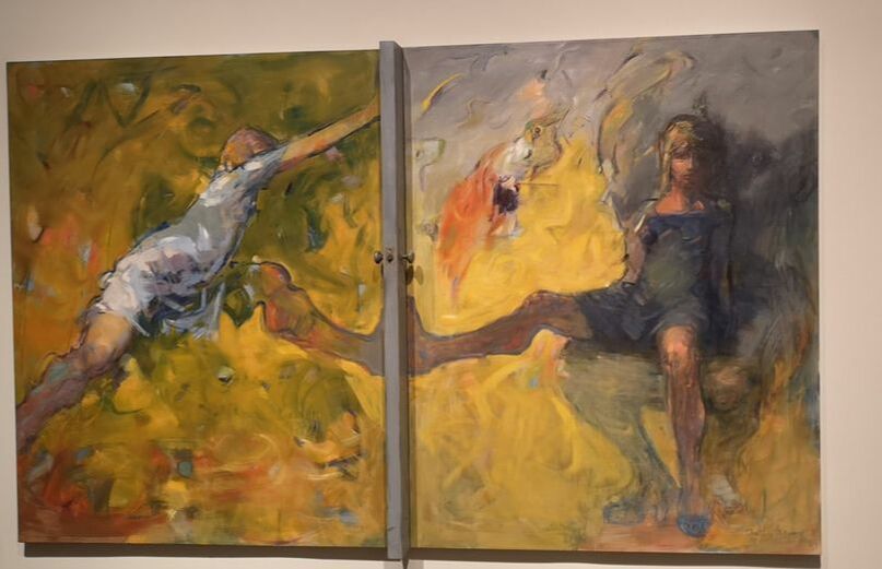
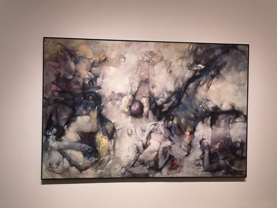
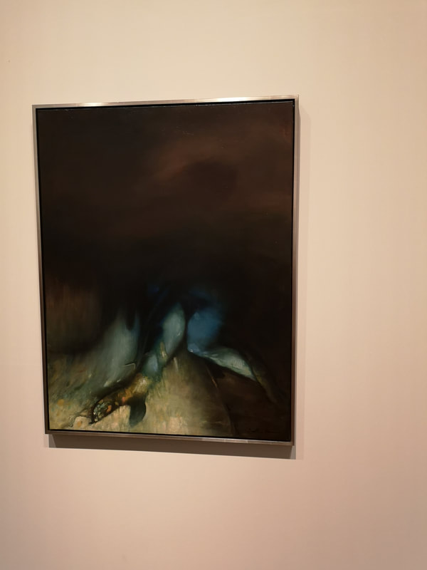
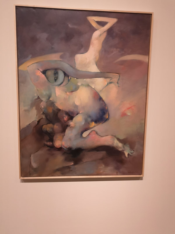
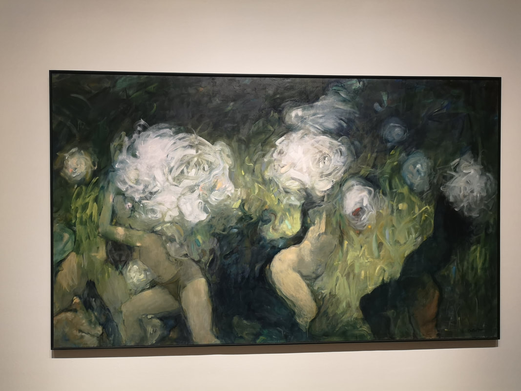
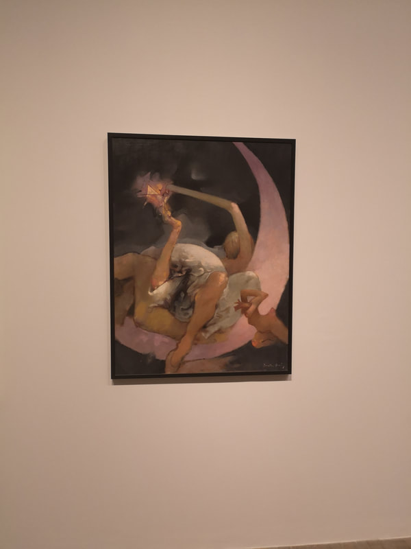
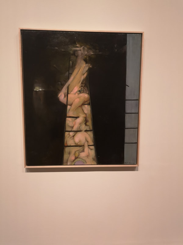
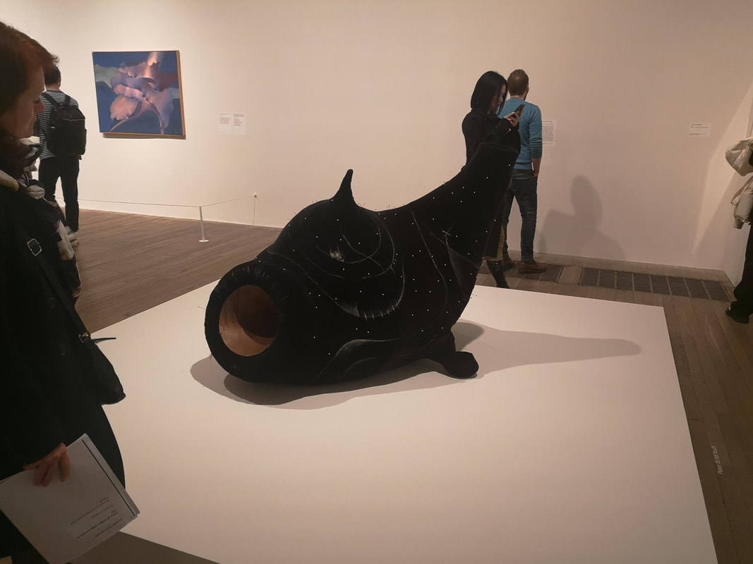
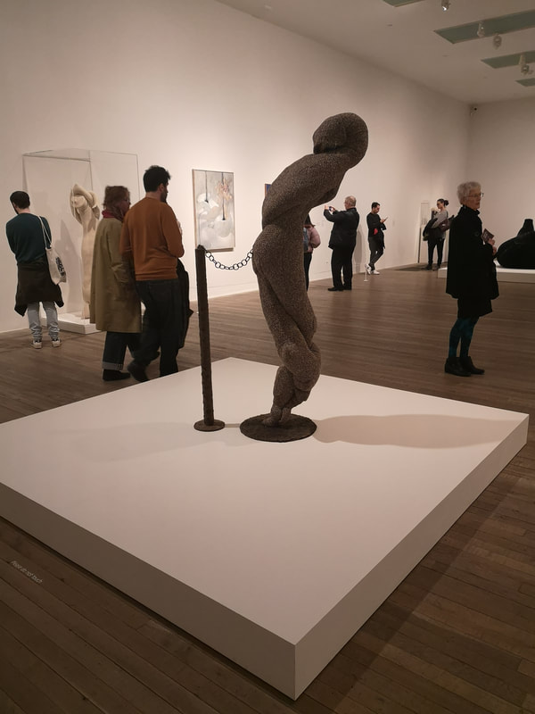
The best surrealist painting packs a strong visual image and also reminds you and feels like a dream. Birthday (above right) was one of my favourite paintings in the whole show. This is a self portrait of Tanning and although she is bare breasted it is not a sexual image but exudes strength, with the signature foliage draping down her back. This painting really spoke to me. I have had dreams in which I am confronted by a myriad of doors. Tanning too by the look of it. Also the small flying creature has more than a striking resemblance to my cat. Not only does it strike all these cords but the technical ability on display is fairly astounding. I like this painting very much. The almost photorealistic dreamscape (if that isn't too much of a contradiction) continue for the first couple of rooms. I shall not show them all here but the Philosophers is worth looking out for. Tanning (or versions of her) feature in a number of them. So for instance you have these self portrait (above left) of this lonely figure in what appears to be nigh attire looking out a landscape that reminds me of Yellowstone national park. The misty lake floor and the hazy horizon make it a lonely place. I like the contrast between the grey and brown rocks. Twists on a classic theme is something that happens in art a lot with varying degrees of success. Tanning pulls it of rather well with her take on a still life (above right) where all the flowers are dead and you have this odd and disturbing insect thing sitting on the table. I love the detail of the table cloth with its bumps and creases lovingly depicted. I also like the dead black rose rising above the rear of the table. Doors. There are frequent doors in Tanning's paintings. Maternity is a theme she explored both in odd fabric sculptures (of which more later) but also in paintings in which a stunning example is above left. The construction is in some ways quite simple, figures, doors, sand and sky. Of course that is irritatingly reductive. Like her other paintings it brings about this odd sense of deja-vu, like you have experienced something strikingly similar. In the background, through the rear door is this assemblage of items looking like female undergarments. Then you have this trio of figures, the barefoot woman holding a baby and then this dog, with a human face (the dog appears in various paintings also). What particularly struck me is the ripped, almost ghoulish shroud-like feel to the woman's clothing. Its almost like the baby has ripped through it you know, like that scene in Alien. Probably the high point of disturbing, more nightmarish than dreamlike is the Guest Bedroom (above right). Again beautifully rendered. There is allot going on here, the person in bed with their arm around a manikin, the naked elfin girl, the horrific dwarfish figure, their head obscured by what looks like a gas mask covering their head, then this looming death like apparition in the shadows in the background. It is somewhat striking. She is good a fabric is Tanning and shows this off with black, grey and beige coverings. I imagine there are reams written about the meanings in this painting. I prefer just to look at it and wonder. Tanning lived for a long time. She die age 101. Later in her career she moved away from the realistic style to a more swirling and abstract style. The first one of these to great you is this flame coloured number (above left). It is very large and the central door is in fact a piece of wood, stuck to the middle of the canvas. The swirling yellow and orange is very eye catching and gives a dynamism to the piece. The message appears to be left is trying to get in and right is trying to keep her out. The style is so different it would not be difficult to believe it was by a completely different artists. To be honest I prefer the realist style but these more swirling pieces have something to offer. Much more hellish is this swirling grey number (above right). Figures emerge from the mists including the dog previously mentioned and various odd people. It is one of those paintings where the more you look at it the more things and people you see. You still get in these later works that same quality of reminiscent and dreams one has had. One of my favourite of these works is the one above left. Most of the painting is nearly black with swirls of misty red. Then emerging from the darkness is the zombie like hand scrapping the floor. The arm changes from vague to photorealistic. The blues and greens of the limb appeal to me. Very different in tone at least but still recognisably the same tone is a sort of legs and eye combo. The eye seems to be one of a cat. Seems to be a number of sensual female forms. This becomes a trope of Tanning's later work, there is quite allot that is vaginal, occasionally quite explicitly so. At the end of the last room is a large predominately green painting. Naked figures cavorting (are they cavorting) with their faces obscured by these swirling lights or possibly flower heads. The deep green colours greatly appeals to me and gives the impression that you are looking down into a pool, to see the nymphs therein among the reeds. The exhibition was slightly oddly laid out in that in the Tate you usually enter one door, and through the various rooms, and out of the different. This time the last room was showing a tedious art film which I did not watch and so to escape you had to go back through the exhibition. I didn't mind this because I nearly always do this anyway. On my way out I looked at these well nearly pornographic entwined naked figures. I prefer the one on the right where there is the keyhole shape. The black lines striking up and across the scene lift it for me. They are a strong addition.
The other figure I really liked is a, well it's a figure. It is made of intertwining fabrics forming this hunched sad, monkish figure, chained to a pole. It is spooky and quite moving but a bit at odds with the rest of the show, which I found mostly joyful and uplifting, in you know quite a disturbing way.
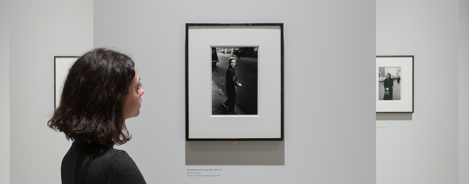
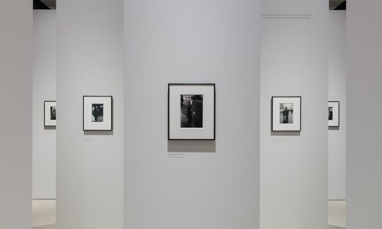
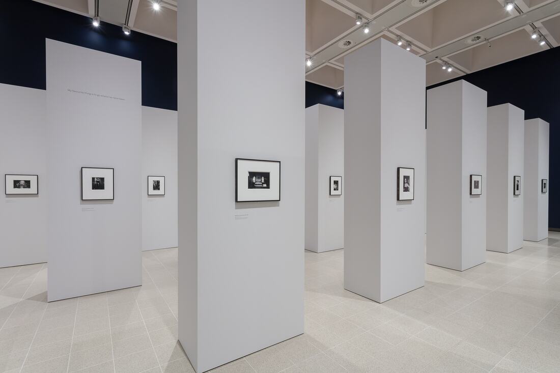
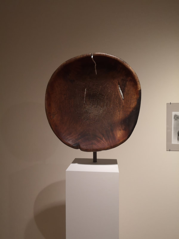
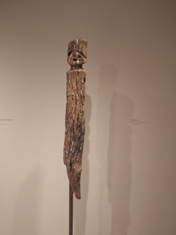
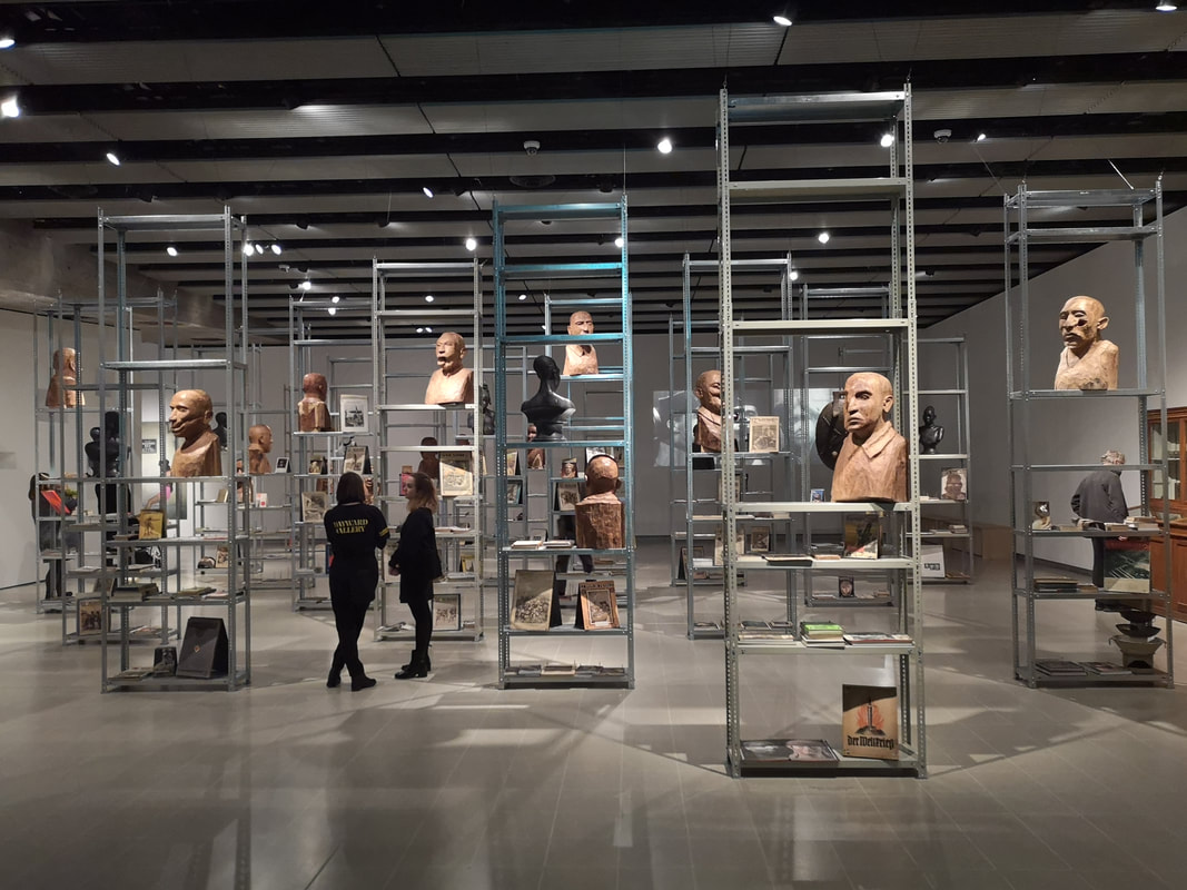
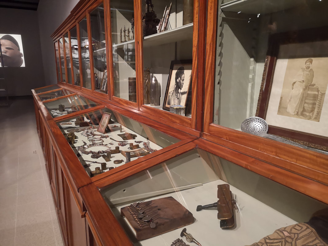
At the Hayward Gallery at the moment (from whose website all the photos of photos are pinched, like the one above, but its reviewing so I think its probably fine) are two shows, Diane Arbus: In the Beginning and Kader Attia: The Museum of Emotion. I shall start with the first which frankly I prefer. It is indeed very good. You have until 6th May (for both I think) but I certainly recommend Arbus, especially if you are a photography fan. The photographs are all black and white from the 50s and 60s, and all from New York and New Jersey. Arbus has a thing from performer, particularly circus performers and what are charmingly called female impersonators. The gentleman above, who is the poster image for the show is a prime example. He goes by the superb moniker of Mr Dracula. Arbus uses black and white very well, particularly a strong light contrast. So most of the photos have a similar trick of the centre figure lit but with darkness particularly in the lower right and right of the image, so you get these figures emerging from the gloom. It is difficult to adequately explain. Just go and see it. The show has been curated. In the two galleries that this show occupies these pillars have been erected and as you can see above each picture placed on its own pillar. Actually you get two on a pillar, one on each side. This is a very good idea, and gives each picture its own its own space. Congratulations to whoever thought these up. The pillars are also different sizes depending on whether the photo are landscape or portrait. The photos themselves are very personal and individual capturing the character and feel of the individual in a way that photography doesn't quite often do. So you get drag queens in their dressing room, people in their living rooms, on the street. One of my favourites was simply called "Girl on the street looking up". That is what you get but there is a loving humanity too them. Conjours up a place and a time very strongly. Photography often leaves me called, as they often for me a least, lack an emotional punch. There is no place to put yourself in the picture. These though allow you in somehow. Very strong. On now to Attia;s exhibition which as the name suggests "The Museum of Emotion" is basically a fake museum. Some of the individual pieces I quite liked. For example a sort of flattened wooden bowl, with slashes of silver (above left), and a sort of daggery statuey figure, again flecked with silver. They were my strongest things in her show. She really goes for the theme in the main room, with large metal shelving displaying distorted wooden carvings of various figures and on each shelves various political pamphlets. Along one wall wooden cabinets with various things made from or depicting ammunition or weapons (above right). I always thought that doing an exhibition like this of a fake museum, or fake archaeological finds would be a good and interesting idea. Damien Hurst thought the same, he did it at Venice at the last Biennial. Having seen it though it has surface interest. Some of the individual pieces are very well conceived and interesting, and the message of colonial exploitation is a worthy one. Frankly though I found myself wishing that I was seeing an actual display in the V&A or the British Museum. The concept is not enough, I'm afraid, to sustain the experience.
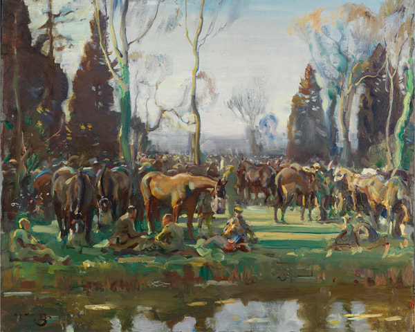
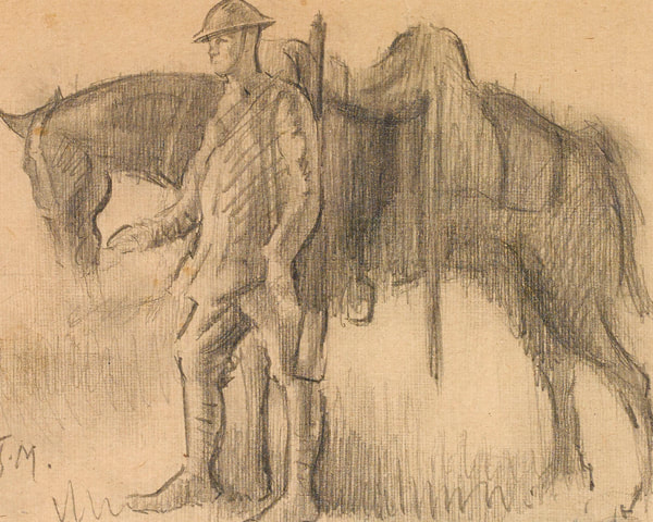
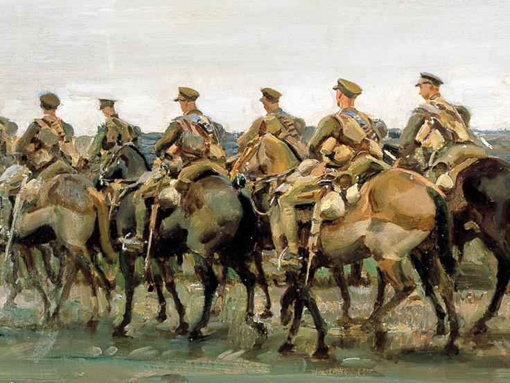
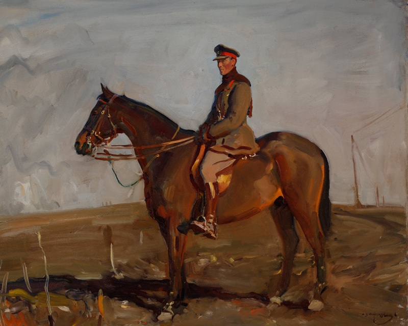
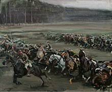
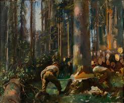
The ticket gets you in for both shows so you might as well go round it. Maybe you will disagree with me. Unless you've already been to the Alfred Munnings show at the National Army Museum because it finishes on the 3rd March. So you might get there if your quick. My father is obsessed with military history and in fact has a his own website celebrating this called British Battles. Occasionally his interest in military matters and mine in art coincide as they did on this occasion, so I summoned him up to London, and along we went. It was in fact rather good. Munnings' thing is horses. He is really really good at horses. So his career as a war artists focuses very strongly on these creatures. He has an impressionistic style with a muted pallet, that reminds me of camouflage as you can see from the picture above of a cavalry brigade pausing by a stream. He has this very effective way of highlighting parts of the horse using green paint. Most of the paintings on display feature horses. One of Munnings' common tricks is to have at least one of the horses looking out at you, which puts you exactly in the place of the artist and you can imagine yourself sitting there in France, in 1918 (which is when most of the paintings were done) with these war horses peering curiously at you. All different hues of horses but also different breeds with these much bigger, denser animals pulling artillery and supplies. He is much less effective when his pictures are just landscapes, or only have people in them. Some of the paintings are more intimate. For example there are two pictures next to each other, one is the sketch you see above of a trooper with his horse and next to it and oil painting of the same subject. The label says it is unfinished but It could easily be taken as not being so. The whole thing is quite impressionistic with a the face of the anonymous soldier, the only thing in focus. Its quite effective. Munnings can get the shape and character of a horse exactly right. He can get the gate as well so horses moving, look like they are moving, like in the picture above with a Canadian Calvary regiment on the move. Each horse is rendered if anything as more of an individual than the people, but if you are interested in your military kit you can pick it all out on the horse. Munnings also does that classic impressionist trick which you can see in the first picture in the blog. The horses in the foreground are done in fine detail but the further you move back the less detail they are in. This helps give you a sense of perspective but also your brain tricks you into seeing detail all the way back and the background blobs as horses. Artistically then Munnings is accomplished and interesting but one of the problems I had is that his work is often is a bit pro-war, the celebration of the glory of war, in stark contrast for example the work at the Aftermath show last year, or Magical Realism. There are no bodies, the closest you get is ruined landscape for example with this regal General (whose name I forget) astride his horse (above left) or this heroic cavalry charge (above right). They are good paintings, but they are very establishment. This is perhaps not surprising though given that Munnings had been hired by the establishment to produce these paintings. I also learnt something. Have you heard of the Canadian Forestry Division? No neither have I. They were basically lumberjacks who came over from Canada and with the help of co-opted POWs, chopped down forests in Britain and France (mainly France) to provide lumber for the war. This apparently freed up much space on transport ships, making a substantial contribution to the war effort. Anyway Munnings was hired by this division. There a number of interesting paintings of the paintings of the forestry division in action (like the above left). The best of them have horses in them, hefty creatures pulling lumps of lumber.
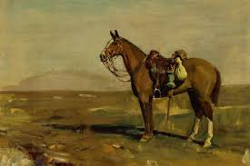
My favourite picture though is just of a lonely horse (above right). You get a real sense of the creature. It was a very interesting show and I enjoyed it. You might have done too, but its probably too late. |
Archives
June 2024
Categories |

 RSS Feed