WJM
  • Gallery
    • Rivers of London
    • Still Life
    • London Landscapes
    • British Landscape
    • Flora and Fauna
    • Past Work
  • Blog
  • About/Contact Me
  • Gallery
    • Rivers of London
    • Still Life
    • London Landscapes
    • British Landscape
    • Flora and Fauna
    • Past Work
  • Blog
  • About/Contact Me
Blog

Tiger Moths

2/28/2016

0 Comments

 
Picture
Picture
Picture
Picture
Picture
I have become obsessed with Tiger Moths.  This all started last summer.  The amazing specimen you can see on the left lived near where I keep my bike. It used to flit around me as I set off for work.  I managed to get the photo you see here but never managed to capture the vivid scarlet of the under-wing (if that is  indeed the correct term).  This started an ongoing obsession with Tiger Moths.  I obtained a few images and painted them as part of my mini mix collection. 
Picture
The one above is the first one I attempted and in many way the best.  It helps that the subject provide most of the effort involved in dreaming up a composition.  This one is on stone and I like the effect of it.  I think I caught quite well. To get the slight furry quality I used impasto medium.
Picture

Before attempting "my" Tiger Moth, I wanted to attempt one on a leafy background.  I wanted the moth to pop, so  I made the background muted.  It didn't quite work and the black is to severe. The contrast is too great.  Onto my moth where I yellowed the moth slightly and made the black more blue.  The moth is fine but again the background is a bit too muted.

Then I wanted to try and different coloured Tiger Moth so I found a picture of a yellow specimen.  This is better in the original than in the photograph but the colours could do with being more vivid.  I left Tiger Moths for a while but came back to them recently.  Following on my recent exhibition and the success of the "Orphan" painting I decided to produce some more abstract Tiger moths in the same style.

Both are produced in fundamentally the same way.  For the background paint is dragged with a palette knife across the board (they are all board, not canvas).   I am particularly pleased with the gold.

Instead of painting from a drawing I produced simplistic shapes with simplistic designs marked on them.  Thick impasto paint.

I am pleased with the result. For the second one I reduced the image even further to just a black and white shape, with black and white markings.

I accidentally photographed it upside down, but actually the image does something different  in this rotation.  I may well do more in the future.  For now they can all be seen on the Mini mix page.
0 Comments

Stash Shopping

2/21/2016

0 Comments

 
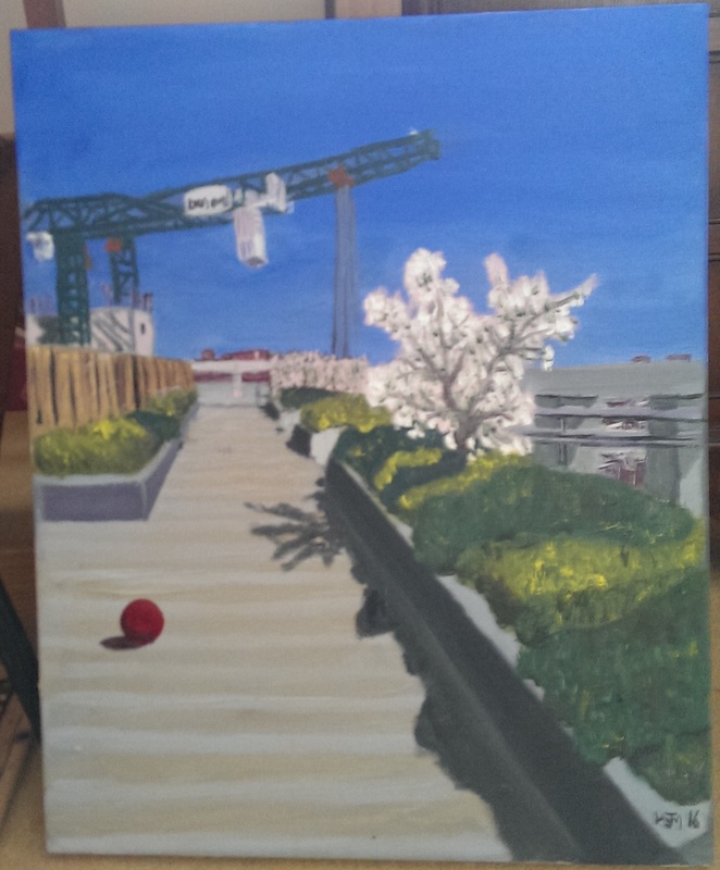
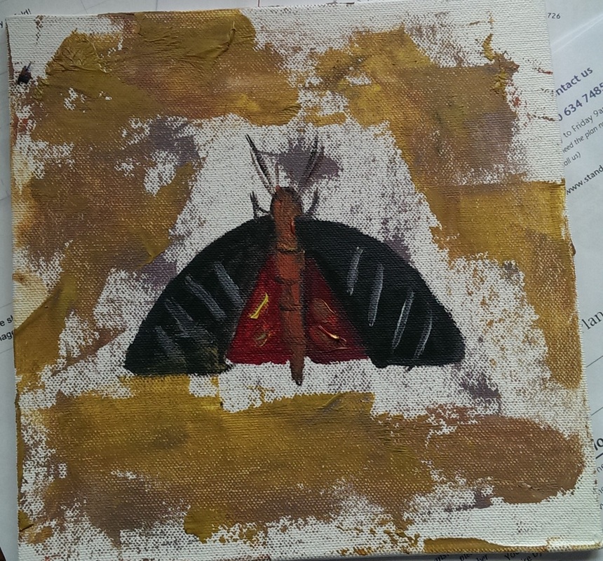
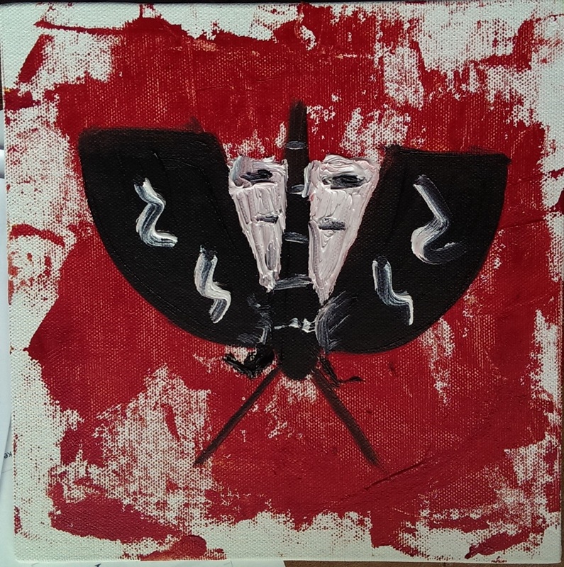
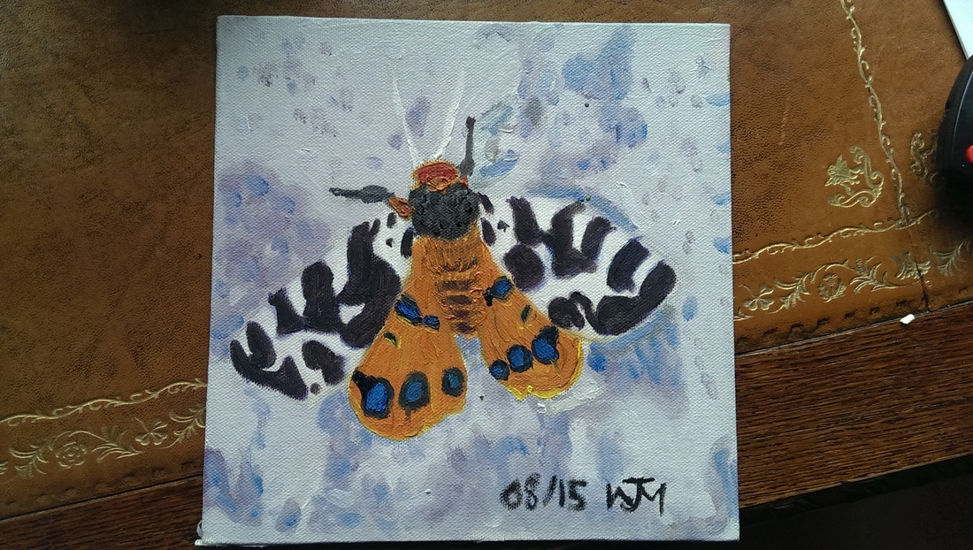
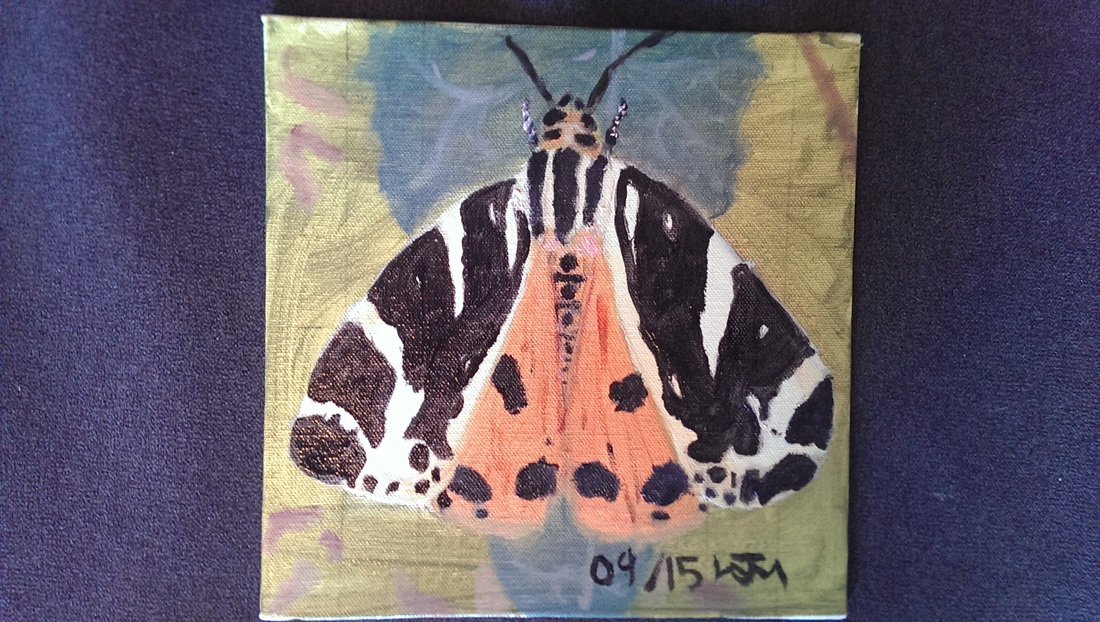
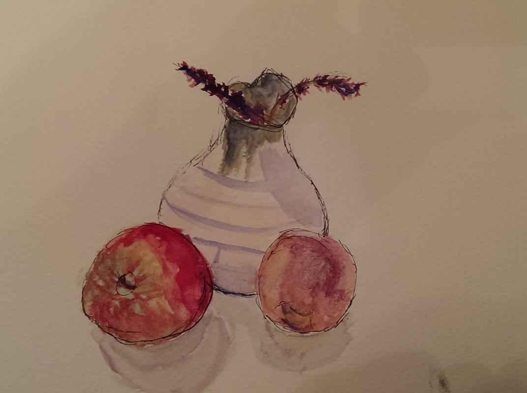
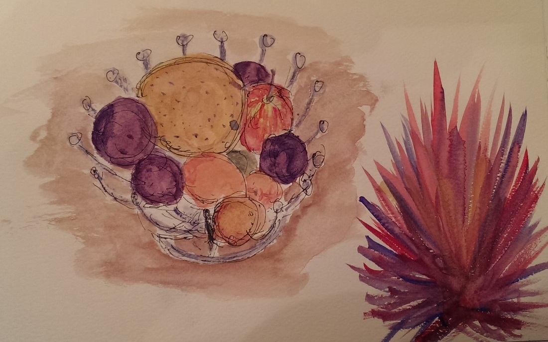
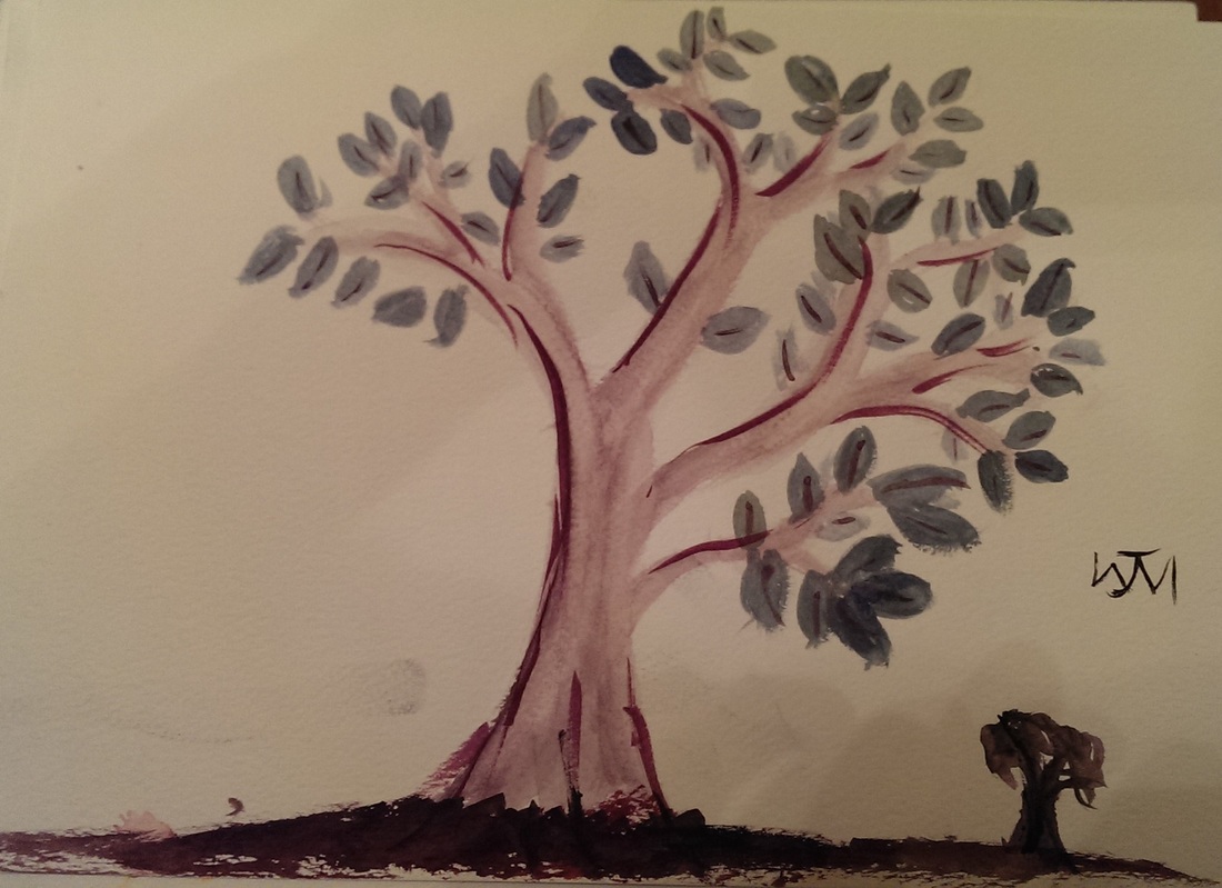
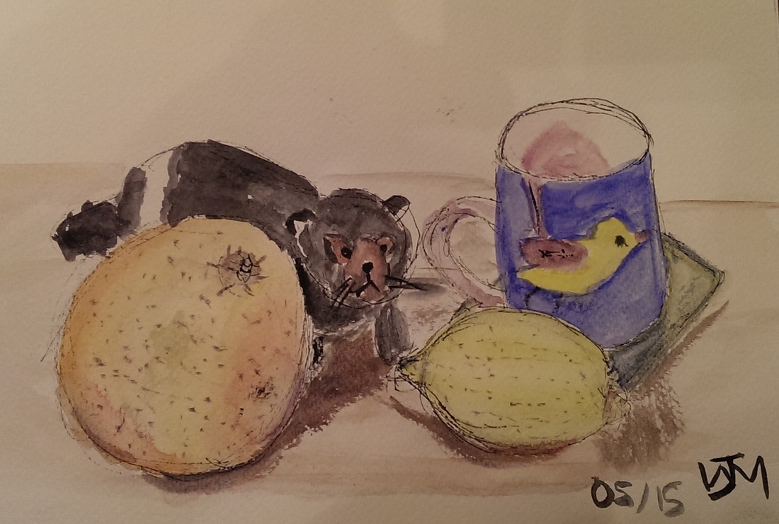
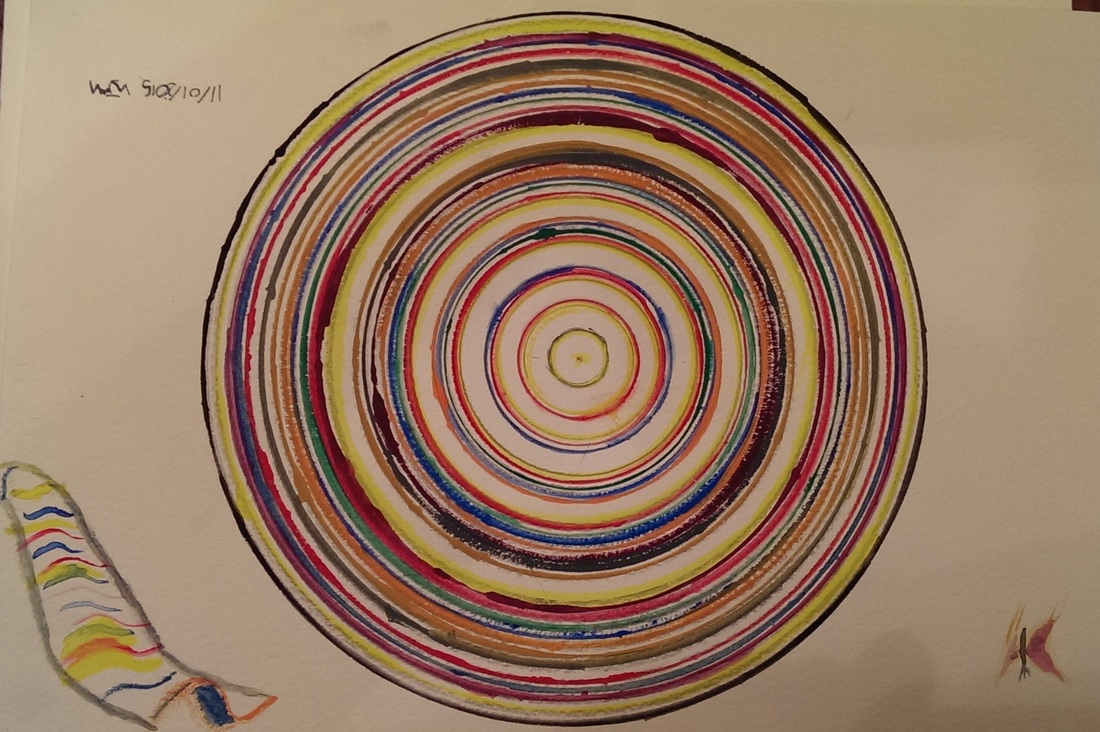
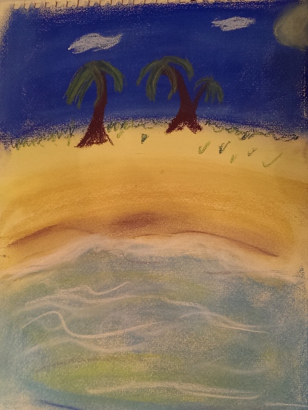
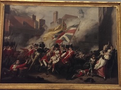
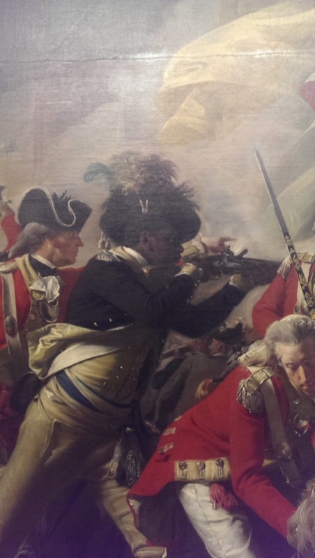
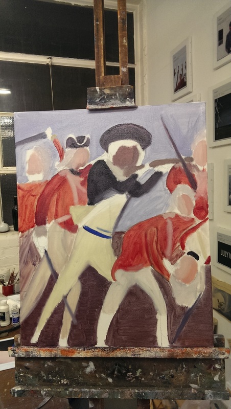
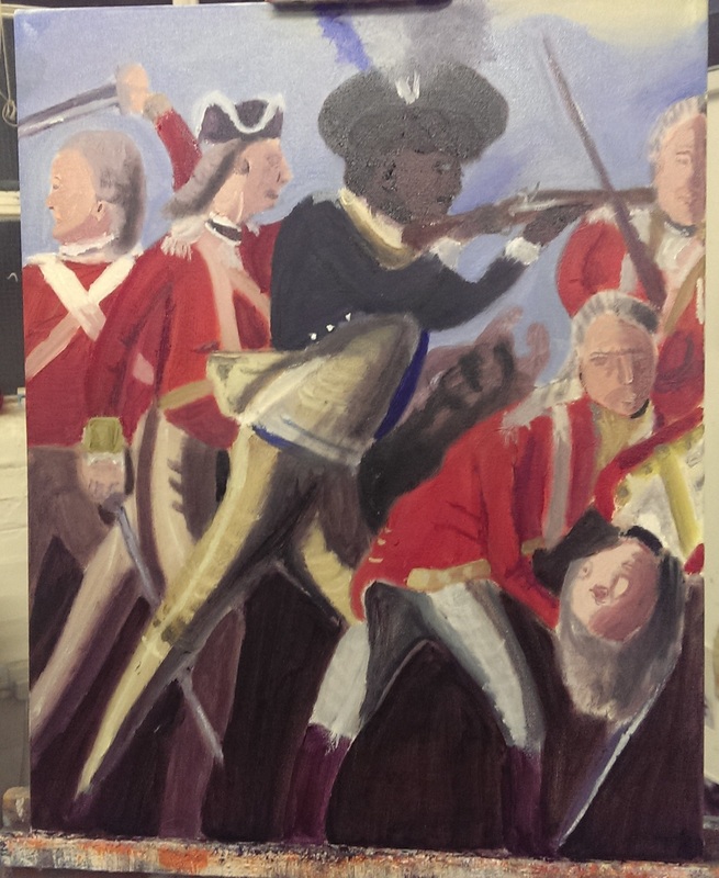
In July 2014, almost 18 months to the day, I first picked up a paint brush.  I had drawn before but never really painted before.  I have, so far, kept everything I have done. 

I decided, on this slightly loose anniversary to look at everything again, particularly at the sketches and media I don't often display.  I was surprised at what I found.

Watercolour and gouache

Picture
Picture
Picture
Picture
Picture
The still life pictures are much better than I remember them being.  I have always found water colour difficult and counter intuitive to use but I am quite pleased with these.

The circle is playing with the fibonacci sequence and produces quite a nice effect.  My favourite though is the tree.  I think I would do the ground and the distant tree differently if I did it again but I like the simplicity of it. 

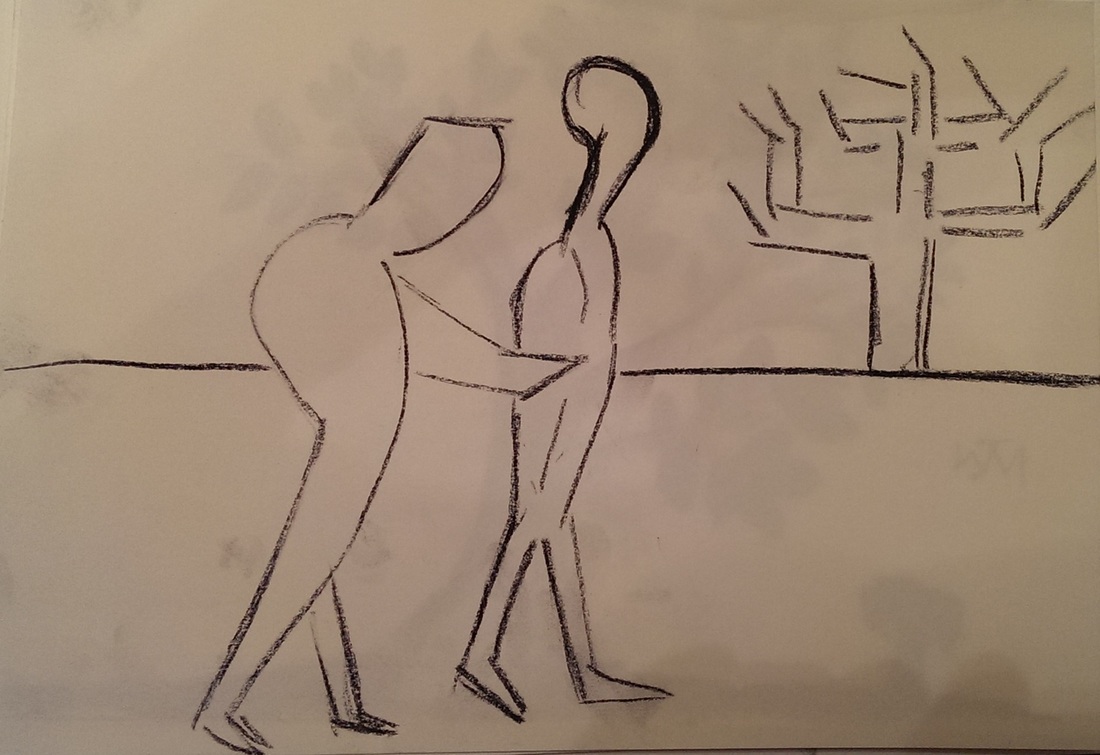
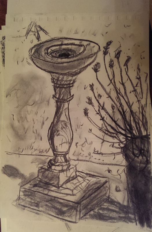
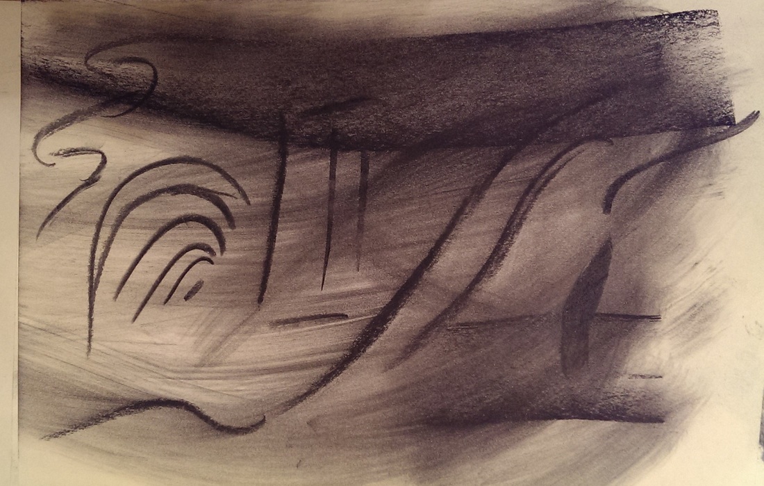
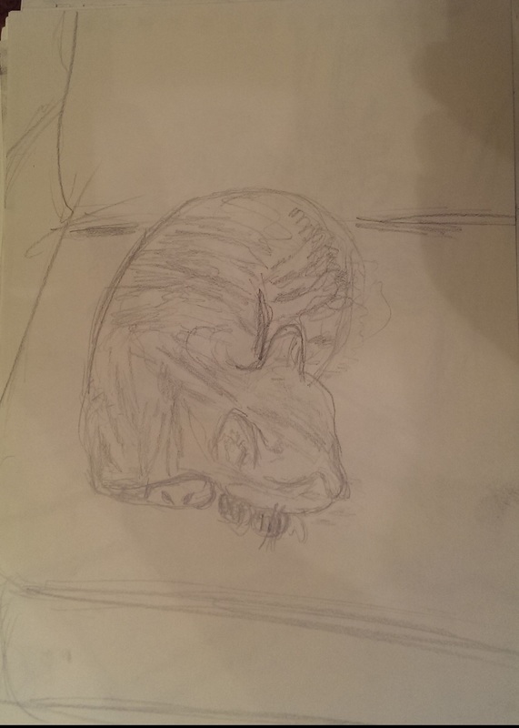
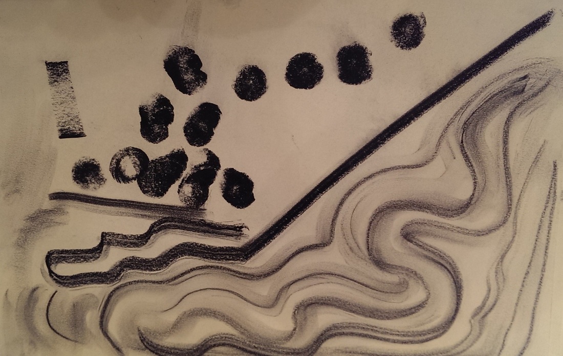
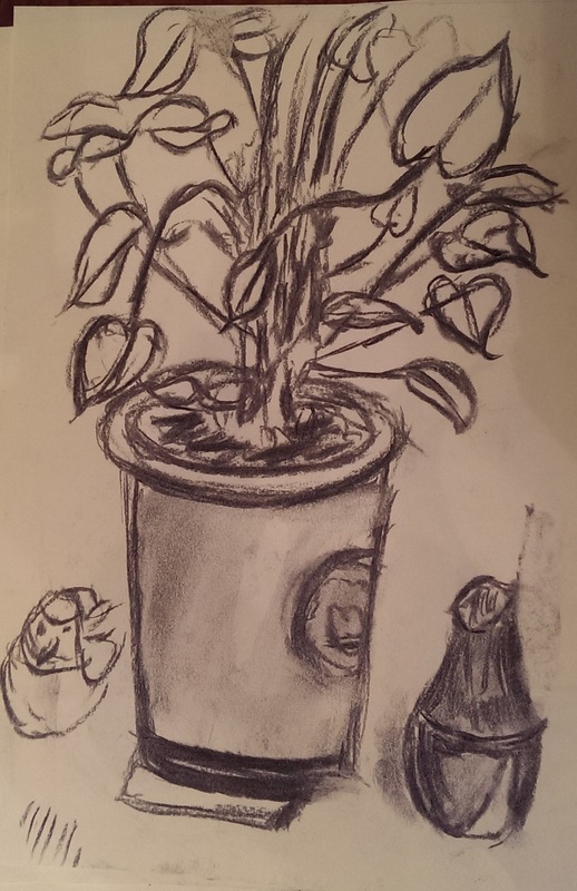
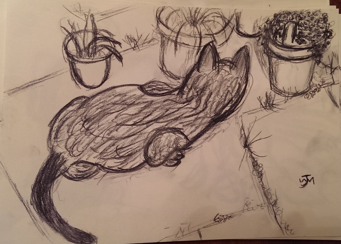
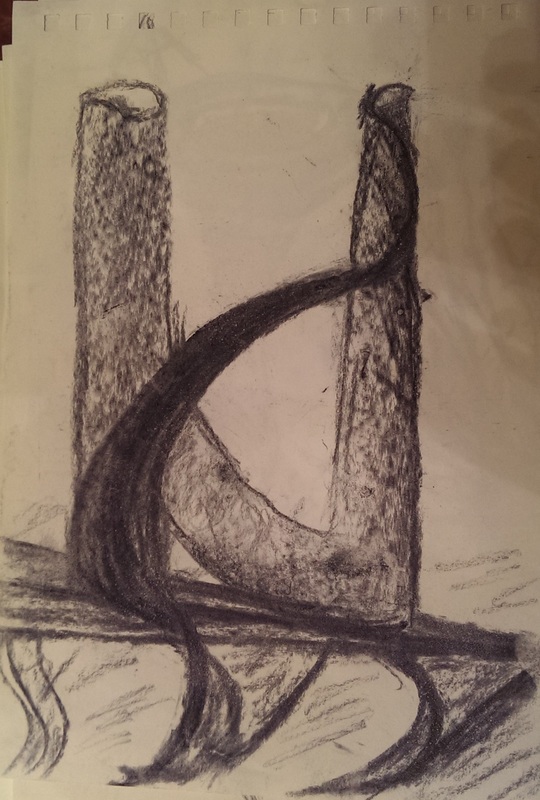
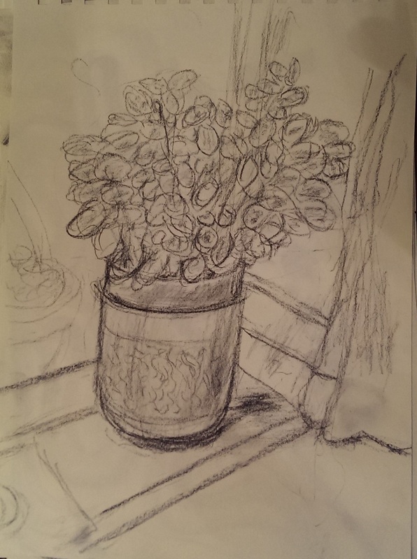
Charcoal, pencil and charcoal pencil.

Picture
Picture
Picture
Picture
Picture
Picture
Picture
Picture
Picture
Picture
Picture
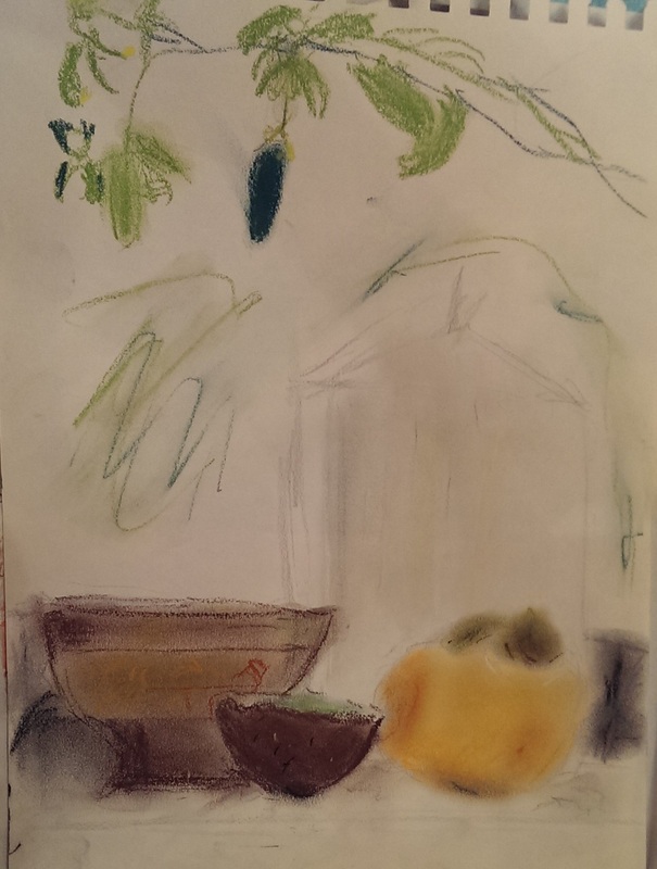
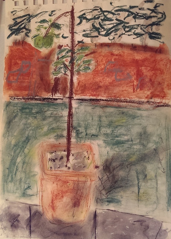
I have neglected these media of late, in favour of painting but seeing these again inspires me to go back to them.  The great advantage of them, is there is no entry barrier.  You just pick up the pencil, or charcoal stick or whatever it is,a piece of paper and off you go. It allows for easy experimentation. I am more drawn and prefer using charcoal pencil which suits my style more (the bottom right drawing for instance).  The easy flow of charcoal lends itself to abstraction.  I like the two figures top left.

Pastel

Picture
Picture
Picture
I started out with pastels before I started painting and it was this I used until I bought my own oil paints.  I come to them rarely now.

The main attraction for me is the smudging effect you can get with pastels as in the persimmon in the bottom left picture.  It is no coincidence that I am a fan of Japanese persimmon pictures.

There are I think two types of pictures I produce.  Those I produce for display and sale or as part of a planned series (like the patterns), and those I produce when I'm just messing around.  It is these later that this selection is drawn from.  This shows to me that such experiments were worth doing and revisiting them every so often can give new insights and ideas for what to do next.  I have for example started doing more still life as a result.


0 Comments

February 14th, 2016

2/14/2016

0 Comments

 
Picture
Picture
Picture
Picture
Picture
Picture
Apologies for the lack of post and activity last week. I was distracted by my mother’s birthday.
One of the main issues that most amateur and beginner artists have, and that I have certainly struggled with, is getting a difference in tone in their paintings.  You see this a lot in a certain type of painting (usually of some slightly tedious pastoral scene).  It is executed well enough, often very well, but it is flat and lifeless.  This is because of a lack of tone.  The other issue is one of composition but I will deal with that another time.

My pictures, to date, do lack tone I think. Or at least they could do with more of it.  This was an issue Hugh had identified and so we decided to tackle it.  

The vehicle for this was my latest attempt at transcription. I had chosen for the subject of my transcription “The Death of Major Pierson” by John Singleton Copley.  This is a very large piece, about the size of a dining room table and is displayed in the Tate Britain.  I saw it first at the Fighting History exhibition which I attend last year.  This allowed me to see and examine the original in person which is always an enormous boon, even essential for trying this type of thing.

It is a complex painting.  There is a lot going on.  It depicts a relatively minor action in British military history, the repelling of a French invasion of Jersey.  Indeed the main square in St Helier is now called Pierson square.

The painting was interesting to me for a number of reasons.  There were lots of characters I could choose from to draw inspiration for a transcription.  It has a large tonal contrast which gives the painting much of its interest. It accords with the golden ration.  The family seen fleeing on the right-hand side where modeled from Major Pierson’s actual family. The artist is an American so it is interesting to conjecture what he is going painting British military propaganda pieces. Perhaps most interestingly. It also has one of the few representation of a black person in western art. What is even rarer is that he is pictured in a heroic role.

It is useful for these purposes to know a bit of the background. The French invaded and captured the Island governor.  Major Pierson along with his servant Pompey went to see what was going on at which point Major Pierson was shot by a French sniper.  At this point his Pepe picked up Major Pierson’s gun and shot the sniper.  This is the action you see as the main purpose of the picture.
It seemed to me that the main focus of the original is Major Pierson and his tragic death, pictured in as a classical tragedy.  I was more interested in Pompey and his act of revenge. This I decided to make the subject of my version.

I started then by limiting myself to smaller canvas and a much more restrictive view.  One of the great advantages of doing a transcription is that you don’t have to worry about composition because someone has done it for you.  Of course you learn a lot about composition by looking at what they have done.
My other major weakness is figures and this piece allowed me to further attempt this. I was most interested in capturing the flow of the action, making Pompey centre stage and making it more dynamic and abstract.  The yellow of the flag contrasting with the blue of the sky and the red of the uniforms makes a good combination so I brought the flag down into the top of the picture.  I found all of this quite difficult.  I had difficulty engaging with the piece and much less of a sense of where I was going.

The early draft captures the flow quite well and the sense of action but is very flat.  There is no sense of the figures being in the painting.  They just sit on it relatively lifeless. So I concentrated on emphasising the difference in tone.  I made the background darker and the shadows much more stark and dark, with a significant contract between the shade and the light areas.  I simplified the faces concentrating again between the difference between the light and the dark.  I also added folds and shading to the clothes.  The end result can be seen on the left.  It is not the best work I’ve ever done but I achieved the lesson and affect I wanted, to really go for it on tone.

This I was able to apply to another work with much more success.  I decided to do a landscape picture, the top of 2 Pancras square in Kings cross. The photo I took is to the left.  It doesn’t really look like England, being a strong sunny day but it has strong shadows.  This and the nice depth to the composition and the background of the crane gave me an image I could work with.

An early draft can be seen with no shadow to the left.  While there is some sense of depth, everything sits very flat on the picture.  It looks dull and washed up.  Partly this is because of course it is not complete, so the blossom on the tree has not been completed.

Contrast this with when it has contrast.  I added thick shadow not only on the low right hand wall and the floor, but on the building being constructed in the background, the pillars on the right and probably most significantly the shrubs on the right hand side.  It gives them much more definition and makes them much more substantial. I was happy with this result. In fact it is, I think, one of the best pieces I’ve done so far.  However I kept thinking it was missing something.  The foreground was somewhat empty.  There was also a colour missing.

Tone can be achieved not just with shading but also with contrasting colours.  Eventually I decided the solution was a small red ball.  An idea stolen shamelessly from Turner, although admittedly in a very different context.  The result, I think, is very good.

Picture
Picture
0 Comments

    William John Mackenzie

    I am an artist with a  specialism in landscapes and still life.  My contact details are here. 

    Archives

    October 2020
    May 2020
    April 2020
    January 2020
    December 2019
    November 2019
    October 2019
    September 2019
    August 2019
    July 2019
    June 2019
    May 2019
    April 2019
    March 2019
    February 2019
    January 2019
    December 2018
    November 2018
    October 2018
    September 2018
    August 2018
    July 2018
    June 2018
    May 2018
    April 2018
    March 2018
    February 2018
    January 2018
    December 2017
    November 2017
    October 2017
    September 2017
    August 2017
    July 2017
    June 2017
    May 2017
    April 2017
    March 2017
    February 2017
    January 2017
    December 2016
    November 2016
    October 2016
    September 2016
    August 2016
    July 2016
    June 2016
    May 2016
    April 2016
    March 2016
    February 2016
    January 2016
    December 2015
    November 2015
    October 2015
    September 2015
    August 2015
    July 2015
    June 2015

    Categories

    All

    RSS Feed

Proudly powered by Weebly