|
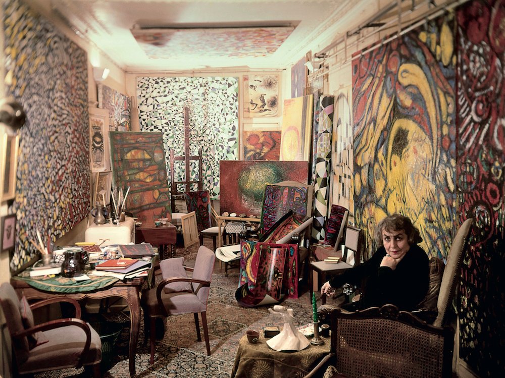
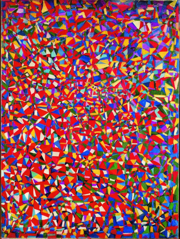
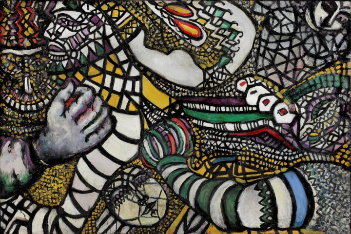
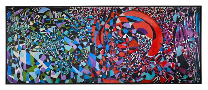
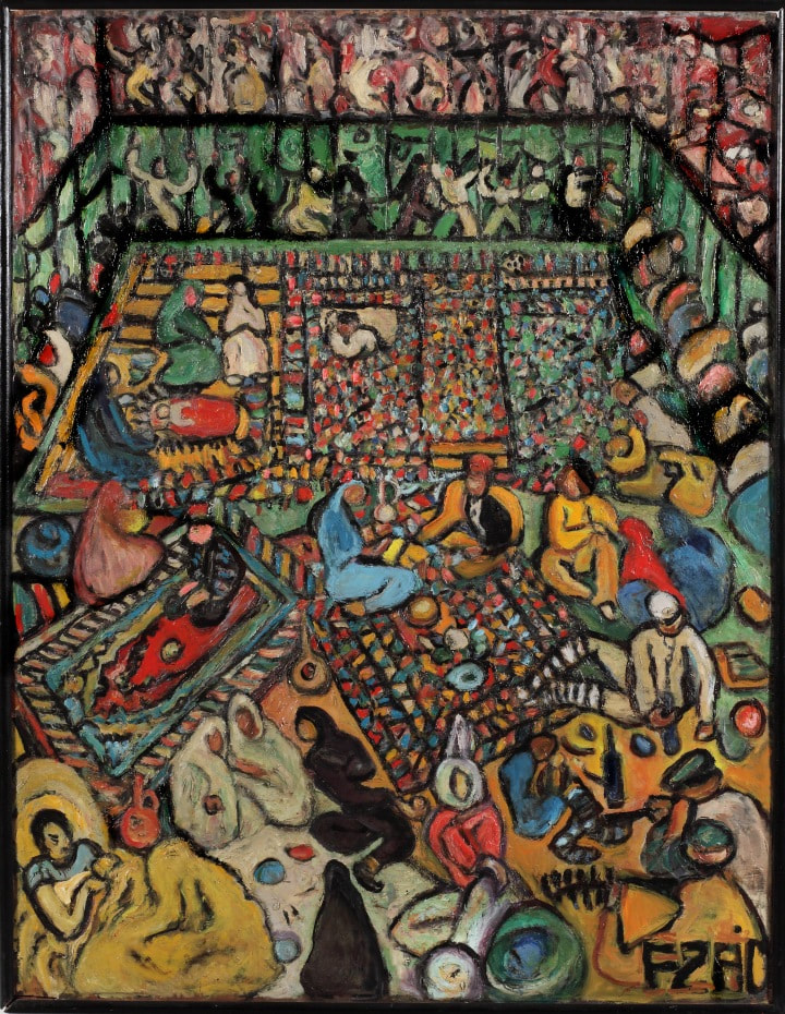
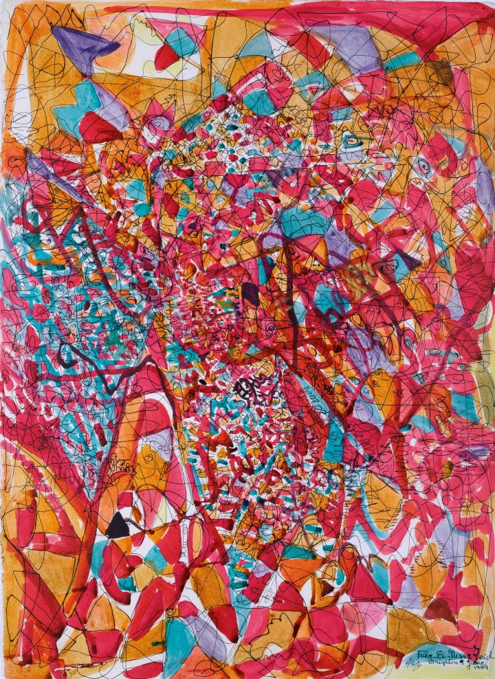
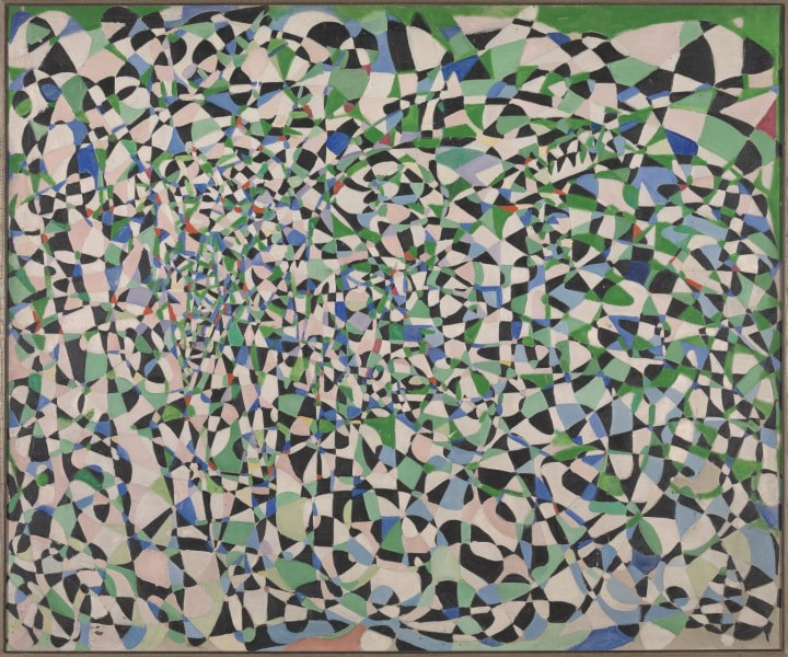
One of the briefs I think of the big galleries is to introduce to artists you might not previously heard of. Before this year I had never heard of Fahrelinssa Zeid, but now I have and I am glad I have. This actually is one of the purposes of this blog. It provides me with a motivation to go out and see exhibitions, that I perhaps I wouldn’t do otherwise. It is also a good show to see if you have fortuitously just finished reading My Name is Red (which amusingly is on sale in the shop afterwards). It is on until 8th October. Zeid is an interesting woman, originally Turkish she married an Iraqi Prince who was ambassador to London. They were in Italy when the coup took place in Iraq and the rest of his family were massacred. A high society artist she was, rubbing shoulders with people such as the Queen Mother. Of her art I similarly knew nothing but the kaleidoscope on the poster appealed to me. I went on a quiet bank holiday Monday morning, padding around the exhibition virtually alone. Her work is usually very large. Inspired by stained glass and Muslim artistic traditions she is best known for the large multicoloured abstract pieces. They are sort of like larger spiky Sonia Delauney but with sharper less foggy colours. Multicoloured coloured geometric shapes edged with black. This is typified by the very good Fight against Abstraction (above), with its fist coming out of the shapes. There weren’t many pieces on display but they are very large and do really benefit from being in a large space as they do need to be seen from a distance. Close up they are interesting to but you feel a bit overwhelmed. My favourites of these very large pieces is Basel Carival, multicoloured with larger geometric shapes cutting into each other suggesting fair ground rounds and tents and little figures. It is a very attractive piece and I kept going back to it. For me her better pieces have the black in them. Earlier work is part figurative and part abstract. They often have several zones dominated by one colour and a strong geometric element such as Three ways of Living which has its arc of birds connecting two of the zones. One of the early pieces I liked was called Turkish baths with the calm blue of the baths contrasting nicely with the flesh tones. Her later work is more organic. There are some smaller pieces on paper. Washes of colour, mainly orange, scratched with black (like the above). Then two medium sized pieces called Fir and Shiran, mostly of one coloured, textured and “cut” with palette knife marks and other colours.
Two large later works really appealed to me. One called London the Fireworks I really liked and reminded me of Turner. Mainly yellow orange and gold crosses obscuring a murky black and blue London sky-line. A thoroughly engrossing work. This had been hung really well in that you could see it from two rooms away and beckoned you forward through the show. Next to it, more subtle and cooler was Sea Cave rendered mainly in blues and greens it felt very much like a sea cave. The final room had these sculptures made of chicken bones and Perspex which were quite good but vaguely repulsive. There were also portraits. Her portraits didn’t particularly appeal. The people are pretty featureless with big eyes. The best things about them are the patterned clothing such as the shawl in Sahid and the background as in the yellow that pops out behind Khadid Shah. Interestingly she sometimes signs her paintings using Arabic script which I think really adds to the paintings. I am glad I went and shall add Zeid to the 20th Centuary pantheon.
0 Comments
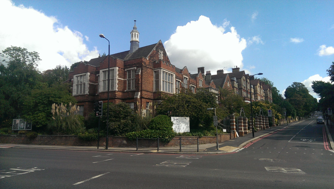
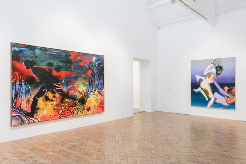
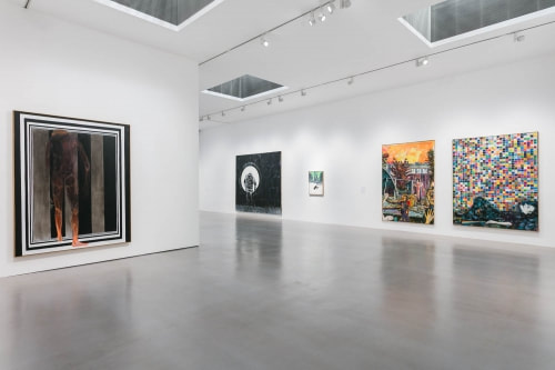
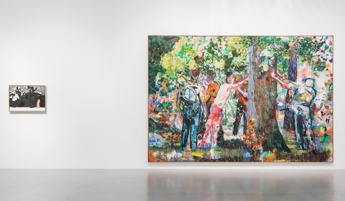
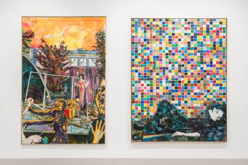
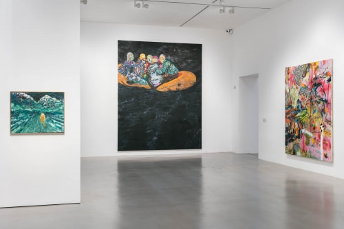
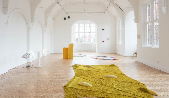
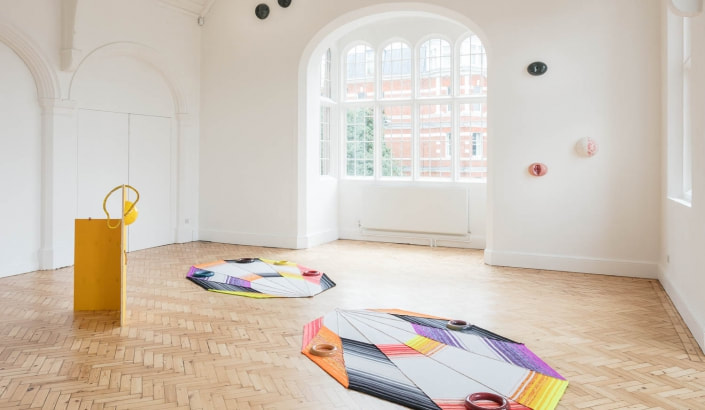
The Camden Arts Centre is on Finchley Road, just across the road from Finchley Road and Frognal overground station. It is housed in an old library, one of those Victorian/Edwardian brick libraries that north London does so well. It is free to enter and they had obviously just repainted as there was a smell of fresh paint, newly applied, to the place. Because it was quite early on an early Saturday morning I was the only person in the actual galleries. As such I was shadowed around each gallery by an attendant, like some kind of suspicious ghost, who tried to make it look like they weren’t watching me but they were. That was quite unnerving and had the effect that I didn’t stay for as long as I would have liked. So that’s a lesson. What did you see? I hear you murmur with slight indifference? Well two people, Daniel Richter and Jennifer Tee. Why did I go? Well I very much like Peter Doig. There is a big painting of his currently on display in the Tate Modern (which I recommend you see if you are there). Hugh Mendes therefore recommended Daniel Richter as being a similar style. The last day of both these shows is 17th September so you either need to scamper or you have already missed it depending on when you read this. And he is, although Doig is better in my view. They both have the runny streaks, the mottled backgrounds and the sort of dreamy aspects. Doig’s are calmer and softer whereas Ricther’s are more violent both in terms of subject and in the colours used. So for example there is a picture of some men round a tree. It is has the feeling of threatened violence about it, their faces obscured with colour (above left, the picture in the right). The same with the picture of Amsterdam (above right, the picture in the left of the photo). Richter is more political in his work too, produces pieces about refugees and border posts. Occasionally he wanders into complete abstraction but I prefer his more figurative works, although he does seem to have a thing for starving looking dogs. Outside the main galleries in the excellently warm and light reading room are a couple of graphicy prints of his. They are less good in my view. As I was there and it seemed rude not to and one of the suspicious ghosts had just told me about it I went into the other gallery to see Jennifer Tee. Installation stuff. Weaved things on the floor, what looked like a weightlifting bar with the weights made of lights, and various hemispheres stuck on the wall. It was ok but didn’t particularly move me. Apparently there is a performance every so often using the art. I hurried away on hearing this.
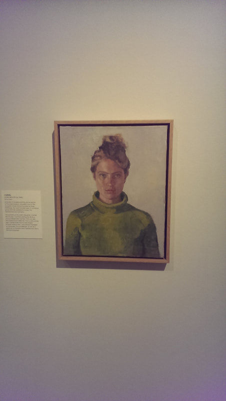
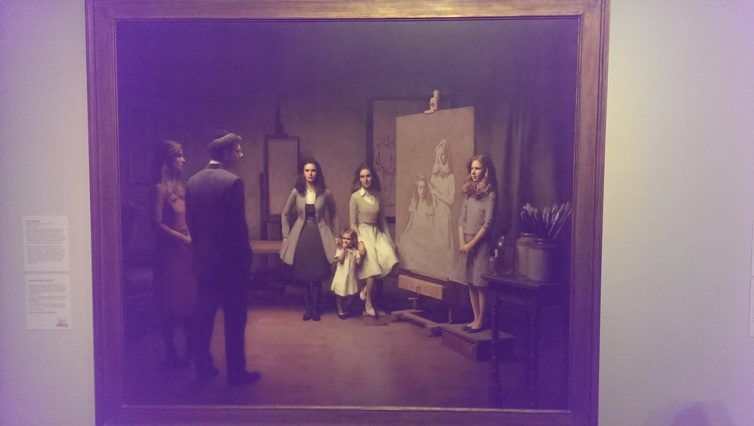
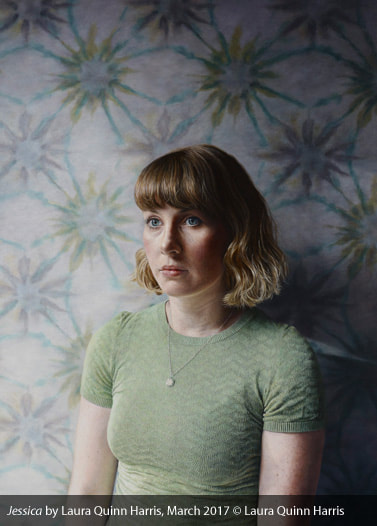
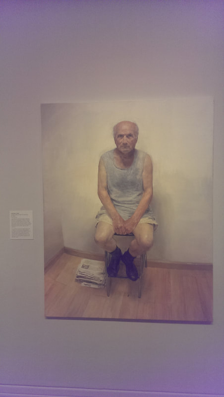
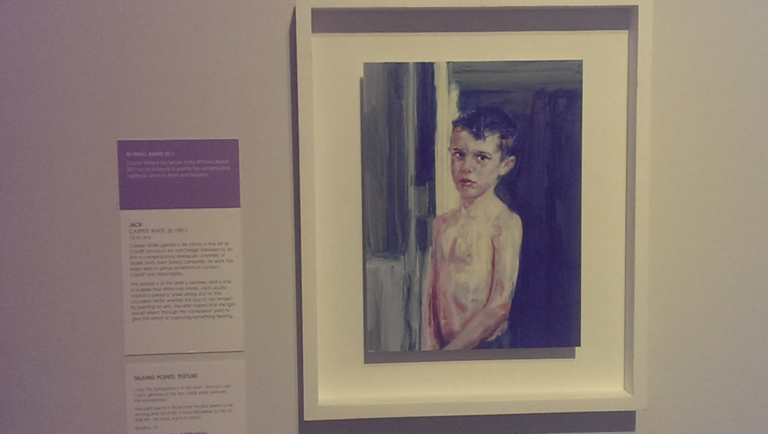
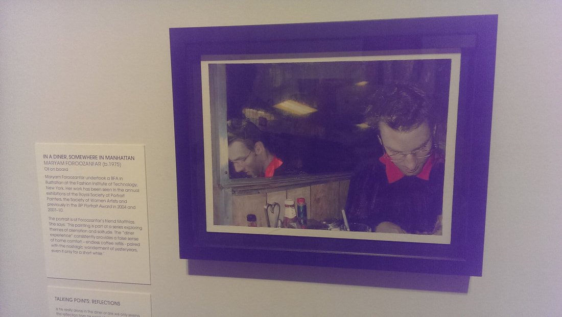
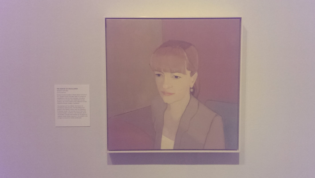
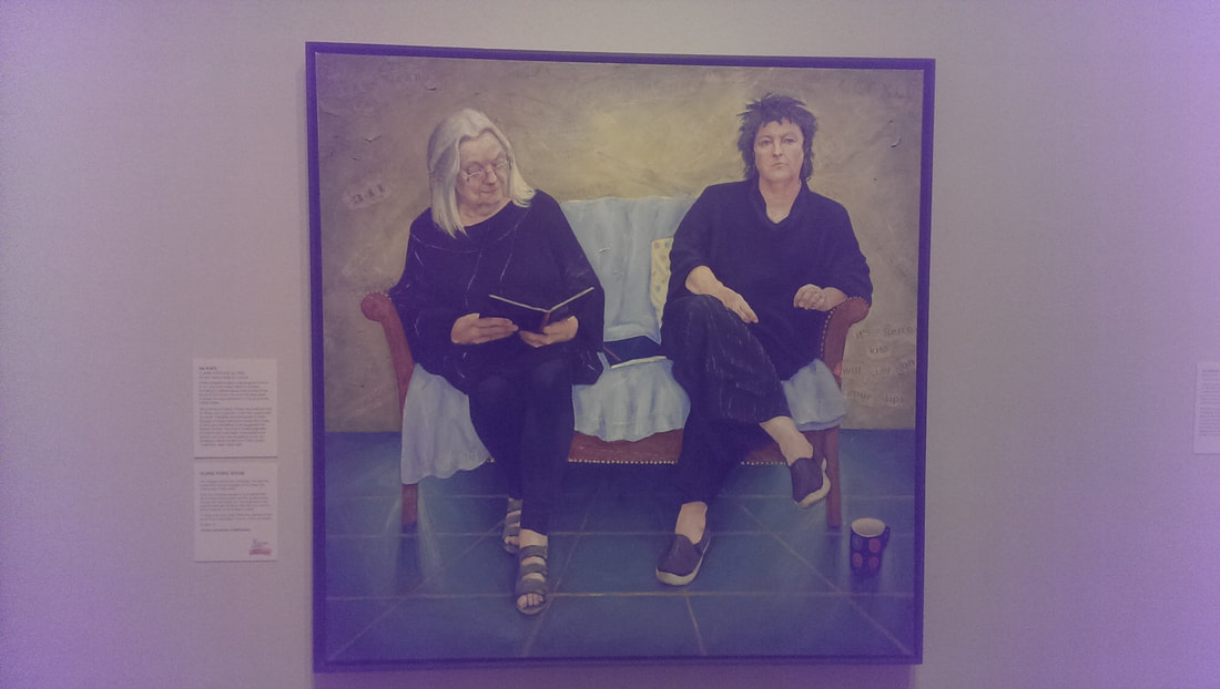
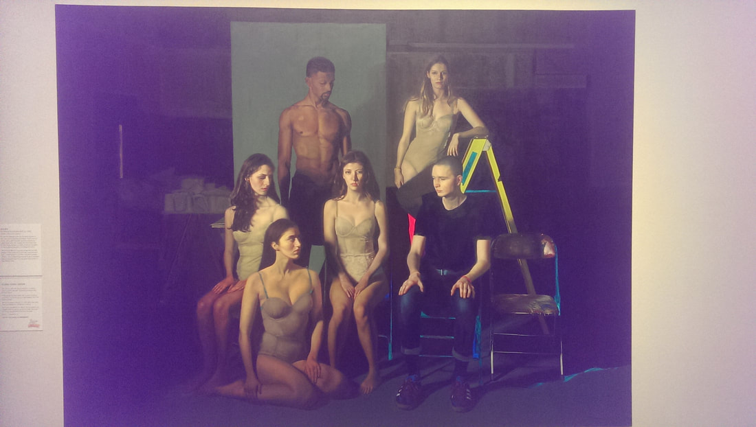
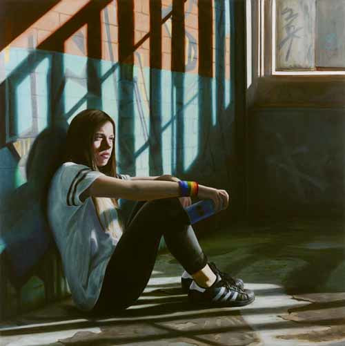
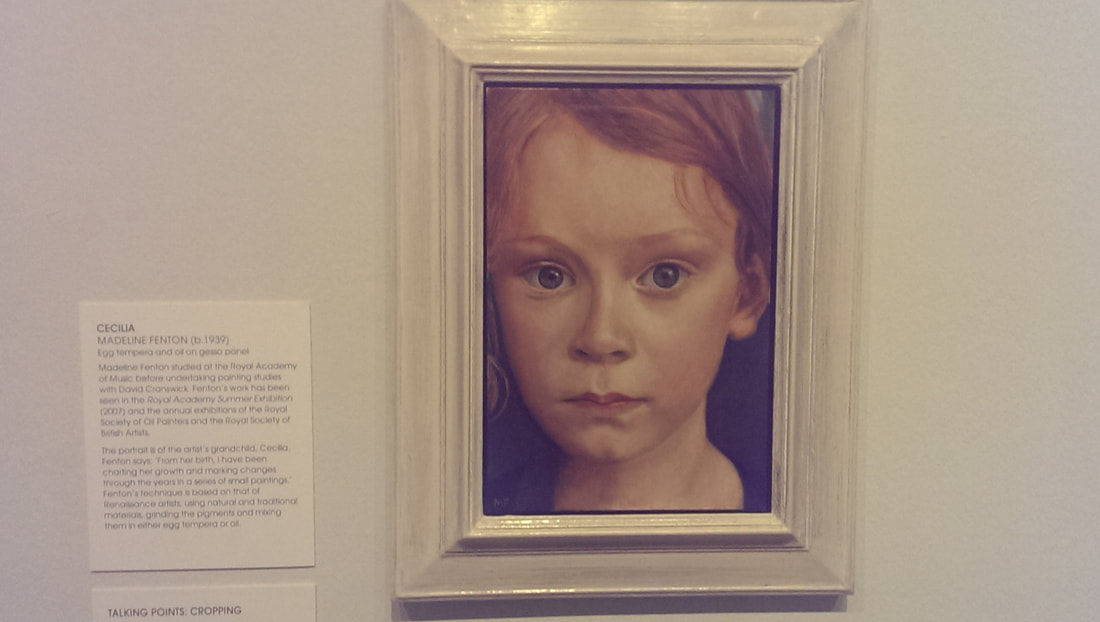
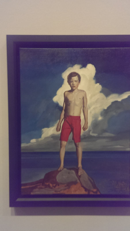
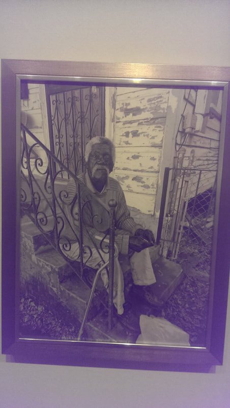
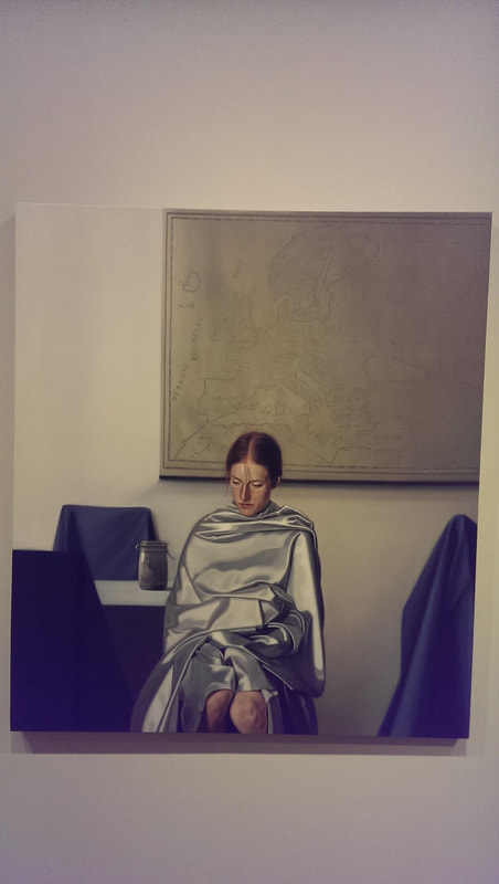
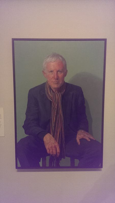
The BP portrait award is currently on at the National Portrait Gallery and runs until the 24th September 2017. Its free which is a good start, and there is usually always something good in there. It comes up for criticism for having to dull photorealistic paintings and there is a certain amount of truth to this criticism. Occasionally you look at a painting and think, what’s the point, this gives me nothing a photograph doesn’t give. Technically very impressive but portraiture needs, in my view anyway, to do more than that. There are a number of paintings in there that do that and of which I like, so in no particular order we have: Carmel by Anne Ben-Or. It is a portrait of the artists daughter. Portraits of relations or loved ones often have an edge of affection that it is difficult to get into portraits of other people. This has this. It is something about the soft slightly blurry style of this piece. There is good texture here particularly in the background and the green jumper (especially the jumper) and the sitter has a very good look. It would appear that the time of family portraits of the rich and powerful is still in vogue and the Levinsons by Rupert Alexander is a fine example of this. There is much in the style that speaks to old Victorian and older paintings but the posing of the subjects lifts is, with the parents side on or in the father’s case almost with his back to us. The interaction between the parents and particularly the youngest child is good, as is the setting in the studio. This picture is patriarchy at work though. Despite being almost hidden the father is very much the authority figure, hand in pockets surveying his kingdom. At least so it seems to me. Photorealistic paintings can still be good if they add something extra, either setting, or pose or just the facial expression. Jessica by Laura Quinn Harris is one such. I like the background very much as well as the highlights of the hair all set off nicely by the almost dispassionate pose of the sitter (stander?). Next up unusual setting, or pose is Antonio Lopez by Jorge Abbad Jaime De Avajon. Put an elderly man in his underwear on a stool. Paint it right and you have a high impact image. This one stays with you. It is not an easy image to forget. It is also slightly odd in the whole things has a sort of fish eye perspective, especially the way the wall curves away. Breach! By Benjamin Sullivan. Good title this. Also an example of how to win the BP award (which this did). You need to be technically excellent (which this is) but also the setting and the rendering has to have that extra something. Again this has that extra edge which I only seem to see in portraits of family members. The title adds to the story but art judges love art references and this painting is packed with them. Jack by Casper White. Children are difficult to paint. They don’t have the contoured face or cragy features that allow you to work a portrait around. This one is good though. Full of poise and attitude, it really looks like a young boy standing there. The green stripes of the background compliment the green shadow on the figure and the use of brush strokes to get things like the hair texture is simple looking but effective. Morgan Foroozanfar (who doesn't seem to have his own website), contender for best name of an artist produced this subtle piece called In a Diner Somewhere in Manhattan. I like the reflection and the intimacy of the piece. Also it reminds me of being in very similar diners in Manhattan. Just next to that is a portrait called The Mayor of Woollahara by Sinead Davis. The style and pose reminds me of old computer games or instructional videos. It is a very effective use of beige tones to create a very human and interesting piece. Next to that is a large portrait called the Poets by Claire Eastgate. It shows Gillian and Carol Ann-Duffy. I don’t actually like the picture that much but there are three things about it that interested me. One the people in it. I am a fan of poetry and seeing these two women depicted was interested. This is the other angel portraiture has, it can appeal to the fan in you. I also like the way words are worked into the wall behind them. This could easily have been trite but it was note. Finally I really like the shadow on the floor of the sofa legs. Dominating the far wall is a large group portrait call Society by Khushna Sulaman-Butt It shows a ground of very good looking people, scantily dressed done in a photo-realistic style but there are a number of elements that lift the picture above this. The way they are set against a dark and dull background. The hostility shown between the sitters (deliberately constructed but done very well) and then set off by these fluorescent highlights of green, blue, red and the bright yellow step ladder. That is a very neat idea and it works extremely well. A related idea is 86 by Janne Kearney. Again we have photo-realism but the setting is interesting, as is the pose of the sitter, particularly the shadow of the window frame over her face. It helps of course that she is pretty but she is poutingly so. The coloured wrist bands make a good contrast. The whole piece shows isolation, which the blurb makes clear is the point. In which case mission accomplished. Egg Tempura is a tricky medium to use but it produces a certain effect in portraiture, a sort of alien, angelic effect. So if like Madeline Fenton you are smart enough to depict a child with it, as in her portrait Celine, then provided you have the skills to back it up you are on to a winner. She does. The close up frame is a very good idea and done well, especially the hair and you are confronted by this quizzical slightly off putting child. Well done, like that. In the Shadows by Noah Buchanan is another example of making references to art works past to impress the judges. I’m fine with that if it works and here you have boy in an epic pose in the manner of some greek figure, on top of the rocks. I particularly like the way the rocks are rendered. Possibly my favourite piece in the show is Another Fine day on Elysium Fields Avenue NOLA by Eva Csanyi Hurskin. This is photo-realistic but she has made the brave choice to do this in black and white and it works. There is so much character in the face of the man in the picture, and the contrast show using black grey and white is very impressive. This is a picture that tells a story and invites you in. Like this. Again photo-realistic but with that extra punch is Blind Portrait by Daniel Coves. The sitter is not looking at you, covered in a very well done silvery blanket in front of an old map. All the chairs are covered to, in green. It is all slightly disturbing and technically excellent and makes you ask yourself what the hell is going on. Nothing good is the implication. Finally what you might call a classic portrait, Norman Lamb MP by Paul P Smith. It is a very strong pose and has captured his charisma very well. The face is done brilliantly as it the scarf which sets up an impressive contrast. Much of the battle with portraiture, as with all art, is getting an interesting and well thought out composition. If you have that, all you have to do is pull it off. All of these pieces have this.
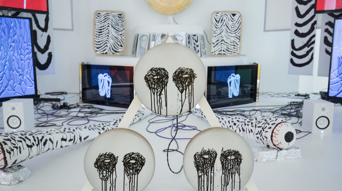
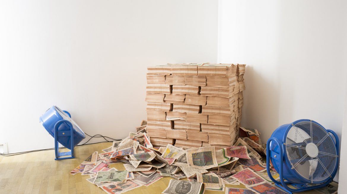
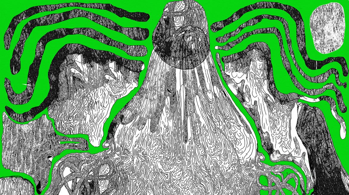
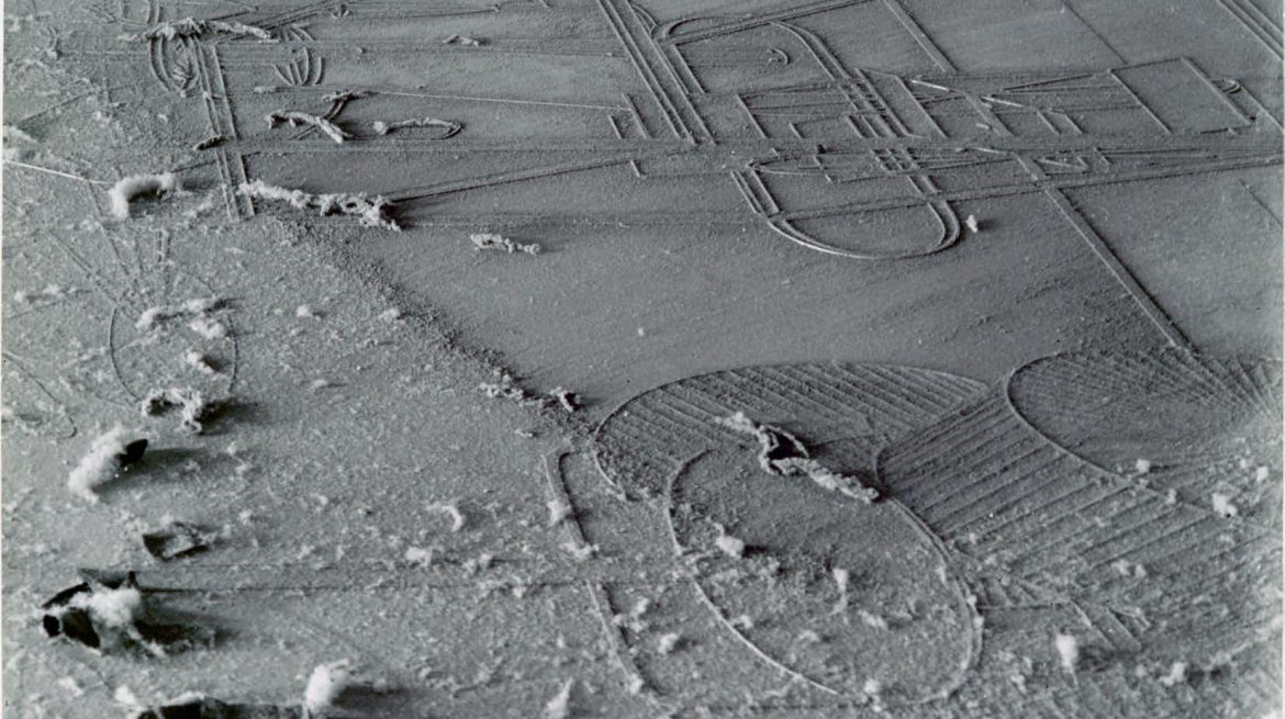
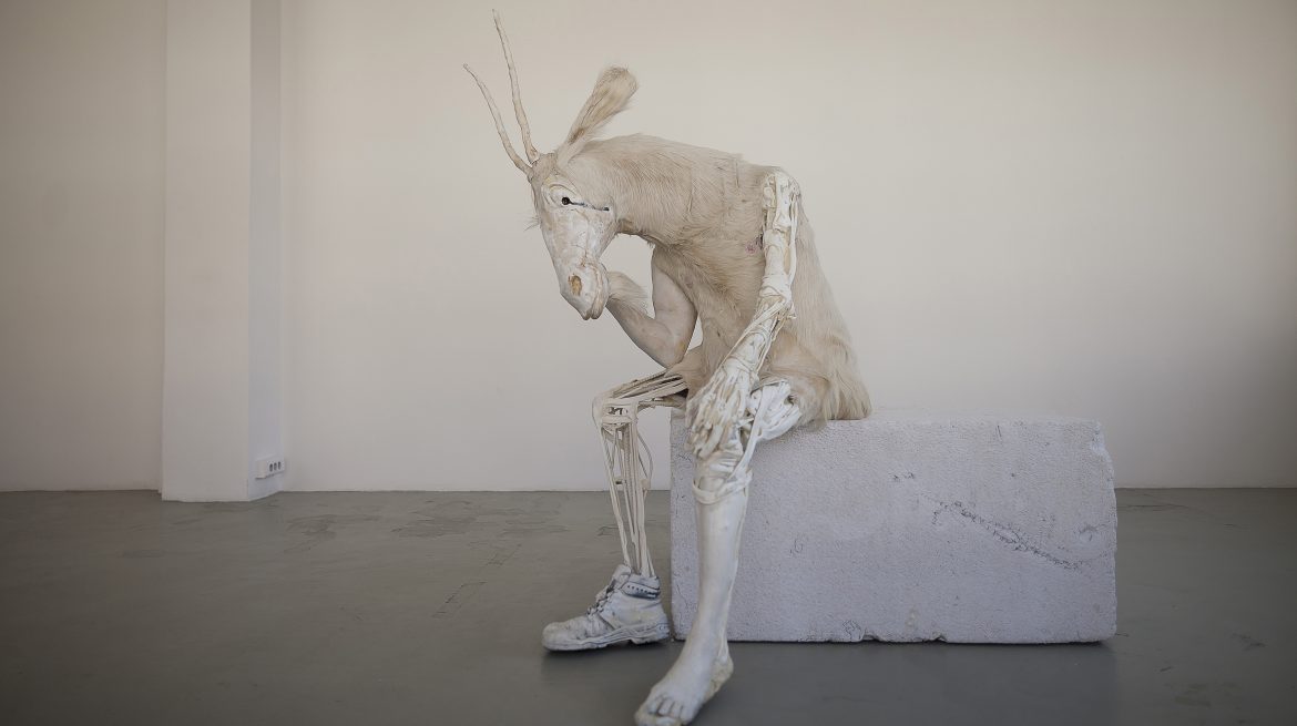
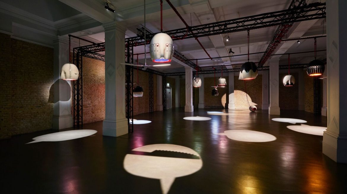
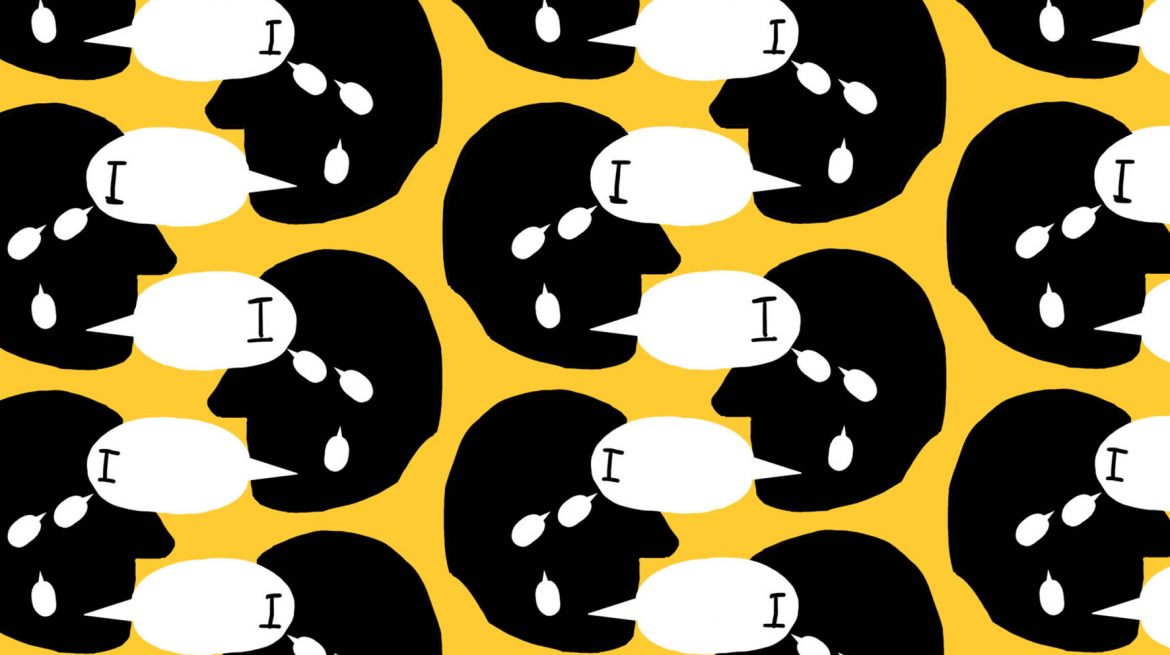
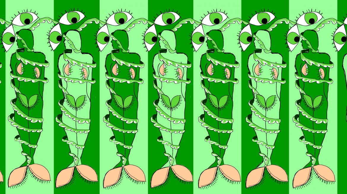
I don’t get to the Whitchapel very often, indeed I’ve only been there once before long ago for an exhibition I can no longer really remember. Much of conceptual contemporary art has a super serious, self regarding attitude that I find really off putting. Even if the shows are not actually like this the contemporary galleries, Saatchi, Serpentine and Whitechapel have a tendency to portray them in this manner, so I don’t go. For me at least the best conceptual art has an element of joy and humour in them, Rauschenberg is a good example, as is Grayson Perry and more recently Hannah Marten (last year’s Turner prize winner). It maybe that this is something I am reading into the works but that doesn’t really matter. The end result is the same. At the Whitechapel at the moment are four exhibitions, Benedict Drew’s The Trickle-Down Syndrome, a photography exhibition called A Handful of Dust (both ominously pretentious titles), then the Max Mara prize exhibition and the I-self portrait exhibition. First up, Mr Drew. Queue pretentious spiel written on the wall, I didn’t read it all. Then on the walls large black and white pictures of guts in which you can imagine words and figures appearing. On one side a red and black internally organy figure and a similar green and black one opposite. In the middle is the prize piece, a multimedia assembly including sound, video screens, lights flicking on a slivery disk all of it displaying a brain with eyes and ears (picture above). I liked this. It had that element of joy I was talking about, particularly the concical bloodshot eyes. Round the corner, a stack of newspapers being buffeted by large fans. You are encouraged to take one of these newspapers and I did. They contain pieces by the same artist the best of which was a picture of a donkey with the slogan “I hate humans”. The show ends with a series of red screens hiding a tv showing someone slowly moving through mud and then a separate yellow lit room which smelt funny showing hands with animated cones coming out of them. Moving swiftly on and up the stairs. A handful of dust was a series of mainly black and white photos saying they were after Man Ray. I didn’t really see a cohesive theme but some of them were quite interesting. There were RAF photos from 1917 showing a formation of parked by planes, then sand sculptures and the California desert. The one I most enjoyed was by Rat Bee Luxembourg’s “In Even Deeper” which in yellowish tint showed steep steps down to a muddy platform with foot prints on and a sharp drop to water below. It made vertiginous looking at it. On the same floor taking up a room is the I-self exhibition the centre of which is the disturbing part skeletal billy goat but there are some other good things in this room as well. There a few pieces by Louise Borgouise my favourit of which was a tall thin Hepworth like sculpture. Another piece that caught my eye was by Enrico David and in blue and purples depicted a sort of ghostly figure. My favourite though was the Rags Media Collective. It was a large analogue clock but instead of number had things like Doubt, Fatigue, Ecstasy written. Enjoyed that. Lastly the Max Mara prize winner, Emma Hart. In one large room a series of large ceramic light shades decorated on the outside to look like measuring devices (above). The light forms speech bubble shapes on the floor and this is cut by fans made from large cutlery. The inside of each light shade is colourfully decorated with a different theme, one of them with a series of heads saying “I”, another showing fingers (2 examples below). I liked this.
|
Archives
June 2024
Categories |

 RSS Feed