William Mackenzie
  • Gallery
  • Blog
  • Podcast
  • About Me & Contact

Bristol and it's art

3/27/2016

0 Comments

 
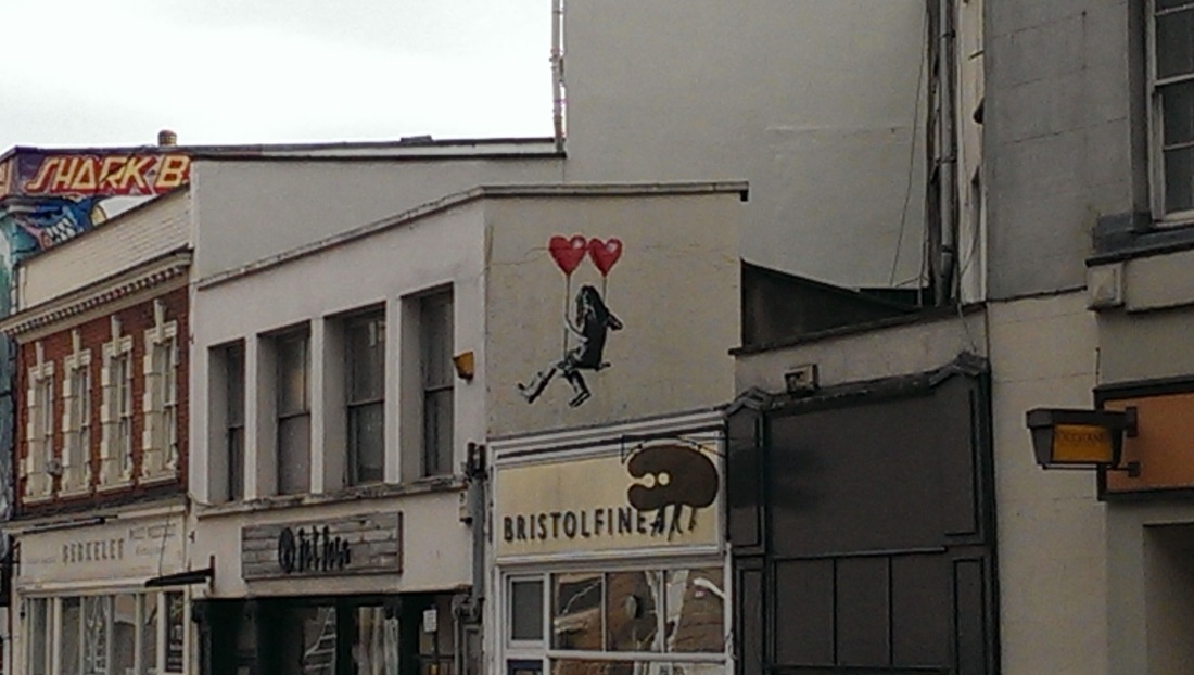
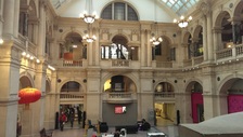
If you live in London you are spoilt for art galleries. Incredibly so in fact.  It is easy to forget this fact.  Recently I was in Bristol.  It is a splendid city, all wharves, cycle lanes, the inherited wealth of the slave trade and Banksy.

Bristol has, beyond a large number of smaller commercial galleries, three main public museums on offer and these are the Bristol Museum and Art Gallery, the RWA and the Arnolfini.  I was fortunate enough on my recent visit to be able to go to all three.

The Bristol Museum had one of its main art galleries closed, and so I was denied the opportunity to see the Barbara Hepworth’s and other major names that it boasts.  It is an interesting place though.  A fine example of a flagship regional museum.  It is housed in a large neo-classical building just past the impressive Willis Tower.  It has a fine natural history collection (dinosaurs, a gorilla etc), archaeological displays from Egypt and Assyria, porcelain, silver and glass, and of course fine art.
Picture
Picture
Picture
Picture
Picture
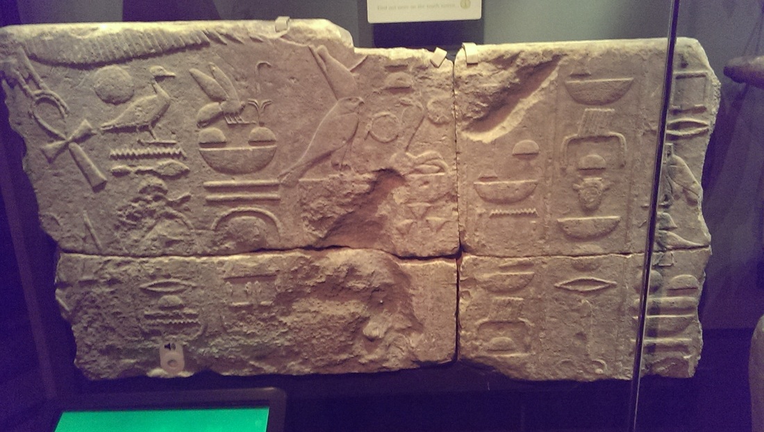
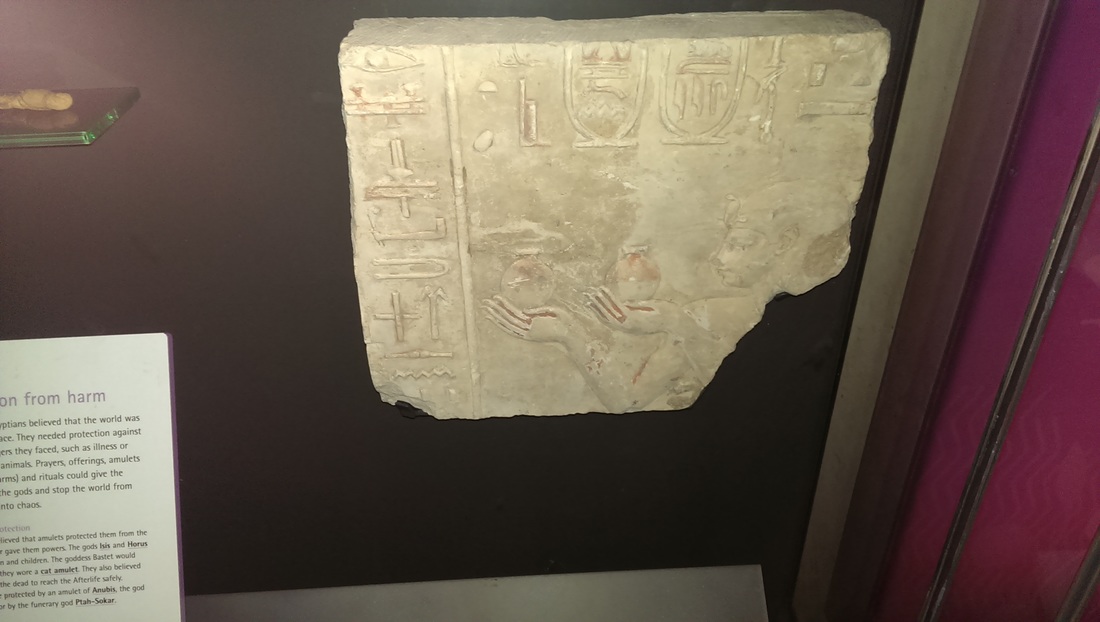
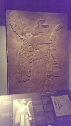
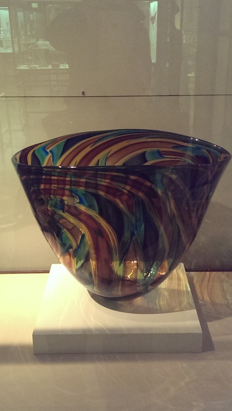
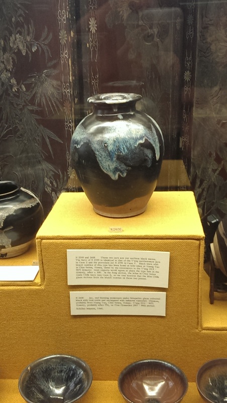
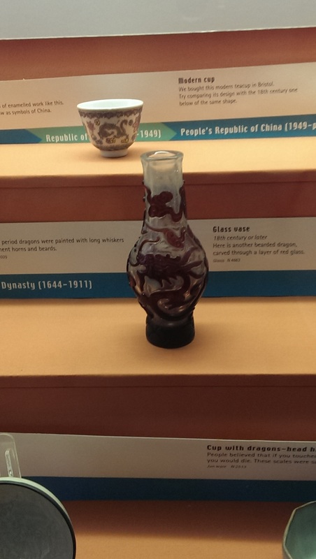
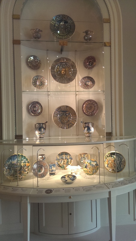
The Egyptian display is quite impressive.  I have not great interest in ancient Egypt but broken tablets of Egyptian hieroglyphs always appeal to me.

Next door is a room of Assyrian friezes from a town in Syria (a town which has recently borne the brunt of fighting Daish and the friezes still in situ have been substantially damaged). They depict winged genie figures all of whom seem to be carrying handbags.  They are intriguing figures. See them if you are there.

Wend you way upwards to the top floor (if you have an interest visit the natural history section, I didn’t have the time unfortunately) and you will find the porcelain silver and glass at the back of the museum.  I am a sucker both for porcelain and glass.  They had an excellent display of the depiction of dragons in these (and other mediums).  Some truly ancient glass and porcelain on display.  Lustrous bowls also.

Picture
Picture
Picture
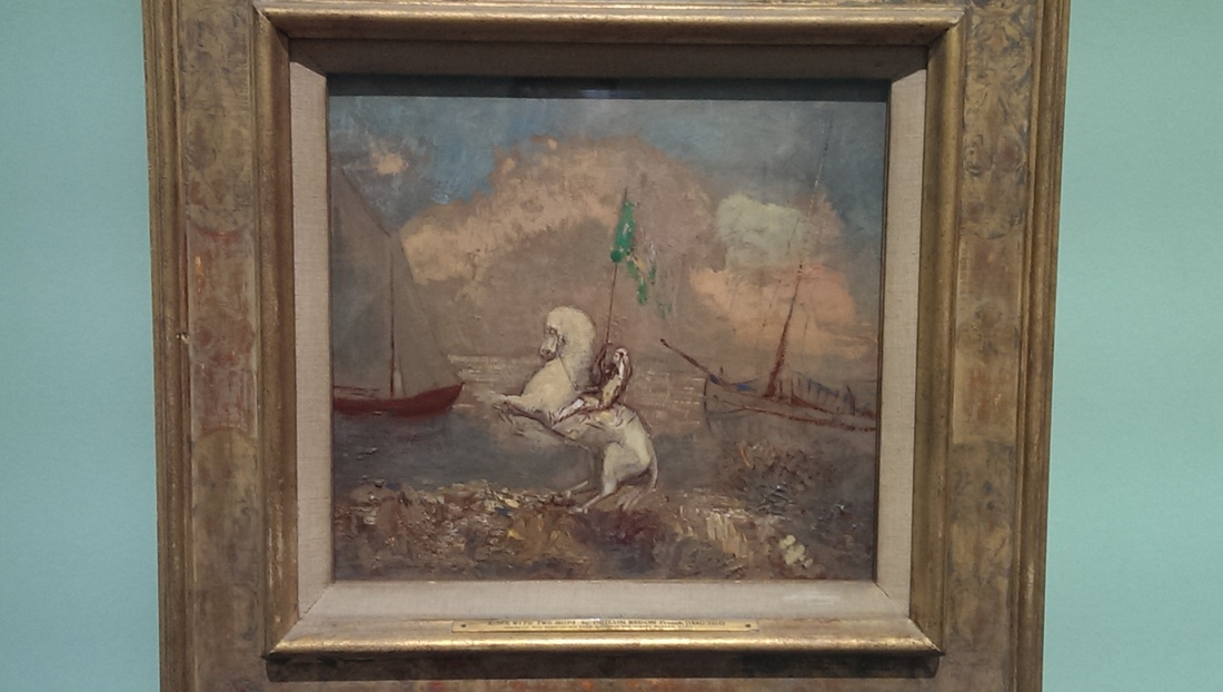
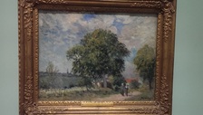
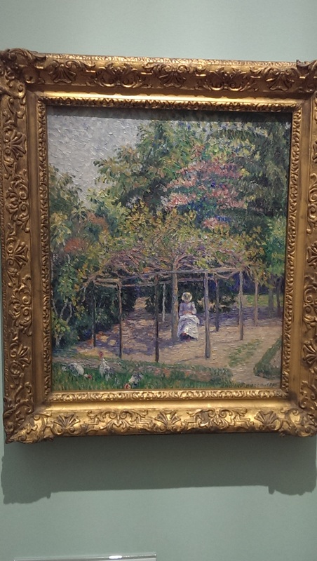
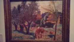
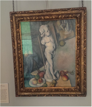
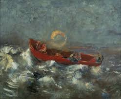
Then onto the art.  As I said one gallery was closed so I just had to stare, enraged, and the barriered door and wonder vaguely what was inside.  Outside there was much to see.  The issue that many regional and smaller museums have is the work while often technically very good, is just a bit dull.  Idyllic landscapes, boats on canals, that sort of thing.  Bristol museum has these but it also has some things that are very good. For example there were a couple of very enticing Pissarro’s and opposite to them a very intriguing Redon of a knight between two sailing ships.

Picture
Picture
Picture
Picture
Picture
Picture
Picture
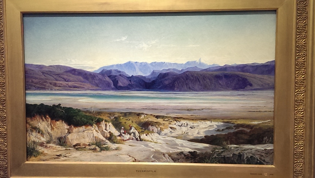
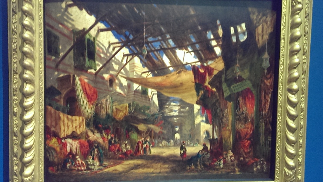
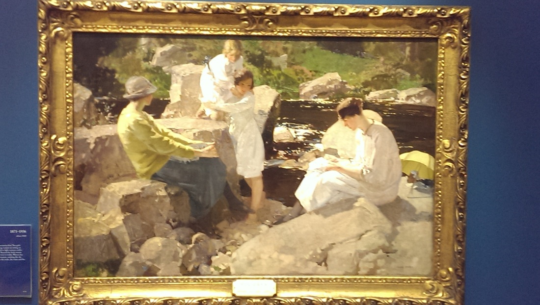
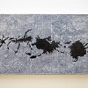
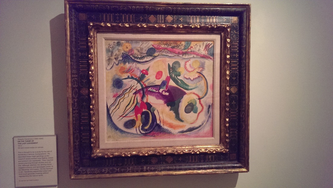
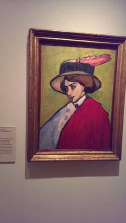
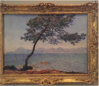
Other pieces from people I hadn’t really encountered before called out. Such as Harry Watson’s Holidays and William James Muller’s The Carpet Bazaar Cairo. Edward Lear’s The Mountains of Thermopylae also enticed.  The looming purple mountains over an empty desert. Very nice. Eugene Carriere’s The Pianist has a bleak mournful air about it.  Christopher Wayne Nevinson’s Dog Tired, stark angular men looking exhausted. There were of course others.

Picture
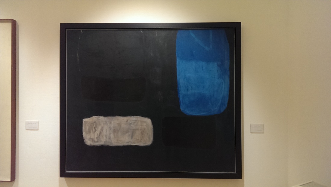
There was a modern gallery in which the other works were blown away and completely dominated by a moody and menacing William Scott.  Black, blue and white squares.  The picture doesn’t really do it justice but it is very good.

Picture
Picture
Picture
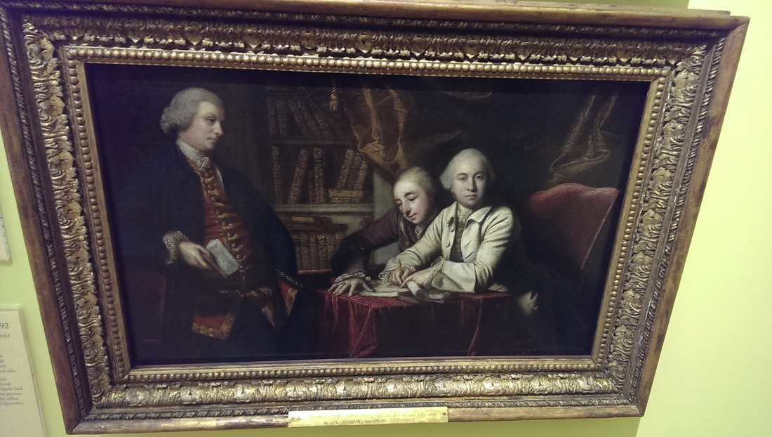
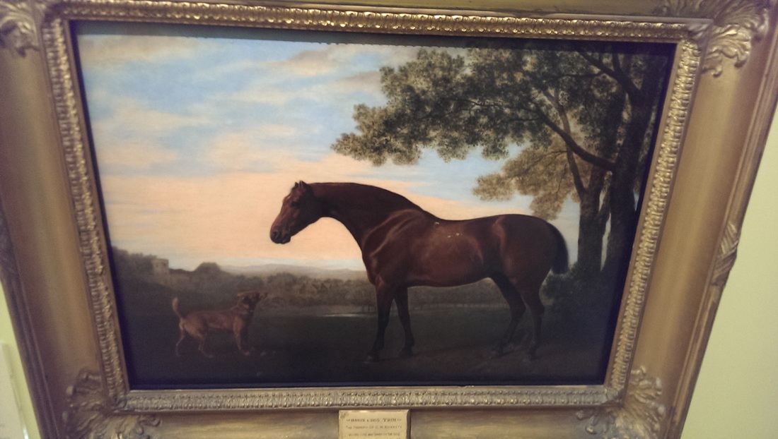
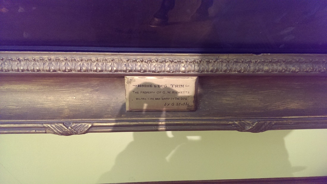
Off this was a 19th century English art gallery.  An ethereal Joshua Reynolds called The “Out of Town” Party.  Then in the far corner was a small John Stubbs.  Much smaller than you usually see of a horse peering at a dog.  It is a good painting.  The horse and the dog feel very real but what really makes it is the dedication at the bottom of the paining.  This back story really adds to the experience of looking at this painting.  Context can, I think, very much change your perception of a work of art.

That was it for the Bristol Museum,  a short trot up the road is the RWA.  It would appear that the RWA doesn’t have a permanent exhibition but much like the RA (of which it is the Western sister), it shows changing exhibitions.  Unlike the RA it is cheap to get in (£6,  £3 with art pass). 

The exhibition space consist of four medium sized rooms.  Two of them where showing Edwardian landscapes of the local area. You know what I was saying about boring works in small museums,  well exactly, although Studland Bay by Roger Fry was pretty good.
Picture
Picture
 The other two rooms though were very good. A display of work by currently active artists, called Imagined Artists.  They had some good stuff here. There was small rowing boat on it is side for some reason but that aside some good things. Two artists particularly appealed to me.  There were two works by and artists called Lydia Halcrow; Spilled Time and Longshaw Drift.  These used maps with shapes overlaid with drawn shapes.  Maps appeal to me, they have a general appeal I think and these were very good pieces.  The other artists was Tim Harrison and had produced 2 Landmaps , one in gray, one in black showing an imagined topography.  This exhibition was good and has given me two new artists to watch out for.

Finally I called into the Arnolfini.  It turned out to be dedicated to video art so I left immediately.

0 Comments

A Change in direction

3/20/2016

1 Comment

 
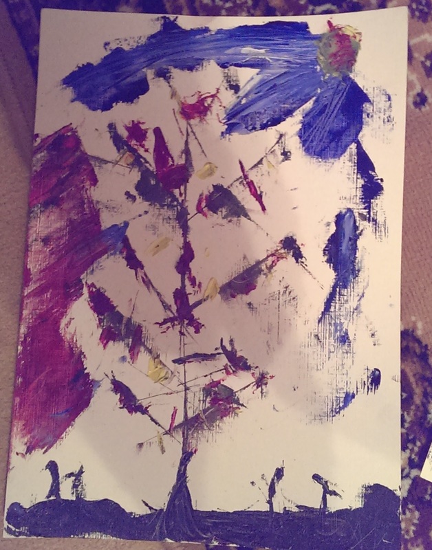
I suddenly noticed that I don’t really do left over paintings anymore.  I used to do these at the end of every painting session to use up the left over paint and some of them such as Mana from Heaven, Migrations Patterns and Journey in the Rain were quite successful.  Indeed Migration Patterns went down well in the recent exhibition I did.

I felt less of a call to do them now.  This I attribute to a number of things.  I spend much more time on my main works now (such as 2 Pancras Square).  Specifically I spend much more time just looking at the painting in progress and thinking about it than I used to.  I have become much more patient.

The other factor is the Pattern Experimentation.  My urge for abstraction has been channeled into these.  On realising this I tried doing a four more Left over paintings (see below) but I was not inspired in doing them and they were uninspiring in my view. I think they are the last of their line. In short I have become more interested in the conscious construction of a painting then just painting and seeing what happens. 
Picture
Autumn Gales
Picture
Building in the Wind
Picture
Stone Circle
Picture
The Conference
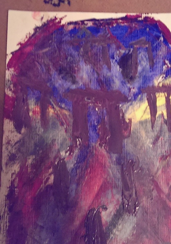
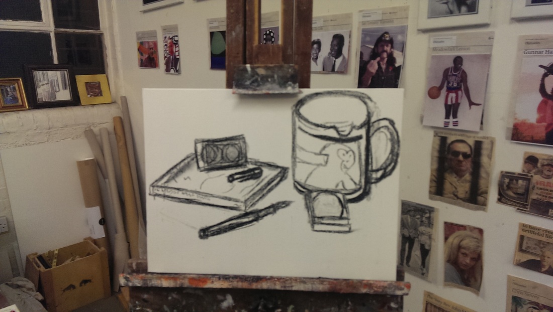
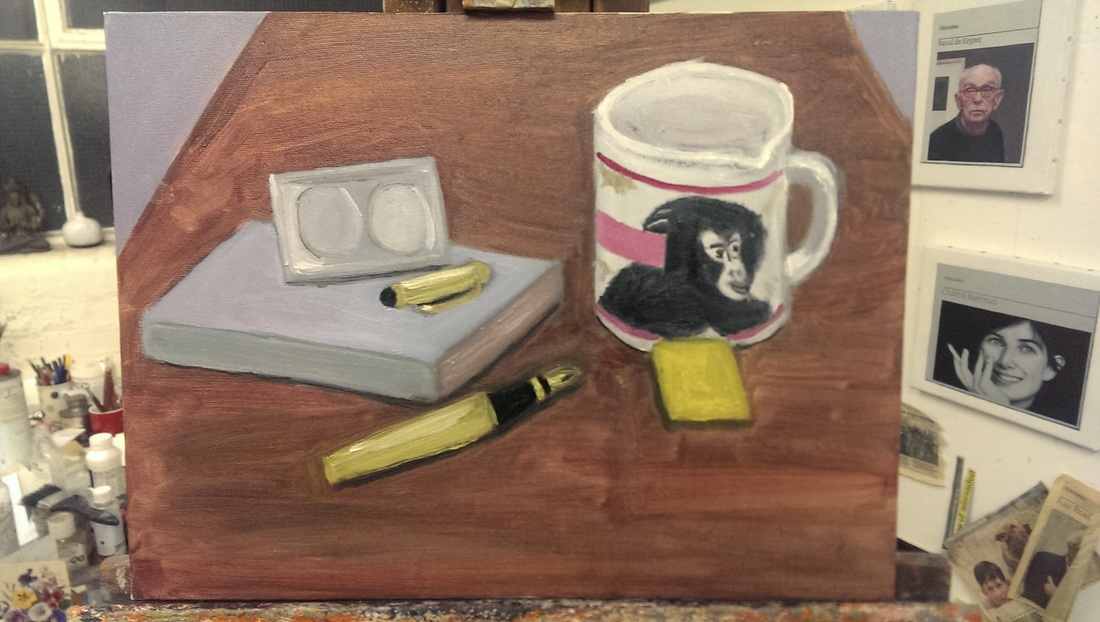
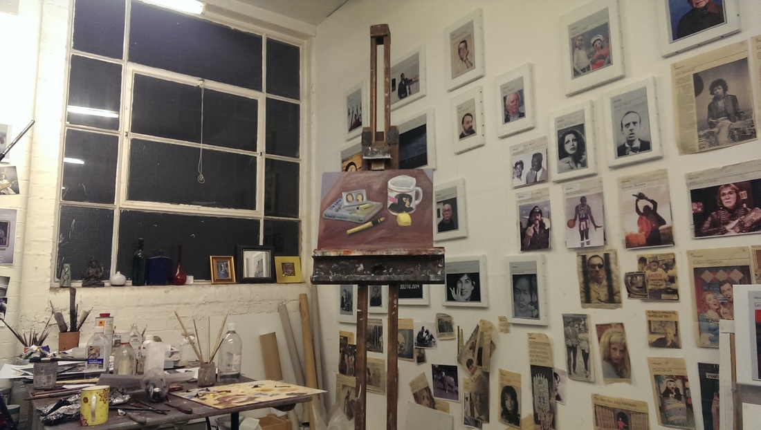
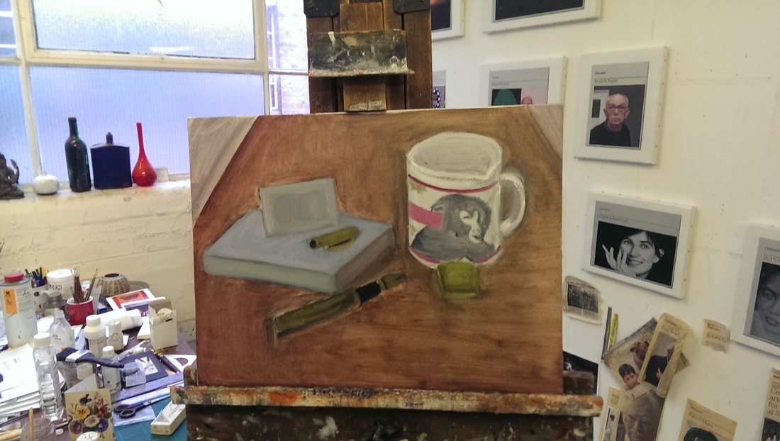
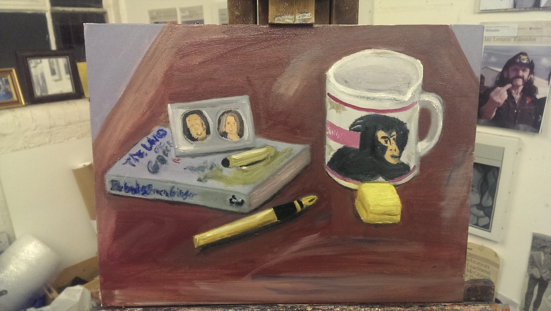
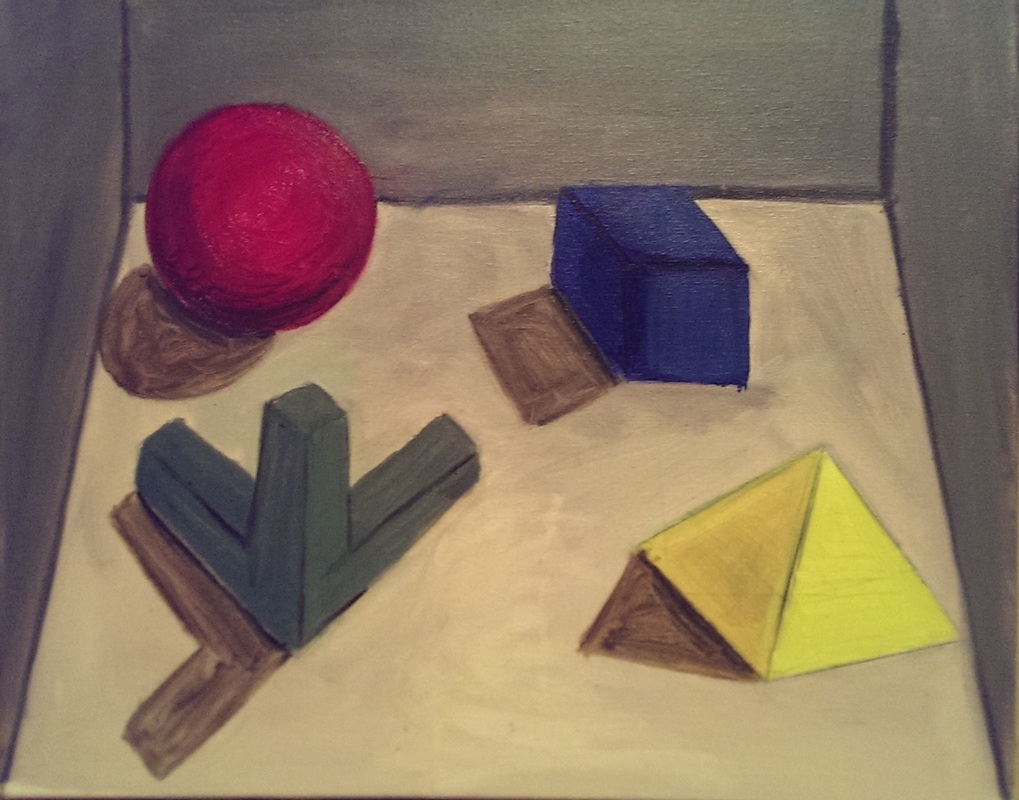
This conscious construction has basically two outlets.  The first is still life.  At the suggestion of Hugh I gathered some objects together to paint in a classic still life.  I very much enjoyed this process and was pleased with the outcome. The arrangement of the objects is a significant part of producing the painting.  They are clustered into two groups so I removed the cap from the pen, put it on the book and have the pen pointing at the mug and the box so to join the two halves together. First I did a sketch but the cup came out far too big, dominating the right hand side of the painting and overwhelming the other objects. The painting started with blocking out the objects with basic colours before adding in the detail. The pen gave me significant difficulties and the size had to be altered a number of times.  Finally the table was a bit dull and needed activating with some details
Picture
Picture
Picture
Picture
Picture
Picture
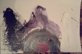
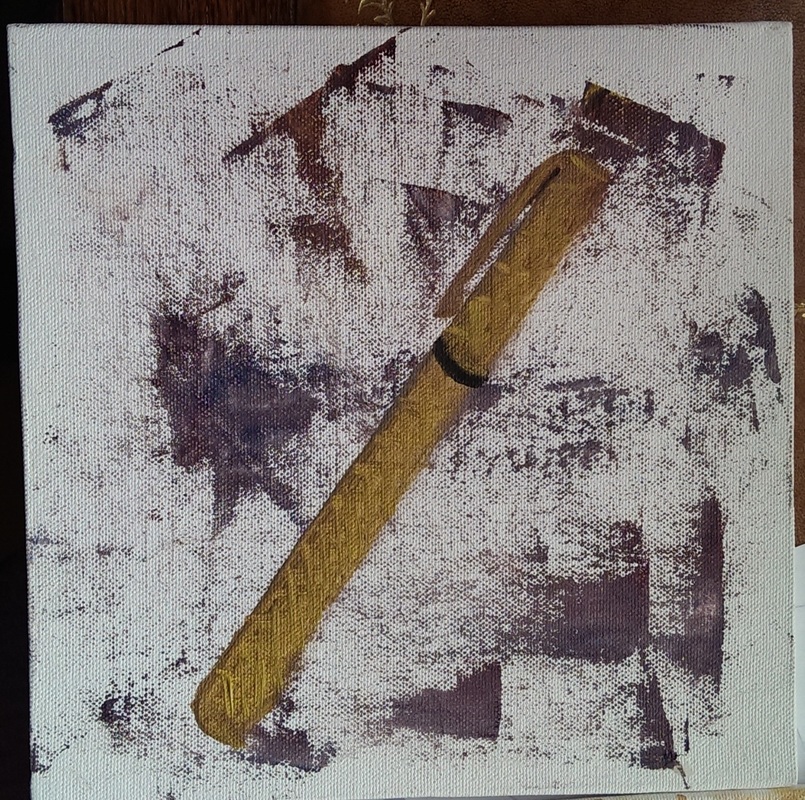
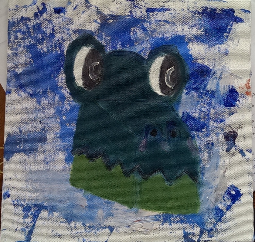
During the preparation for this though I did a number of sketches and two small oil paintings.  This melded the still life idea with the background seen in my recent Tiger Moth paintings.  They make for an interesting result. The crocodile box, while an interesting object didn’t make it into the final piece, mainly because it is too fragile to transport.
Picture
Picture
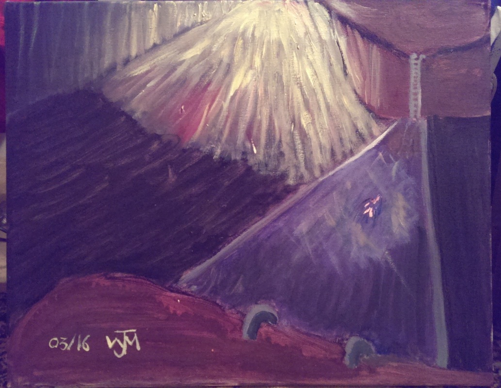
The other direction is the attempted rendering of dreams I have had.  This is far more difficult in that there isn’t an object to work on.  The first is a figure swimming in a strange underground swimming pool and the second a series of geometric shapes.  They made for an interesting experiment and I am quite pleased with the results but there are two realisations. Firstly these would have been better if I had been doing the final painting from something concrete,  rather than from just my mind and secondly they are probably better off being elements of another painting rather than subjects in their own right. Both can also be seen in the Maxi Mix page.

Picture
Picture
All of this though makes me thing that with a shift in approach I probably need to redesign my web page.  I have been meaning to do this for ages, for example to add a “Shop” page.  More on this in the next few weeks.

1 Comment

Caught by the Courtauld

3/13/2016

0 Comments

 
Picture
Picture
Picture
Picture
Picture
Picture
Picture
Picture
Picture
Picture
Picture
Picture
Somehow, despite living in London for over a decade, I only went to the Courtauld to the first time this weekend. It is one of those places every so often I say, I should go to etc, but then I don’t. Finally I have.

It is a cave of wonders and I highly recommend you go.  It is not part of the national collection so you do have to pay to go in.  Tucked away in the entrance arch to Somerset house, it is larger than it looks laid out over 2 and ½ floors with a café basement and lockers in which you can store bags, toddlers etc.

Then you navigate up the medieval style, distinctly Escher like, stair case to see the art on display.  Hint for dealing with multi-story galleries; start at the top and work down.

One of the things that drew me to the Courtauld was the Botticelli and Hamilton Collection exhibition. This consisted of a series of drawing sketches illustrating Dante’s Inferno, and a selection if illuminated medieval books.  The sketches while intellectually interesting where quite dull.  They were very faint and difficult to see and frankly I didn’t have the patience.  The illuminated books on the other hand were very enticing.  A particular favourite was a bible which on the open page had the main parts of genesis summarised in a series of colour illustrations backed with gold. Everyone likes gold. Another had a fine illustration of Alexander the Great being lowered to the bottom of the sea in a diving bell.  Apparently diving garb is the same as full coronation regalia.  There was also a tiny book which was very pretty but is difficult to see how any non-hawk could read.

This exhibition is not up to much but worry not as entry is included in the price of general entry to the gallery and that is well worth it. Moving from the top floor down I saw many wonders. The top floor has a large domed ceiling but is carefully subdivided by display walls to give the place a more intimate feel (and no doubt to provide more hanging space). I by passed a room of Freud and Auerbach as holding little interest to me The next space was a room with a number of Kandiskys in.  I was particularly drawn to a work called “On the Theme of last judgment”.  Vague figures and landscape morph out of the abstract shapes and in the background there appears to be barbed wire.  Somehow he has managed to get oil paint to act like watercolour.

Next to this was a piece call “Portrait of a Young Woman in a Large Hat” by Gabriele Munter.  That is exactly what you get with strong lines and deceptively simple shapes making a striking portrait.  I liked it.

The next room was a series of tiny Seurat’s.   It was very well laid out so you could see the development of his style. You could see the introduction of marks of colour and this moving onto pointillism proper.  Not only good art but an example of good curator-ship.  Well done, whoever it was who did this.
The next room had a dull and depressing Walter Sikart painting but also two luminous Bernard landscapes.  They were called “Landscape with Olive Trees” and “The River Seine in Paris”.  These fought for attention with, and over came a Renoir (girl tying her shoe). I like the way Bernard's tree trunks blur out and then become leaves. 

Onward and another new discovery (for me) Ferdinand Leger  called "Contrast of Forms". Painted on burlap (he must have been skint). Its good though.  Other striking works included Mattise’s Red Beach a very good portrait by Pierre Bonnard with the original title “Woman in interior”.  She is that but it is strong and intimate portrait with bold colours and solid use of paint. He married the model apparently (who doesn’t?).  There was also a figurative piece by Braque.  I’ve only ever seen abstract but The Port of L’estaque is very good.  He uses green blobs in the sky which is a trick I will steal. The prize for this room though goes to another unfamiliar name, Larionov’s "Still life in a Major key".  Objects rendered in simple lines and shapes and with effective use of contrasting primary and secondary colours. Particularly liked the blue kettle.

That’s the top floor and on the next floor down is the Renaissance moving into impressionism. This time following the conventional route round I started earlier and went forward in time. The Courtauld is a little like the Wallace collection in that it isn’t just pictures and sculptures but other objects as well. Books, furniture, fine table wear and also the decor of the building itself are part of the collection.  The thing that catches your attention in the first room on the 1st floor is a fine selection of decorated plates.  There are also some Botticelli which are interesting to see having seen his sketches earlier.  Cranach has special significance for me and it was nice to see his Adam and Eve.  I like his apples and his crazy animals.  There was also a number of Rubens including an intriguing and very dark Rubens landscape. I was also intrigued by the very odd perspective in 2 paintings, the one I preferred of which is "Esther before Ahasuerus".  It is like you are looking up at the action from a flight of steep stairs,  a view you share with a dog that is in the foreground of the piece.  He does flesh and violence best though in my view and the room was dominated by Rubens’ "Cain killing Abel" hanging over a large ornamental fire place. 

Moving on the next room was a series of fairly dull portraiture.  Fine examples of the genre I am sure but I find them a little un-engaging. Landed gentlemen in early versions of watch catalog poses.  The striking work in this room was Joshua Reynolds' "Cupid and Psyche" with these strange luminous light grey figures, ethereal and odd.  Again hanging over a fire place.

Then into the next room and suddenly you are in the impressionist era.  The paintings are on the whole much brighter.  Presumably they mostly abandoned the use of coloured grounds which would make sense if you were painting out of doors as there wouldn’t be the time.  Monet and Renoir in evidence but there was singular Degas called “Woman at Window” which was dark and the painting was barely there at all yet it was still effective.  The paintings have to fight for your attention with the ornate ceiling of the rooms.  It adds to the whole experience I think.

The final two rooms are real show stoppers.  The next room was a long oblong.  Manet’s “A Bar at Foiles- Bergere” is here. Modigliani and Gauguin also.   My favourites included a small Rousseau called the "Toll Gate".  It is the stark contrasting lines that make it work for me.  The diagonal line of the road and the wall contrasting against the straight upward lines of the trees and the figures.  You can see modernism hammering at the seams to get out. I also liked Cezanne.  Cezanne is in fact becoming a rapid favourite of mine. He had three landscapes.  I like his landscapes.  I like his trees especially. He also had a still life that greatly appealed called “Still life with a Plaster Cupid”. I would have like to stay longer in this room but I was driven out by a student with trendy blue dyed hair giving the most soul crunching embarrassing art talk I have encountered in a long while.  I meant to go back in after she had gone but I got distracted by the next room.

The next room included a “Vase of Flowers” by Monet.  Since last week’s exhibition I have more of an appreciation of flower paintings.  He used thick blurry paint to make the flowers stand out.  There was a Lautrec of a very ill looking woman.  There was the famous Van Gogh of a portrait of him with an ear missing.  In one corner was a large Seurat of a woman powdering her nose (his mistress, unsurprisingly).  Pointillist and hypnotic. The two stand our works in this room, for me were a Van Gogh and a Monet.  The Van Gogh was called Peach Trees in Blossom. So vivid and striking, particularly the sky.  The Monet’s was “Antibes".  It is deceptively simple.  An iridescent sea, struck through diagonally by a single dark tree.  Very good.

There was a mezzanine of dull drawings.  I was not interested.

Down onto the ground floor there is a single room of medieval art. All painted panels, religiousty and gold.  It would seem that in this period either nobody smiled or artists had yet discovered how to paint smiling.  Master of Fogg Pieta’s "Saint Lawrence", popping out of his gold background is particularly grumpy.  I was struck by how modern this looked.  This and also a piece by Quentin Mossys. I have seen similar things in recent art shows.

I would have liked to stay longer but I had to leave.  Bafflingly, and for the second time, the postcard collection contained a picture of a painting not on display. This time it was Degas’ Two Dancers on a Stage.

0 Comments

The Crux of Delacroix

3/6/2016

0 Comments

 
Picture
Picture
Picture
Picture
Picture
Picture
Picture
Picture
The National Gallery is currently showing an exhibition called Delacroix and the rise of Modern Art.  The conceit of this show is that Delacroix and those who were inspired by him gave birth to Impressionism and then Modernism. It is a nice idea.  I am often slightly suspicious of "inspired by" shows.  They often have two major issues.  The first is that the link between the main artist and those they inspire can often be a little tenuous or at least not as all encompassing as the show would like to make out (which makes the process of inspiration a little reductive).  The second is that, because those who are the inspirees are not the major focus of the show they are either minor figures or not  the major figures best work.

I also went into this show knowing nothing about Delacroix prior to this.  He was just another name the floated around vaguely in the artistic firmament filed in the "a bit like Rubens" box.  The show I am afraid to say had both of the problems that I feared it would.  No doubt Delacroix was revered as the show hammers home by a sketching painting by Cezanne showing him and other painters of the time worshiping the man.  Unlikely to be the only influence though.  This Cezanne painting, and indeed all the Cezanne's on display nicely illustrated the other problem.  They were less good examples and far from Cezanne at his best. An early Van Gogh makes an appearance, which is is interesting but not a particularly spectacular example.  Likewise in the last room was a Kandisky and a very rough Kandinsky it was.

This is not to say that I did not like the show.  I did.  For a start I was there with Hugh Mendes whose encyclopedic knowledge of all things art greatly enhanced the experience.  Also Delacroix himself I like.  The Lion Hunt and The Bathers were particular favourites.  The main thesis of the show was Delacroix's establishment of colour theory and the use of complementary and primary colours to create great visual impact was a significant turning point in art and a major inspiration.  One primary colour sitting in the field of the other.  This element and the move away from painting realistically to painting for effect.  The paintings then were selected to display this element and in that way the show worked.  In one way then this exhibition works better for those who are interested in art theory more than those who are just interested in art. 

Once you see these elements you see them again and again. Blocks of primary colours,  a bright main figure popping out for the rest of the painting.  And then you see quite how far this idea develops in for example Van Gogh's Olive Trees (which is a good example) and another favourite Gaugin's I Raro Te Oviri. For me the highlight of the show was the discovery of Redon. I had never heard of Redon before but I his work greatly appeals to me, I particularly like The Red Barque.  Another point of interest was the rediscovery of flowers as an artistic subject.  This is something the exhibition does do well.  The rooms are themed on subject and it makes for a great impact.  My favourite room probably was the flower room just for the great initial burst it makes upon the ideas.  I came away inspired to look at flowers again as a subject for painting.

I bought the postcards afterwards, as is tradition.  Oddly the collection contained a postcard of Music in the Tuileries Gardens by Manet, which didn't even feature in the show (although other obscure Manet's did).  Very strange.

I am glad I went as it taught me a lot, but I could easily see people coming away left cold and slightly baffled by it.
0 Comments

      Keep in Touch

    Subscribe to Newsletter

    Archives

    January 2025
    September 2024
    July 2024
    June 2024
    May 2024
    April 2024
    March 2024
    February 2024
    January 2024
    August 2023
    July 2023
    June 2023
    May 2023
    March 2023
    February 2023
    December 2022
    November 2022
    July 2022
    June 2022
    May 2022
    April 2022
    October 2021
    September 2021
    July 2021
    June 2021
    April 2021
    March 2021
    February 2021
    December 2020
    October 2020
    May 2020
    April 2020
    January 2020
    December 2019
    November 2019
    October 2019
    September 2019
    August 2019
    July 2019
    June 2019
    May 2019
    April 2019
    March 2019
    February 2019
    January 2019
    December 2018
    November 2018
    October 2018
    September 2018
    August 2018
    July 2018
    June 2018
    May 2018
    April 2018
    March 2018
    February 2018
    January 2018
    December 2017
    November 2017
    October 2017
    September 2017
    August 2017
    July 2017
    June 2017
    May 2017
    April 2017
    March 2017
    February 2017
    January 2017
    December 2016
    November 2016
    October 2016
    September 2016
    August 2016
    July 2016
    June 2016
    May 2016
    April 2016
    March 2016
    February 2016
    January 2016
    December 2015
    November 2015
    October 2015
    September 2015
    August 2015
    July 2015
    June 2015

    Categories

    All

    RSS Feed

Proudly powered by Weebly
  • Gallery
  • Blog
  • Podcast
  • About Me & Contact