|
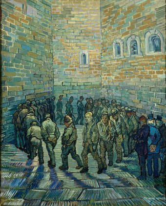
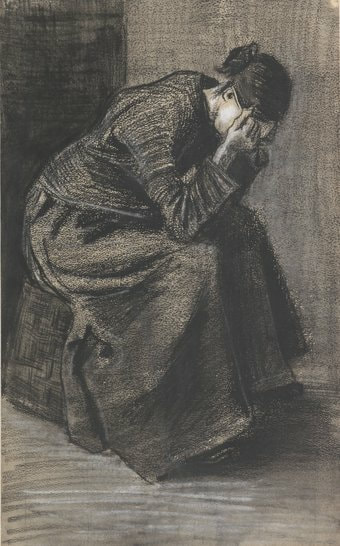
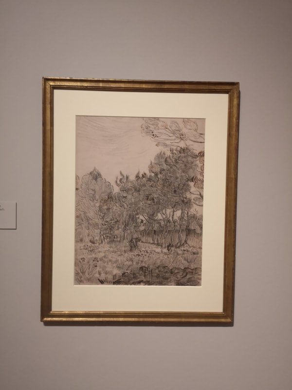
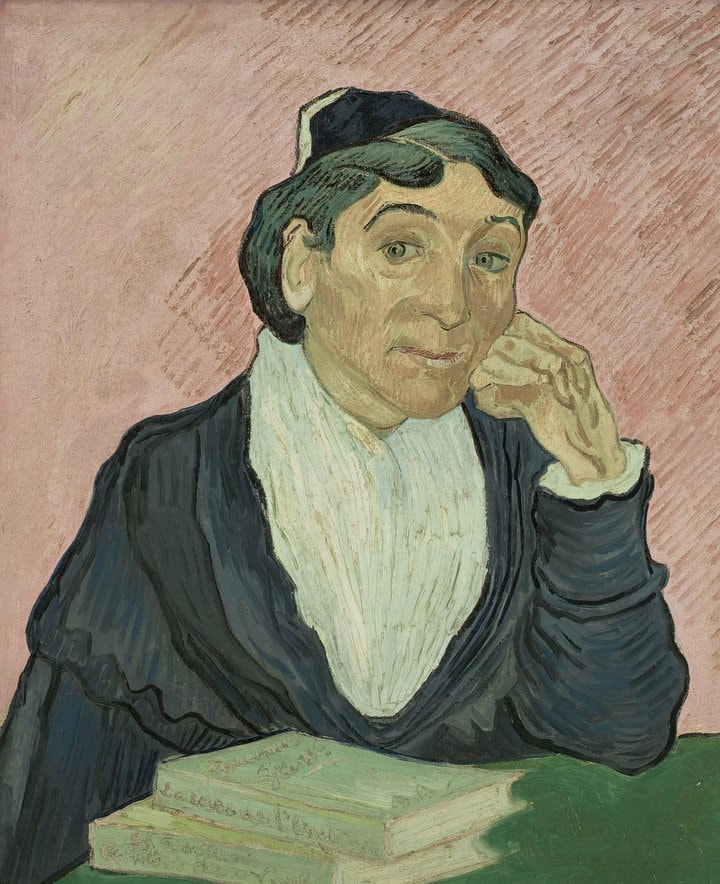
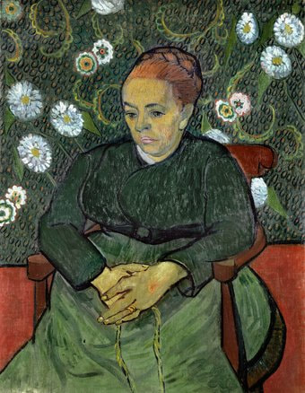
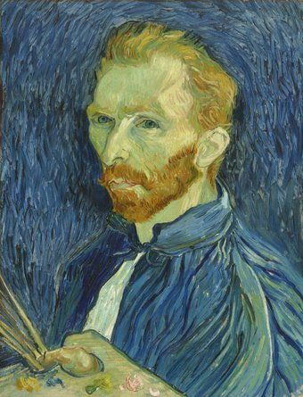
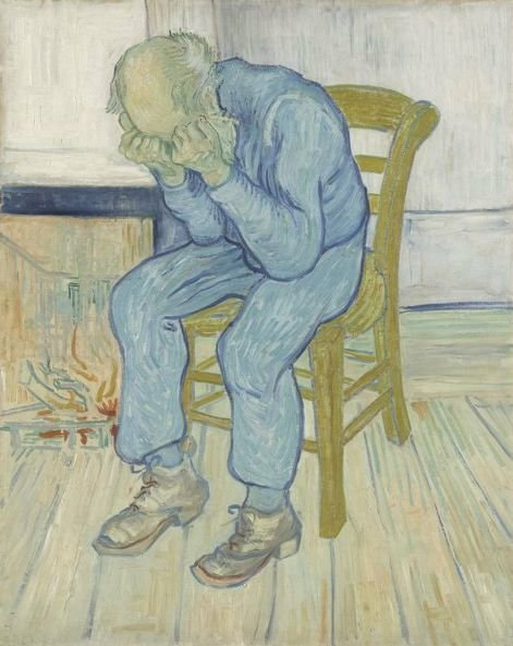
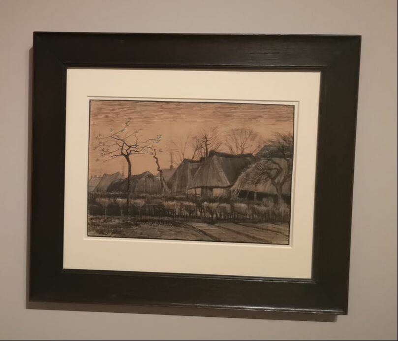
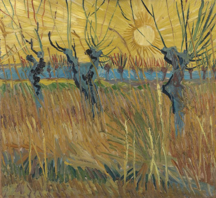
Van Gogh is at the Tate Britain. Tate Britain justify his presence there with a tenuous link with London where he lived for about a year. He didn't actually doing any painting here, a few sketches but he met some people, was inspired by others and forged links with impressionist painters who lived here, most notably Pissaro. There are in fact a couple of very nice Pissaro's in the show. The most obvious link is also probably my favourite picture in the show, that is Van Gogh's transcription of Newgate Prison (above), the original being by Dure. I love this painting. I like the different texture of the bricks and the way the lines on the paving stones alternate between vertical and horizontal. That and the slightly comical and goulish faces on the trudging prisoners. Just a couple of asides. If you are thinking of mocking any Americans for saying Van Go. Well we say Van Goff, and that is not right either. I have it on good authority it is Van Hoch. So there you go. Also prices have really gone up at Tate Britain. The full ticket price is £22. I was very pleased that I have my art pass, which gives you half price tickets. You will see in this show some Van Gogh you have not seen before. These split into basically two different categories. The first (which I will come back to later) is his earlier paintings. They are more stayed, more muted, more classical than his later work. The second are his sketches, both drawings and watercolours. In addition to this there are much more casual sketches included in letters, some of them in English that he wrote to various people. They are interesting and intriguing artefacts. As indeed are letters written about Van Gogh and sketches other people did of him. For me though these sketches are more artistically interesting. The figure of the hunched figure head in hands is one Van Gogh returns to again. The one here (above left) is called Grieving Widow which is probably something you could have guessed. The use of different tones is impressive here, particularly the use of white chalk to produce the highlights, which reminds me that I must get some white chalk. It took me a while to notice that almost the entire surface is covered. The other is a terrible photo, so go and see the original but it is a landscape and you can already see the swirling twisted trees that you see in his paintings. More of which... now. compassion for his sitters. In fact the painting above left opens the show and it is really nice portrait. The scraping effect on the wall behind her really adds a sort of halo effect to this gentle maternal scholarly figure. I really like it. The other (above right) is more somber and restrained slightly sad figure. He has done that classic trick of the background on the left hand side being lower than the right. This gives a 3d effect. The Mona Lisa does this most famously. It is used in portraits a lot. Look out for it. This example is a bit extreme perhaps. I like the way she sort of emerges out of the green background. The white flower by her left arm is too strong and is quite distracting. colour contrast between the face and the rest of the picture and this and the swirling blue background really give the painting its power. Next to it, using a much softer combination of blue and yellow is At Eternities Gate (above right). Here again we see the crouching figure and also the appearance of the wooden chair that makes its way into many of Van Gogh's paintings. incidentally one thing you learn from the show (if you didn't know already) is that Van Gogh was only painting fo 10 years and all his famous paintings, the super colourful ones, were done in the last 3 years of his life.
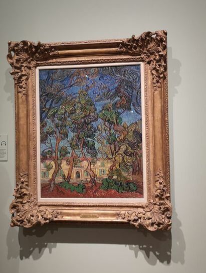
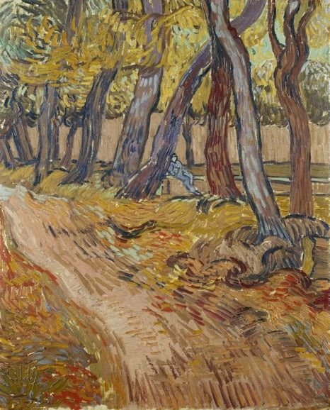
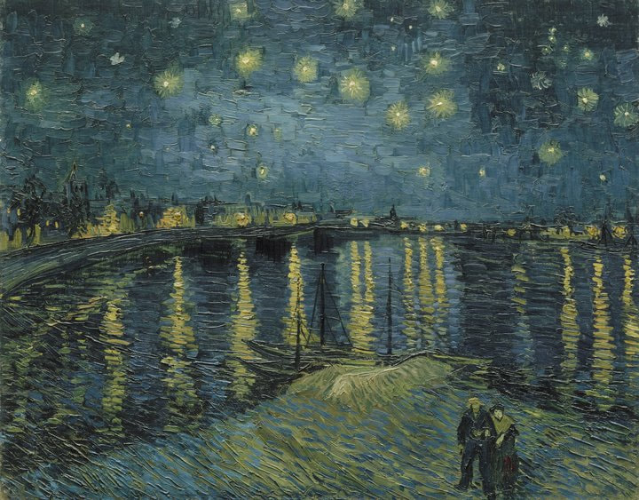
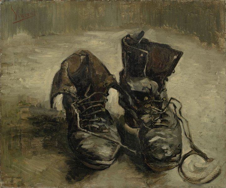
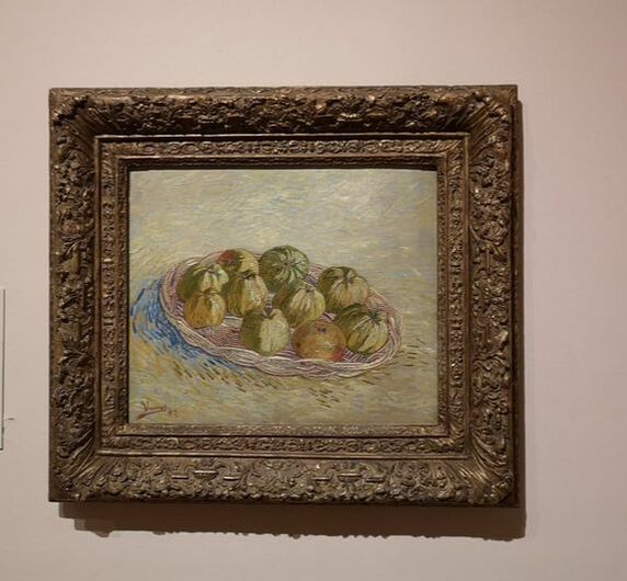
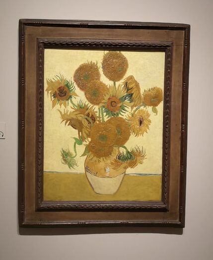
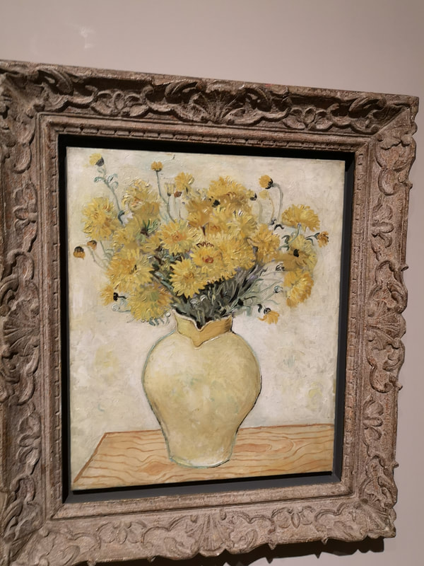
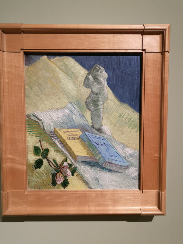
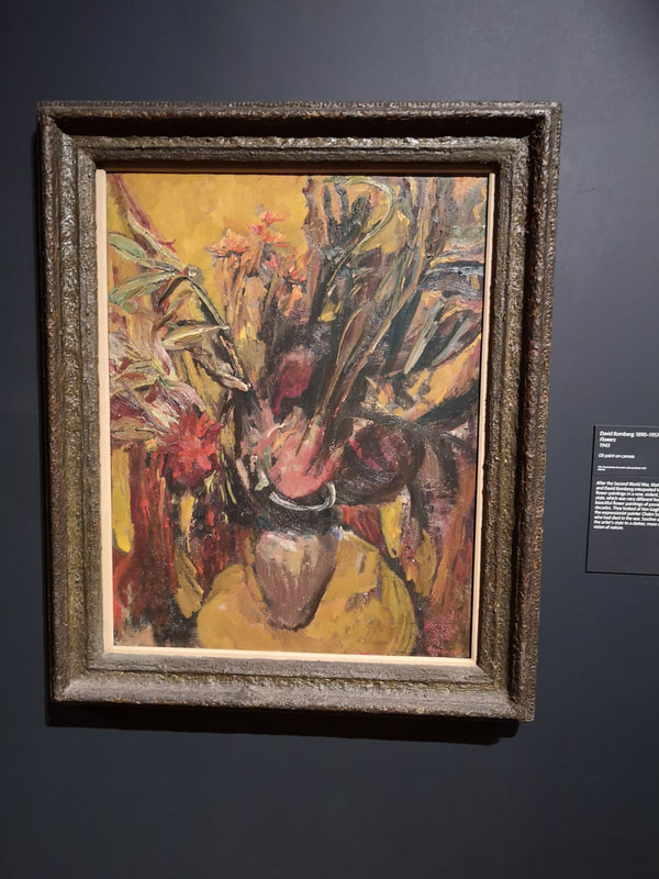
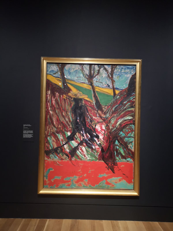
opposite of all these things. A riot of colour, bold red for the earth in stead of brown, a bright yellow building and these swirling twisted trees, all bent and storm battered. There is an odd dichotomy going on in this picture, the trees look like they are being buffeted by a mighty wind, while the building behind it seems all calm and serene. There is one detail I particularly appreciate. Not all of the shutters are open. We see this again in the picture above right, which is a painting of the garden and the asylum where Van Gogh committed himself. He did some of his best work in that place, this painting, with its yellowing trees and lonely slouching blue figure, and the prison scene we opened the blog with. There are other landscapes in the show, many in fact but the stand out star of the show is Starry Night (above). Van Gogh photographs well but looks even better in person. What you don't get from this painting, indeed from a number of them is the sheer luminosity of the paintings, the slickness of the oil. Its big this picture, and the yellows really shine, blending into green, obviously applied to the still wet blue. That's the other thing after a while you realise, there are basically only two colours at work here. A masterpiece of tone, colour and composition. Having demonstrated he can nail portraits and landscape, the show then goes on to show Van Gogh's mastery of still life. Boots (above), has become one of him many iconic images. Again there is allot done with a very limited palette. The detail is great and the broader brush strokes help bring out the dilapidated state of the boots. There were various other versions by other (British) artists on display but they didn't really compare. One day Van Gogh saw some apples and was so taken with them that he immediately went away and painted them three times, giving all the paintings away to various friends. One of the results is above right. They are presented to us on this shimmering almost water like surface with the shadow of the basket suggested by just a few marks of blue and red paint. The apples themselves look delicious. This one is much better in person than in photograph and is probably the painting I spent longest looking at. And of course sunflowers, wilting half dead sunflowers but still magical (above). It is an iconic image and mean that in both senses (because you know I'm a very smug person) in that it literally resembles an icon, both in the gold/yellow background and the texture of the deflowered sunflowers. I think you can see in this image a Japanese influence. Again there is a limited colour allette and there is a more subtle right hand higher than the left side thing. This painting really glows. They have shown it in a room with other yellow flower pictures and it blows them out the water. It was I noticed the only one showing dying flowers. As intimated, surrounding the Sunflowers like supplicants around the altar were various other yellow flowers by British artists. Of these my favourite of them was the above left by Christopher Wood who, pleasingly is very good at rendering wood. I was going to say something clever about this still life which is not by Van Gogh, although there is one of his in the show of just a plaster torso, but as I have lost the name of the artist I will not. The final room is very strong, even though there is no Van Gogh in it at all. In that room they are showing on a perptual loop the Kirk Douglas film of Van Gogh but there are also a number of spectacular paintings by British artists, my favourites of which were David Bomberg (above left), I am always pleased to see Bomberg and Francis Bacon (above right), with his violent study for a picture of Van Gogh. Inspired by but completely different and idiosyncratic. Quite a neat way to end the show I thought. In summary, its good, its worth going to.
While your here why not have a look at my gallery page and if you are feeling reckless, maybe by something?
0 Comments
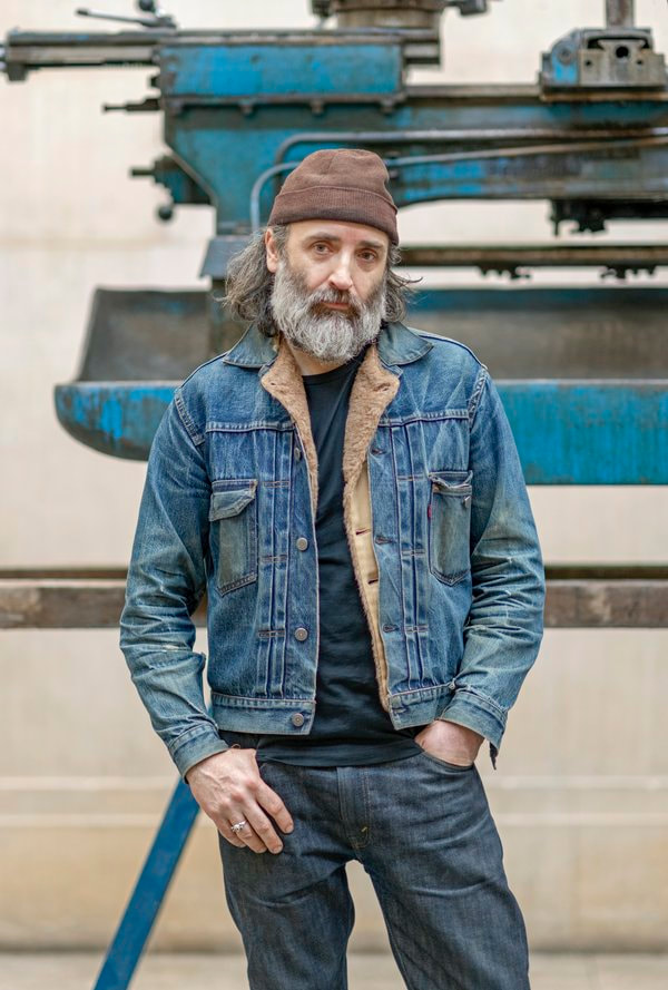
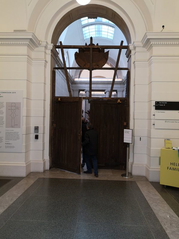
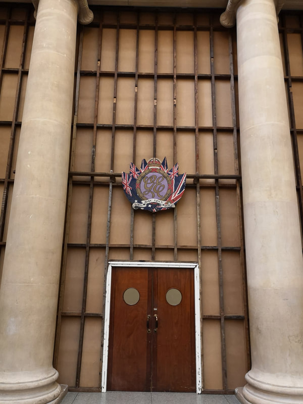
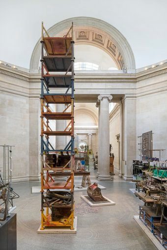
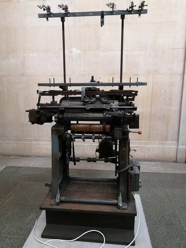
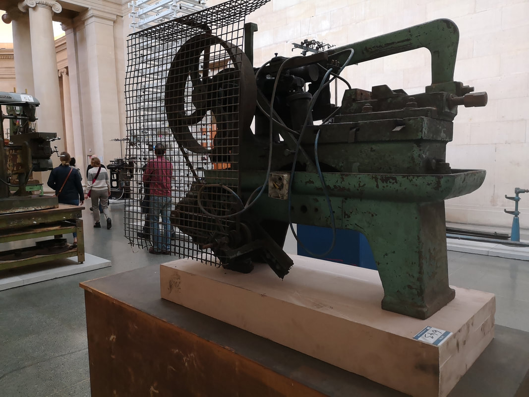
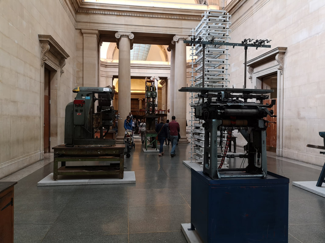
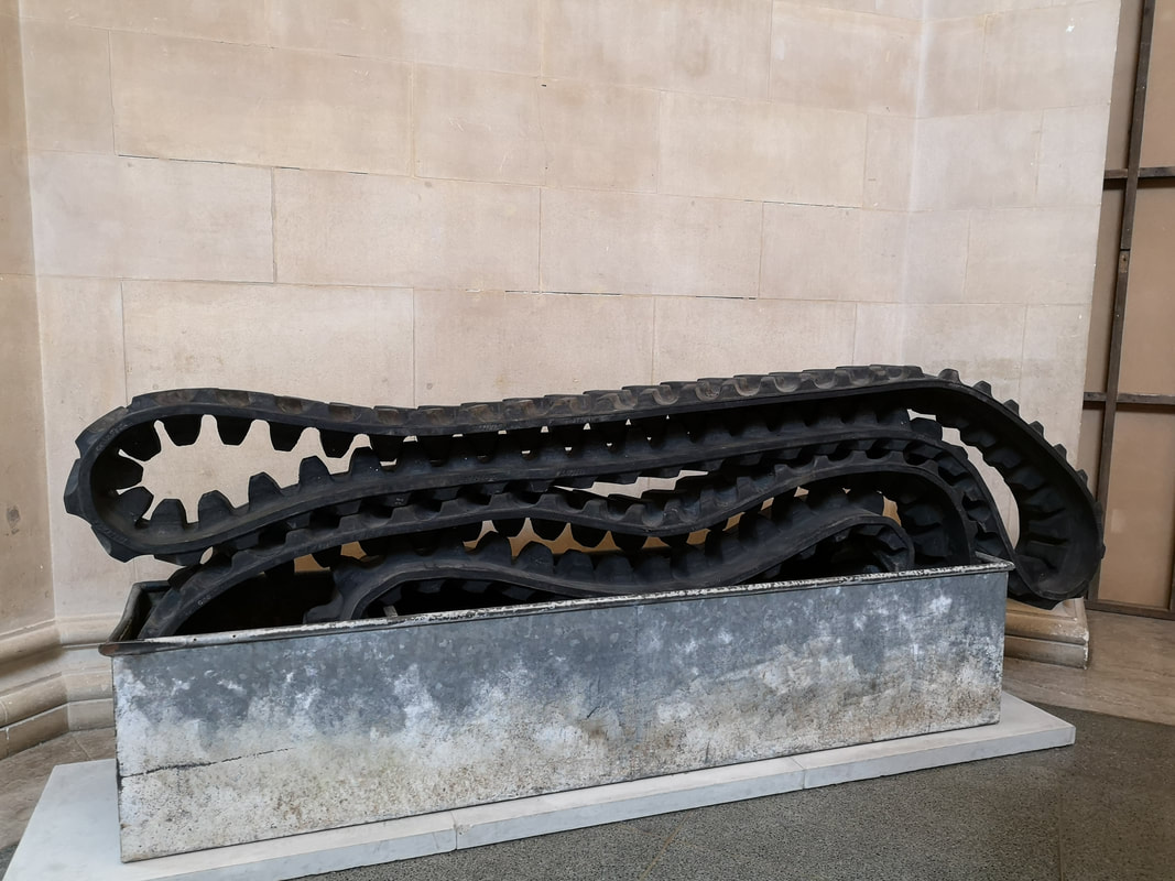
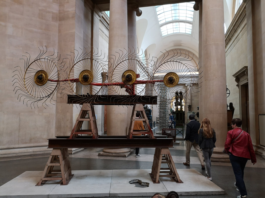
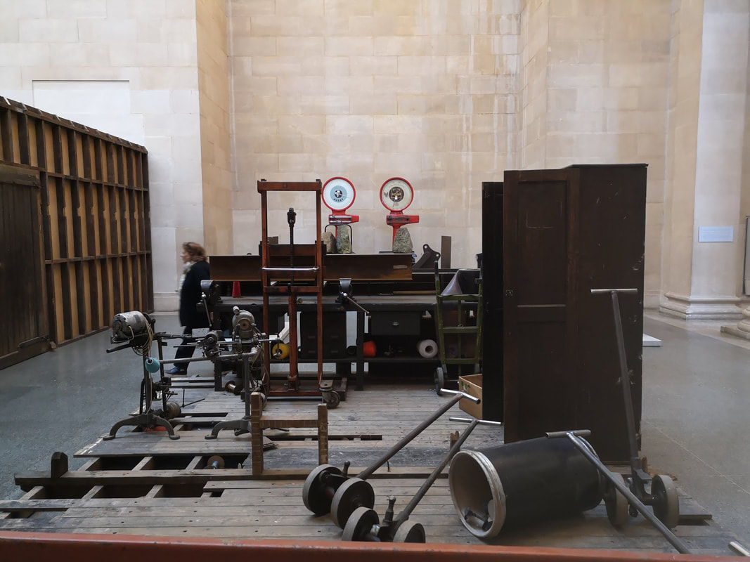
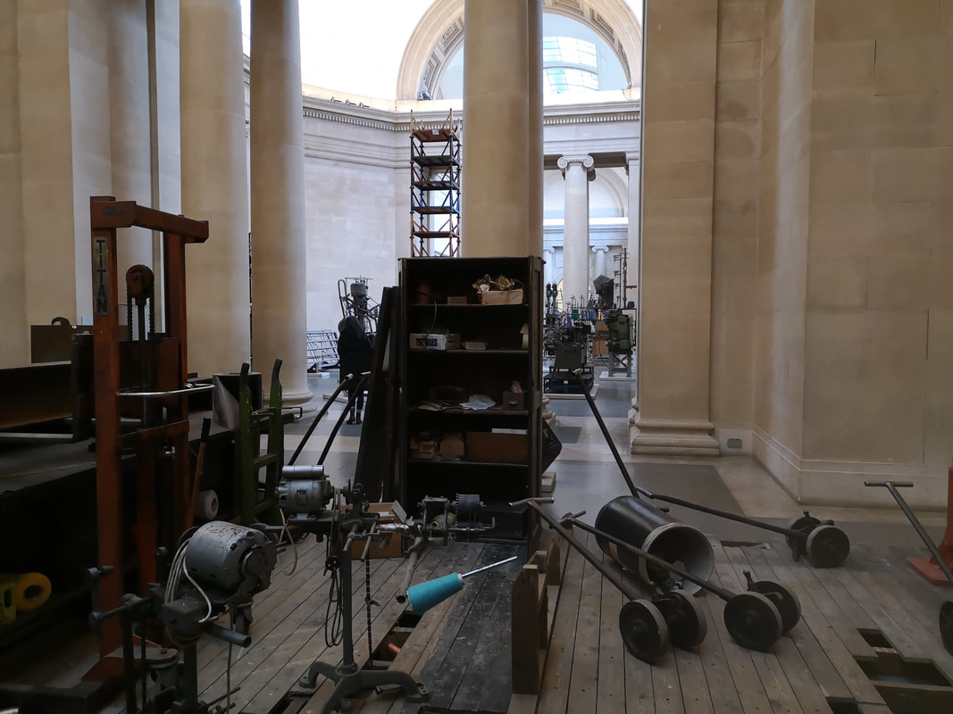
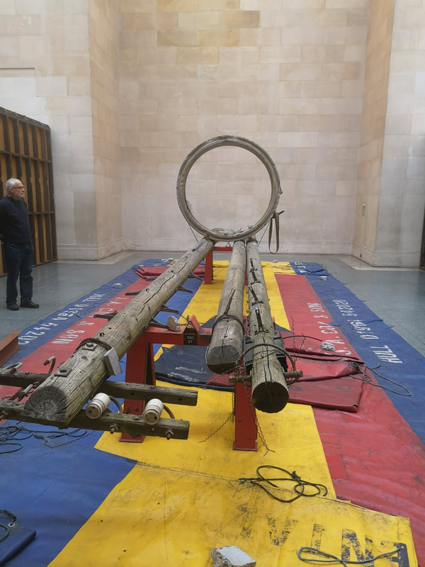
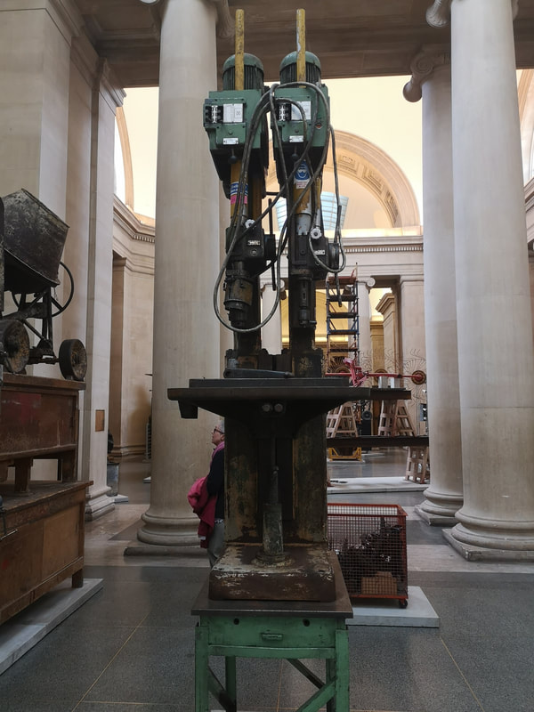
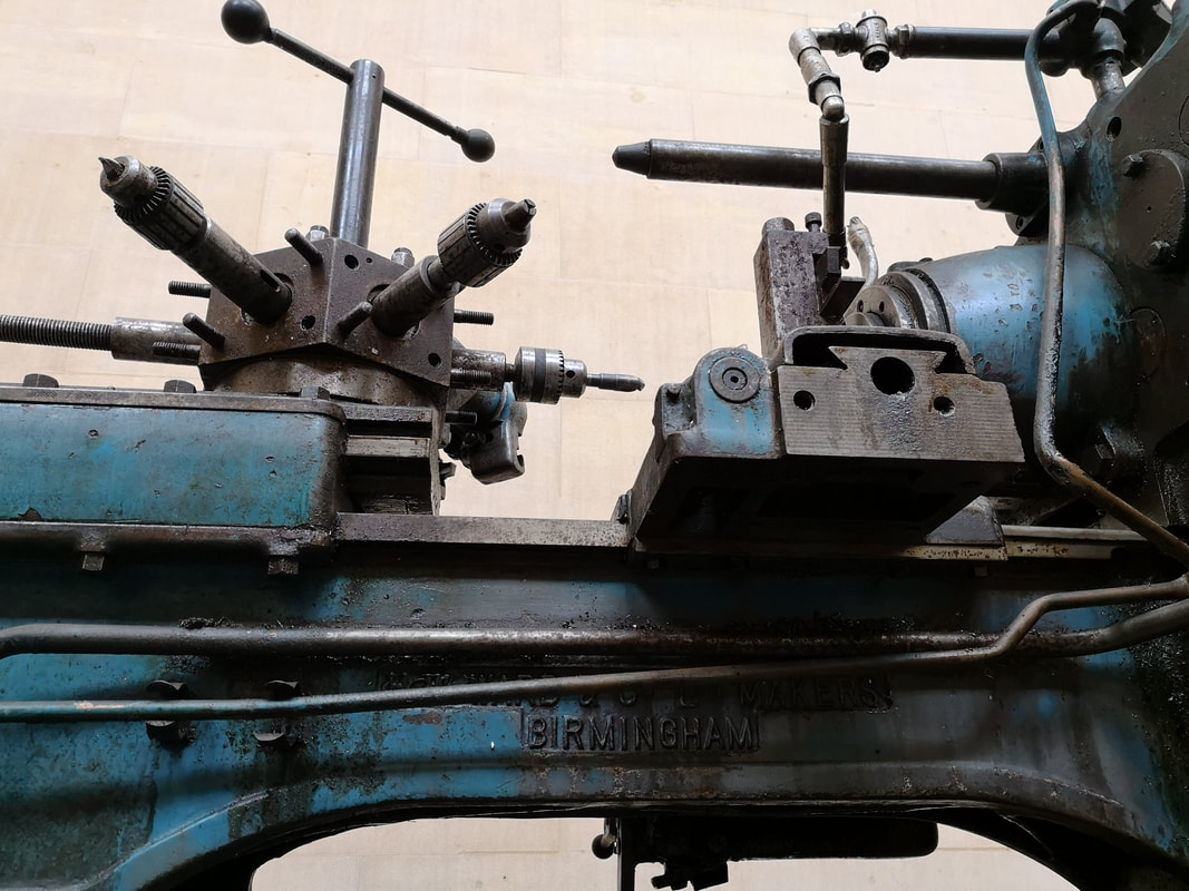
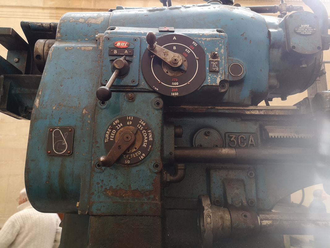
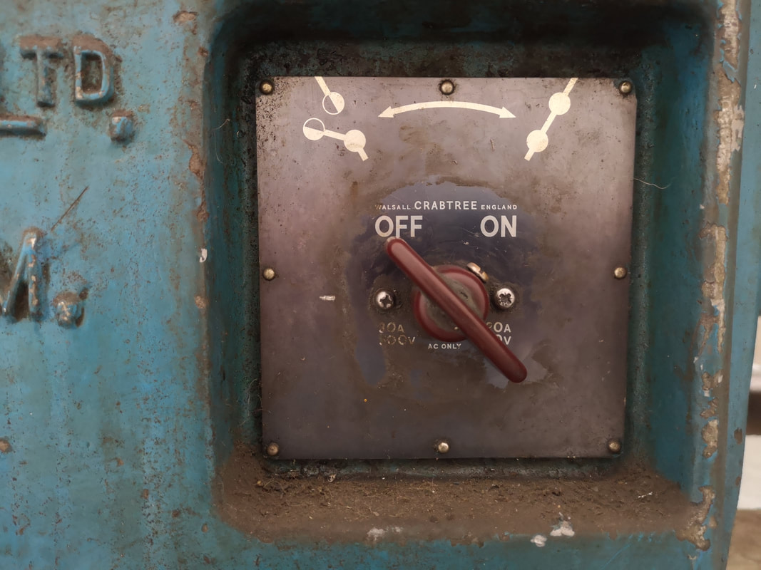
This handsome devil (above) is Mike Nelson who could quite easily pass as a relative of Willy Nelson. In the central hall of Tate Britain is his installation the Asset Strippers. The concept is simple enough. Nelson has bought old and second hand industrial machinery and fittings from auctions and scrap yards and them arranged them, either on their own, or in combination, inside Tate Britain's vaulted central hall. I can hear the voice of someone I know saying "this isn't art, this is just old machinery in a room". Yes yes, but I have two main qualifications for good art and they are 1) is it a good idea and 2) is it done well? The answer to both of these questions is yes. An effective starter is the whole exhibition is section of by these large wooden structures. You have to push your way in through these swing doors and some of the arches are blocked of entirely which makes you feel a bit like you are in a 1930's factory floor which is presumably the intention. pneumatic drill heads and digger troughs like the one you can see above, rusting hulking things. Other machinery is more intricate and I found myself specifically drawn to various loom contraptions or in the case of the one above right ink stained printing machines. Other lumbering machines lurk around the place, still with their auction labels on them, placed on large cabinets or metal tables. Fly wheels. I spent an enjoyable few minutes wandering around after two elderly men one of whom was explaining the machines to his friend and thus I learnt the word metricated. The machines still have metal shavings caught in the guards and guttering. Agricultural and construction paraphernalia is also in evidence. Folded over caterpillar tracks are folded over themselves in a large tarnished rectangular metal box (above left) they look like over-sized liquorish. Standing in the centre of the room are four large roundels, some kind of threshing device that you towed behind a tractor. It is raised out on two trestle tables so it come to resemble enormous dream-catchers or wind turbines. I like the way the spikes are in some cases distorted and bent. Near the northern end of the hall (I entered in from the south), are more assembled, constructed semi rooms if you like (above left and right), mini abandoned workshops. Scattered tools and half empty draws on battered, broken wooden boards. Empty spaces, reminded me of Helen Marten who does something similar but in a more constructed (and in my view more interesting) way. I like the way the two scales peer over everything like two enormous eyes. Larger devices and constructions appear. Felled telephone polls (above left) on this multi-coloured tarpaulin braced down with this great circular piece of concrete. It takes up pretty much the whole width of the gallery. You can just see to the left the wooden wall which tunnels of a walkway between the two gallery wings. Other objects loom above you, deliberately elevated presumably to give them more presences like the cement mixer you can just see (above right) and the double electric drills. It is a boon for photographers this show you can take all kinds of interesting shots of machinery from specific angles, so you can have the multi-tooled head of the lathe looming above you (above left) or the indecipherable control panel of the same machine (above right). This for me was one of the most interesting part of the show, being able to zoom in and out if you like to get the whole but then these odd specific views.
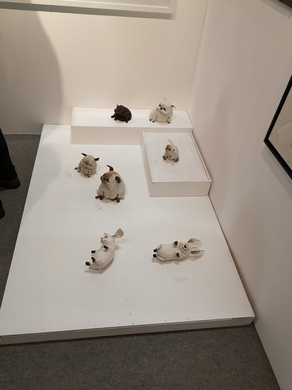
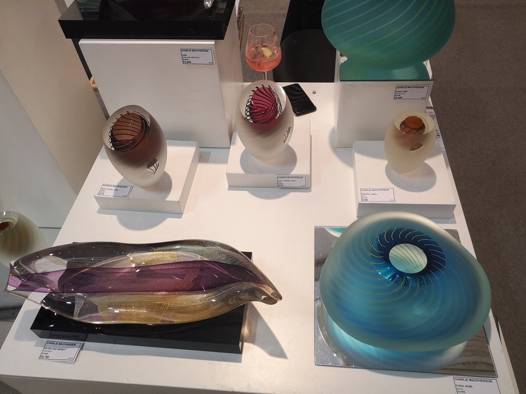
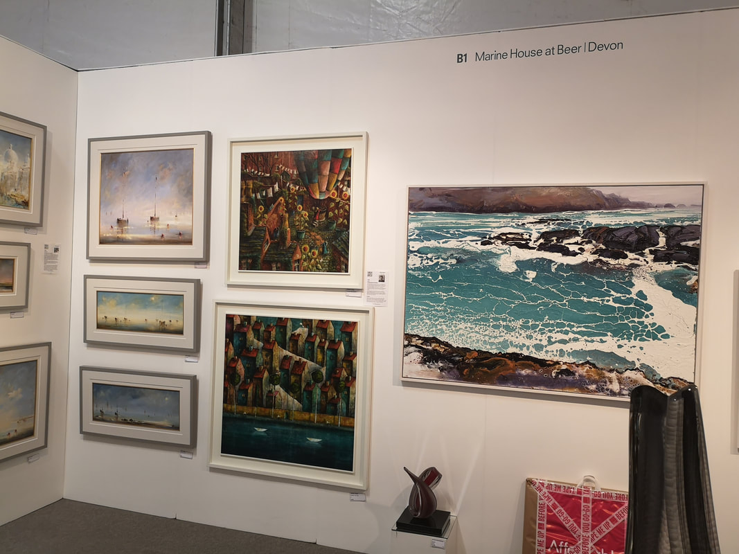
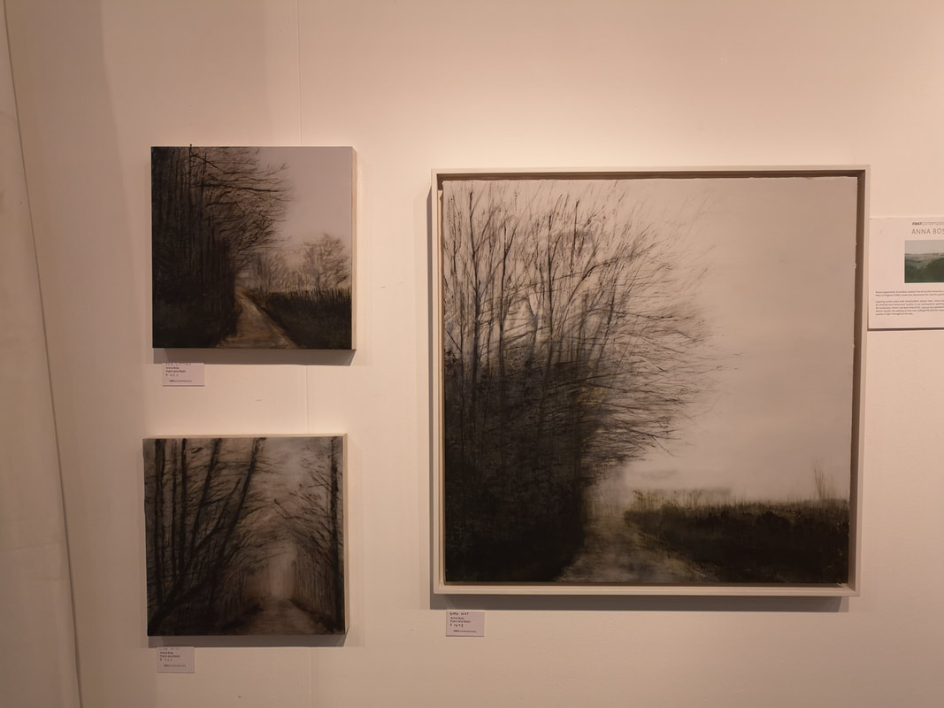
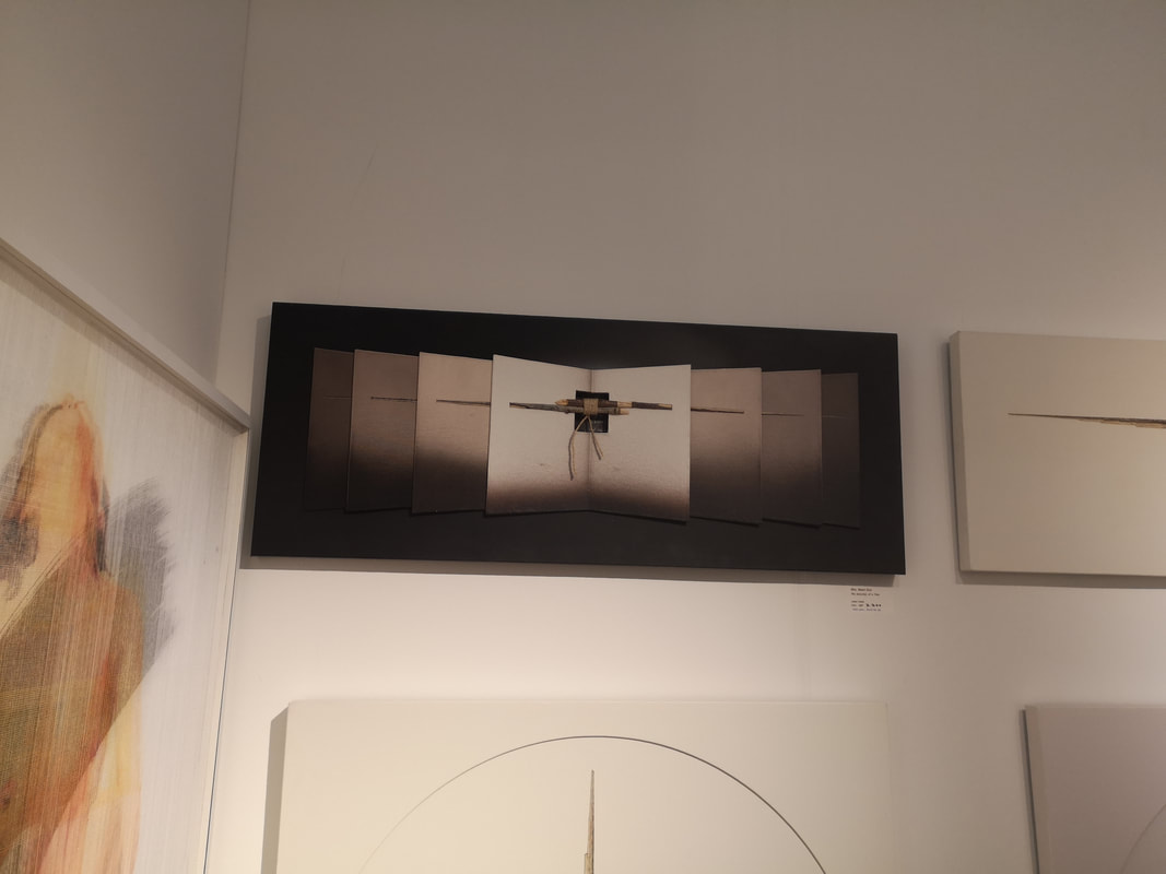
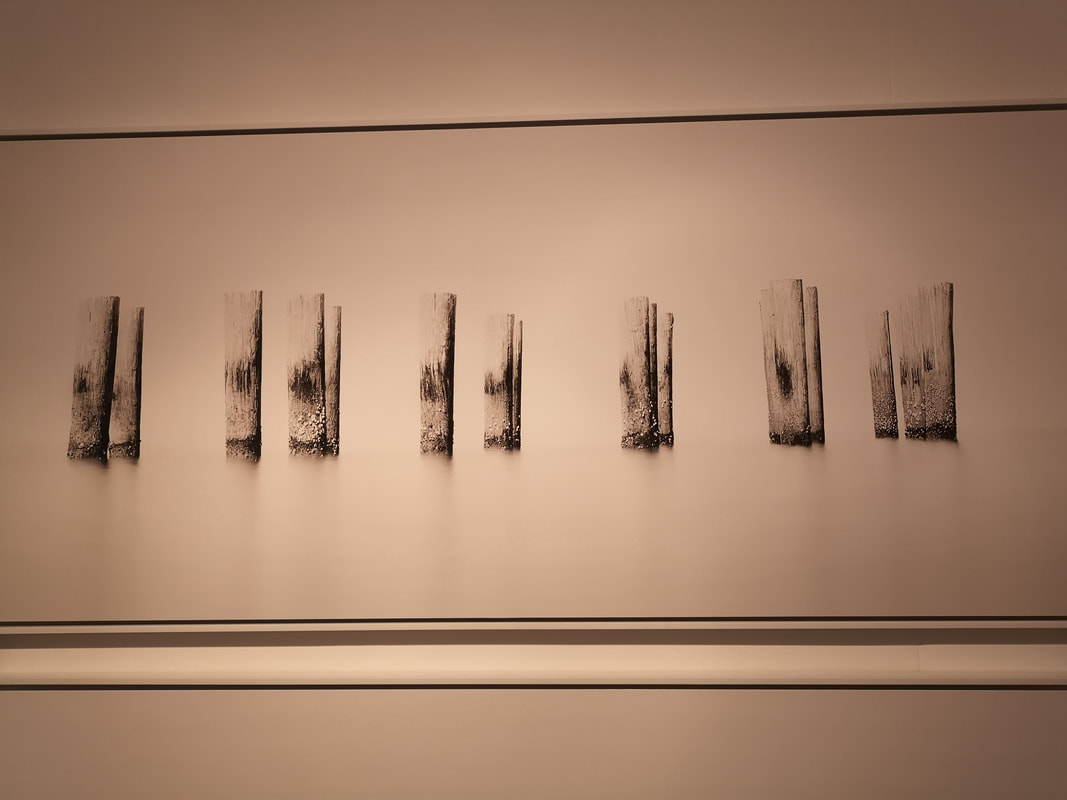
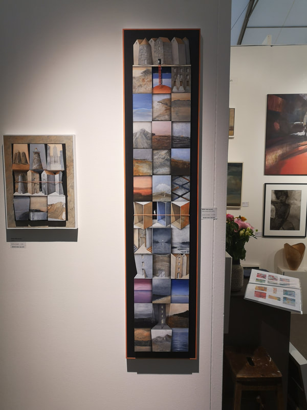
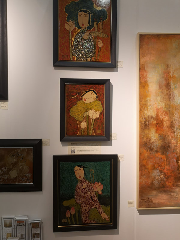
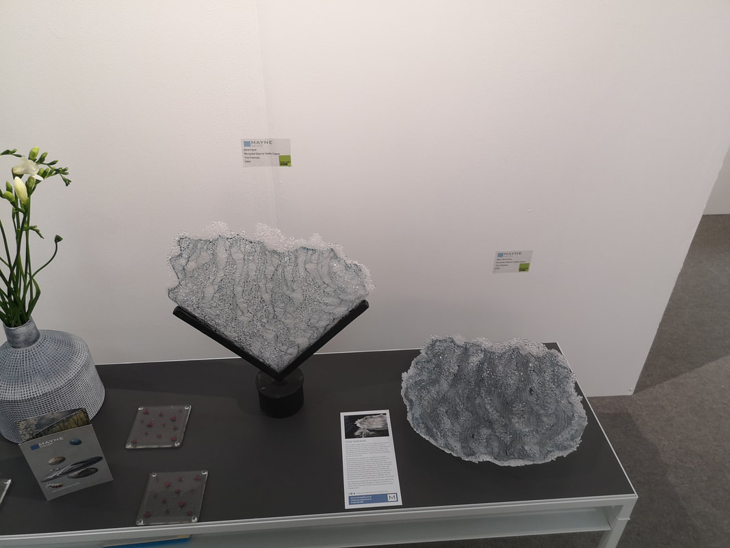
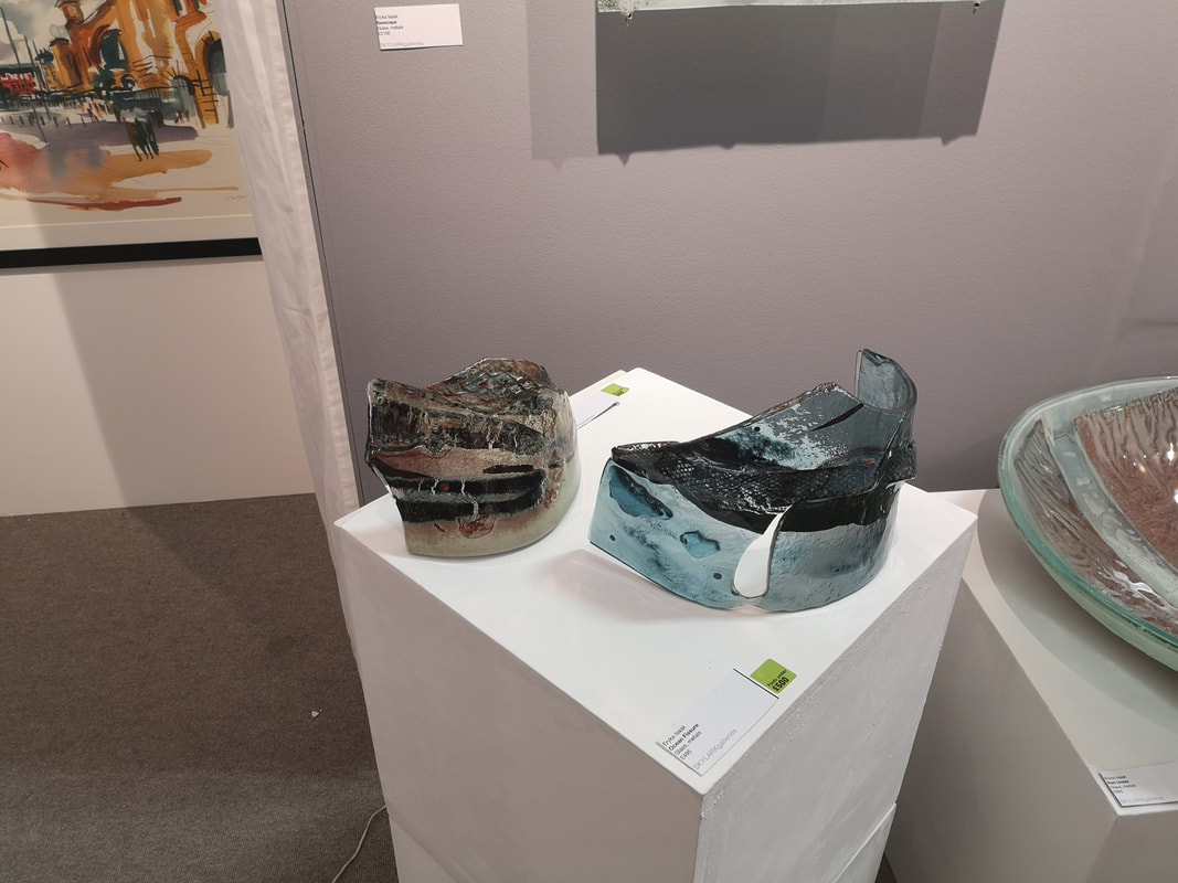
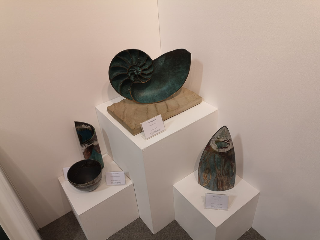
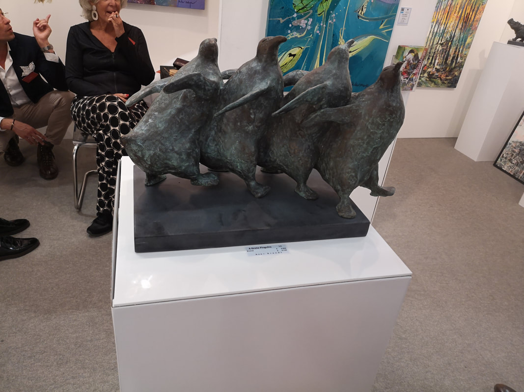
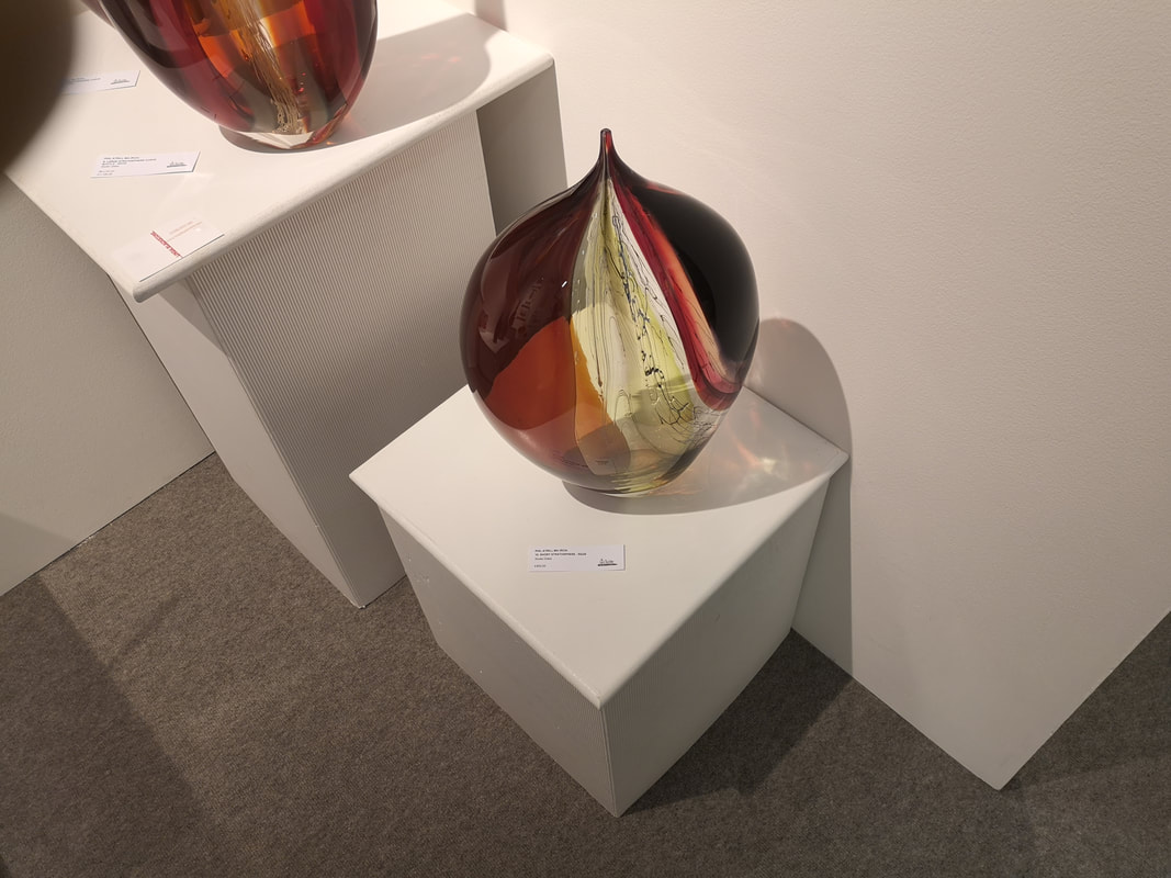
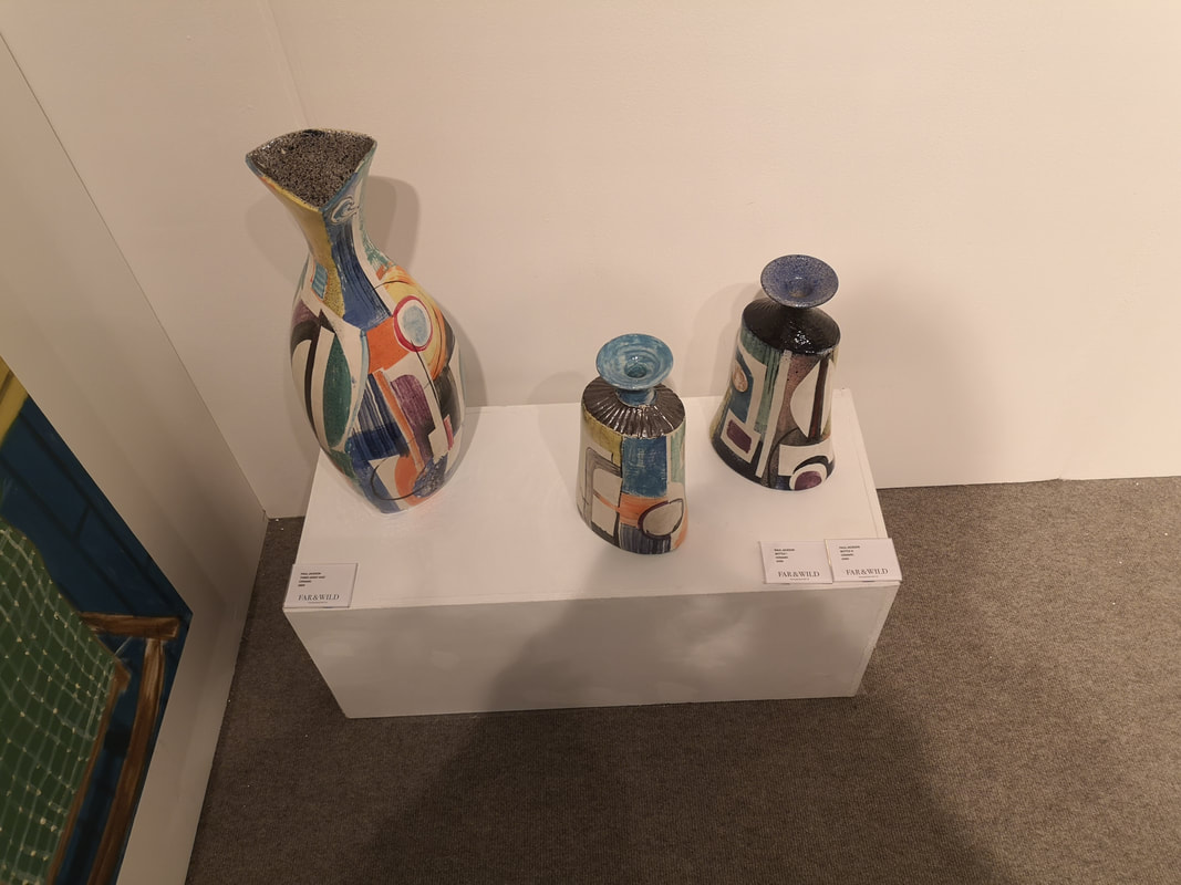
Incidentally I have re-vamped my gallery page. Have a look and tell me what you think. That will do for now. Next week Van Gogh, until then, William Mackenzie signing ... And those pictures tell you pretty much all you need to know about the Affordable Art Fair. You will see quirky art, colourful art, graphicy art, occasionally good art, and you will see a dog who is better and more expensively dressed than you are (a real dog that is not one of the fine people above). Joyously one of the dogs pooed on the floor. This was apparently not art, it was just a poo. If you have been before (to the show that is, not for a poo) then you will also see people you have seen before. I will try and avoid those in this blog, a rule I shall now immediately break. Charlie Macpherson (above left) is an oft lusted after favourite whom I'm sure I've blogged about in previous years. I like the concentric nature of his glass, those smaller pieces with the gem like glass set within the smoked glass. What I really covert though is the curved triangular turquoise number in the bottom right. He is represented by the Marine House at Beer (above right) which is always one of the best most attractive stand in the show. I do like my misty autumnal landscape, and Anna Boss' triumvirate of pictures (above left) with their bleak sincerity really appealed to me. A road leading you in is always a good shout. I think the one in the bottom left is my favourite with it sort of tunnel effect, with the spindly trees reaching to each other. Antoine Gaussin's "Escape" is a large rectangular piece. What is it? Is it a landscape, some wooden posts rising out of a misty lake? Or is it a series of pots, stacked on an invisible surface. I am not even sure what the medium is, the title did not say but a brief google indicates photography. Any way you have to drop over £5,000 for this evocative, peaceful piece. Stefan Mas Persson (above left) is another perennial favourite with his raised slightly 3d pieces. The one on the right is a slight departure from what his previous work with its series of different squares. It is interesting and allows your imagination to run riot. Particularly the little white figure walking along the wooden bar. Completely different is Bui Trong Du's stylised portrait (above right). They are lacquer on wood, these sumptuously clad women on the patterned background. Always with these flowers in different stages of opening. I like the bottom one best with her slightly louche pose on that rich green background. Glass, sculpture and pottery will occupy the next few entries. I have a weakness for glass and they are often of a high standard in the Affordable Art show. Toni Fairhead (above left) makes the pieces out of recycled glass and copper. It has a sort of crazed glass, almost fan like, shell like organic effect. The triangular wedge is the best of them. Eryka Issak's glass and metal sculptures (above right) have attracted me before and have caused me to break my now shattered role again. They have a sort of toenail like structure but have good tone, structure and sympathetic colouring. The tear drop void in the blue/turqouise (I like turquoise) works very well. There are two artists' work on display in the photo above left but it is only one of them, Lindsey Walsh, who drew my attention. If you double click on the picture so as to enlarge it you can see in better detail but basically what you have here is ceramics decorated with slightly abstracted, slightly mythical landscapes or scenes. The shape often echos the scene like the sail shape one on the right depicts a sailing scene. The curved one behind the bowl, which has a seaside townscape particularly appeals. I didn't buy anything this year by Walsh made my shortlist but now, as I write this, I regret not having done so. Dancing Penguins (above right). Who doesn't like dancing penguins? Well if you don't then the work of Noor Brandt who does a line in cute animals in bronze is not for you. His groups of animals are the best, and the penguins are the stand out stars. Joyous and happy. Another purchase I regret not making is some of Phil Atrill's glass (Above left). I saw him years ago at the Origin Arts fair in Somerset house. I couldn't quite afford him then but I could now. They are big pieces. Swirling glass coming to a point, stained with strong colour. They are substantial pieces and so it is difficult to see where they would live without the prospect of their inevitable destruction hanging over them. Paul Jackson (above right) presents us with what I suppose might be considered fairly classic ceramics. Vase shapes decorated in abstract colour. However they are very attractive, very well done and conceived. The soft pastel colours all work well with each other and somehow compliment the shape of the vase. The abstract designs or all interesting and again work well on the shape they inhabit. Restraint is an under-praised quality in an artist. This is an example of someone who knows where to stop.
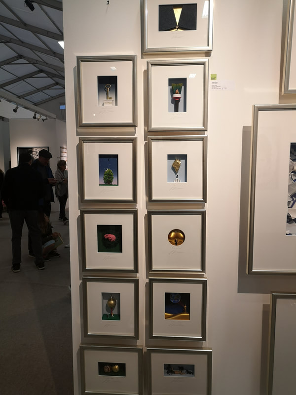
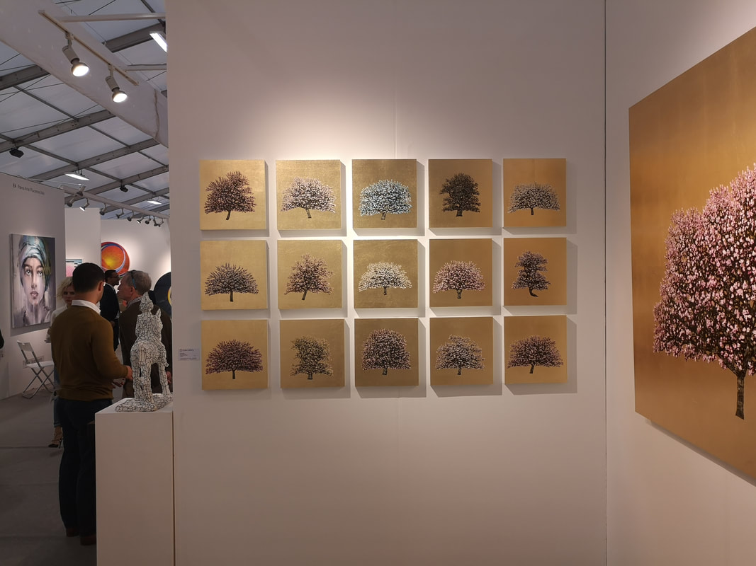
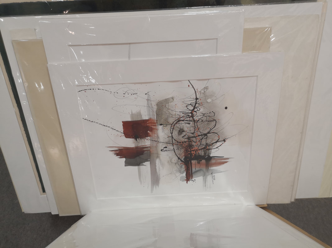
There is no doubt though the presence of 15 pieces arranged in a grid really enhance each other. They make for a more powerful golden glow. Individual pieces are very attractive in themselves and I suspect they sell very well but the grouping is even more enticing. A example of a similar thing at work is the column of Volker Kuhn's work (above left). Little 3d scenes set within a frame. Some of them are quite amusing when you exam them up close but again there is no doubt their collective appeal is greater. Last up we have some scratch abstract work. I found the above left leafing through a folder of work. I recently brought something for such a foray so I do it more now. I like the two blocks of red colour and the barbed wire/tree like line that balances it. I took a photograph of the handwritten label on the back but unfortunately it is unreadable so the artist must remain a mystery to us all.
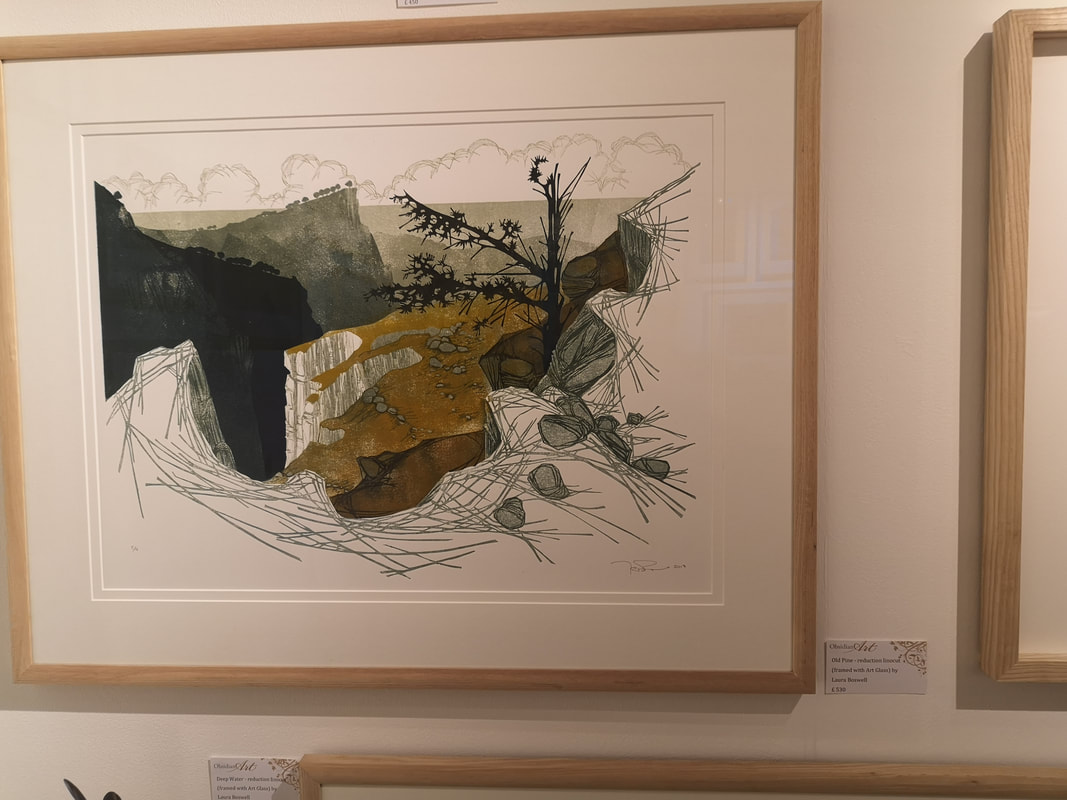
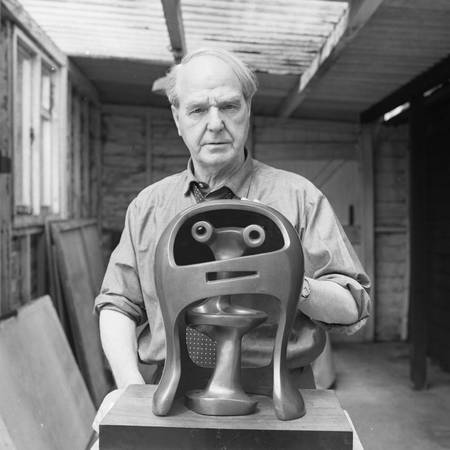
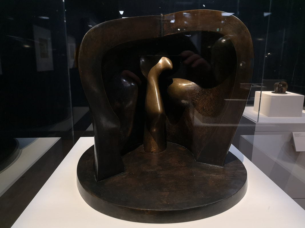
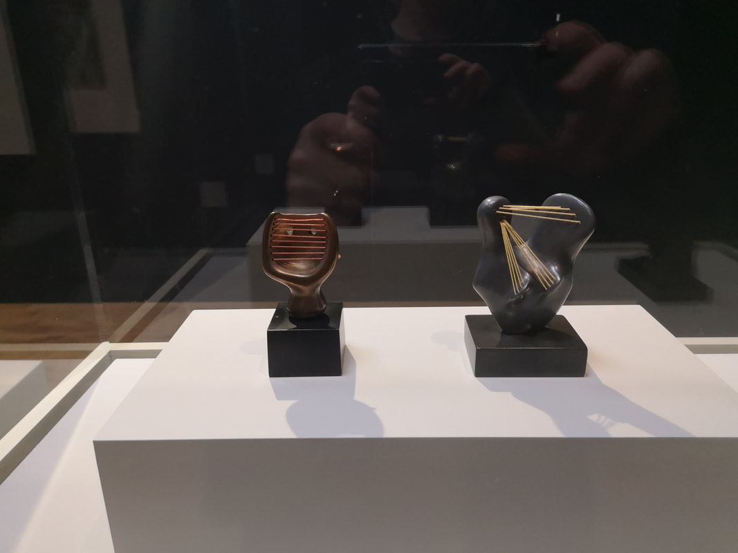
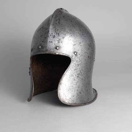
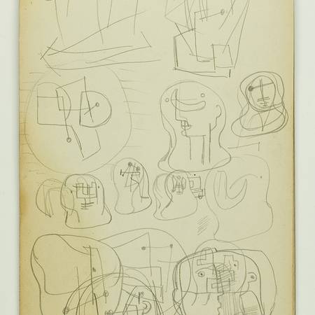
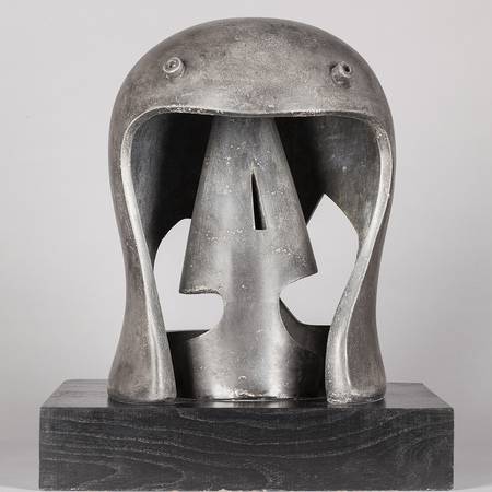
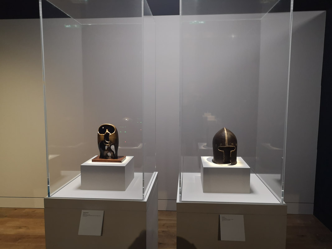
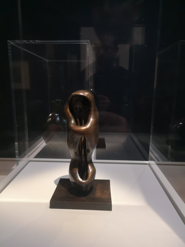
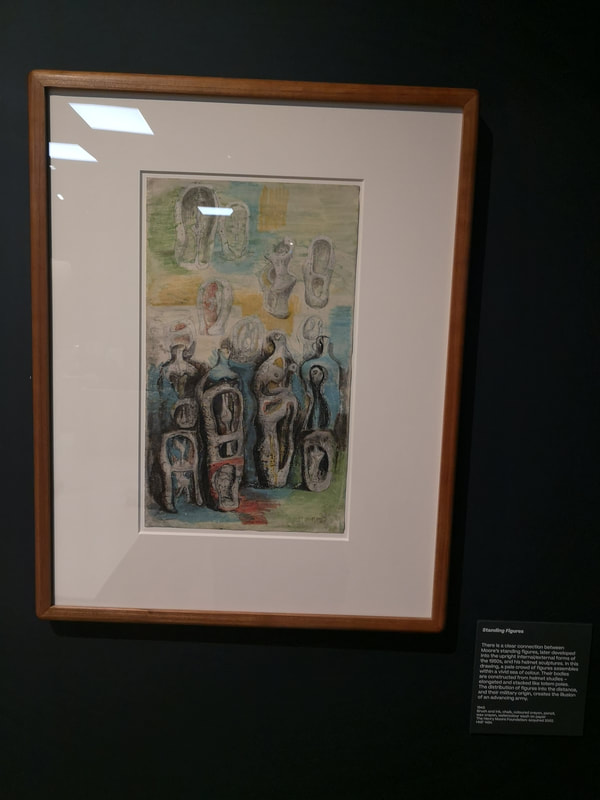
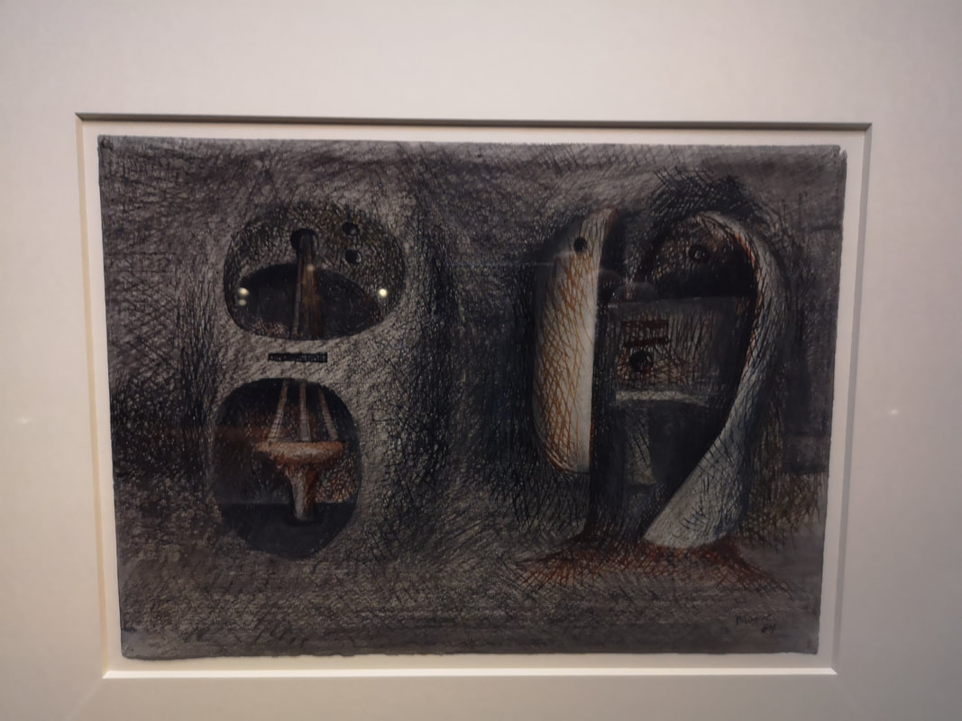
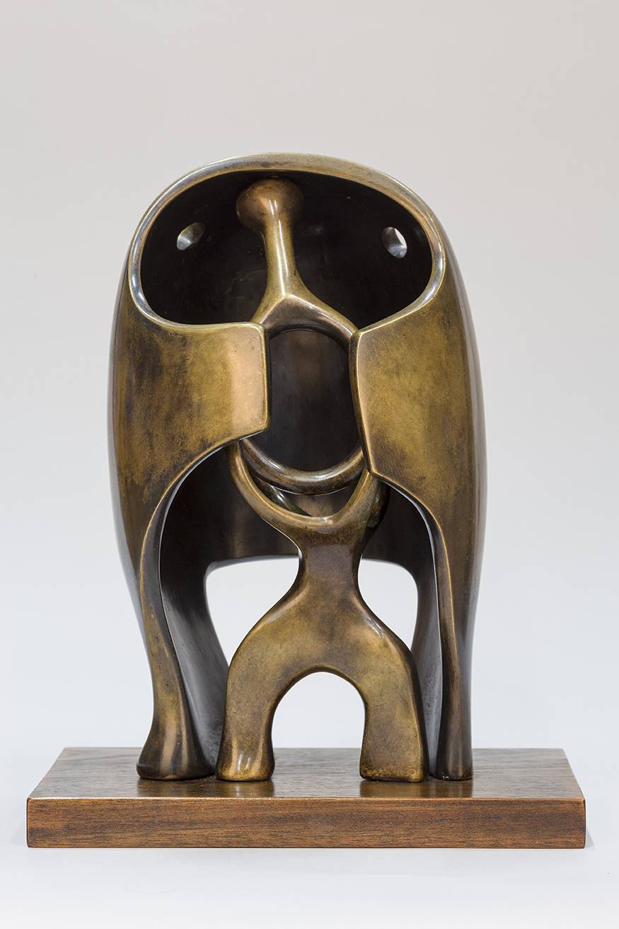
A similar style but much more figurative are Laura Boswell's linocut (above right). Again it is the scratchy nature of it that appeals to me, and those two balancing fields of colour, the gold and the black. It is a strong piece and again I can see these selling well. That's it for this week. For the next couple of weeks it will all be about Tate Brtain. In the meantime I have slightly revamped my gallery page. Have a look. Tell me what you think. Buy things. TTFN Do you like Henry Moore? Do you like Helmets? Do you like Heads? If the answer to any of these questions is yes then you would struggle to do better than the current exhibition at the Wallace Collection. It is on until 23rd June I would recommend you go. It is quite a small show so if you find yourself caught in a bout of tedious shopping in Oxford circus you can always escape to the quite of Manchester Square and go see this. The exhibition is centred, as the name would suggest around a number of bronze Helmet Heads that Henry Moore produced. It is housed in the Wallace collection basement exhibition space, below their atrium tea rooms. Not only the helmet heads though, and some of the helmet heads like this one above left are much more yonic in there feel, a gestating something in side a womb like space. Some of it reminded me of H.R Giger but much less aggressive. I wonder if Moore was one of his influences. In addition to this there are a number of other small works on display, some of them properly tiny. I really liked these two harp like constructions (above left). It shows one of the other revelations of this show the different textures, sheens and colours you can coax out of bronze. This like Barbara Hepworth's work (who uses the string trick to great effect also) really appeals to me. Your eyes travel up and across the strings. However the central theme of this exhibition is the inspiration that Moore took from actual Helmets in coming to his final designs. There is convincing evidence that Moore came to the Wallace Collection and literally drew from their considerable accumulation of European armour. What this allows the curators to do is show an actual Helmet from their collection (above left), Moore's preparatory sketches (above centre) and then the final finished Head (above right). It is a smart decision and gives the exhibition an extra dimension. You get some history with your culture and get to see the genesis of an artistic idea. They do this several times and the comparison is made early and explicitly in one of the first exhibits you come across (above left). Of course apart from the shape, this slighted twisted shape with upwards looking eye holds, the tone of the bronze what adds most of the time to these Helmet Heads is an internal shape, like an abstract spice. Sometimes they are separate and sometime they are integral. They provide more personality than the actual helmets. Others are more explicitly helmet like (above right), a modernist all encompassing head covering. This is a good example of different bronze. One (left) is dark, while the other (right) is bright and shining. The first main room though contains things other than Helmet Heads as intimated previously. There is a large over human size plaster statue, that looks like a large version of this odd cocoon like structure that you can see above right. You can see the forms here that develop and morph into the Helmet heads. And then a very shiny bronze sculpture which has resonances of some of the internal structures. Again marvel at the different finishes bronze can achieve.
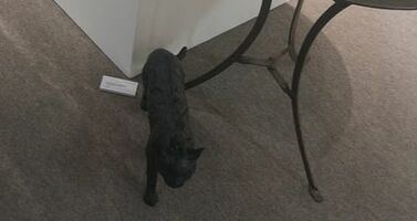
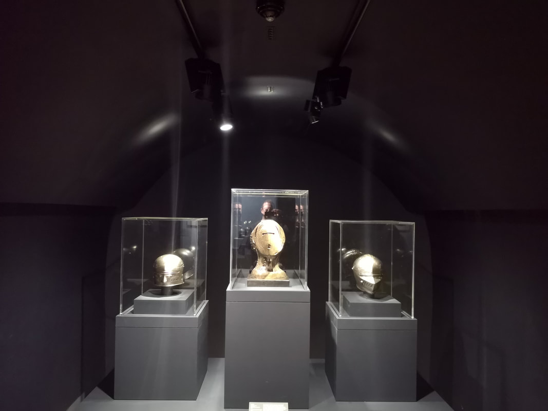
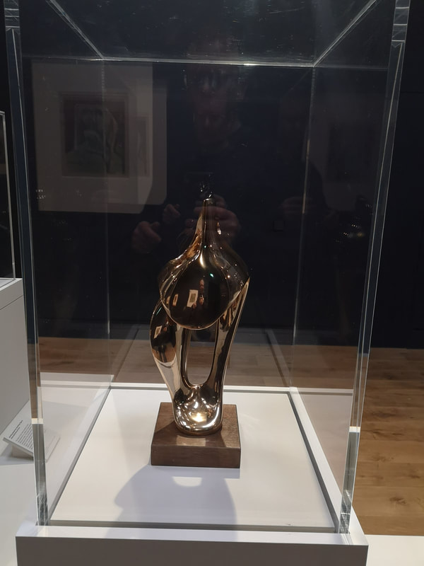
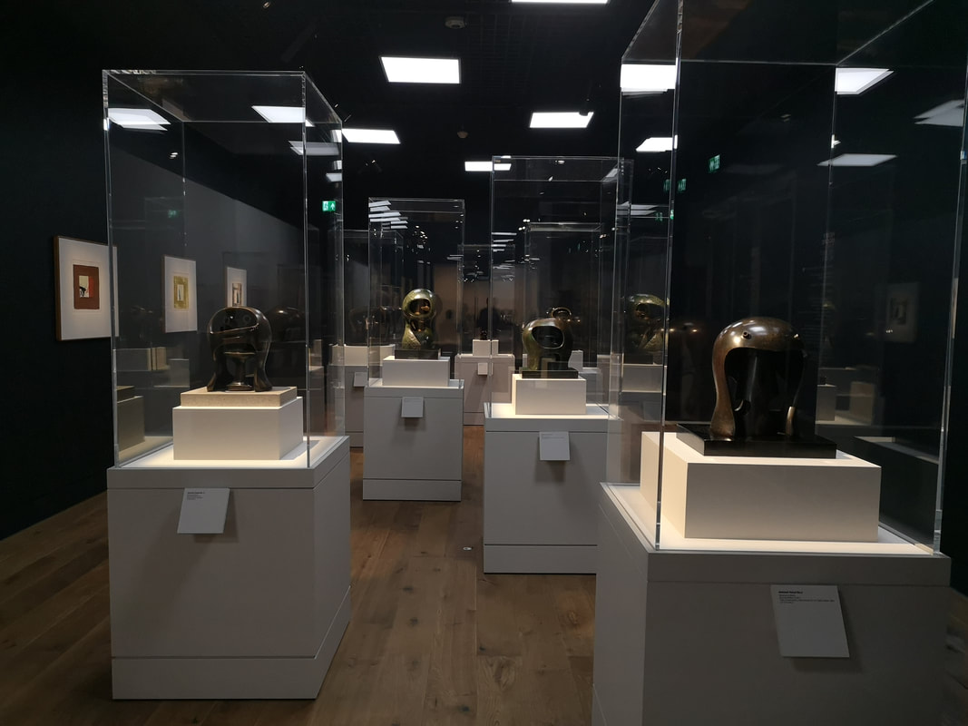
They are surprisingly complex often using multiple media and show what a good draftsman Moore was. Some of them are just riffs on a motifs like the mummy like structures over a coloured washed background above left). Others are more polished renditions of what Moore envisaged as the final structure and make for excellent pieces of art in themselves (above right). The show then opens up and ends on a collection of all the Helmet Heads arranged together (above). You can just about see from this photo some of different finishes, in both the external and internal pieces. This central placing of the podiums allows you to circle the sculptures and admire them from all angels. This is one major advantage that sculpture has over painting, it allows for different view points. You can never see the whole thing, only different aspects of it. Smart curators (and the Wallace Collection curators are smart) take full advantage of this. It is an excellent show. it is a happy and uplifting show. I enjoyed it very much and I think you would too. I will leave you thought with a picture of what I think is my favourite piece from the show. He (I project onto it as a he) is a cheeky little chappy and I've glad I met him. Until next week then....
|
Archives
June 2024
Categories |
 RSS Feed