|
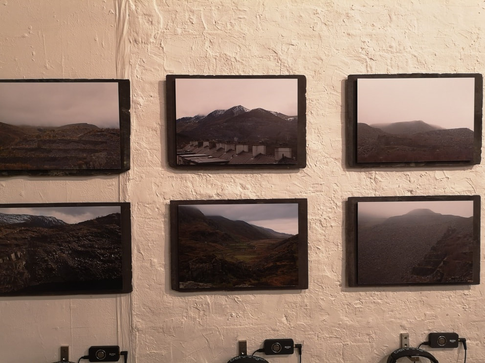
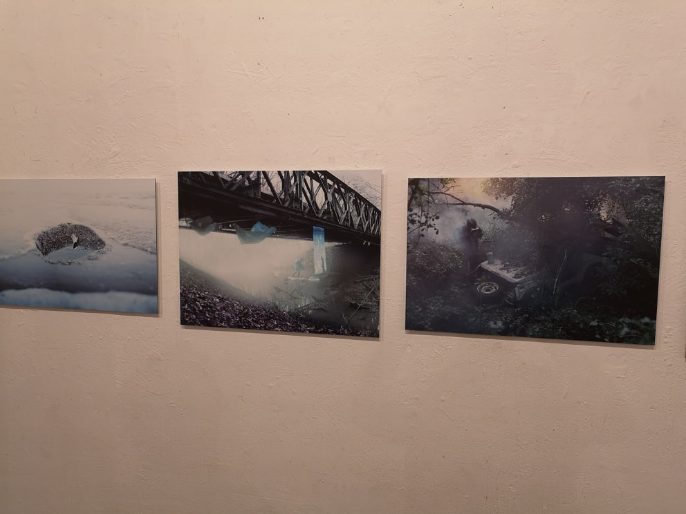
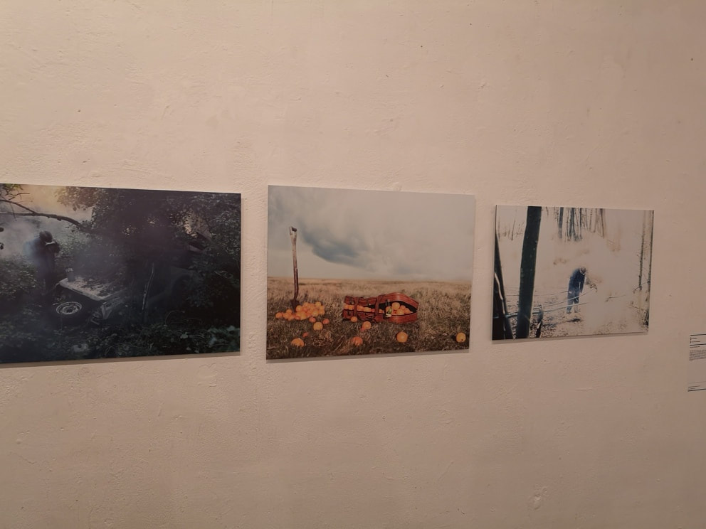
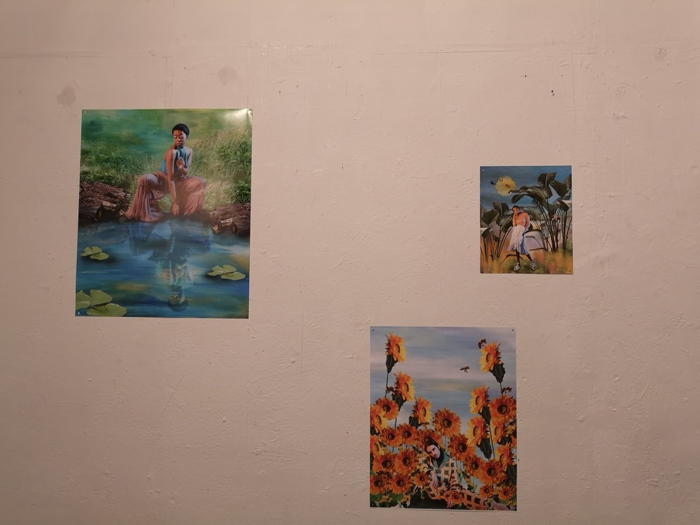
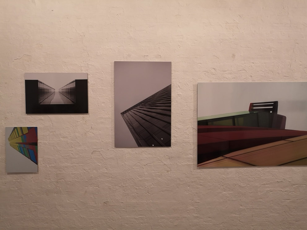
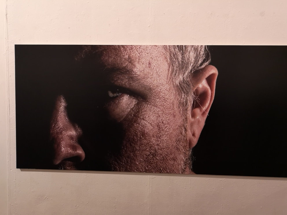
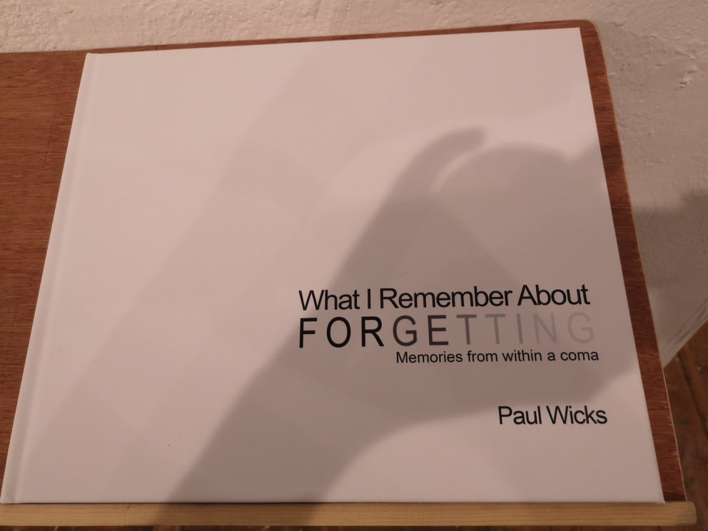
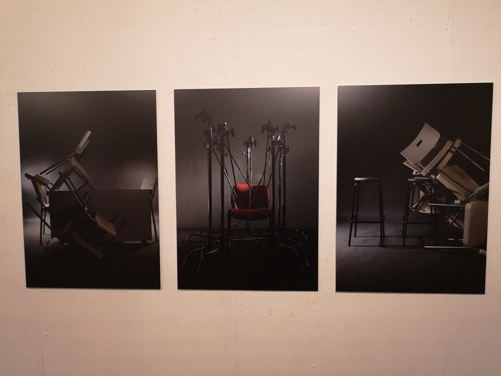
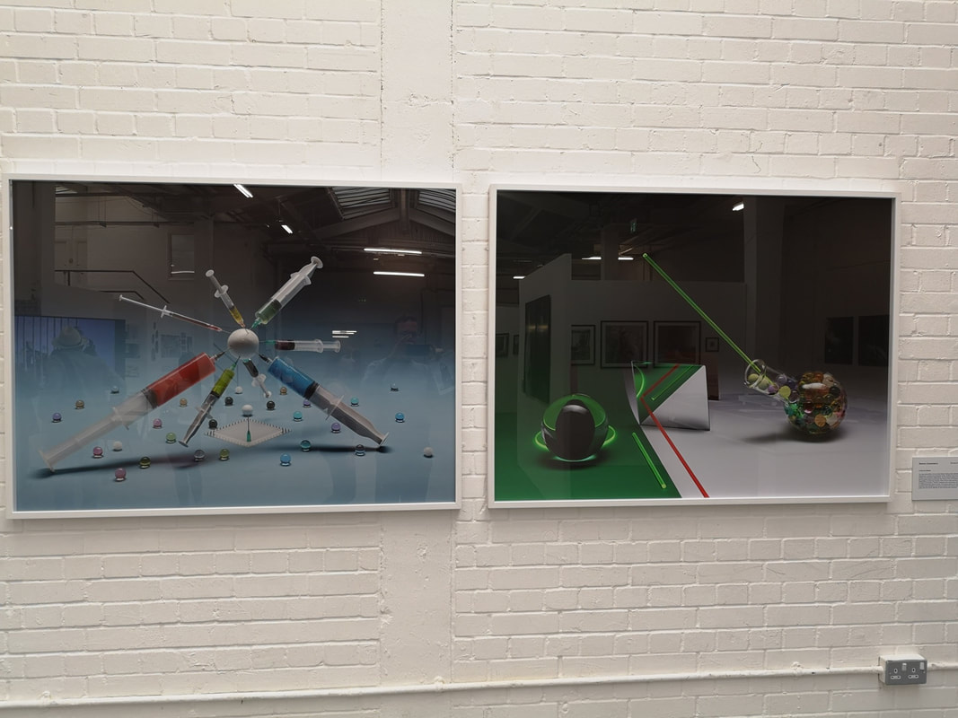
It is the season for graduate fairs, and earlier this week I stumbled across the University of the Creative Arts Photography Graduate show at Candid arts. I had gone along to see the Candid Arts Summer Salon which turned out to be pretty poor. However there were signs pointing to the above mentioned show. Usually I have little interest in photography but this one be over and I ended up being impressed. It is quite a small show, only 24 exhibitors in one room. They eyed me with some bafflement as I had managed to crash the private view. Several of them though have some serious talent. The first of which is Ethan Hughes with Tales of my Grandpa (above). It combines several good elements, excellent moody shots of the Welsh hills, mounted on slate that those hills produce. Underneath where headphones where you could listen to the self same Grandpa in lilting Welsh tones telling stories of his life. Nice idea, done well, the only two requirements for art. Luke Wassell produced a series of 5 photographs called the Last of the Material Men (above). They seem to show these odd post-apocalyptic scene. I particularly like the one of the man in the gas mask discovering a wrecked jeep under a tree. Reminded me of Jurassic Park, only gloomy and menacing. I am sure it is not supposed to but the one with oranges spilling out of a trunk made me laugh. Very good. There is a fashion these days for moody, foggy misty shots. Not that I mind this, indeed it greatly appeals to this. It is nice however to see someone depart from this and I must therefore give credit to the hyper colourful range of photographs by Abigail Edwards (above). She uses a combination of oil paints (approve) collage and photography to producing these striking dreamlike images. The blurb reveals that is in fact the intention, well then aim achieved. Architectural or sculptural photography shots can suffer from being dull. It is a difficult thing to pull of by Sam Gasson (above) manages it. He has chosen colourful subjects which I think helps. The angles and perspectives are intriguing. Also the way they are displayed means, I think, that each one augments the other. Best in show is without a doubt What I Remember About Forgetting by Paul Wicks (above). My definition of good art is a good idea done well. Great art has an extra element though, it reaches into your soul and wrenches at something. It is a rare thing and something Paul Wicks has managed to do. In photographic forms he manages to convey the harrowing effects that encephalitis, a disease that damages the brain, has had on him. The main picture on the wall (above left) if powerful enough, but it is when you delve into the book (above right) that it all really hits home. He has to be given credit for what he has achieved and for leverage something so dramatic and horrible as this disease into something worthwhile. I expect to see great things from Paul, and would not be surprised if he became something of a star. Photography can do something that few other media can do, and that is be stylish. Moodily lit shots of furniture and recording equipment by Ravaan Clifton (above). There is a sculptural element to this in the arranging of the subject matter. The gray background is a good choice, allows you to project your own story onto the scene.
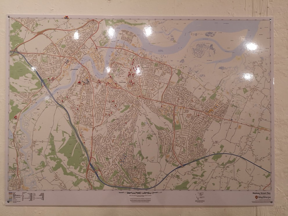
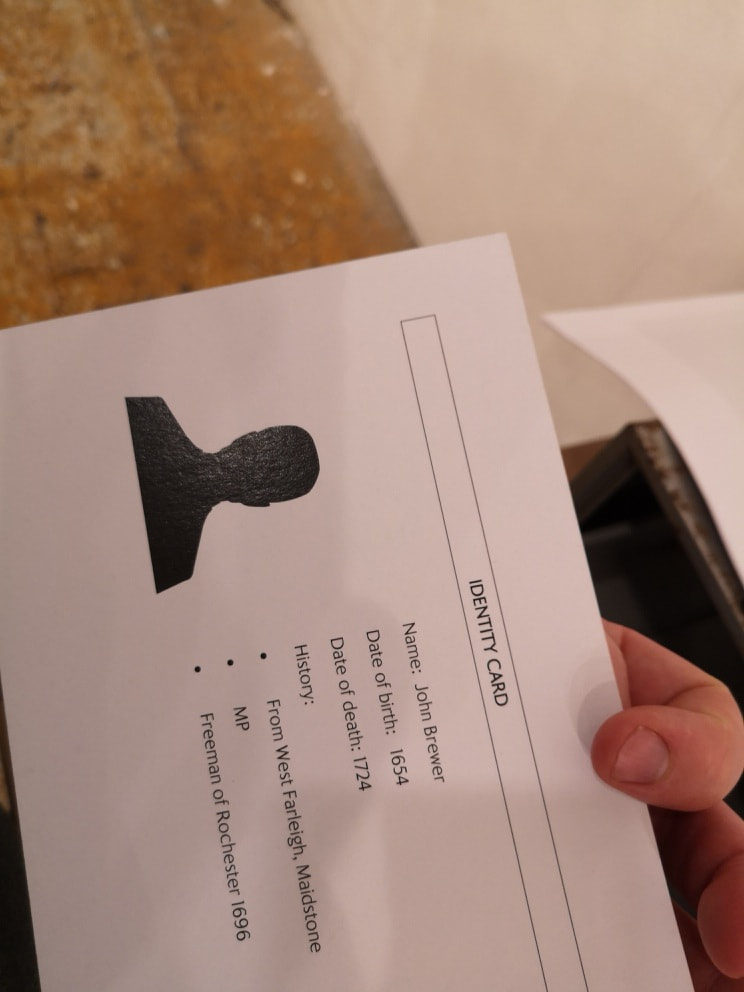
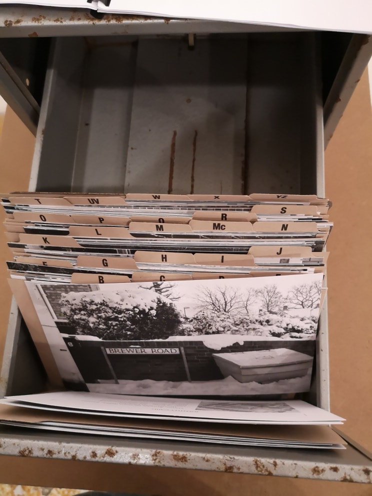
The map shows the places in Rochester and environs that the photographs were taken. The final part was she left copies of the photographs on the street signs with her contact details, and there was a little booklet containing the emails of peoples grateful and surprised replies. This was very interesting, and if like any sensible person, you like ferreting in a card index, it will appeal to you. Going back a moment to the original purpose of my visit the Candid Arts Summer Salon . It was not all bad, in fact it wasn't bad exactly so much as dull. There were a couple of people who were good, one of whom was Jon Britton who is in the Law Society Art Group with me and whose work I had primarily gone there to see. What struck me though is the high prices of the work. Almost everything was over £500 and several pieces were in the thousand. I do wonder if at that price, in this kind of show, if anyone will sell anything. It seems to me to not be aware of the market you are in. The quality doesn't merit the price in most cases.
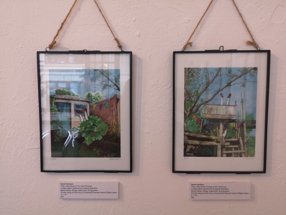
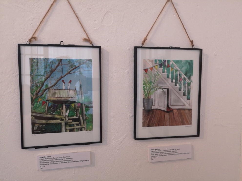
The one exception was a quartet of charming illustrations by Sarah Harrison (above). In fact they are prints but at £80 they are perfectly pitched, it seems to me for an impulse purchase. I almost did. Finally my exhibition was due to end yesterday but it has been extended until 6th July. It is at the Hoxton Cabin. Details below.
0 Comments
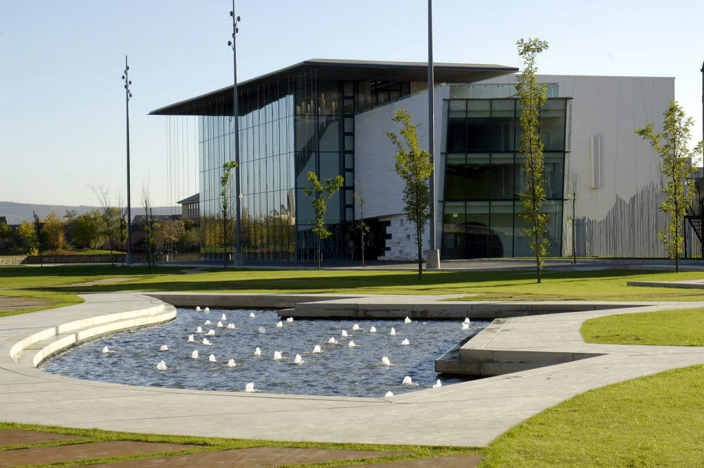
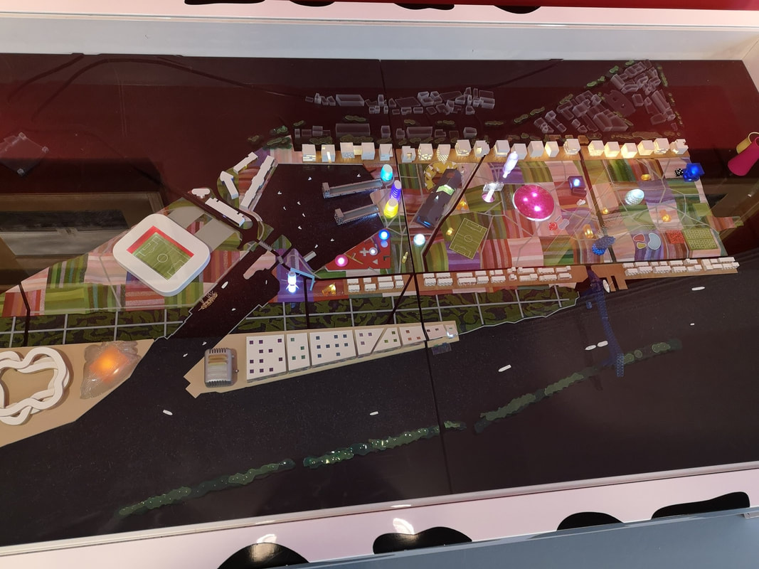
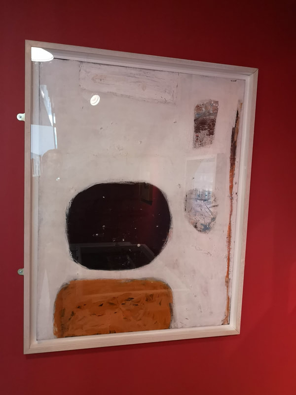
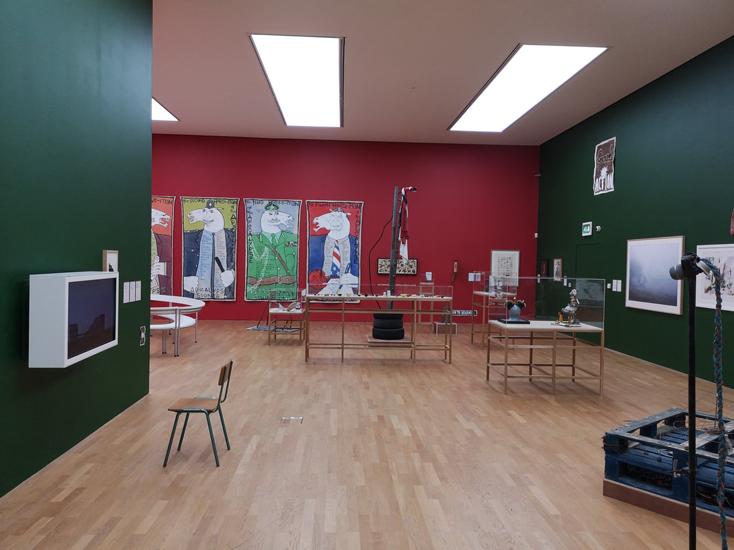
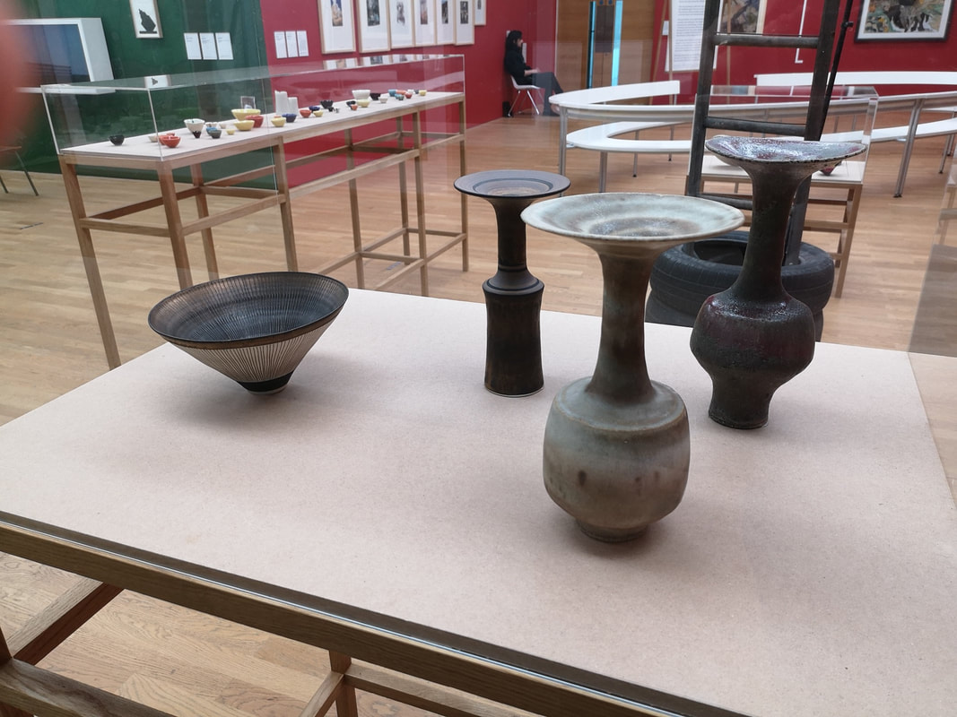
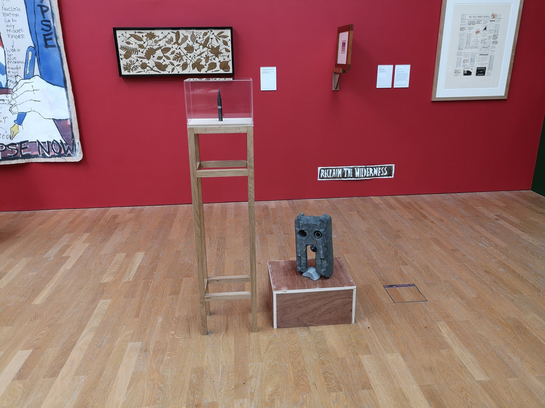
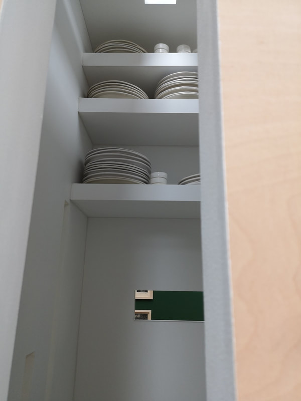
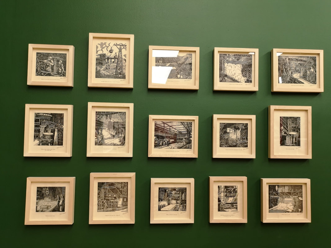
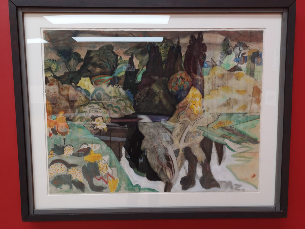
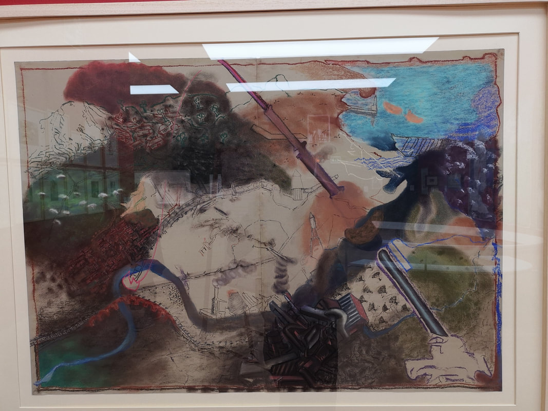
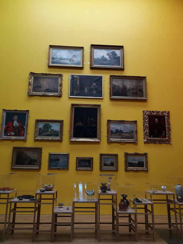
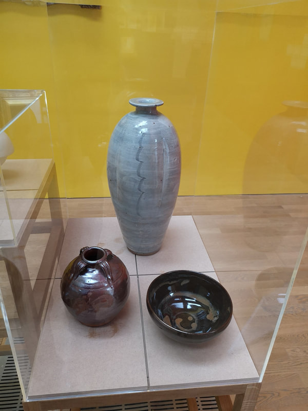
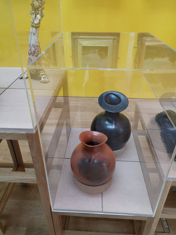
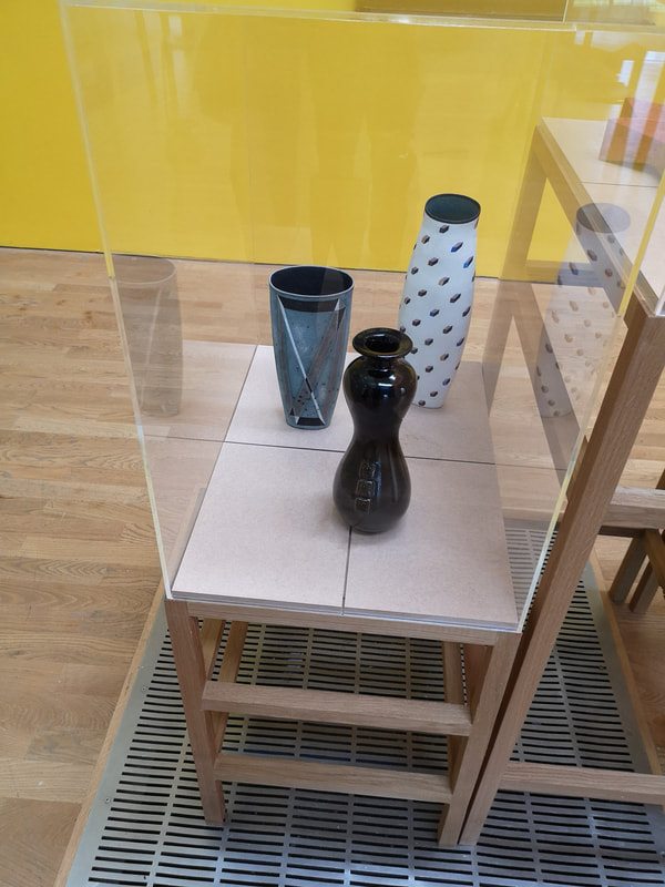
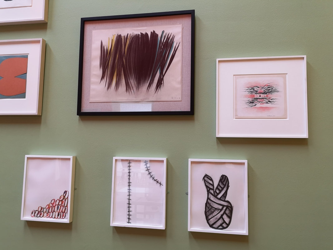
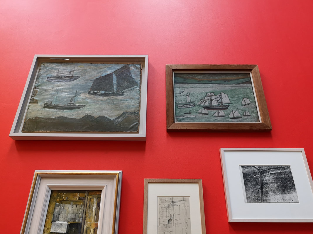
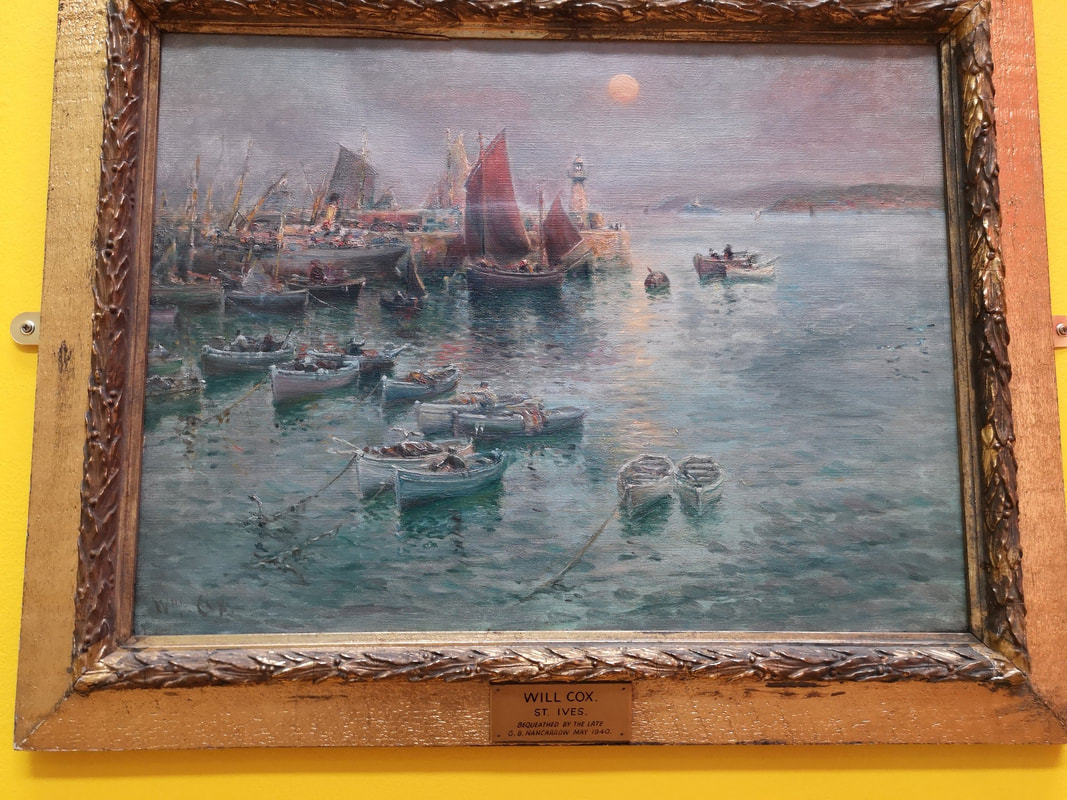
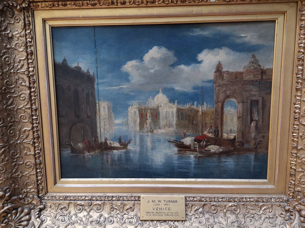
Journeying from the north I had a few hours to kill in Middlesbrough and the need for breakfast. The minimum amount of research I had done suggested that The Smeltery would serve for breakfast. And serve it did, turned out to be both reasonably priced and delicious. I recommend it. Because I hadn't been paying attention, what I didn't realise until I got there was that it was also the cafe/ restaurant for MIMA (the Middlesbrough Institute of Modern art pictured above). It is located in a very attractive square, just across from the looming gothic mass of the Town Hall. The short version of this post, is that it's good. Other small museums could learn allot. I was impressed. The staff there were super friendly and agreed to store my suitcase in the shops store room so I could look round the museum unencumbered. The building itself is three floors. The top floor is a viewing platform from which you can look out over the city. The 2nd floor contains a corridor full of art including a colourful mock up of a proposed redevelopment of Middlesbrough riverside (above, you can see the stadium) which was sadly derailed by the recession and government obsession with all things London. There were an number of other artworks in the same area, the best of which was a fine William Scott called rather simply Orange, Black and White (above). All the coloured are mottled to give a more interesting texture. The gallery on this floor is a large L shaped room which holds a cornucopia of contemporary arts in various media and by various people, the majority of whom (but by no means all), where British. There was a terrible Tracey Emin drawing for example, one suspects only there because of the name and completely eclipsed by the 4 horseman banners (three of which you can make out above). There are various vitrines of pottery in the gallery, including this quartet of wide mouthed pieces that I like. I like the subtle variations of blue to grey that you can see on the bottom (above left). You can also make out in the background a long cabinet of coloured pottery. Sitting in the middle of the floor there are also various installations, of varying quality but many of them good (such as the one above right). My only criticism is the labeling on the wall makes it difficult to work out which piece is which. However on the plus side, they have avoided art guff style explanation of the pieces and instead just tell you who its by, what its made of, and occasionally the history of the work. Squatting at one end of the L is this large beige box, with large slits in it. If you peer through the slits you can see piles of white crockery (above). It turns out to be by Edmund de Waal and is called, aptly, the cabinet of curiosity. Incidentally his book is very good. This is an odd piece. It is not much to look at from the outside, and frankly the white pottery is a bit dull and yet one feels compelled to try and look through the different apertures. I find that It allowed me to project my own story onto the thing. I also suspect I gave it more time than usual because of my admiration for its creator. Themed collections can often work well together. Also suitable subject matter can be enhanced by its location. Middelsbrough being an industrial city (at least in inheritance if less so now) does well in displaying these 15 etchings of the Steel making process by Viva Talbot (above). They manage that very difficult trick of being both artistic and educational. The etchings take you through in chronological order the process of making steel, rendering into a human and detailed experience. Just to the side of the door into the gallery are two stylistically similar paintings that caught my attention. Sadly the glass covering has made my photos a little indistinct. The one on the left is called Fortrenn by Kirkland Main. It is an abstract almost fantastical depiction of the Scottish Highlands. I like the flashes of orange and the tendril like way the land reaches into the water. Incidentally this is one of the things MIMA does well, introducing you to names you may never had encountered before. One of the ones I will be taking away with me is Vivian Sundaram with his Riverscape (above right). I am sucker for maps and anyone who finds an interesting new way to render them has my attention. This it seems to me is precisely what Sundaram has done. The second floor also has a window looking onto the entrance room of the ground floor gallery (above). The present display works quite well with this, particularly the pyramid of paintings, and I can easily see how some exhibits would benefit from such a vantage point. The first floor had a moving, and politically interesting display about rouge landlords, the housing crisis and the effect it has on people. Engaging but not aesthetically interesting so photos of it wouldn't really convey. In a similar way 3 rooms of the ground floor dealt with the issue of immigration and refugees, but here illustrated with art work. I shall come to that in a moment. In the centre of the ground floor are these series of glass cabinets containing a number of things, the most interesting to me where the ceramics (above). Again here the labeling made it difficult the only details being in a booklet on the wall. Being a man of little patience I wasn't really prepared to actually read beyond the first page. Therefore the only information I can give you is that in the photo on the right the spotty vase is by Poh Chap Yeap, and the other two by Elizabeth Fritsch. They are all though very good examples of pottery. I particularly like the rear of Fritsch's two vases, with its variation in colour and the two crossed stripes on its surface. Clustering paintings can work very well. The only downside is dome of them end up to high for you to be able to look at them properly. In a small museum like this though you have to be smart with your space. There were a number of interesting paintings in this room. From the photo on the left four pieces particularly caught my attention. The feathered black stripy one in the centre is by Hans Hartung. I like its dense, compact changing tone. The three beneath it are by Nayland Blake. Of the photo on the right i am drawn to the two seascapes both by Alfred Wallis, they are charming almost naive but there is something about them that elevates them above that. It is not all contemporary or 20th century works (although that is the focus of MIMA). Two more classical pieces caught my attention. One is a misty harbour scene by a Will Cox (above left). I like the way the see is rendered, and that red sail makes for a good contrast. The one on the right is a Turner.
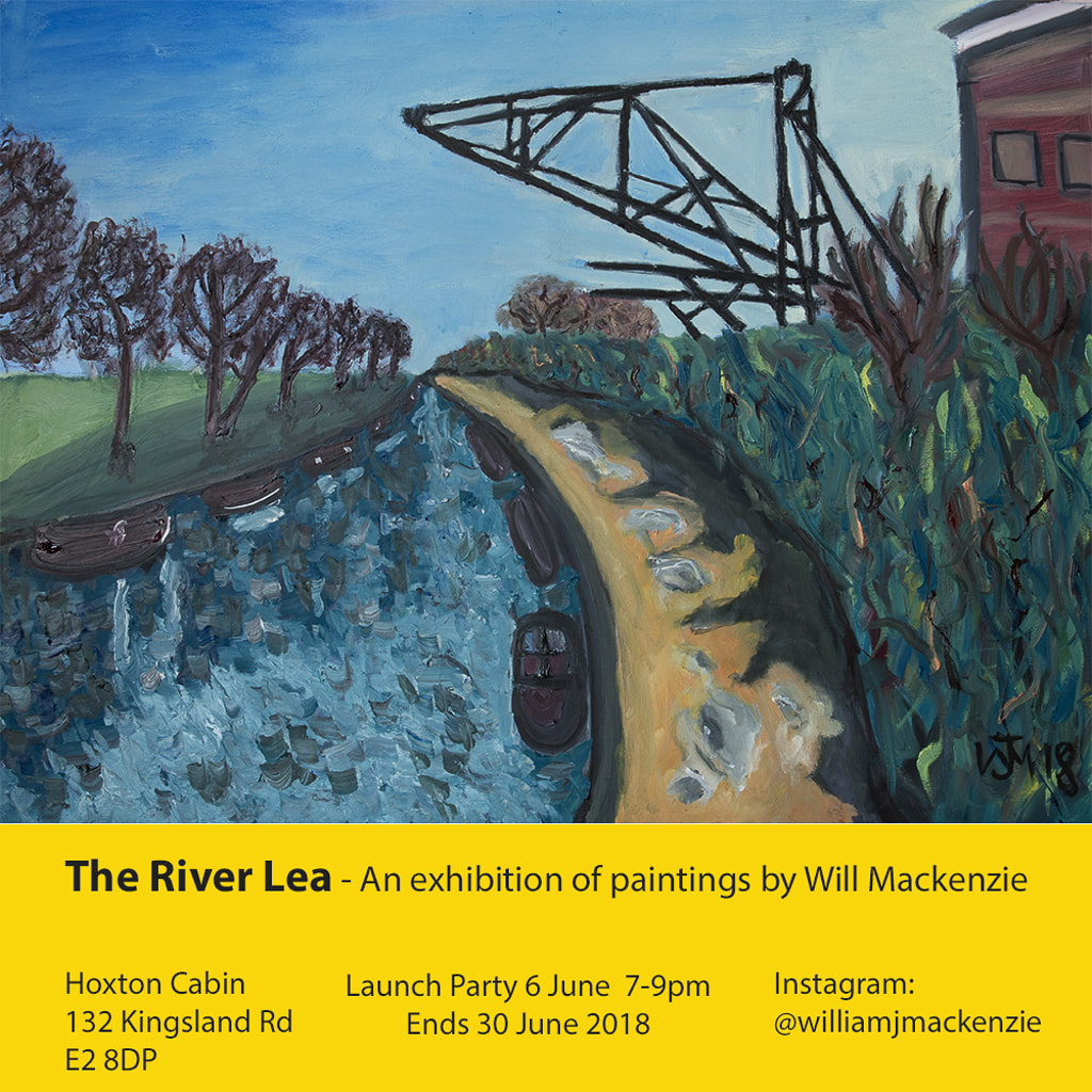
Thank you for reading this far. I shall leave you with a shameless plug for my show at the Hoxton Cabin, which finishes next week. Details below.
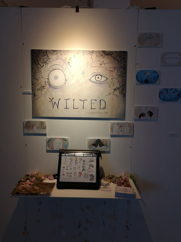
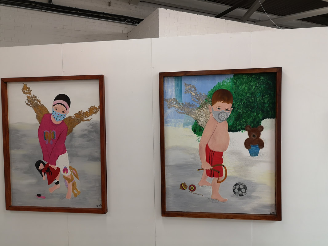
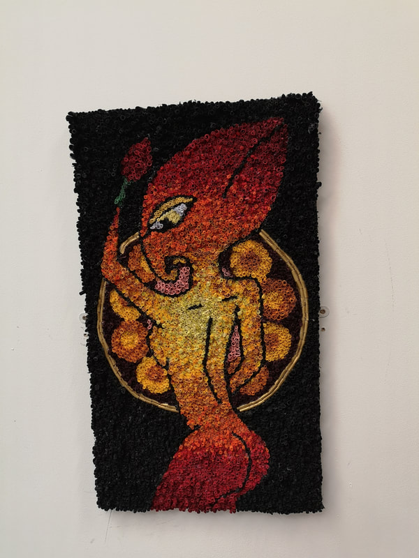
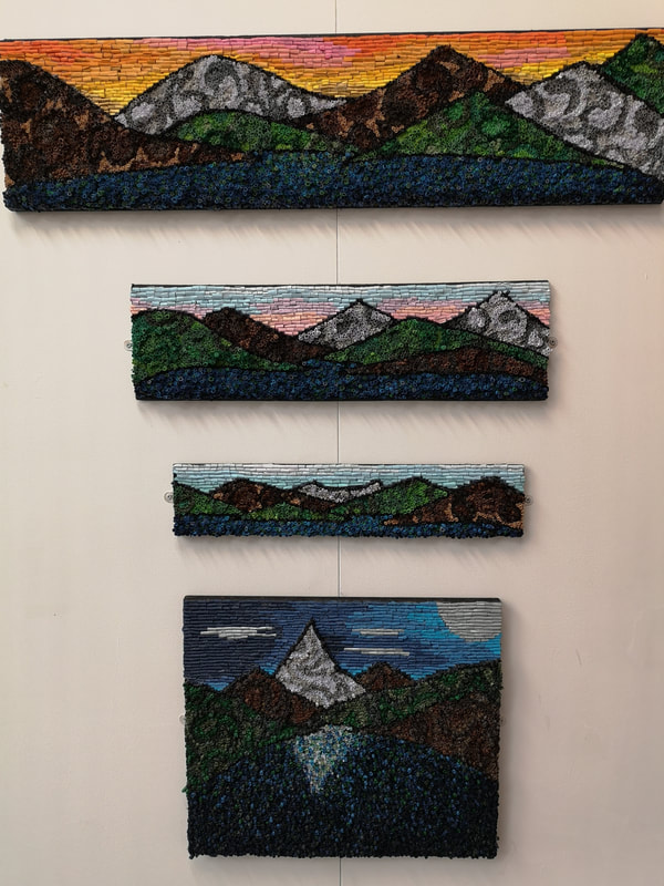
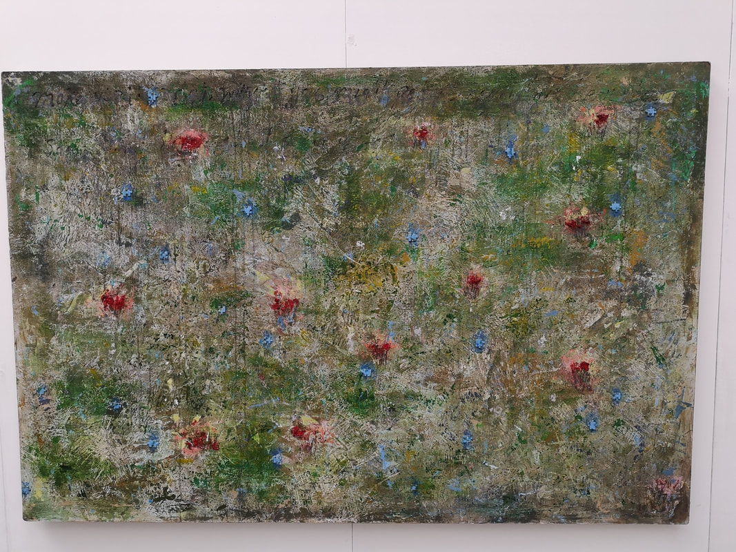
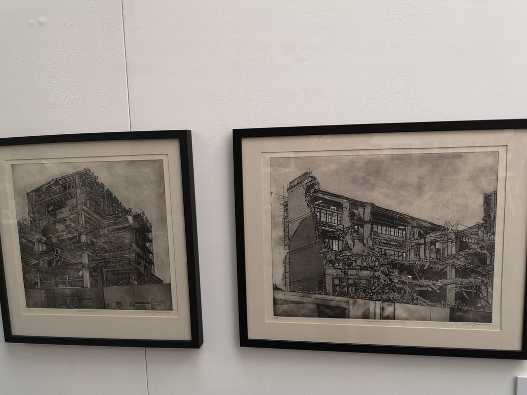
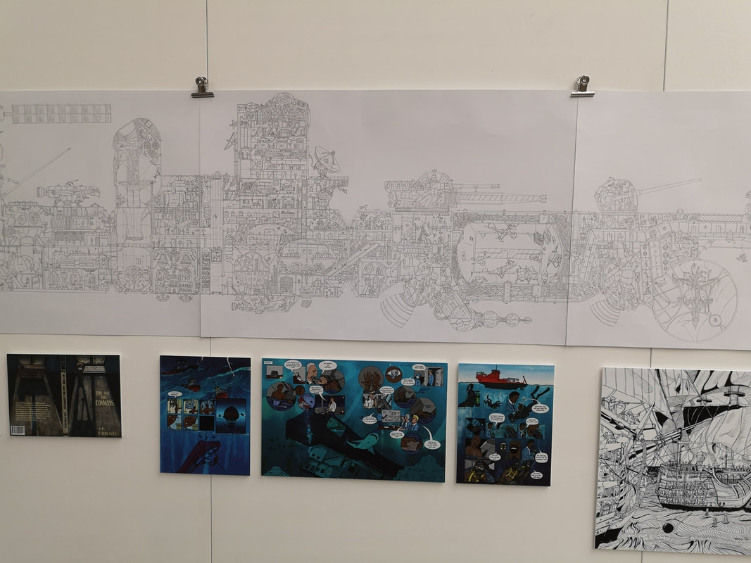
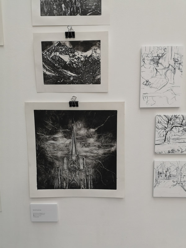
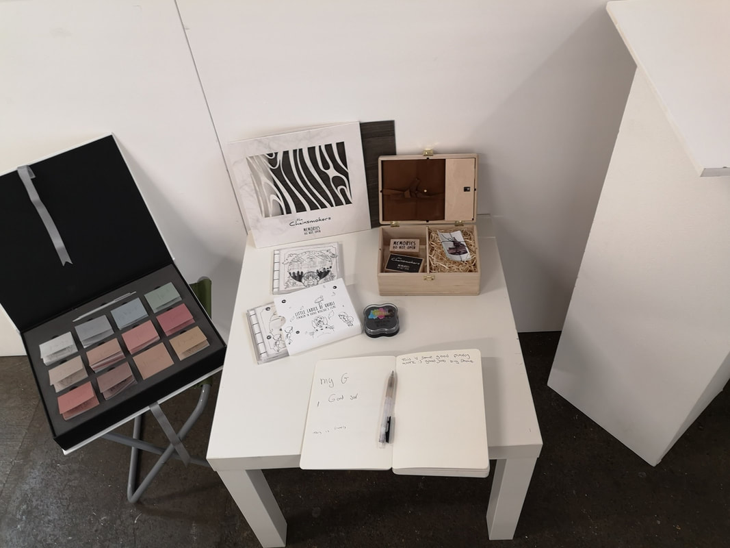
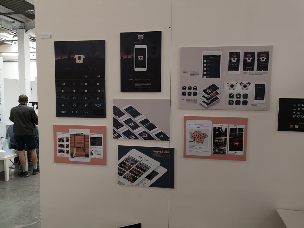
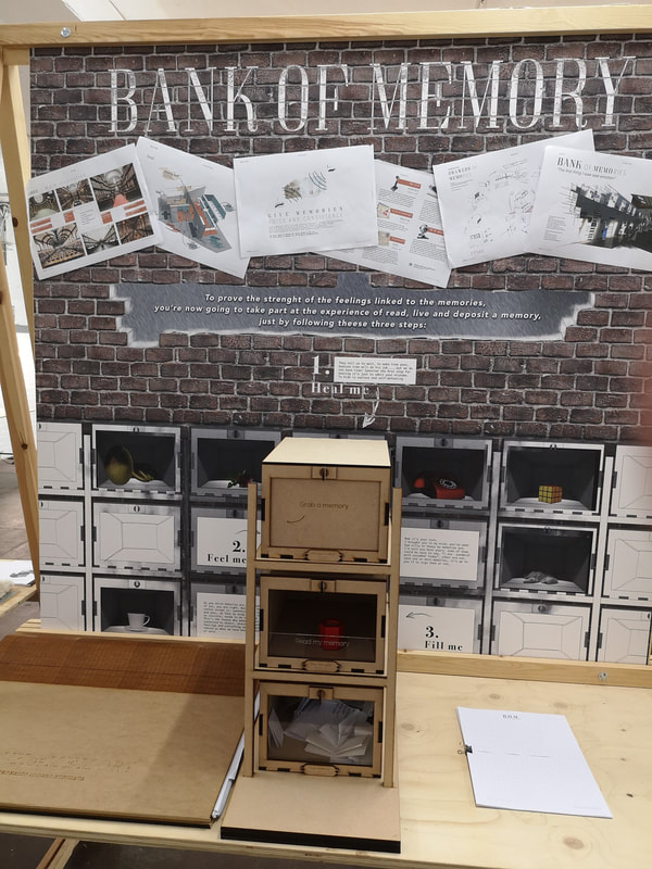
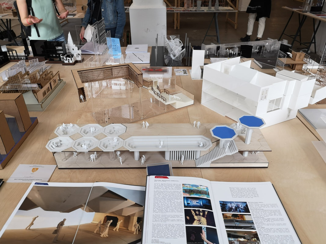
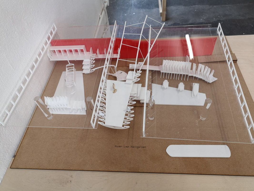
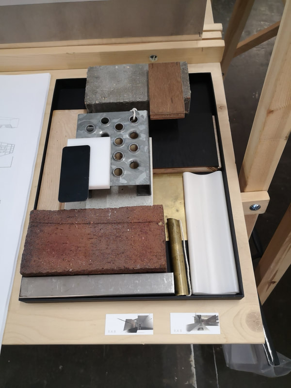
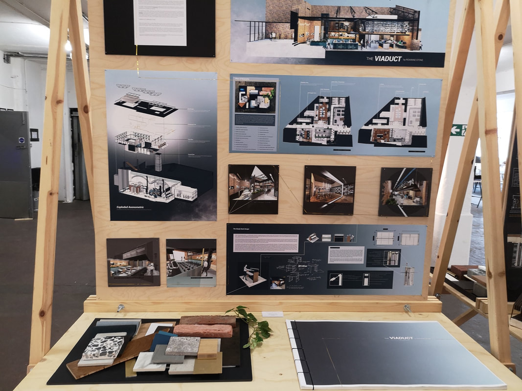
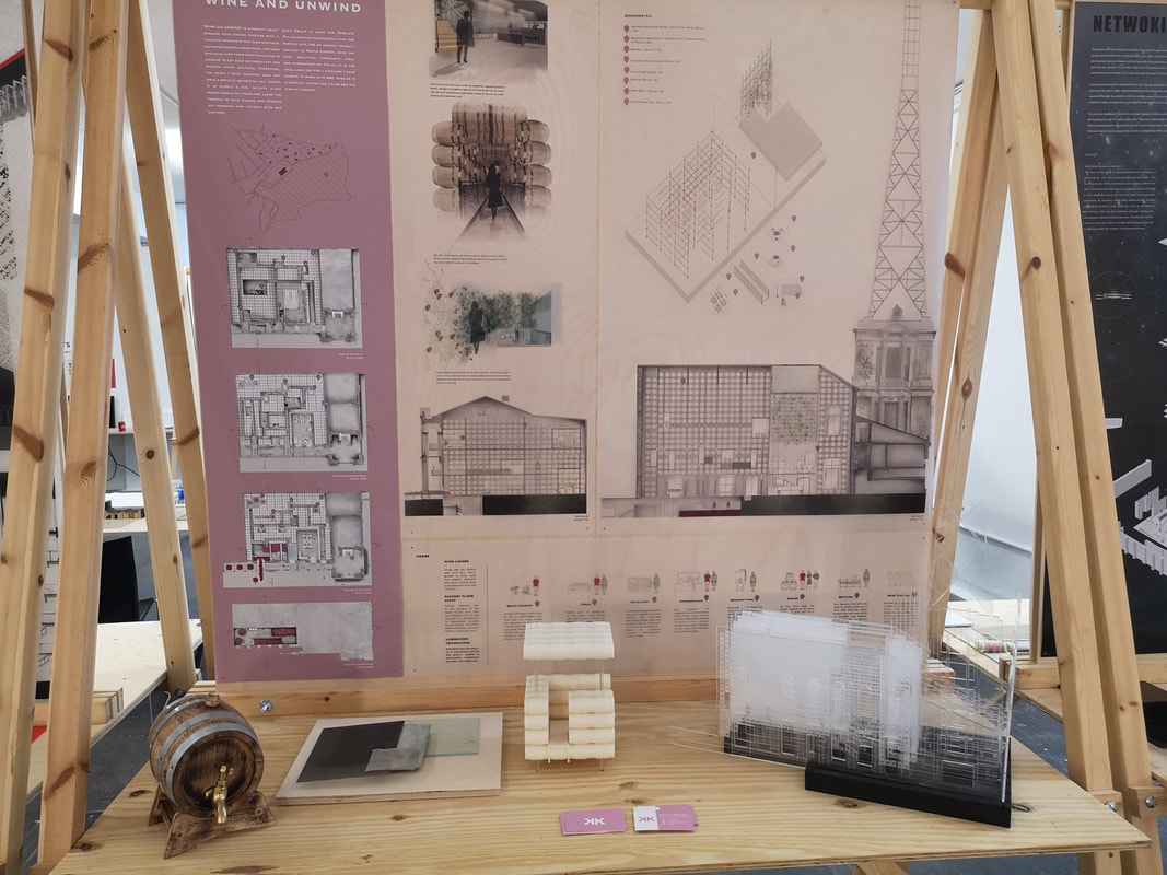
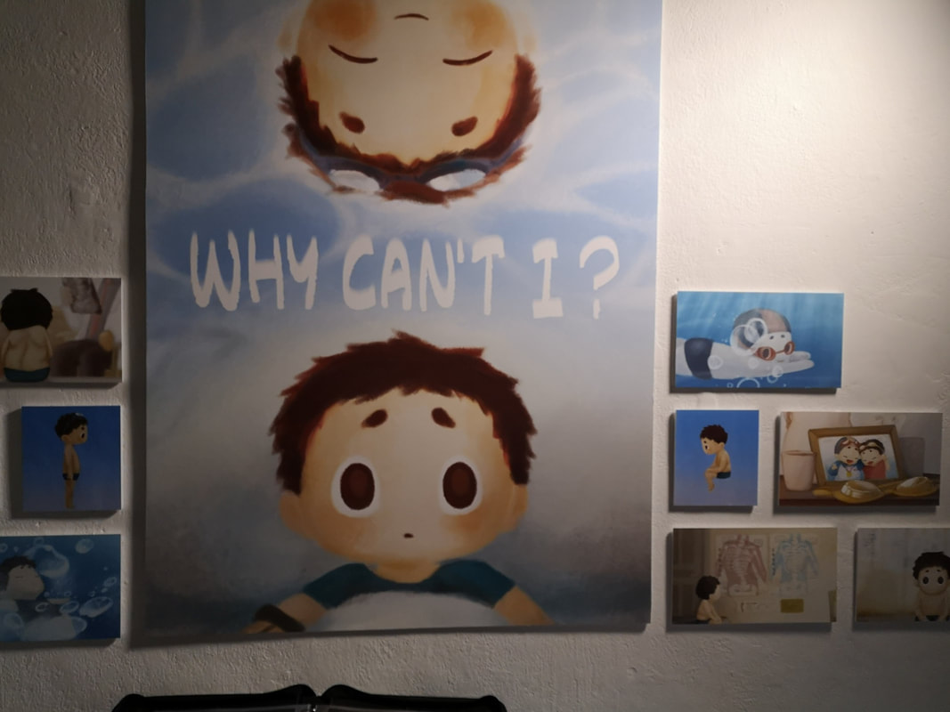
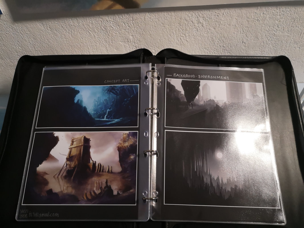
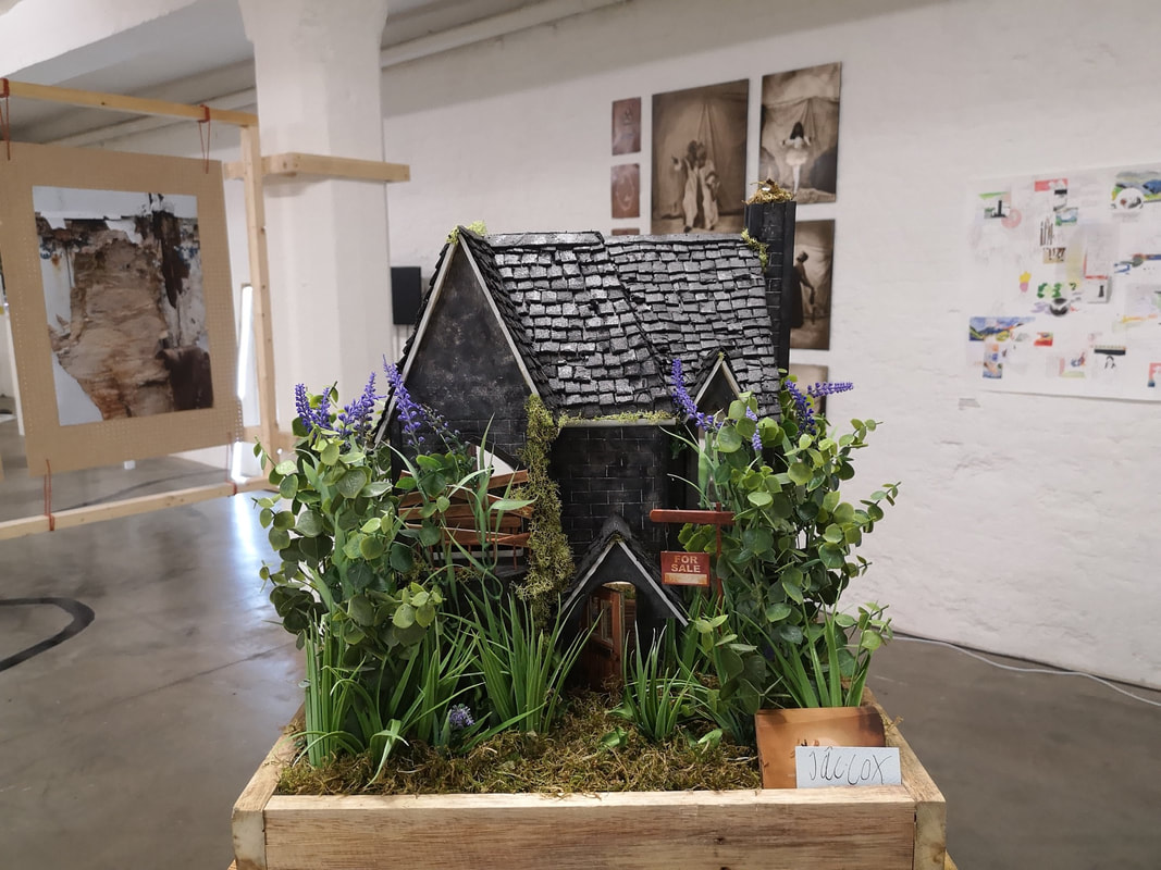
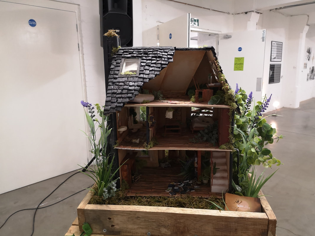
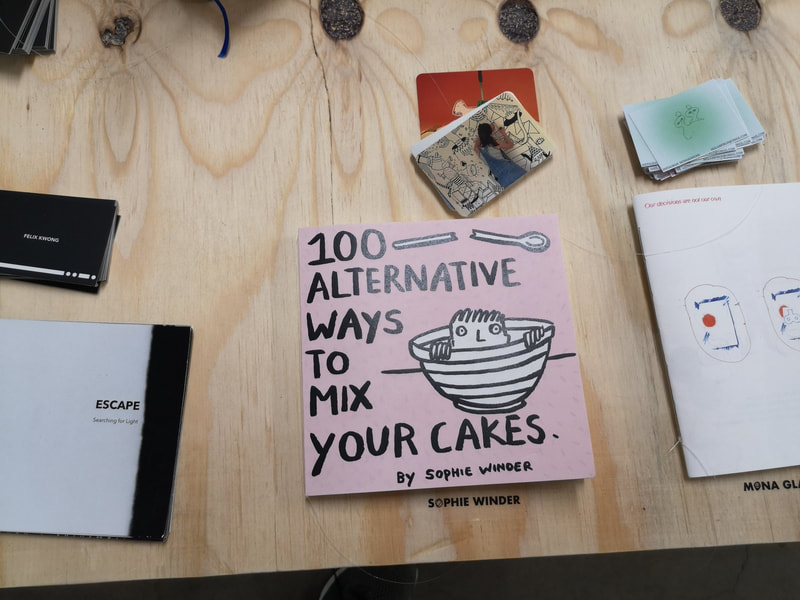
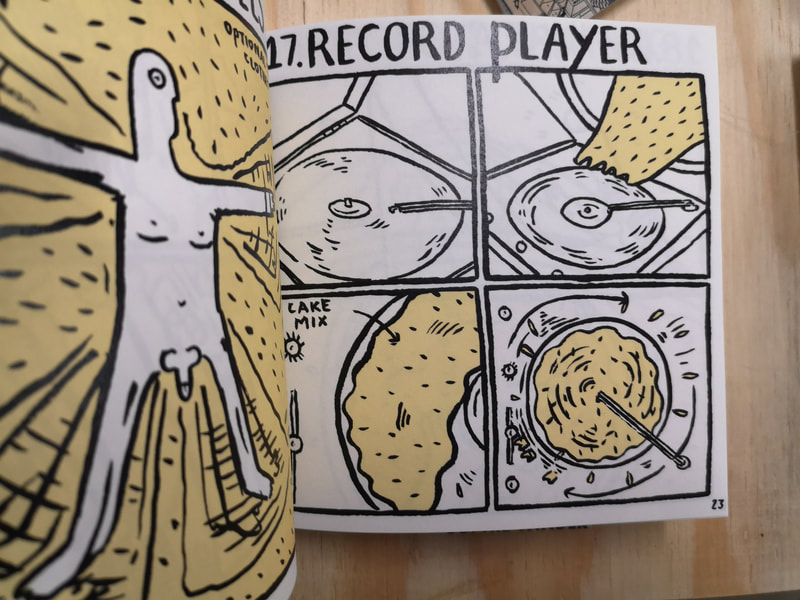
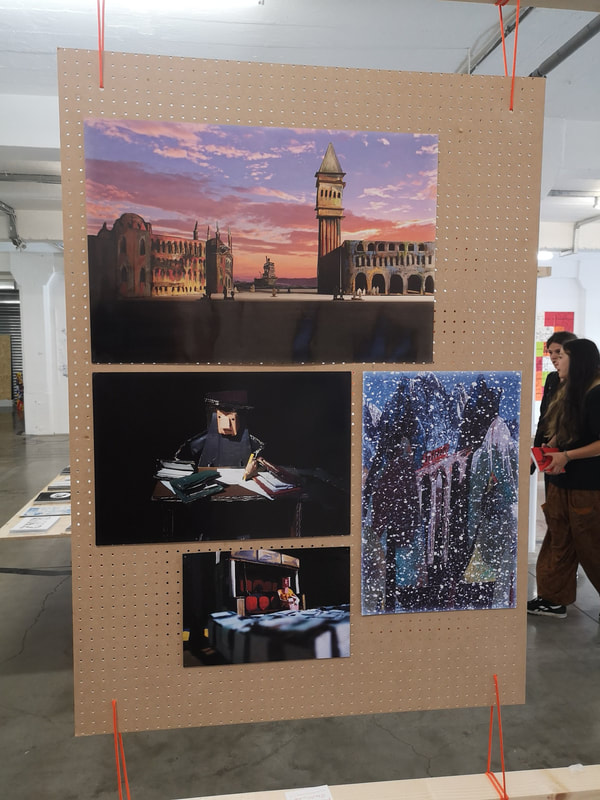
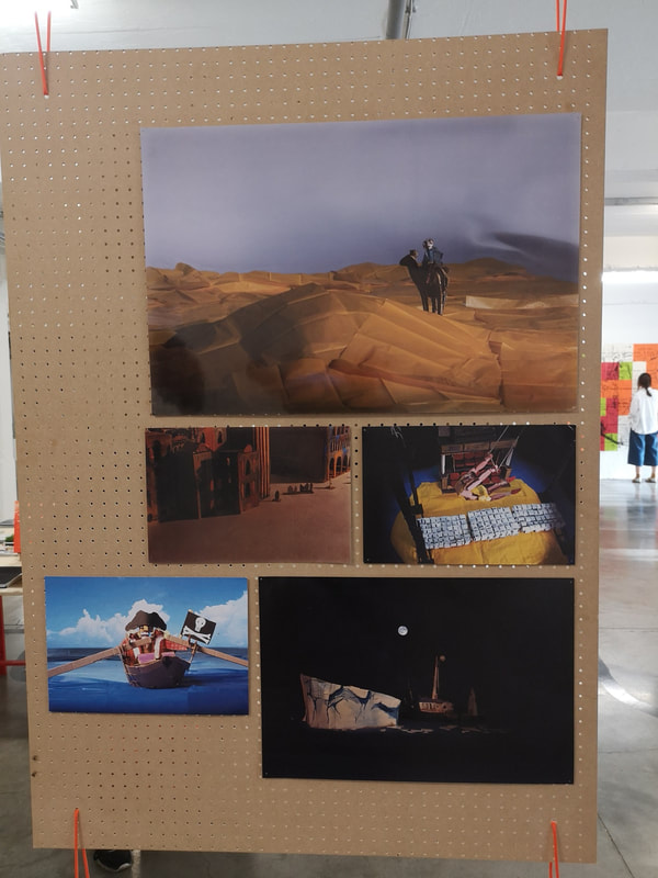
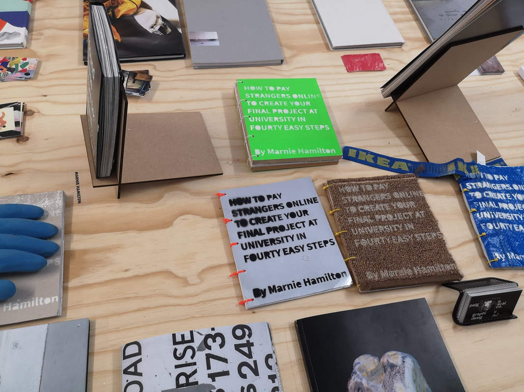
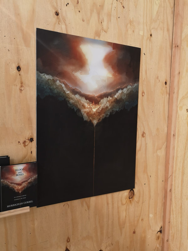
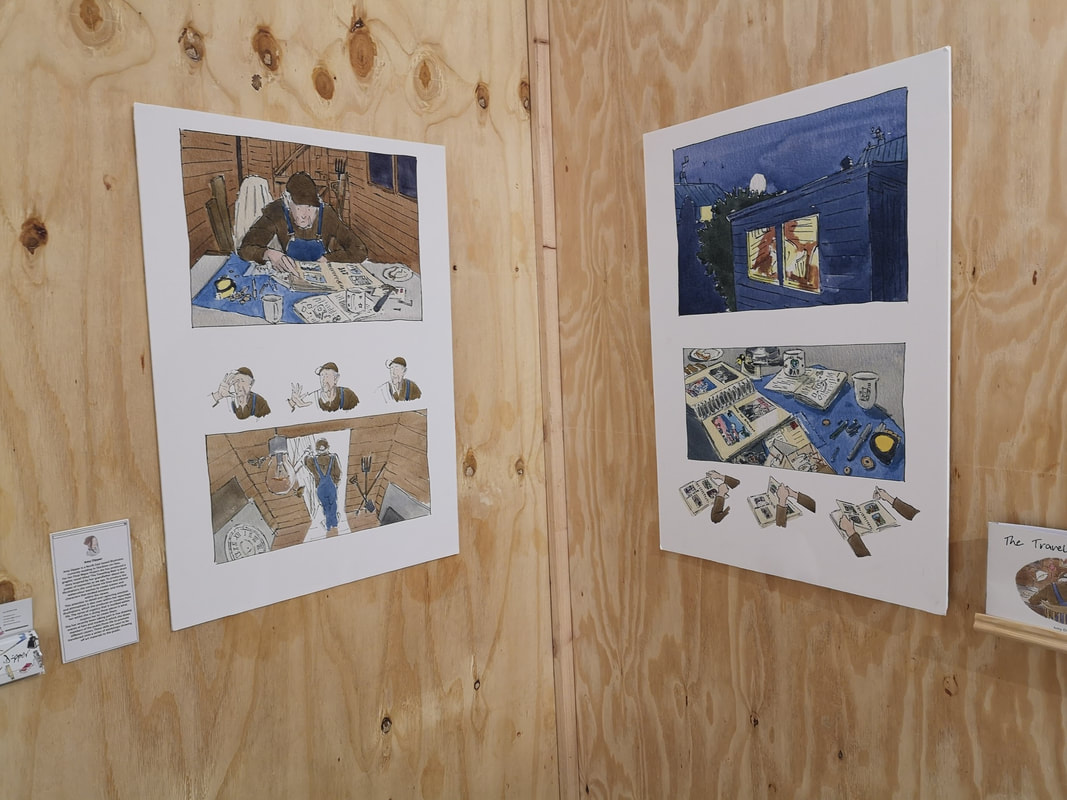
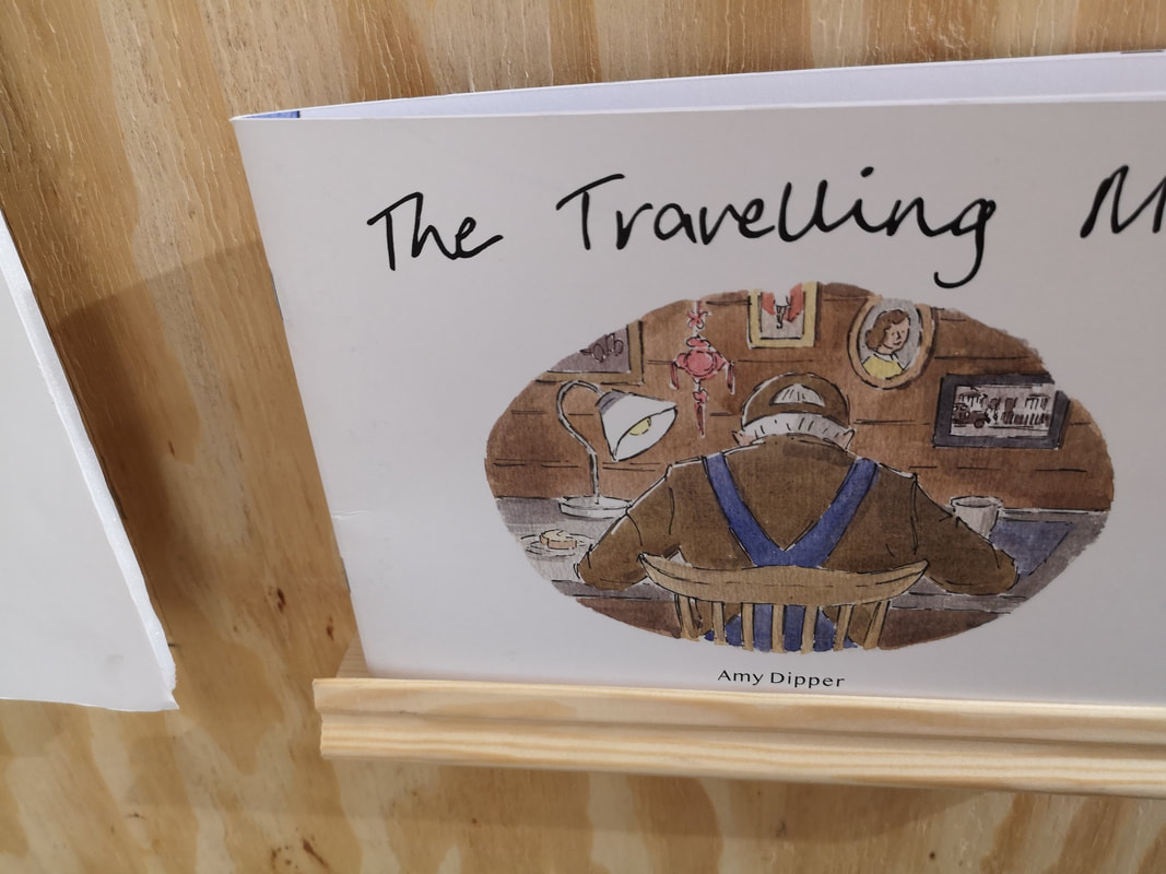
I discovered Free Range for the first time last year, when I caught the architecture show, and was seriously impressed. The concept is simple there are a series of roughly themed weeks in which various art and design schools put up their degree shows. It is free to go and the amount of talent on display is simply sickening and inspiring. It both makes me thing I should give up given what's coming up behind and pleased at the talent and work ethic of the next generation. This week was design week, although it featured photography, fine art, indoor architecture, animation and illustration. There were three universities displaying, Middlesex University, Brighton University and a small but intriguing illustration show by Cleveland Colleague of Art and Design. Middlesex were first out of the block. I was seriously impressed. There was a small fine art display and I was intrigued by these post apocalyptic semi angelic masked children (above), playing in this semi desolate landscape. I particularly like the desperate bunny clinging to the girls leg. The artist is Fedra Jimenez Castro. She is someone to watch, unfortunately I could not find a website only a facebook page. The above colourful textured pieces are not textile as they first appear, but consist of small, coloured, rolled up pieces of paper. I like the way the colours transition particularly in the alien figure. Elsie Macdonald. Elsie is very and it would appear very patient. Her facebook page is worth checking out as she shows you some of how these pieces are put together. Azalia Barad works with miasmic splotches of coloured, textured with puzzle pieces for some reason but it produces a nice effect (above left), like a semi-dessert landscape viewed from above. Hill Barnes produces these very detailed drawings of ruined buildings (above right). I am drawn to scenes like these and so these appealed to me greatly. Texturing the sky with that smudgy gray sets it off very well. It is the kind of drawing you can look at for ages. Sadly I can find no website of any kind for Hill. Photography doesn't do much for me. But I did like the above by Remus Comanescu called "A Plan for Britain". They are well composed, with a good eye for colour and structure. Drwa allot from still life I think but it is donw very well and photographed well. Jamie Pryor produced this super complex design for a Robo-Tech style ship as part of a design for a comic strip. It is intricate and technically superb, crammed with amusing little details, as was the block of flats that was next to it, but which in my excellence, I failed to photograph. For a similar purpose but with a very different style is Sarah Kadrnka's looming dark gothic church. I like the scratchy trees grasping at it, and I also like the sparer sketches you can just see on the right hand side. Around the corner from the Comic/graphic novel/book illustration section were design concepts. It varied from things like night club events to my favourite a health app to help you quite smocking among other thing (above). Michelle Mei Fan Fu. It is a very attractive coherent looking design. Well thought through. Sadly I can find no online details for Michelle. Indoor Architecture is next up and my first encounter was with Frederico Luciano Nunziata with Bank of Memory. An attractive piece but I also really like the concept. You take a "memory" out of the top, read it and then post it into the bottom. The one I took out said "This Project Makes Sense" that made me actually laugh and I still think is very funny. Credit to Frederico. The joyous thing about architecture is the depth of talent on display. You have these intricate plans, bold concepts and then little rendered models. Two such models called out to me. One by Sinclair English (above left) with a communal space of some kind. I like the hexagonal blue shades and the way they are reflected by the 6 hexagonal seating pods in on the left hand side. The other one that appealed was by the superbly named Bounthavy Malavong. I was extra delighted when I peered closer to reveal that it was to sit next to the River Lee Navigation. Nice to see the place inspires not just me. The other joyous element of architecture is the materials board (above). They are like a tactile still life and can be if done right a covetous item in their own right. The whole thing pulls together in a the whole stand. What is very easy to do is to overwhelm with information and make the whole thing a confused mess. The two above are, to me, examples of very attractive, enticing, well laid out boards. Very different approaches but both effective. The one on the right is by Kornelija Kopustaite. I can no longer remember who did the other one. In a baffling state of affairs, many of the students have business cards but surprisingly few of them put websites, or even instagram pages on them. This is a really missed opportunity in my view. 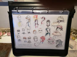 After the computer game section, which while impressive didn't really interest me, was the animated section. The first one that caught my eye was Wilted by Eve Travers (at the top of the blog and above). There is a sweetness to it that doesn't seem contrived or saccharine and a very pleasing and coherent overall feel. Having the close up concept drawings for the characters was also a nice touch. It very much bought them to life. A very different style with the big eye school of animation is Why Can't I (above left) by Yen Yee Tan. Instantly your inner child (or indeed any form of child) is drawn to this drawing particularly surrounded by the concept drawing. Yen Yee Tan does a particularly good bubble in water effect. What I liked about in fact all of the animation displays is that they were very intelligibly laid out. You could instantly grasp what was going on. The one above right is close up stills from the work of someone else but because the other photo I took is just of my thumb, I don't know who they are or what it is. I do like the moody, medieval mistyness of it, particularly the forest by moon light in the bottom right panel. Now we are on to the University of Brighton. I found there display generally more confusing. There was allot of information presented and it was often quite difficult to work out what was going on, or to actually see things properly. The were some exceptions though. The was so good I had to photograph it from both angles. It is a miniature house constructed for use in her animated film Shelter and is by a women called Tash Tully. It is wrought with such loving detail and the use of real plants around it is a very nice touch. Allot of skill going on here. Humour and silliness is always to be rewarded, particularly when done with a level of charm as in the case of Sophie Winder's 100 Alternative Ways to Mix Your Cakes (above). I could easily see this selling in bookshops. It was very well done, the little man peering out the bowl instantly drawing you in. Sadly I can find no online details for Sophie. Someone, I am afraid I know not who (above) also know how sot charm, with these well constructed and well shot stills from a stop motion animation. The figures are blocky paper characters which somehow makes them more engaging. I particularly like the pirate in his little boat. The background scenery, especially the snowy one are stunning. Marine Hamilton, also very funny. The title page (above) tells you all you need to know. These were scattered all round the show, the covers in various different substances. The final part of the show, which took some finding, it is sort of opposite Big Chill and Rough Trade and you can only access from outside the building, is a discrete offering from Cleveland Colleague which I had not heard of before but which is in Middlesbourough. From the show there were two things that caught my eye. The first was this design for Blood and Roses by Morrighan Corbel (above) who has the perfect name for producing this sort of gothic horror. The way the sky bleeds into the shiny city and then this line of light taking you into the darkness is very convincing. Stylistically very different, and it seemed to me very much in the English illustrated tradition was the Travelling Man by Amy Dipper (above). Characterful, muted colours, fine lines and full of pathos (is that the right word?) it reminded me of several books I had as a child. Again I can see this actually selling. All in all an impressive show.
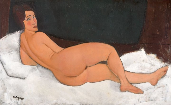
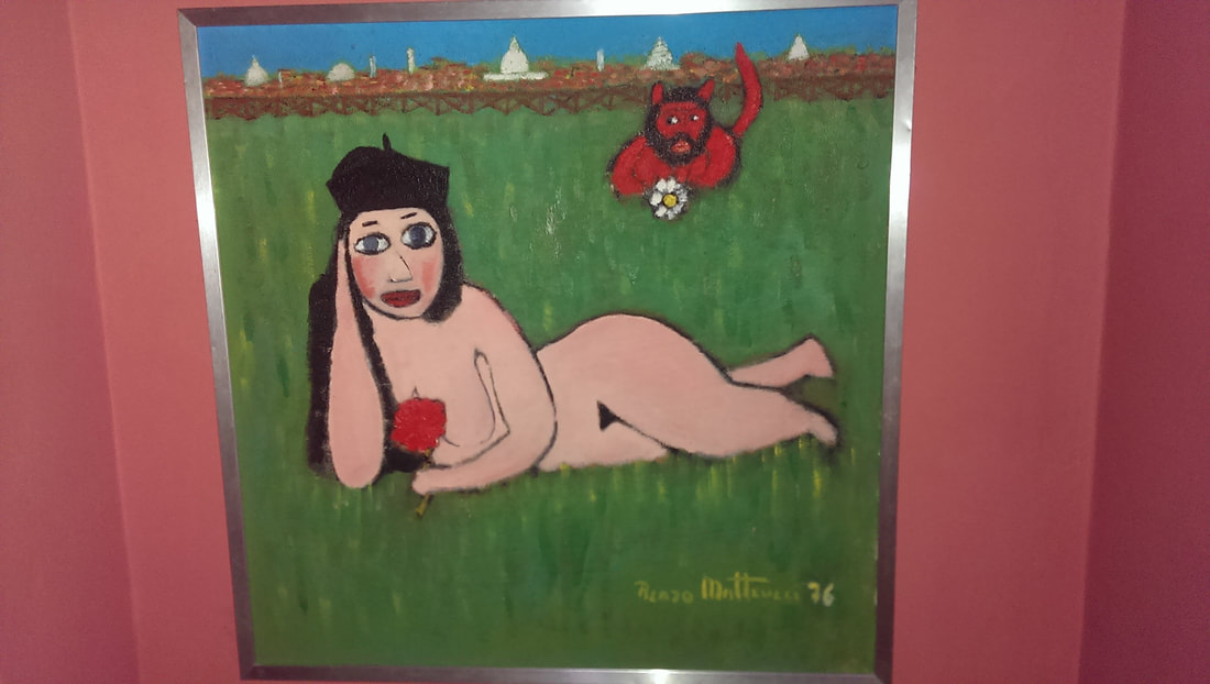
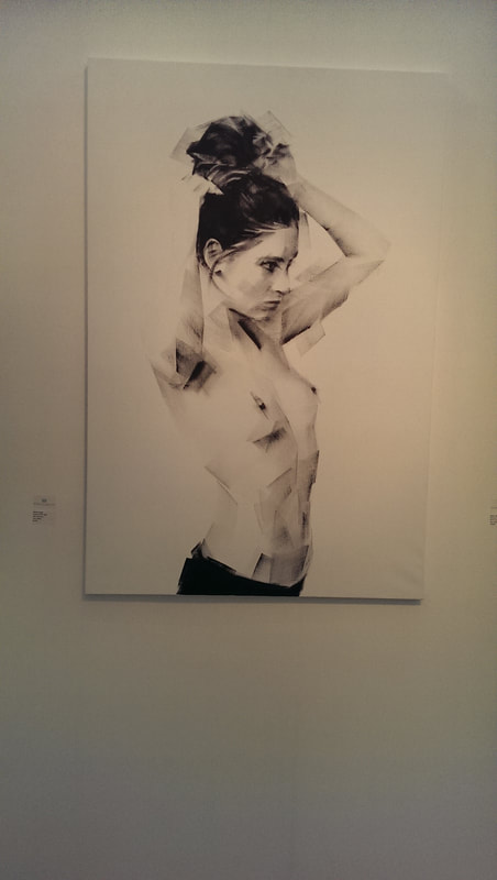
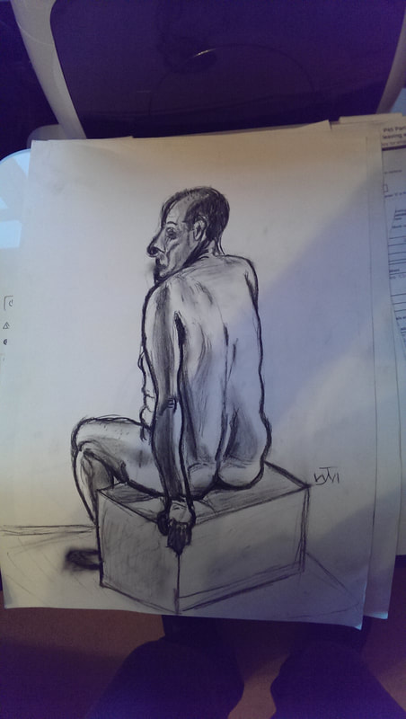
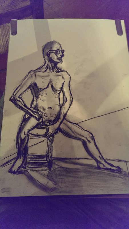
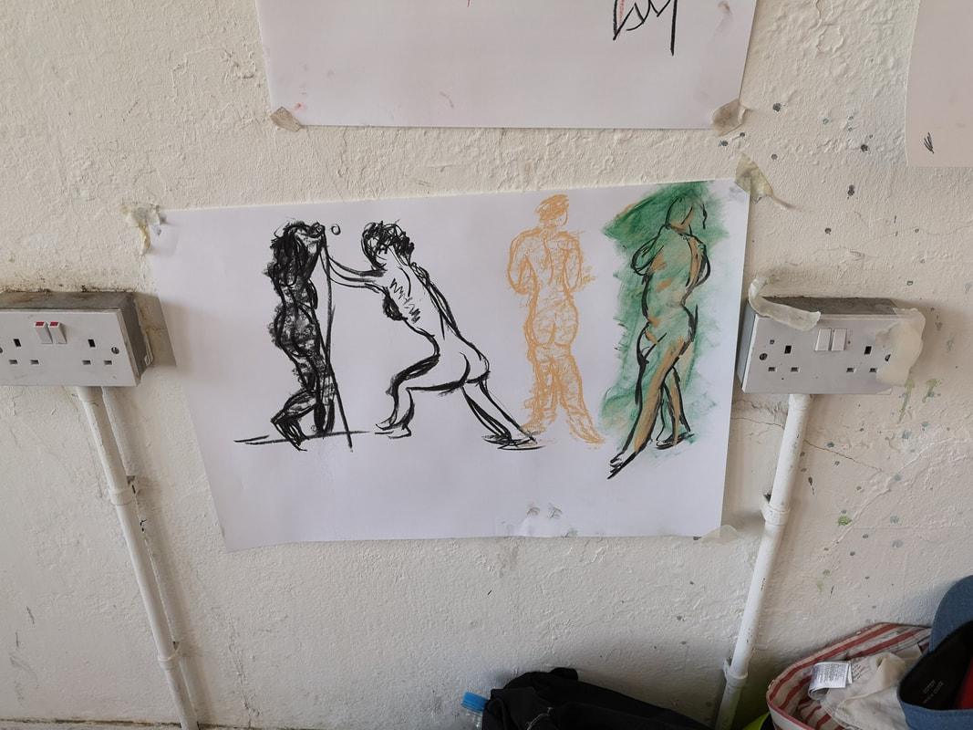
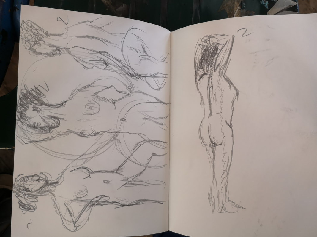
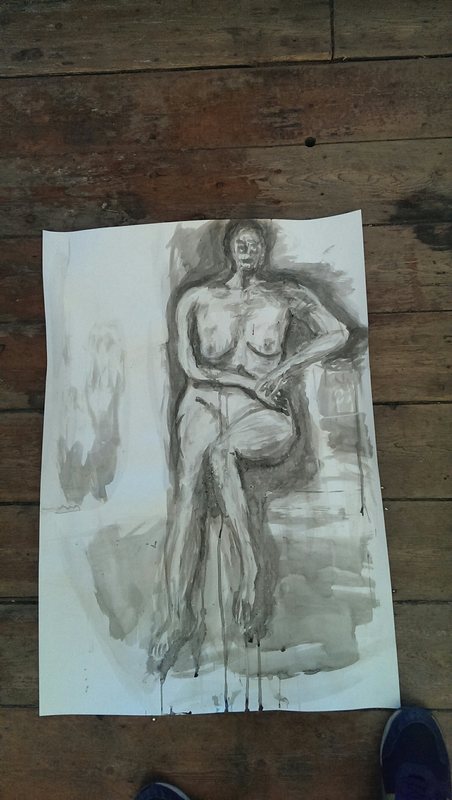
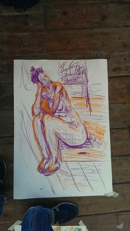
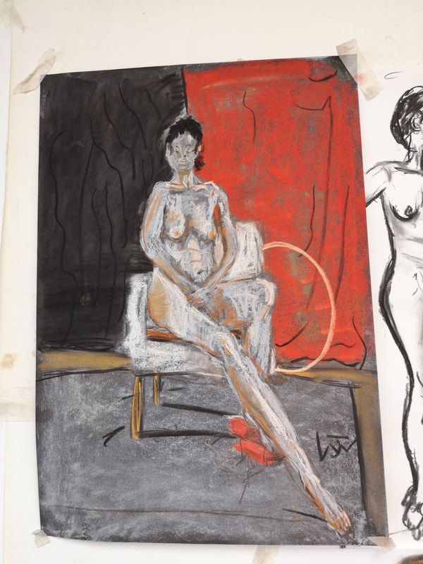
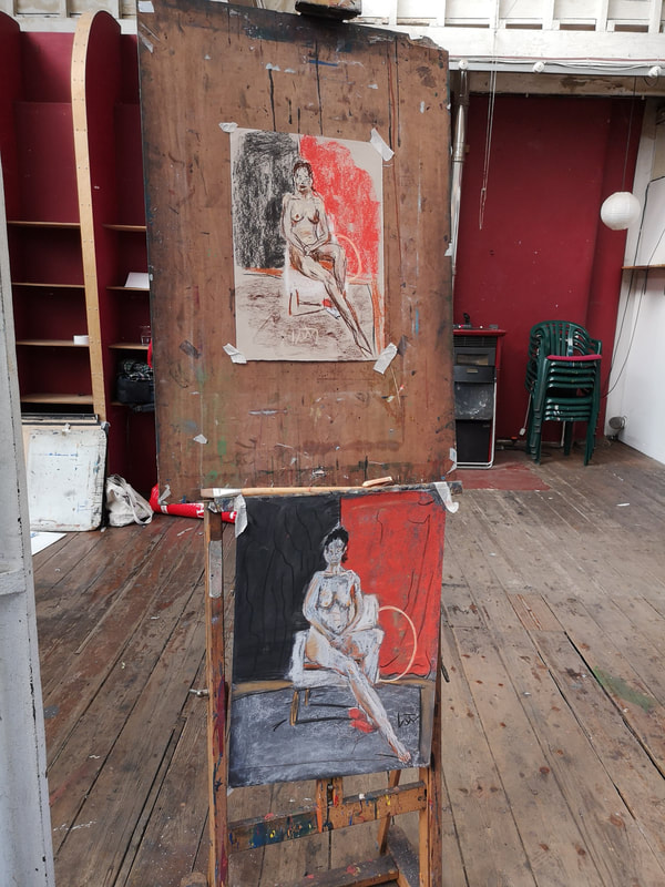
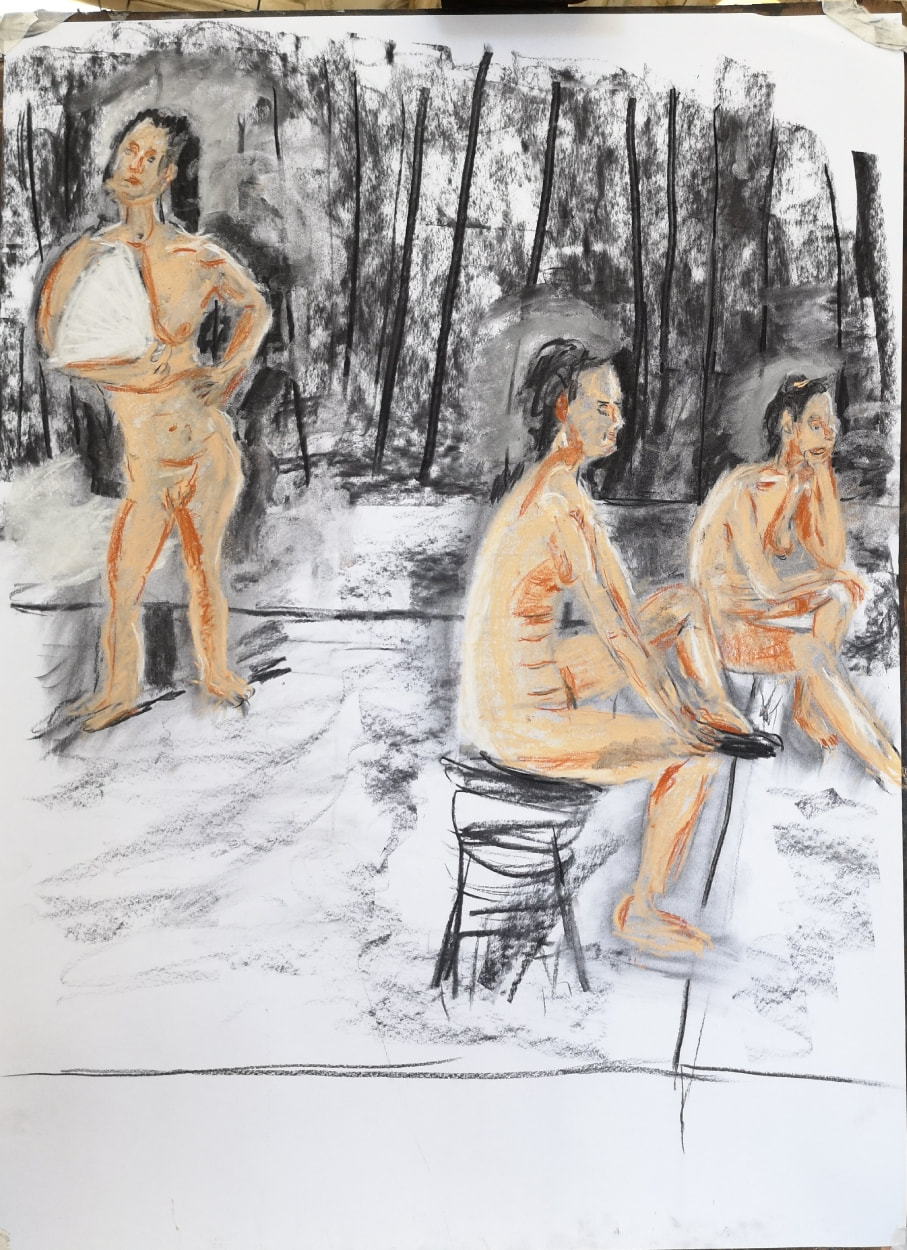
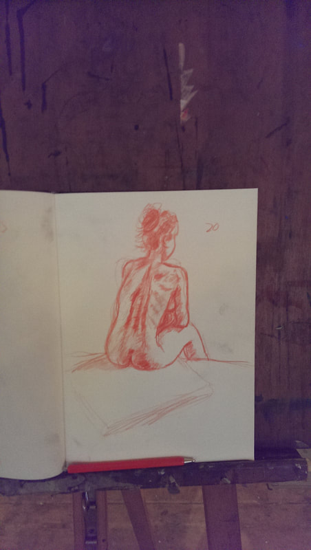
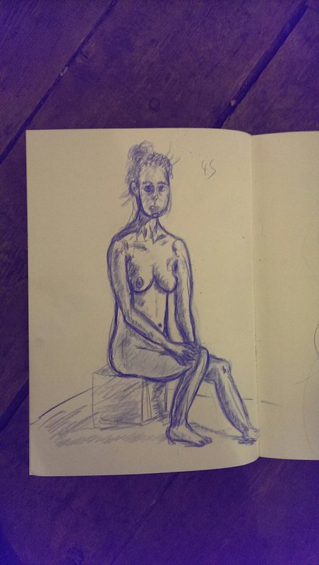
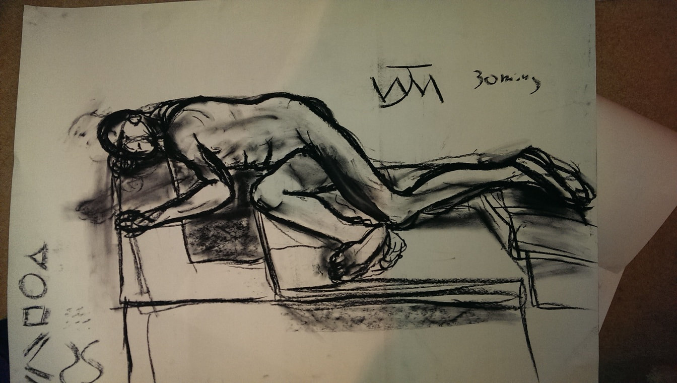
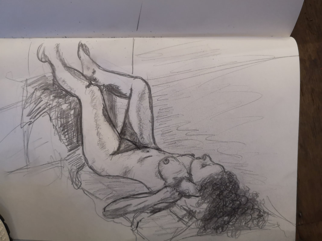
Speaking of shows, mine is still going on at the Hoxton Cabin and will be until 30th June. Details below. Nudity exists in as far as I am aware, all artistic traditions. In Western art though it is almost always women, and they are almost always portrayed as a passive sex object. This has been said much more expansively and better by John Berger. I consider myself to be somewhat of Bergerac. You see very few male nudes. Particularly in what you might think of in a classic nude pose. The only famous one that comes to mind is Lucien Freud and even then he is looking you in the eye. This is how I think nudes should be portrayed. As a person not a sex object. My least favourite type, in fact I really hate it is the nude female body with the head obscure or replaced (with something horribly trite like a storm troopers helmet or an animal head. No. The best ones are when you get the impression you are looking at a person. In the house I grew up with there was this very odd nude on the stairs (above). This figure, looks right at you and there is lots of what later in life I began to realise was sexual symbolism. Mogidiliani does much the same thing but better (top). I saw a good example of a good nude in the recent affordable art fair (above). It is very much an actual person. So then how to approach life drawing. I like life drawing. I think it is very useful to do. It is also fun. You get to meet other people interested in art and there is nothing quite like drawing someone from life. I go to Candid Arts in Angel which is a drop in, every evening in the week and is £9 (apart from Friday which is £15). They provide quite a range of models, both Men and Women. More women than men in my experience but not by much. So given the above how to approach this. Rule 1: remember this is an actual person who is taking off their clothes for you to look at them naked. You should remember this. I always try to our the name of the model. Somehow this is important. Incidentally there should be a word for when you run into a life model in public and takes you a while to remember you’ve met them. Candid arts is fairly informal and everyone wanders around the place, looking at each others works. Including the model. Frankly if the person you are drawing says your drawings are good. To me anyway. This is one of the best ones I’ve done. You build up making longer and longer drawings, usually ending on a 40 minute drawings (of which the two gentleman above are example). Always try to draw the actual person. This is tricky to do in a 2 minutes sketch (like the above). This is why I don’t like Cezanne. He doesn’t paint people. He paints people shaped objects. Always draw the head and if you have time the face. Even if it goes horribly wrong. Don’t just draw the naughty bits people. Anyway I’ve been going for a while now, and they do a fine line in Saturday all day courses, taken by the excellent Kim Scouter. Teaching you techniques like measuring, and drawing without outline (like the above left) and drawing with two different colours (above right). I also went to a drawing with pastel course which was very intriguing and taught me some very useful things (above) This included drawing, pastelling (I am not sure what the right verb) is the same person in three different poses. Difficult and i managed to get her legs far to small in the standing pose but it worked out quite well (above). The drawings I am proudest of are the ones where I manage to capture the spirit of the person. Often this is the last picture of the day but sometimes not. For example the one in red (above) was the penultimate one of the night. And then it sometimes really comes together as in the above two pictures. I had a coherent idea of what this post was going to be about but it seems to have just drifted into pictures of naked people. Well never mind. I suppose what I am trying to get at is that drawing people is difficult. I try in approach in a way that does exactly that, draws people.
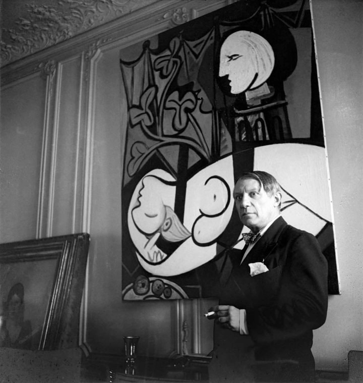
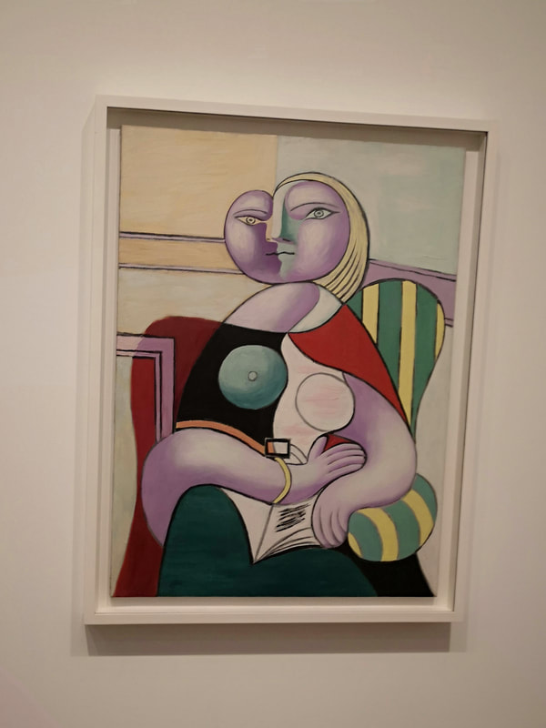
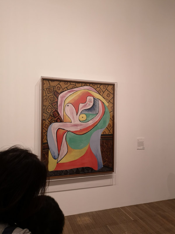
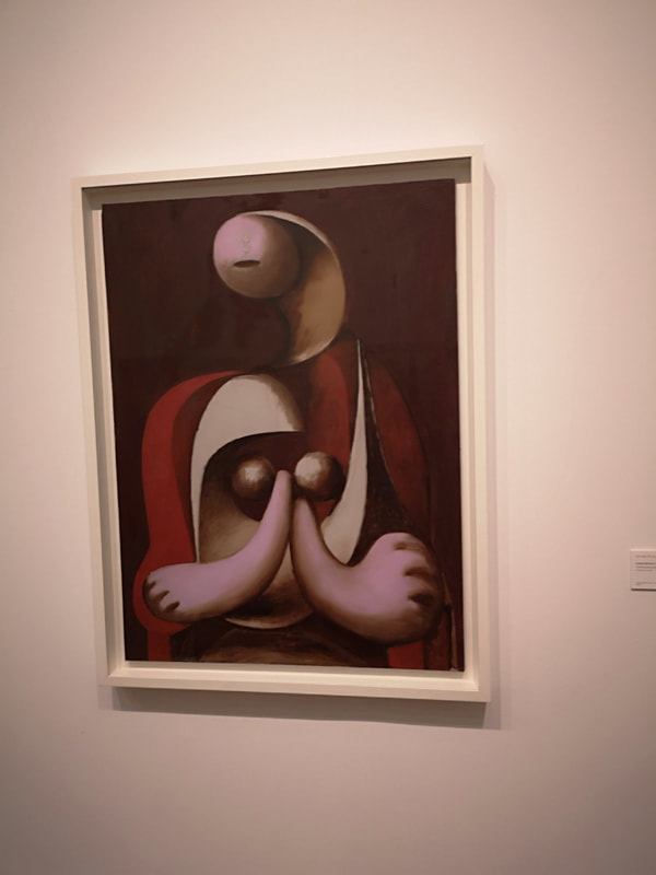
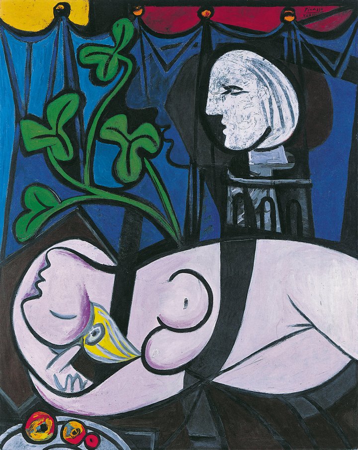
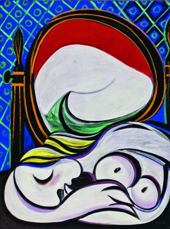
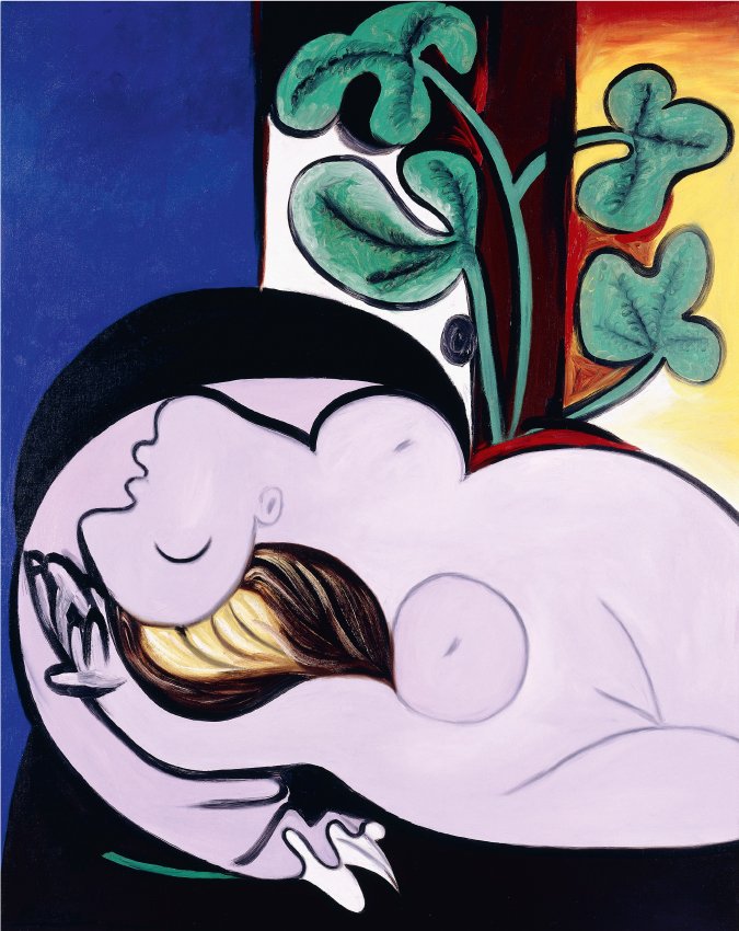
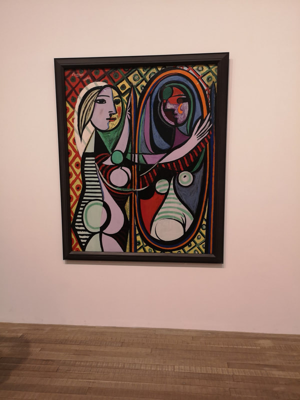
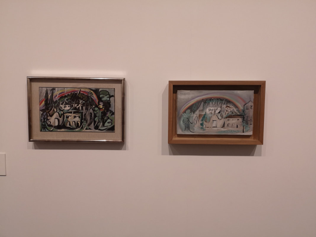
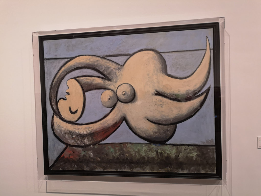
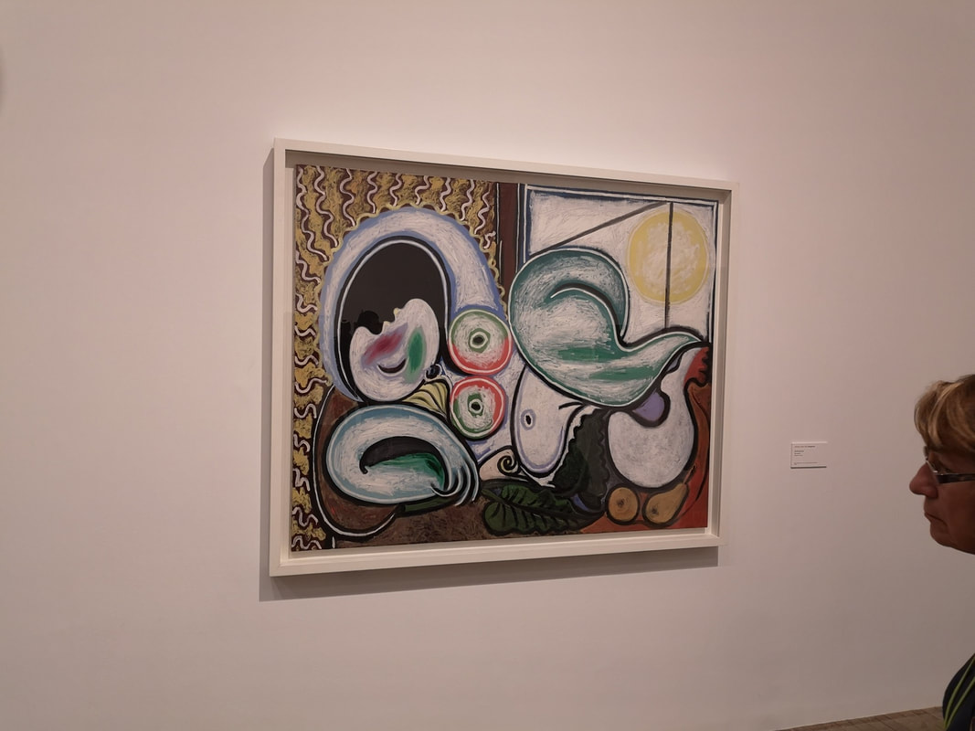
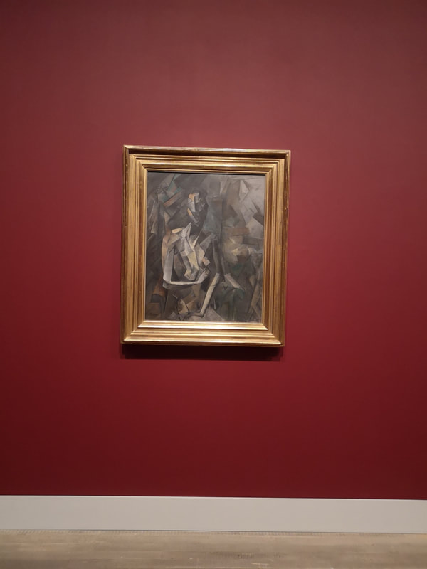
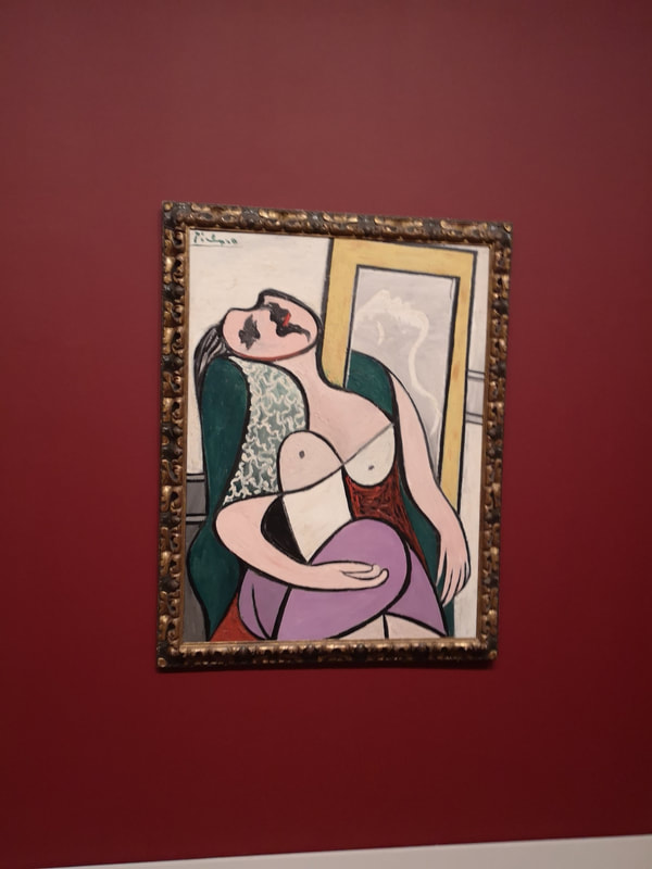
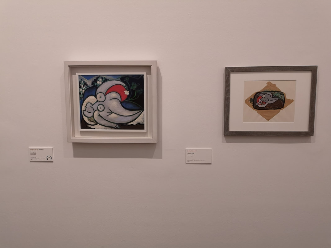
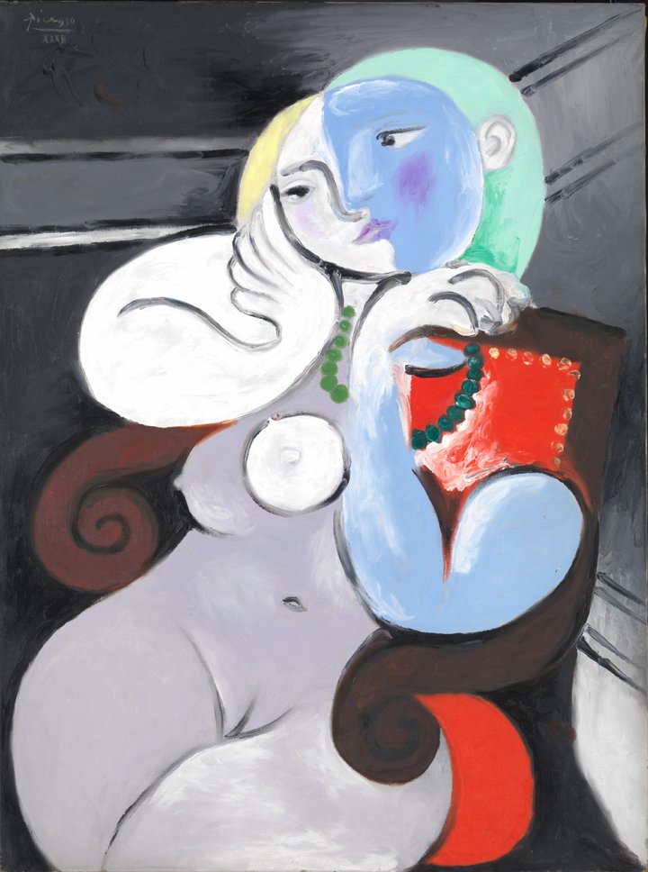
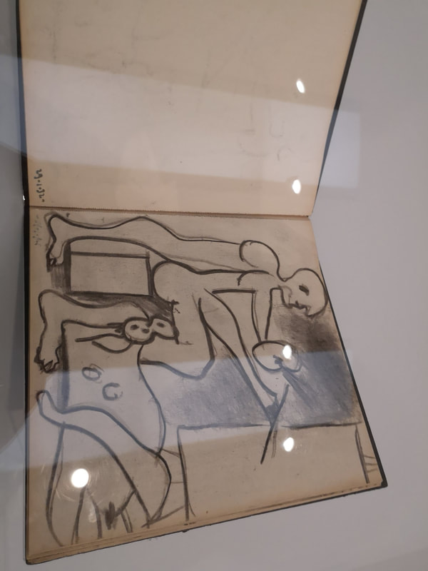
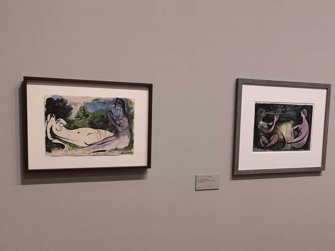
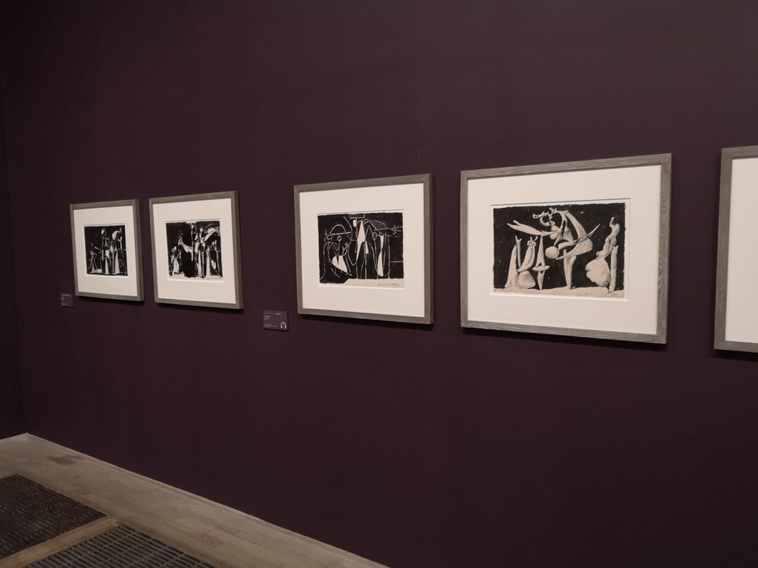
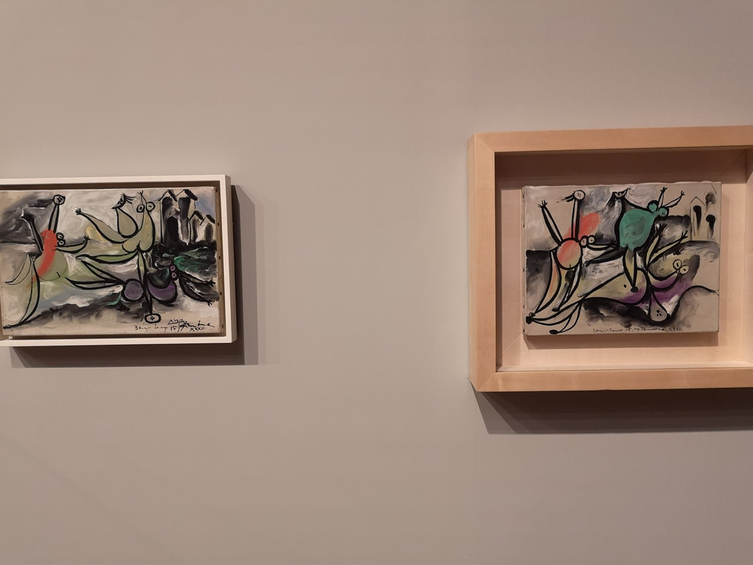
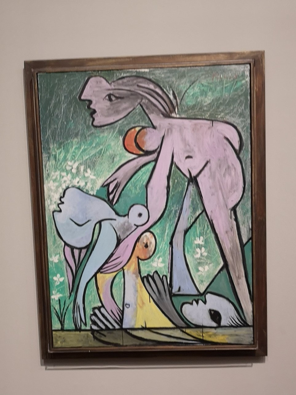
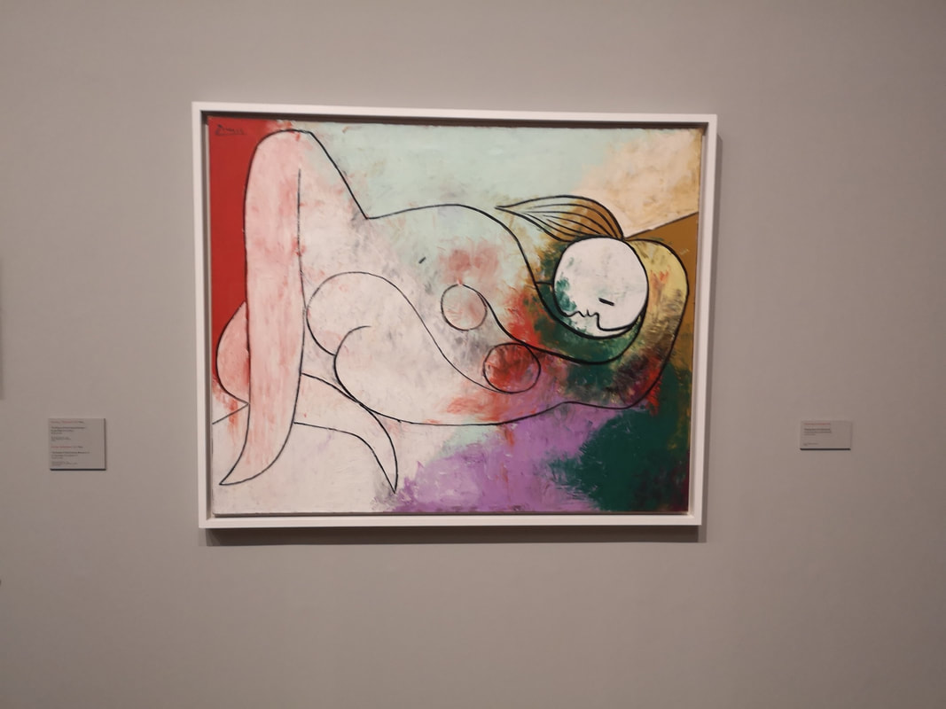
Incidentally I have a show going on (details below). Picasso 1932 is Tate Modern's summer highlight show. It reveals how monstrously prolific Picasso was, some of the pictures being produced in a day. There are many excellent pictures in this exhibition, some true masterpieces but being so prolific there are some real duds. This is something I have noticed about Picasso before. His work benefits greatly from the halo effect. There are pieces that had they not been by Picasso would not benefit from a second glance, never mind being hung in a major show (for example the really bad Composition with Butterfly). That being said there are some really good things in this show. The other thing that comes across is how much of a massive misogynist Picasso was. Most of the pictures in the show are female nudes and with all but one exception they are simply titled "the nude". Some of them, such as The Three Dancers (which I hate) are truly horrific. Other people have said this better than me but it really comes across. I shall leave such things though and concentrate on the art I like, which even with the above being said is really worth seeing. The show takes you through the year chronologically. The first room is the least interesting and the most crowded so waft on through and it starts getting good, fast. The first heights are hit with Reading (above). As with most Picasso he makes sure you know there are books but it is a very good painting. NIce flowing shapes and the two tone chair and background is very effective. He paints quite thickly. In the same room you have "The Yellow Belt" which is a woman with a yellow belt. It has the characteristic Picasso abstraction but with very playful childish colours. This is called Rest (above). Excuse the persons head. You could take photos of most of the paintings (but not all). Even though I went during the day on a wet and thundery Tuesday, the place was pretty packed and judicious use of looming had to be used to get a good view of things. At first I thought it was just abstract shape, but eventually it resolves itself into a deeply unhappy looking woman. The fragments of colour in violent red, yellow and blue imply anything but red, as does the screaming face. Also the backdrop looks like the wall of an old English pub. Various versions of a Woman in a red armchair sit on the right hand wall of the same room. The 27th January version uses thick white and brown paint in more geometric shapes, reminiscent of a reductive skeleton, all in front of these looming red monoliths. Next to it is 30th January (above) where the paint is more subtly applied and blended, the chair less monolithy and for some reason this woman has a penis for a head. The penis head motif appears a few time. The cards next to the painting regale you with pyscho-sexual analysis of this, the conclusions of which I am sceptical about. Also, to show you he is annoyingly good at sculpture as he is at painting, there are various sculptures through-out the show. There is the centre of the second room the Bust of a Woman which is booth grecian and playful. The next room you have these very bold, very colourful and entirely excellent nudes. They appear to be of the same blond woman as far as I can tell. There is Nude with Green Leaves and Bust (above left) in which the figure is crossed with these thick black lines that seem to be restraining her. In the foreground you have these super coloured apples. Next to this is another picture of a woman sleeping in front of a mirror (above) and is all about the base, her bum surrounded by this lucious red that makes it pop against the geometrically scarred blue background. I do mind a bit about the objectification. However these really are superb works of art so one can stand away from that a bit. There is no doubt though, these woman aren't here as woman, they are here as abstracted shaped sex objects. So you get this again with Woman in a Black Arm Chair (above left) but there is a superb use of colour here, with fiery yellow blurring into orange and red on the right countered by the cool vivid blue on the left, and then these thick curving geometric shape. I particularly like the way he fills the negative shape in the figure with the hair. Different from this though is Girl Before a Mirror (above right). Again you have the bum in the mirror highlighted by a red background.but this time the figure itself is cut with these intriguing geometric shape. She looks pregnant to me. I like the way her face is light and almost haloed but the reflection is dark and almost bloodied. The sharp geometric background is most striking. What I like about shows like this, indeed exhibitions in general is introducing you to the new and unexpected. In this case it was views of Boisegeloup. He had a place there and painted a number of very sweet interesting landscapes. My favourite were a pair of a Rainbow over Boisegeloup (above). In each one the subject matter is approached very differently but they both have this very Japenese quality. I think the one on the right is my favourite. Picasso was interested in Octopuses, there is a video he shot of one in this room. This interest can clearly be seen in the two nudes in this room (above), one very much so where the woman's breasts morph into an Octopuses' eyes. I like the way he morphs the tone from dark to light in this one. he other one is more colorful and more interesting. Thick colourful paint and thick black lines. The pairs in the foreground are presumably symbolic. I also like the gold lines that are arcing out of the woman's head, and the half moon of black space, above her head and formed by her left arm. Compositionally it is excellent. In fact it is an excellent painting. The next room is called simply Fame. In this room along with some programmes, books etc the curators have put next to each other various different of Picasso's periods, culminating in one from 1932. Seated Nude (above left) is from his cubist period and is all dark and moody, with this almost alien figure emerging from the blocky background. Sleeping Woman in Front of a Mirror (above right) is much more what the hell?! What's with the gash for a mouth and the scratched out eye. Again thick colourful paint and in many ways it is an excellent painting but it reeks of dysfunction, which I found quite off putting. The Three Dancers is in the same room and that painting has the problem even more so. There are portraits of his family in this room. Done is a very classical style, save for they are against bare canvas. July and August are next and the naked squid woman are back (above). A similar pose, a similar style but these are still excellent paintings. The use of contrasting colours and varying tones is masterful. This room also contains one of my favourite paintings in the show, 27th of July's Nude Woman in a Red Arm Chair (above). The woman is calmer (indeed a little bored looking). I like her two tone face and again you have the juxtaposition of blue (her left arm) and red (the seat of the chair. The paint is thick and textural and the old trick of contrasting back ground (dark on the left, light on the right) is done well. Very nice . Black on White is the title of the next room and is an excuse to show a number of dull sketches on canvas. They look like abandoned pieces of work. They come across as filer. They are not particularly interesting except to show the way he worked. The cabinet in the centre of that room houses a number of his sketch books (like the one above) that do this in a more interesting and visceral work. This room also contains one of the few portraits where the subject is named; Marie-Therese in Pensive Mood Moving swiftly on. September and October is possibly the most interesting room in the whole show. There are three different series of paintings in this room. The first is the flute player (above) where in a number of different poses and styles The Crucifixion, specifically transcriptions of Grunewald's Isenheim Alterpiece are the next theme (above). All done in ink you have the same theme again and again in different ways. Some horrific, some geometric, some surrealist. There is a whole wall of them and they are fascinating. My favourite series though was four joyous beach scenes (of which two are above). You have these dancing playful almost cartoonish figures cavorting around. They are quite simply done but I kept coming back to them again and again, they are amongst my favourite things in the show. Final room- November and December. Picasso had recurring dreams about trying to rescue people from drowning. He did paintings of this of which the one above is my favourite. I love the soft green flower covered background and the way it becomes darker and seems to be scored with scratch marks. The final painting in the final room was probably the best thing in the whole show. It is called Sleeping Woman (above). I like the way you just have this outline figure, with these vivid colours in the background morph into each other before fading away entirely. The gold triangle is particularly good.
Many people dislike Picasso and I can really see why. He is however extremely good and this is a very good show. Having made it so far I shall leave you with a puff for my show, which opens Wednesday 6th June at Hoxton Cabin. Launch part from 18:00-21:00. Do come. |
Archives
June 2024
Categories |





 RSS Feed