|
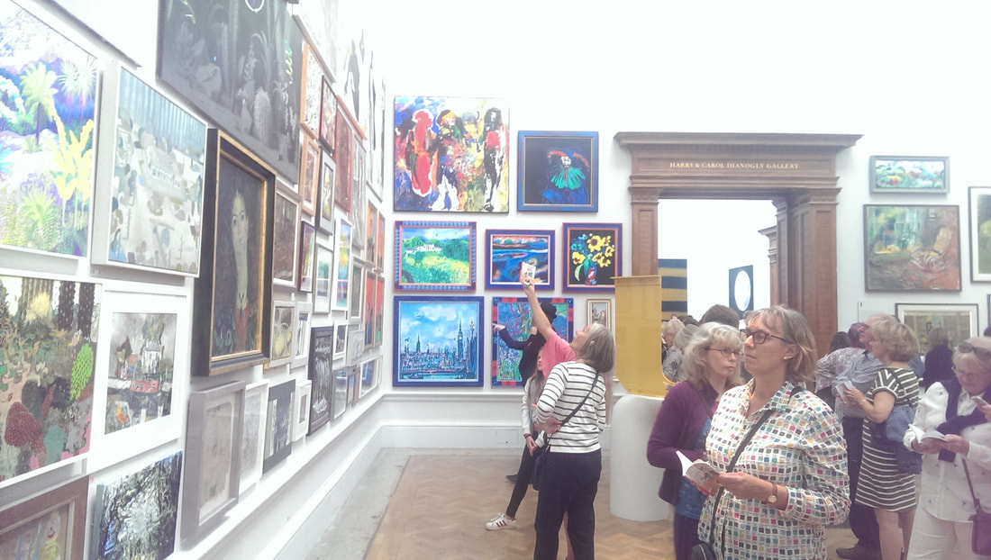
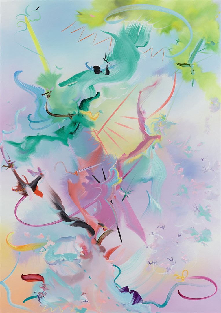
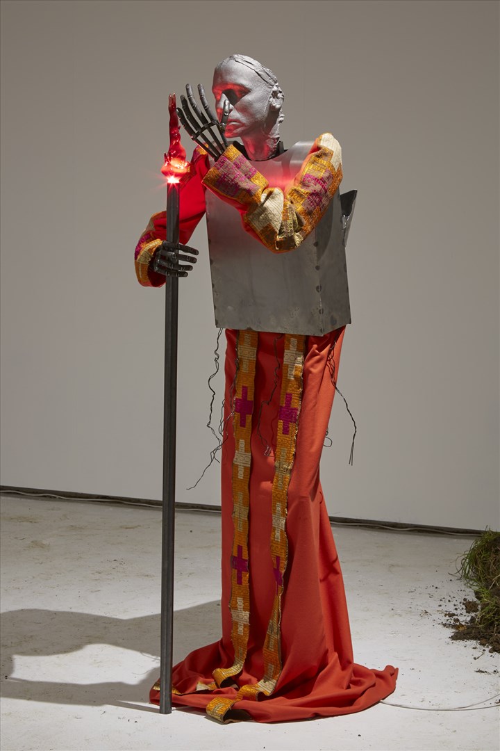
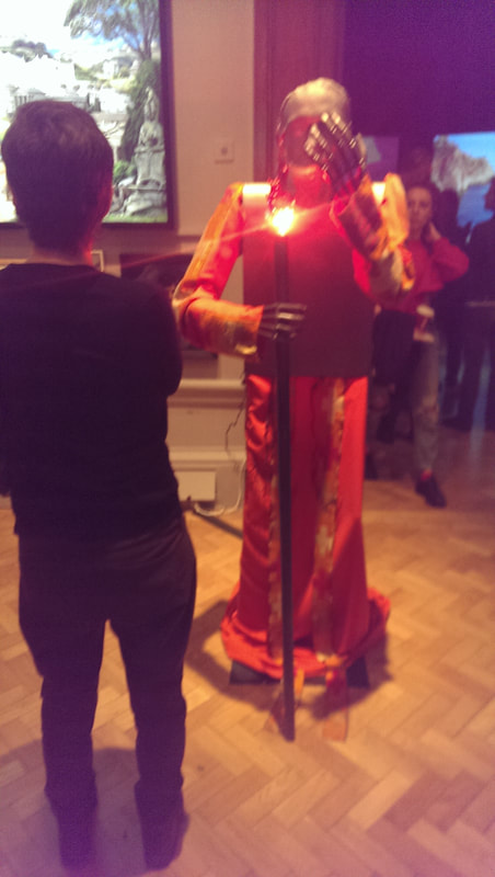
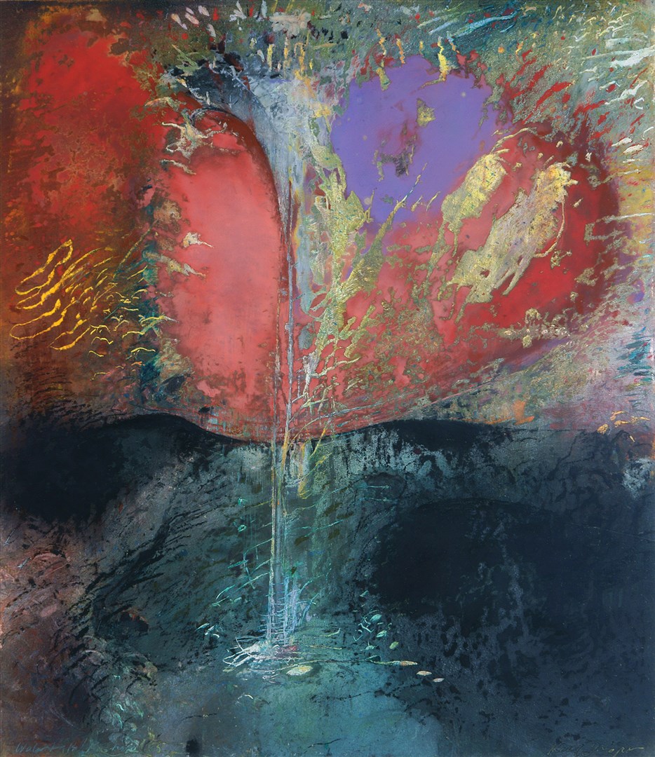
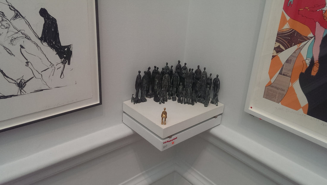
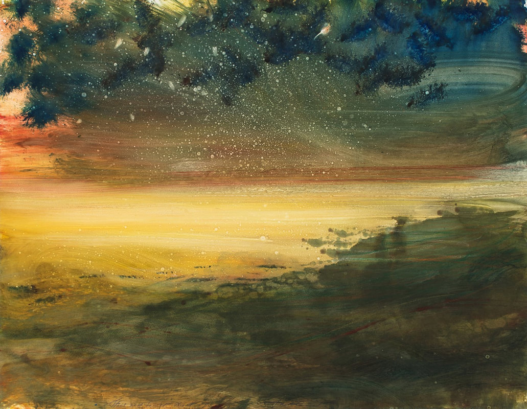
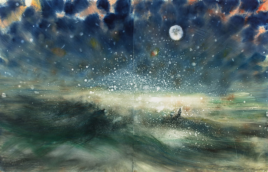
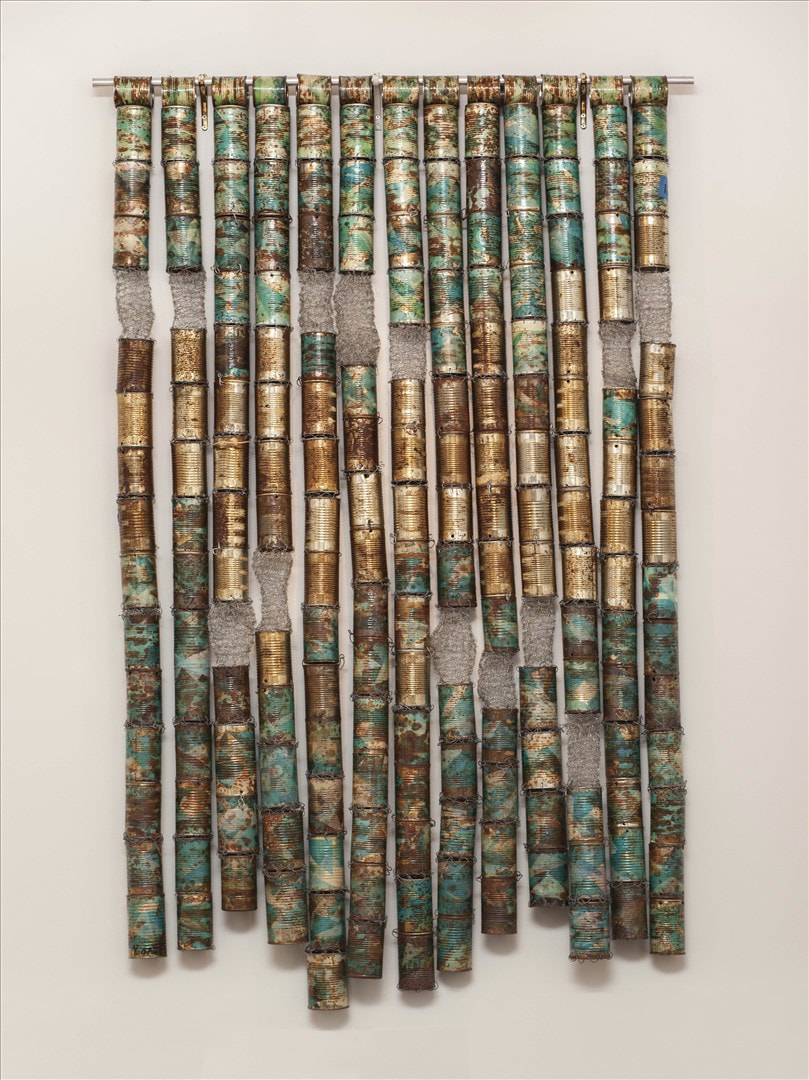
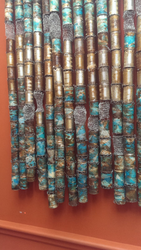
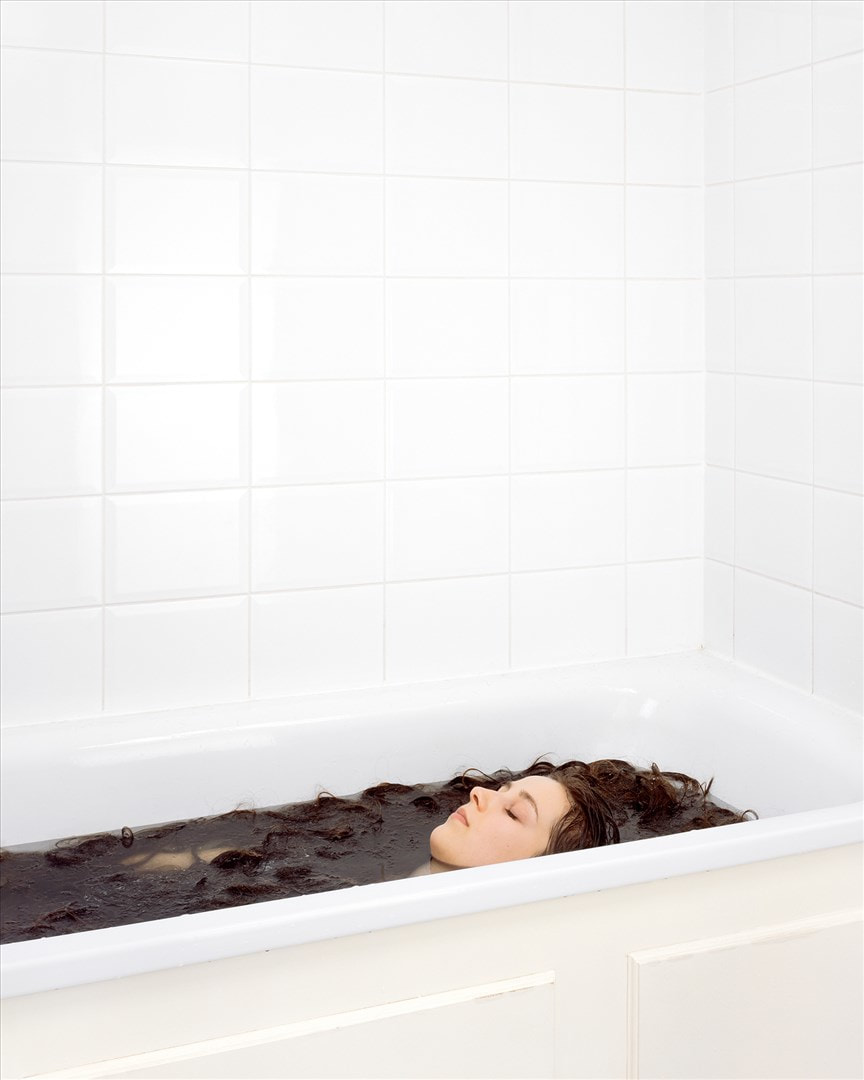
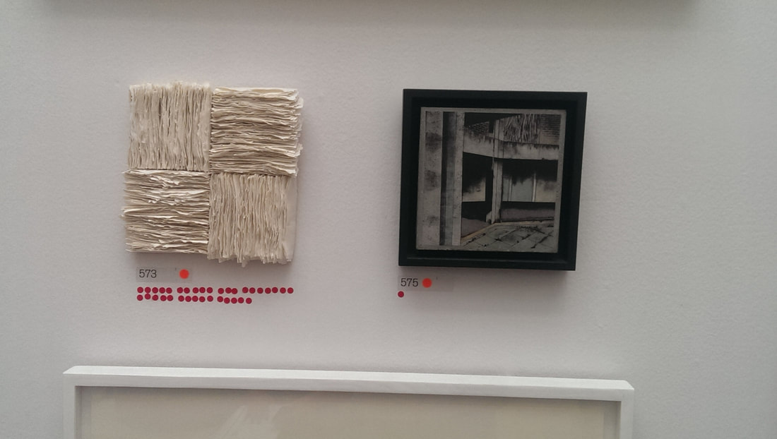
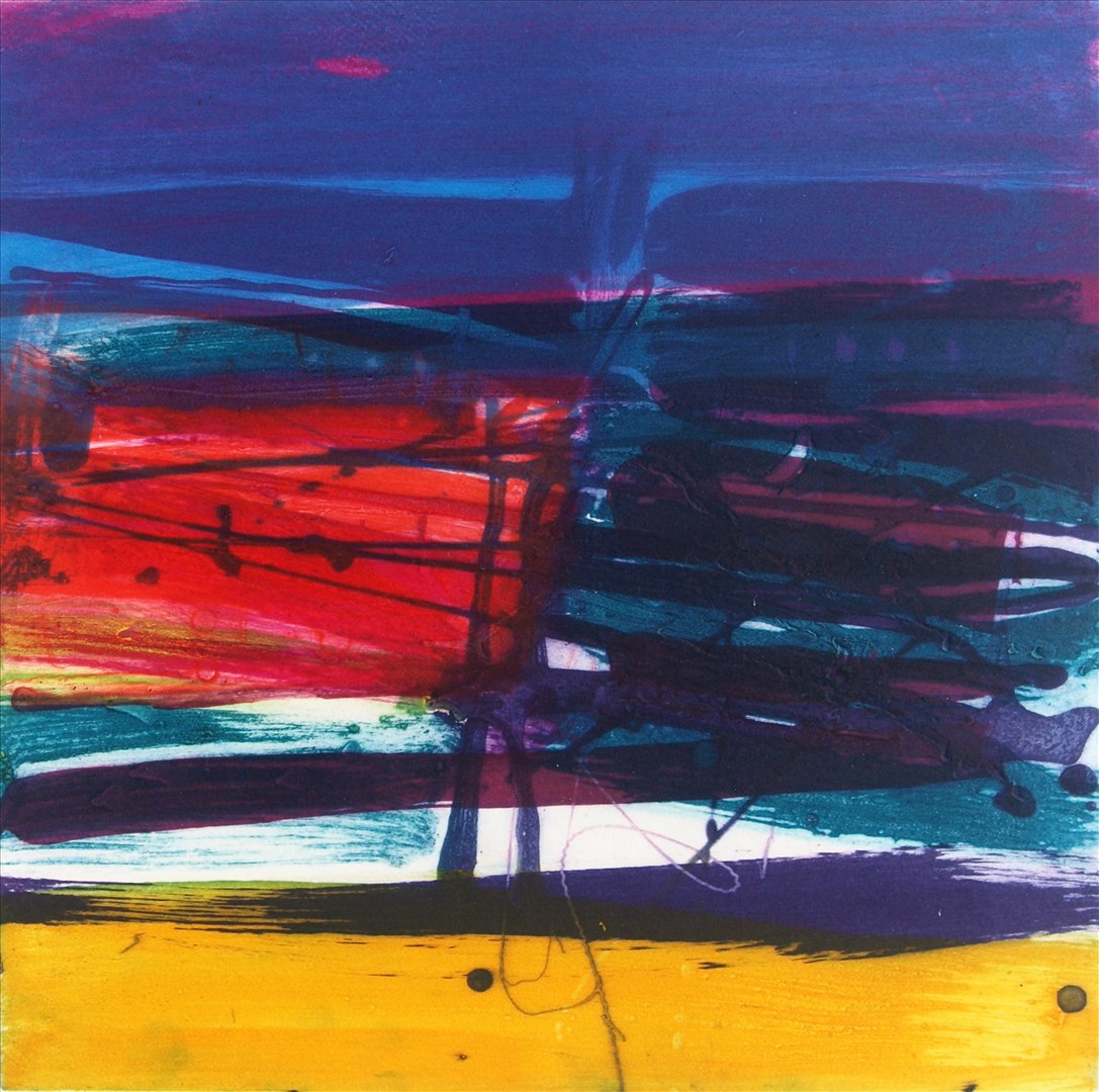
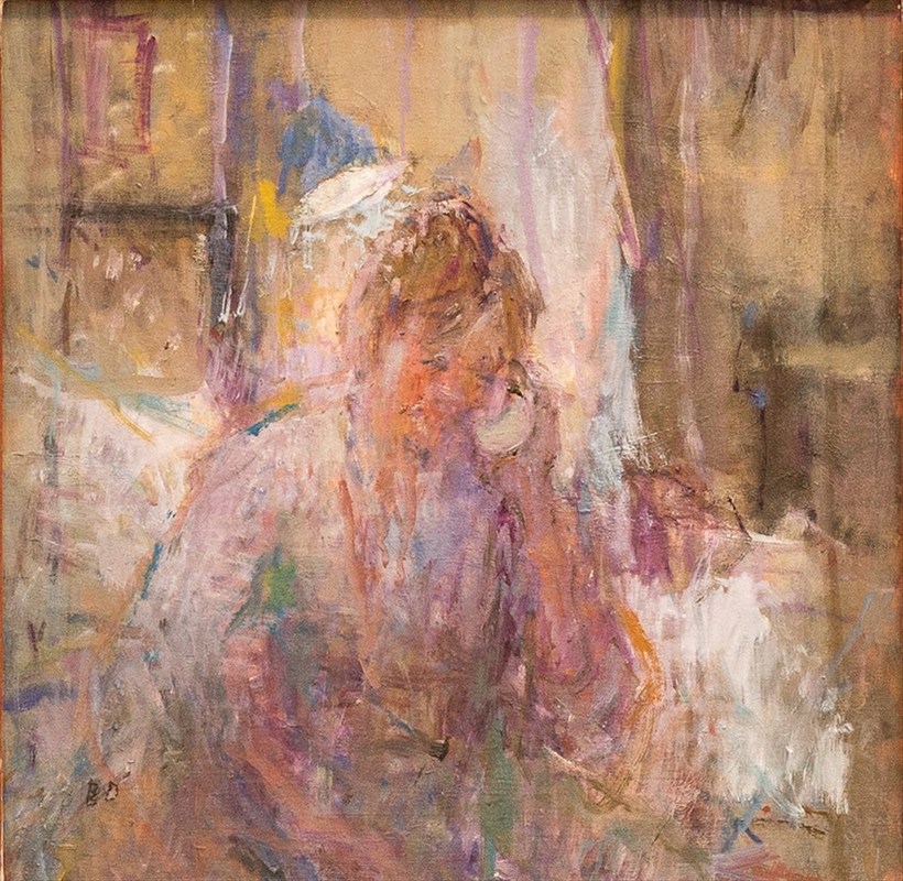
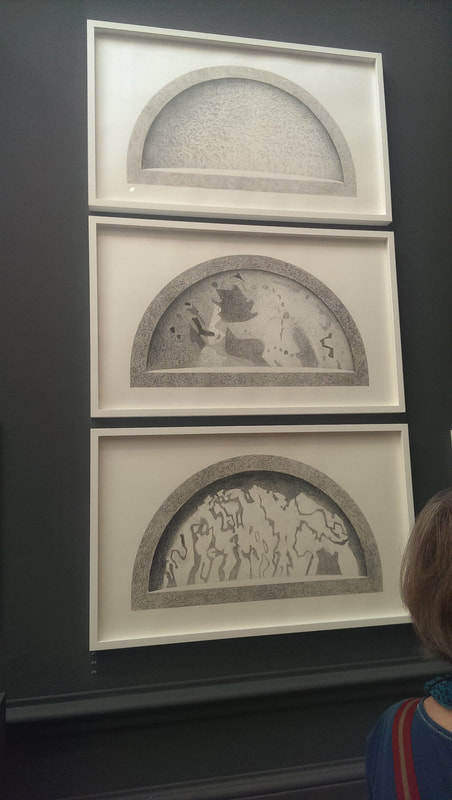
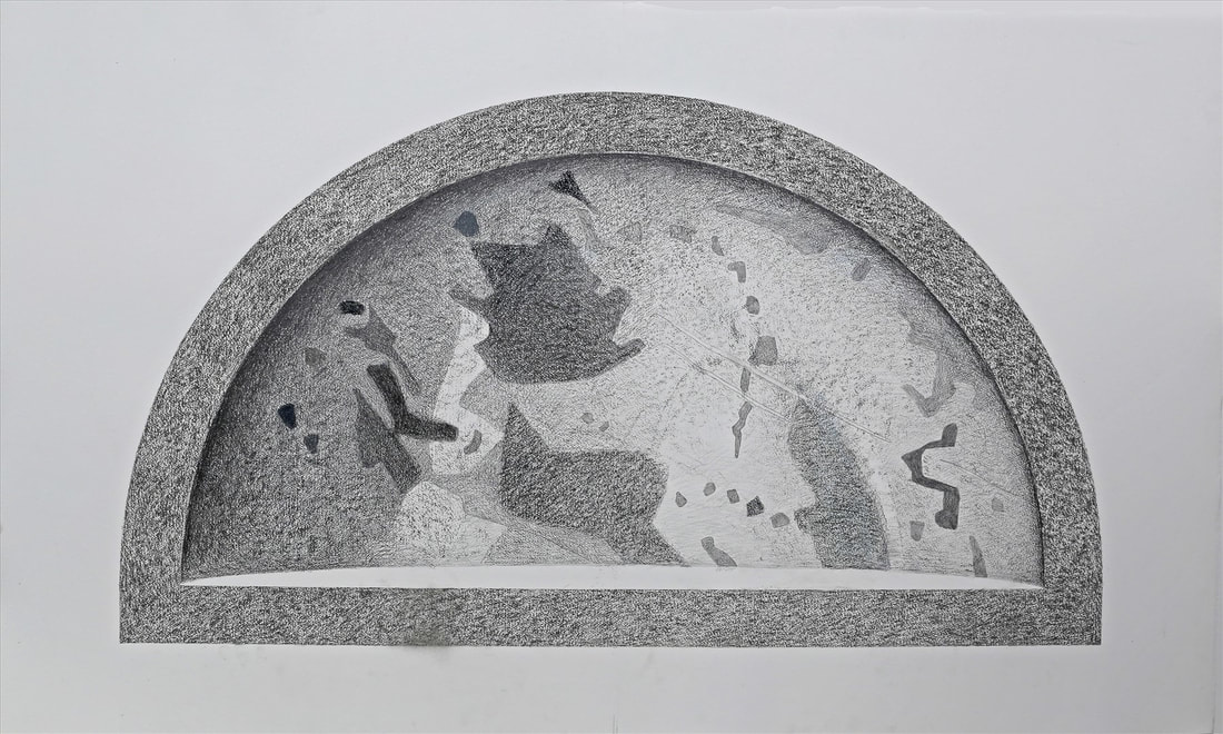
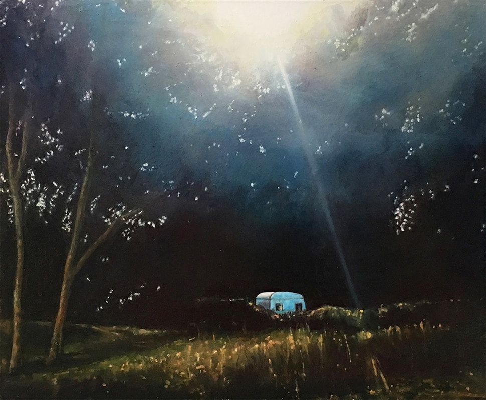
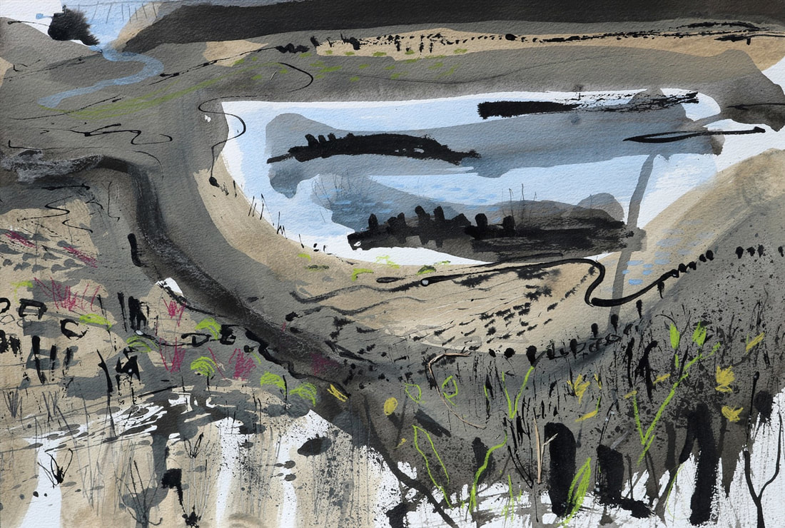
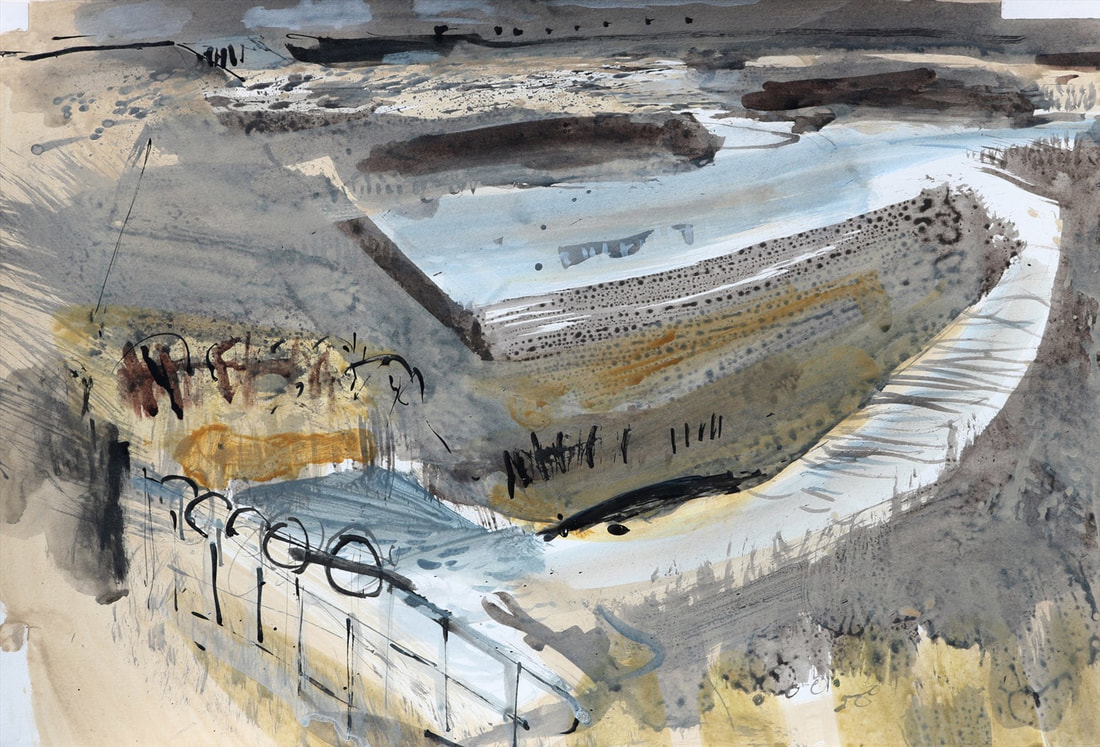
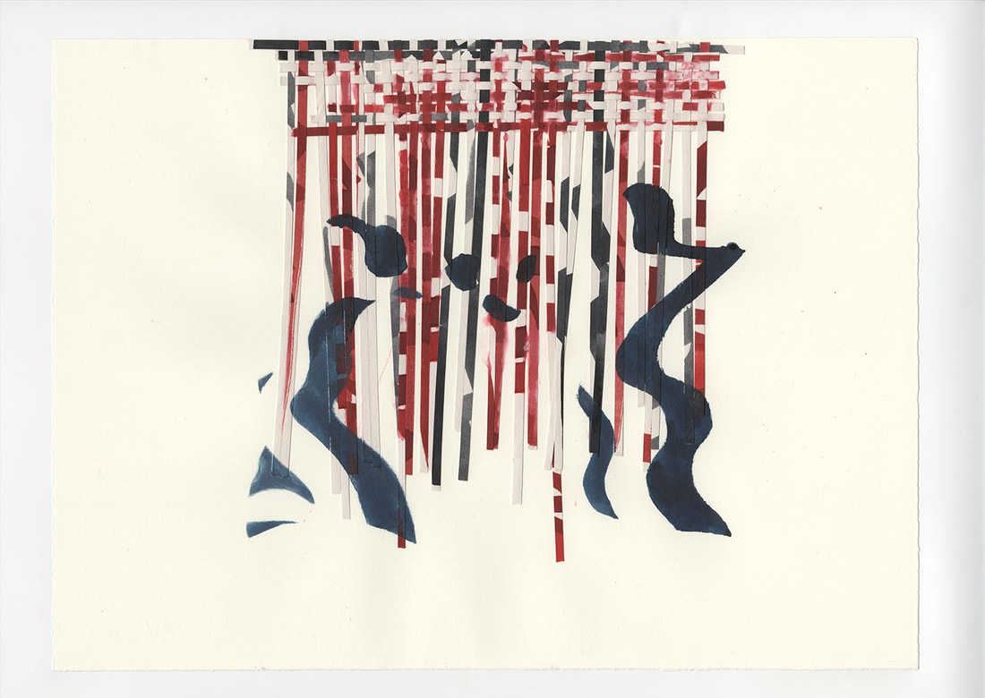
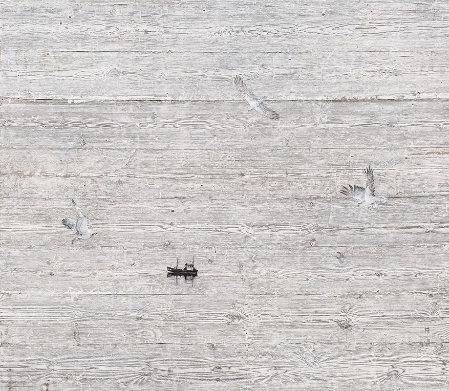
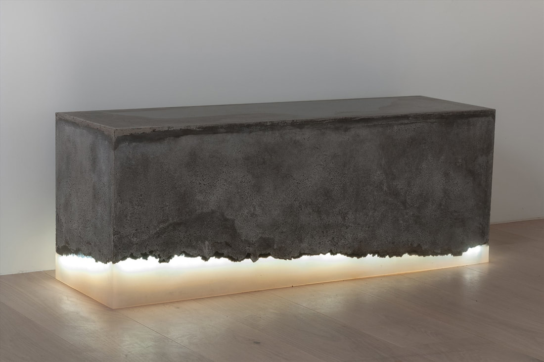
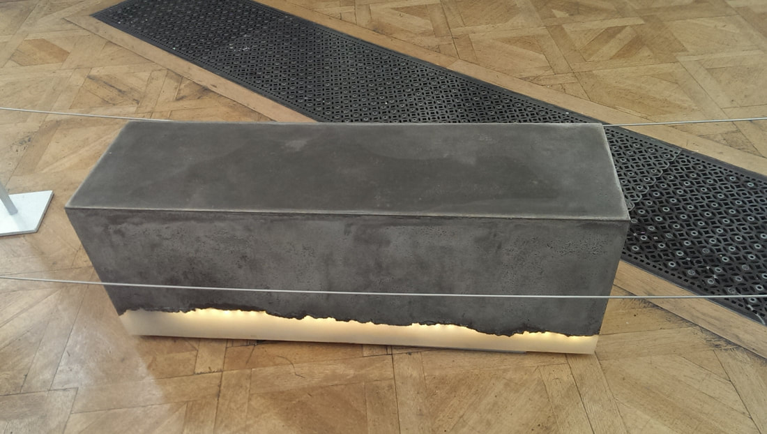
Finally I made it to the Summer Exhibition this year. In accordance with the established helpful tradition of the blog, the exhibition finished last Sunday so if you haven't been, you can't do now. There is a predictable sameiness to the summer exhibition. In part this is due to the RA members who can put up to 6 pieces in the show as of right. They all tend to have a very distinctive style and so this ensures a certain continuity. Beyond this though, the public submissions that are chosen often have the, I’ve been here before quality. It is a big and packed show so it takes a while for one’s eyes to adjust to the madness of it all and make out what is good and what is not. There are simply to many paintings to pay them all serious attention so what I now do is scan round the room and then focus on the ones that catch my eye. Any other approach is just exhausting. Incidentally the RA do an excellent website catalogue for the show and they are to be commended for this. The photos from this blog are taken from that website or taken myself on my rounds. My main disappointment from this year’s show was the absence of architectural models. I wonder if that was a choice of selection or submission. It was a shame either way as these made up some of my favourite pieces last year. They had sold a good percentage of the pieces by the time I went, there was still a large crowd in there and some of the prints had an absurd number of red dots festooned on them. Prints it seems are the way forward at this show. Even some comparatively dull ones had done very well . There were though still some things I liked. The above is Fiona Rae RA's Many Coloured Messenger Seeks her fortune. I like the colour and the texture (which sadly does not come across very well in the photograph). It has a calming and alluring quality and has an unusual palette which is very individual. This is one of two works that were very similar but I slightly preferred this one. The semi abstracted birds and bees appealed to me. Kira Freije has produced the above, almost life sized and thoroughly creepy sculpture called The Unbeliever. The top of the staff glows with a red malevolence and when you encounter it, it looms out of the crowd of people beckoning to you. The gauntness of the sculpture adds to this sensation. It reminds me of fantasy magicians. I wouldn't want to own it but I do like it. Kenneth Draper RA's Waterfall is an interesting piece. I like landscapes that flirt between abstract and figurative in the way this one does. It is something I do myself. I like the way the water streaks metallic like over the surfaces and I particularly like the rocky lower cave like surface contrasting with the red above it. The red gives it a sort of biological feel to it and there is something (in the best possible way) slightly repellent and off putting to it. I love it though. Wendy Freestone's watching is a very popular bronze sculpture (above). It is as you can see a group of grey bronze figures opposite a smaller childlike gold bronze figure. Who is watching who? Who cares? They are well rendered pieces full of personality. Justifiably it has sold several editions. Accessible, purchasable, small , a good idea done well. Precisely the kind of think that fills me with hope at these exhibitions. Bill Jacklin Ra had several works on display of which the above two were my favourite. The one on the right is called Stars and Sea at Night. I forget the name of the other. I like his almost fingerprinty clouds. Atmospheric and contemplative they are a very nice depiction of light, with the various swirls and colours. Tin cans can be art. Especially when arranged and coloured as above light a cut off from an enormous suit of armour perhaps adorning. Produced by Naomi Wanjiku Gakunga it takes the idea of a wall hanging in an new and interesting direction. I think it looks much better against the red wall in which it was actually hung than against the white wall of the professional photo so credit to the curators. I am rarely interested in photographs but this one called Hairbath by Nastha Sade Ronkko and Luke Turner . They often work with the actor Shia Labeouf but he does not appear to have been involved in this one. It is a technically very well taken photograph but the subject and the setting are all very beguiling. The blandness of the white really emphasises the main subject. Two pieces here, one has sold lots and other sold, but only one. The one on the left is Sara Dodd's Swell. It looks like paper but in fact it finely made of porcelain. This one got quite a lot of press attention being featured on the promo show on TV, picked if memory serves, by Fiona Bruce. I think the smallness the intricacy, skill and also the un-threatening nature of the piece, would be mean to say bland, but there you go. This is a good piece of art. It is a good idea, it is done well but for me it lacks the extra appeal to me. Whereas the piece next to me really does called Changing Spaces by Mandy Payne. I like the urban claustrophobia of it, not grimness, the colours are grim but it doesn't seem grim to me, but somehow hopeful. It also reminds me of the Barbican. Deep breath now we are nearly there. Lets dismiss two eminent RA's in a couple of lines shall we Barbara Rae (above left) who usually does large canvases this year did smaller prints but I still like her abstracts. Very different from Bernard Dunstan with his soft focus purpley people morphing out of an indistinct background. They have a nice dreamy aspect to them. I was sad to discover when writing this blog that Bernard died this year. I wish I'd known that going into the show. Presumably he won't be in next year which is a shame as he consistently makes my list of favourites. John Maine produced what one might called a series. There were a trio of grey and white simple but intriguing pictures of arches. Then around them were sculptures of the self same pictures. I am not sure which I prefer the sculptures or the drawings. Actually you want them both as the compliment each other very well. A sure bet for pictures in the Summer exhibition is there will be at least one picture of a lonely caravan looking ominous in some countryside. Actually sometimes cliches can be good and Louise Wallace's picture (above) I like very much. I like the light, I like the grass in the foreground. This, I think, is a good painting. She mostly paints on copper which I think gives some of the distinct style. Nik Pollard does wildlife mainly but also does a fine line in salt marshes. I like the way these are produced with quick washes of paint highlighted with that black. I particularly like the walkway in the right hand picture. Liminal spaces marshland, its my new word, liminal, and they make for good subjects. Sense of desolation, creeping destruction, kibble Philip K Dick calls it. All good stuff. Probably my favourite paintings these (all though this is something I change my mind about frequently). FInishing up with two RA's. RA's dominate my list. I often don't realise until I look them up afterwards as the exhibition only has catalogue numbers by the paintings and unless you recognise the painter (which I do sometimes, like with Barbara Rae). Then when I look them up on the website afterwards. The one on the left is by Alison Wilding and called Simian Drawing. Has a sort of Japanese feel to it, simply red black and white, ominous colours in the wrong hands. The right hand painting is by Mick Moon. I like it when people produce art that seems to take a very simple idea but one that no one has done before. So taking wood and using the natural grain of the wood to create a sea scape. Very nice. Finally my favourite sculpture. Simple things can be excellent and I love stuff like this. Metal and lit perspex is what it looks like but in fact concrete and rubber. It is by Christina Seilern who is in fact an architect. I really like this piece, it is very tactile and appealing.
What has been interesting in writing this blog is how much better many of the pieces look in the online catalogue than they did in the show. This is partly that the work is overwhelmed in the show but also the skill of the photography.
0 Comments
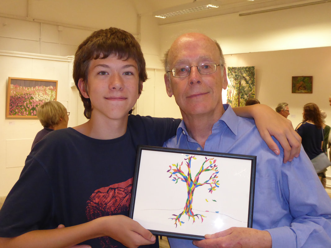
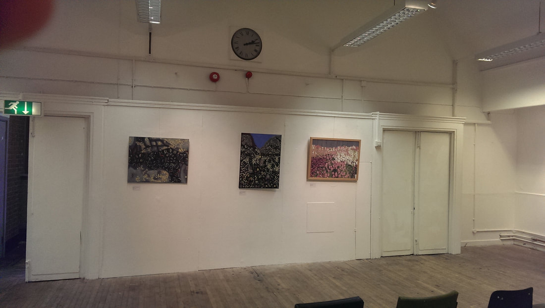
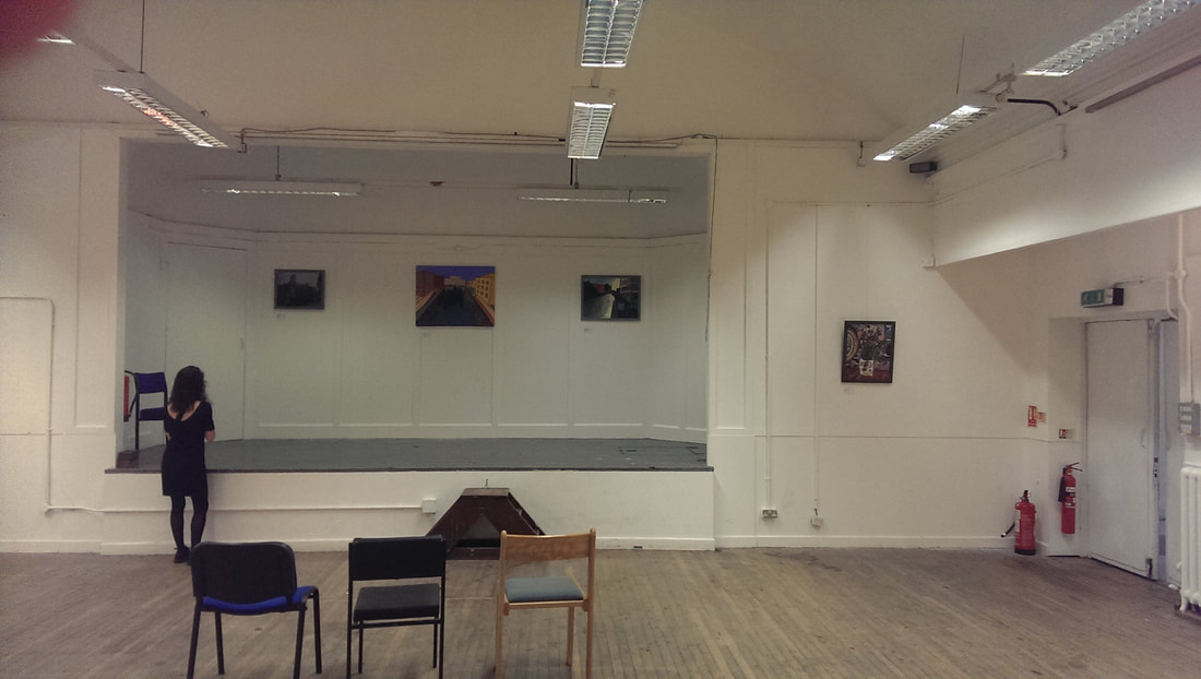
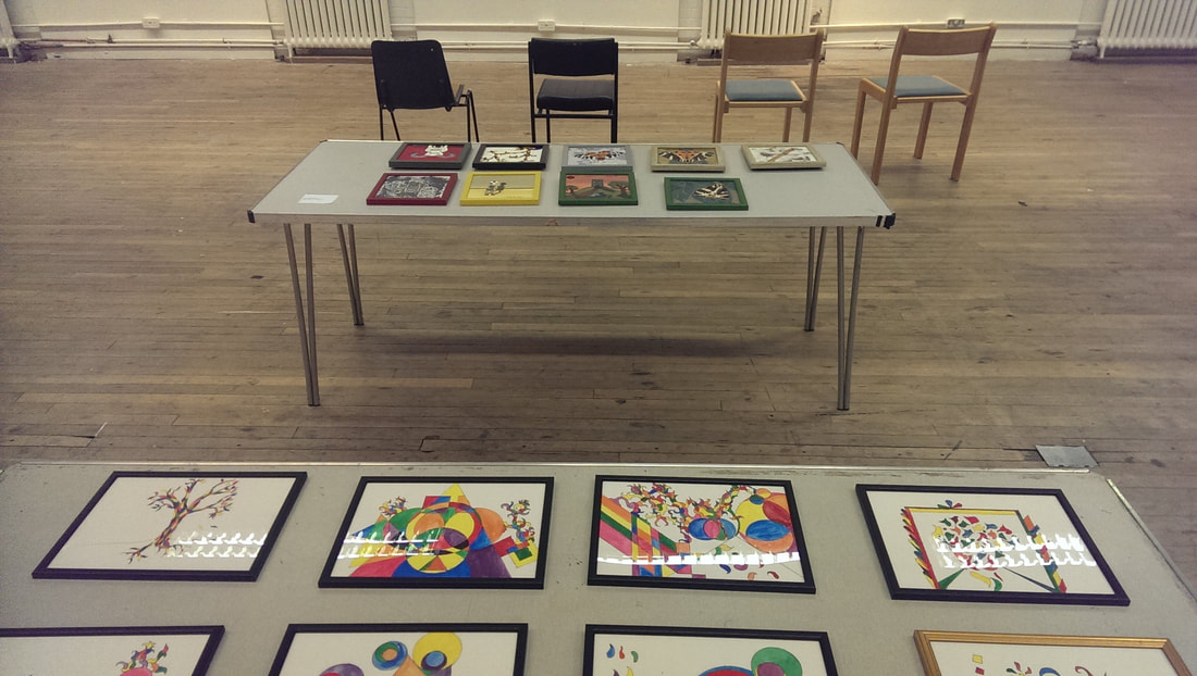
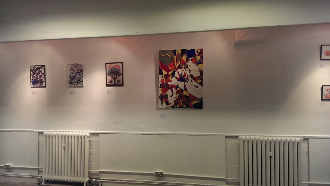
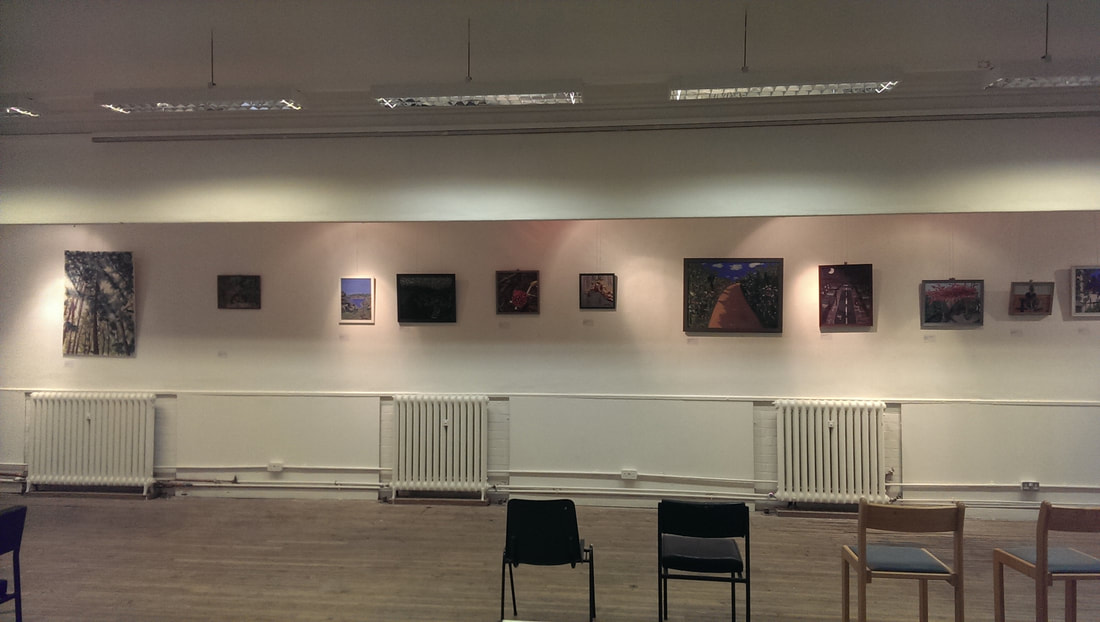
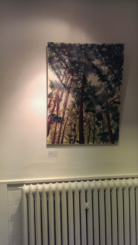
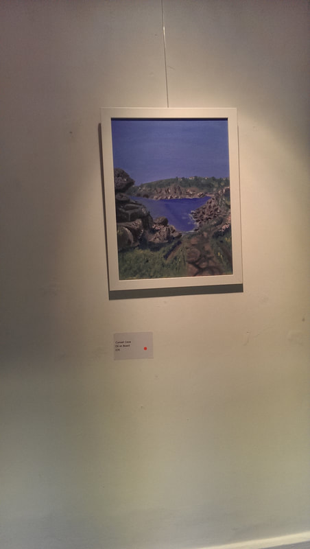
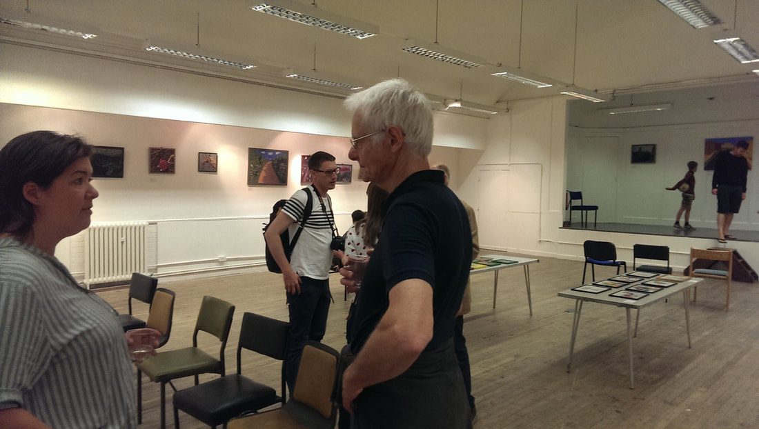
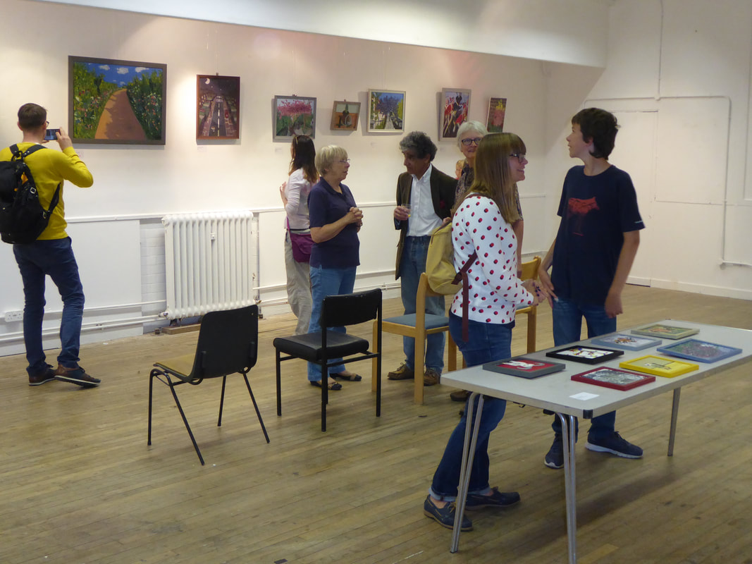
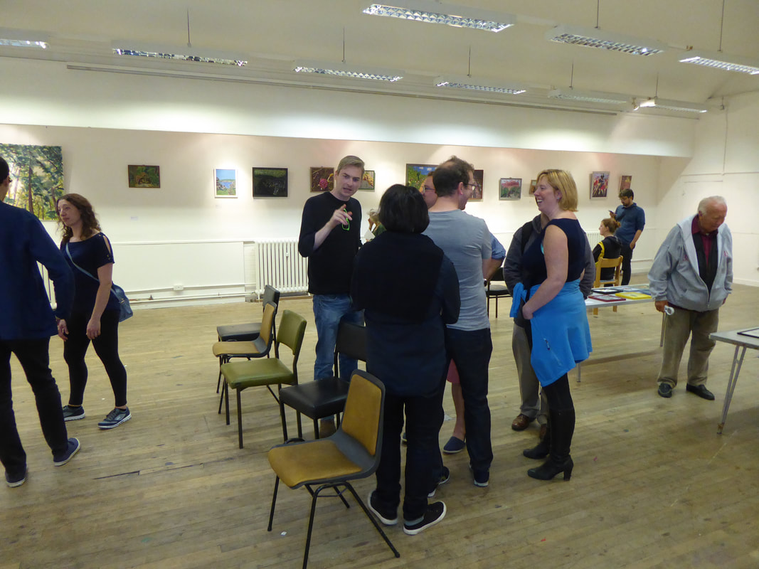
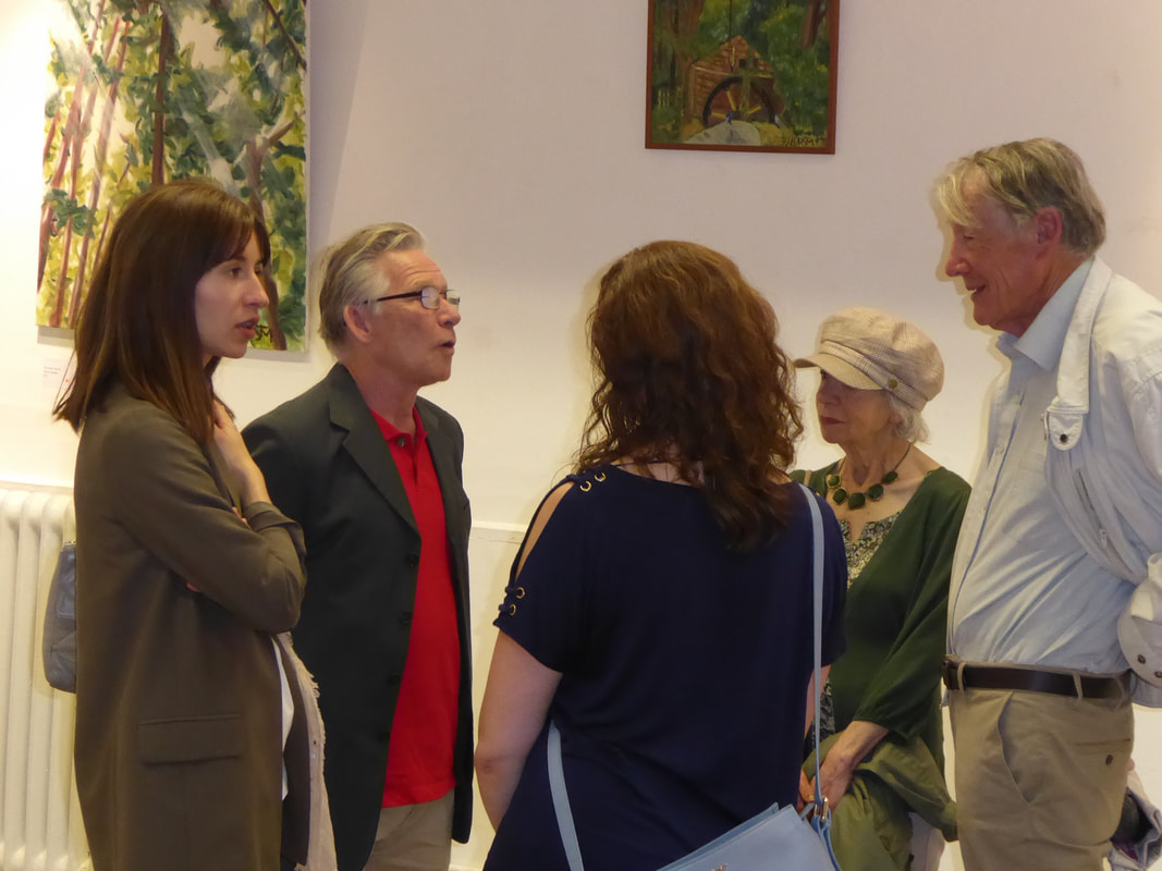
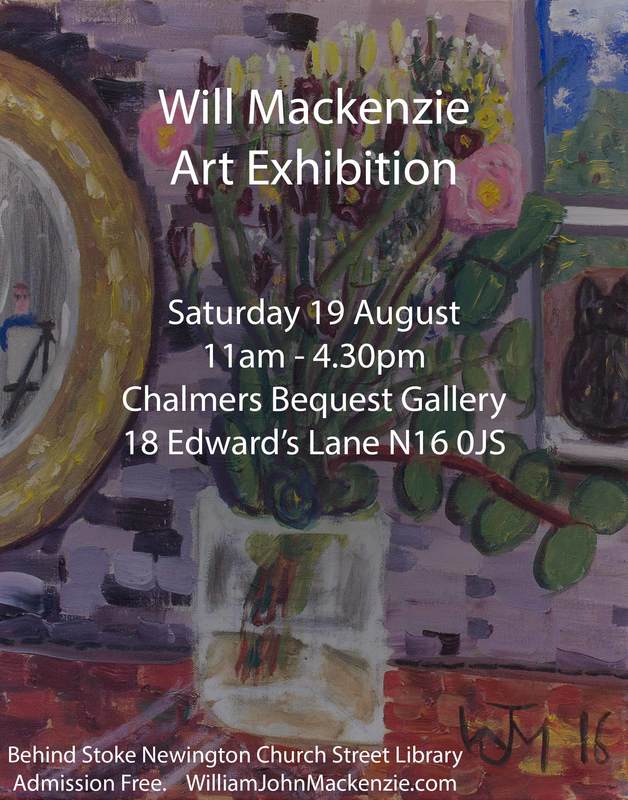
My first exhibition was yesterday. It went very well and I am very happy. The picture above shows a young man called Josh with my dad. Josh has just purchased this picture of mine. I had three things I wanted to achieve when I went into this exhibition. I wanted to learn how to put on an exhibition. I wanted to find out which of my various styles people preferred and I wanted to sell a painting to someone I didn't know. I am very pleased to report I achieved all of these. Firstly the set up. My original plan was to set up in the hour before the show on the Saturday morning but eventually I decided there was not enough time so I managed to hire the venue for an additional couple of hours the night before. This was a good idea but also the choice of venue turned out to be really helpful. They had on the wall this adaptable hanging system. Plastic wires hang from the ceiling and can be moved left and right. On the wires there are metal hooks. These can be slid up and down the wire and the picture wire or string just hooks into the hooks. These makes it very easy to hang the pictures. We had everything set up in about an hour and a half. This gave us plenty of time the next morning to put on the finishing touches. At 11:00 it opened and soon I sold paintings. Much to my surprise the first painting to sell was the one above left, The St Lucian Canopy was the first to sell and probably the most painting in the show. Several people expressed disappointment that it had already sold. Shortly after this a couple I didn't know came off the street. They looked around the show and then bought two paintings. I couldn't believe it. Throughout the day I sold a total of 16 paintings. A very surprising turn of events. One of my greatest assets was my friend Emily Lomax who hustled a number of people in from the street and was responsible for at least one sale. What was nice was the large number of people who attended the show. First prize goes to Henry and Adrienne who came all the way from Glasgow and also bought the most art.
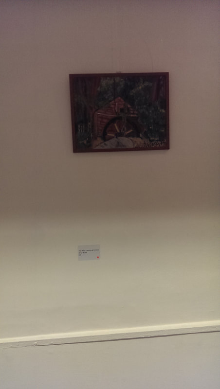
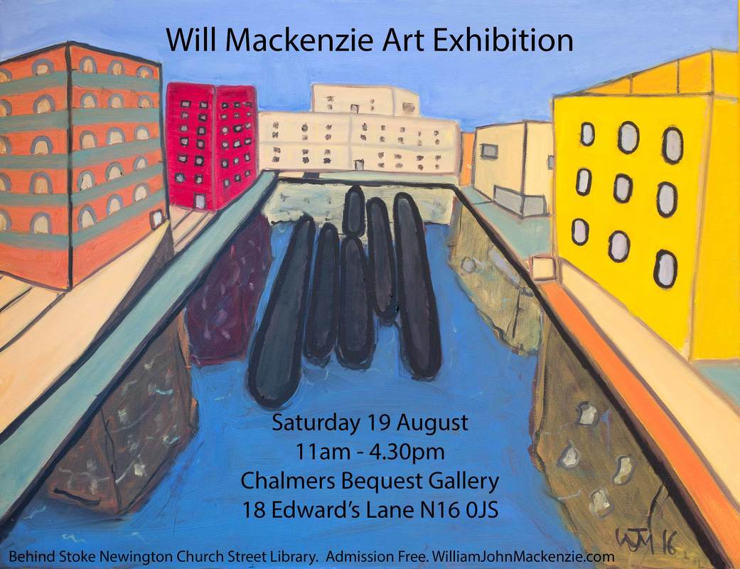
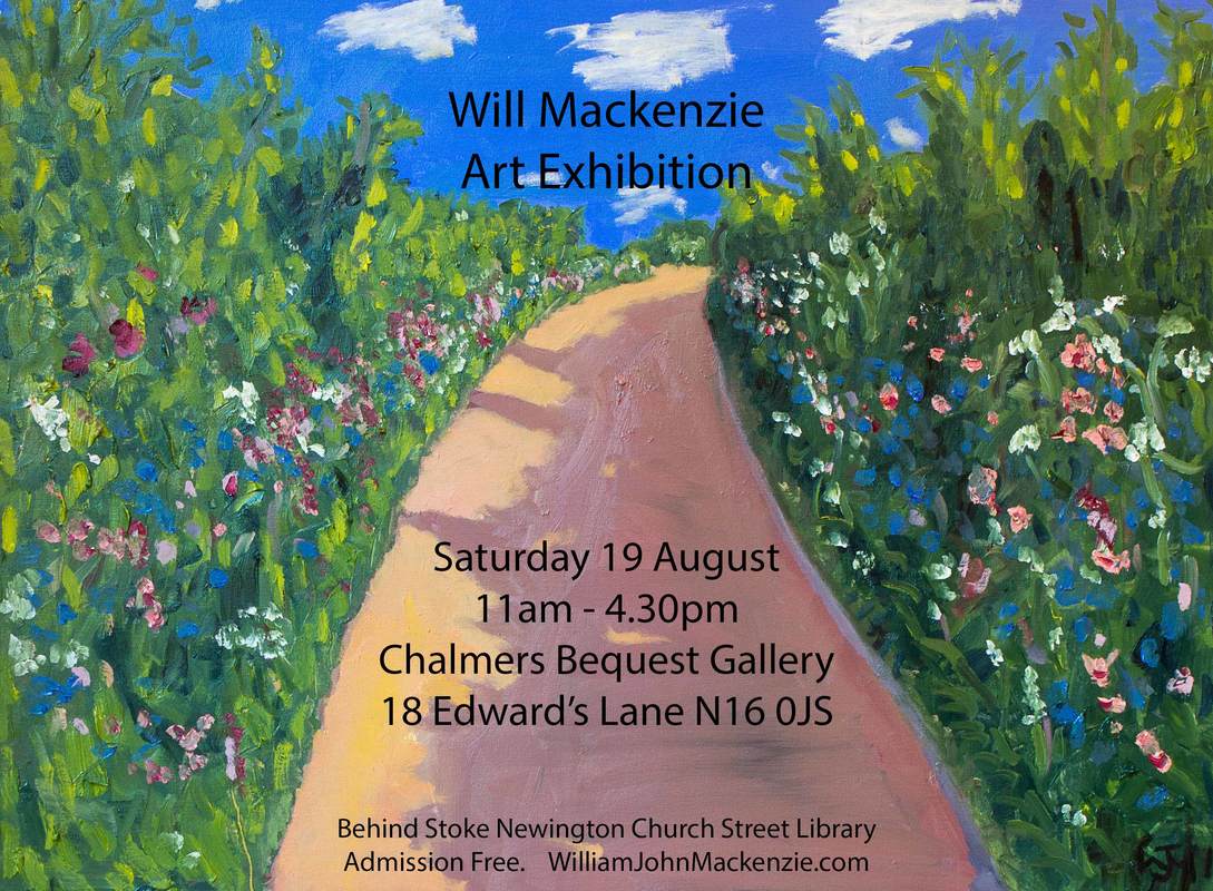
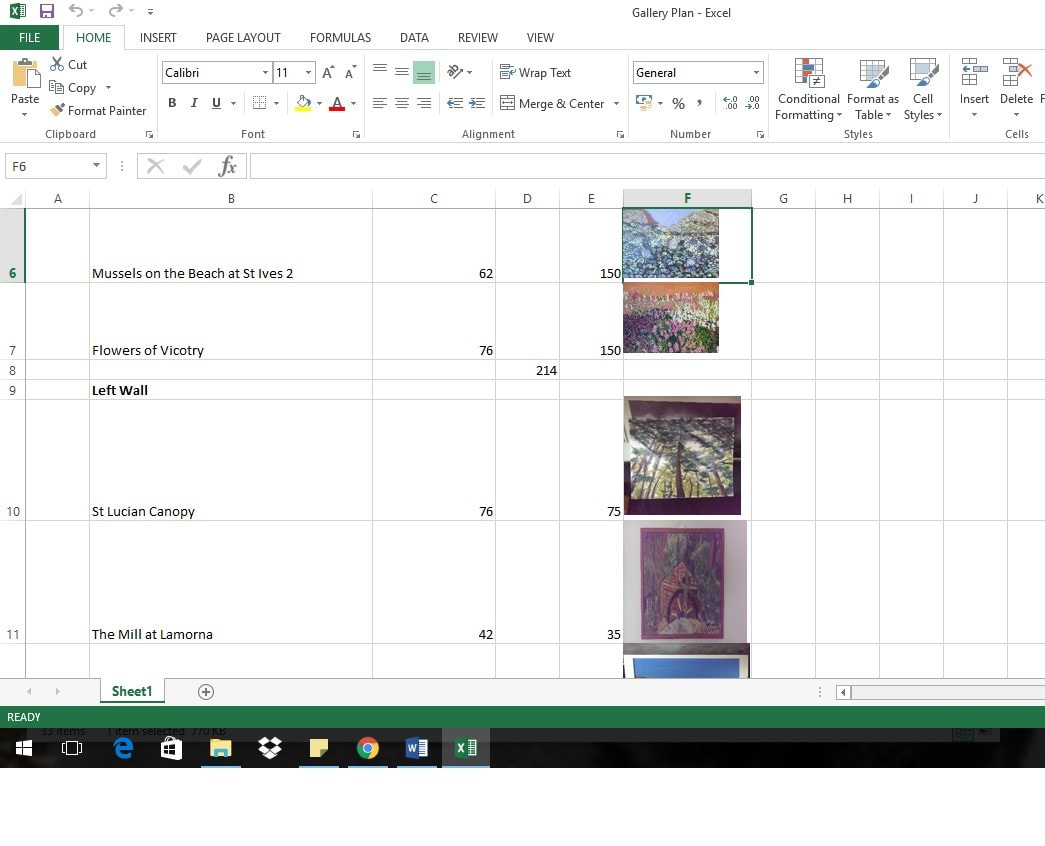
As to which style people preferred, I was surprised at the two most popular pieces, the St Lucien canopy and Pompey's revenge. Next up was Orsman Road, that one did not surprise me, I think it is one of my best. Many people liked the gouache patters, many people like the small paintings of the Tiger moths, of which I sold three, the most popular those were the floral/landscape paintings of various sizes. What would I do differently? Well I would hang the paintings lower, older and shorter people complained they were too high. I would have business cards to give out, I would have a printed list of the works with a short bio on it. Finally I would have an A3 stand out on the street directing people into the show. The one I jury-rigged didn't quite cut it. Oh yes I would also have food available for those helping with the show. What went well, I think the hanging order was good. I think I got the pricing more or less right. Having free booze available was a very good idea. Thanks very much for coming for all those who did so. Only one week left to go until my exhibition! I am very excited. I do hope some of you reading this will come along. If you do feel free to come and say hi. If not next week's blog will be a post match analysis and then I shall return to talking about the show's I've been to see. This week I thought I'd talk a bit about the preparation for the show, the steps and the cost. Firstly the venue, Chalmers Bequest Gallery, part of the Stoke Newington Library. This costs £60 a day or £35 for half a day. I originally hired it only for a day but decided I needed more set up time. Fortunately it is open late on Friday so I hired it for a couple of hours then to set things up. It will be interesting to see if I have enough time. So hiring costs £95. Next, publicity. In this wonderful age of internet one can do much for free and I have used Instagram, twitter, facebook, whatsapp, email and of course my website and this blog to drum up publicity. I have been considering revamping this website for quite some time and finally did so as part of the preparation for this show. It reminded me of why I put a website together in the first place. I entered an art competition and it had a field saying website. I should have one of those, I thought, so off I went and made one. Incidentally this platform, Weebly, is super easy to use and I recommend it. Then there is physical advertising. I have run up a few posters and fliers 30 fliers and 12 posters which came to £46 in all. I do wonder if this will draw in anyone I don't already know. I had to overcome a certain amount of nervous shyness to put these up in various establishments on Stoke Newington Church street but they all let me without any return obligation, which was nice of them. What I suspect will be the most important advert is the A3 posters directing people to the gallery on the day. We shall see. There shall be booze and nibbles at the event all of which will probably come to around £100. Finally there is the works themselves. There was an ongoing debate about whether to have paintings framed or unframed. They look better framed but of course there is a cost to that, a cost which can be quite considerable. My dad, with puppy like enthusiasm scampered away to get many pieces framed. The total cost so far is around £300 but the final bill has yet to arrive. he library staff were kind enough to let me into the gallery to measure up. This allowed me to plan where all the works were going to go and draw up a plan of where the various pieces are going to go. There are a couple of more pieces of preparation to do. I have to print out some sticky labels to go with the paintings when they are hung. I am not sure if I will produce a catalogue or exhibition guide, it will depend on how much time I have left.
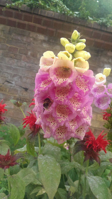
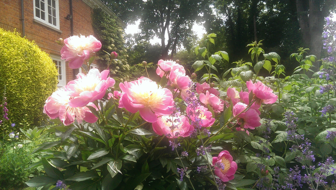
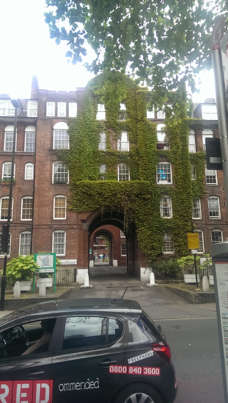
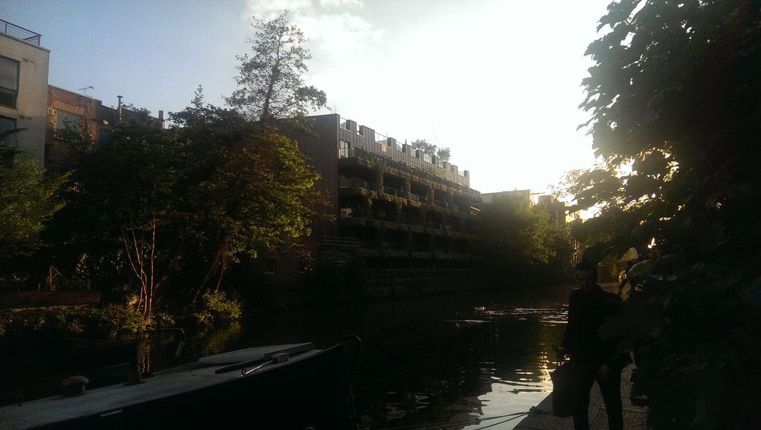
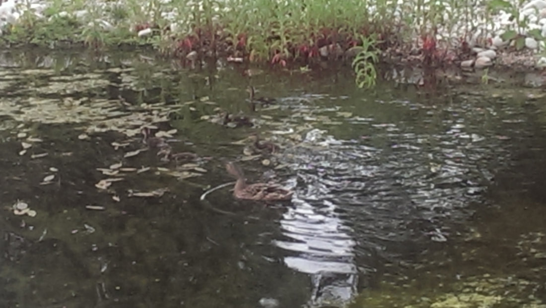
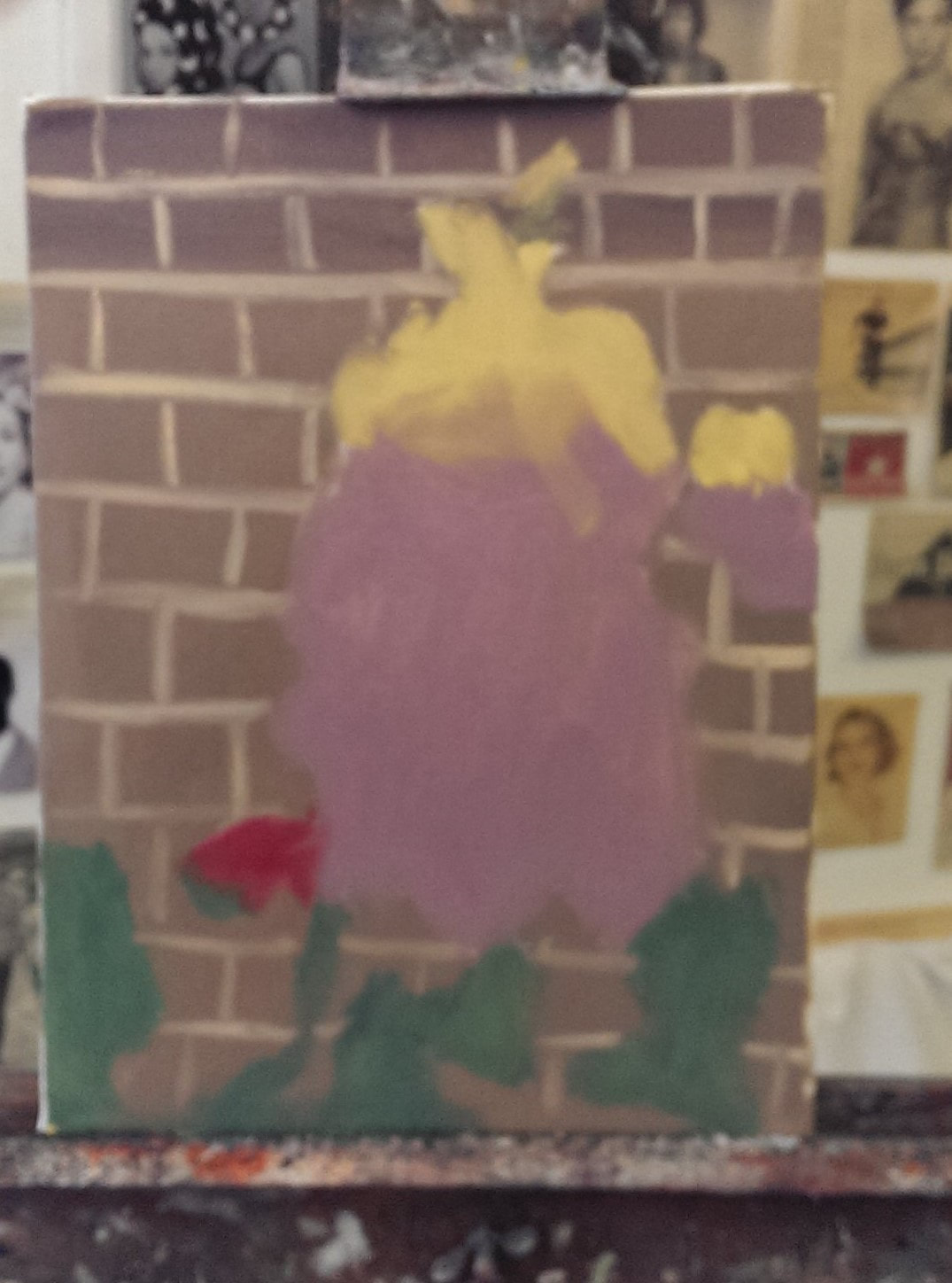
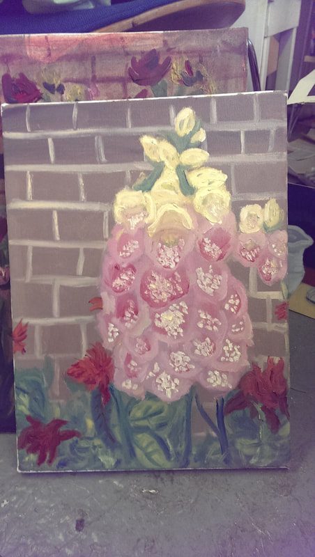
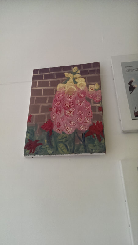
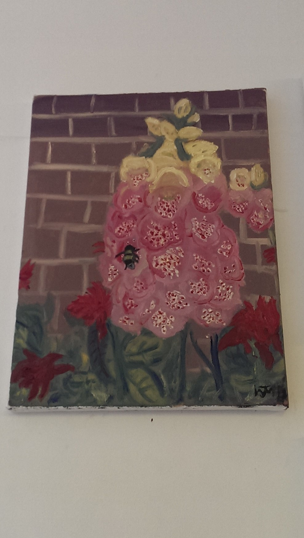
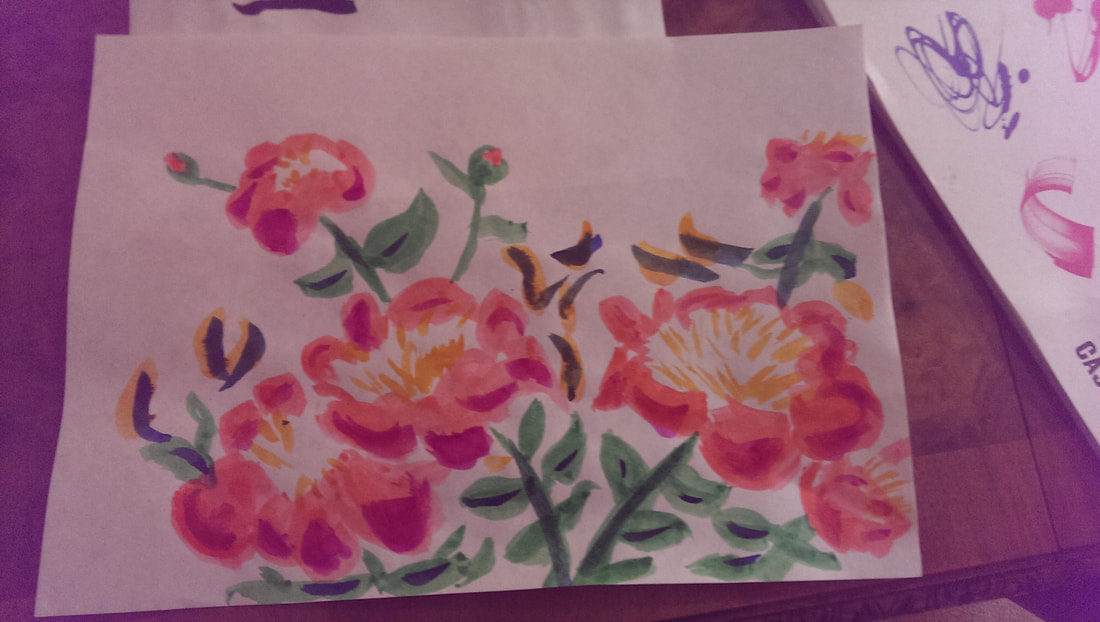
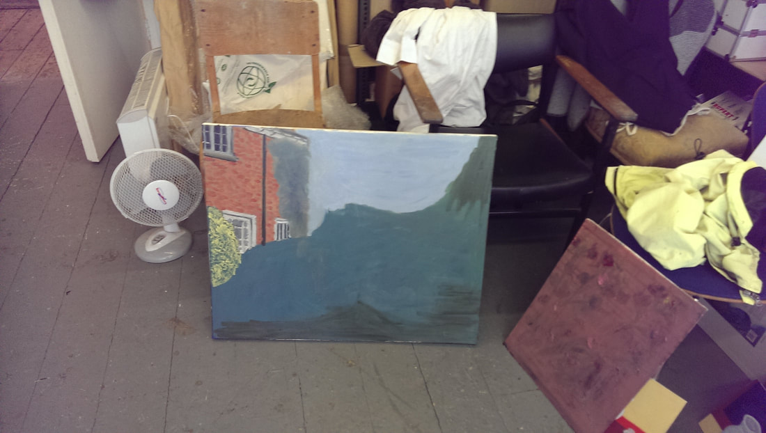
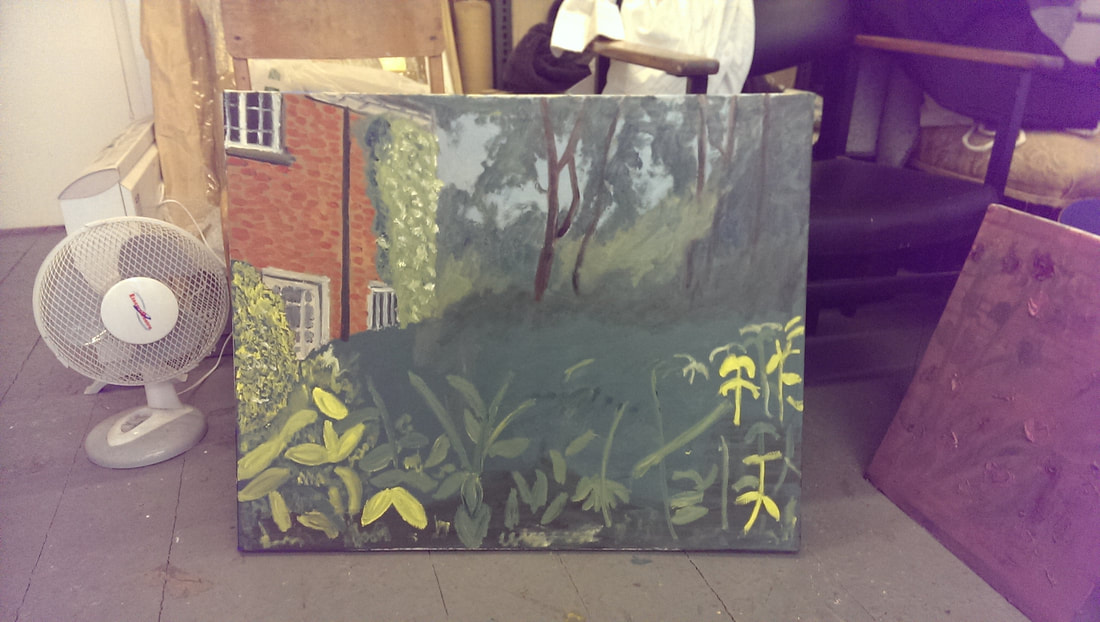
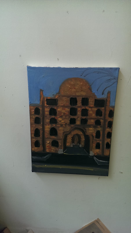
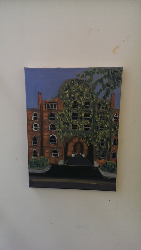
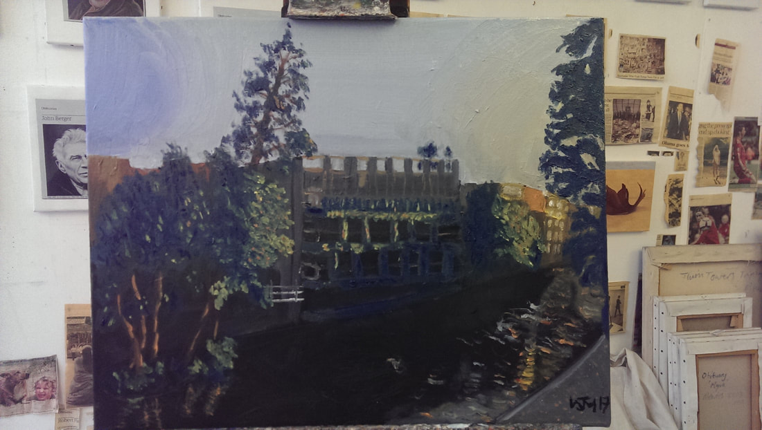
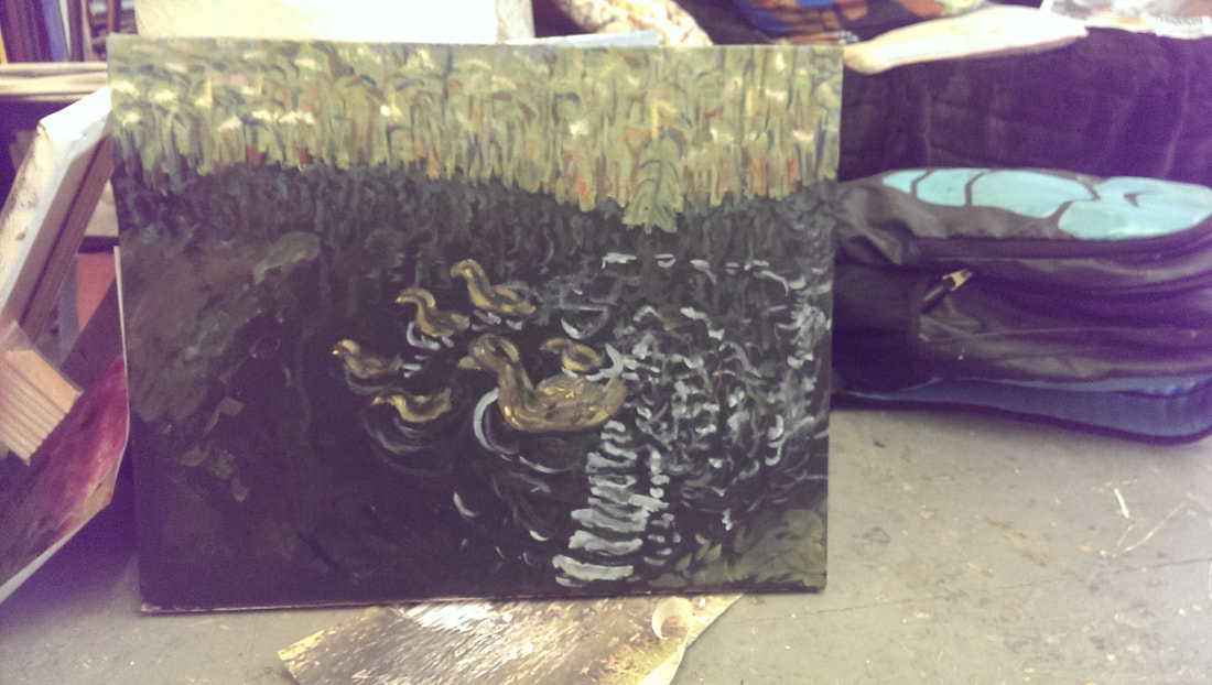
Otherwise all that is left is to hand the show. Exciting! Hugh Mendes has been away in the USA for the last month and was kind enough to let me loose in his studio while he was away. As I have my first solo show coming up on 19th August I decided to use the opportunity to try and produce some more works to go in the show. I have a habit of when I am wandering round places of taking pictures of things that interest me and that might make a good painting. Many of them I simply ignore or only use to sketch from them but some of them make the final cut. This time I chose the following 5. As part of my lawerly day job I currently travel once a month to Kingston in South London. This takes me via Richmond Station. At platform 1 of that station there are a series of raised community flower beds, in which there is always something interesting happening. When I was passing through in June it was a lovely summer day, the flowers had bloomed and the place was literally buzzing. I got the above shot. Foxgloves, bumble-bee, strange spikey read flower. Continuing the flower theme, and at about the same time while visiting my parents I got the above shot of their exquisitely maintained garden. They are peonies I think and I like the sea of green and the building and looming trees in the back ground. There are some extraordinary buildings in London. Next to the hulking mess that is Pentonvile prison, on the Caledonian Road is the above castle like structure, which is in fact a council estate. I like the fort like structure, the series of arches that gives you a view of the internal court yard and of course the ivy infesting almost half of the frontage. One of my favourite parts of London is the Regent's Canal, specifically the part just West of the Kingsland Road, running towards Angel. It has been through massive redevelopment, much of it very good, in recent years. On a recent dusky walk down the tow-path I came away with above snap. The twilight and the reflection on the canal particularly appealed. The final picture is this blurry snap of a duck and ducklings wafting across the surface of a pond in Chester. Sometimes you can do more with an indistinct picture than a sharp one, and the chopped up water with the light reflecting on it, also appealed to me. These then were my main subjects. First up the flowers and the bee. Stage one is above. I like to get the canvas covered in paint. So the first session included sketching out the outline of the plant and some of the greenery and then painting in the wall around that. I was very pleased with the wall and the gradient from gray to beige. Apologies for the blurry photo. Session 2 (above left) was adding in more detail. Greenery was added to the bottom and the red spikey flowers put in. More definition and colour contrast is added to the actual flowers and finally the addition of the pale dots. Session 3 (above right) is even more detail, mainly on the flowers. More and different reds on the spikey flowers, and then more definition to the foxgloves so it is easier to differentiate one flower from the next and the two main colours, yellow and pink, blend into each other better and the flowers themselves look more three dimensional. The aspect that really changes the picture though is the red dots on top of the pale. Final stage (above) - bee and signature - Completo! From beginning to end, well there were also some sketches I did from the photo at home so the ideas were forming from well before painting started, but from the beginning to the end of painting, probably a total of 6 hours. Recently I have been experimenting with inks. Extracting just the flowers from the above photo I did the above sketch. I think it's pretty good. I toyed with the idea of just doing as a painting but decided instead to go for the full scene. Absence works well in ink but I think with oil painting it is not as effective, unless that absence is activated with paint of some kind. I chose a large canvas. In fact I chose an old painting I was no longer happy with and painted over it. The first stage was to block out three sections in colour, orange, green and blue and then leave it to dry for about a week. The next stage which you can see in the above left picture was to put in the detail of the background building. For this I used dabs of different shades of orange, then green on top of that for the ivy. I also put in the detail for the hedge on the left and some darker shading on the top and right of the green. Stage 3 was foliage. The ivy was completed with contrast and also the white flowers, trees were put in over the sky and the back and different shades of green swirled round for the leaves, then I began building up the greenery in the foreground. There has also been a stage 4 put it is not yet finished. So far it has taken about 6 hours and I think needs another 2 or three to finish it. The flowers, being such a big and dominant part of the picture are going to be tricky.
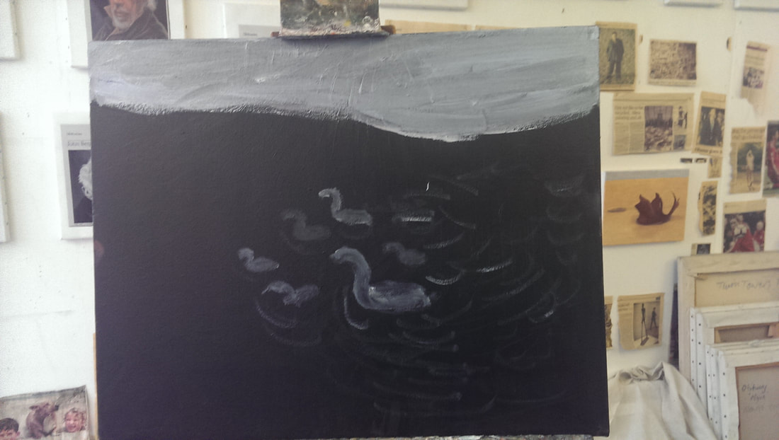
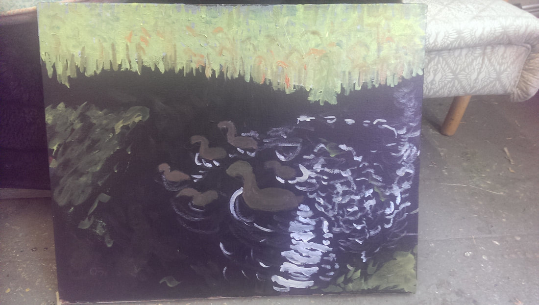
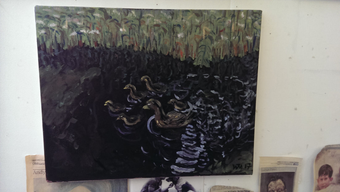
Next up, the building on Caledonian Road. With this one, and the next two, I did something I have not done before. I painted the entire canvas a very dark almost black before starting painting. This was then left to dry. Stage one and two (above left) of the painting was the sky and the building itself. First just a brick red colour and then dabs of different shades of orange (like in the large flower landscape) on top of that to give it texture. The tree is sketched in and the foreground road lightened. I decided to leave out both the car and the lamp-post and change the perspective a little. Stage three (above right) was then adding in more detail. Highlights of white and light grey on the windows and shrubbery in the front and then of course the foliage themselves in different shades of green, blue and yellow. I find I use more yellow than any other colour so have invested in a larger tube of it. There was also a stage four where shadows were put in but if you want to see that you will have to come to my show. I ascribe to my general incompetence the fact that I cannot find my photos of the interim stages of this piece but this is it in its finished form. The first stage though was putting in the sky and the buildings in grey and orange. I kept the buildings vague and left the colour drift of towards the bottom. This was using a pre-painted black background so this worked quite well. After that more contrast to the buildings, particularly the orange one to the far right, contrast to the sky and the reflections to the right on the water. Stage three was adding in the foliage. This took two stages. The first stage was just blocking it in and then the next stage after it had dried was adding in the detail and the colour contrast. I am particularly please with the light contrast I have managed to get on the trunks of the trees on the left, and their reflection on the water. I took my time over this one, relatively speaking but maybe 8 hours. It is difficult to be sure. Finaly, Chester Ducks. Stage one (above left), put in a blue background for the foliage to go on top of and using the same colour sketch in where the ducks are going to go and some of the main points of reflection. Stage 2 (above right), put in the foliage, using greens, browns, blues and oranges, the algae using the same colour scheme, add a brown to the ducks and using various shades of blue put in some of the main light reflections. Stage 3 (above left), more detail on everything, so more colour on the foliage and the addition of white flowers, more on the algae, building up the ducks,and putting in more reflection.
Stage 4 (above right) is probably difficult to tell the difference but if you look at the ducklings you can see more yellowish highlights and all the ducks have been made lighter to stand out more. The other main addition is the reflection of the foliage into the water. That is the final stage. I have simplified how these are produced. A stage in each painting may in fact take place over a couple of days interwoven with works on other paintings while various things dry, or while I think what to do next. Anyway, I hope you found this interesting, if you want to see these in person, all bar the landscape with flowers (which won't be ready in time) will be in my show on 19th August in Stoke Newington Library Gallery. |
Archives
June 2024
Categories |

 RSS Feed