|
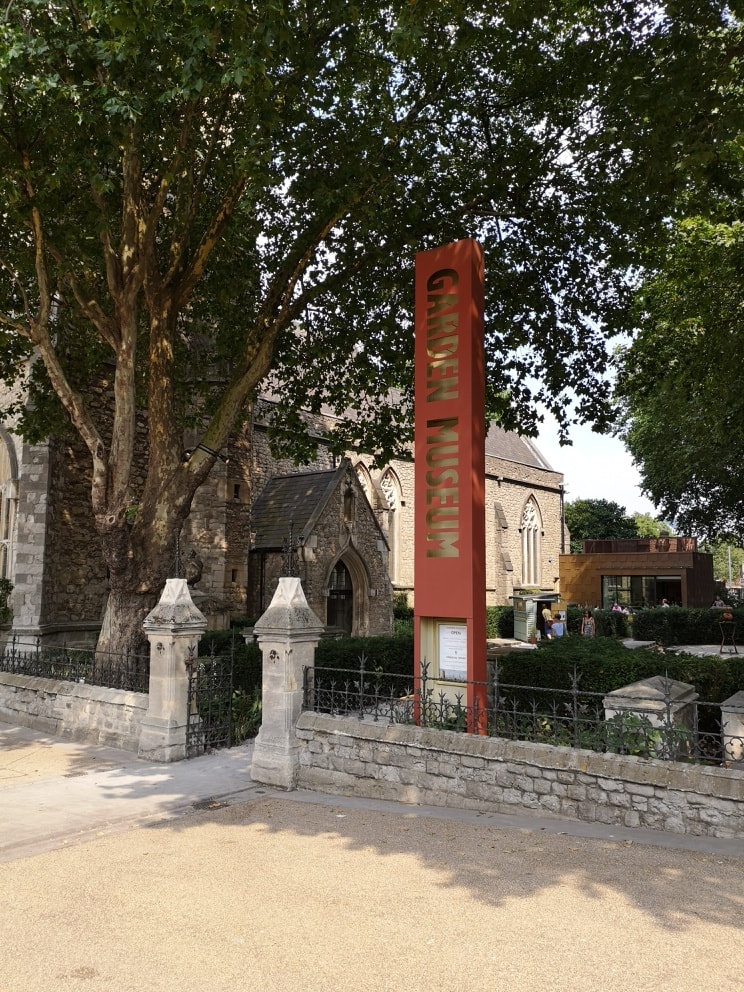
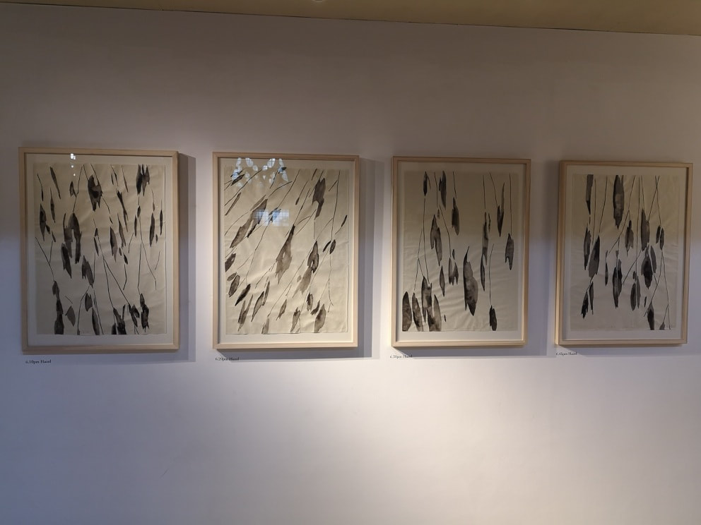
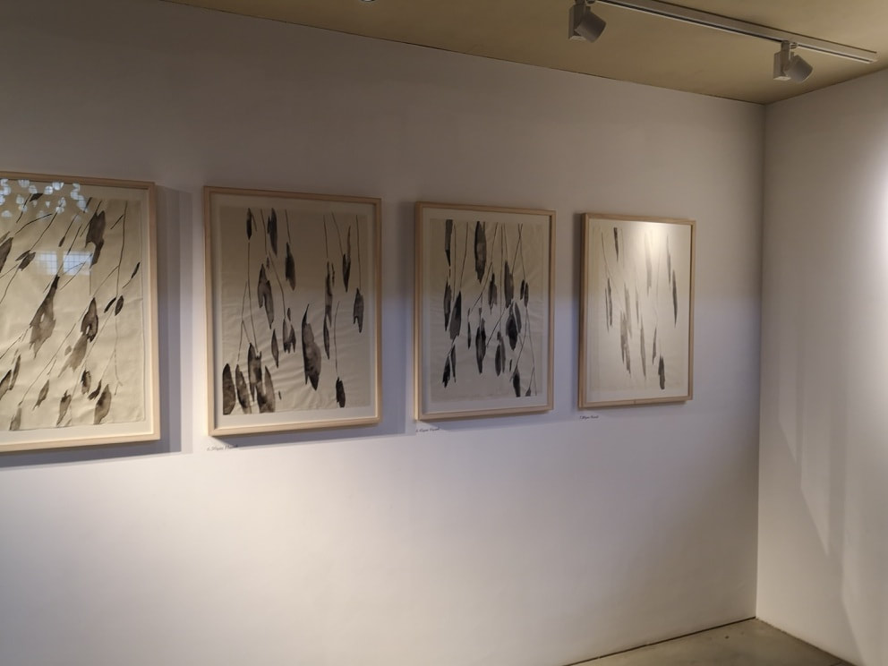
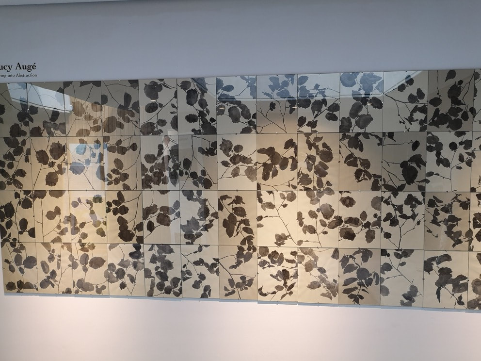
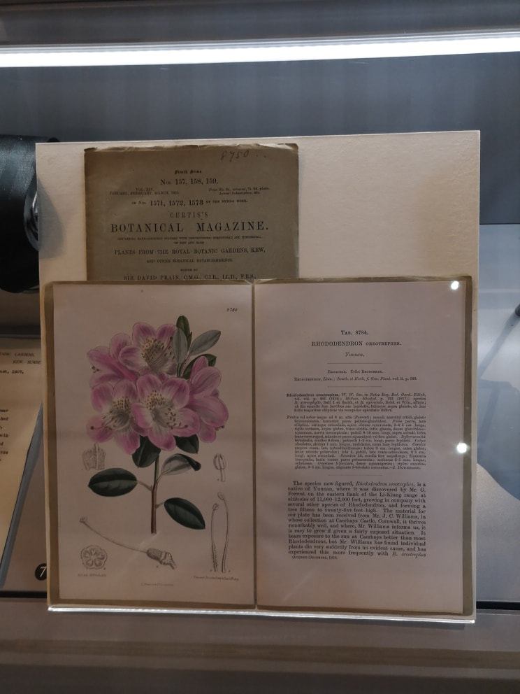
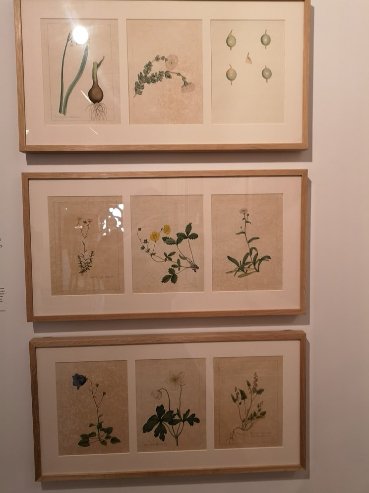
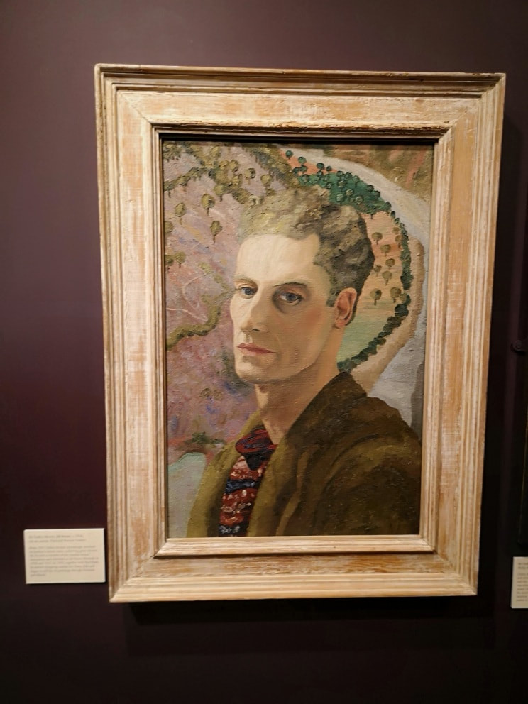
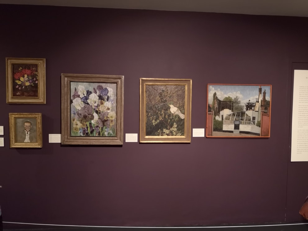
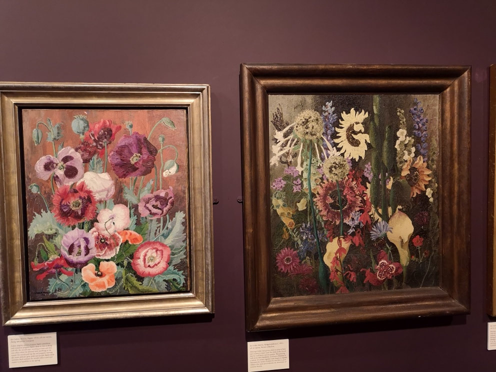
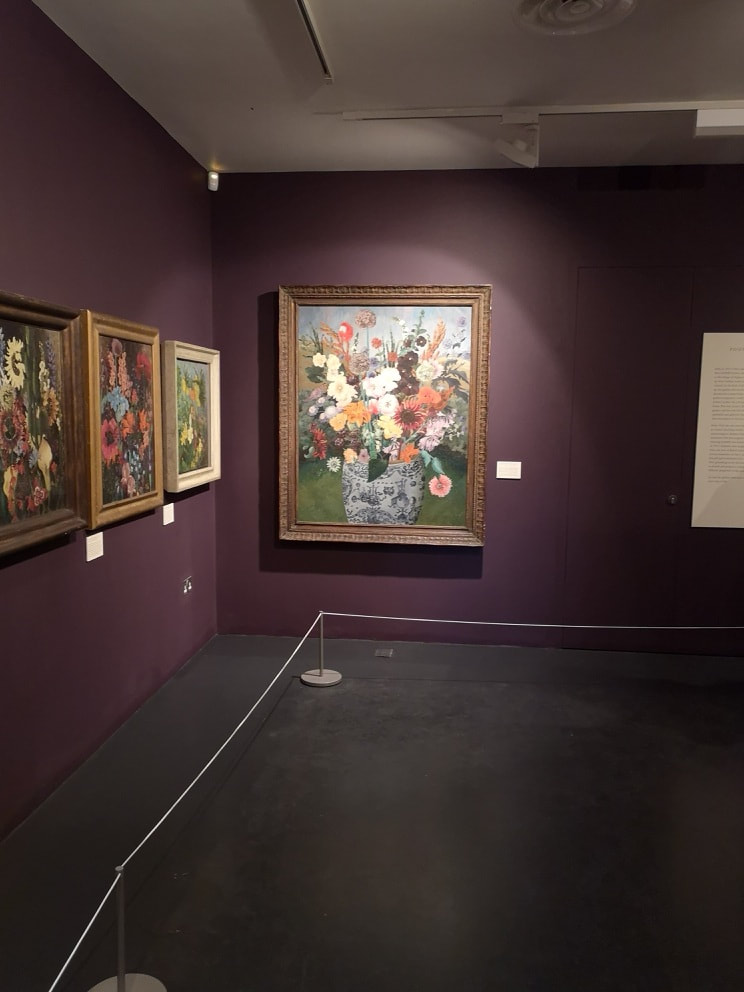
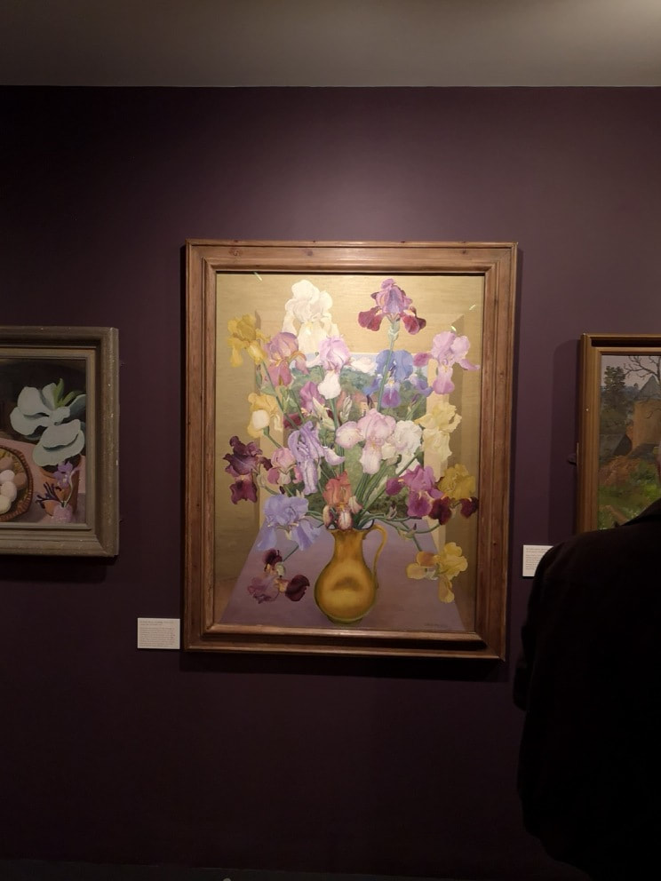
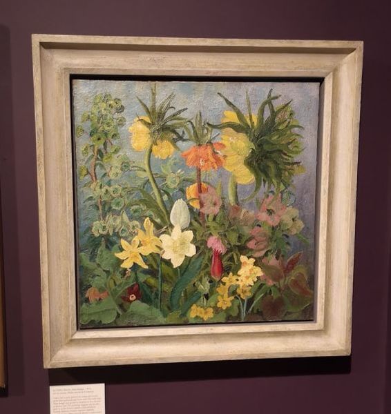
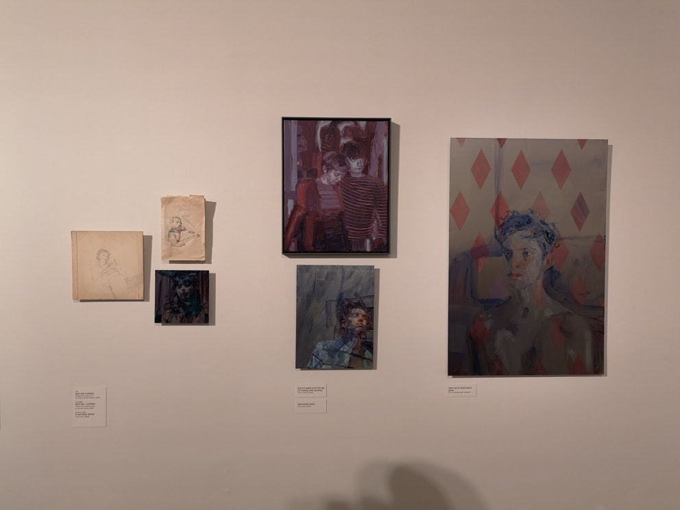
This blog will be particularly helpful if you actually want to go and see Cedric Morris at the Garden museum, as it finished on 22nd July 2018. Still I shall burble on about it anyway. The Garden Museum is probably one of London's lesser known museums. It has been closed for a couple of years for refurbishment and re-opened earlier this year. It is housed in an old church (as you can see above) just next to Lambeth palace, over the bridge from Westminster. It is a great place for lunch during the week as it has a nice cafe, and as the name suggests an elegant garden in which you can sit. Entrance to the garden is free, as is the main body of the church. Botanical themed artwork can be seen inside the church, such as Six Hazel Paintings in one Afternoon by Lucy Auge. As you can see they are these very elegant Chinese inspired ink and brush paintings. The surface of the paper is all mottled and texture, and as with all good ink paintings there is contrast in tone within the pictures. Auge appears again in the museum with a larger much more complex piece consisting of a series of squares each one containing an ink brush foliage picture. The don't quite match up which attracts you in a maddening way. You have to pay to get into the museum, but this includes entry to the church tower and the exhibition room on the ground floor, which has a changing exhibition. The museum itself is on the mezzanine level and circuits the church. It is of course mainly about gardening but there is botanical art, including some fine pieces by James Sowerby (above right) who is buried in the grounds of the church. My reason for going was to see an exhibit of works by Cecil Morris (depicted above). He was in the museum for two reasons. The first was that he painted colourful pictures of flowers. Secondly he was really into his Irises and bred several different varieties. Morris had an interesting life. He founded an art school and among his pupils was Lucien Freud whose portrait of Morris can be seen above far left. The school burnt down, possibly due to a cigarette Freud discarded. The burnt remains of the school which Morris got all his pupils to draw can be seen in the painting above, far right. Flowers those are the main subject matter, and amazing they are too. Rendered in superb detail and bright vivid colours they are a veritable feast for the eyes. Intricate and delightful and very well composed. Some of the paintings are very large indeed and pack quite a punch. My favourite one though is the one with the burnished gold background and the orb like yellow pot (above right). The Morris flower of choice, the Iris is dominant in this painting, with the different shade of purple picking out that characteristic Iris shape. Morris is good at using different coloured backgrounds to give very different feels to a painting. The one above has a cool relaxed feel to it, in contrast to the warm enticing glow of the golden painting above. I like the small purplyred flower with the yellow centre that pokes out from between the foliage. Speaking of which he manages to do the foliage in a way that they have a different light to them, to the flowers.
Anyway, I liked it very much.
0 Comments
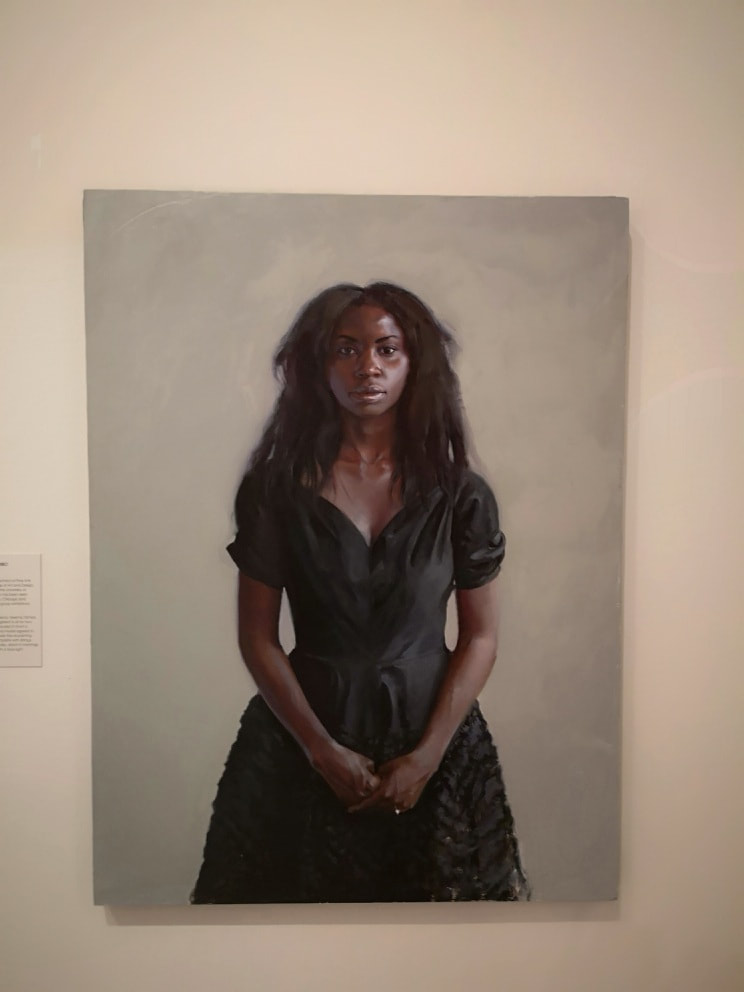
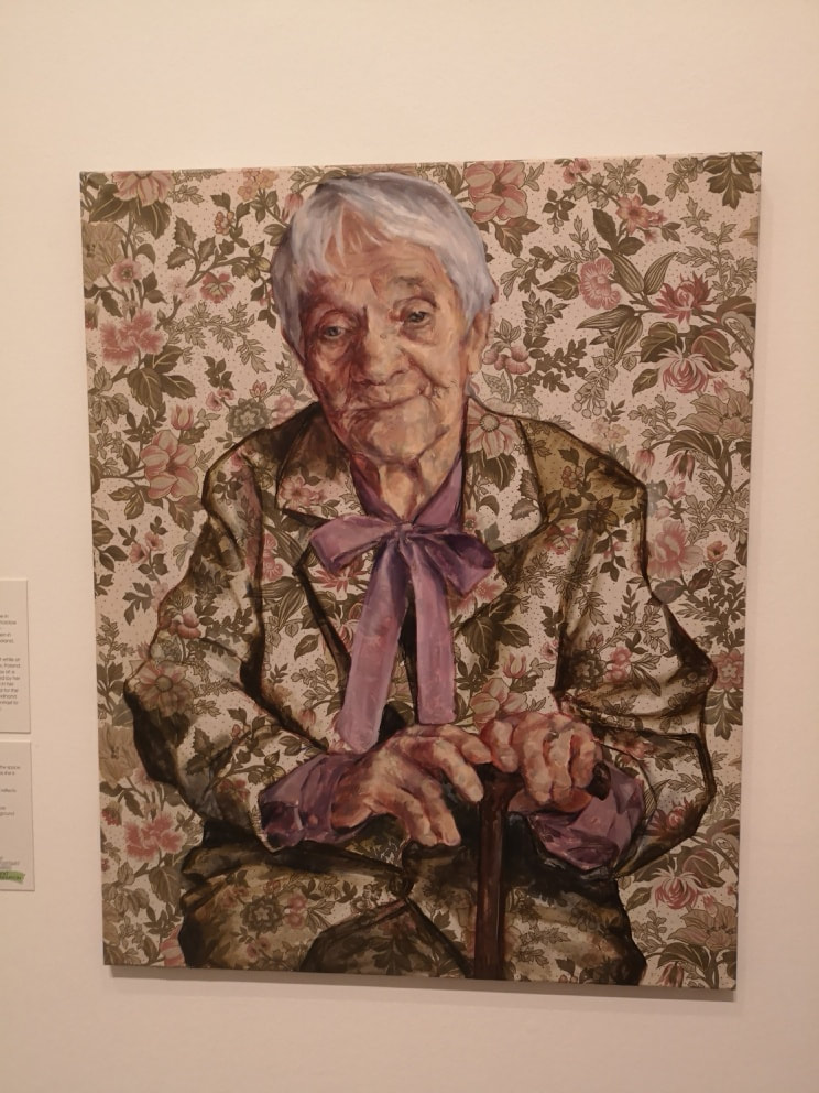
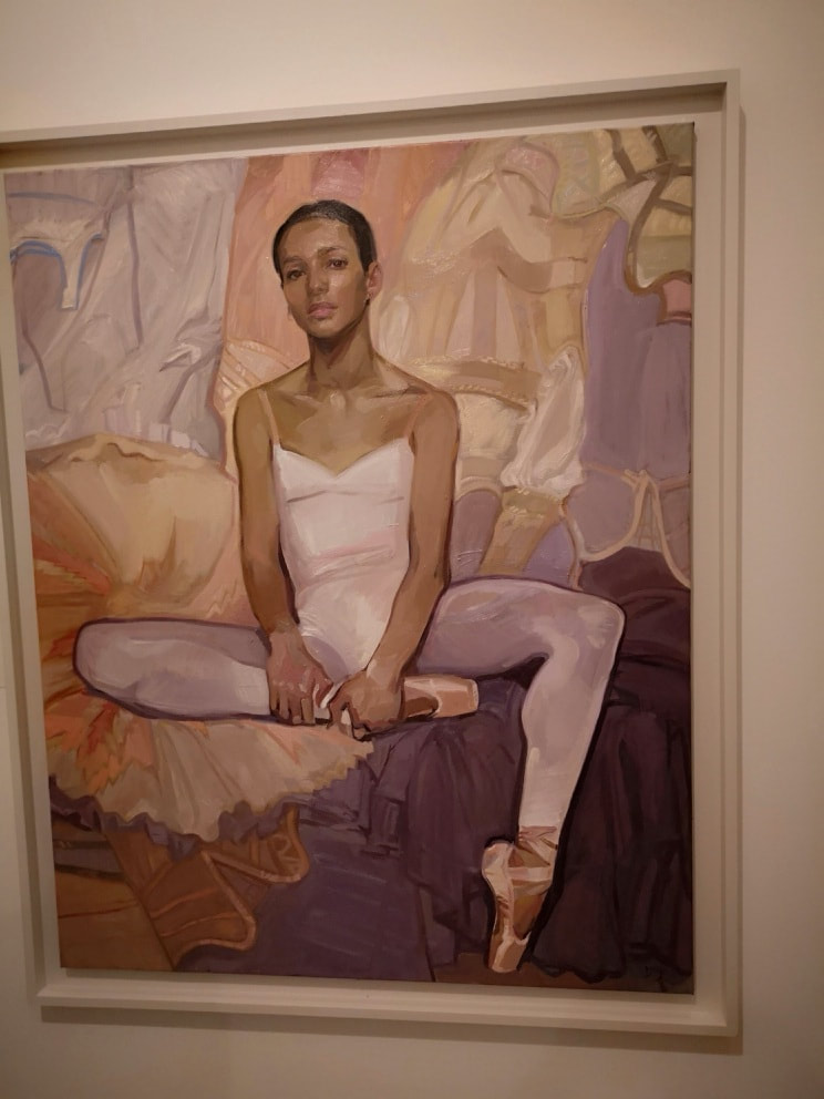
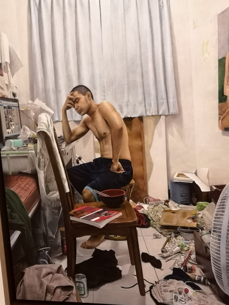
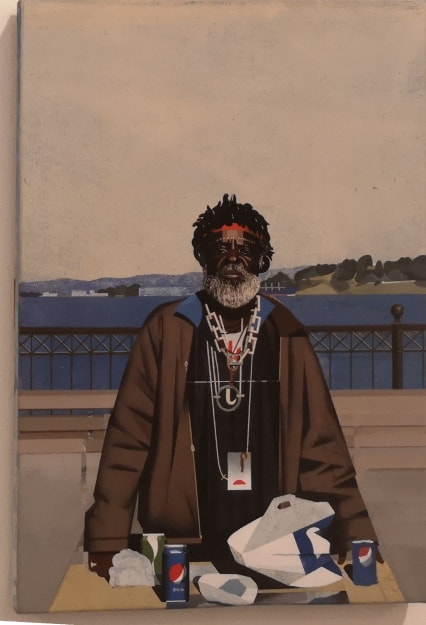
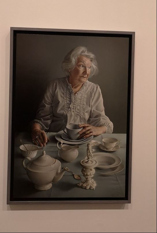
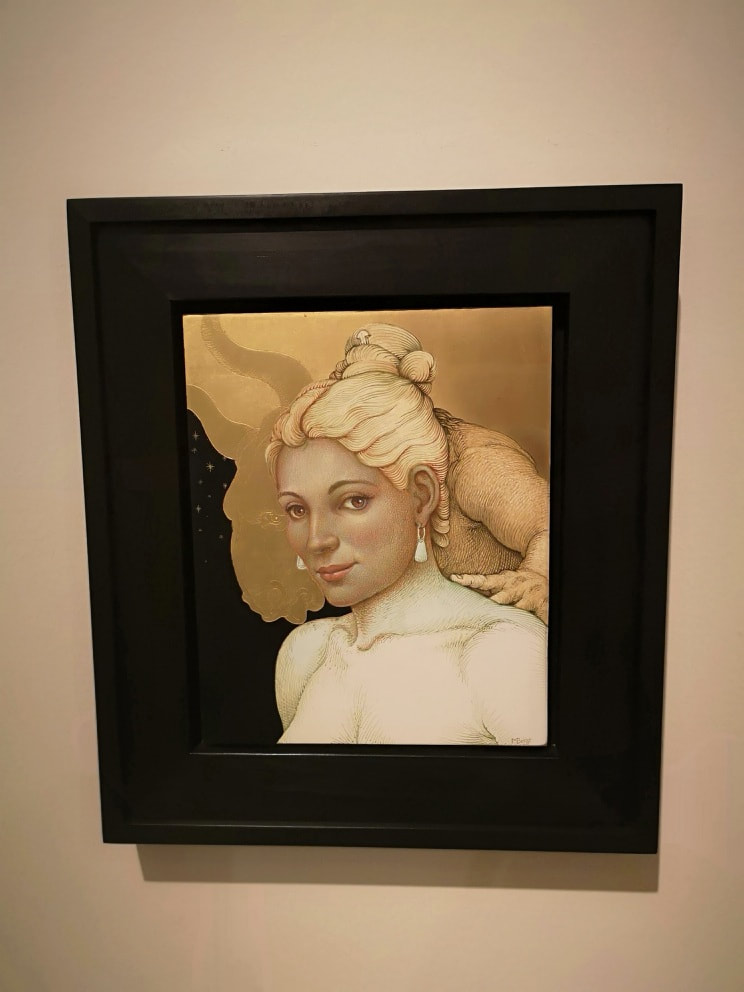
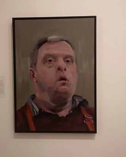
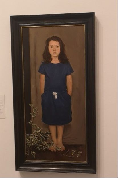
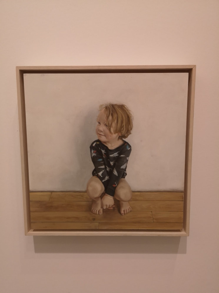
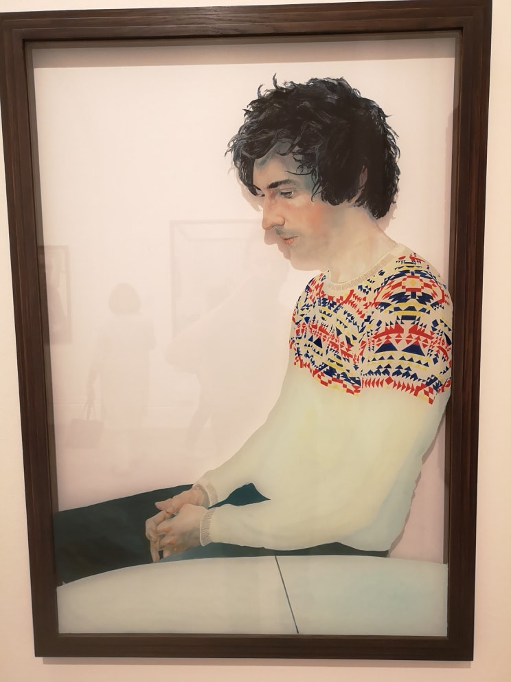
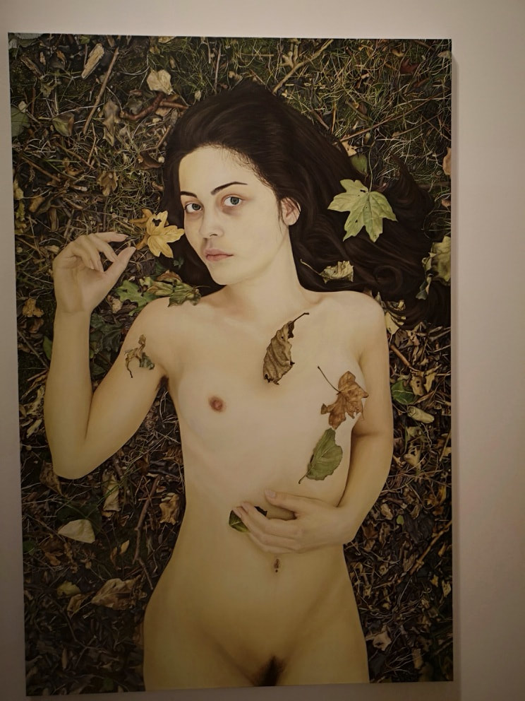
The BP Portrait award is on again at the National Portrait Gallery. It is free and is on display until 23rd September 2018. This year it has been bounced from its usual place to a smaller gallery and I have to say it suffers from it. This is to make room from the monster Michael Jackson show. Credit has to be given to the National Portrait Gallery for doing this slightly more off beat kind of show. It is also the kind of thing the V&A does well. Back to the portraits, you have to hunt around to make sure you have seen them all as they are round corners and in various nooks. As always the show is predominated by the technically impressive but emotionally and artistically dull photo-realist painting. The problem is that some of them are compositionaly photography so that it is obvious the photograph has been effectively traced. Indeed I did wonder if one could submit a photograph and fool the judges. Still apart from this there were some very striking and impressive portraits and I will open with my favourite; Neema Tambo by Gaela Erwin (above). Erwin is from Kentucky, just one example of the international reach of this competition. It is a very striking picture. The 3/4 length shot is a good choice. The model, Tambo, is both pretty and interesting looking. The contrast of her dark skin, the black dress (which is beautifully rendered) and the muted grey background make the painting really stand out and also give it a mournful quality. There is good use of shadow here, particularly in the way it bisects Tambo's face. An old trick but a good one. This is verging on photo-realism but there is character and personality there, which is what I want from my portraits. I voted for it in the people's favourite competition. I hope it wins. Different media can be interesting to. Mrs Anna Wojick by Monika Polak (above) is one such example. Instead of painting on canvas or board, she has painted on patterned fabric. By the clever use of shadow, tone and shading she makes her subject appear out of, or perhaps is disappearing into the background. One could easily read into this something about the invisibility of old age. An interesting face is also a bonus and we have that here. We also have very well rendered hands, something that many portrait painters cannot do and avoid. Here though they are in many ways the focus of the painting. Some paintings, for whatever reason don't photograph well. Particularly when you are in a crowded gallery and have to content yourself to snapping from an angle. Such is the the case with Francesca Haywood by Vanessa Garwood (above) which trust me is much better in the original (or don't trust me, but it still is). Haywood, as the painting makes abundantly clear is a ballerina. I like the bold outlines to the figure and the fact she is surrounded by tutus and similar. Garwood also makes good use of thick paint to give a nice texture to the whole piece. In additional the slightly defiant look to Haywood, moves this above a standard portrait. We move aware from the typical female portrait of an object to be gazed at, to someone who is looking at you. The technical mastery in Ziqiang 124 by Chunchieh Huang (above), almost ruins it for me. It is almost too photorealistic to be interesting, crossing the border into what might has well have been a slightly dull photo. It is the central figure that lifts it out of this, and also the shiny curtain behind him. Also I like a messy room. Religious allegory often creeps into portraiture, sometimes intentionally sometimes not. David by Robert Seidel (above) is one such example. The central figure David has a christ like, prophet-preacher air to him. The flat almost graphic way he is presented (painted in egg tempera) gives this a graphically literally iconic feel. The beard helps of course. Seidel has won the BP travel award so we will see more of him next year. An Angel at my Table by Miriam Escofet (above) one first prize. I wouldn't have chose it (my choice is at the top) but it is a good portrait and I can see why it won. Firstly it is technically excellent and the judges at this award always seem to prefer the photo-realist style. The colour pallet is also interesting with the greys and whites predominating throughout the picture. There are a few elements though that lift it. Firstly there is the shadow, the way the left hand of the portrait in darkness and the middle and right in light. Then there is the fact the subject of the portrait, who is beautifully rendered, especially the hair (and is I believe Escofet's mother) is looking off to the left. Difficult to see from my terrible photograph but the figurine and the plate behind it on the table, are blurred almost as if they are moving. Finally a good title really helps and An Angel at my Table is a good title. Is the angel the sitter, is it the strange figurine, or has the angel left and is now stage left. hence the movement and the way the subject is looking? Get your title to provoke thought and you can really add to a painting. Transformations by Michael Bergt (above) gives us egg tempara, it gives us good leaf, it gives us a Minotaur, implied nakedness and a sinister dark background. The face of the sitter, is wonderfully done with a beguiling look to it. Reminds me of Kim Cattrall. The sharp collar bone, the earings and the beehive hairdoo all frame the face nicely. Then behind it you have this grasping hand and indistinct bull's head. Pictures that allow you to build a story are always good. I was very taken was this, and it nearly made my first choice. Tony Albert by Hugo Fergusson (above) has a very touching quality to it. Adults with learning difficulties have to be approached in a certain way, it is easy to be patronising, or render them child like but Fergusson manages to avoid both these traps. At least I think so. I like the slightly blocky way in which Fegusson paints, there are good shadows and different tones in the face. He has given Albert a stern but contradictory approachable quality. The stripes of red braces work very well as a contrast. The background is a bit too muddy, which is perhaps my only criticism. Children, lacking as they do craggy features on their faces can be difficult to do well. Above are two different pictures that have gone for two different approaches. Above left we have Ilea by Neale Worley. Worley has gone for the allegorical approach, the sackcloth dress, the ivy and the brown curtain behind the subject all tell a story. Quite what that story is, is up to you. Another approach, that taken by Samantha Fellows in Found Albert Crouching in the Kitchen (above right), is to look to depict the personality of the child. This, with the crouching Albert, looking cheekily off to the left she has managed to do very well. Painting in a different way on something different can often be a way to stand out from the crowd. You have to be able to pull it off though. Tom Bedeman by Oliver Bedeman (above) is done on glass using something called reverse oils. I don't know what those are, presumably they are for painting on glass. It gives the piece and ethereal quality, emphasised by the pale colour palette and the mournful look of the subject. To do elfin nudity you have to avoid being to fantastical and also being too coquettish. One of the ways to do this is to do a self portrait as Secil Guven has (above). High quality of work as we have here helps, so for example the leaves make it rustic, but not fantastical. Secondly, the pose in general with the eyes looking straight at you. These are not come hither eyes, but rather, "what?" eyes. I like that. The paleness of her skin makes for an excellent contrast with the dark brown ground behind her. Finally I shall leave you with Charlie Masson by Alvin Ong (above). I like the colours of this picture. I like the way the yellows, greys and brown swirl in the right hand side of the image, like one of those polished stones. The shadows of the figure do a similar effect. This is one of only 3 abstract or semi abstracted pictures in the show. It is also one of the smallest. This one is a bit of a grower, in that the longer you look at it the more it draws you in.
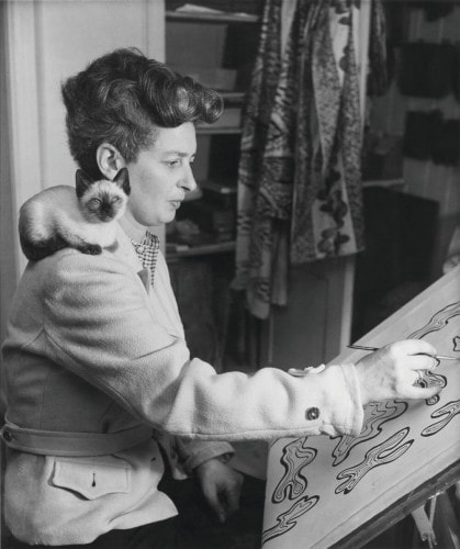
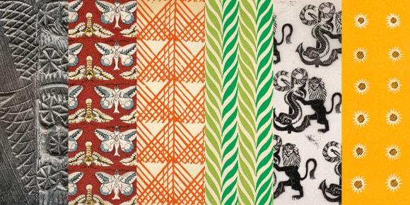
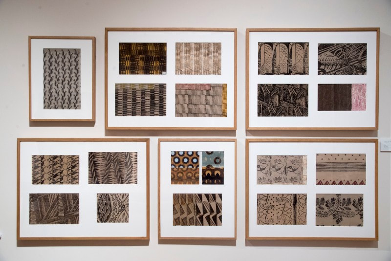
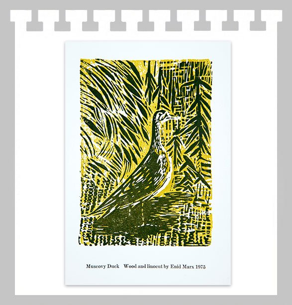
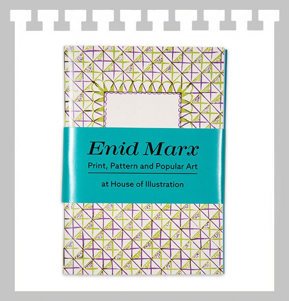
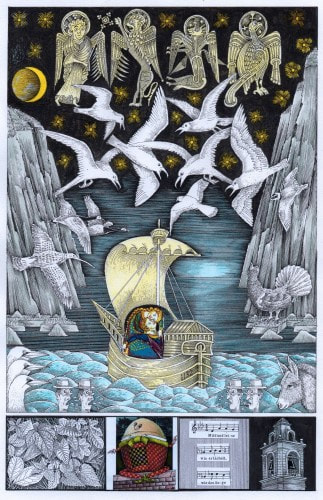
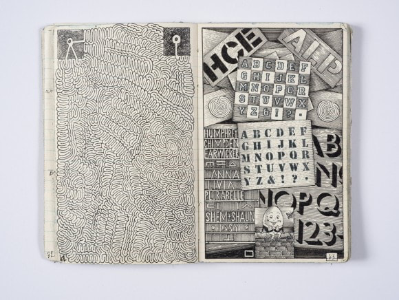
There are many others in the show that I haven't mentioned. Its free and worth going to. I would also recommend ascending the front stairs to the mezzanine where you can see the work of Noah Buchanan (below), who I blogged about last year, and one the BP Travel award. The results of his travel are on display and rather good they are too. I am quite a fan of the House of Illustration and go there relatively frequently. They have no permanent collection, instead exhibitions that change every few months. The museum has three galleries. The main gallery, which presently houses the Enid Marx show that is the focus of this blog, and two South Galleries. The smaller of those has a shifting but constant display of Quentin Blake's illustrations. The larger one changes frequently and currently holds a fine display by John Vernon Lloyd, more of him later. Enid Marx, pictured above with a cat on her shoulder and bearing more than a passing resemblance to my grandmother, was an artist, illustrator, designer as well as other things. She was a protege of Paul Nash, of whom I also like. Enid Marx was prolific and successful and if you go to her show, you will recognise her design for the Bakerloo line which can still sometimes be seen on the older trains. Marx used woodblocks to make fabric and pattern prints. She carved the woodblocks herself and the first room contains her wood carving tools, and a couple of the carved blocks. One of them, which bore a strong resemblance to an African mask was displayed next to the print it had produced. Her designs are strongly geometric and often tessellated. Many of the prototypes are beige but colours appear later. Some of the designs are complex in the way that they interweave and seem not to repeat. This I suspect was done by simply turning the printing block. Some of it reminded me strongly of Agnes Martin. Marx was fairly prolific in this regard and was responsible for the design of Utility Fabrics. These were cheap fabrics to be given to those whose houses had been bombed out or returning soldiers so that they can furnish their new homes. The genius of Marx's designs was that they were integral to the fabric and thus could hide the defects in the cheap material used. My favourite of these was a curved shell design. Marx also produced illustrations and book designs (as in the above). There are several of these on display and I particularly like the geometric book design that you can see above right. It is simple but quite elegant. She also produced designs for stamps, including stamps for the Israeli postal service amongst which was my favourite a large pouty biblical looking blue whale. Sitting on one wall were several regal looking prints of cats. Cats particularly but nature in general are a recurring theme. The cats depicted are usually the same bread of the cute little creature perching on her shoulder in the first photo. Not content with this panoply of achievements there are also on display some charming watercolours as well as pottery she designed. Some of it now seems quite chintzy but there were some very characterful piggybanks that stood out. As is often the case with the House of Illustration the show was artistically, historically and intellectually interesting. The larger south Gallery contained the work of John Vernon Lloyd, which it seems to me has a touch of the William Blake, but also of the Terry Gilliam about it. The display contains illustrations he produced for Alice in Wonderland, Alice through the Looking Glass and The Snark by Lewis Carroll as well as Finnegan's Wake ans Ulysses by James Joyce. The above illustration is from Finnegan's Wake. The illustrations all have similar themes. There is a strong geometric element and an interest in words and numbers. There is very fine detail and also a somehow monastic or mythic quality to them. They remind me of gilded illustrations in old bibles (and the whole thing inspired me to hurry off to the British Library afterwards to have a look at them). Of these illustrations my favourite we Yawn's Inquest from Finnegan's Wake, which had this swirling geometric design called a Omphalos at its centre. Various sketchbooks and detailed ideas abound (such as the above). Some of the most interesting of these were for the Lewis Carroll books, such as the one focusing on the number 42 including a depiction of a magic cube that adds up to 42. This as well as another illustration called 6 impossible things before breakfast made me realise that Carroll must have been a major influence on Douglas Adams.
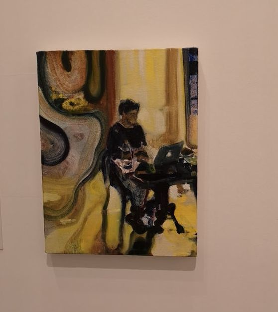
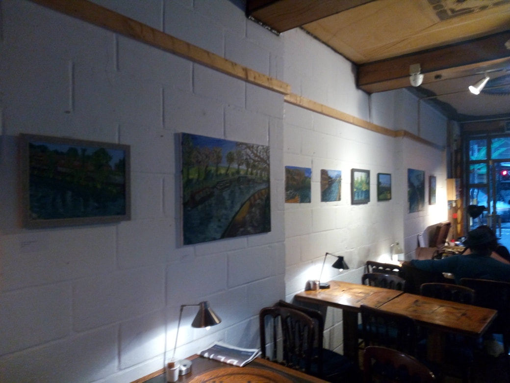
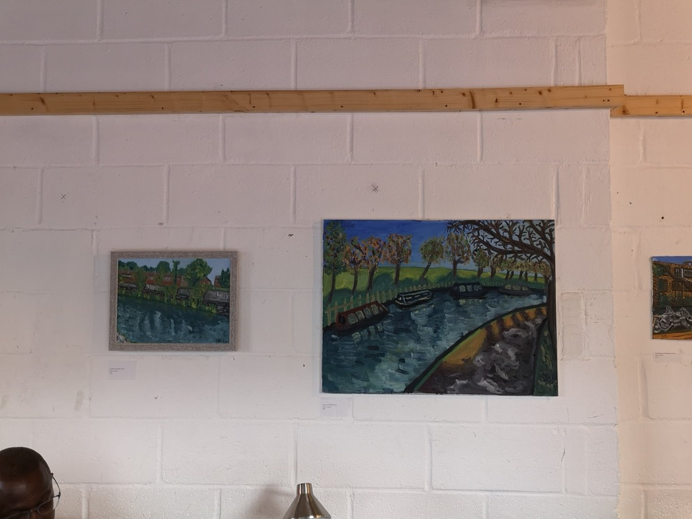
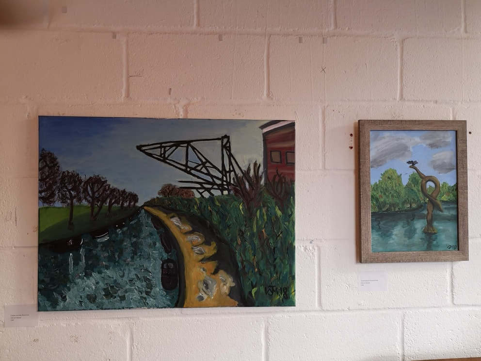
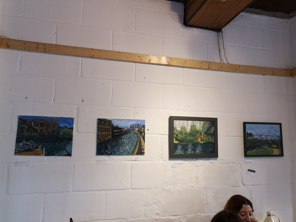
In addition to this there was a wall of tiny sketches, all of excellent quality and occasionally humour as Lloyd had taken it upon himself to do a sketch a day for a year. There are also two larger drawings, occupying both sides of a stand in the middle of the room and I was particularly taken by the chaotic interior of The Back Basement of 76 Charlotte Street, drawn in loving details. Like all good museums I had gone for something specific, which had been well delivered but also encountered something unexpected and interesting. As usual I would recommend it. My just over a month long show at the Hoxton Cabin, came to an end yesterday. It was originally up for just a month but was extended at the request of the venue, which was nice. It is very hot today so I shall keep this post short. The Hoxton Cabin is a nice venue. It has a long white while, which has nice natural light from the large windows and good artificial lighting at night. Sitting just round the corner from Hoxton Overground station it is super convenient and acting as a coffee bar during the day and a bar at night you get a nice cross section of punters. The people at the Hoxton Bar, particularly Anna, who curated the show for me, were super friendly, nice and helpful. I went along with 8 paintings planning to only hang 6 but was pleasantly surprised to have them all fit in and look good. The main stays of the show were two large paintings, Tree over the River Lea (above left) and Crane over the River Lea (right and at the top of the blog in a Flier designed by the excellent Owen Smith). I paired this with Graffiti on the Lea Navigation (above left) which was also in the previous show, and went slightly off the topic of the River Lea with Cormorant in Victoria Park (above right). It looked good next to the Crane as it leans in the same way, also I think its pretty good and wanted a chance to show it off. For the middle wall I had originally planned just two, River Lea Navigation (2nd right) which had been in the previous show, and a new painting that I was quite proud of, Overground over the River Lea (far right). This was the first of my paintings ever in fact to show a vehicle in any detail. I was pleased with what I had managed to do. However the wall was to large and just the two, was too bare. I had brought with me two very new paintings, both of the Regent's Canal. I was trying out in these a more detailed water effect. I am working on an entire Regent's Canal series and as these two were from just around the corner, I reckoned they could go in the show. The only error made was in the mounting of the pictures. We chose velcro, which had worked very well in the Indo Bar. Unfortunately the sweltering heat that developed meant that the glue on the velcro strips started to fail and a number of pictures had to be remounted. When I finished the Indo show I thought if I had another show soon afterwards , I could build on the momentum. Actually one of the results of having two shows so soon after each other was that it was difficult to motivate as many friends and fans to attend as had appeared at the first one.
This left me a little down but in fact, financially this show was more successful. I sold three paintings. I sold the poster piece, Crane over the River Lea. Then I was contacted through this website. Some people had been to the show. I don't know who these people are, but they tipped of their friend who they thought would like my work. He came to my website and he did, and ended up buying Cormorant in Victoria park and also a piece not even in the show. From both shows I wasn't really expecting to sell anything, and in both shows, I have sold 3. I have 2 more shows booked. One for the month of September at Beans Love Greens in Shoreditch. This will probably be mainly patterns and abstract work. I then have a much bigger show, in terms of size, running for a week over the Easter Weekend at the Old Fire Station in Henley-on-Thames. Who knows what will come of those. More details in due course. |
Archives
June 2024
Categories |


 RSS Feed