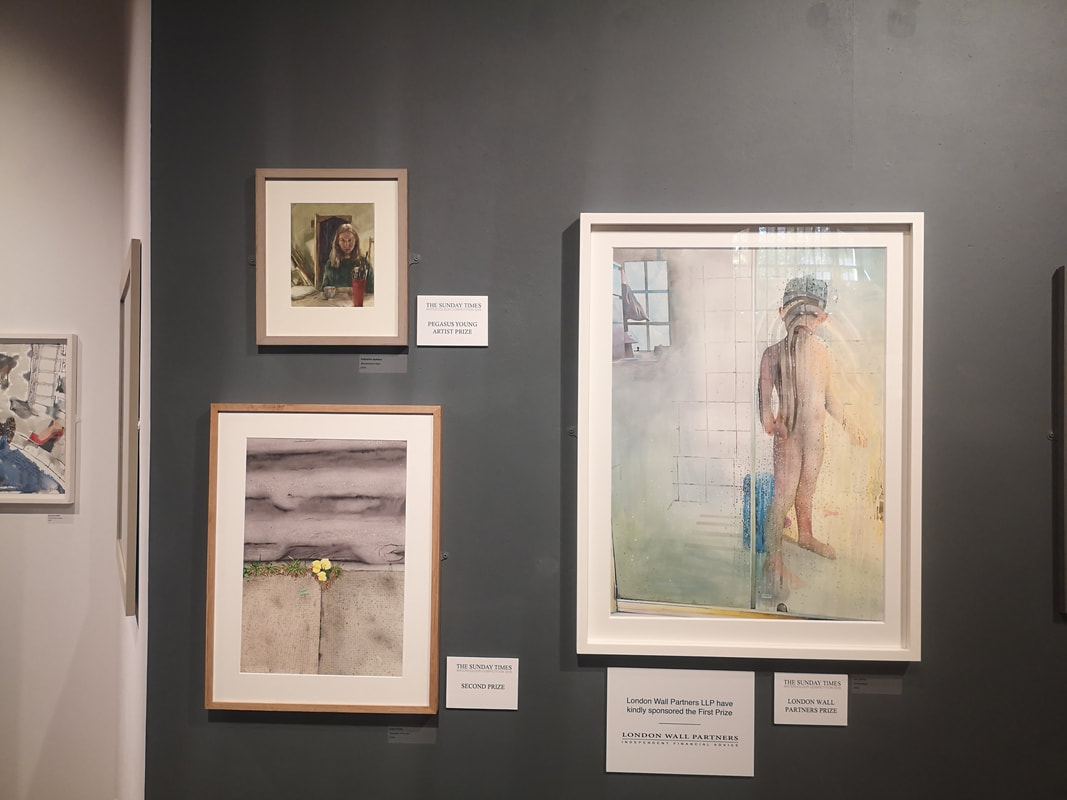
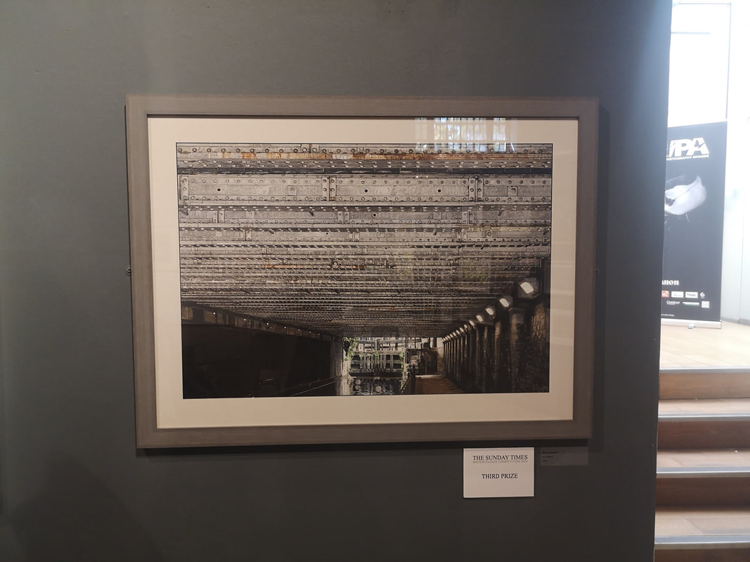
The excellent Mall Galleries is currently showing the Sunday Times Watercolour Competition. It is on until 13:00 on Sunday 22nd September so chances are you have missed it, but let me give you a run down on what was best in the show, at least what appealed to me most, which as our current political leaders have taught us, is the same thing. The prize itself has its own website where some of the exhibitors and their art is shown. Above we have the winners board. Of these I actually really like the one in the bottom left which is a picture of a small yellow plant growing out of the pavement. Primrose Pavement its called and is the work of Aidan Potts. The plant itself and the pavement itself is super detailed whereas the road that forms the upper half of the painting is almost abstract and river like. I have as you may know a fondness for canals. Third prize, or Iron Mighty by Mark Elsmore as it is otherwise known (above right) fits right into the wheelhouse and there is a sense of weighty claustrophobia that entirely fits the brief. Technically impressive, I can see why it ranked but for me though, it is a little too constrained.
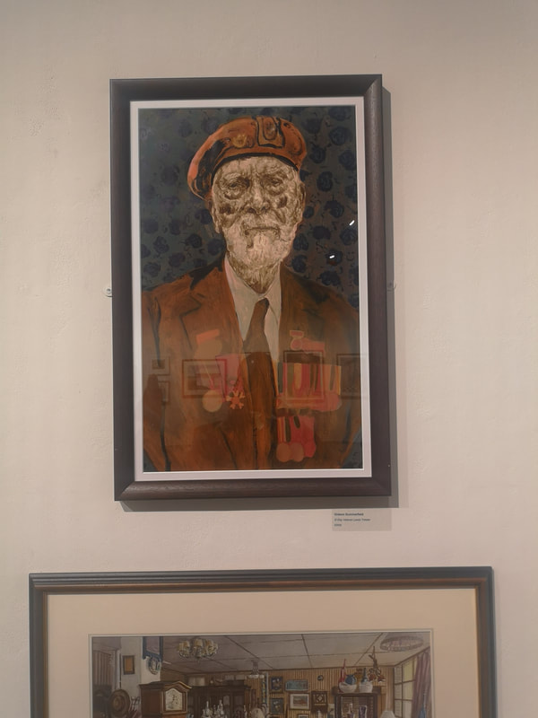
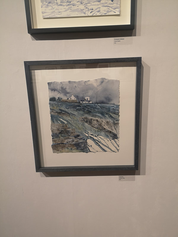
Having in a few sentences dispatched the winners I shall now do the same for the other highlights of the show starting with the excellent portrait of D - Day Veteran Lewis Trinder by Gideon Summerfield (above left). There is an excellent sense of fading heroism about the picture with that wonderful craggy face and the uniform and medals all slowly merging in a brownish red, the whole figure contrasting nicely with the blue and gray background. Maybe its projection by the dark blue shapes make me think of poppies. One of the things you can do particularly effectively with watercolours is use the imperfections of washes of paint, the dripping of paint and having the white paper peeking through to create striking images. It works especially well in landscapes and Linda Saul has pulled it off marvelously in her work Pendeen Clifftops (above right). The result is a very cold feeling, wintery blustery landscape with a real sense of the craggy eroded nature of the cliffs.
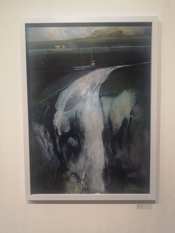
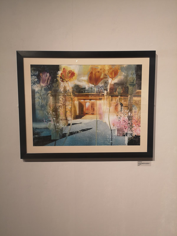
What I also like is when people blend the abstract with the figurative, which is what appears to be happening in David Firmstone's Scottish Harbour (above left). This piece is actually more impressive in person. That emerging and expanding ribbon of water has much more colour depth to it, and much more of a glow to it than the picture suggests. What the painting does do very well is take your brain on a journey from the ordered straight lines of the harbour wall and the boat to the swirling chaose of the water running into the sea. In watercolours I have a strong preference for pieces where you can see the paint, and the brush marks. It is a medium in which photo-realism works less wells and seems a bit pointless (other than in botanical art but that is a whole separate thing). There is a surreal dreamlike quality that watercolour lends itself well to and I respond well when an artist plays to these strengths, as with Julian Bray's piece (above right) which has an improbably long and unwieldly title. The strong use of orange and pinks, contrasting with the dark blues and grays is very good, as are the oversized flowers in the foreground.
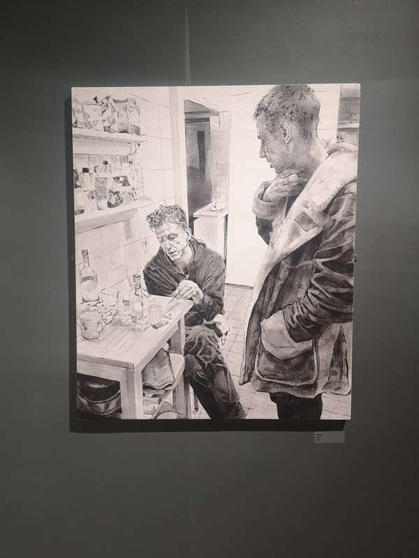
Having now dismissed watercolour as a medium to avoid photorealism, I shall now subvert that point by having two paintings which are nearly there in presentation, but I shall forgive as being excellent and evocative. Firstly we have Aidan Potts again (above left) riffing further on his theme of urban, cheeky flowers. This one lacks the contrast between swirling and realism that the top one has but the colour contrast, between the wall and the flowers, and wall and the pavement is much stronger so it makes for a more eye catching piece. You don't get much social realism in watercolour, you also don't get much monochrome (although there were a few examples in the show). A striking exemplar of both of these things is Kitchen by Peter Busa (above right). Credit to the curator for hanging it against a dark wall which makes it sing and glow in a way it might not of done otherwise. The different tones in this painting, like the way the coat is rendered is superb as is the attention to detail. There is real drama here to between the two figures.
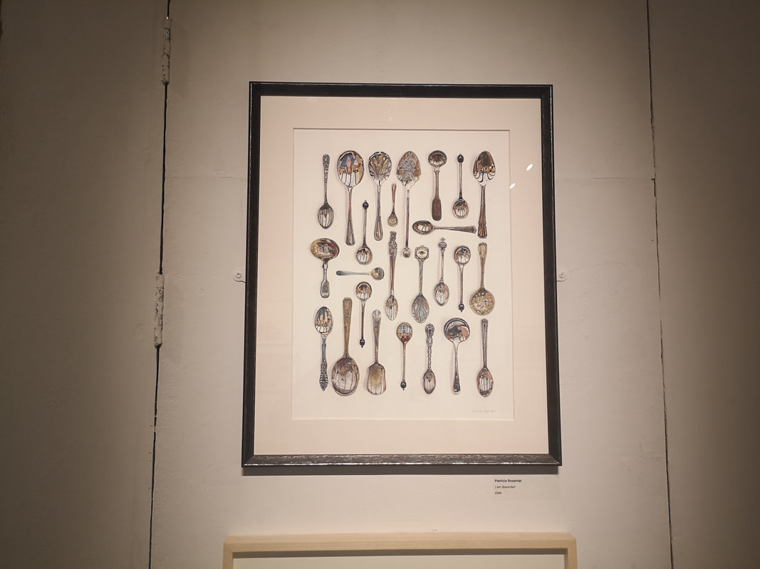
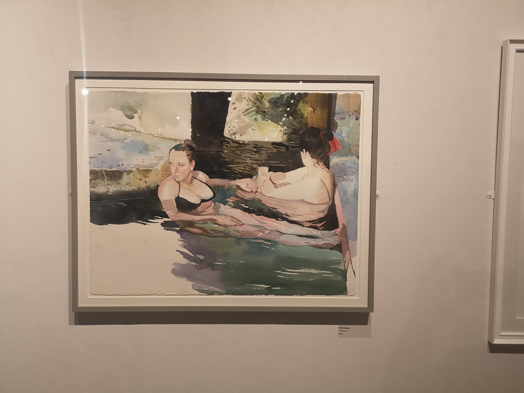
They are not just spoons. You can't really see it in the photo and it takes a while looking at the painting until you realise but within each of the spoons of Patricia Rozental's I am Spoonfed (above left) is reflected the face of a person, motled and distorted by the surface of the spoon. Some of them are barely visible beneath the tarnish she has put on the spoons. An excellent idea well done. Mark Entwistle's Primavera II (above right), plays to all of the strengths of watercolour that I was talking about previous. What is particularly impressive here, and is obviously a strength of his as he does it again in Primavera I which is also in the show, is the way he depicts people under water. It is very good. This painting has a nice, intimate, dreamlike quality that really sucked me in. The contrast between the solid dark wood, the pinkness of the skin and then the, frankly very cold looking, blues of the water. Very nice.
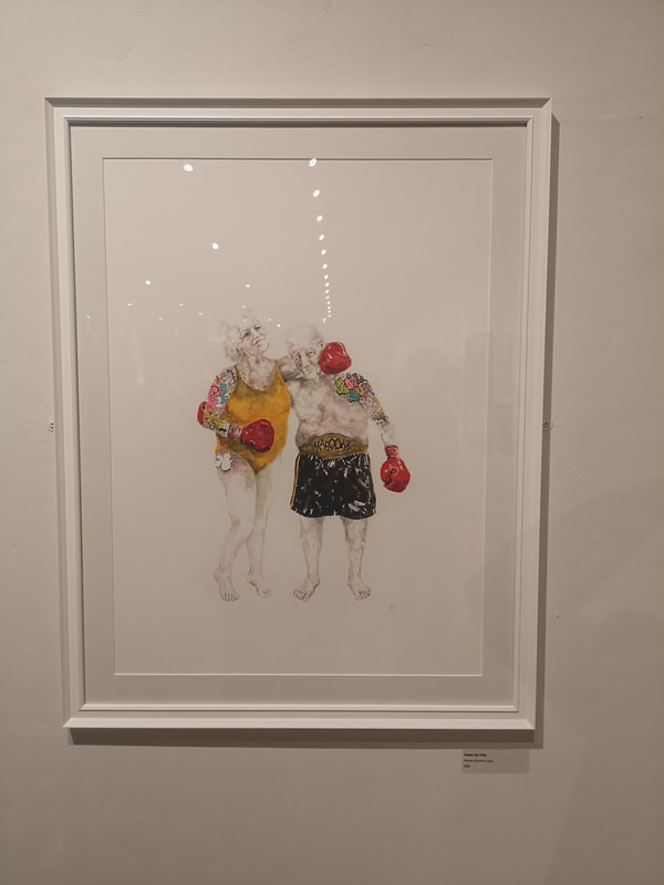
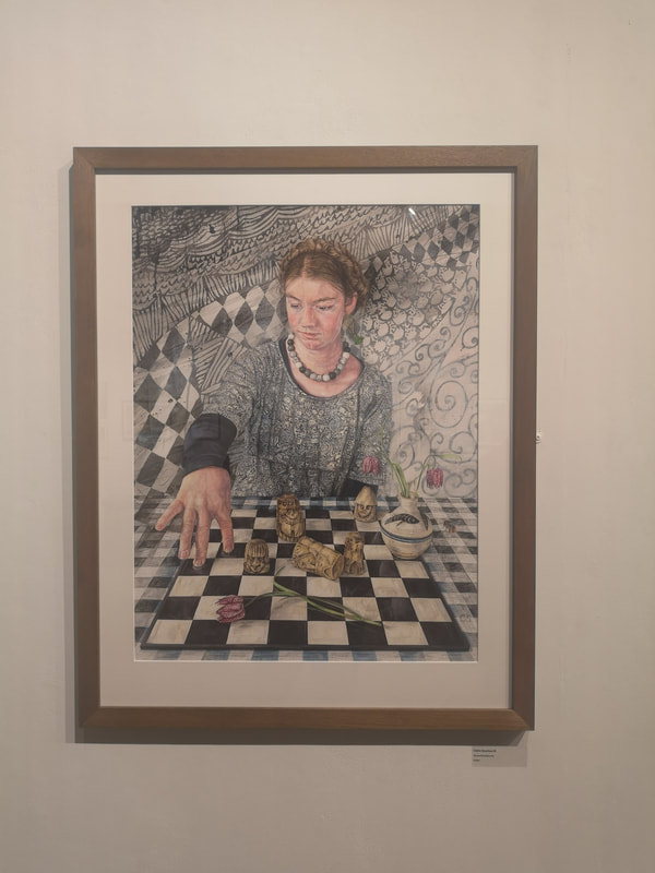
I have said it before and I will say it again until you listen is that comedy in art is very difficult to do and very effective when you pull it off. Punch Drunk in Love by Adam De Ville (above left) made me, and most other people at the show, laugh as soon s they saw it. The absurdity of the figures, the swim suit, the colours, their age, the overhyped highlighted tattoos all play off the sweetness and cuteness of the message. It is also very simple, just these two people against a white background, and the more effective for it. I like it. Much more maximalist and repleat with symbolism is Claire Sparkes piece (above right) which has an unpronounceable German name. I like the way the various elements of the piece reflect and blend into each other. Foreshortening is difficult to day and I therefore really like the way her hand reaches out onto the board. Sometimes though art speaks to you simply because it sparks associations. I am very fond of the the Lewes Chessmen for reasons that are too long and difficult to explain now. This painting reminds me strongly of those chess pieces and therefore I like it, frankly, mainly for that.
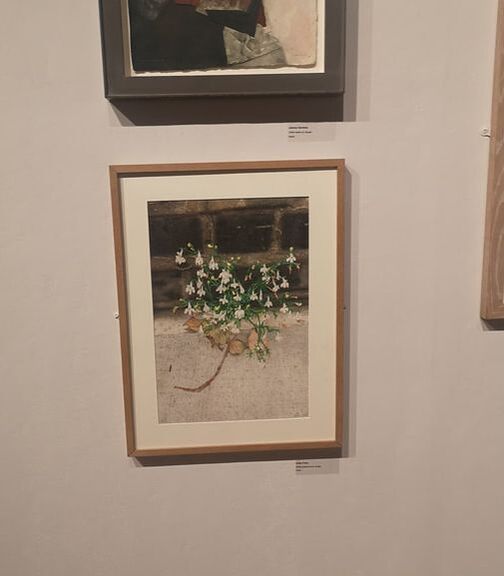
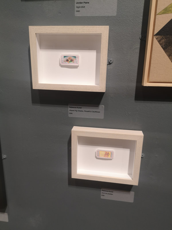
Last two, well last three. Two though are by the same artist. They are by Rebecca Kunzi (above left). It is very difficult to see from this photo but they are food stuffs painted on tiny tickets. I particularly appreciate the bottom of the two, which is a picture of two prawns and is called Don't be Shellfish. You don't get nearly enough puns in art, or in life for that matter. Nice idea, done well.
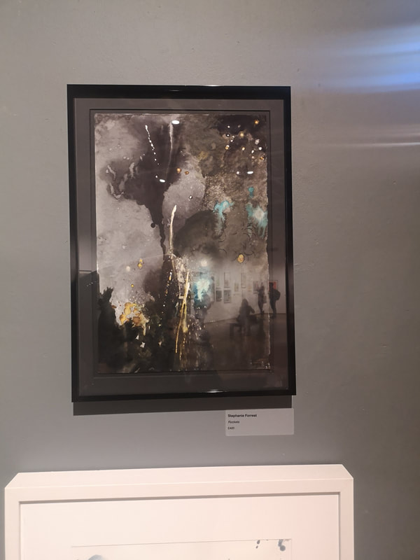
Let us sign off with a celebration. Stephanie Forrest's piece (above right) is one of those pieces that is initially slightly baffling but the coalesces into something else one you know the title. Right so, look at it. Have you done that? It is called Fireworks. Now look at it a again. See? Once you know you can see that she has actually caught really well the smoke and light of a firework display. The exhibition is on until Sunday. I am posting this on Saturday to partly make up for missing a blog post last week. Go if you can, enjoy it.
0 Comments
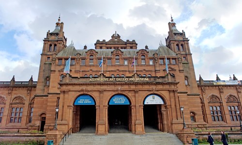 I was recently in Glasgow and despite it being August, perpetual and ferocious rain, which was swelling the river Kelvin at an alarming rate caused me to scurry into Kelvingrove Art Gallery. It is one of those high Victoria reddish buildings that are scattered around Glasgow with a sturdy solemnity. I think they have the function of stopping the city being washed away. I am being a bit mean, partly because getting soaked gave me a cold but it is a good gallery and worth a visit in its own right.
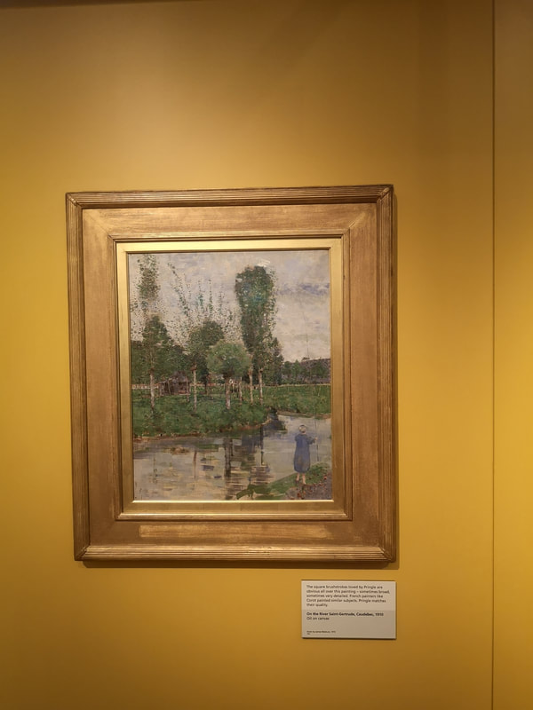
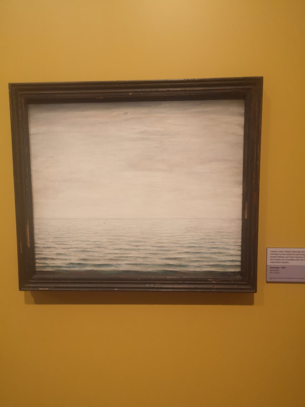
So lets get cracking. There is a non-part of the museum which includes dinosaurs, social history etc but the bit I enjoyed most was the pre-history part. Stone axes and so on. However onto the art. There is a fair collection of paintings by John Pringle. There was a particularly good selection of oil sketches in a glass case but the reflection off the glass rather ruined the picture. They were very interesting to see. Of the other paintings on display this one on the top left, the River Saint-Gertrude. It is charming. Charming can be something that some people use as damning with feint praise but I think it is difficult to make something charming. I like my river scenes and the sky and the river are excellent. I like the way he uses horizontal strokes of paint for the water, giving a different texture to the surface of the water. I am coming increasingly to the view that landscapes need a figure to make them really work, context and interest. Not all the time obviously but certainly the figure in this painting gives an idea of scale. There were a couple of Lowry's on display and I will show you both of them but the first of them (above right) is extraordinary. I have never seen a Lowry without figures, without buildings before. It is just an empty seascape but I love it. Empty and mesmeric. It must have been difficult to overcome the urge to add something to it. The receding dark tones gives a great sense of perspective to the piece.
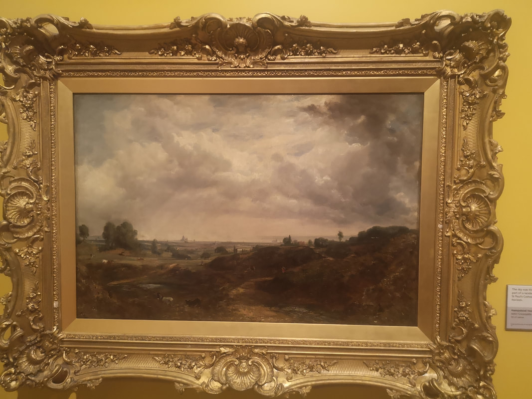
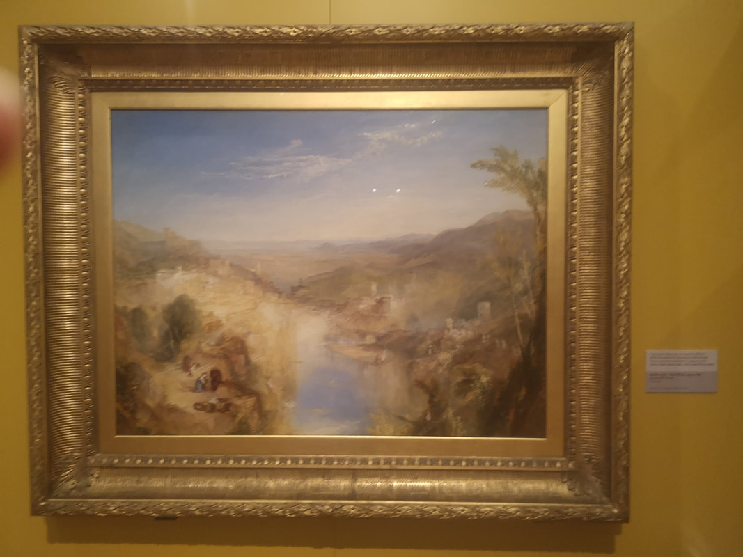
Constable and Turner sit next to each other in this gallery, the dark super detail and moodyness of Constable landscape and sky, a real autumnal scene. Then sitting next to it the golden light of a Turner ethrealness, a real summer view.
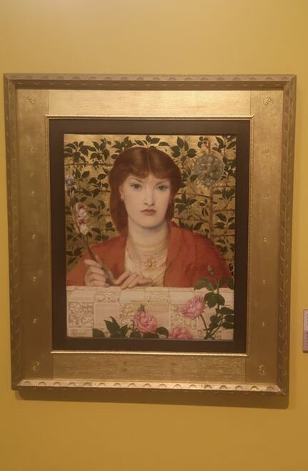
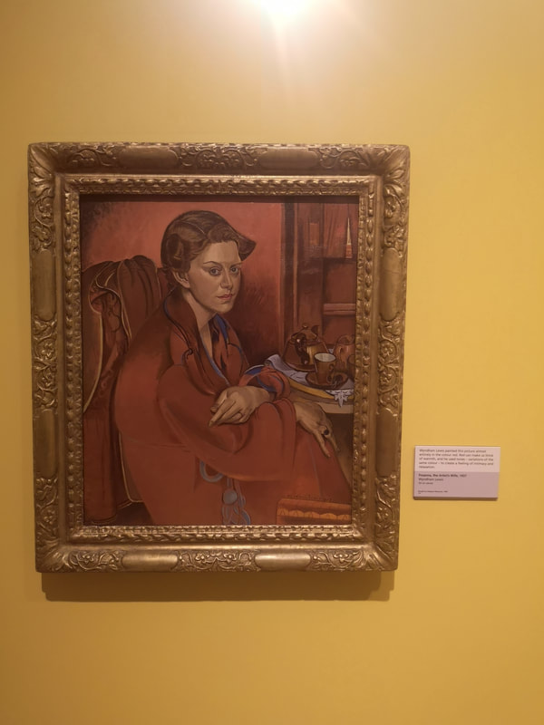
Portraiture now an a symphony in red and gold, firstly mainly red with an actually iconic Rossetti painting (above left) showing his classic red headed, ice maiden. Gold wall, gold frame, golden backdrop making the reds of the hair and shawl stand out from the backdrop. full of symbolism with all those flowers. Then more red than gold, is Wyndham Lewis' wife Froanna (above right). I really like it when artists riff on one colour, as Lewis has done here with red, all different shades of red. She doesn't look very happy though does she? A feeling that is emphasised by the distorted slightly twisted figure. There make a great pair these two paintings and credit to the curators for putting them next to each other.
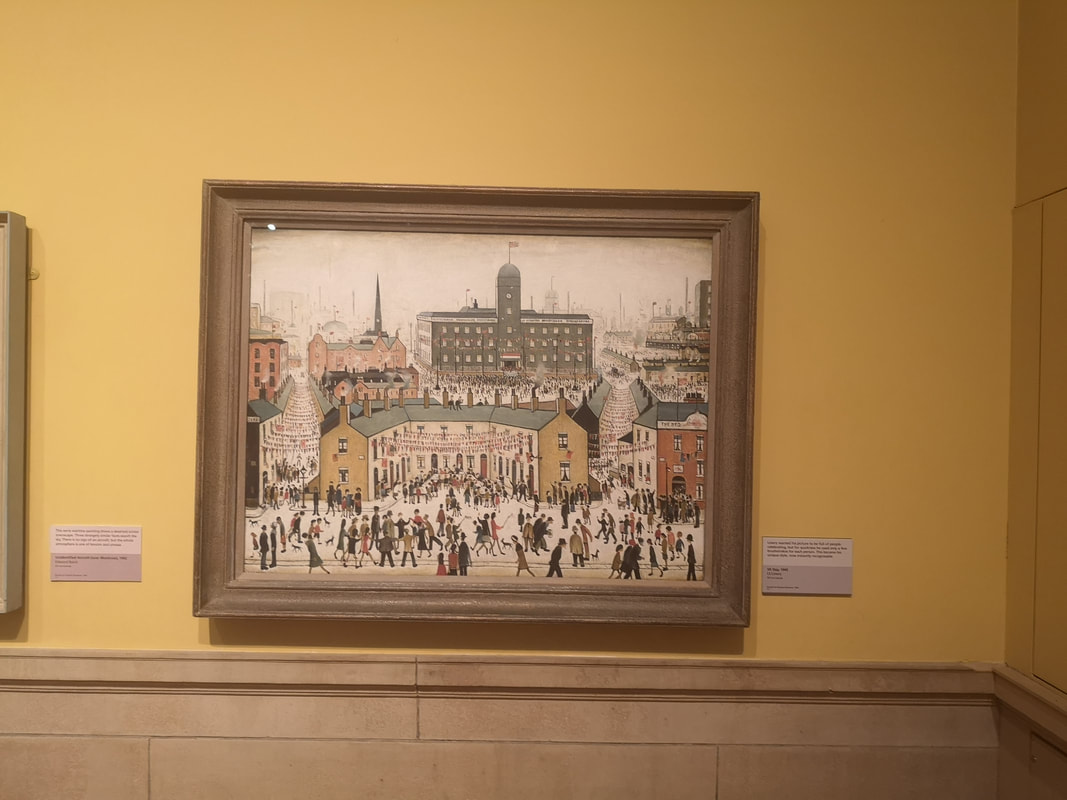
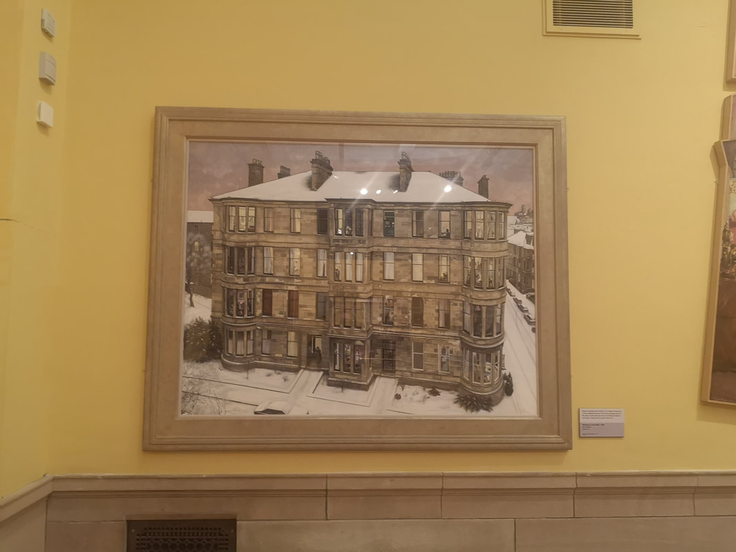
Buildings now and a Lowry and more what we come to think of as a Lowry (above left) a scampering of figures. The painting is called VE days and bunting scores across between the streets. There is never any greenery in Lowry paintings, it is all people and buildings, these odd perspectives and those very recognisable figures. The other one I have failed to record either the name of the painting or the painter but I really like it. It is a large apartment block (above right). There are lots of buildings like this in Glasgow and it has an architectural drawing or painting. In a number of the rooms are different scenes from just solitary cats to a fat man holding court at a party. I like the fact that it is set in winter too.
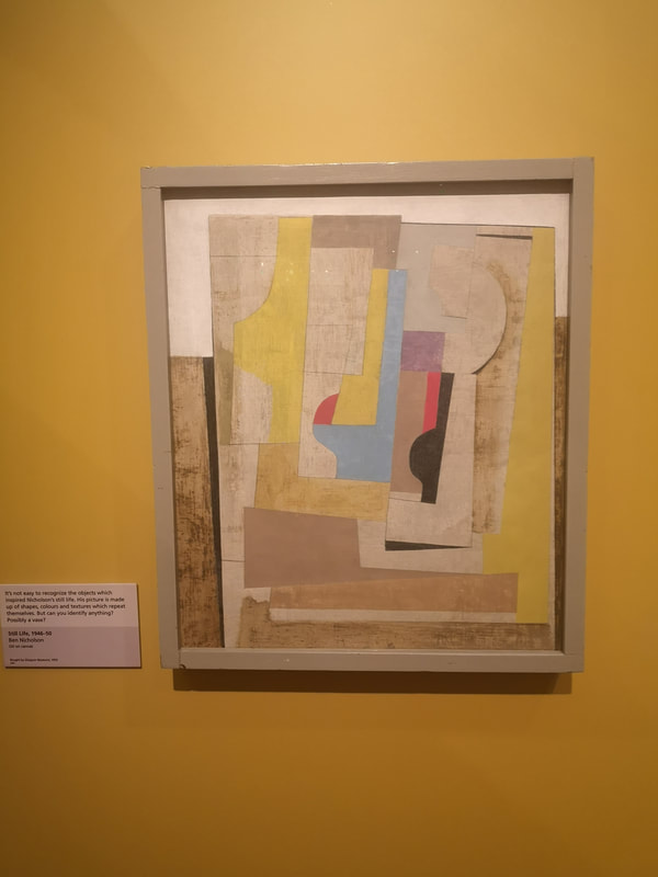
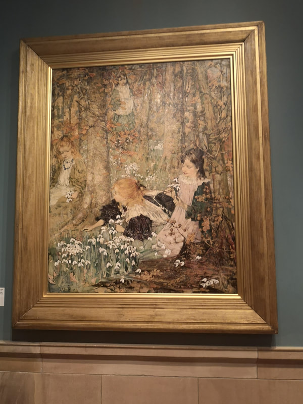
Before we leave the gold room is a Ben Nicholson Still Life (above left) with is a deconstructed vase. I reminds me again of an architecture design or drawing. The colours are quite restrained and cooling, giving a scientific air to the whole thing. I would not be surprised to find out that there was some complex formula behind the whole thing. Into the green room, which focuses on the Glasgow Boys. There were various paintings by the various members of that particular groupings but my favourite of them with this bitty barky style was E A Hornel. He seems to specialise in children in fairy type settings and my faovurite of those is the one above right. I particularly like the snow drops.
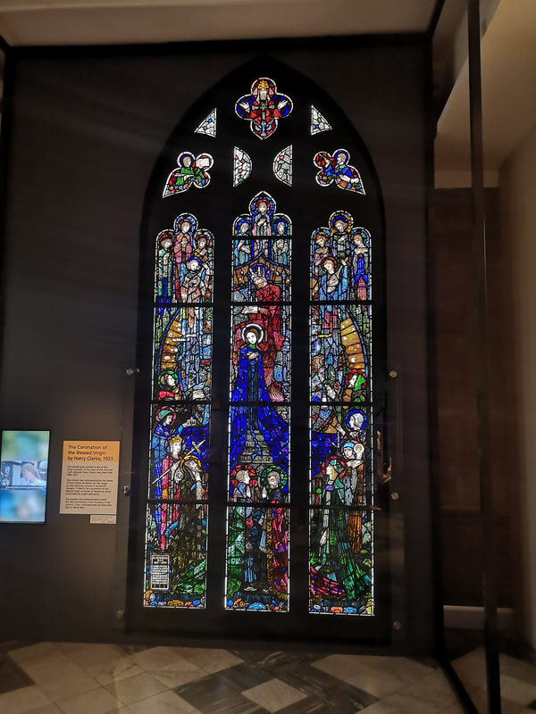
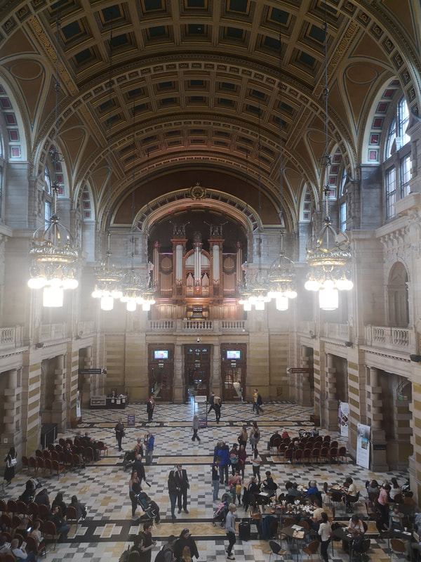
If you then ascend upstairs then there is a picture gallery running the length of the southern end of the Gallery, from it you can see the main hall (above right) which while I was there was being set up for an afternoon's organ recital. As well as paintings it contains a rather fine stained glass panel (above left).
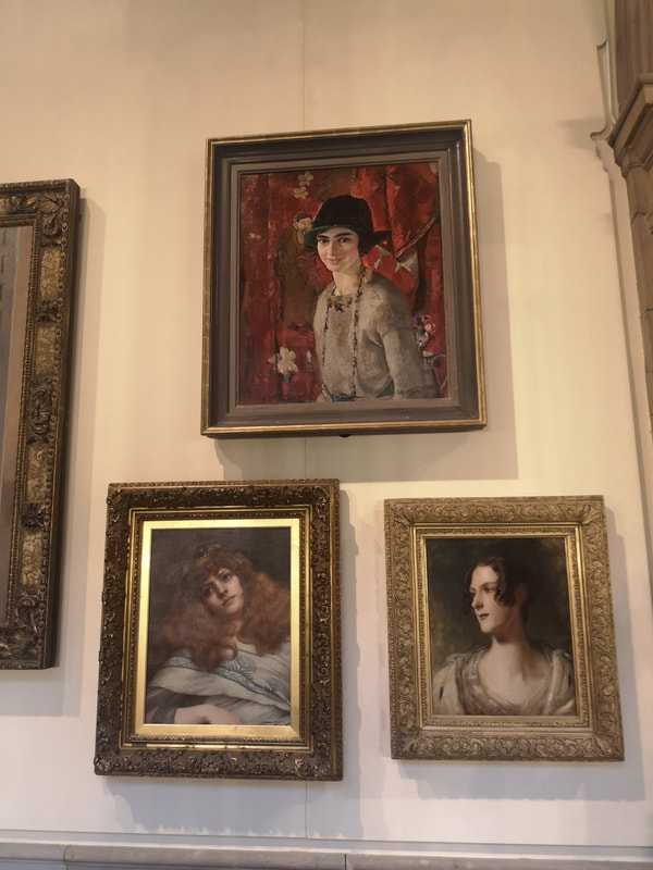
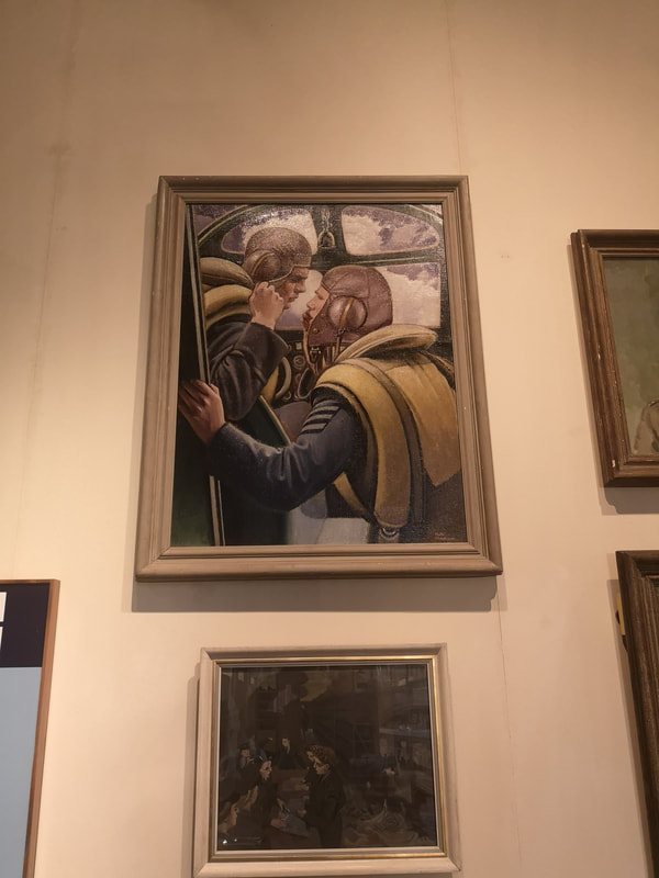
In said picture gallery there were a number of pictures that peaked my interest. These three pictures of women piqued my interest (above left). They are in clockwise from the top, the Artist's wife by William Hutchinson, A Lady by John Godward and Chritsina Mitchell McNeill by Thomas Duncan. It is the first of these I like, her somehow relaxed and intimate smile. It's a very warm picture and placing her against the folded red curtain makes her stand out. Pilot and Navigator Confer (above right) by Keith Henderson is an excellent war painting. Often the best war paintings don't actually show any violence. They show either the build up or the aftermath. The ones that actually show action tend to be far to propagandaish. Henderson's one is good. I like the intimacy between the two main figures.
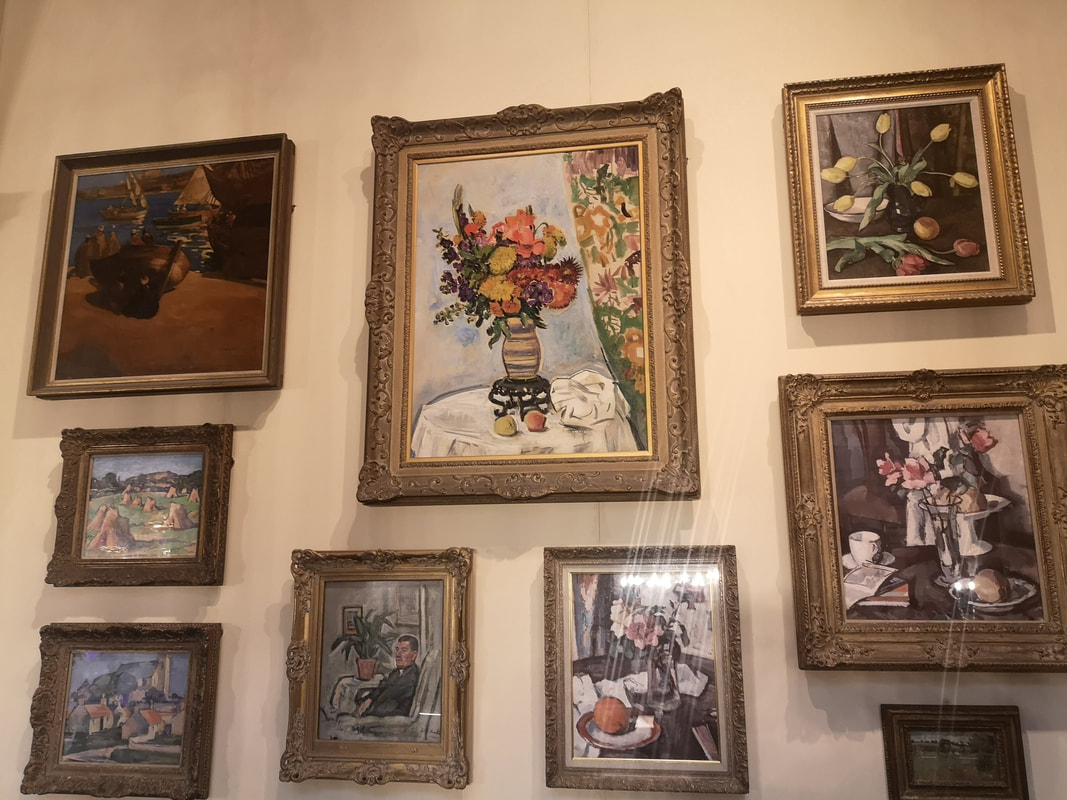
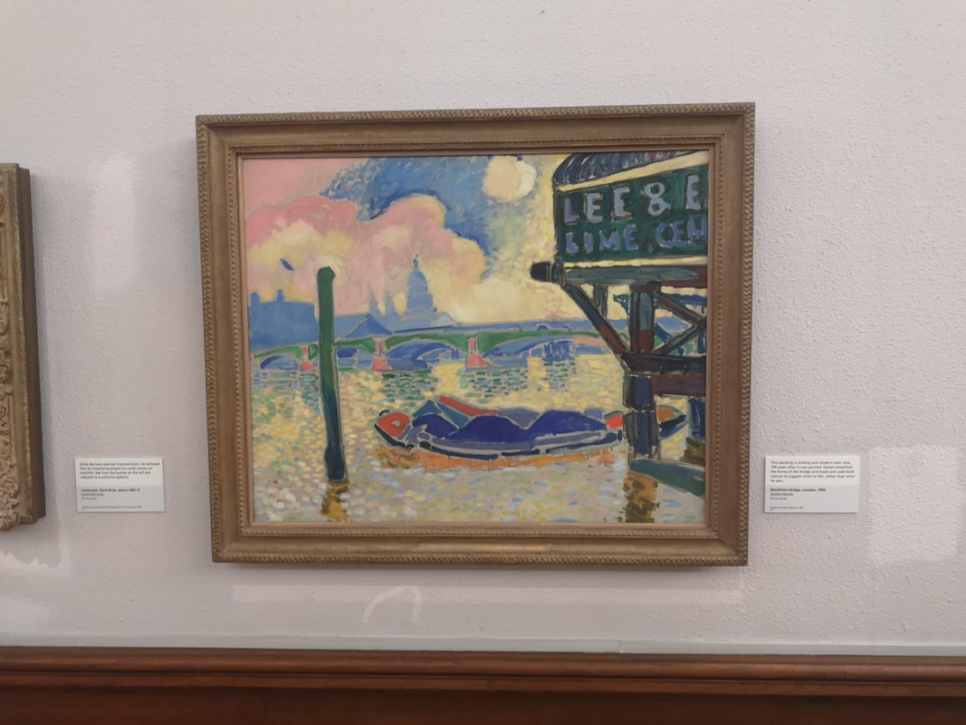
An array of still lives makes for a fine conurbation of painting above left). A combination of classical and more abstract. The top right one and the one below are by S J Peploe, one of the Glasgow boys. The spray of yellow tulips is particularly fine. Intricate and detailed and very eye catching is by Leslie Hunter. The way the curtain pattern reflects the central flower picture works well. As you circulate around the picture gallery you eventually end up in an impressive end gallery, packed full of Impressionists. Includes Monet, Pissaro, Matisse and various others. It is an eye catching bunch. I could do a whole post on just them, but they are also the kind of thing you could see in any gallery in the world. Instead I shall focus on one of my favourite and slightly lesser known Impressionists, Andre Dorain's Blackfriars Bridge (above right). The bridge itself barely features, instead you have that looming edifice in the foreground. I like that kind of thing and the way it plays against the luminous river is very good.
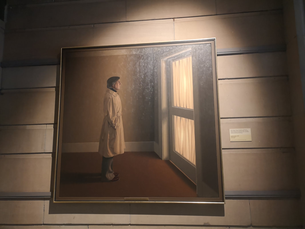
Is the figure waiting for someone to arrive or trying to muster the courage to go out. It is very good.
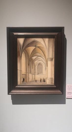
I have jumped ahead some what as there is a gallery of Dutch Masters (as well as a gallery of Scottish Colourists none of whom really grabbed me). This one (above left) is unusual for a Dutch Master being all light and interior. The arcs and the way they are rendered gives it an abstract air and the whole edifice dwarfs those tiny figures. It is called A Baptism in Saint Bavo's Haarlem by Pieter Saenredam, who I have to confess is a name new to me. There is of course much much more to be seen. It is well worth a visit. 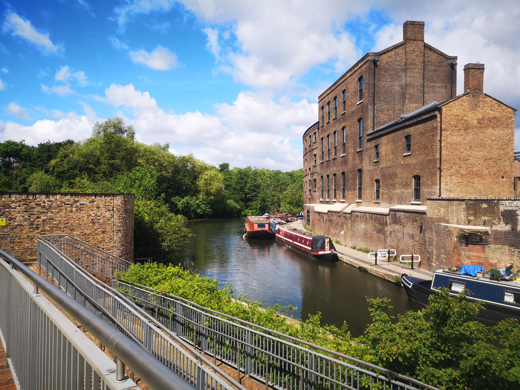 I talk a lot here about other people but I thought it was about time I spoke about me. Any suggestion that I have run out of exhibitions to talk about is a lie! It is a contistutional convention to take a break from exhibition reviews and there will be plenty of time to talk about them again. Anyway the subject for the paiting was the newly refurbished Coal Drops yard at Kings Cross (above). 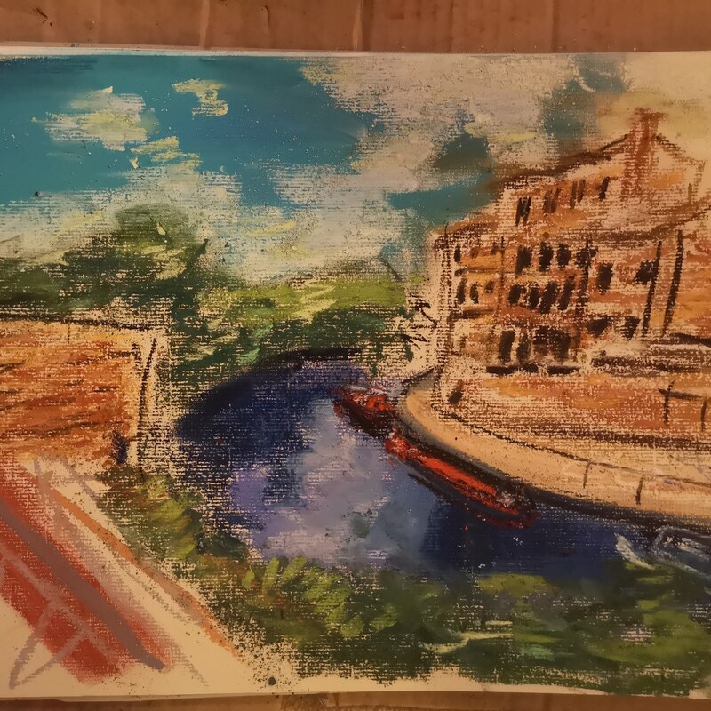 First off i tend to start with a sketch. In this case a pastel sketch. This tends to help with making a decision as to wether the paiting will work at all and if so what I should change or exclude. In this case it became apparent that the railings in the left foreground werre not going to work and shluld be excluded. 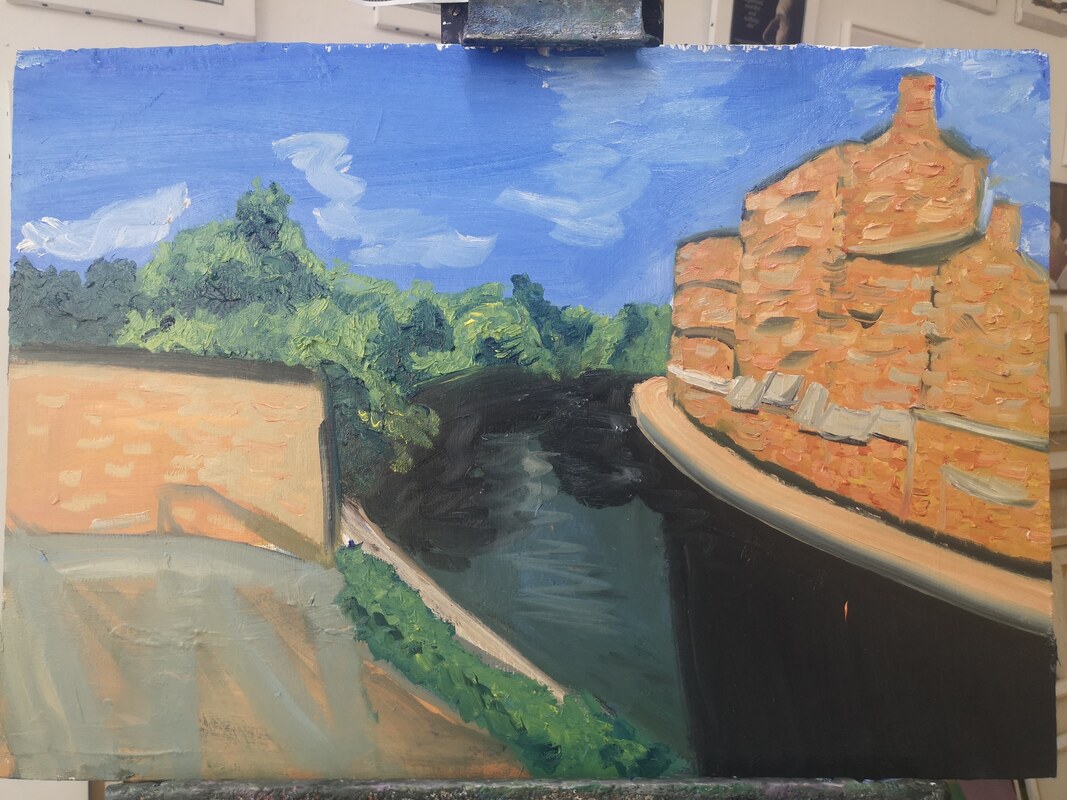 Then onto painting. I am painting on wood. 5 mm ply wood to be precise that i habe treated with 6 layers if gesso. I do not sand the gesso down as I lile the texture it gives. On the first session I block in the main shapes, add some texture and tone. A quick experiment confirmed that the railings would not work. 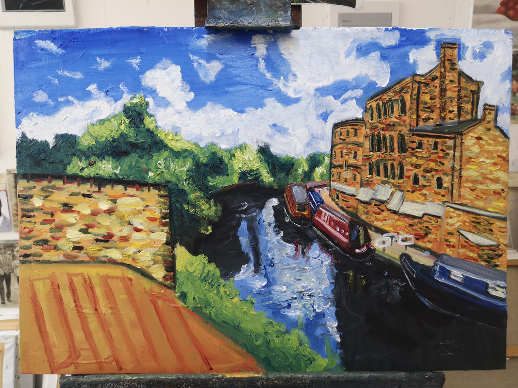 Then bulid it up. Bassically I work from the top down. Technically I work from the back of the image forward but this usually ends up being top down. I do several passes adding detail each time. 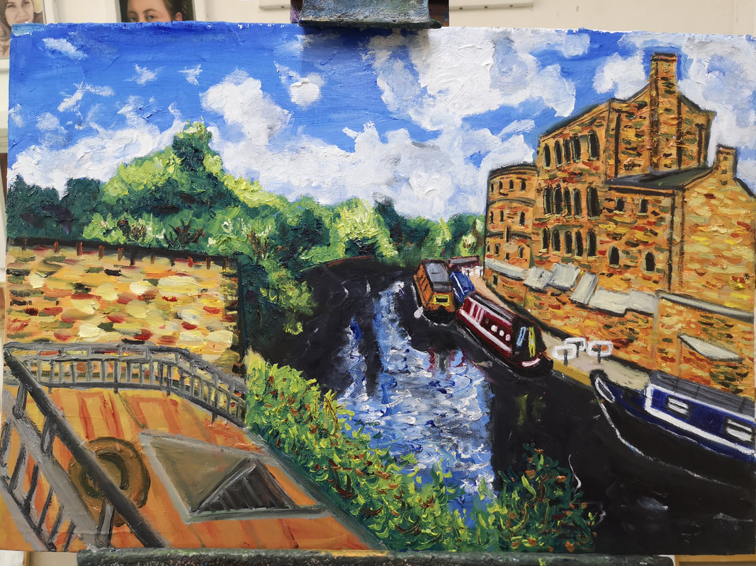 This continues until the major elements are all in place then I jump around the paintinf adding detail and changing things so it is a more balanced composition. 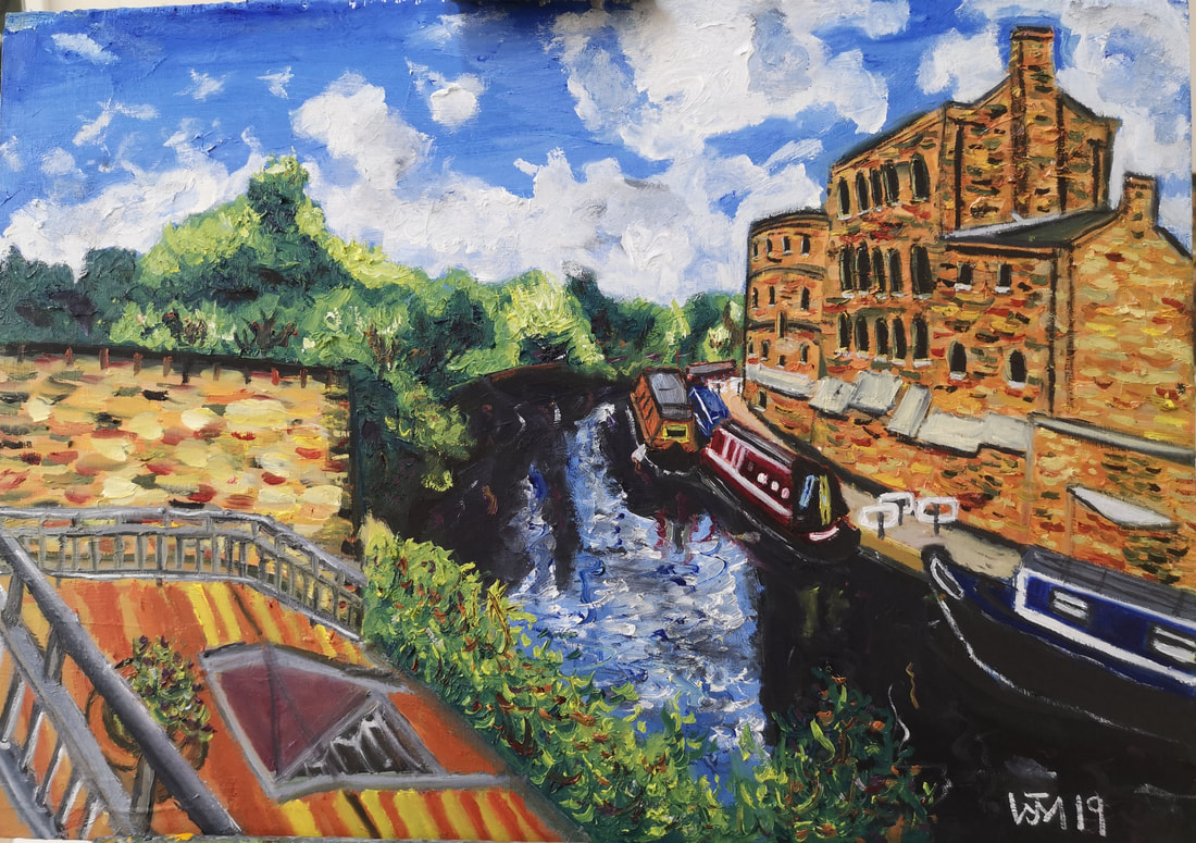 The finisjed version. An imagined left foreground which i like and reflects the boats that are accross the water. Flecks of orange have been added to the foliage and grey to the sky. I was paeticularly pleased with the houseboats in this one. What do you think?
|
Archives
June 2024
Categories |
 RSS Feed