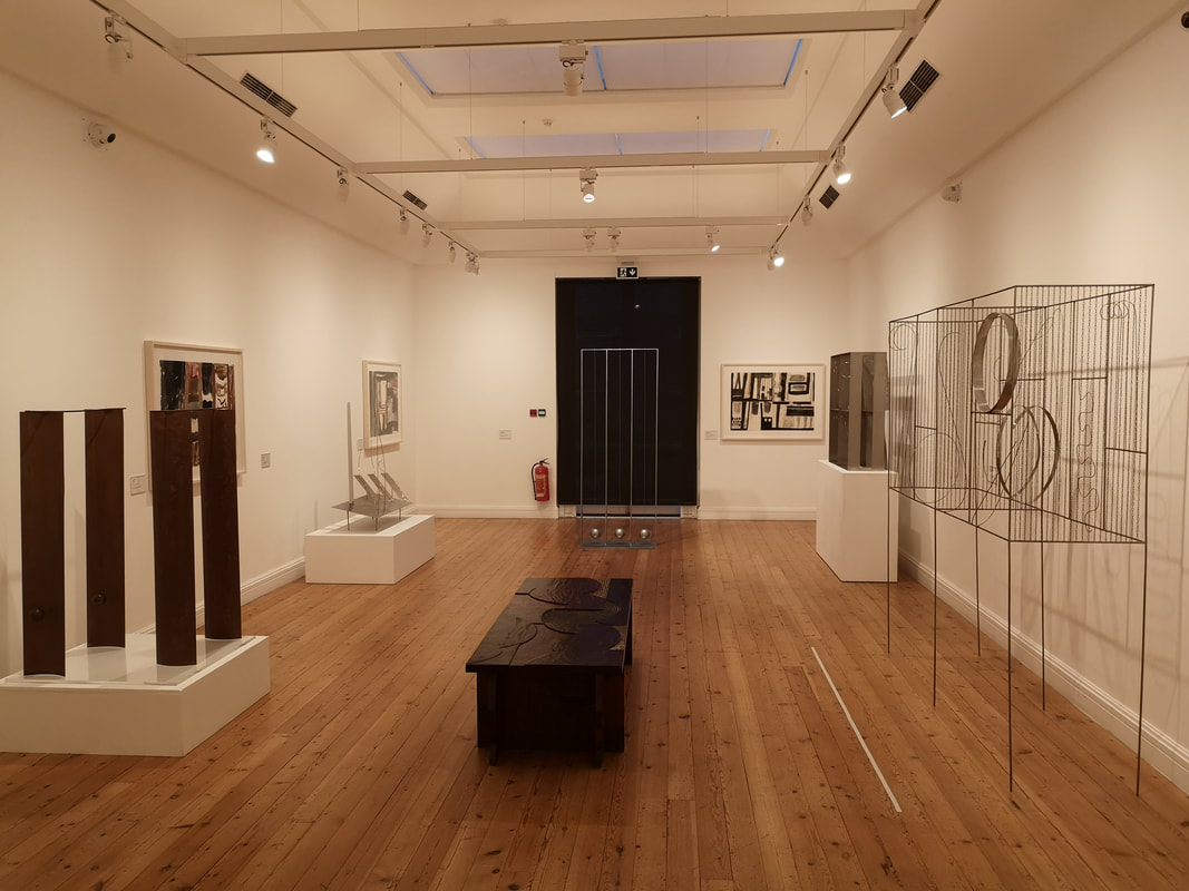
 Ever heard of Fausto Melotti? Neither had I before Friday when I popped into the Estorick to see their exhibition of his work. He is apparently quite famous in Italy but not that well known here. The Melotti show is quite small, occupying only the two galleries on the ground floor but I enjoyed in. I always like discovering artists who are new to me. The permanent exhibition at the Estorick is also good and worthwhile trotting round while you are there.
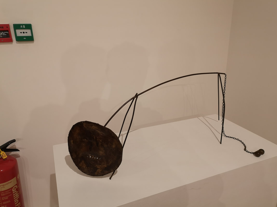
Melotti's work, as displayed at the Estorick can basically be divided into two. Work on paper, often involving pastels and burn marks and usually as a study for a final sculpture, and the sculpture themselves which usually involve thin dangly pieces of metal such as the one above right which is called the Lion. You can't really see in the photo but the head is just a battered round disk in a smiley face in it. This and the floppy tail with the two balls on the end make for an absurd construction, especially when married with the name. I new when I saw this that Melotti and I were going to get on. I like an artists with a sense of humour.
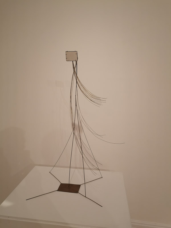
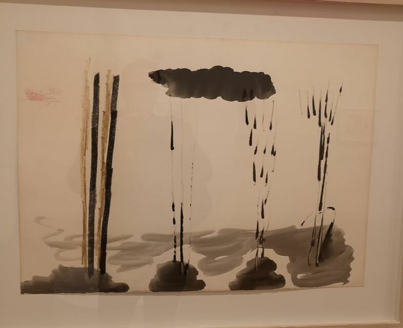
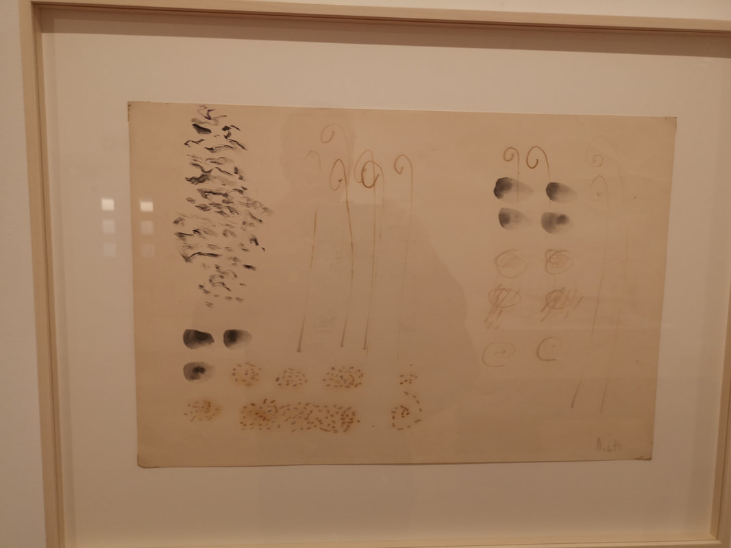
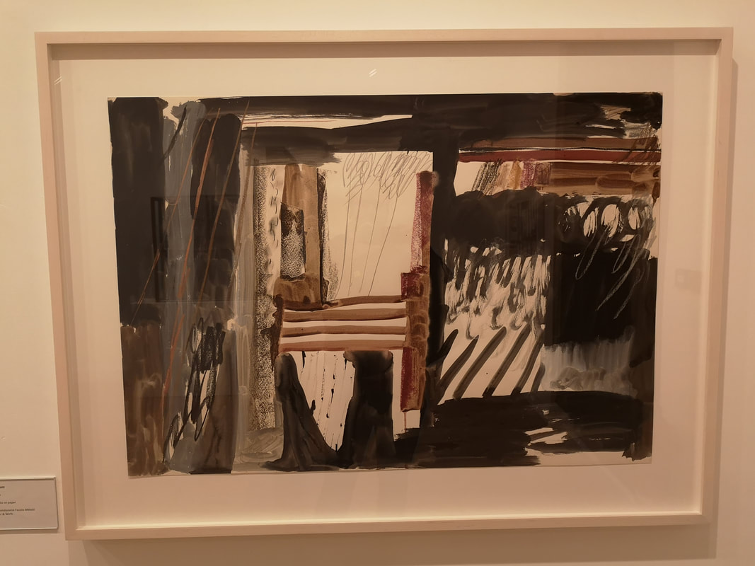
This fine structure above left looks, with i thin strands of wire curving off to one side, like a waif like figure, possibly a little to fond of new romantic music, striding through the wind. The square at the top, reminiscent of the head, is in fact a mirror. You have to crouch a little to make yourself appear in it and there is no doubt something deeply psychological going on behind its construction but I just find it quite joyful. Demonstrating the other side of Melotti's work are two sketches (above right), are they sketches? What ever they are I like them. The top one was done in memorial to a friend of his and those clutch of bamboo like sticks together with the black rain give a real sense of sadness. He has achieved here the simplicity I like in Japanese, Chinese and Korean ink paintings, of which these reminded me. The one below it, the thicker dark marks are produced by burning the paper slightly. I like the feel they give and may try doing this myself (and perhaps burn the house down in the process who knows). In the same room as these, was a much more vibrant painting with burn marks housing colourful pastel sketches. It was good, but I prefer Melotti's more monochrome works.
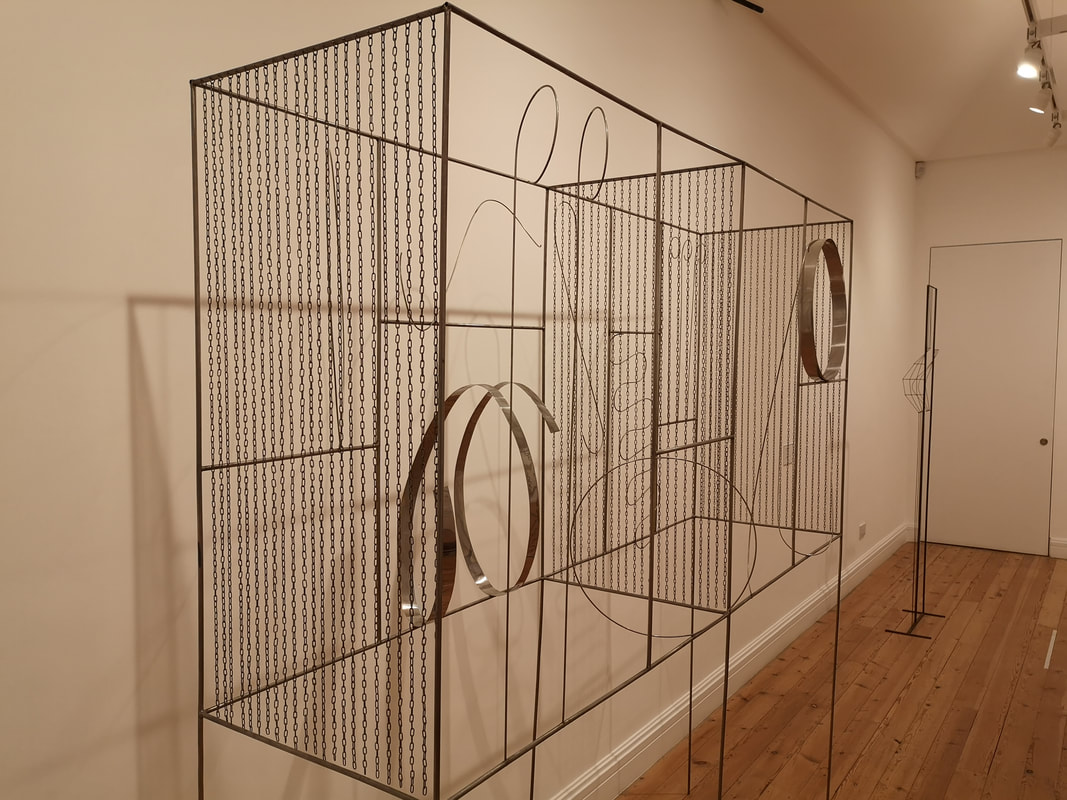
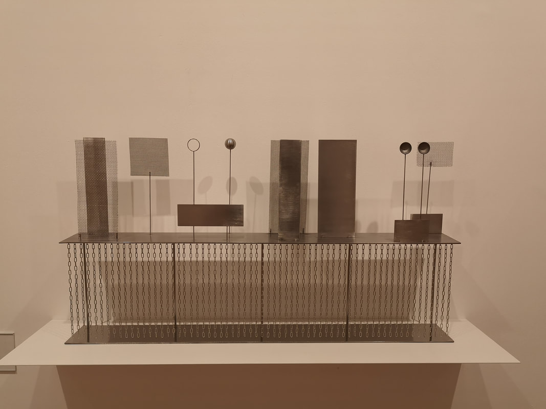
The second room had much more substantial sculptures in it that reminded me of Mona Hatoum (only the wire is not barbed), and I wonder if he inspired her (he lived before her). So you have these large cage like structure with these dangling slight chains on either side and in the middle (above left). They aren't attached at the bottom so sway slightly in any breeze. Contained within them are these thin wire curved shapes, and thicker metal curved shapes. They all have names like counterpoint. My favourite piece in the whole show was somewhat smaller (above right). I wondered if it was a mock up of something bigger. It look a little like an elaborate machine, like something they would use to communicate with on Blake's 7. Again you have the dangly wires but I enjoy the various elements play of each other, with shadows falling on gauze behind those hemispheres. Also reminded me of chemistry experiments I used to do in an earlier life. I kept coming back to this one again and again.
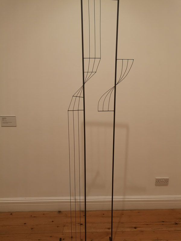
The three slender wires, particularly when they cross over the thicker one, remind me of musical staves and I am left with the impression I am looking at the essence of an instrument, possibly two. A chello and a violin perhaps.
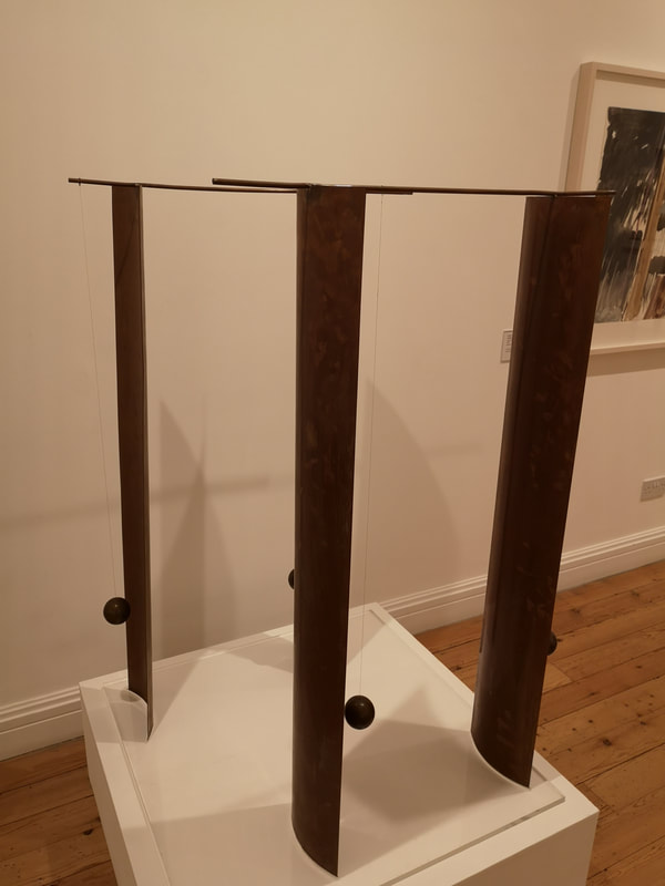
There were also two pendulum based pieces. If you look at the first picture in the blog you can see a large steel one, with three pendulums hanging down. If you sweep past them at sufficient speed they will oscillate for you (and pleasingly while I was there a small bird would tweet just outside the window every time I did this). The other one is done in brass I think it is (above right) and I do like the deep browny-goldy glow of brass. Set in pairs facing opposite directions it is a very pretty and quite thing. There were other pieces I haven't shown. It is an interesting show. It is a calmer more cerebral form of art Melotti's. It doesn't shout at you, it invites you in (for the most part) and causes you to write drivel when you think about it afterwards. After you have been round the show though go round the rest of the show. My current favourite piece in it is this one below. 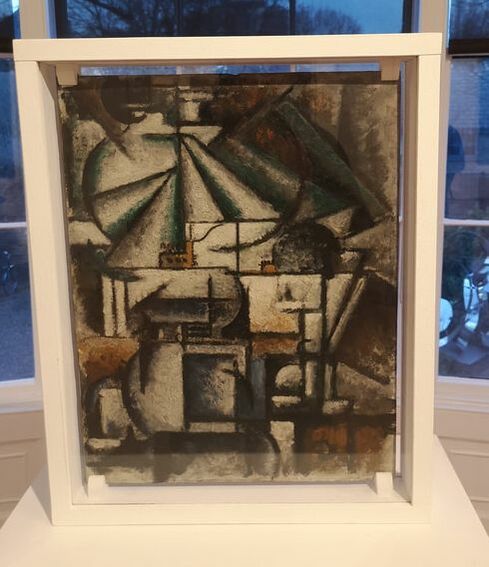 Incidentally, you only have another week to see one of pieces in a show at the Indo bar. Go along. Buy it.
0 Comments
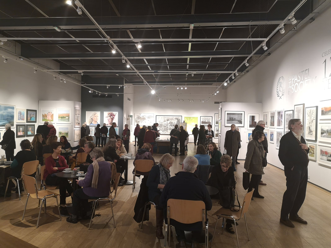
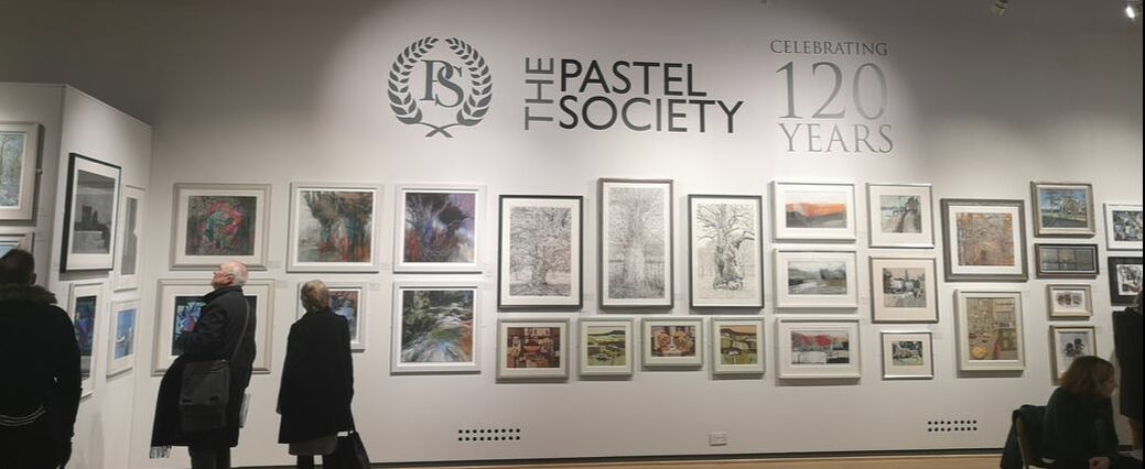 Until 16th February the Pastel Society is having its annual show at the Mall Galleries. This time they are celebrating their 120 years. So by the time you read this you'll have missed it which is a shame as it is a pretty good show. Tastefully hung and well arranged, as typified by the main wall, with their pleasing and attractive logo. In the main room as you can see the exhibition had clustered works by the same artist together. This works well and makes for a cohesive and impressive display.
I went on a Wednesday lunch time and there were a fair few people in the show. At one end of the hall on a series of benches was a demonstration area. While I was there it was covered in various sketch books, watercolour, pastels and pencil. It brought a different dimension to the show. Sadly I couldn't stay for the demonstration.
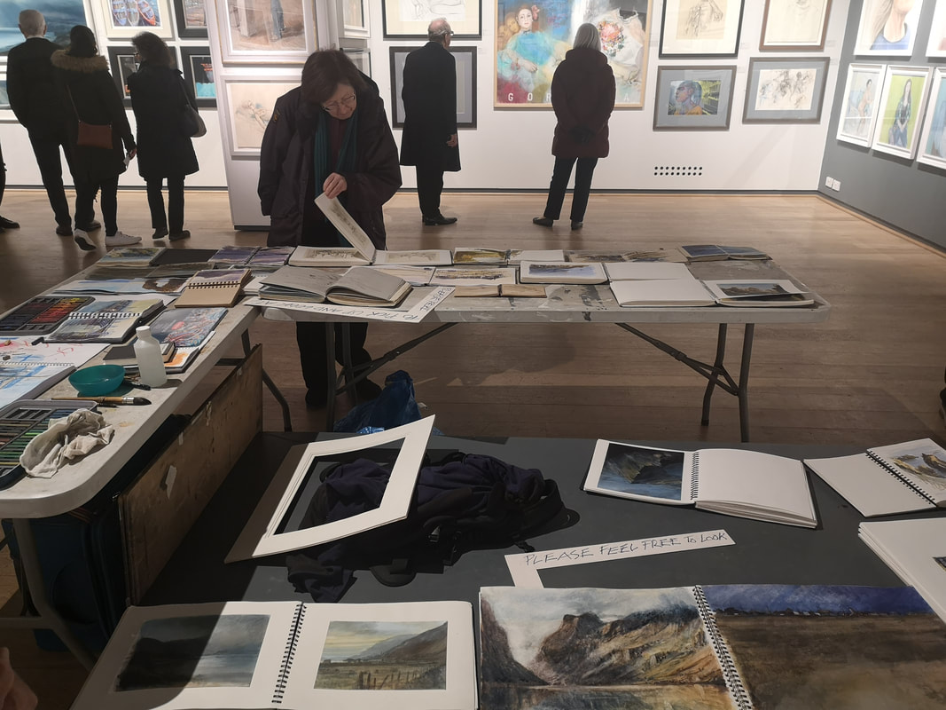
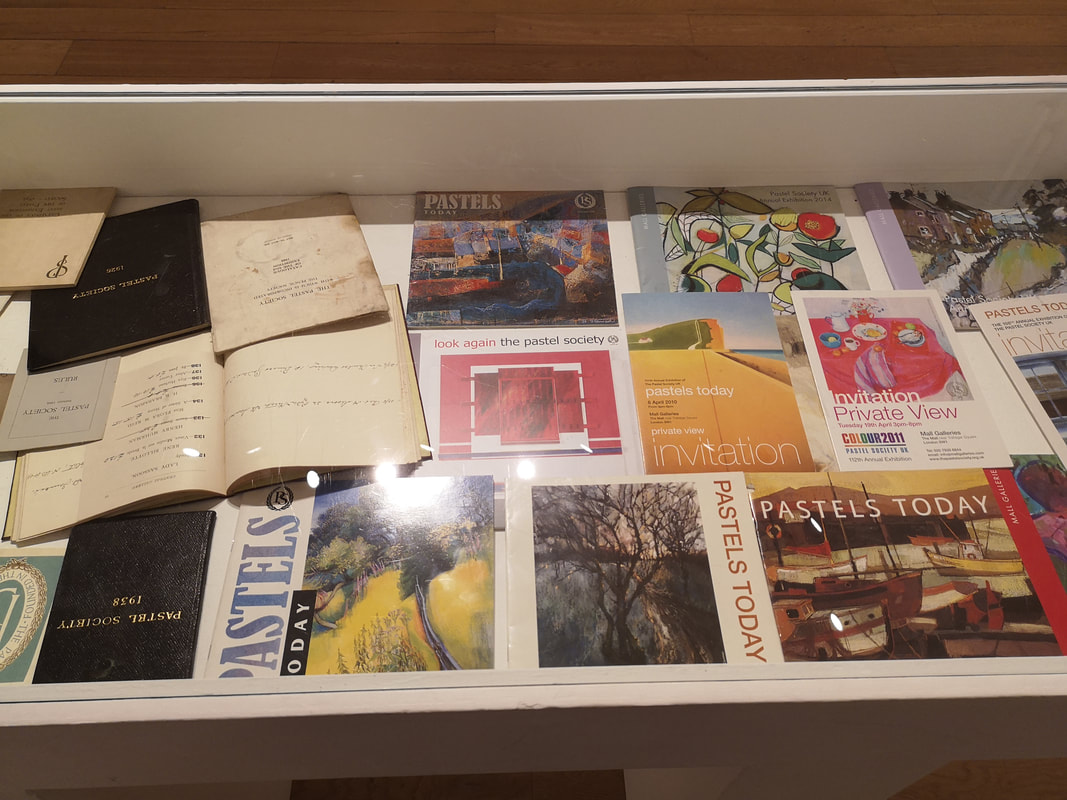
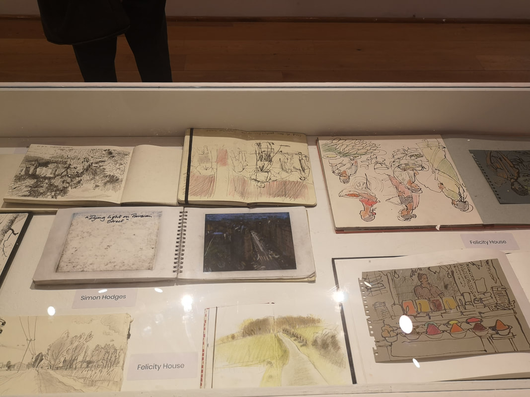
2 quite interesting display cases were in the North Gallery. It being an anniversary show this was subtly celebrated by a collection of historic catalogues (above left). IN the other another series of sketch books (above right).
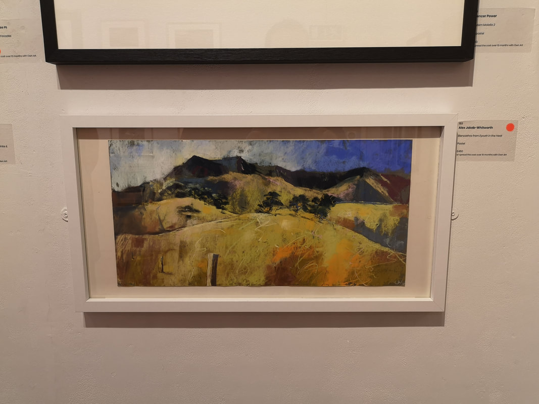
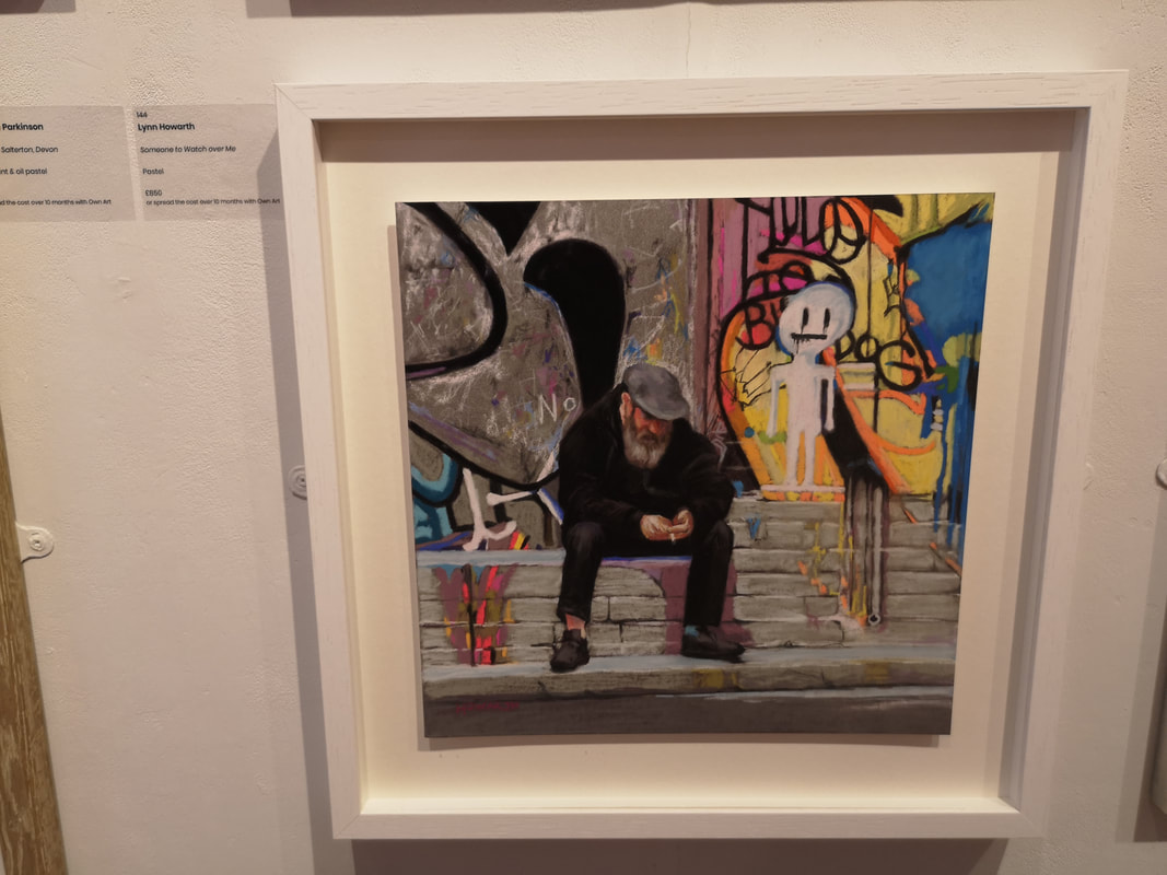
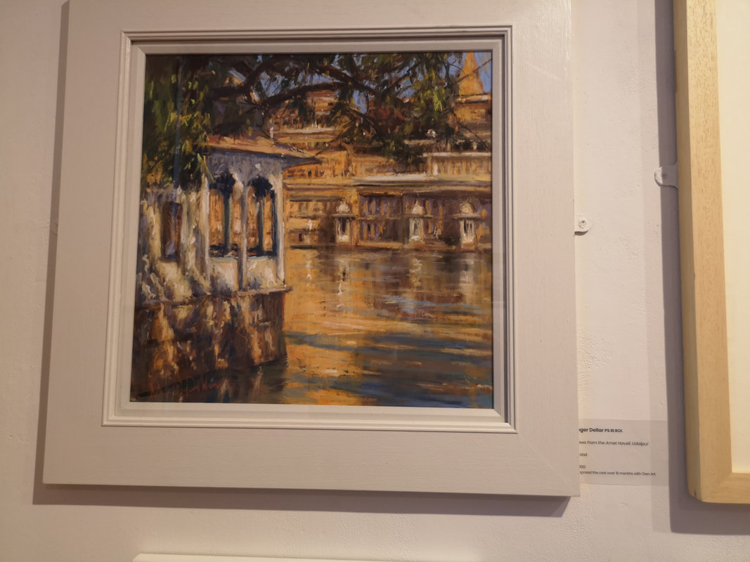
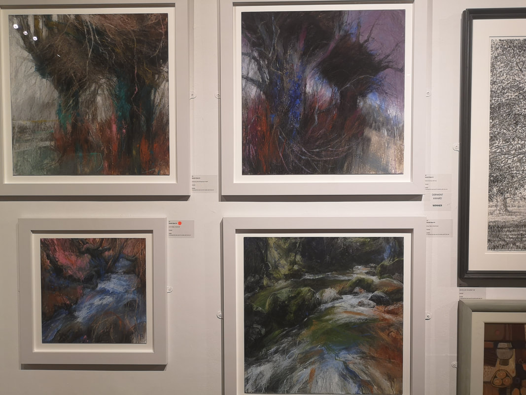
Now onto the painting. I started a the back of the North gallery and made my way south to the main gallery (if you know the Mall Galleries there is also the Threadneadle space but the pastel exhibition did not use this space). First out of stocks is Alex Jacob-Whitworth with Blencathra from Eycott in the Heat which is a fair mouthfull of a title (above left) . I like the scratchy quality to it which gives a good feeling of dryness and heat. The dark hills in the background create a good sense of depth. Pastel is often perceived as a twee medium. It is nice then to see pieces that subvert this expectation. Lyn Howarth does this very well in Someone to Watch over me (above right) with and almost photo-realistic depiction of a tramp sitting in front of a graffitied wall. The texture of his beard is particularly pleasing.
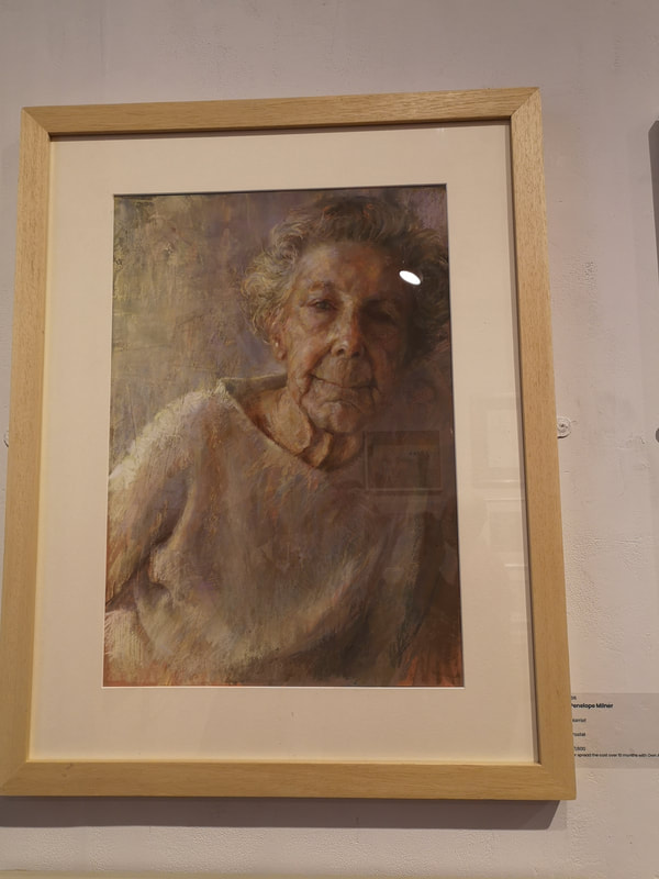
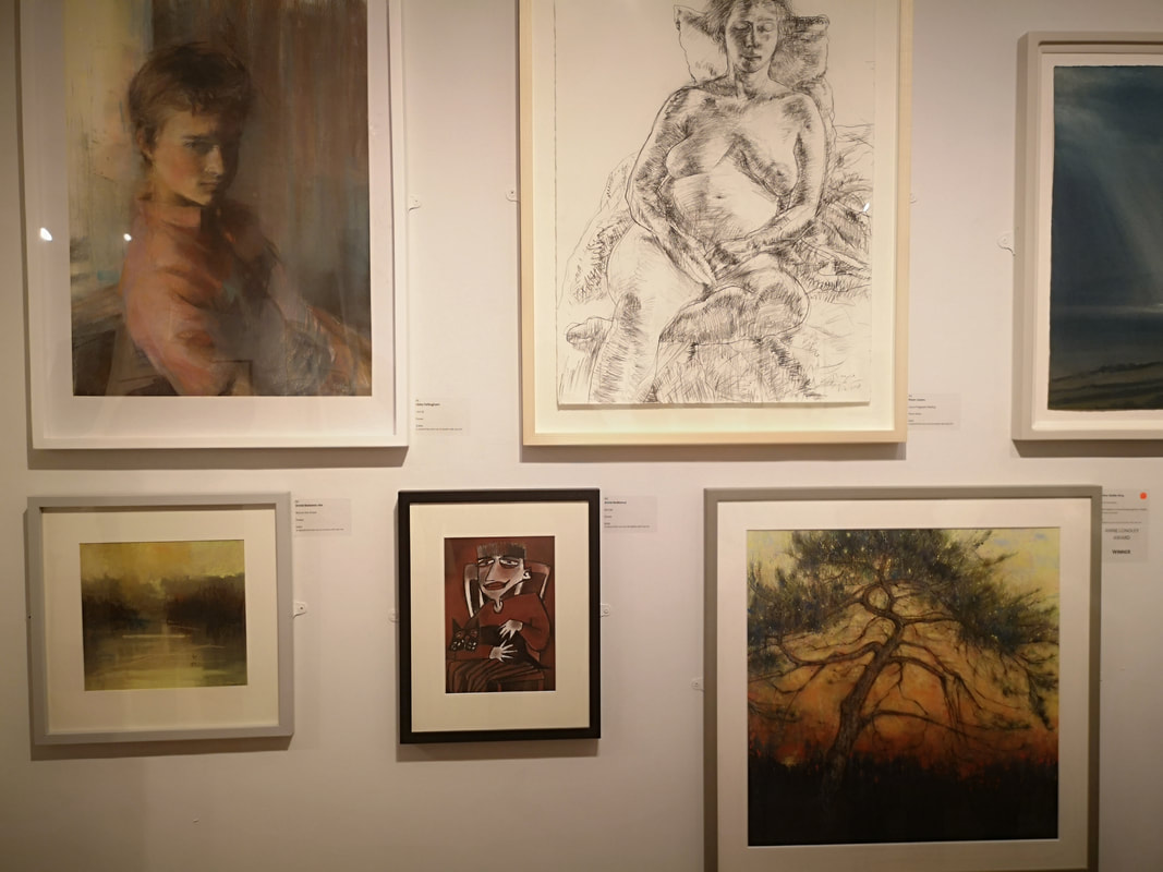
There were quite a few portraits in the show. I think about 10. Two have made it into this blog and the one above right, the portrait of Harriet by Penelope Milner. There is an intimate softness to the portrait, a real affection that the use of pastels highlights rather wonderfully. The off kilter stance of the subject makes this portrait slightly different, as though she is leaning towards you. It is beautifully rendered, and rather lovely.
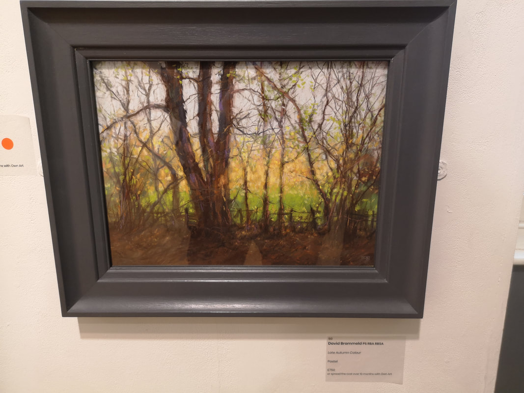
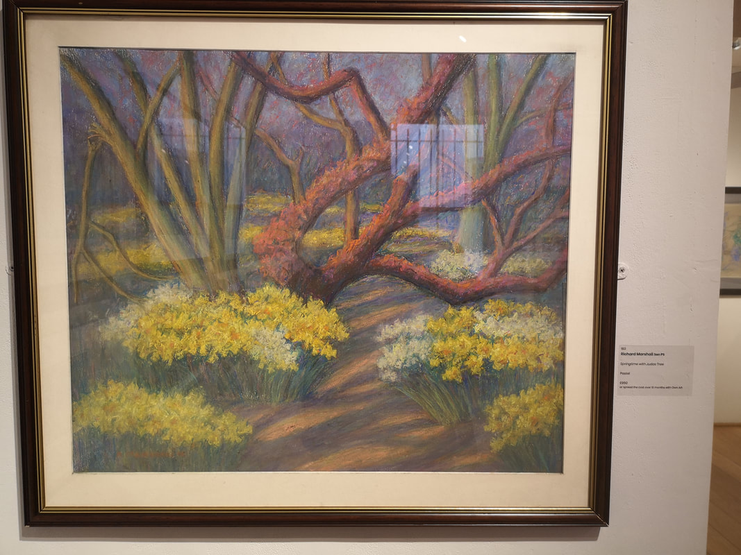
As previously intimated you can't review pastel show without encountering landscapes, and particularly foliage, it is after all a subject matter that plays to pastels strengths. Of the various treescapes, I have chosen two of my most favourites. David Brammeld's Autumn Colour (above left) is exactly that, strong dark trees against soft yellow and green. At the other end of the seasonal scales is Richard Marshall's Springtime with Judas Tree (above right). Lovely and light, a spring morning. The tree has a nice sculptural aspect with nice strong shadows on the underside, and those thick field of daffodils. Very nice. I do like that tree.
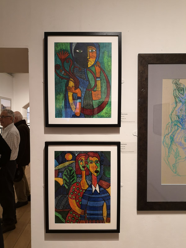
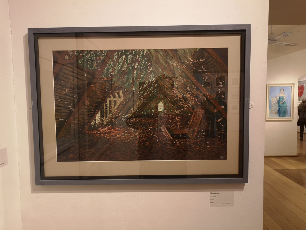
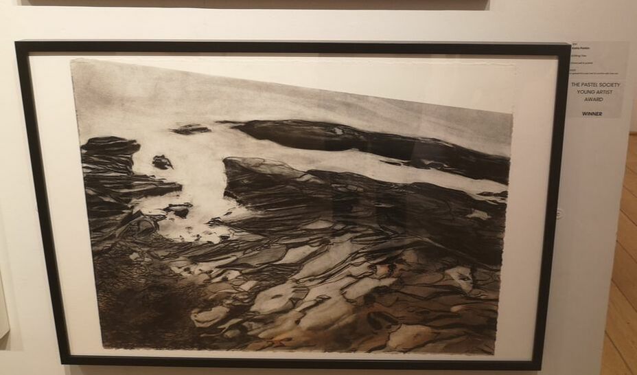
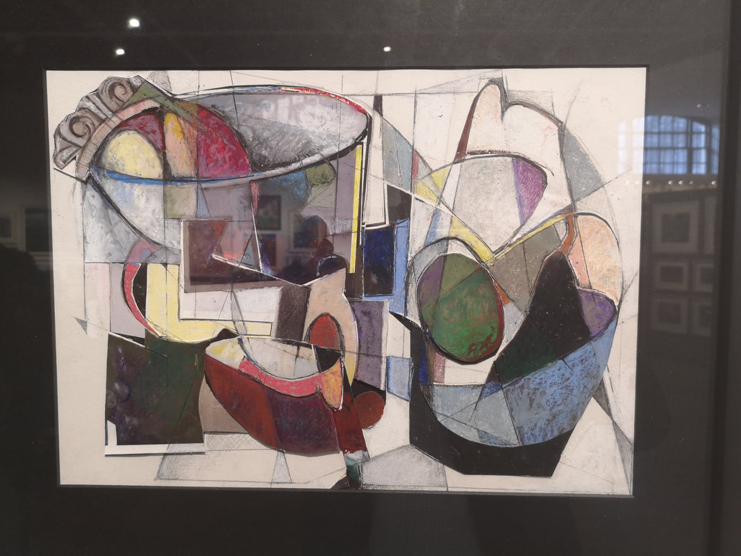
Back to abstraction, with these multi-coloured portraits both by Jocelyn Rossiter (above left). They have similar motifs with the fronds in the bottom picture and the red hand emanating fronds in the top one. I prefer the top one I think. It seems to have more going on, the birdlike neck and torso and the divided head, against that emerald green background. No, I definitely prefer the top one. Who doesn't like an abandoned building? Only monsters and Tom Walker's Automatic (why is it called automatic, who knows? - above right - top) is a lovely deserted attic fall of swirling autumnal leaves, the tree canopy visible through the roof. The small door at the end helps establish perspective. So far its all been colour so Katie Parkin's Shifting Tide is a beautiful calm technically superb piece and the deserving winner of The Pastel Society Young Artist Award. It is in fact not entirely charcoal with red pastel give tone and warmth and indeed establishing a sheen and wet feeling to the rocks. Very nice.
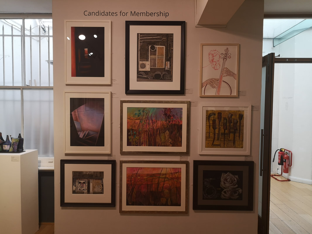
The north Gallery has then (or rather had, by the time you read this blog the show will have finished, never mind, try going next year?) a fine diverse display of paintings. Some of them (such as that umber autumn tree in the bottom right of the above left picture) built up in interesting ways, using some kind of gesso related magic. There was also one wall dedicated to candidates for membership (above right), which showed to me at any rate that the future of the society looks fairly strong.
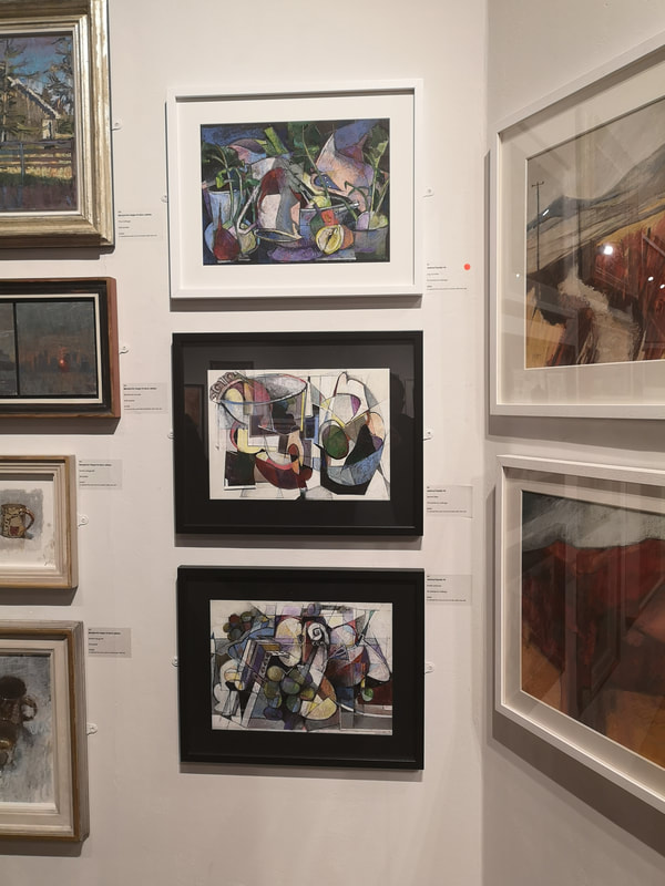
I like all three, but I think the bottom two work better, against the white background. They have a slightly 3d effect and when I looked closer, and hopefully you can see on the individual shot, this is because the shapes have been cut out, pastelled separately and then collaged together to form the final image. Good idea, done well. Had I had any money at the time I went to the show, the one painting I would have bought is Secret Pear.
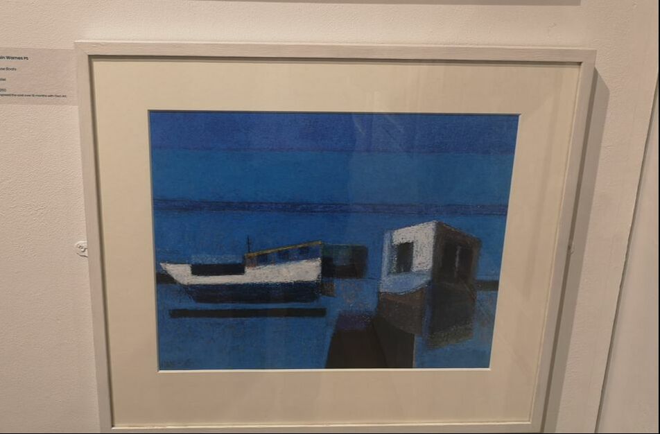
Landscapes now and starting off with two very different contrasting styles. First and arrangement in blue and white (above left) Robin Warnes' House Boats. A very calming and meditative pieces. It took me a while to realise that the building on the right is a house boat, front on, the composition presumably a deliberate play on the words house boat. I also like the way the main boat is floating on the water, with that strong line of shadow hovering underneath. Very different, a riot of colour and noise and aggresive pastel marks are the quartets of forest scenes by Sarah Bee (above right). Her style creates a wonderful impression of raging storms, and gusting winds. It is particularly well suited to rushing water, which is why I think here bottom two pieces are the more effective and the ones I prefer.
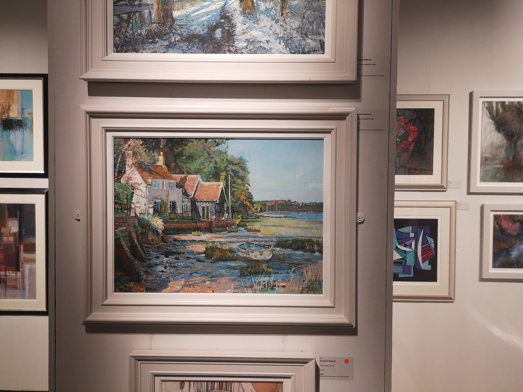
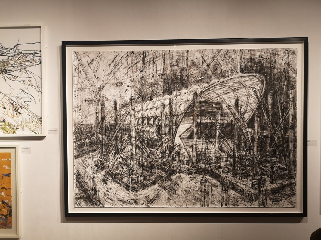
As alluded to previously there is a certain style of landscape that one instantly thinks of when the work pastel is mentioned. Colourful. pastoral, perhaps slightly twee. There is a reason for this in that pastels, particularly soft pastels lend themselves to producing this kind of work. Actually I quite like this kind of landscape if done well, and the best example of it in this show at least is Margaret Glass' landscape, Seashore Shade, Pin Mill (above left). The building is very well rendered and provides a focal point that draws you in, and the contrasts and dappled light on the beach and particularly in the foreground are very pleasing. The bank of trees give a slight sense of menace which stops the picture from just being a twee beach scene. Completely, different, massive, dominating the far wall and immediately capturing your eye when you enter the Mall Gallery is Jeanette Barnes' Crossrail Station Canary Wharf (above right). Barnes had been especially invited to exhibit in this show, and I can see why. Done entirely in Conte crayon the swirling lines not only give a nice rendition of the new station but also a sense of its ongoing construction. I like this and at £13,500 it is probably the most expensive thing in the show. It also shows what you can achieve purely in monochrome.
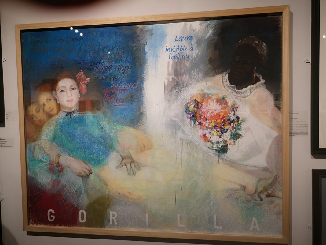
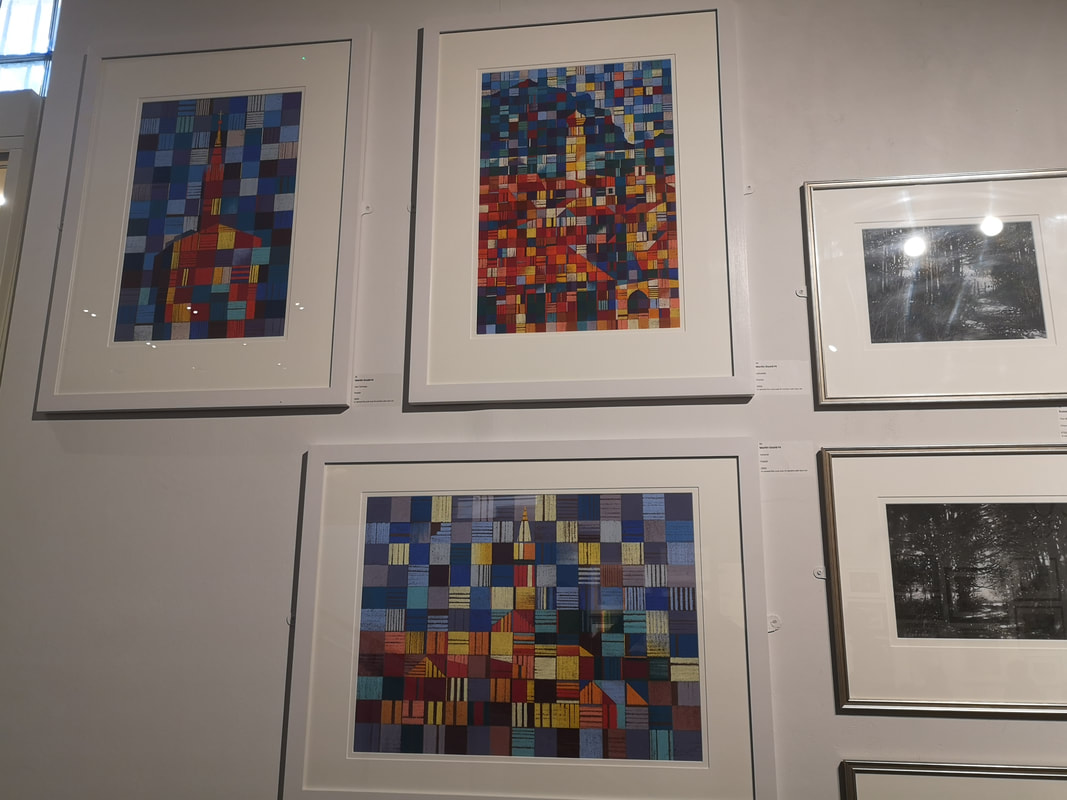
There was also in the main gallery a section dedicated to portraiture, of which the most compelling was the slightly disturbingly titled Gorilla by Brian Dunce (above left). It is a montage of three reclining white women on the left and divided by this shaft of white, a black lady conveying a bright bunch of flowers. The whole thing is rendered in lovely glowing detail, with the qualities of pastel used to stunning effect. There are various comments in French on it. I have my own conclusions as to the meaning of the title along with the subject matter but I will let you draw yours. It is a lovely painting though. Abstract, colourful, reminding me slightly of Paul Klee, are these three very enticing visual feasts, of various churches by Martin Goold (above right). None of the squares are solid colours but either shade from one tone to another, or are like small squares of bright tartan with differing colours intersected by lines.
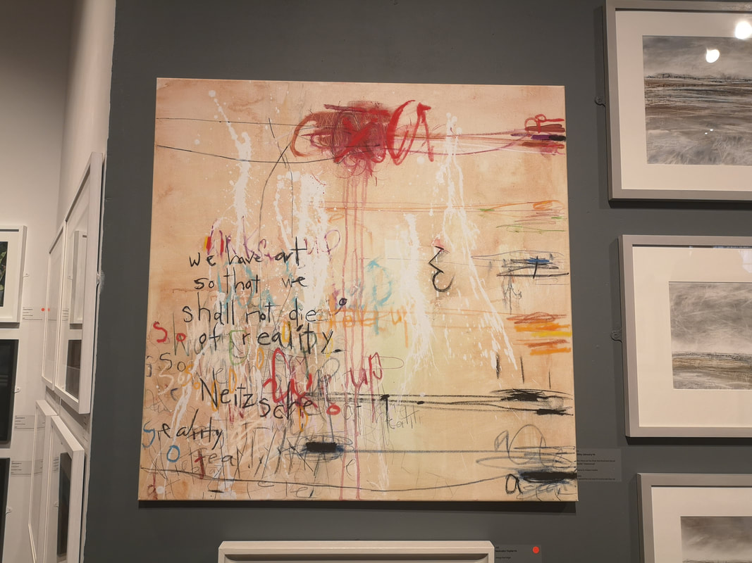
We are coming to the end now so I will leave you with two very different pieces. One is riotous agit-art type construction of aggressive lines and scratches out and graffiti like writing (above left). It has a terribly pretentious title which I refuse to repeat and frankly slightly spoiled what I had initially viewed as an interesting striking use of pastel, by Libby January .
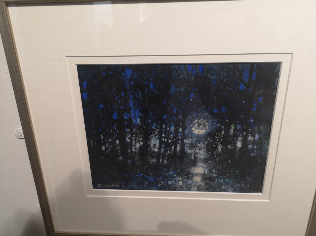
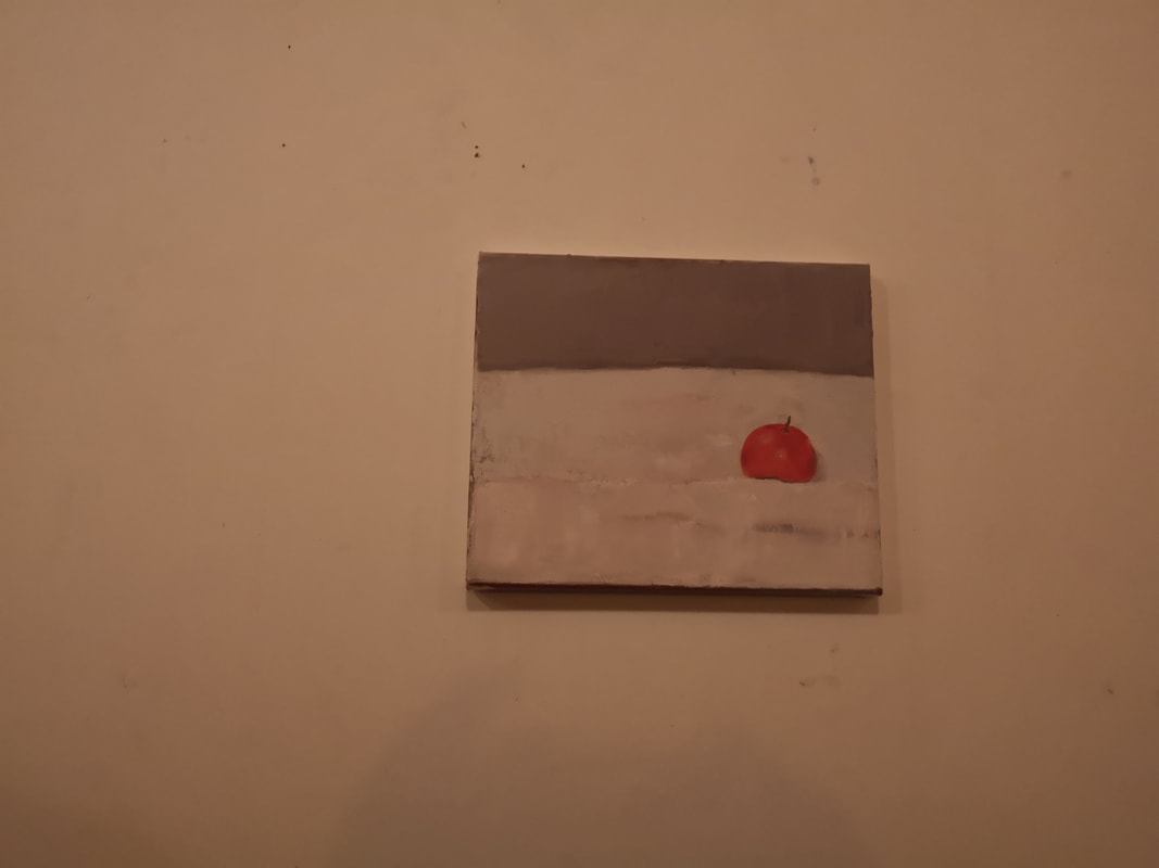
The other, was also a contender for painting I would have bought had I any money is simply called Moon by Susan Dakakni (above right). Lovely isn't it? Just to remind you I am in a show at the Indo Bar until the end of the month. Go and have a look.
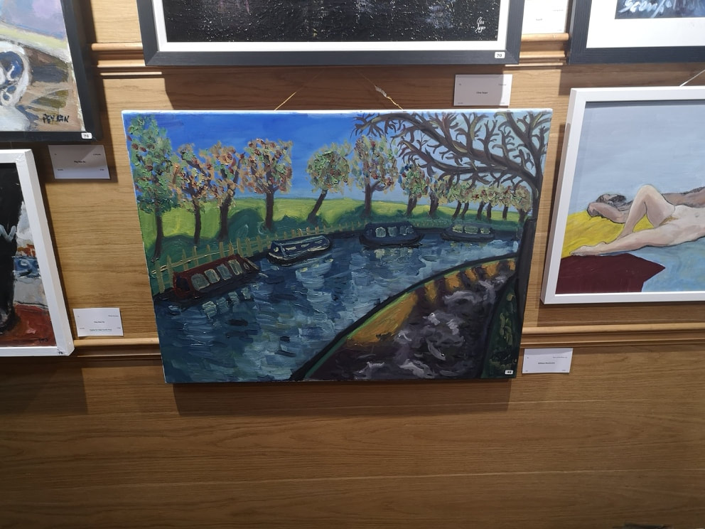
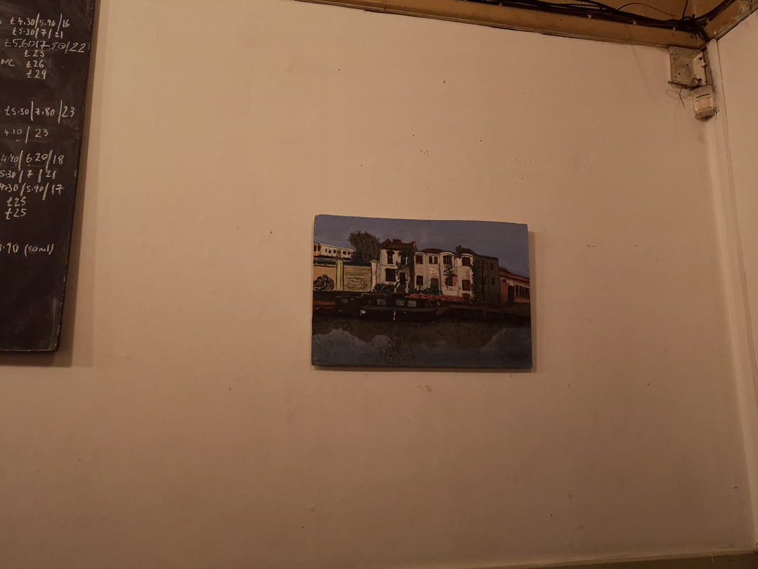
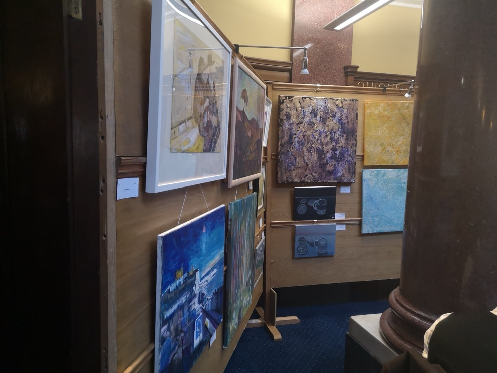
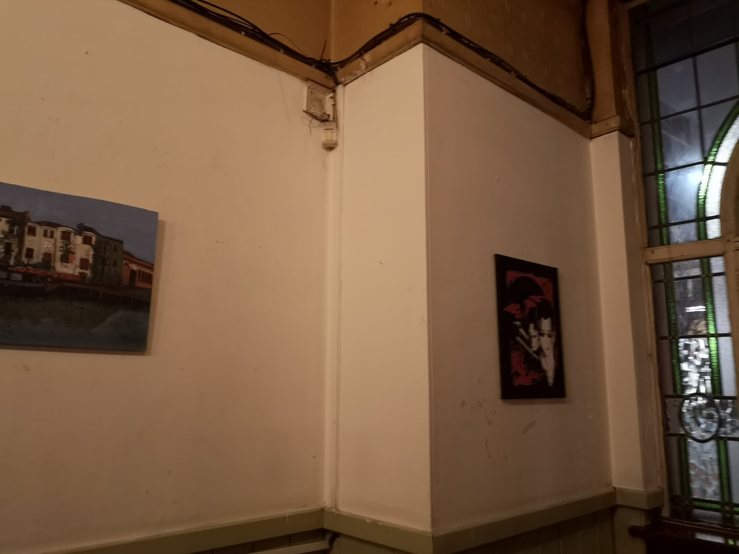
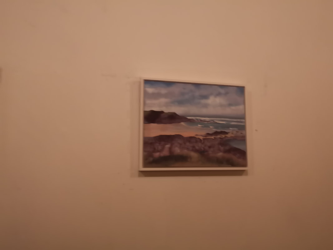
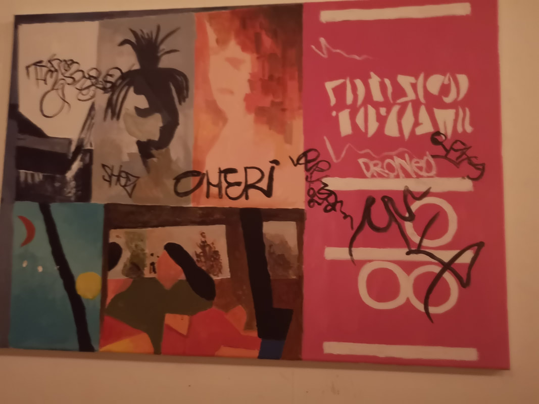
The beginning of the year has kicked off with two group shows for me. The Law Society Art Group, which comes round every year, and a group show at the Indo Bar of those from the Mendes stable. I had three works in the former (of which Tree over the River Lee above left was the biggest) and one in the latter (above right). It is interesting for me as the Indo show work was produce about 9 months after the ones in the Law Society Show but I was pleased to see a great increase in quality.
doesn't really do the work justice. Also I chose 4 very different works this year, which meant they were separated throughout the show. I think next year I will choose 4 that are thematically similar in the hope that they will be hung together and make more of an impact.
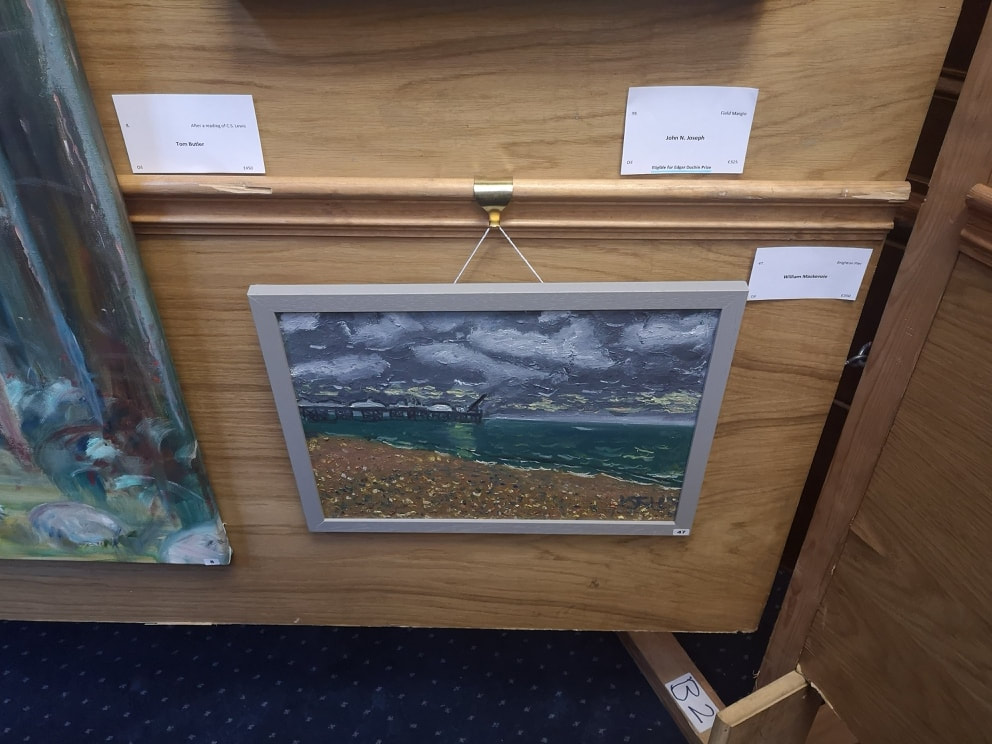
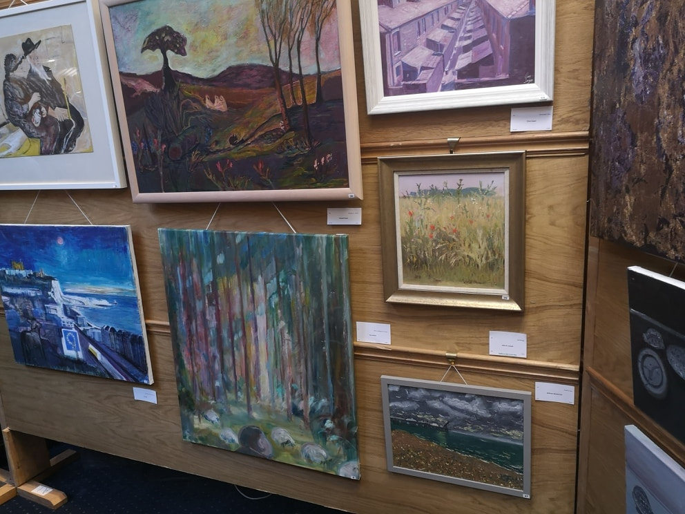
There was some good quality stuff on display, I particularly liked the wall above left where I thought my Brighton painting was in good company with some large powerful landscapes. The fact it was hung lower than them though meant it was difficult to see. Also as you can see from above right it was behind a pillar. Still these are minor gripes. It was quite a good show and I shall of course go in again next year.
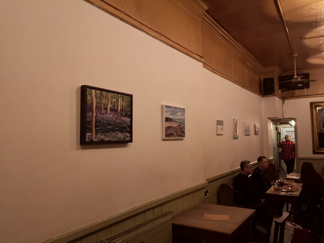
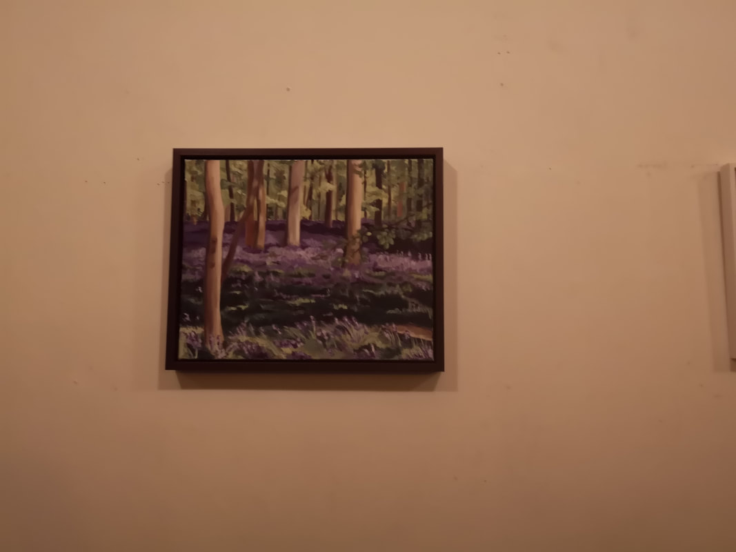
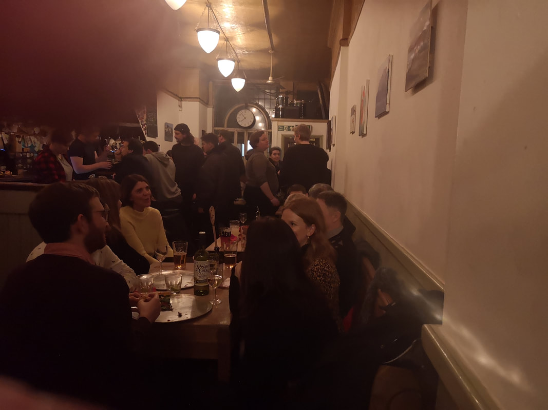
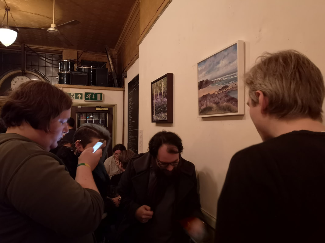
Then on Tuesday night, I and others were back in the Indo, for the launch of the Mendes Studio show. The common factor is that all the people presenting receive private tuition from Hugh. The setting particularly suits the mournful subject matter of my painting (top of the blog) and of course the beer and pizza is excellent. It was a superb and well attended night. I don't feel I can really comment on my colleague paintings so I will simply present them below. The show is on until the end of the Month so pop along and have a look.
|
Archives
June 2024
Categories |
 RSS Feed