|
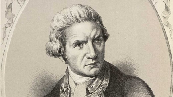
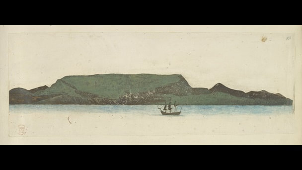
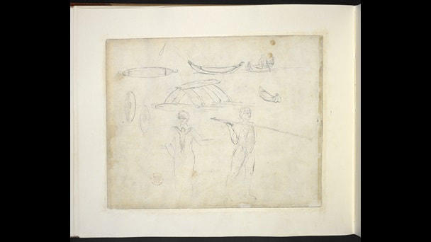
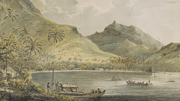
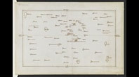
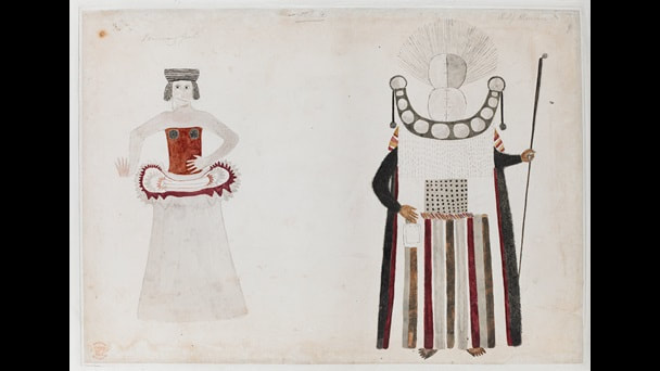
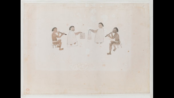
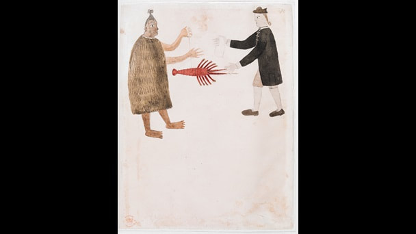
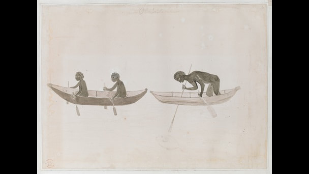
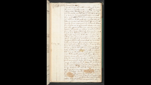
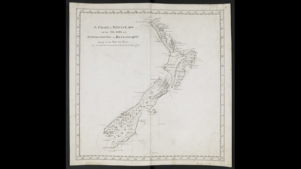
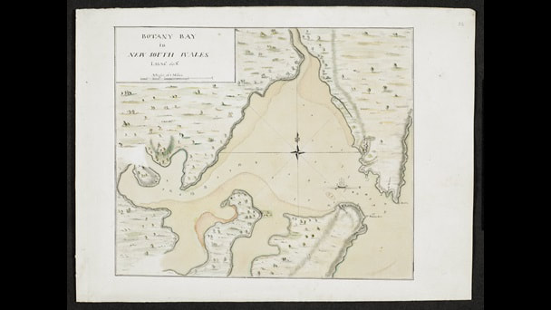
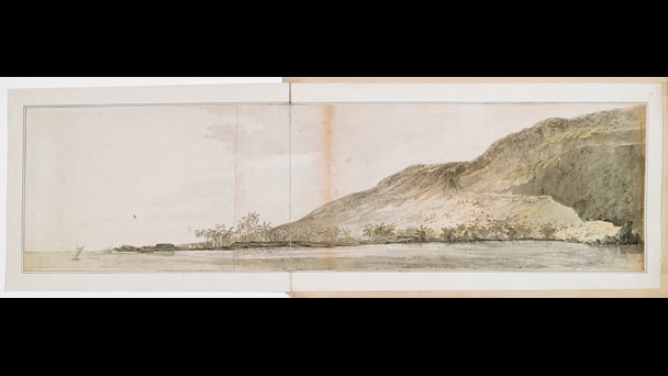
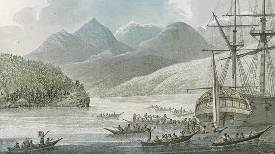
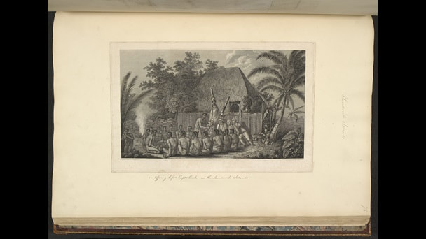
Among my primary interests are art, history and maps. The current exhibition at the British Library about the voyages of James Cook (above) was always going to be a draw. First to clear up a misconception. He was called Captain because he was in charge of the ship but for the first voyage James Cook was a lieutenant and the second he was a commander. This is just one of the mildly confusing traditions of the royal navy. He undertook three voyages, the first to Tahitti, New Zealand and Australia, the second to the antarctic circle and the third to find the legendary north west passage over the top of America. Artists accompanied all three voyages and the exhibition is repleat with maps, charts, drawings and paintings. The first voyage was to Tahiti to observe the transit of Venus, one of the first stops was at Tierra del Feugo, off the south coast of South America and the resident artist produced a drawing of this (above). There is a sketchbook of the artist (who on the first voyage was Joseph Banks) (above) and it would seem his practice was to sketch and then on board ship, but also after their return to England, to work these up into fuller drawings and paintings. These of course all have the issue of imposing the European ideal of painting onto the scenes. Like so. This brings me on neatly to one of the most interesting characters revealed in the exhibition, a Tahitian by the name of Tupaia. Tupaia was possibly some kind of Tahitian priest, no one is exactly sure. What is known is that he joined the exhibition, and stayed with it until Batavia where he died of disease. Perhaps even more interesting is that he then went onto record illustrations of later events in the voyage such as the one above left showing Joseph Banks trading with a Maori on New Zealand. Tupaia acted as a translator between the expedition and the Maori and it is only thanks to Joseph Bank's diary that we know it is Tupaia who produced these drawings. Then you have a later illustration of a the expedition meeting Australian Aboriginals. Maps and diaries abound in the exhibition. You have the log books and James Cook's diaries (like the one above left) from all three voyages. A principle purpose of the voyages was also to provide accurate charts so you also have the exquisite diagrams like the one of New Zealand (above right) which proved that it was not part of a Southern Continent but a separate Island (proved it that is to the Europeans, I imagine the Maori already knew). The exhibition then moves onto Australia and the much discussed and controversial encounter between Cook and the Aboriginals. The first Voyage was the most interesting but for all of them the curators have managed to convey the sense of wonder that these discoveries and encounters must have brought about. Particularly thrilling is being able to read the original diaries and journals of these people. There are drawings of plants (and plant samples) along with landscapes (like the one above). There are no written records from the other side of these encounters so these are presented instead by a recounting of the stories passed down amongst the First People and shown in videos. These videos are of variable quality and are just not as gripping as the contemporary artifacts. The third Voyage involved a trip to find the North West passage and included a call into Nootka Sound (above which TV viewers may remember from the patchy Taboo). Cook had established good relations (or at least so was thought) with the inhabitants of Hawaii. There is a picture (above) of Cook attending a feast with them. He called at Hawaii on the way out and then went to winter there before returning to the North. At least that was the plan. In event much disputed some kind of argument broke out on the beach between the Hawaiians and Cook's men and in the ensuing fight, Cook was killed.
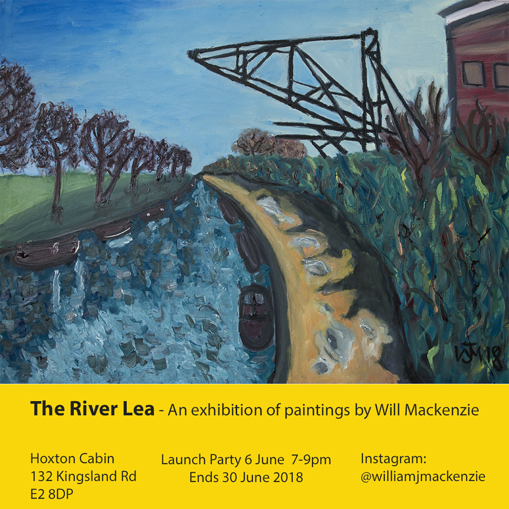
There is much then to like about this show. It is historically interesting but also artistically so. There is much to engage with from any angle. I am really pleased I went. Incidentally, if you do go, leave yourself time to go round the Treasures of the British Library afterwards. It is very much worth it. I shall end on some self promotion. I have a show starting Wednesday 6th June at the Hoxton Cabin. Come along. Details below
0 Comments
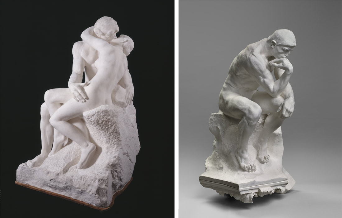
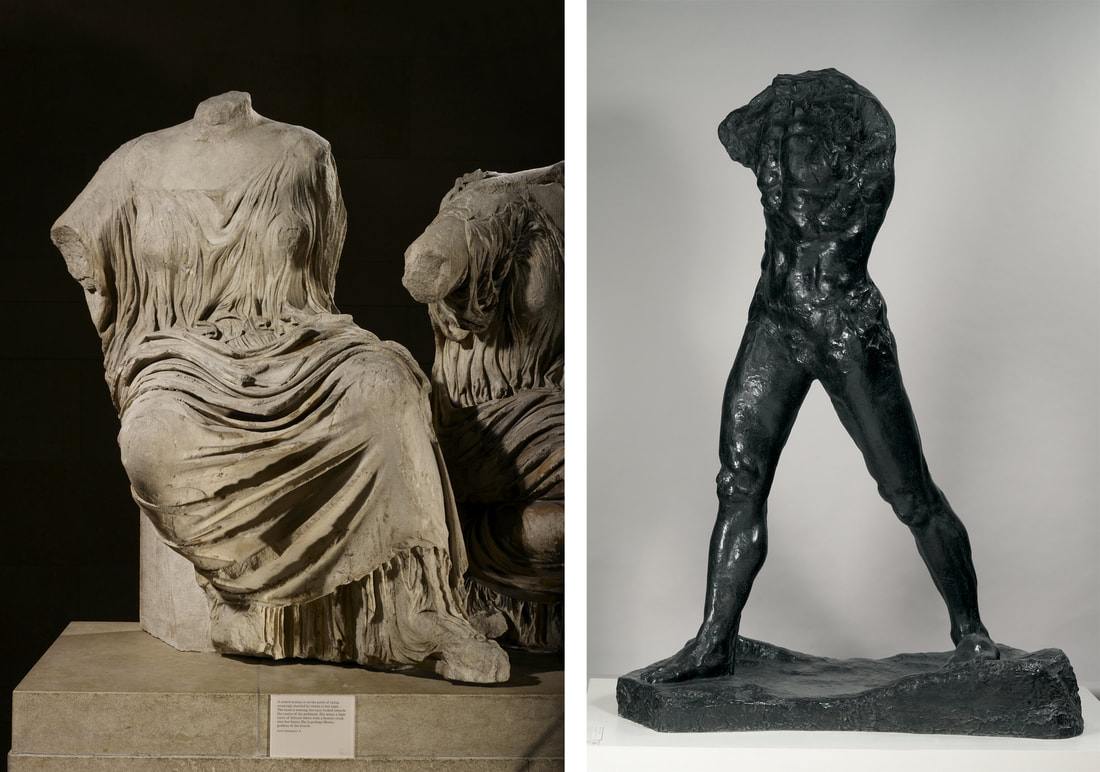
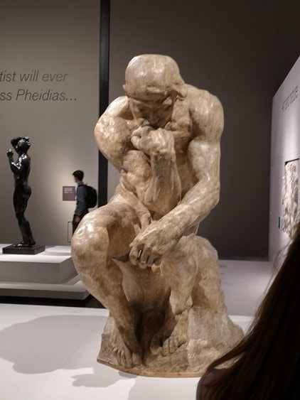
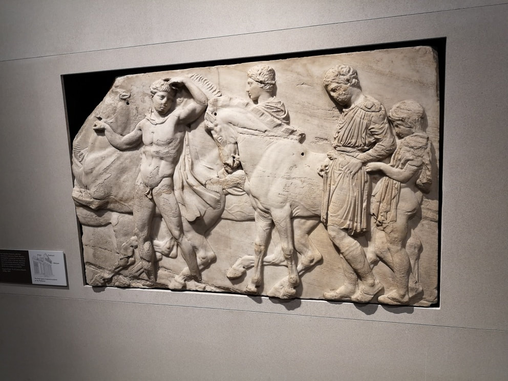
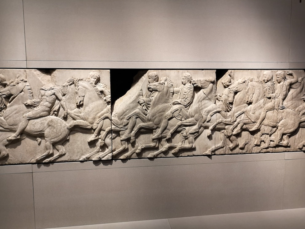
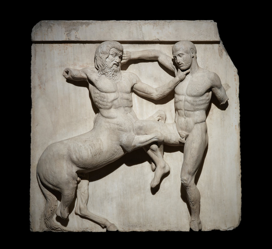
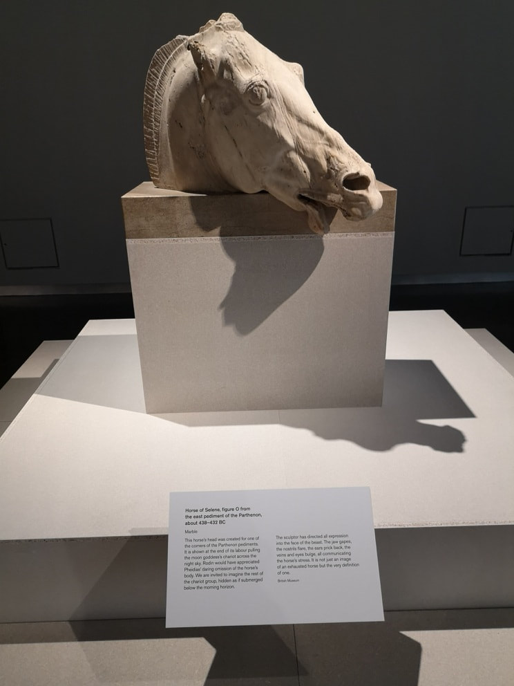
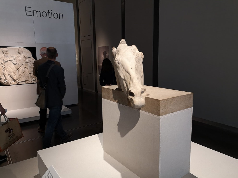
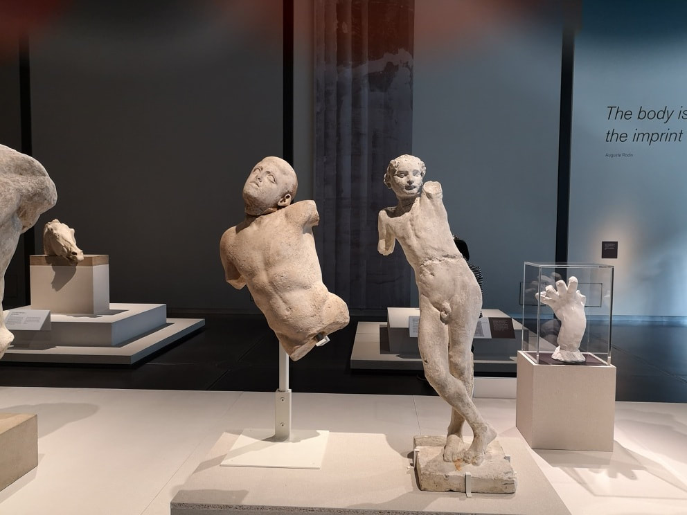
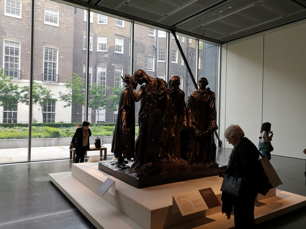
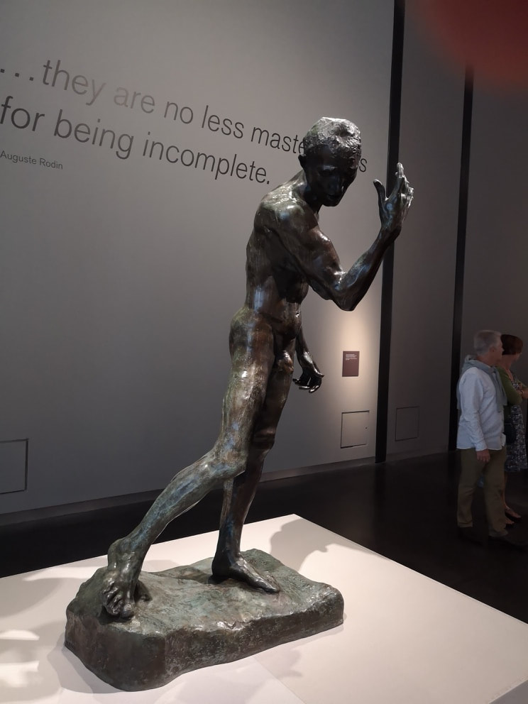
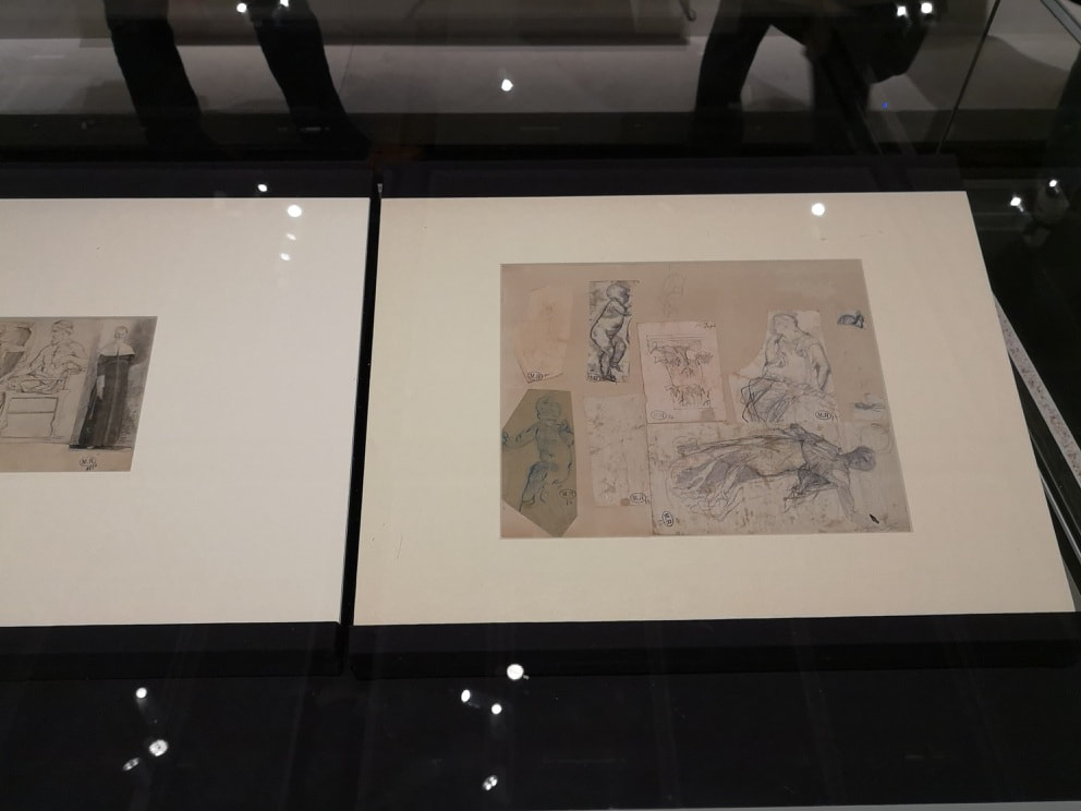
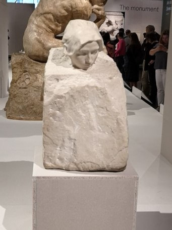
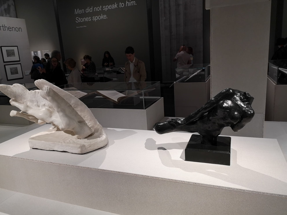
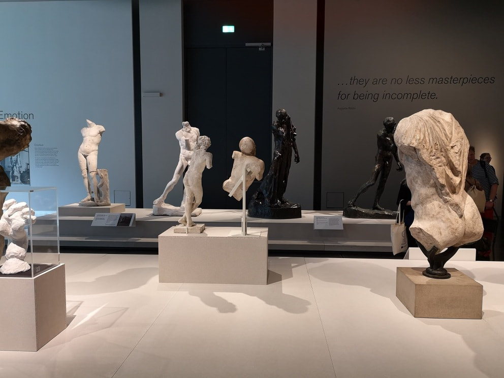
For many people the British Museum is the mothership and apparently for Rodin too. He never actually went to Greece, instead viewing the purloined marbles in the comfort of Bloomsbury. He referred to the museum as the temple. Fitting then that should put on an exhibition of his work. The theme is Rodin and the Greek works that inspired, and you have them displayed side by side . The whole thing is exhibited and an elegant black and white decorated room lit by a large window at one end. It is nice to have some natural light in an exhibition for a change. Like so (above). I often find sculpture cold and difficult to engage with. A number of Rodin's escape this by nice feathery effect. There are a number of pieces that are in bronze like the walker (above right) which is easier to emotionally respond to. The ancient Greek sculpture, cracked, weathered and with pieces missing and often with these deep folds carved into them allow for a similar response. I find myself drawn to these more as I wandered round. There are two version of the thinker. The clean white marble white marble one (top of the blog, right) and the orange marble one (above). I really like the orangey one. It is massive, large and looming. It brings to mind a Gaulish chieftain from Asterix and Obelix. All muscularity. I really like it. My favourite things in the show, which I suppose I could have seen at any time were the Parthenon friezes (above). I like the movement and the overlapping characters. Of all the friezes my favourite is Lapith fighting the centaur (above). I like the frozen moment of combat and the furious almost serpent like hair of the centaur. Speaking of terriying things I also found strangely appealing the twisted baby head (above , the figure on the left) with the blank staring eyes looking up towards the ceiling and the way it is twisted off the torso. It pairs very well with the Rodin next to it, although that one is a bit little lord fauntelroy for my tastes. Of course you cannot do a Rodin show without the Burghers of Callais. This strange wasted group, in there ripped and sodden rags, oscillating around in a mournful circle. Like all good sculpture it rewards you when you circle round it. Each angle presents a different relationship and shows you something new. It's a powerful piece of work and the darkness of the bronze adds something. It would not have worked in marble. Interestingly there are some other bronze sculptures, preparatory works for the final piece. The one above I found the most evocative. If you look you can see him in the final work, but this stripped version is even more cadaverous than the final one. I heard a passing stranger saying it was modeled on Rodin's son. If true, he had good veiny legs. Tastefully set out at various points are vitrines (posh word for display cases) of Rodin's sketch and note books. Chalk, ink and charcoal drawings of various statuary or ideas for sculptures. Always interesting to see the generation of ideas. Of the work proper apart from the bronzes I liked this smaller piece of a woman's head, emerging from a roughly chiselled block (above). It makes for a nice contrast between that and the smoothness of her face. In a similar vein I was drawn to Sister of Icarus (above, left figure), again you have the smooth figure this time diving into a roughly hewn sea (presumably). It makes a good contrast to the dark marble torso figure next to it.
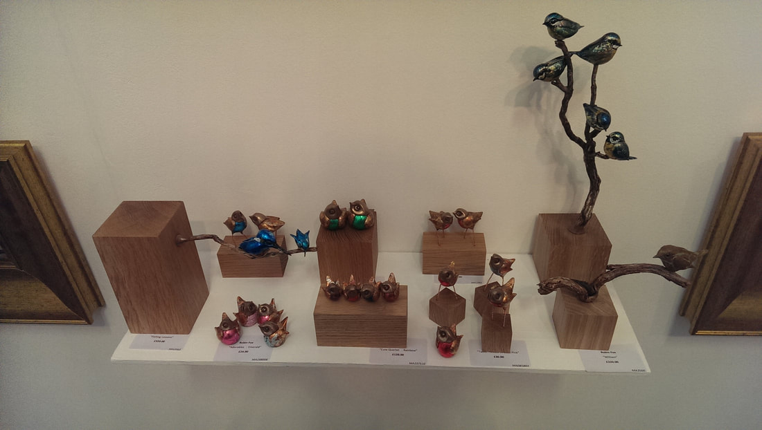
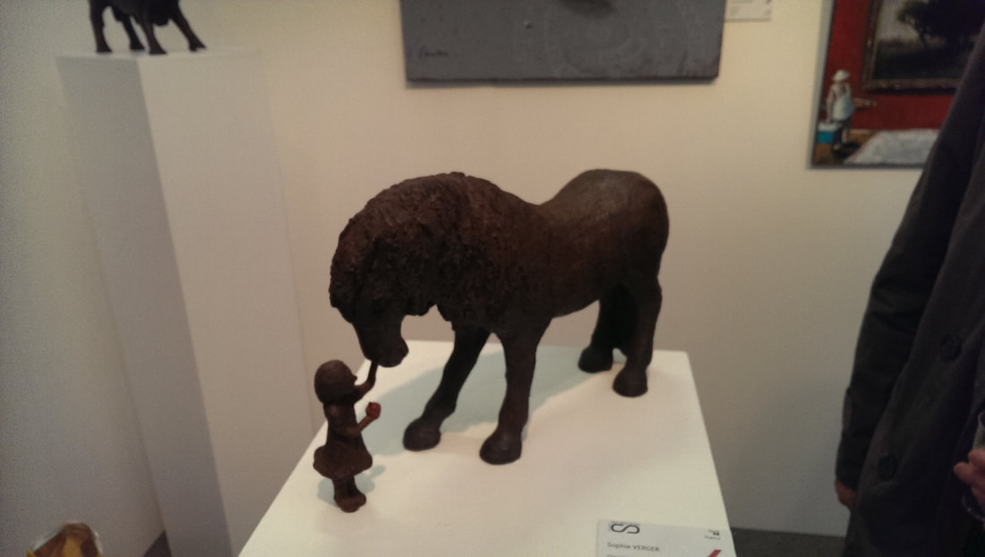
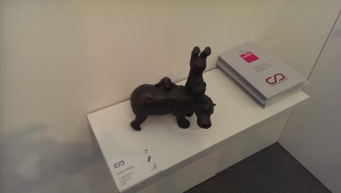
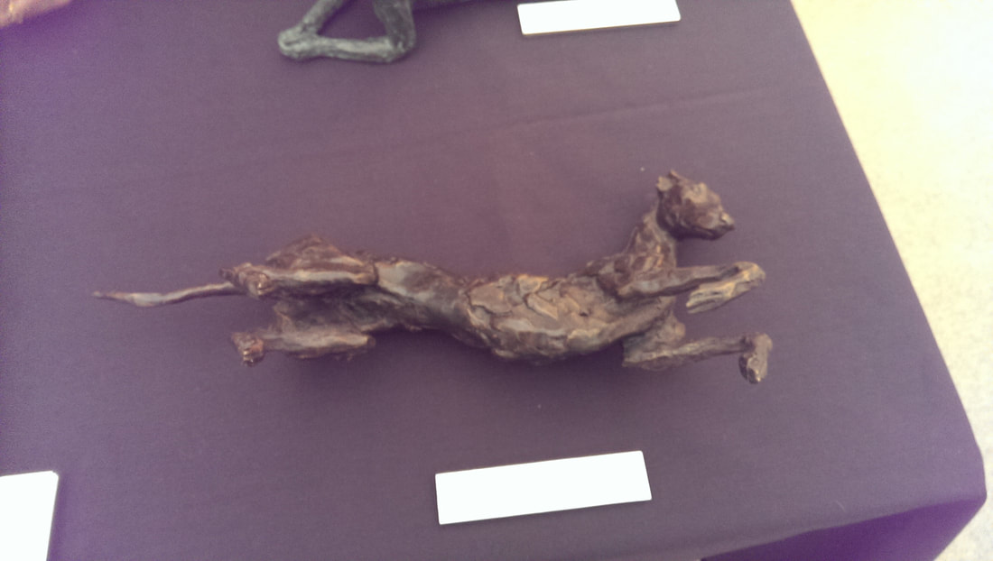
I spent quite some time in this show, looking at things and sketching some of the figures. The curators have obviously had an eye for the vista as well (below for example). The figures are arranged in rows and segments so if you look back across the rows there is a often a harmony in the themes. And on that unnecessarily pretentious sentence I shall end this post. Rolling around now twice a year is the Affordable Art Fair, the first of which (and in my view the better) takes place in May, on Hampstead Heath. It finishes on 13th May so chances are you've missed it. Buying tickets to attend is surprisingly expensive, but there are quite a few free one's sloshing around and if you buy something at the fair you usually get sent a free ticket for the next year. I went last year and so this happened to me. If you go to allot of these fairs, which I have a tendency to do, then you do see the same things again and again. When I first entered the fair, the first few stalls provoked a feeling of severe de-ja-vu. However by the time I past my first dog that was more expensively dressed than me, my eyes had adjusted and I began to see new and interesting things. There were many old favourites but I shall concentrate in this post on those I had not seen before, or was especially pleased to see again. The first thing to catch my eye were these very sweet little bird sculptures (above) by the appropriately named Robin Fox. They are well wrought playful little things, with attractive metallic colours. I especially like the little blue couple perching on the branch which emanates from the block on the left. They are full of personality and I like them. The line between sweet and twee is a thin one (and a subjective one) but if you can stay on the right side of it then your work can be terribly effective. As with Robin Fox, so is Sophie Verger who produces these very playful sculptures in clay (above left) and bronze (above right). Two subjects interacting in a sculpture is often a good idea, it helps to fire you imagination and animate the sculptures in your mind. It doesn't have to be two subjects though. A single subject such as this greyhound (above) , the provenance of which is sadly lost because I didn't note down who it is by. Useful isn't it?
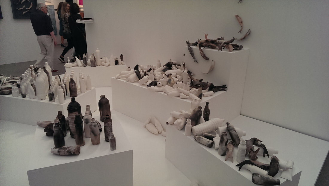
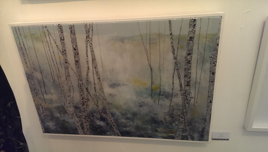
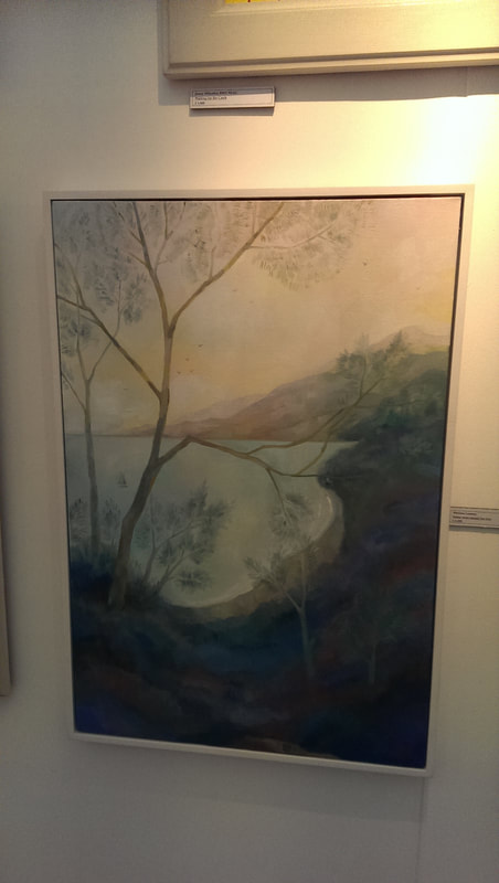
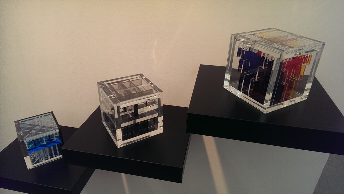
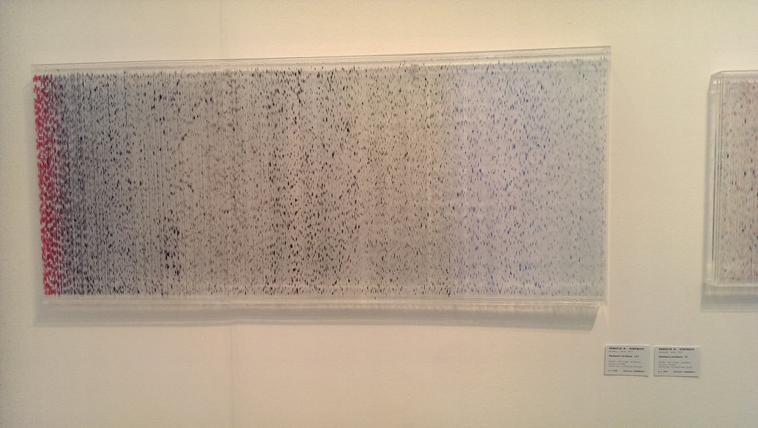
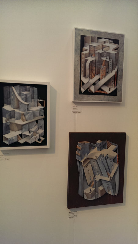
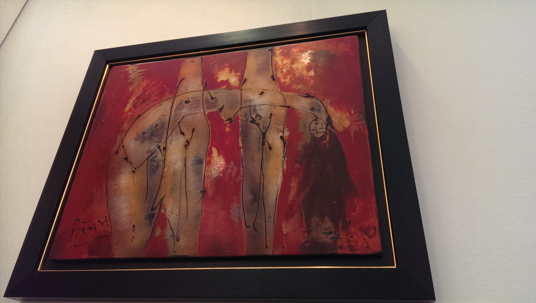
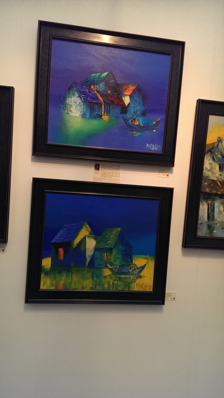
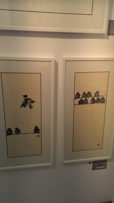
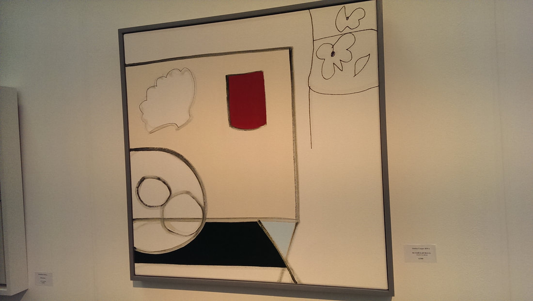
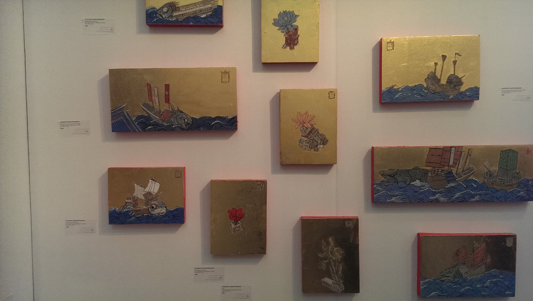
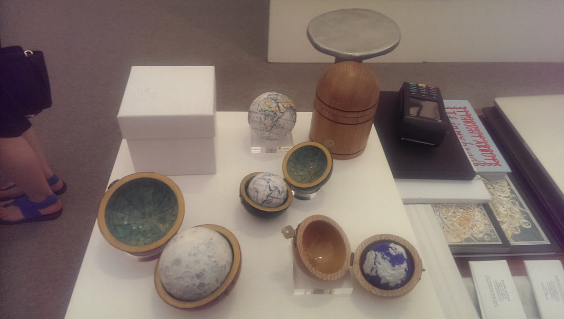
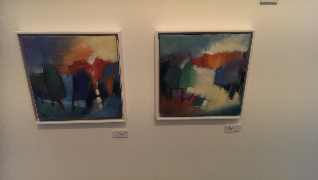
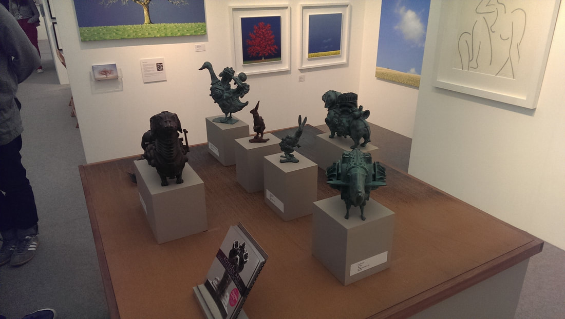
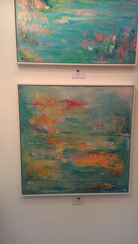
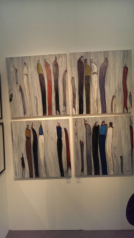
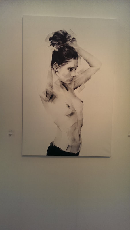
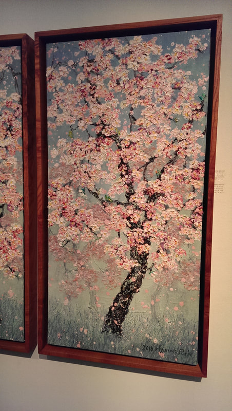
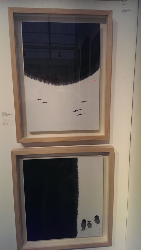
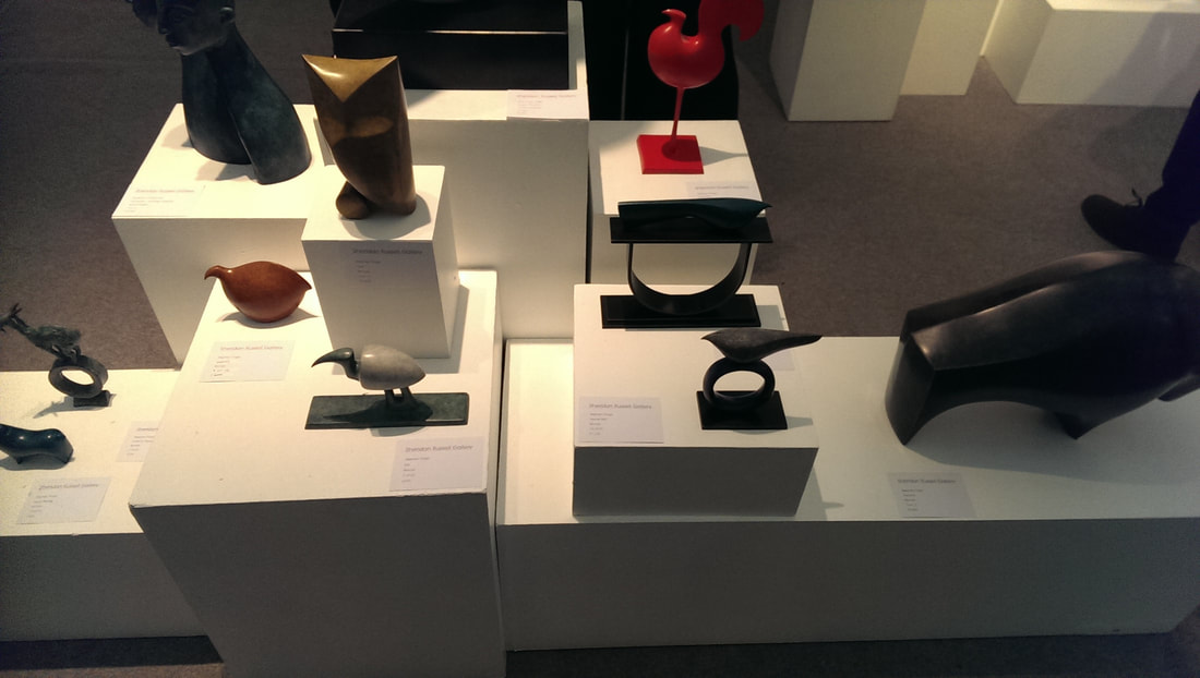
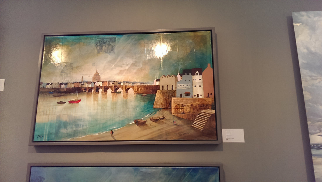
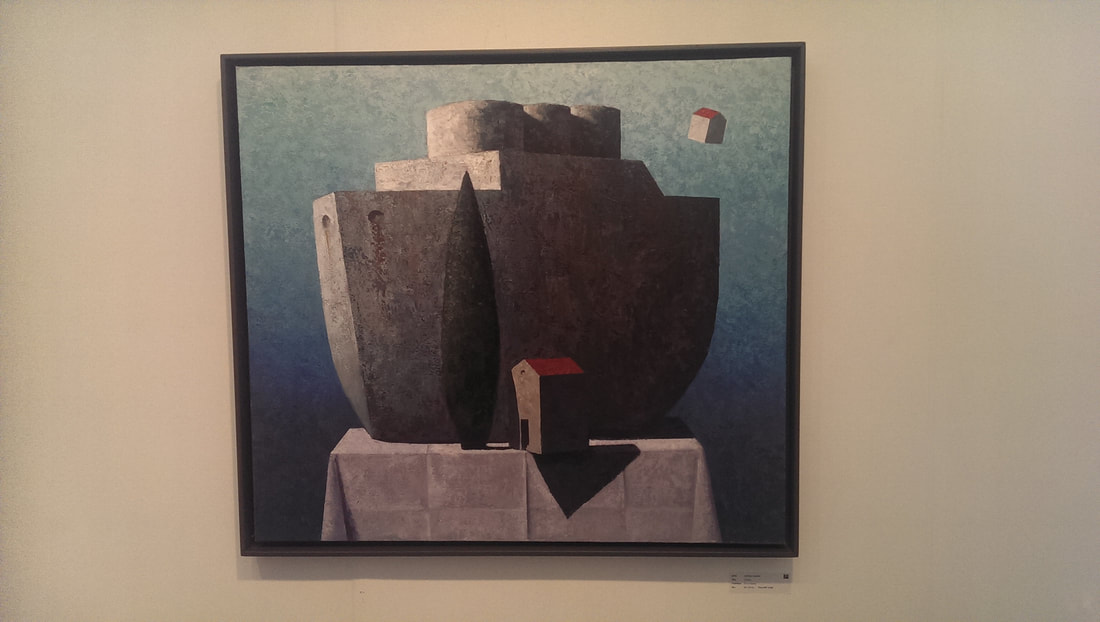
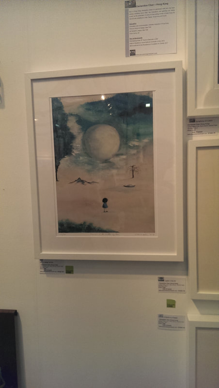
Objects in a series benefit from being well displayed so these three acrylic glass (above) by Haringa + Olijve owe a debt to their gallery, Galerie Nummer40 for having arranged them as you see them. They are in themselves interesting and attractive objects and as with all such sculpture reward you from being viewed at different angles. My favourite is the far left one. The same gallery had large glass based works by a Freddie M Soethout (above). The glass is flecked with colour but depending on which angle you look at it, different flecks, and different quantities of them can be seen, so you get a shifting image as you walk past. If you like Escher then you will like Stefan MAS Persson (above). It has the same impossible topography that you have with Escher however with two distinctive differences. The first is that, as you can see it is rendered in colour. The second which is not quite so obvious is that the pieces themselves are slightly 3D. The main work is in wood I think and stands proud of the frame, with elements jutting out. This adds a whole new layer of confusion. An addition to this year's show that I don't remember them having before was the presence of larger installations, of which you could buy elements. So for example there was a phalanx of little robot men in the entrance. My favourite of these though was the one by Mella Shaw which you can see at the top of the blog. They are ceramics, and ceramics of plastic bottles and fish interspersed with each other. The meaning is obvious but it is well done and I like the grey smoky tones of the pieces. One thing that shows like this do well is bring you art from different places that you might not otherwise see. So it was this time and probably my favourite stand of the show, Akartasia, showed a number of different artists from Asia. The painting above, a disturbing rendition in pinks and red is called feminine and is by Phoung Binh a Vietnamese artist. It has visceral bloodiness that I like, and I think the flow of hair down the right hand side is particularly effective. Two other artists from the same stand caught my eye. One was Dao Hai Phong (above left). Again Vietnamese their work is this super colour saturated land and sea scapes, dominated by this deep deep blue. I find this colour palette particularly arresting. At the other end of colour scale you have the ink paintings of Pu Yu (above right). His name apparently has the charming translation of SImple Rain and I really like his simple, almost spare ink drawings of birds. They are somehow very expressive. I nearly bought this. I might still, there is still time. I am sure Jessica Cooper (above) is a name I have seen before. Even if not it is a name I look forward to seeing again. She has produced an abstracted still life. At least I assume that is what it is. It has the rather pretentious title of "the Truth is all there is". Not sure about that but anyway, I like the painting. The sparseness of the lines and shapes contrasting with the red shape. Very good. Another in vogue style is the gold leaf backed painting. Gold is gold as my uncle would say (at least he would if I asked him to). If you get the subject right it can really work. You can either go the icon route or use it to change up a familiar stlye. This is what Konstantinos Papamichalopoulos (above), winner of the longest name in the show (Pu Yu having won the shortest), has done with these Chinese looking sea scenes brought to glittering light by the gold. Globe conkers! Little Ceramic globes (or moons) in attractive wooden cases (above). The carefully taken photo I have of the artist is so blurry that I cannot make out their name. Nice though aren't they. I though seriously about walking off with the one you can see at the top of the picture. I still might. I think they are very nice. I imagine if I did some googling I could find out who did them for you but there is limited time in the world. Ingegerd K Westin has the best name in the show and also some of the best painting. They are quite small, probably about 30 by 30 cm and in many ways are simple abstract pieces, but the composition is good both in terms of shape and colour. I particularly like the looming black figures in the one on the left. These two also work well as a pair. These made my short list of things I might buy. Sadly I can only afford one and to my mind these two should stay together. Steam punk animals is the theme of Sebastien Boyesen's work (above) going under the evocative name of Single Cylinder Dachshund and other unfeasible imaginings. It is a neat idea, the combination animals and engine but they are also attractive pieces. They made me smile, they made me think. You can't ask for much more of that. My favourite of them all is the duck you can see at the back. Linda Franklin (above) is again a name that chimes distant bells. They have a Monetish quality but are individual enough to not be derivative and once you get close enough are quite distinct. I like the colour palette, I like the dreamy composition, I like the way it suggests shapes without defining them. Long whispy figures, against foggy backgrounds are the work of Mario Angel, (above) which is appropriate enough as the figures do have a sort of angelic quality, shifting across the landscape. Few pictures of figures make my list, but my favourite of them is this blocky almost pixelated portrait of a woman by Marion Cadet (above). It shows fine technique and you get a real sense and feeling of the subject. This is a requirement of mine if you are going to do a nude or semi nude, especially of women. I hate those pictures of a nude female torso with the head obscured with something trite like a storm troopers helmet. This is the opposite of that, this is not a sex object, this is a person, although they are not named. This was one of my favourite galleries last year and it was again this year. I was particularly attracted to two artists. Above left, is a glorious depiction of blossom by Hyun Ok Park. I like the way the blossom busts out the canvas and then fades back in as it falls to the grey and misty grass. They also also have who was last year, and is again this year my favourite artist of the show, and had I the financial means I would definitely buy some. Tae Hoo Park (above right) is his name and his depiction particularly of birds very much appeals to me. They are cute evocative things. Bronze is an attractive thing and it interesting, depending on how you treat it and shine it, how different you can make it look. Stephen Page (above) renders it to look a little like wood. He produces these almost Egyptian looking animal forms, either standing on there own or perching on top of these large rings. I have centered on my favourite the odd slightly white beetle looking Ibis. Keith Athay (above left) storms along atop another current trend, that of simplified, naive, slightly shiny and colourful landscapes. He rises above the heard by using things mixed media, so you can just about see in the sky what looks like newspaper used as the surface. His colours, textures and composition all compliment each other very well, and I like the flat surface of the buildings contrasting with the rugged sky. Slightly similar in style but much more abstract is the work of Matthias Brandes (above right). However it looks very different. You have the concentration on just the building, depicted on a strange table cloth and solidly granite in depiction. I shall leave you with two utterly contrasting pieces, pared together because they were both available for under £500 and thus tempted my strained wallet. The one above left is by the poetically named Clementine Chan who has produced this very sweet picture of the lonely female figure in a dessert landscape.
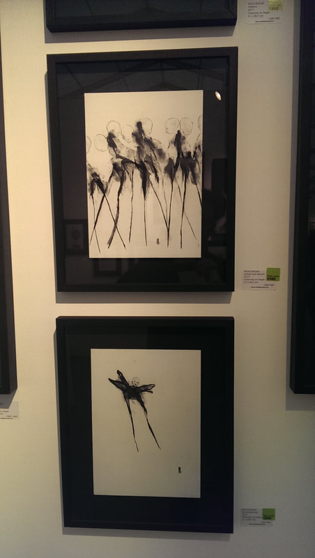
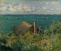
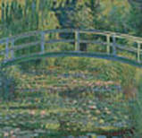
Contrasting with this are this horrific spidery ink drawings by Felix Dolah. They are quite horrible but they are well done and they have strange pull and appeal to me, although I wouldn't want to see it every day. That's it. There were many others I saw and liked and no doubt other good things I missed. I would recommend going along. Its an interesting show, and there is free booze. Monet and Architecture is the National Gallery’s monster summer show. It is large, 73 paintings apparently and when I went, 2pm on an Monday afternoon, it was crowded. It is also very good. Like many people I find the architecture thesis a little strained but the title paintings with buildings in them apart from the ones that don’t have them is a little cumbersome. Still if you are fan of Monet, Impressionism or chocolate boxes you should definitely go. There are pieces here from far off museums and private collections that you may very well never see again. I really enjoyed it and here are my highlights. The show runs chronologically but also thematically, so for example you have Rouen and Westiminster grouped together, but we shall get to that later. The national gallery is rather stingy with the photos of the art work but where I can get them I can show them. To begin at the inevitably crowded first room of the beginning. The Hut at Sainte Addresse (abvove) is a small battered fisherman’s hut the roof and chimney peeking out over the foliage. Beyond that the sea and in the far distance ships sail past. The sea, plants and the building are all beautifully rendered although there is not the range of colour you see in Monet’s later work. The various elements make a good counter point. Monet does water and reflections very well and does so particularly well in the picture that I think is the star of the first room, Houses on the Banks of the Zaan. Monet’s titles are all a bit like that and I suspect he never really bothered naming his paintings. Anyway it is this strong pink and green building, superbly reflected in the water. I love the way it is slightly refracted and obscure. Vetheuil is obviously a fairly inspirational place as Monet painted a number of versions of the church there, all of which are excellent, with again the sublime water reflections. Actually my favourite of these is the winter scene which gives a real sense of cold and has a calming meditative quality to it. Then you move through the aperture and into room 2. One of the excellent pieces is the Cliff at Varengeville, noticeable perhaps for its entire lack of buildings, but as I have said before, the title of the show is just an excuse. Worry not though it is an excellent piece. The grassy scrubland is made super-real by the many colours added into it. We are now firmly into the territory of what you may think of as the Monet palette. Likewise the cliffs, leading you down into a blue and turquoise sea which fades away at the horizon into the sky. Very nice. Incidentally this is a painting from a private collection (lucky swines) so you are unlikely to see it in the flesh again. There is a church at Varengeville and Monet paints it twice, you see it perched atop vertiginous cliffs, the rock of which is brought to life with streaks of colour. The shadows in these paintings are very good and they fine examples of the use of colour tone in painting. May favourite in this room though, and the one that burst into my vision as I walked through the door was The customs officer’s cottage. You have this promontory of rock sticking out over a fairly rough sea and then this cottage, thrust at your eyes with patterns of red. Kept coming back to this one. None of these paintings are usually housed in UK institutions and it is quite something to see them all together. Room 3 and we start having the travelling Monet. There are two pictures of a place called Bordighera which I think is in north Africa and sounds like a member of the Thundercats. There is View of Bordighera and the more interesting Villas at Bordighera. What is interesting to me at leastis he use of dark purple as shadows on the building that act as backdrop to this lush, multi-coloured vegetation. The whole thing is framed by the tower on the left. There are two views of Anitbes from across the bay, both looking at different lighting effects Antibes from La Salis, you have the mottled water and the distant slightly foggy town all framed by a tree. The light and shade effects on the tree are particularly good. I have to say that when Monet does a series, like this one, I always prefer the ones with stronger tonal contrast, more shade in them, rather than the lighter pastelly ones. Monet was obviously drawn to slightly beaten up shack like buildings. I can understand the attraction. I myself find rusting brick industrial buildings particularly evocative. Gardener’s House at Antibes is one such shack, a slanting decrepit looking building, mottled with colour, against the sea and with these two trees twirling in front of it. Just as the way your taste pallet gets more tolerant (sophisticated if you prefer) so I think you’re your visual tastes. I used to find snow scenes dull. I don’t any more. Snow Effect at Giverny has a nice calm meditative quality that many good snow scenes provide. The snows is given texture You couldn’t have a Monet show without some water lilies and they are duly provided with The Water-Lily Pond. Does a bridge count as architectural? It is a very good painting, allowing you to play the, how many shades of green, game. Its presence, while welcome did smack a bit of fan service. Incidentally you can see a very large Water-Lily in the Tate Modern. Room 4 and now we get onto the urban section of the show. The Boulevard de Capucines (or Monkey street as I like to think of it- and before you write in I know it is named after the monks and not the primate) shows what you can do with light and shade. Half the painting is burning with light, the buildings practically yellow, as are the spindly autumn trees. Then the other half in muted purpley darkness, the crow like throngs of pedestrians in black coats used to emphasises the change. In the same room the other piece I liked was the view of Rouen which seems practically sombre compared to many of Monet’s other works. I particularly like the boats squatting in the water. Room 5! Snow Scene at Agenteuil (above) has the qualities of the other snow scenes I have talked about already but is also as these tracks carved through the snow. Get closer and you see the tracks are marked in red, as though someone has wandered that way after suffering some life changing event. From a distance though it just looks like a track. The Ball-shaped Tree Argenteuil is another masterpieces in the art of reflection, it is all about the way the eponymous tree and the evening sky are rendered reflected in the water. This is also an excellent composition with the picture framed by the tree on the left and the bank of trees on the right. The Coal-Heaver, is quite good but mainly I just like the title. Heave! Better are the two paintings of the Gare Sant-Lazare, sitting next to each other with their dark engines and their clouds of steam. I like the use of red to highlight the edges of some of the buildings, and also the ghostly way Monet does people. Room 6 we get onto the series of paintings that are the centre piece of the show, that of Rouen Cathedral and the Houses of Parliament. I don’t particularly like the Rouen cathedral series. They are exquisitely painted but I think the composition is fairly poor. You just get this flat front of a cathedral with no depth to it, nothing to invite you in. My favourite of the bunch though was number 57 from the catalogue. There is no other way of identifying it as they are all Called Rouen Cathedral 1894. The exception to this is The Cour d’Albane, showing the side of the cathedral, it standing monumental on the left side of the canvas and a dark archway leading you under a motely collection of buildings. The houses of Parliament collection are much better in my view. Done from a distance the Thames provides the perspective that draws you in. Of the three I really like the House of Parliament Sunset, with the sun and its reflection represented in burnished gold, and the Houses of Parliament Stormy Sky, with the sunlight now an angry red.
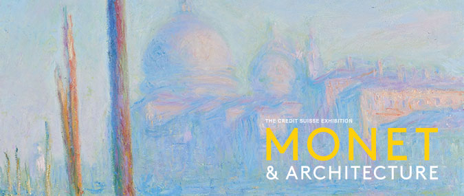
Calmer in temperament is Charing Cross Bridge Reflections on the Thames. This time the Houses of Parliament are just a foggy shadow in the background and the bridge itself a dark line across the mottled water. It is of course all about the water. Nearly there folks, we are in the final room now, that of Venice. The Grand Canal is presented twice and the softer, more pastel shaded version is the poster picture for the exhibition (and appears at the top). What makes these works other than the rendering of the water and the building is the off kilter angling wooden posts (mooring posts for gondolas) in the left of the picture. Of the two pictures I prefer the one with darker contrasts. Similarly with the Doge’s Palace, there are two and I prefer the darker one, with these dark blues and turquoises playing on the surface of the water and masking the reflection beneath. I particularly like the way he does the shadows on the buildings. There are stripes of muted colour in the darkness. Finally The Palazzo Contarini, possibly my favourite piece in the whole show. You have this solid looking, celestially feeling structure, facing you across the water front, pompous in its power and wealth, a thing of beauty and awe. As you may be able to tell I liked this show. You may do too. It is on until 29th July. Book in advance. |
Archives
June 2024
Categories |


 RSS Feed