|
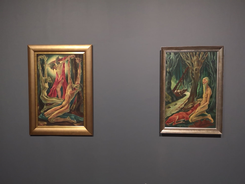
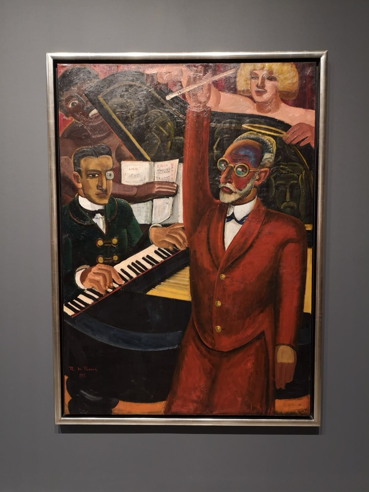
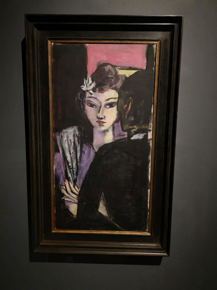
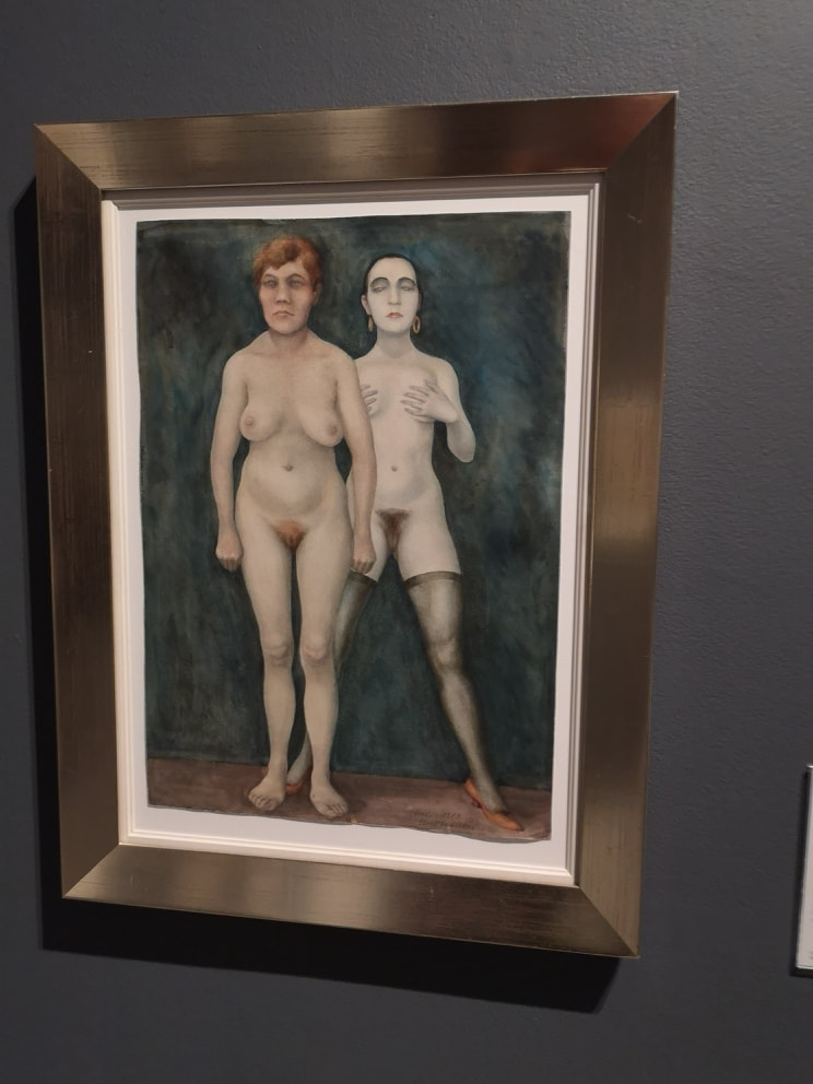
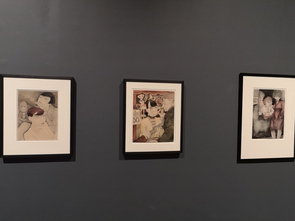
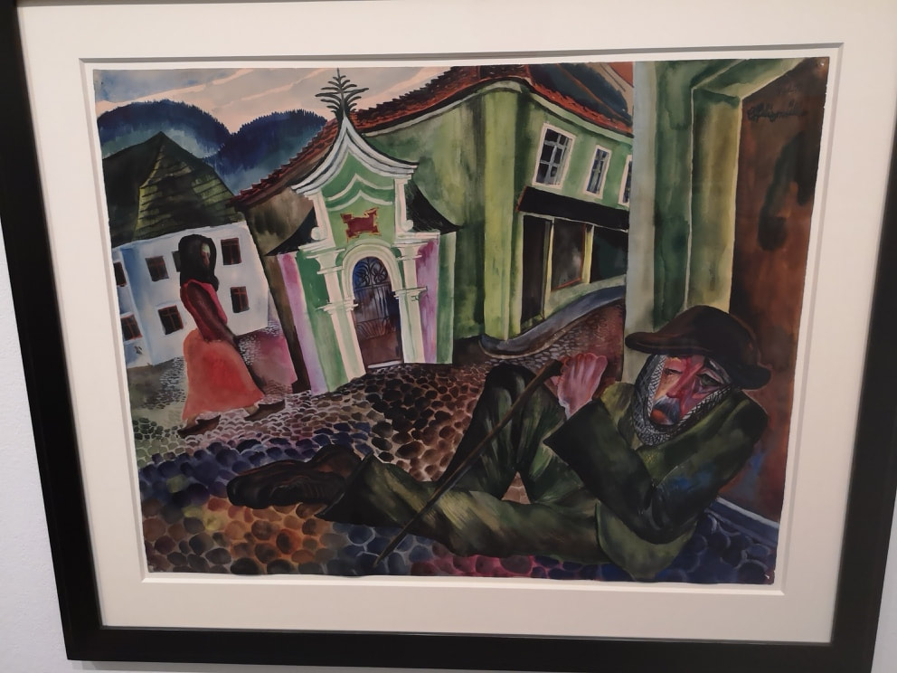
Dovetailing nicely to the Aftermath show at Tate Britain that I recently wrote about, is Magical Realism at Tate Modern. The full name is Magical Realism, art in Weimar Germany and features many of the same artists at the Aftermath. It is quite a big show (occupying four rooms), is free, and the main difference from Aftermath is all the artists are German (or Germany based) and goes wider than the war. I seriously recommend having a look. You've got plenty of time as it is up until 14th July 2019. If you enjoyed Aftermath (although it is many way not a show you enjoy but rather appreciate or endure). The rooms are themed, and starting at the furthest and working back, the theme there is religion and very disturbing it is too. The two most striking are by the same person, Albert Birkle (above) with these withered emaciated forms, all elongated and twisted, and in the right hand picture you have the kind of dead trees one associates with art from the first world war. Both of the pictures have this upsetting redish pink colour, reminiscent of blood. The next room is called cabaret , you can't have Weimar Germany after all without cabaret. These smart decorous individuals, are mid performance (above). Indeed you can make out the name and some of the music on the score, which gives this piece name Erik Satie (The Prelude) and the artist is Prosper de Troyer which is a rather fine name. The style reminds me of the Italian Futurists. I like the way the main figures velvet, burgundy arm bisects the black piano. Max Beckman makes and appearance (above left) with this drinking couple make a characteristic use of stark black gives the appearance of an intimate conversation, that item in her fan could be a fan, maybe a drink. I like the was the purple of her dress compliments the two tone colour of her face. Speaking or women there is a distinct savagery about Otto Griebel's Two women (above right). They made be nude but there is nothing sexy about them, even with the high heals and the stockings on the rear figure, especially as she stands behind the almost guardian frontal figure. The skin tones echo this as well with the front figure earthy skin tones compared to the ethreal paleness of the rear figure. Given the period it is unsurprising there are few women in the show, in fact I think there was only one and that is Jeanne Mammen who had tryptic on display (above). They are called left to right, boring dolls, at the shooting gallery and Free room. Boring dolls is an excellent name and I like the dark line of shadow of the front figure against the back. The subtle colour really suits the theme and she has a nice subversive style to it. The pensive pinched faces tell you volumes. The next room is roughly divided into portraits and landscapes. Well sort of landscapes. The most moving of the landscapes, to me at least was Conrad Felixmuller's The Beggar of Prachtice. It does the classic trick that is so redolent of magical realism. You have these wonderful jaunty colours and shape but these are completely at odds with the often disturbing subject matter, in this case a collapsed beggar on the streets. I love the tones of green on his clothing, done in mottled green which , with his hat tells us this is an old soldier, and then the detail of the bruised left eye. At complete contrast with the pinks and greens of the houses.
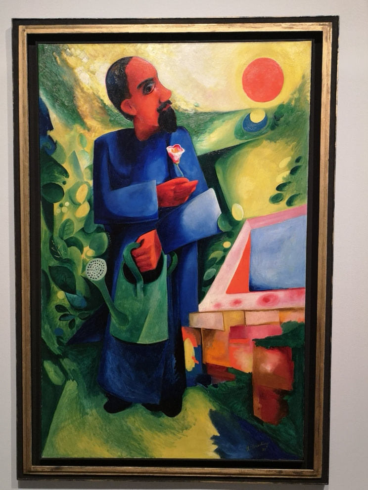
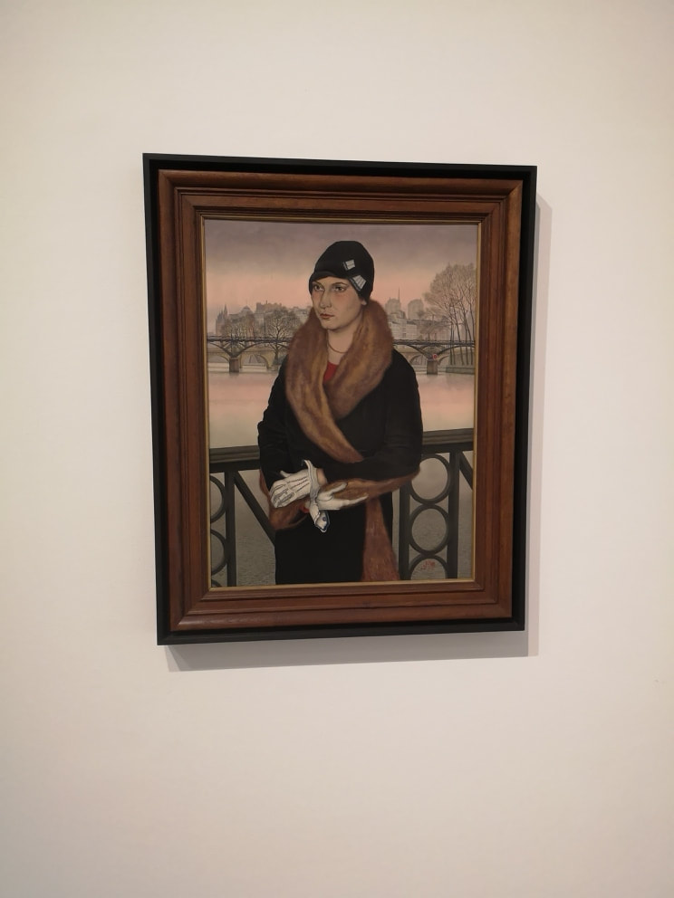
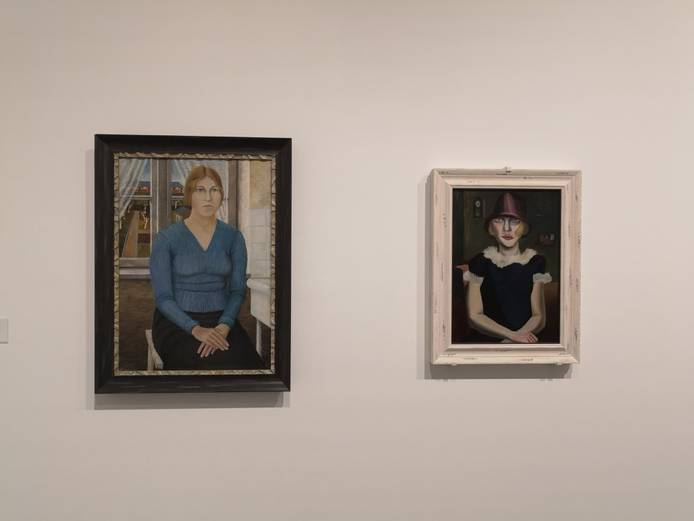
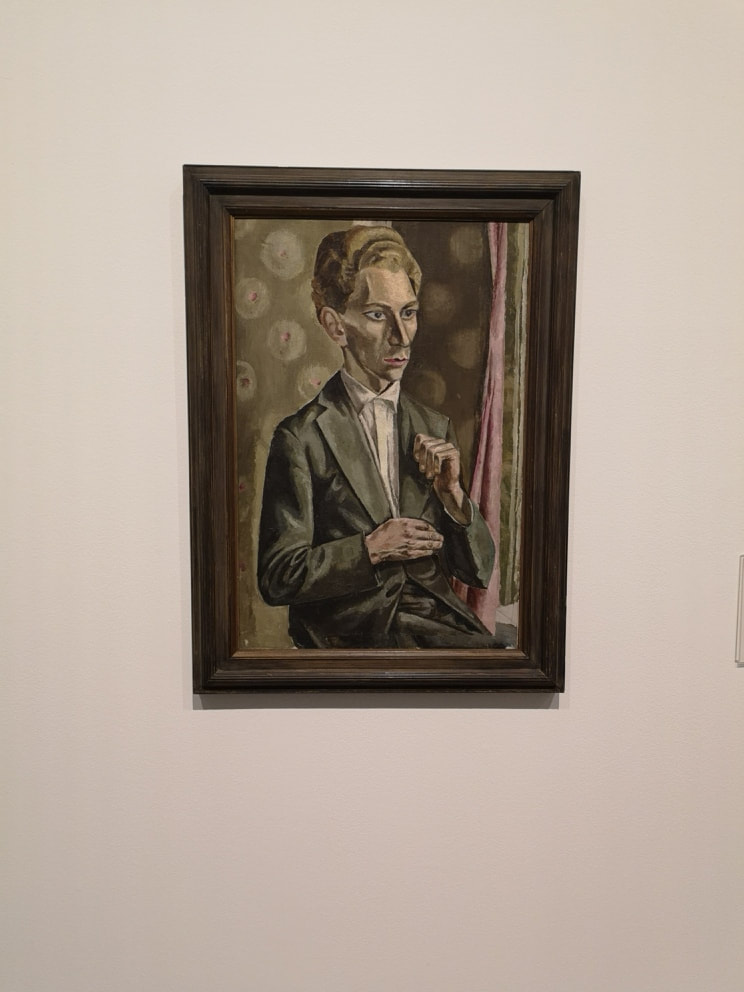
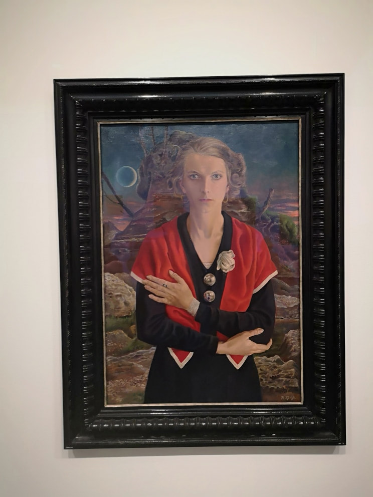
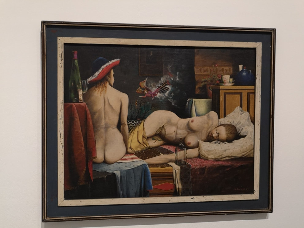
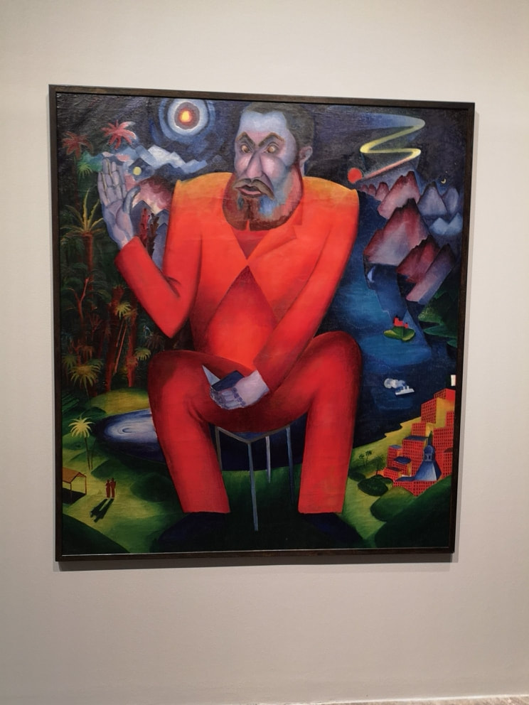
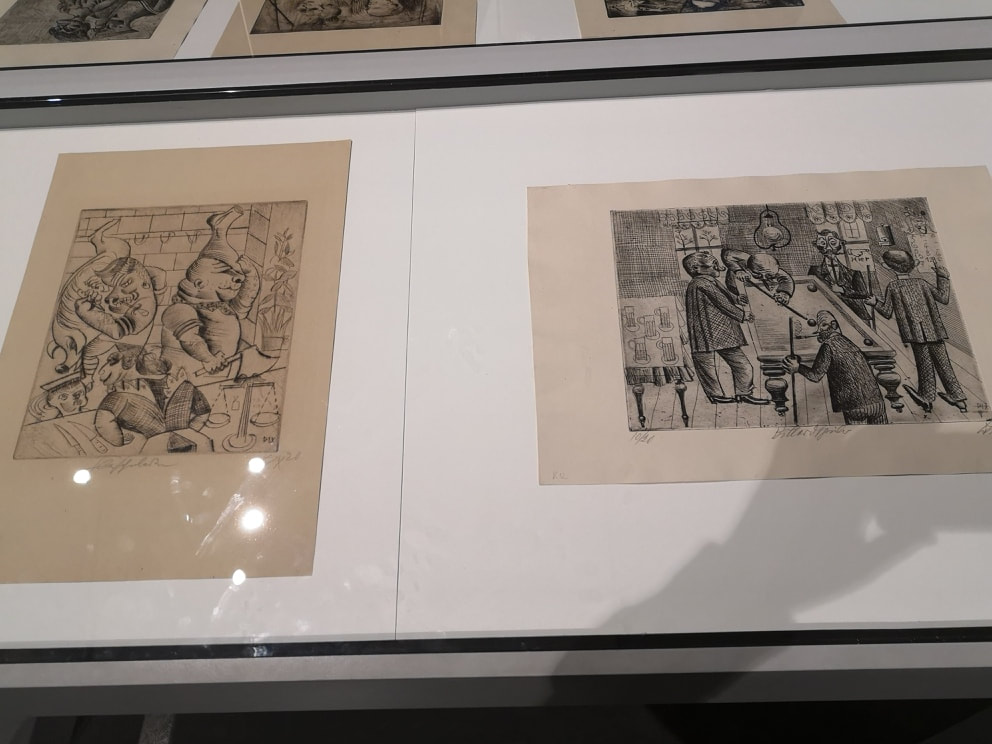
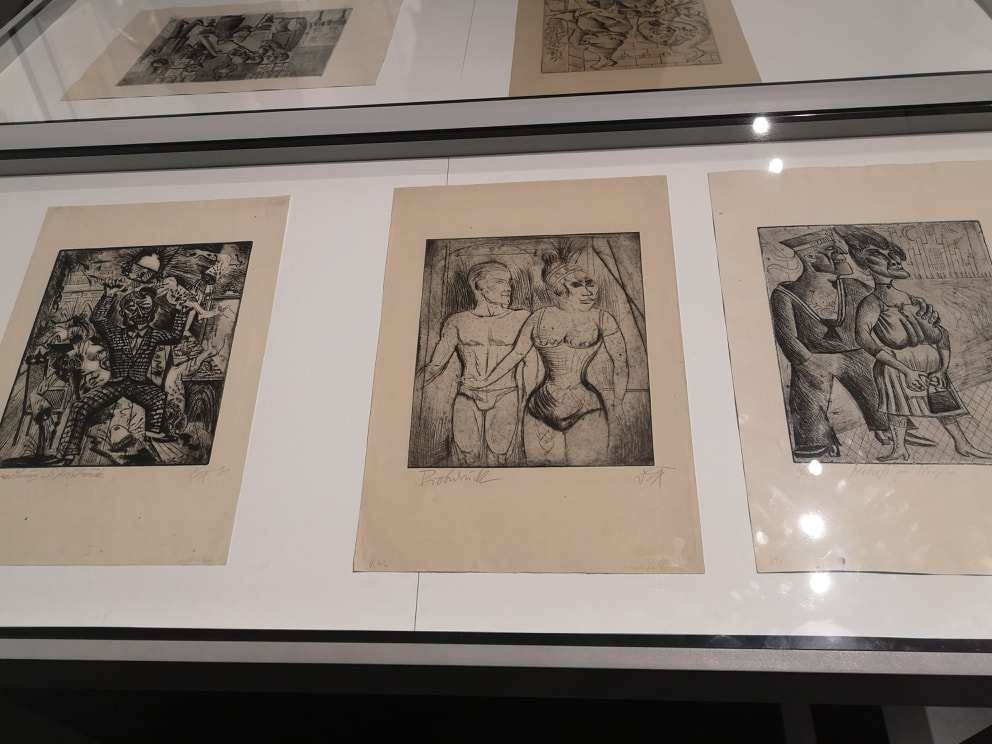
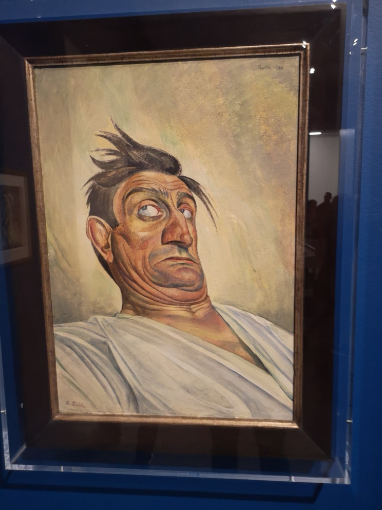
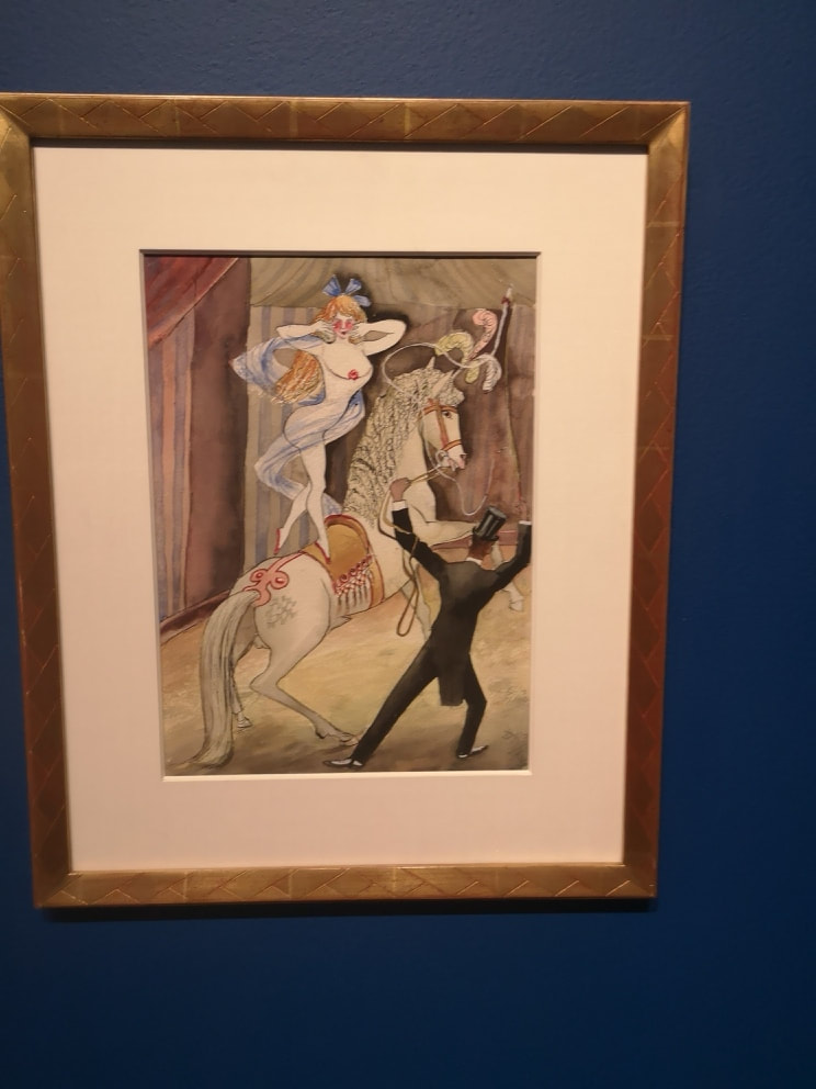
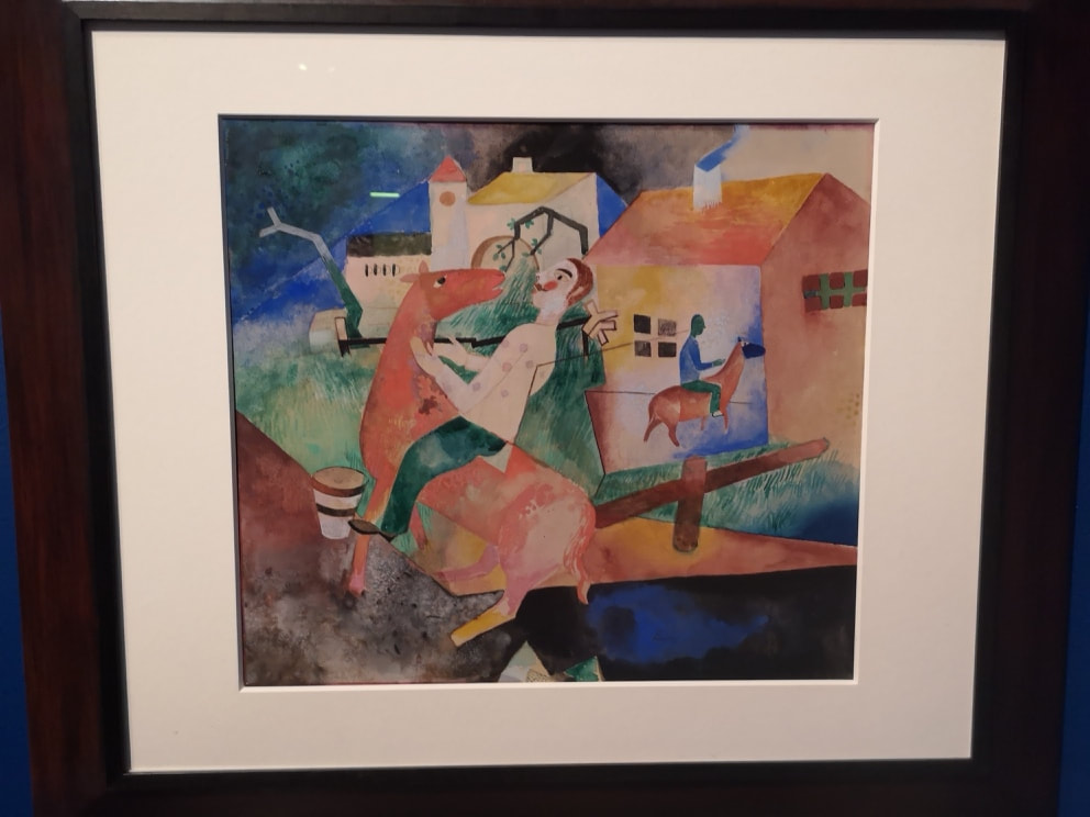
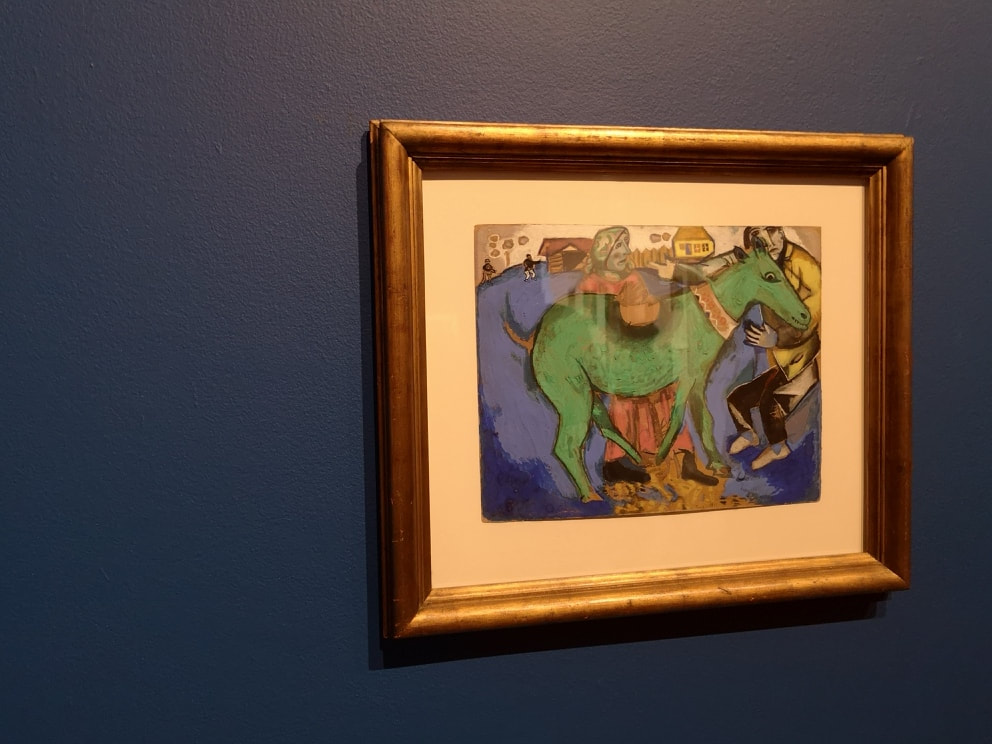
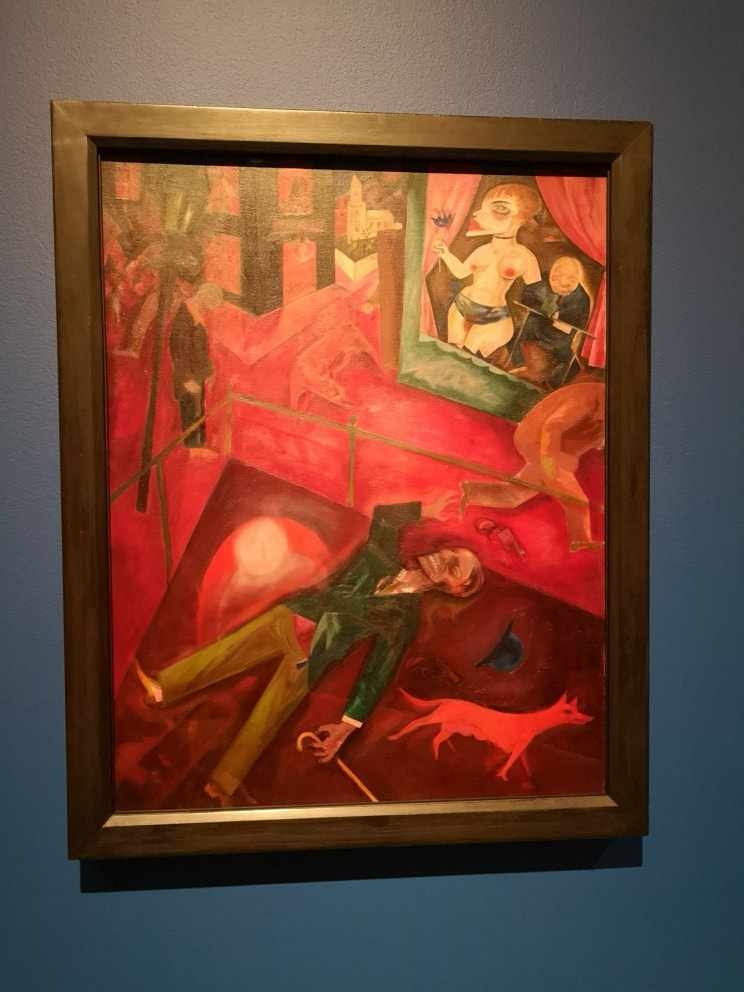
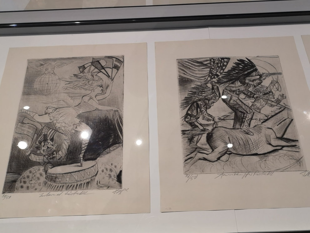
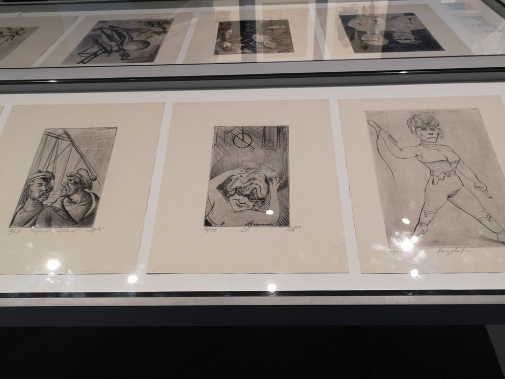
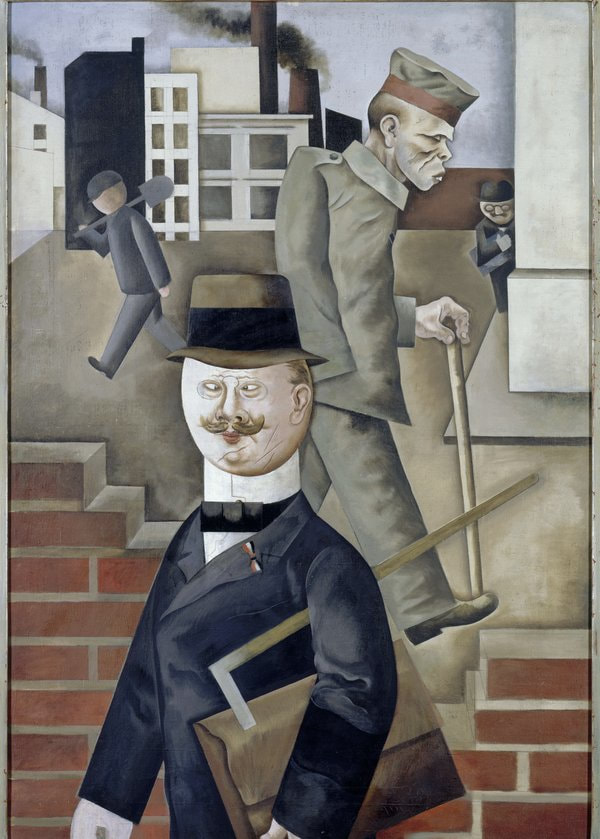
The two above right are respectively Anna by Karl Otto Hy and Girl with Pink Hat by Hans Grundig. With Hy's Anna I like the strength and solidity of the sitter, she seems powerful, all the more so for the relatively mundane setting. Grundig's painting by contrast is allot more socially cutting, the figure looks ill and ghostly and the pink hat is barely pink at all. Her face has an almost clownish quality which is upsetting. Nervous, earnest ,awkward and weasely self important, Marie-Louise von Motesickzy's Russian student (above left) could easily be how I imagine a young Rachmaninoff to be. His thinness and the tones of brown, on brown, with the one stroke of colour being the rater ragged pink curtain, very much given the message of a level of poverty. I like the shadows on his face and suit, the seem to emphasises the thinness. At a complete contrast, and almost photo-realist in style is Rudolf Schilter's woman in a red scarf (above right). It reminds me very much of sci-fi covers from the 60s and 70s with that ruined landscape and the moon. The figure challenges you with a direct gaze and that odd arm position is like she is about to summon some creature from the depths, or possibly criticise you for being 5 minutes late. The award for most powerful piece in the room goes to Franz Radzwill's Conversation about a paragraph (above). It is a beautiful painting with this wonderful detailed interior. He is showing off his skill here in the manner of Vermeer et al, by having that glass bottle with its reflective surface, another painting against the wall in the background, crockery on the sideboard, wonderfully detailed fabrics and of course the beautiful but somehow upsetting female figures. Why is the one on the left wearing a hat? That tattoo around the central figures crotch is interesting and arresting. It is all done in a smooth and detailed style. Then you discover that the paragraph in question is a section in the Wei mar Germany constitution that outlawed abortion and the painting shifts, and the disturbing elements in the image start to take on a new meaning. What was in that bottle? The 2nd room you may enter (we are going backwards remember) has these two large colorful pictures with these oversized central figures. At first I thought they were by the same person but on later inspection I discovered not. The one at the top of the blog is The Gardener by Harry Deiering and the other is called The Poet Daubler by Henrich Davringhausen (above). They both have a similar style with these supper saturated colours, often in large smooth blocks, and this dreamlike quality. At fist I thought the Poet was going to be an inditment of Marx or similar but no that is not the message. Something to do with the dominance of culture hence the tiny figures and houses. They are both the type of aesthetically pleasing piece you can gaze at for hours and project your own story onto. Of course you cannot have a show like this without Otto Dix (above). He is the most famous of this group and I think this is for the 2 reasons. The first is he is excellent. The second he has a short and memorable names. Many of the other german artists don't. A significant percentage of my time in writing this blog has been taken up with transcribing long German names. Not with Otto. Anyway, back to the art. There are a significant number of his etchings, with the characteristic angular and distorted figures. All with a slamming social message, like for example in the one on the far left called Sailor and Girl, with there hiders faces, telling you precisely what is going on here. The first room you enter is called The Circus and features the poster boy for the show (above left) . I think it looks like Jon Hamm, has the same powerful head and body, allbeit the head is creased with this strange drunken expression. Of course he may be flying through the air, and the swirling pastel background perhaps suggests that. I do like the way the skin tone is done, with these pinks and purples. Next to that we have Albert Birke's the Acrobat (above right). You have this lovely flowing sense of movement and dance and the way the woman is rendered she is almost animal like, as much part of the show as the horse. This is the thing with good art, it both challenges and confirms ones prejudices in a way that this nonsense sentence has entirely failed to explain. More than one horse on display you also have Heinrick Campendonk's (winner of the best name in the show competition) The Rider II (above left). These beautiful pastel colours. I particularly like the dark blue of the sky and that strange rectangle in the foreground. Why is the horse that strange red colour. It is quite beguiling, particulalry the facial expression on the horse. Speaking of strangely coloured riding animals you have an appearance from Marc Chagall called appropriately enough The Green Donkey. Its an odd painting. I am not sure I like it but it certainly attracts your attention with the odd colours and perspective. I prefer Campendonk's though, in no small part because Campendonk is much more fun to say. Campendonk. Just to make sure you are not enjoying yourself too much though, and to set you up for the rest of the show we have the brutal impact of George Grosz's Suicide (above). So much red, with this desperate cadaverous figure who has killed himself, firmly centre stage, while the other figures (especially the prostitute which is so much a feature of magical realism) pay no attention at all. The one light spot is the white church in the background. Is it a ray of hope or a cutting indictment of religions failure to save this man? Don't worry about that it is the kind of tedious question that will often be pondered upon in impenetrable art speak. Instead wonder at the blocky rendering of the green jacket, the faceless man standing just to the left and come aware awed and more than a little upset (a common experience in this show by the way).
I shall leave you with some more Otto Dix.
0 Comments
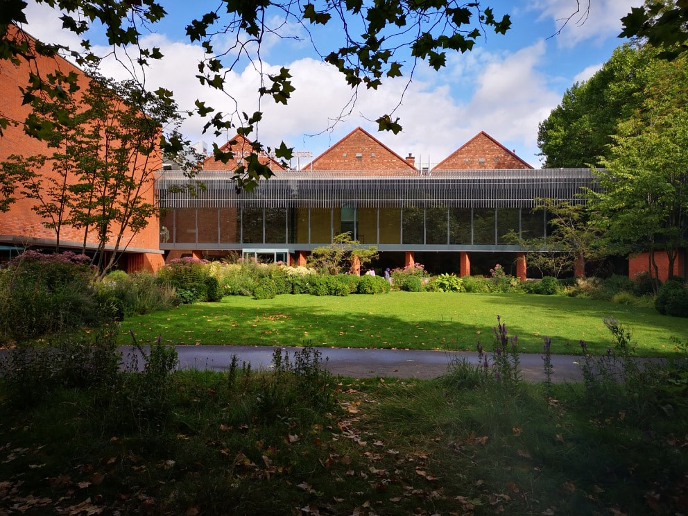
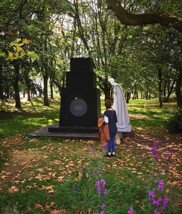
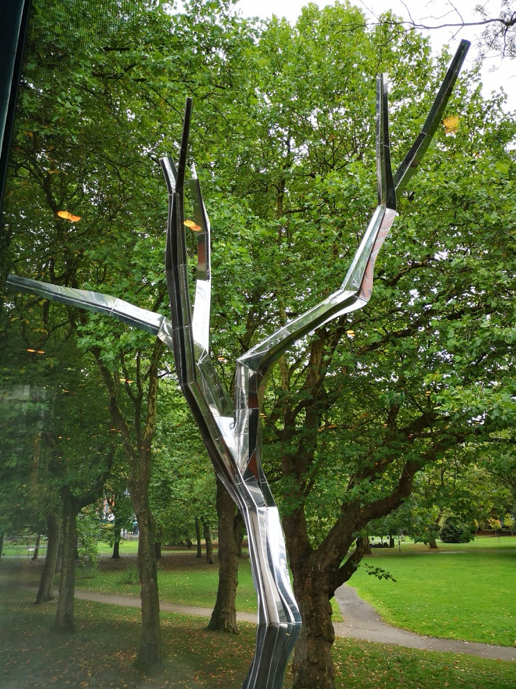
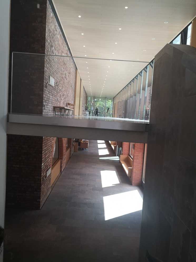
I went to University at Manchester. Twice in fact so I spent about 5 years in the city yet I have no memory of even noticing the Whithworth art gallery, despite tramping across Whitworth park many, many times. In recent years though it has shot to fame, and won a number of major awards so I decided, on a recent trip to the city, to see what all the fuss was about. It is an attractive building, the front a large Victorian brick edifice of the type that abounds in Manchester and grafted onto the back an attractive two winged affair enclosing a very attractive garden (above). At the back of the garden, just beyond the boundary between kempt and unkempt sits this ominous looking no faced statue (above). I monk like figure with a clockwork or mechanical chest, peering at this black monument. You can see it from various points of the museum and it beckons you out into the grounds in a ghostly way. The south wing of the extension is a cafe. The tea is terrible but it has a very good view. Three sides of it are made up of floor to ceiling windows, but as you are up near the generous tree canopy , while being light and airy it still has an enclosed cosy feel. It becomes obvious from here that the garden has been well designed so that it shows off different parts of itself depending on the level you view it from. You can also see out into the park and see several sculptures including this shiny metallic bare tree (above).
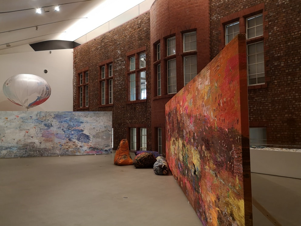
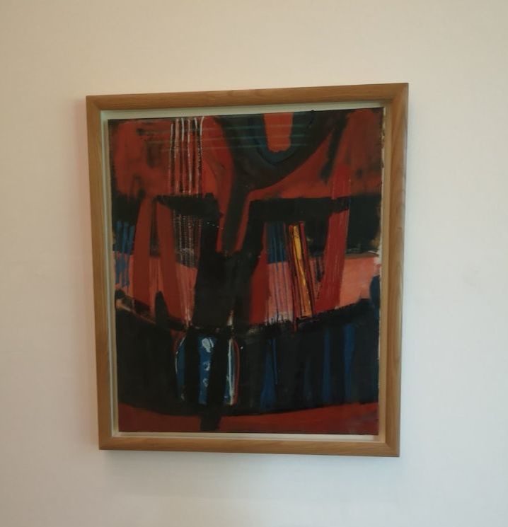
The largest gallery is on the mezzanine level and is I believe called the great hall (above). I like the way that they have exposed the brick work on what is presumably the back of the older Victorian building. This gives you a surreal inside/outside sensation. While I was there it was playing host to a rather fine exhibition by Alice Kettle called Thread Bearing Witness. It was a series of large rectangles, along with stranger more three dimensional objects, all decorated in highly coloured thread. The depth of colour and density of the thread is extraordinary. Figures, patterns and objects merge in and out of the more abstract background images. It is visually very appealing and very good. I particularly liked the burnished red colours you can see on the right hand panel. The gallery has a number of fine paintings but the likes of Barbara Hepworth and Philip Lanyon. They are all glass fronted though so my photos of them are just blurry reflections of an idiot with a phone. However one that has survived is Terry Frost's Blue Red and Black (above), Frost coming from the does what it says on the tin school of naming. I like Frost and he is better on a bigger scale but It was nice to see one I had not seen before and again it was the stripes of red and pink, particularly where you have that flashing line of gold, that appealed to me.
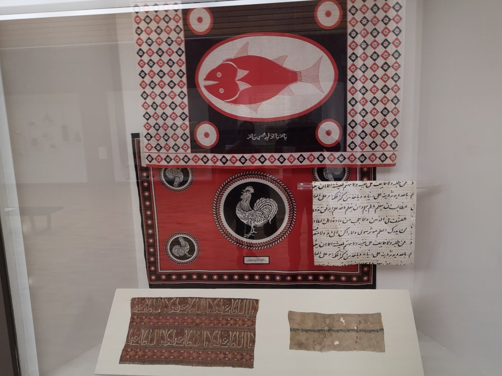
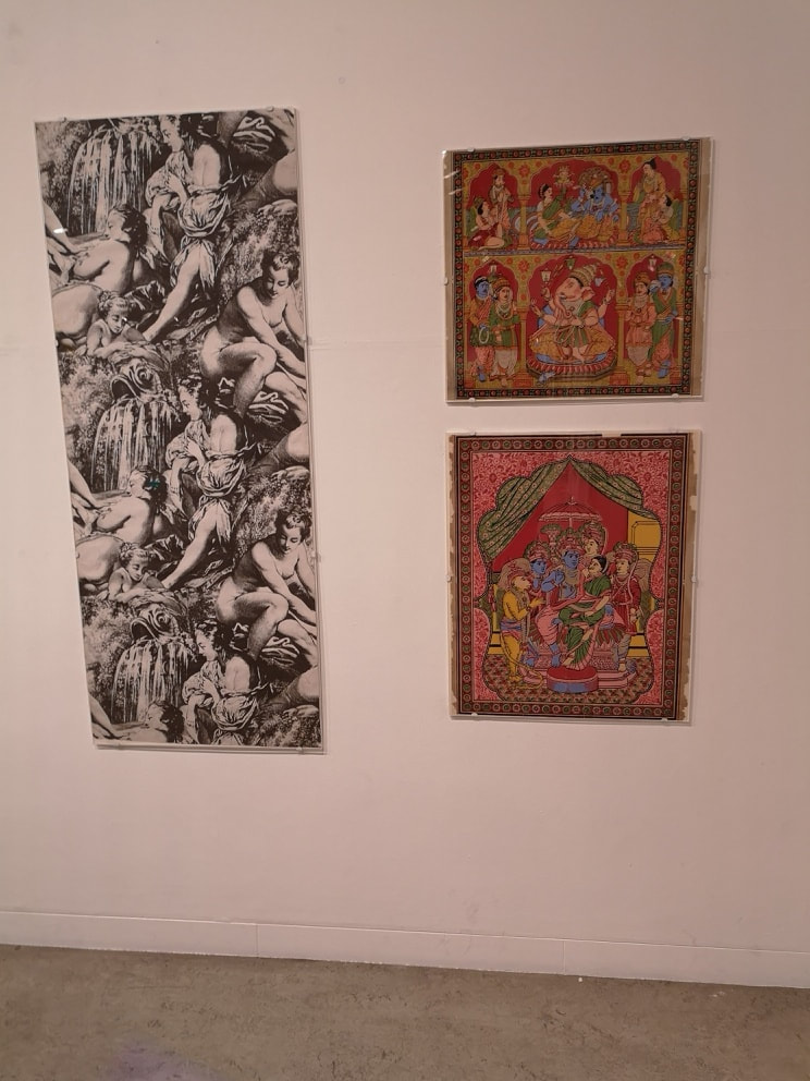
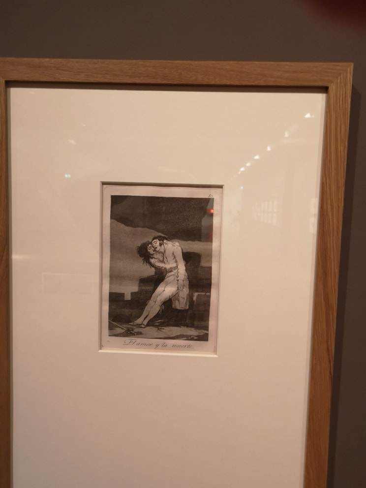
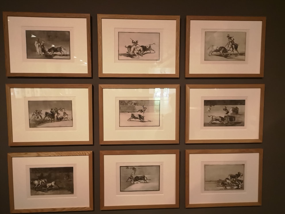
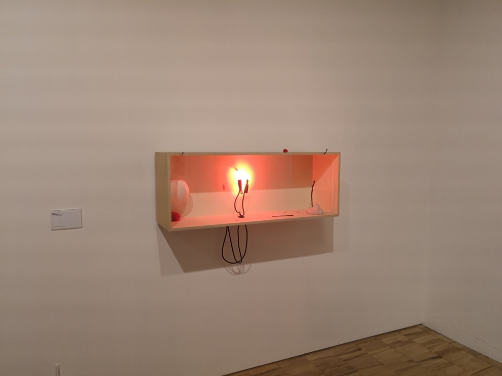
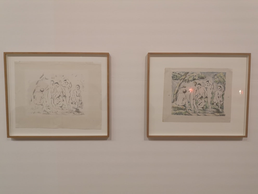
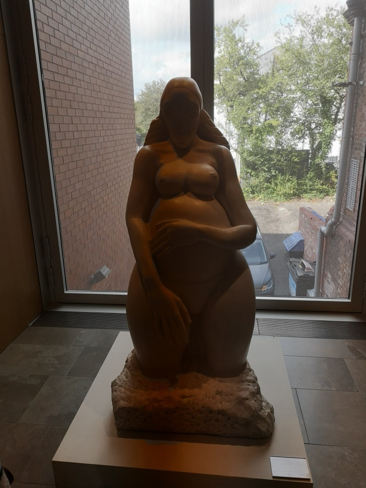
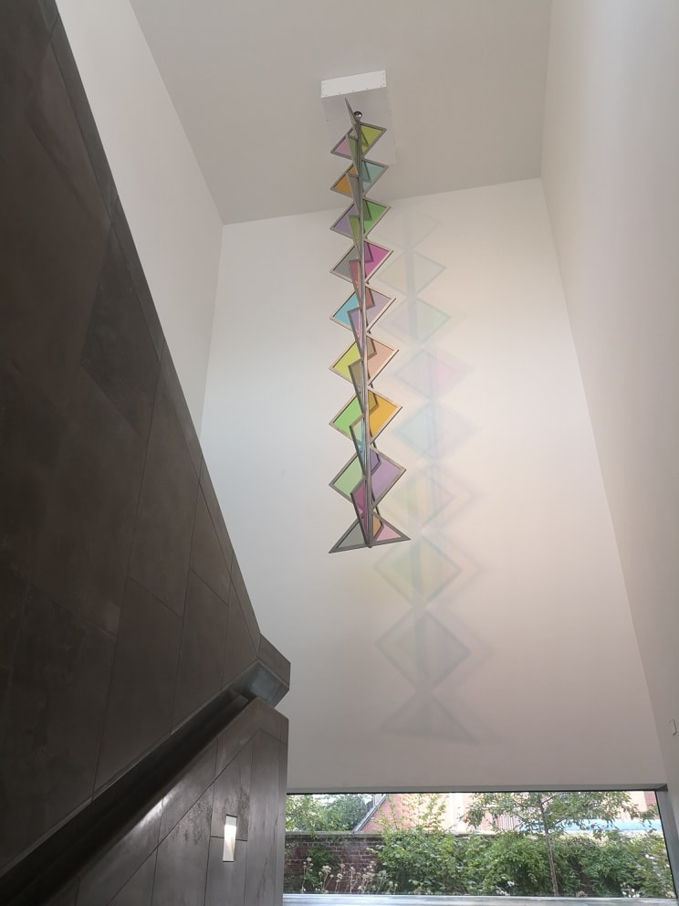
You have these people injured, dead or dying, the effects of deprivation. Or more dynamic sections like in the collection of 9 above which shows bull leaping. No one looks happy in a Goya etching. Running along the north side is a small gallery containing some modern work, including a installation of a peach light in a box by Rebecca Warren (above left- who has reached that stage of success where artists no longer have their own website). IT is simple but has a reassuring glowing warmth to it. I also like the sharp divide in the box that the shadow forms. Did I say this area was more modern, well I liked because incongruously opposite it are these two line drawing sketches by Cezanne (above right). They are irritating because they are spare and simple, and probably done quite quickly yet are still superb. Moving along the corridor sitting in an alcove is a generous sculpture of a pregnant woman (above). I have failed to record who this is by but it is very good and like all good sculptures has a real earthy presence to it. At the end of the corridors the stair lead down into the lower ground level, and the exit to the garden. A coloured glass sculpture hangs over you as you descend (above left). The is also a nice architectural feature in that as you descend you can see both levels at once, split only by quite a think concrete floor (above right) and both lit by the large windows at the end and to the right. Give that lovely sense of space/cossiness that I was talking about before.
While I was in Manchester, they had the bee art trail going on (the bee is the symbol of the city). They are scattered through the city but my favourite of the ones I saw was Lord Beedon Powell in the Manchester Cathedral (above). Puns and art, always an excellent combination.
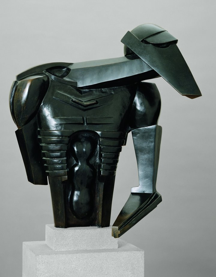
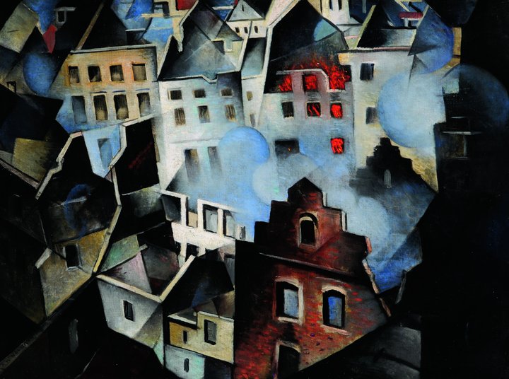
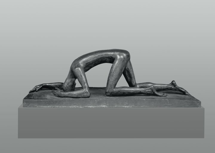
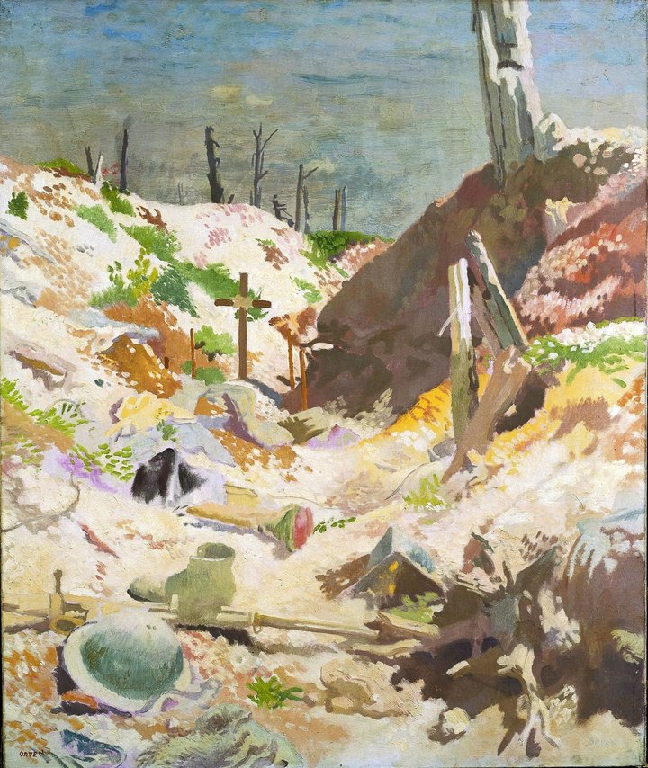
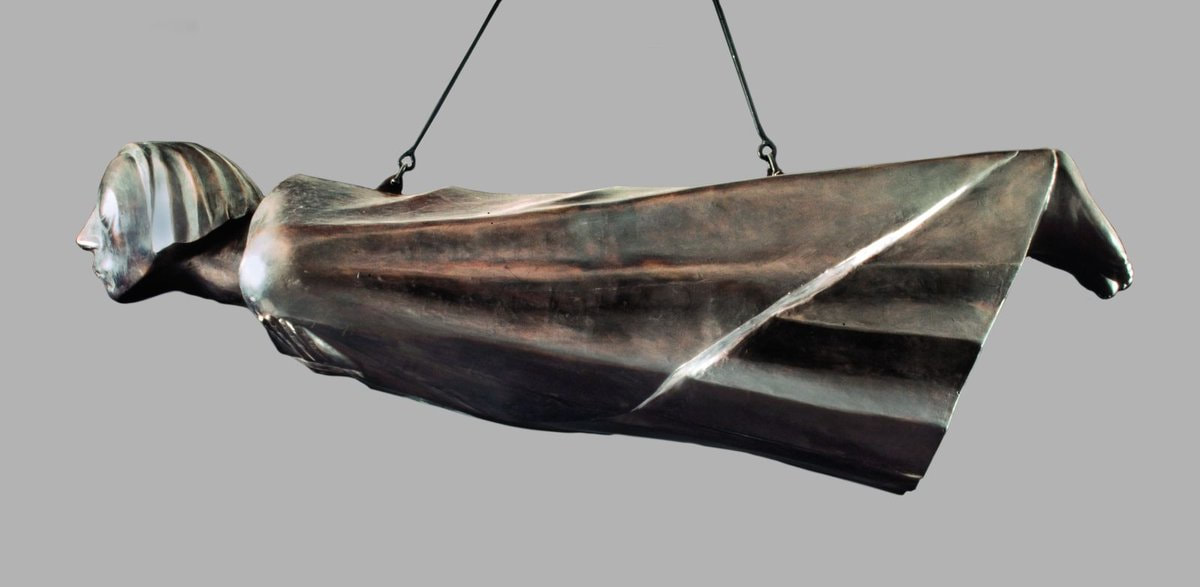
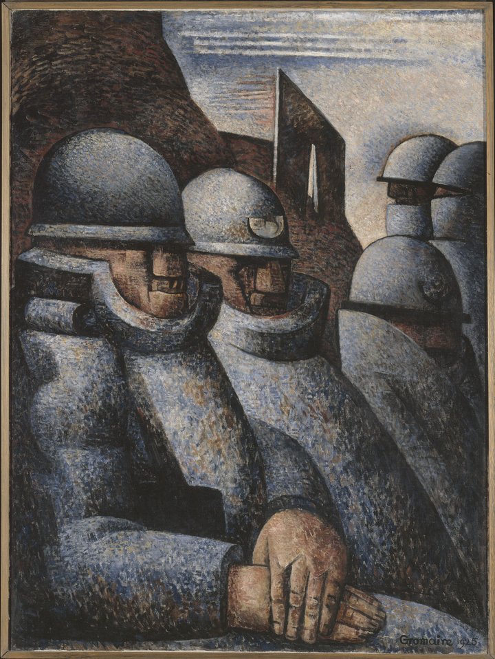
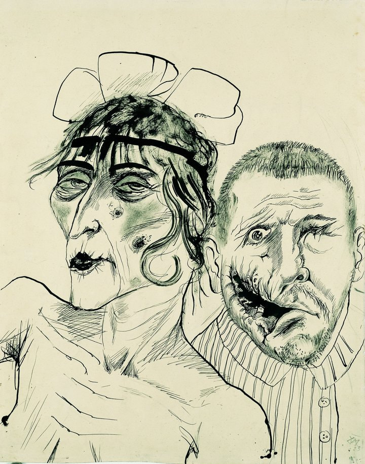
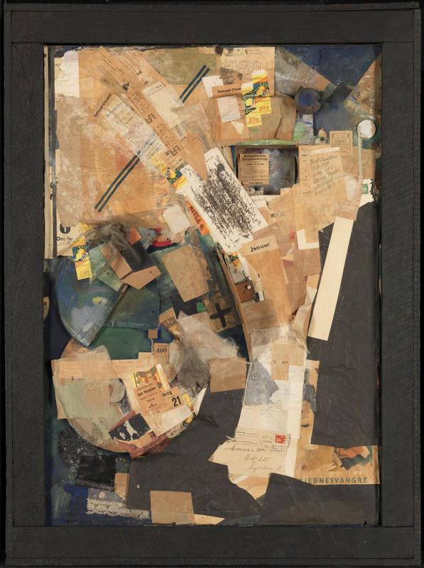
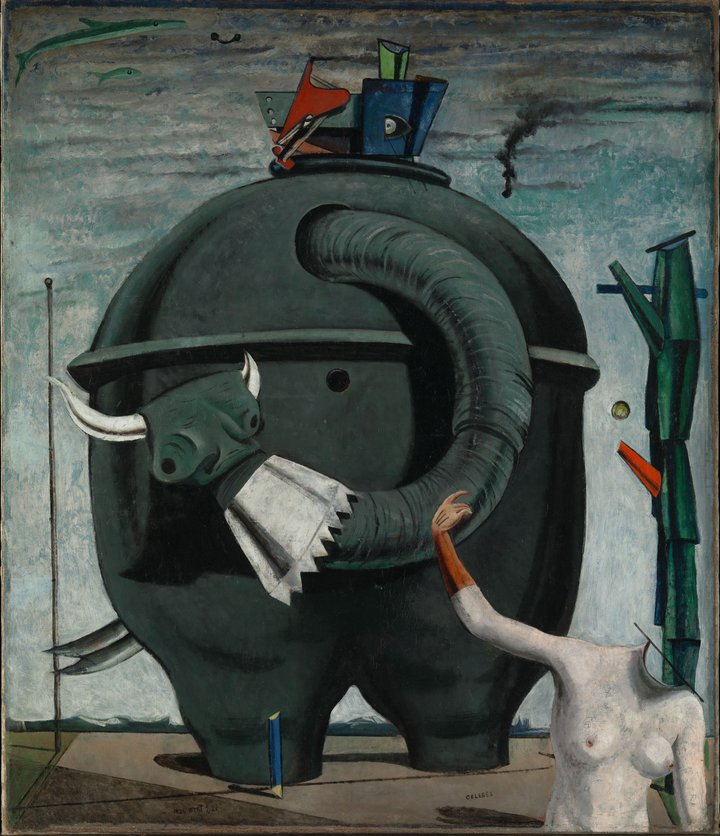
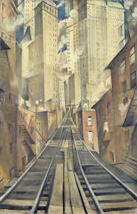
Aftermath at Tate Britain is a show that displays art from during, as a reaction to and after the first world war. It focuses on British, French and German art and is an intensely powerful show. In fact I found it almost overwhelming. There are parts of it that really hammer home the horrors of war. It is a stunning show of both artistic, historical and political import. Any tub bashing hawk should be made to go round this show, until they get it. As with all good shows there were some old friends and some new people I had not heard of, or had heard of but not really appreciated. The first room contained pieces of art, reflecting the war, either done contemporaneous or completed in the years that followed. It contained both paintings and sculpture as did the show as a whole. There were some very striking pieces right from the start. As you enter the door you are greeted by the rather threating presence of Joseph Epstein’s Torso in Metal (above). A statue of a mechanised torso, ribs and insides showing and with a robotic alien like appearance. In fact this set a thought running that was confirmed by much of what I saw in the rest of the show. Many of our cultural images of horror, gothic horror and science fiction seem to come from this period (particularly horror). The images that the tortures of war caused these people (mainly men in the case of this show) to produce resound still in our culture. Torso in Metal certainly has echoes in various sci-fi robots I have seen. It took me quite a while to get out of the first room as there was so much to see of such quality. The picture that immediately called out to me was Charlie Simms The German Front Line. It is a large piece, dominating the wall. The foreground is the trench itself which is dominated by white. The rocks and mud are given a white almost snow like appearance, as though it is somehow fading out of existence. This causes the red corrugated iron, and the dark entrances to the dug out to stand out even more. It is all under an ominous purple sky, in front of a desolate landscape (that phrase is going to be in this blog a lot) punctured by a glinting far off church tower. Round the corner from this a very different piece by again a name new to me, but one who I came away from the show a firm fan of, that of Christopher Nevinson (above). It is called Ypres aft the First Bombardment. The canvas is full of these abstracted angular buildings, rotated to view from various views and transected to see inside. There are no people. One of the buildings is on fire, and this oval and circular gray smoke ascends from the centre of the piece. It has an ascetic appeal but this gives way to a nightmarish quality (another description that will re-appear). Opposite this picture was a very interesting vitrine (glass display case). In it were various objects, such as pen knives, made from discharged bullets, and models made from spent shell casings. Made me think of the alternating horror and boredom of war. You can picture these men, sitting there, nothing to do but wait for disaster, carving these things. In the middle of the room is a sculpture occupying a rectangular area of the floor is Wilhem Lehmbrack Fallen Man (above). The title hints at the pose, kneeling with the head on the floor, head bowed so the face is hidden from the front, arm outstretched in front of him. The figure is naked, and emaciated and when you orbit round to see the face, it is a picture of despair. It is beautifully cast from bronze. As you can see it (and many other pieces) made quite an impression. William Orpen (above) was another new name to me and one who came out of the show high in my estimation. He had two pictures in the first room of which I greatly preferred Grave in a Trench. What is particularly convincing is the use of soft, almost playful pastel colours that contrast entirely with the subject matter. It is not a picture that instantly grabs you, because of its muted demeanour but it very much draws you in, not least because you have to look quite hard to see the grave. We have had British and German now it is the turn of the French in the form of Luc- Albert Moreau. It is a strangely sparse piece. A sort of grey cloth draped over a shattered tree (shattered trees are a feature in this show). All composed in this angular style with blocks of tonally shifting colours. It has a sorrowful feel and it reminded me of Paul Nash. Maybe it likewise reminded the curators as they had but a Paul Nash next to it, all be it one slightly different from his usual style (I am fan of Nash and have written about him before). It is call simply Wire and shows a shattered tree (told you) bedecked in broken and twisted barbed wire giving the appearance that the wire is growing out of the tree. This was one of the images that very much reminded me of a horror film set. I am not the first to say this. Zombies were famously inspired by the James Whale (check this) witnessing blinded gas attack survivors stumbling along. The final piece that grabbed me in the first room (yes we are still in the first room was by Felix Vallotier and is called Military Cemetery. It is a field of closely packed almost uniform crosses merging together into a grey mass as the recede into the distance. They speak of anonymity. Yet most of the crosses have been decorated, a personal touch has been added. Because of the subject matter there is a modern almost structural form to all those crosses. The message is pretty compelling. The next room was not as interesting. It was basically state and memorial art in remembrance of war. Grand in its pomposity and all about the glorious gallant dead, the nobility of war etc. Technically impressive but less interesting. There were four unusual pieces in there that caught my eye. The first was a German nail object. As the name suggests it is a picture made by nails hammered into to a painted bored. The effect is very German, very militaristic. I had never seen this before and the one on display was an eagle over the colours of the German tricolour. It was called rather ominously strength through unity. Literally hanging over the other pieces and casting an impressive shadow against the far wall was Ernst Barlach’s (above) the Floating one. As sort of weird impassive angel like figure, with a seraphic expression, arms folded over the chest, floating calmly above everything. It is beautifully carved in an angular but soft style. Against one wall in a glass cabinet was a marquete for the Soisson memorial by Eric Kenning. Three identical looking very modernist blocky angular soldiers stand next to each other, flanked by shells. The square nature of the identically faced figures is reflected in the equipment they are bedecked with. It is very similar to the piece it hangs next to, in rather a good stroke of curatorship, that of Marcel Gramaire’s War (above). You have these solid looking, very mechanical blocky soldiers. Depicted with this lovely sort of soft speckly almost pointillist paint. I like this one very much and Gramaire is another name that is coming away with me. The next 2 to 3 rooms are a bit hard to take, emotionally speaking. The theme of all of them is the aftereffects of war and the pictures scratch at the psyche. I found it quite upsetting and I kept wondering about the mental state of the men who produced these pieces. Fractured and distressed presumably. So round the corner you have a number of lovingly rendered portraits of soldiers, done in a simple watercolour style by Henry Tonks. The subjects all have horrific facial injuries. One of them is missing most of his lower jaw. Henry Tonks was working with a plastic surgery unit and the drawings were to record the before surgery state of these poor people. I can feel myself welling up just recalling it. It’s powerful stuff and pretty much sets the tone for the next few rooms. Along the wall at right angles to this you have Sella Hasse’s etching One Arm War Blinded Man at a machine. It is all done in firm blocks of black and strong black lines. The man, with his artificial arm is rendered to appear as though he has been reduced almost to a machine himself. William Orpen reappears with a piece called Blow up. An almost naked, skinny, young alien like soldier, wearing only a helmet and cloth over his privates stands in a destroyed landscape. Again the use of these calm pastel colours is at odds with the subject and the imagery. We also now start having appear the giants of post war German art, the first up is Otto Dix. The pieces are sketches or drawings. Some of them were studies for paintings that did not survive the advent of the Nazis and the second world war (Dix along with a number of other German artists such as Max Enst and were labelled a decadent artists and their work destroyed). The first haunting piece you come across is called the Prostitute and the Disabled War Veteran. It has a sub title, Two Victims of Capatilism (above). She is Haggard and defeated while he has been horribly disfigured, his face shattered, by the war. It is a simple line drawing but very effective. There are more of Dix, along the dividing wall, showing war veterans deformed and dehumanised, very effectively portrayed in a surrealist style. I defy anyone not to be moved by this. Around this partition the style backs of a little. You have a wonderful mad assemblage of news papers by K Schults (above). There is a small niche set into the piece and sitting in these niche are two tiny models of dogs. They give the picture its name, a picture of two dogs. Quizzical was my reaction to this. More ghostly and sombre is Andre Mosson’s Piccardy Road. You have this empty road leading through an abstracted landscape with tomb like structures on the floor and twisted trees. It is all misty and done with these pale pastel colour. Much more colourful, indeed packing a real punch in that respect is Max Ernst’s Celebs (above). This is a famous painting and chances are you will recognise it. The large grey elephantine machine, with a top resembling a helmet, sucking up something through the trunk like house. Sitting in front of it an a striking contrast both tonally and in subject is this headless naked female torso. Subtle fish swim in the sky. The next room dives you back into despair. It shows prints. These prints by various artists emphasise the horrors and the effect of war. This is done best by the series displayed in the square case in the middle. It is called the War and it is again Otto Dix. They are truly horrific. For example the Foxhole where you have this plump evil cackling figure playing cards but standing to one side is this near naked, thin elderly man. They all have a similar message and you might well recognise the skull, infested with maggots which is quite a famous image. The next room is called a Return to Order and is frankly something of a relief. Because of the nature of the show (and well frankly art generally) there aren’t many women in this show. Winifred Knight’s the Deluge appears in this room for reasons that seemed a little strained to me but there was a very good painting by Dorothy Bett called War Widows. You have this group of women, all dressed in mourning black, against a yellow cloth they are using to make things with. The women are all quite young. A couple of them are visibly pregnant including the central figure who stands there brandishing a pair of scissors. Their faces are indistinct and similar, allowing you to project onto the figures. It is very well painted, the black contrasting with the yellow. Paul Nash appears again in this room as does Otto Dix, Edward Durres’ very famous The Snack Bar and some very poor Picasso’s which I didn’t understand why they were there. There is also guy called Franz Radzinil with a picture called Morning at the Cemetery Wall. The bricks of the wall are beautifully rendered. The whole thing sits below this pink sky. The buildings in the background seem somehow medieval in quality and you have leering down at you from above the cemetery wall this malicious looking angel figure. I was quite captivated by this piece. Then I read the blurb and had that disturbing sensation of finding out that an artists whose work I like had become a Nazi. This produces an odd dissonance but it is still a good painting. On the same wall is Old Military by Franz Lenk, which shows an abandoned trench, flooded with water, against an empty greying sky. The water effect is very good, as is the rendering of the wooden slats of the trench. Decaying industrial landscapes appeal to me so I was always going to react well to this. In the final part of the show there were two paintings I liked. Nevinson appears again this time with soft pastel shaded abstraction. This one shows an elevated train track arcing off through angular buildings. It is resonant of Ypres at First Bombardment particularly in the style of the buildings. It was originally entitled New York in Abstraction but he renamed it the Soul of the Soulless City (above).
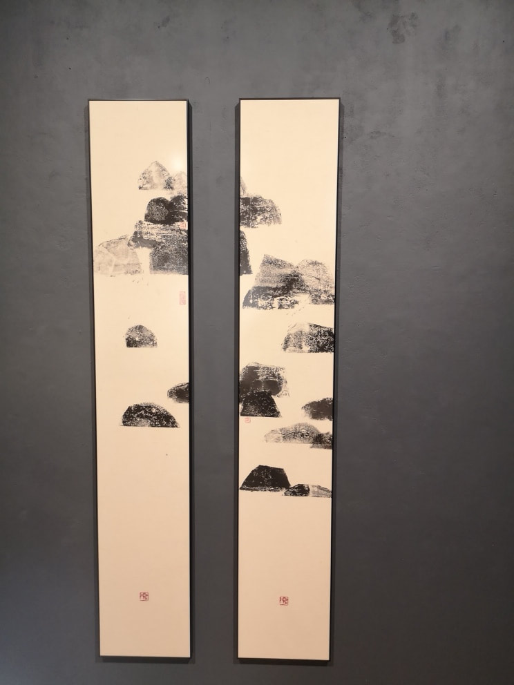
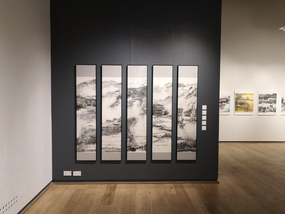
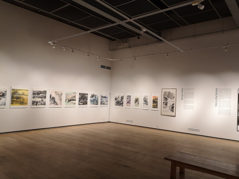
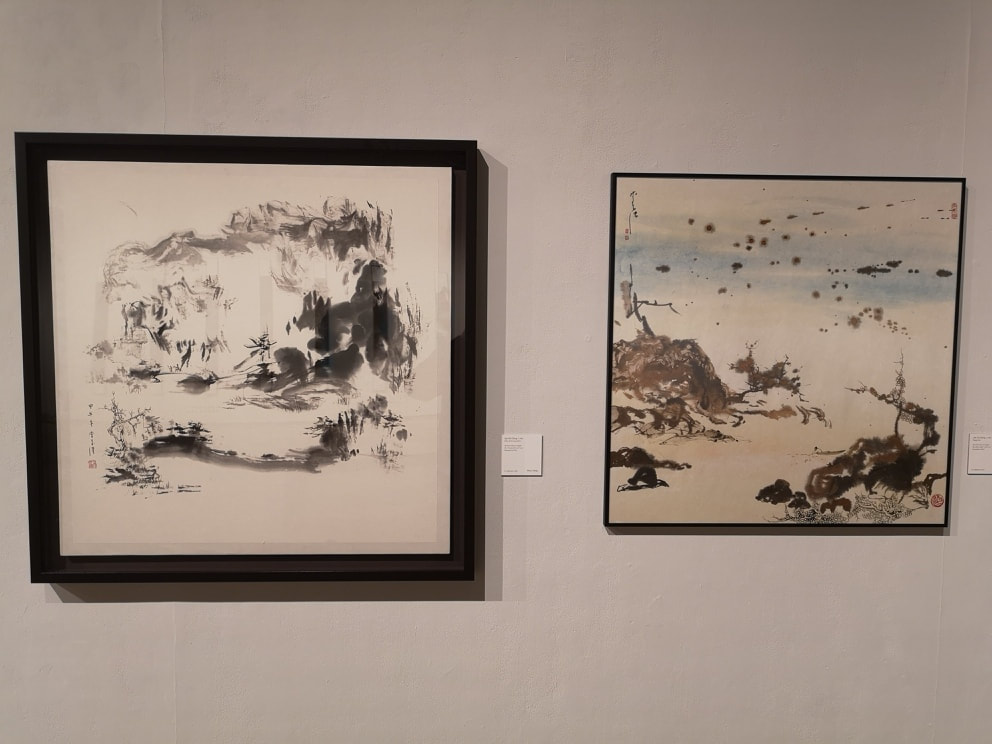
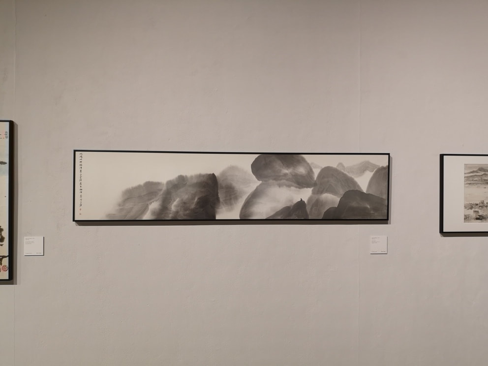
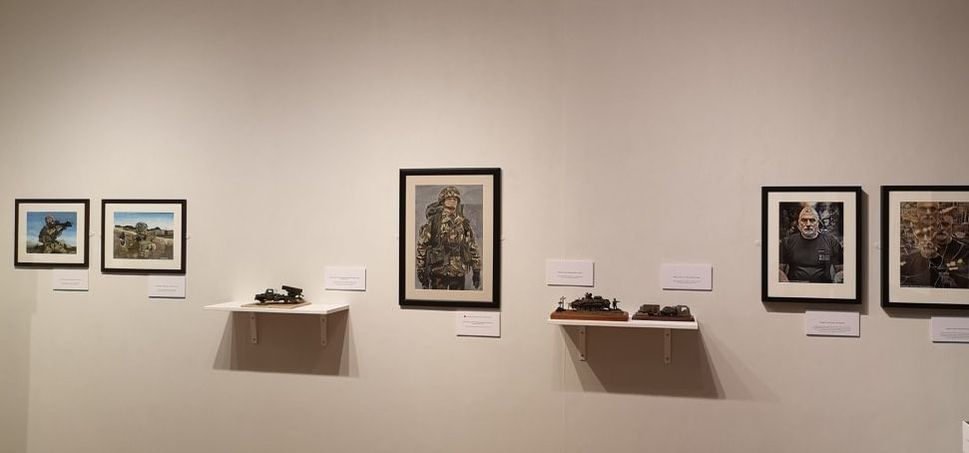
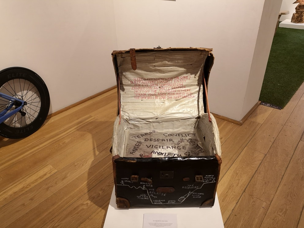
Finally there was a pure abstracted, school of Mondrian type painting called Discs of the city by Fernand Leyer. It is bold geometric shapes and circles, in reds, blacks, blue and yellow making a sort of machine like assemblage. It is a nice piece and works well as a pallet cleanser to refresh you and send you stumbling back out into the real world, and sunshine. The show is on until 24th September and I highly recommend it. 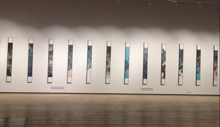 I go the the Mall Galleries periodically and when I went a couple of weeks ago there were three very different exhibitions. The only problem with Mall Galleries is their exhibitions only last a few days so you have to be on your toes. Two of the three shows were on their last days, I think the third will have finished by now. I advise you, if you live in London, and particularly if you work in the area to keep an eye of their website they often have interesting stuff. The first was a collection by three Korean ink artists, Raymond Fung (above) Nina Pryde and Lee Chi Ching (more of whom later). Fung is one of those ridiculously multifaceted people. Not content with being an artist he is also an architect. His coloured inks (top of the blog) benefit very much from the cheerleader effect producing a lovely sort of muted rainbow. It would be best if they remained together in a group of at least 3 of 4. As a single entity they are quite nice but they lack a detail once you get close. They have a nice initial impact but reward less close examination. He had up a pair of black and white paintings (above) and these for me were much more interesting. They definitively work as a pair as you can see the marks join up between them. I like the sparseness and emptiness of them. They indulge a meditative quality. Pryde has a more diverse display, basically four different types of work. They are all ink drawings. Above you can see the colourful square pieces and a series of 6 blue/black ink drawings that work together as a set to produce this landscape. I like particularly the blue black long rectangular pieces. This composition style is something that really works for me. The gaps in the scene make it seem like a shuttered window, or a carousel zooming round. Pryde uses a technique where she combines her ink landscapes with photography. It is an interesting idea but for me it doesn't work. It somehow shatters the suspension of disbelief. Finally we move onto Lee Chi Ching. Who seems to have two competing styles. You have these quite spike sparse landscapes (above left) and then the more abstract, even vague rock formations (above right). It is of course the later that attracts me. If anything I find them a bit two crowded and could do with more space in which to wander. The next show was very different. It was put on by the charity Help for Heroes who have a project called Creative Force who use art therapy and art clubs to aid the recovery of soldiers, particularly from mental illness such as PTSD. It was a very moving and powerful show and had some really quite impressive pieces in it. There was as you would expect a strong military theme but the show was at its best when people went beyond this.
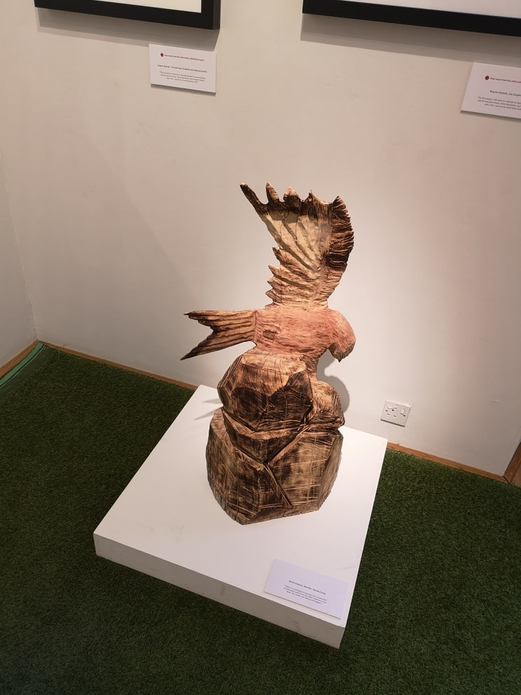
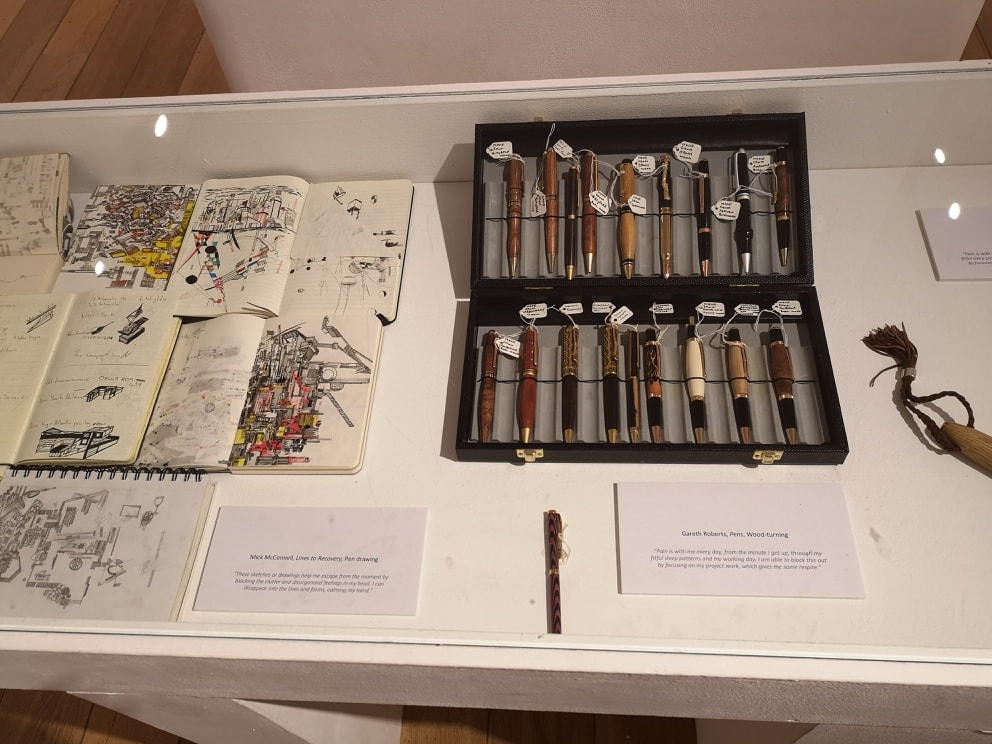
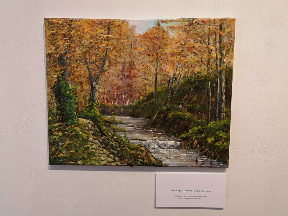
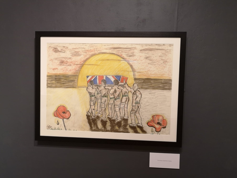
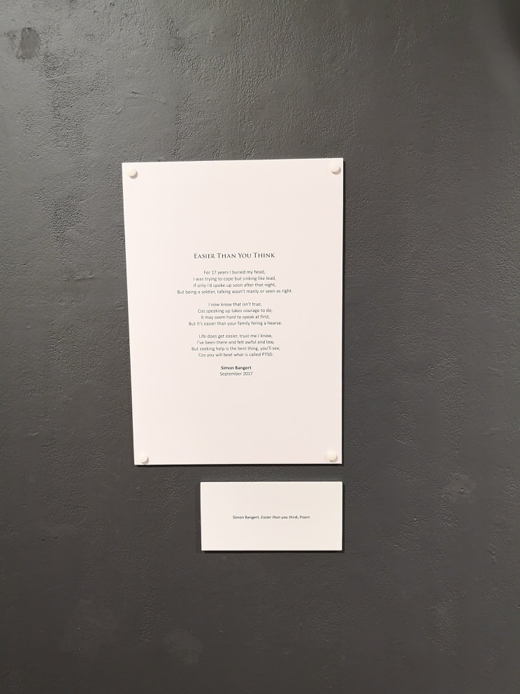
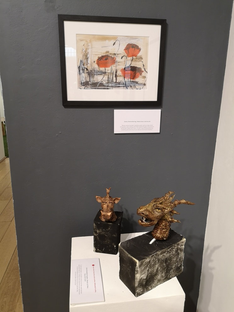
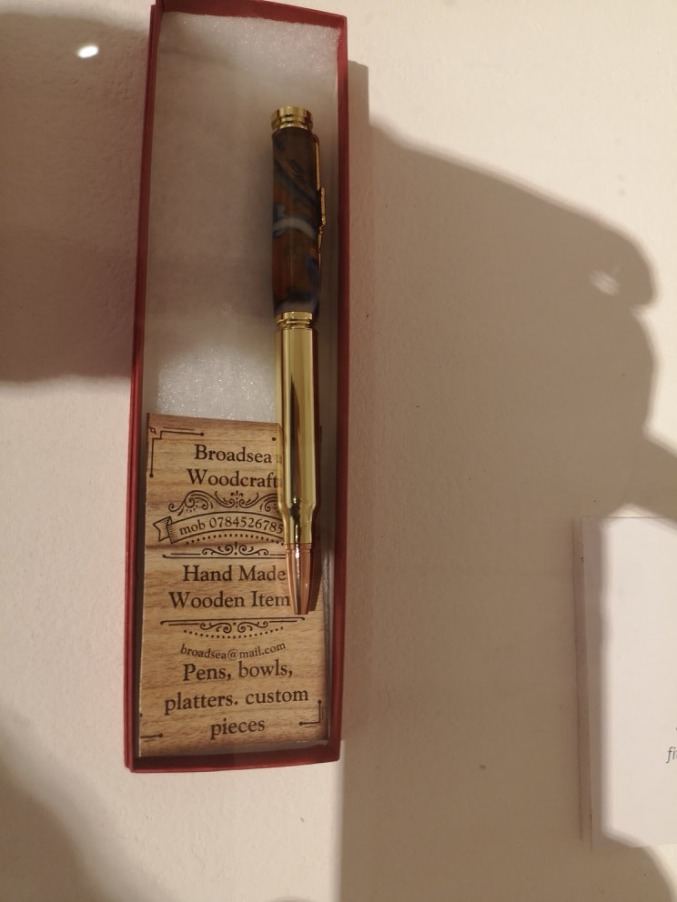
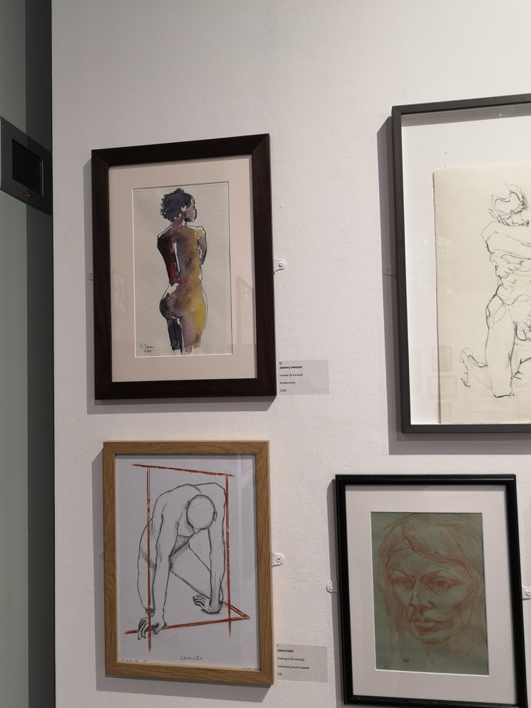
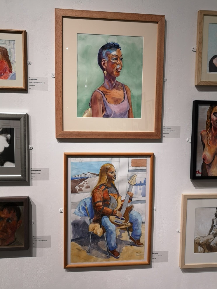
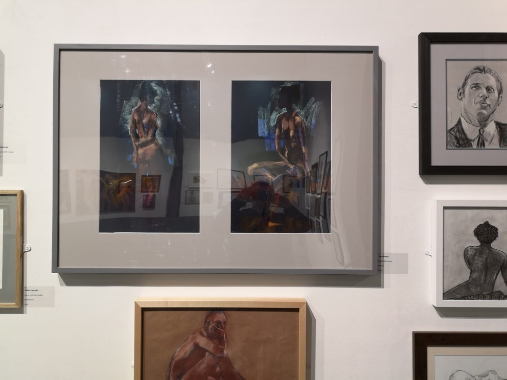
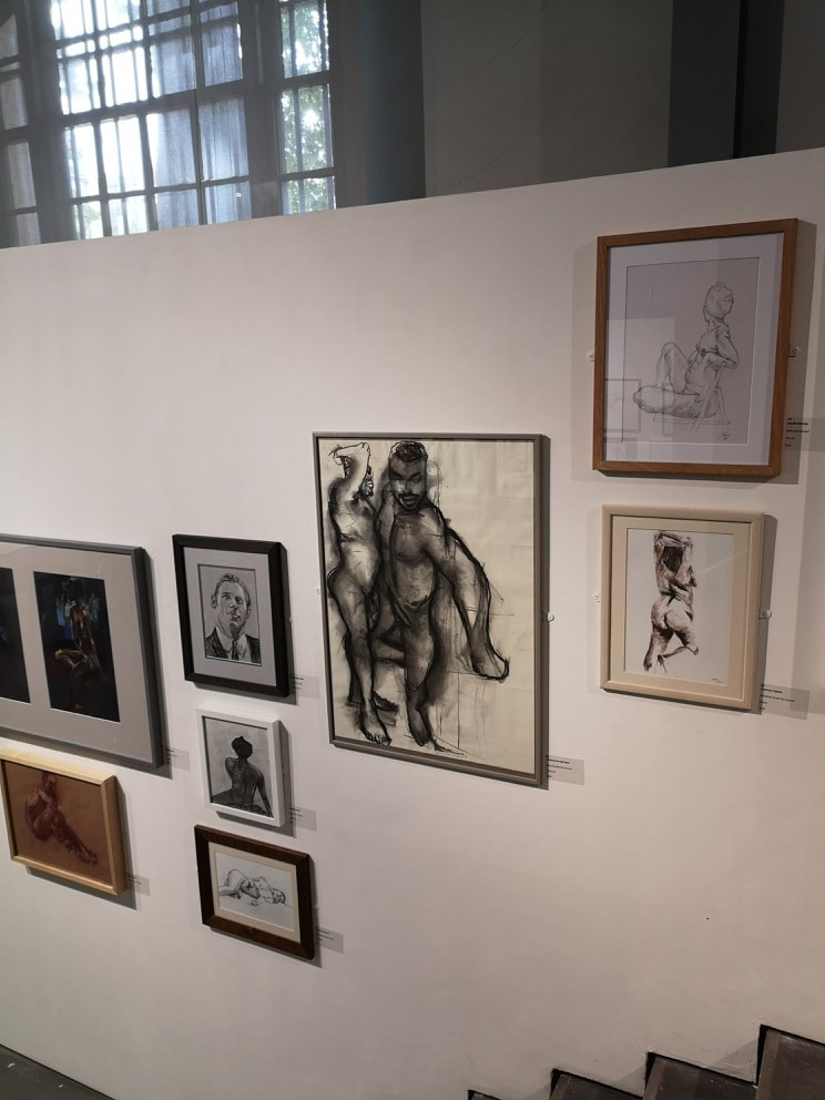
I love this intricate imagining in the above left photo. This strange machines and odd cities. Rendered very well and very imaginative. The red and yellow are used as an effective highlights. Next to it are these very attractive pens made from a variety of materials.. These are lovely objects and I particularly like the tortoiseshell number sitting on its own. Sometimes you just have to admire a well rendered composition. It may be a classic scene but this pretty brook ambling through those gorgeously amber trees. The orange of the foliage making a good contrast to the green mossy ground. The water effect is done well (above left). The sketch like drawing above right is, in this context very moving. Particularly somehow the man at the back with their hand resting on the flag shrouded coffin. I was left with the distinct impression that the artist new the person in the coffin and perhaps was one of the people depicted. Not only painting and sculpture was on display but also poems (above left) as well as video art and some music. A veritable panoply of art. You get some odd contrasts too with these fierce wood carved dragon sitting under the nice, scratchy watercolour of the poppies, which is a fine piece (above central). There was also another producer of pens (above right) with these appealing wood business cards. A sort of finer, sleeker feels to the other artist and I am seriously considering contacting the maker to purchase one. The last show I went round was the annual show of the Heskath Hubbard society. They are a society who focus on life drawing both nudes but also clothed models. There was a vast array of different drawings, sketches and paintings. A number of them were very good. In the above left, the crouching man, in that odd brown box in the bottom left of the painting has something about it. In the above left the portrait of the lady with the guitar it is excellent portrait. It has a real sense of character and personality about it.
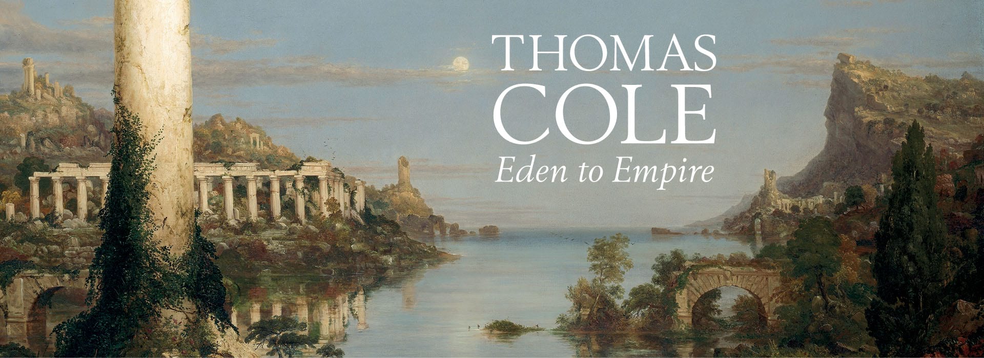
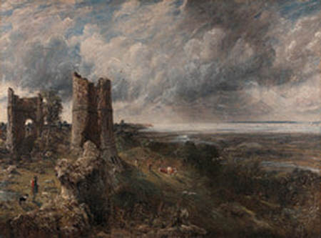
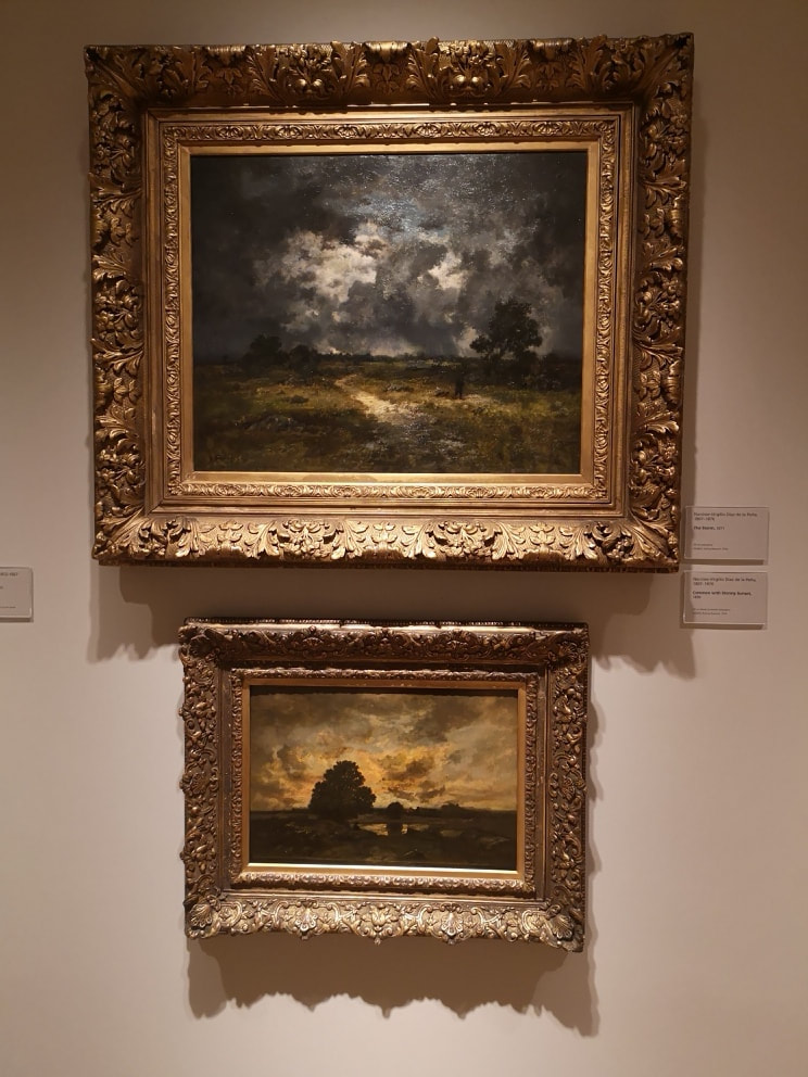
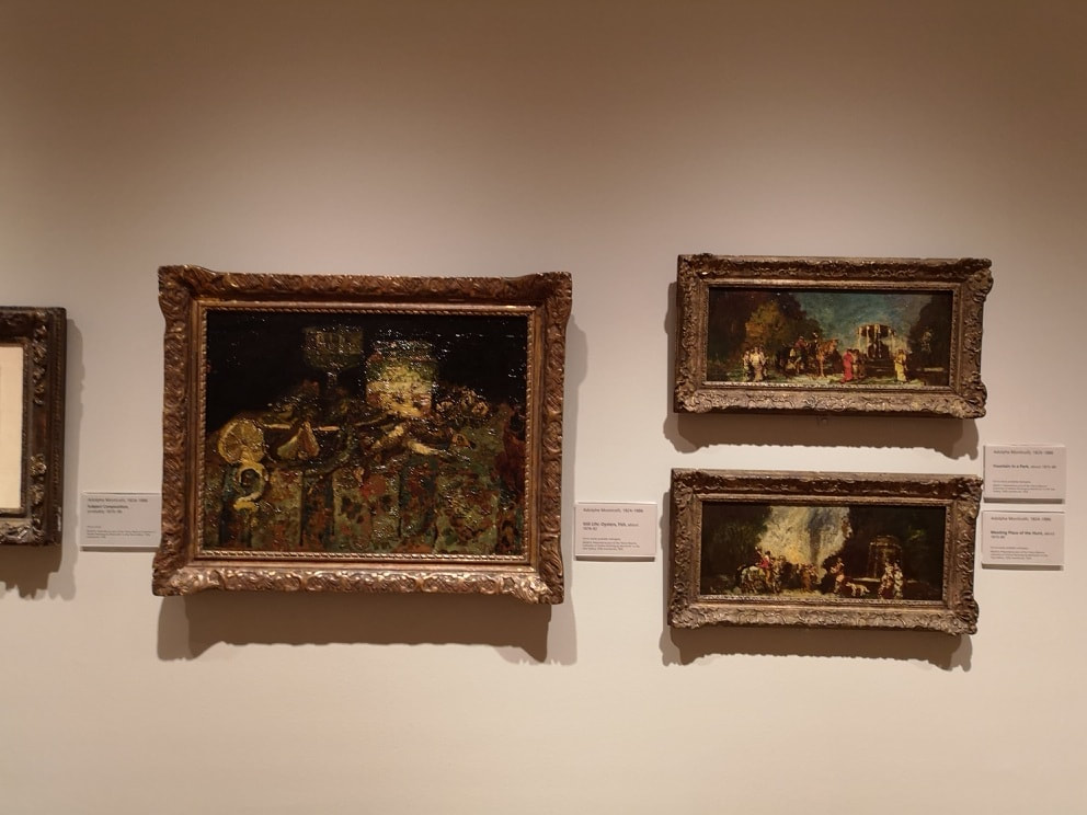
It is not often that I am disappointed by an art show. There is usually something that I enjoy about it. However the current exhibition at the National Gallery, showing the work of Thomas Cole, I found quite disappointing. I had not heard of Thomas Cole before. This rarely puts me off as I have been to many shows I've thoroughly enjoyed that focus around artists unknown to me. Who is Thomas Cole. Well he was English and American. He focused on two types of landscapes. The first and probably more successful type is the mythic as shown above. The second type are Arcadian landscapes, stripped of most human habitation, all lush greens and looking mountain ranges. He specialised in landscapes of the US and his work was used to popularise the Hudson river valley. It is because of these two different strands that you have the title of the show. It also reflects a series of paintings that Cole did, that are the centre piece of the show, which show an empire raising from an empty landscape and returning to ruin. The problem with Cole, at least for me, is that there is very little to his work. It is all very pretty and all well done, but it is just rural propaganda. The myth of the virgin countryside. It lacks punch, it lacks depth. The imagery and metaphor when they appear are all overworked. There is a lack of anything substantial. He is important in part because of his main subject matter but also because he is an early painted of the American countryside. He doesn't paint what's there though, or even a reflection of it. He paints an idealised version. An the ideal in question is quite a dull one. One thing the curators have done, which does Cole no favours, is put in the show pictures of his contemporaries who inspired him. In one room then, you have 2 large Turners and 2 large Constables. All of excellent quality and quite frankly completely eclipsing Cole in terms of style, technique and in fact anything. Indeed the main thing I got from this show was seeing a Constable I had never seen before. The spectacularly craggy Hadleigh Castle (above) which was on loan from the Yale Centre for British Art. It is a marvelous piece. About 6 foot square, with this ruined castle, with its enigmatic split through the tower, a stormy sky and then the wooded river valley beneath it. People are here, and although this too is idealised, the ideal here is an interesting one. I spent about 80% of my time in the show, looking at the one painting. It was almost, on its own worth the admission price. The other Constables and Turners are very fine too, don't get me wrong, but I had seen them before (they were from the Tate I think). All this showed to me it seemed was to firmly push Cole into the second rank. The National Gallery is despite the occasional miss-step, still and excellent museum and rewards just wandering around. The recently opened up two new rooms in the basement, in order to put more works on display and I like ambling through it seeing if I can spot something new that takes my eye. I did that this time and found two new friends. The first is the delightfully named Narcisse-Virgillio Diaz de la Pena (above). Who had two works on display called The Storm (top) and Common with Stormy Sunset (bottom). He obviously liked storms and I can see why he would. He paints them with a wonderful energy, and delicate subtle tones of gray (in the top one) and gold or orange (in the bottom one). Then you have them set over these murky almost muddy wet and desolate landscapes. I particularly like the way he has these somewhat lonely trees silhouetted against the sky. Lovely stuff, I would like to see more of it. Almost directly opposite him were three paintings by Adolphe Monticelli (above) who like Diaz is a 19th Century French painter but with a very different style. He has this crusty, deep (probably not the right word) use of paint that is particularly well displayed in the larger piece on the left called Still Life with Oysters. The objects themselves are difficult to make out, the crusty paint catching the light in odd ways, and it is a great deal more modernist than one would of expected for the period. The colours and the shape morph into each other. A similar style appears in those post box landscapes but they, to me at least are less interesting.
Go then to the National Gallery. There is always something to discover. Just don't perhaps bother with Eden and Empire (unless you are a Constable fan). |
Archives
June 2024
Categories |

 RSS Feed