William Mackenzie
  • Gallery
  • Blog
  • Podcast
  • About Me & Contact

Barbara and St Ives

5/29/2016

0 Comments

 
Picture
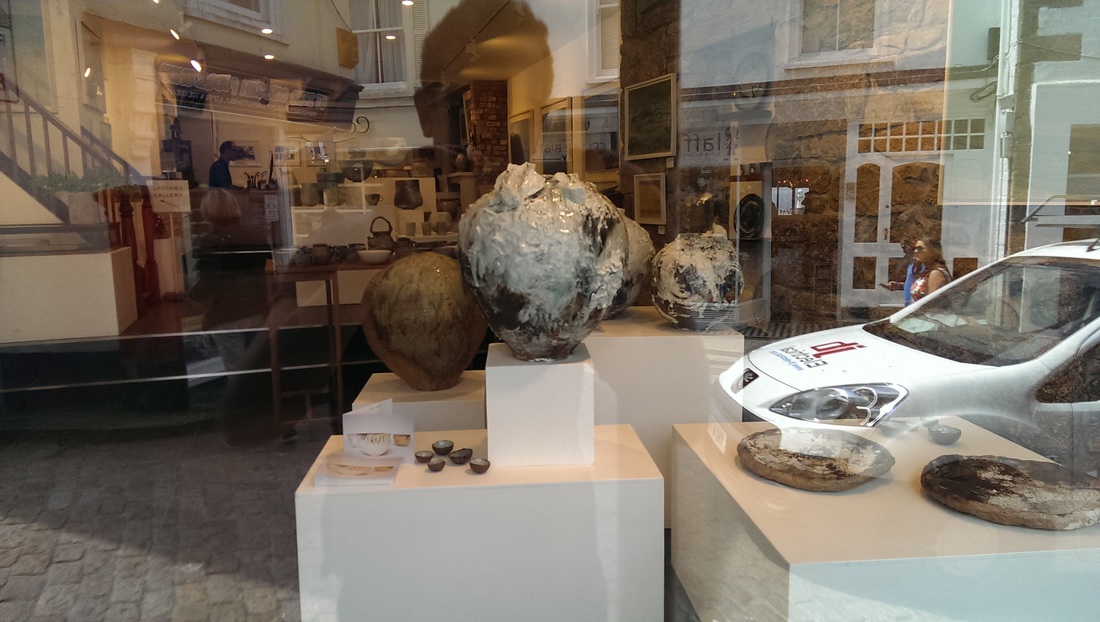
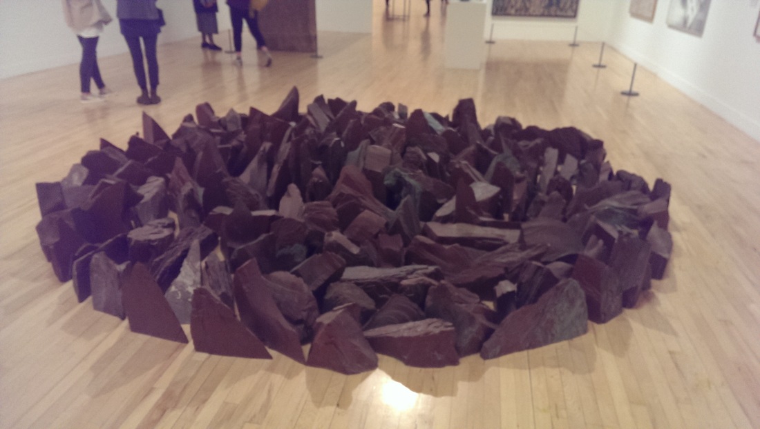
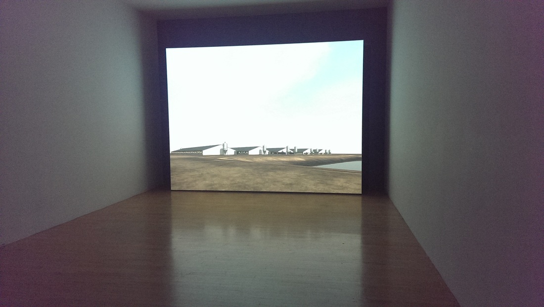
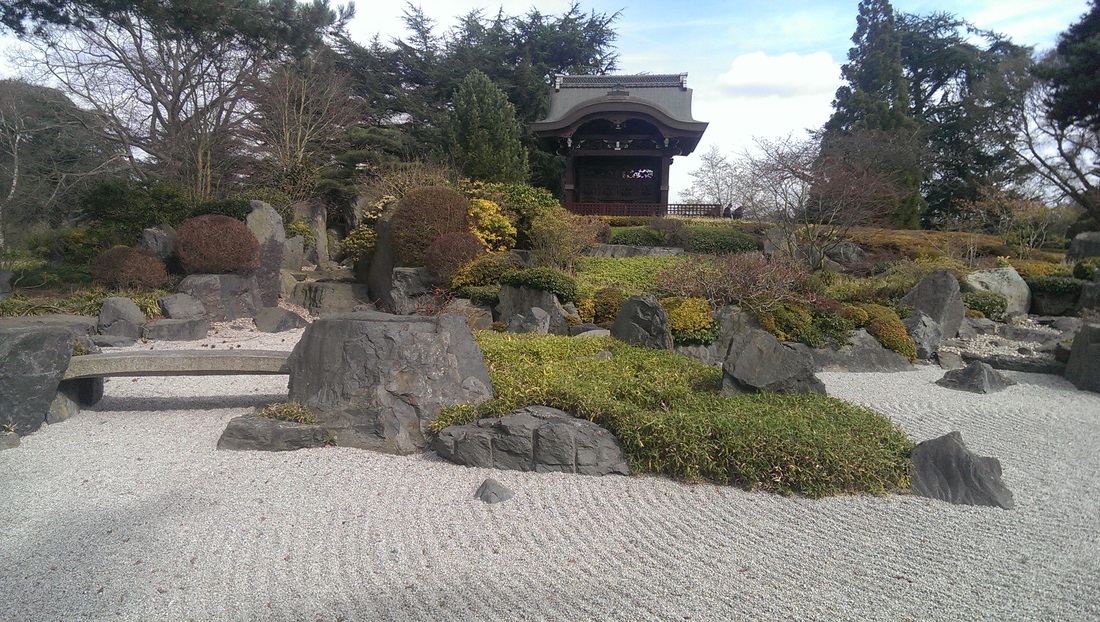
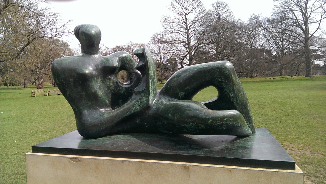
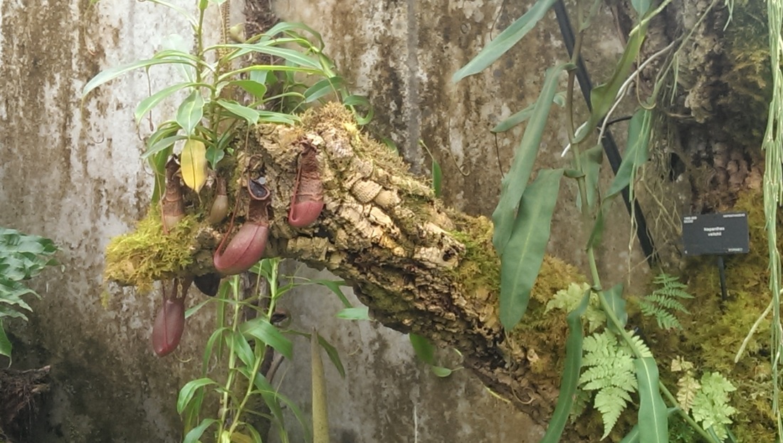
St Ives is not what I imagined. It is a small tight town. Stone buildings and narrow winding streets on a steep hill leading down to an idyllic harbour and to the right a large sandy beach.

St Ives is lousy with artists and almost every streets has a gallery on it. We went into quite a few, the best of which was New Craftsman Gallery on 24 Fore Street. We were biguiled in by an exhibition by Akiko Hirai whose open studio I attended at the Chocolate Factory in Shoreditch and purchased one of her bowls.

One of St Ives most famous residents was Barbara Hepworth and there is a great museum in her old studio. There are many fine pieces on display. Outside a number of sculptures are arranged in a very pretty garden. One of them collects rain water which adds to the piece. Another is a collosal structure you can walk through. There was also a wire sculptures which I didn't know Hepworth did and reminded me of Alexander Calder.

A fascinating element of the museum was her workshop was preserved, as were a number of works in progress. This provided a very interesting insight. It was also nice seeing works both in stone and wood.

Later around the town encountered another piece outside the Guildhall.

​Be warned though high season the town can be crowded.
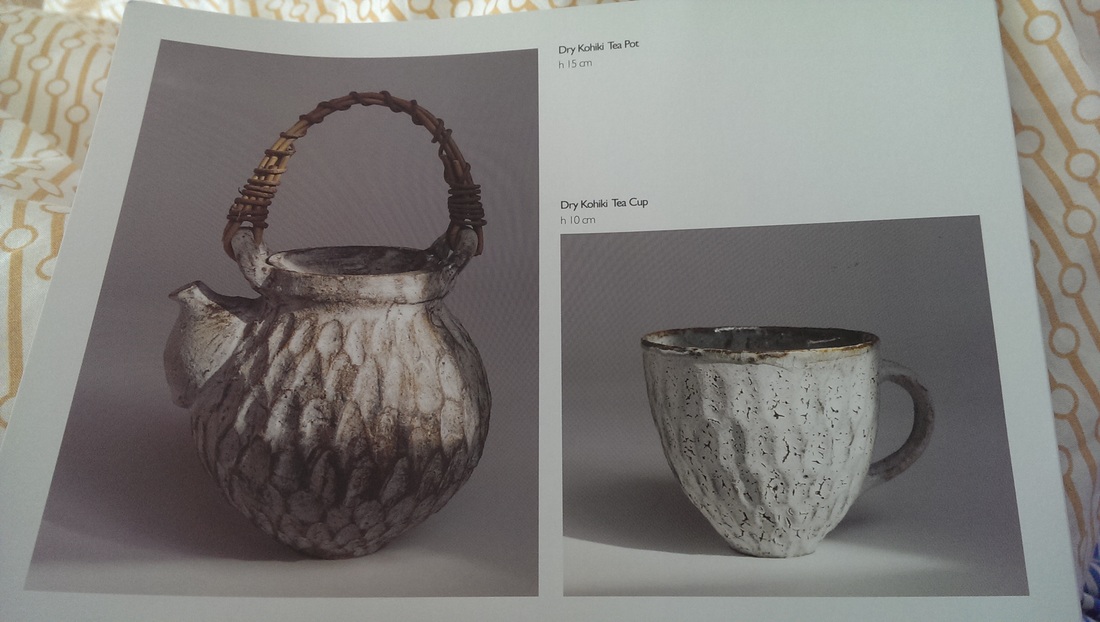
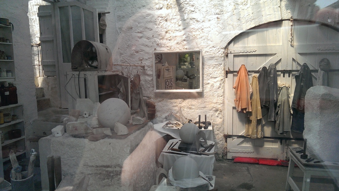
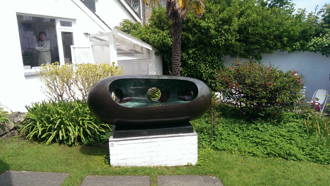
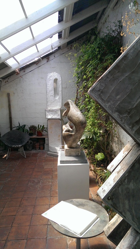
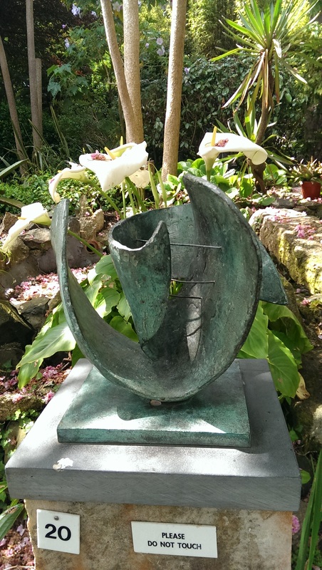
Picture
Picture
Picture
Picture
Picture
0 Comments

May 22nd, 2016

5/22/2016

0 Comments

 
Picture
Picture
Picture
Picture
Picture
Picture
Picture
Picture
Picture
  Did you know the Open university does small, free, courses? Neither did I but I do know and am trying out the Art History course (more on this later).

It has already fulfilled one of my expectations which is to introduce me to artists I had not previously encountered.  The first of these is Paula Rego who I was drawn to.  As luck would have it one of her works is on display in Tate Britain (the Tate has many more but sadly many are not on display).

I went to have a look.  What I had forgotten is that Tate Britain periodically re-hangs the permanent collection and there was much in the 1960s to present day galleries that I did not recall seeing before.

I have documented some. These are no necessarily the best ones but ones for reasons I often cannot describe, grabbed my attention. Paula's is the top picture.  In order the rest are as follows:

Aubrey Williams, Death and the Conquistador.  i like the slightly blurred quality to it, the feeling of motion, the way shapes come and go out of the picture, the occasional horned head, appearing.  It is the kind of picture I could spend ages in front of. 

Victor Passmore the Hanging Gardens of Hammersmith. The name is good.  Names can be important.  It is a sad melancholic scene with its dead trees. 

William Scott, Orange Black and White. I'm a big fan of William Scott.  Simple, elegant, effective. 
 
Gillian Ayres, Break off. I encountered a man who had met her and bought her an egg sandwich, which for some reason she rejected. Apparently she smoked allot. I like the energy in this one.  What doesn't come across in the picture is the size of it.  It's massive. That lurid pink square kept drawing my attention for some reason.

Anthony Gormley, Bed (far left).  It's made of toast coated in something, some kind of plastic.  It's funny and I always appreciate humour in art.  I found my self wandering who the people were whose outline it was.  Are they same person who was used to model all those statues that stood on the London skyline a few year's back?

Anish Kapoor Sandstone and Pigment (near left).  very 2001. It is not a whole in the stone but dark, dark pigment.  It's oddly threatening and tantalising. 

Richard Long, Red Slate Circle. What doesn't come across well in the photo is the clever arranging so that the inner stones are taller than the outer stones.  They have been selected and placed with some care.  It has to say this and the Kapoor sculpture complement each other very well.  Both of them feel like ancient Britannic sacred sites, escaped into a museum.

John Gerrard, Sow Far.  Credit, indeed much credit deserves to go to Mr Gerrard for producing video art I actually like.  Most video art is rubbish. It is boring and also often very badly shot. Mind-numbing in it self serving tedium. It always fails to grab my attention.  This though is utterly hypnotic.  It is simple, a camera endlessly orbits this enormous farm. The large buildings slowly marching past in a way that somehow hooks you. It is apparently endless with the landscape shifting to reflect the seasons.  Very good.  Well done Mr Gerrard.  I think the reason I like it is the artist is absent. He has come up with a good idea which he has presented very well and then just leaves you to get on with it.


0 Comments

Getting inspiration - Kew Gardens

5/15/2016

0 Comments

 
Picture
Picture
Picture
Picture
Picture
Picture
Picture
Picture
Picture
I find it very useful to go to different places to get different kinds of inspiration.  There are of course the art galleries and exhibitions.  There is a surprising amount of inspiration to be garnered from simply wandering the streets of London (and at some point I will do a street art walk blog, but not today).

Fine old buildings like Westminster Abbey and new monoliths like the walky-talky all add to this.  I always find Regents canal inspiring, and for some reason particularly the bit where it is crossed by Kingsland road. 

Then there are the surprising bits of London like the Lee Valley and Walthamstow and Hackney Marshes. 

Every so often though an event location is a very useful kick-start to one’s creative juices.  In such a vein did I find the excellent Kew Gardens.  I have been on a flower kick for a while now so it was bound to fall right into my wheelhouse. 

There are of course many and various beautiful flowers, very pleasingly arranged by the obviously supremely talented staff there.

There is an extremely calming an evocative Japanese garden.  A distinctly meditative experience and the sweeping raked stones is something I may well come back to.   (Rocks have a mythical significance in Japan).

There is a fine Henry Moore sculpture resting in the grounds.  Avenues of trees and strange arches of foliage can been encountered.  The kind of thing that makes you think if you went through it, 1000 years would have passed by the time you came out the other side.

Pretty spring blossom in abundance of course and fields of spring flowers. There are also a couple of pits of modern sculpture which are not only good pieces in themselves but have been perfectly captured in their environment.  A particular favourite was a sculpture of small tower block like structures en-caged in a circle of rose bushes.  It is interesting to imagine what this must be like in full summer.

Much of the finest specimens can be found in the elegant greenhouses.  Being a fool I did not of course take a picture of the greenhouses themselves but I highly recommend you go and see for yourself.  Strange black plants and a plant which has only recently been persuaded to fruit. Carnivorous plants which look very much like extras from Aliens and attractive pools of water (complete with Fish).

Came away with lots of ideas and images to play with.  More in fact than I will ever really have time to do justice.  This is the advantage of such experiences.  You can set down a store of ideas and inspiration which can then be accessed again in the future.
 
The following week I went to Chelsea Physic garden which is also great but a smaller, posher version (we past a cluster of ladies talking about their recent encounter with Lady Sarah Chatto and how she wore no makeup - the shame of it). I took no photos unfortunately but it is well worth a visit.  They have arranged the garden into scent zones, which is a great idea.  It means you can stand there and let the different scents waft past you.  Walking along an arresting scent causes you to suddenly pause. Scent in art.  An underused idea.

Picture
0 Comments

Pastels - trying new media

5/8/2016

0 Comments

 
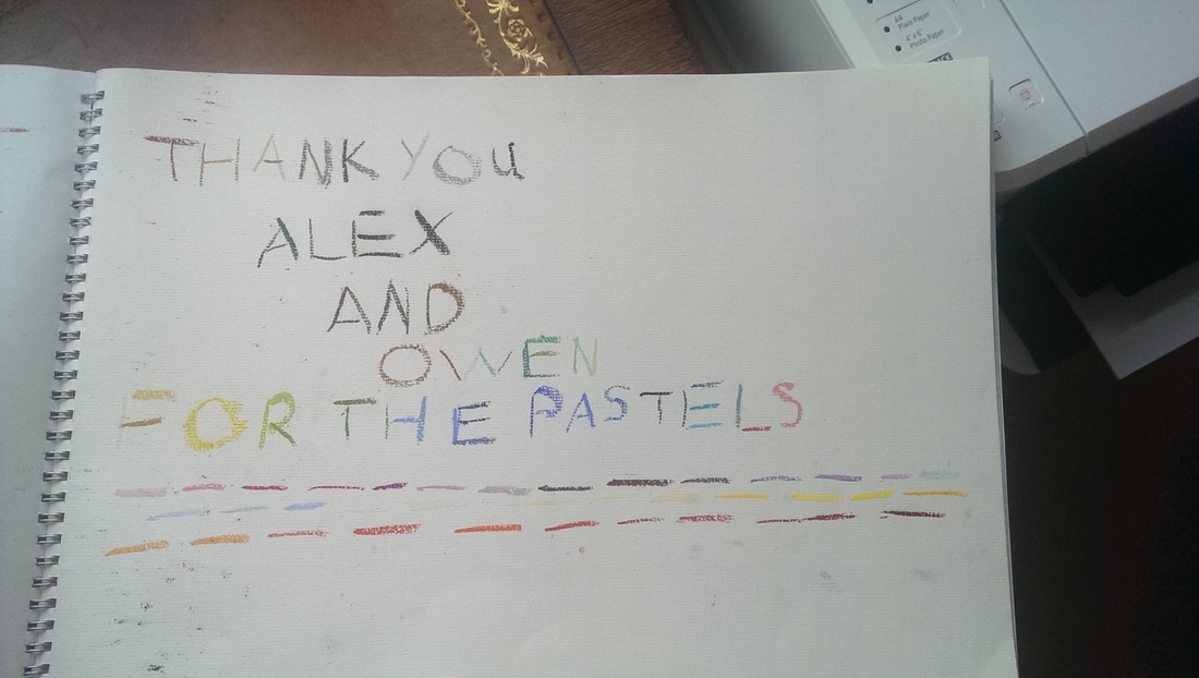
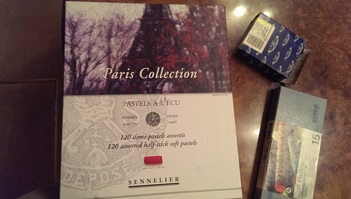
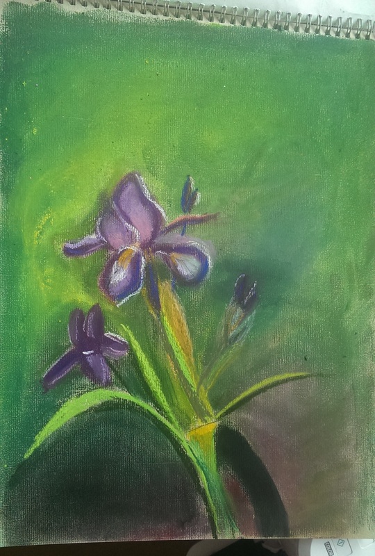
I have tried pastels before.  Before that is I got distracted by the wonders of oil paints and they fell by the wayside a bit.  My interest was sparked again by the very generous gift of a large box of pastels and a pastel book by some friends of mine.
Picture
Picture
Picture
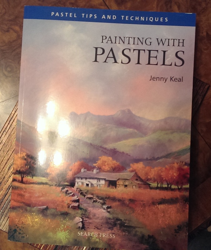
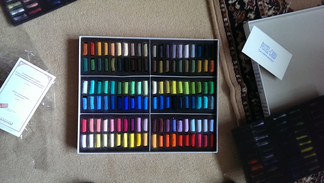
Presentation of particularly art materials is important.  The box itself and then the wonderful rainbow of colours when you open it invites you to dive right in and experiment.  There is always the challenge of when starting a new media, or going back to it after an extended break of what to do with these wonderful new toys you have been given.

I am actually quite a big fan of these how to books. Many are available but Jenny Keal's (shown above) is a good example of the genre.  These books, if done well should do a number of things.  There should be a short and concise introduction to the medium and the equipment you need.  There should be a short account by the author as to how they use it, then there should be a number of examples of various different types that you can work through.  This has the effect of getting you started, comfortable with the pastels, an idea of techniques and approaches and perhaps most important of all a body of work to use as your base point.
Picture
Picture
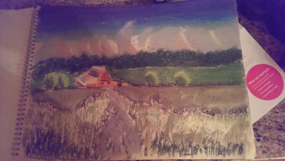
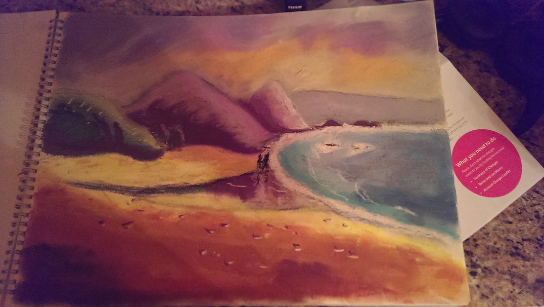
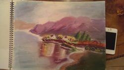
Above are the first two I did.  What is good for me is I felt and I think you can see a definite improvement from the first to the second.  There are elements of using pastels I find difficult.  As my main media of choice is oil paint I am used to mixing the colour I want before applying it to the paper. There is layering to be sure but part of the process for me is manufacturing the colour.  I find it a different intellectual process to select the nearest matching colour from such a wide range and that all the mixing is effectively done on the page. 

There are some elements of using pastels I greatly enjoy though.  The visceral feedback of blending the pastels, particularly with your fingers is very enjoyable.  Top tip,  have plenty of facilities for cleaning your hands as you go along.  Another top tip, pastels are messier than you think.   Another factor of course is that you don't have to wait for pastels to dry, however it is much more difficult than with oils to correct errors without making a horrible smudgy mess (at least I found it so).
Picture
Picture
I was pleased with my progress with the second two paintings.  Partly this is a question of confidence.  As you become more familiar with the media there is a greater willingness to put more of it on the paper.

This has the effect of reducing the blank paper and uncertain edges the are an issue particularly in the first picture I did (the cabin scene above left).

I think it also helped that I was drawn more to the subject matter in these final two having a interest in both reflections (which for me is the core of the above bay scene) and flowers (Iris - left).

I have enjoyed pastels very much and shall certainly be using them again.  I shall sign off with this message:
Picture
0 Comments

The adventures of Orange

5/1/2016

0 Comments

 
Picture
Picture
Picture
Picture
Picture
Picture

or more accurately a review of Conceptual Art Britain at Tate Britain.  Conceptual art has an image problem in the public consciousness.  The old, "I could have done that". Well probably you could but the point is, could you have thought of it. 

As an idea I am fine with this,  that the concept is the art.  The problem is that it is often quite boring to look at, and smacks of extreme self indulgence.  The Tate Exhibition has both of these problems.  It also has the added issue that, as the exhibition is of the early days of conceptual art, many of the tropes it uses have been copied ad infinite-um at second rate degree shows across the globe.  It therefore smacks of both being cliched and trite.  I had to remind myself that these people were doing many of these things for the first time. This does not get you away from the "really?" reaction.

By way of an example the picture of the artist eating his own words.  It does not help that this image, along with many of the images on display where quite dull, black and white photos. The whole setting was wrong to, it was too quiet and needed obnoxious people chatting and drunk. For me it doesn’t work in setting of quiet reverence.

There were some pieces I quite liked.  Homeostat Drawing No1 was a sort of shit Agnes Martin but ok. 

In the first room was my favourite piece, a pyramid of Oranges by Roelof Louw.  I was vaguely wondering what happened to the oranges and whether I could take one and it turns out you can! I grabbed one feeling terribly transgressive and stuffed it into my bag.  No this is in an example of conceptual art at its best.  It makes you think, it makes you feel something, it says something about the nature of art and galleries and it forces you to act or interact in a new way.  Well done Mr Louw.  It is only a shame the the best piece in the show is in the first room and there after its all a bit dull.

In the same room was a mainly black painting by Bob Lowe called Blue black and violet which was nicely meditative. There was also Michael Baldwin's famous mirror which made me laugh the first time I saw it in the Tate Modern last year, with all these people peering attentively into it and taking photos, basically of themselves.  It is I am convinced a joke on the consumers of art.  There was also an ok piece by him in the next room called Hot, warm cool and I can't remember by who the most irritating self serving piece a black painting called "the secret painting" the subject being a secret known to only the artist.  Well it can stay that well you self important prick (whoever you are).

Some guff about a cabinet filled with timed photos in the next room and fairly interesting selection of photos of a camera in different light conditions. 
 
In the longest room arranged on a shelf was a work by David Tremlett called The Spring Recording which were a long line of cassettes labelled with British towns.  I had a strong urge to knock them down like dominoes, such where they arranged.

There was on a  glass of water on a high shelf, made me feel thirsty. It was quite a good idea but there is only so long you can look at a glass of water.  The whole exhibition had in display cases a selection of worthy pamphlets.  Dense type and jargon.

Also in the long room a piece by John Tatham, a timed banner operated by a switch. YOu can’t operate it yourself.  Every 30 minutes someone comes in and solemnly presses the button and it unfurls.  At least so I assume, I was not prepared to wait the 20 minutes to find out.

In the final room there was the time honored  scribbled on print and collages of newspaper ( inevitably with a sexy picture). This is prime example of something that is now horribly cliched.
 
The whole thing took me some 20 minutes.  It was quite interesting and in quite informative but if you don't have an interest in the area then it will irritate you.  Perhaps you like being irritated.
 
I took the orange with me.  It did inspire me to create my own piece of contemporary art so I present to you now; the adventures of Orange.


Picture
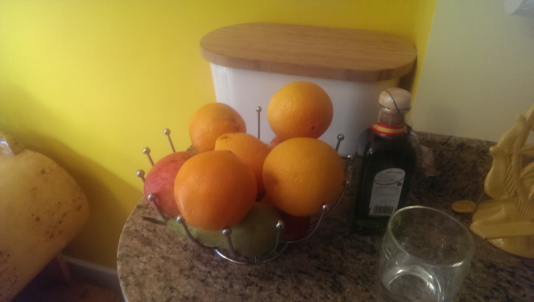
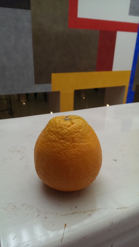
Orange is out of the exhibition but is still in the gallery so is safe and assured that it is still art.
Picture
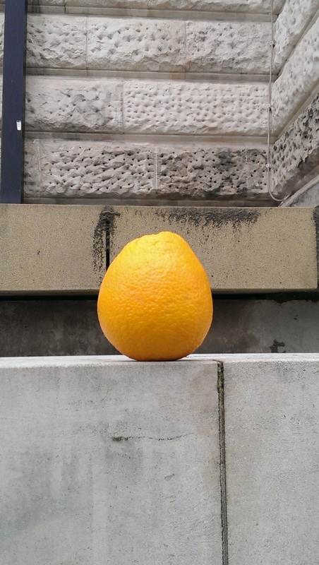
Outside the gallery the context is still reassuring to Orange and Orange is happy that it is still art.
Picture
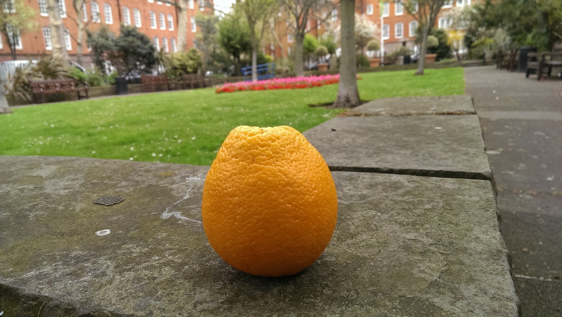
Displayed in a park Orange is in a transitional phase and is considering become public art.
Picture
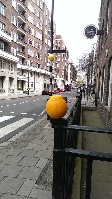
Orange comes over all Banksy and temporarily becomes Street Art
Picture
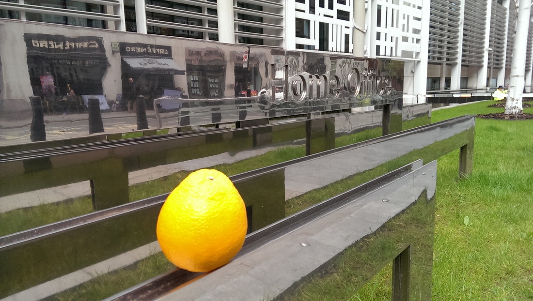
The mundanity of bureaucracy interferes with Art. Orange being of course an immigrant is forced to apply for Leave to Remain. 
Picture
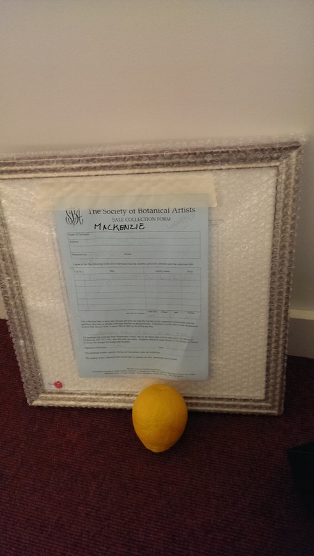
Orange is taken to a gallery to recover, where Orange feels superior as it is in the presence of mere figurative art.
Picture
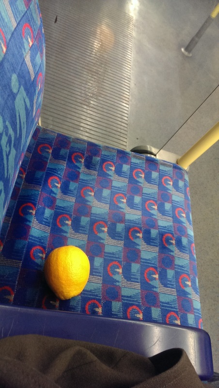
Thus rejuvenated Orange fools itself into thinking it is doing good by consenting to appear as Public Art on the Tube.
Picture
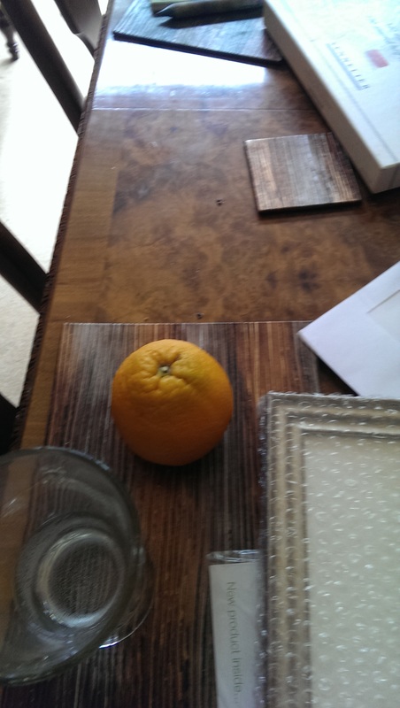
The reality of commercialism bights hope and Orange is taken to a middle class home to supplement its owners cultural capital.
Disaster! Orange is placed in a bowl with mere oranges, which are not art because they have been nowhere near a gallery.  Orange thus becomes an orange.
Picture
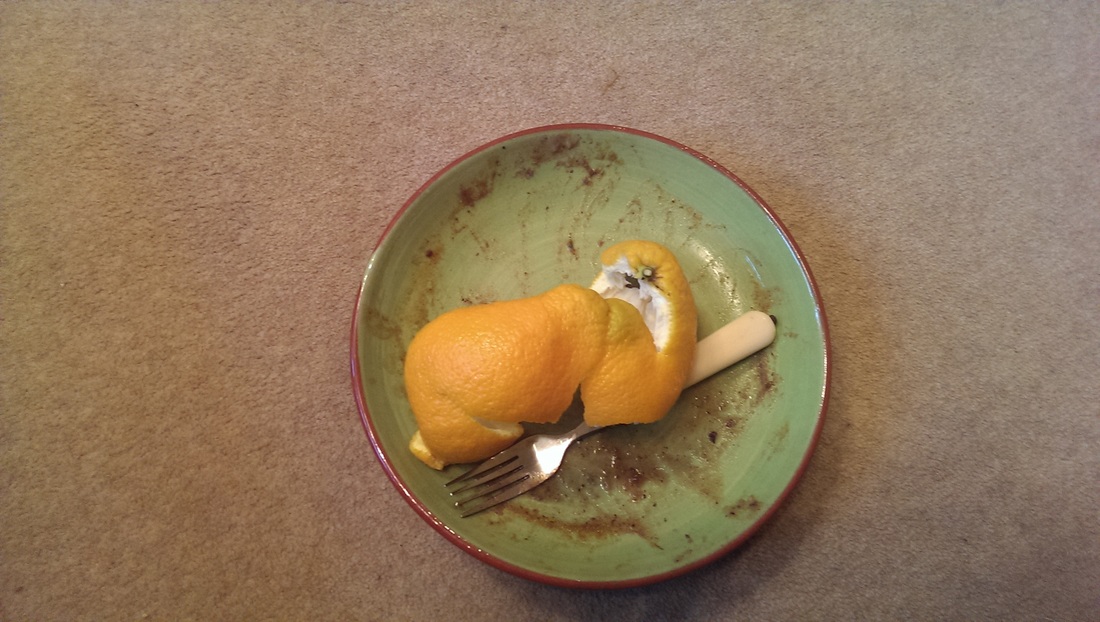
An orange is eaten.  Is it the same orange.  Does it matter if it is not?

Fin.
0 Comments

      Keep in Touch

    Subscribe to Newsletter

    Archives

    January 2025
    September 2024
    July 2024
    June 2024
    May 2024
    April 2024
    March 2024
    February 2024
    January 2024
    August 2023
    July 2023
    June 2023
    May 2023
    March 2023
    February 2023
    December 2022
    November 2022
    July 2022
    June 2022
    May 2022
    April 2022
    October 2021
    September 2021
    July 2021
    June 2021
    April 2021
    March 2021
    February 2021
    December 2020
    October 2020
    May 2020
    April 2020
    January 2020
    December 2019
    November 2019
    October 2019
    September 2019
    August 2019
    July 2019
    June 2019
    May 2019
    April 2019
    March 2019
    February 2019
    January 2019
    December 2018
    November 2018
    October 2018
    September 2018
    August 2018
    July 2018
    June 2018
    May 2018
    April 2018
    March 2018
    February 2018
    January 2018
    December 2017
    November 2017
    October 2017
    September 2017
    August 2017
    July 2017
    June 2017
    May 2017
    April 2017
    March 2017
    February 2017
    January 2017
    December 2016
    November 2016
    October 2016
    September 2016
    August 2016
    July 2016
    June 2016
    May 2016
    April 2016
    March 2016
    February 2016
    January 2016
    December 2015
    November 2015
    October 2015
    September 2015
    August 2015
    July 2015
    June 2015

    Categories

    All

    RSS Feed

Proudly powered by Weebly
  • Gallery
  • Blog
  • Podcast
  • About Me & Contact