|
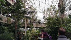
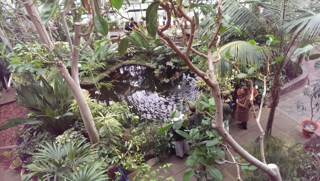
The Barbican is a weird building and every time I go there I am exposed to more of its strangeness. It reminds me of the tower block described in Broken Homes. This time I went to see the Turning Earth. The exhibition was housed in two small halls, just off the two storey conservatory that for reasons that no doubt make sense to someone, occupies the 3rd and 4th floor of Barbican Floor. It is a strange place, a combination of brutalist architecture, swathed with exotic tropical plants, ponds and fish. You feel a bit like you are on the set of Logans Run
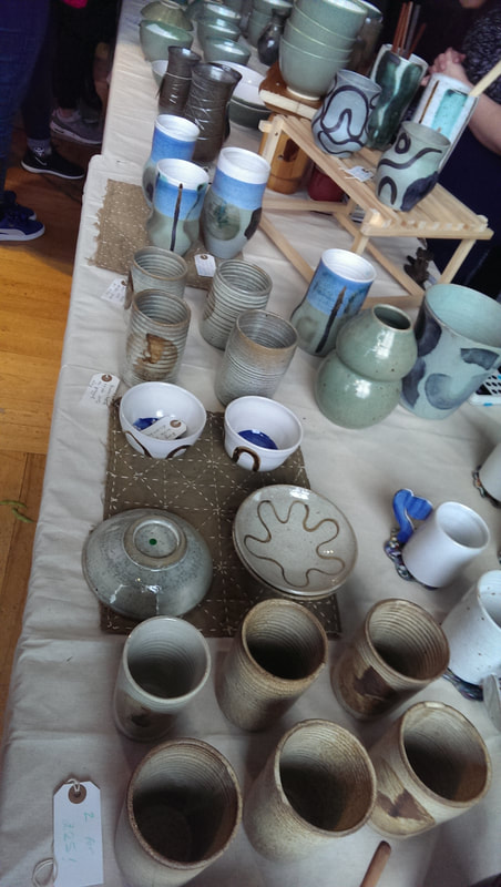
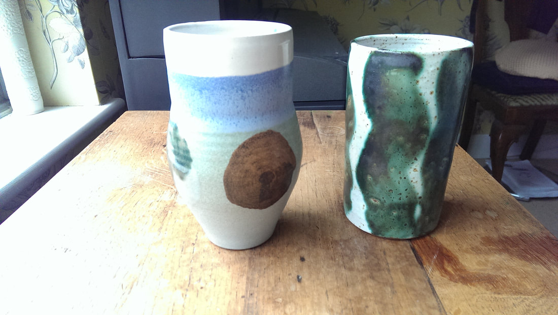
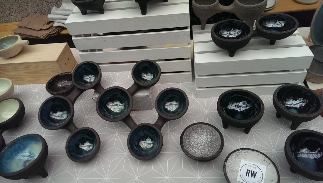
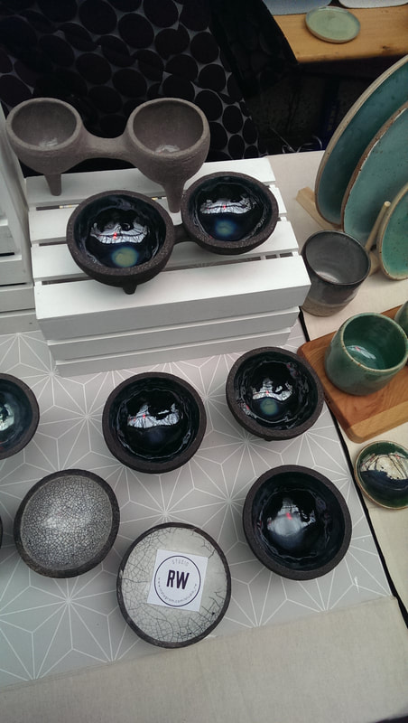
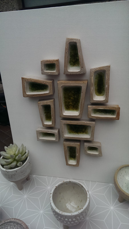
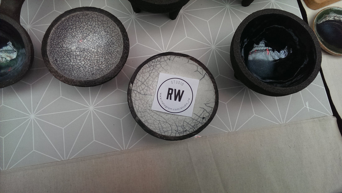
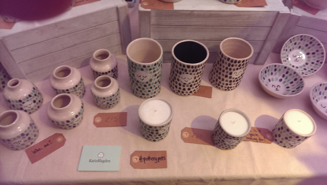
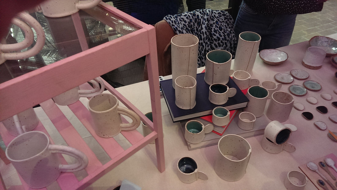
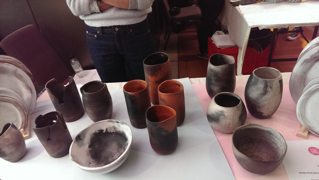
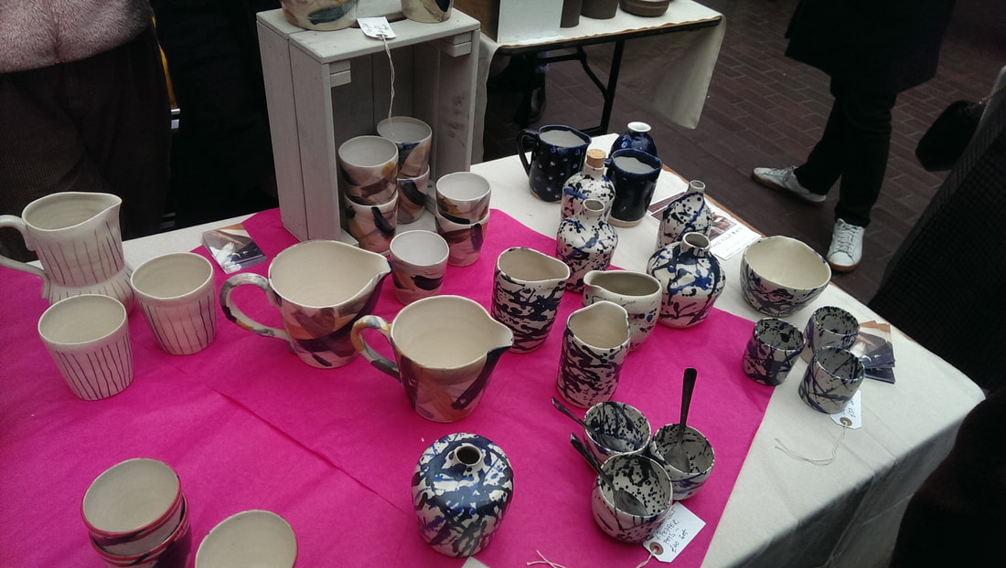
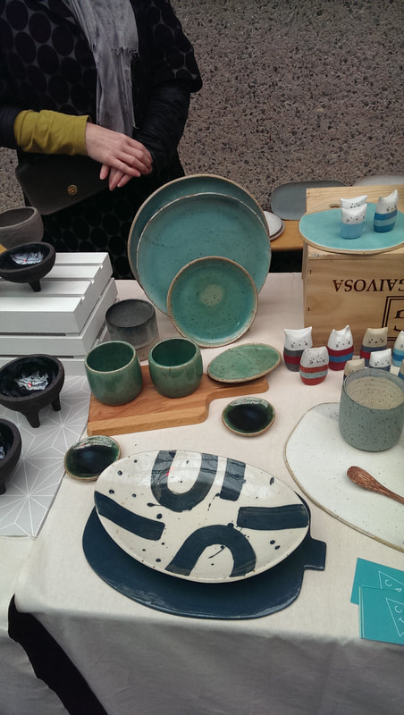
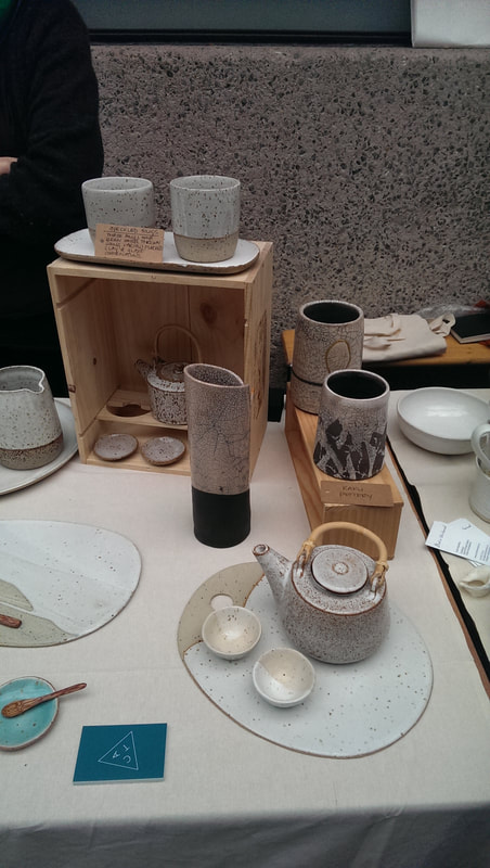
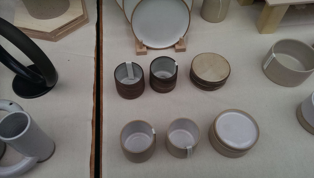
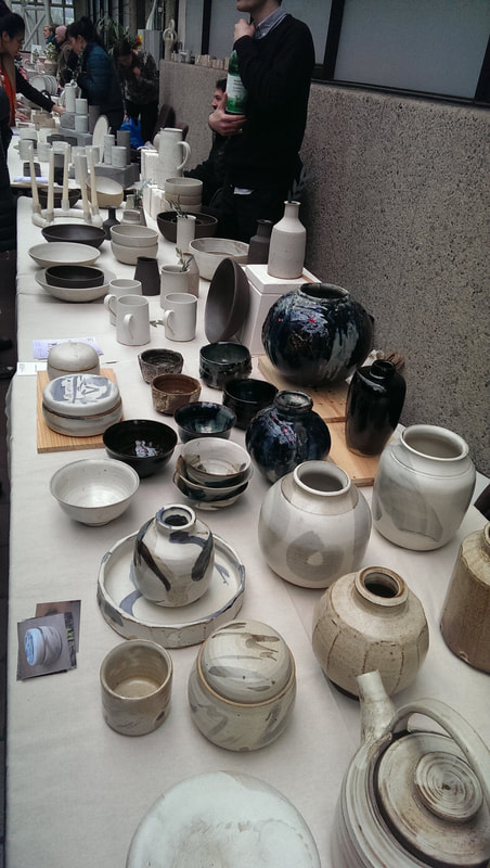
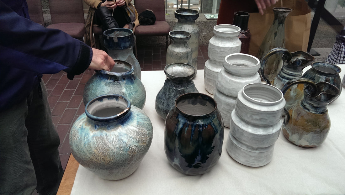
Indeed it was quite a high quality show all round. Here is a trot through some of my favourites. I also came away with a small tripod pot from RW pottery (above). She has a good combination of gnarly rough iron like outside and a smooth lustrous interior. There was a very interesting version of this with several such pots, joined together to form a sort of hexagonal shape. Mixing the styles up a bit there is also a series of small amber filled rectangles, like a minimalist bee hive. Katie Blagden has a sort of cat animal thing going on. Little smiley faces appears on lots of her works. It is mainly white with dimples of lustrous blues and turquoise. The contrast between the two is effective and of course they have a nice tactile quality. Miyelle Ceramics does a smooth white/beige exterior, spotted with brown flecks. With the tall vases and the cups, the surface wraps around over itself, so you get a lip or edge up the side, that attracts the eye. The best ones are with the striking blue interiors. Blue can be very effective in pottery and appeals to me considerably. L’Atelier M (above) has gone for well wrought simplicity, with beige or black interior against a white exterior. The designs seem quite simple, but are slightly misshapen (in a deliberate way) which give them a unique charm. I liked the small plates in the wooden shelves the best, particularly the one where the blue intersects the white. Studio Ran J (above) does this burnt effect, solid looking pottery. They look a bit earthenware but are in fact pottery or porcelain. My favourites are the orange and black flamed pots, and the cups with the slits and circles cut through them. I had already exhausted my budget so sadly could not take either of these. Sally Dawson has a slightly Jackson Pollock (above) thing going on with colours splattered, although in a controlled and pleasing fashion. I particularly like the cups under the wooden stands. They had a good tactile quality and I like the way the yellows and the blue swathes of colour interact. Glazeycat Ceramics has, as the name might suggests small pottery cat creatures that are very sweet, but it is the turquoise glazed plates that I thought were particularly good and her crazed cracked folded vase. Diana Ng produces these solid, well shaped classic Japanese style mugs, with a signature stamped into the base. Guy Brain Ceramics has an elegant range of dark blue lustrous vases (above) which really shout out of you from the stand. Then Ryan Barret, who has gone for size and heft. Done it quite well.
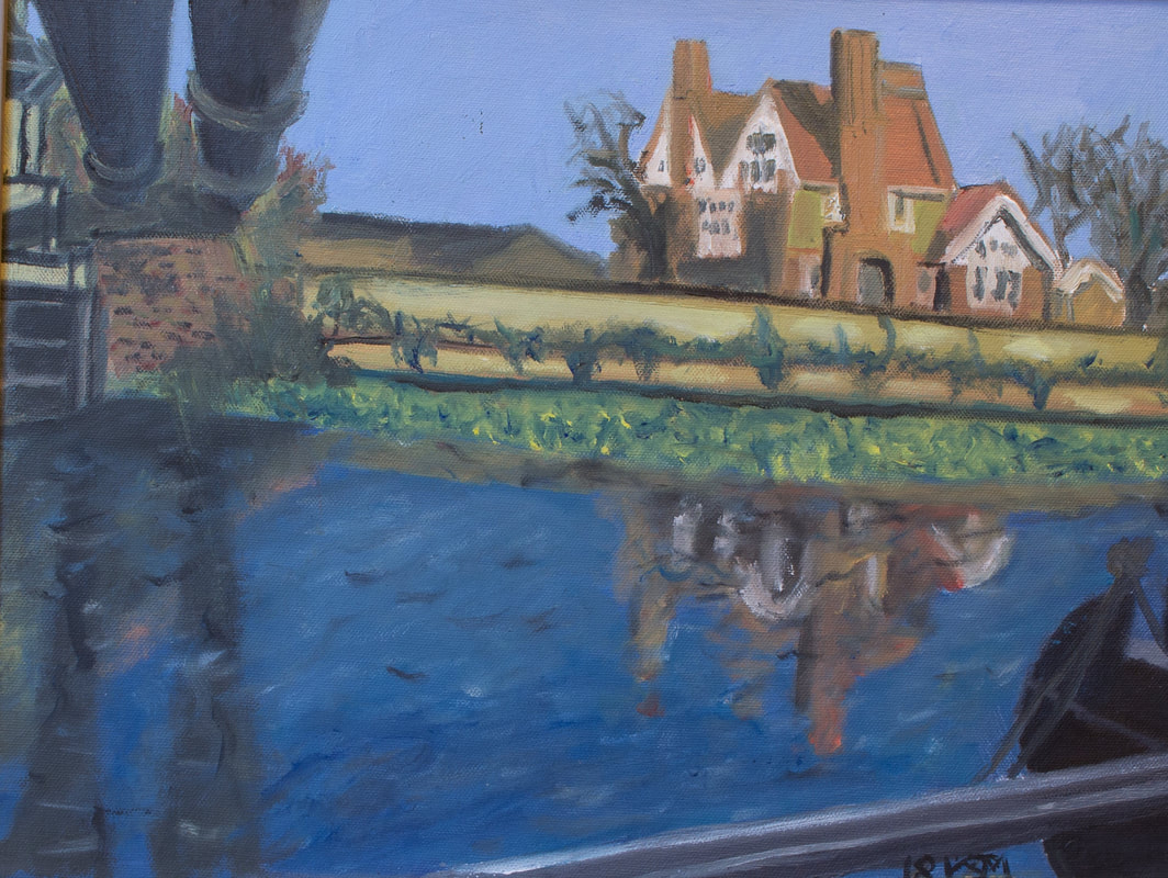
In other exciting news I have a solo show of paintings of the RIver Lee (below) starting at the Indo bar for the whole of April. It starts on Wednesday 4th April with a opening night party from 7 - 11pm. Feel free to attend.
0 Comments
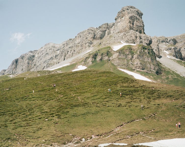
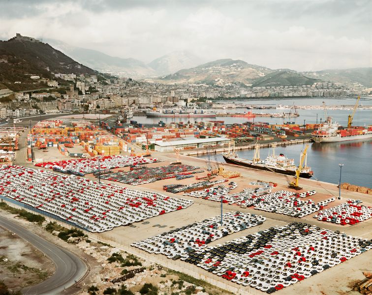
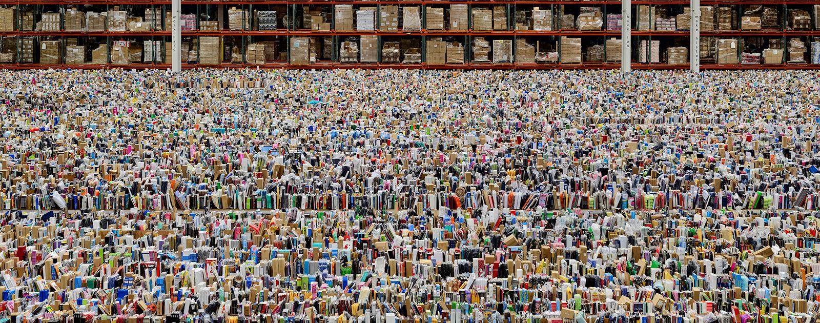
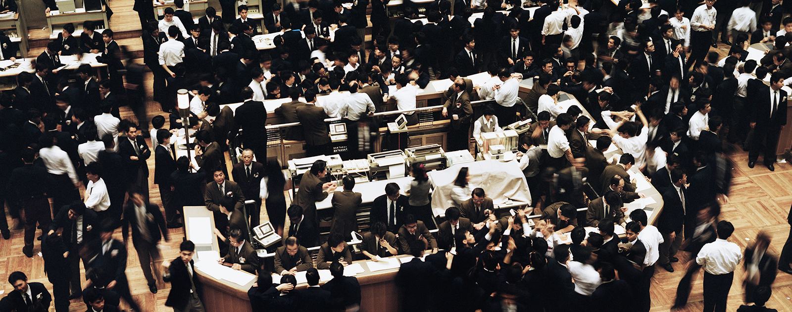
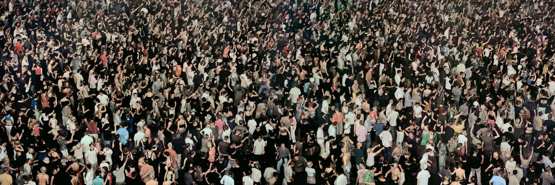
Photography is not often something that appeals to me but this was a rare exception. I was going to attend with two friends of mine but one of them horrifically broke her leg, so I corralled in someone else to attend the Haywood Gallery with me. Gursky uses photography in much the same way others use paint to construct an image. His earlier images aren’t that interesting. They seem to me just monumental quite boring holiday snaps, the kind that has no focus and subject (like the above). There is an interesting use of man made lines, reflected in the landscape for example in Ratingen Swimming Pool. The really interesting stuff happens when he develops this technique of compiling very large, very detailed pictures of repeating patterns often caused by human activity. The first of these that really struck me was Salerno (above), depicting the Italian port with ranks and ranks of different coloured vans. These form a great contrast with the looming mountains in the background. If you are interested in photography then there is a great deal of skill gone into rendering something so vast in such high resolution. These and the photographs like them form the stars of the show in my view. There is a vast picture of an Amazon warehouse (above) baffling in its apparent like of order, ranks upon ranks of random ephamera and the soul destroying company slogans of “Work hard, have fun, make a difference” none of which of course can happen in such a soulless environment. This if of course one of arts function in that not is only the image intrinsically interesting but it teaches you something. There are a number of photographs of mass displays from North Korea, which have a similar impact. Crowds of people are another interesting subject matter and particularly stock exchanges (such as the above) interested Gursky with the bustle of economic activity, some people looking tense, others happy. This contrasts nicely with May Day, a large composite photograph, with all of the vast crowd in focus, all having fun and generally cavorting (above).
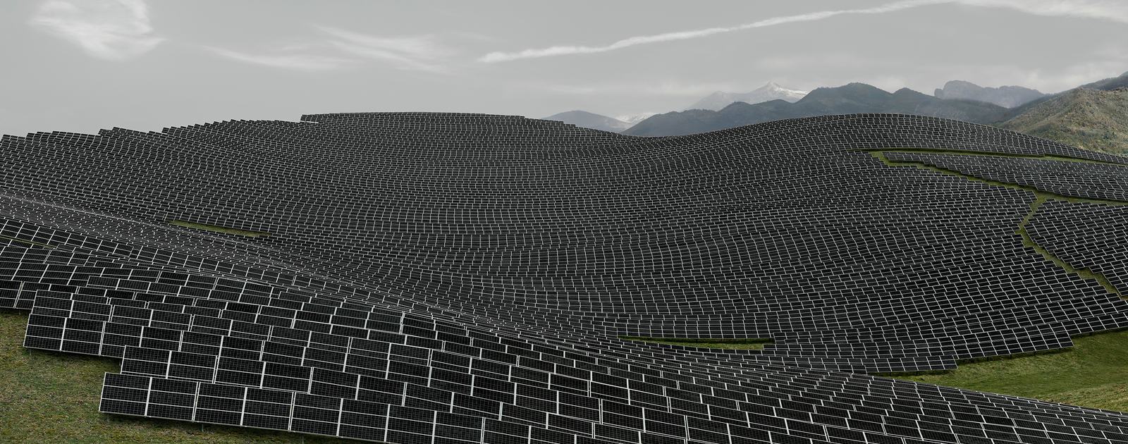
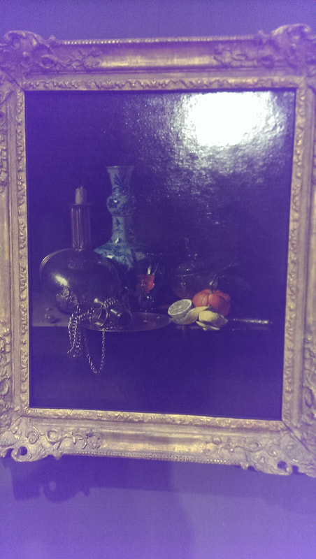
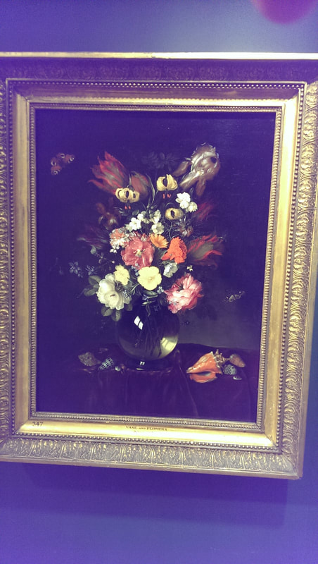
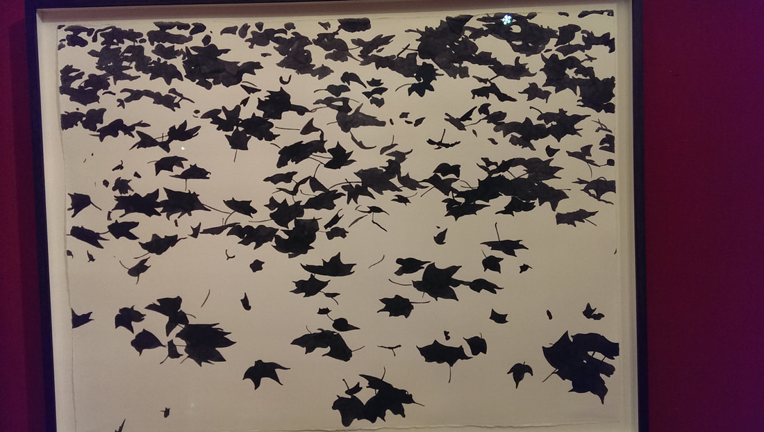
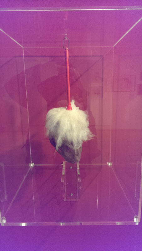
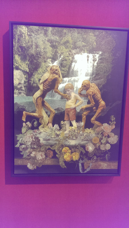
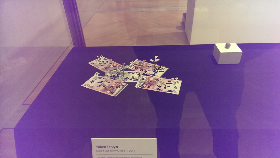
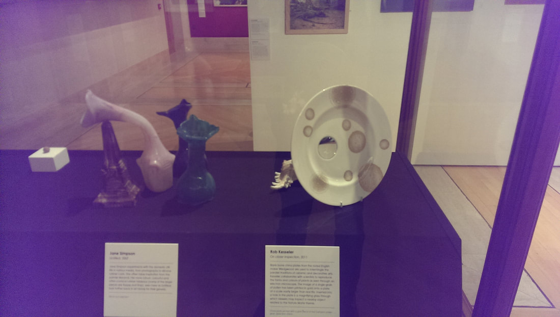
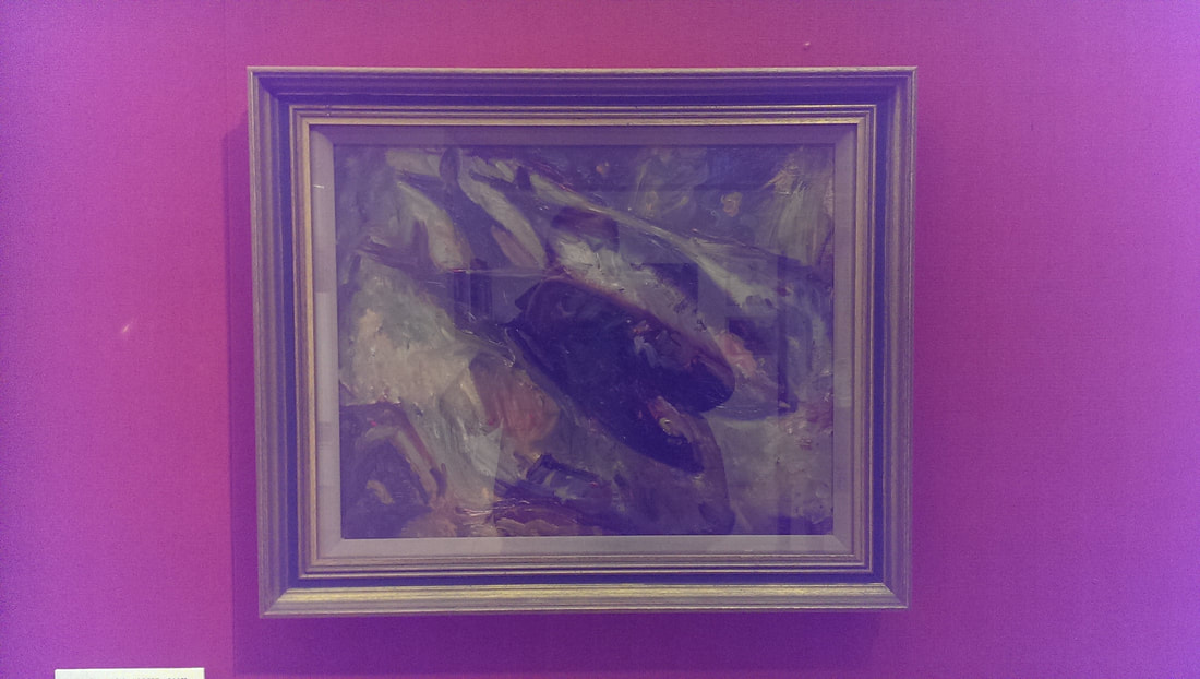
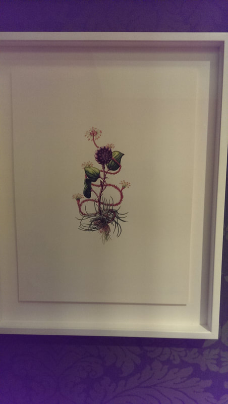
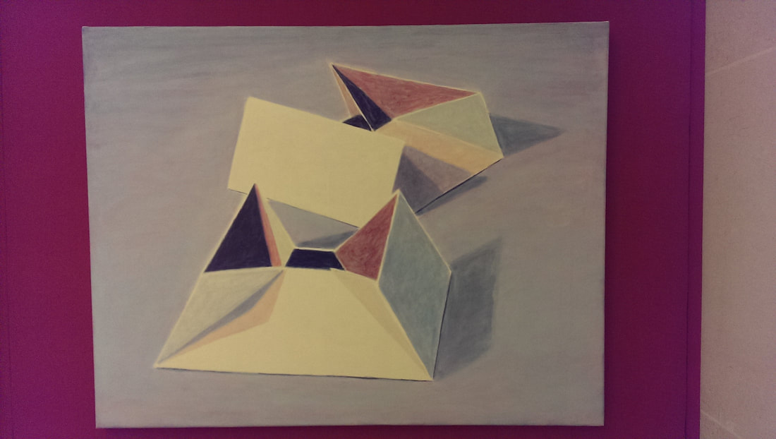
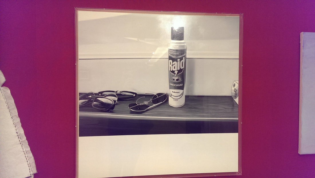
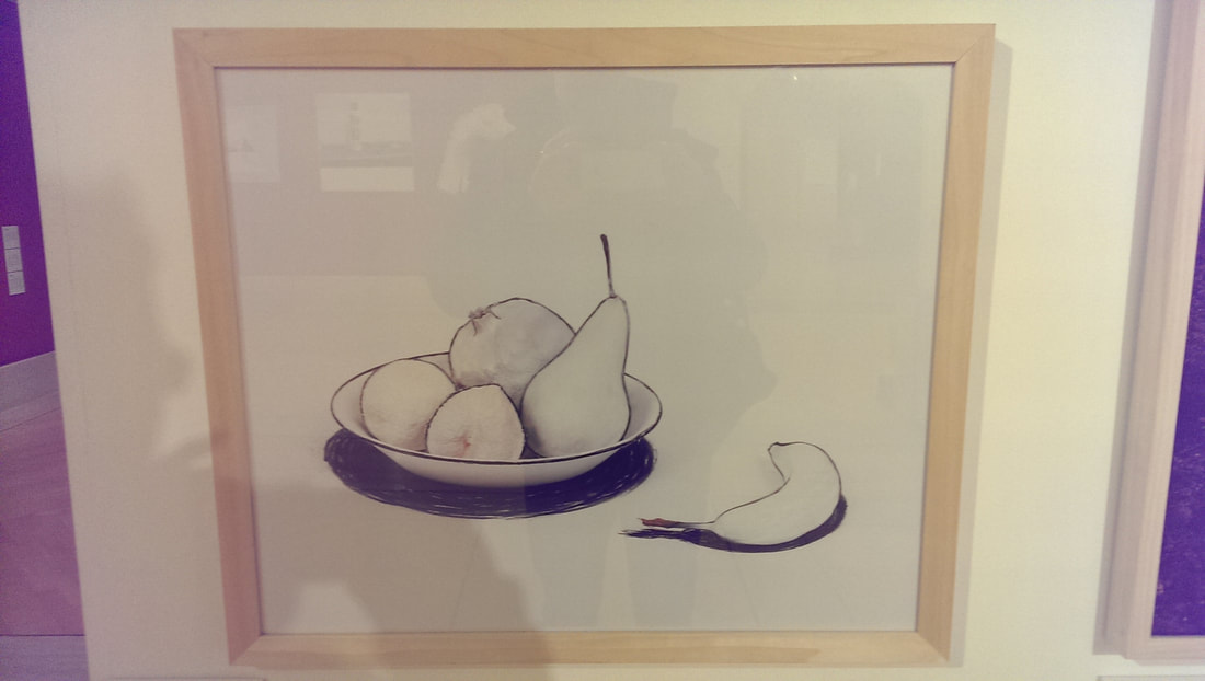
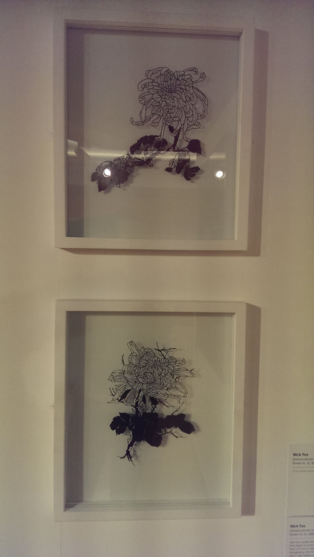
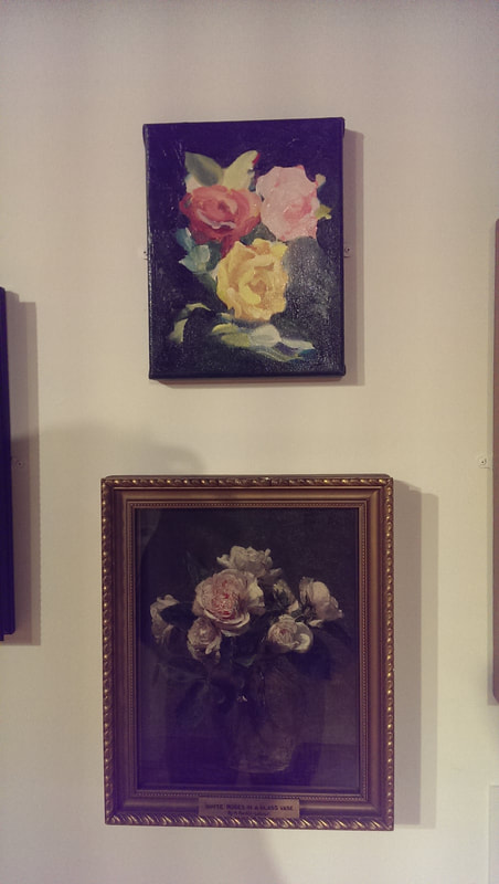
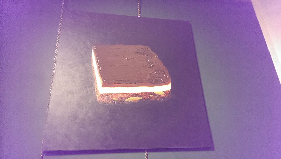
For me though the most appealing images are those with the repetitive geometric elements, like Salerno but reaching its height in the poster image for the show, the vast solar panel field of Less Mees (first picture in this blog). It’s a very hypnotic image. There are of course many others, some effective, some not. There is a good one of an apartment building that will appeal to the voyeur in you. It is a quite a large show and there is much much more. If you are interested photography then go. It is on until 22nd April The Guildhall Art Gallery is one of those overlooked gems. Overshadowed by the much bigger London art museums it is none the less a good gallery. It has an excellent selection of mostly British art and in the basement the ruins of a Roman Amphitheatre. It is free to get into and I highly recommend a visit. On a weekend it is a nice quite refuge from the rest of London. Currently it is showing an exhibition called Nature Morte, which is basically a still life exhibition so off I went. It is a quite a sizeable show set out by themes which are basically, food, fauna, flora and so on. It is well curated, apart from the labels, which tell you what the work is and who is by and in tiny tiny type what the medium is, but the rest is art guff, especially with the contemporary work where they feel the need to try and explain the piece, which for me defeats one of the major points of contemporary art, but there you go. They have however nicely mixed the modern with the old master in a very effective way which allows you to draw your own conclusions as to influences, themes and so on. I liked that. I spent a happy almost two hours there and encountered lots of people, none of whom I had ever heard of or seen before (that I can recall anyway). Willen Kolf piece is called Pilgrim Flaks, a tour de force in glass and silver (top of blog). A nice touch is the artist (at least I presume its him) is reflected in the jug. Showing the Dutch really knew their reflective surfaces. Opposite this is a piece by PIetr van De Venne (above). A simple looking classic Dutch still life but I kept on coming back to it again and again. Particularly effective was the warm glow of the light from the vase. Digital art is difficult to do well, but Jennifer Steinhauf’s piece was quite good. It was a projected image of flowers and branches moving and swirling on top of each other and had a nice hypnotic effect. What was nice was the pattern never seem to repeat itself. Out into the main room and the flora theme continues with a piece by Sue Arrowsmith (above). It is deceptively simple in that the piece is just black silhouettes of leaves against a white background, however the leaves are all expertly placed and rendered so they appear to be blowing in the wind (which is I believe the title). There is something quite Japanese about it. As you follow the wall around, things begin to get a bit weird. For example Paul Hazleton (above left) has produced a mask and wig made entirely out of dust which is just plain upsetting. A couple of places along from this is a disturbing pieces by Matthew Weir (above right) which shows some very odd looking skeletons playing with a ceramic doll like boy in front of a tropical rain forest. Advice, don’t read the label it spoils it. The label also spoils Yuken Teruya’s Green Economy Group (above) which has small flowers cut out and stick out of various Euro notes, the holes they leave behind making very convincing shadows and the colours of the notes used to good effect to make the flowers. Teruya's piece is housed in a vitrine (pretentious word for art display cabinet) with works by Jane Simpson which are tentacle octopoid like apendages made for rubber and a plate by Rob Kesseler which is quite well decorated but also has in it a magnifying glass, which enlargens the shell behind this (both above). I found this appealing. On the wall opposite these are some very well rendered and oddly delicious looking Mackrel by Vera Cunningham (above). The way the multitude of colours and the different textures swirl together to make the mackerel is very effective. Around the corner is some very good botanitcal art by Helen Goldhart (above), with an excellent composition and use of colour. She has called it Jaunty which caused the curators to make a bid for the all time prize for art guff in the label. Moving round the outside wall there is quite a nice abstract by Lisa Milroy (above left) which makes good use of shadow, and next to that a picture called Raid (above right) which is just a photo of the self same substance but is somehow a terribly effective photo. Before you leave this room you should orbit the middle section, particularly the part near the door. On the left hand side is Cynthia Grieg’s Nature Morte no;3 (above)which is a very sparse painting of some fruit, which just the outline and the suggestion of internal texture and colour. The kind of minimalism that draws you in (as opposed to being boring). On the other side are two pieces by Nick Fox, which are really worth looking up close. From the distance they are some nice outlines of plants, effective enough, but when you get close you realise they are slim slices of acrylic mounted between two pains of glass and you realise how painstaking this must have been Next to this is a piece by Kim Baker which is a small painting of sensous flowing flowers (top of the two above). On your way out look out for Peter Jones Ollie Mack which is very disturbing picture of a toy monkey and some delicious looking cheese by Floris Van Schoeter. Not all of the exhibition is in the exhibition space. There are two paintings in the gallery proper of which the best is by Andro Semeike. It is basically and enormous chocolate bar. It is deliciously rendered with superb use of texture to produces the different layers of the cake, with the glowing yellow middle layer to the gloopy shiny looking chocolate surface.
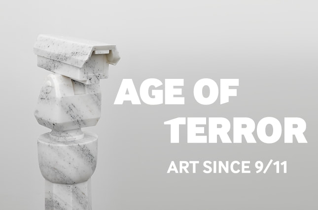
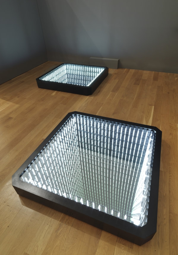
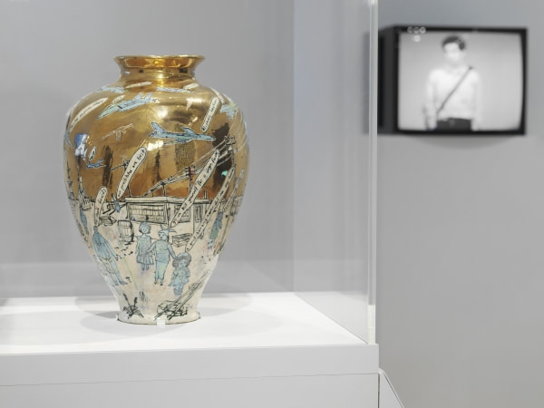
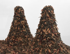
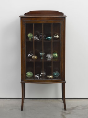
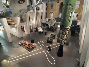
The show is on until 2nd April and I suggest you go and have a look. I haven’t been to the Imperial War museum since I was a kid when my father used to drag me round to view the various militaria. Now art has dragged me back, specifically Art in the Age of Terror (although by the way they have a good permanent collection which includes people like Paul Nash). The exhibition was art made either as a direct reaction to 9/11 or the events that came after it. It is arranged over three rooms. The exhibition starts of very strong with a series of newspaper front pages from the day after, from around the world. It brings it all back, the strange surreal horrible reality of those events. It is interesting also seeing the different cultures of front pages from different countries. The UK papers for example all featured a full page image with a one or two word headline. Then you are through the corridor and into the art. First up are three windows into the ground (above). Lights appear on each of the four walls beneath the window and they form an optical illusion that seems to descend forever, like a disco lift shaft. Ivan Navanno is the name of the artist. Grayson Perry appears a few times in this show in various media. The first of his offerings to appear is a large mainly gold pot called Dungeness (above). Repeat with aircraft and despairing slogans, added to the already nearly complete work after witnesses 9/11. Gerhard Richter is an old favourite, and he uses his characteristic blurriness to great effect here to produce a very effecting picture of the two towers, which uses smudge of black and greys over blue to produce an atmospheric and evocative image. Sabine Moritz’s White Angel is a very simple concept but done very well. It is a sort of muted impressionistic painting of a grounded plane, done in quite loosely quickly applied paint. What appears to be smoke and flames pouring from a hanger. The Chapman brothers are here with two mounds of mutilated tiny nazi figures, heaped into two mounds (above). I don’t really like the Chapman brothers. A visceral impact no doubt but it repels me. A more effective use of figures is Jitish Kallat’s Circular Rhyme (good name, good pun). It is a number of figurines, in pairs. The pairs are a security guard (each one in a different uniform) frisking someone. A slightly joyous attack on the security culture, the universality of it. Much more blatant is Ai Weiwei (there are some big names in this show) with a marble statue of a CCTV camera (see first picture in the blog). Simple but elegantly done. Another big name is Mona Hatoum, who presents us with a Victorian style glass fronted cabinet in which are very pretty glass grenades, imbedded with various coloured glass. Dexter Dalwood produces a white flag, a very Jasper Johnsesq white flag, on a wall with a strange broken tiling on the floor in the foreground. Round the corner you are surprised by a manikin sitting on a chair clutching a gun, a female figure call Ves Gerilleres. She has no face, just a red star on her face. It is an alarming and arresting work by Mai-Thu Perret. Throughout the exhibition are various bits of video art, a medium for which I have a very low tolerance, however there were two pieces that I thought were very good. One was called Sometimes Doing is Undoing. I forget the name of the artist. It is two videos side by side. One showing a British soldier assembling and disassembling a rifle. The other shows a member of Afghan military doing the same thing. It is a good juxtaposition both of environment and the quality of equipment but the same basic time. The other good video is Hrair Surkisson. He left Damascus as a refugee and expresses his frustration about this very well. He built a scale model of his old apartment building. It is a very good model made quite robustly out of concrete and metal. In the video he smashes it to pieces. It is a hypnotic and powerful piece. There are some good photographs in the show too. David Cotterrell presents a series of images called Gateway II which shows scenes of injured soldiers being transported, in bleak transport planes that are very reminiscent of the set of Alien. No really, they do. Tapestry makes an appearance to. Jim Richter produces a carpet called predator, which on a field of blue the silhouette of a Predator drone is picked out. Grayson Perry reappears with a fine tapestry triptych called Line of Departure. It shows three different soldiers in their civilian lives, haunted by their military ones. Their shadows are them in uniform with guns. It’s very good. Other media includes cardboard. Walid Siti produces a series of joined together cardboard hexagons arranged like a sort of map, slumped against the wall. It looks like a bombed out city. On the wall next to it is Husa Malalla’s My Country which uses patchwork of burnt and coloured canvas to produce a map of Iraq, with a red sector bleeding out of Syria. The final painting (drawing/whatever) in the show is by Julie Mehretne and is called Epigraph of Damascus. It is presented in 6 vertical strips, composed of architectural drawings obscured by squiggles or what could be writings. Like all good abstract art you get drawn in trying to make out the patterns amongst the swirling whole. The final room is a small cinema screen showing Terry Gilliam like images of tanks and so on piled with various western chain images. When you leave if you peer over the balcony you will see the outline of a predator taped out on the ground floor.
There is a lot of good stuff in the show. It is a very powerful show, some of it really quite upsetting and moving, some of it uplifting. It is on until 28th May. |
Archives
June 2024
Categories |

 RSS Feed