|
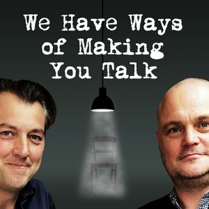
Painting in silence is unnerving and I don't like it. I prefer the sound of life to accompany me which is not easy to do when you are stuck alone in a studio. Music doesn't really do it as the tempo and mood of the music can profoundly and unhelpfully effect the way I paint. Also it just, doesn't quite do it. So I listen to people talking. This is perhaps not surprising. Studies have shown the being a the company of other people, a coffee shop say, increases creativity and productivity. My favourite thing to listen to is Test Match Special. That of course is not always on, so for those other occasions I reach for podcasts. I also listen to these on other occasions, travel etc. These are my favourites. 1. Uncanny Japan I like my myths. I spent along time trying to find a good podcast about myths and eventually found Theresa Matsuura's Uncanny Japan. Theresa is an American ex-pat living in Japan in a city whose name I keep forgetting on the coast of Japan. She has a lovely lilting soft lyrical voice which those of you with ASMR may find activating. Theresa is a horror writer of the dark mythic vein and these podcasts are the produce of her research. At least once a month she will treat you to a very well constructed 15 minutes or so about some aspect of Japanese Myth. It is well produced there is always some ambient background noise to signal the season for you, crickets, frogs, cicada, the ocean, the sound of local festivals in the background, while her voice scampers through the particular myth. I discovered this a couple of months ago and am scampering through the back catalog, and have yet to catch up. I particularly like the episodes where she ties the myths into her own life and so my favourite episode so far is the Demon Gate. Check it out it's really good. 2. Adam Buxton Ah, Lord Bucculese of Ramble Chat, otherwise known as Adam Buxton. Adam is a relatively well known British Comedian and is now a giant of the podcast world. He is at time of writing rapidly approaching 100 episodes. So what do you get, you get around an hour, sometimes more, of rambley chat with usually one (sometimes but much more rarely two) guests. They are usually other Comedians but not always. There are film- makers, such as Paul Thomas Anderson, Garth Jennings, Gretta Gerwig and of course Joe Cornish with whom Adam was at school (as indeed he was with Louis Theroux). The course of the conversation is very much driven by the guest and the best ones are the ones in which Adam really chimes. He often gets much more personal and interesting thing than people give up in more formal interviews. I haven't listedn to the whole back catalogue, who has the time? My favourite so fart though as been his meeting with Aishling Bea. Each episode is delightfully book-ended by waffly intros by Adam, as he walks his dog Rosie, who is very much a feature of the show. It is delightful and never fails to lift my spirits. 3. Have you heard George's Podcast? This swept the board at the recent podcast awards and if you listen to it you will immediately hear whey. Have you heard George's Podcast is really really good. George is a poet from west London, from the area around Grenfell tower and that incident and the injustices that particularly the black community suffer feature predominately in the podcast. It is therefore not one for salving the sole, but one for serious listening and to move you and make you angry. This is excellently produced, in glorious lyrical style. His voice and his passion carry you right into the podcast and the issues he is talking about. He's a smart and interesting man and I am glad that I have discovered him and his excellent podcast. I shall watch his career with interest. 4. We have ways of making you talk. I have a strong interest in history (although rarely in podcast form), My father has an obsession with military history and inevitably some of this has been passed onto me. I was therefore intrigued with We have ways of making you talk when it appeared a couple of month ago and have been listening it to it ever since. It consists of comedian Al Murray and historian James Holland talking about the second world war. It would be safe to say it is for those already interested in the second world war. A fair amount of previous knowledge is assumed and this and the nature of the subject matter means that this is not for everyone. It is however for me. They take an interesting take on the matter, looking at the unknown stories, examining artifacts and answering peoples questions. It is done with an certain amount of humour but they are a knowledgeable pair and the chemistry between them is good. They have certainly taught me a few things. My favourite episode so far is this one, where to my great joy they answered my question about the Night Witches, with whom I have a minor obsession. 5 David Tennant does a Podcast with .... David Tennant is very charming, and this charm is on display on his podcast, David Tennant does a Pocast with... It is similar in tone to the Adam Buxton podcast so if you like that chances are you will like this, although the style is more slick and professional. It is also much more focused on acting, the experience of acting and the effect of fame, except for one surprising episode with Gordon Brown. There are some interesting snippets in this and by far my favourite one is the first one with Olivia Colman Tennant seems to get on with everyone and the warmth between him and his podcastees, particularly Colman (or Collie as he calls her, she calls him DT) is very touching. If you are interesting in acting and the process of acting and the experience of fame, this is one to check out. It is also just lovely. It is currently on a break and and I am keenly awaiting its return. 6. Off Menu One of my favourite radio programs is Kitchen Cabinet, and one of my favourite TV programs is MasterChef the Professionals I like hearing people talking about food in an interesting way and there a couple of podcast in this vein, the first of which is Off Menu. The format is relatively simple, our two affable hosts, Ed Gamble and James Acaster getting their guests to construct their favourite meal. It can be very funny and often gives some very good food and restaurant tips. However some of the guests don't really work. Strangely iIchard Osman fell very flat, while the weirdly maternal flirtatiousness of Grace Dent made for what I think is my favourite episode. It is this inconsistency that means it is not higher up the list. It is also on a break for the moment but I will be listening again when it returns, and yes I already know what my meal would be, just waiting for the invitation. 7) Lecker This is difficult to describe this podcast other than to say it is about food. Lecker is the brainbaby of Lucy Dearlove and is about all aspects of food, eating it, cooking it, the emotional importance of food, how people made their way into a career in food and other related matters. Lecker by the way is German for delicious. Dearlove is a professional audio producer and she tailors the production to the feel and emotional impact of each episode. Some of the episodes then it is her chatting to someone, in one notable episode she takes herself out of the frame altogether and you just have the voice of the subject. Each episode can be very different and Dearlove is a considerable talent. 8) A history of the World in 100 objects. I remember hearing some of this when it was on radio 4 at the time , Neil MacGregor the then director of the British Museum takes us through the history of, well not quite the world, but certainly human en-habitation of the world in 100 objects. Each episode is about 15 minutes, and packed full of information. MacGregor is an engaging and knowledgeable host and each episode experts both historical and cultural comment on the object in question. You wouldn't think that a radio show based around an object wouldn't work on the radio or podcast but it really does. You get evocative descriptions of the object itself, as well at its history but MacGregor deftly uses each object as a matrix through which to consider the world at the time. I am working my way through to hear it all this time. I have just head about the HMS Beagle Chronology. It will be a bit sad when I reach the end. 9) Book off. The premise of Book Off is a simple one. Two literary types, often authors (not always though, David Tennant was on it once) promoting a new book are introduced and chatted about a bit before then getting 3 minutes each to pitch a book they think everyone should read. The host, whose name temporary escapes me then decides the winner. If you are in need, or want book recommendations then this is a good place to go, it has turned me onto a few interesting authors. Sometimes though, it can be a but dull, being very much at the mercy of the guests. 10) Houston. We have a Podcast.
Do you like science? Do you like space travel? Do you like hearing about the difficulties and challenges of space travel and how they are overcome? Then Houston, We have a Podcast is a podcast for you. Interesting and high powered people from Nasa come and talk about a number of things. This is a recent discovery for me and I am still working my way through the fascinating episodes on the International Space Station. It is fascinating stuff. I suspect this may rise up my rankings as I listen to more of it. NASA have quite a few podcasts out there so if this is an area that interests you, they are somewhere to look. Anyway this is my top ten, I do delve into others from time to time, but these are the ones I keep coming back to. I hope you found this interesting. Next week, we return to art.
1 Comment
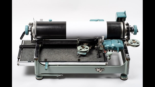
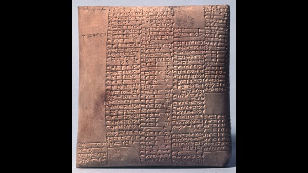
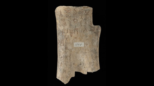
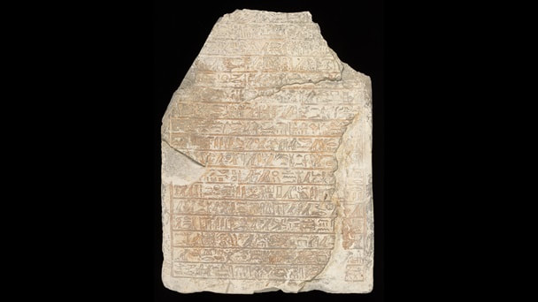
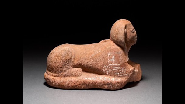
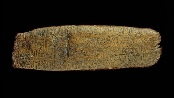
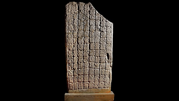
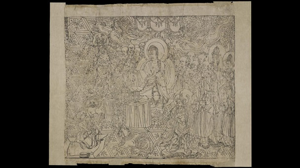
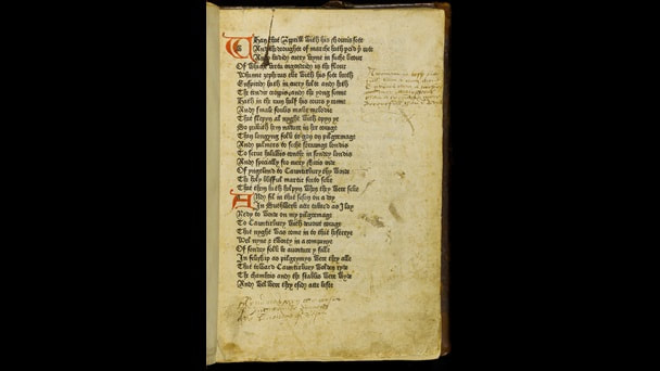
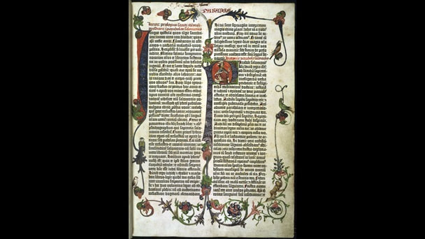
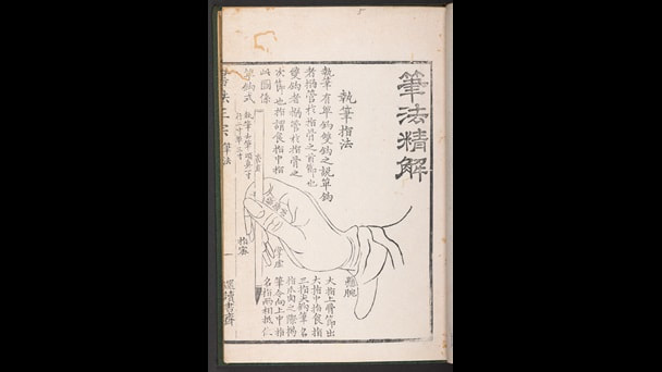
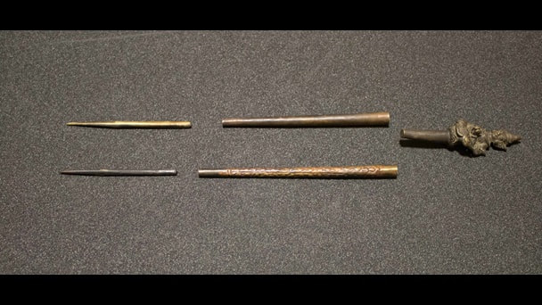
The British Library is, currently, showing a show called Making a Mark and is as the name suggests a history of writing. It takes us through, in a series of carefully presented vitrines from the earliest writing to modern computing. I recommend that you go round the wrong way. That way you avoid the crowds as, common to other British Library shows, there is a lot of peering over at documents. If you start at the beginning though the show starts at the beginning. I have a fondness for Cuneiform so it is always nice to see it again, those small delicate scratches on a little pillow of clay (above left). There is then ancient Chinese oracle bones (above right), bones use for fortune telling. Those centuries old marks still clear and vivid inscribed on the bone. Of course you have Egyptian Hieroglyphs, a Steele indeed (above left). More interestingly there was a piece (above right) showing the very early changes from hieroglyphs to the modern alphabet. Those marks are the beginning of this, coming up with a system that was taken up by the Phoenicians, the Greeks and finally the Romans. It starts out being read right to left and only once it reaches the Roman's does writing change to the left to right that I am gibbering with. Slightly more obscure writing also appears including, a slab from South American with pre-Mayan script (above right) and entirely new to me, writing from the mysterious East Island (above left). A slab of hardened wood with these swirling curving glyphs. Now onto books. The British Library has of course a multitude of glorious glowing wonderful books and it is nice to see them. Incidentally after you have been to this show, do yourself a favour and wonder up to the Treasures of the British Library room. Among those on display include the note book of Florence nightingale, a Qur'an in both Persian and Arabic (the borders deliciously decorated) and Mozart's autograph catalogue of his own works. The last of these is a most interesting document, a few lines of description and the opening few bars. Lost work abound apparently. Illustrated here are a Thai folding book (above left) that unfurls and one of the first printed books, a Chinese woodblock printed book the Diamond Sutra (above right) with the disturbingly specific date of 11th May 868. The first printed book, leads onto a display of movable type and what we may think of as printing proper. There is a hand printing press with a variety of typefaces on display and of course early printed books including a copy of the Canterbury Tales produced by William Caxton (above left) the earliest substantial book produced in England and of course a Gutenberg bible (above right). Another section of display includes exhibits on the mechanics of writing, early fountain pens, ball point pens and quill pens. You would sharpen your Quill pen with your Pen Knife, and suddenly the penny dropped. There were displays about different forms of writing including instructions on hoe wot write (such as the Chinese manual above left) and various end products of this such a the calligraphy of Emperor Shomu and Empress Komyo of ancient Japan and more recently the charter from the last couple of years, incorporating the Craft council. Not just writing on paper, or wood, but on people including a painful looking example of Burmese tattoos and the fierce looking implements with which they were produced (above right) . There are ancient Greek wax tablets, a wooden paddle with a verse from Qu'ran and then the show shifts into more modern exhibits. One of the most interesting for me was my introduction to the Vai script (above left). This was an entirely new alphabet created in West Africa, around Liberia in the 1830s. This was produced in reaction to the European colonizers and their view that a language that was not written was not worth considering. So they came up with this. I think it is quite beautiful and what an achievement, to create from nothing a whole new alphabet. I love it.
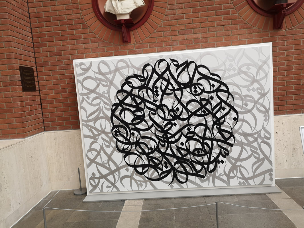
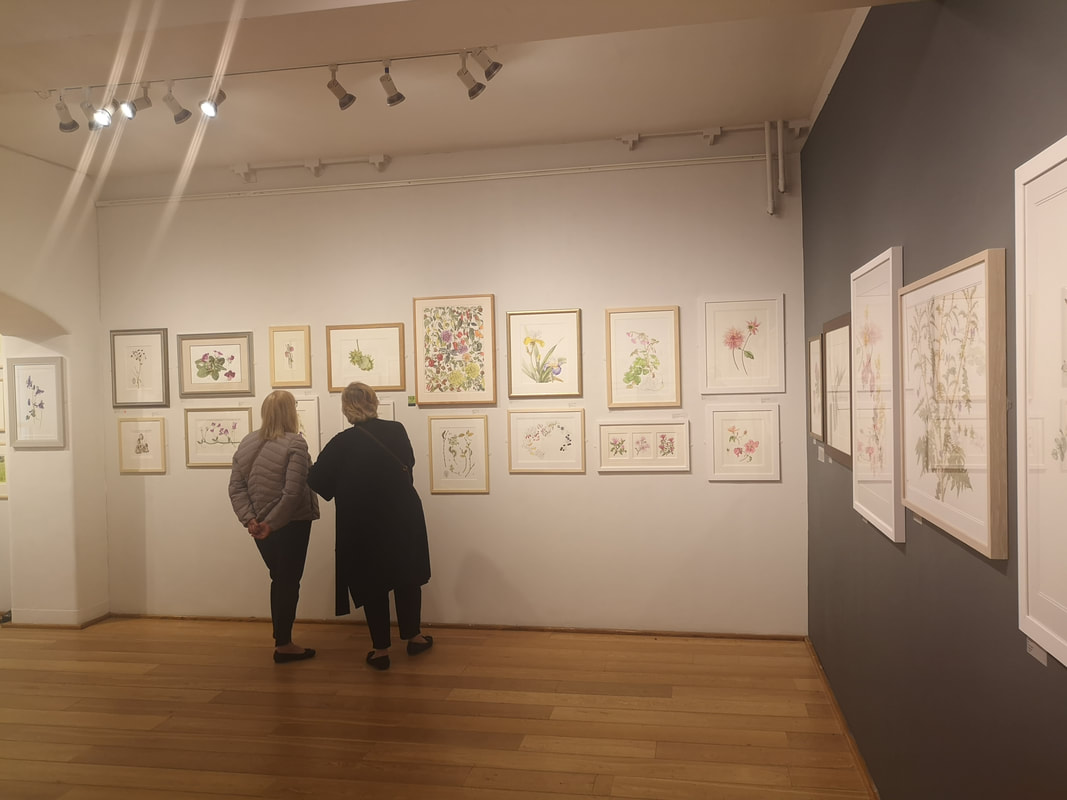
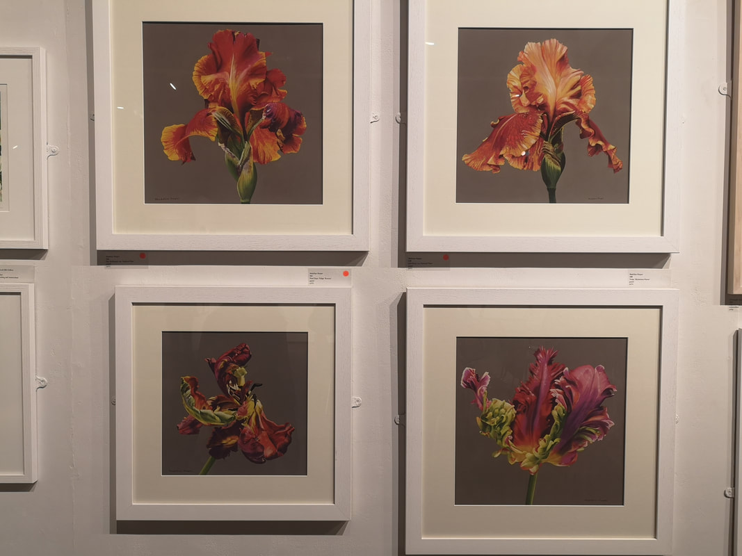
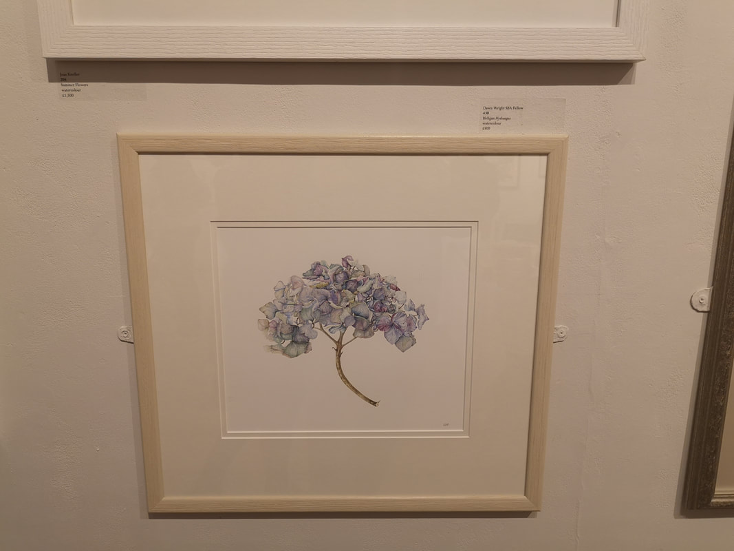
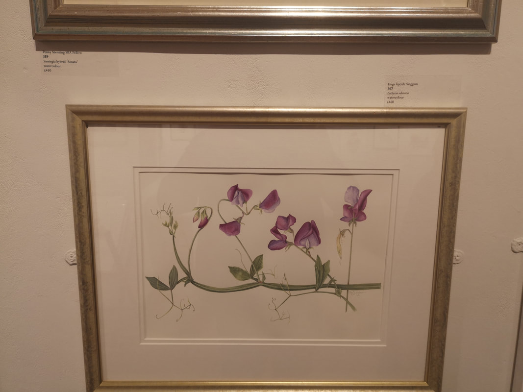
The show carries on with the adaption of script and fonts into the modern age. Futurists adapting Cyrillic for Soviet Ends, the BBC creating their own fonts. The show culminates with this man call El Seed (above right). He creates these lovely curving calligraphy messages of pieces which he places around the world. This one was at the show. That's it for this week. See you next time. This is one of my favourite shows of the year. It wasn't on last year due to some international show in the U.S and this time makes a welcome return, but to a new venue, the Mall Galleries. It benefits from the new venue, more space, more light, the work is better spaced out and easier to see. I went for my birthday and was going to buy. WIth that in mind I will take you for a trot through some of the things I like.
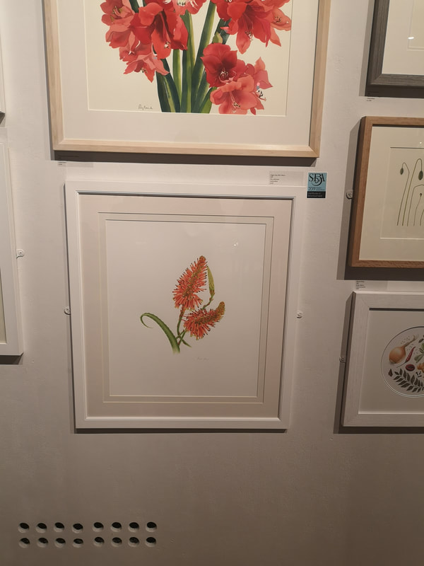
I often have a high degree of concurrence with the prize givers in this show so was not surprised to see Angie Gray's effort (above right). An orange Fern like plant, all bristling colour. The standard of draftsmanship and skill in this show is always excellent. What makes the works stand out then is two things, composition and then just an extra level of skill. Many of the works are too crowded, it takes quite a lot of confidence just to present your piece in the middle of the page and leave it to speak for itself.
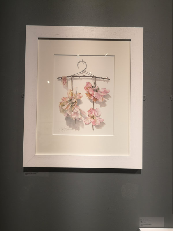
Some of the credit for the show as a whole must go to Billy Showell who is the President of the SBA and to whom I had a very nice chat while we were trying to persuade their card machine to work. The visit of the Toddler in Chief had caused mobile phone coverage to be curtailed with knock on effect. A solution was found in the end but I also like her work and example of which is above left. It is one of the few where not only are the flowers lovingly rendered in subtle print but they are also presented as part of a scene, with convincing shadow effect. This made it onto the shortlist.
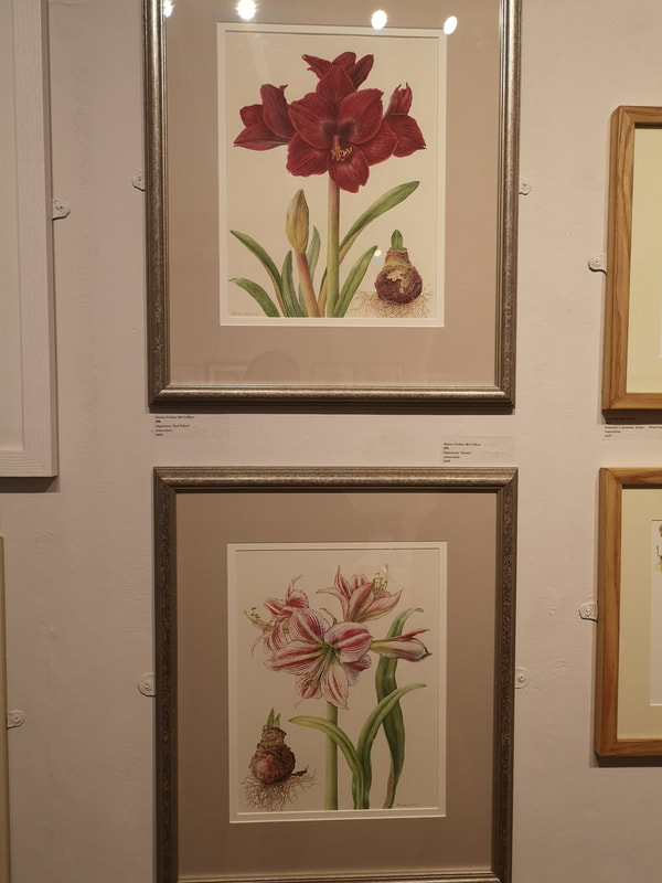
A slightly more maximal look is these two paintings by Marion Perkins (above right). What she is doing here, with the customary high level of skill that you expect in this show, is showing the same plant in three different phases of life, bulb shoot (or bud), flower. The flowers are of course beautiful, richly textured but I like the idea and particularly like the detail of the earth effect beneath the bulb, and the oniony surface of the bulb themselves.
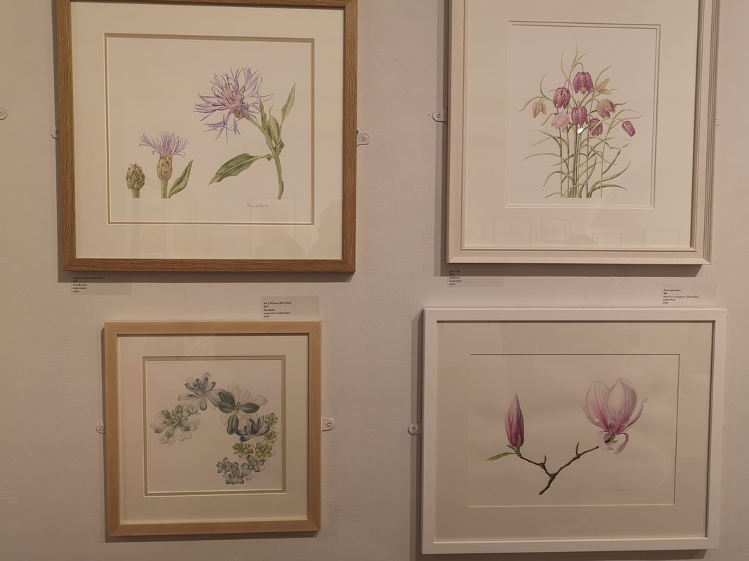
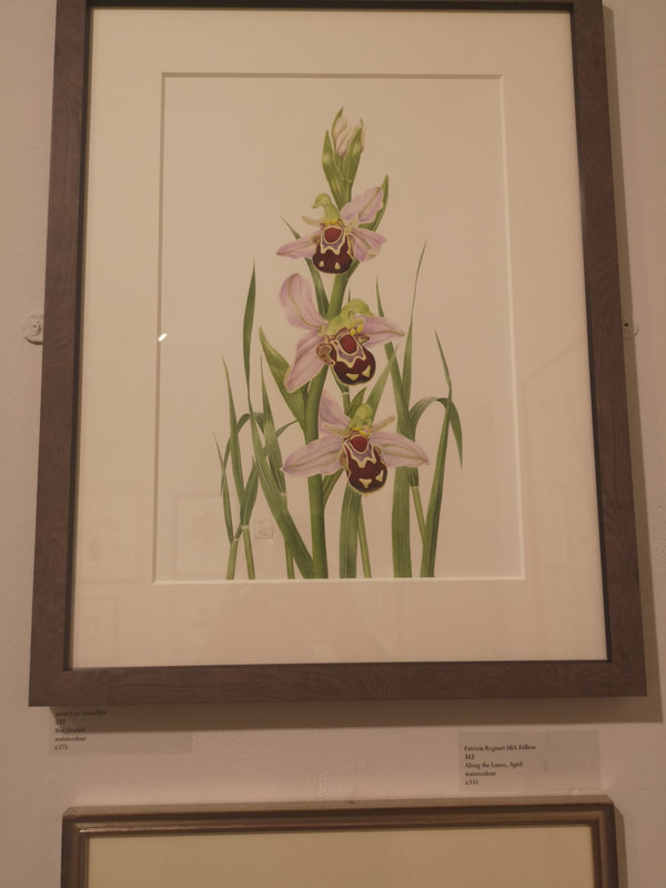
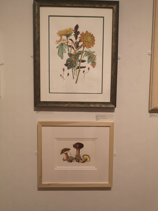
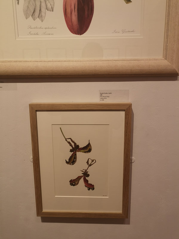
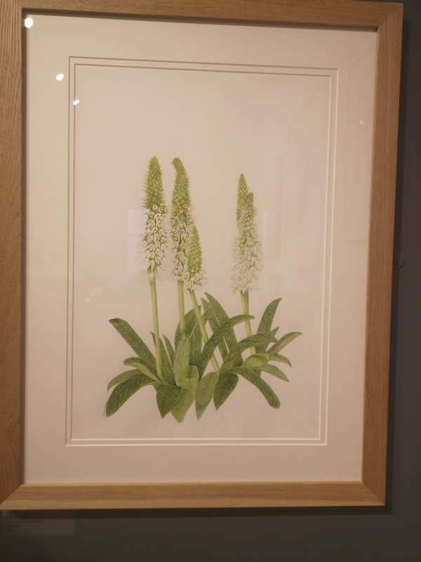
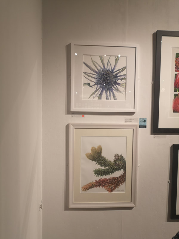
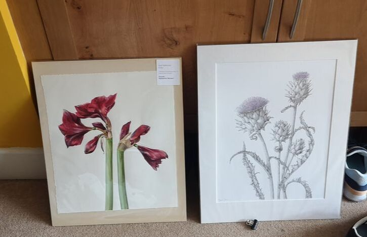
Bee Orchid! This one by Janet Lye (above right). I think it is just stunning. You have a fairly classic pyramid composition, with space all around the plant, and slightly off centre those exquisitely rendered flowers. I really like this and it also made my shortlist for purchase. It was a strong contender and I regret not buying it. It is very easy to be fixated on the flowers but the structure of the leaves and stem really build this piece up. I hope she sells it. I am sure she will. Moving away from flowers now to other foliage. There is a strong tradition of nuts and seeds. Pine cones are a common subject. Here we have two paintings at once, Laura Barraclough's Crimson Tide (top, above left) and Bay Boletus by Reinhild Raistrick (bottom, above left). Bunches or arrangements of flowers are another trope of this show, and again I don't like them to much. They are often too crowded. I like Barraclough's though, if that is indeed what it is. It is entirely possible I have misunderstood. Anyway, I like the restraint, the dried slightly desiccated look and feel of the flowers. It all seems slightly bedraggled. There is personality here . Who doesn't like Fungi? Raistrick's picture is a wonderful thing. Again as with all these paintings it looks simple (and indeed that is part of the appeal) but the skill and attention to detail is staggering. Particularly pleasing is the whole gouged out of the cap of the central mushroom so you can see the inside. This is the art paying homage to the scientific beginnings of the whole thing. Likewise with Rachel Pedder-Smith's Tree Peony Pods (above right) which were my favourite of all the pod seed pictures. Attention to detail, but also a composition which suggest that these have detached from their tree and are falling to earth. Most of the paintings (most of them are watercolours but there are some people who can do demonic things with coloured pencils) of course produced colourful flowers. There is an obvious aesthetic appeal to doing so and they mark for a nice, stark contrast against the white paper. I applaud therefore someone who goes for something more subtle and pulls it off as Fiona Kane has done (above left). The different shade of white, which just stands out from the paper around it, giving way to the spiky green tops. Of course if you are going to do this then your foliage also has to have detail and you can almost feel the texture in those leaves. Very good. Again in a slighty different vein we have Michelle Eun Young Song's Monkey Puzzle Branch (bottom, above right) but in fact it is Jessi Neale's blue exploding number that I am particularly drawn to. It is an unusual view and the way it goes off the page is interesting. It had already sold when I saw it and I am not surprised. As I was weighing up all of these options I discovered two racks of paintings, designated Folio works. They were effectively unframed, and slightly cheaper works by some of the same artists. There were some real treasures in here and it was in fact two of these I went for (above). On the left we have Gael Sellwood. High contrast red and purple flower, in different stages, starkly presented against a white background. The opposite facing of the two flowers is a good composition element.
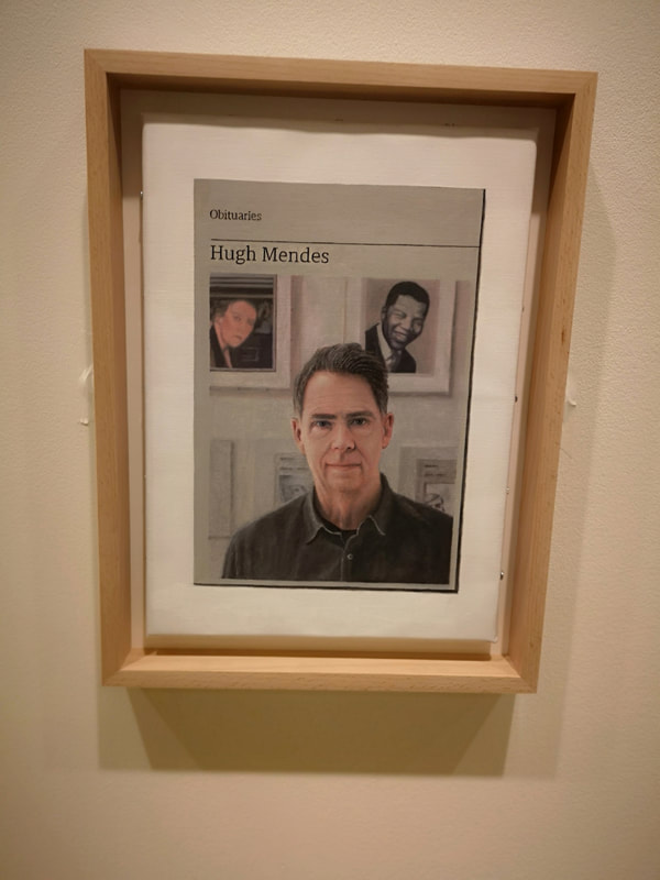
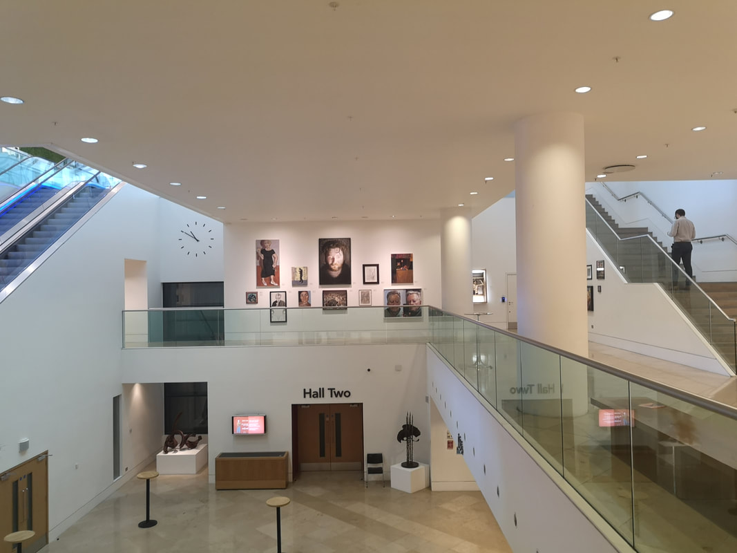
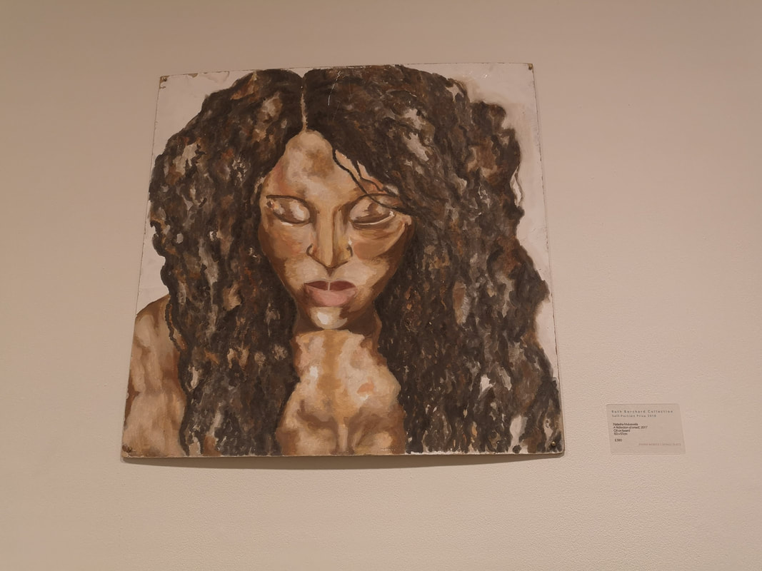
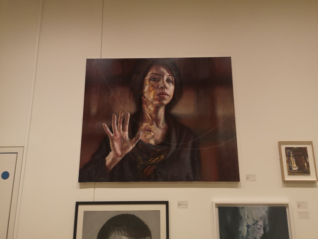
Then in pen and ink, with just a dash of colour. Rachel Munn's Globe artichoke, writing up out of the bottom of the frame like some terrifying sea monster. That's a good thing by the way. Now I just have to frame them. Sadly the show finished on 9th June, but keep an eye out for it next year, and go along. This week I am writing about the Ruth Borchard Self Portrait Prize at the Piano Nobile Gallery in Kings Place. I was tempted there by the presence of work my this man (above). He teaches me art you see. Kings Place is the building where the Guardian Squat. There is a theatre/venue complex there as well as a couple of galleries. It sits across York Way from the new St Pancras development and has a restaurant called the Rotunda which overlooks the Regents canal as it chugs it's way slowly East through Islington. One of the galleries there is Piano Nobile and it is an odd space in that it is isn't really a space at all. It occupies the mezzanine and the lowest floor of the King's place building (as you can see above). Sharing the space with stairs, elevators, doors to offices and theaters. As well as loos. There is no one around who tends to the gallery. It is like they just decided to hang their art here. Quite a few of the paintings had sold and I vaguely wondered who you buy them off. Visiting it is easy though. The building is basically open all the time so you just wander in and down the stairs. The paintings are hung in various clusters in strategic spots around the place. You could (and indeed I have before) go round the place and not realise these were the wares of a commercial gallery.
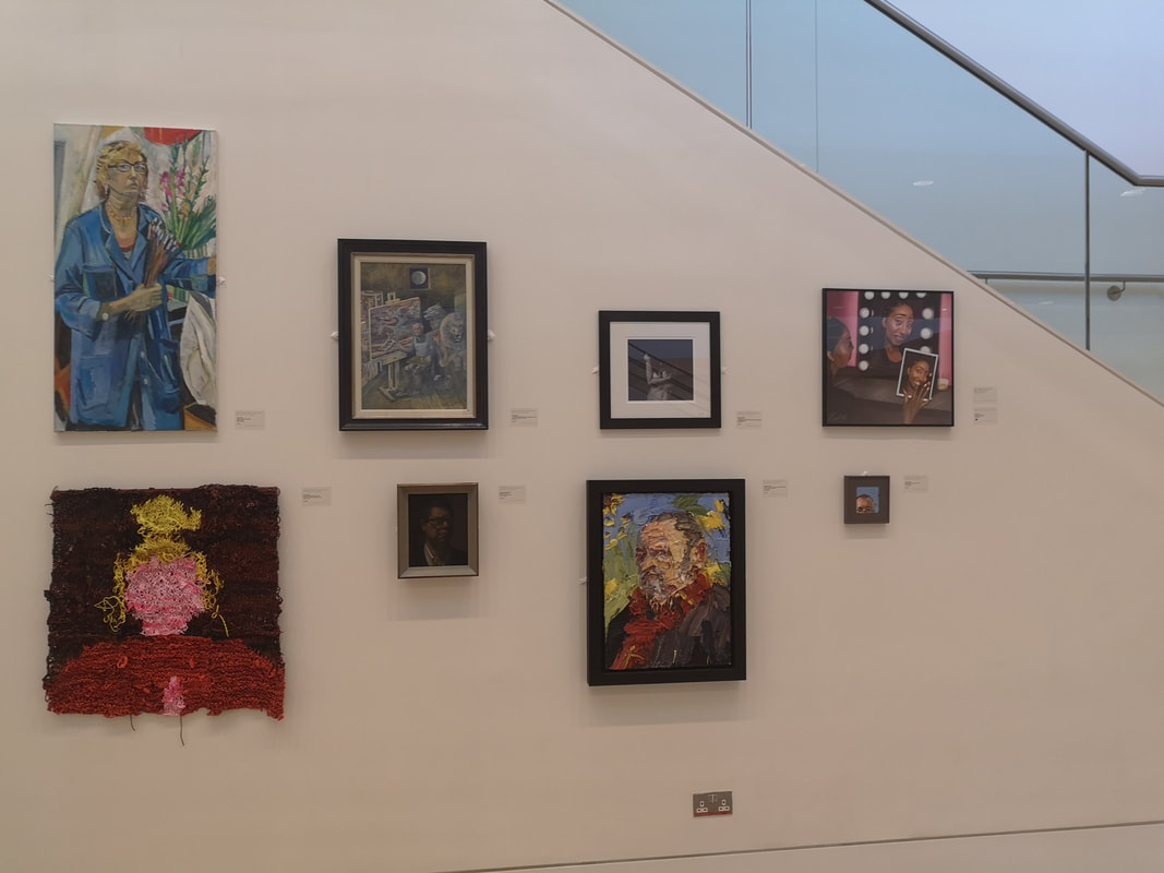
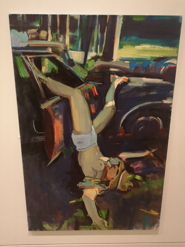
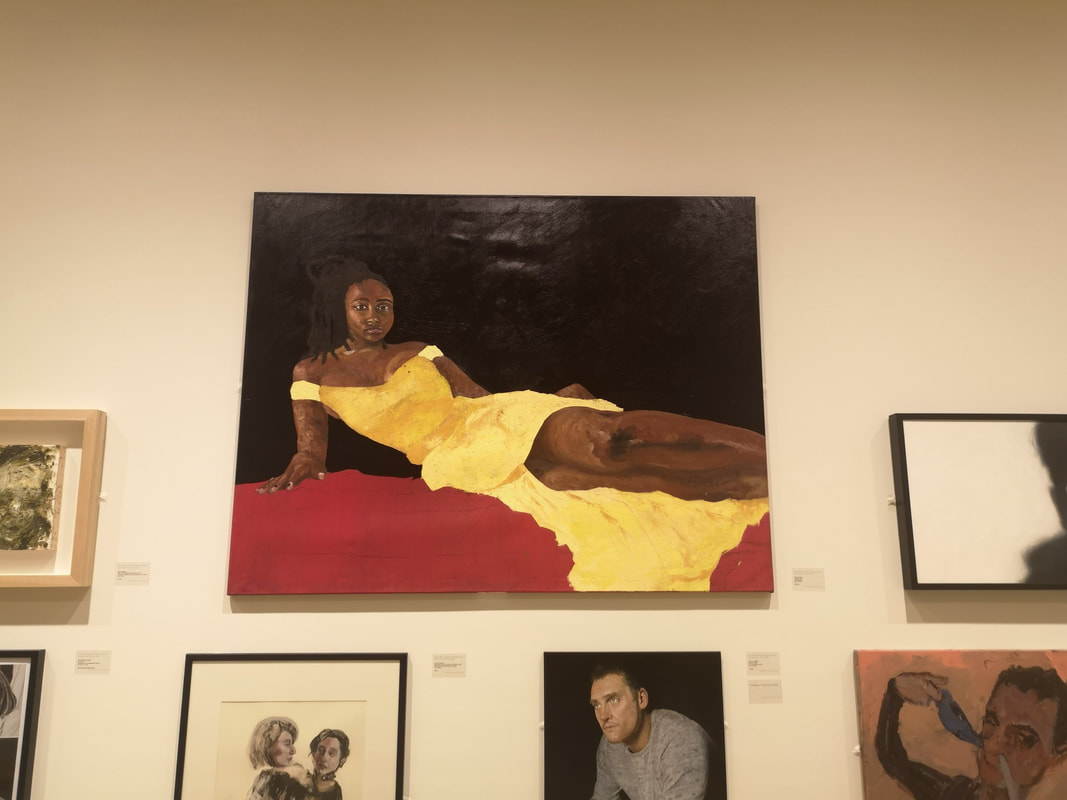
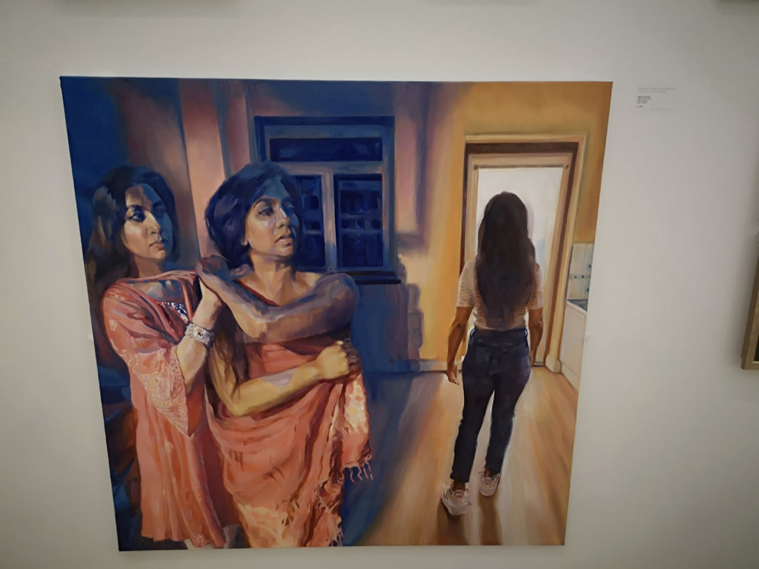
Another type of self portrait that I like is one that seems to give you a narrative and you certainly seem to get that from the delightfully named Cherry Pickles (above right). From this we can deduce she likes drinking, smoking and getting her tits out. Its funny though right? Or at least wry. Its kind of anonymous though as her face if pretty much obscured by that hat. The pose is interesting and I like the style of painting. I particularly like the car door, although of course its difficult to focus on it.
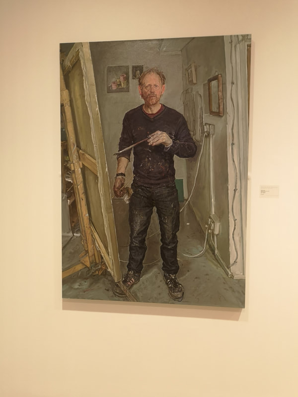
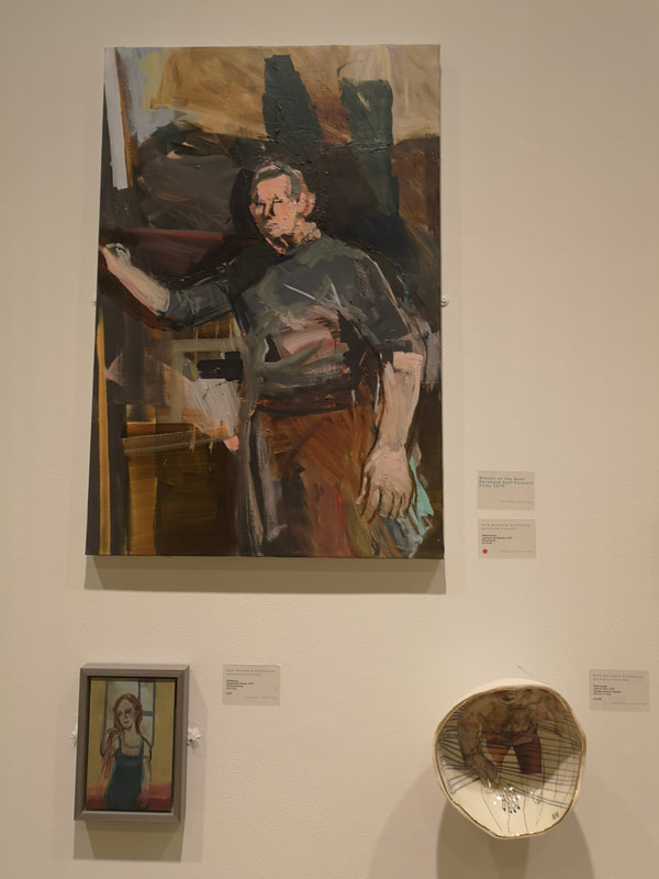
would have like to have been able to see it better. This is rather the problem with the handing scheme for this show but I suppose it is a product of space restrictions. Artist at easel is fairly classic but I don't mind classic if it is done well. I think James Lloyd (above left) has done it well. I like the trailing wires everywhere, the odd frozen pose, particularly the way he holds the brush. The style, which am not sure if there is a word to it, has a roughness to it, matches quite well the muted tone of the composition. He does very much feel both that he is about to move, and that he is about to speak.
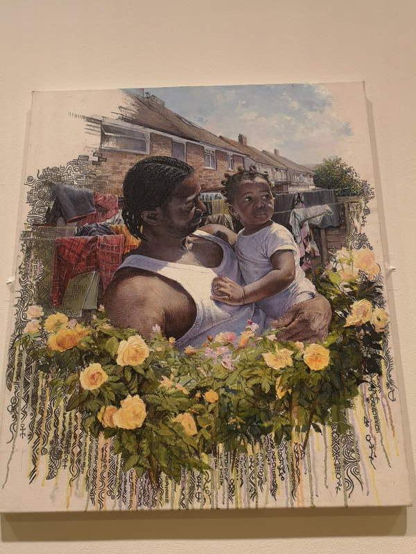
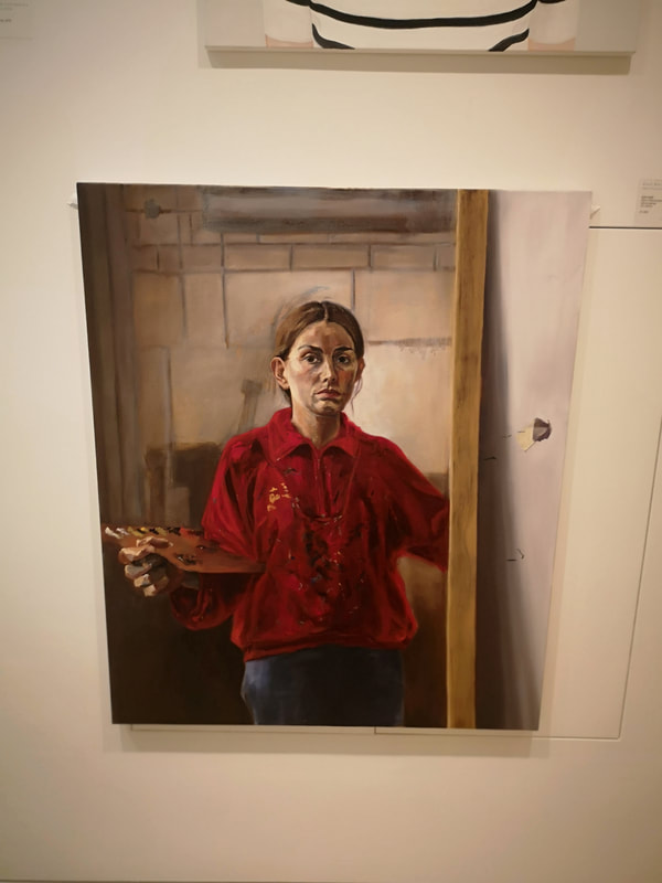
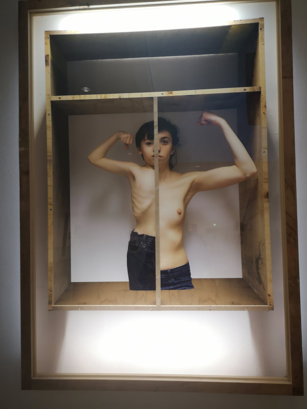
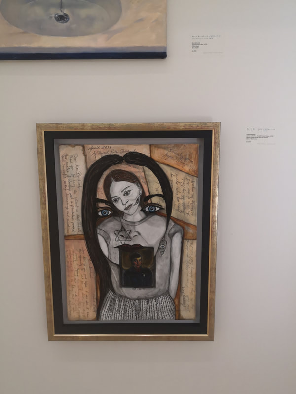
There are in this show (and I will feature one of them quite a few paintings of women with children. Only one of a man with a child and that is Titus Agbara (above left). With the empty white space and the floral wreath curving under the figures it does have a remembrance feel to it (like Mendes' picture at the top of the blog). I like the detail with which the setting is depicted, the loving gaze and the way both figures are linked by their white tops. I also like the way the flowers morph into symbols and designs instead of roots, and the way the bricks of the houses do the same. Children, particularly babies are really difficult to paint and he has done his (I assume it's his) really well, with a depth of feeling and character. All of these features avoid this piece becoming cheesy which it could well have done. Above left we have David Dawson (the top figure in the three) who won the prize itself. It's a perfectly nice painting. It is quite interesting stylistically and there are some nice touches like the highlights to the leg and hand, and the strange highlight on the torso. I include it because it won and although it has grown on me a little since I first saw it, I can't really see what moved the judges to award it first prize. This is of course the problem of all such prizes they are a matter of taste. Very classic, right down to the wooden palette in her right hand (our left) is Ruth Smith (above right). It is difficult to make a happy self portrait if you do it in the classical style of painting from a mirror (as Smith seems to have done) as a glum miserable face is easier to hold. It is often also people's concentration face. She also seems to have stabbed through her canvas which is interesting. It is the red jumper, her mum's apparently that really intrigues me. It is painted at least so it seams in much more loving detail than the actual person. Leni Dothan's picture (above left) literally shines at you from across the room as it is back lit. It is a photo of her and her son. I like this allot, the idea, the composition, the way its presented, the intimate family quality to it, the indication of strength. There is a lot you can read into this one. The primary image if you like is photography, which I usually rate less than painting, but this was one of the strongest pieces in the show. It took me a long time to see all three faces in Joyce Moloney's gothic self portrait. Image within image . It is quite moody and teenage but then I like that in this piece.
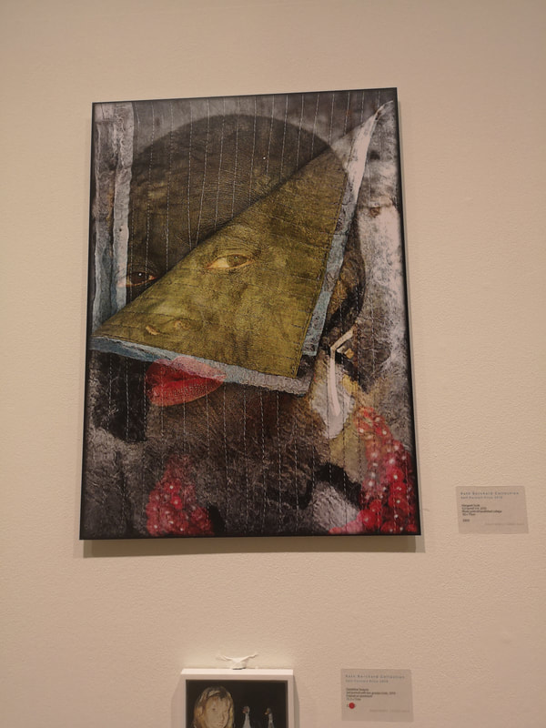
There were many other excellent pieces but the one I will leave on is Margaret Scott's piece (above right). The use of the folding over page gives a clear nod to the revealing of identify. The odd stormy background and lines over the face, and the whole tone and feel of the painting make you wonder vaguely at what is going on here. Of all the painters this Scott is the one, whose work having seen, I now most want to meet.
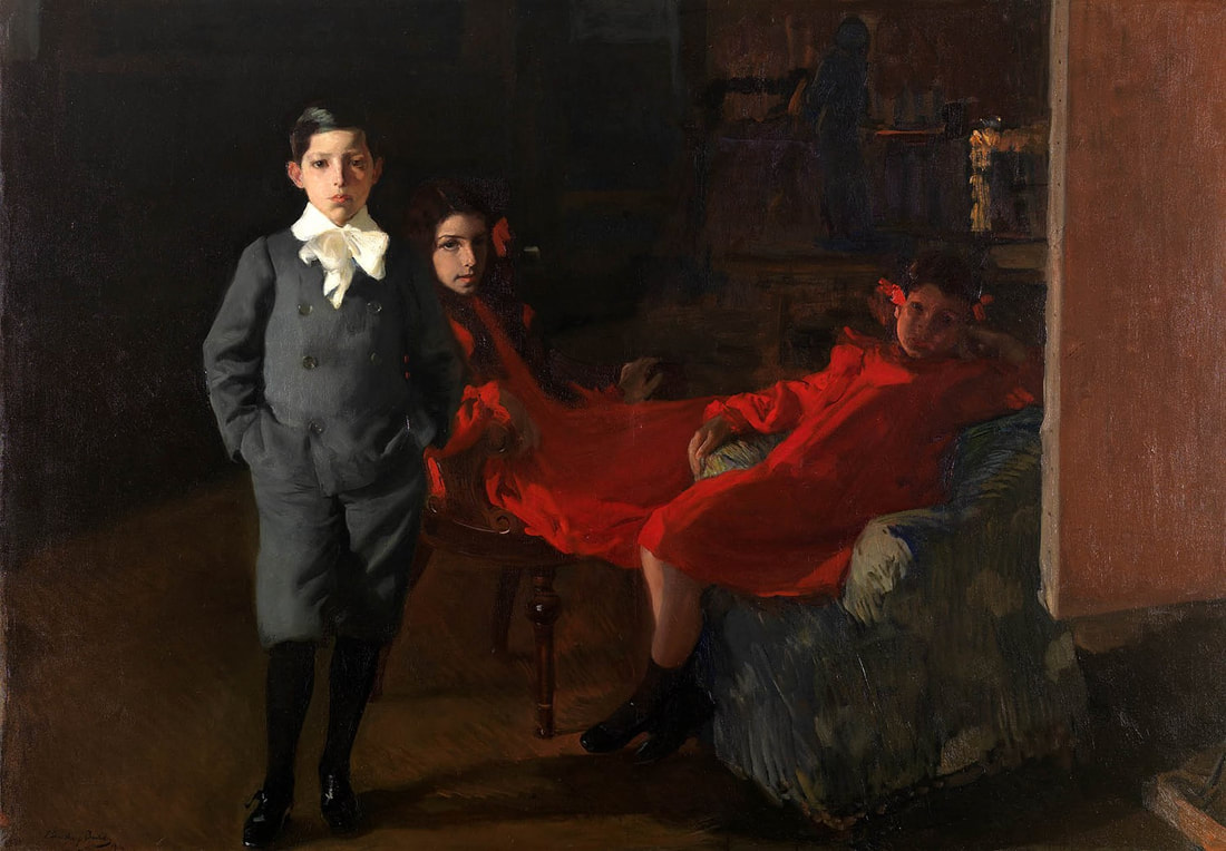
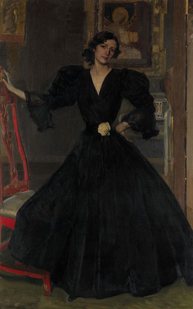
Next week - not sure yet, maybe the British Library. I was singing that song to myself with the appropriate word substitution, to myself periodically as I ambled around the Sorolla: Spanish Master of Light show at the National Gallery. It is on until 7th July and is well worth going to. It is the perfect show to take us from spring into summer. I tend to repeat myself in this blog but I am hoping no one is reading enough to pay attention but one thing I really appreciate in art museums is when the bring to our (my/your) attention artists who you may not have heard of but really should of. Sorolla is one such of these. I'd never even heard the name before, let alone seen the art but now I am glad both of these things have been rectified. You may have seen the poster of the women making a sail around the place. It is a good indication of what is on show but there is also more subtly to be had. Sorolla is basically a Spanish impressionist but he strays more into classical style and subjects than his French colleagues. He is also a family man and his family and home are a central theme to his art. He therefore treads the well worn path of sleeping with and marrying his model but in his case it happens the other way round. He married Clotilde (for that was her name), the daughter of one of his major patrons (smart move) and then she became his muse. As also did his children depicted to stunning effect in the painting above. His works photographs well but is as is often the case, so much more impressive in person. Not least because his canvases are quite big. This three person portrait is about the size of a medium sized table. I like the way their faces are in half shadow, or in the case of the youngest almost in full shadow. The way his canvas or easel cuts into the picture is also odd and make the scene somehow more interesting. The most standout of the three though is the middle figure, his eldest daughter who is 14 or so at the time of this painting. The impact in the original is even more startling but you get a sense of it here. The knowing look. It is haunting and challenging, compared to the son's haughty disinterest. It is easy to project a theme of the coming of age onto this picture. And in the background a shadow figure approaching them. Who is that? It is really good and I think my favourite in the whole show. I kept coming back to it.
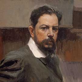
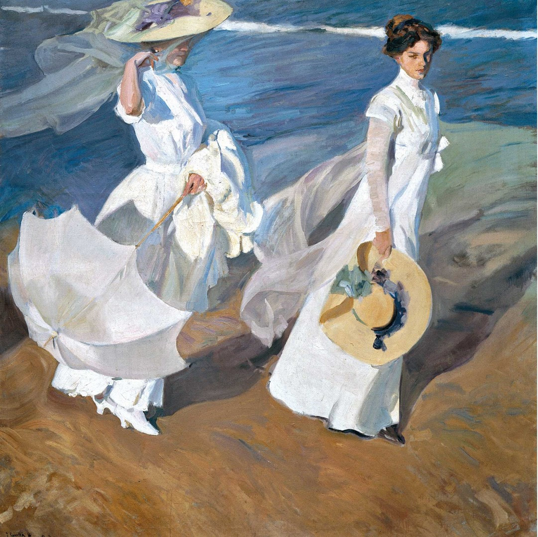
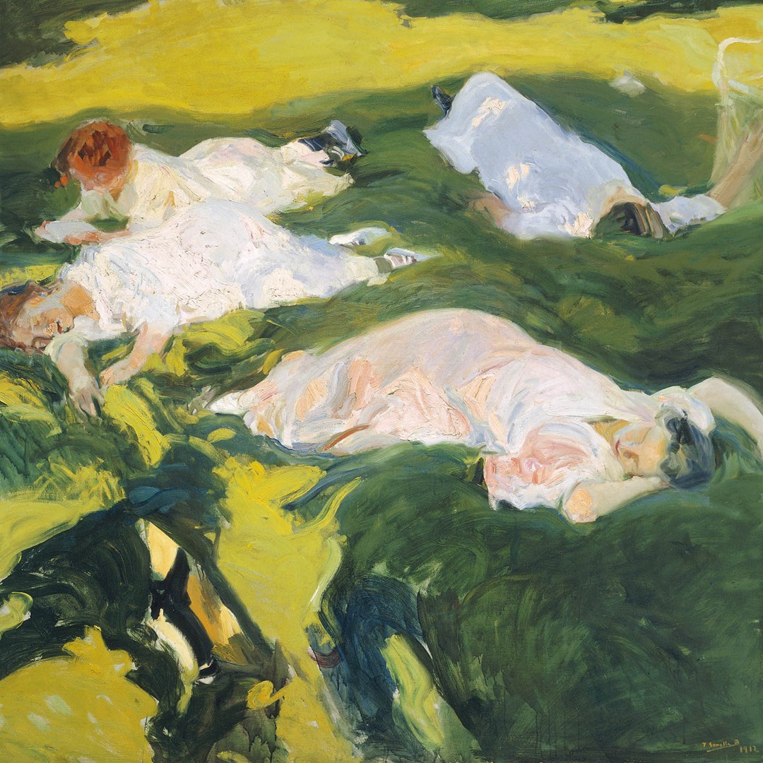
Sorolla (Joaquin Sorolla y Bastida to give him his full name) also did a self portrait (above right) which I find rather engaging. The expression is an odd one, as though he has just caught site of himself in the mirror and is not entirely pleased with what he sees. All of these pictures have a slightly soft focused, softened edges approached, with the background vague and ephemeral, and other words. So that then are the Sorollas. What justification for the pater familia being dubbed Spanish Master of Light. Well the case is quite convincing. There are various paintings of his family out and about, in the garden and elsewhere. There is a particularly fine portrait of his wife sitting on a cliff top, toying with a camera. Wind swept by the sea suits Sorolla though as we can see in this painting above left of his wife and daughter promenading along the seafront. Promenading is the same as walking, just you are overdressed. This painting, strolling along the seashore captures a good sense of movement. This is done mainly by the billowing of the diaphanous shawls blowing behind them, and the mother clutching at hers. You can feel the wind blowing off the sea. The positioning of the figures is finely observed. This is very much people moving forward. What I really appreciate here is the subtle different shades of white. The way the shadow are done and particularly the sheer material over the arms. Its very nice. Sea, wind and sun. He does a similar trick in a picture of his daughter's skipping. One figure is caught mid air, her feet entirely off the ground, with the skipping rope sweeping down behind her. The movement is particularly defined by her shadow, leaping underneath her. Both these (and other pictures) were almost certainly sketched on the spot and then worked up again later, probably with the help of the models. One though looks like it was entirely painted in-situ (plein air is the awful arty term) and that is the Siesta (above right). The style is much loser and quicker but he has really caught the play of the sun and the shadow, again particularly on the rendering of the dresses and their is a real sense of repose and relaxation. It has more of a dreamy, instant quality. Not describing this very well. It is always nice though to see the more natural paintings next to the more composed
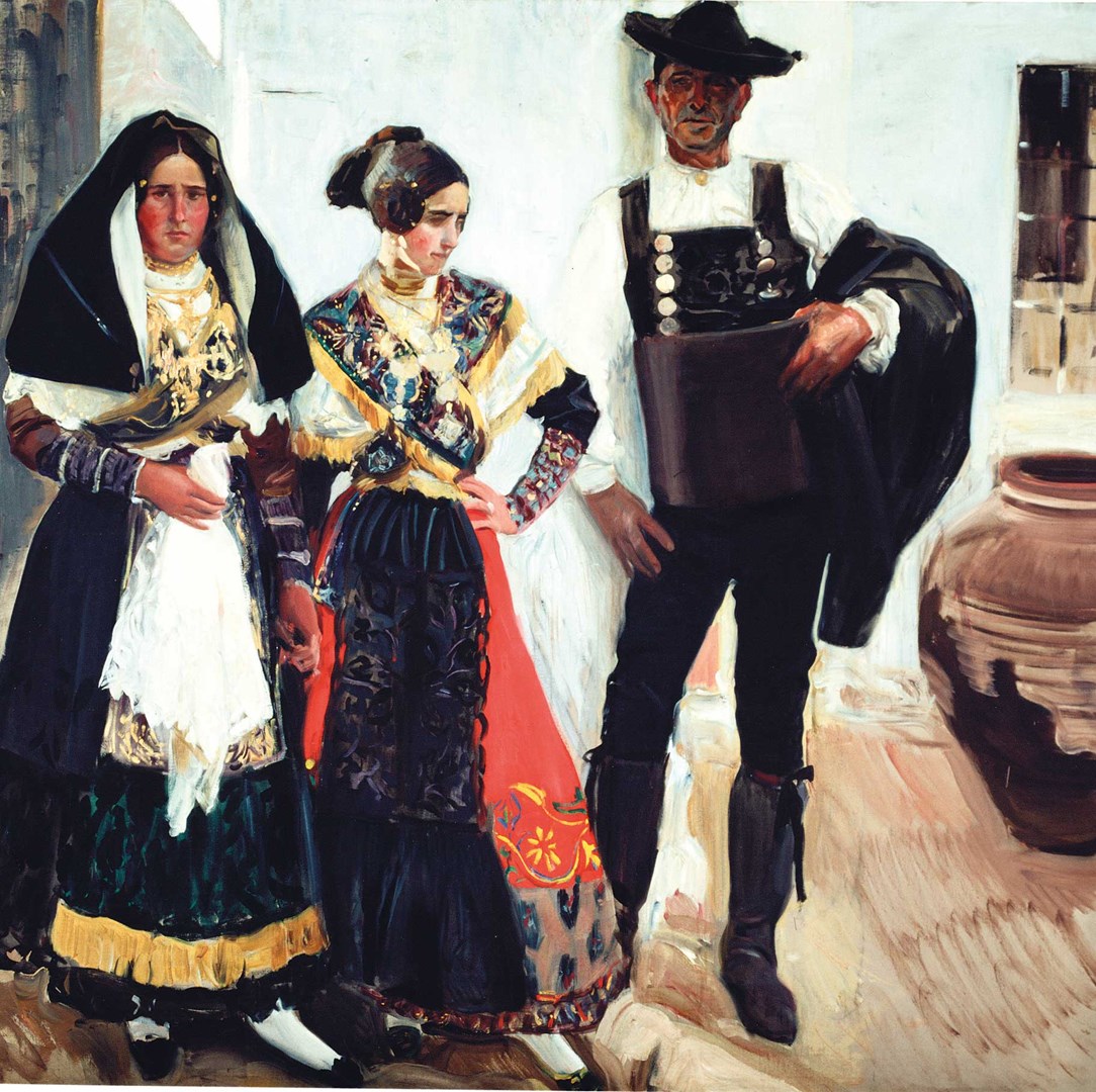
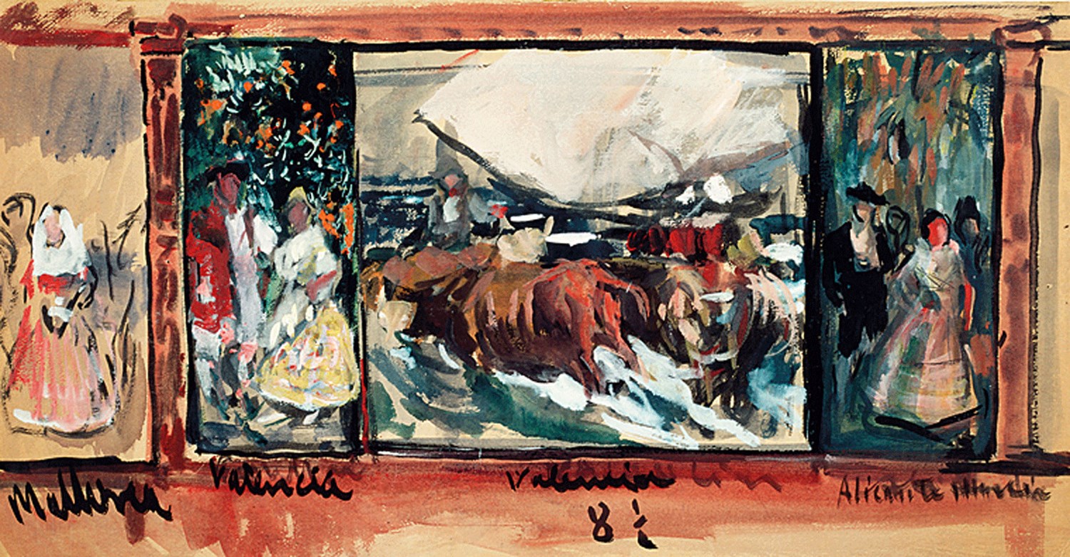
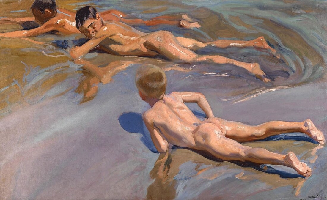
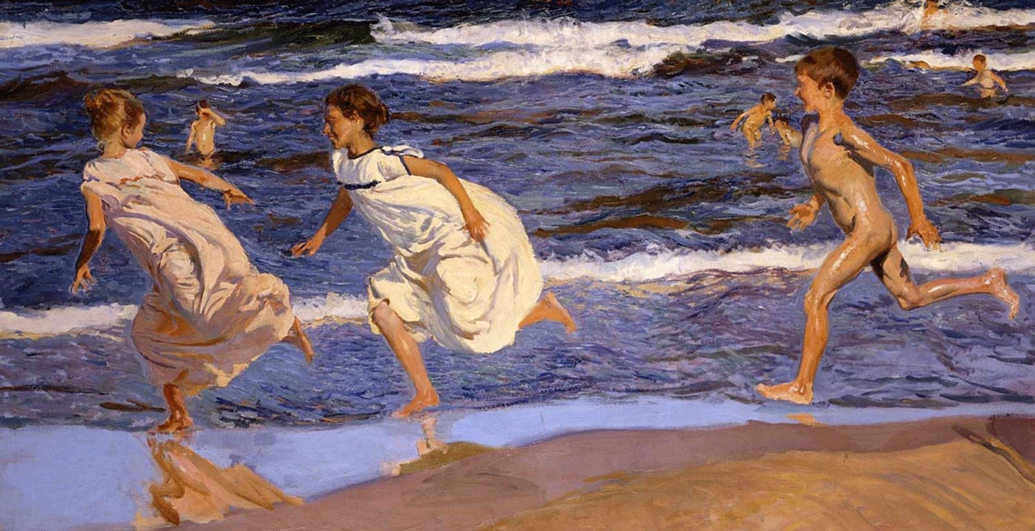
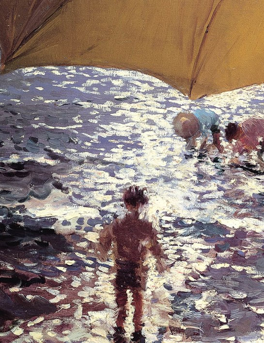
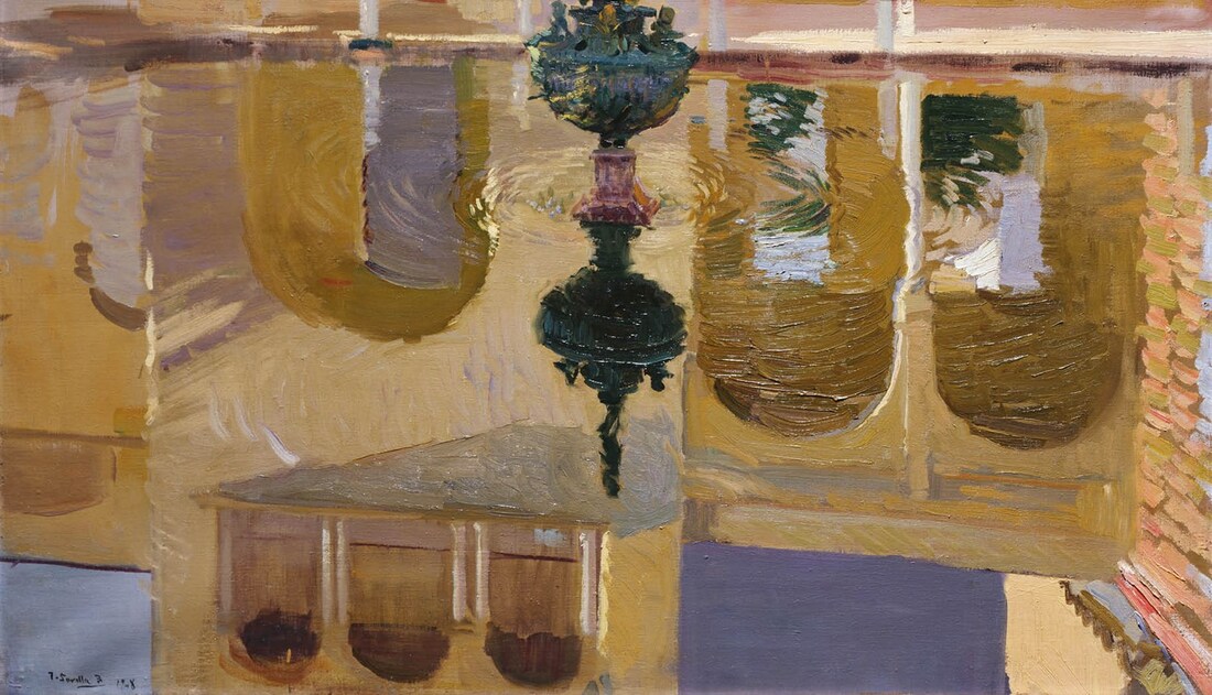
In a similar vein he was commissioned to produce a large set of screens featuring similar scenes for a museum in the U.S. (I forget which one) for which the above right is a preparatory sketch. The above left is similar to the planned painting. Another room shows a scene similar to the one planned for the middle of the panel. It shows two oxen pulling a small sailing ship out of the surf. Changing tack to the beach. It was, apparently, the custom in the late 19th centuries for boys beneath a certain age (presumably puberty) to swim in the sea naked. Girls of course did not. Sorrola depicts this and in modern times these pictures have,. particularly in the case of the one above left, somewhat different connotations. Museums are oddly coy about such things, and this like in other similar cases, fail to mention it. I find this absence odd. Anyway it again shows Sorolla's masterly use of light and in this case the texture of skin. It very well depicts a joyous abandon. This is likewise shown in the other seaside picture this one again showing Sorolla's capacity to depict movement. What I particularly like is the reflection of the foremost girl. I also like the different light and shadows on the surface of the water.
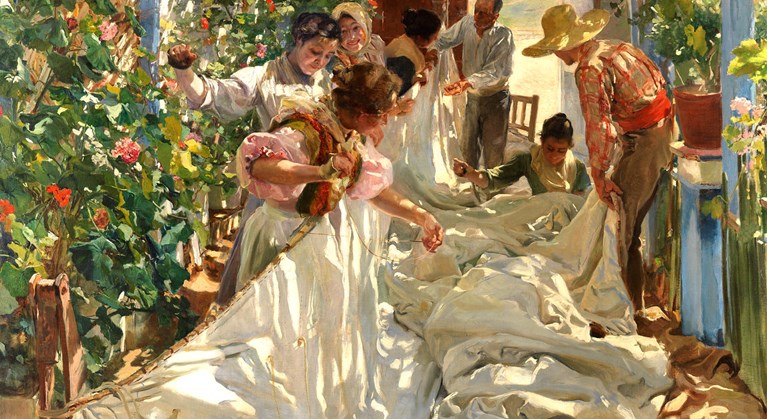
The effect is exaggerated or enhanced by the blurry nature of the figures, as though obscured by a heat haze. All these photos are pinched from the National Gallery website and the one above left is a close up of a large piece showing children playing in the sea. There is a room of large pictures. The bulls pulling the sail ship is there but also what has a shout at being the finest picture in the display, the above, the Sewing of the sail. The sail, furled and ruffled on the floor cuts a white shaft through the picture. The tones are subtle here but the lifted left side is brighter and whiter than the clumped sail on the floor. The figures are in motion here, a skill of Sorolla's that I left the exhibition really. Then lying on the left wall an foliage in a panoply of green and pink, the pink reflecting the shirts of some of the figures. It is a fine piece.
Next week, the British Museum. In the meantime why not have a look at my gallery. Tell me what you think. |
Archives
June 2024
Categories |









 RSS Feed