|
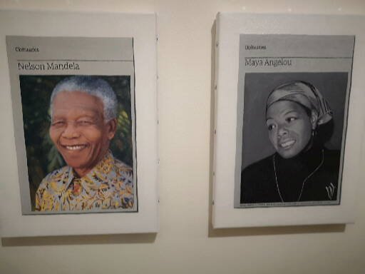
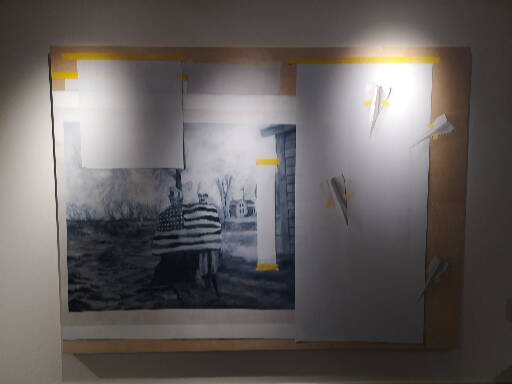
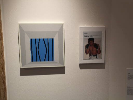
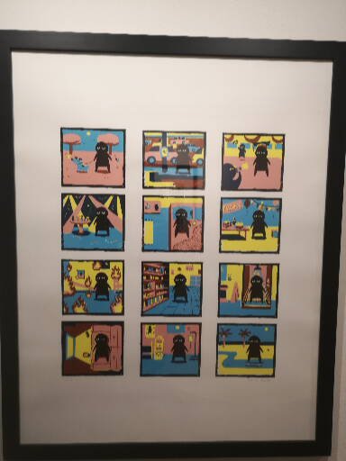
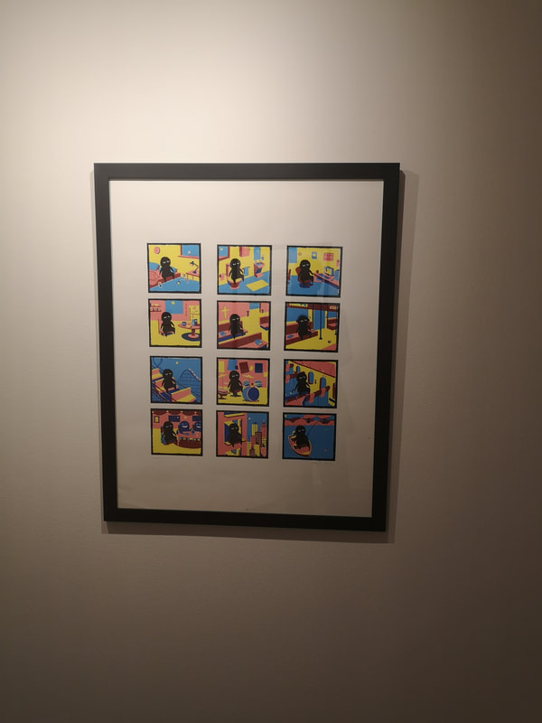
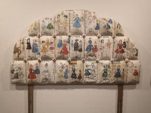
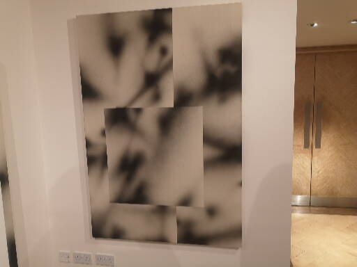
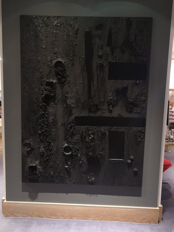
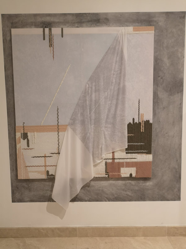
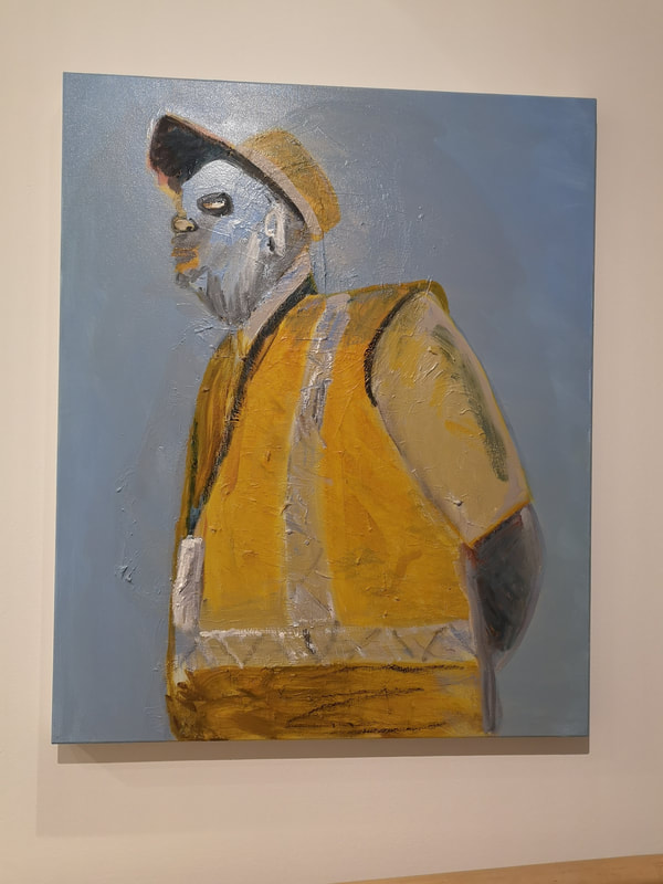
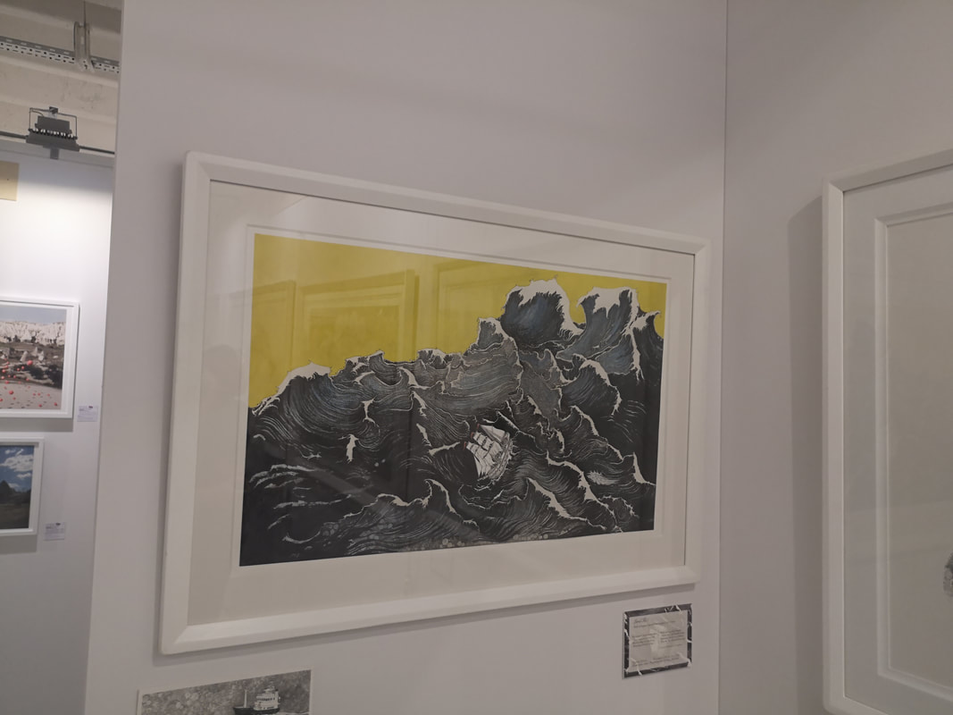
You get art galleries in the oddest of places and there is one in Collyer Bristow, which is a trendy law firm in Bloomsbury. They have a show on at the moment called Rules of Freedom all about rule breakers and the theme of freedom, free speech and Human Rights. It is on until 13th February 2019. I knew two people who were in the show, one the august Hugh Mendes who had is obituaries of dead famous people, this time selected from those who chimed with the theme such as Nelson Mandela and Maya Angelou (above). Hugh teaches me art and I rent his studio once a week where I produce almost all of my work. It is an excellent arrangement. His work, including Nelson and May have been my consistent companions. For this reason I don't often review his shows, it seems a bit crawling. As such I got to swank along to the private view, causing the two sides of my existence, art and law to meet nicely. The reason the gallery is an odd one though is you can't just walk in. If you want to see it then you have to contact the curator. Also the art is displayed in what is basically the reception and meeting rooms of a law firm. The space then doesn't quite work. Collyer Bristow is the kind of place where someone called Sylvia brings you cucumber infused water while you wait, and the gallery plays very well into this shtick. It was though very intriguing to see Hugh's work on public display. I am always interested by how much better it looks out in a gallery, than confined to the studio. They glow. I also know Alastair Gordon who has been kind enough to let me invade his studio and talk to me about art. He does these super detailed trompe l'oiel paintings (above). Those paper airplane and bits of tape you see are not stuck on. They are in fact painted on. Its an illusion and a very impressive one. Apologies for the poor photo but the painting was being displayed (and presumably still is) in a gloomy corner. The tweedledish couple you can see are wrapped in an American flag. Mohammed Ali has also been an old companion of mine (above, right) and this time he was being kept company by a small, simple blue and black geometric number by Juan Boliver (above left). At first I thought the white and grey border was an overlarge frame but is in fact again an optical illusion. I made me think of a prison window that someone had bent apart and legged it through, which shows that Oliver has succeed as when I looked I saw the work was called Jailbreak. Of the new work's I encountered the above two were my favourites. They are called Depression I and Depression II (above) and are the work of Kazz Douie. The idea of this never changing black figure in a variety of colourful settings is a very effective one, and one that really spoke to me. Incidentally everything in this show is for sale and the unframed prints of these are at the more affordable end being £250 each. Paula Chambers' Daddy's Little Princess looks at first glance like a twee head board, with 1950s house wives depicted in domestic bliss (above left). However once you look closer then you see anarchic and indeed disturbing images and themes, guns, knives ect. The medium and the style of the presentation beguiles the message nicely. This provoked allot of attention. Very different is the blurry overlapping images of Lucas Dupuy's On (above right). Hypnotic and calming this image. I like it. Violent and disturbing like an old jail door, burnt and crusted like it has been attacked by lava is Simone Bynoe's Inside out I (above left). Looming and threatening but well done I thought. This could have easily gone to far but keeping it to tones of blacks means it has a powerful understatement. Evy Jokhova's 1991. From Memory (above right) is made from embroidery. I am not sure what the date of the title signifies but it comes across a partially shrouded city-scape or perhaps a surrendering city. Anyway I like the blend of light blue and soft beiges.
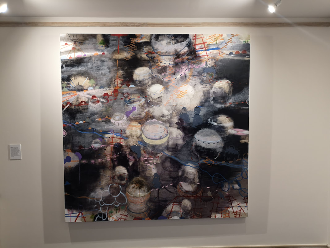
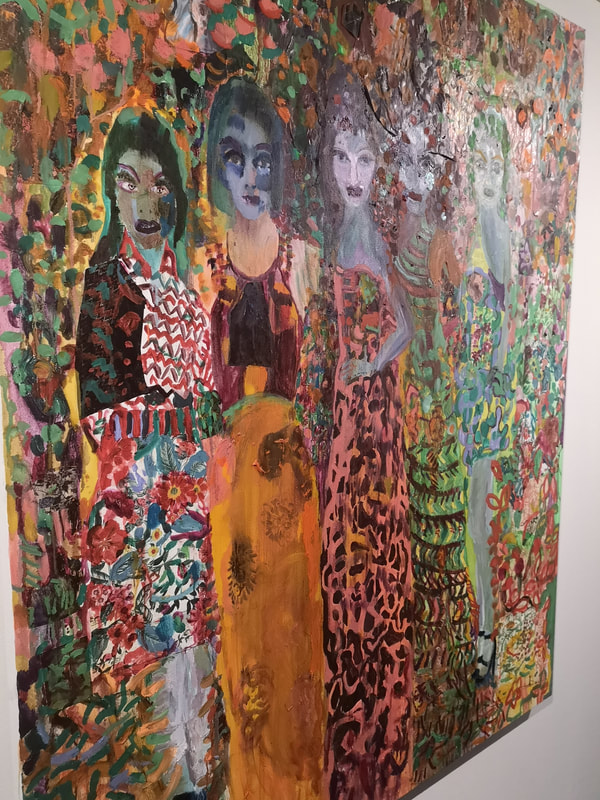
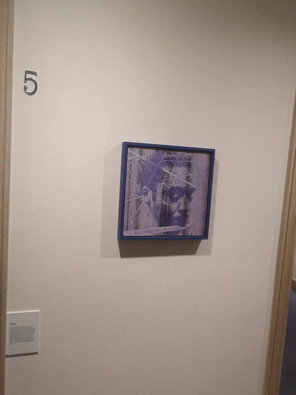
they can be eye catching and entertaining. Such I found The Beautiful by Vanessa Mitter (above right). These female figures emerging from a dazzling array of colours and shapes that merge from the woman's garments to the background and back again. It is a delight to look at. There were many other paintings in this show but the above where my favourites. I shall leave you with the title piece of the show by Justin Hibbs (below) after I have plugged by upcoming show which runs from 18th November to 18th December at Beans Love Greens.
0 Comments
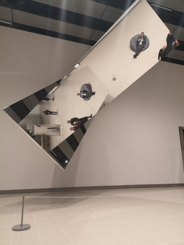
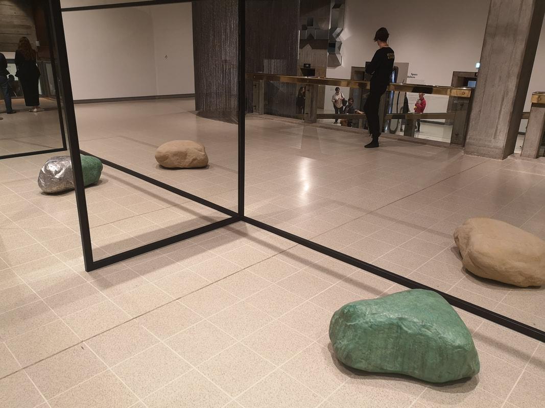
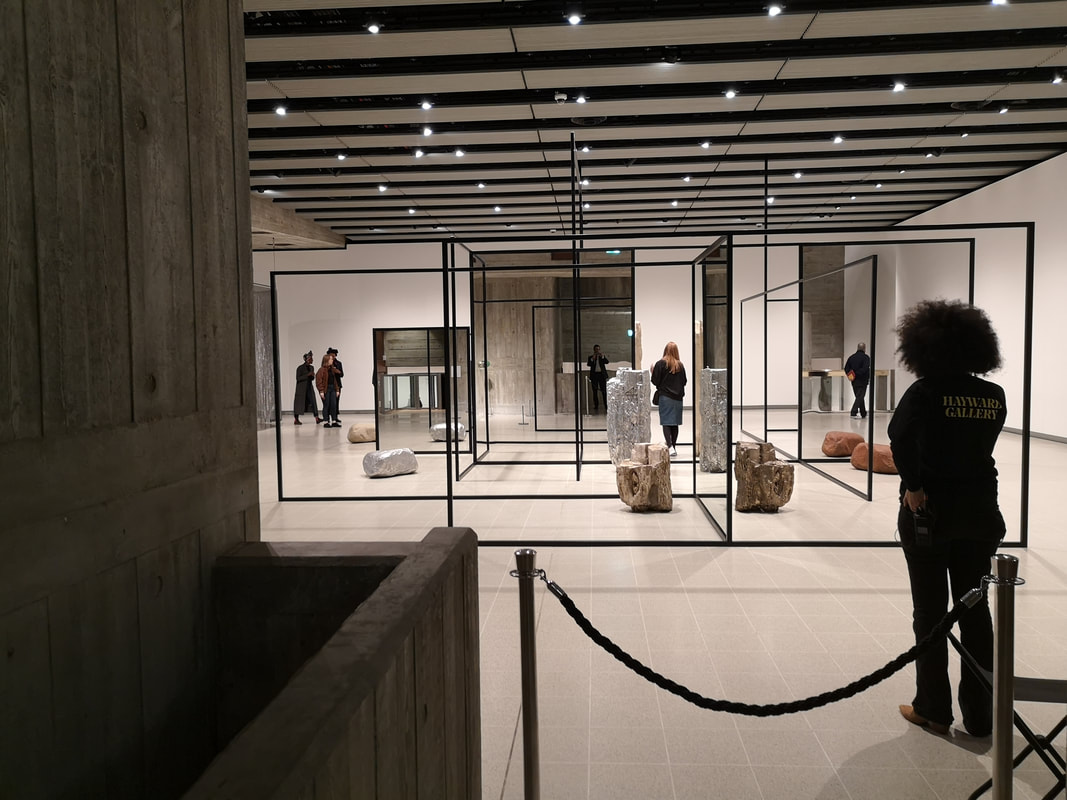
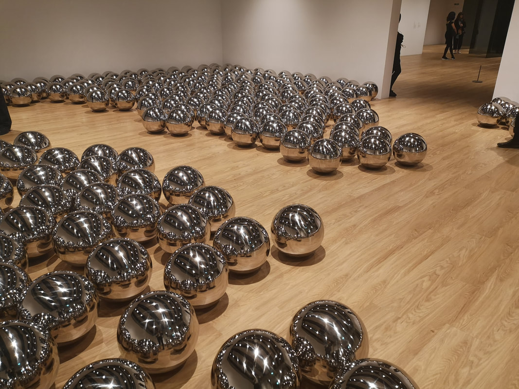
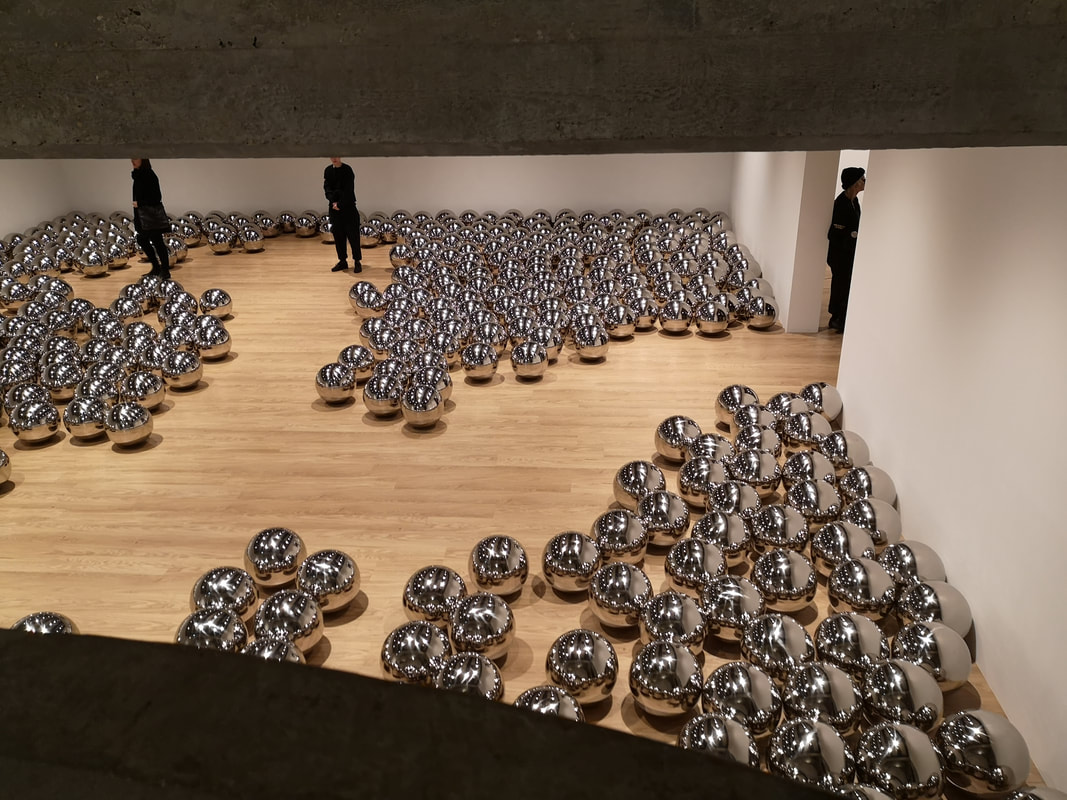
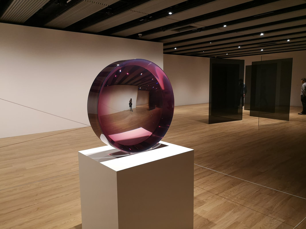
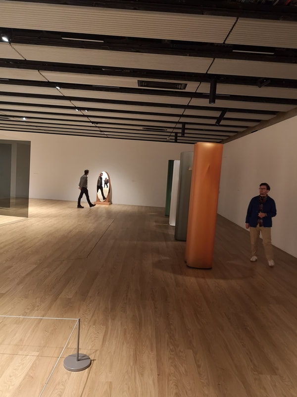
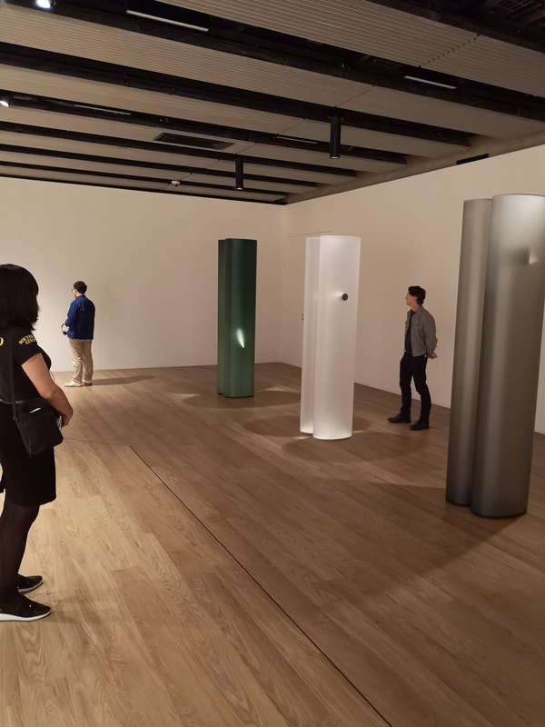
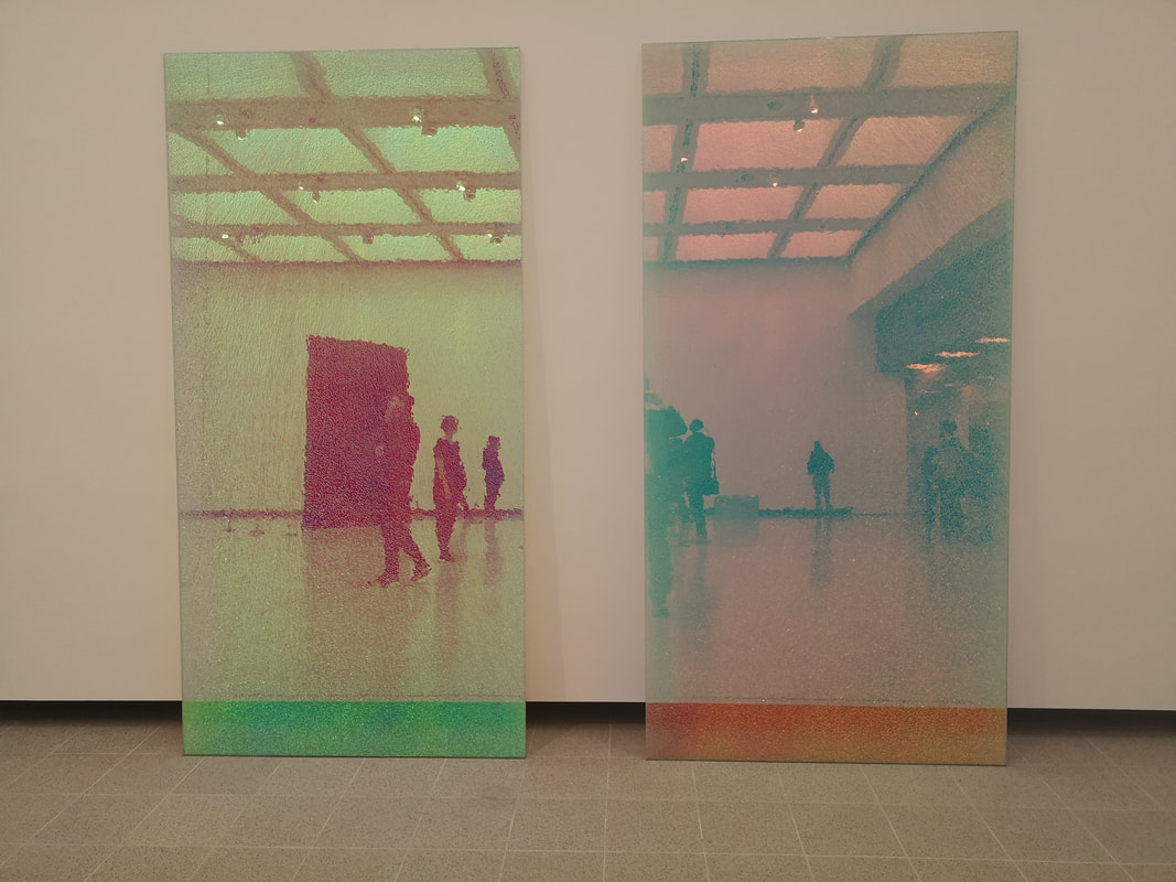
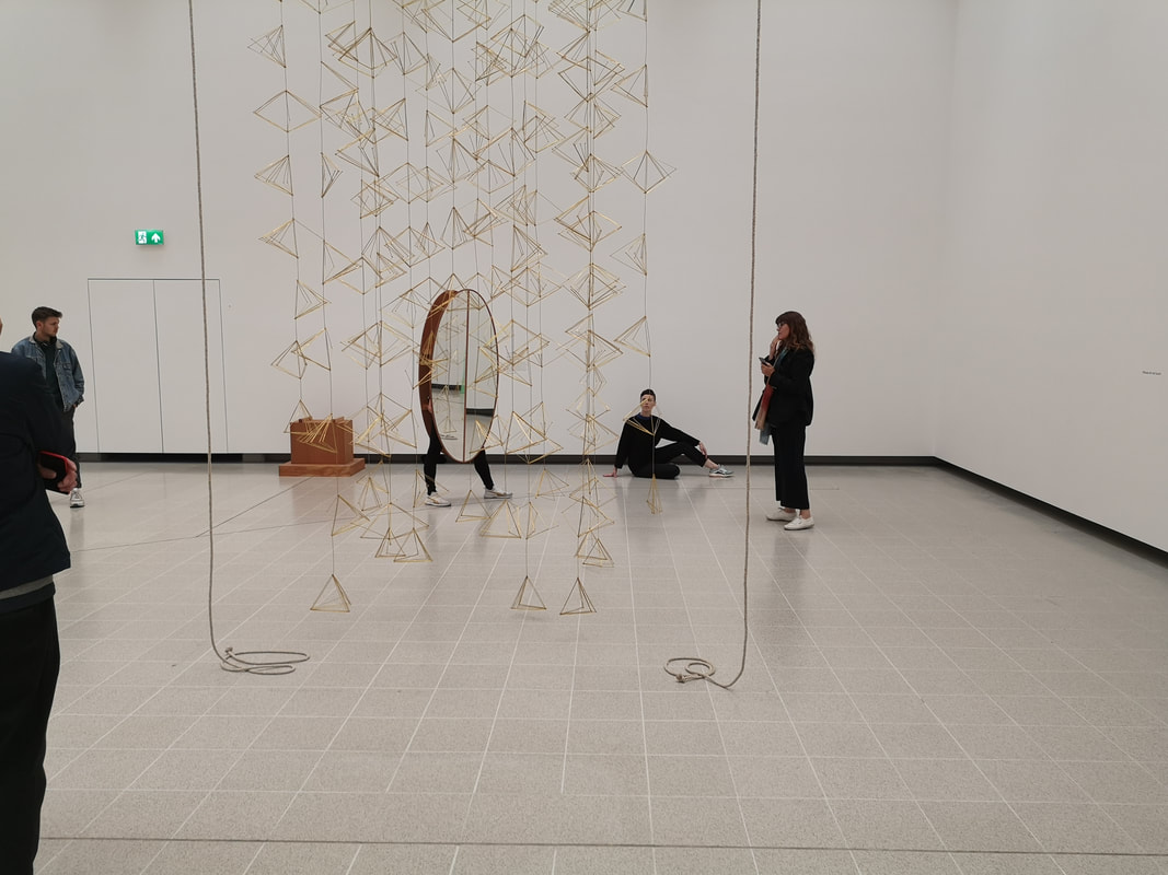
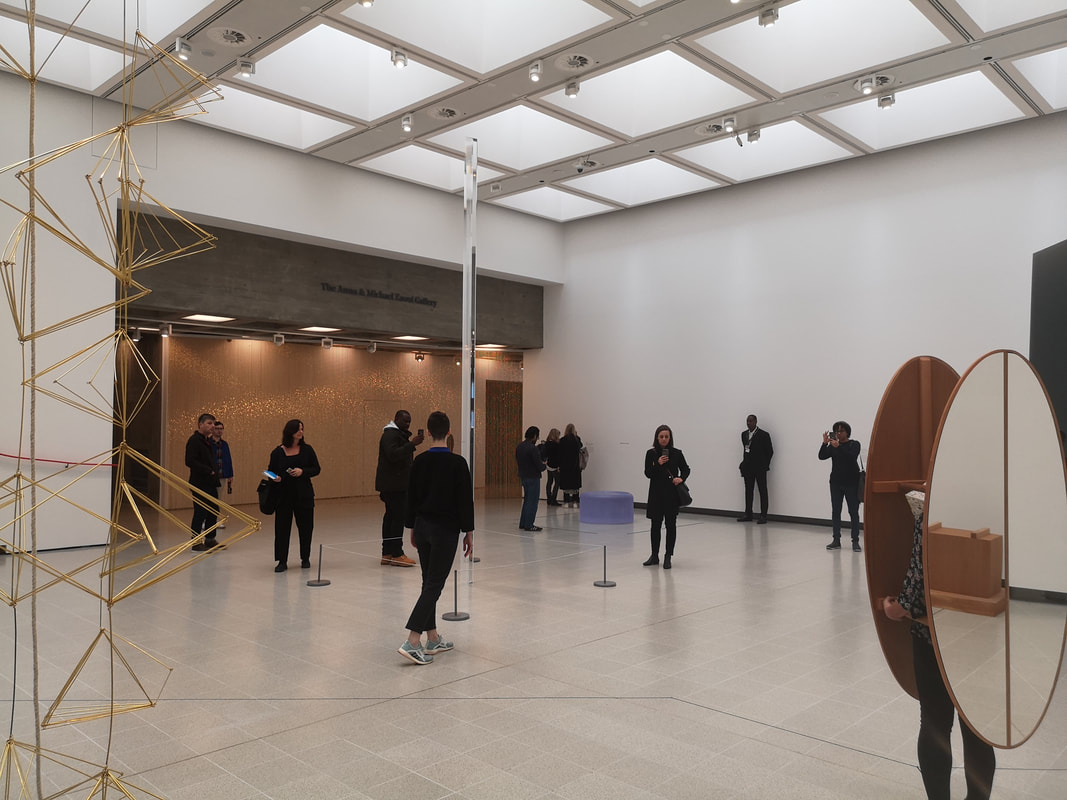
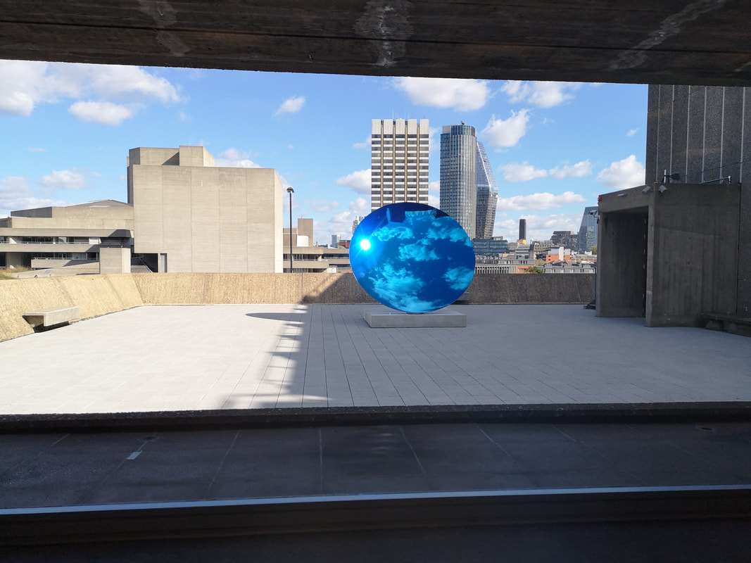
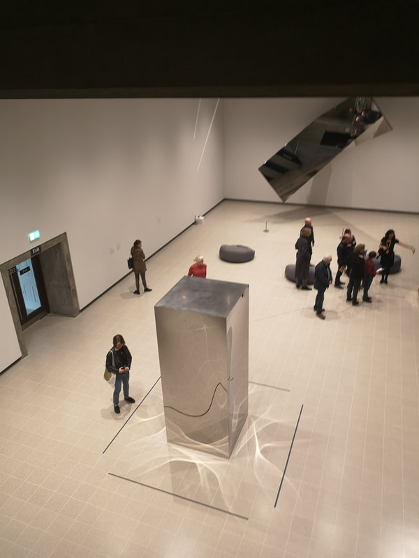
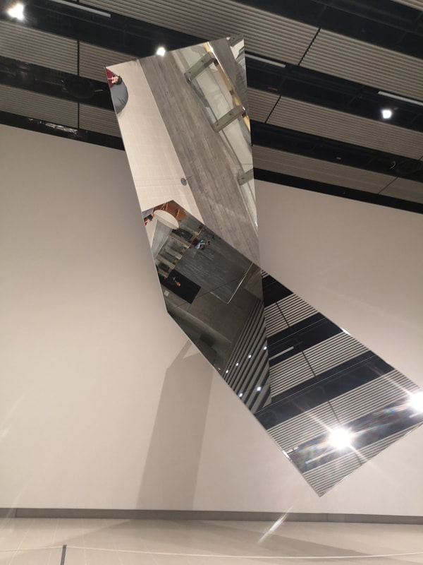
Space Shifters is one of the shiniest art shows you are ever likely to see. It is on at the Hayward art Gallery until 6th January 2019 and is well worth a look. It plays with the ideas of mirrors and optics. In case you are wondering the glamorous gentleman in the mirrors above, is me. Bean bags are not my natural habitat. The show has works by a variety of people, the shiny quality being the unifying feature. The mirror shown above, rotates slowly. It is the work of Jeppe Hain and is called 360 degree Illusion V, which is not the most gripping of names but the piece is oddly gripping. As it rotates, the mirrors reflect the room and of course each other so different aspects of the room, and the people watching are revealed as it tumbles slowly around. It is a hypnotic relaxing experience. Up the ramp and through Daniel Steegmann Mangrane's chain link curtains and you encounter what is basically a small mirror maze, brought to us by Alicja Kwade (above left and right). The clever part of this though is as the photo hopefully shows there are similar objects sitting opposite each other. In this case a rock. They are different in colour so as you move the image of one eclipses and replaces the image of the other. In the example above left, the gold is being swapped for the green. Off course not all the objects are separated by mirrors. All of this makes it an entrancing and intriguing experience to walk round. This is helped by the fact you can walk round and through it. People love being able to see themselves (myself included). In fact because you can orbit and in some cases walk through the art works makes for a stronger more personal experience. The lights and images shift as you move and you appear and disappear in many of the pieces. Sometimes in multiple as in the large cluster of shiny silver balls by Yayoi Kusama (above left and right). Little avenues and paths take you through and round these enormous baubles as they reflect the light from above, each other and of course, you. The Hayward gallery is quite a good venue for this show, and indeed it has been well laid out around the gallery space, allowing you to view many of the exhibits from different heights and vantage points. You can look down on the shiny balls from the stairwell, which frames them nicely (above right). I find coloured glass and resin very attractive and very calming. I liked therefore very much this purple parabolic mirror by Fred Eversley (above). It is fact made of polyester. Whatever it is made from I find it a very calming and satisfying presence. I like the way the colours change with the density of the object and of course the image that is displayed through it, as though there is another, purplish world, through it. In the same room and in the same photo, seen to the right was another mini glass maze. This one was the work of Larry Bell. It is made of darkened frosted grey glass, alternating with clear glass, to give a slightly bewildering and disorientating experience. As with most of these exhibits, interaction is key. This really is a show that rewards attendance. It is another example though of what I call the gallerification of art. Contemporary art is all about this really. You can't have these at home, or a private space. Not really. They are designed to be displayed and interacted with somewhere public. I am not sure how I feel about this as a concept. That being said I really enjoyed the show. Back to the theme of shiny resin, this time in the form of four different coloured columns brought to us by Helen Pashgian (above left and right). She also appears elsewhere in the show but these were my favourites. I like the solidity of them. Particularly with the furthest three (seen in the above right picture), the changing density of colour is very good and this is something that resin does very well. Pashgian has lit each one internally with a differently orientated light source so all of them gloss in a different way. Most satisfying. Reflective, different coloured, crazed perspex slabs are the work of of Ann Veronica Janssens (above). I don't really think they need much more explanation. They are what they are. They play well off the rest of the show and the people wandering past. Also the way the wall is set up with that dark slit at the bottom really adds to these pieces. Whether intentional or not, that was a good move. In person they are slightly flecked with gold. You may have seen in the background to other photos, different shaped mirrors. I vaguely wondered what the point of these where as although the shapes were interesting they were a bit dull. Then I discovered that one of them had sprouted legs and was dancing around. They are the work of Josiah McElheny (above). You may be able to make out lines marked on the floor. These designated the dancers path. There is also a non mirror encumbered dancer who interacts with the mirror dancer. You can see her here posed on the floor. For me the main interest all this provided was the different angles that the moving mirror through up. of the other exhibits. Would be a it dull on its own. Incidentally the gold coat hangers are the work of Leonor Antunes. They are gold, they hang, they shine, the rotate slowly in the breeze. What more do you want? Also in the same room was a solitary perspex pole, not actually a pole but a three pointed vertical object by Robert Irwin (above in front of the dancer). The squat circular blue thing at the back is a glass sculpture by Roni Horn, which has the glowy perspexy thing that I like and you can just see in the right hand corner a wedged shape black monolith, the work of De Wain Valentine. However the main thing of interest is that golden, flowing curtain at the back of the room. It shines, it tinkles, it delights and it is gold. It is the work of Felix Gonzalez-Torres and most satisfyingly you have to brush through it, to get to the rest of the show. I enjoyed that. The show also takes you outside. Through a large slit window (that reminded me of military pill boxes), was a very large, blue parabolic mirror. This mirror reflected for our delight the sky above. It is of course the work of Anish Kapoor and this, in my view is the kind of stuff he does best (above). Large, statement, public sculptural pieces. It is very hypnotic and the parabolic nature tricks your eyes into thinking the image is rotating slowly, although it isn't. The work has the title Sky MIrror, Blue, a name that comes from the Ronseal school. It is however, very impressive and very good. Off that room was Richard Wilson's vat of oil. It was for many years in the basement of the Saatchi gallery (it may in fact still be) and I have seen it before many times. It has a strange smell. There was a queue and a wait of some 30 minutes to go in and see it so I passed it by.
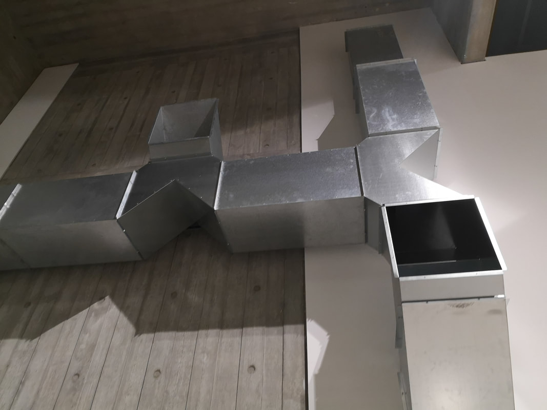
has the very pretentious name of Non-Object door but is in fact, just a four sided fun house mirror. Circus for the pretentious. There were a few other pieces that didn't make it in here but that's because I found them a bit dull. The show is on until 6th January 2019 and is well worth seeing. I shall leave you with my favourite piece. Oh and I have a show coming up on 19th November at Beans Love Greens in Shoreditch. More details in due course.
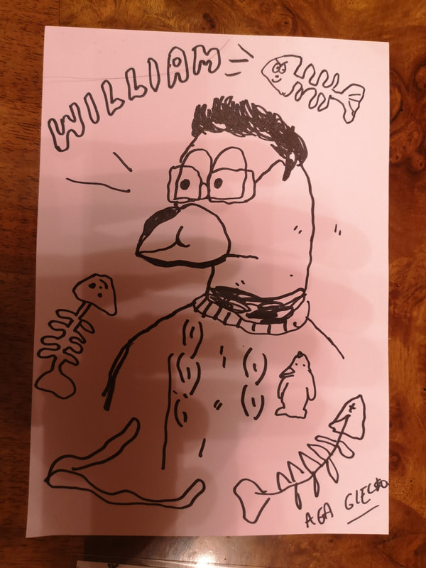
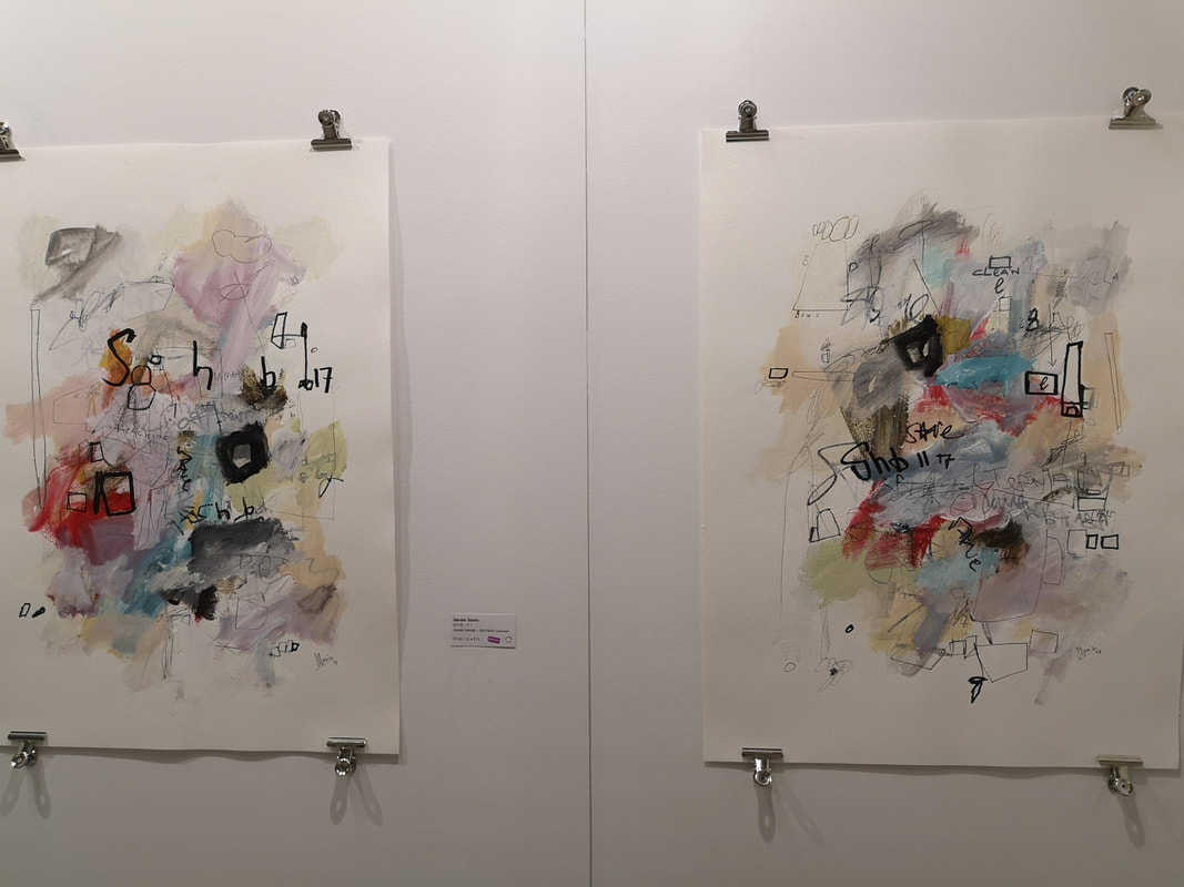
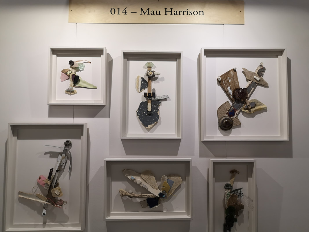
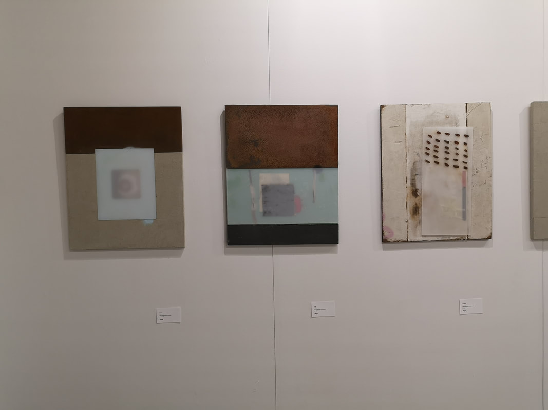
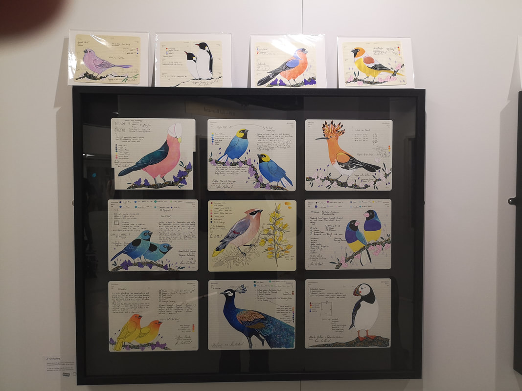
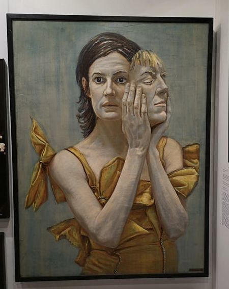
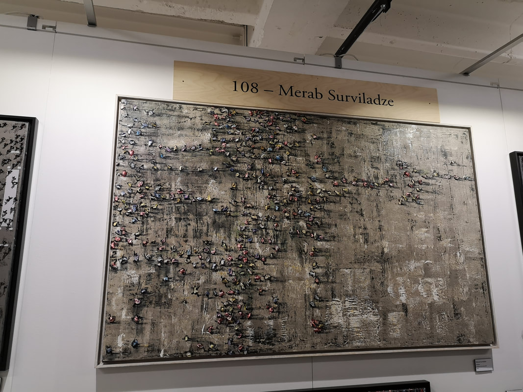
I haven't been to the Other Art Fair for quite some time. I have a new job now and work in Holborn and the other art fair was conveniently located just up the road, in the building by Bedford Square and the old St Martin's College building. When you first go in the Other Art Fair it is an assault on senses. The main Bedford Square building is an odd space. It is crowded and cramped and strangely subterranean. The last time I went it was at Truman Brewery which was a much better space. Also lots of what is on display is crap. Shiny, graphicy crap with pseudo inspirational slogans or, the ulimate sin, an nude female form, without a head or wearing a mask. This was tired and sexist 5 years ago. Why are people still doing this? Still in the rubbish there was some gems in among the nonsense. The best stall by far was the Illustrated Menagerie. Two women, recently graduating running an animal themed store, colourful postcards, comics and colouring books. This is a really good idea as being quite cheap (£15) they put themselves firmly in the impulse purchase category. They are very talanted (going by the names of Aga Giecko and Doctor Gurlfriend) and will draw a caricature of you as an animal. Above is me as a puffin. Good isn't it. Sander Steins is a great name for an artist and I quite like Sander's mixed media, washed constructions. They are quite joyful although at £750 each they are a tad steep. The pastel colours make for a relaxed feel to it. I might try doing something like this. Mau Harrison as that large name plate makes clear has built these jointed bird and insect like pieces. They remind me of oversized fly fishing baits. This is not a criticism, I like that association. My favourite is the one in the centre of the bottom row which looks like a cross between a Swiss-army knife and a dragon fly. That seems to be the thing here, treading that line between the mechanical and the natural. I like that. The work above left is by Blackie Swart has these seemingly simple pieces (above left). They look in a way like posh chocolate wrappings, with the way the colours intersect each other. The first two do any way. The third one is more complex and is my preferred, the discolouration on the bottom left and coffee bean like elements that get wider as they move right. Going now to figurative with highly colourful pictures of birds by Fran Giffard (above right). They are very pretty, eye catching and attractive. They pop off the paper and make a nice accompaniment to the text (which is a diary entry and pretty dull to read) that fall down the side of the pages. There was particularly good Puffin (might have a thing about Puffins). Will Teather's portrait (above) took my breath away and I think was the best thing in the main building (which I have discovered since starting this blog is called Victoria House). It is stunning picture. The golden dress, the fabric of which is very well rendered, with those folds and bows, goes really well against the grey background. Figurative portraiture can be a but dull but Teather has produced a very expressive, fearful face gazing out the painting. The mask she is holding (the hands are excellent also), lifts the feeling and tone of this painting. Its very good.
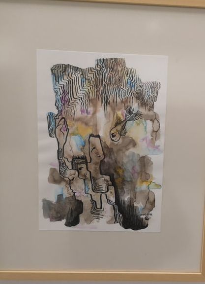
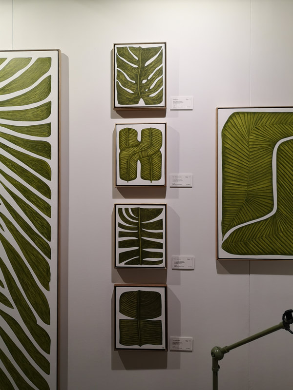
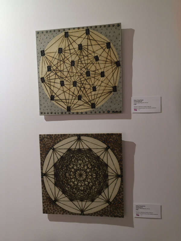
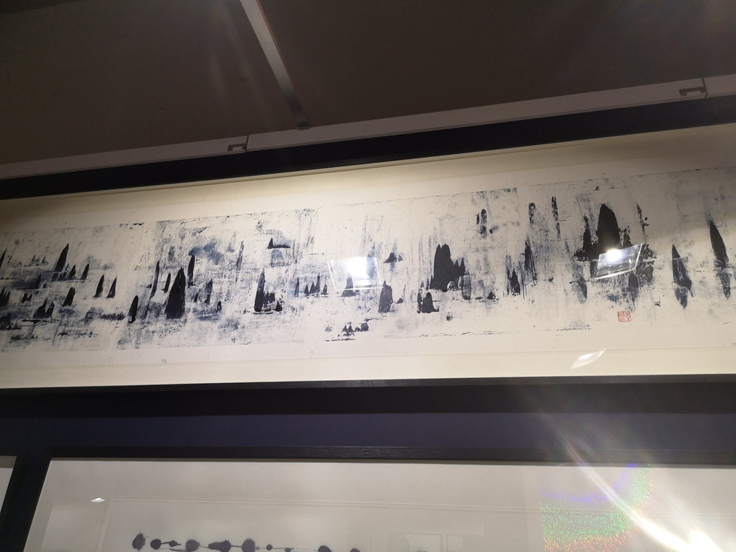
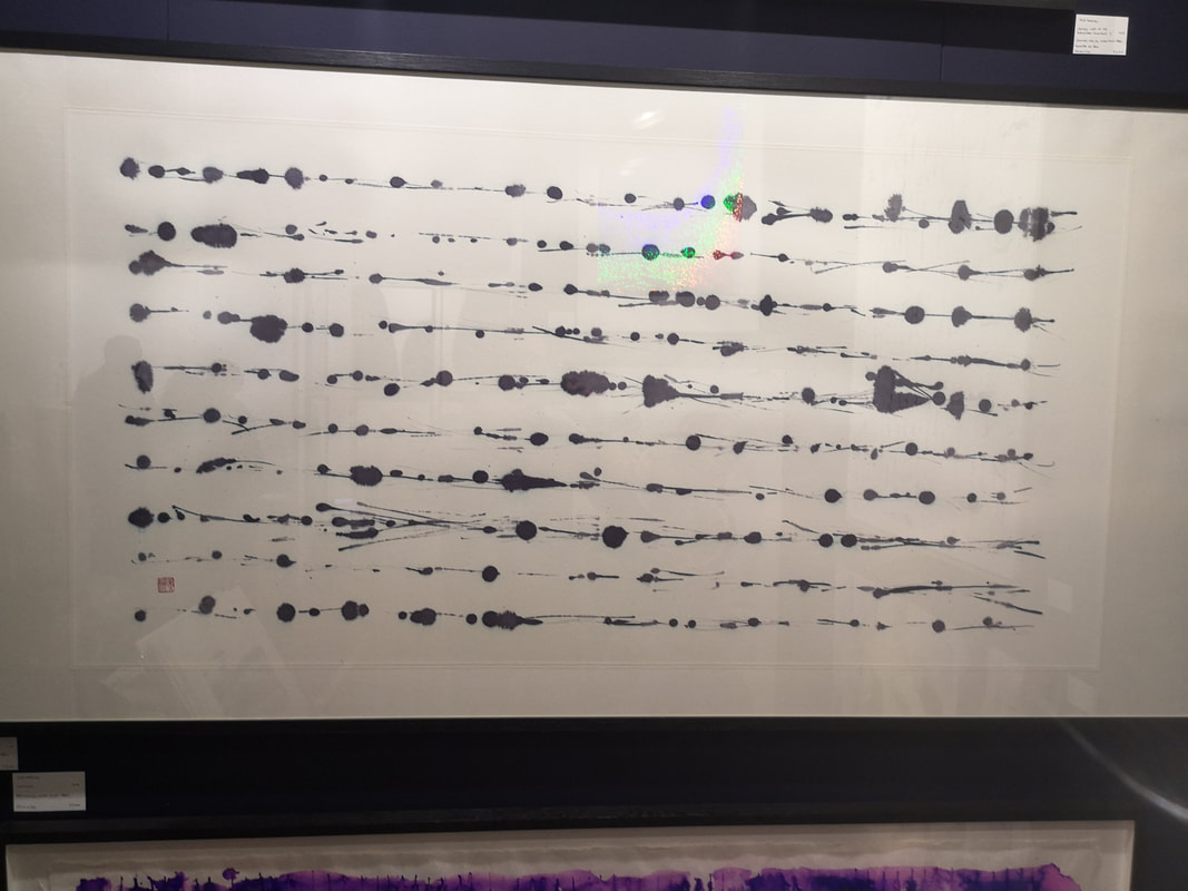
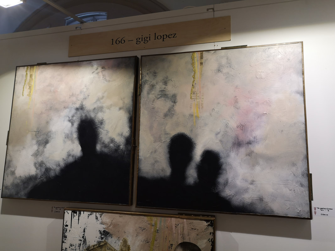
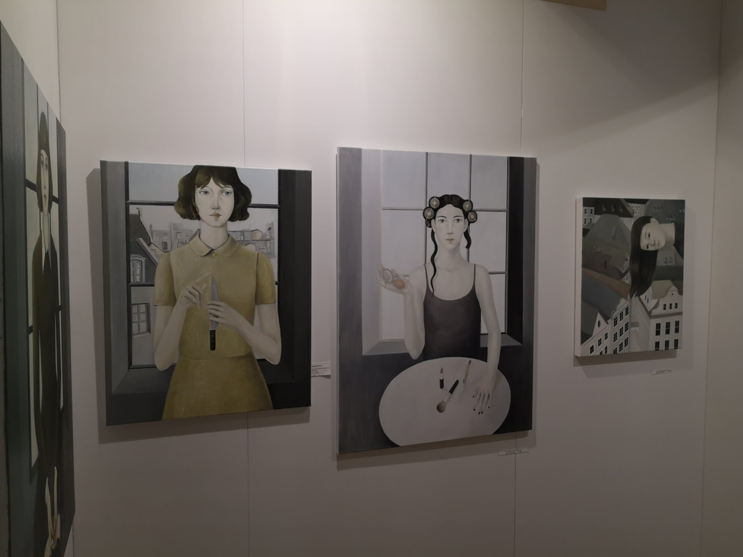
The other, much better part of the show was in the old college building over the road. It was a curated show, curated by Kate Bryant of Soho House and Sky Landscape artists, and was called The Not 30%. All the artists were women (the show title is a reference to the fact that less than 30% or artists in galleries are women). It was a much better show. The standard was higher, and the fact that it was curated means it was more coherent. There was some very good stuff. I really liked these green leaves, in almost geometric forms by Marianne Hendriks (above left). They are rather like icons and I like the sort of flat quality to them, and the simple green, black, white colour combo. Works very well. Clare Crouchman's work (above right) is in ceramics. Reminds me of Islamic tiles but the works are more individual and the geometries are more complex. The paler one above, is my favourite with those inter-connected black squares. Something hypnotic about them all. The above two are by the same artist, and far and away my favourite of the show. Her name is Mila Morton and she paints with inks on Japanese paper. I am sucker for this kind of thing, and I found the long picture (above left) with its blobs and stripes of ink making an abstract tree like landscape. The kind of landscape you could get lost and dream in. I was stating at it for a long time, lamenting the fact I had not the £3,500 to buy it. Turned out the artist had some cheaper ones in a box, so I bought one of those. The wrapping room was in the same space as a tattoo parlour that had been set up for the show. Have many people got tattoos, I asked, more than you might think, came the reply. GIven the buxom and scantily clad nature of the tattoo artists I am going to make a solid bet that many of those patients, I mean patrons, were males. Finishing my review with two very different types of portrait. Above left you have Gigi Lopez with these misty, steamy, smoky pictures, streaked with odd yellow stripes and the people appearing only as silhouettes. I assume the two shown were a diptych as the shadows of one seem to form a whole with the shadows of the other. As with lots of good abstract art you can project what you like, this time yourself into the picture.
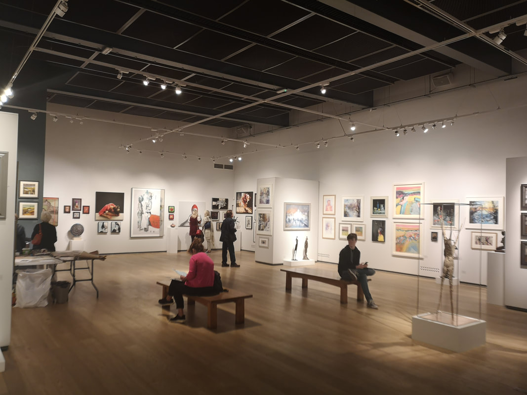
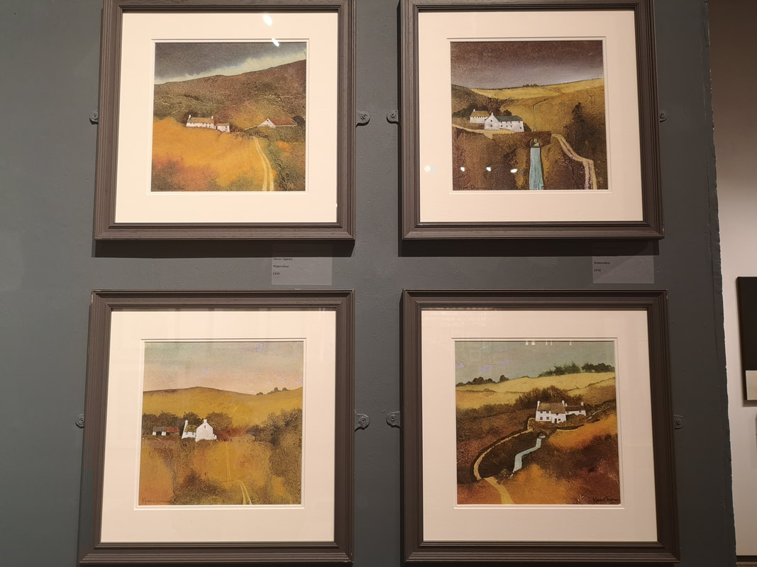
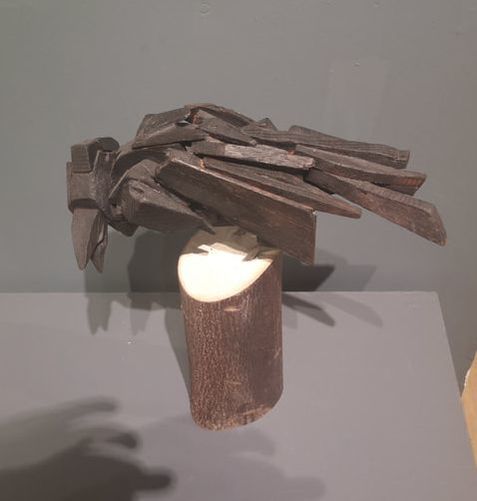
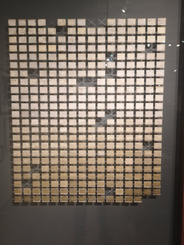
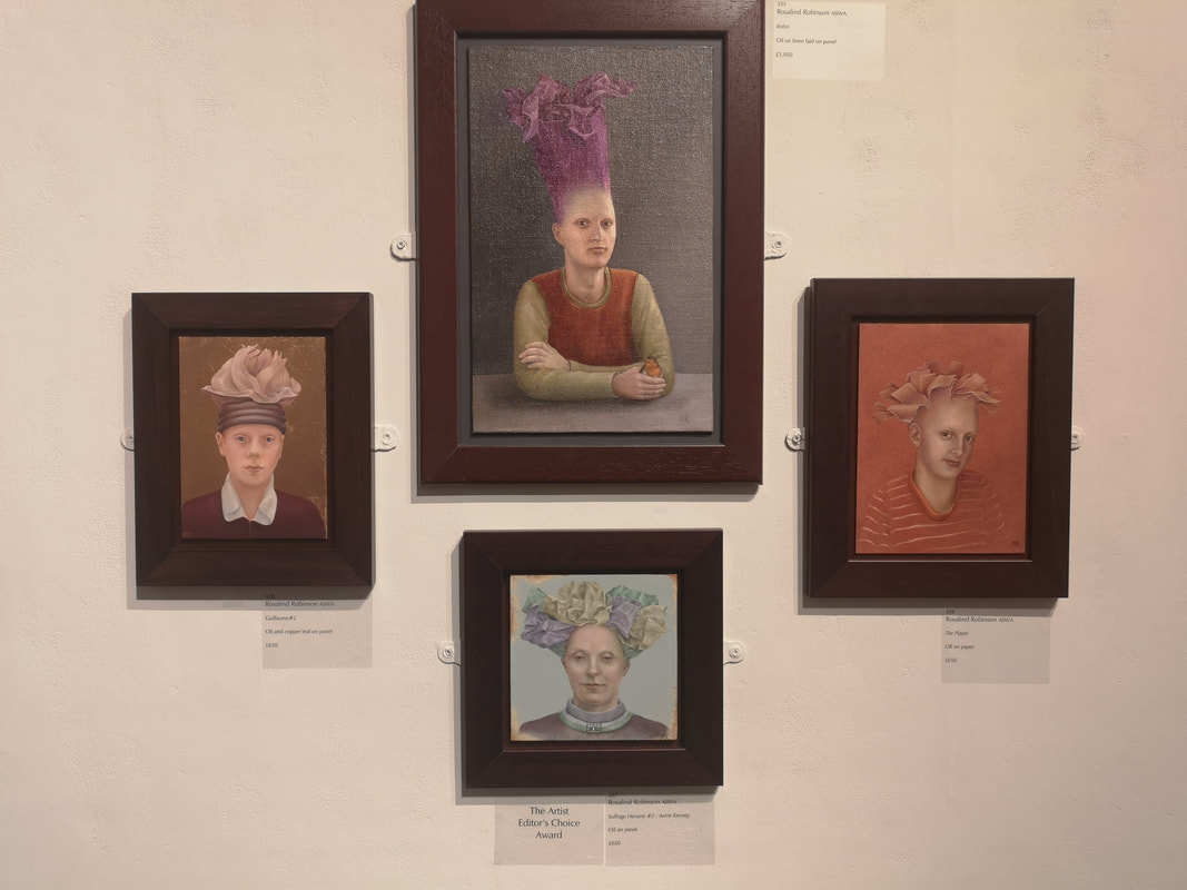
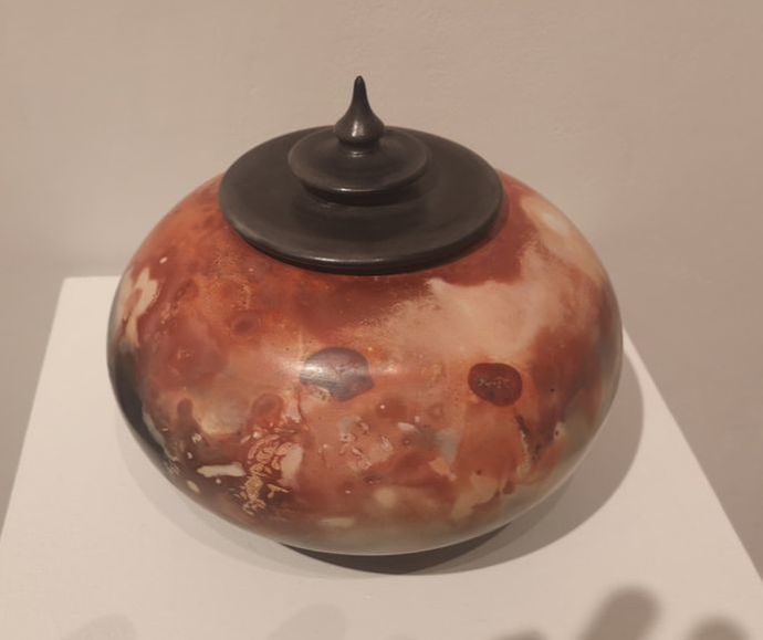
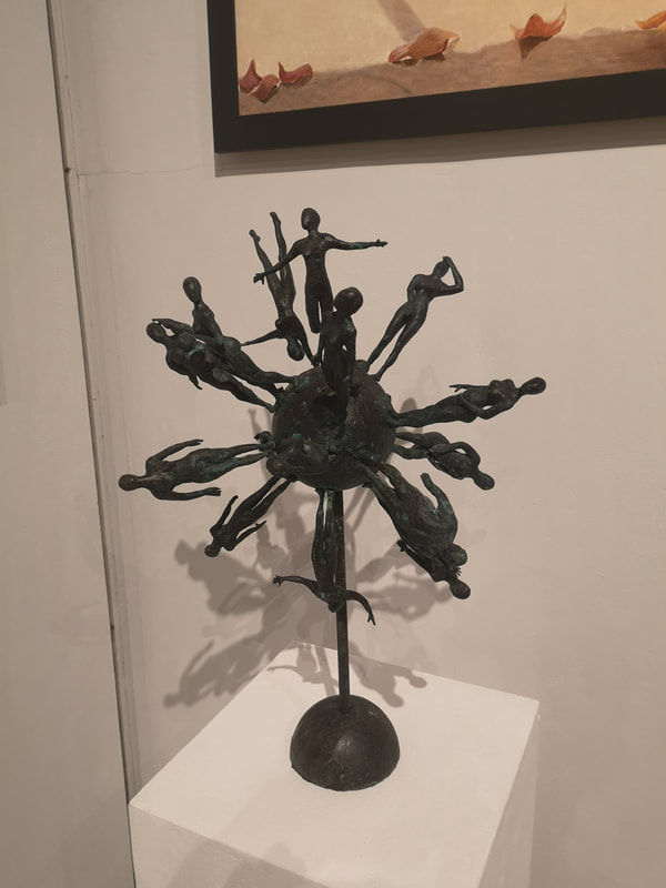
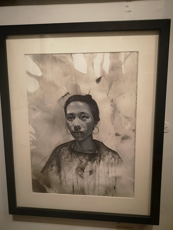
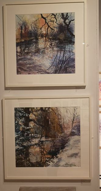
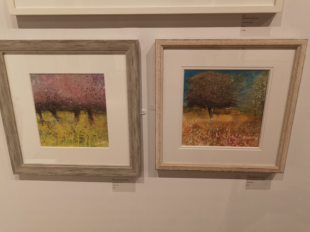
My keyboard doesn't have the necessary cedillas to do the above right artists name justice, it is Serpil Mavi Ustun, or at least that's as close as I can get. There is something very emotive about these oddly flat figures. Intimacy I suppose it is, especially the one with the rollers in her fair. They are fairly sparse pictures, allowing your mind space, space to write nonsense about them a week later. Anyway you can't go to the show as if finished on the 7th October. You both did and didn't miss much. The Mall Galleries holds a number of exhibition but a strong contender for the best of them, and always consistently good is the Society of Woman Artist exhibition which ran from 25th - 30th September. My only criticism is that it is only open for a few days, never past 17:00 and then only to 13:00 to Sunday. These shows can therefore be easy to miss. I managed to miss it last year, so made a special effort this year and the effort was rewarded. Here are the works I enjoyed. Karen Charman produced these very fine four watercolours. The red, oranges and yellows are not as bright in the photo as in the originals. The composition of all of them is very good especially the way the rivers are made more geometric, cutting through the soft focus landscape, with the nestling buildings. The one at the bottom right was my favourite and I very nearly brought it, it made it to second on my list. Perhaps early to put out my favourite of the show, but I am going to do it anyway and it is the above, Crow by Vojsava Fakhro, constructed out of burnt wood and metal, resting on a log. It is a very fine piece full of verve and character with an element of abstraction. I like the slight sense of menace about is, with an interesting stance and open, crowing beak.. I liked it very much and in fact bought it. She is now peering over my shoulder as I write this. Often when in a diy shop I think that the paint charts would make a good art exhibit. Well that is exactly what Jessica Arevalo has done (above) and bagged herself the Vice President's award into the bargain, showing that there is a world between having an idea and acting on it. I like the way it softly blends into bronzey gold. What gives it that extra touch is the missing pieces, marked with a simple cross. It reminded me of the geology section in the natural history museum, where some of the exhibits have been removed and replaced with the slogan "This exhibit has been removed because it is radioactive". Marvelous. This selection of four bizarre headed portraits by Rosalind Robinson (above). with the way these vegetable like protrusions emerging from their heads. I particularly like the purple cabbage like do that elongates her head. It pops out of that graduated gray background and the strong cross armed pose. I also like the figure on the right with the different complimentary shades of orange and the slightly quirky sidelong glance. Although this is all done in oil it has a nice pastel feel to it all, a gentleness of touch which plays to the subject matter rather well. Jane Gibson's pottery (above) is something I have noticed at this show before, probably about three years ago now. She has a way with glazing and this she does again here with this burnished orange and pinks swirling round this flattened urn type shape. The pointed top to the lid is an especially good touch. Has a very malleable feel. I prefer my ceramics in a more vase like shape but nonetheless I can appreciate the skill and appeal of this piece. Dee Stanford's a Celebration of Women (above left) was one of my favourite pieces in the show. A bronze orb with a number of female figures in various poses emanating from it, it has a joyous well frankly celebratory feel to it, like a kind of trophy. Sadly budgetary constraints (it costs £9,000) prevented me from getting any where near purchasing it. Moving from celebration to subtle understatement you have the melancholic monochromatic portrait of Holly by Alison Mulroy (above right). It is done in watercolour and acrylic but has that nice washed sensation you get with ink. I particularly like the way droplets come down from the figures clothing and blend into the foliage like background. The shading on the face of the figure is superb.
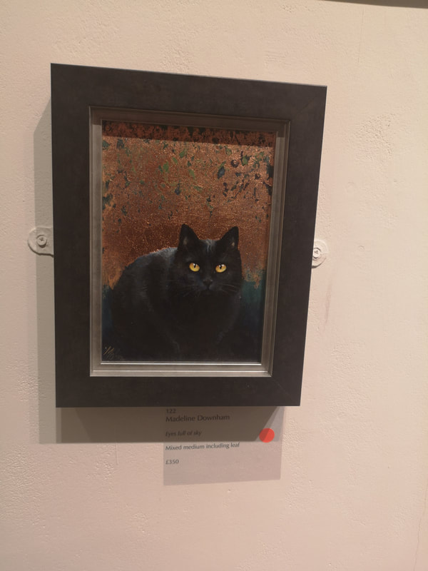
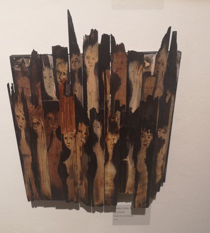
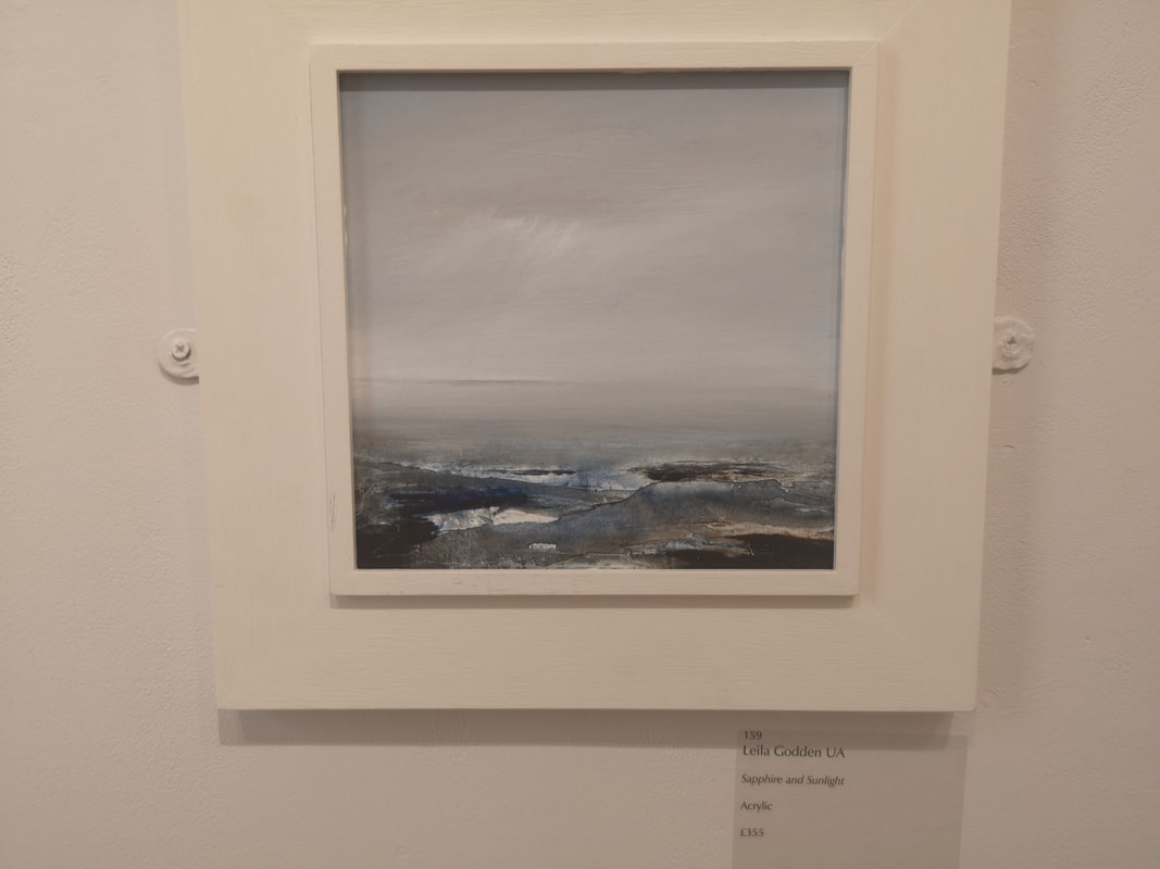
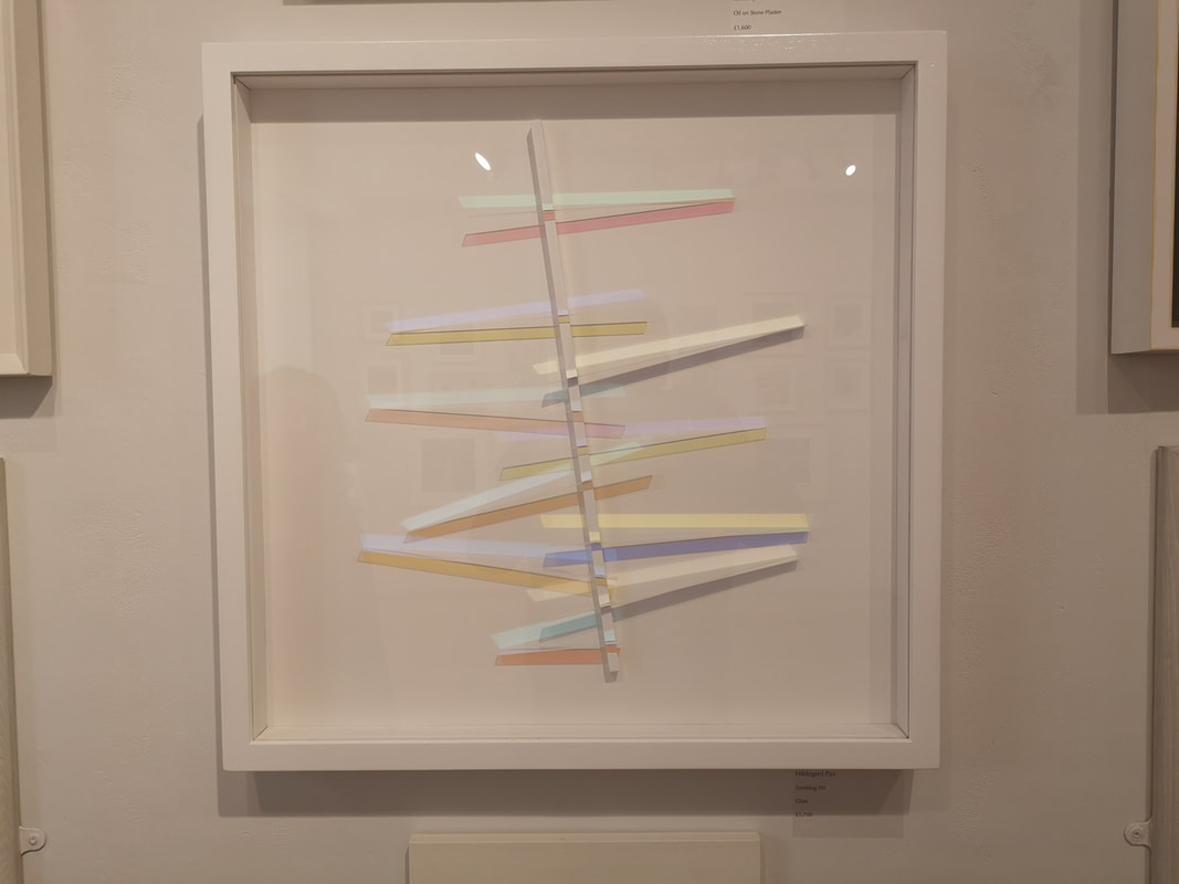
Madeline Downham has given us a cat (above left). A very finely rendered, very cute looking, almost strokeable black cat with piercing yellow eyes. The two tone background, bronze merging into blue, that descends into shadow, from which the cat emerges is a stroke of genius. At £350 this sold, l imagine almost immediately. Slightly more avaunt-guard and at the other end of the pricing scale Sue Freeborough's Becoming (above right). At £25,000 I think this was the most expensive piece in the show, and the cage it is in fact form part of the piece as a whole, with this sort of stretched butchered carcass feel, like some ancient totem that marks the edge of a sacred henge. The top though muddles this thought with a more tree like feel. Again serious budgetary constraints prevent anything more than my aesthetic approval. Very different, and a unique and impressive use of unusual materials is Heather Tobias' Burnt Women (above). By building on the natural curves and warps of the grain, emphasising these with burning and ink use have this strange choir. It is slightly like a Quentin Blake illustration. That finishes my highlights of the main gallery, off now into the North Gallery. Leila Godden's seascape (above) is called simply Sapphire and Sunlight. Subtlety is impressive when done well, and this appropriately titled with the patches of open water pocking through the ice which blends into the sky. It is a calming piece, one something to meditate in front of. Very different is the excellently named Hildegard Pax's Tumbling XVI. It is slivers of differently tinted perspex against slim rectangles of colour. I imagine a small marble running down it. Again simple but effective. This is the nice thing about this show, several of the pieces are museum quality. I could see this, perhaps on a bigger scale, adorning the wall of the Whitechapel.
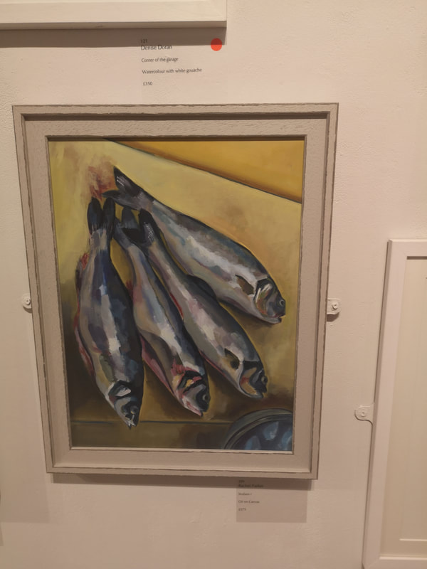
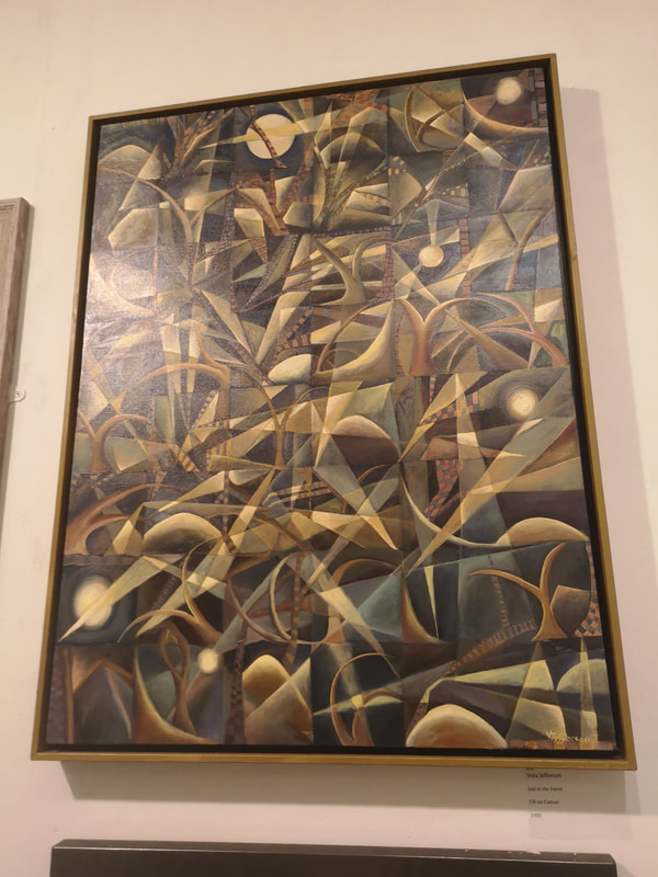
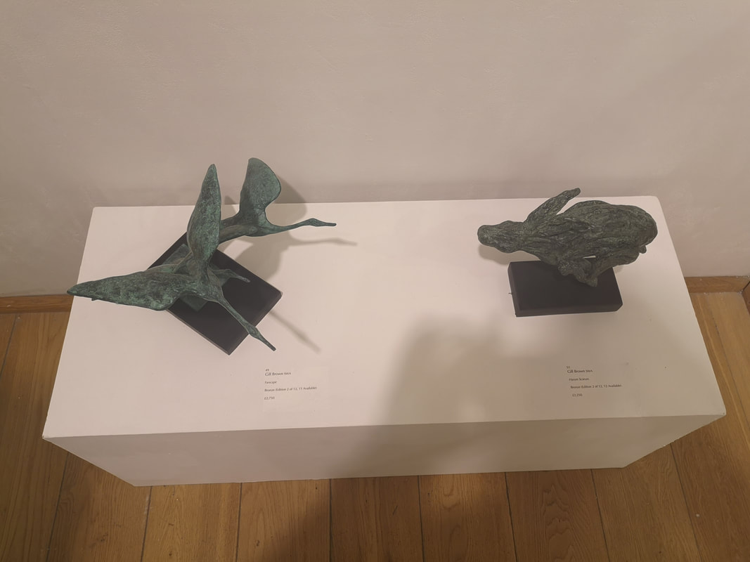
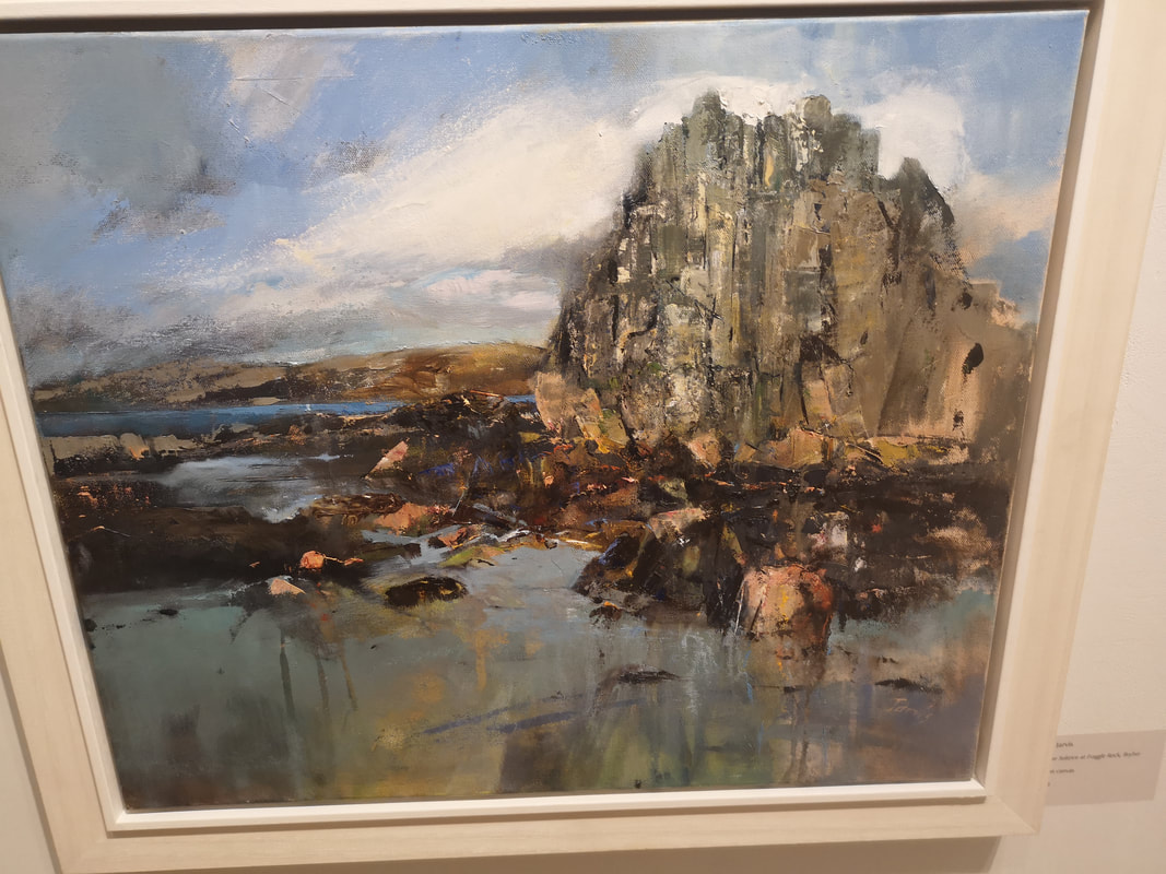
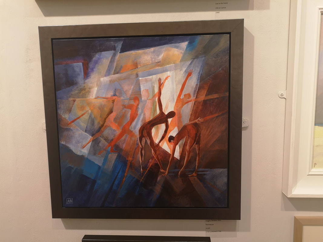
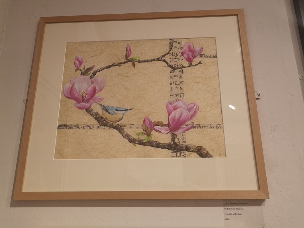
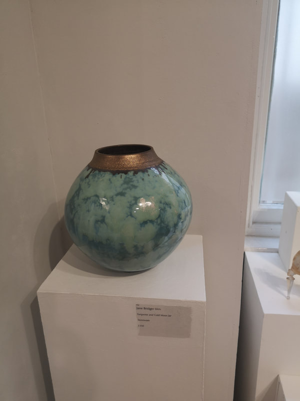
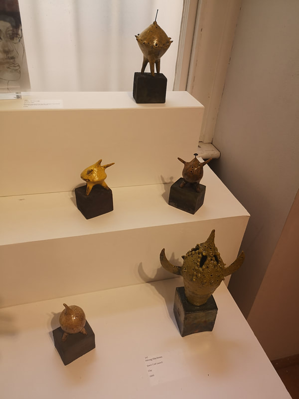
Fish are surprisingly difficult to paint, it is quite tricky to get the scales and shiny silvery quality. Rachel Parker's Seabass I (above left) look, well they look delicious. The almost geometric shades, of gray, silver, brown and purple make for a striking iridescence. Tonal contrast wielded well here. Set off well on that beige yellow background. My wife is a surfer for Braque and so her favourite in the show was Vera Jefferson's Lost in the Forrest (above right). It his heavily abstracted and geometric, and those light triangles make very convincing shafts of light, as do the blurred light dots, scattered around the painting. Bronze, often a winner, it is interesting how the different treatments of it, bring out different colours and these two green bronzes by Gill Brown (above left) are delightful. The smooth almost dance-like elegance of the flying geese and then the rough craggy, almost crazed energy of the running hare. Speaking of craggy, Kim Jarvis' Winter Solstice at Fraggle Rock is pleasingly craggy, rock standing proud of the crumped scree. This spiky wintry feel is emphasised by that lose scratchy marks at the front of the picture and the scraps of dark clouds scudding across the sky. I really like the way Jarvis has done the rock though, it really is the star of the show with those stabs of white and black on the gray face. Angela Brittain brings us Warming Up (above left). Red and blue, nice contrasting colours, and the figures become more solid and, red as they come forward into view. Warming up indeed, very good composition. I have a soft spot for oriental style and also botanical art so I was always going to be drawn to Linda Travers Smith's Nuthatch and Magnolias. I like Magnolia's, I have three of them growing in my garden. This then ticks allot of my boxes and it is beautifully composed. The simple cross of text with the curling branch of the Magnolia. The subtle yellow background sets off the pink Magnolia flowers, then the sweet little Nuthatch. Very nice. I hope it sells. Unfortunately a little above my budget. Jane Bridger Turquoise and Gold Moon Jar (above left) has a real presence. The only problem is the gold top is slightly to sparkly in a fake looking way, which distracts from the more appealing swirling blue body. It has a sort of skyscape feel to it. If we take the Moon of the Jar to form a tangential space themes we have the very witty Space Craft Launch by Morag MacInnes (above right). You have this collection of nobly little space craft, that look like a sort of 50's sci-fi creation, with several of them have a distinct sputnik feel to them. The muted colours play really well with the subject matter.
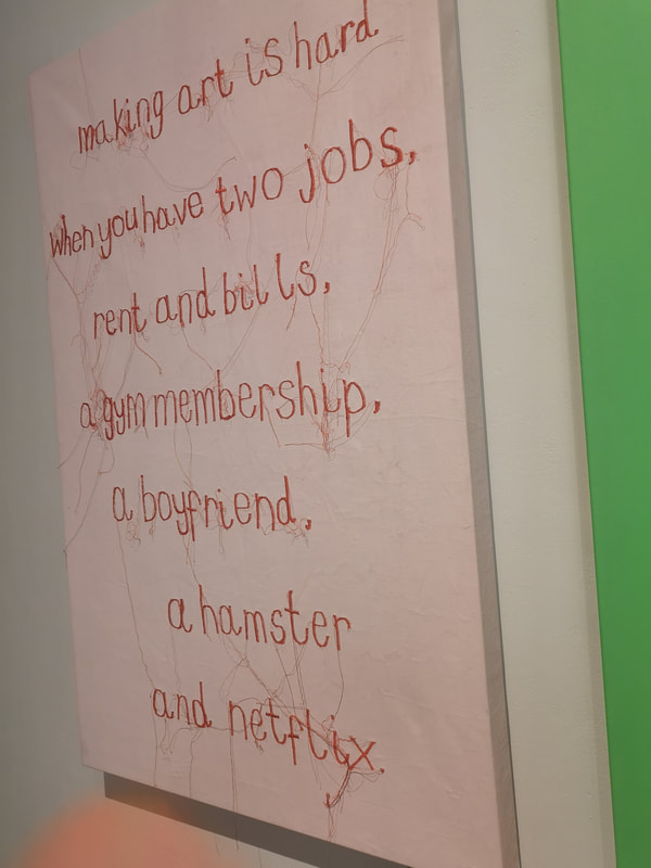
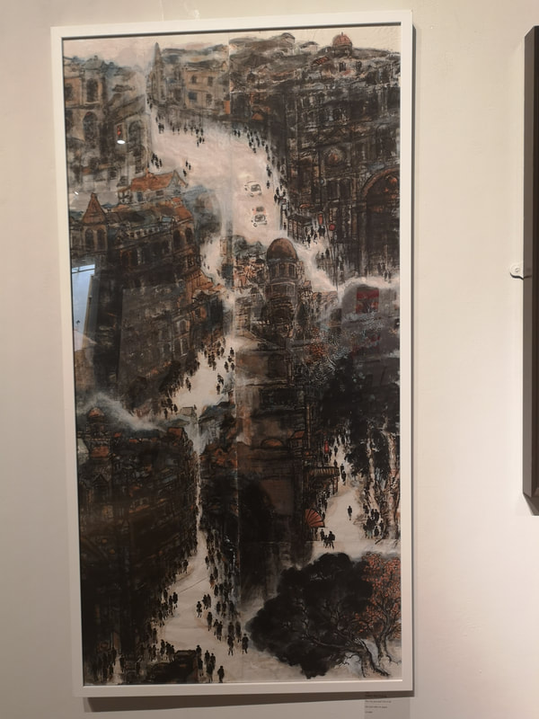
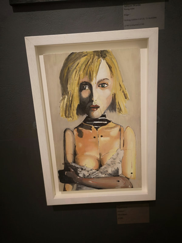
Humour in art is difficult. I mean actual humour, things that make you actually laugh rather than pieces that a certain type of awful person would describe as "witty" (you know who you are). Poppy Clover's Making Art is Hard (above right) made me laugh out loud. It still makes me smile. The medium, embroidery gives the message more of a punch than simple writing would. Yellow Ran Haung, has produced this modern take on the oriental mountain scene by making a cityscape, in her The CIty You and I live in - 8 (above left). Its a gorgeous piece, domes and dark arches with these little figures scurrying through those white, river like streets. Doing a twist on classic art, using references to ancient forms, can work well, provided you have the skill to pull it off, which I think Haung has. Strange and unnerving is the main sensations in Ingrid Lucas' Construct (above right). The elfin elongated face with the strong shadow and the way the skin is over the clothing on the torso, that odd plastic looking arm and that line from the corner of the mouth.
I shall leave you Bev Knowlden's Pop up Moses (above). Again I found this actually funny. Made in iron resin it is very well conceived and of course the heads, in that odd red hue, are cast very well. It is a serious expressive face, which makes the situation more ludicrous.
|
Archives
June 2024
Categories |
 RSS Feed