|
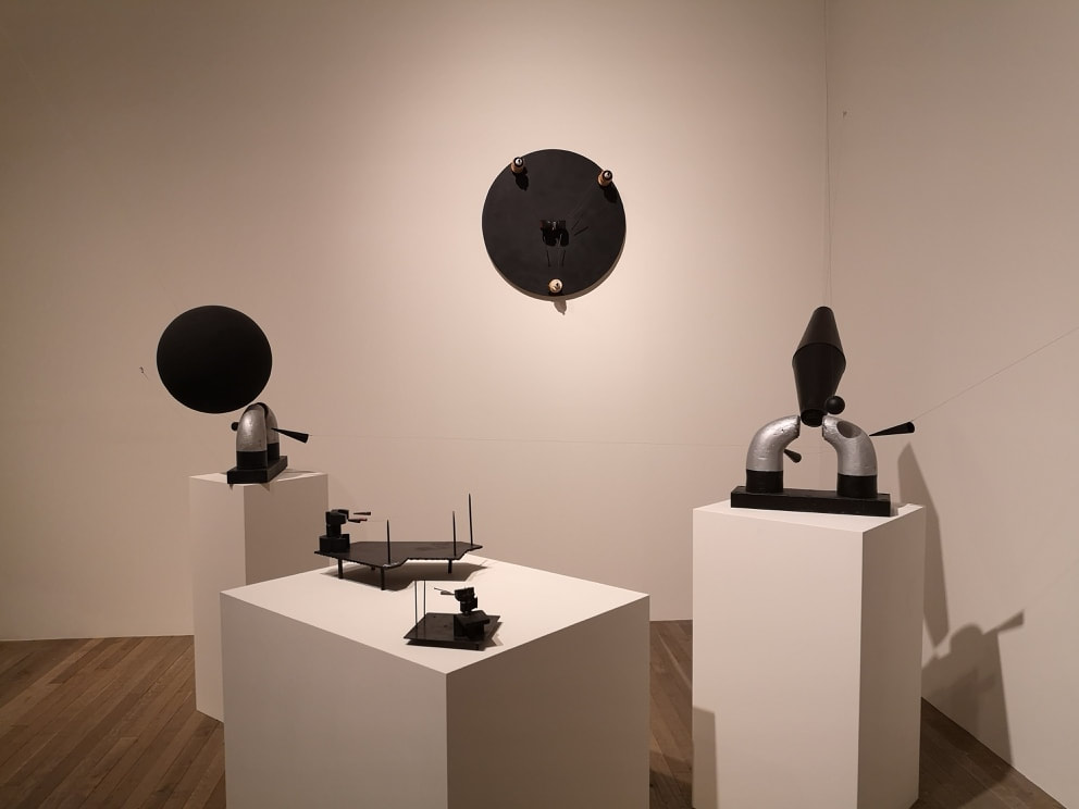
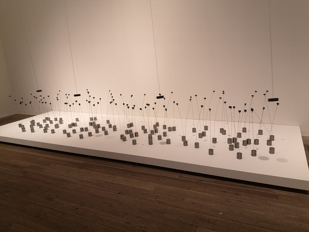
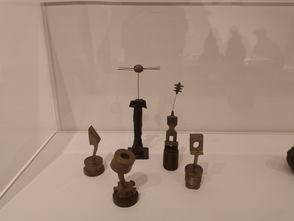
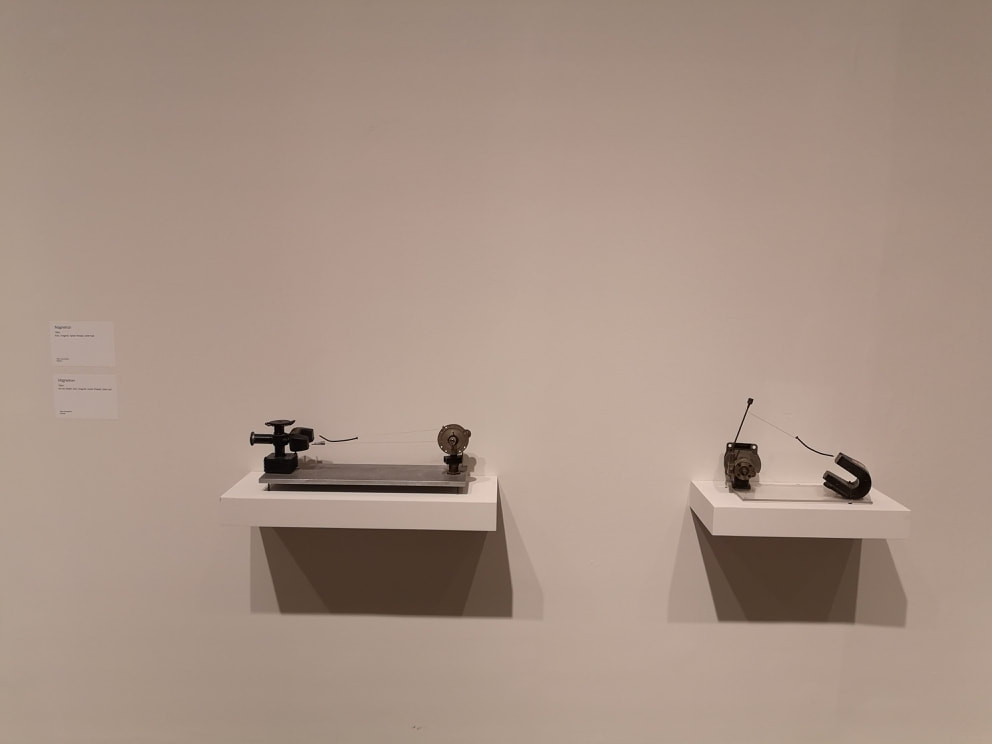
This blog comes out on the last day of the Takis show. It is on at the Tate Modern until 27th October 2019. I had no idea who Takis was but I was at the Tate Modern for another reason today and I thought, why not and so in I popped. Lots of artists are known for just one thing. Takis is the magnet guy. Magnets feature very heavily in his sculptures. They give an extra dimension to his sculptures. If you look at the photo above at first glance it is a just a fairly pleasing assemblage of metal, but look again and you will see elements are suspended at the ends of wire. They are not touching anything. It is strong magnets that keeps them in place. Literal tension. Its a nice idea and i've not seen this done anywhere else. Some of the pieces are kinetic, to varying degrees. When I first arrived the collection of magnets in the top left were just gently oscillating and then a security guard came in and set the large one swinging in a circle. It caused all the smaller ones to follow them round in a pleasing bobbing formation. Some of his work though is not magnets, it is just small electrical component like structures. They are quite interesting to look at but I have to say they don't do much for me.
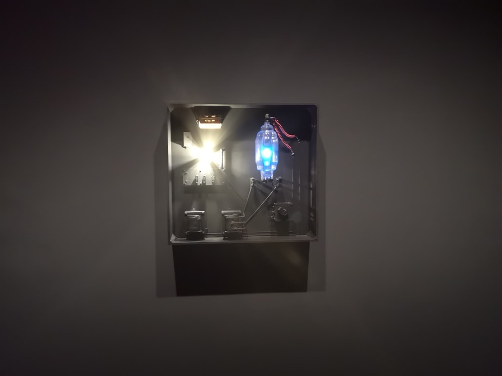
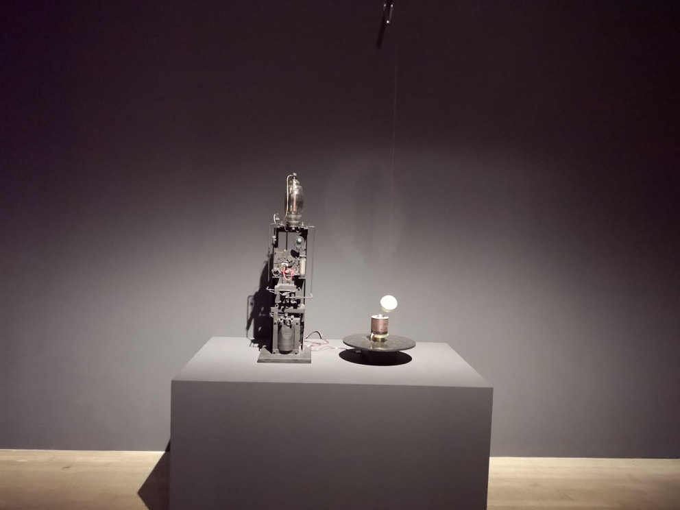
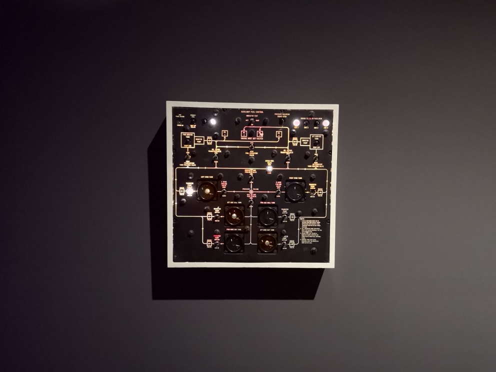
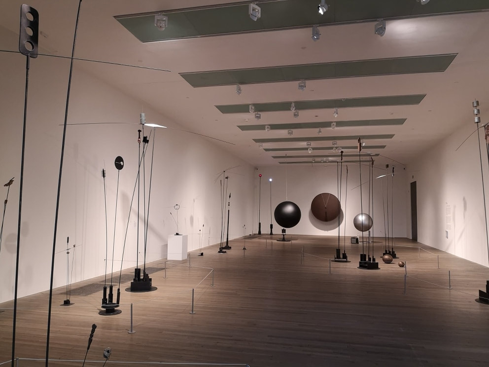
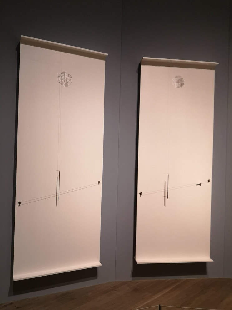
In a darkened grey coloured gallery are a number of light focused pieces, the darkened room of course emphasising the light as it appears. I like the switched based, almost steam punk feeling mechanism. Timing is often an element. So with the one above left the blue light stays on constantly but the white light flicks on and off at intervals. I particularly like the bulky blue bulbs with the red wires. More robotic and somehow anthropomorphic is the construction above right. It has a nice mechanical menace to it, and again the light illuminates at intervals, and the little balls rotates. The one though that provided me with the most joy was this control panel (above left) . With its switches, flashing lights, and alarmingly swirling dials it reminded me of old sci-fi sets. I was gripped with a strong desire to flip those switches and a regret that I never became a pilot or anything similar. It is a simple concept in a way. Presumably all he has done is jury rig a control panel so it mis-behaves but it was somehow beguiling. At the end room (above right) there was a collection of tall thin sculptures on the end of metal poles. Again they had a strong mechanical or electrical component bent. I could not help comparing them unfavourably to Alexander Calder. I found them a little bit dull. Some of them had a nice scythe like quality that I enjoyed but otherwise I found them difficult to engage with. More intriguing were those three large spheres you can see at the end. The large brown one is in fact more of a shield shape, and has a oversized flatted screw hanging in front of it. The other two are actual spheres and were oscillating gently. Again as I watched a member of museum staff appear. He set the screw swinging so it banged into the shield. He set the metal sphere swinging. This caused it to twang a triplet of wire strings, connected to an amplifier which produces a noise much like when a child gets hold of a bass guitar. That was quite entertaining. This is another theme, the production of discordant chaotic sounds. In an octagonal side room are hung about eight of these rectangular boards (see above left). On them are dangling blunted metal spikes, which intersect differently angled metal wires at different points. Every 5 minutes the magnets are activated which causes the metal spikes to jangle against the strings, producing a pleasing cacophony. After 5 minutes it stops again, at least so the signed informed me. I did not stay for the whole five minutes.
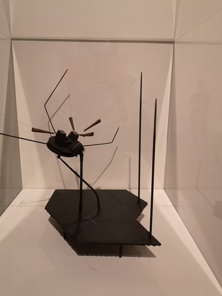
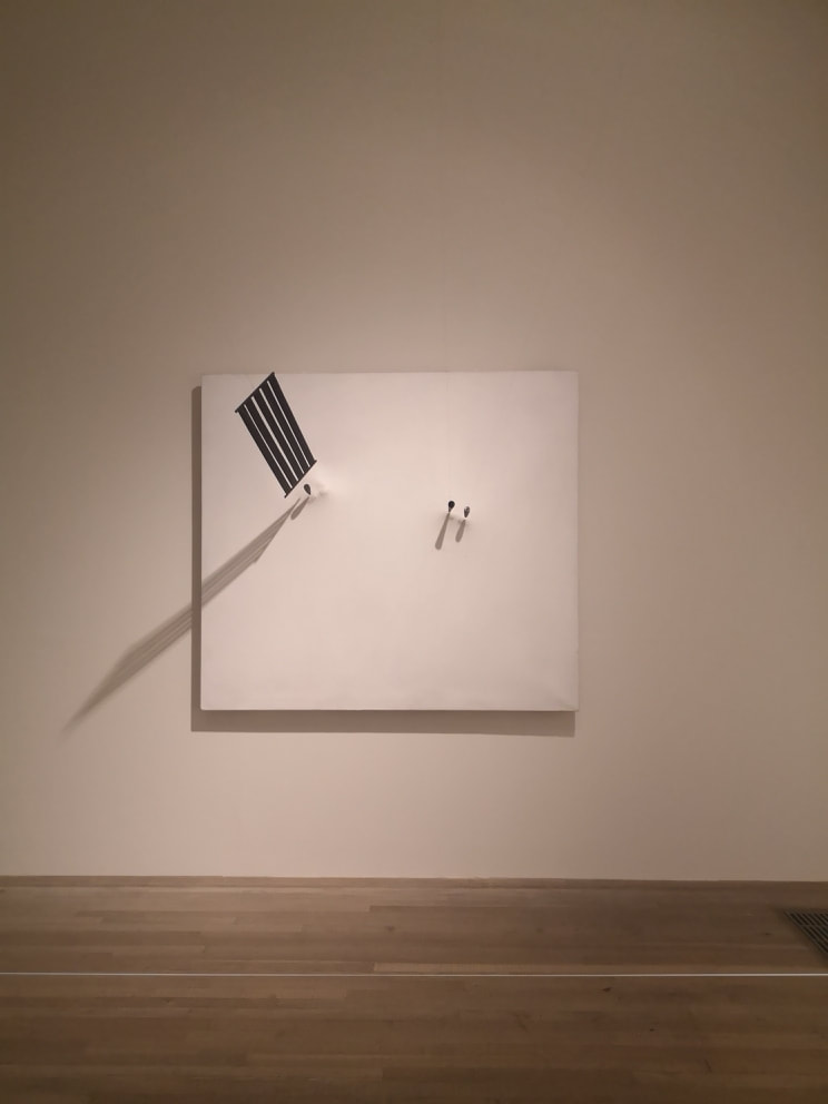
I will leave you with my favourite piece from the show,, three structures held in place by magnets against a white background (Above right). it is the 5 bar stave that particularly appeals to me here. Anyway, hope you found this interesting. Check our my paintings here
0 Comments
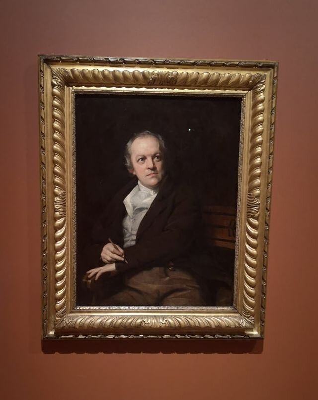
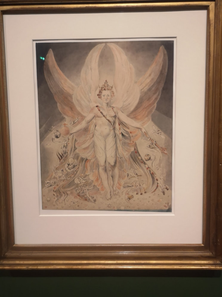
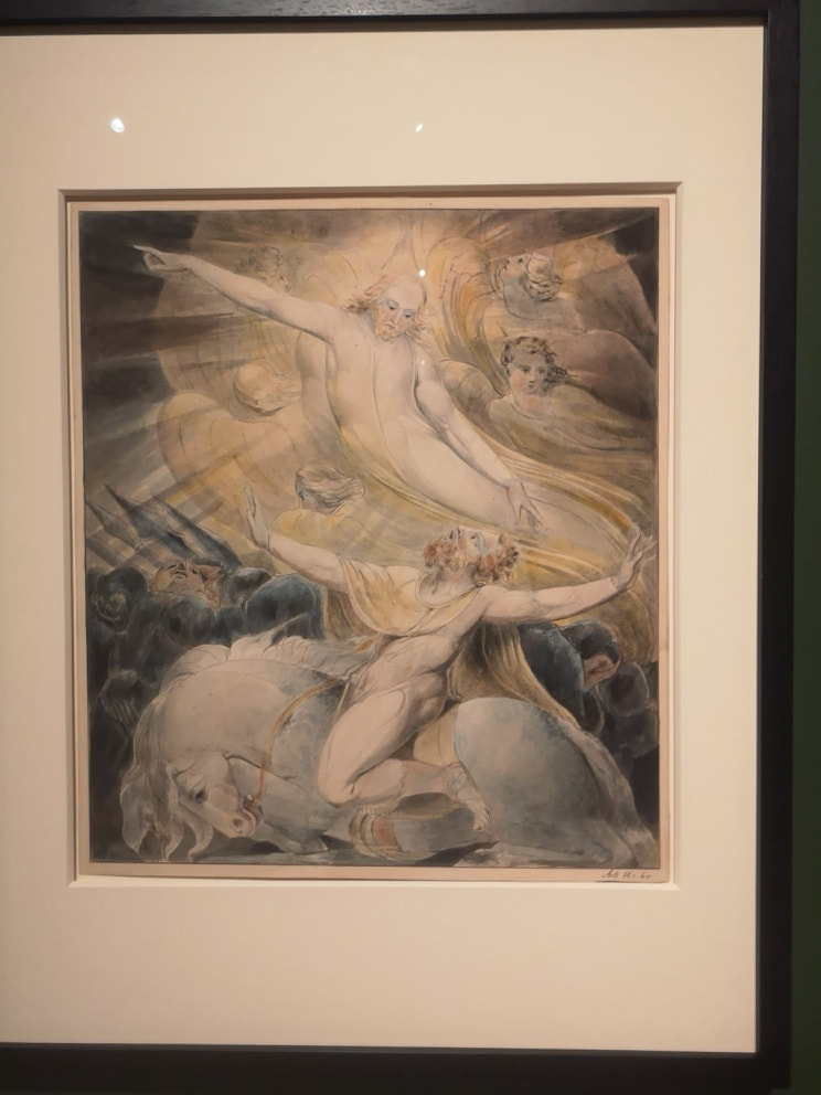
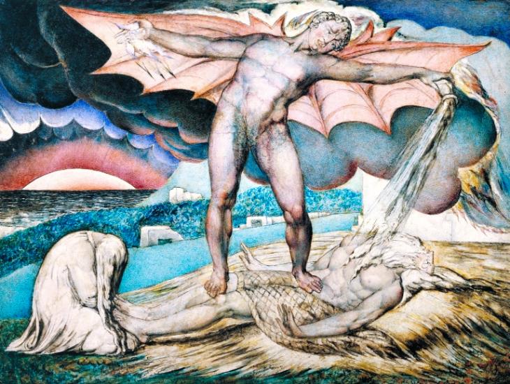
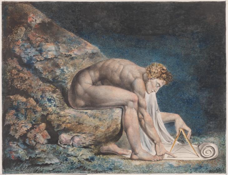
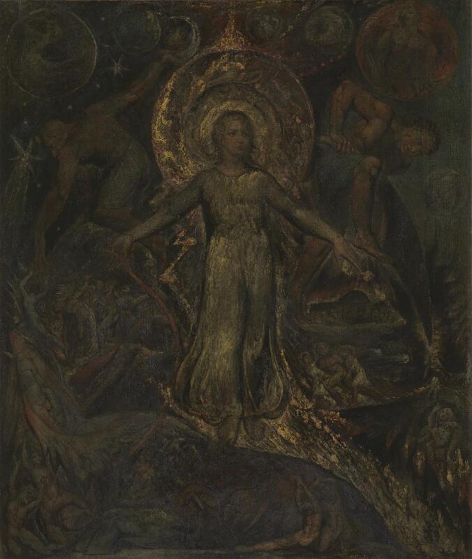
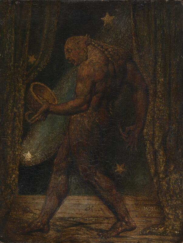
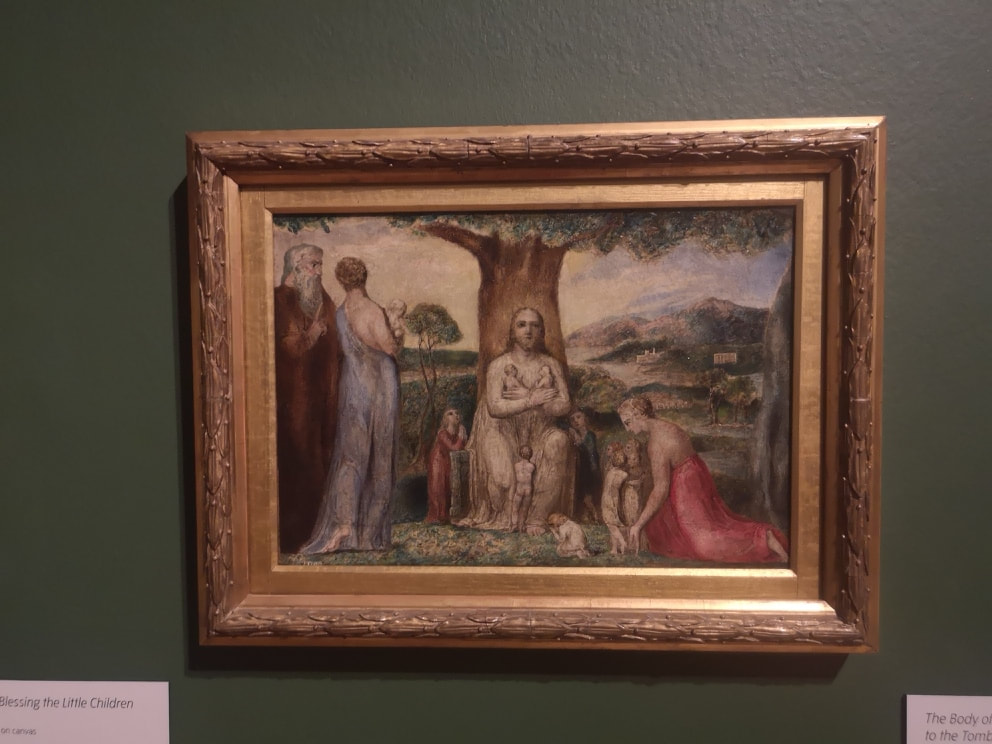
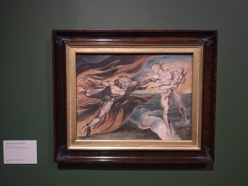
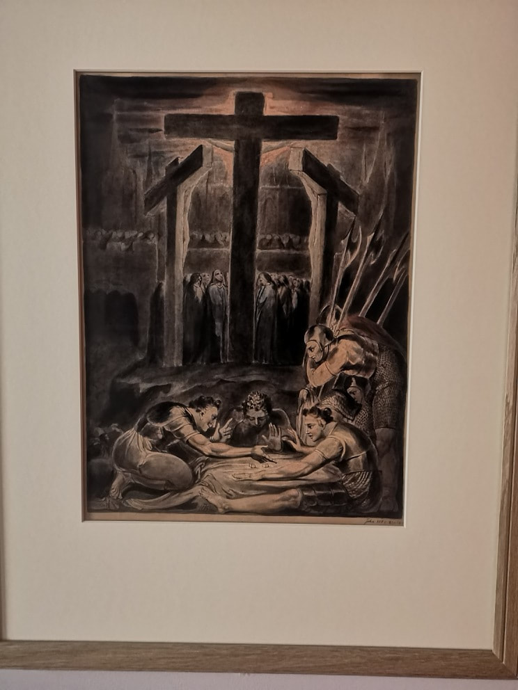
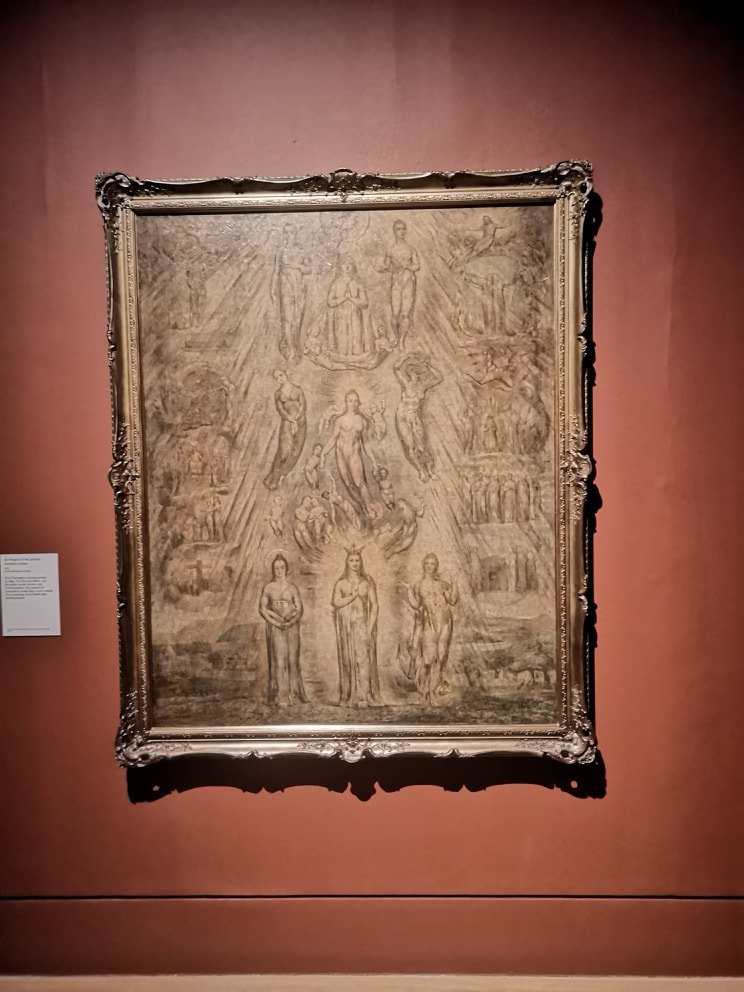
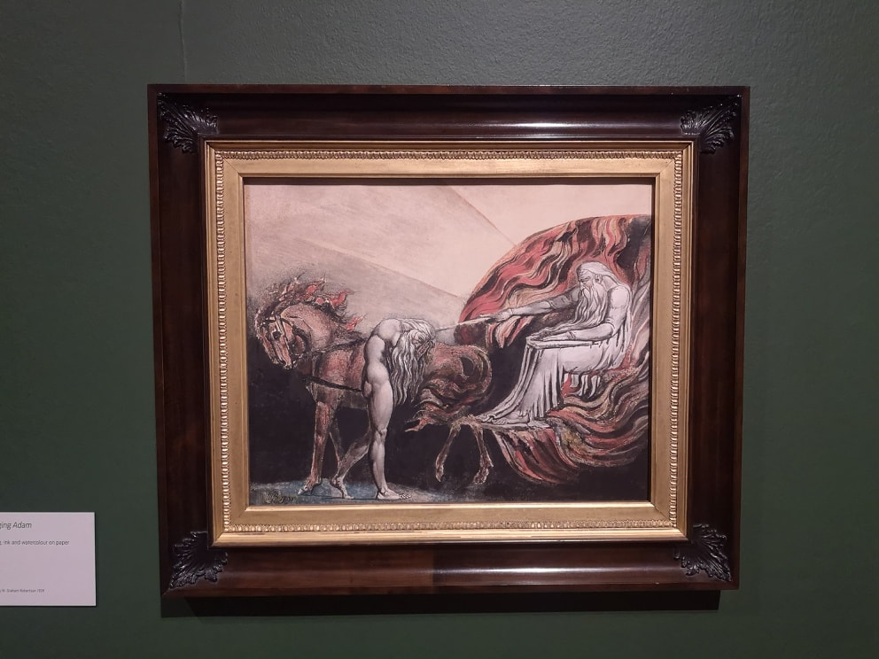
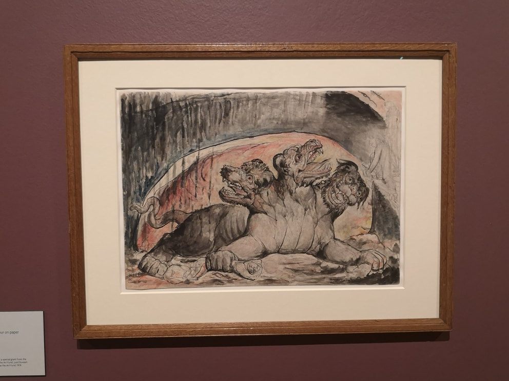
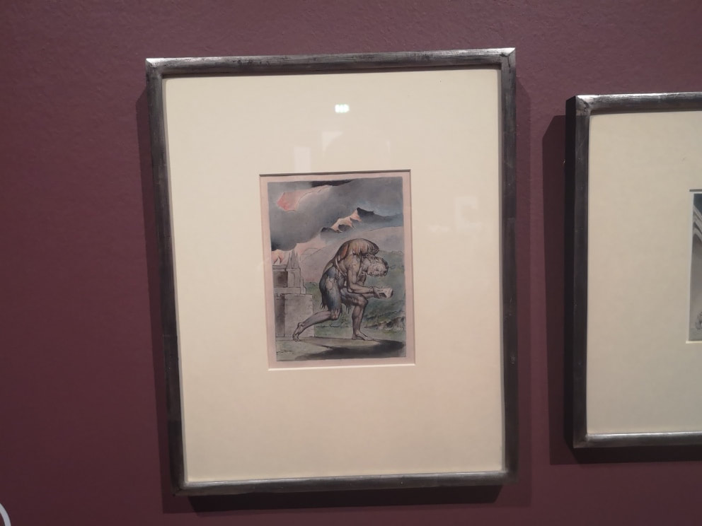
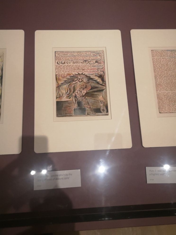
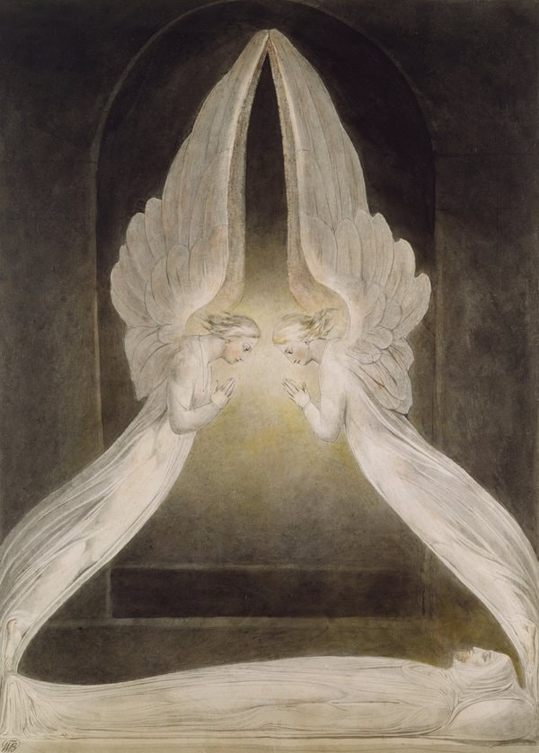
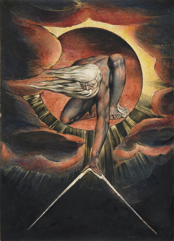
Tate Britain is showing an exhibition of William Blake at the moment. It includes portraits of Blake, by other people (although there may be self portraits there as well). He does not look like you think he does. I at least imagined a prophetic wizened bearded man as we see in so many of his paintings. Instead we have what looks like a chubby accountant. This pleased me because it is more or less how I look and one can console oneself that genius comes in unlikely packages. Most of us are unlikely packages. Anyway, onto the art. There is as you might expect and would be disappointed if you didn't see, lots of religious depictions. It is a very packed show and there is much to see. I will only skim the surface to give you a taste. Blake does a lot of watercolours and they have always struck me as rather monochrome and insipid. In many ways as you can see from the above they are. However it is also clear I have been doing the man a diservice. What I hadn't realised is quite how much watercolour can fade. As the clever curators (who have done a marvelous job by the way) point out. In the top left picture do you see that line of blue in the bottom right hand corner? That is a part of the painting that is usually covered by the frame and has not been subject to fading. You can see how much more vivid and bright it is than the rest of the piece. This fired my imagination and I began to try and image what the paintings would have been like in their pomp. The one above right for example with the man on the kneeling horse, I forget who he is and what he is doing. It is a striking and arresting image. Oddly modern, almost abstract in its depiction. Imagine how it would look with the blues, and yellows popping out. Would have been quite a sight. You get much more of a sense what the watercolours would have been like with some of the oils. Like the one above left with Satan afflicting Job with boils (which reminds me of my favourite religious joke; Ahh yes, the book of Job. If it wasn't in the bible then you wouldn't believe it). Very vivid blue and I particularly like the sun boiling below the horizon with that thorn like crown of dark blue sky above it. More meditative and looking slightly like he is perching on an underwater rock is a portrait of Newton (above right), although I suspect that Newton was never that buff or that naked in real life. Here is Newton risen to angelic of grecian form. Scattered around the place are these beguiling dark paintings. They no doubt have faded, but I suspect that they were also painted this dark. Because I am foolish I have lost my notes of what some of these paintings are. No doubt if one is sufficiently religiously adept one can read them from the painting. The one above left has a haloed figure atop a dragon, St George possibly. The one above right is one of the most baffling pictures. It is small and very dark and difficult to see. It is called the Flea. Why? who knows, what was in the bowl, is he on stage? It is a painting that invites you to take your own journey, no doubt with many a visual clue for the cognoscenti. Back into the light and the religious themes that dominate Blakes output. Many of the paintings are quite small, just above A4 size and where then rendered as prints. I find him less successful when he is dealing with the New Testament era stuff like the above left. In its stilled rendering it is very reminiscent of the Renaissance artists, who frankly do it better. Where Blake is best is when he is going full Old Testament bonko like in the above right. There is always more movement, like that flowing cloak, or flames, or possibly a cloak of flames. There is more drama and the visuals are more arresting. Fortunately there is no shortage of these. These after all are probably the images you think of, when you think of Blake. There are some prints on display and one of the neatly contradicts what I was saying about Blake and bible era. The scene above left takes a new testament scene, the Crucifixion but presents it in a more ominous and looming light. We cannot actually see Christ, just the dark shadow of the cross obscuring the sun, and then these no doubt nefarious figures in the foreground who appear to be gamboling and it would seem are destined for the Bad Place. I particularly like the way their halberds echo the lines of the cross and the shadow crown in the back ground. I also like this scratchy on velum like material depiction on the above right. It is almost like an instruction manual for how to ascend into paradise. The figures are nicely poised but there is glorious detail sitting in the background and it is easy to just blow right past it. This is what makes Blake (and indeed many artists great) is the attention to detail. Knowing when to have it and when not, when others might get it the wrong way round. Those trees at the bottom, not really needed for the subject but they almost literally ground the painting. Above left we have what I think is one of my favourite pieces in the show. It is god judging Adam. Adam it would appear is not coming off well. But I love the composition. The background with the triangle of light and then blackness. The circle of flame and then the figure pointing which, it seems to me at any rate, is a Sistine Chapel ceiling reference. What I really like are the pair of insane looking horses and the hunched posture of the figures as though they have both been utterly defeated. God, presumably is disappointed. Blake also produced illustrations for various pieces, including Dante's Inferno. There are a number of scenes from throughout the poem but by far my favourite is of Cerebus. Mashing up your Greek myth with your Christianity and you get what is to my mind, quite a cute looking three headed guardian of the underworld (above right). He looks as though he is relaxing in front of the fire.
Where Blake is at his most eye-catching though is where his work has this strong structural elements. Triangles he does best and so I will leave you with two excellent examples of this. The show is quite something, I would recommend you go and see it.
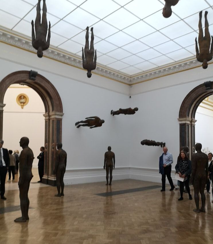
I have very fond memories of in the early 2000s seeing Gormley's figures standing like extras from City of Angels on the top of various buildings across London, some of them were at street level. I was looking forward to seeing them and see them I did at a exhibition of his work at the Royal Academy. We might as well start with them. They were assembled in the middle room, all of them the same dimensions, varying in amounts of rust on them. They face in different directions, some of them perched on the wall (as seen above), some standing on the ceiling. It is oddly calming and there was one brilliant period of time when a man was standing next to a statue in exactly the pose of the statue. I suspect the statues are hollow. Incidentally when Gormley portrays figures, he only portrays men. Why is that? I suspect in fact he only portrays himself.
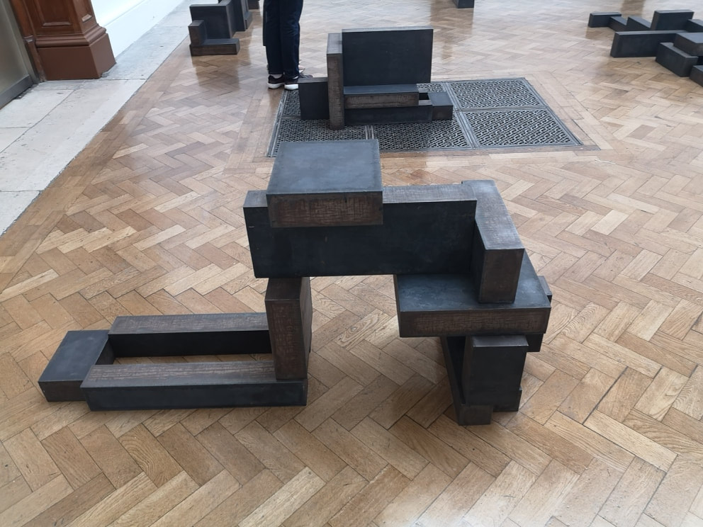
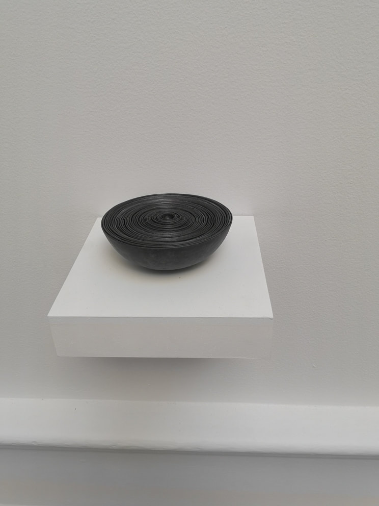
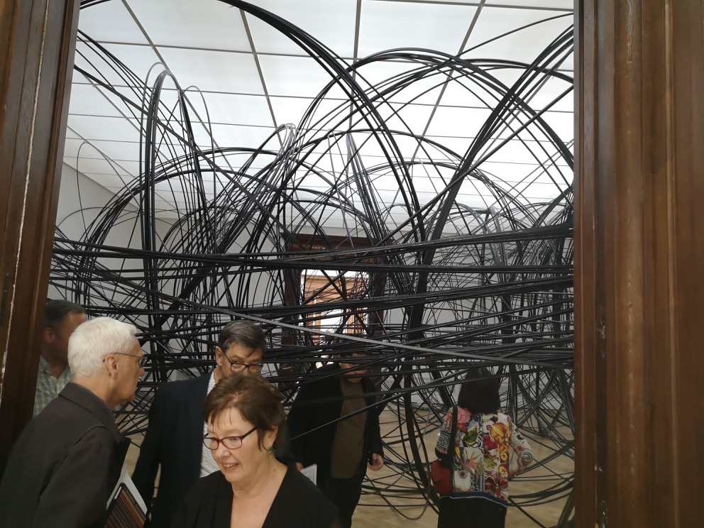
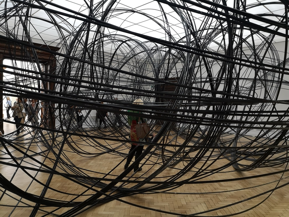
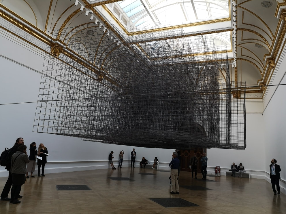
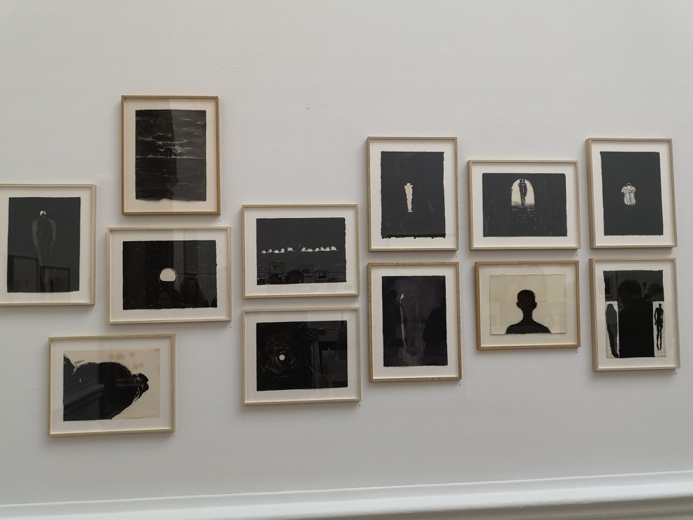
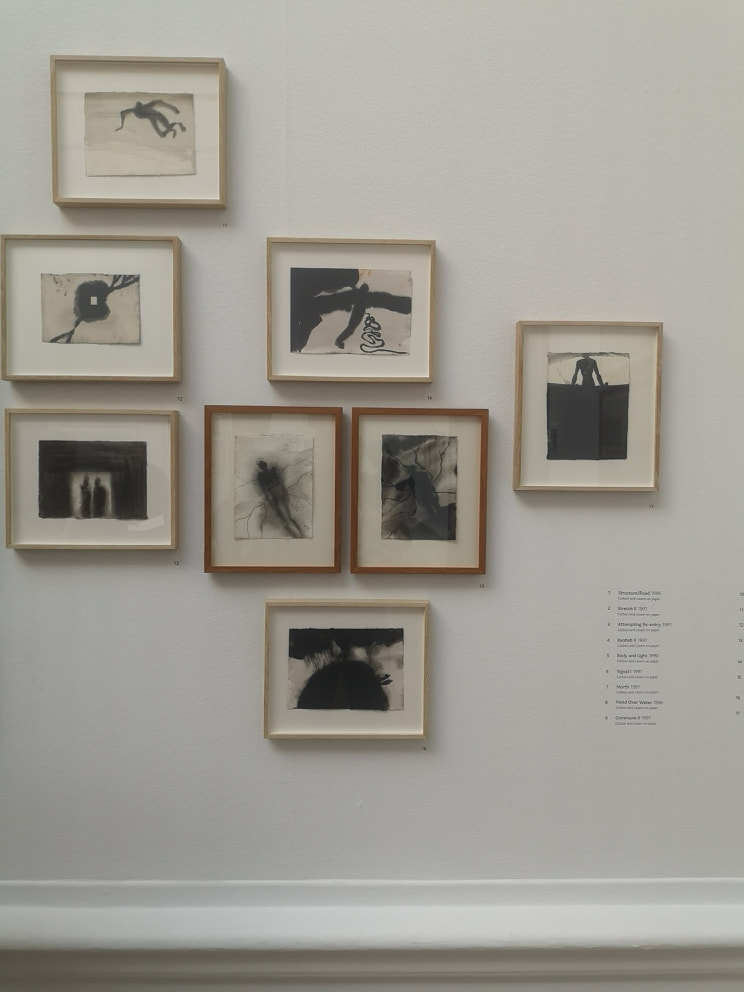
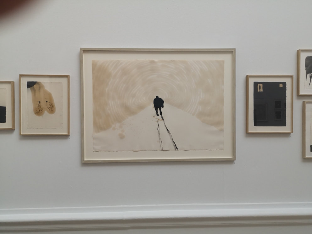
There is then a room of early work,. You are greeted as you enter this room by a long rectangular plank, on which in slowly increasing sizes are chesnut like pieces made of metal. It is very pleasing. There were two other pieces in this room I also really liked. Once called mothers pride was the outline of a figure made out of cut pieces of white bread, preserved in wax. A powerful and humorous image. However my favourite piece was this bowl (above right). It is called Filled Bowl, or something like that and as you can see it is just a series of concentric bowls, made out of a lead like material. It appeals to me. I wanted to pick it up, sadly you cannot. I like its solidity, its uniformity and its decreasing size. Then you turn left and the madness starts. Occupying almost the entire inside of one room, with just enough space around the side for the squeemish to avoid it is a tangle of metal rods (above). They are in fact a series of metal circles, arranged like the orbits of electrons in several colliding atoms. You have if you wish, and I suggest that you do, to scramble through the assemblage. The metal makes a clanging sound if you hit it, and this cacophany resounds throughout the room. I choose to treat it like the scene from Entrapment where they are avoiding the lasers, and tried to get through with no bongs being sounded. You can if you are suitable nubile, which it appears I am. Your reward is a far room, with one sculpture, a figure of a man seemingly made of metal jenga bricks. He is a very huncy man. After a few minutes of contemplation/recovery you can make your way back out through the maze. Sitting mostly alone in a room is a very large series of metal square fencing (above left). What is that horizontal wire you ask. Well that you will have to go and find out for yourself. As with many of this show, this sculpture which I believe is called Matriz rewards viewing from many angles. As you can perhaps see, there are different densities of fencing arranged in interlocking squares. Differing lights and density of wire. Now a word about drawings. There is a room of lots of drawings. Intriguingly there are four glass cases showing, suspiciously neat pages from many, many of Gormley's note and sketch books. Some of them are very good art in their own right, but all of them are interesting in terms of his process. There is what appears to be an early idea for what became the Angel of the North. Anyway as light digression. There are a series of intriguing black and white paintings (above right). They are done using Charcoal and Casein (what is casein, please tell us). They are quite simple pieces but riff on Gormley familiar themes of what is a man/figure of me.
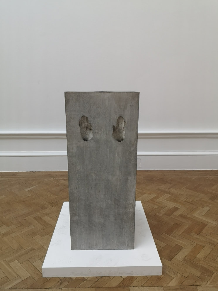
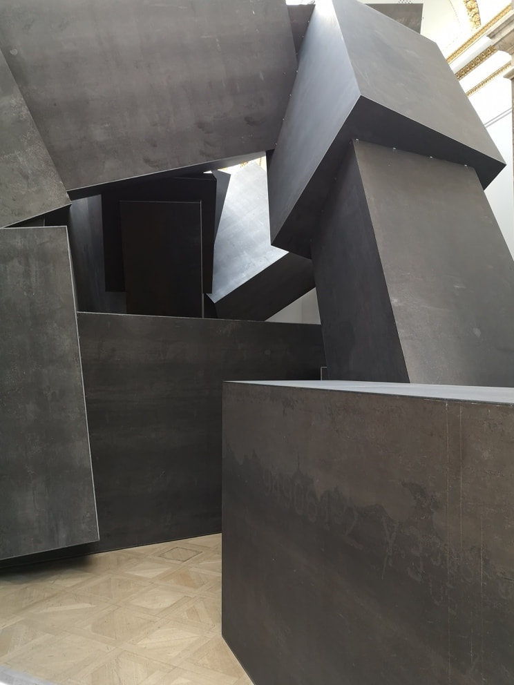
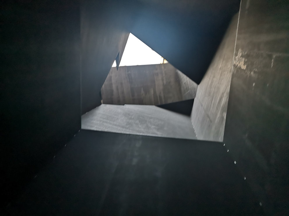
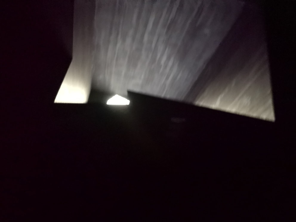
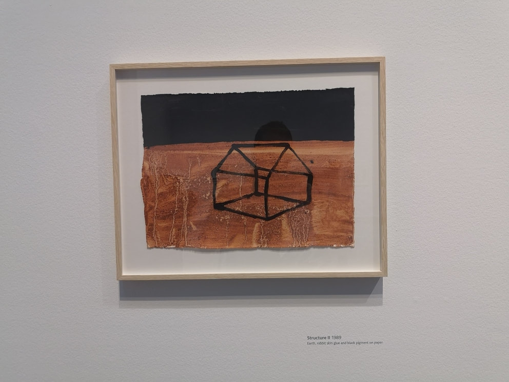
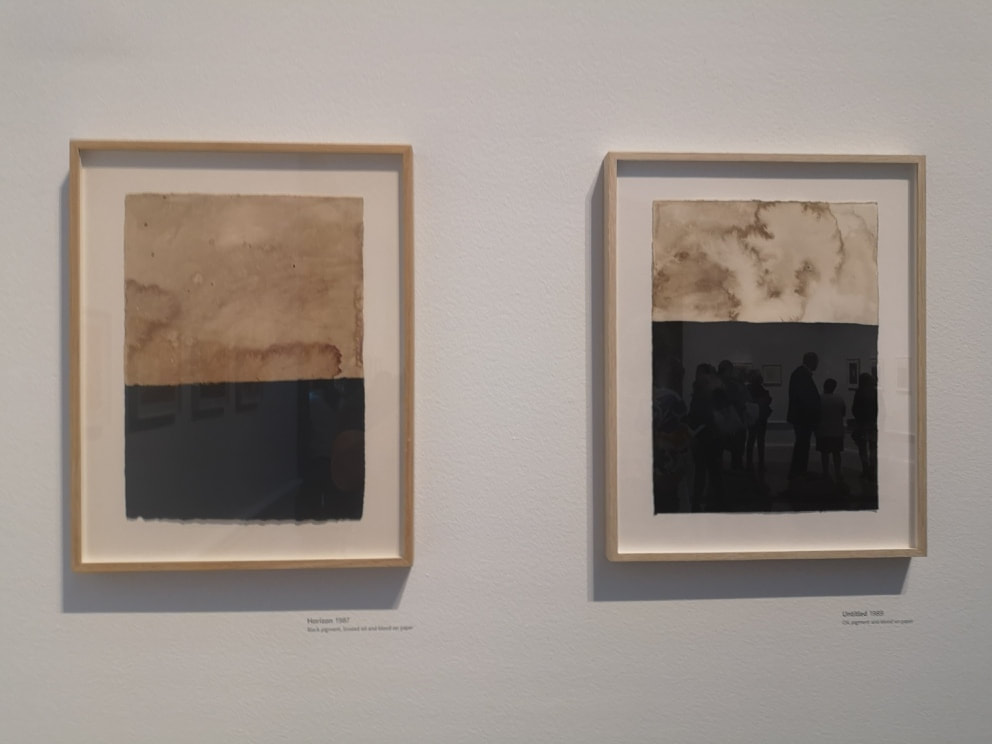
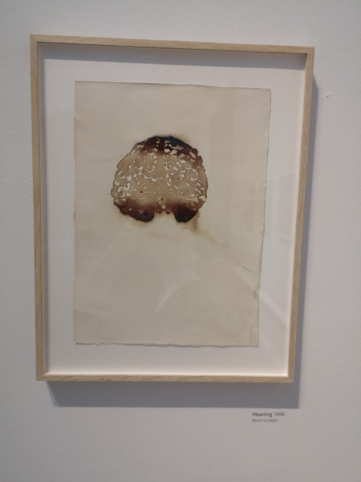
Other more subtle pictures make an appearance (above left) and I like the more shadowy blurred figures. Particularly creepy is the sort of flying man in the top picture and the one below and to the right of that has a distinct resemblance to the angel of the north. It is nice seeing the genesis of an idea knocking around in someones brain. Just off this room , in a circular room, are two giant rusted metal conkers, one larger than the other, gently oscillating on the end of stout ropes. It is very pleasing. Following this are a series of cement slabs with hand or foot prints, impressed into the cement. These were a bit dull to be frank, probably the weakest thing in the show and made me want to see Rachael Whiteread who is much more interesting with her cement casting. They while away the time though while you briefly queue. What are you briefly queening for you ask. Well occupying the next room is a large series of metal square tubes, arranged like some slumbering transformer. Again you can skirt around the outside, or you can if you wish choose to crouch down and enter the tubes. It is like being in the film alien and it brings you into a large cathedral like atrium, with light streaming down from high up apertures. The atrium is not regularly shaped and some of the angular protuberances resound with different tones if you strike them. After you have had your fill of this you can emerge into the final room. More paintings with strange materials. There are a series of red and black paintings like the one above left. The red is made by a combination of earth and rabbit skin glue (and yes it is made from rabbits). Some of them are very disturbing and the red earth produces a very striking effect. My favourite paintings though were these two of cream and black (above right). The black is just black pigment, but the cream is rendered with the return of linseed oil, which gives this stained cloud like effect. I like these very much and find them very calming. Taking materials to more extreme now we have blood. Whose blood is not specified, or indeed the species that the blood is from. The immediate assumption I made is that it was Gormley's but of course it could simply be pigs blood from a passing kidney. The best of the blood paintings is the one above left. Brains! The shift in tones is very effective.
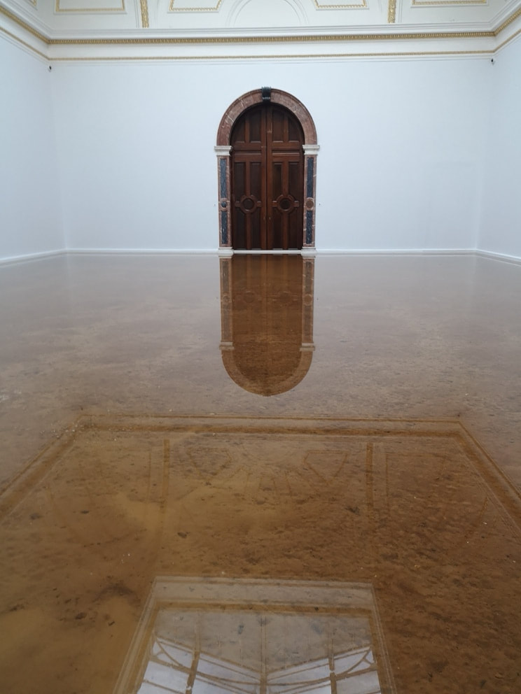
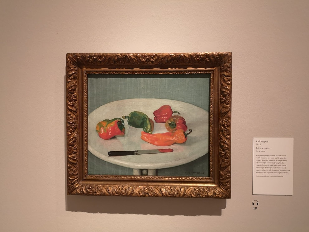
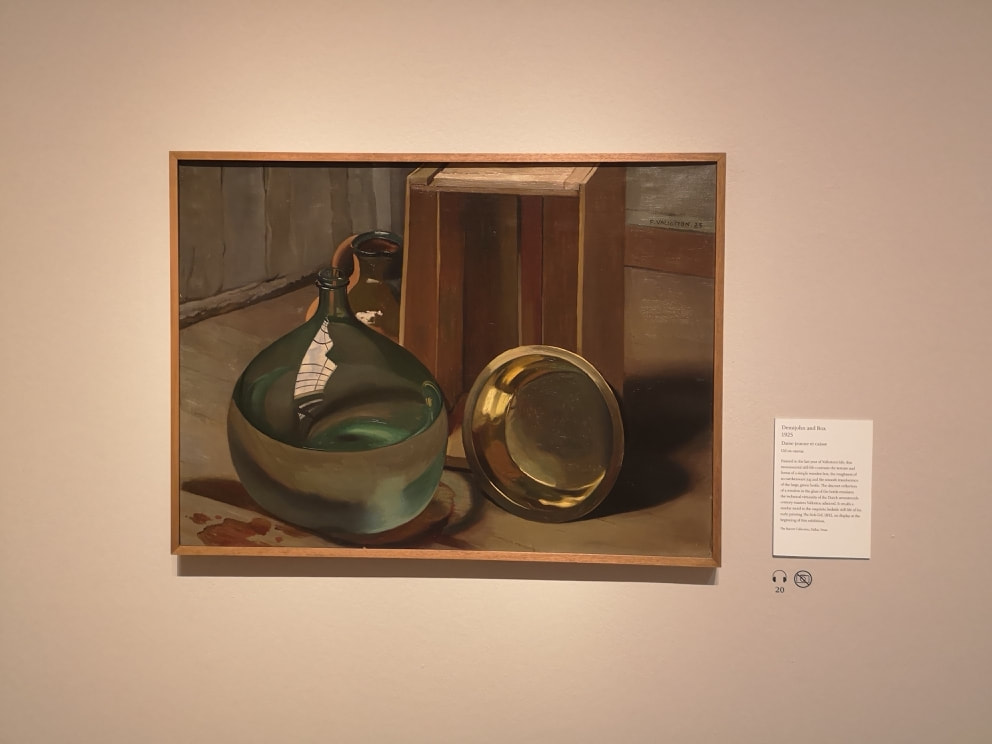
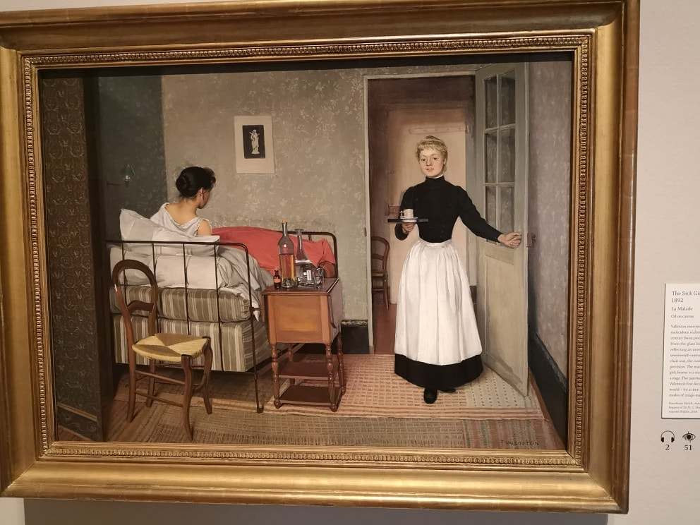
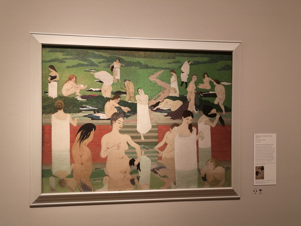
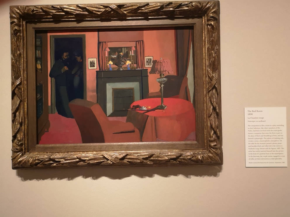
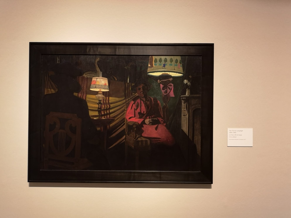
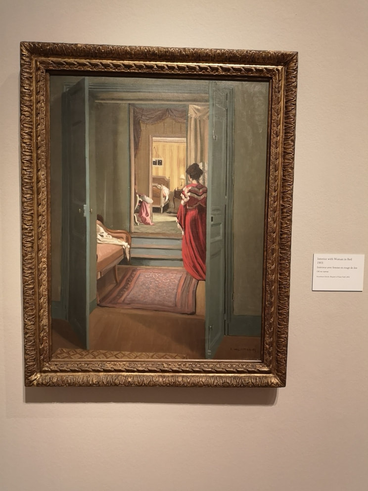
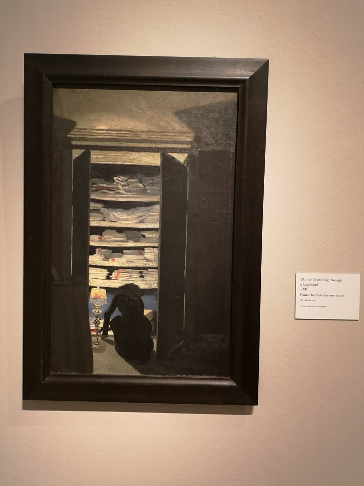
I have left until last, my favourite piece/installation of the whole show. There is a room. The floor is covered in earth and clay and then the room has been flooded with water up to a depth of about half a meter. A surprising cold seeps out of the room. I often have dreams of flooded buildings and this reminded me of that. It had a profound calming and mediative effect and I liked it very much. I may go back just to see this. It is worth going just to see this. 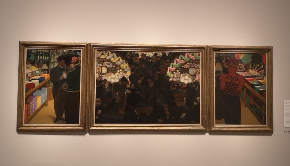 Not so much a review as a retrospective as it closed on 29th September, but this week I am talking about the Felix Vallotton exhibition that recently finished at the Royal Academy and had the slightly over ominous subtitle of a painter of disquiet. So who is Vallotton. Swiss, moved to France, 19th Century, part of a group of painters not cool enough to hand with the impressionists, or Matisse and those lot. On the surface Vallotton' paintings have the appearance of being boringly factual, if well done and highly colourful. The above painting, a triptych of a department store is just such an example. As I was photographing it, I was altered by a guard that this was the one painting with a sign saying no photographs. Too late though, and I'm not sure why and I am fairly sure Mr Vallotton's copyright in this painting has lapsed so I present it for your view anyway. On one level this is a very pleasing highly coloured painting of a department store. It is slightly more interesting than that as triptych's are almost always religious in some way, and this is one of few examples I have seen that departs from that. I also like the way he has in the flanking paintings, extracted the individual, from the bustling crowd in the centre. This slightly off kilter way of depicting and looking at things makes Vallotton interesting, and if you were to stretch it, could justify the title of the show. I don't think that a painter, to be good and interesting, has to be doing anything particularly radical or subversive. The very famous ones often are (Turner, Monet, Picasso etc) often are but sometimes you just have to be good (Constable) or have a slightly different way of looking at things to make it art worth seeing. Indeed I think the, I like that but I don't know why, or, that's pretty reactions are prime examples of art being successful. Which is a long winded way of saying that I like Vallotton's still life paintings (above) just because they are good. Let me tell you why. With the peppers (above left), well they look delicious. They arranged well to get a nice negative space, and they are painted with strong vibrant colours, with a supreme level of accuracy. The way the light catches them is very effective. Putting them on the, by the way very detailed, marble table which slightly reflects back the colours, and the over the gray background really lifts them. The final touch though that makes this very good is the knife, with its slab of red on the end. This could be one of two things. It is either a reflection of the pepper above it, or it has been used as a pallette knife and has just been left, with a slab of paint, sitting in the picture. Of course it could be both. The other purpose of still life is to show off. Traditionally how they were often used, and Vallotton does the classic, look at the surfaces I can do spiel with his carafe of water and box ensemble (above right). The way the different textures of light and shade are captured, particularly in the water is very impressive. The show is arranged more or less chronological but I am not going, but now we deal with people. He does a good interior does Vallotton and he always put a slight spin on it. A prime example of this is the Sick Girl (top left) . Vallotton is quite good at doing in motion poses, which are not easy to do. He used photography to paint from later in life but I wonder if he did it here, or made it up. It gives a sense of dynamism, of a scene interrupted. And of course there is a bottle of water and elements from the still life that he does so well. Much more staged and replete with classical illusion is this painting of women bathing (above right) it is very different in style to the other interior and has some very strange elements such a the central figure is holding a green shriveled head. The shaft of red across the centre makes for a good contrast to the greens and breaks up the foreground to the background. While I was there a very tall serious looking woman dressed all in white was taking close up shots of all of the boobs. It is, to a certain extent, that kind of painting. There are some very sexy nudes later in the show, but you can't include everything in a blog and a post mainly of boobs would be a bit weird. Sexual mores appear frequently in this show. There is a whole series of prints dedicated to them, although I have to say I find the prints some what un-engaging. More interesting are these series of paintings, often with a dominating colour, with some dubious sexual encounter heavily implied. As in the one above left, where you have these shadowy figures, clutched in an awkward embrace, at the threshold to this clashing red room. It is very odd, made particularly so with the well placed flashes of other colour such as the yellow flowers in their blue post on the mantle piece. It is painted in distemper on cardboard. Now then, a note to curators. Instead of waffling on about what the picture shows us, we can see that by you know looking at the picture, perhaps tell us about how it was painted. I had never heard of distemper before. A quick google search revealed it is a canine disease, which is an odd thing to paint with. In a similar style but going heavy on the shadow are a couple of by lamplight paintings which appear in the next room. They are beguiling but they are bit like too moody tv programmes in that you can see so little its a bit off putting. Nice lampshades though. A nice trick with paintings is having the action framed by an internal device, and doorways are excellent at this. They give you the viewer more of the sense that you are there looking in on the action. There are two excellent examples of this, one bathed in light (above left) and the other darkness (above right). The fact that the figure has their back to us helps emphasise the peeping tom aspect of the whole thing. As does the dishevled sheets in the one on the left. As with the other paintings the level of detail and rendering is superb, and again you have people in motion.
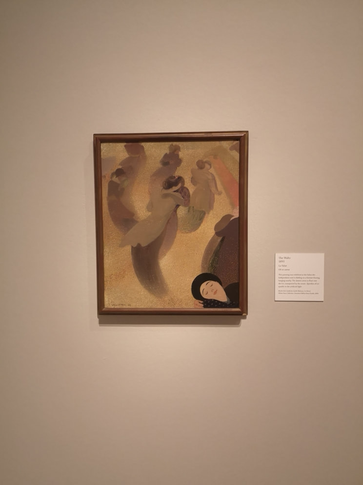
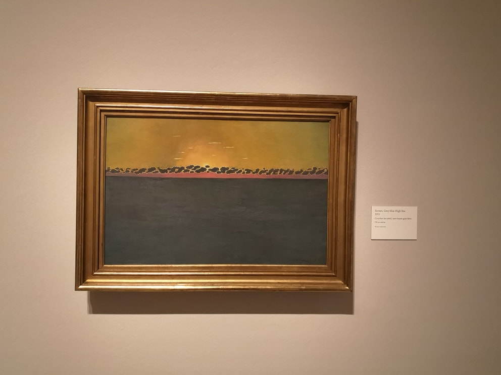
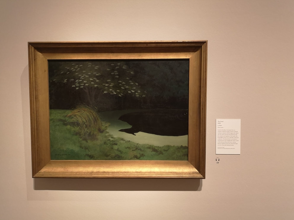
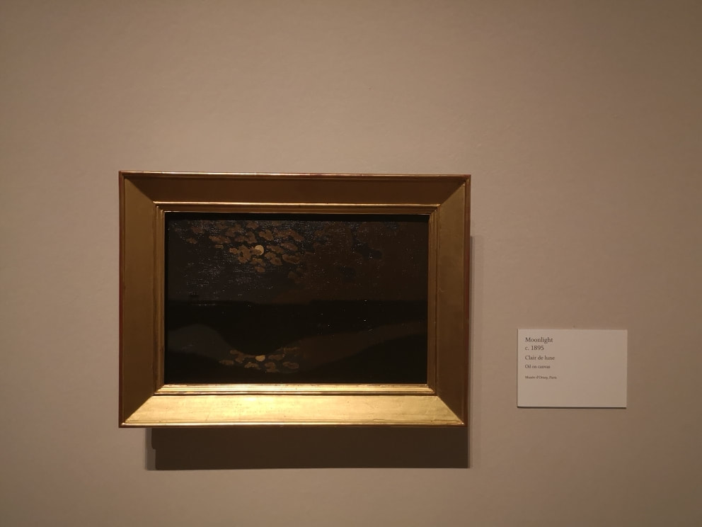
It is however an interesting image. A much more delicate usage of gold is in these dancing figures (Above left). Swirling around in this field of gold. I particularly like the face in the bottom left. She gives the feeling that you are one of the dancers. There is a tremendous sense of motion, and I like the fading of the figures into the ground. I really like this painting. Odd landscapes make a reappearance but these last two are much more effective. Again there is an apparent simplicity to them with these ribbons of colour, and having landscapes at night. You don't see them very much, dawn and dusk sure but not at night. This allows the two elements that I really like in these paintings. In the one above left it is the blossom on the tree, catching and reflecting the light. In the one on the right it is the golden glow on the clouds and reflected in the ribbon of water underneath. Very nice.
We are back in the RA next week for Anthony Gormley. |
Archives
June 2024
Categories |
 RSS Feed