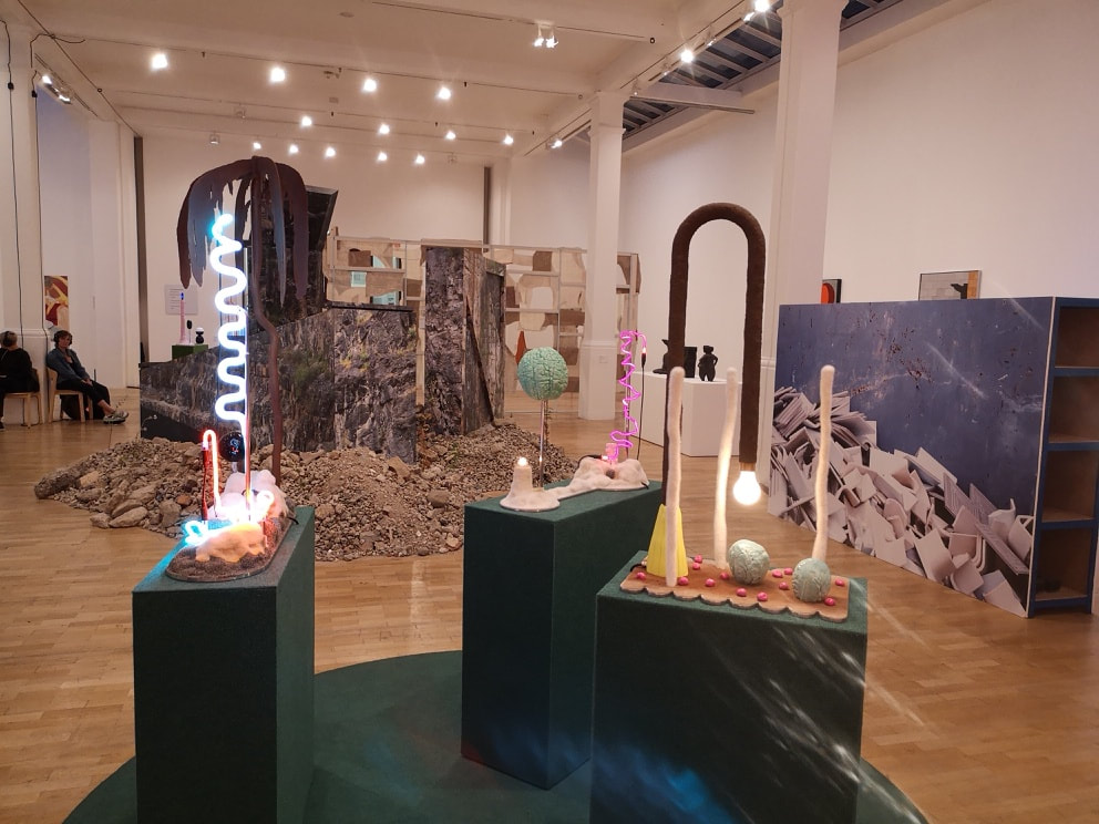
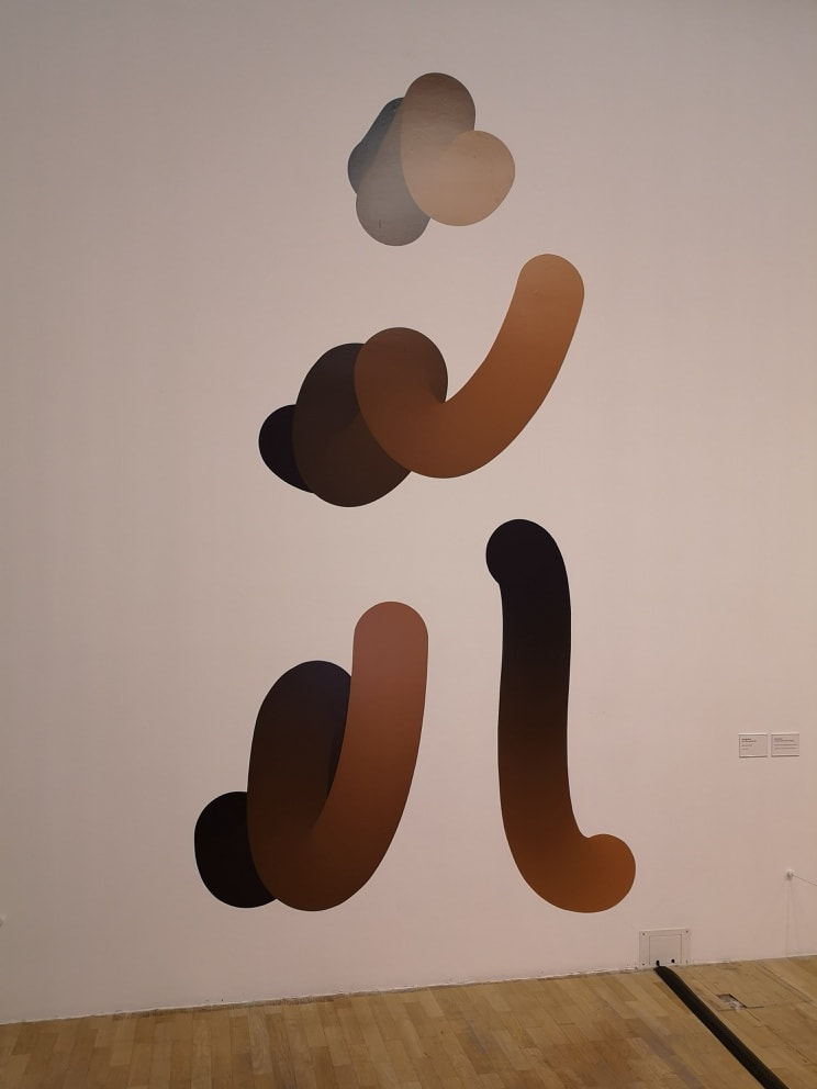
 The London Open at the Whitechapel ends on 26th August 2018, so unless you are reading this relatively early on Sunday morning, then you have missed your chance to go and see it, which is a shame because its pretty good. The theme, such as it is, appears to just be artists from around London. I shall come back to the weird alien like set above at the end. It is free, eclectic and wide ranging, over two floors of the gallery, with, this being the Whitechapel, a focus on the conceptual and installations. 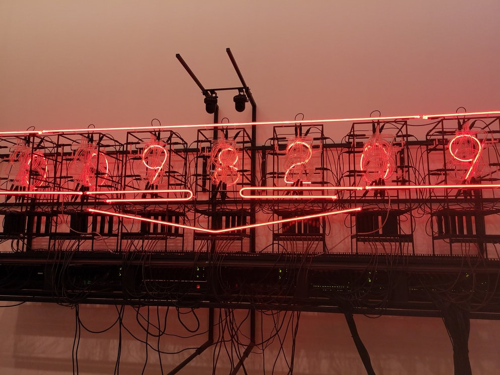 The above appealing Neon affair. is by Rachael Ara and has the knowing title This much I'm Worth. It is apparently a self evaluating work of art. They didn't change while I was there but looking at past photos the number has increased. I do wonder if it ever decreases. I like the contrast of the glowing red, slightly threatening, against the bank of black wires and machines.
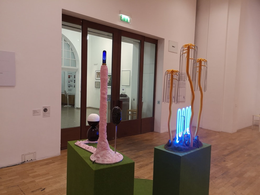
As intimated above, many of the pieces are three dimensional, allowing you to wander round them. I shall come back to that intriguing heap of rocks in a moment but right now I am concentrating on Jonathan Trayte's three pieces (above left). Using a mixture of painted bronze, light fittings. making what look like childish chemistry sets or odd tele-tubby sci-fi set. There is something very playful about them. I keep expecting Morph to peek out from behind the round objects in the near right piece. He had in another part of thee gallery two more, taller pieces, lit with this blue light (above right). I particularly like the dangling willow like pieces over the blue neon toast rack.
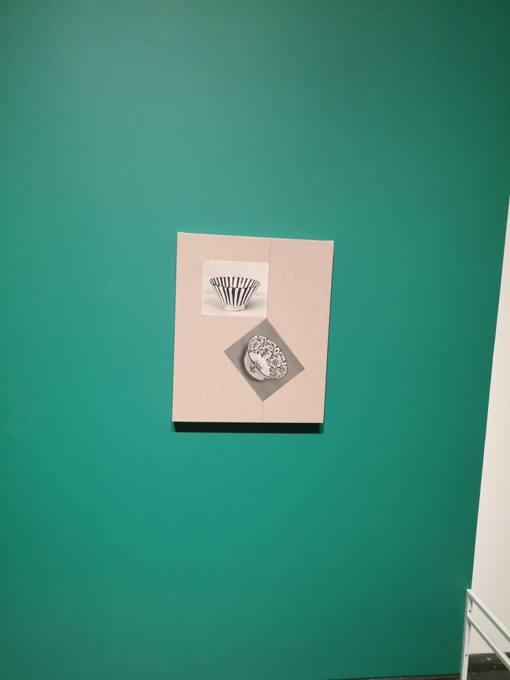
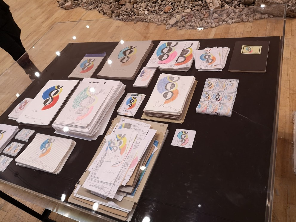 I am slightly obsessed with Sonia Delauney. RIght at the start of this blog it was one of the first shows I very briefly documented. It made quite an impression on me so it interesting to see that Celine Mainz (above) was similarly and indeed even more so stricken. Basically she has taken once of Delauney's most famous works and repeated it a very numerous times. I particularly appreciate the stamp light ones that you can see on the right hand side. It makes me smile this piece. I also like the sort of pointlessness of it. 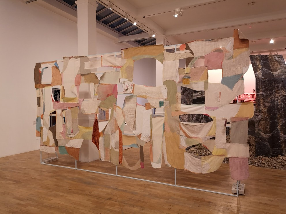 The above pastel coloured, muted patchwork screen is the work of Alexis Teplin and is called "The Politics of Fragmentation". This is what one should expect in the Whitechapel. I understand that the full works include two strangely garbed people in front of it. Works like this, for me at any rate, work by tricking the brain into seeing shapes, and in my case letters, which maybe aren't supposed to be there. I can also see it on the set of Mad Max or something similar.
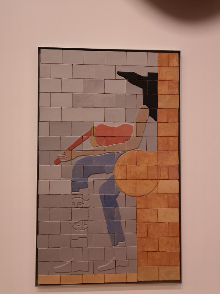
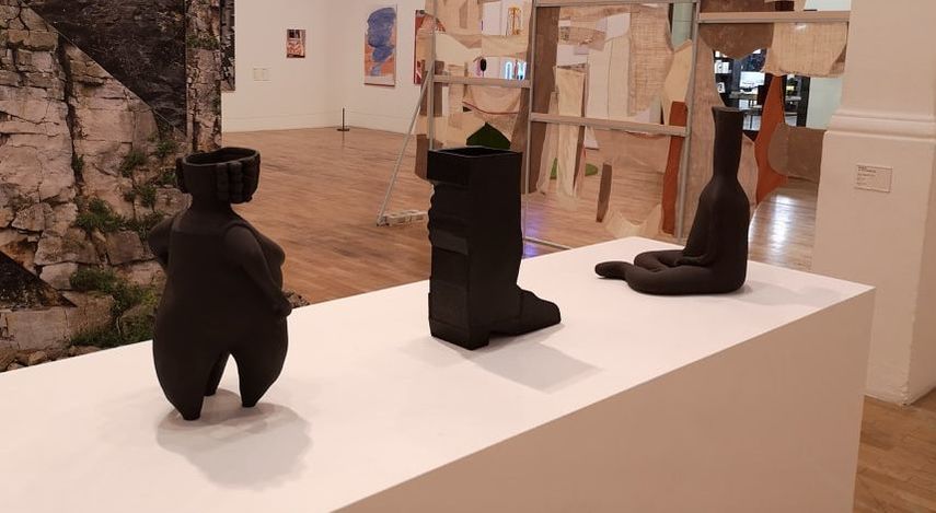 To show that she is annoyingly talented, So also had on display these three enigmatic Ceramic and bronze figures (the boot in the middle is bronze). They are like some kind of ancient religious artifact. I like the way the figure on the left perches on those thick tripod legs, and the curly legs of the figure on the right morph (yes him again) into that plain head figure. WIth their organic feel these two pieces are clearly related whereas the blocky boot, which reminds me of one of those fracture boots, stands apart.
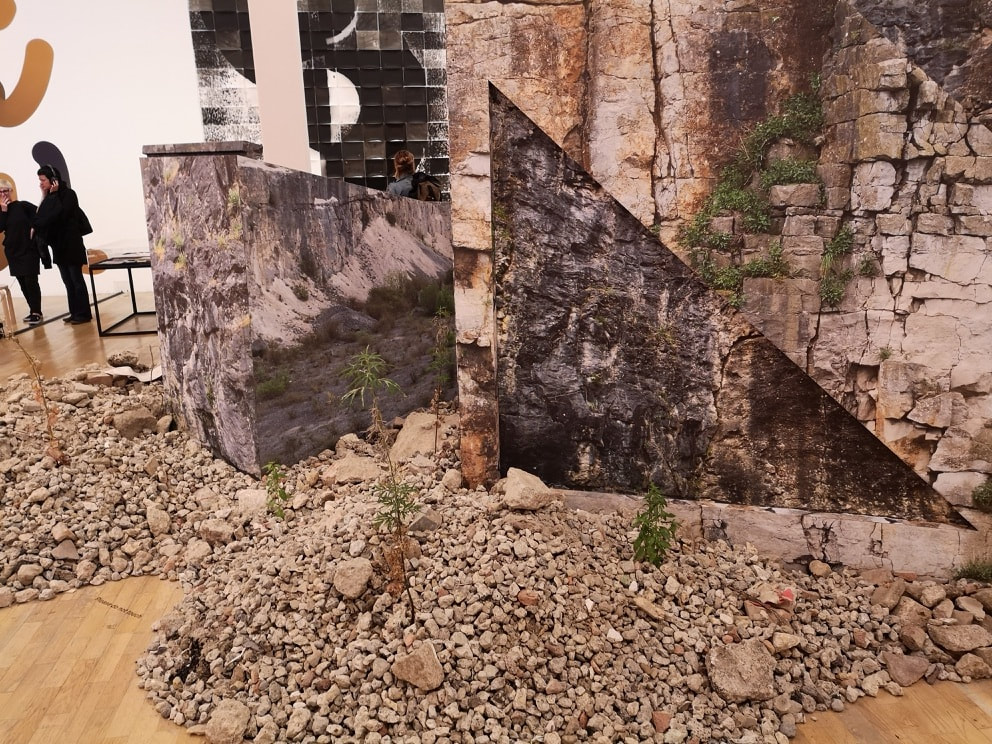
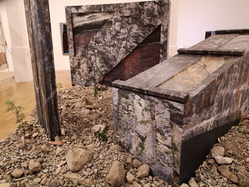
Back to the rubble previously mentioned. It is complete with raggedly weeds, blocks and triangles illustrated with a tumble down ruin. Being the largest piece in this room (and the second largest in the show) it is the work of Rachael Champion. This tickled me and I found myself walking round and round, smiling to myself. 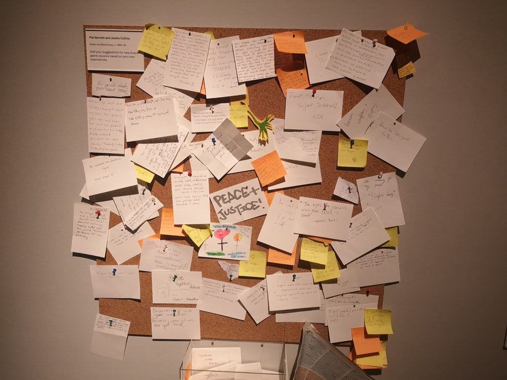 The show continues up the stairs. One way to do art is to get people to do it for you. You usually have to start them off but it can make for interesting result and it was a road that Pat Garrett and Jackie Collins did. Ending up with this notice board (above) covered with various peoples' scribbles. 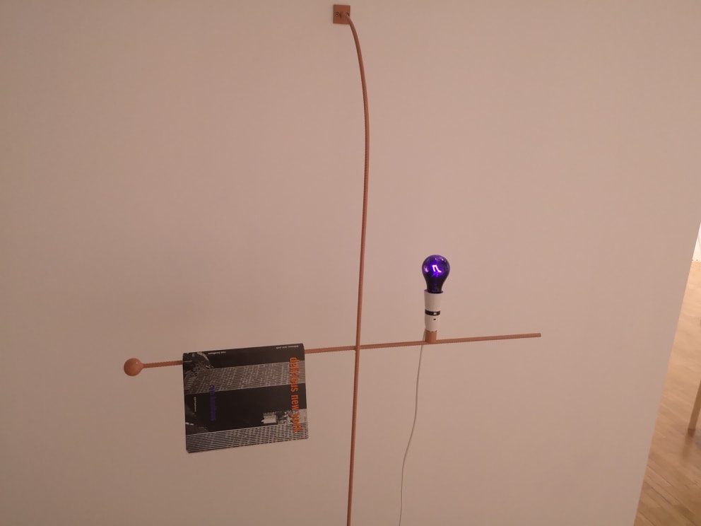 Richard Healy (above) had on display a number of these book and coloured bulbs, on cross like copper hangings. They are minimalist, almost simple. The books are of course bone achingly pretentious, but they make a nice counterpoint to the soothingly coloured bulbs both figuratively, and I suspect, figuratively.
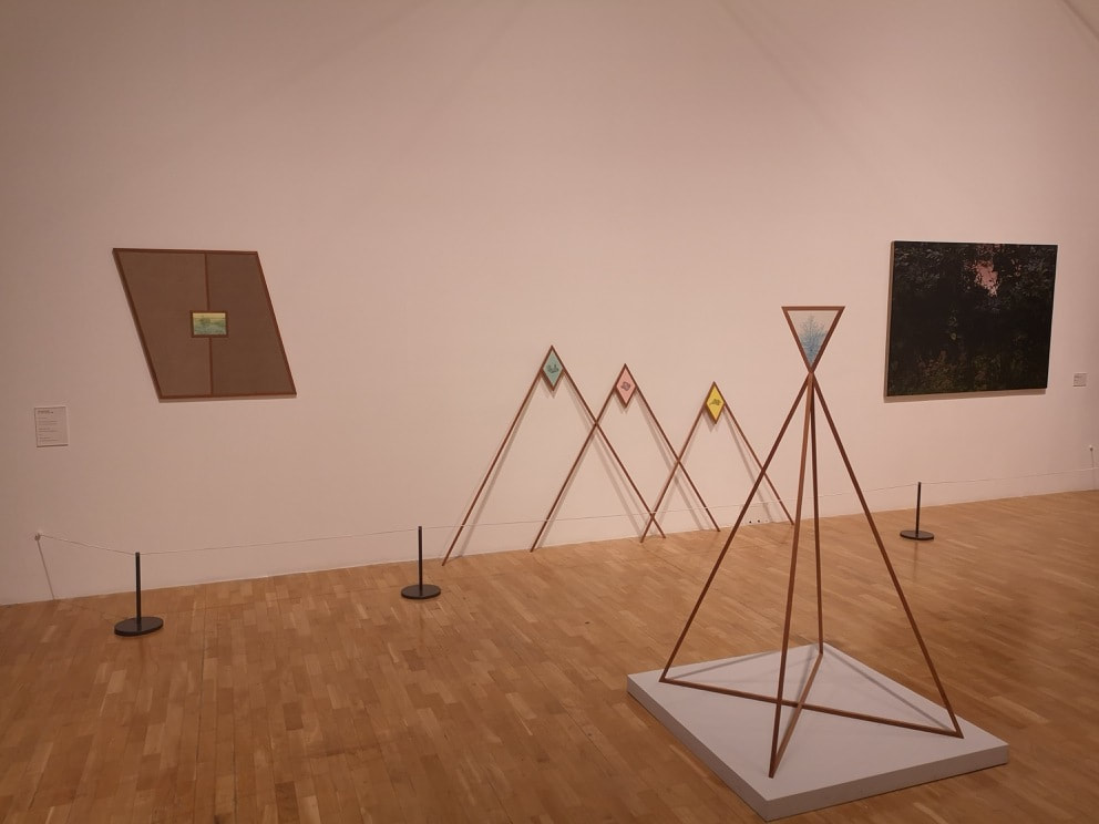
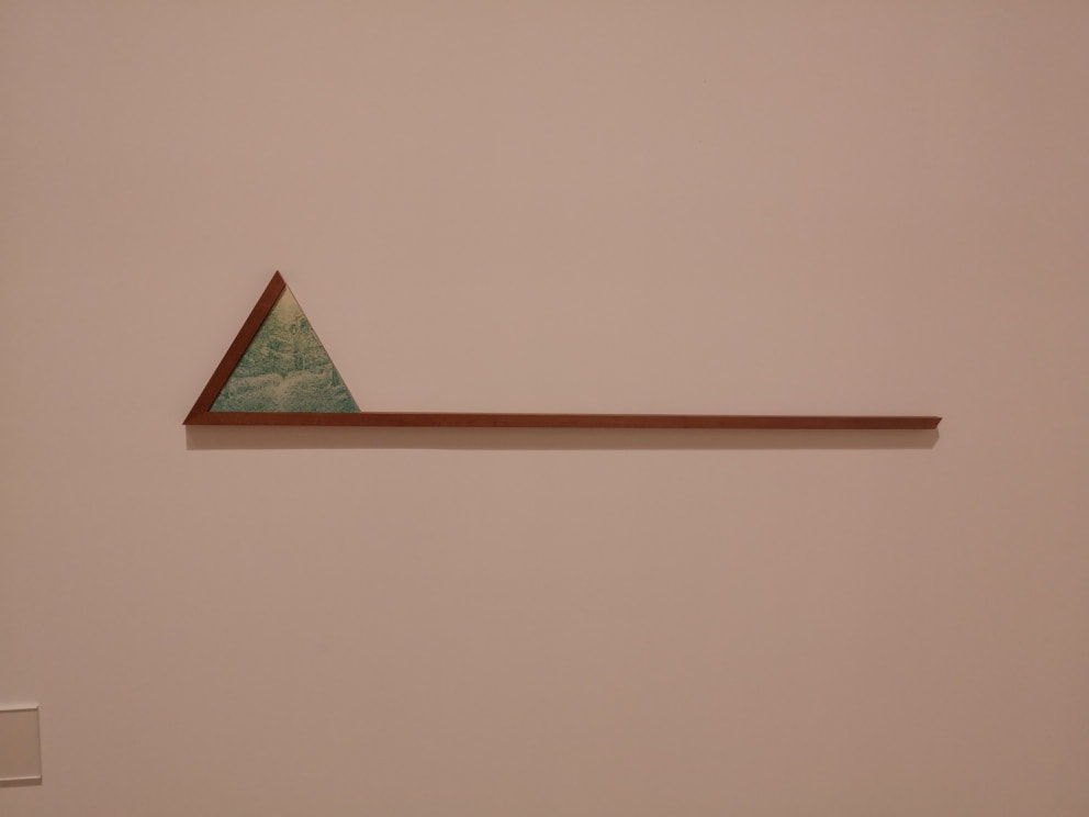
Another favourite of mine were these selection of angular geometric wooden shapes by Gary Colclough (above left and above right). Within the triangles that sit at various points of the shapes are these small and intricate one coloured pictures of pastoral scenes. Of the various ones on display my favourite is perhaps the most simple, just the triangle on one end of a line (above right). It is well conceived and works very well. In a close second are the triumvirate of triangles you can see on the back wall in the above left photo. All these people work well on there own but are enhance by being together. 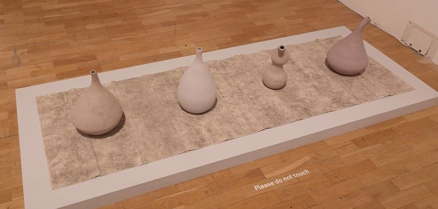 Pots, I like pots, and much like many of the other pieces in the show that appeal to me the apparently simple can be very effective. These beige numbers are the work of Ayan Farah (above) as is the linen on which they sit. Themes of the desert, a barren and hard landscape, is the story these pieces seem to be telling.
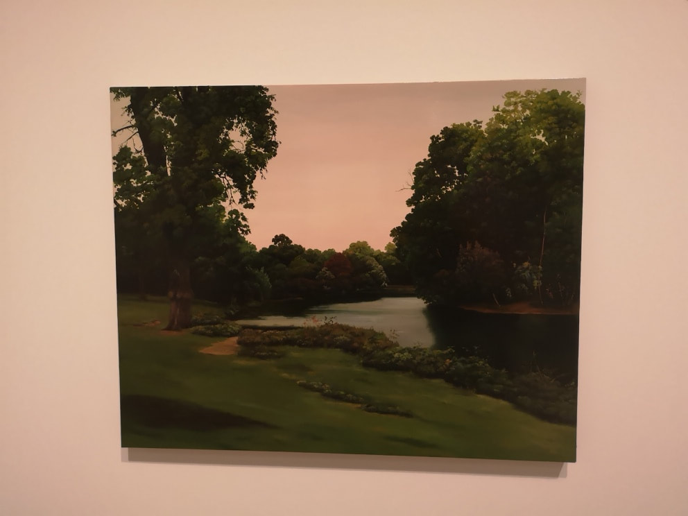
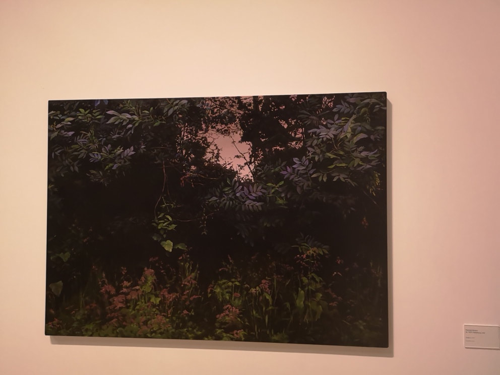
These excellent paintings (above left and right) are the work of Hannah Brown. The one on the left is Victoria park which is a stomping ground of mine. She has kept away from photo-realism by having this slightly foggy, soft focus feel to it. My favourite of hers those is this one on the left, with this soft purplish light filtering through the foliage. It had a sort of hypnotic effect.
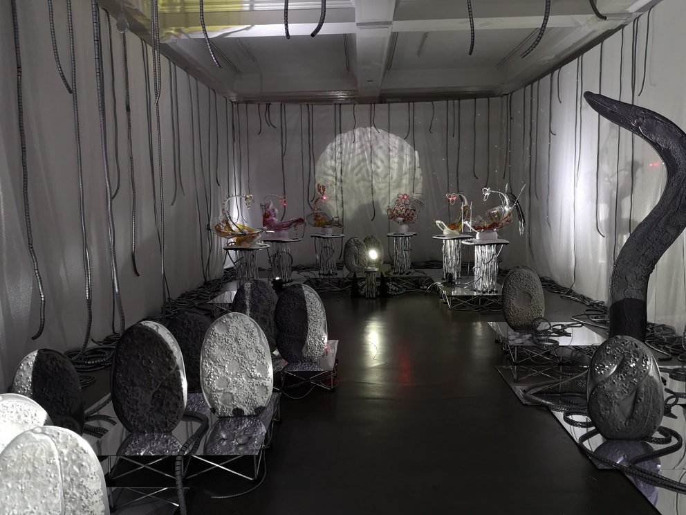
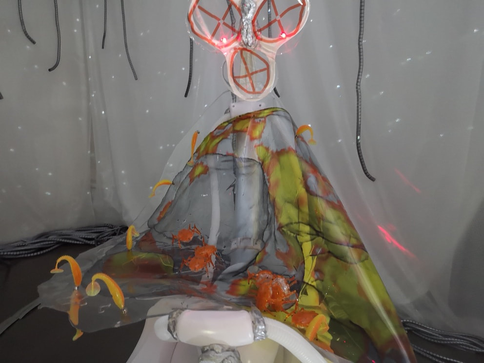
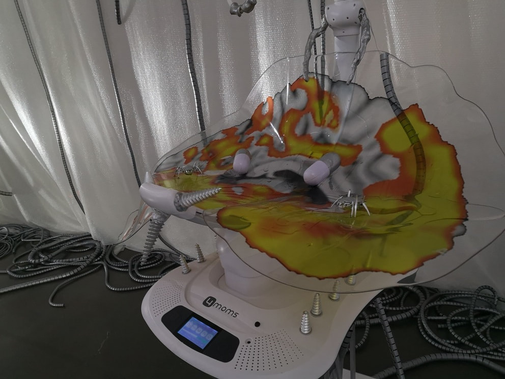
Back to the mad thing from the top of the blog. It is the work of Katja Novitskova and is not in fact part of the London Open but is a separate exhibition and is on until 2nd September. It is also free and is worth seeing as it is quite an experience. Alien creche is the theme and these baby rockers move up and down to a weird sound track , with images and light projected around the place. I stood captivated for several minutes. Around the periphery stand more, often tentacle like, pieces, as well as odd photos on the wall. Quite an experience.
0 Comments
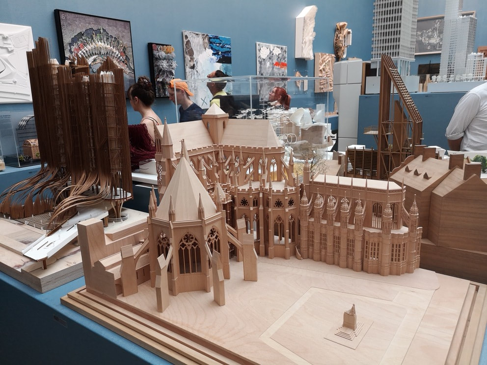
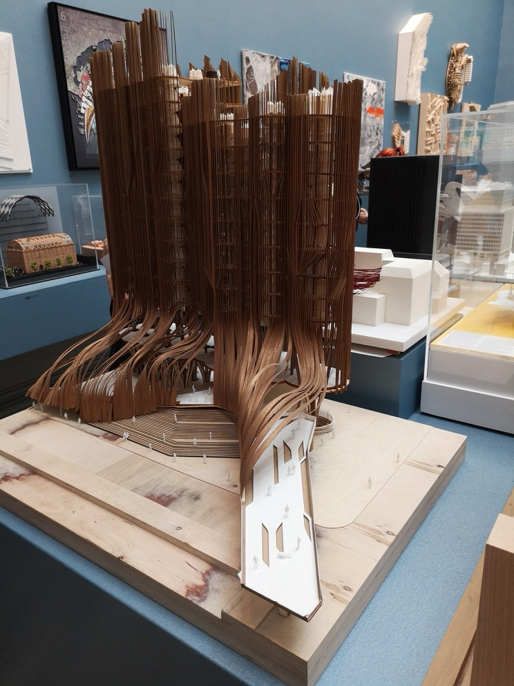
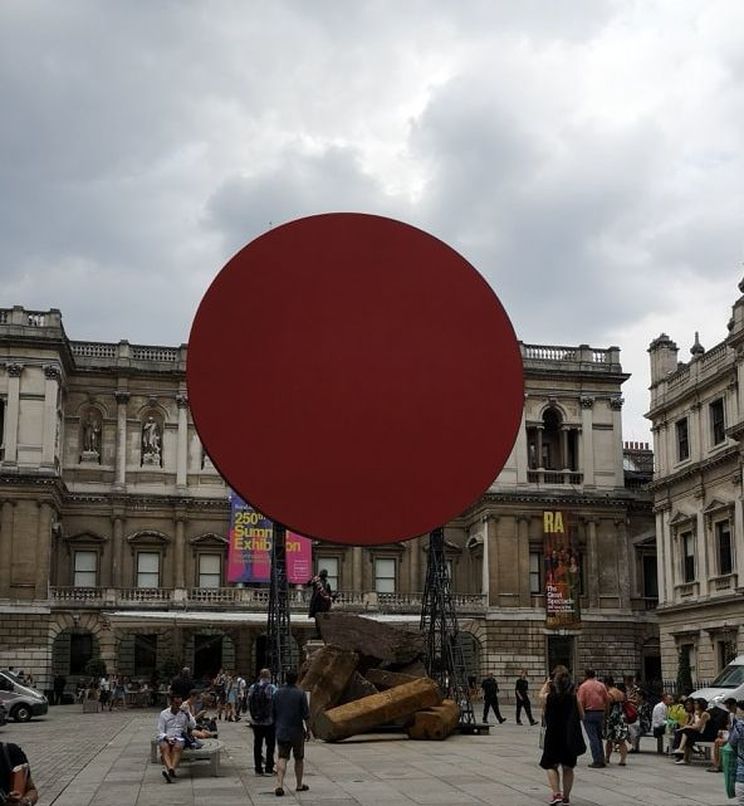 The Summer Exhibition always has something monumental in the courtyard, and this year was no exception with this large red sunlike circle looming over some collapsed column. It is the work of Sir Anish Kapoor and is very him. I like it I have to say like it. I like his work anyway, structural and substantial. 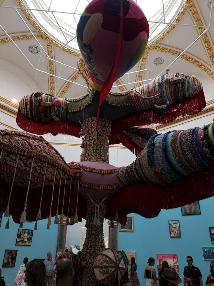 Then in the exhibition proper, dangling from the ceiling is this enormous, bulbous, balloon like somehow elephantine structure. It looks very comfortable and the tassels dangle down temptingly. It is called Royal Valkyrie and is by Joana Vasconcelos. I suspect it was commissioned especially for the space, which it occupies like some upholstered deity. 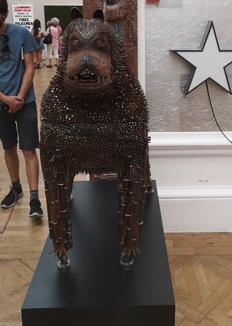 Who doesn't like a dog made of nails. Well probably lots of people, but I liked it. Appropriately it is called Gnasher (presumably after the Beano dog that it closely resembles) and is the work of Timothy Blewitt (above). He had two dogs in the show and they had been cleverly placed flanking the entrance to the room, like some weird guardians. This one I much preferred though. It has bags of personality and a savagery. A solid piece of menace. 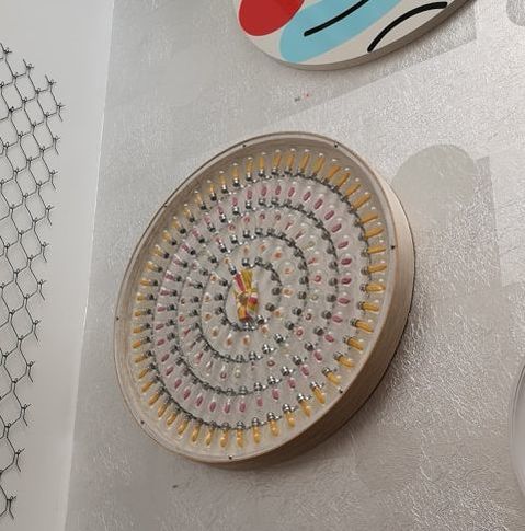 Up on the wall in the same room is the oddly named Karmic Sweetshop by Daniel Hogg (above). Hogg is interesting in that he started art relatively late in life (at 40, he is now 48). As an older entrant into the art world that can be inspiring. This hypnotic clock like piece provokes thought rather than a strong emotional response and it was only after looking at it for a while and vaguely wondering did I realise it was a spiral. It is difficult to take these things in, during the bustle of the show so I suspect it would do better in a sparse minimalist gallery. 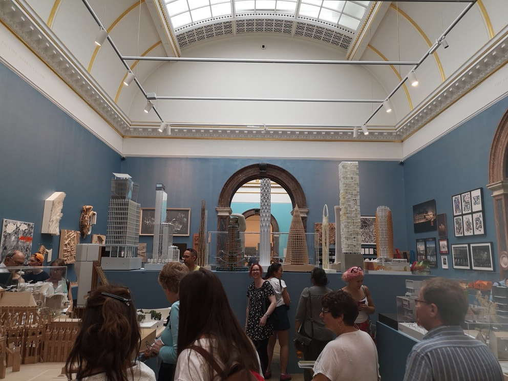 I said last week that the best room in the show was the architecture room (above). I shall now set about justifying that. One of the things that made it was the way it was laid out, so much credit to the curators. There are items around the walls, and four low tables with models but the tour de force was having a high platform, at about eye level, no which were displayed models of skyscrapers, so you get a feeling of height. There was also an arch in the platform so you sneak underneath, and many children delighted in this feature. Smart, very smart.
Several of the exhibits in this room wander the line between sculpture and architecture and back again so on the theme of sinuous and organic we have this 3d picture of a sort of landscape by the late William Alsop (above left). Suggestions of buildings and roads intermix with fantastical creatures and landscapes. Next to it we have SIr Nicholas Grimshaw's designs for the Philip and Patricia Frost Museum of Science studies. These all remind me of giant ears. They also remind me of the components of a pin ball machine. You can imagine that ball like structure careering around between them all. and some of them, like the one top right, do look like those flippers. It is one of the thing I like about the architecture room. Although there is often only one persons name on the work, this is the result of collaborative effort. Science, an art and high levels of skill, working to a brief to produce something wonderful. 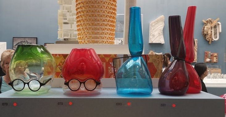 Silliness and humour are for me , greatly to be appreciated in art. The above are all called Where are my Glasses by Ron Arad and was not even slightly surprised to see that they had all sold. Playful, skillful, nice glass objects in themselves, turned with those glasses into an amusing story.
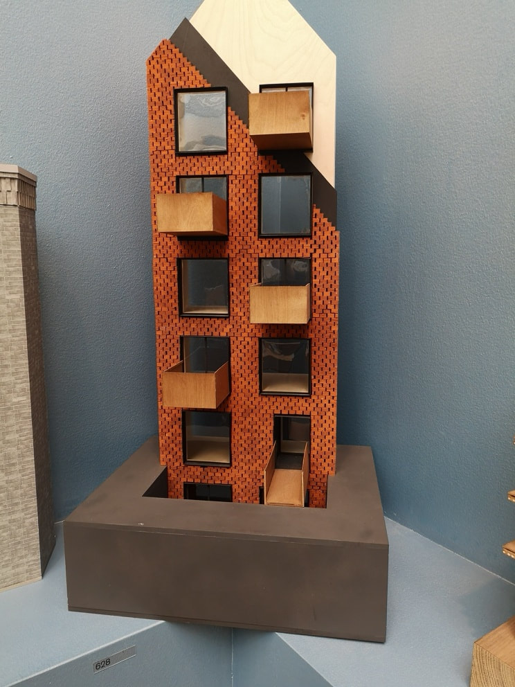
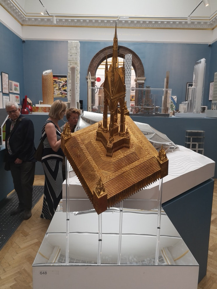
I chose the one above left because it is a model of a building that is near where I live, and I like that building. I remember admiring it when it was constructed, particularly the wicker effect balconies that protrude from the front, and the honeycomb brick work. It won an architecture award and rightly so. I was nice to see it in concept form. The staggered stripy roof is particularly effective. It is called Barret's Grove and is the work of Groupwork and Amin Taha. Well done to them. Changing tack rather is this made golden form, which turns out to be a different perspective of the Albert Memorial by DSDHA (snappy name guys, above right). They have done the nice trick of rendering something familiar in a different way, forcing you to look at it again. The original in my view is somewhat ugly, but this looks like some alien sigal. I could see it hanging behind an overly made up actor in an episode of Star Trek. All of these elements are good things by the way.
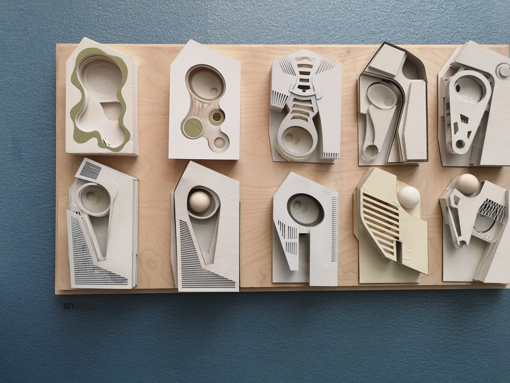
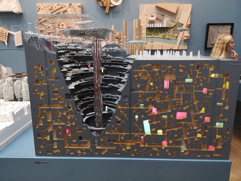
These the are last two from the architecture room before we head off to briefly scamper round the rest of the room. The 19th August is the last day of the Summer Exhibition so chances are you have missed it, but it is worth going, just for this room. Anyway, space, futurism and futuristic buildings have always appealed. Above left is Chthonoplis by Nic Clear. I suspect give the layout and the name it is inspired by ants or termite mounds. It reminds me of the subterranean lab in Black Panther. As an object in itself it is beautiful. Grey and gold is a winding combination and then they are punctured with these slabs of pastel colours, with then the conical cross section on the left taking you into the depths. The one on the right also has a futuristic feel to is, the modular feel of a space habitat. It is however intriguingly the design for a private house call Robin's Wood by William Alsop. I hope it gets built. 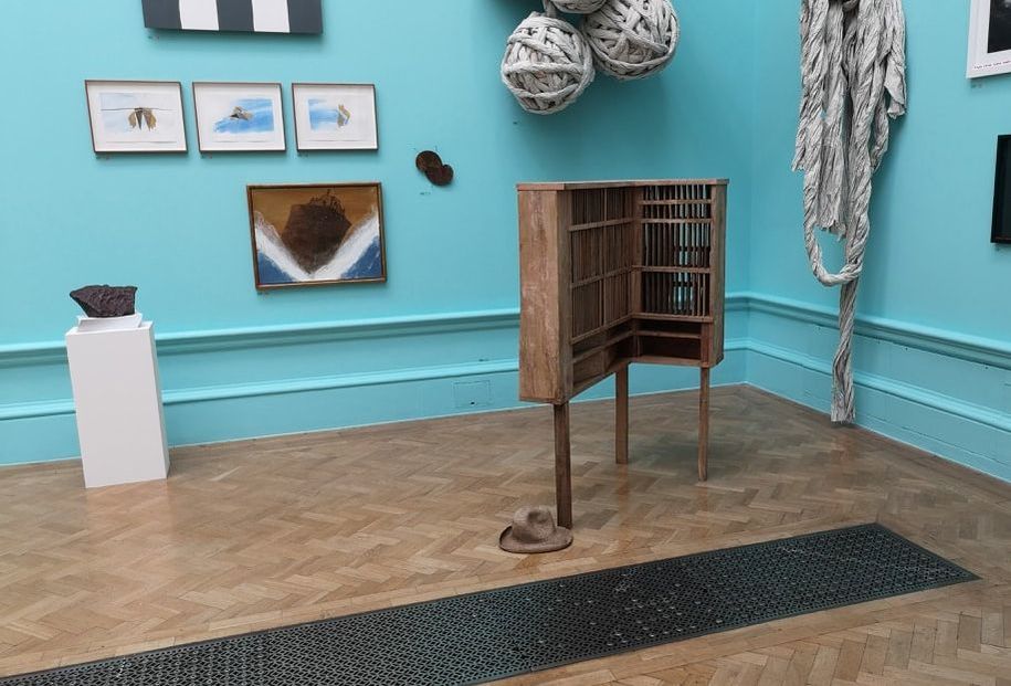 The next exhibit is presented (above), not so much for the exhibit itself which is all very well and good, but for the hat that lies next to it. The hat was provoking much debate when I arrived in the room. It is a fairly matching colour to the bookcasey thing it lies next to. The question occupying people was, is it part of the exhibit or has it just been dropped there? The question resolved itself when I came back through later on, and the hat had gone. The fact that this occurred at all tells you everything you need to know about the Summer Exhibition.
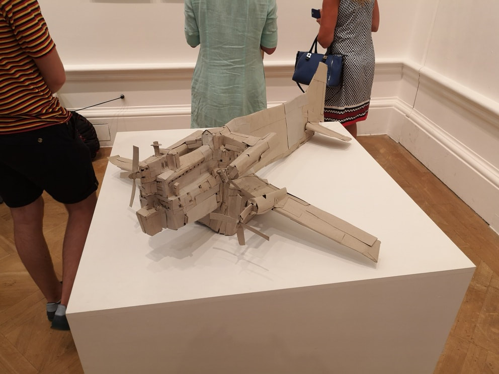
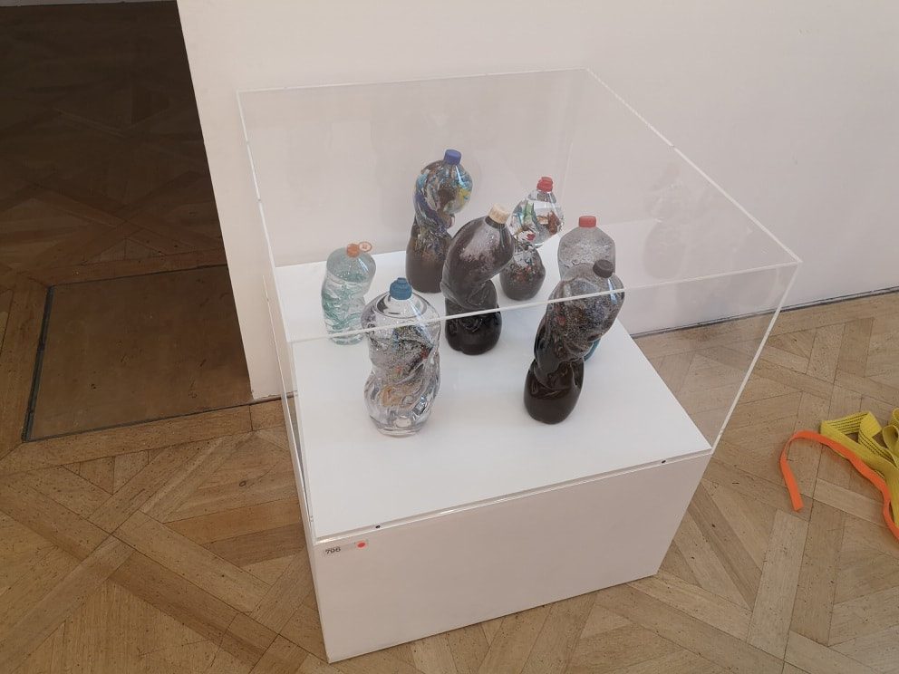
Hans-Jorg Georgi managed to get a badly made lopsided model of a plane (above left) into the show. It is called untitled because it is obvious what it is, but I enjoyed it for the sheer childish joy of the whole thing. it is also worlds away from the stomach-churning seriousness of the next piece (above right) called the Seven Stages of Degradation by Sophie Thomas and Louis Thompson. It is a mixture of found bottles and blown glass. It was the latter that attracted me to it. I am a fan of glass and there was a lot of skill that had gone into those melting and distorted shapes.
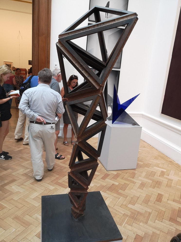
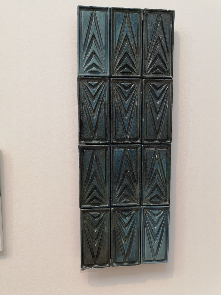
Conrad Shawcross featured allot last year, and had a large sculpture in the courtyard. I like his use of triangular weathered steal so it was nice to see it again (above left). The way the triangles get bigger to make the sculpture appear larger than it is, is particularly effective. Then tiles, who doesn't like tiles? Only morons. This is called modular Ornament - TIle XI by Joseph Armstrong. The tiles have a good luster to them and I like the increasing triangle design. 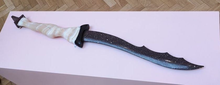 I shall leave you with what Stephen Cox would present to us as the Sword of St George. A savage serpentine blade, mixture of light and dark is no doubt ominous.
Anyway next week will be the final week on this massive show and will deal with the prints, unless that it I have got bored of writing about it and decide to do something else. 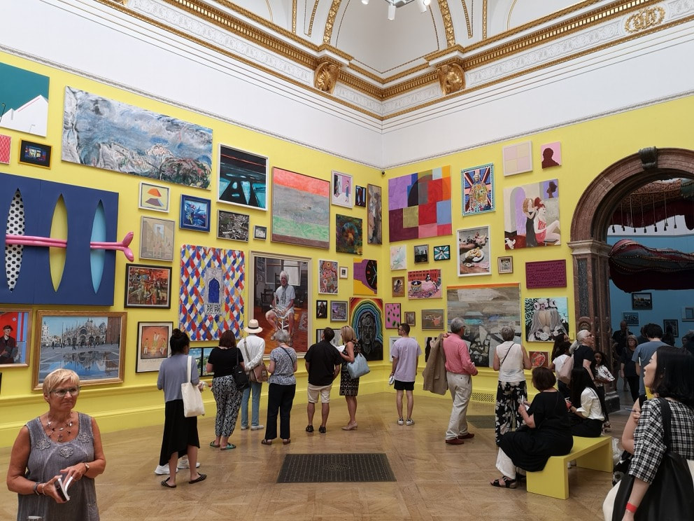 Partly out of interest, partly out of duty, and partly to escape the sweltering heat I went to the Royal Academy summer exhibition. Its only on until 19th August so by the time this comes out you will only have one week left. It is as usual an assault on the senses, especially so the main room which had been painted an eye watering bright yellow. Overwhelming is one word. Horrendous was the way someone I know described it. After a while, though, especially as you progress your eye adjust and you begin to see things you like. This blog is about some of them and focuses on things that would fall under the general category of paintings.
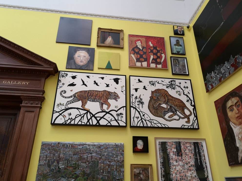
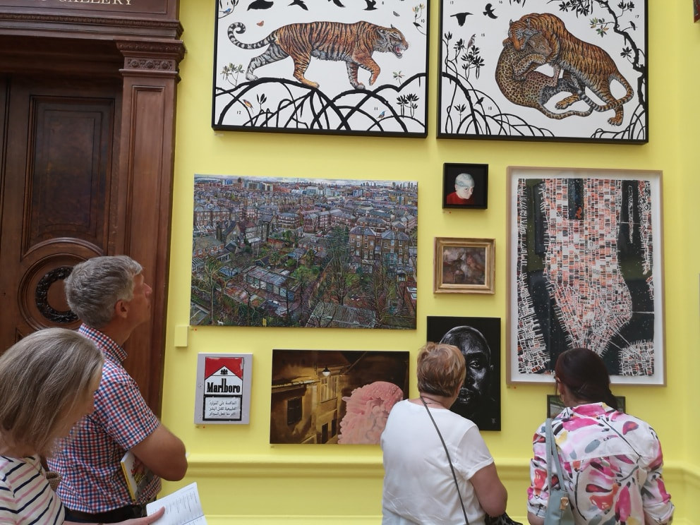
In this main room, amidst the panoply of paintings, I found four I liked, well five. The first one (well two) are the pair of animal paintings on the white background that you can see above left. They go together and are called a Tyger for William Blake by James Prosek. I love the dynamism of the subject matter and the way particularly in the right panel they are framed by that arching piece of foliage. Underneath, and in many ways opposite in style is Melissa Scott-Millers View of Islington from a Tenth Floor Window (above right). Densely packed with urban detail, which fills the canvas, leaving only a peeping skyline right at the top. The intricacy of it all causes you to stop stare, and pick out the details.
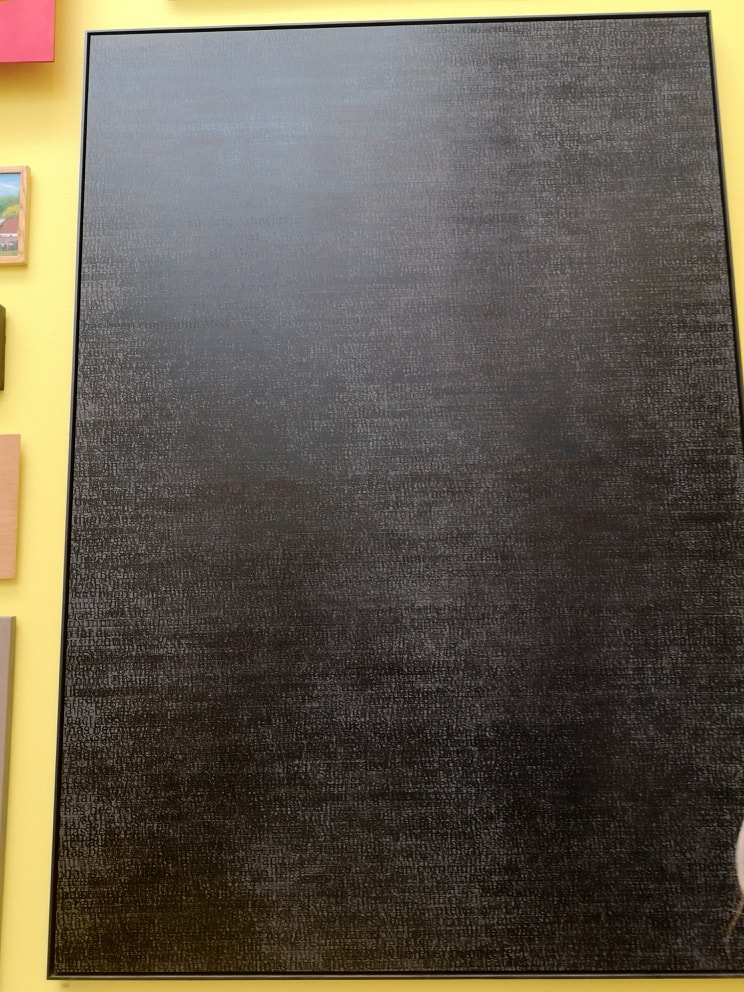
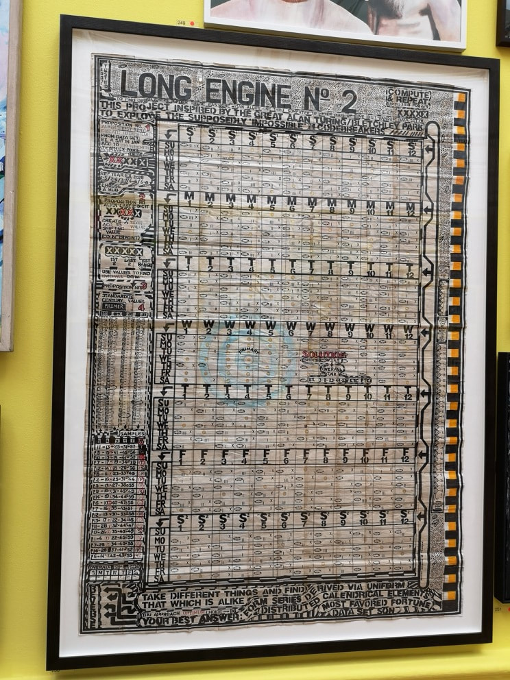
The solid black canvas was like an oasis of calm, a rest for the wearing eyes after the deluge of colour that is the rest of the room. Then you look closer and realise it is mottled in different shades of black. Then you look closer still and realise it is letters. It has the rather pretentious title of The Pain of Others (No3) and is by Idris Khan. I am prepared to overlook this because of its other qualities. The code like diagram on the right is called Long Engine No.2 by George Widener. It is I believe inspired by Babbage's difference engine. Superbly complex pseudo science art has long held an appeal to me, arrows, and columns and often meaningless jumbles of letters. Is this in fact a calendar? The odd splashes of colour like the orange down the right hand side make it somehow more human. 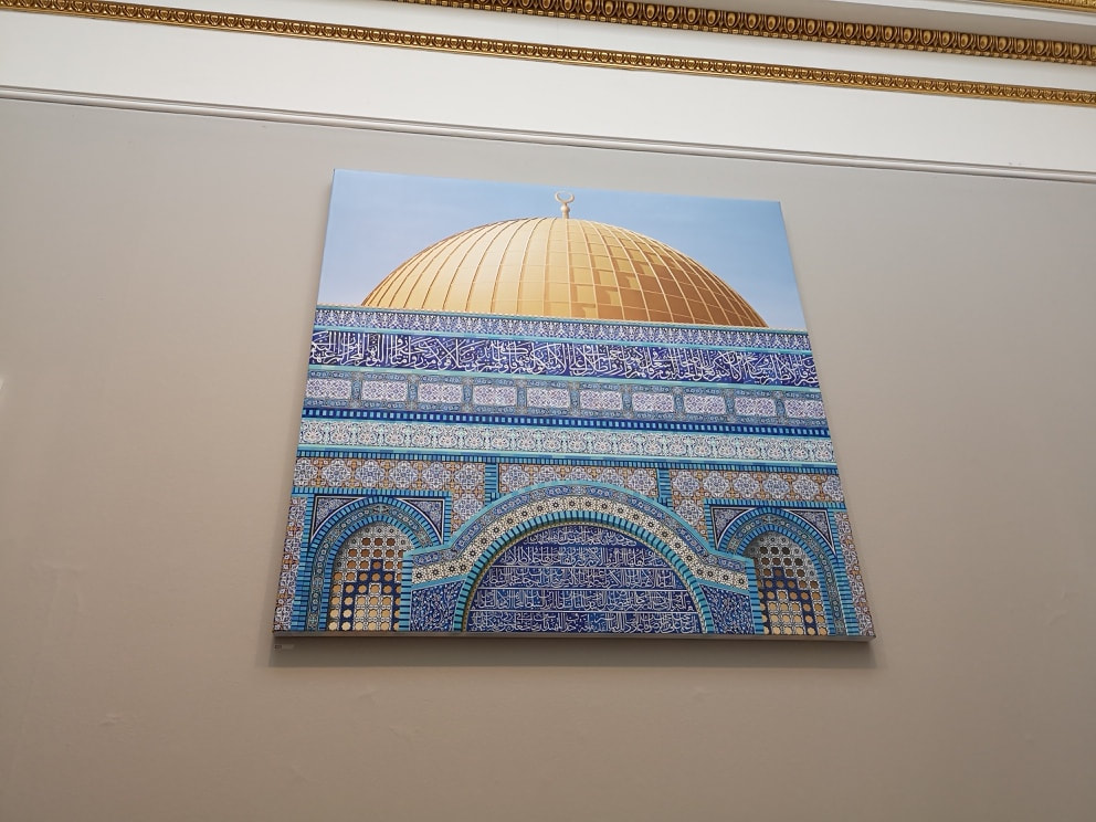 Dominating the next room was this almost photo realist piece called Dome of the Rock Facade by Ben Johnson (above). Again a masterpiece in intricate detail, showing off those elegant turquoise tiles. It made me want to go and see the original. It was a good idea to include the golden dome at the top as it makes for a nice contrast, and I like the way Johnson has captured the shadow on it. My favourite feature though are the two inset arches, which are possibly windows, either side of the main arch. 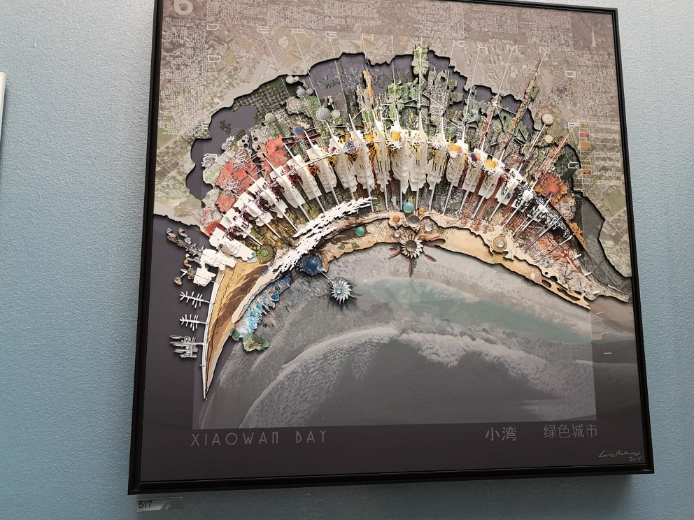 The best room in the whole show for me was the Architecture room. I shall talk more about that next week when I deal with sculpture and architecture, however I thought I would include one piece from there in this blog which is the above, Xiaowan Bay, China by Laurie Chetwood. I love the sweeping curve of the bay and the way it is overlaid with these feather type objects, and the strange gem like roundals on the sea front, jutting out into the sea and morphing like some organic lichen. Then behind the white feathers it gets more mechanical, resembling a circuit board.
Skipping over the mediocre horrors of room VII (we started in room III), we land in the more relaxed environment of room VIII. Here we get established professional artists, who had exhibited by invitation. Better quality of work, well on the whole yes, but more importantly the work was given more room and space to breathe, making it easier to look at. Two works by the same artists, Ann Christopher, attracted me. Called respectively Flowing lines -3 (above left) and Flowing Lines 5 (above right). These don't come across well photographed, and it is not easy to capture their slightly opaque coolness, There is as you can probably see a depth to them , with sharp geometric shapes overlaying charcoal shading. This room will appear more next week, when I talk about "sculpture".
The perennial problem of this show is the hanging of the pictures, with works spread out to the ceiling making them difficult to view and, in a crowded room, to photograph except from a jaunty unhelpful angle. So apologies to Mark Habrisrittinger (above left) whose multicolured, pixelated piece is not shown to better effect. It is nice to look at though, and after a while you begin to see/imagine patterns in the colour. Is it a crowd of people? Completely different is Kings College Hospital by Jackie Brown (above right), the soothing, fading columns in fact made up of dirt. You see if you are going to use statement materials they you also have to produce something worthwhile with them. I like this, It puts me in mind of a forest of regular pine trees.
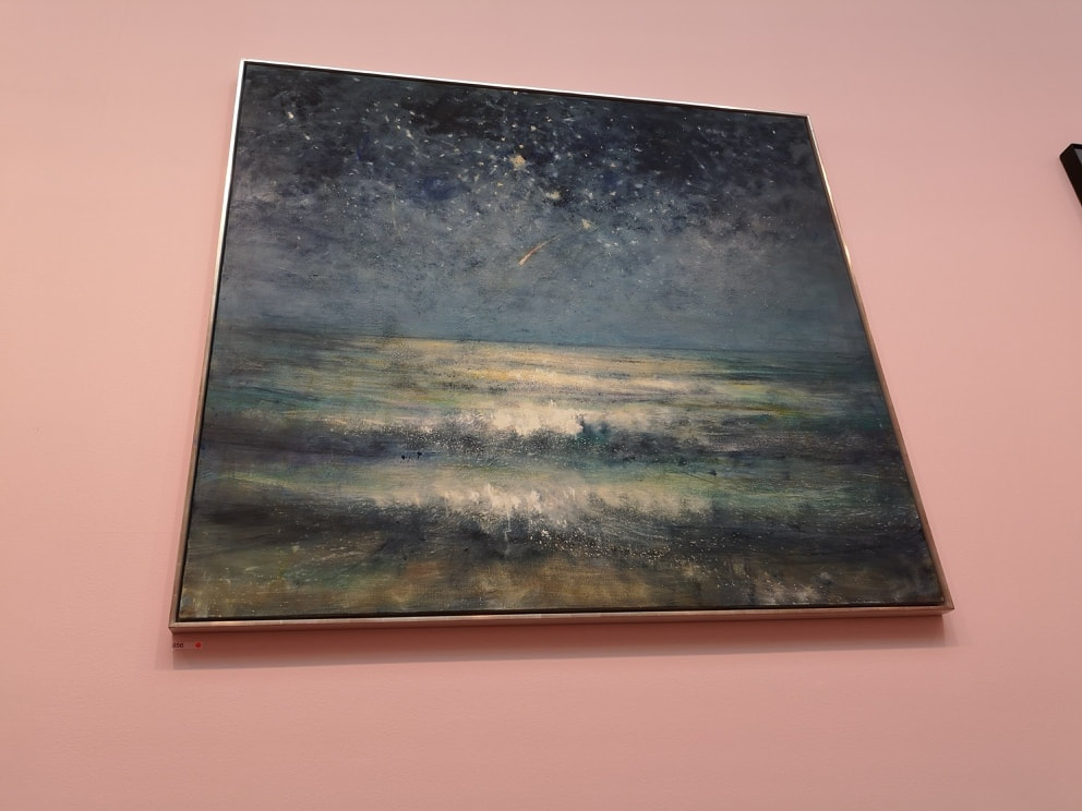
The Lecture Room, or the room of monumental paintings, or the room of two enormous indifferent Hockney's is next up. Here we have BIG works, mostly by RAs. Refuge (above left) by Cathy de Monchaux. Made from cooper wire it is a 3d depiction of unicorns trampling through a wood. I like the way you have the roots, as well as the canopy. Next to it, all dreamy seas and starry skies, is an old favourite of mine by Bill Jacklin. His paintings have a nice mesmeric quality to them, all soft focus and dreamlike. This one (above right) is called Shooting star.
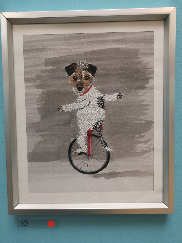 Finally we reach the point where in fact you enter the show, the Central Hall. This is dominated by a hanging thing I shall talk about next week. Of the paintings on the wall, I only liked the above, the extremely charming dog on a unicycle. It is called Peggy and is by Les Deacon, and at £150 I imagine sold straight away. It is well done and amusing, and sets the tone very nicely for what you are about to see.
No doubt there will be others that deserve to be in this blog. The deluge of visual information though, makes it difficult to pick them out. Next week, architecture and sculpture.  I went to the V&A recently, partly to see the Future Starts Here but also to get out of the sweltering heat. The Future starts here is an interesting and thought provoking show, all about current and just about to arrive technology. Particularly fascinating was the obsequious autonomous car (why do these things always have female voices?). I shall not describe it here as it doesn't really lend itself to and art blog. Fortunately, the other exhibition I went to see the Jameel Art Prize 5, does. The Jameel Art Prize celebrates contemporary art inspired by the Islamic art tradition. The 5 is presumably because it is in its 5th year. It's free, and rather good. Currently it is quite small but I hope it grows both in size, popularity and importance in future years. The prize is diverse both in the types of art selected and displayed, and the nationality of the finalists. Women dominate which defies ones prejudices. 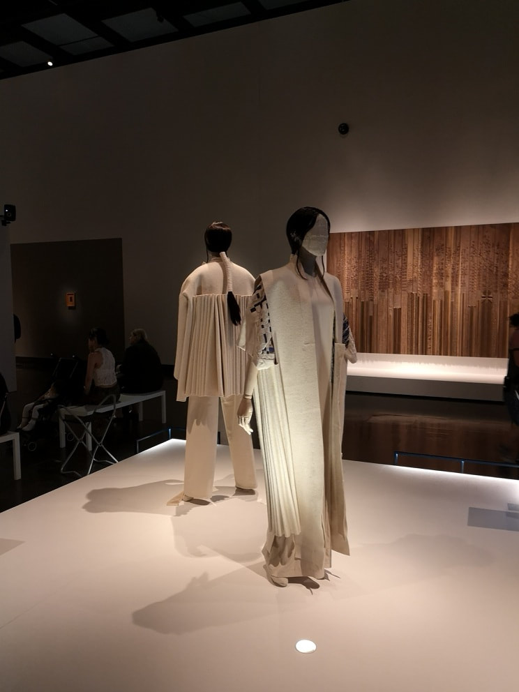 You are greeted as you enter by these two elegantly attired mannequins. They are displaying the work of designer Hala Kaiksow (above) who is from Bahrain. Elegant beige and white flowing outfits, with what seems to me to be a Japanese influence. The have a modern classicism about them and other contradictory phrases.
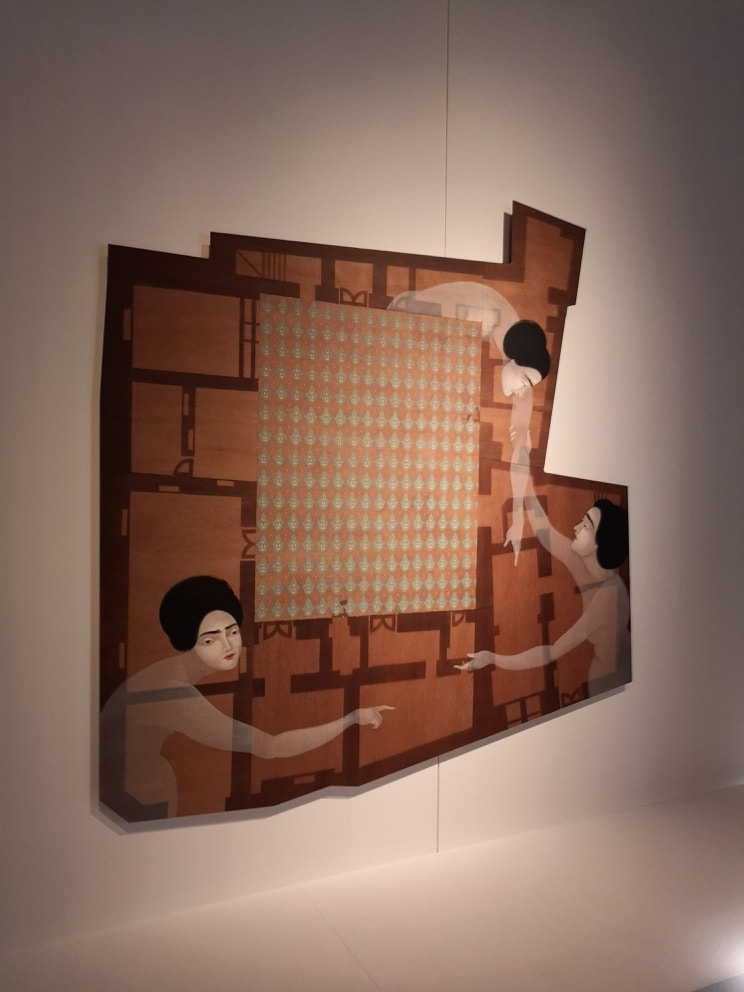
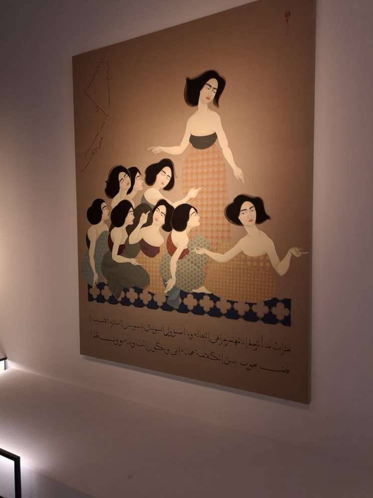
Hayv Kahraman (above) is an Iraqi living in the US. She has produced these two wonderfully evocative paintings. According to the blurb they take scenes fro 13th Century Arabic manuscript illustration and replace the men with women, as well as making the subject about immigration. I have to say I didn't quite understand the second part but eh images are captivating. I particularly like the way, in the left hand image the gesturing women solidify out of their transparent bodies. Why are they pointing at various rooms? The use of patterns in both works is good, and there in the right hand painting you have a real sense of dynamism and discussion between the women depicted. 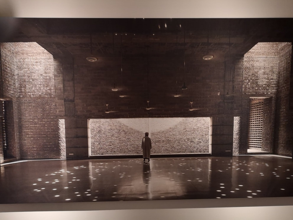
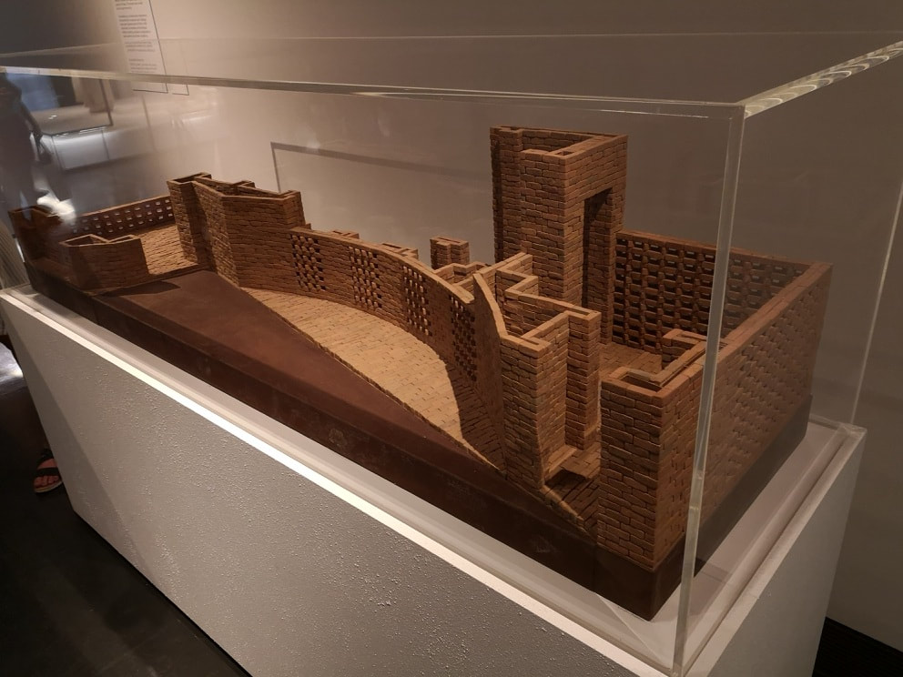
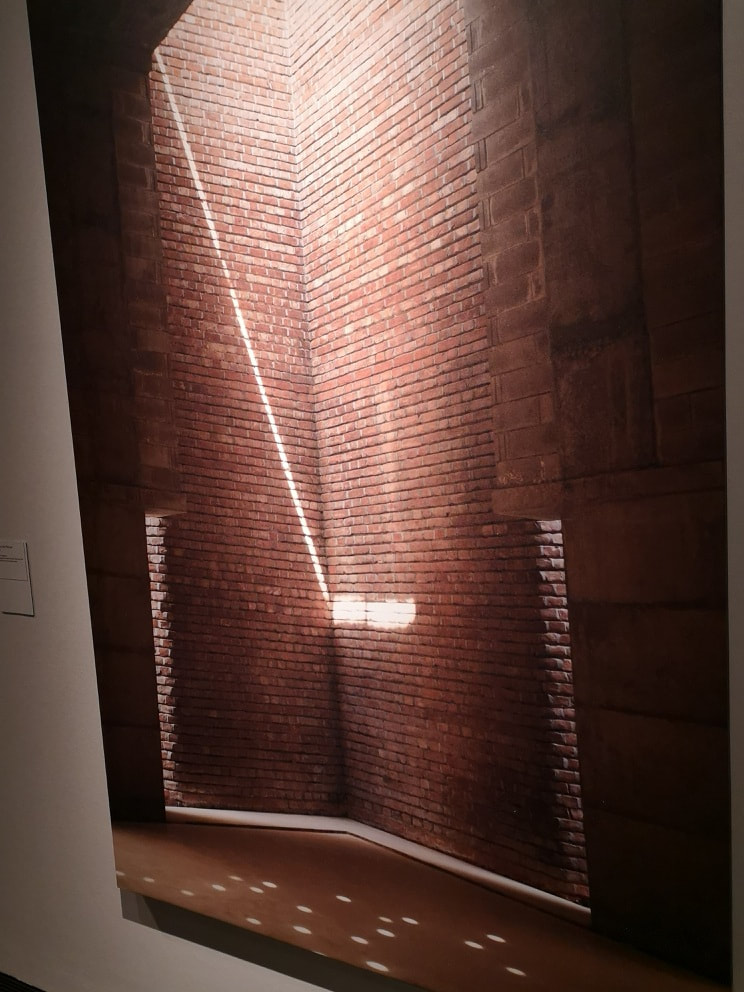
win an international prize. She has designed and constructed a mosque and there can't be many women who have done that. The design of this building is also pretty sensational. She has managed to use brick work and light to fill the place usually occupied but illustrated tiling. It must be easy to have a religious experience in that calming, dappled light space. This is where she manages to bust another expectation, at least to those ill informed of us living in the west, that of Bangladesh. It is eye opening to realise there are buildings like this being constructed there and it breaks from the usual media news cycle of poverty and flooding which is usually all we here. I found myself wanting to go to Dhaka and stand in that building. By bringing these things to our attention the Jameel prize is doing something interesting and important.
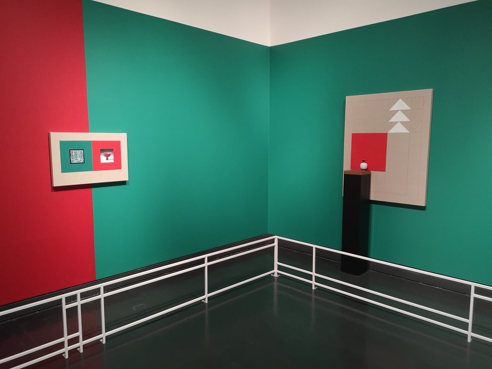
He is right of course but museums cannot help but display things out of context to a certain extent. I particularly liked the small pot, displayed on top of the large black plinth against the red square of that abstract painting. It is a nice juxtaposition. 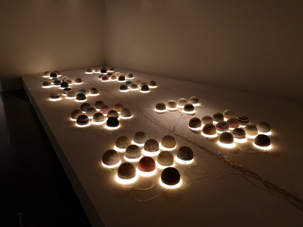 Squatting in the middle of the gallery is a small enclosed area containing the work of Younes Rahmoun (above). What it is, is a series of multi-coloured woven hats, arranged in sets of odd numbers and lit from underneath. They have a charming and calming air to them glowing, as they seem to do, with a benevolent light. This is another example of the Jameel prize doing something that all good exhibitions should do, you come away knowing more than when you went in. So these hats are like those worn by Moroccan men of modest means as a sign of their faith. Once you know this of course it adds an extra dimension to the display. I couldn't help thinking though it would work better if somehow they had managed to hide the wires. 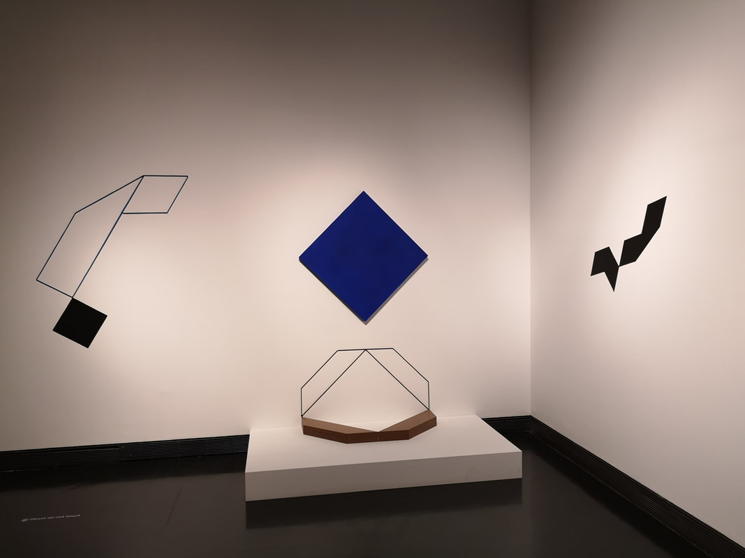 The other joint winner was Mehdi Moutashar (above). Moutashar would seem to be the most established artists in the show and has won with this bold and stark abstract installation. He would seem to be too grand to have an easily locatable website. It is easy to dismiss this at first, as I did, although the longer you look at it the more it seems to have something to say. There is something quizzical about it.
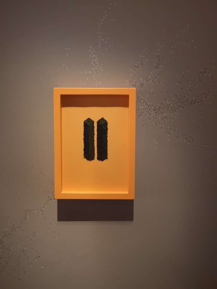
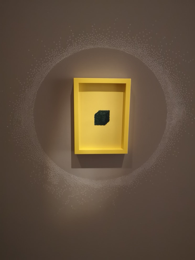
Rounding the corner and you have the work of Wardha Shabbir (above) who is from Lahore, Pakistan. She was trained in the Islamic miniaturist tradition and has used this to produced these abstract pieces. They are made up of geometric shapes, (and curves in other works not seen here) made up of tiny, tiny, intricate leaves. The exhibition provides magnifying glasses with which to closer inspect them. They make an odd contrast these dark green classical leaves against the orange and yellow lurid frames. The work also continues outside the frames and you can see detailed patterns covering the wall. I particularly like the expanding sphere of dust around the yellow frame (above right). The exhibition includes a projected film showing all the artists and them working and the hours of painstaking work that Shabbir puts in. For her though it is a form of meditation. 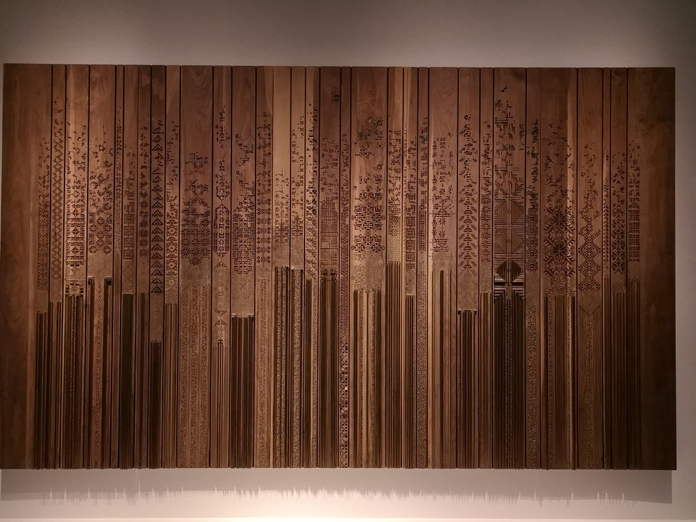 Last and by no means least, we exit where we came in, with this sumptuous gold painted brass and wood object called Shawl by the naqsh collective (above). The naqsh collective, consists of two sisters, Nisreen and Nermeen Abudail. Originally from Jordan they now live and work in Dubai have produced what is my favourite piece in the show. I like a piece of detailed golden art and this delivered. It is impressive how they have managed to get the hard substances of brass and wood to resemble a shawl. The intricate patterning and the overall design is very impressive and appealing. I like the way they have achieved contrast in the piece by light and dark stripes, and also how you suddenly spot there is even finer detail that calls you to look closer. Have a look at their website too there are many intriguing things there.
The Jameel prize is free and is on display at the V&A until 25th November 2018. |
Archives
June 2024
Categories |
 RSS Feed