WJM
  • Gallery
    • Pet Portraits
    • Landscape >
      • Rivers of London
      • London Landscapes
      • British Landscape
    • Still Life and Abstract >
      • Still Life
      • Flora and Fauna
      • Abstract
    • Past Work
  • Blog
  • About/Contact Me
  • Gallery
    • Pet Portraits
    • Landscape >
      • Rivers of London
      • London Landscapes
      • British Landscape
    • Still Life and Abstract >
      • Still Life
      • Flora and Fauna
      • Abstract
    • Past Work
  • Blog
  • About/Contact Me
Blog

A tour of Switch House - The Tate extension.

8/29/2016

0 Comments

 
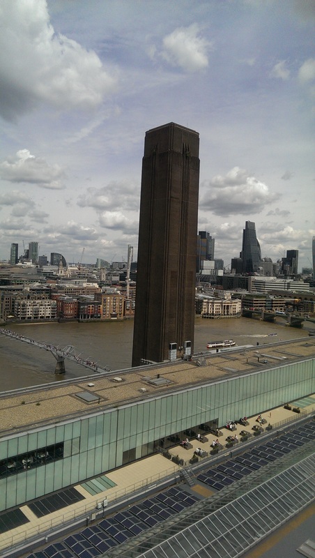
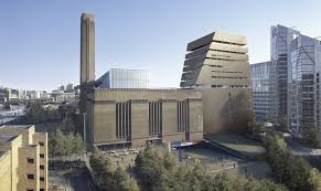
I remember going round the tate a couple of years ago and seeing the model for the proposed extension.  I thought it looked rubbish, and during construction I did not like the latticed brickwork that clads the exterior.  Once it was finished though I did like it. Particularly viewed from the embankment it looks like an enormous cruise liner with the new extension, Switch House, forming the funnel.  The old building has been renamed Boiler house by the way.
Picture
courtesy of tate.org
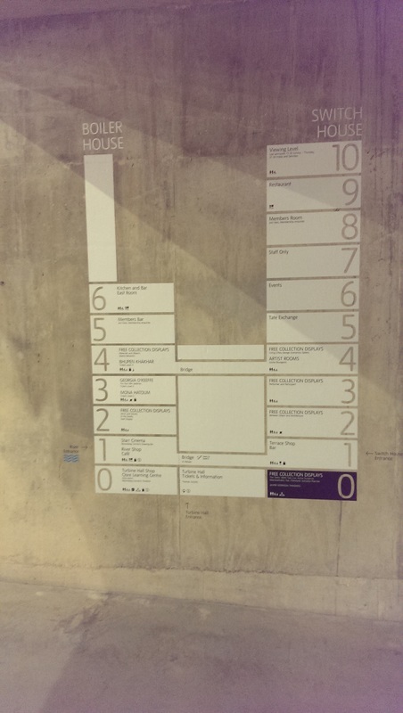
I still remember when the tate modern first opened and a very excited Michael Palin did a piece to camera as multicoloured lights played on the museum behind.  In this blog I will take you on a brief photo tour of the new extension. It is arranged over 11 floors, of which 3 are currently either out of bounds (like 7) or not yet completed (like 5).  It is a tapered structure so the floors get bigger as you descend.
Picture
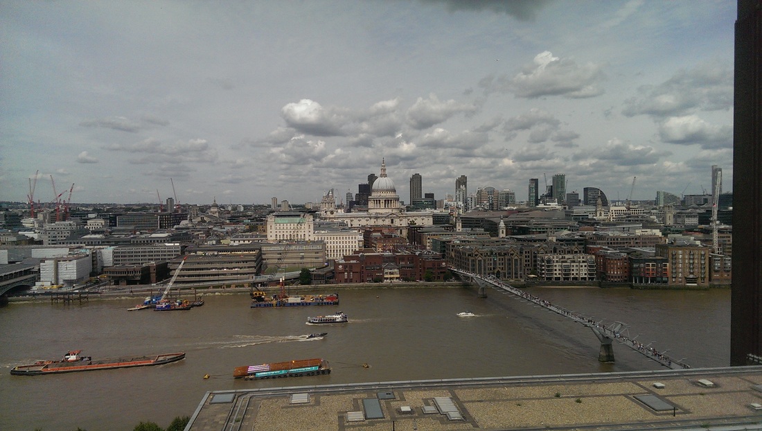
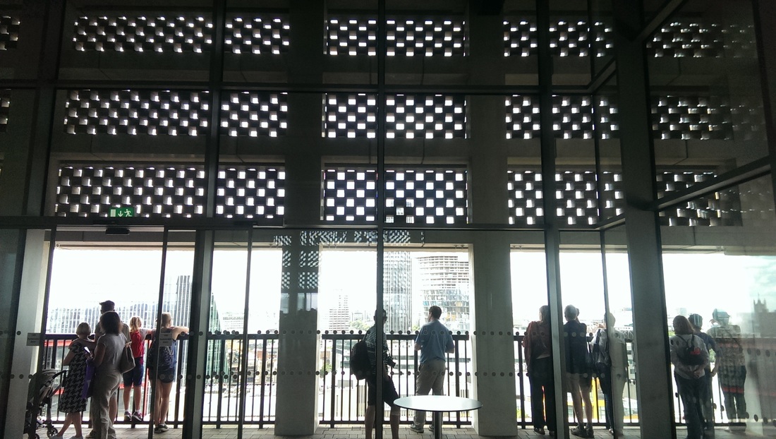
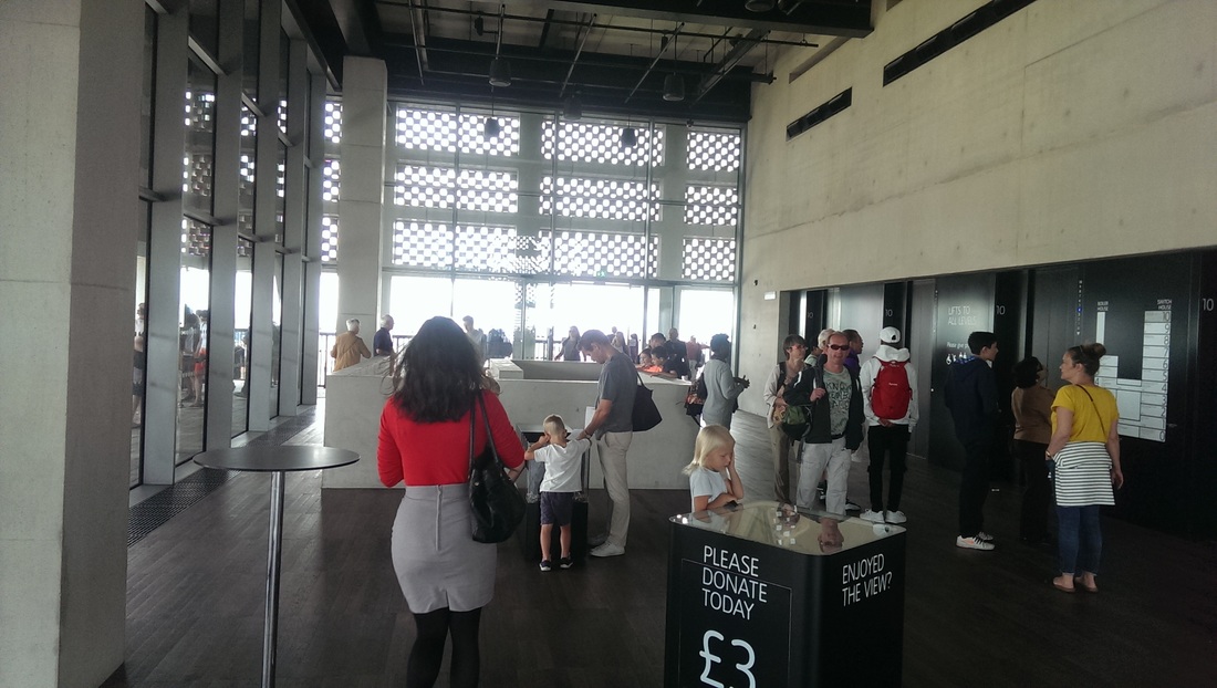
The top floor is a viewing gallery, allowing you panoramic views of London.  Such viewing platforms are very popular, with me as much as anyone else.  This one more rarely gives you a view of South London (not shown) and the Kentish hills that mark the boundary and beyond which you cannot go without special permission lest you buy a landrover and not return. The inside is made slightly cathedral like by the light streaming through the lattice brick work and is all brushed concrete and shiny black surfaces and wooden floors.  It is a theme that is repeated.
Picture
Picture
Picture
Picture
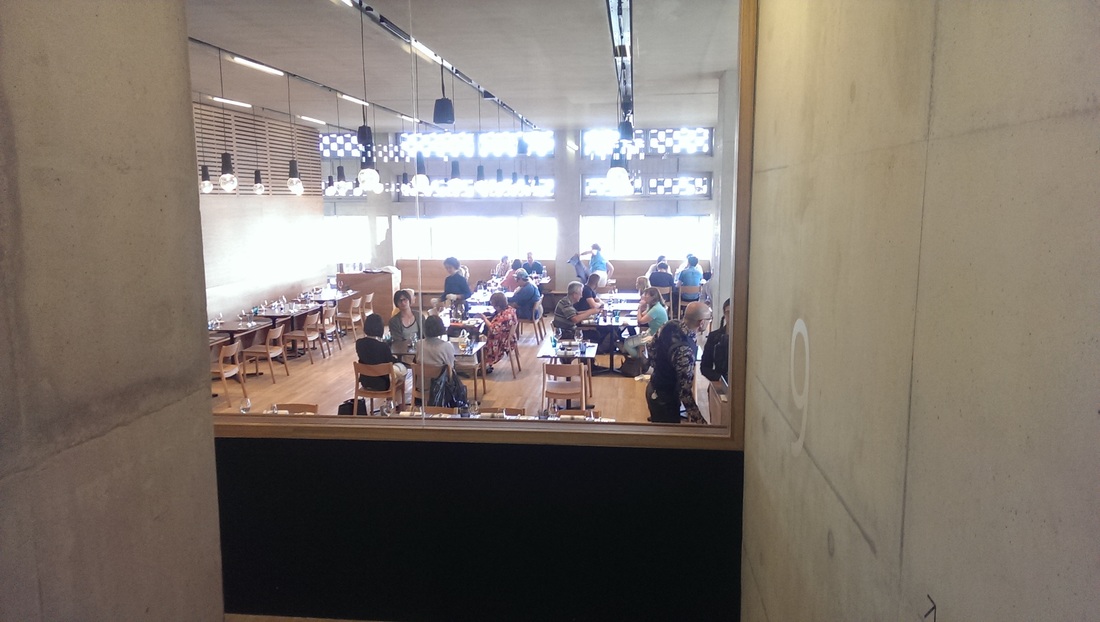
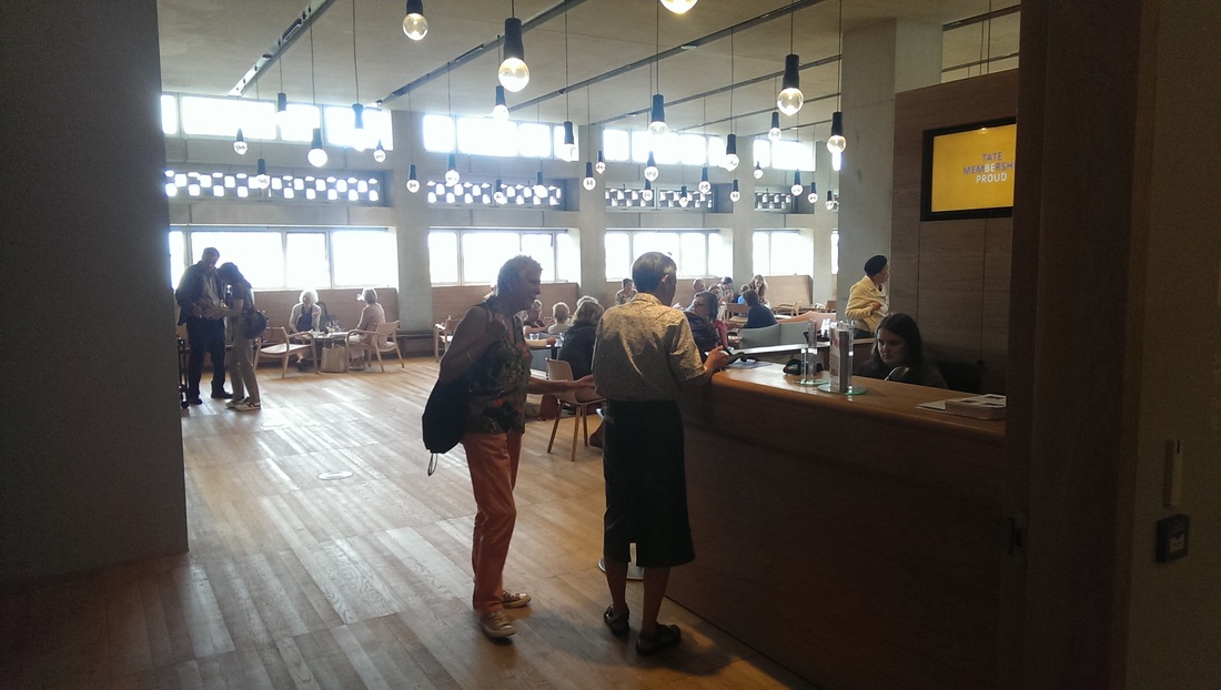
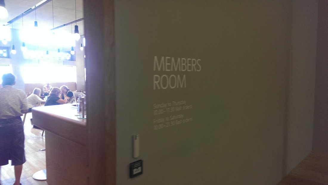
The next few floors are not very interesting (some of them might become so). On the ninth floor you have the restaurant which is nice and bright and with good views but has a slightly canteeny feel due to the wooden floors and furniture.  On the eight floor you have the members room which is exactly the same only slightly bigger and with the sense of smugness that restricted entry always provides.
Picture
Picture
Picture
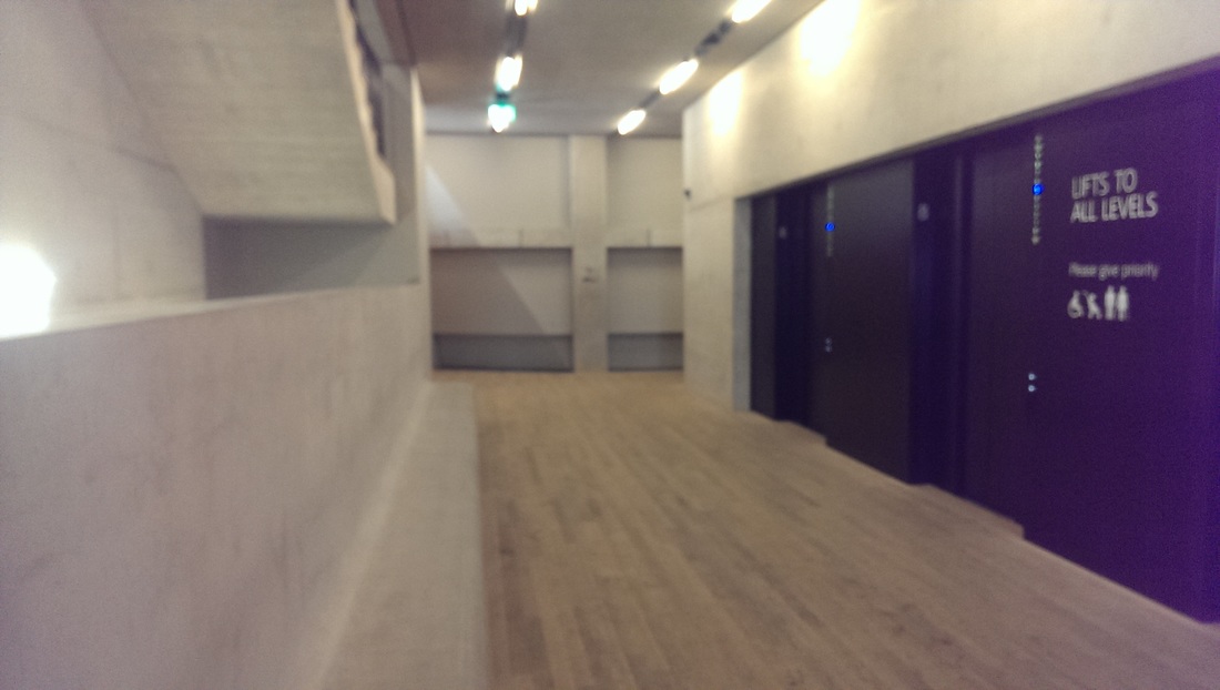
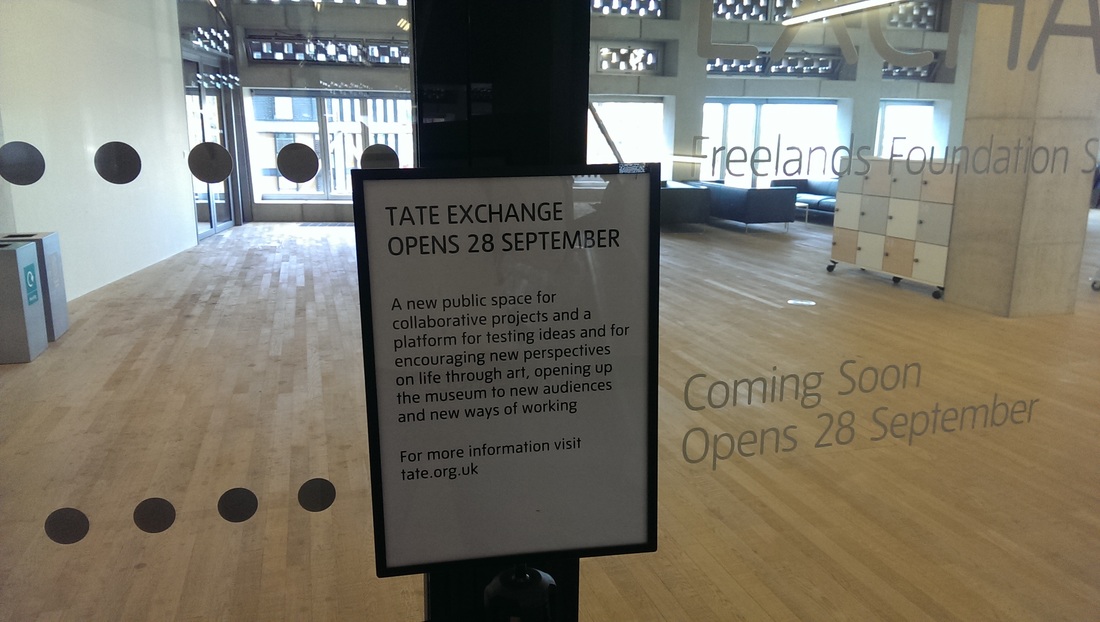
  The 7th floor is staff only and presumably strange and mysterious things happen beyond those opaque doors.  The corridors are pleasant to move through though.  Cool and airey and with a muffled acoustic which gives a very calming feel to the place.  This persists throughout making Switch House an attractive place to visit.  6th Floor is events and is not yet completed.  5th floor may one day be interesting, it is something called Tate Exchange where basically an interactive/collaborative arty stuff will happen.

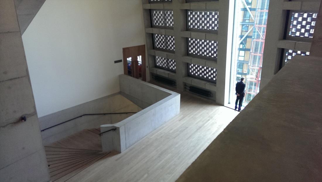
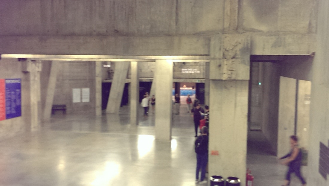
Up until now the stairways have been enclosed but as you descend to the fourth floor they open up and you can see the floors below. The floor to ceiling windows that exist in Boiler house are echoed here.  The ceilings are high and again you have a cathedral like feel.
Picture
Picture
Picture
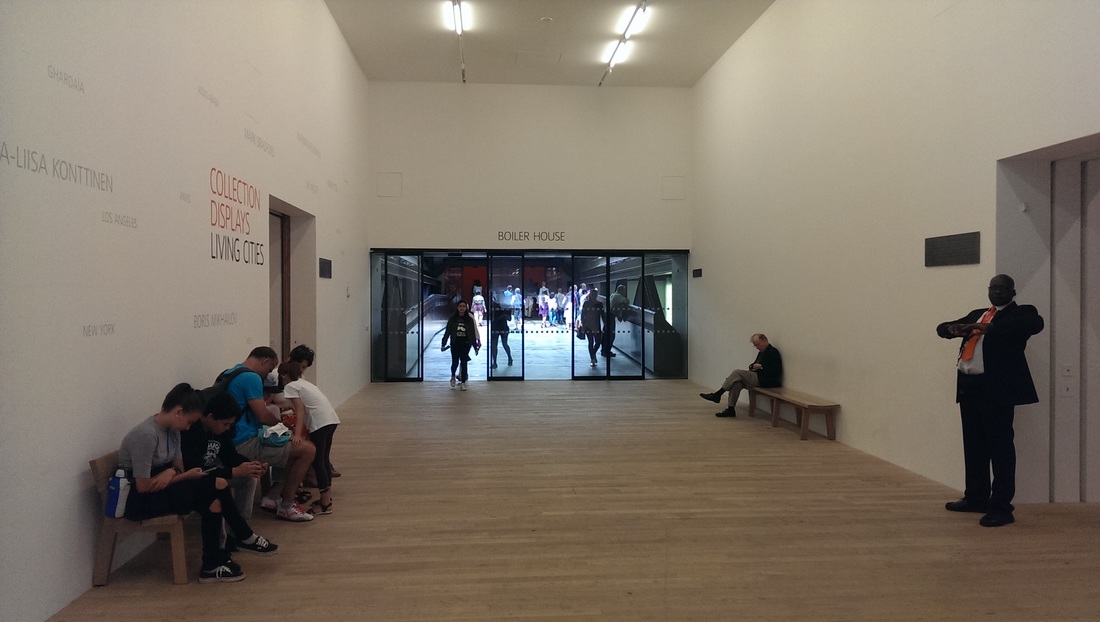
The fourth floor is, currently where the art begins. It is also one of the junctures where the Switch house connects with Boiler house by means of a newly constructed bridge that takes you across the upper reaches of the turbine hall.  This was a smart move as it give you an extra perspective of installations there.  The hallways are wide and the whole architecture and layout of the place makes it very easy to flow round through the exhibits. 

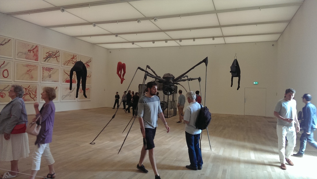
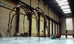
One of the other things that is happening in Switch house that I approve of is that most of the space has been given over to women. The explicit purpose of this is an attempt to redress the imbalance in art of the display of mostly male artist.  The pieces are all quite modern. Not everything was to my taste but somethings really were such as the metal structures, particularly the spider by Louise Bourgeois.  

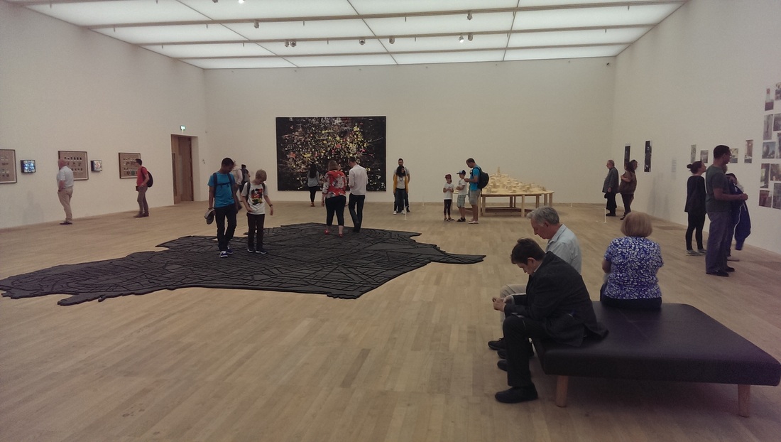
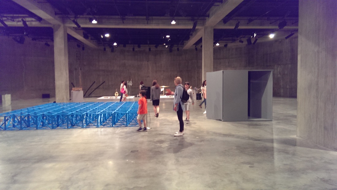
Crossing the corridor again you encounter the room portrayed bottom right.  I am a sucker for cartographic art and so the large map on the floor that you are allowed to wonder across hooked me instantly.  Also can you see the yellow city sculpture in the far right corner.  Well closer examination is rewarded. It is not sand.  Go and see it for yourself because this is an exhibit where simply viewing is not enough.
Picture
Picture
Picture
Picture
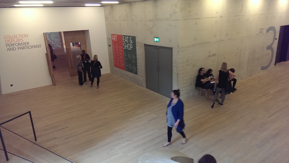
Third floor now. The floors are getting larger and there is more art.  A wide stair way takes you into an inviting space and you are immediately drawn towards the generous doorway on your left.  The place has a similar feel, on a larger scale, to the new Foyles site on Charring Cross Road, an analogy that only works of course if you have been there. 

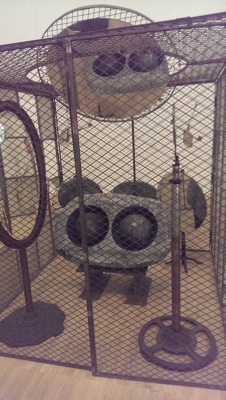
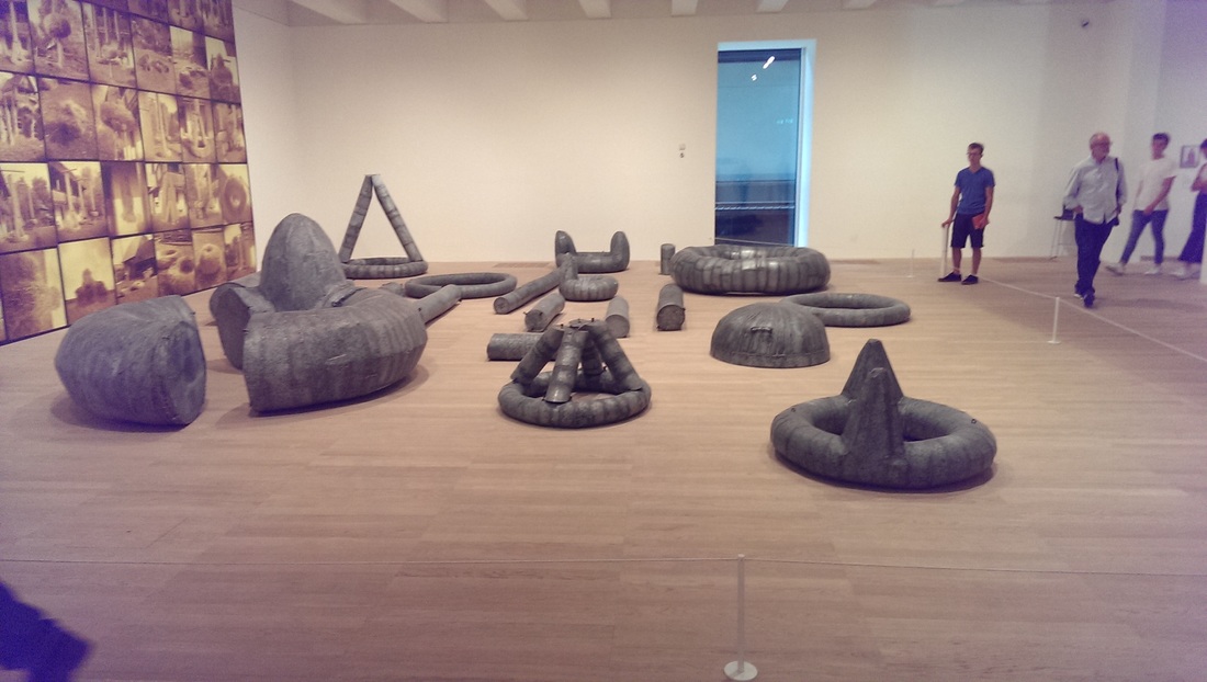
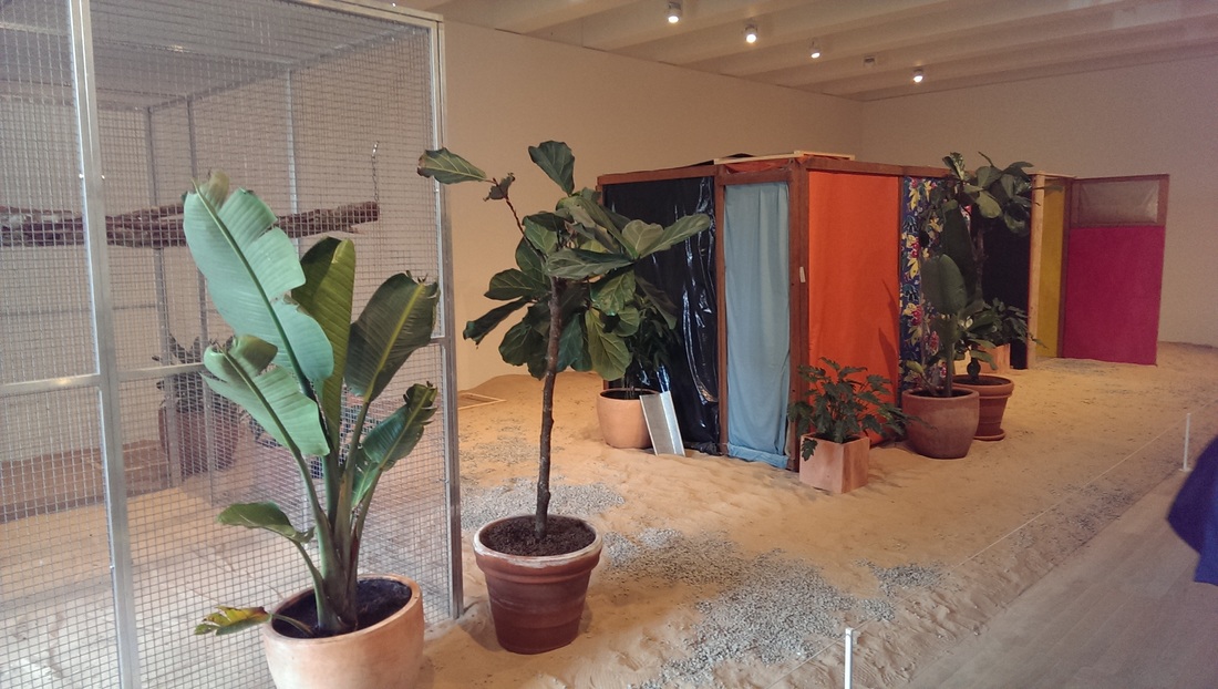
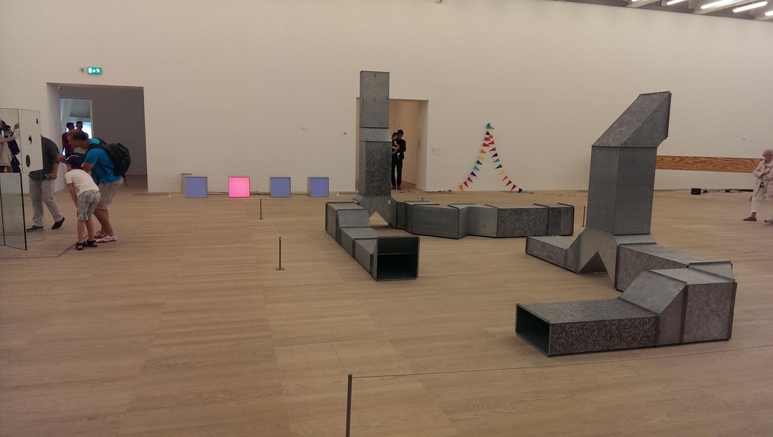
The first installation shown (top right of the photos below) is on the themes of zoos and display.  I foolishly did not make a name of the artist which was a great mistake.  I am a big fan of humour in art and for reasons that would entirely spoil it if I were to say them here is very funny.  You then go through a couple of rooms of tedious video art on small screens and worthy writing before encountering these rather fine large metal sculptures (middle left)

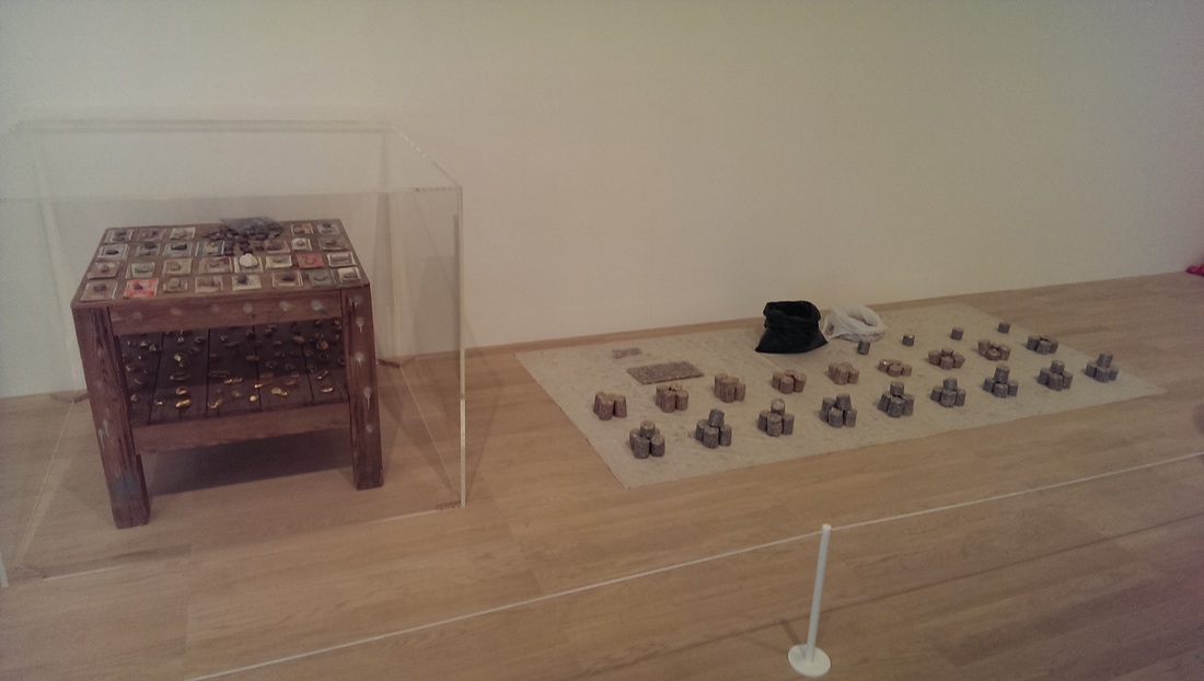
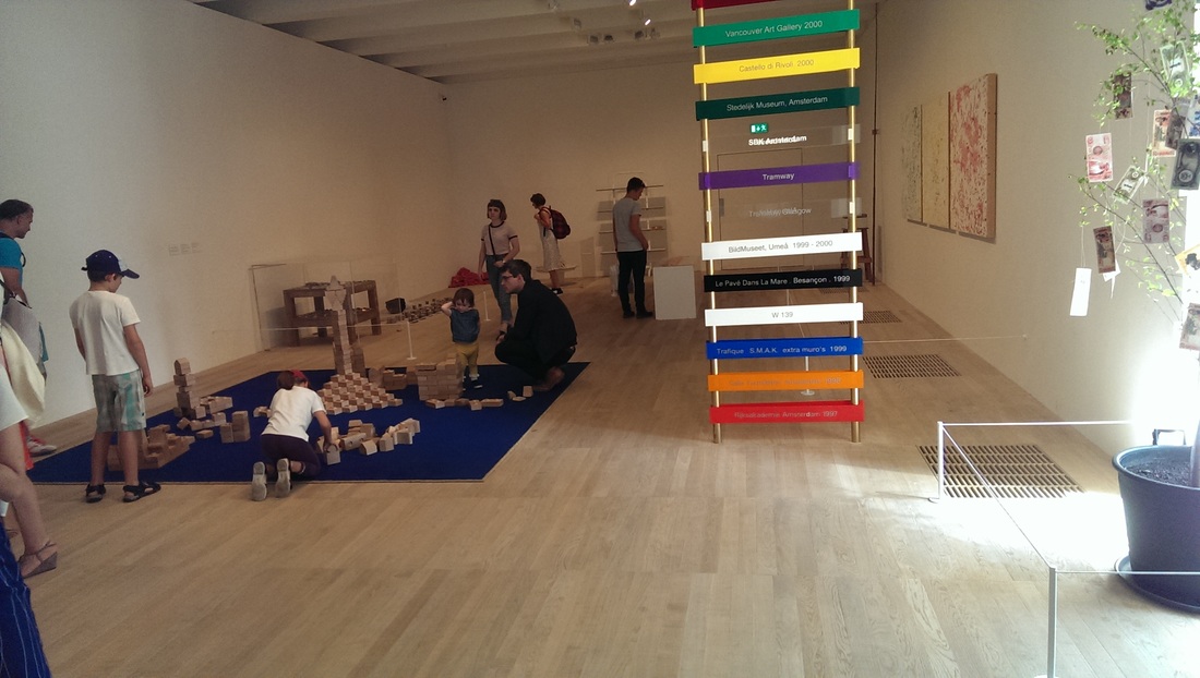
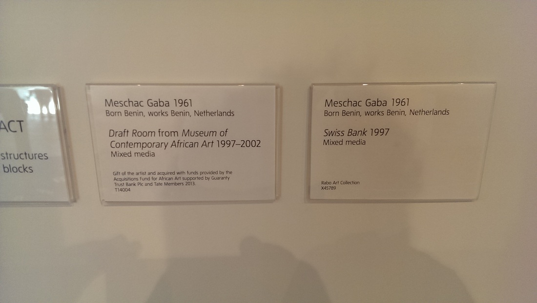
Many galleries are tedious for children. The Tate Modern is slightly more bearable I think but infinitely more so now.  There is a room containing the fine work of Meschac Gaba who juxtaposes money from various different places with lumps of gold.  As you can see there are also blocks for children to play with (or invited to make their own art as the labeling protests, frankly I don't see there are being a difference).
Picture
Picture
Picture
Picture
Picture
Picture
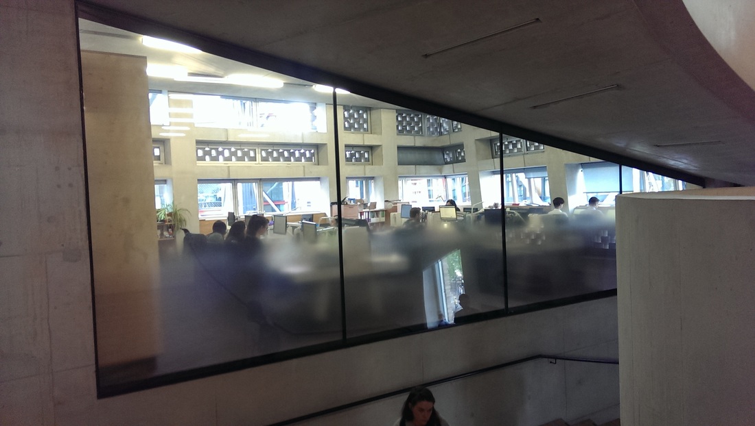
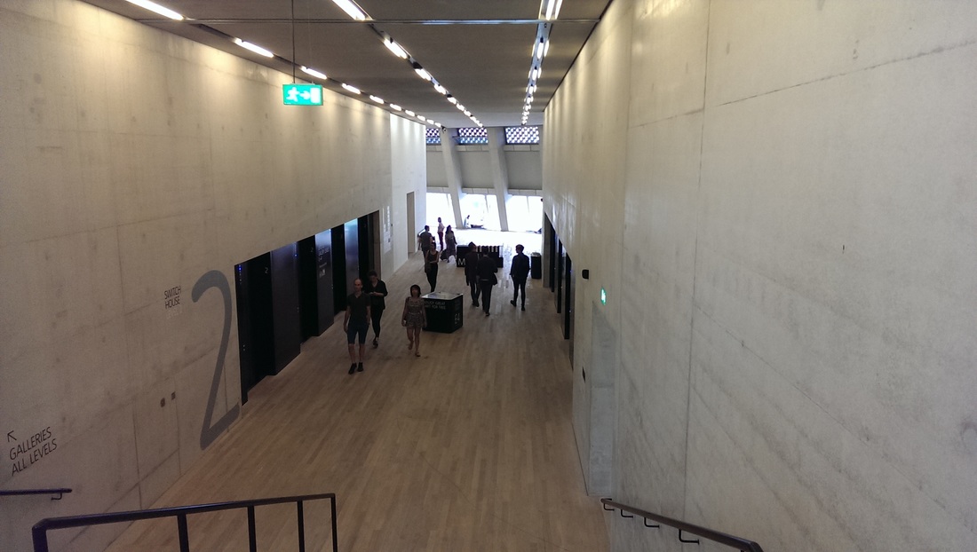
 On down to the second floor, past the mysterious banks of computers. This time you are invited to go straight on, on towards the light.
Picture
Picture
There are many good things on this floor.  You are swept round to your left into a large room divided into two. On the way in, just to your left is projected video art. 98% of video art is tedious self indulgent tosh, neither interesting in subject or in presentation.  This piece by Joan Jonas called Song Delay (there is no photo as photos of video art are pretty pointless, is actually good.  Well shot with some interesting, arresting and also genuinely funny moments.  I am always impressed by people who pull of a medium I basically consider to be trash.

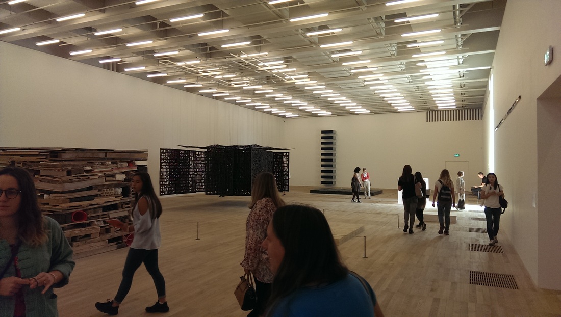
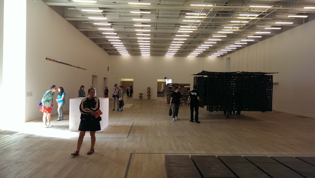
Into the main room itself.  The theme is sort of art/architecture.  A couple of pieces had made it here from the old display in Boiler house such as the metal boxes with blue perspex interiors (in a ladder formation against the wall in the top left photo below) and the lump of molten lead which is an old favourite of mine (in the corner middle right). 

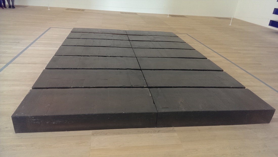
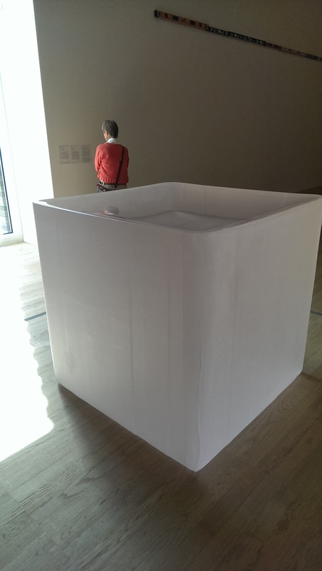
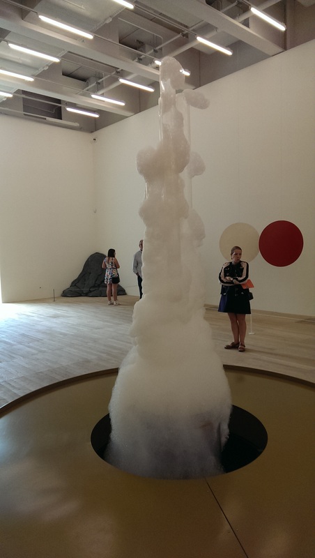
There were three pieces in these rooms that really stood out.  One was a series of perspex/acrylic rectangles arranged on the floor, by the Rachael Whiteread.  The second was this perspex luminescent cube that looked like ice melting.  Both of these had a frustrating tactile appeal which goes unfulfilled and a sort of deep glowing quality to them.  The third is completely different.  It is basically a bubble machine,  the bubble rising slowly up a column and then dripping down the outside.  The room is large, quiet and well lit, both by the overhead lighting and the windows.
Picture
Picture
Picture
Picture
Picture
Picture
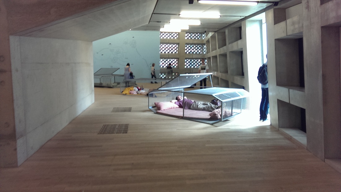
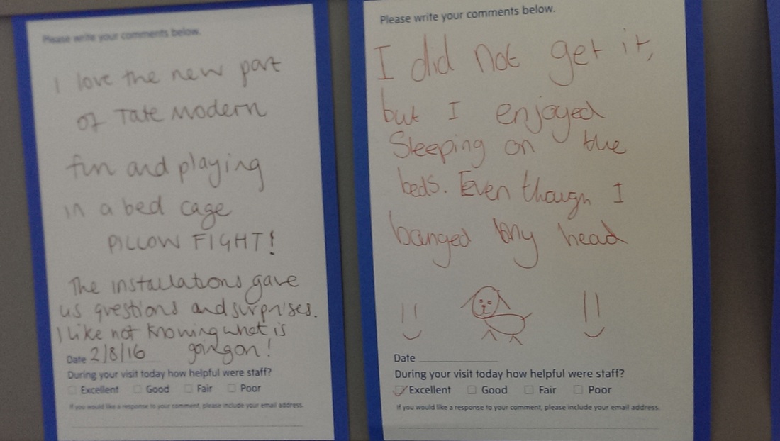
Turning left out the end of this room there is a smaller almost corridor, currently containing a number of caged beds in which you are invited to lie.  I am far to british and selfconcious to do so.  Around the corner is a board for leaving feedback.  Children make excellent critics and it would seem the beds are a hit. I bought some coffee.  This was a mistake,  the coffee at the Tate modern is terrible.
Picture
Picture
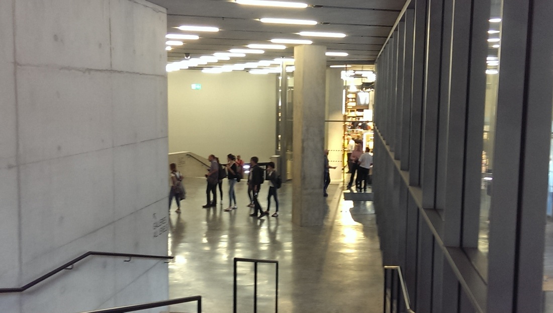
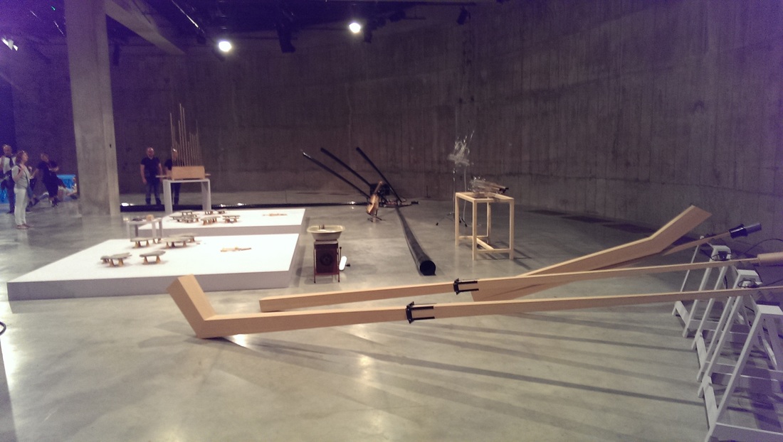
On down to the first floor which is the entrance, connection to Boiler House and a large shop.  All very tasteful.  Moved on swiftly to floor 0.  This floor has a crypt like feel. There are no windows and the concrete is presented differently, harsher, more rugged.  There is a large semi-circular room at the end in which performances can be given (there is a sound booth).  The most interesting display was a variety of strange instruments which were occasionally played by ingenious mechanical devices. 

In a side room there was some pornographic video art, needless and tideous and past this an interesting display, an entirely blue corridor where the art is made by your shadows.  The photos came out poorly so I have excluded it. 
Picture
Picture
Picture
Picture
The new building is then, mainly installations. There is little painting (and it is not very good).  A lot of what is shown is a bit, challenging I believe is the polite description and even the things I like set out above may well not be to everybody's taste.  It is though a wonderful space and personally I think has some good things in it.

I do have one criticism.  One of my and many other people's bug bears is that the Tate and other museums have a large body of work that we never see, it being in storage.  What disappointed me on going back into boiler house was the realisation that they had two paying exhibitions (rather than the usual 2 or 1) and so the amount of work released from the storage is not all that it might be.  I have yet to go around the re-hung sections of Boiler house and will post on this when I do.  I fully acknowledge that such an extension as Switch house is mind numbingly expensive and additional exhibitions are one of the ways the cost can be recouped.  I think then these are minor criticisms and for me at any rate, the new building is a success.
0 Comments

Mona Hatoum at the Tate.

8/26/2016

0 Comments

 
Picture
Picture
Picture
Picture
Picture
Picture
Picture
Picture
Picture
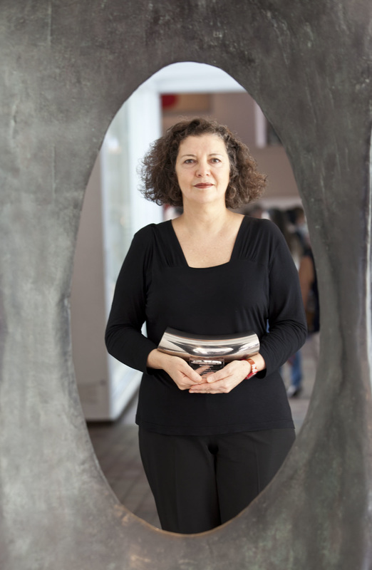
Mona Hatoum was an artist of whom I was only vaguely aware before she came to the Tate.  I think only her neon globe had entered my awareness before I saw her exhibition and it was partly for that reason I went to the exhibition.

I am glad I went but I am still not entirely sure what I think. Hatoum (all artists are referred to by the second name apart from Damien Hirst, who is Damien for reasons presumably of incredible pretension) is primarily a conceptual artist who produced installations.  I am wary of installations.  They can often be awful, I have difficulty relating to them and they often become outdated very quickly.  They are also often, unspeakably self-indulgent.

There were traces of all these things in the Hatoum exhibition but it was mainly over-ridden by a number of very good ideas well presented.  Hatoum has a distinctive and established style which is all about industrial metal, electricity wires and the threat of confinement and violence.  These are powerful themes that she, for the most part handles well and occasionally very well.

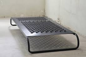
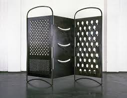
Enter the exhibition you are presented with a large felt or fabric cube.  Moving swiftly on you get to the good stuff.  In the main room there is a circular column with gaps in it.  You crane inside and can watch what appears to be a video of a colonoscopy.  It is strangely hypnotic and though provoking. What dominates this room though are these enormous metallic cheese graters.  They have a dark patina to them and one, is three joined together and arranged to resemble a Victorian dressing screen. Liked them.  Very good.  

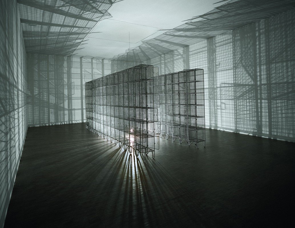
In a small room just off this are arranged in a square horseshoe shape racks of empty chicken wire cages.  They are interesting objects in themselves but what adds an extra dimension is the lighting.  A light rest on the floor, tethered to the ceiling by a long wire.  This causes the light to gently roll around.  It is obvious why this piece needs a small room and well done to the curators for installing it so well as essential aspect of the piece is the shadows that the rolling light casts.  This is what Hatoum does well and is something she pulls off in other (and best) exhibits.  She creates what is a good and striking image but adds something that means the experience of actually seeing the installation in person adds and extra dimension.  In my view this is something that makes conceptual art good.

There were in the next room framed burnt pieces of toilet paper and handmade paper with hairs on them.  Sounds awful right but they were actually quite good.  Vaguely disgusting but still interesting works of art.  On the floor next to them was a large square made of blocks of soap.  They had been scored in such a way that what looks like a feint coastal outline. 

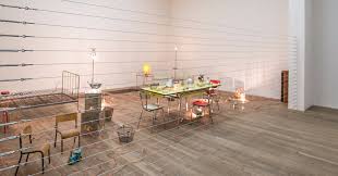
At the far end of this leg of the exhibition is, for me, the standout work in the whole thing.  Behind what looks like an electric fence is a room made up of tables, chairs with no cushions, empty bed spreads and similar furniture. The whole thing is adorned in an array of large copper wires leading to lights of various sizes.  As you stand (or sit) there and watch the lights slowly light up and dim again.  The increase in light levels is accompanied by a terrific electrical humming noise. It is difficult to describe the experience or show it by photograph but it is an installation well worth seeing.

A corridor leads to the return leg.  A small cabinet contains a number of pieces including what looked like a Perspex block with toenails embedded in it.  On the wall is a medicine cabinet filled with a collection of very attractive glass hand-grenades, each one with a different coloured core.  The contrast of the subject and the pleasantness of their presentation works well without being trite.

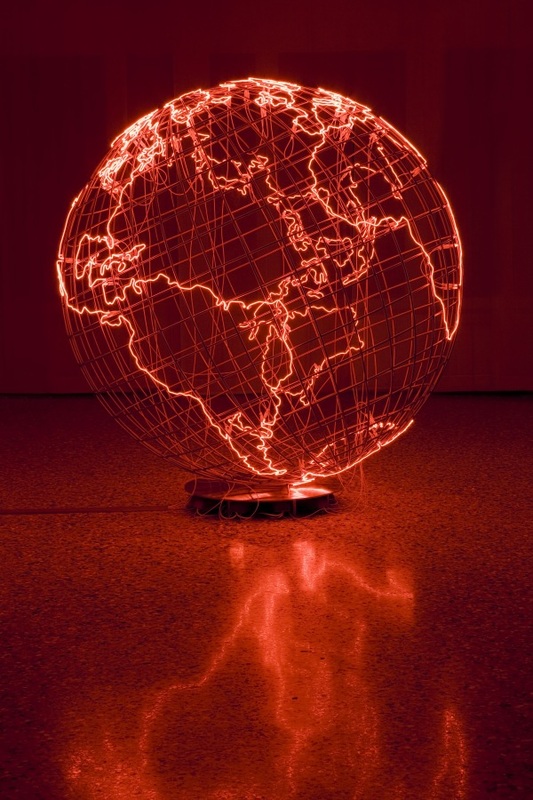
The corridor opens into a large room dominated by the famous red neon globe.  I like maps and map related art so this appealed to me, as did a non-Mercator projection map in simple white with grey outlines on the wall.  They are both overtly political but, and this I think is the point, work as worthwhile pieces of art without this.  Again this is something Hatoum pulls off which makes her a superior conceptual artists is her work is supplemented by the political/cultural points they make rather than simply relying on them.

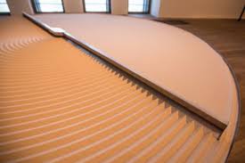
Into the next room. On the floor a large circular container filled with sand.  It is bisected by a metal arm which rotates.  It has teeth on one side and a wiper on the other so it is continually creating and erasing ridges in the sand.  The sound of the sand shimmering as it is moved around is part of the experience. This is gently hypnotic and I stood contemplating it for several minutes. This, like the electric room, is a piece that rewards seeing in person.

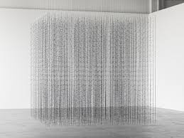
As indeed the piece in a side room which is a cube made of strands of barbed wire, suspended from the ceiling and arranged in rigid ranks.  What I enjoyed was being able to walk all the way round it and see the gaps that open up along the various axis. It is complemented by a tiny piece hanging on the wall next to it of a square net made of hair.

Before the final room are cuboid large wired cages each of which contain a differently shaped amorphous red glass bottle.  I can see what she was trying to do with these but they didn’t really grab me.

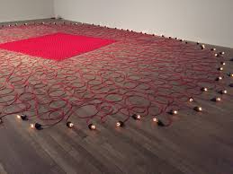
You leave on a high. The final room is filled with a large circle made.  There is in the middle a square made of cross hatched intertwining thick red wires, woven together.  These wires emanate from the square and spiral out to form a circle the circumference of which is marked by light bulbs.  These bulbs light up and dim as you watch.  A fine piece well presented.

I have missed out of this description some of the pieces that appealed to me less.  There were some (various chairs) that left me a bit flat.  On the whole though it is a very good exhibition.  If you want to see installations with an edge, with something about them, this would be a good exhibition to try, only you can't because such is the on the pulse way in which this blog is written, the exhibition has been and gone.

0 Comments

The Museums of London Part 1

8/23/2016

0 Comments

 
Picture
Picture
Picture
Picture
Picture
Picture
Picture
Picture
Picture
Picture
Picture
Picture
Picture
Picture
Picture
Picture
Picture
Picture
Perhaps you don’t live in London, or don’t go to the museums much. Anyway here is a roundup of my favourite museums and galleries.  Many of them are public, some are private. Some are always free, some charge for some parts and not others. There is no particular order to them, just ones I like to go to and why.

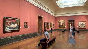
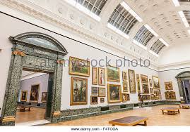
National Gallery.  A superb museum with its impressive frontage onto Trafalgar square.  It has two parts to it the main gallery and the Sainsburys’ wing where the paid exhibitions are usually held.  The main part is free and well worth going to.  It holds some of the British national art collection but from artists of all nationalities.  It will take you from the early middle ages right up to 1900’s  (after which the Tate takes over).  It is an excellent place, with its grandiose stair case from the main entrance and the large galleries.  It houses some of may favourite paintings such as Turner’s Fighting Temeraire and Velasquez’s in the House of Martha and Mary (sickeningly he did this when he was 19).   It can get very crowded on the weekends but they have a late night opening on Friday evenings which is worth going to.

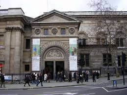
National Portrait Gallery.  Annexed to the back of the National Gallery this can often be overshadowed by its enormous neighbour. The main collection is free and as the name suggests houses the British national portrait collection.  Portraits, particularly of severe dutch people in black can get a little tedious but there is some great stuff here.  There is a superb portrait of Charles II in which he reminds me of a character from Harry Enfield. It shows the annual BP portrait exhibition, which is free to go to and this year was very good. There are various paid exhibition and it does a fine line in small, cheap exhibition.  One of my favourite exhibitions of this year, the art of the Russian’s was one such.

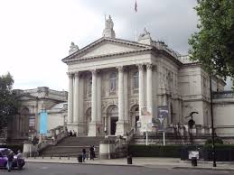
Tate Britain.  Probably my favourite gallery.  Right on the river, separated only by Millbank, and an easy work from Pimlico is it is a fine neo-classical building, on the site of an old prison.  This shows British artists work from the early middle ages until now.  This is presented in the walkthrough which takes you through it chronologically. There is a fine selection of Henry Moore sculptures but for me the siren call of this museum is the Clore gallery with its Turner paintings.  It is worth frequent revisits as particularly the more modern galleries are frequently re-hung.  It hosts the Turner Prize exhibition every year, although this is often rubbish.  In a recent exhibition there I came away with an orange.

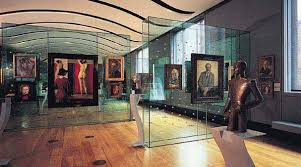
Tate Modern, that enormous hymn to modern art is one of London’s prime destinations.  It can be approach impressively by the pedestrian bridge from St Pauls.  Beware thought it is often very crowded.  Now with the new Switch house up and open it is a vast museum.  The large turbine hall is home to frequently varying large pieces.  I still remember sunrise from when it first opened and a time when it played host to an enormous metal spider.  The main collection is free and there are usually at least 2 paying exhibition (Georgia O’Keefe being a recent example).  The new building is nice though and worth exploring.  The art is 1930’s onwards (basically).  Dorothea Tanning a favourite that can be seen here.

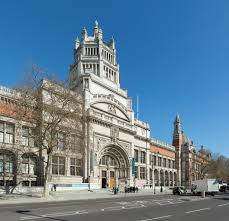
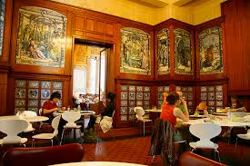
The V&A which can be found in South Kensington in the museum quarter, opposite the Naturally History and the Science Museum. Both of those are good by the way but the V&A is better.  It is free to enter but it hosts usually fashion based paying exhibitions a good example of which was the monstrously successful Alexander McQueen retrospective.  The V&A edict is to present the best of different media. There is not much painting there but you will see sculpture, pottery, porcelain, jewellery, musical instruments, furniture, architectural elements and my favourite; glass.  I have a predilection for glass and their glass gallery, hidden away at the top of the museum is often an oasis of calm.  It also has fine café , with sumptuous tilling which were commissioned by William Morris when the museum first opened. It also has one of the best gift shops in any museum.  

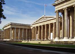
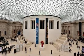
British Museum, the leviathan of London museums, the most visited, the highest number of items in its collection, the largest collection of Egyptian artefacts outside Egypt etc etc. Not to far from Holborn it is on the conveniently named museum street It is an enormous place, you are welcomed in by impressive neo-classical steps and frontage and the very large enclosed courtyard with the central rotunda which used to contain the British Library (now separate and at Kings Cross).  To try and go round the whole thing in one day is a leg and eye exhausting experience and can’t really be done.  Pick your gallery and do it justice.  My favourite is the recently refurbished Bronze age gallery on the first floor which displays various treasure hordes.  One thing that this, and in fact the V&A reveal is how similar artistic designs from pre-history are to modern and mordenist art.  The main collection is free and there are various paying exhibitions.  Pick your time as it can get very busy.  It is open late on Fridays.

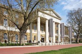
Saatchi Gallery is a short walk from Sloane Square station in an old converted army barracks.  It is usually free but occasional the entire place is given over to a paid exhibition such as recently a tedious but popular Rolling Stones exhibition. This aside the exhibition changes frequently usually in keeping with a particular theme.  I have discovered some excellent people there such as Ged Quinn who I think is brilliant.  I have also seen some truly disturbing things and the most depressing exhibition I ever went to by Russian artist.  The only thing that doesn’t change is a room filled with sump oil which has a calming dark sheen to it.  Go with an open mind. 

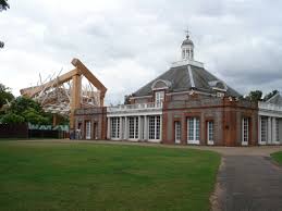
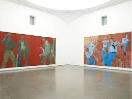
The Serpentine is compromised of two buildings, the Serpentine proper and the Serpentine Sackler (5 minutes up the road).   Nestling in the middle of Hyde park by the fake river of the same name it is usually free and the exhibition is usually dedicated to one artist.  They tend to be very modern and tend to be challenging.  The last I went to was Leon Golub and while it was good I didn’t enjoy it.  The time before that there was display of posters, but only the backs of posters which made me very cross.  If you meander around the park near the gallery there are also various enormous architectural sculptures on display.

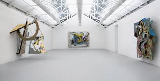
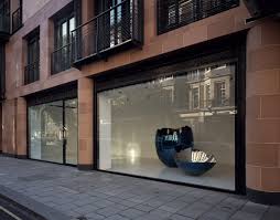
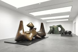
Gagosian is a chain of commercial galleries.  The one I like is on Britannia Street, a small side street near Kings Cross.  It is not easy to find.  Free to go in it has three large well lit rooms.  The display changes frequently and I have seen some good things including Henry Moore, Rachel Whiteread and Antony Caro.  Large sculptures are at home and well displayed in the space.  It is nice to wonder along occasionally and see what’s there.

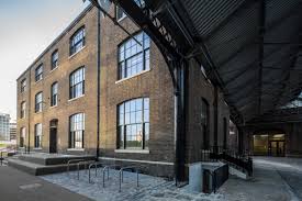
House of Illustration is one of my favourite galleries.  I have written about it a number of times. It is part of the new Kings Cross development, by the new St Martin UAL site and in the same building as the Art Fund.  It specialises, as the name suggests, in exhibitions on illustrations.  You have to pay to get in but it’s cheap.  Quentin Blake is heavily involved and there is very good display of his work up there at the moment.  In the best possible way it is the best lunch time gallery.
 

Picture

    Which is your favourite of these museums?

Submit
0 Comments

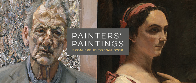
Painter’s Paintings at the National Gallery

8/20/2016

0 Comments

 
Picture
Picture
Picture
Picture
Picture
Picture
Picture
Picture
Picture
Picture
Picture
Picture
Picture
These “themed” exhibitions (as opposed to those of a single artist or movement) have mixed results in my experience.  Often the theme is a little weak and seems to be just something to fill the calendar.  This one is not like that. Its good but even the bad one’s have the same thing that this one has in the it exposes you to artists and possibly whole genres that you weren’t previous aware of.  This has happened to me several times, the Delacroix exhibition introduced me to Redon.

The conceit behind the National Gallery's latest offering is paintings owned by famous painters.  They have included with the displays some works by the painters themselves that allows you to see their influences.  There is a large variety of things on display.

First up on display was Lucien Freud and you are confronted from the kick off with a self portrait.  I find this piece a bit murky with the subject being too similar to the background for my taste but I did like the thick crusty paint particularly on the gouty nose.  I’ve never been that fond of Freud.  He did have some very good things in his collection though.

There was a very sweet pen and ink birthday card sketch by Frank Auerbach showing them hanging out in the café.  I have said this before of Auerbach he is much better in sketch form, when he is not hiding behind layers of paint.

There were Cezannes.  I think Cezanne is rapidly becoming one of my favourite painters.  I like his trees and the way he uses them to frame the images.  I like his soft blurred use of green and blue shadows and ill defined edges and blurred features of people. There was a good example of this there call the Afternoon in Naples where the job of the framing trees is instead taken by a curtain and leaning servant.  Incidentally who lets someone serve them tea post coital?  Only in art it would seem.

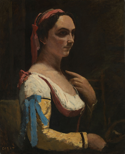
Corot is an artist that was floating around on the edge of my consciousness before but I’d never really encountered before.  There was portrait there, classical ¾ pose, a very dark background and an enormous sleeve bursting out into foreground. 

There were some sculpture on display.  I don’t engage emotionally with figurative sculpture (although I do like abstract work).  I don’t know why,  they don’t draw me in, in the way that painting do.  I often think it is a shame that the classical sculptures on display in places like the V&A no longer have the colour on them they would have in antiquity. I digress, back to the show.

A small Constable portrait.  Not seen a Constable portrait before.  It was interesting to see the ways it was similar to Cezanne,  blue shadow and blurred suggested features (the ear particularly).  I can see a consistency in taste here in Freud’s taste.

The next room and an array of impressionists.  Two Matisses, one self portrait, large areas of colours and stark lines, very blocky and opposite that the portrait of Greta Moll which is softer and more pastel colours done with quick vigorous strokes.  They sit either side of a good Matisse sculpture, enormous and hulking called Back III.  Another Cezanne of bathers under the traditional trees, made up of small blobs of colours in different planes. 

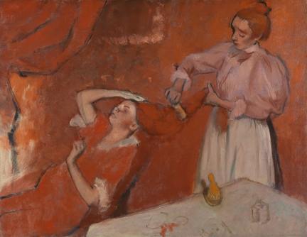
Dominating the room was a large Degas done in various shades of red with blue/purple as shadow.  This is all about the texture with a good use of naked canvas as highlight points, almost like watercolour (but it is in fact I think oil paint).  The two figures morph out of the background. I like this very much.   There were also a couple of dull Picasso’s grey and boring but all about the composition.

I shall being to skip along more quickly and only comment on matters that attracted my attention one way or another.

Gauguin had a very nice portraits of flowers which appealed to me greatly.  The flowers were simplified and geometric in strong good complimenting colours.  The shape was nicely reflected in the pattern on the pot.  I always wonder in these portraits if the colours painted were per-selected in the flowers or altered on painting to make a better composition.

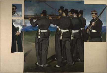
Manet – Execution of Maximillian. Very large.  This is an extraordinary piece made all the more evocative by the fact that it is incomplete.  Parts of Maximillian disappear off to the left, the panels that complete them having being lost to history.  What makes for a good impact is the anonymity of the firing squad contrasted by the homely, warm looking late middle aged man, calmly loading his rifle.

The next room had two collections that of Lord Leighton and Watts.  I had not encountered Leighton before but I am glad I did.  I really liked his work and will have to go to Leighton House.  There is a good avuncular portrait of him.  A man with an excellent beard. 

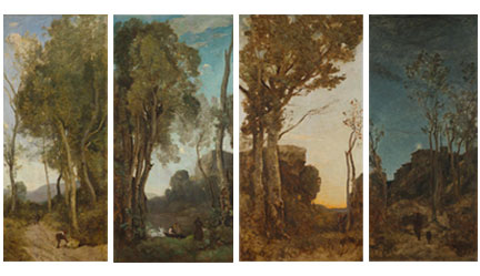
The stand out pieces were four long narrow works by Corat representing four  different times of day.  They are painted on wood.  Long narrow trees almost for the whole painting frame, with bury energetic leaves,  the centre view which in each one is different but thematically linked.  I am glad these pieces are all together as they do play well off each other.  I stood there for several minutes trying to work out which one I preferred but my mind refuse to fix on each one.

Opposite these are the work of Antony Watts.  Not a man I had heard off before and while technically very competent I found them quite dull.

Van Dyck collection next.  Many people greatly like Van Dyck and there was on display a powerful picture by him of a grey stallion called the Horse of Achilles, all steam and vigour which I liked.  His portraits though while excellent in a number of ways I find dull.  I can’t relate to these scowling dark clothed Dutchmen, no matter how excellently rendered. What I did like was his almost grey scale painting of Cano and Ubaloo, just black, white and shades of blue. 

New painter was encountered here, for me anyway, that of Reni and the idea, which I shall steal, of painting oil on copper which gives a lovely warm golden to the piece. 

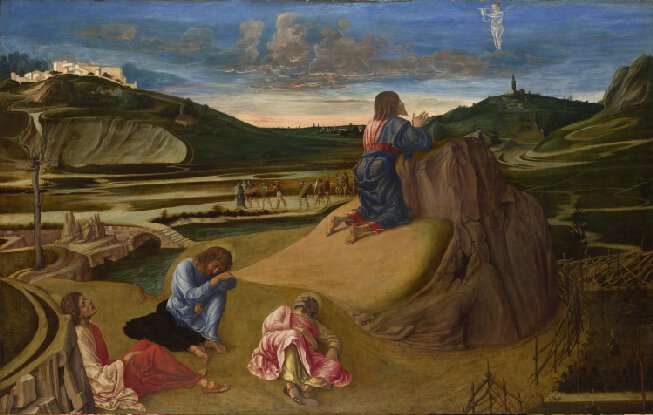
Depictions of the gospels in art canoften be dull. There is a worthiness that seeps into many of them..  There was here though a piece by Bellini called by The Agony in the Garden.  There was a Delacroix type use of colour with the blue tunic of the main figure broken up by red. In the background a strange ghostly figure. I like the odd landscape it is all in.

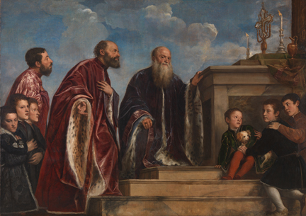
The shows finishes off with a large Titian.  Finish on a high.
 

0 Comments

Lets go to the Mall..

8/14/2016

0 Comments

 
Picture
Picture
Picture
Picture
Picture
Picture
Picture
Picture
Picture
Picture
Picture
Picture
Picture
Picture
Picture
..today!  The Mall Gallery that is, sumptuously located at the top of the Mall, just by Admiralty arch, more or less opposite the cabinet war rooms.

It is a venue that I had heard of many times before.  It hosts a variety of organisations and is the headquarters of the Federation of British Artists and the Hesketh Hubbard Art Society.  It is a nice bright open space.  When you enter there is the reception and two galleries off to each side.  One contains the café and radiating off this is the smaller North Gallery.  It is well lit with good natural light.

You have to be quick as the exhibitions change almost weekly. I enjoyed it and intend to go again.
When I went, and it will have been and gone by the time this post percolates through to my blog, it was the 155th Annual Exhibition of the Society of Women Artists.  Entry was £3 (or £5 with a program).  Katherine Tyrell on her excellent Making a mark blog (http://makingamark.blogspot.co.uk/2016/08/review-society-of-women-artists-annual-exhibition-2016.html) did a very good review of the show.  She was right it has been well hung and well presented.

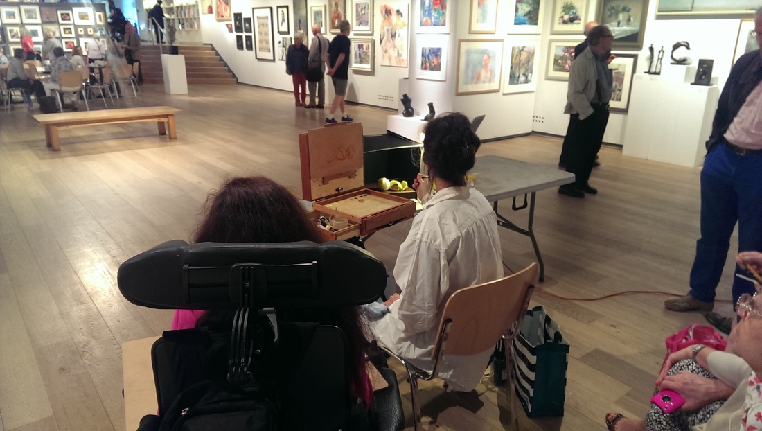
In this blog I intend to concentrate on those things that appealed to me or taught me something. As I was there, an oil painting of lemons demonstration was just starting up.  I stopped to watch for some several minutes.  She had a good quick technique.  I liked the physical set up.  The box to contain the fruit, good idea, I shall use that, and also the portable set up. I shall use that too. She was painting (I failed completely through a surfeit of British shyness to find out who she was) on a small rectangle of wood.  I liked to look of that surface and should take that to.  Finally she was holding her brushes further up than I do.  I shall have to try that.  She had a quick, flicking style.
 
Onto the artists and the works that appealed to me.  There was quite a few.  What I particularly liked about this exhibition was that there was also a high standard of sculpture on display.  Of the people I liked in alphabetical order they are

Judith Barton – Blue Boys.  A large portrait of two nuzzling cats rendered mainly in oil but with a novel and very effective use of gold leaf as highlights.  It is the kind of painting the draws you in with the main figures evolving out of the background.

 
Diane Bedser – Distant Hills. An example of Diane's work is the first painting (top left). It is not Distant Hills but you can see the style and it is similar (although not as good).  Nice movement and energy of the sea and blurred landscapes. 

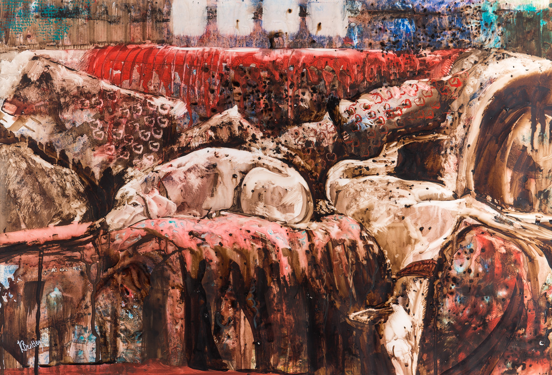
Kate Bentley  - watching & waiting .  A very interesting use of watercolours. Large paintings with a sort of spotted effect, strong shadows and shaggy lines giving a sort of horrific edge that reminds me  of Mervyn Peake.  Kate had won the Princess Margaret of Kent Watercolour award for her other work  Chilled & Content (pictured above left) but I preferred this one.

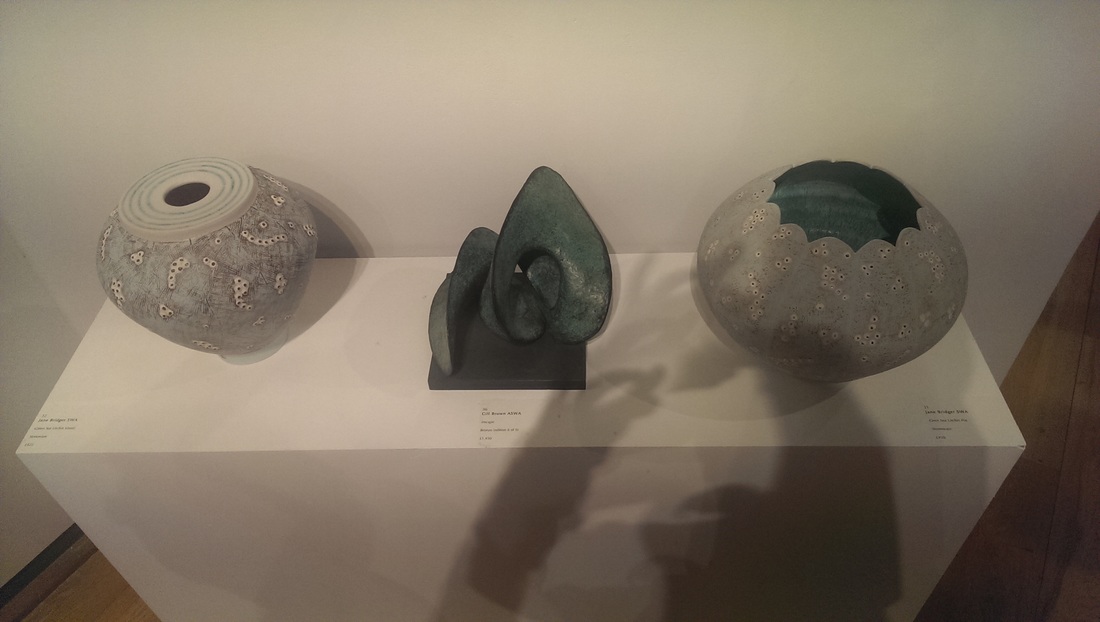
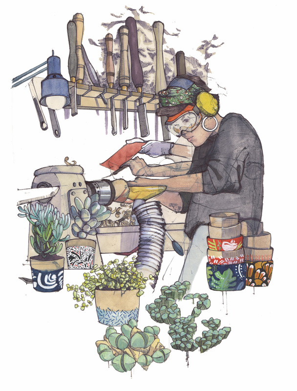
Jane Bridger.  Jane had produced three very fine pieces of Stoneware call Blue Sea Urchin Bowl, Green Sea Urchin Pot and Green Sea Urchin Pot of which 2 can be seen here.  I am sucker for pots and pottery and my hands itched with the desire to handle these, purchase them and scamper home with them. I do like the effect of barnacles adorning the pieces and the gentle pastel colouring.  The shapes are alluring to.

Stephie Butler’s Graffitti Girl is another award winner.  It is a very good watercolour portrait using square brushes of paint to create a very characterful picture, which by the way is perfectly reflected in the name it has been given.  The background and the colour was a lot more subtle and interesting than a first glance would suggest.  I like this allot.  It had sold when I was there.  I am not suprised.

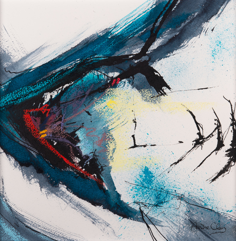
Andie Clay’s Reach is done in the frustratingly unhelpfully described “mixed media”.  I would like to know what.  There is some acrylic in there maybe. I like the movement in this piece with the bird like marks exploding out of the monstrous shape.  Energetic piece. 

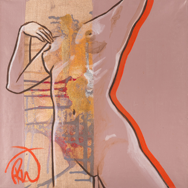
The superbly named Rebecca Fontaine-Wolf VPSWA had three works on display of which my favourite was Morning Dew.  A simple outline nude over the gold stripe down the left of the painting and highlighted in red.  I like the contrast between the stark nude and the dripping looser paint over the gold.  These work on my brain to trick me into seeing a face above the torso.  The colour contrast works well in this piece.

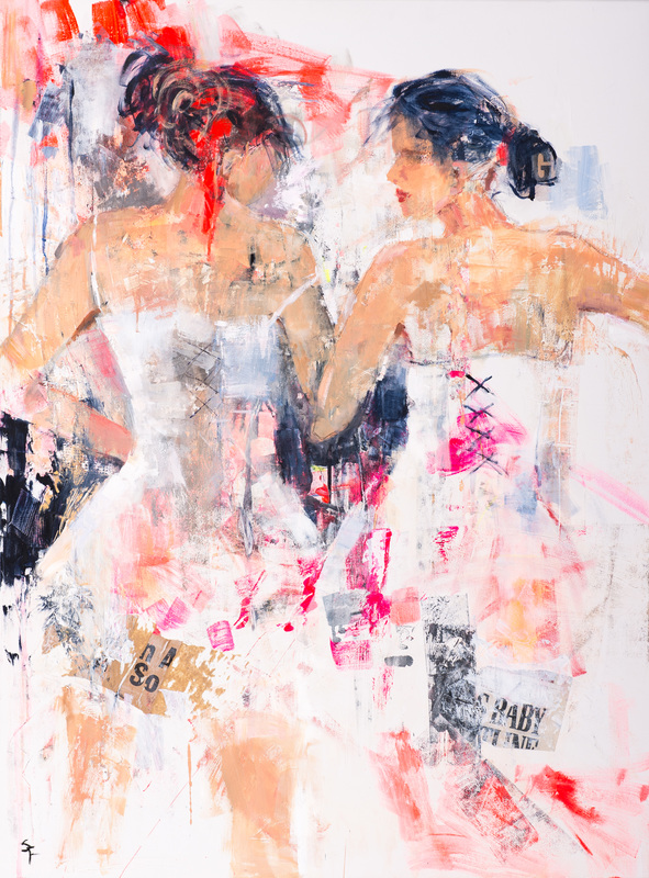
Soraya French again in the beguiling Mixed Media has produced a large somehow threatening piece of two dancers.  The marks and the paint suggest competition between the two figures and the cross stich of the right hand figure suggest some kind of bandage to me. It has good energy.  It looks much better in person by the way. 

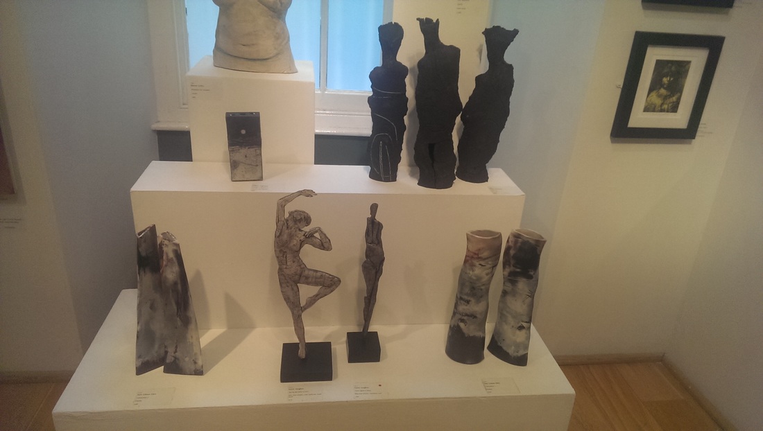
Jane Gibson Conversation 1 and Conversation 2 both in ceramic (left and right of image).  Each conversation consists of two vase like pieces.  Of all the pieces in the show these are the most I would most like own and I regret not buying them. It would be tough to pick between the two.  They have a tactile sense to them that the photo doesn’t really convey. Neither does the sheen of the colours.  I may have to buy them after all.  I shall certainly keep my eye on Jane Gibson.
 
Gillian Highland – Midnight at Brabourne – Raku Sab pot. It is the one on the middle level on the left.  It compliments very well Jane Gibson pieces.  A plainer simpler shape, but plays to these strengths nicely A very tactile object
 
Sophie Glover produced an almost illustrative series in pen and gouache called Women who Make.  They are all very good and I hope in some way they are kept together if purchased. Simple line but it is very good at showing the movement and energy in the creative processes depicted.

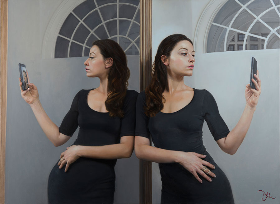
Natalie Holland – Mirror Me – oil on canvas.  This is not really the kind of style the appeals to me, photo realistic type portraits and paintings lack something as far as I’m concerned.  I do admire the technical skill required which this one show.  What caught my eye on this one is the subject matter.  It says something,  well conceived.  I like the pose of the reflected subject and the fact she is holding the phone and the smug narcissist facial expression.

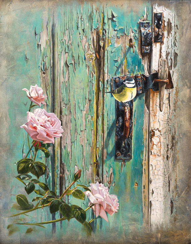
Vanessa Jayne – A welcome visitor. A very sweet oil painting of bluetit  (maybe? I’m not good on birds). Sweet paintings can often be saccharine but not in this case.  The colour contrast is very good and the detail is extraordinary.  She particularly is good a bringing the wood of the door alive. 

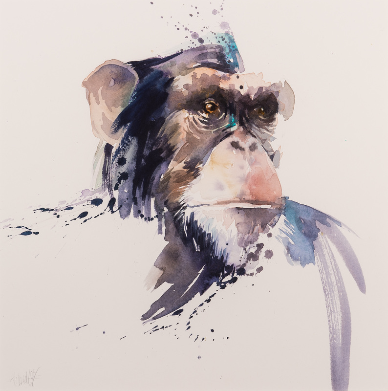
Ali Lindley – Mr Grumps Got the Hump is a brilliant titled watercolour of a chimp.  This piece of full of character and made me laugh when I saw it.  She has brilliant brought out the humour of the subject, which is something that is difficult to do and of which I am a big fan in art. It is also a good example of less is more painting.

Elizabeth Bradshaw is a very vivid strongly coloured piece in acrylic that just hammers out at you from the wall and overpowers the surrounding pieces.  It screams “here I am” at you. It does this without becoming bombastic or too much. 

Julie Rawson Should’ve Seen us in Our Prime. A strange title that only really becomes significant after inspection of the painting.  It is one of those cases where the title changes the perception of the painting in this case, for reasons I cannot entirely explain, in a way I strangely resent.  I like the simplicity of this piece, the flat way the red leaves sit on the grey background.

Liz Seward Two Green Bottles is a good piece of Mixed media sitting on the wall.  Sorry but you can’t not with a title like that.  It is more complex than it first appears and what is done very well is light through glass and water and then the diffuse light this produces on the other pieces. 

Jessie Sheffield has produced in Cement and Acrylic (and other things) a remarkably simple piece of sculpture with the unlikely name of Magnaparva No.5. Simple but effective that put me in mind of some kind of strange enormous gun cartridge.  Again very tactile.  I like this.

Picture
0 Comments

Summer exhibition part 3 - the rest

8/7/2016

0 Comments

 
This is the last of my posts on the summer exhibition at the Royal Academy. If your interested in going to see it, and it is worth seeing, then it is on until 21st August. I haven't been back since my first visit, there are too many other interesting shows to go to, but I imagine everything else has sold.  One of the things that interest me about it though is the way art work attracts you are attention. The are some pieces that stand out as you enter the room but then disappoint on further inspection such as Paul Fernaux's Burnt Orange Earth (below) which has good shape and colour but as you get closer reveals itself to be a bit insipid and flat.
Picture
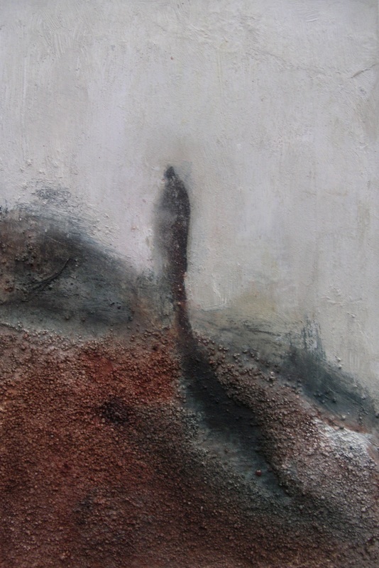
Then there are the tiny pieces that you could easily walk past but once you see them, your curiosity is intrigued and you want to see what it is and several of them like Laura Hudson's Sleepwalker (below) greatly reward this effort.  Not surprisingly all such pieces have sold being good, relatively cheap and of course easy to accommodate .
Picture
I like the granular texture she has used for the foreground and the ghostly effect of the figure. Somehow it is slightly disturbing.  I shall comment on a couple more and then present the rest.
Picture
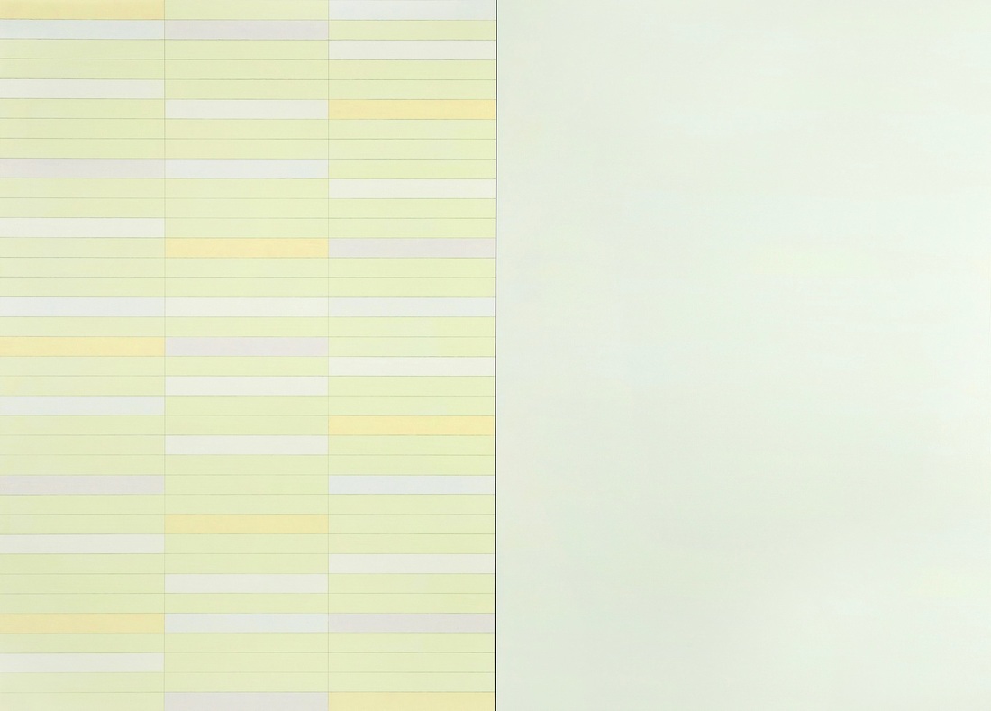
Trevor Sutton's Yellow Snow (left) is a subtle piece.  It is quite large and photographs don't really do it justice.  It is very Agnes Martin and has the same quality of gentle calmness.  I like art like this.  It is art I could never, and have no interest in, trying to produce but the exactitude of the pastel shades and the geometric shapes is appealing.
What works much better in the original and is a bit flat in the photo is the contrast with the blank white area on the right of the painting.
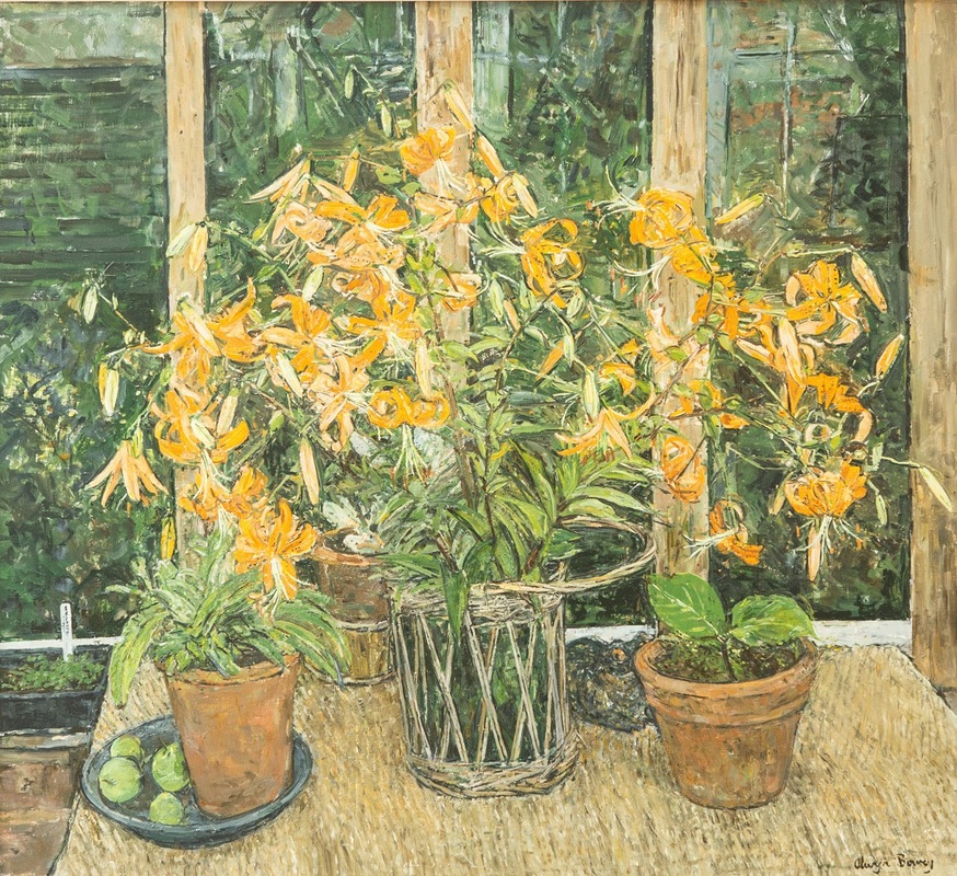
I like portraits of flowers and Olwyn Bowey is good at them.  She had a couple of them on display of which the picture on the right (Tiger Lillies) was my preferred.  A liked the yellow scored onto the green and brown background.
There is a nice almost naive rustic quality to them and a depth which unfortunately this image has flattened.  I am always interested in painters who have managed to develop a distinctive style and Olwyn has. 
I like the way she has produced the wooden surface of the table and the dirt on the sides of th pots.
Picture
Picture
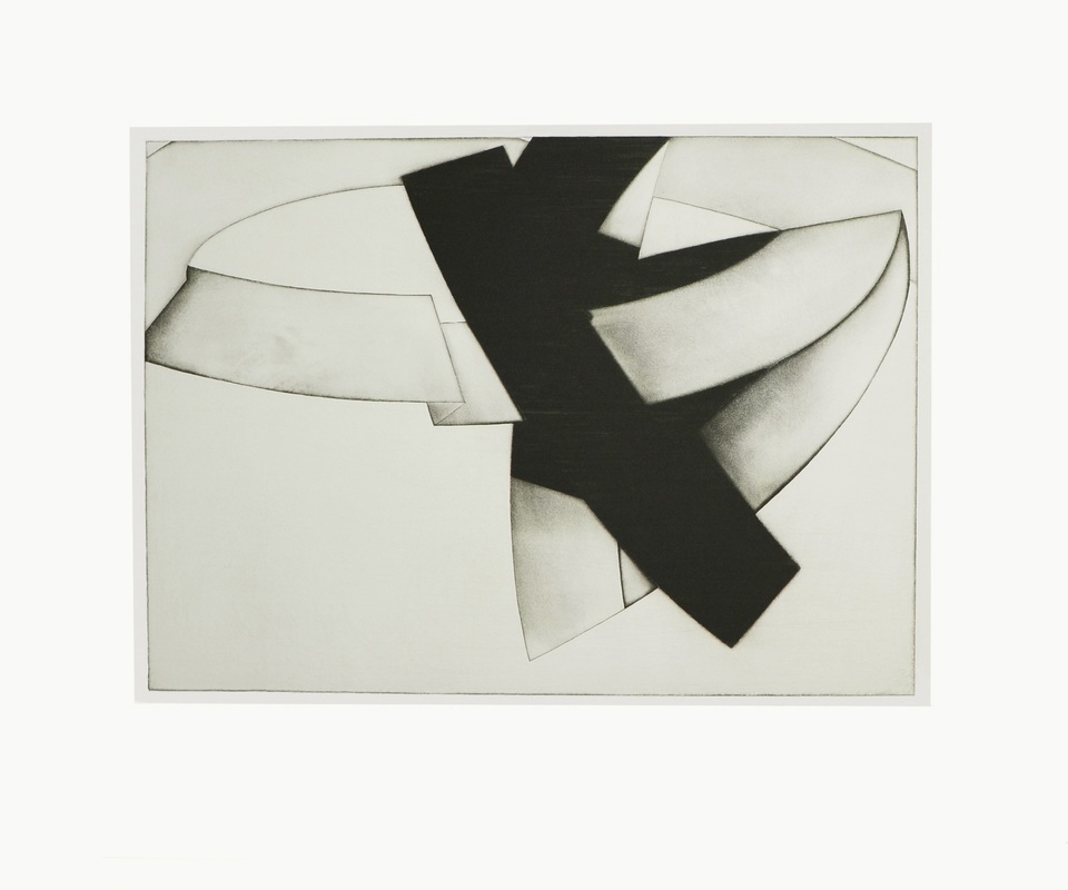
An excellent example of simplicity producing good art. The picture left is Snare 1 by Jula Farrer. There were other snares but this is the one that appealed to me the most.
I like the way the different shapes interact.  I like the way shading is used to produce definition to some of the shapes.  In the original the charcoal marks are much more visible (it is done in charcoal) and it is better for that but it still in the photograph a striking image.  I find it difficult to stop looking at it and like wondering whether the white areas have been ripped out of the black or form part of the same structure.  I prefer the former idea.
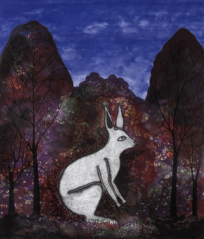
This is Jhuma Sharma Roy's Moonstruck.  I like this very much.  My grandparents lived in India for a while so we had a number of Indian paitings around the house and this reminds me of that style. 
It also reminds me of Ghibli films.  I do enjoy the central figure and the way it is reflecting and emanating light onto the area around it.  I also like the way in which the background Autumnal forest is represented with red and purple paint dotted in various colours.
I think this painting is a very good composition and part of the appeal is the flat lack of perspective element to it.  The clouds in the sky slightly bug me,  I don't think they quite fit but otherwise it is excellent.  One of my favourites.
Picture
 There are many others that caught my eye for various reasons, either through excellence of execution or subject matter, frequently for both and sometimes for reasons that I am not entirely sure of.  It would take to long to dissect them all and after all there is only so long one can write about one exhibition so I present the rest of my favourites to you here:
0 Comments

    William John Mackenzie

    I am an artist with a  specialism in landscapes and still life.  My contact details are here. 

    Archives

    May 2022
    April 2022
    October 2021
    September 2021
    July 2021
    June 2021
    April 2021
    March 2021
    February 2021
    December 2020
    October 2020
    May 2020
    April 2020
    January 2020
    December 2019
    November 2019
    October 2019
    September 2019
    August 2019
    July 2019
    June 2019
    May 2019
    April 2019
    March 2019
    February 2019
    January 2019
    December 2018
    November 2018
    October 2018
    September 2018
    August 2018
    July 2018
    June 2018
    May 2018
    April 2018
    March 2018
    February 2018
    January 2018
    December 2017
    November 2017
    October 2017
    September 2017
    August 2017
    July 2017
    June 2017
    May 2017
    April 2017
    March 2017
    February 2017
    January 2017
    December 2016
    November 2016
    October 2016
    September 2016
    August 2016
    July 2016
    June 2016
    May 2016
    April 2016
    March 2016
    February 2016
    January 2016
    December 2015
    November 2015
    October 2015
    September 2015
    August 2015
    July 2015
    June 2015

    Categories

    All

    RSS Feed

Proudly powered by Weebly