|
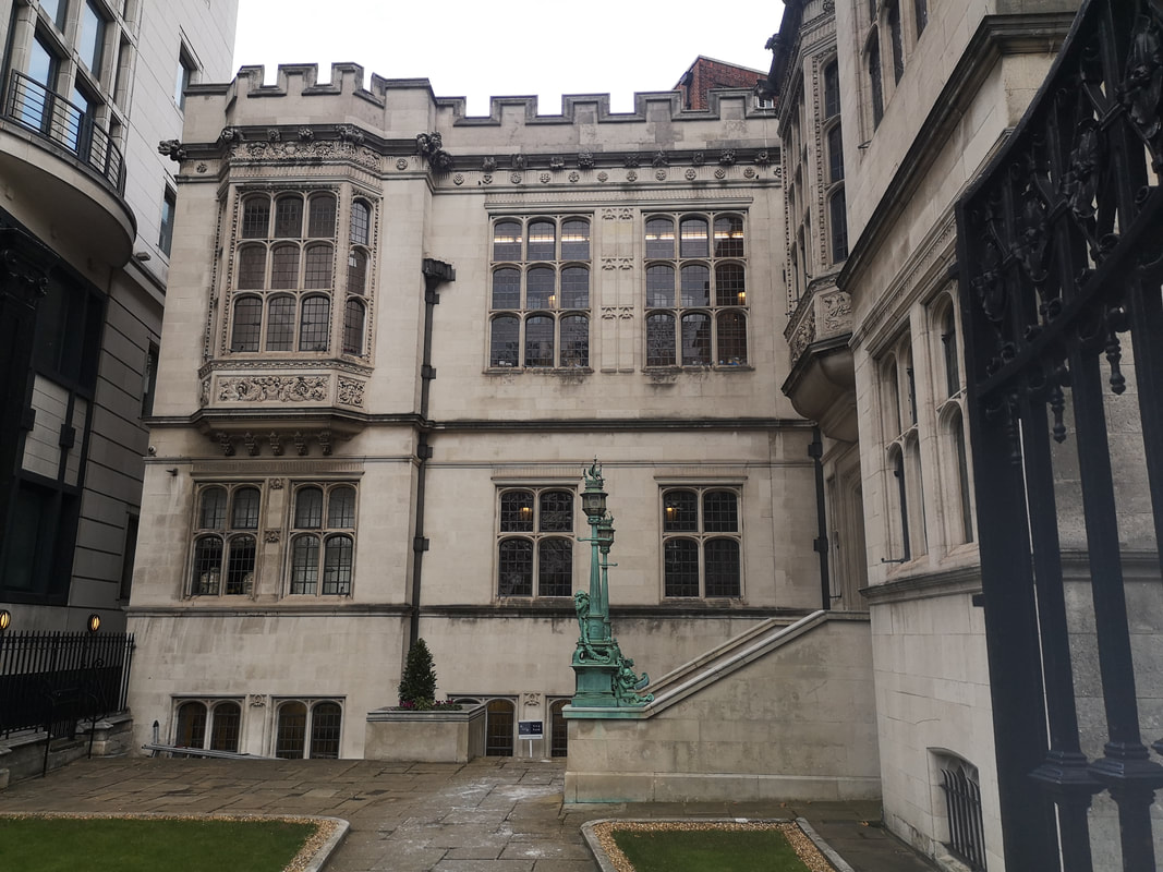
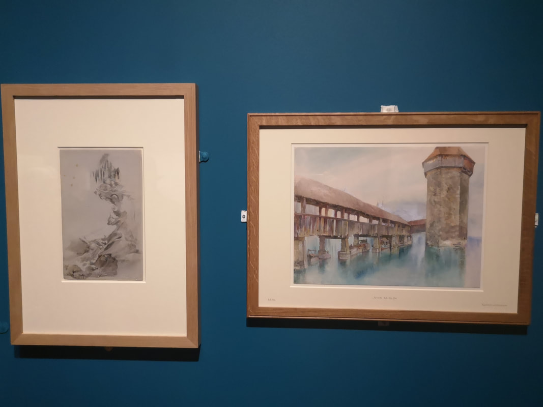
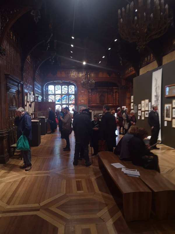
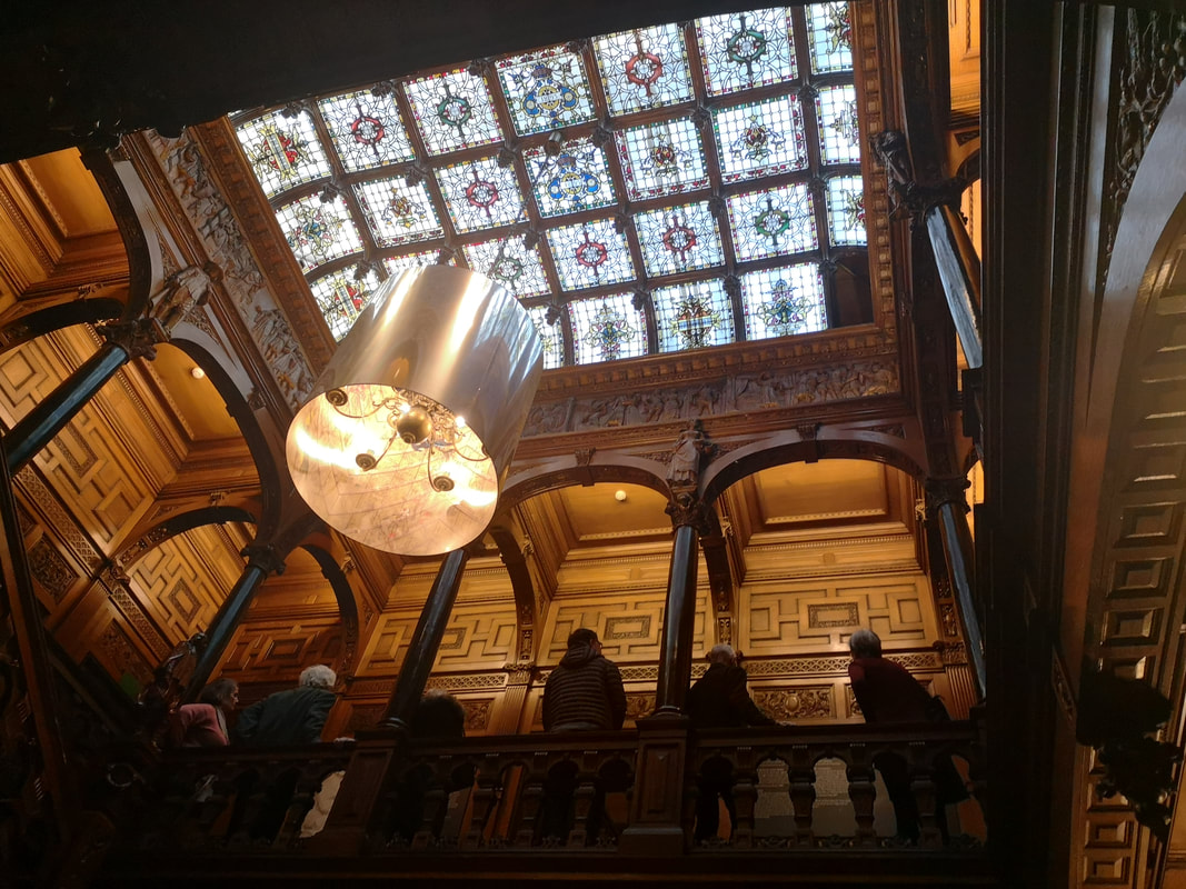
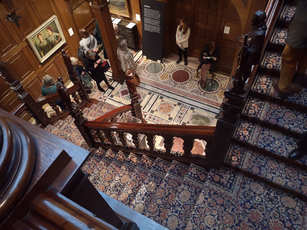
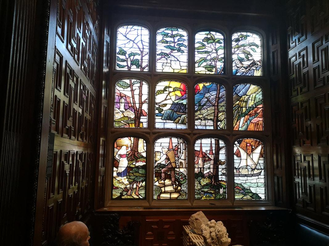
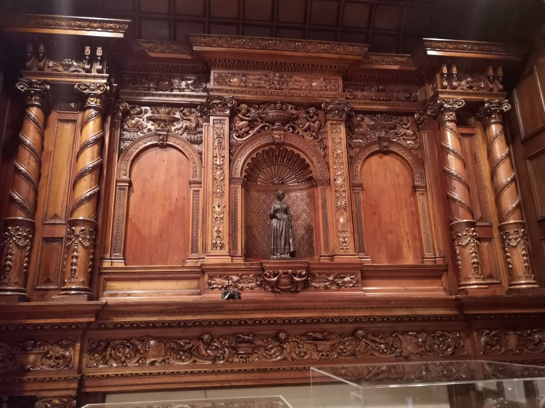
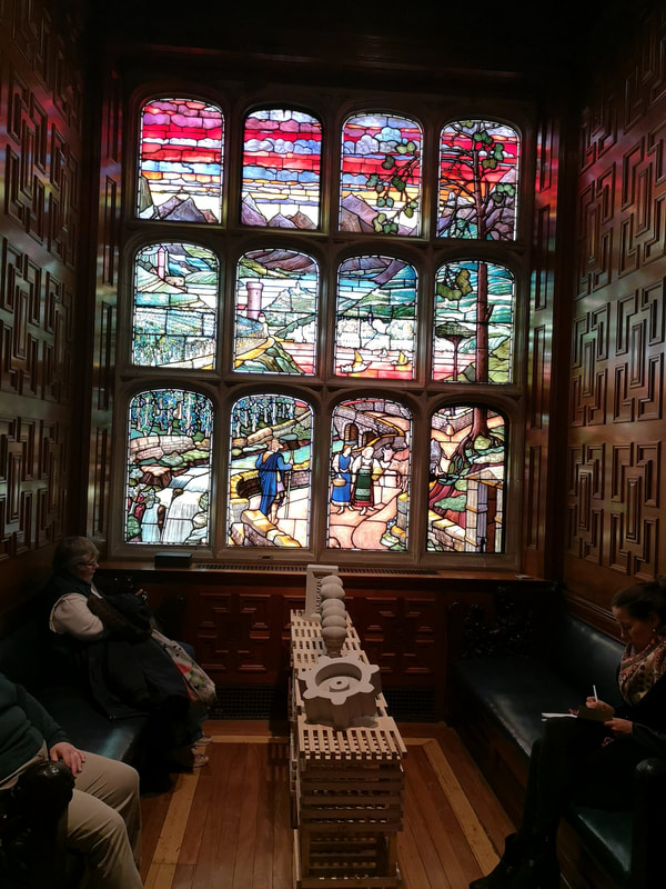
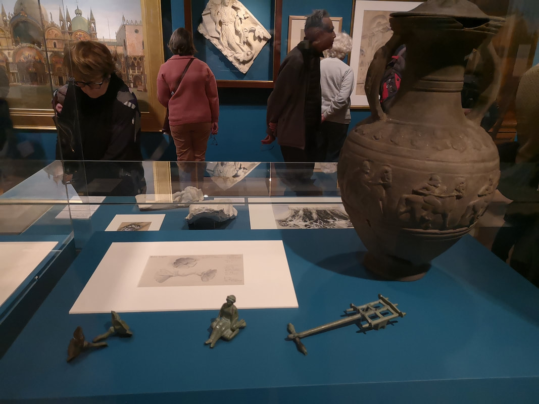
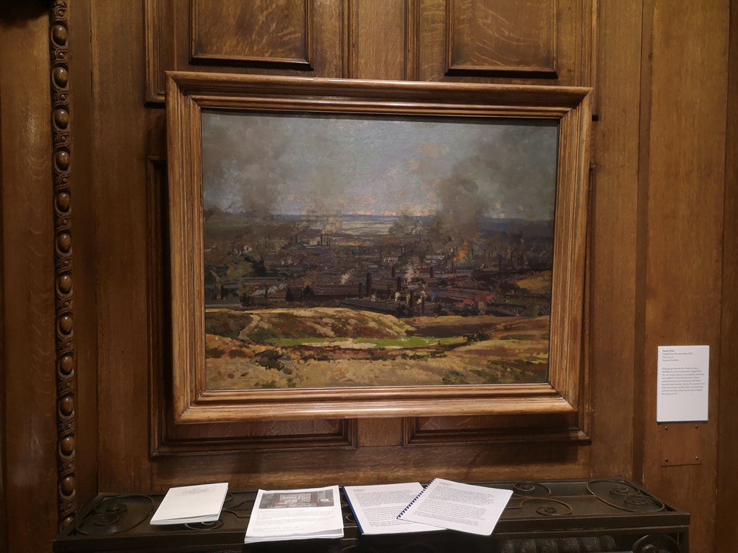
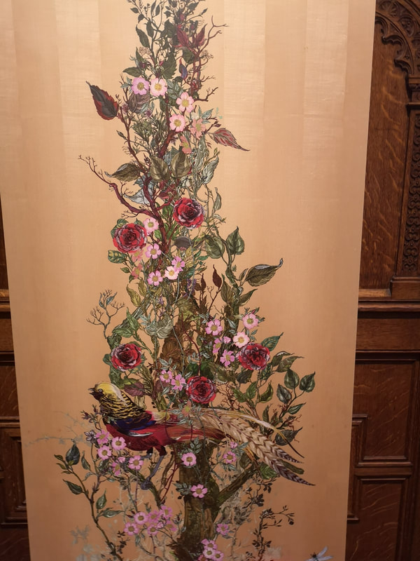
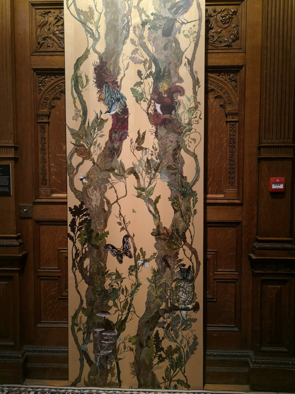
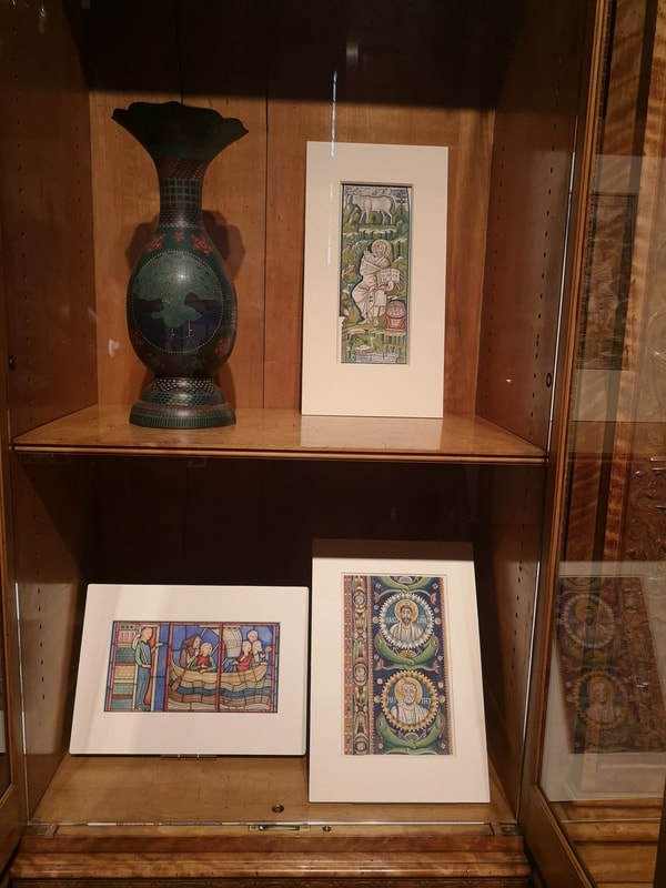
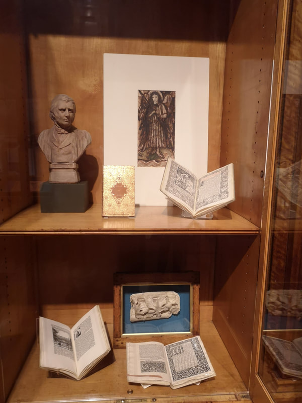
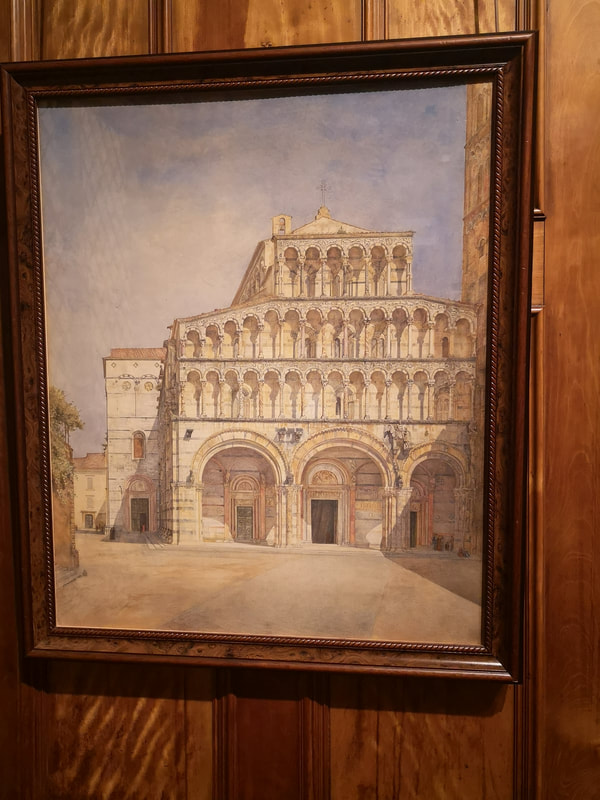
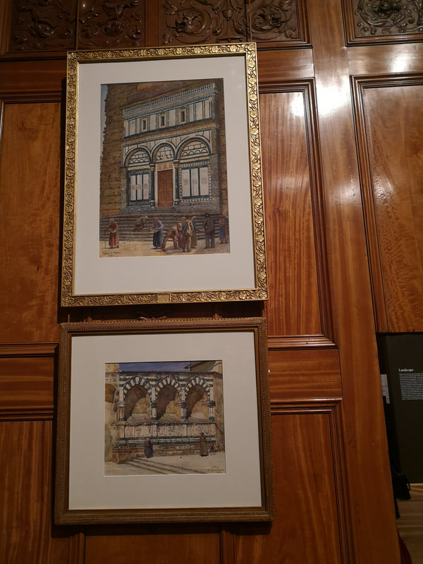
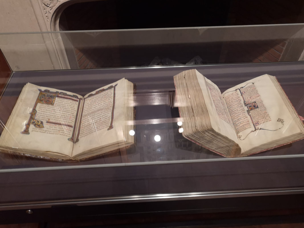
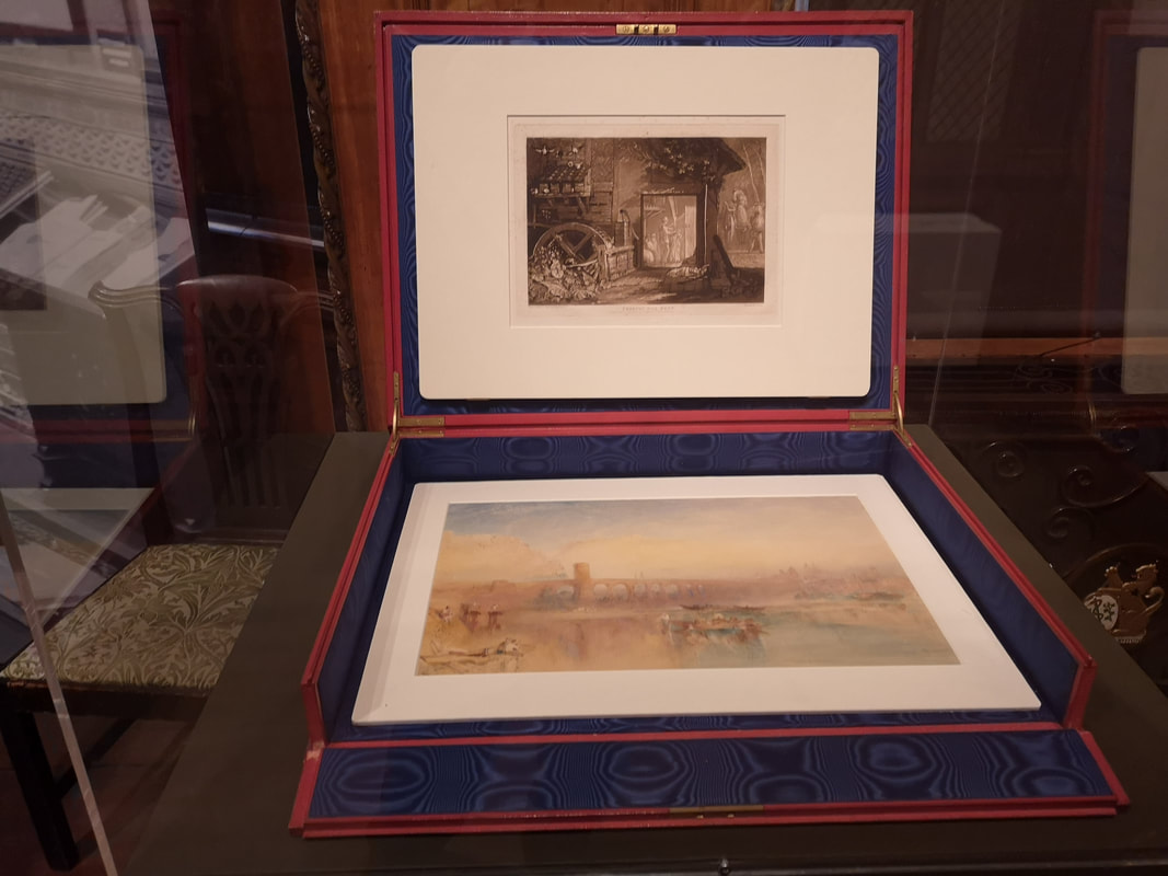
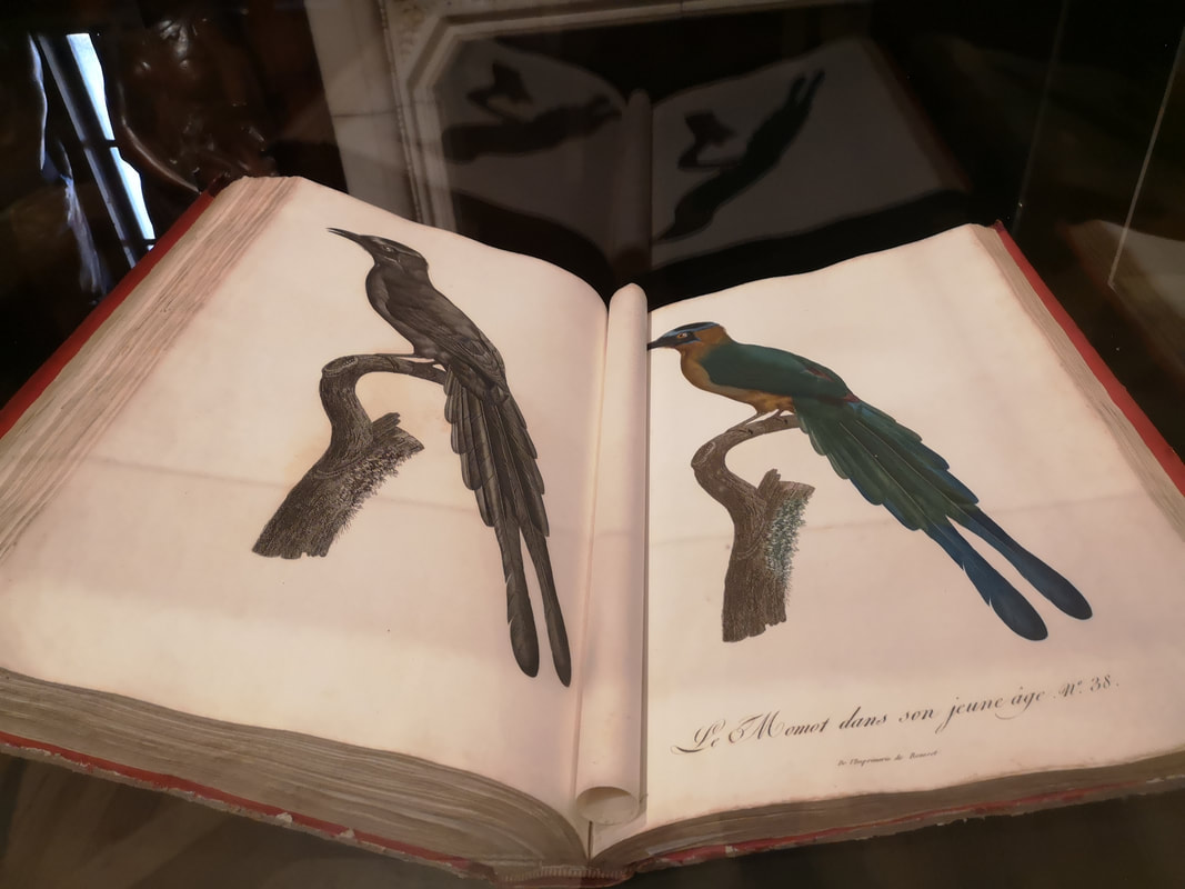
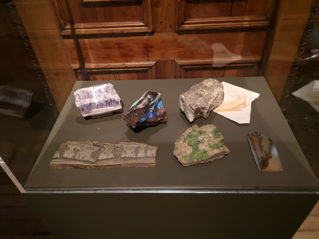
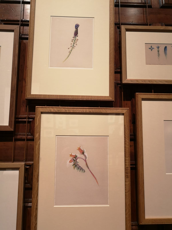
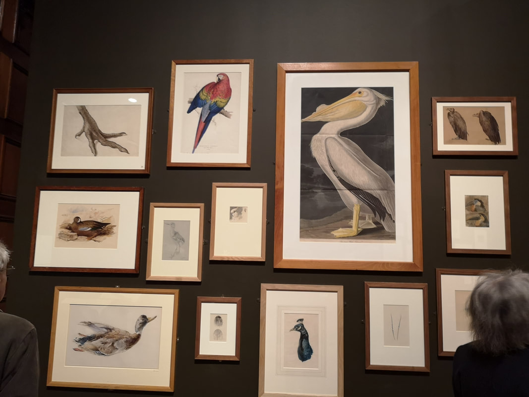
Two Temple Gardens is a magical place (above left). Currently it is showing an exhibition about John Ruskin (above right) called the Power of Seeing. Nestling near the embankment at the bottom of the Temple it is built in a medieval style but was in fact built in the Victorian era by William Waldorf Aster to use as his estate office. Before this I had never heard or been to it before. It is open to the public from January to April each year, and each year hosts a different exhibition. Ruskin is this year. Entrance is free. It is open late on Wednesdays. The inside is a wonderland, with blush dark wood, tiled and carpeted floors, a vaulted stained glass window (above right), and a plus stair case. The main room is a wooden paneled hall complete with chandeliers and ornate carved details (above left). Each end of the hall has detailed stained glass windows showing pastoral scenes, the windows set into alcoves each containing plush green leather sofas. Specially commissioned sculptures relating to Ruskin sit atop slatted pedestals (above right). Also for your delectation I give you a detail of some of that ornate carving (above left). Frankly it is worth going just to have a snoop around the building. There is a nice looking cafe there which I think will tempt me back. Onto the show, which is worth going to as well and basically divides into two parts, work by Ruskin and stuff he collected. The cabinet above left neatly encapsulates this including as it does several metal objects he owned (including a rather fine vase) and a gentle graphite drawing of the two metal flowers that sit there bottom left of the cabinet. Ruskin being who he is there is lots to do with Sheffield (and most of the works are on loan from various institutions there). So you have this dull brown, smoky industrial landscape with what could quite easily be a shell hole in the foreground, being a view of Sheffield by Stanley Royle. As you ascend the stairs you are greeted by these two hanging screens? are they screens, lets say they are screens. I failed completely to find out when they were made or by who but they are beautiful. , swirling foliage, and on the one on the left this peacock like bird, nestling among those pink and red flowers. The one on the right darker and autumnal with a cheeky little art barely visible and perched on the right. Upstairs in a smaller room, are a collection of ephemera that Ruskin owned, including busts of various people, old books, pieces of architecture, the odd psalter illustrated pages of medieval manuscripts. The Two Temple surroundings really come into their own here especially the shelving shown above. Architecture was obviously an interest of Ruskin's. This can be seen from the piece of building, cornices that are scattered around the show. Pictures of buildings, done in fine detail by Ruskin (above right) and others. More on the illustrated book line with some fine medieval manuscripts with those ornate golden borders that we all love to see. In one cabinet in a special presentation box is a fine Turner Watercolour (above right) all soft yellows, purples and blues. I read somewhere that the Impresionists where the first to use purple as shade but having looked at the Turner watercolour I am not sure this is true. Books of flora and fauna, in this case fauna being birds where also among the collection with types of birds loving illustrated. Presumably in this example the male and female of the species. Ruskin also had a thing for pretty rocks and gems. There are two cabinets repeat with iridescent rocks. Geology was an interest of his it would seam and her wrote a treatise on it (and other things) and did a number of detailed watercolours showing the striations in slate in particular.
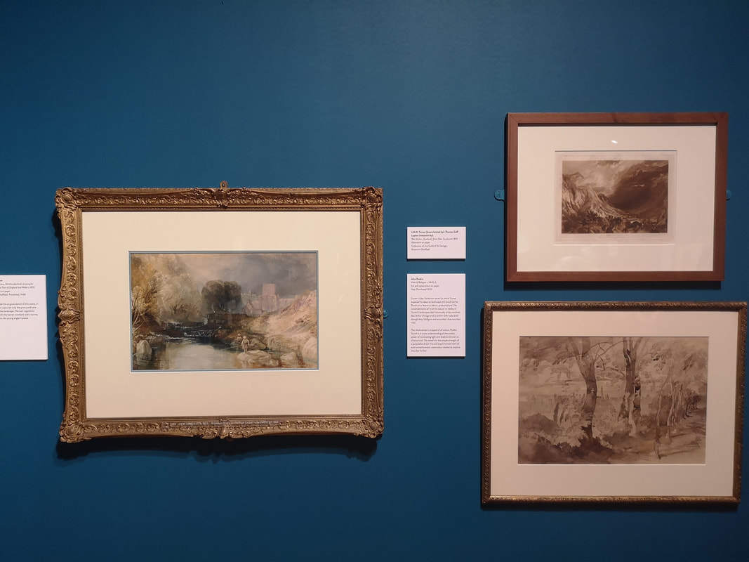
More or less opposite is another collection, this time of botanical print. For reasons that were not made clear the photographing of some of them was forbidden. While I am on the subject there are also some early daguerreotypes in the show. Feint displays of silver and black which you have to peer close up to make out what they depict. You are not allowed to photograph them either but they are interesting to see. Turner was a big inspiration to Ruskin and in the first room you come to there is a corner dedicated to works by him, or inspired by him that Ruskin owned (or indeed produced such as the watercolours at the top of the blog). I particularly liked the watercolour you can see above, with its almost menacing shady tree in the middle distance and the characteristic Turner indistinct buildings in the background.
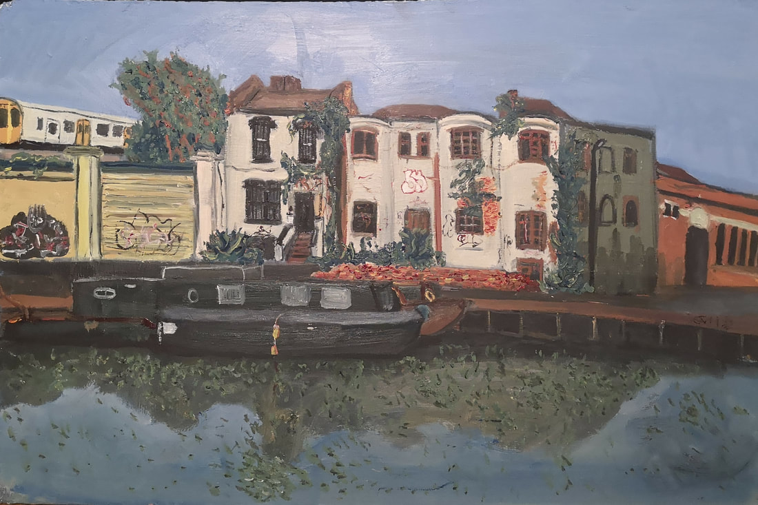
Having just spoken about Turner I will now have the gall to talk about me! I have a show starting Tuesday 5th Feb until March 3rd at the Indo Bar. It is a group show and I have one painting in it (see below). Come along and see it in person.
0 Comments
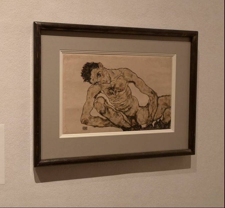
If you can, always open with some boobs. Be warned that this blog and also the Klimt and Schiele at the RA is not fit for work. There are many boobs, and more than a couple of vaginas and the odd penis. You have then been worked. This is basically high class porn. Drawn porn if you will. Still I shall talk about it anyway.
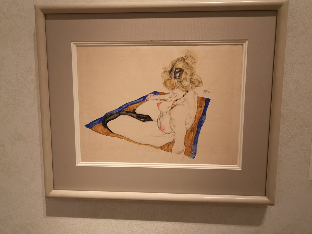
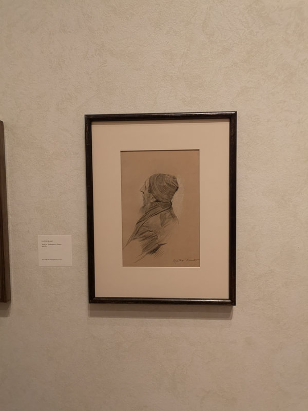
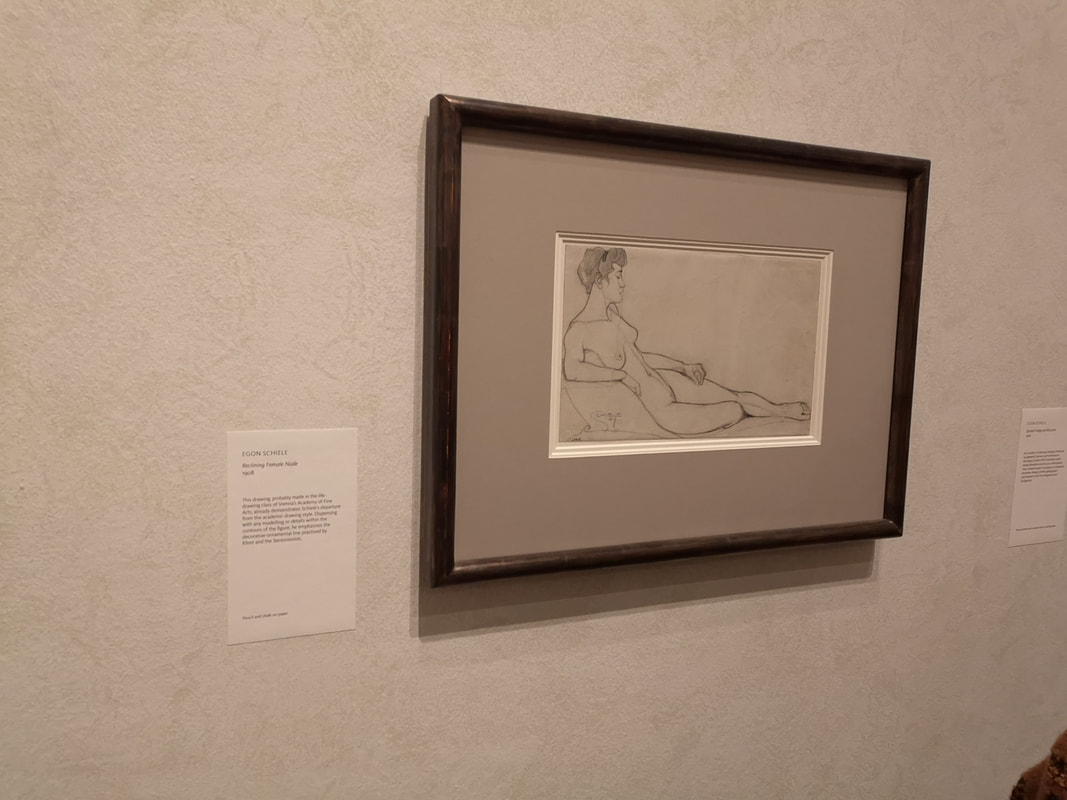
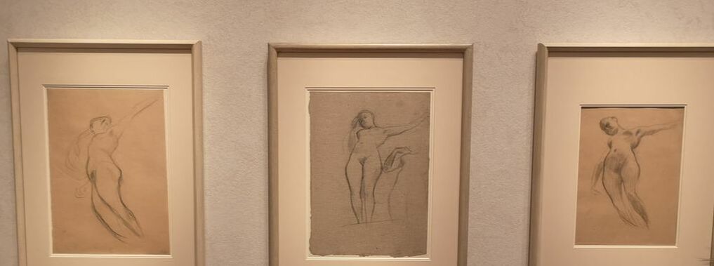
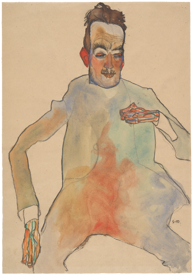
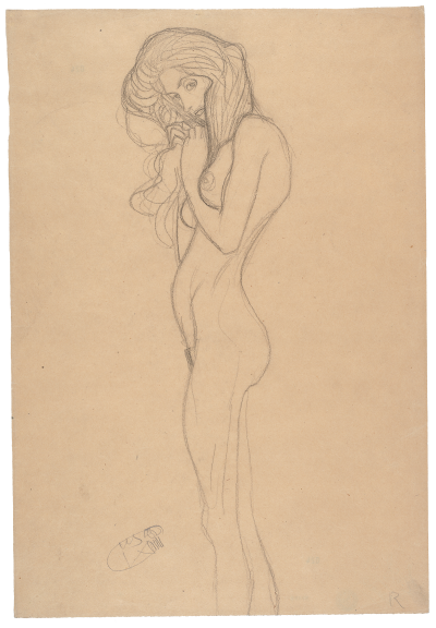
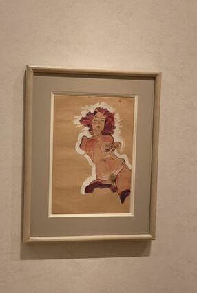
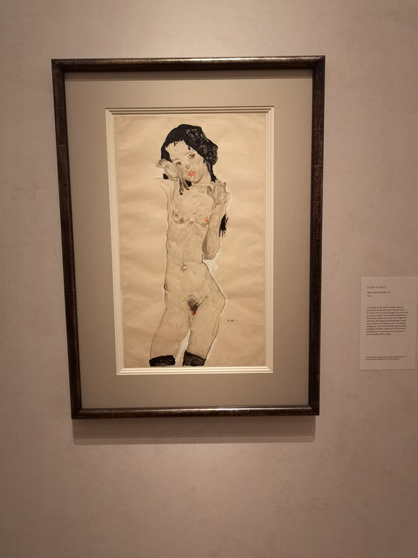
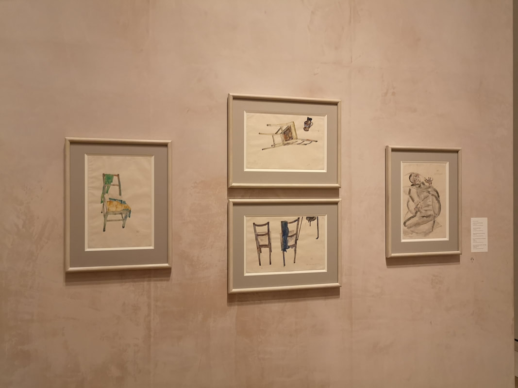
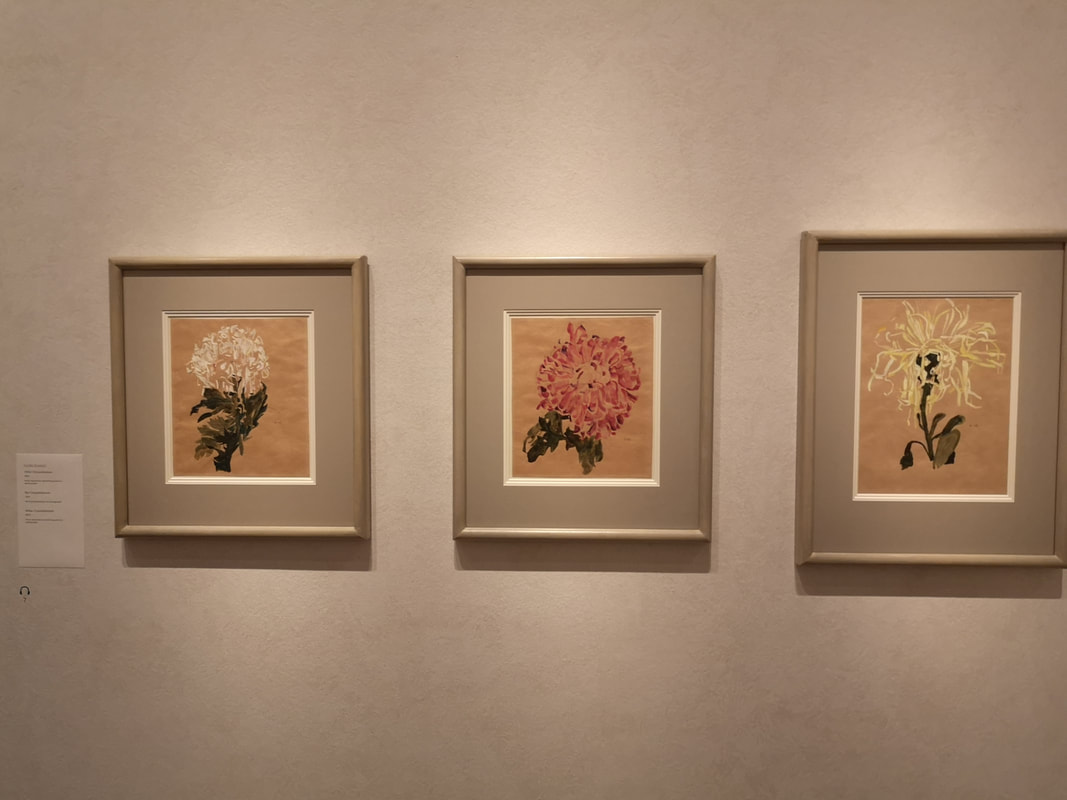
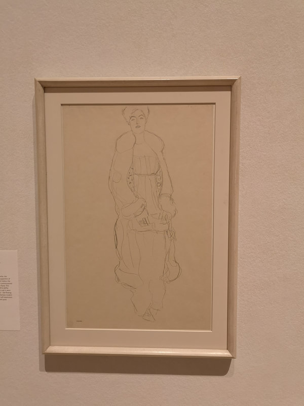
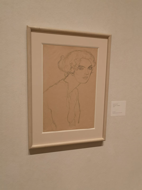
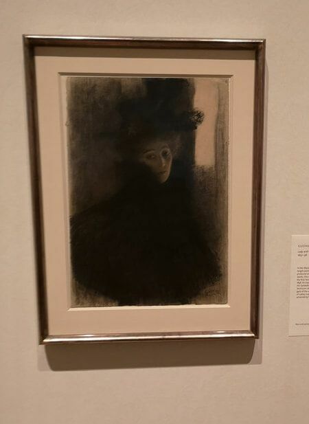
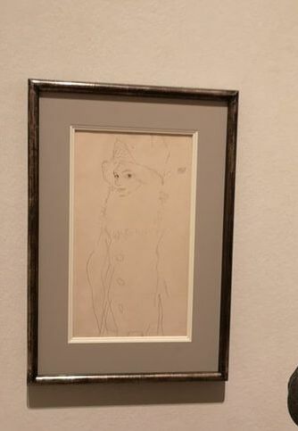
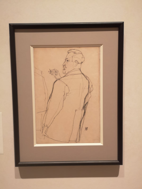
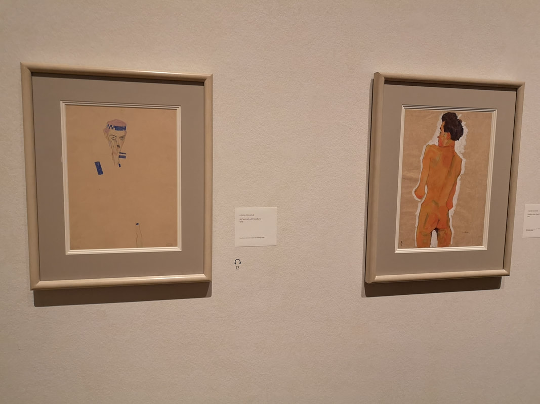
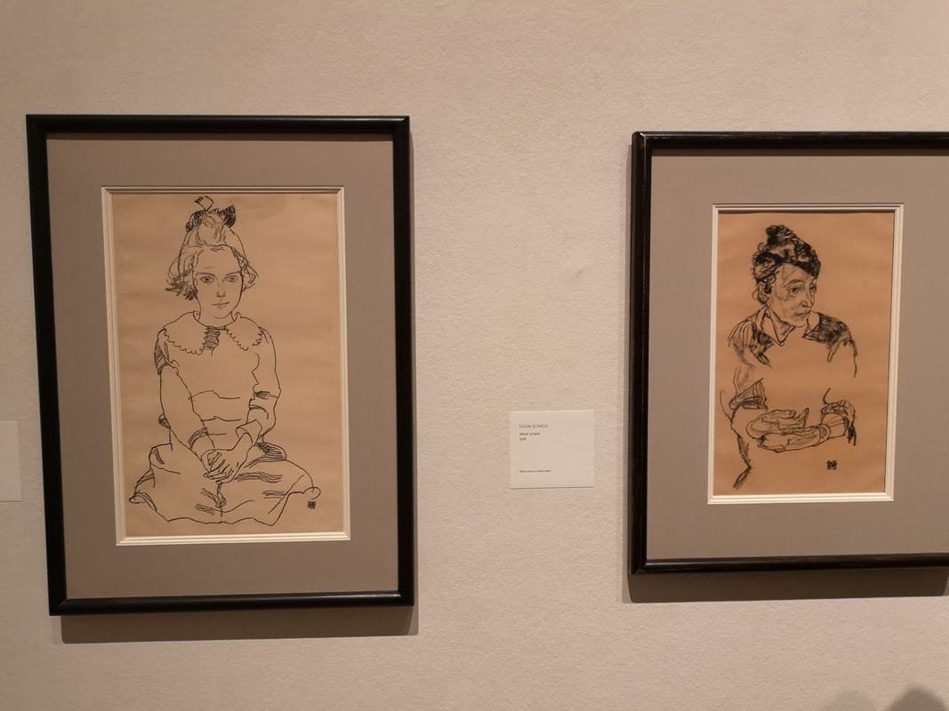
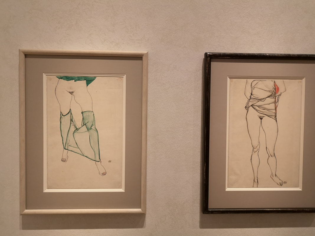
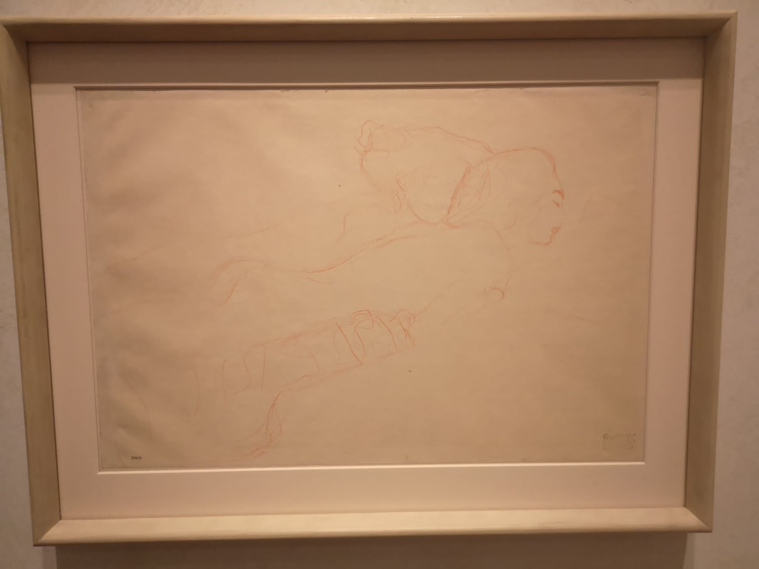
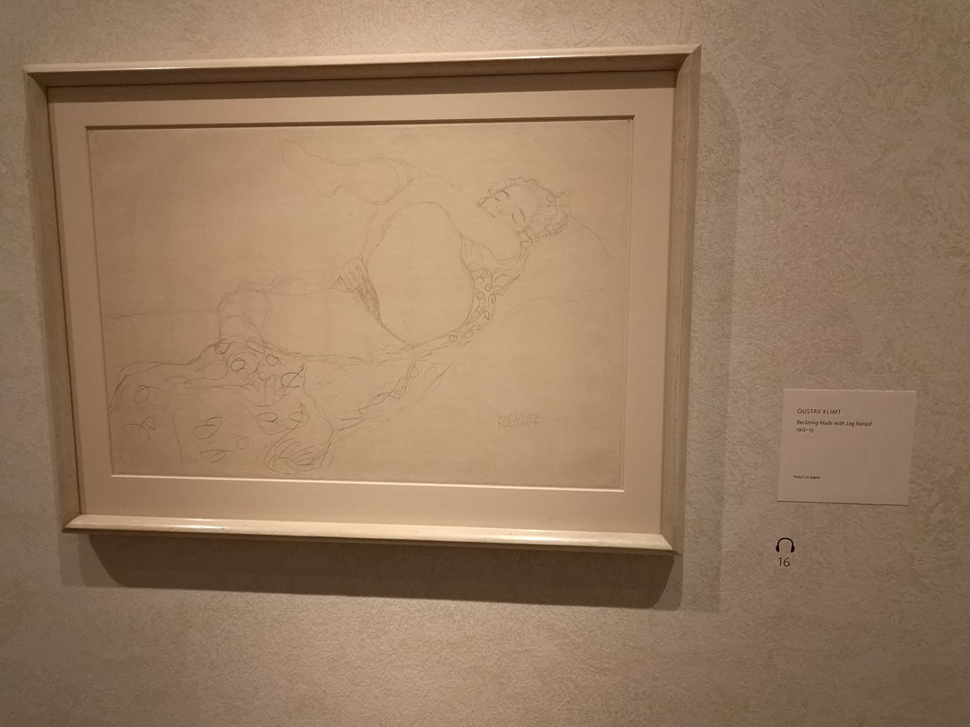
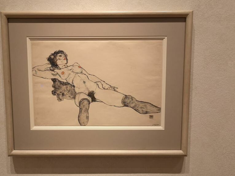
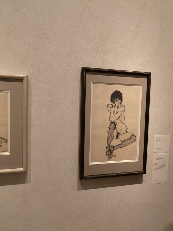
Despite this I prefer Schiele's work. Klimt's sketches while technically superb and often very detailed I find very cold and classical. Schiele by contrast is often spiky, quick and full at character. You get the feeling there is an actual person being depicted rather than a type, and indeed this is often borne out by the labels. I prefer actual people. The other thing I spotted that was interesting was the use of materials. Both used packing paper. Presumably because it was very cheap. Klimt though can give you a very fine lesson in how to conduct a drawing study, particularly in this female nude (he only does men from the back), rendered three times, in slightly different ways and from different angles. I particularly like the third one with the excellent use of shading to give the tonal contrast and a three dimension feel to the picture whereas the first one has more a feeling of motion. They all have boobs. You get colour with Schiele you see as in this rather fine pen and watercolour portrait of a man. I like the washed multicoloured torso contrasting with the detailed face and those odd spectral hands, vein highlighted particularly the odd left hand poised as though holding a drink, or possibly a fag. Contrastingly Klimt's almost manga like naked lady picture. It is a type not a person. He does vivid flesh tones well in the case of the red head on the left where as the possibly early teens prostitute from late 19th century Vienna. Pale, thin and disinterested. A very visceral indictment of the sex trade. You are made to feel shame. Very effective. Again it is because you have an actual person here rather than a type. Moving beyond portraiture Schiele does some interesting things. He was sent to prison for taking a pre-teen girl on a trip, in a way the RA portrays as naive rather than suspicious. So you get these soulful desperate pictures of chairs from prison interiors (above left). On a more cheerful note there were three charming flower pictures (above right). This is where the use of packing paper works well as it has a velum like colour. Schiele makes good use of negative space, in that the flowers are more absent than they are there. Back to lines. One thing Klimt developed (which Schiele later coped), was the positioning of the figure, with them extending from the bottom to above the top of the frame, and in the exact centre so they are like a human column (see above left). It is quite an interesting stylistic touch. There is one example of a more detailed Klimt drawing and it is the one above of a woman. Shrouded in black, her face a barely visible dark grey and bleak looking it packs a punch and tells quite a story. The rectangle of light in the upper right hand corner makes the whole thing visible and bearable, and allows you to see the hat. Otherwise it would just be too dark. The eyes and face sparkle with a real cheekiness to it, particularly the pose half turned away. Likewise the sketch of one of Schiele's early patrons, a railway inspector who brought a number of his works. There is a real affection for him in that sketch, and again we have the column thing going on. They are both done with quite spare simple lines. There are about 7 of them flanking a corner in one room of the gallery. They are all of him in various poses, in none of them does he look even slightly happy about, well anything really. Some of them such as the one above left he is barely there, just a disembodied head, with arms marked by flashes of blue and a sweat band, like a sulky ill tennis player. Others like the nude next to it, he is very much all there with the same skin tone we saw in the nude female red head and the same stark humanity. It is hammered into your retina with the white highlight that halos the entire figure. Finally we have full frontal nudity, dirty crouching nudity. Skinny gaunt musculature with this black substance leaking out forming a shadow, a trick he also uses in a female nude. its very upsetting. Opposite these shameful (seems like the right word) self portraits are more affectionate pen and ink portraits of family (above left). The more shaded one is his mother, again showing a classic Schiele trick of having the head and hands with the torso merely suggested by their shape. The one on the left has the other Schiele classic, particularly in young women, the mixture of innocence and knowingness. Through the next room and you have a series of ladies crotches. They are very well done and quite shocking but I mean why? Klimt can also be filthy, but in a much more aesthetically pleasing images and you have too such examples here although they are very feint which is probably just as well. The one left is a red chalk image of a naked lady being fondled by another lady. The other, pencil line drawing is prudishly called woman with right leg raised, presumably because the title, woman fingering herself was just too much for the various curators who have displayed it.
If you want some disturbing and well rendered filth, and I have to say I did and was not disappointed, then this is the show for you, but you only have 3rd February. Also it is a master class in how to draw people.
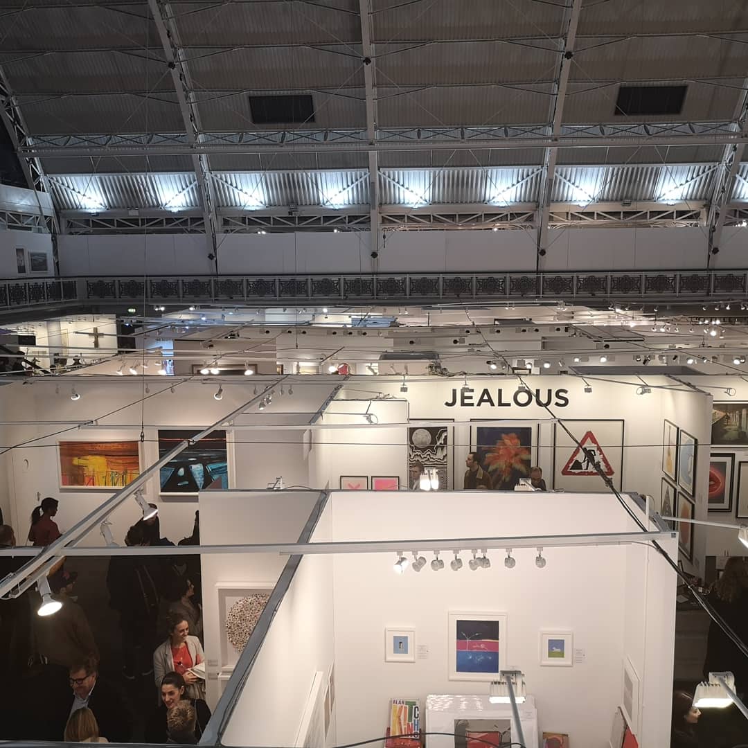
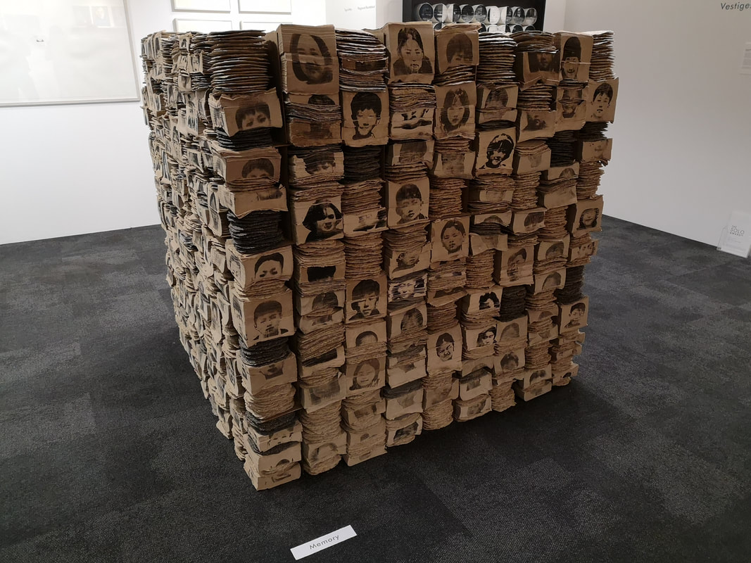
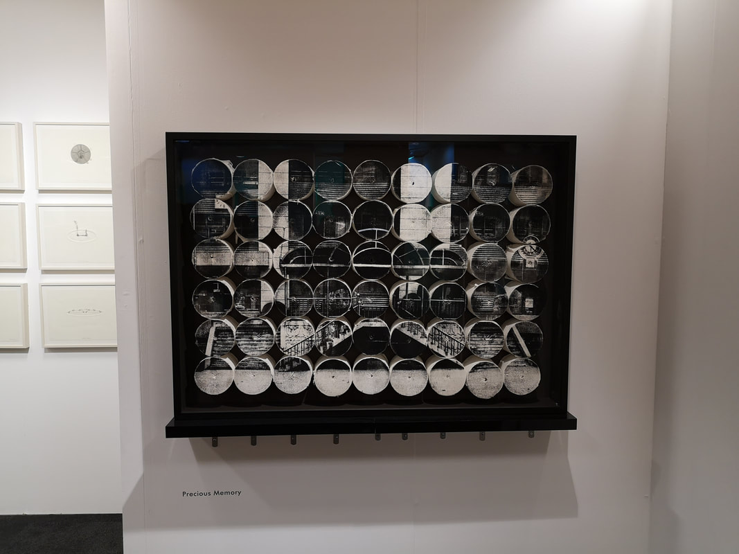
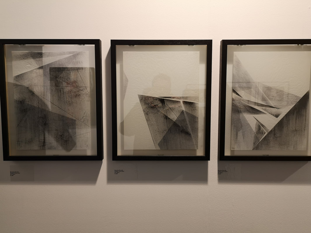
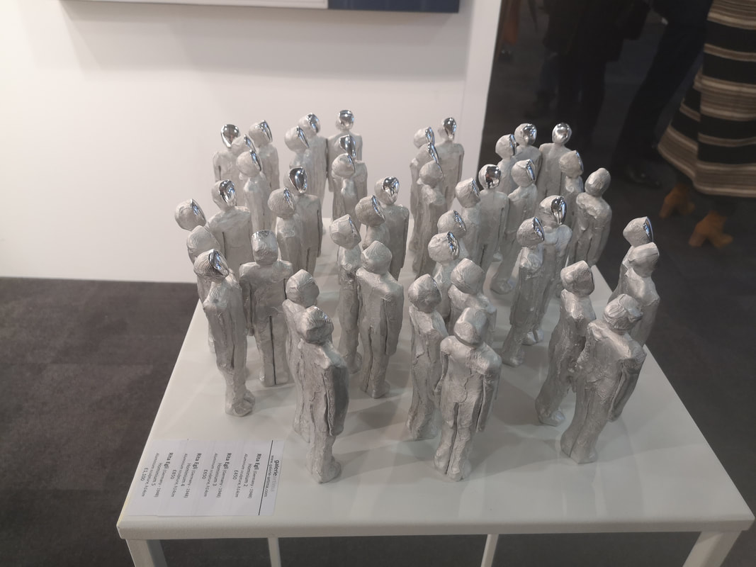
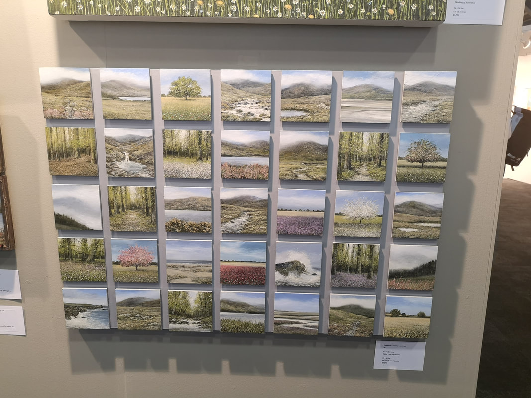
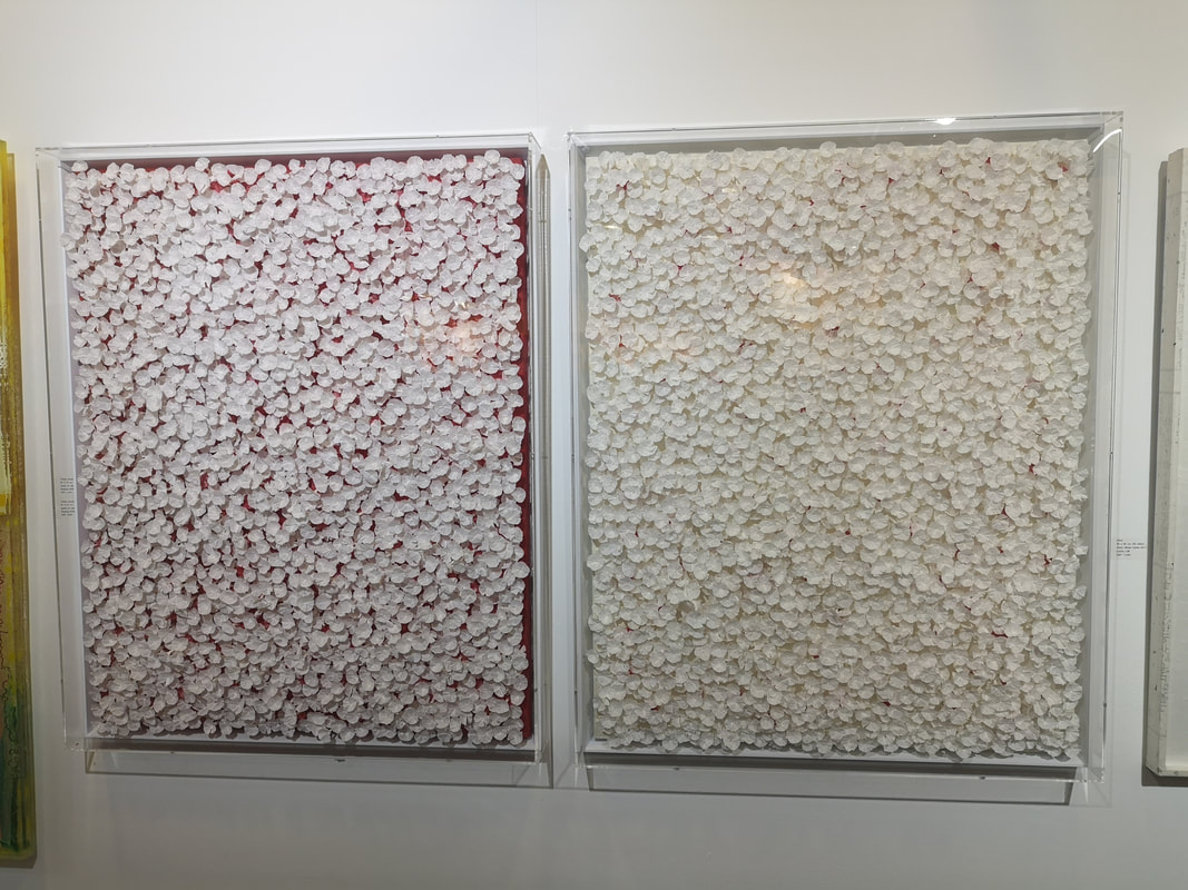
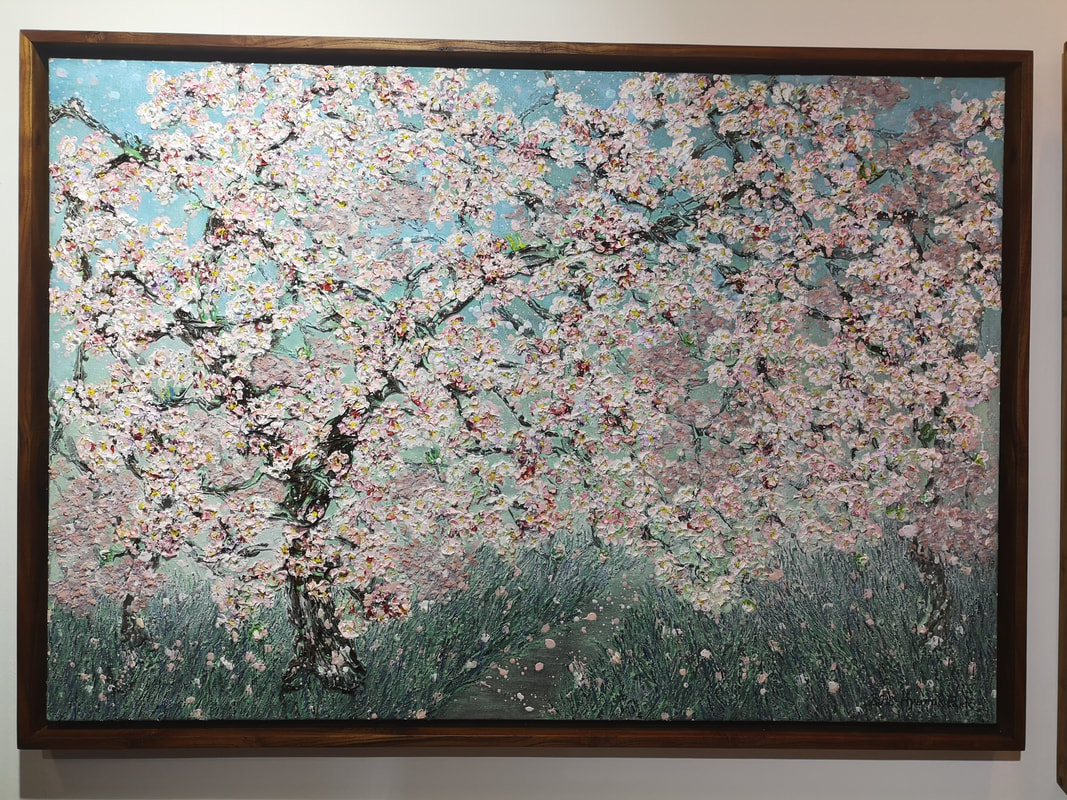
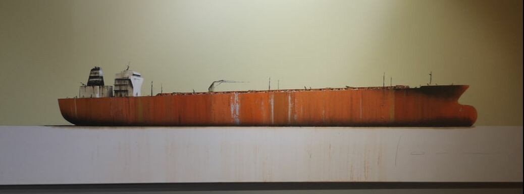
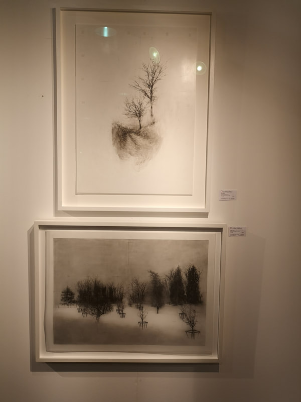
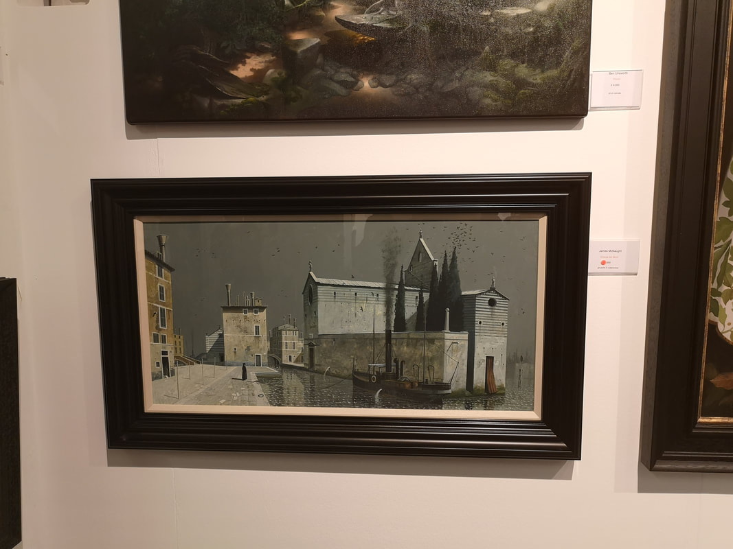
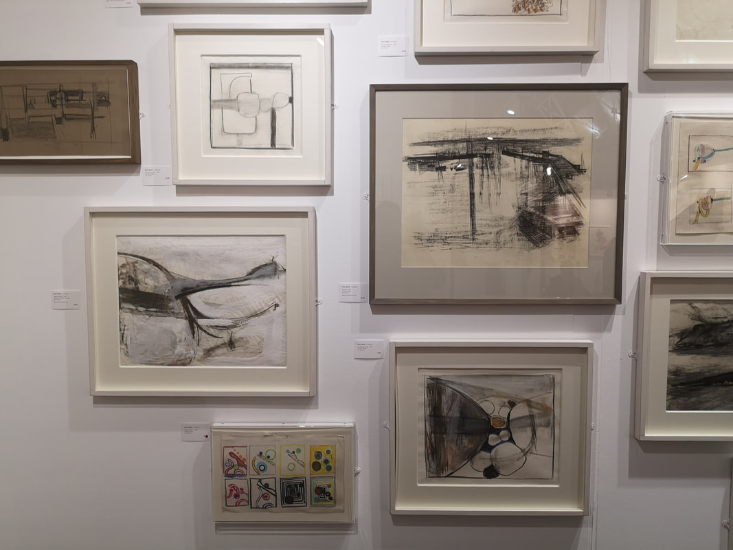
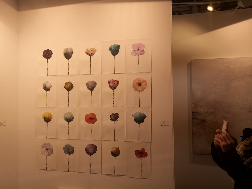
The horror of a cold and miserable January is punctured by the London Art Fair. It only runs for a week and closes on the 20th so chances are you've missed it. It is a show I enjoy. It is one of the few places where you can see allot of Modern British art in one place. It allows me to chart both how my taste is changing but also how fashions in the art market are changing. This year the vogue for slightly weird fantastical art has gained ground on previous years. None of it particularly grabbed me though. As I entered I made a decision not to photograph artists I had covered in previous years, a vow I broke almost immediately. If you don't know the London Art Fair, it is a mammoth exhibition centre called the business design centre, a large central atrium surrounded by a balcony and leading off the north side a smaller exhibition hall. In the smaller hall there is what is called the project space, for newer works and more avant guard stuff. I started there and moved down into the main hall then out the door. So lets go with the first one, which is pretty much the was this installation Ilkwoon Youn. Firstly there is pile of burnt looking paper (above left) which I enjoyed but better where these section black and white logs which make a city scape when you step back from them. It messes with your eyes but I like it. About left Beverley Bennett's trio of charcoal geometric compositions that she has called Graphic Score's. I like them they are very contemplative pieces, with these intersecting tonally varying shapes. This pretty much typifies where my tastes are moving towards, simpler, starker black and white pieces. Above right Rita Egli's Hominium figures, which come in groups of 2, 3 or 4, fused together at the shoulder. They are like space age figures, with their blank shiny faces, all peering up at you. Garry Pereira (above) is someone who I featured in previous posts and he was here again with finally painted landscapes in wooden box lids, but what really attracted me with this grid of small landscapes. They are superbly detailed with much charm and character to them. They could be quite cliche but both the composition of the pieces and Pereira's unique way of presenting them lifts them. They are very good. Do you like flowers then you will like these two paintings? Then I have something for you. Above left you have two paintings called Flower Garden by the excellently named Rinring Wang. They are simply coloured paper glued onto canvas but they have a lovely field quality to them. Bringing blossom brilliantly to life is Hyun Ok Park's Spring Afternoon. The lovely impasto blossom works spectacularly well. Its a photo-realistic oil tanker (above). Sitting alone, rusting and stranded on this gray background. The canvas is very long making for a piece that packs a punch. I like the detail, particularly the blue and rusting staining down the side of the ship. It is the work of Stephane Joannes.
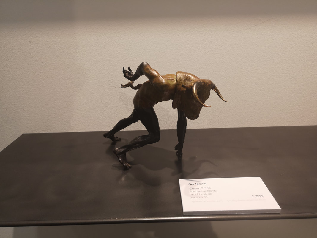
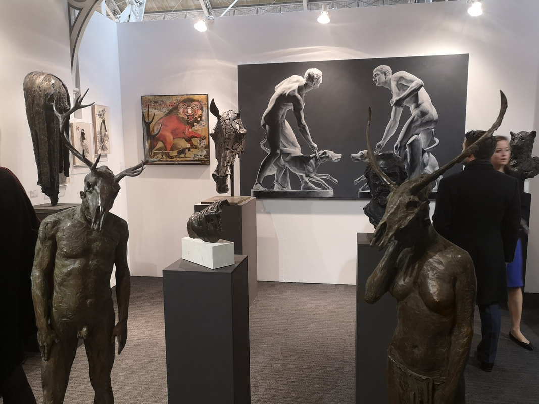
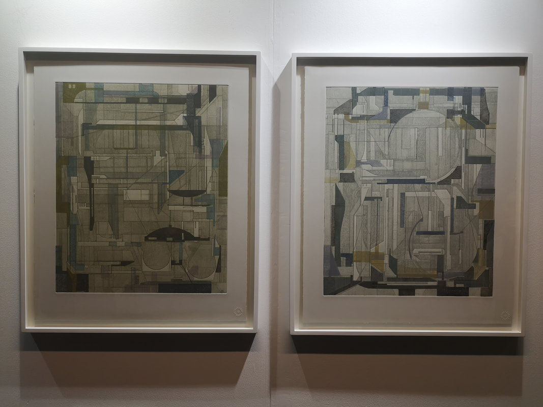
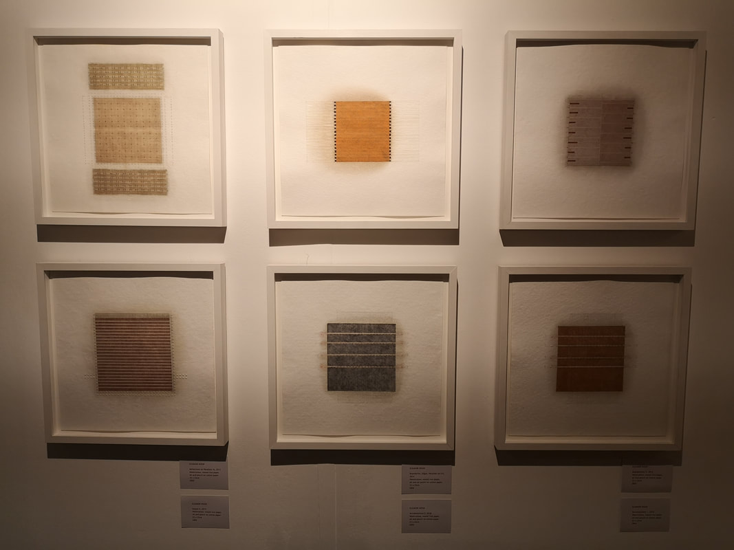
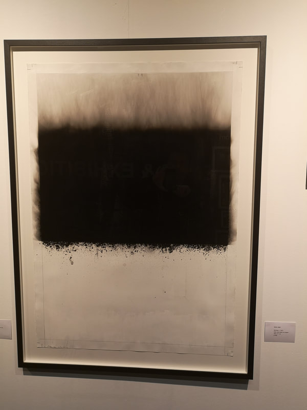
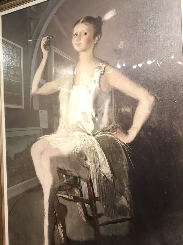
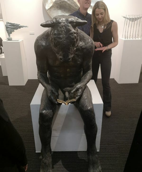
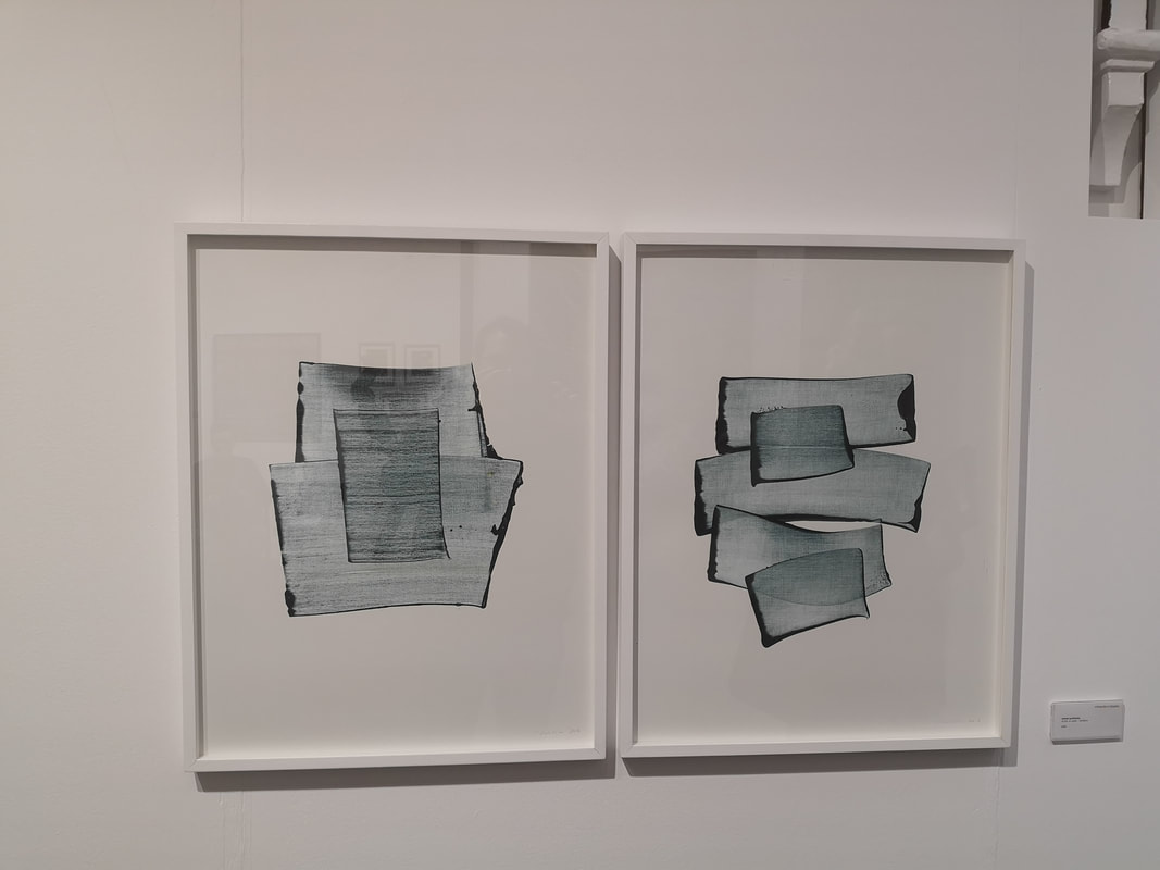
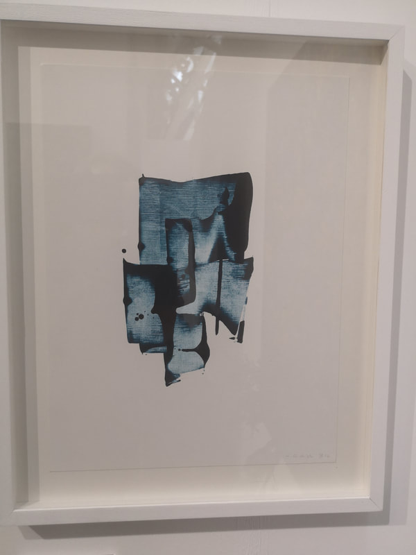
The vogue for the surreal and the fantastic was also present in sculptural form as you can see by these full length skull headed figures (above right). Very well done though, in a appalling way. Much more interesting to me is the Minotaur (above, above right) who is either setting off in a sprint or stumbling to the ground. It is bronze and is the work of Cesar Orrico. Above left we have James Kennedy's Transpositions, using the intriguingly named process of Intaglio (which is a printing process). It is a series of intersecting geometric shapes giving the appearance of buildings or a cityscape from above. I like it. Agnes Martin is one of my inspirations so I have a soft spot for work that echoes her style particularly when it is done well. The artist is called Eleanor Wood and I do like her squares of colour. Its made of soot! And water. Nigel Bird's Horizon (above left) delivers on its title in a novel way. That solid thick layer of black like the mantel of the earth, and the drifting lines above it that could be smoke (which is what the medium makes you think), but also could be fog bound trees. The framing of the piece is interesting but I think it work even better with white above, as well as below the image. Completely different, and vastly more expensive at a cool £35,000 is David Donaldson's Young Dancer (above right). Technically superb with the rendering of the dress and the central figure. What particularly draws me to this the sass of the pose and the slightly strange, chubby face. Its almost like she is puffing out her cheeks, or holding in a draft from the cigarette. It has what I like about portraiture, there is an actual person there.
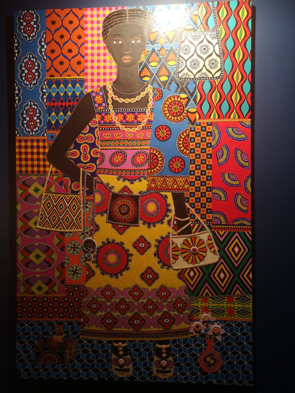
Carla Kranendonk, a very close contender for most excellent name in the show changes both subject and style for us completely with her joyous portrait Fifi (above left). It is riot of colour with the figure almost lost in the patterned background. You also have those nice 3d touches with the button on the bag and the flowers, coming out and enhancing what is otherwise a flat perspective piece. I like her pose to, and despite the simplicity of the depiction of the person you still get a sense of personality there. Minotaur! Full sized bronze sculpture, tackle out, but it is of course the bookish pose that really makes this superb sculpture. Its a nice contrast subject and positioning. Sadly I completely neglected to find out who this was by. If you are reading this blog on Sunday 21st and you live anywhere near Angel then you could maybe scamper along and find out for yourself and who know, if you have the no doubt tens of thousands necessary, this magnificent creature could be yours.
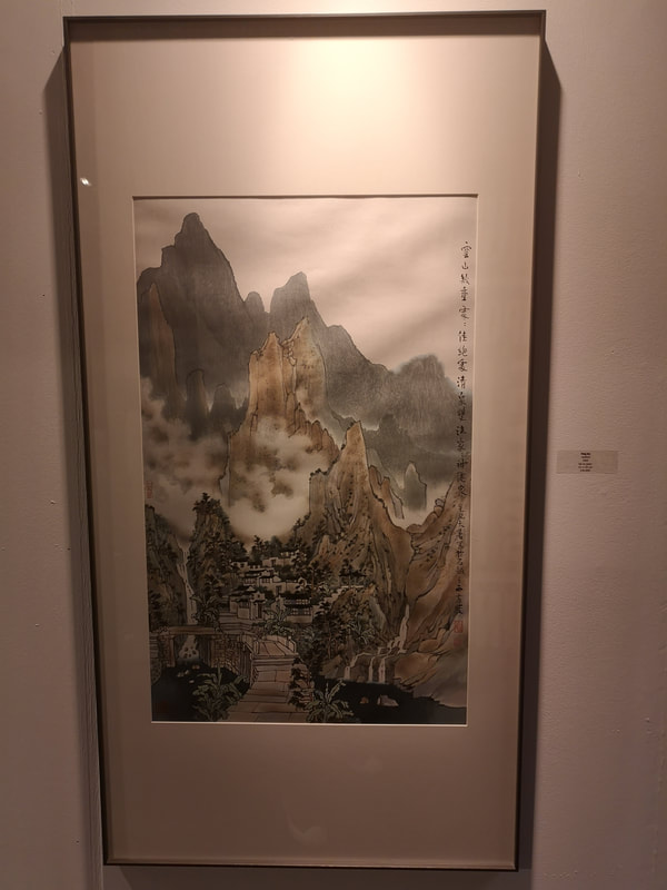
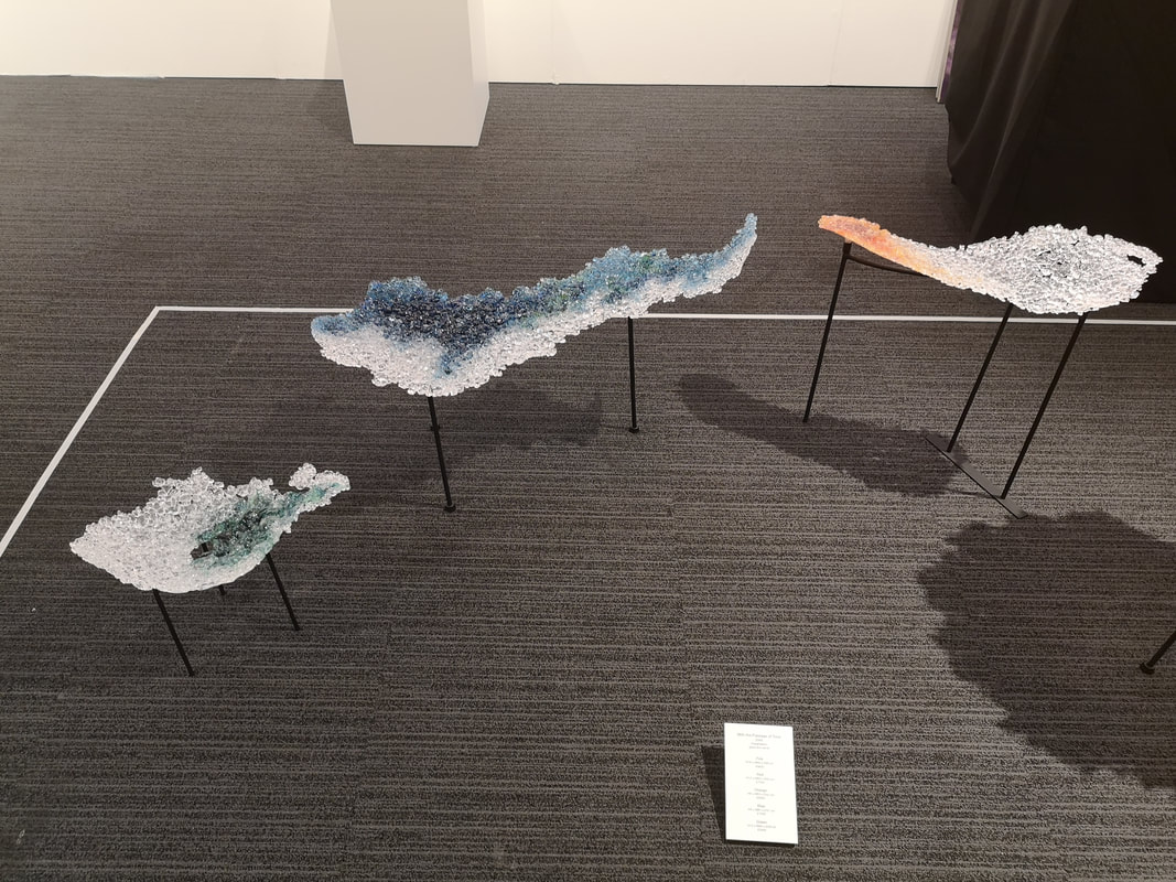
Fang Jun (above left) gives us a fairly traditional misty brown mountainscape. I like these. They very much invite me into the picture to be part of the world and the technique of hiding the landscape in clouds or fog is one that really appeals to me. Craggyness of the mountains is always a must. There are many of these types of paintings around but this was the only one in this show. Nice isn't it? Glass. I do like some glass. The work of Akido Noda is something that has attracted me before and would be purchased would it not be for the fact that you know, I need to eat and heat my house etc. This year there was a frankly lovely installation of pieces of coloured glass called With the Passage of time (above). They are delicate whispy things like clouds or islands on a violent see. They are lovely and I would wish to have them. Sadly they start at £3800 (for the one on the left) and go up from there. Also I suspect that just one would look lonely and you would have to Pokemon them (got to catch them all for those over the age of, actually scratch that because a few months ago I was behind an elderly woman in the cue at the RA who was playing Pokemon on her phone while we waited).
The shifts of shading within the pieces given them a feeling of depth and draw you in. At £900 they are also the more affordable end of the show. I really like these.
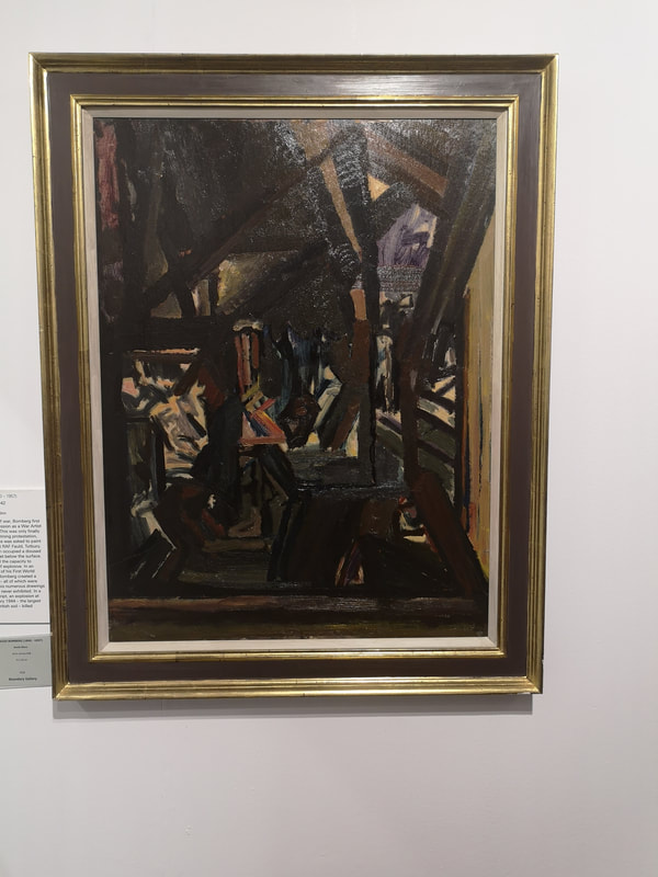
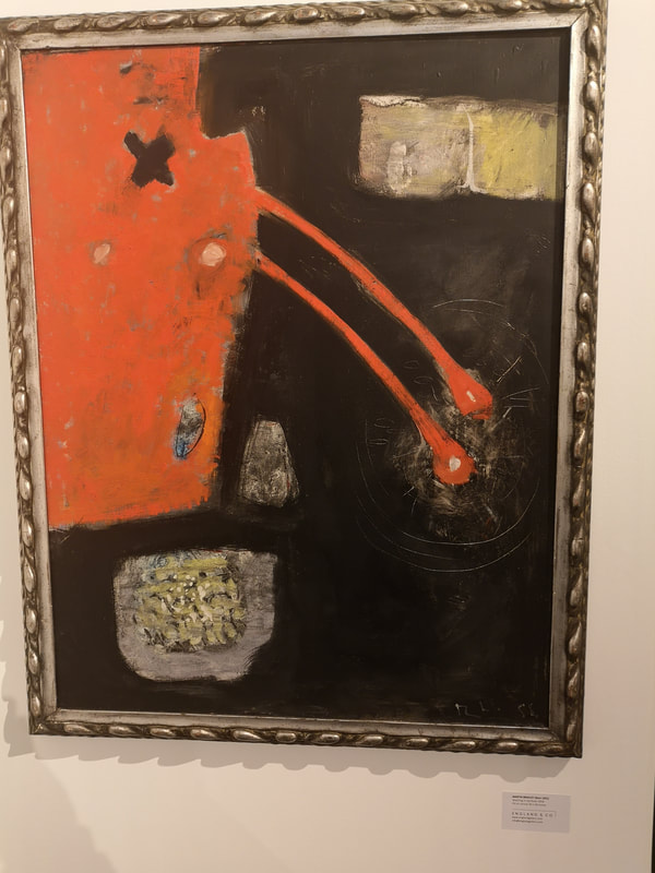
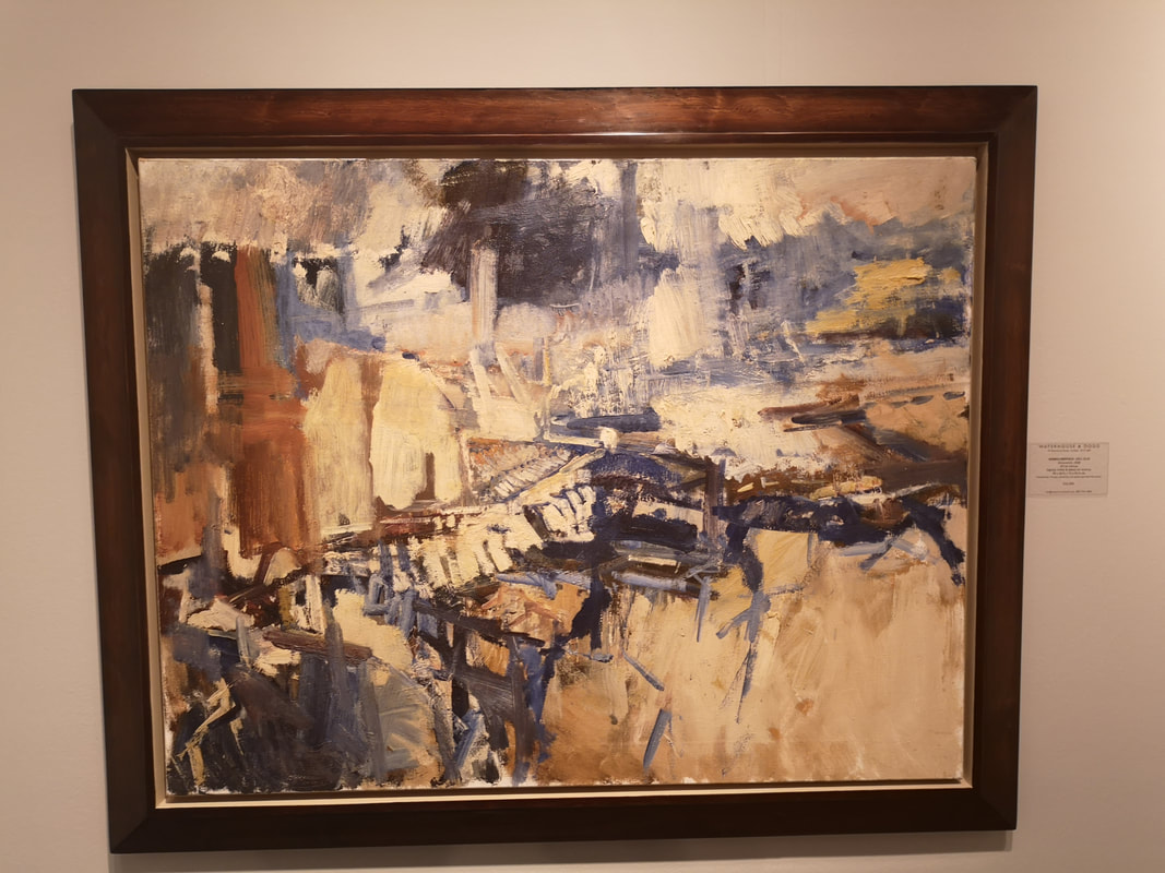
Frankly it looks like people pissing in the river and I wonder if that in fact what it is by the artist, or maybe the gallery had a fit of embarrassment and changed the name. I do like an abstracted landscape though. I like the darkness of the mirror with the splash lines scratched into it and the violent red, pouring into the river. Then there are those odd patches of grey and yellow. It is interesting to speculate on what those are. Little Islands? Bunches of bulrushes?
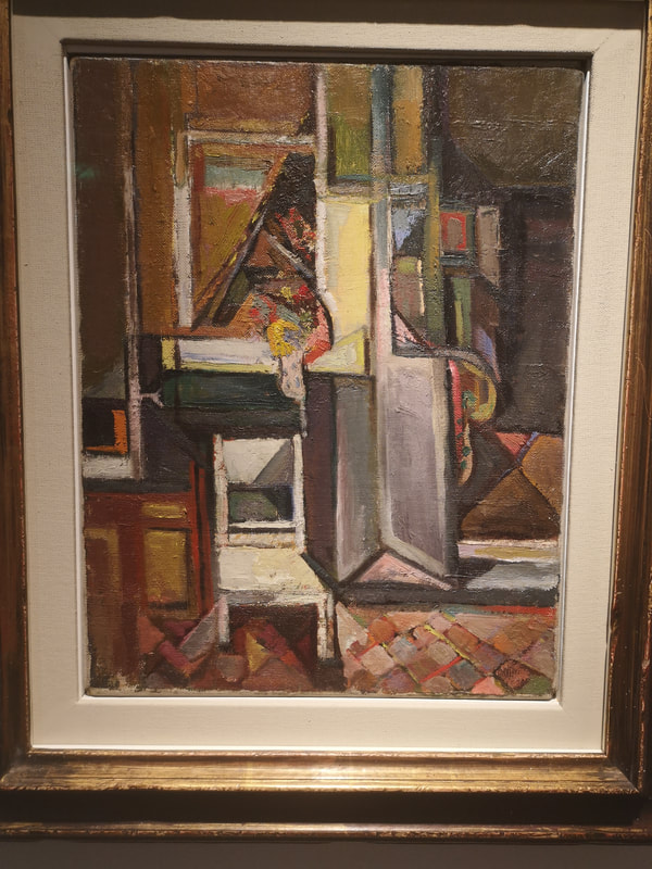
More restrained and cubist is Paul Feiler's the Green House Oxford (above right). Here there are more recognisable elements, such as a chair and a door, distorted in interesting and colourful ways to make for a fine composition.
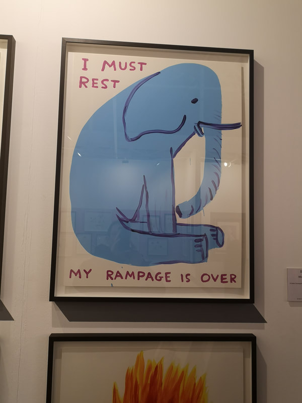
David Shrigley's My Rampage is Over (above left) is genuinely funny. I laughed when I saw it and that has been the reaction of everyone I have show it to. If you don't at least smile then you are a monster. It still makes me smile. Simple but effective the humour is done in the juxtaposition of the style and pose of the elephant with the words. Very well done.
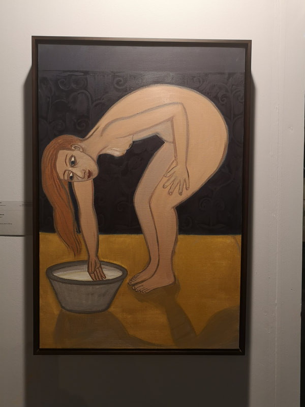
Eileen Cooper is another inspiration for me. She is a superb example of someone who has really nailed a distinctive style. You can tell work is her at a glance. Dynamic poses with a simple line to them and exaggerated features are her calling card. The negative space often makes for interesting images too. This one, Warm Water (above) is an excellent example of her work.
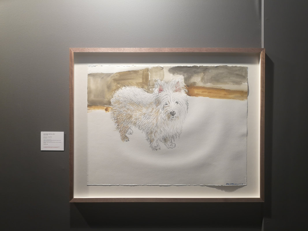
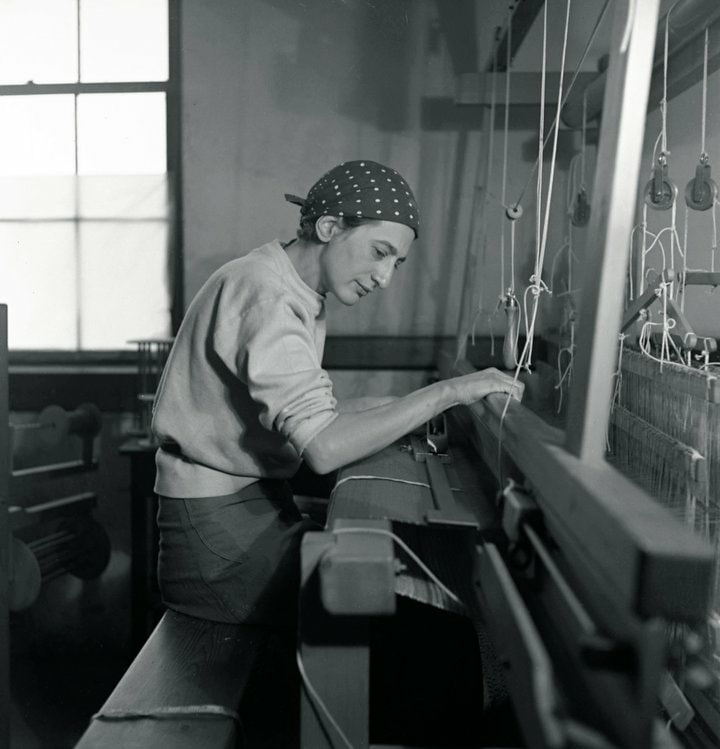
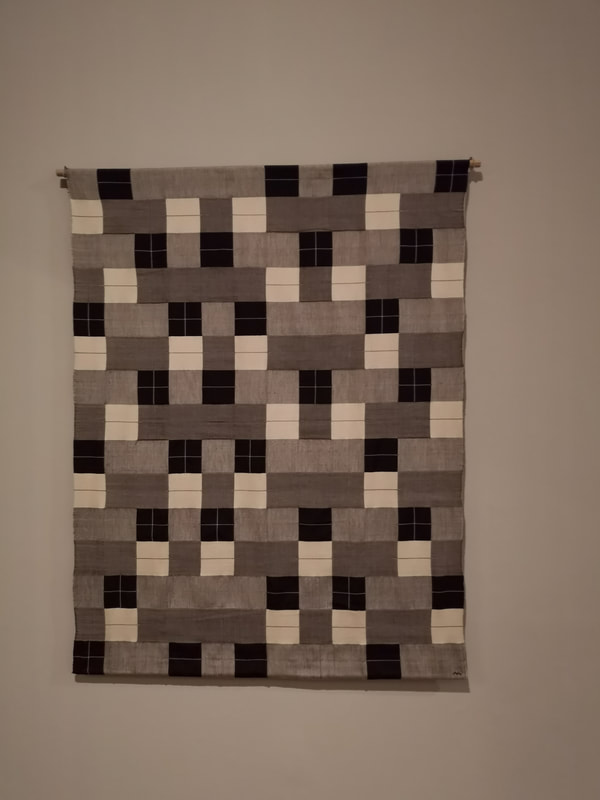
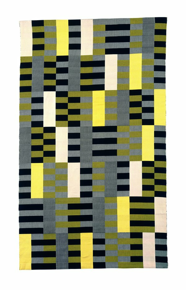
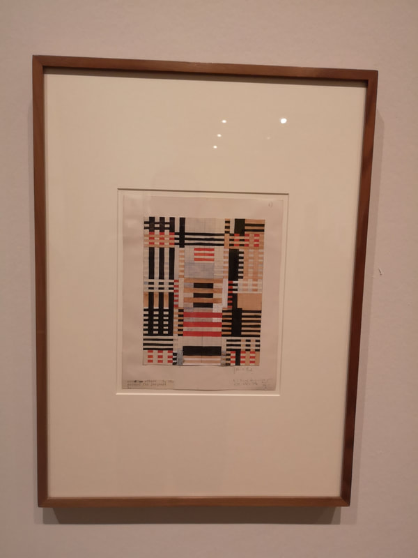
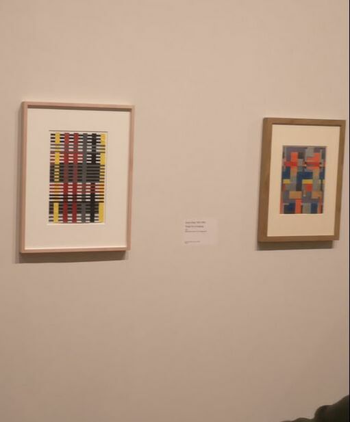
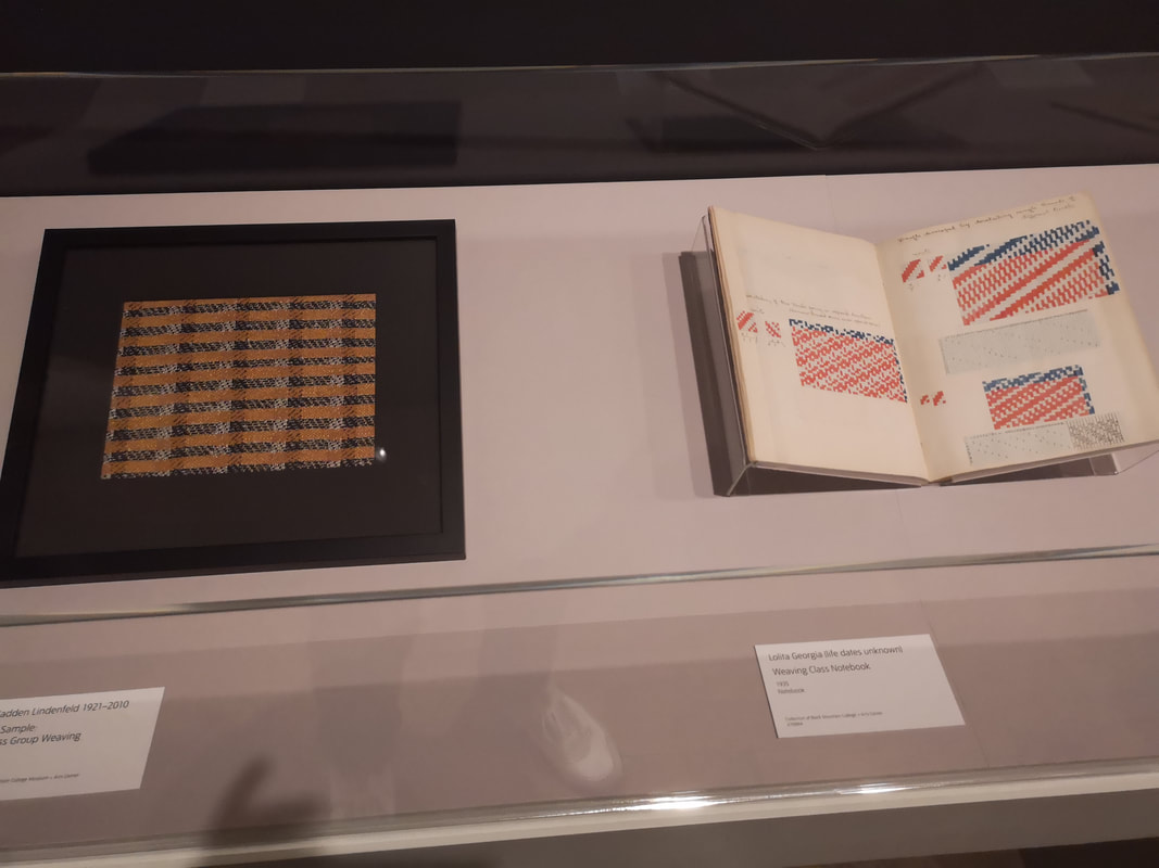
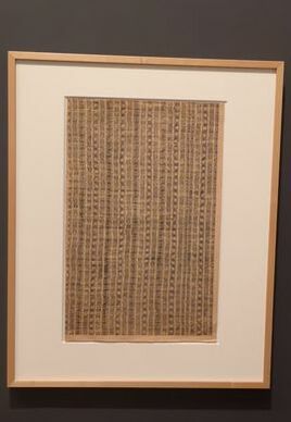
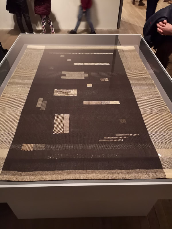
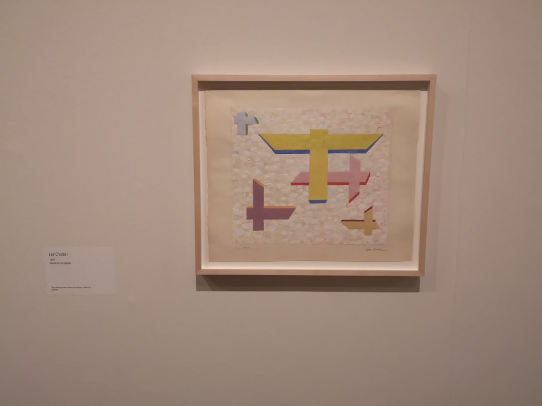
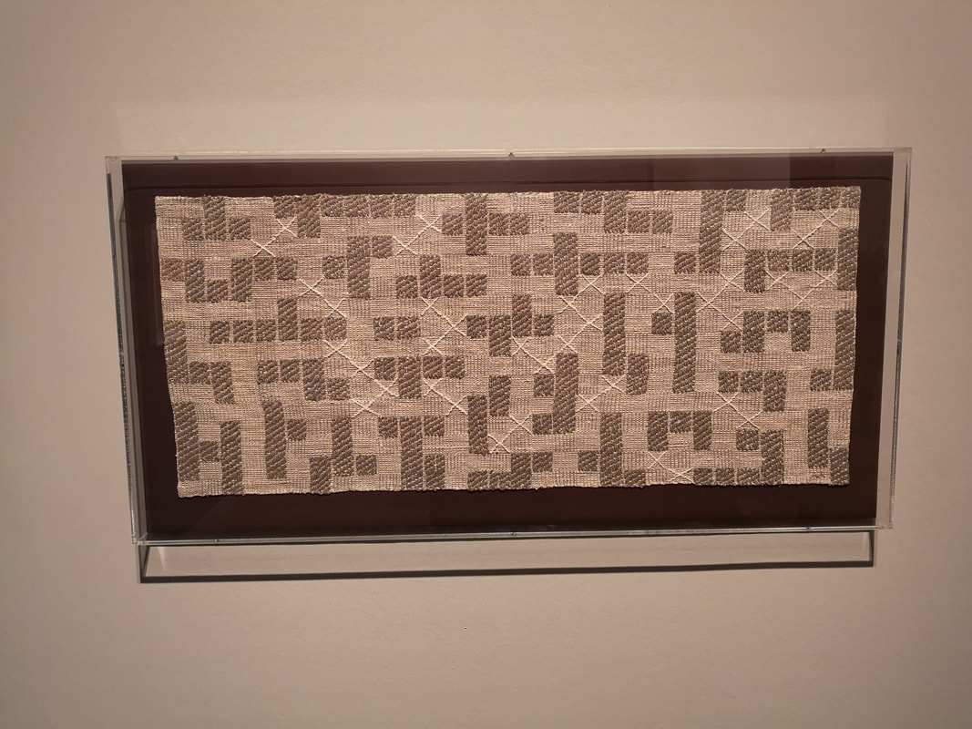
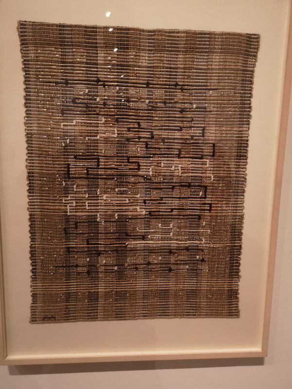
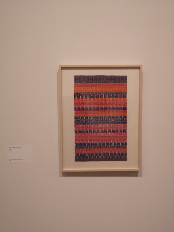
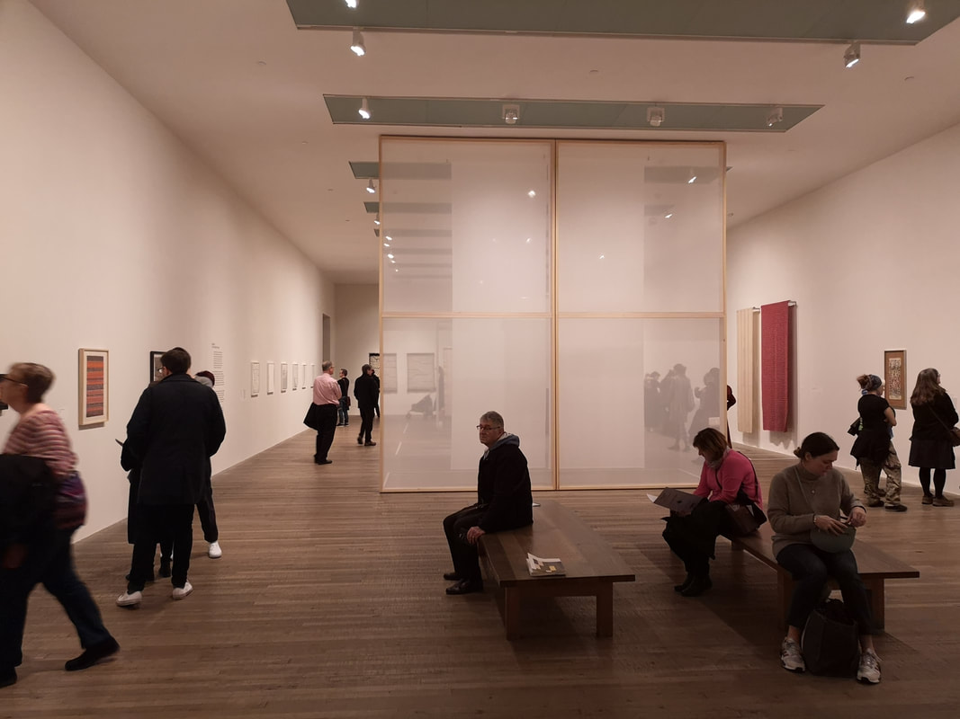
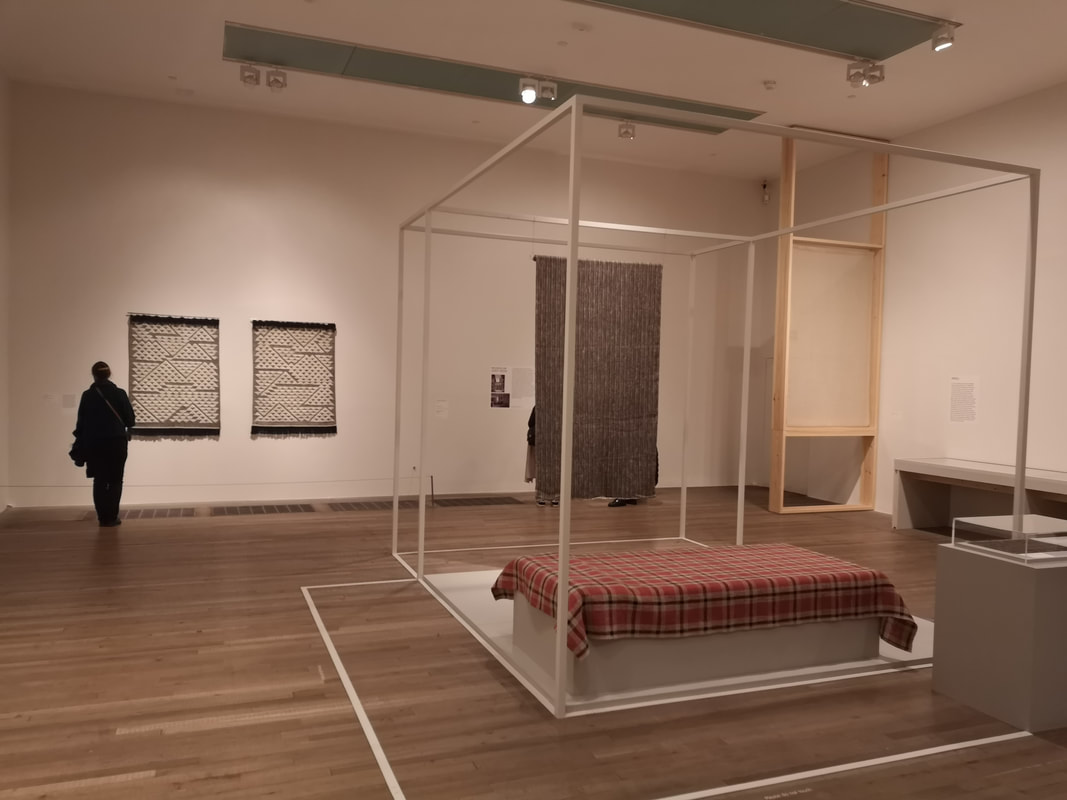
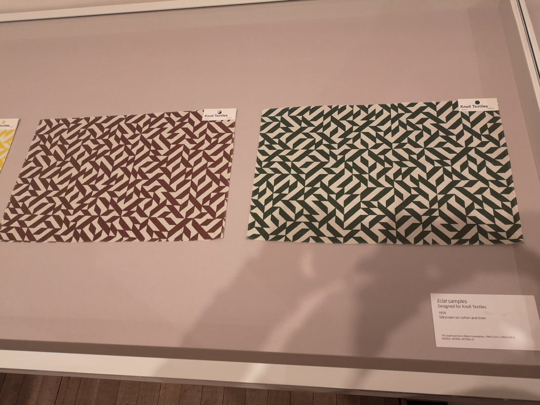
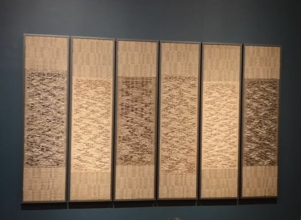
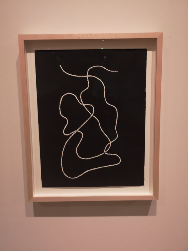
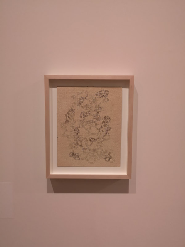
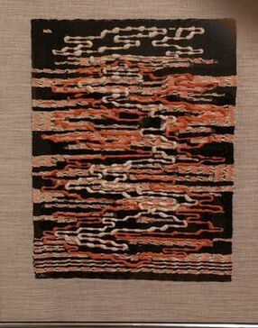
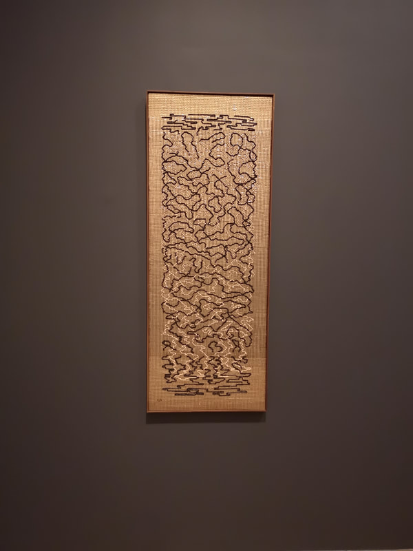
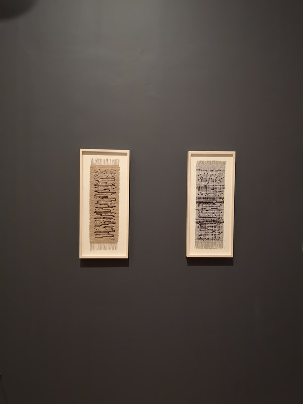
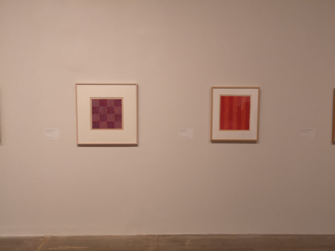
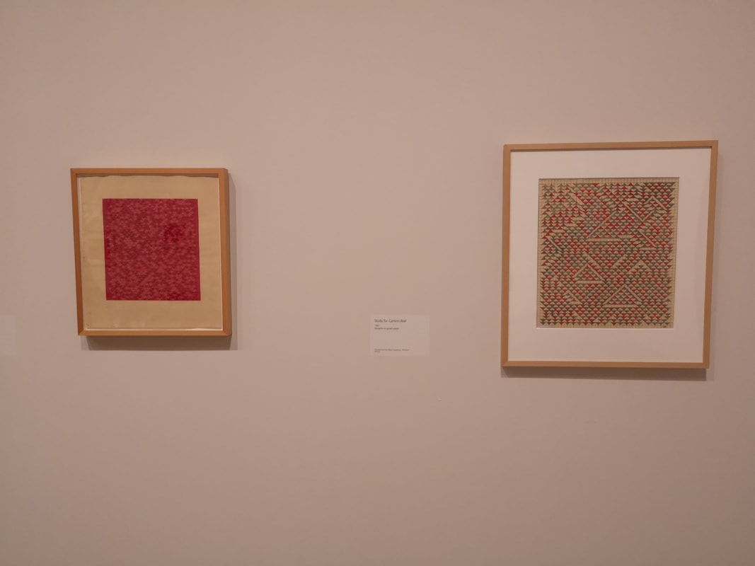
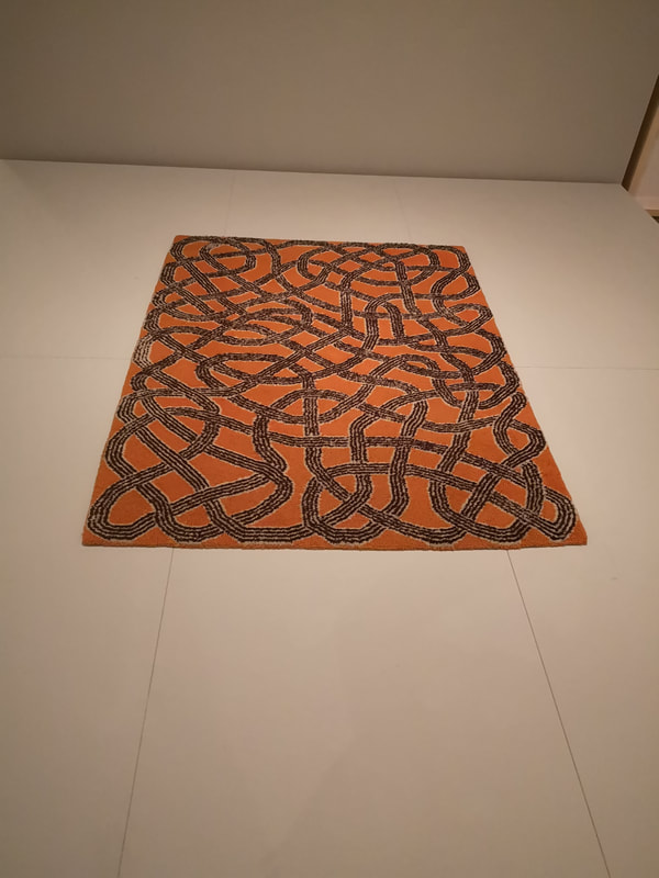
So that's it for this year. I will leave you with a cute picture of a dog, the work of David Remfry. I've been meaning to go to Anni Albers at the Tate Modern for ages but I finally made it. It is on until 27th January 2019 if you want to go and I suggest that you do. She is credited, more than anyone else anyway with elevating Weaving into art, and this show charts very nicely how she did it. You are greeted as you enter with a large loom, very like the one above, indeed possibly the one above. She was originally a student at Bauhaus in Germany before the Nazi's shut it down and thence she went to Black Mountain Art College in the U.S (where Rauchenberg amongst others studied). So the show displays her work and others from Bauhaus and the work of her students from Black Mountain. They have also done a smart thing in that some of the rooms are separated off, not by walls but by diaphanous hanging screens. It is very effective. The above is the kind of thing Albers produced, geometric wall hangings, grey white and black are a common colour scheme and I find them calming almost spiritual pieces. The squares are differently textured some distinctly jumperish. It is of this type of work that gives us possibly her most famous piece (above right) the simply titled Black, White and Yellow. As with much great art it is both simple and complex. What was also quite engaging was to hear two american ladies speculating how it was made. It would appear that in fact the technical skills required is considerable. In addition to the weavings are designs for hangings done in coloured gouache. Interweaving and geometric. They reminded me of Agnes Martin and Malevich or possibly Mondrian. The more blocky one which reminds me of tetris was done by one of Albers' tutors Gunta Stolzl, the first female tutor at Bauhaus. Another one of her tutors was Paul Klee and the ideas he taught of rotation and reflection of shapes appears several times in Albers' work. One of my favourite pieces in the show is above left, it is called Ancient Writing. It beguiled me for quite some time, not just ancient but also reminded me of a 1980s computer game. Above right we have a design in soft pastel Las Cruces I which led onto a silvery textile cross. The other piece above right is called Pictograpic with the thick grey shapes contrasted by these white crosses which you can just about see. The largest room has a number of different elements. There are the pictures weaves, like the one above left which has the name Black, White Gold, the black threads appearing almost like writing, a common theme in Albers work. There are more of these as you track round the room like Play on Squares, Northwesterly where she has managed to conjour up the feeling of a weather front. She moves into colour as well with the vivid red and oranges of south of the border and the layers of blue, purple and red that you can see in Red and Blue layers (above right). Albers does tend to be somewhat literal in her titles. The room is divided by a gauze screen and roughly speaking once you get to the otherside you are into commercial designs that Albers either produced on commission or speculatively. Something very austere about that lonely bed covering in the square enclosure above right. Among these commercial designs was a pattern that looked very familiar. Albers produced them for Knoll Textiles. I am not sure whether I have seen these actual patterns before or if they have just had many imitators over the years but it certainly has a very familiar feel to it. You can very much see here the rotation and reflection that Albers learnt from Klee. As you round the corner into the home stretch the smallest room in the exhibition contains the most spectacular piece of work. Commissioned by a Texas Synagogue the Six Prayers are six wondrous columns of golden thread. Each one is given a subtly different composition. Differing uses of black and white thread give a tonal contrast between the pieces. They are very nice. They really glow and I bathed in them for quite a while. Frankly the show is worth it just for this. Knots. If you are a weaver you are going to be obsessed with knots. Indeed one of the thing this exhibition brings out is the depth of Albers' knowledge and there are samples in cabinets where she has tried using different materials in combination. Back to knots. Above left you have this stark and effective white gouache on a black background. It is quite evocative. More complex is this pencil and ink drawing (above center) with elements of the knots highlighted in the ink. Finally these elements go onto to appear in textile form in Underway (above left) where the rivlets of thread feel like river currents, or lava flow. More Gold! This time in Epitaph (above left) which has a water like quality where at the bottom of the piece the direction of the thread shifts giving it a reflective quality, does the same at the top to. Its like a sort of organic maze. You have here again the theme of suggested writing but this is displayed more effectively in two smaller pieces (above right) called Code (the gold one) and Haiku (the silvery one). It is also in this room, in a screened off section that you have the samples mentioned previously and also the products of Albers' research and trips to South America, particularly Peru, which provided a substantial amount of her inspiration. There are also a number of very careful Gouache studies on the wall where Albers tries out different colours and different shapes to see what works. This is done well in this show, showing her process and mind at work. For such a technical, physical medium like weaving this is somehow more successful. In other shows I have been to this part has been a bit flat and dull.
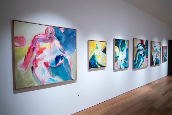
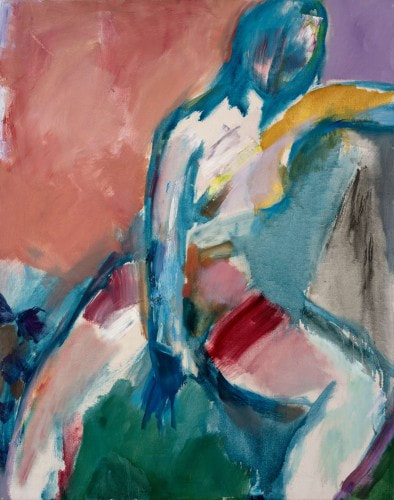
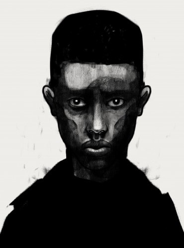
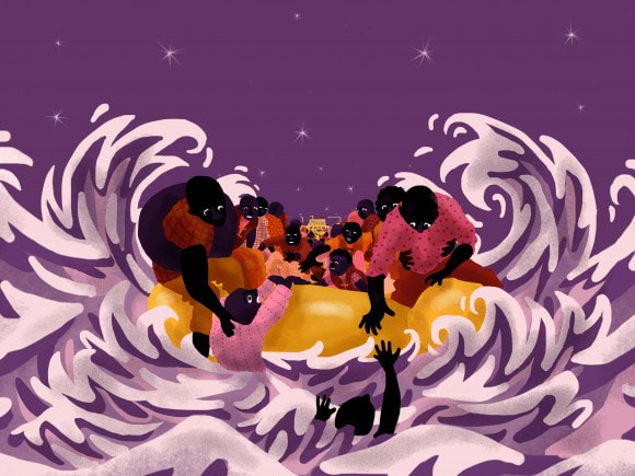
I shall leave you with a rug with knots on it. Annie Albers is someone worth getting to know. The House of Illustration is very much Quentin Blake HQ and it is now very much playing to this theme by hosting an exhibition of 100 figures done by the man himself. They cover quite a few from his immediate post graduation days right up until the 1990s when for some reason he suddenly stopped. Curiously the exhibition doesn't say why which is odd given they could just ask him. The first room is a mixture of wet pastel life drawings, which look like a sort of heavy charcoal and pen and watercolour sketches in which you can see the beginnings of the Blake style of illustration which is so familiar. Two interesting things are revealed though, one was that when he got home he would add imaginary figures and background to the drawings, and secondly after a while he wouldn't sketch directly from the model but what from their body stayed in his mind. Eventually he abandoned painting from real people altogether and painted instead from figures conjured entirely from his mind. It is this aptitude, something I find almost impossible to do, that leads him to be such a great illustrator. The sketches develop though into these large oil paintings, like the one at the top and above. They were never done for public consumption it would seem but instead seem to have been a sort of relief. I can understand this, it is nice to do work that you just do without worrying about who will see it. The style is interesting, these great washes of colour, the form highlighted in blue (as in the above) or red or pink, and the shadows picked out with again big patches of colour. You get the feeling it is all done at quite some speed. The features are always obscured, which is not something I like in life drawing but I am prepared to forgive when the model doesn't actually exist. What you end up with is a vivid painting that has strong tonal and colour contrasts. They are very nice and it is interesting to see this other side of Blake. The final room finishes off with figures done in a gentle wash of water colour. Fans of Blake will find this interesting but if you are interested in life drawing then this is a show that will provide another perspective. The other exhibition, occupying the North Gallery is called Journeys Drawn: Illustration from the Refugee Crisis. It is as the name indicates, illustrations inspired by (that seems to be the wrong word, reacting to would perhaps be better) the Refugee crisis. The quality is very good but it is fairly depressing stuff and being in a fragile mood at the time I found it difficult to stay in the room with for a protracted period. The intense portrait above is a good example of the type of thing you can expect to see. I have to say it makes for a fairly odd companion exhibition for the light hearted jollity of the Quentin Blake show. There are a variety of works on display though to the illustrative of tragedy such as this very good picture of people on a small inflatable boats, being battered by the sea and vainly trying to save one of their number (above left). I like the way their reaching and hugging arms are echoed by the splashing tendrils of waves.
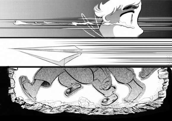
You also get actual animations (which you can sit and watch) as well as story boards for animations, such as the above right. I had gone to see Quentin Blake you see and only really encountered this show by chance. I wasn't really in the mood for it so probably didn't spend the time with it, that it deserves, I scampered round and retreated instead to the gentle whimsy of one of Britain's foremost illustrators. I shall probably go back though and give it a second go. It is on until 24th March 2019. |
Archives
June 2024
Categories |
 RSS Feed