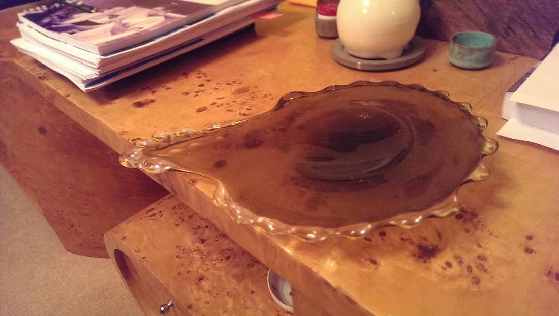
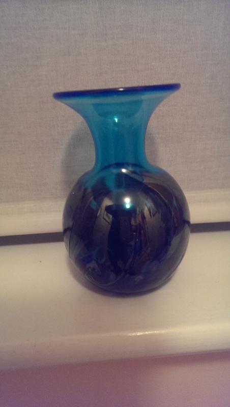
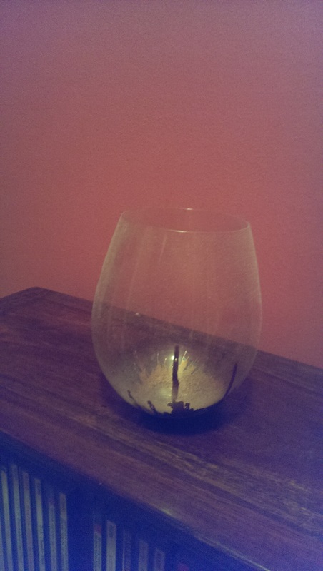
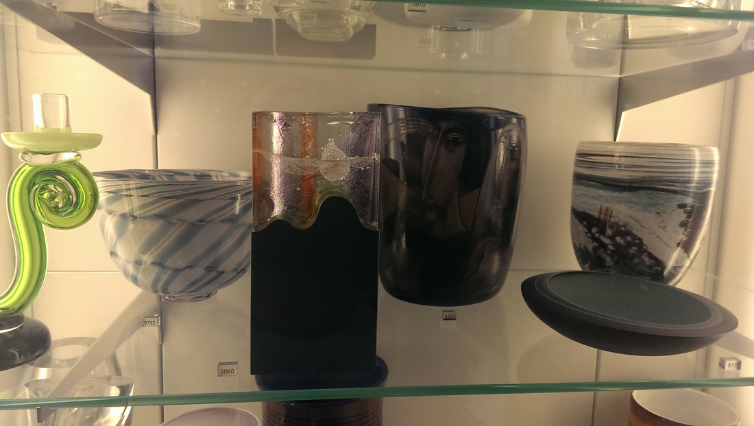
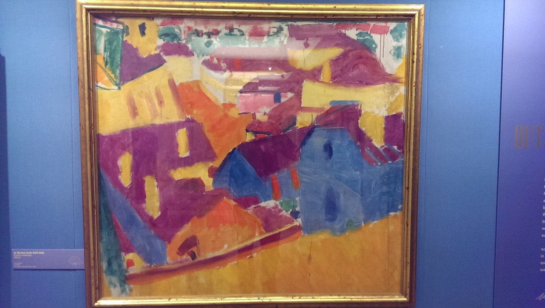
 I have a long held obsession with glass, that predates my interest in painting and art generally. It encompasses all types of glass, those you drink out of and sculputral or decorative glass. It is all the fault of maternal grandfather William Cook Stuart, after whom I am name. He was the last member of the family to run Stuart Crystal, then a family firm, before it was sold to Waterfords Crystal. By the time I new him he was retired but still maintained an active interest in glass and gave out prizes and scholarships. There was always very interesting glassware in his house. He also introduced me to kippers. This is what I put my abiding interest down to. An interest that I have to work hard not to indulge because glass, particularly sculptural glass is expensive, very breakable and difficult to store. If I win the lottery I might build myself a glass wing. I do have a few pieces. My favourite is probably the Blue vase, which I bought in Bath and is the famous Bath Aqua Glass. It has a deep blue quality glows differently in different light. The splashed gold glass is by a woman called Hanne Enemark and my wife bought it at the Ma degree show at the Chelsea Art college back I think it was in 2008.
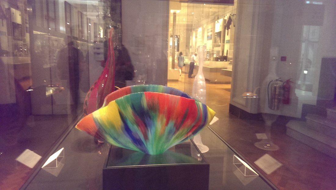
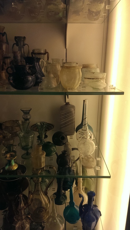
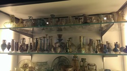
Where then can you see glass in London. There are basically two main places. The first is the wonderful glass room at the V&A. It is cunningly hidden on the top floor, through the architecture room and so if often an oasis of calm when the ground floor throngs with hordes of people. I often marvel at the simple ability of stairs to defeat people. Fortnums has the same thing, step up of the crowded food floor and you enter a much more sparsely populated world.
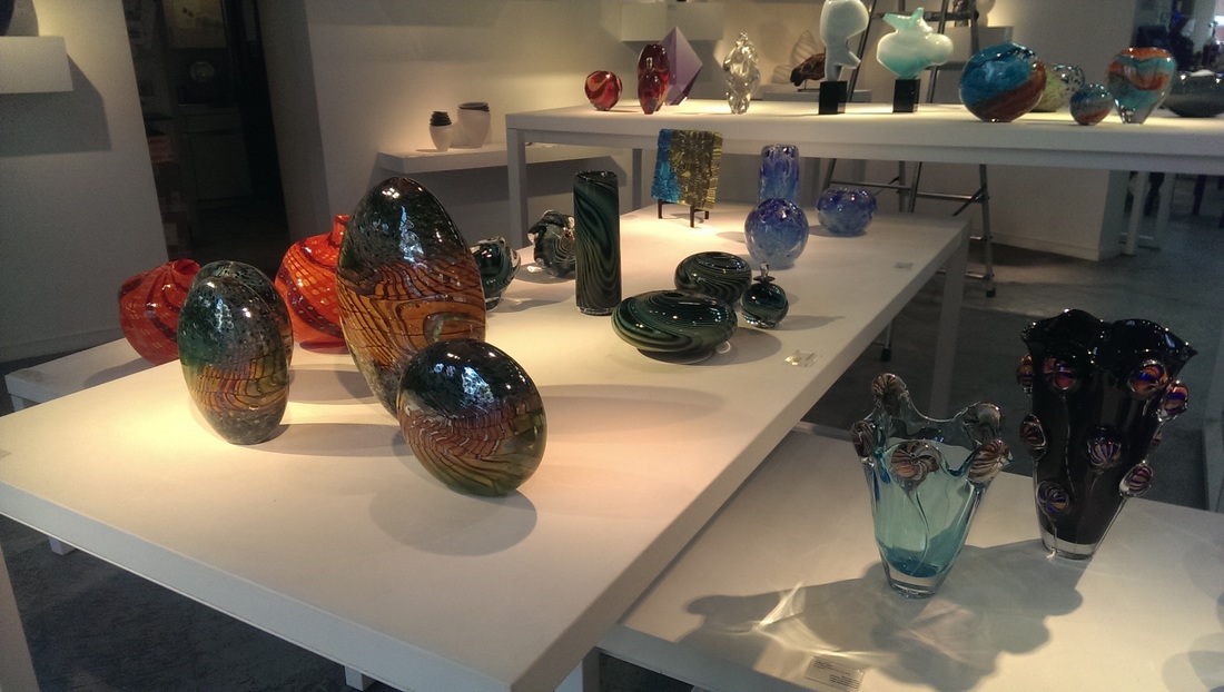
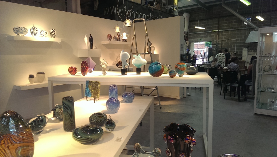
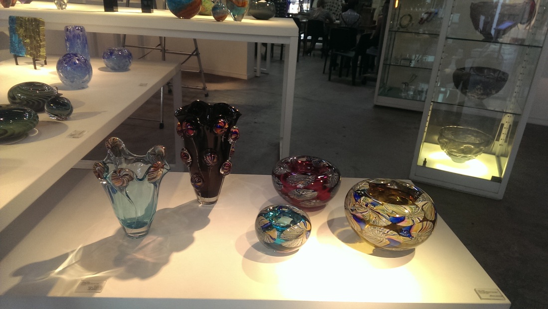
The other place is London Glassblowing in Borough South London. It is an active glass blowing studio and gallery displaying contemporary glass which is available for purchase. You can also sit there and watch glass being blown which is a nice and interesting experience.
0 Comments
Hugh Mendes has a show at Charlie Smith. I went there for a private view. My first private view at a commercial gallery. It was an interesting experience. The gallery is on Old Street directly above the Reliant pub indeed the best way to get there is to go through the pub and up the stairs at the back. This aids greatly to the lubraction of the patrons.
https://www.google.co.uk/maps/place/CHARLIE+SMITH+LONDON/@51.5265907,-0.0863878,16z/data=!4m5!3m4!1s0x48761cbab9cd8aaf:0x2847b9c310090e18!8m2!3d51.5265907!4d-0.0813935
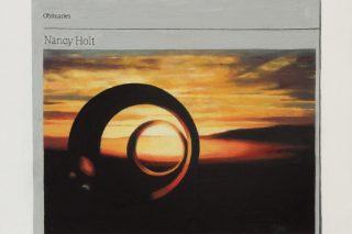
I was familiar with all the works on display having seen them hanging in Hugh's studio and in some cases seeing them in production as it where. What struck me was how different they looked in this new context. They looked much better. The theme is Dead Artist's, done in Guardian obituary form. There is something about the idea of an artist painting dead artists that reverberates with people. The Nancy Holt picture (above) is one of my favourites and it looked even better in the gallery environment.
The first night was packed with people including Edward Lucie Smith who had been the judge at my first exhibition with the Law Society Art Group. At Hugh's event he was sporting the most fabulous coat. 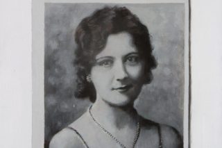
The picture that was most transformed though was the Dorothea Tanning (above). In this new context it looked very sweet and had an emotional power that I hadn't perceived before. Discussing this all with Hugh afterwards he said this is one of the reasons he moves his pictures round in the studio to see what they look like. It made me think what other pictures, particularly mine, would look like in different environments.
London is lousy for museums and the large ones like the Tate eclipse the smaller ones. One of these is the London Guildhall museum, situated in Guildhall square, attached to the Guildhall. Lots of Guildhall going on here.
The main gallery takes you back in the past. Mainly Victorian era work. If you like Victorian painting then you were like these. Some of them can be a bit mundane. There were some that really caught my eye.
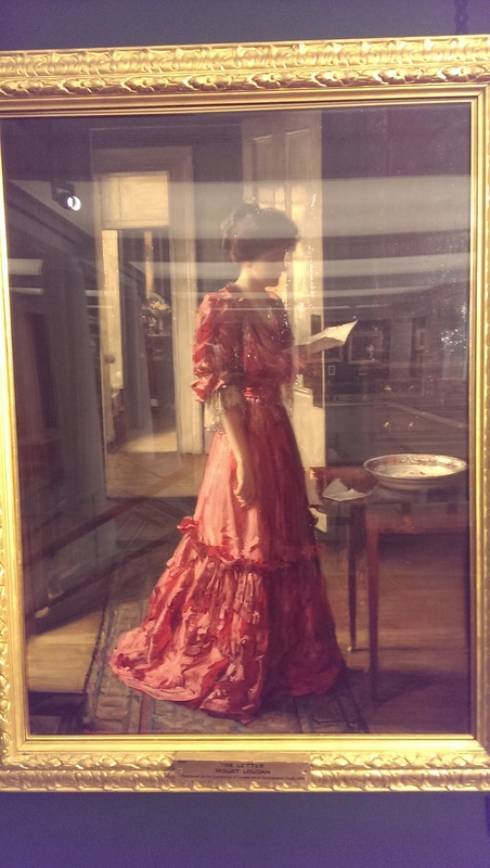
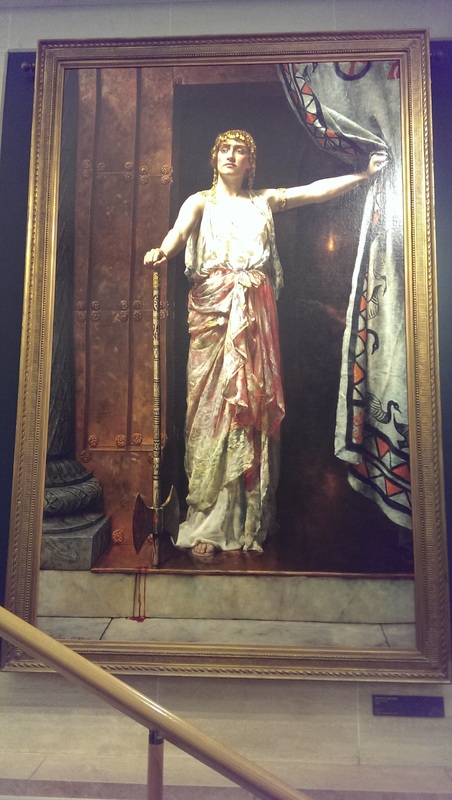
These two sit more or less opposite each other. The on the left is called the letter and is by William Loudan. High Victoriania, as indeed many of the paintings in this gallery are. Such a genre of painting is out of fashion at the moment and indeed many of them are dull but I like this one. I like the fabric of her dress and the slightly mournful attitude as well as the perspective of the room vanishing into the background. I am thinking of doing a version of this with someone holding a phone and call it the text, but then again maybe not. Contrasting vividly with this is the implied violence and vivid blood flowing along the floor of John Collier's Clytemnestra. I particularly enjoyed the nonchalance of her facial expression. Women of violence and power are rare in western art and this is a good example. The marble texture is excellent and the whole thing is really made by that rug.
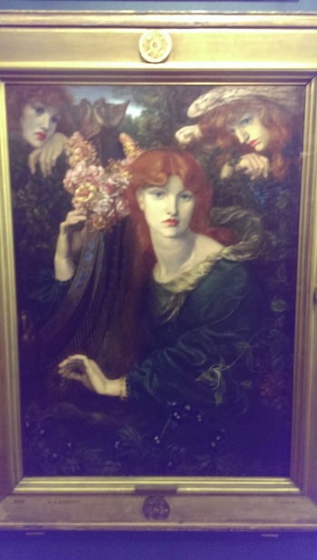
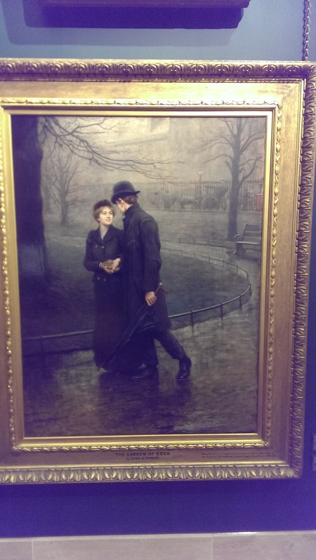
There is then a Rossetti (above left). Typically and obviously so with the pensive red haired girls. They are magical things Rossetti painting all wistful and pensive. It is physically distant in the gallery from the piece I have put next to it. Annoyingly I have managed to lose my notes of what this is called and who it is by but the picture is clear enough. Early 20th century, the gazing expression, the dark coats and foul weather and the Turner-esk light in the background. This is a doomed love affair.
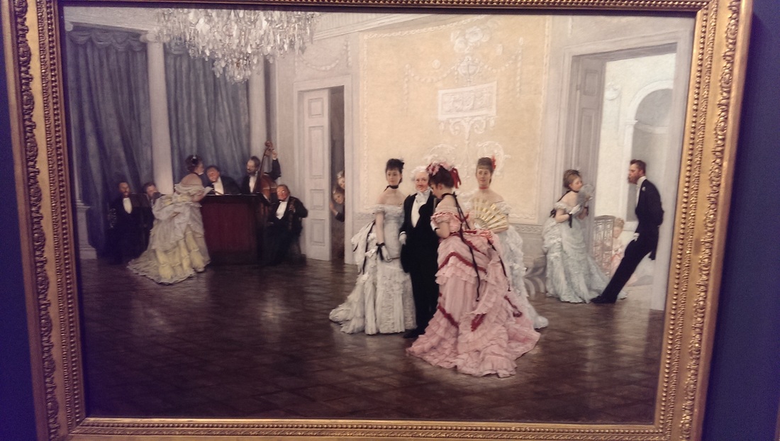
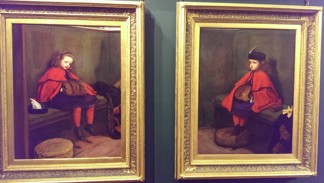
I am a fan of humour in art so I enjoyed the pensive boredom of the figures in the painting on the left called Too Early by Jame Tissett. A sumptuous picture with a sumptuous setting deflated nicely by the subject and air of boredom. We have all been at events like this. It made me smile. Another piece was a duo by Millais called called My Second Sermon and My First Sermon. You can see what's going on there. The star of the museum is the truly enormous picture called Defeat of the Floating Batteries at Gibraltar by John Singleton Copley. All pomposity, patriotism and propaganda it dominates the space taking up nearly two floors. You have to admire the scale. John Singleton Copley is someone I have encountered before but this painting other than the scale didn't particularly hold me. 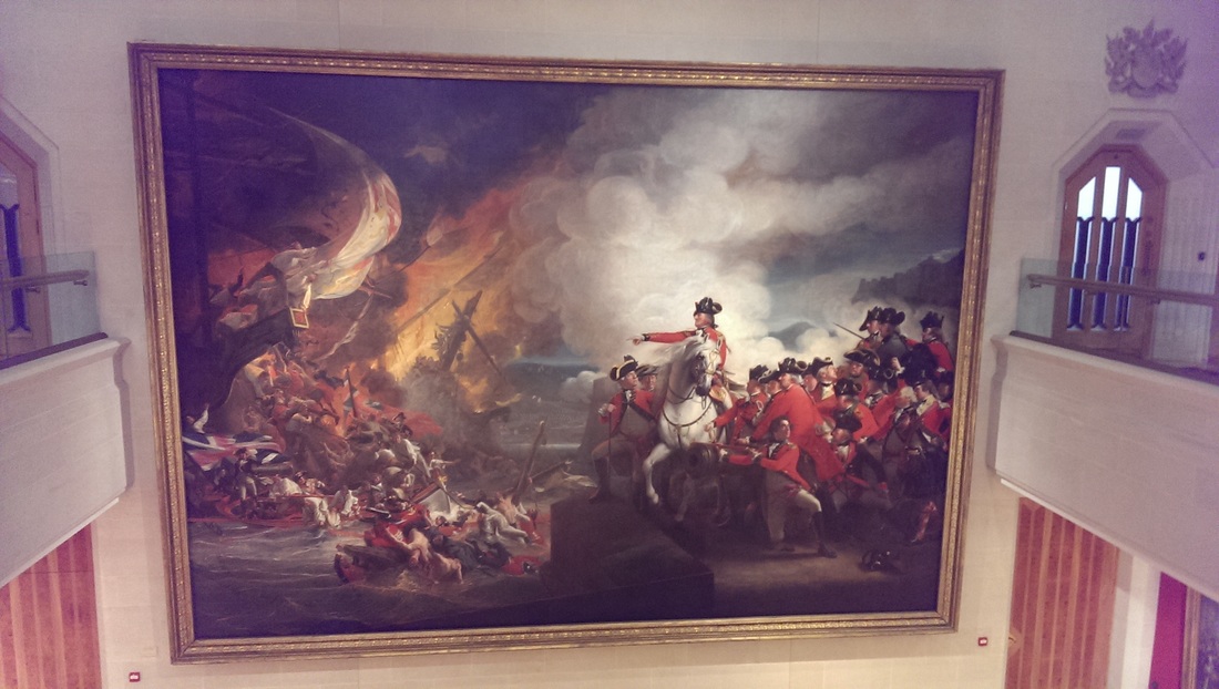 This year I visited Cornwall for the first time that I can really remember. When you get there you can see why the landscape and the setting have inspired so many artists and so many choose to live there. I came away with a number of images, some of which have already become paintings. This is the story of two of them.
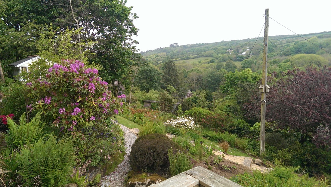
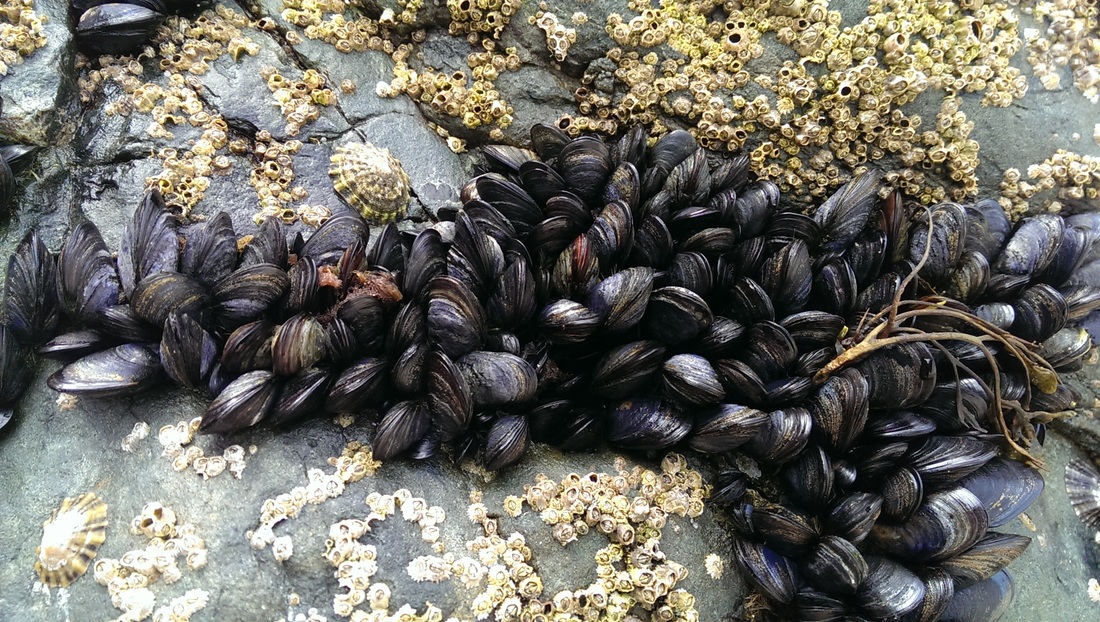
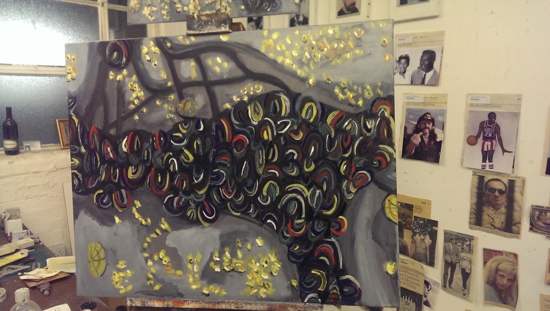
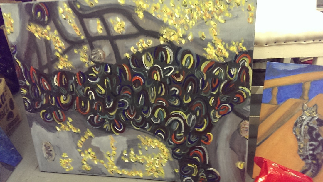
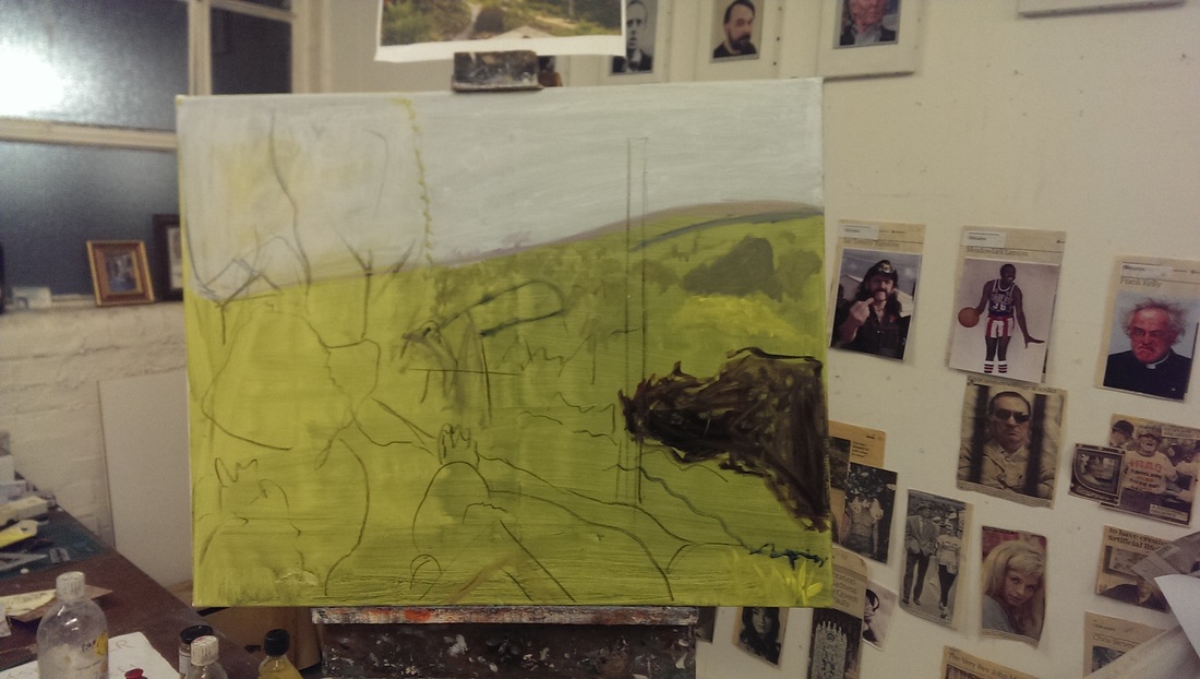
The top left image is a view from the hillside in Lamorna. There was an open studios event going on at the time and small white building behind the bushes is an artists studio. I forget his name. The other picture is a whelks and muscles attached to a rock on the beach at St Ives. To deal with the right hand side first. I was attracted by the subtle different colours on the muscles, the sheen of the rock and the contrast with the yellow whelks.
To render this accurately is frankly beyond my skills. I time this summer to experiment as Hugh Mendes had gone to USA leaving me the keys to his studio. Thus I was able in invade on a regular basis to try new projects. I started with a small version on board. and worked this up to the large version (left). It involved several layers of different gray and blue paint. Then simply a question of going a bit mad with arcs of different colours paint. After a couple of weeks I had achieved the painting on the left. I was pretty pleased with this but it lacked enough energy so more yellow whelks were added. It was a very rewarding project and may provide me with a new direction to try, sort of semi abstract. I also benefit from painting on a big scale. Then onto the valley view.
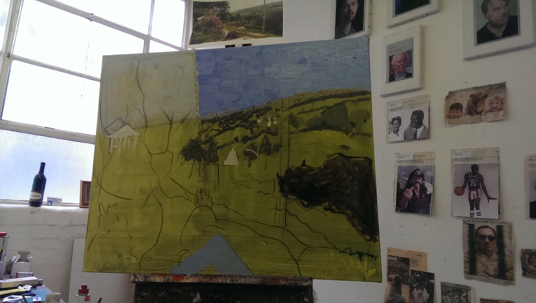
The painting is of the same size and started off with a green coloured ground over the whole canvas. Then the sky was marked off in blue and a rough sketch of the major features added over the top. Blokcing off the bush on the right in blue helped me get a real sense of it all, as did the outline of the tree on the left. From this I added sky in solid blocks of paint. My idea had been to do the whole painting in this fashion but again I sound found this wasn't going to work. Instead I started building up different layers of colour including the lines of the hedges and the buildings.
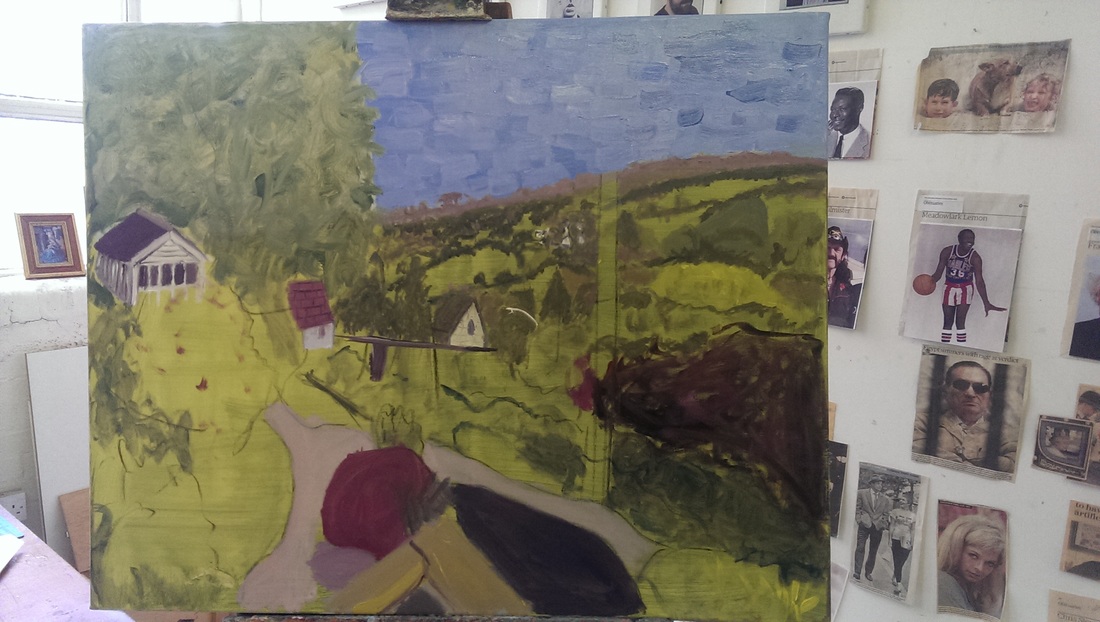
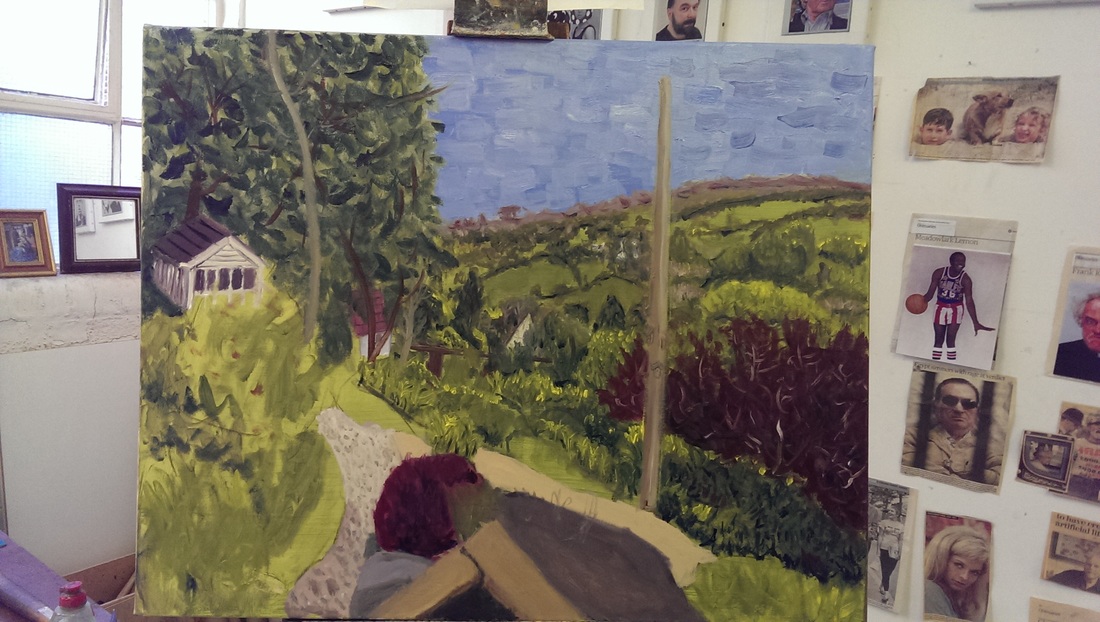
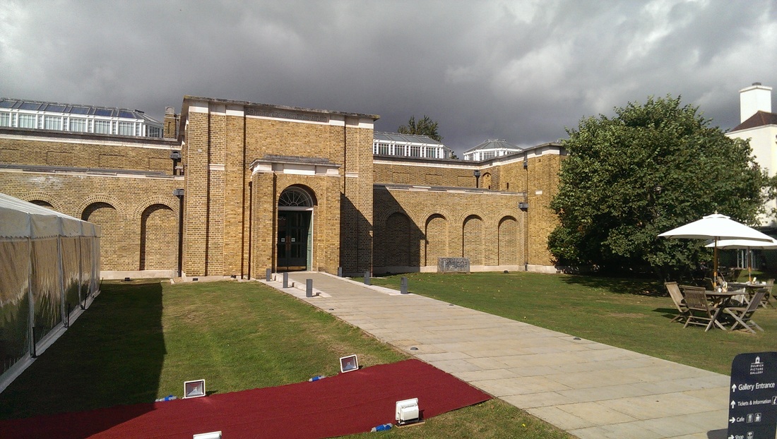
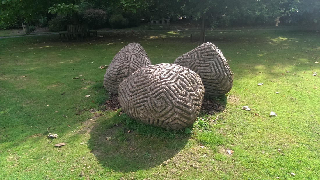
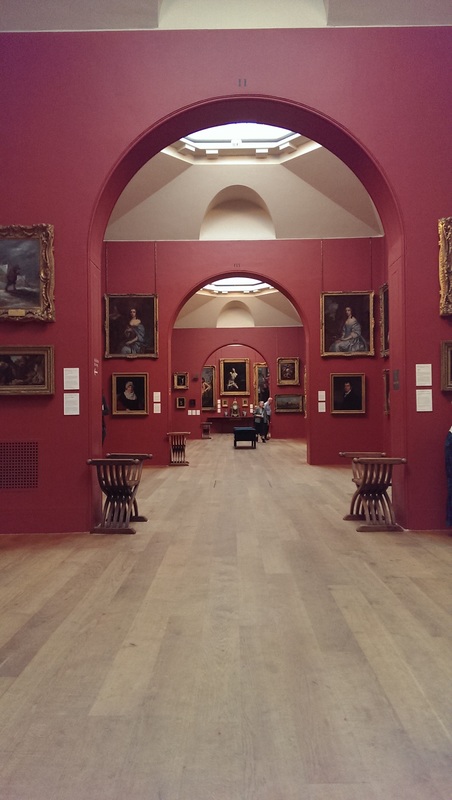
Even though they will eventually be hidden I painted in the buildings, it helped add depth to the building and also define the foliage around them. I should say this is all oil paint by the way and the main development I have made since I started is the deployment of more paint. Then it was simply a matter of continuing this painting, adding in the main tree and the path and shrubs in the foreground. Hugh's tip was that the elements in the centre of the painting were a barrier and should be replaced by just a path and the sky was too much and should be knocked back. So this is what I did. It took several attempts to get the texture on the path but was eventually achieved by dabbing with a fan brush. This and adding the shadow to the plants along with the lines of the phone cable achieved the final effect. I am very pleased with it. The big question is which one of these two styles should I follow? 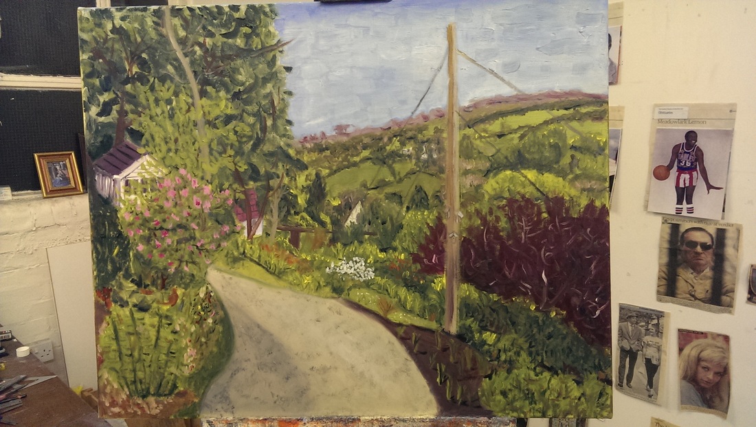 Dulwich Picture Gallery is, apparently, the oldest public art gallery in England and was purpose built. It well not exactly nestles, it is a little to large and imposing for that, shall we say resides, in the semi rural London suburb of Dulwich. I have been meaning to go for ages and did recently, for the first time, to see the Winifred Knights Exhibition. Previously I have been put off by its distance from the centre of the metropolis but it is in fact, very easy to get to, a short hop by train from Victoria (or Brixton) gets you there in about 10 minutes and then a leafy walk of about 5 (follow the steady stream of satchel bearing old buffers) takes you to the Gallery. Dulwich itself is very picturesque itself by the way. It is a winged pavilion like structure best seen from the road but the entrance path winds round the back, passed some rather fine etched stones (below right) to the almost prison like entrance at the back. There is by the way quite a fine cafe there.
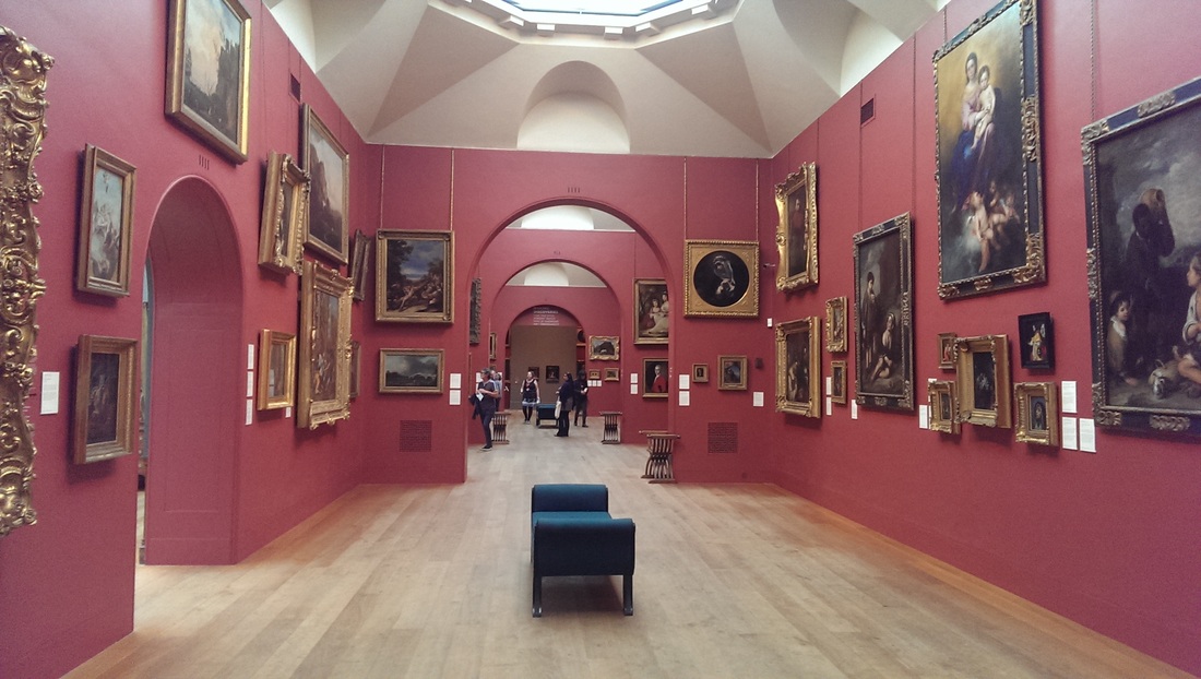
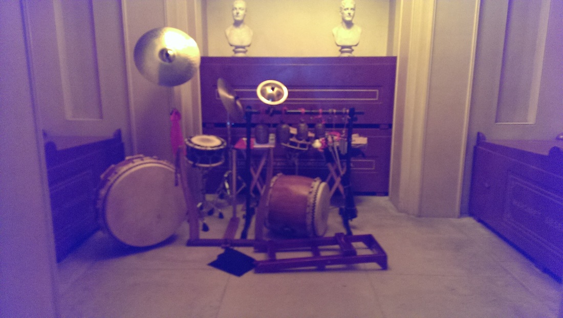
Two of the galleries are usually set over two paying exhibitions. It also costs to enter the main exhibition unless, like me, you possess an art pass, in which case it's free. You are greeted, immediately on entrance , glowering at you as your haggle fruitlessly with the staff at the counter, by dutch old master style painters and it is this style that predominates the collection. There is a large well lit central hall with ante-chambers radiating off it. The collection is a little to large for the space its in and there is a little bit of a stuff it all in attitude. This means some of the paintings are quite high up and difficulty to see. In one antechamber, I think the smallest and softly lit by orange light percolating from small highlights was what looked like an abandoned drum kit but was in fact part of a sound exhibition called In Harmony by Liam someone (my note of his surname is illegible).
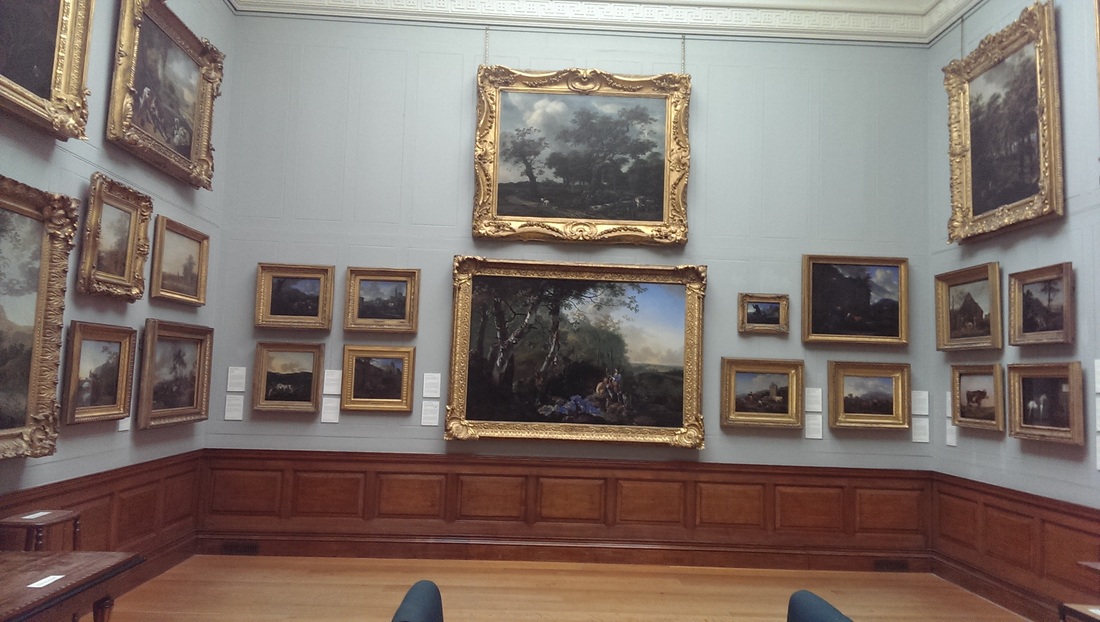
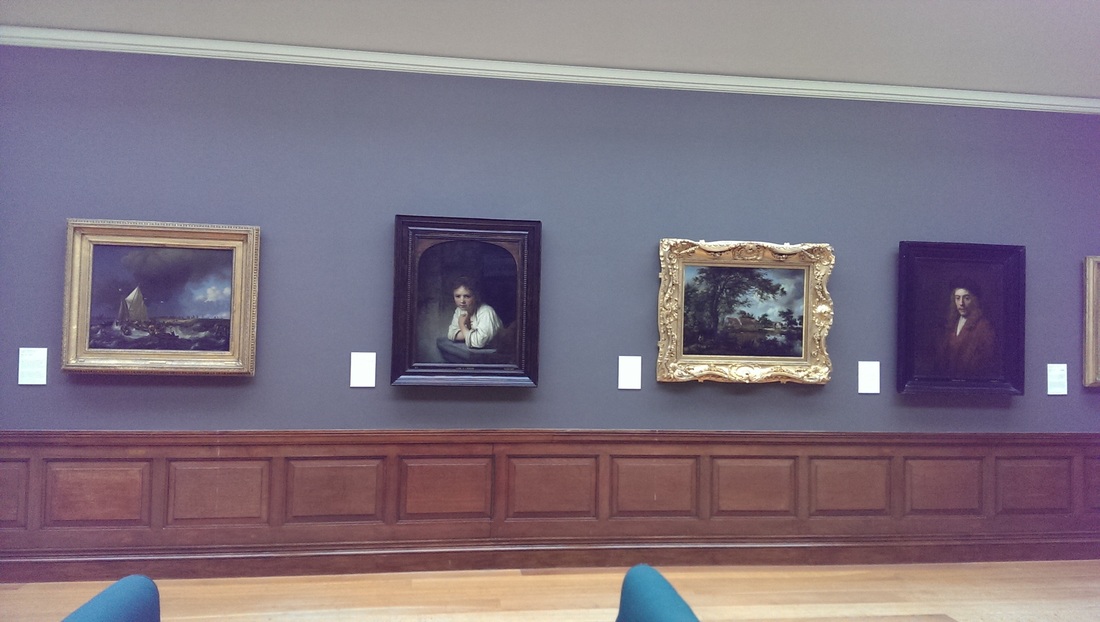
As I've said above the collection is mostly dutch style old master paintings. While I can see they are excellent paintings I find them somewhat dull. There are only so many elderly smug men in black and hats that I can take. The great thing about going to galleries though is discovering new paintings and artists that appeal. I do like galleries with walls that are a colour other than white which can be far to sterile where as these soothing pastel red and blue I find make for a soothing experience. This allowed me to take the time and discover a few gems.
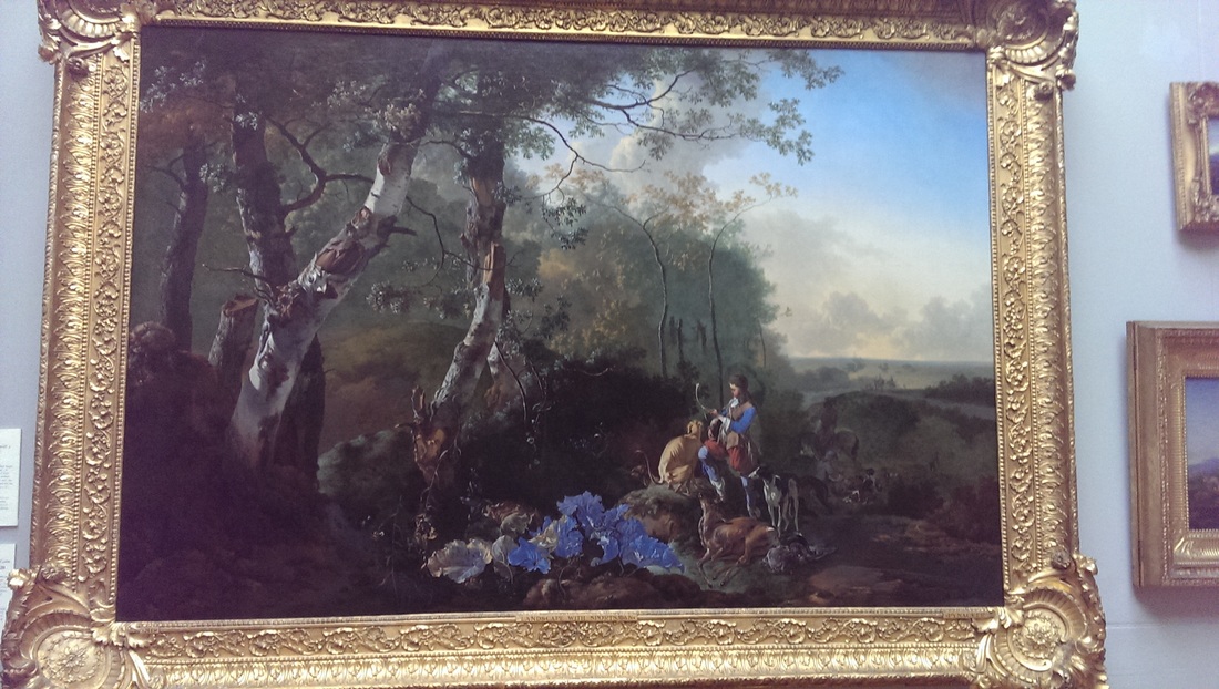
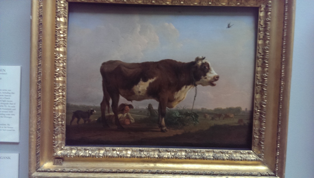
Some paintings are lifted from the dull by an unexpected element. In this case the blue flowers setting off the blue jacket in Adam Pynacker's Landscape with Sportsmen and Game. It gives a focus and dynamism to the picture. I also like this very amusing bull by the amazingly named Balthazar Paul Ommeganck. It is a solid creature from a man with a solid name. It has fine musculature.
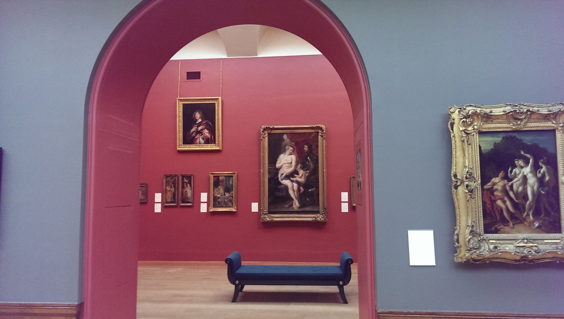
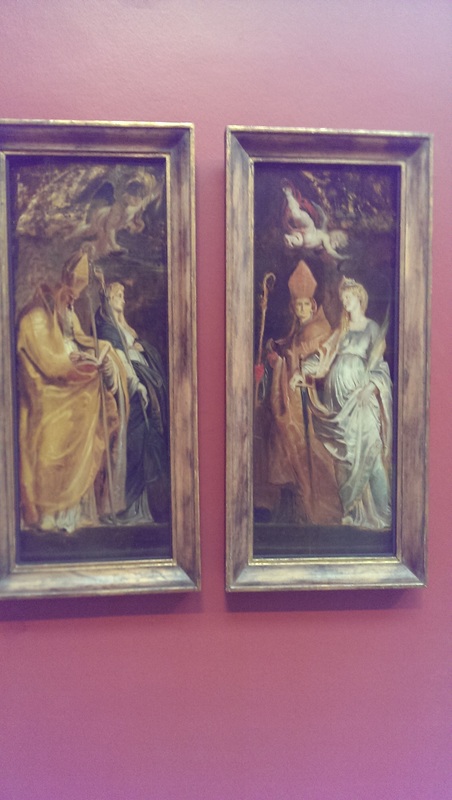
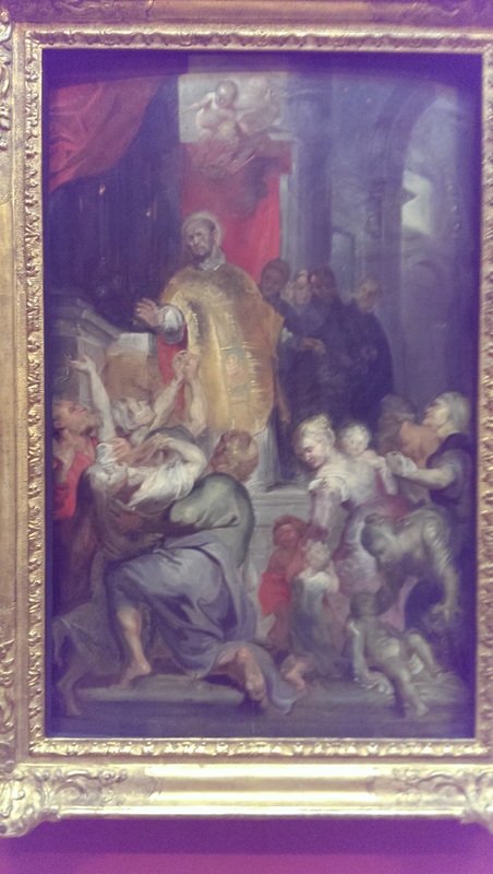
The gallery is lousy with Rubens. The three graces is here in sort of monochrome form but I particularly liked this trio of works with the ill looking terrifying priests and the ethereal spectral form. Reminds a bit of El-Greco (who I prefer but don't tell anyone). There is allot going on in these with their theme of the spiritual made manifest. He is very good a cloth texture also
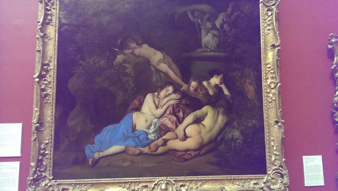
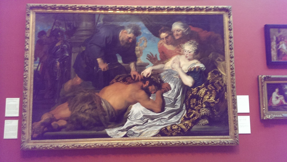
There are plenty of reclining people in states of semi undress. I was quite impressed by the nymphs bottom in the left hand side painting, Peter Lely nymphs by the fountain. Classical nymphs always provide a good excuse for nudity in art. It is though a very impressive rendering of skin and flesh tone and leaps out of you from the dull (occasionally strategically placed) foliage behind it. They painting on the right is Anthony van Dyke who I really like when he is not painting dull dutch men. It is Sampson and Delilah. Strange that here Delilah is robbed of her agency by getting presumably a servent to do the hair cutting for her. That rich black and blue cloth in the fore right hand side is seriously impressive.
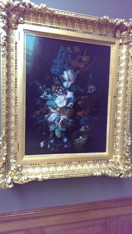
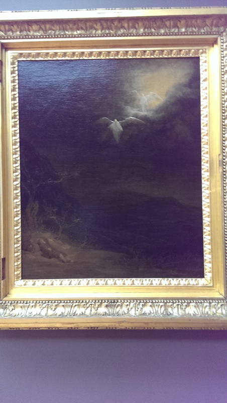
I have just this year rediscovered floral still lives. I like them now and the above left by Jan van Huysum is a good example. Apologies for the poor photograph. The Dulwich website has in fact an excellent search facility under the collection tab with high quality images of their collection. They should be praised for these feature. Back to the painting the form and the colour contrast and particularly the birds nest in the bottom right hand corner with its dainty eggs setting off the feathers (or feather like leaves) appealed to me. Also I couldn't help wondering to what extent ornate and magnificent gold frames augment a picture. Maybe I should frame some of mine like this. The mysterious floaty angel thing is by Arent de Gelder and is called Jacob's Dream. Jacob presumably being the chap slumbering in the bottom left. I like the blurry light effects that put in mind of Turner and the contrast of that between the dead looking trees in the bottom of the painting. I could look at this for a long time. It was one of my favourites in the whole place. Never come across de Gelder before and I am glad I have.
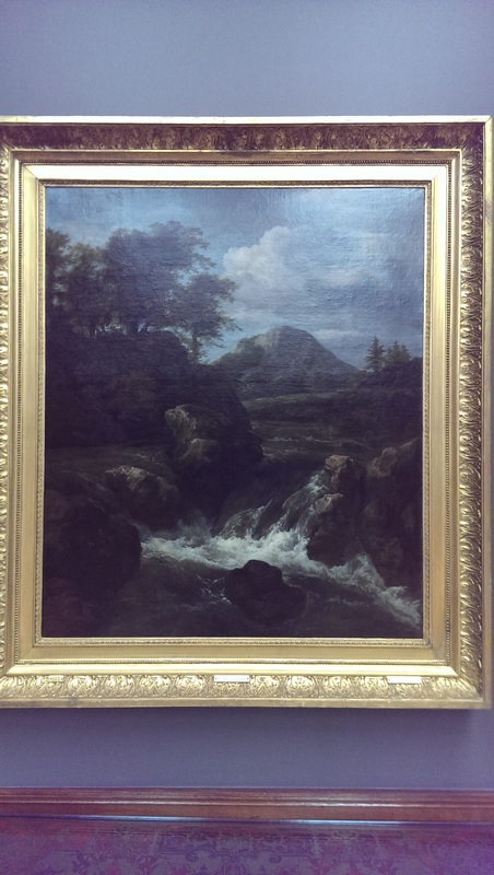
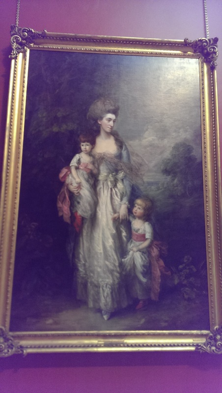
Raging torrents of water against ominous landscapes when done well always make good art and this piece called A Waterfall by Jacob van Ruisdael is an image to conjour with. The water effect is very good standing out against the much more indistinct background. I appreciate the naming as well. It allow imagination full reign. Where is this waterfall? Who is lying dead just out of shot etc? Thomas Gainsborough is another artist who is excellent but whose work I mostly find dull. This is the problem with portrait painters, many of your subjects are just not going to be that interesting. This lady is different though. It is an excellent picture. Her slightly sad left looking expression. The melancholy background. It is called Mrs Elizabeth Moody and her sons. The figures are boys so if you come across one of those crushing sexist bores who insist that girls wear pink and boys blue because of some natural urge then after you have spat in their face you can refer them to this picture to show them how wrong they are. It has a good history this picture too. Mrs Moody died in her early 20s and the children where added to the painting later. Full length pictures are often more interesting then simple bust portraits.
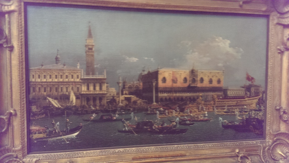
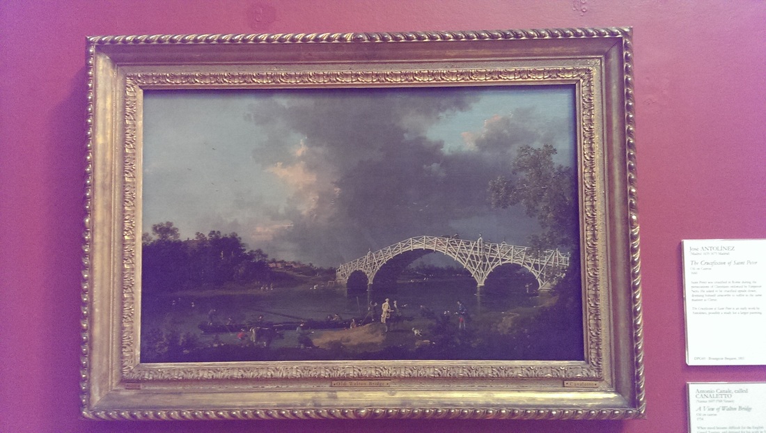
A Couple of canelletos. I like Canelleto and the top left picture is a typical example of his well rendered chaotic venetian scenes. The top right though is also by him and is very interesting to me anyway as it is very different from anything like his I've seen before. The style is recognisably Canelleto but the odd skeletal bridge and the stormy sky and the whole thing revolves about the two figures in the. Apparently he lived and worked in England for a bit and this is one such painting from the time. I really like it. I like that bridge and of course water. Canelleto water is always worth an ponder.
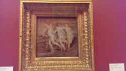
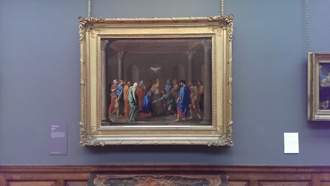
I mentioned the Rubens three graces earlier on and here they are. Nice voluptious forms and so much energy and flowing movement. I in fact prefer this to his larger full colour works. It is interesting to compare it to Poussin's The Marriage on the right. The gallery has a whole ante-chamber full of Poussin but this is my favourite. It is so calm and stately with that dove hanging over everything and the Delacroix like block of colour segmenting other colours. Well and classically composed, a very calming work.
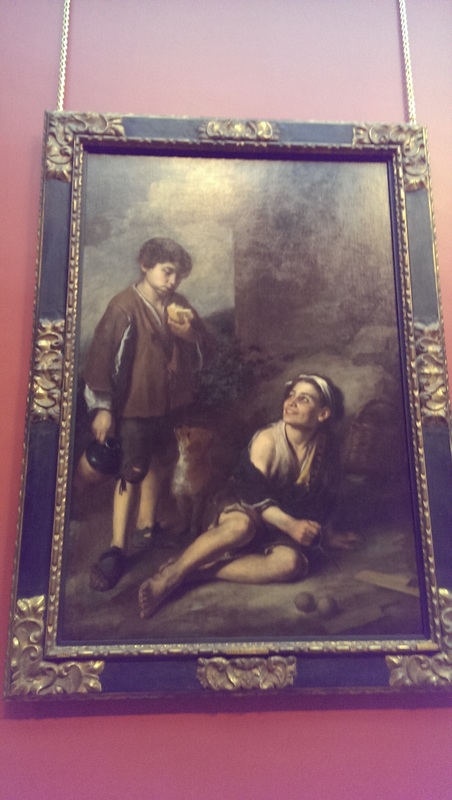
There are many other works and artists in the gallery, some of them very good, some of them a little dull. I shall leave you though with my two favourite paintings and new discovery, an artist I think I really like. He is called Murillo. I like the setting, I like the ways the figures are portrayed and their facial expressions and the way they interact. In the one on the left, Invitation to a Game of Argolla, I particularly like the sheen on the vase and the little dog. The blurb claims that this is two boys but I don't think so, the cheeky figure on the right is obviously a girl. Look at the face! What do you think?
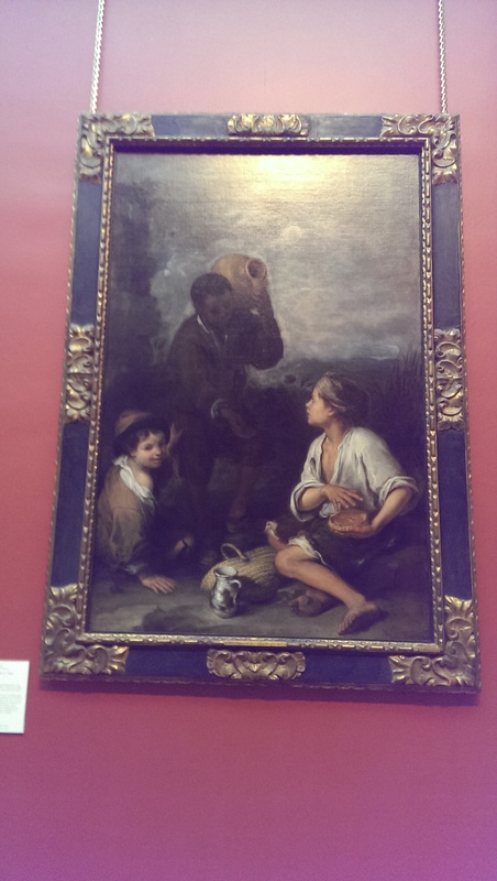
The one on the right has the same dynamism. It also has the strikingly rare aspect of depicting a black person in western art. From his clothes as well you can see he is a higher status that the two urchins (who seem to be the same models as other two). The sens of movement is good and it all flows around that excellent shiny metal jug in the centre. So Murillo and de Gleder (but Murillo more so) are my discoveries from Dulwich. |
Archives
June 2024
Categories |
 RSS Feed