|
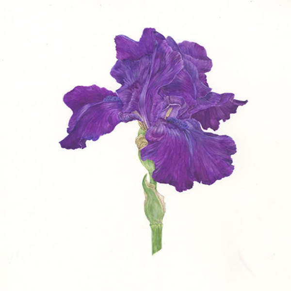
There are some very good and useful art blogs out there. One of the best is Katherine Tyrell's Making a Mark. It is a supremely good and helpful resource. It is more useful than mine in that she tends to review things before they finish, unlike this blog post which is reviewing an exhibition after it has finished. Read Making a Mark the other day I came across a feature on the Society of Botanical Artists 2016 exhibition (who incidentally have a very good website). This it turned out was in Central Hall and as that is but ten minutes form where I work I decided to go along. It finishes yesterday which means if you reading this and haven't been then you've missed it and indeed have missed out. 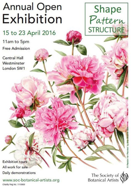 Botanical art has of course a very long tradition founded in the scientific need to accurately record botanical specimen. The SBA is a fairly recent organisation but it has tapped into a rich vein of talent and interest. I had no real expectations when I went other than to see some art. I am quite a fan of Japanese Persimmon paintings and these hit a similar niche I think. The work there was all to a very high standard. Some 600 paintings, mainly in watercolour but also in colour pencil, pencil, oil paint, silverpoint and so on. They were all technically excellent. Flowers can of course make very good subjects giving a natural richness of colour and shape to exploit. The theme of this exhibition Shape, pattern and structure had been seized upon to great aplomb by those exhibiting.
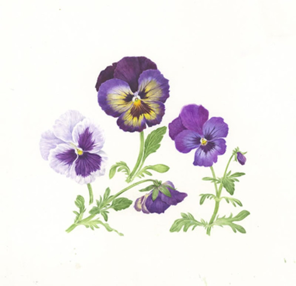
This type of painting has a reputation for fussiness and a hint of the old fashioned in some quarters. To be honest it was bias I held when I went along. I was wrong though. It is well worth considering. This is, in my view, for a few reasons. Firstly they are very attractive well conceived and executed pieces of art. Secondly for original art they are quite cheap (around £300 - £500 for a moderate sized piece). Thirdly the stark image on a plain white background struck me as quite modern. It is I think a genre of art that could be due to rise in popularity. Certainly I intend to see more of it. There were many good pieces and many good artists. Three particularly caught my attention; Janet Pope (top left), Jennifer Jenkins (top right) and Sandra- Wall Armitage (the two below).
In fact I managed to catch a few minutes of Sandra demonstrating how to paint flowers. I enjoyed the show very much. So much in fact that I went back the next day. I then made my wife come and we went back again and bought a painting. The original of the Pansy you see above left. I pick it up on Monday. I'm very excited.
The fact that these paintings are good, are accessible (in a way that Frank Auerbach isn't for example) and cheap make them an entry point into art. A gateway art if you like. This is a concept I am interested in and on the look out for more examples of. Summary: keep an eye on the SBA and their artists. I think we can expect to see interesting things from them in the years to come.
0 Comments
My wife has long been on at me to develop the patterns I draw and render them into oil paint. She is of the view that they might be very commercial. I like doing them but when it comes to oil painting I am more interested in doing something else. Eventually though I agreed. The first task to select one. I whittled it down to a short list of 5 and finally chose this one: 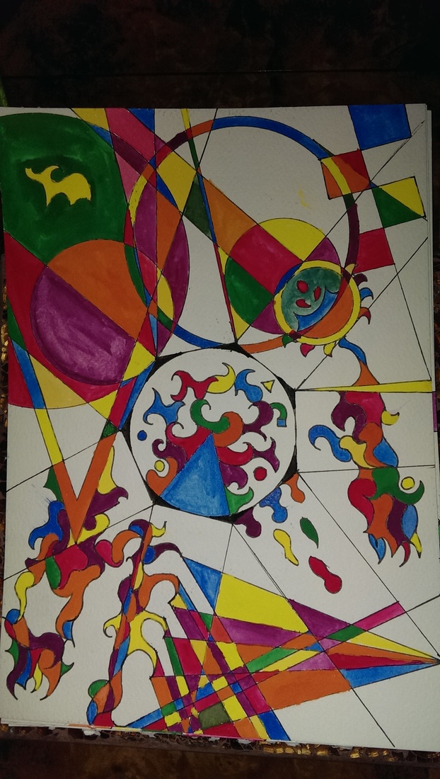 The original size is A4 by the way. I selected it because it has a number of different elements that would be interesting to work on. It also has an obvious focal point and a sense of flow around it. It is also one of my best quite frankly. In consultation with Hugh I decide to use a large canvas. I also looked at how other artists such as Kandinsky, Klee and Miro had approached such subjects to get an idea of how to proceed. The first step was to sketch the design onto the canvas and then start filling in the spaces thus: 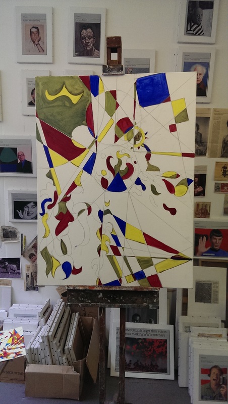 There were a number of elements that meant the design changed. Firstly the canvas is not scaled up A4 but of different proportions. Secondly it is quite difficult to draw a circle on such a large scale. Various things were employed such as large plates before Hugh taught me a technique using a piece of string fixed in place to the focal point of the circle. Lastly I am impatient and slightly incompetent so when I drew the polygon around the circle I got it wrong. Instead of correcting it I just went with it. Finally even with all the elements in place there was much more blank space on the canvas then there is in the original page. I therefore added more. In this way the process continued. 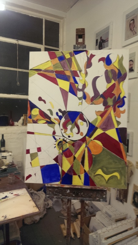 At various points again at Hugh's suggestion I rotated the painting around. Looking at it from different angles brought different elements into consideration and different ideas of how to proceed. What very quickly became obvious was again the issue of the amount of blank canvas so the decision was made to put in more shapes and fill in more of the "gaps" between the shapes. In addition the colours on the areas already completed were built up to be more vivid. This was also one of the few paintings where I used a secondary pigment. Usually I only use ultramarine blue, lemon yellow and crimson alizerin red, lamp black and titanium white (for reasons that I shall cover another time) and mix all my colours from these. However the orange the yellow and the red produced was insipid and didn't pop in the same way the gouache original did. Therefore I tried senellier red, a lighter more orangey secondary red. It produced a much more vivid colour. This continued until all the shapes were filled in: 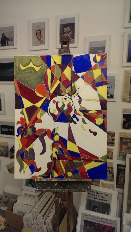 One of the things that I had noticed in my research into how the great artists had approached this is the "background" is not left blank. There is no (or very little) bear canvas. Instead it has been activated or covered to various degrees and in various ways. My gouache original had of course bear watercolour paper as the background but in the oil version this did not work. It just made the painting look unfinished. The solution was to cover this with a thick cream colour. 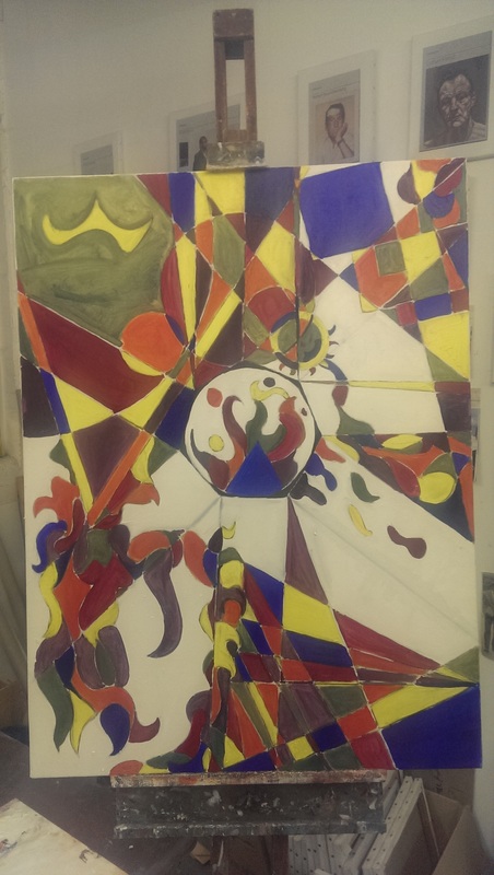 It is not easy to see the cream "filling" in my poor phone taken photo above but trust me it is there. In the original it made a significant difference. The final piece is very different from the original. It was interesting and fun to do but I am far from sure I will do it again. I will wait until the painting is home and dry (literally), put up a final photo on this website and see how I feel. As usual though, I have learned a lot.
|
Archives
June 2024
Categories |

 RSS Feed