|
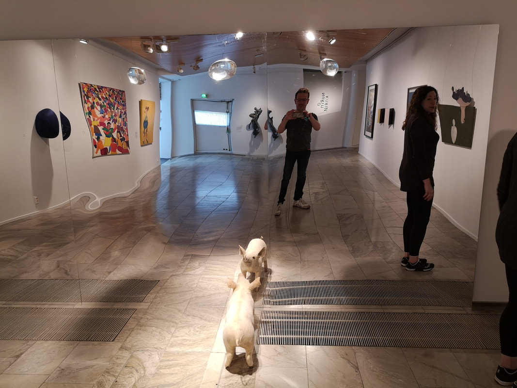
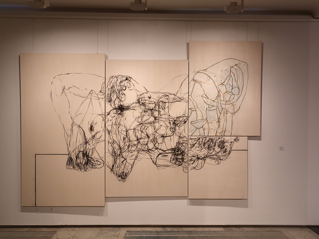
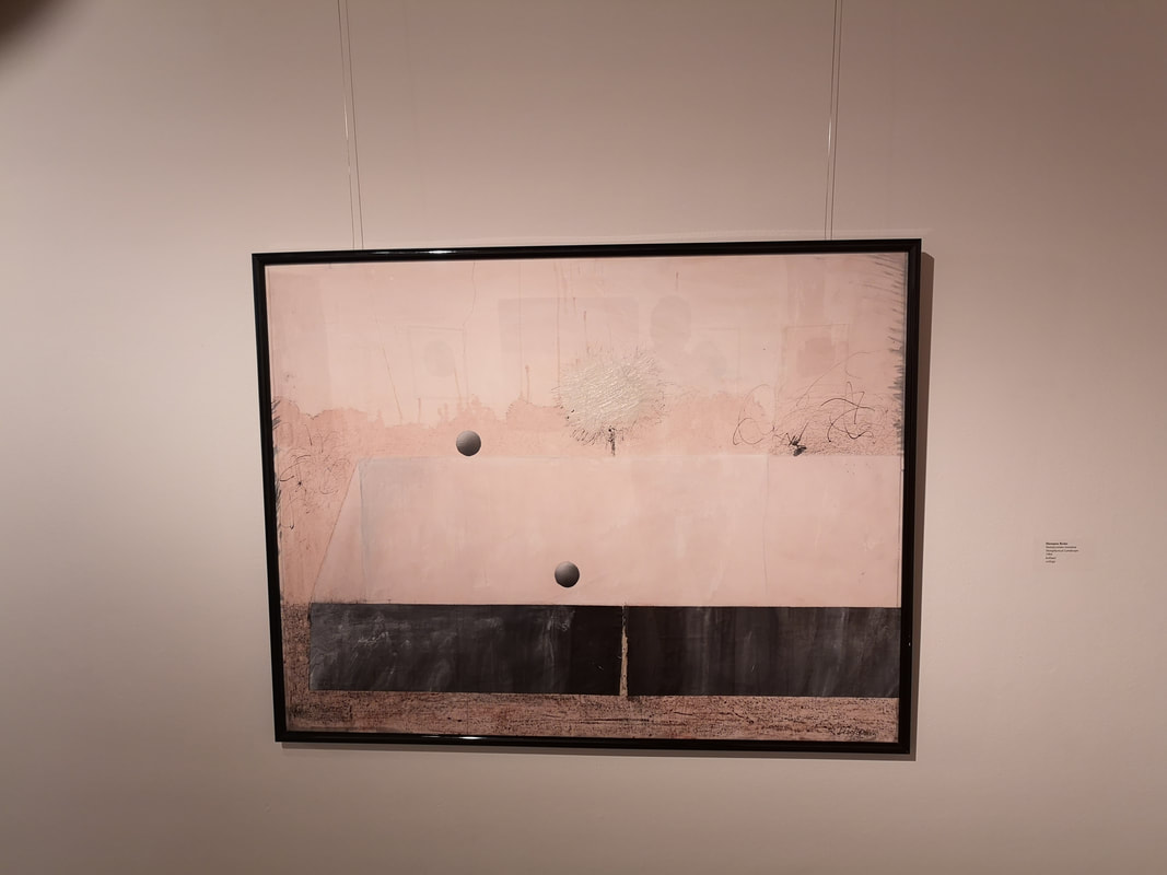
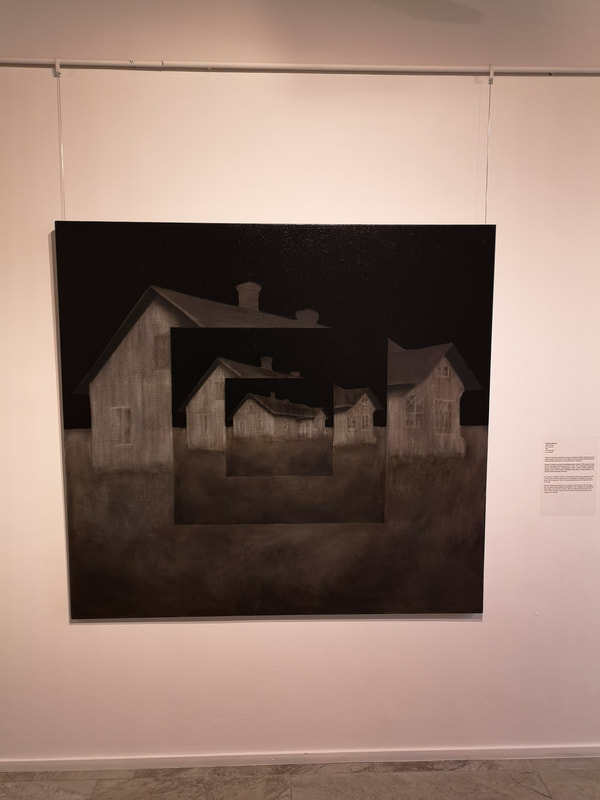
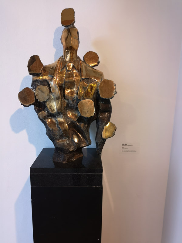
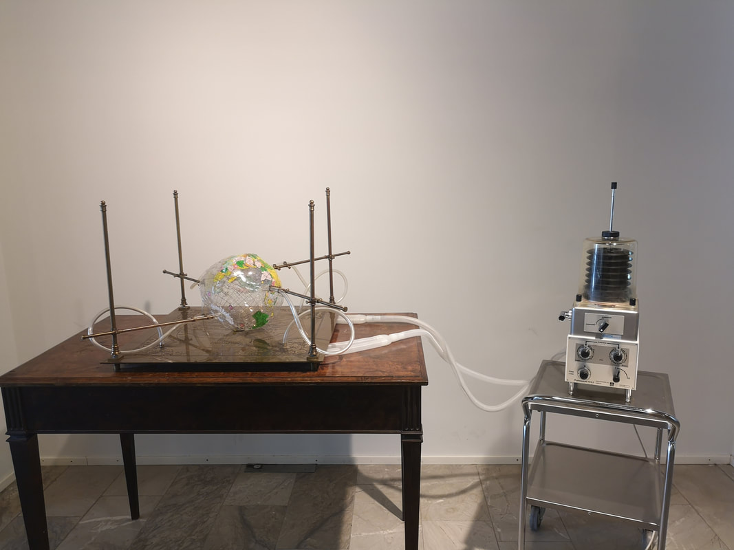
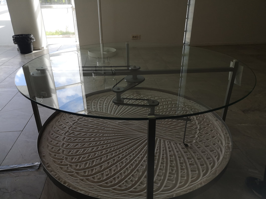
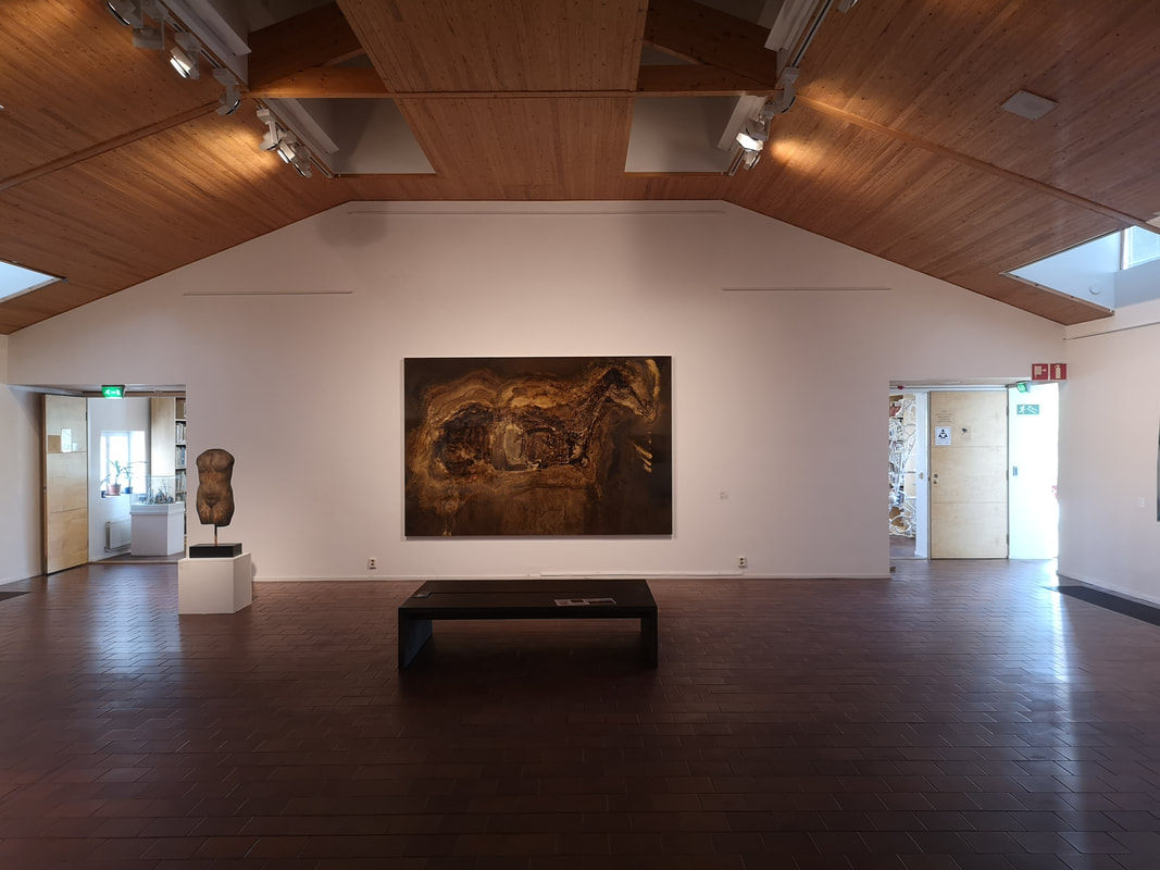
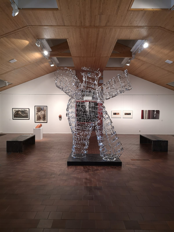
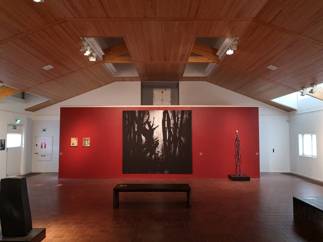
You are unlikely to be able to see the art featured in this week's post. Why? Well two reasons, the first is that I am fairly sure the exhibitions they were a part of has finished and second, they are on display in the Korundi Art Gallery in Rovaniemi, Finland. So unless I have readership in those parts (which strikes me as unlikely) then you will have to content yourself with this review. Rovaniemi sits on the Southern edge of the arctic circle. I was there during June so there was 24 hour sunlight, and I mean strong, bright, sunburn levels of sunlight. It was quite something. The countryside round there is fairly special. Why was I there. Well my wife (who you can see above, I'm the idiot with the camera, the pig is part of the art.) was competing in the European Masters Weightlifting Championship. She did quite well. I realise all of this is a very unlikely opening paragraph for a blog about art, but that's life I suppose. Onto the art. The Korundi art gallery houses a concert hall and is home to the Rovaniemi chamber orchestra. It is also houses changing displays of contemporary art. My Finish is not great (it is limited to "hey" - hello "hey hey" - goodbye and "kiitos"- thankyou) but I don't think they have a permanent exhibition. They had 3 or 4 different shows on when we were there but I have just picked out my favourite from each. The piglet looking into the distorting mirror (above) I enjoyed immensely and is the work of Pekka Jylha (a note on names, many of the artists name have umlauts and other markings which I cannot work out how to produce, I have left them out). It is called What is life anyway, and the answer presented is as good as any. This rather suggestive scratchy affair (above left) is in fact not pen but oil and charcoal and the work of Stig Baumgartner. I am not sure exactly what it shows with these muscular intertwining forms. I think I can spot a rabbits head in there? I also like the different sized canvases combined together. Much calmer is this almost monochrome affair by Reino Hietanen (above right). Its a simple composition in some ways, this bisected black line in front of what looks like a wall but doubt spread about this by those orbiting planatoids. This causes you look closer and then you see the splashes on the wall are a city sky line and those scratchy white things are trees. It's nice, I like it. Susanne Gottberg (above left) another purveyor of calm introspective like paintings. Again simple idea, taken just that little bit further and done well. A lonely rural house pictured in concentric squares. It draws you in, which is presumably the intention, and the washy grass gives a dream like effect. Tapia Junna (above right, for whom I cannot find an internet link), seems to be a collection of bronze hooves morphing together and this strange alien like conglomeration. It is odd but strangely appealing. There are also couple of moving sculptures. The first called Continuity by Lauri Astala (above left) is faintly disturbing. It consists of a plastic beach ball like globe, that it is slowly inflated and then deflated again by a 70's looking iron long machine. The whole thing is accompanied by a wheezing sound, making you feel like your in the presences of an aging invalid, but presumably that is the point. Much more relaxing is the kinetic art of Osmo Valtonen (above right). It reminds me of the kinetic sand art of Mona Hatoum. This one is very soothing though. It functions as a coffee table and the hypnotic swirling of that pendulum as it scythes looping around across the sand. The gentle scraping sound of the sand being parted is all part of the effect. The gallery continues on the floor above, and indeed the floor above that and this time at least that for me was where the quality was. Toni R. Toivonen's rather magnificent piece dominates the northern first floor gallery (above). The room itself with a nice gentle vaulted, the strong arctic summery light gentle filtered for a calmer feel. A very good setting for this piece. Its wooden tones, sometimes appearing to be a horse, sometimes a womblike structure. Its soft glow is due to the fact it is made of brass and dead animal. I subtle memento-mori. Then you turn round and dominating the floor of the next gallery along is the super fun dancing bear (Above) being the work of Kimmo Schroderus. It is joyous and lifts the spirits from some of the more somber works. It is consists of stainless steel words wrapped around to form the shape. I cannot remember what the words say but given the piece is called Insulter, probably nothing pleasant.
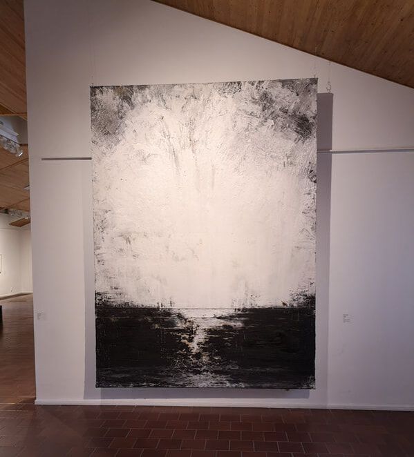
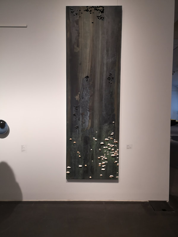
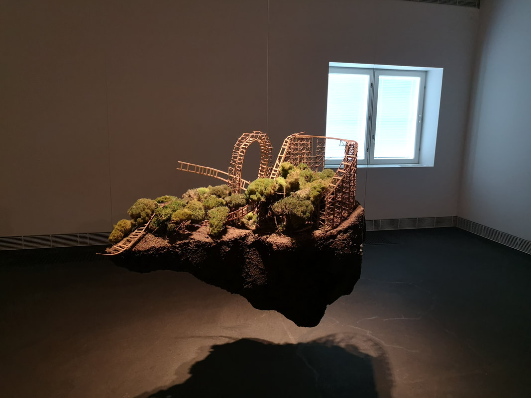
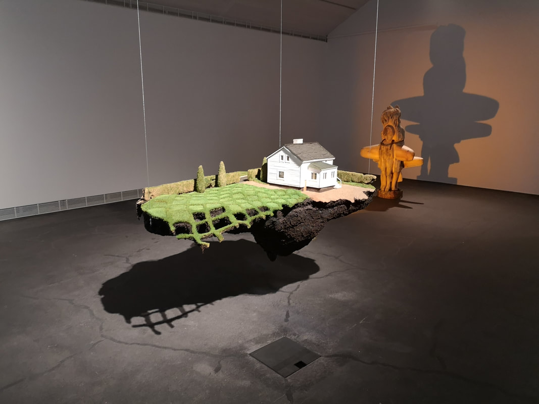
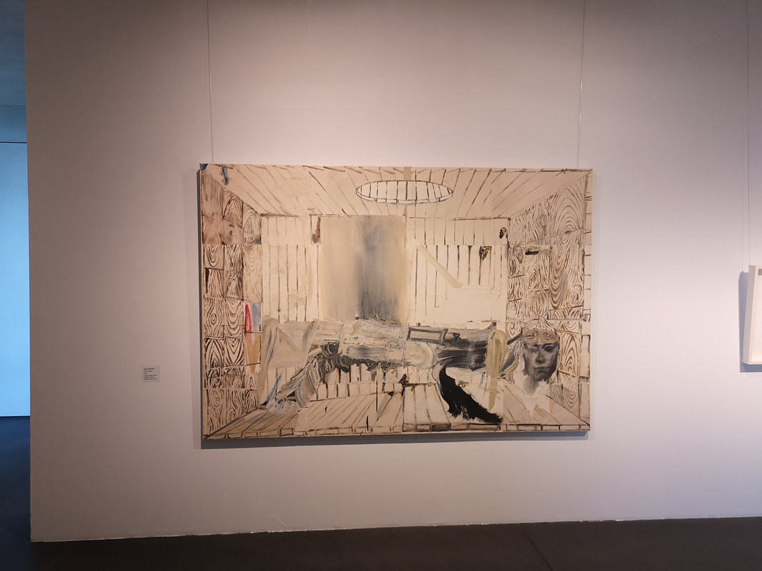
The Giacommeti like figure standing next to is, gaunt and imperious, sadly my photo of the label is so blurred I cannot identify the name of the artist so apologies for this. Standing elsewhere in the gallery the almost bomb-blasted appearing landscape, rendered I think more appealing by the monochrome palette (above right). It is the work of Mikko Paakkola. I like the scrabby sky and the way in which the foliage stretches and mingles with the sky. Very different is the work of Alma Heikkila with Trillions become one (above left). I cannot decide if it is an undersea sea, muscles and cockles adhering to the side of some rock, all alternatively fungi marching up the side of a tree. The jut out from the piece, going from white to black and grey (you have to peer closely to see the darker ones. It works better in person. It pleased me much and is high in contention to my favourite piece of the gallery. I like also the swirling charcoal and blue grey surface on which the Trillions sit. Jouna Karsi also greatly entertained me with floating islands, suspended in the middle of the gallery, flood lit so their shadows for part of the piece. I have given you two above. They are quite different in tone. One, I think my preferred one is the above left and the decaying roller-coaster. The detail is impressive and the way the pieces (like in the house above right) peter into nothingness. I enjoyed it very much and circled them a number of times taking them all in.
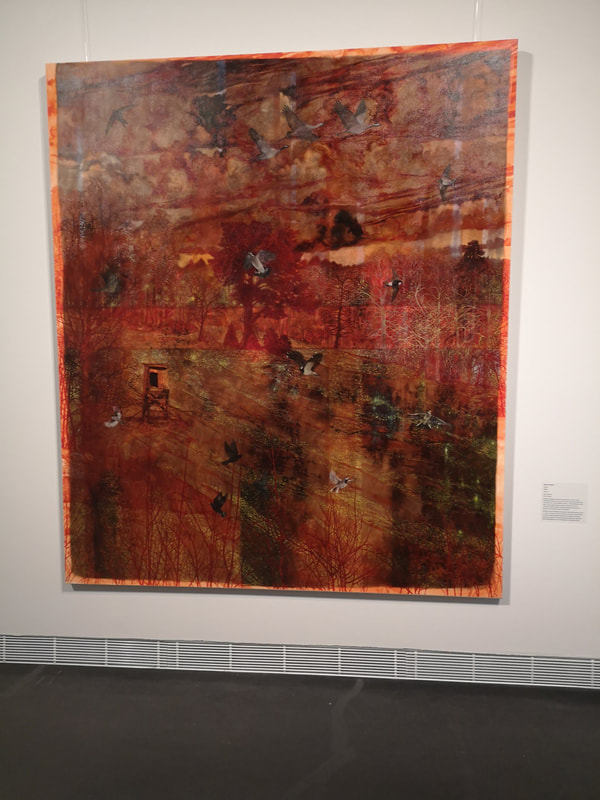
Finally a violent colourful piece (above left), with red and orange, and scraps of green and black. I am afraid once more I must disappoint you as to the identity of the artist. The colours are immediately appealing and then you move past that and you see a sort of pastoral scene with flying birds. The tone of the painting fighting with the subject. Nice.
Next week back in the UK. Probably the Summer exhibition.
0 Comments
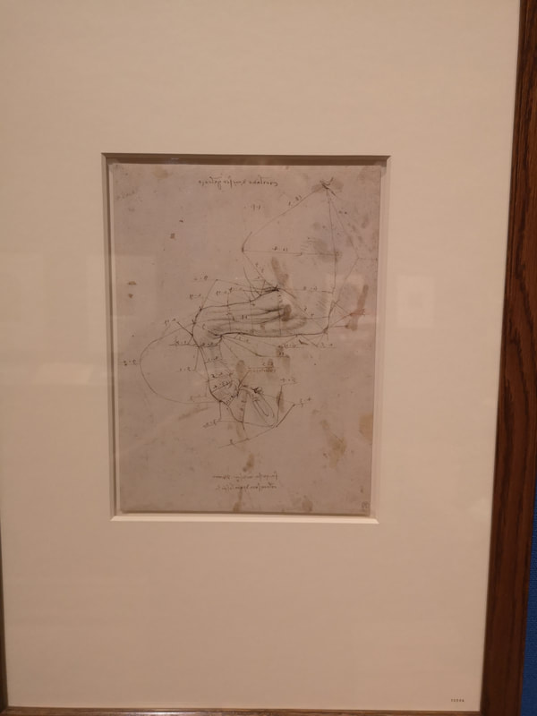
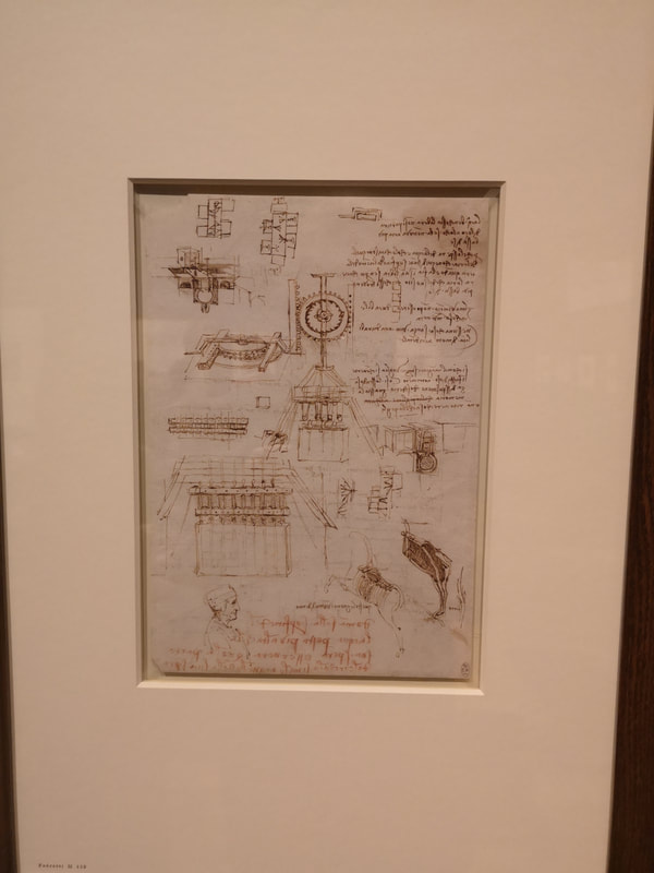
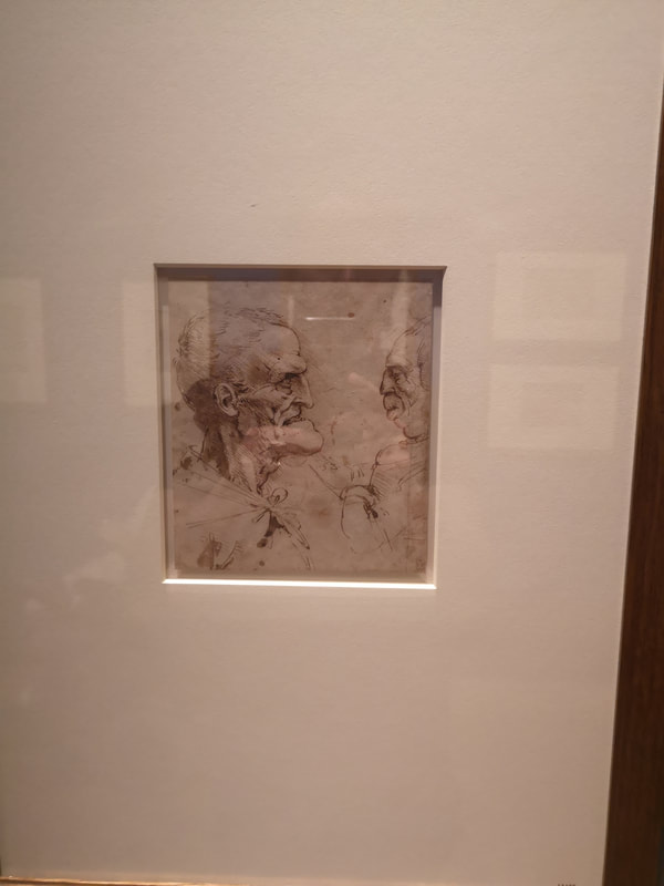
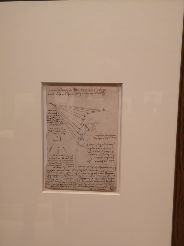
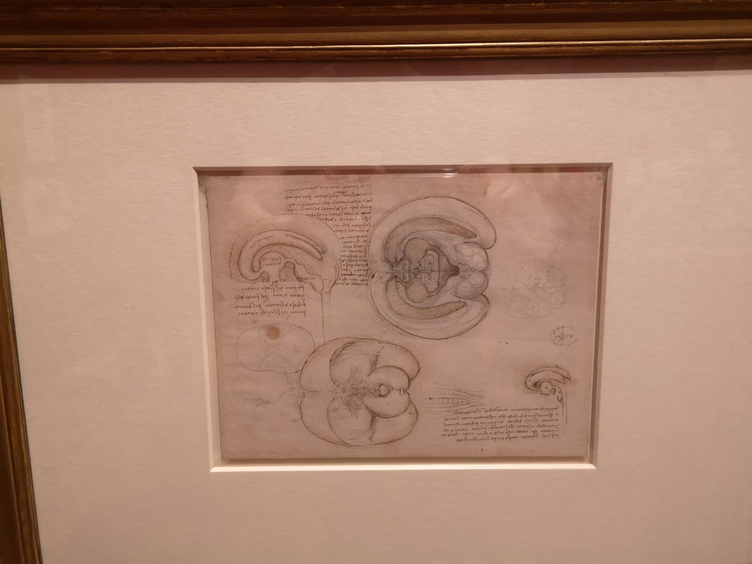
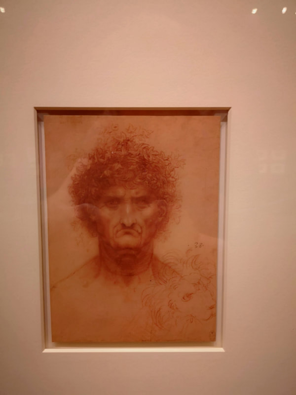
This show has been touring the country and I have seen several of its incarnations at various galleries I have visited. I never went in though, saving it for the London version at the Queen's Gallery. It is on until August, but it is a popular show so I suggest you book, and as the banner above suggests is celebrates Leonardo 500 (birth or death, I am not quite sure). The exhibition website is work a look, having as it does high quality photos of pretty much all the drawings that are display. These photos below were taken by my grubby mitts as I ambled around the show. Amble with me. Leonardo is of course a name so often bandied around. However I suspect most people when asked to name his paintings will say Mona Lisa, The Last Supper, er something to do with a Madonna? One of the reason for this is that he wasn't much of a finisher our Leonardo. This exhibition is a treasure trove of wonders but there is a pattern which is 1) get interested in something, 2) get obsessed and draw lots of things and make notes, 3) plan for a book 4) lose interest and move on to something else. t is of course a manifestation of his scorching curiosity, and of course his scientific rigour. It is then quite something to see these superbly drafted drawings of a horses front leg (above left) with detailed notes above proportion, measurement and so on. Then just across the room you will get an equally detailed drawing of a machine for moulding something, along with the famous and characteristic backwards writing. This is a shook that keeps on giving by the way, the he actually wrote/drew this. The drawings so often have other sidetrack doodlings in them like the one above right which has a profile of a man. Because I am a man of high culture I could not stop thinking of Terry Prachett particularly this which you will have to read for yourself to find out why. There are of course many people, mostly men (but not all) and mostly in profile. Leonardo seemed to like drawing in profile. Some of his pieces were not of real pieces at all but caricatures, often imaged rather than real, as you can see in this fine picture of an old man (above left). Just look at the absurd level of detail, the structure of the neck and ear, the shading on the face, the construction of the expression. No doubt the drawing has been designed to show these things off. If you are an aspiring artist (and who isn't) then this exhibition is of both humbling and inspiring. If you have pretentions of being a scientist (I used to be one) then it does the same. To be confronted with both is, frankly, a bit much. So in the same row as the old man you get a short treatise on the effect of light and shadow on the face (above left).
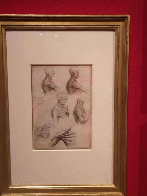
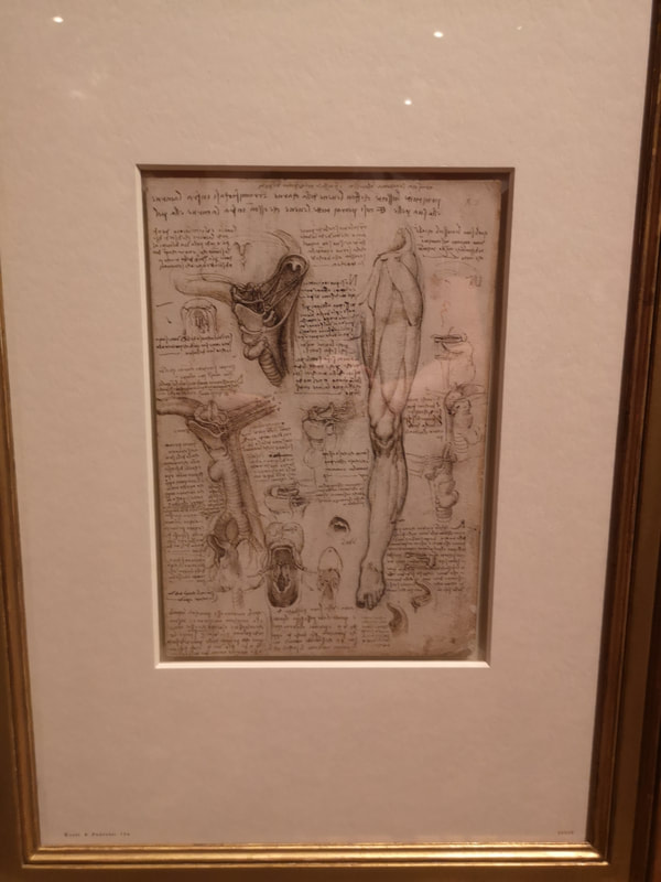
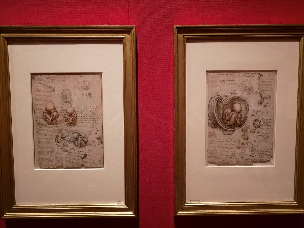
Along with this you have drawings of the structure of people (well I say people, unless dealing with matters of reproduction they are always men) like this drawing from various angle and at various poses of the shoulder (above right), including, stripped of its flesh the sheaths of muscle underneath. Artistically this and his work generally reminded me and have inspired me to use white (various kinds at various points, chalk mostly though) as a highlight in drawing.
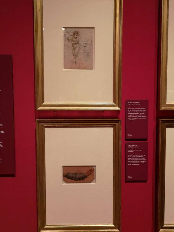
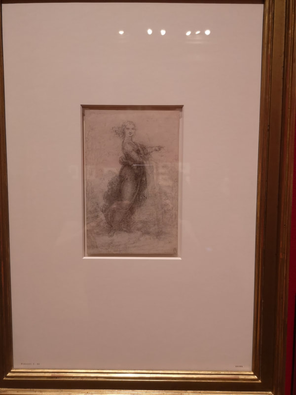
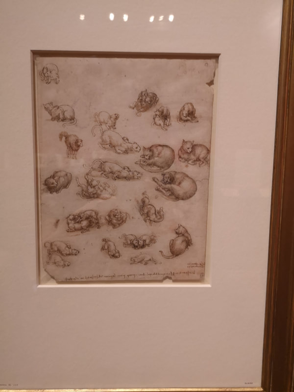
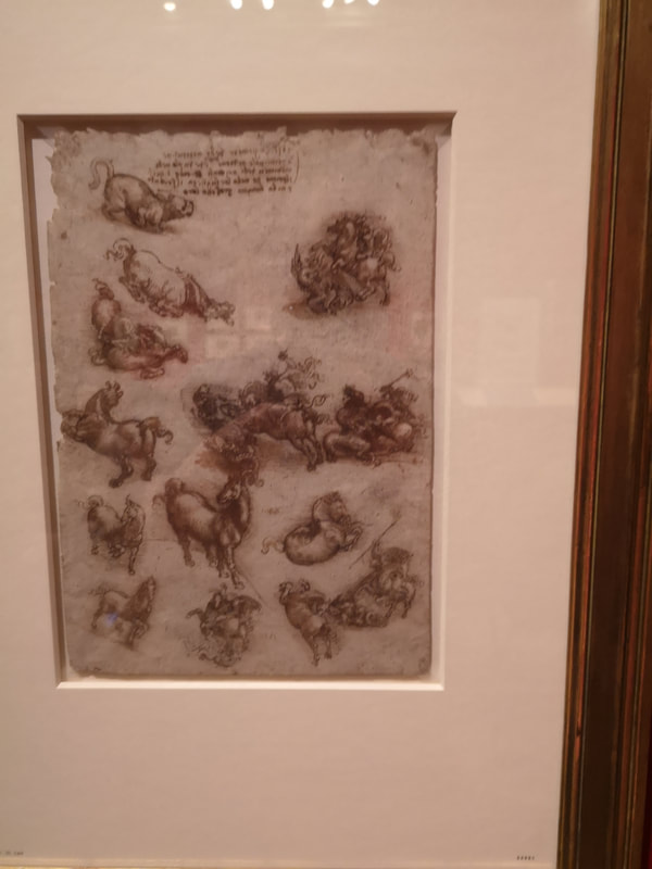
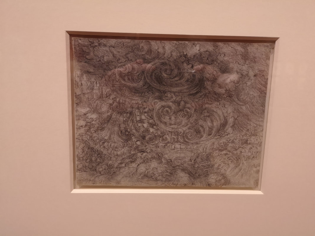
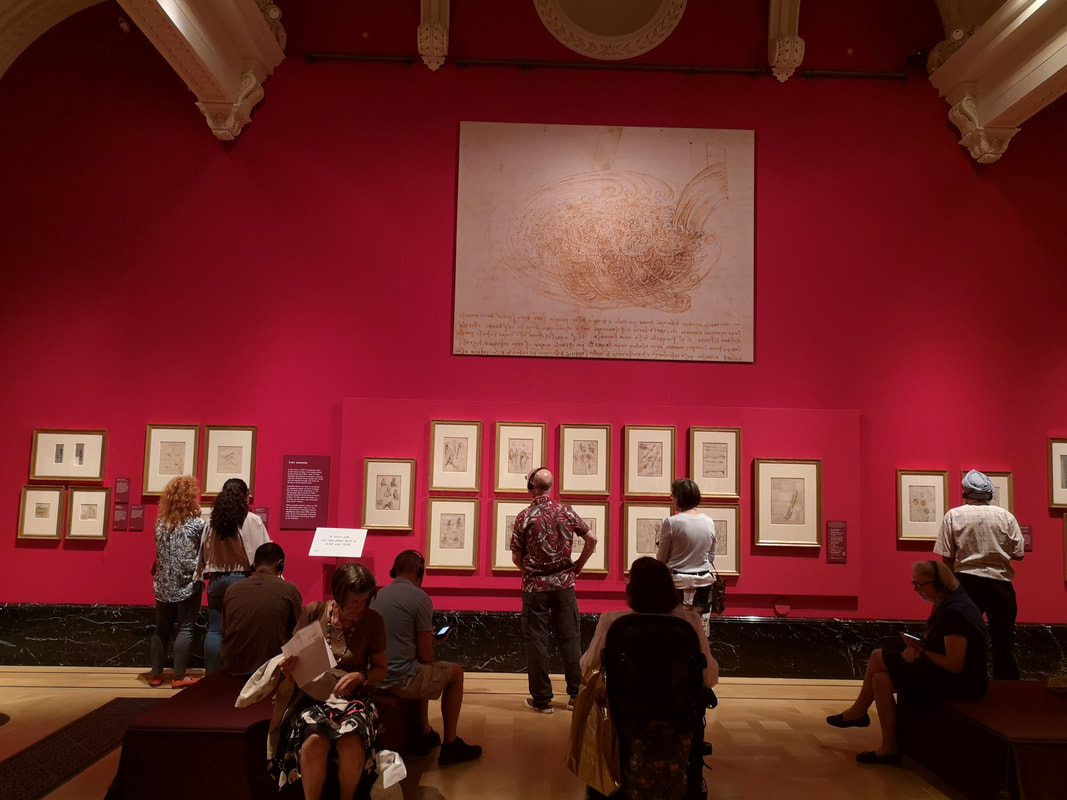
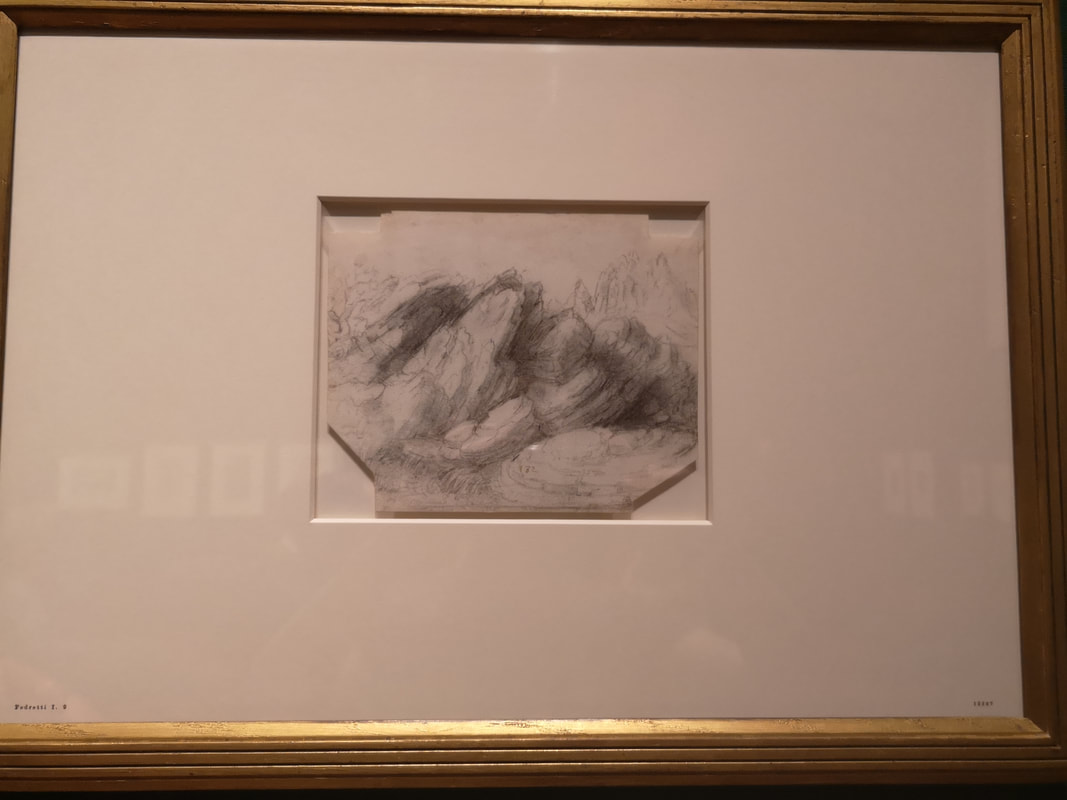
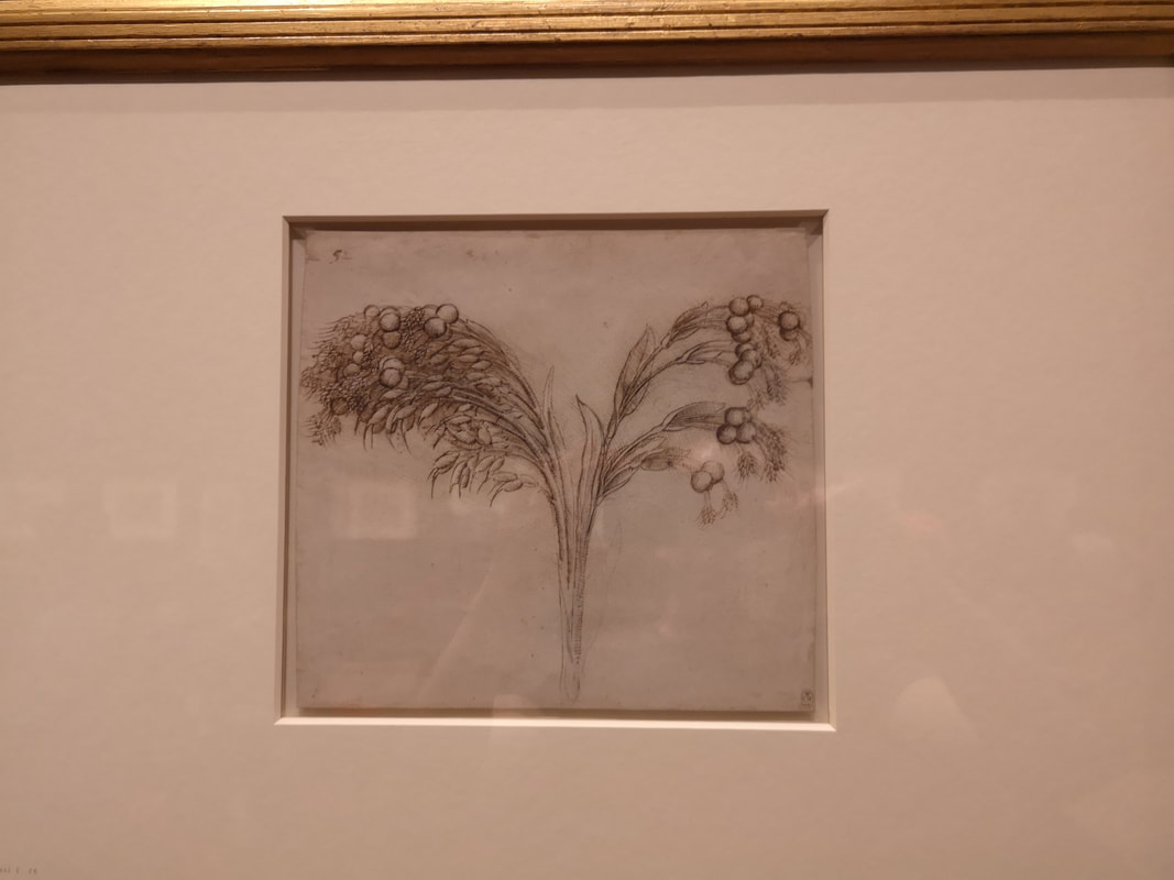
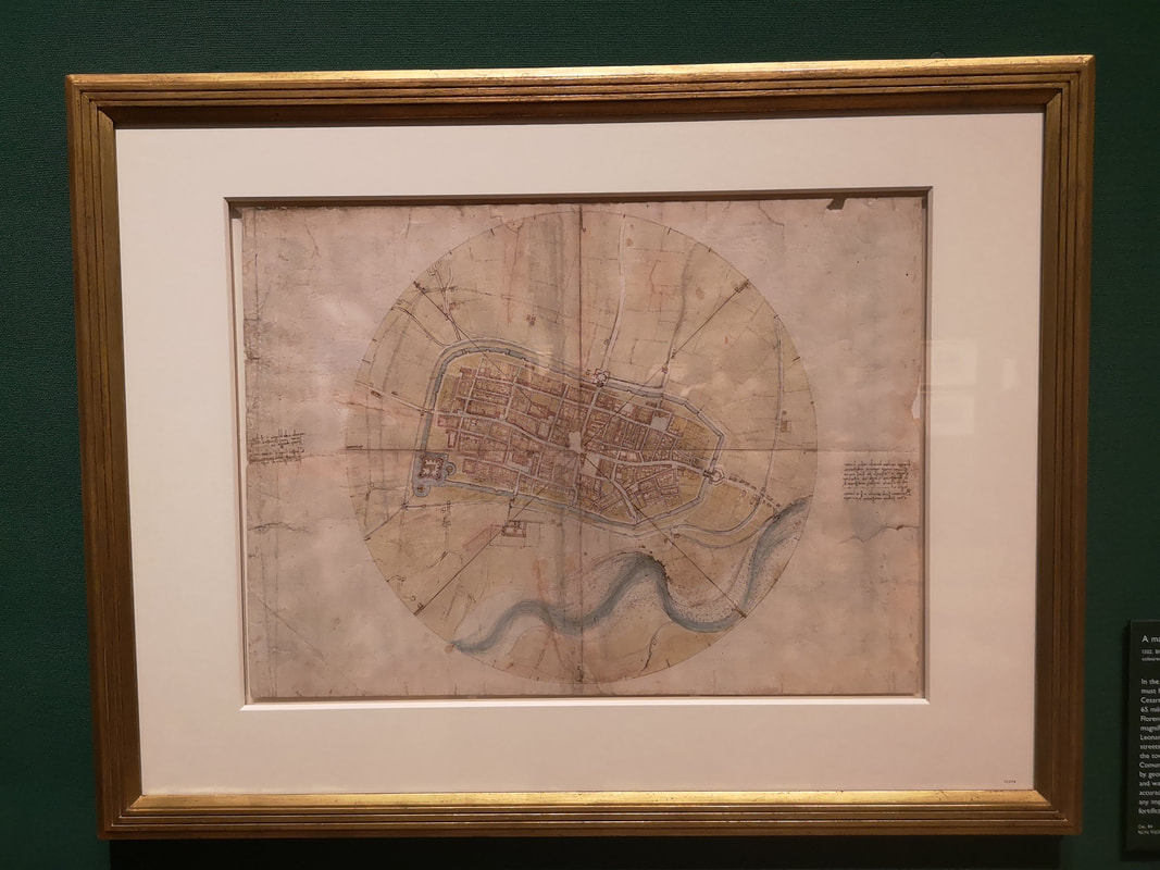
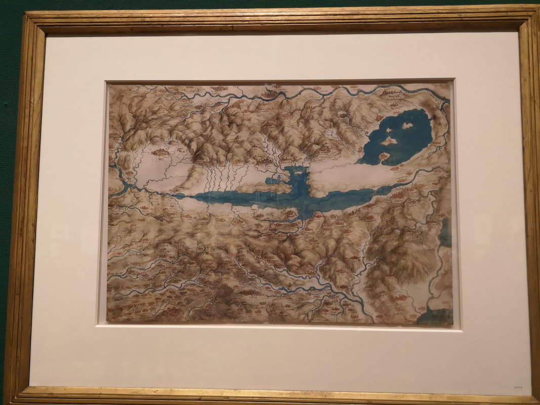
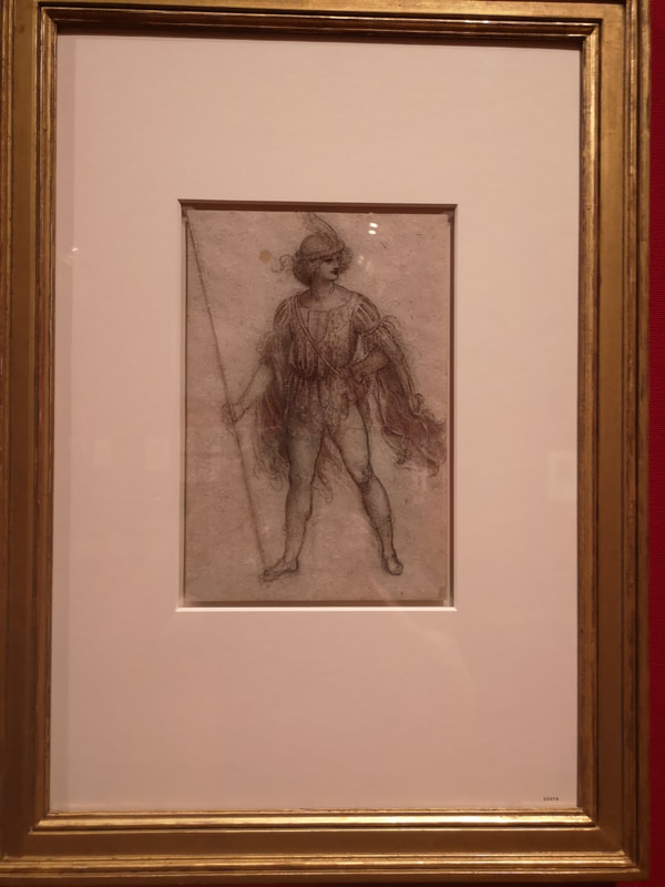
You do wonder though at the drivers. What prompts him to wake up one morning and go "[insert typical Italian name] fetch me a dead body, it must be muscular mind, I wish to do a study of the leg". Most of us I think it is toast or cereal? Anyway what a fine study it is but I suspect the external leg is somewhat idealised. No one has a leg that well defined. By the way, this exhibition is a very crany experience. You do a lot of peering at manuscripts, trying to fathom the detail. Trying to read the text before you realise your backwards Renaissance Italian is probably not up to it. Back to art now, well specifically art now. Scattered throughout the exhibition are various studies. Studies frankly of a quality that would make many final works throw in the towel. There are lots of babies in putti (cherub) form posed for appearance in final painting (such as the top painting in the above left). You also get very detailed studies like this clothed arm (bottom, above left). It is the cloth apparently he is studying, detailed and amazingly, diaphanous. The arm you can see has a very Renaissance religious poise to it. Studies of full figures also appear, such as this woman pointing (above right) and again the tone and detail on her clothing is very good. There is a personality here to, you can almost hear the woman saying, "look, over there". Animals appear to. I particularly like it when you get lots of them on the same page. Showing off a little how intricately he can draw maybe such as the cats (above left, but can you also spot the dragon) and the horses (above right). If I were being critical I would say some of the cats were a bit ratty. How he drew quickly above to capture them in those poses or mid movement I have no idea. Of the horses (above right) my favourite is the one rubbing its head along the ground. Such an identifiable horsey movement, wonderfully captured. The Queen's Gallery is worth visiting just for itself by the way. It is a fine space, and particularly fine is the large red gallery in which probably the majority of the pictures appear. I am finding my use of superlatives a little wearing now so I think I will abandon them for the rest of this post. Many of the pictures I have featured above appear here, along with an obsession that gripped Leonardo in his old age, that of a deluge consuming everything. He drew this several times (above left), all roughly similar, a town being engulfed by wind rain and sea. The swirls remind me of the puffs of air coming out of angels mouths you see on old maps. There are four rooms in total in this show (of which I suggest you scamper through the first one, it is crowded with people recently arrived, has only one picture and it is of Leonardo, rather than by him). We are into the last of them now. Along with the familiar themes already covered you also get weapons, landscapes (like this dreamlike rock formation - above left) and depiction of plans (like that above right). You also get maps! I am fond of maps and these are great. Leonardo was various peoples chief engineer and responsible for mapping out various things so you get the detailed and cartographic like this map of a town (above left) and the no doubt accurate but more representative and evocative map of a district of Italy. The lakes presumably (above right). These were among my favourite things in the whole show, and also completely unexpected. They reminded me strongly of maps in fantasy novels, which presumably crib their style from productions such as these. Its a great show but rather tiring to see. There is just so much of it and your eyes and indeed neck gets tired from craning in to see the fine detail. As always by the end, you find yourself walking past a study for the Last Supper, having tired of profiles of men. I shall leave you with two more, a design for a costume (above left) and a grump looking fellow who appears to have leaves for hair (above right). Only downside to the whole experience, there was an annoying absence of postcards to buy afterwards.
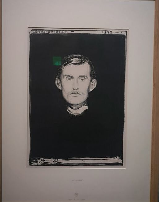
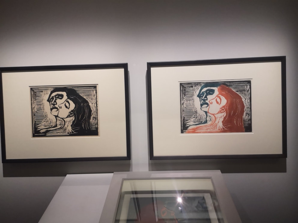
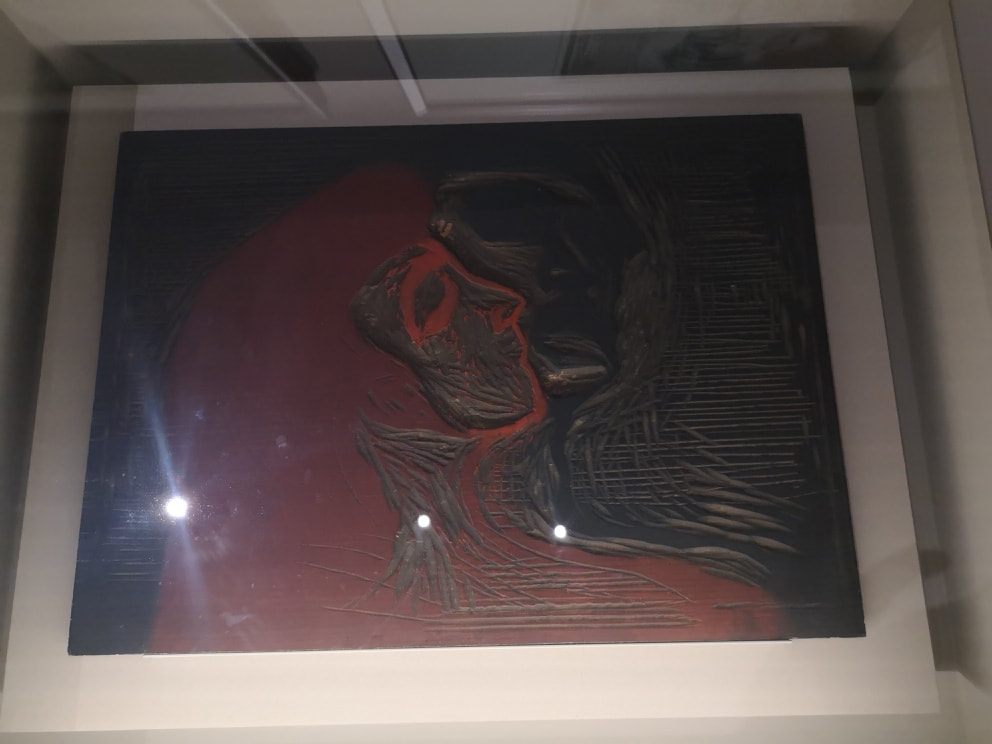
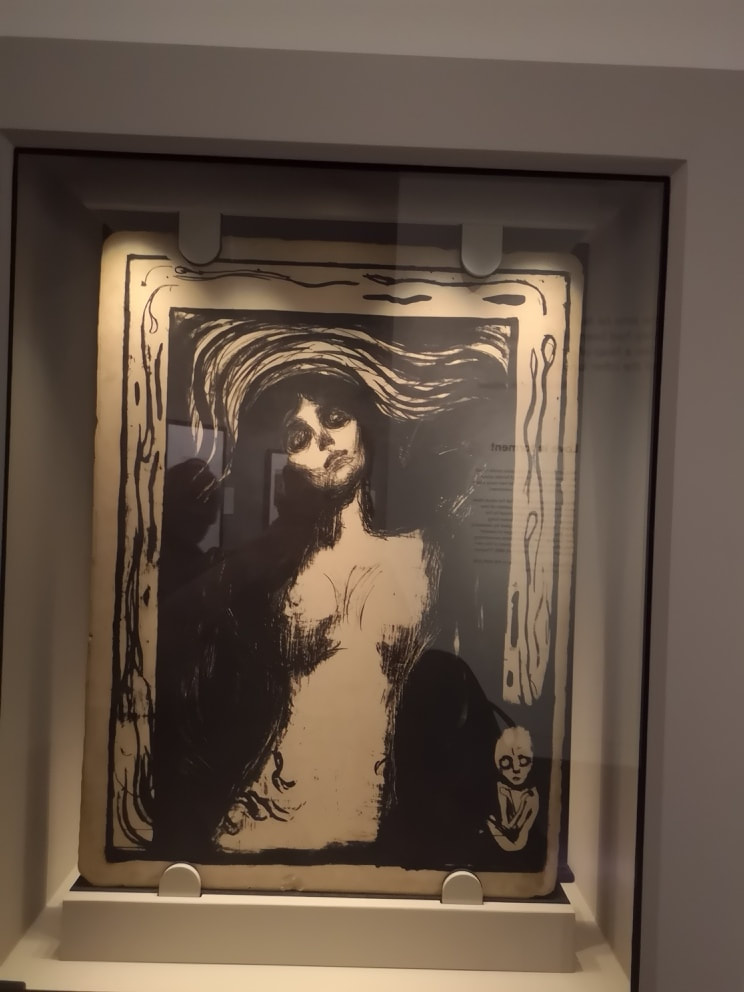
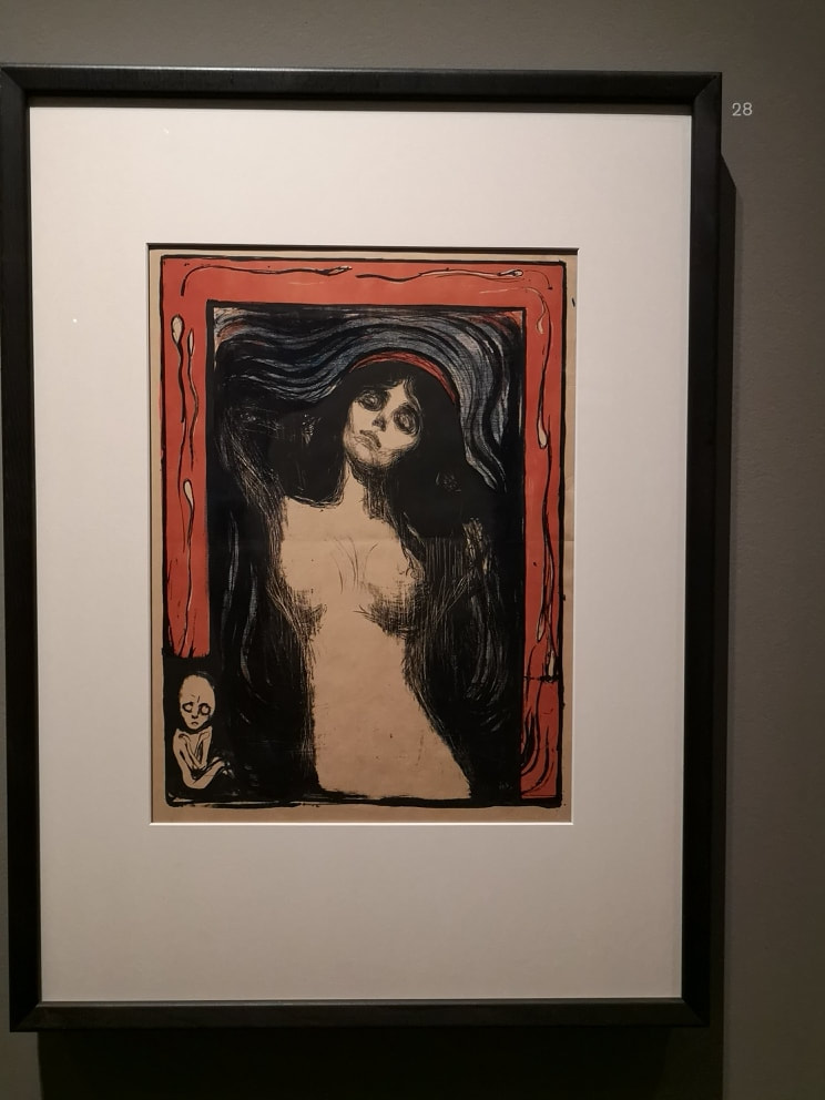
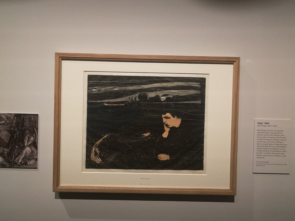
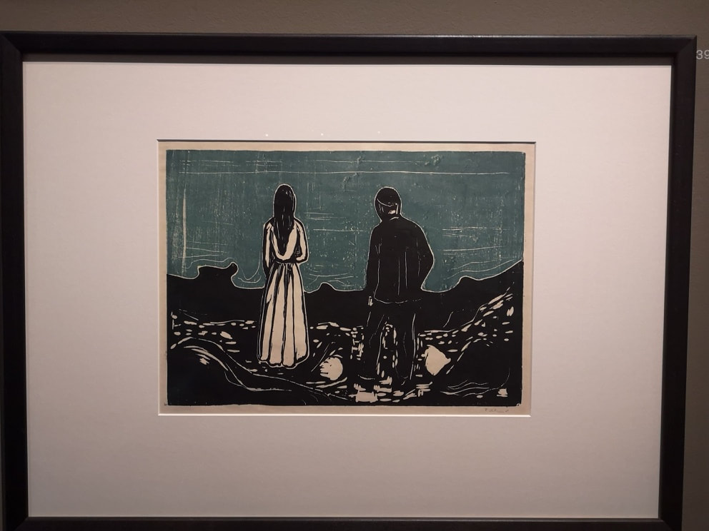
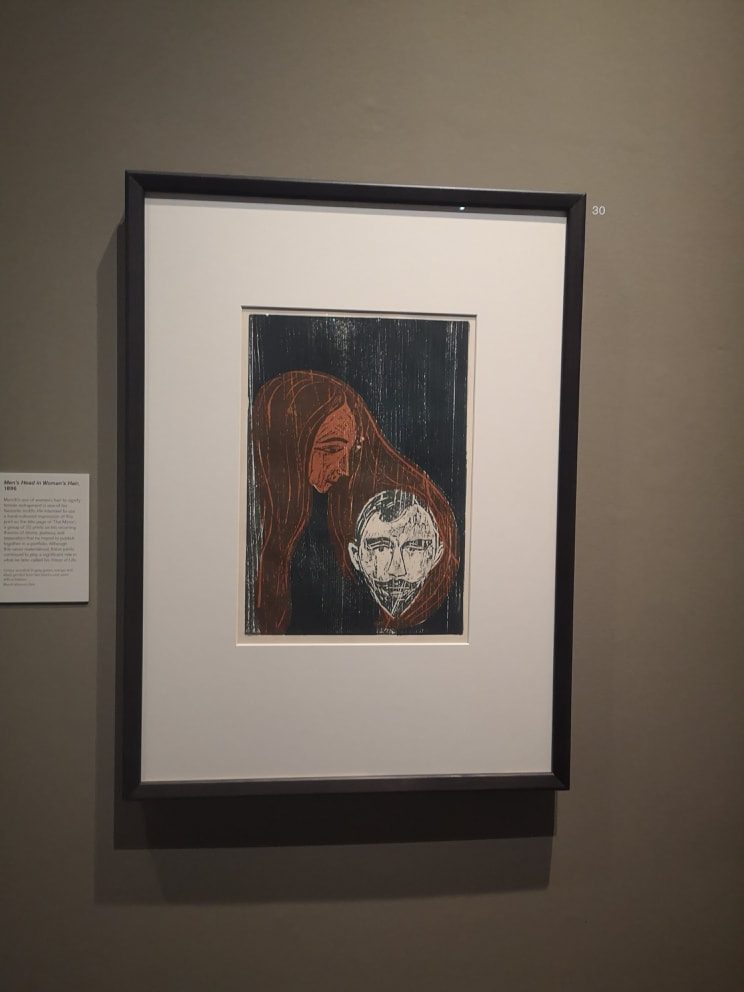
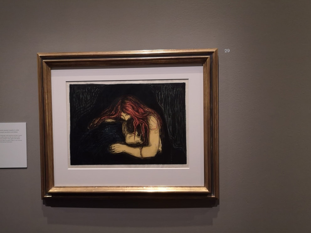
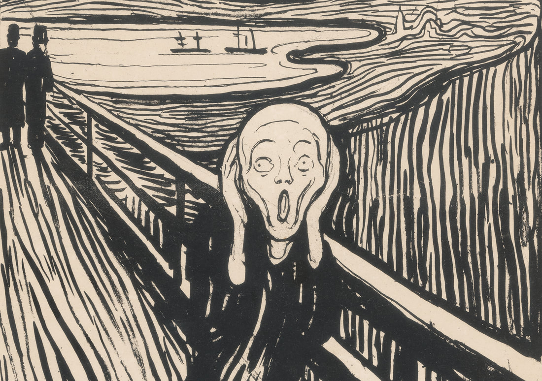
Next week, I haven't decided. Either Lee Krasner or Frank Bowling, or possibly neither of these. Come back and find out. The British Museum has a show of Munch prints called Love and Angst. It is only on until 21st July so you don't have much time. As you may expect from Munch it is heavy on the Angst, starting as it means to go on with a self portrait print of Munch with a skeletal arm (above). A symbol, and quite a heavy handed one (pun alert) of his mortality. Munch, particularly in this picture looks like a slightly maniacal priest, who ironically the Lutheran influence of he was desperately trying to escape. Its a powerful image though with just that face and that arm, looming out of the darkness. The show uses the prints to chart Munch's life but more interesting to me at least it also shows the printing techniques he used and his artistic influences. Many of the images are quite striking. Like for example these two heads. Incidentally like many male artists, particularly of the Impressionist type period, Munch had a problem with women. Maybe tortured misogyny is a driver to artistic production in some people who knows. Anyway the display of the two prints, one monochrome, the other slightly coloured, is a good touch (above left). Underneath them is the woodblock (above right), which can be assembled in a jigsaw fashion so that the pieces can be coloured separately to produce the colour version. In a similar vein you get an example of lino-cut printing with the finished version, a semi naked female torso surrounded by a shimmering halo effect, bordered by this odd red edging emerging from a disturbing skeletal fetal figure (above right) . All sorts of imagery going on here and nearby you get the revers image inscribed on a stone (above left) from which it was printed. There is a great deal about the influences on Munch; impressionism, Ibsen and so on. What it doesn't mentioned but really struck me as an obvious influence was the art of the Saami people and other indigenous Scandinavian cultures. Maybe it is just an aspect of the printing technique, but the strange almost archetype figures, the swirling clouds, the bone like devices certainly reminded me of this. If you like this that style of art (and also Munch's prints) then can I recommend this.
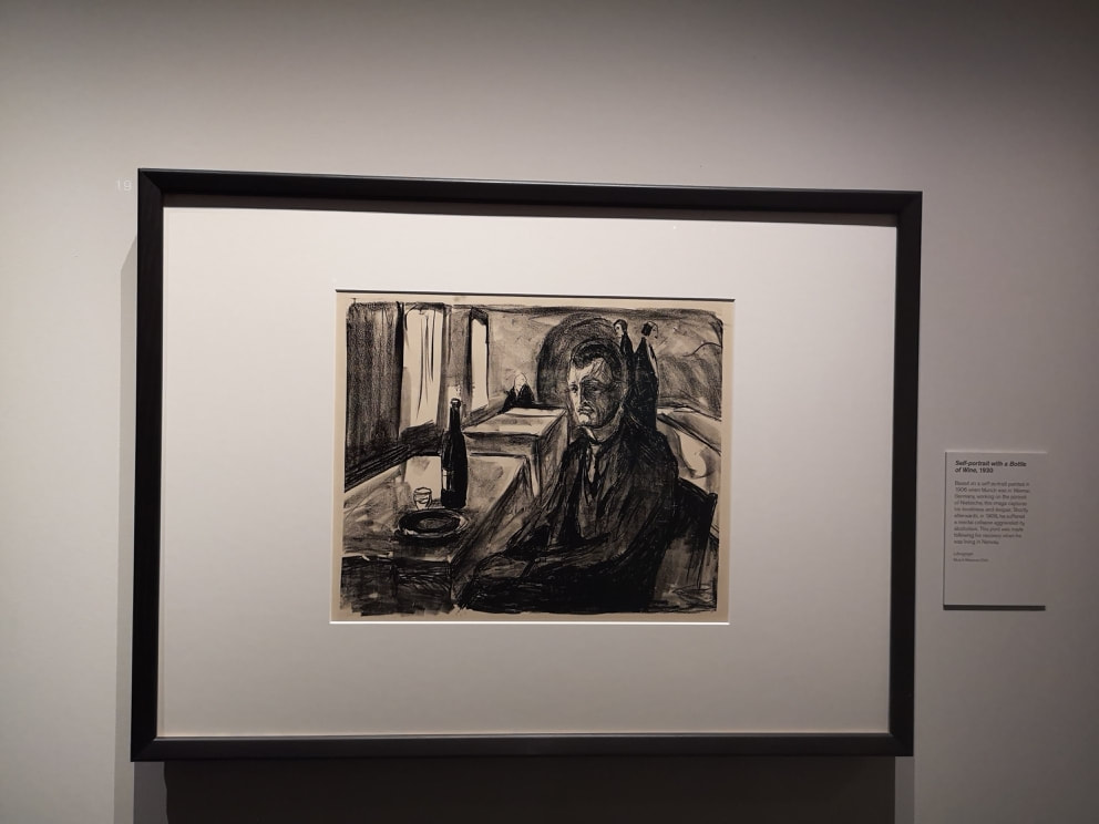
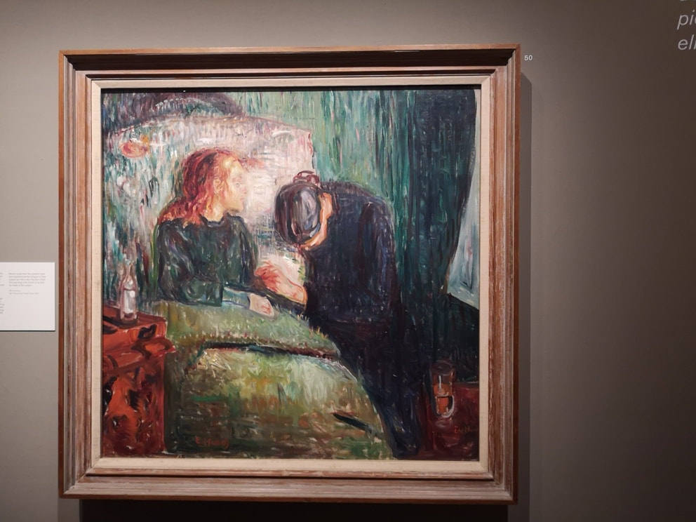
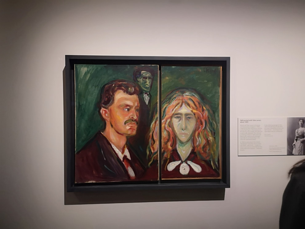
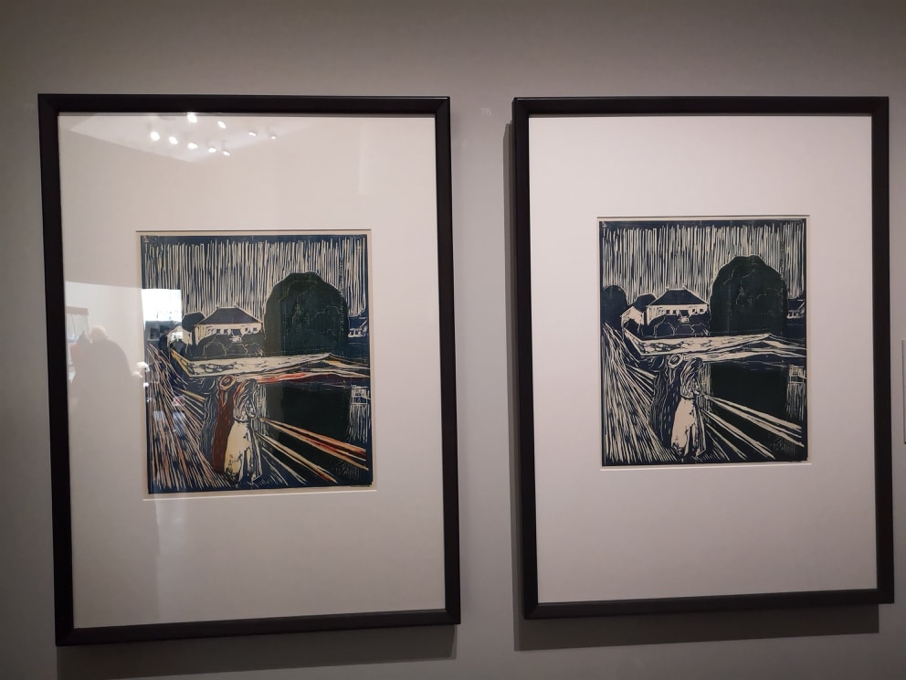
There seems to be a strong pre-raphelite tinge to particularly these prints, the swirling red hair, draping everywhere. Maybe I am straining to see something that isn't there. I like these two prints despite my rant. The use of black, with the figures emerging out of the darkness. It is the same thing that appeals to me about the self portrait that open the blogs but it really highlights the drama of the pieces. The man himself appears a few time. He is never happy (actually if you ever do a self portrait it is really hard to one in which you look other than pensive, it is a function of the concentrating on drawing I think). Often very miserable as in this lonely self portrait of him in this scratchy cafe, looking slightly bemused and with only a ghostly faceless figure for company (above left). Of course there is the scream (above right) and the oft told story of its genesis. Even in black and white it is a powerful image. The prints are excellent and interesting images, and I am glad I've seen them. There are however in the show two of Munch's paintings (above). They are very good and frankly they blow the prints out of the water. I cam away, pleased I'd seen what I'd seen but wishing the show had just been of his paintings. The two are the Sick Child (above left), a hearfelt rendition of loss and pain, built from his own experiences of the death of his sister. The depiction of tender mortality with these swirling muted colours really hits home. The red on the green, and the haloish whiteness of the pillow. The carer (Munch's aunt), head bowed. It is a wonderful work. Not quite hitting this work, but still excellent is a portrait of Munch with a woman to whom he was briefly engaged (above right). After they split up he cut the painting in half but it seems to me from the pallid depiction of her that he was never entirely keen on here in the first place. That is not a loving expression of love but one of rage. And who on earth is that greenish gooblin in the background? Is it jealousy incarnate? The strongest prints are in the final room. There are two sets. One is a similar setting to the scream. Three people, possibly women (above left) peering out over a view one version in black and white, the other this alarming blood red making an appearance.
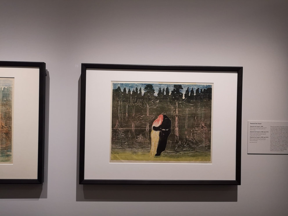
The other set (above right) has this couple getting closer and closer to a forest. The one shown is the final of the three. They are always in the same pose (he is clothed, she naked or apparently so), just the landscape changes. This is an alarming modern image and one I am sure I have seen in various form in a number of current artists work. Its good though. Go. You don't have long. Next week I shall be talking about, hmm, Leonardo possibly. For reasons that are too complicated to explain, I ended up in Coventry. Coventry is a strange place. For those of you who don't know Coventry was decimated by a German firebombing air-raid on 14th November 1940. A large part of the city was destroyed, and as a result it was rebuilt in the 1950s and 60s.
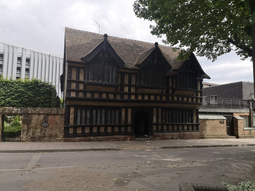
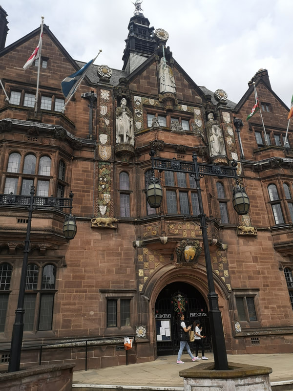
Which is a shame because there are glimpses that it was once. There are some very attractive old buildings scattered around the place such as Ford's Hospital (above left) and the Council House (above right).
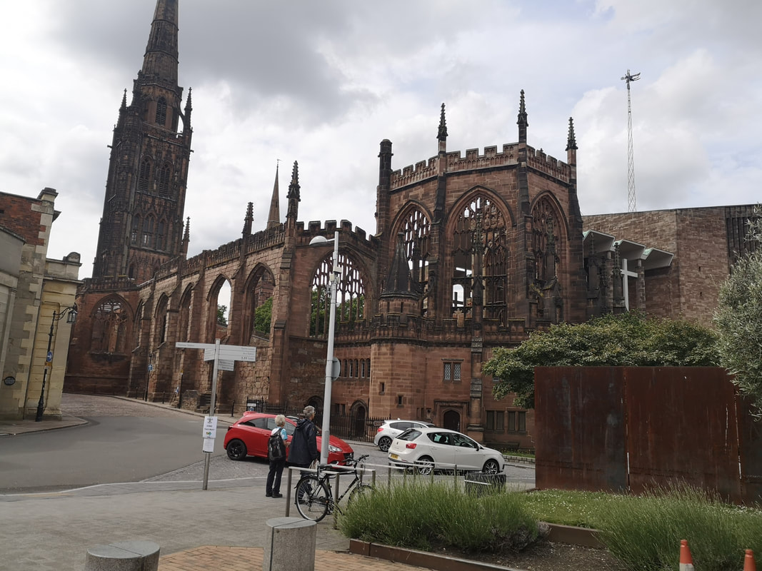
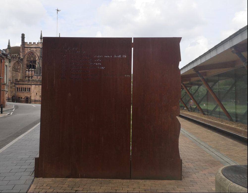
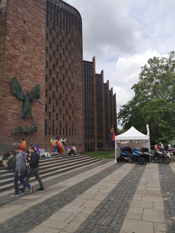
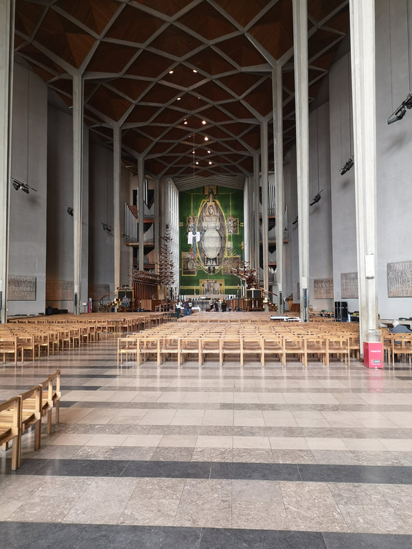
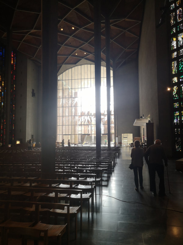
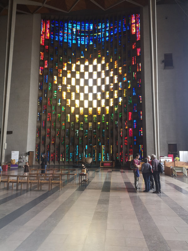
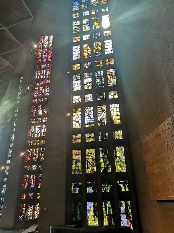
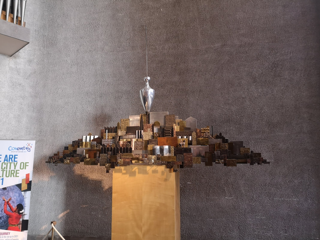
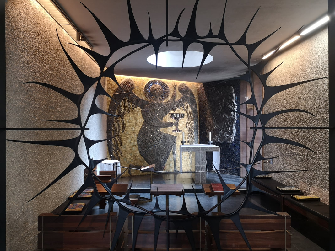
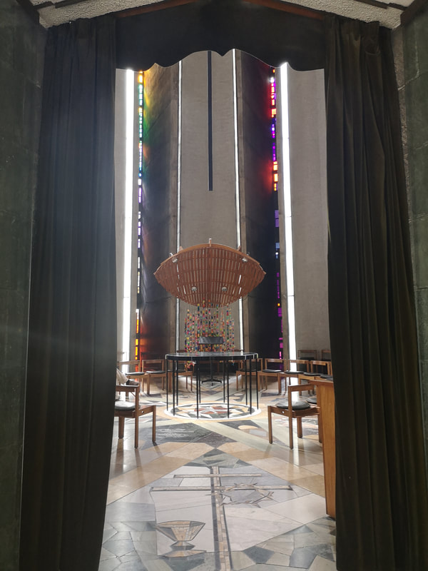
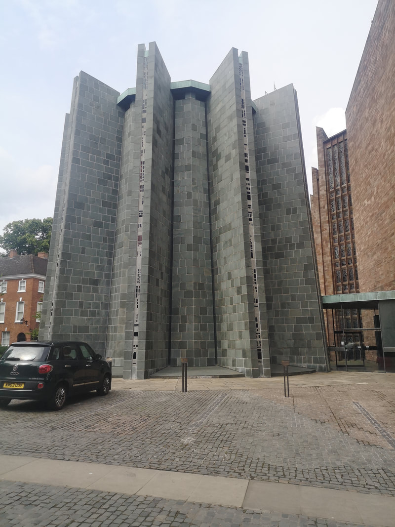
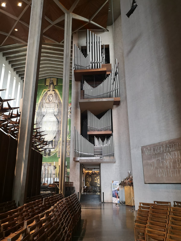
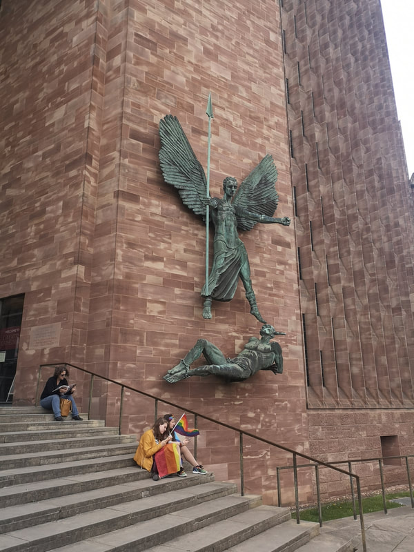
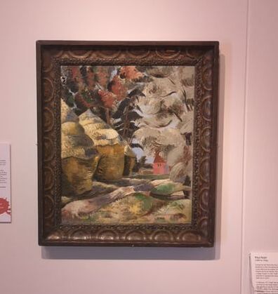
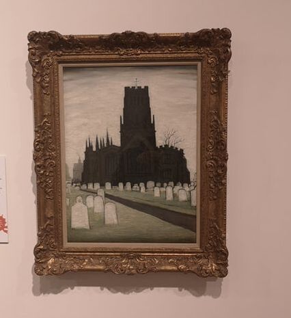
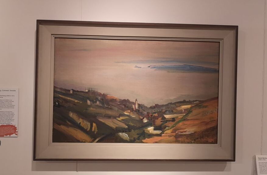
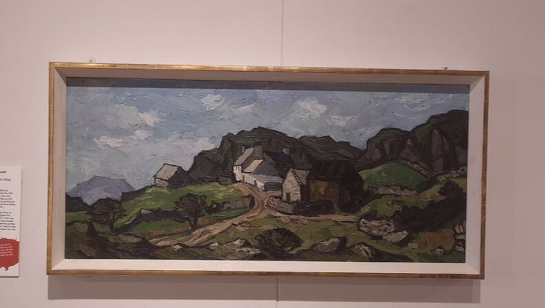
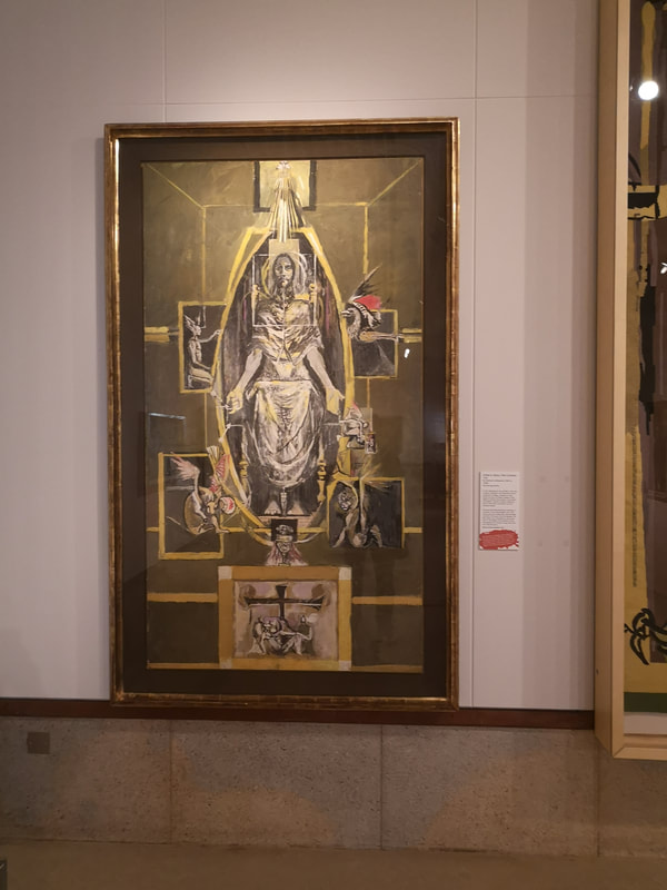
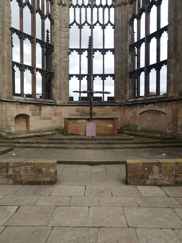
iron placards marking destroyed buildings (above left) Then you are greeted by this bank of new square blocky building (above right). It is when you see this that you realise to what extent your brain is geared to expecting a cathedral to be a certain thing. This to a certain extent defies this so my initial reaction at any rate was, well I don't think much of that. But then you adjust and actually it works really well, particularly once you get inside. It is large and vaulted light building with this honeycombed structure to the ceiling and at the end this impressive green backed tapestry of Jesus (above left) deigned and made by Graham Sutherland. It looms over the Nave, and echos and sets the town for the entire internal decoration. Those cement slabs you see on the walls have simple biblical inscriptions on them, and I found very effective. Sitting opposite the tapestry is an enormous plain glass window (plain as opposed to stained, it is in-fact inscribed with figures). It provides sunlight into the cathedral but also a view out onto the ruins of the old cathedral, which stands opposite. This is a very smart design feature. Perhaps what Coventry cathedral is most famous for is it's stained glass. I like stained glass and particularly modernist stained glass and there are few places you can see it (Leicester Cathedral is another). There are a number of artists involved the most spectacular of which is the Baptistery Window (above left) it is the work of two artists, Patrick Reyntiens and John Piper (designed by the latter, made by the former. It is a joyous medley of colour, this core of yellow, merging into green, blues and reds. Each panel has its own iconography forming part of the impressive whole. As you journey towards the alter there are columns of stained glass (like the above right) each with a different colour as their central theme and are the work of three different artists, Lawrence Lee, Keith New and Geoffrey Clarke. They face away from the congregation. They encourage contemplation and it is very easy to get lost in them. Only a very little of the original stained glass has been preserved and sits up towards the alter. It would have been easy to flinch from this modernist brief, go for something more traditional and therefore make for a terrible mish-mash but credit to the architects of the Cathedral, that they stick to to this brief, including this interesting city sculpture siting 3/4 (above left) of the way up the nave, and the Lady Chapel, (above right) which this evocative crown of thorns sculpture allowing you to peer into the gold and black mural. It's lovely. The other part of the church, is the chapel of unity (above left), with a decorated floor and this lovely futuristic shape (exterior shot above right). It has a different feel and feels separate cathedral so I wonder if it was added later. Again there is modernist stained glass, in thin shards at the points of the star (which I assume is what the shape is meant to be). Details have also been thought about to the thorn like tops to the choir stands and the spiky arrangements of the organ pipes (top left) to the sculpture of Arch Angel Michael defeating Lucifer. On the same square as the Cathedral sits the city Art Gallery, a drab building with a poor internal lay out. It is worth fighting your way through though as there are some gems of modern British art to be found. Paul Nash is a favourite of mine so it was with no small amount of joy that I discovered one of his that I hadn't seen of his (above left). All swirly with a soft feel to the whole things. I like particularly the huts. The looming down church is a Lowry (above right). I like the sky, echoed in the colours of the grave stones. This is the only Lowry I have seen with no people in it. It gives the painting a lonely abandoned feel to it which is perhaps the point. David Bomberg is a favourite of mine and again it was a nice surprise to find one of his that I hadn't seen before (above left). A landscape of Cornwall and relative figurative in Bomberg times. The way the sky and the land play of each other is very nice and I particularly like that blue eye in the top right corner. Recently I was in Cardiff. A discovery I made there and rapidly rising up my chart of favourite painters is Kriffin Williams. He paints these Welsh landscapes of which the one above right is fairly typical. Thick glossy paint giving a solid, somehow industrial feel to these rural landscapes. There is also a Cartoon of the Sutherland tapestry (above left). It is nice to get so close to it and see the intricacies of the design, it is also nice to see what changed and what stayed the same in the final piece.
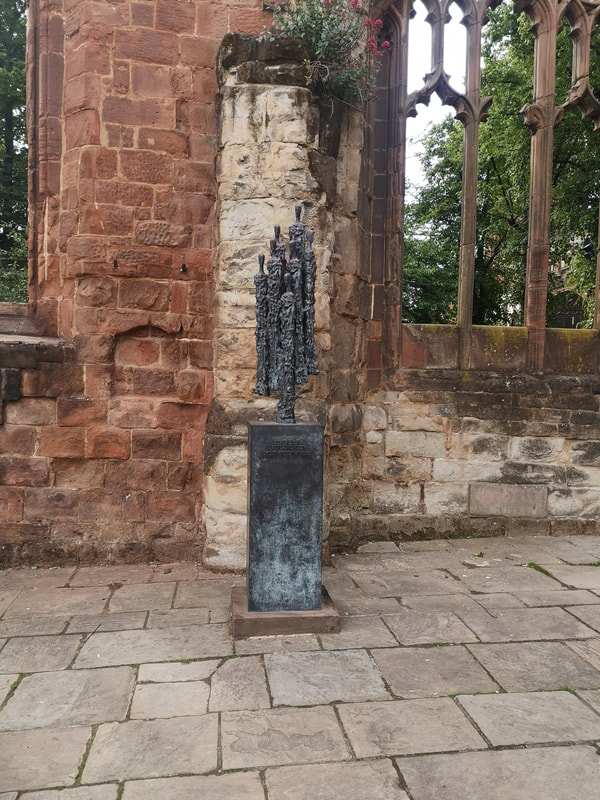
Before you leave though, go around the ruins of the old cathedral and which has been tastefully decorated by modern sculpture. It is all rather impressive.
|
Archives
June 2024
Categories |
 RSS Feed