|
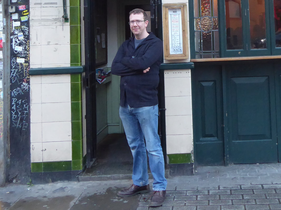
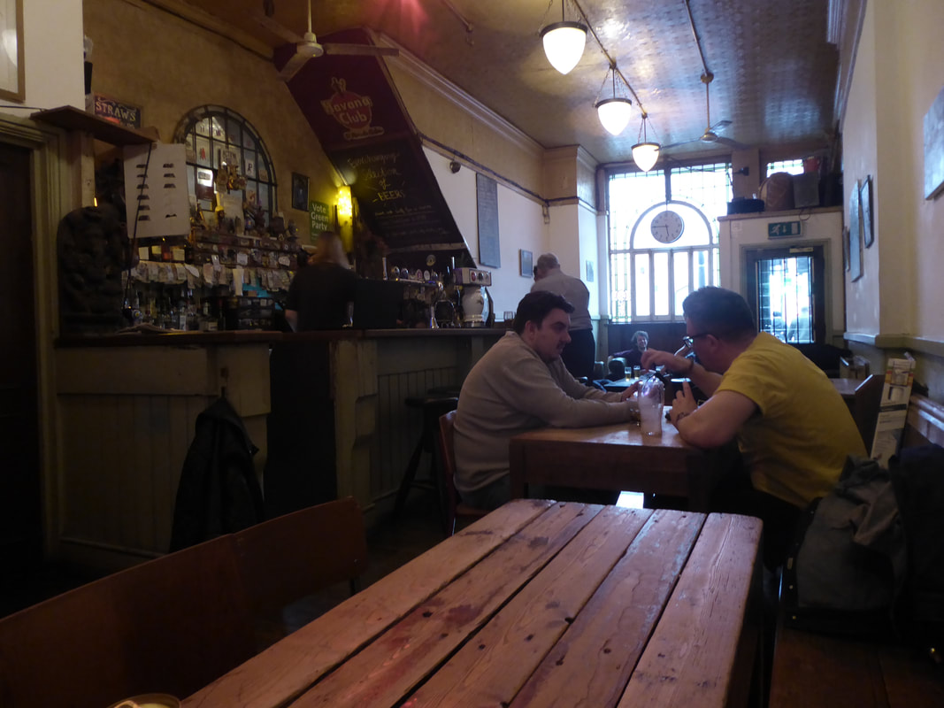
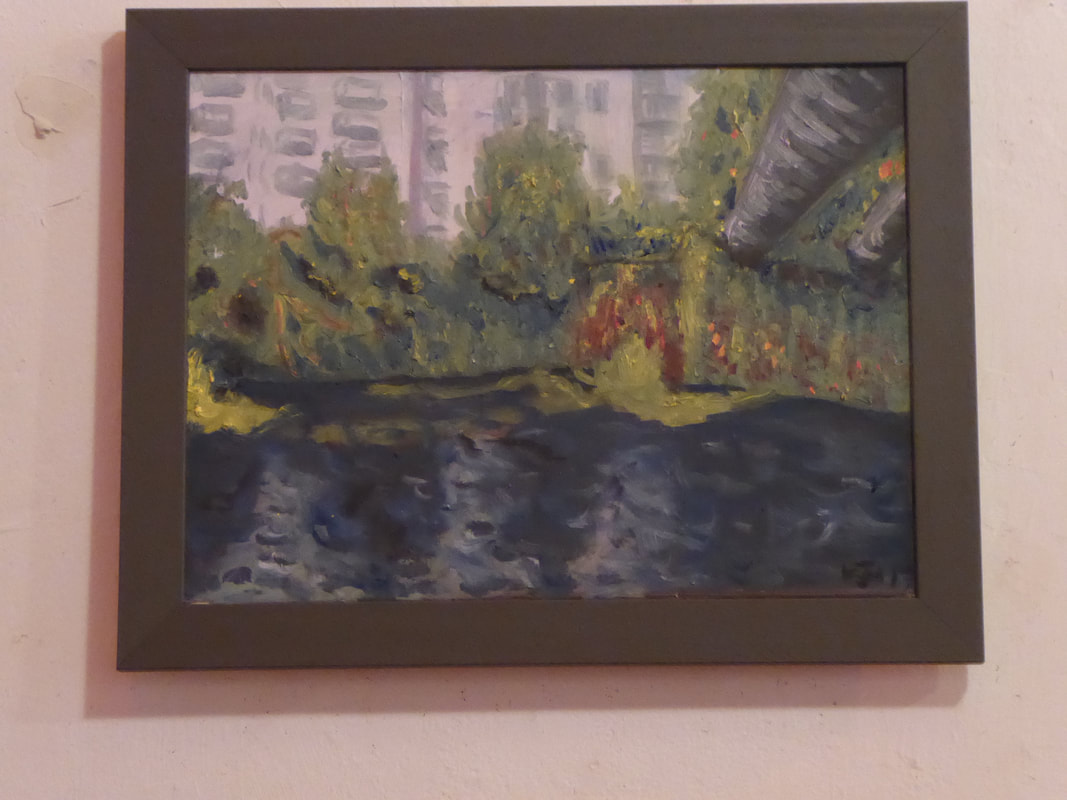
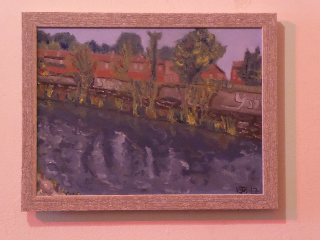
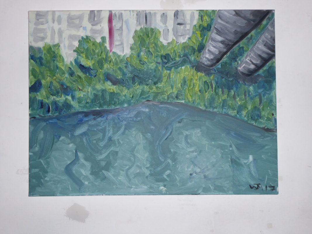
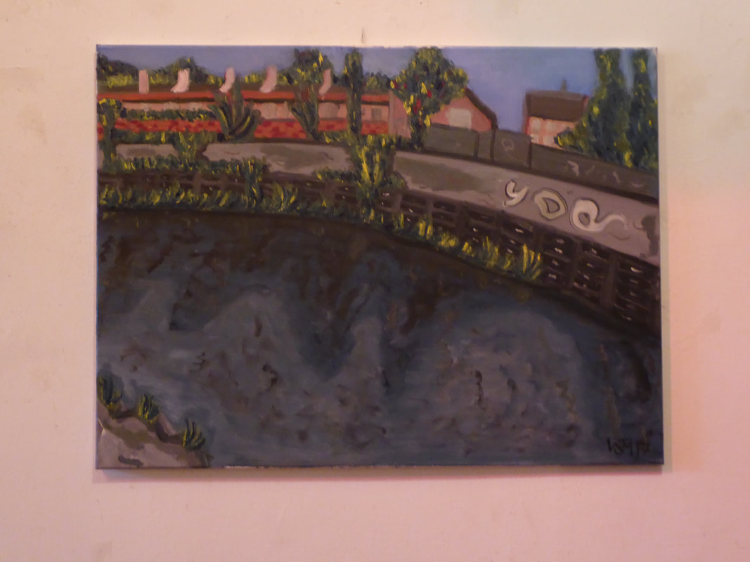
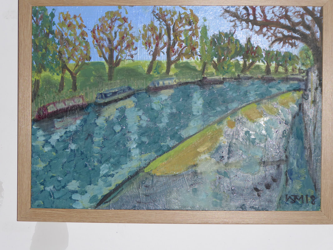
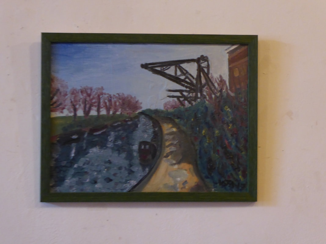
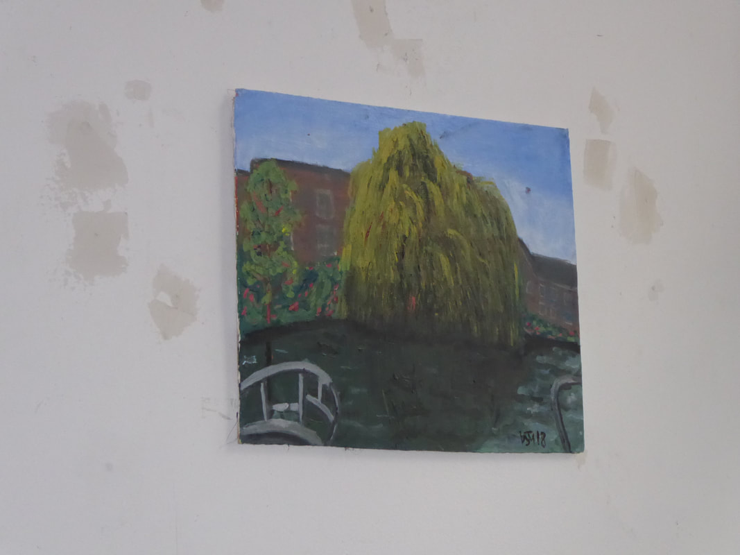
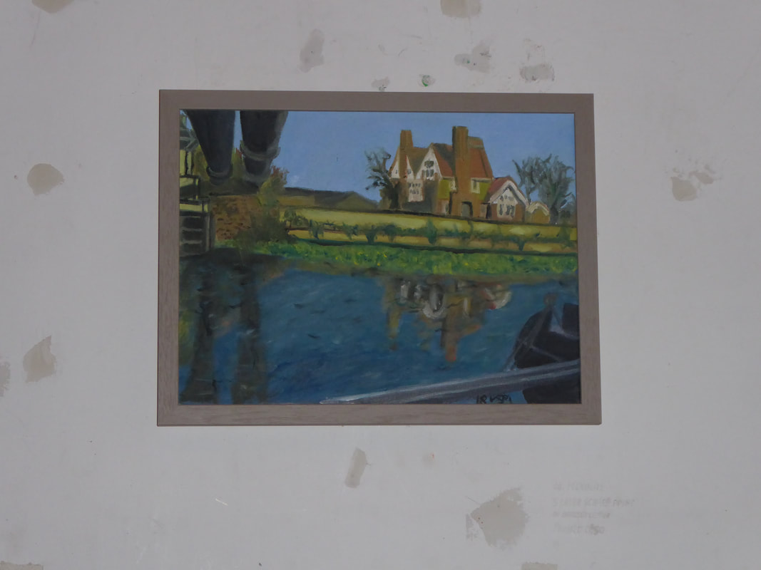
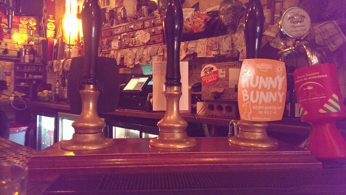
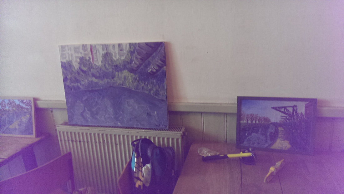
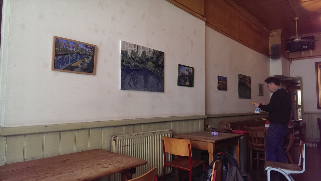
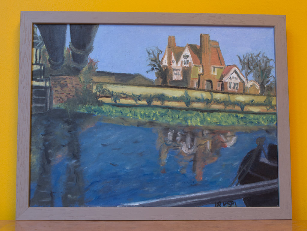
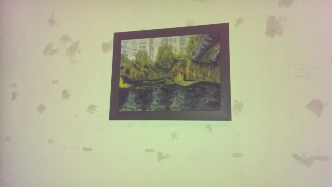
There is nothing that people like more than a smug artist (above) talking about their own successes. This is just as well, because this week, that is exactly what is happening. My show at the Indo Bar finishes this Sunday and I shall be taking down the work. It has been a terrific and eye opening experience I am now going to tell you about it, at slightly greater length than is politic. Photos in this blog courtesy of John Mackenzie. Firstly the Indo (above) was an excellent venue. It has great bear and does very nice Pizza and chips as food. Also the owners Peter and Katie are super relaxed and friendly. They were present on the day I appeared with Hugh Mendes (who acted as my curator) to hand the paintings. They said complimentary things and indeed I sold my first painting before it was up on the wall. You could not ask for a better start to a show (well you could but not probably at my stage of the career). On then to the paintings. Above are the first two paintings I did from the series, the one on the left called the River Lea Navigation was the very first and remains my favourite. It is deliberately in a slightly abstracted style. The one of the right is called Graffiti on the River Lea. People reacted well to the presence of the graffiti on the wall. I decided to larger versions of several paintings, indeed for the first paintings I did two larger versions. In the end only two of the larger paintings made it into the show (above). It was interesting to me. People reacted better to the above left painting better than its smaller original. It was painted quickly and loosely and I think people responded to the energy. In contract people preferred the original of the one on the right to the larger version. The main criticism was the chimneys are to jarring. This was not something that I saw until someone said it and now I agree and it really bugs me. I may change it. The above two are painted on wooden board, rather than canvas. The wooden board creates a very different effect which is most obvious in the water. I really like these and thought they were two of the stronger pieces in the show. People liked the one on the right but were not that interested in the one on the left. Well your public can't be right all the time. In contrast The Willow on the Lea (above) was not one I thought was particularly good. Hugh though was insistent it should go in the show. He was right and it was one of the three paintings I sold. Indeed it provoked a lot of interest. This has brought home to me the comment that is often made is that the artist is not a good judge of their own work. I am super pleased it sold thought and it is off to a good home, once I've had it framed. The last two pictures in the show were also the other pictures that sold. Somehow I don't have a picture of one in-situ so we will have to make do with the one from the studio. I had this from my first exhibition but the ones that sell often attract a great deal of interest and such was the case here. I could of sold particularly the one above left , several times over. I think there are number of reasons for this. The colours are more vivid. They have a perspective that lead you into the picture (the pipes in the one above left, and the path above right).
They also have a structure and the structure acts as a focal point, and a point that people are interested in. I think the willow tree performs the same function it it's painting. This is a useful lesson when thinking about future paintings. This then was a very useful, ego-boosting experience. I came away with three sales, a commissions, some new friends and a new bar to drink in. If you are an artist and you haven't yet I highly recommend exhibiting your work. Even if you have to set it up yourself as I did last year. You will be surprised as to the result. Now I will just have to start hustling for another one.
0 Comments
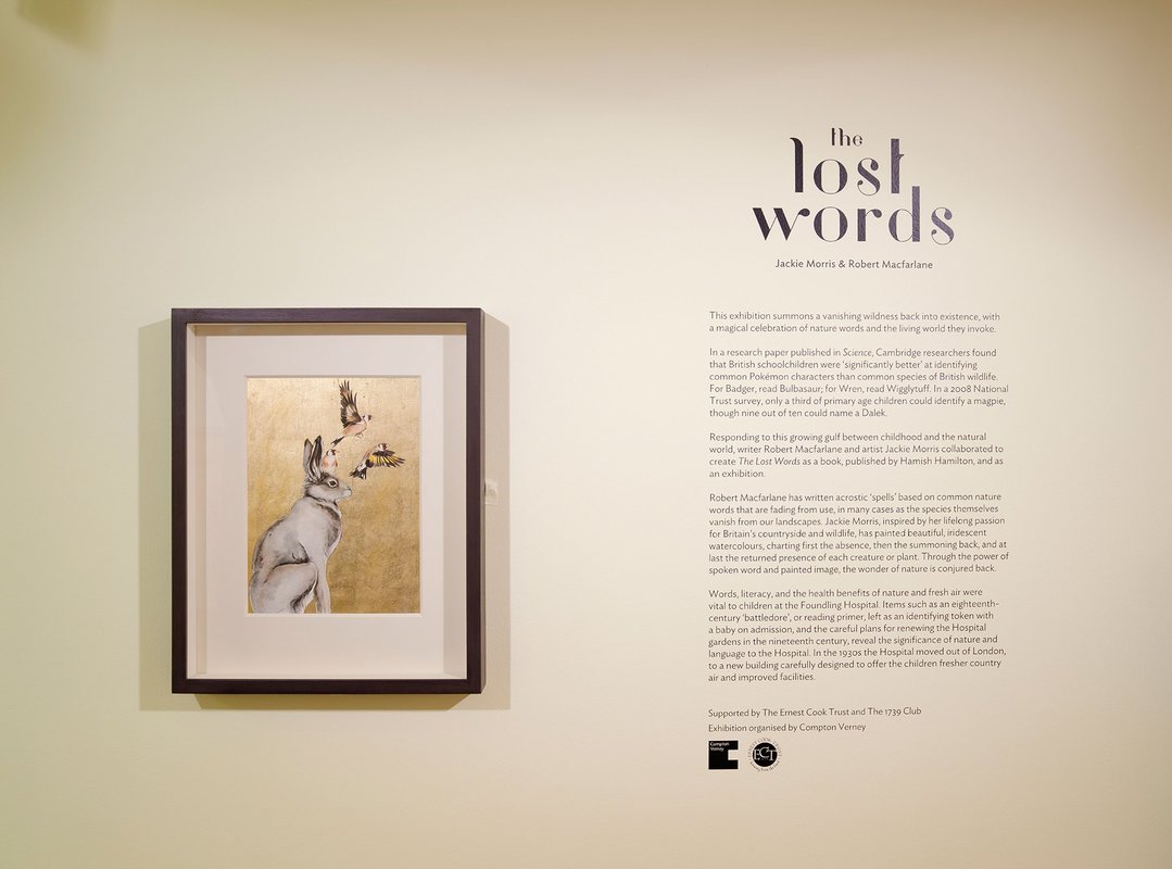
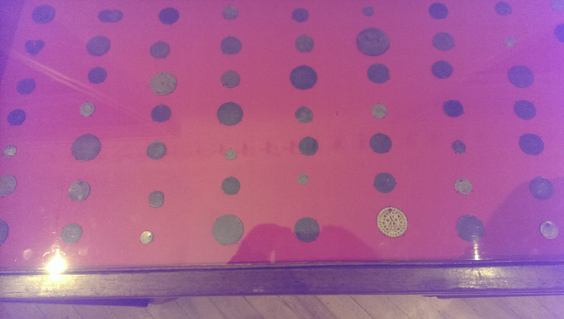
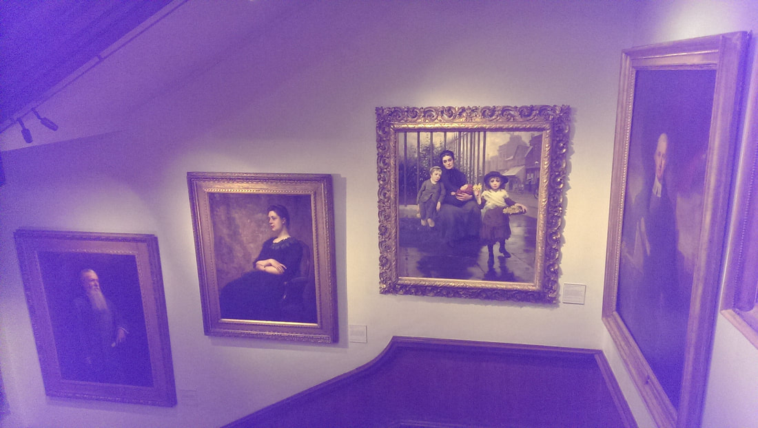
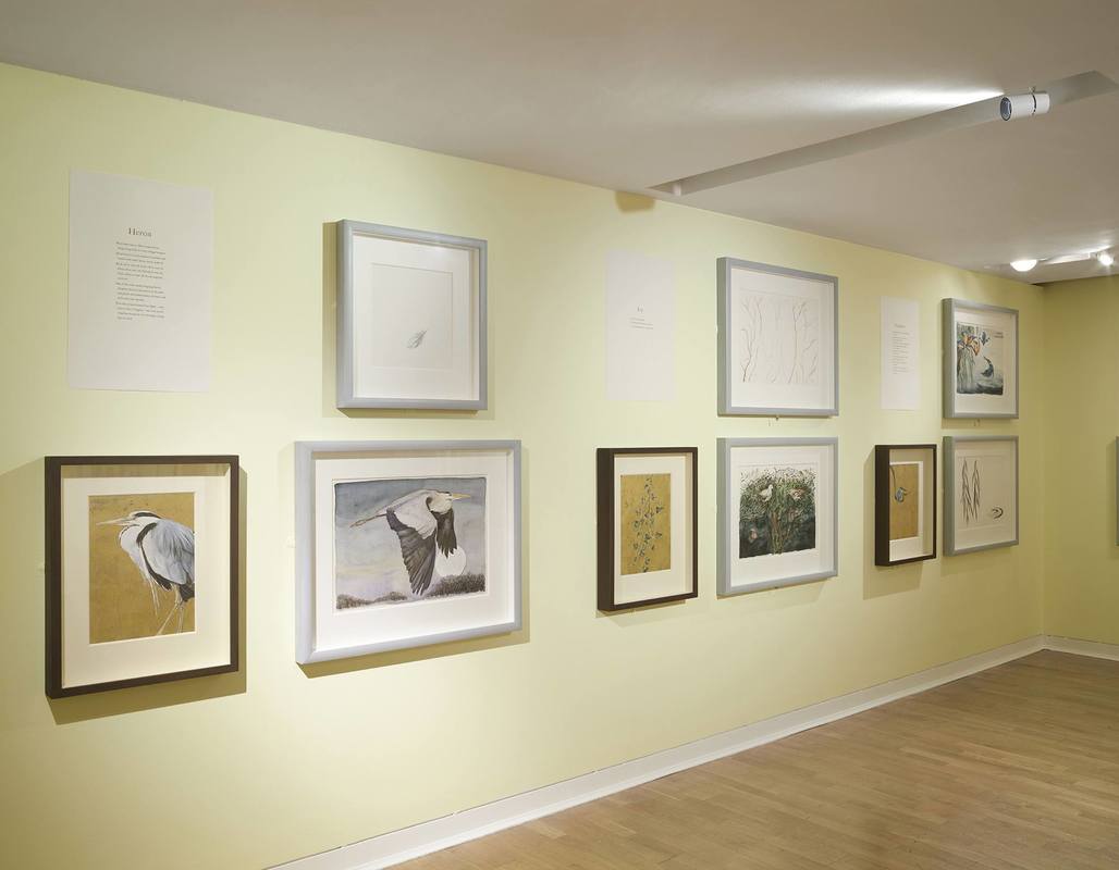
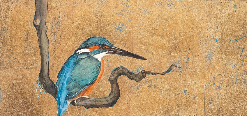
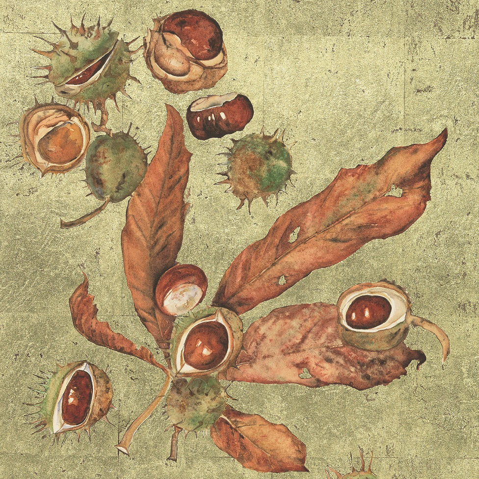
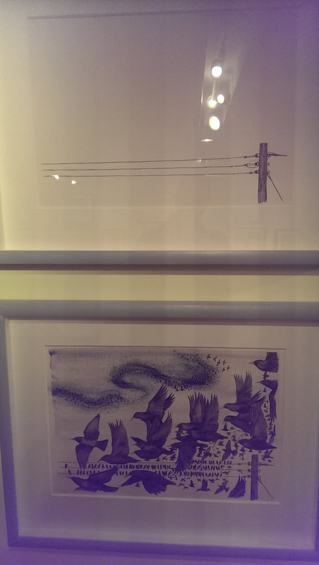
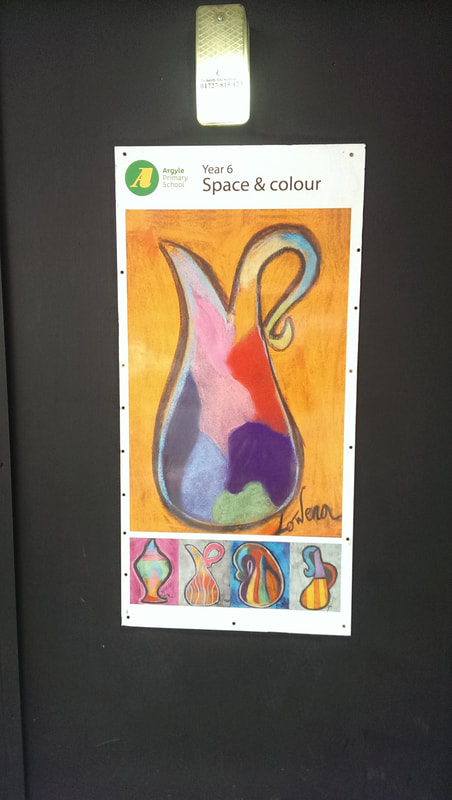
If you’ve never been there, the Foundling museum rests in the far north east corner of Coram fields, just east of the Brunswick centre. It is the museum on the old site of the foundling hospital where children could be left by parents who couldn’t care for them. Lots of interesting people were involved in its early foundation including Hogarth and Handel. As a result there are more than a few Hogarth’s on display. Handel wrote the messiah to raise money for the hospital and left the manuscripts and the rights to them in his will. You can see the will and some of the manuscripts on display in the Handel room. Foundling’s, when left at the hospital where left with tokens. Often several tokens. Thus if their parents ever wanted to reclaim them (examples above), the simply had to describe the tokens. There are two cases of those tokens on display and they make for a fascinating collection especially when you consider their unique resonance. A by product of this practice is that the Foundling Museum has the largest collection of historic fabrics in Britain. There is a fee to enter, although it is not much and if you have an Art Pass, it is free. There are a number of grand paintings in the museum, my favourite of which is the centre of these three that climb the stairs with you (above). The one of the far right by the way is called “The Pinch of Poverty” and is a bit too winsome and moralistic for my tastes but I do like the portrait of Mrs Forbes by William Carter. She is looking slightly severe but it is the textured background that really does it for me. The star of my visit, and the reason I highly suggest you go, is to be found in the basement. It is an exhibit called The Lost Words by Jackie Morris and Robert MacFarlane. The good photos are taken from the website. You can take photos at the show but the light is dim and you cannot use a flash so they are a bit, well dark.# The theme is the detachment of children in London from nature and an attempt to reacquaint them. To do this there a series of poems about the Wren, the Bramble, the Lark, the Fern and so on. Each poem is accompanied by three paintings. One is a gold backed icon like piece, one a watercolour of the object in question, and one a sort of loose and sparse sketch. The plump heron, strutting passed the gold background has quite an oriental feel about it. I like the way in all of these the gold is marked and scratched with black. The kingfisher, perching on a solitary branch, eyeing you suspiciously has a similar feel, although here, to compliment the bird, the scratches in the gold are done in blue. In the Bramble the gold is given a much more greenish tint presumably to emphasize the plan nature of the subject. Also the blackberries look delicious. A similar tone is given to the Acorn and the Conker (above) The best of the sparse sketches was for the Wren, where you just have the suggested outline of a bird, mouth open in song, purchased atop a bramble, with its song lifting up into the air. It’s a very good composition. Coming a close second is that of the Magpie, where two birds are depicted merely as blank spaces in the spikey branches. My favourite triad are those that of the Starling. The sparse sketch is just two empty power lines, and then the watercolour is the same power lines, now inundated with a torrent of birds (above, if you can see it). The golden icon type piece, has a starling in all its mottled iridescent, sitting firmly centre page. Charming is a description that can be a bit damning with feint praise, but it is not meant to be in this instance. This is an exhibition that is utterly charming, and of very high quality. Go, and buy the book afterwards. There is more in the book than there is on the walls. On my way home I passed a series of posters, on the outside of a construction hoarding on Euston Road. They showed artwork by the local primary school. Whoever produced this piece (above) from year 6 (which makes them about 11), is disgustingly talented.
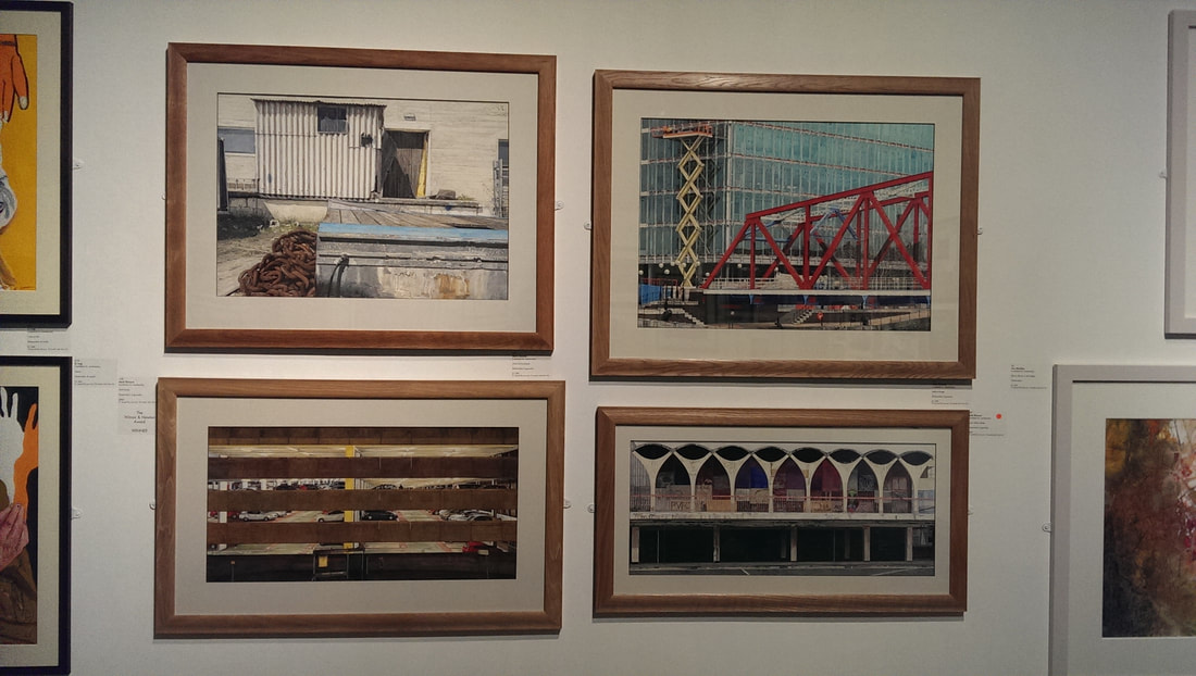
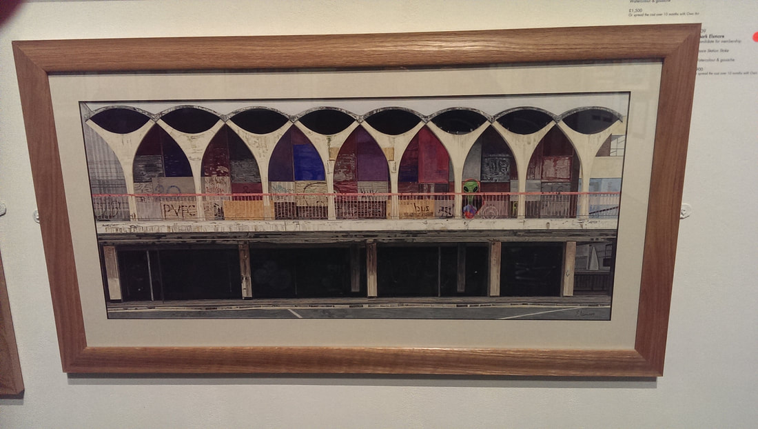
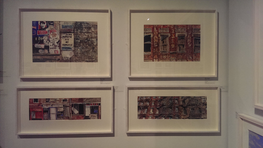
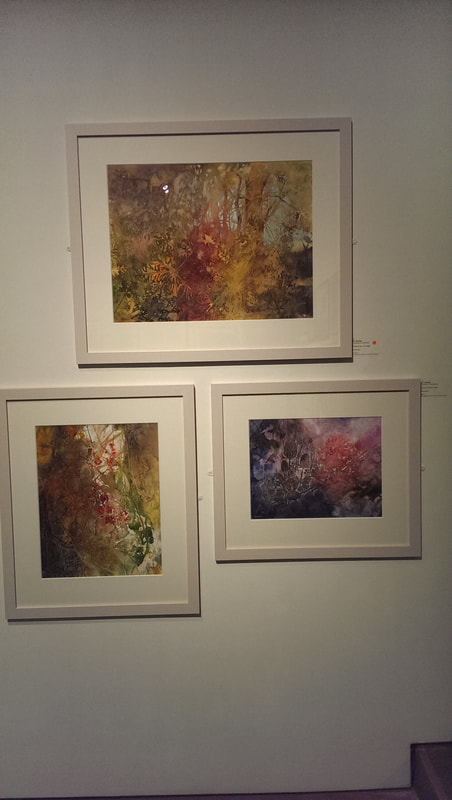
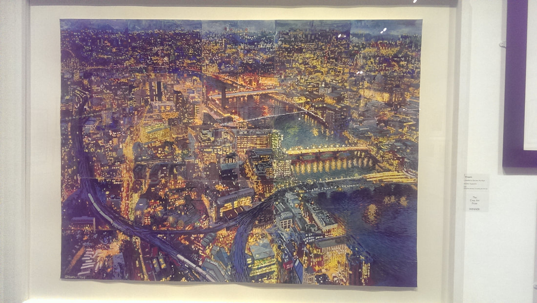
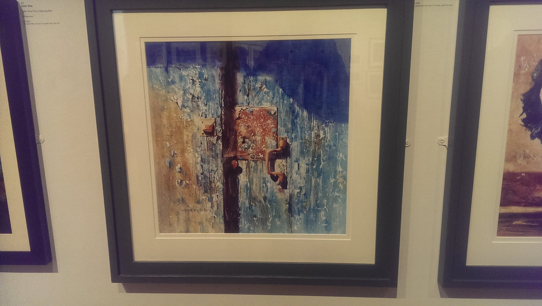
Now for some self promotion. My show has just over a week to run at the Indo Bar. Go along and tell me what you think. I haven't been to the Mall Gallery for a while which is a shame as they have many good shows. It hosts the annual shows of many of Britain's top art societies. I happened to be in the area on Friday so made a beeline (why bee, why not crow?) straight for the gallery to see the Royal Institute of Contemporary Watercolour (or RI). Prince Charles is its patron. I believe he exhibits under a nom de brush but I am not sure what it is. If you think watercolour is stayed and boring, well you are an idiot, and wrong, and this show is an example of why. It is well laid out across the mall galleries and I have selected below some of my favourites using the vigorous criteria of I happen to like them. One of the vistas in life that fascinates me is the backs of buildings, the lesser seen slightly run down industrial visage. This is one of the themes in my current show. I am always struggling to find a way of presenting these images in a satisfactory way. I therefore appreciate it when I find someone who seems to have cracked it as Mark Elsmore has (above). I particularly like Space Station Stoke (the bottom image above) in all its beautiful griminess. He stays just far enough away from photo-realism to still be interesting. I am not in the least surprised it has sold and I suspect Mark will breeze through into membership. Staying on a similar theme are the urban wallscapes of Sandra Walker (above) I particularly like the one of the wall at brick lane called Fake News (above, the picture top left). These are highly textured detail paintings and I particularly like the way she renders brick. My only criticism is I think the picture takes you two close up, there is no perspective in them. This is clearly a deliberate choices though and it is choice that works best in the narrow almost claustrophobic pictures that are the bottom two. Next we have Ann Blockley (above) who has produced these three marvelous, somehow slightly threatening nature scenes. The have a sort of loose misty quality, a feeling of nature out of control which seems to be quite in vogue at the moment and which I really like. She has good colour contrast but also has an effective way of dominating each picture with a particular colour to give them each a different tone. This piece (above) by the interestingly named S Z WImperis is called One hundred to one from the Shard. The picture is made of a number (presumably 100) smaller paintings on small pieces of paper, assembled to make the blue and yellow whole. It is good. Not only is it a good painting in terms of light, colour, composition, detail and so on but the idea of assembling it out of smaller parts is a good one and done well. It adds an extra dimension to the whole thing. Like you are looking at the city through a slightly distorted reflection. David Poxon has given this piece (above) the slightly pretentious title of Places only we know. The title spoils it a little, lock and door would have been better. The painting can speak for itself without attempting to add superfluous mystery to it. As you can see what David is particularly good at is texture. You almost feel like you could touch the battered wooden door, with its pealing paint and the rusty lock.
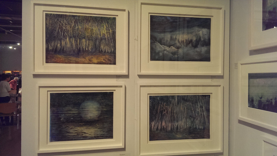
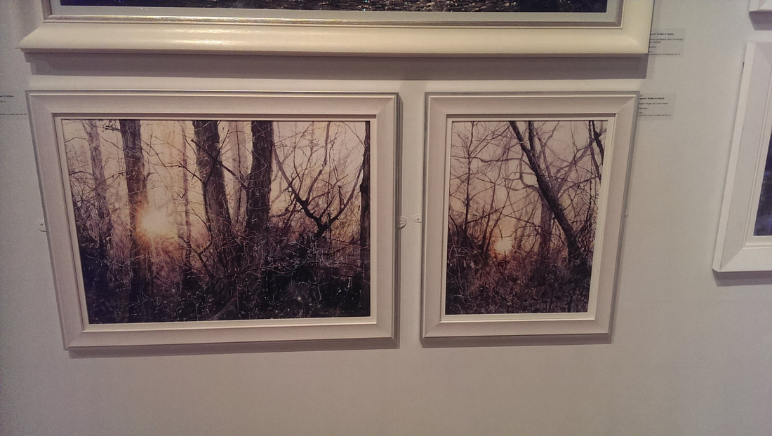
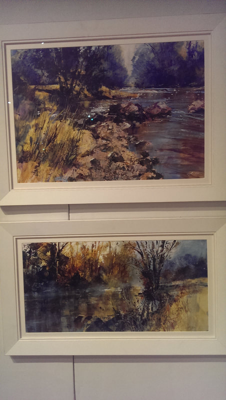
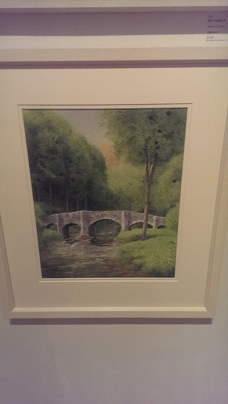
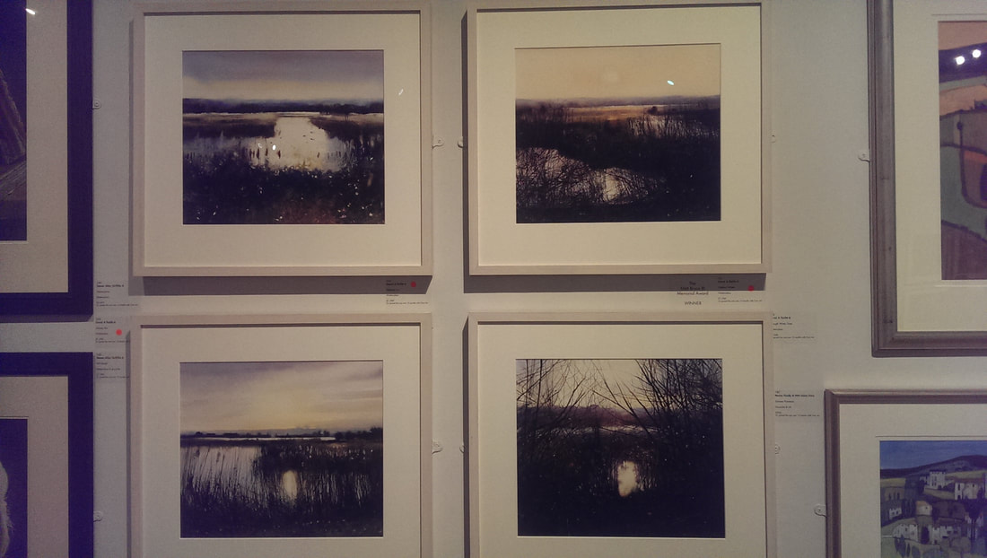
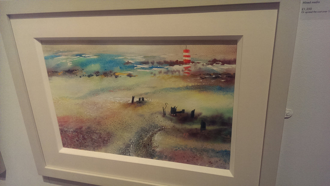
I like trees. I like pictures of trees, if they are done well, and I like these scratchy slightly skeletal tress produce by Deborah Walker. The light coming through gives a good sense of depth and you really get the sense you are stuck in a cold wintry thicket of trees. Doesn't show up terribly well in the photo but the colours are more subtle then they appear here (above). Watercolour is well disposed to a certain moody type of landscape so in a similar theme we have the paintings of Chris Forsey. Astute readers will have noticed there is a pattern to my tastes, misty slightly off kilter scenes are high up my list of ascetic sensibilities and so I like the soft silvery light of Chris' work, the reflection on the water and the scrabbly landscape. Classic use of water leading you off into the painting. Of course it doesn't have to be wintry and dark, with foreboding mist. I also very much like the above picture of FIngle Bridge by Kevin Hughes. The whole thing is superbly rendered but what I particularly like, and I think what lifts it above a standard landscape is the mossy effect of the foliage of the trees. Gives it that something special. ahe of course I have to return to type with misty, autumnal watery scenes as in these four (above) by David A Parfitt. Again exquisite technique and very nice reflections but these are a good example of fine composition, particularly the bottom right one with the sliver of water framed by the bending twigs. Still misty and probably autumnal but much more brightly coloured and exuberant that the others is Richard Plincke's coastal scene. It is the bright lighthouse bursting out towards the back of the picture that grabs you and then swirling colours to keep you interested.
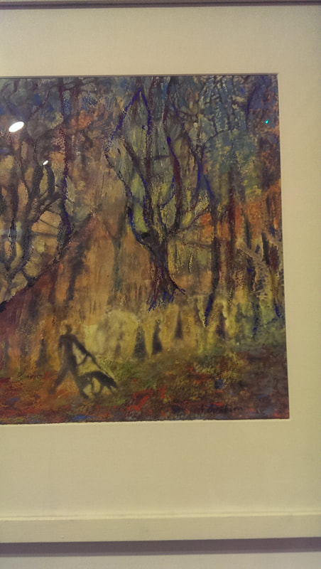
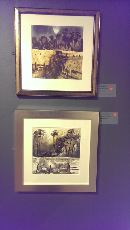
Last up and I was not surprised at all that they had sold were these two pieces by Karen Read Coley (above). I am sure there is ink in there (the label just said mixed media. They have a sort of fluid Japanese style to them and of course, chiming with my other tastes, silvery light and autumnal trees. I fear I am becoming too predictable in my tastes.
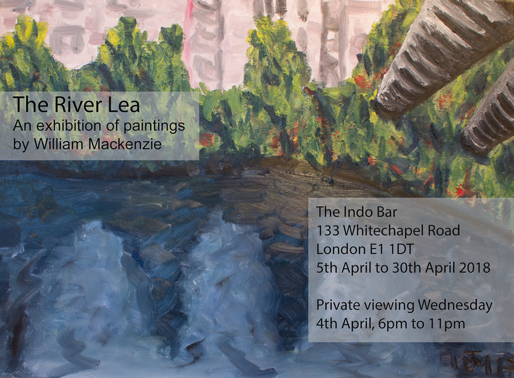
If you have read this far, then just a quick reminder that I have a show on at the Indo Bar in Whitechapel. If you get a chance pop along and then tell me what you think. What is the point of having your own website if you can't shamelessly promote your own work and your own show. As the above flier makes clear I have a show at the Indo Bar in Whitechapel, showing my paintings of the River Lea. I spent the days in the run up to the show, handing out fliers at various establishments and galleries around the area, including to the staff at the Whitechapel.
14 paintings were taken down to the bar, but with the assistance of Hugh Mendes, (seen below) 9 were selected, strategically placed around the bar and then hung up and I have to say they looked very good. By dint of his eye for measuring and ad hoc mathematics the centre of all the paintings were at the same level. It is amazing how much better this makes the whole think look. Seeing all these paintings, hung up together is quite a moment. I am very pleased that this show has come about. The one in the flier is the nearer of the two larger paintings. What is interesting was quite how nervous I was in the run up to the opening night. I was buzzing around in anticipation and with lots of energy. I didn't really relax until I was there and people had arrive. It was a good attendance. Some 20 people came specifically to see my paintings and the bar was packed with its usual crowd. Some of whom I saw looking at the pictures in an interested fashion. I have to say it is enormous ego boost when people whose opinion matter to you come to such a show and tell you they like such things. Specific mention goes to Ben Moon, who called in on his way home from Myanmar, and Alex Alexander who hobbled in on crutches.
One of the interesting thing is the works people preferred. My favourite remains the first one I ever did (above) which is called River Lea Navigation. Most other people though prefer the two paintings that I sold. I think this is because the buildings provide a contrast both in colour and subject that most people like.
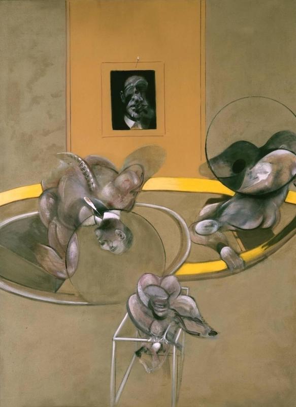
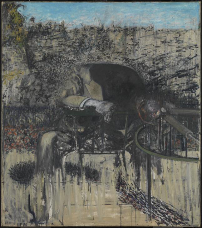
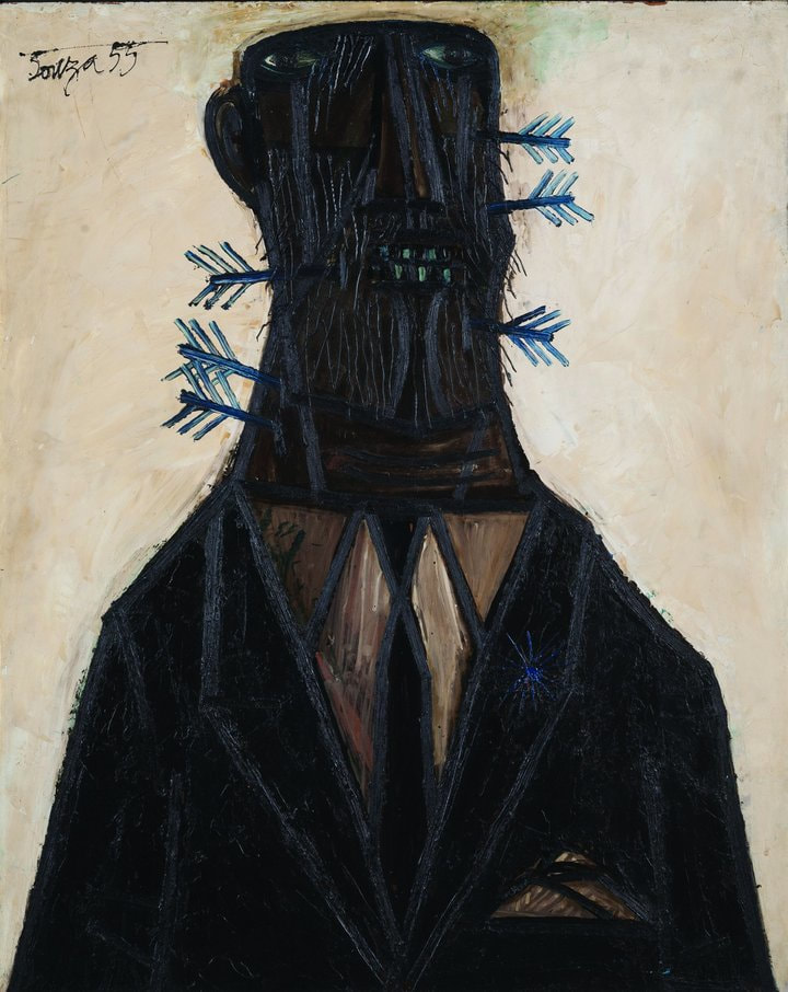
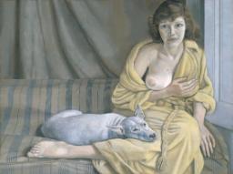
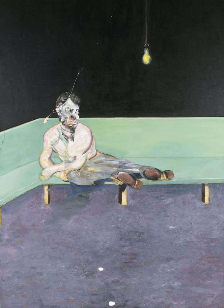
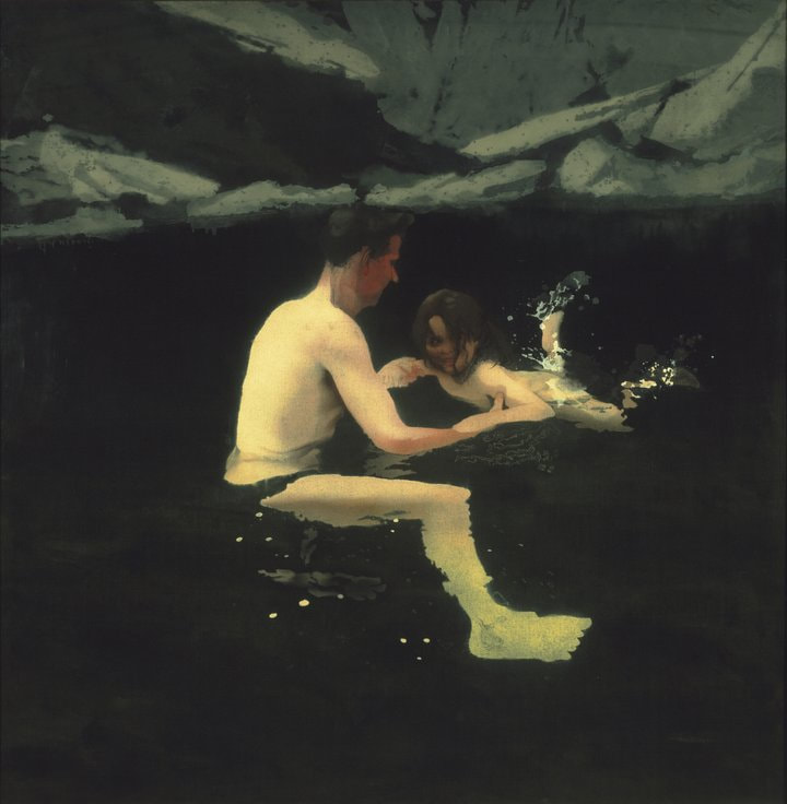
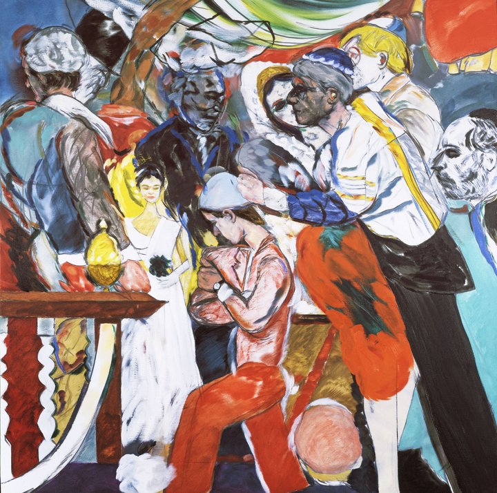
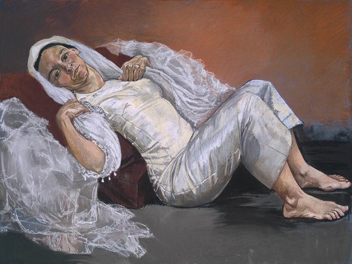
I went back again today and this opinion was seconded by my two In-laws. I shall be popping in again at various stages, with various different people until the end of April. Interesting to see what people say. If you are in the area, please do pop in and tell me what you think. I shan't show you all the paintings that are up in the show. I might do at a future blog, hopefully this leave the wanting more approach will tempt you to go and have a look (also the beer and pizza at Indo are excellent). Many thanks to the Indo and all the excellent and friendly staff there. There is a monster show at Tate Britain with the evocative title of All Too Human and features the giants of mainly Britain from the 20th century such as Freud, Bacon, Andrews and others. It stretches across 11 rooms and there is a large number of paintings on display. As with all such good shows it also introduces you (well me anyway) to people you haven’t heard of or are less familiar with. A good example of this is the artist who opens the show , Stanley Spencer and his direct and fierce portrait of Patricia Pearce, one nude, one clothed. Unlikely “classic” nude there is a genuine personality here and the person looks out at you from the canvas. David Bomberg is a favourite of mine and there is allot of his work in this show including an interesting early self portrait and a landscape, Toledo from the Alahambra with the builts marked by thick swipes of paint. For some reason although this is a predominately 20th Century British artist Soutine makes an appearance with both a very striking portrait but also a mad dynamic landscape called Landscape of Ceret. It is crusty colourful and dynamic. In fact it fits in the show quite well as it shares a number of similarities with both Bomberg and later Kossof and Auerbach. The second room contains Francis Bacon, quite a number of them and all ones I hadn’t seen. The most striking of which is called simply Figure in a Landscape a sort of twisted horrific black figure in a scrabbly distorted landscape (above). As with most Bacon pictures at least for me, it is unique and interesting but actually deeply unpleasant to look at. More subtle was a Study for a portrait after William Blake in which against a dark background is depicted a semi translucent ghostly head. The next room was entirely filled with an artist I had never heard of called F N Souza. His style was very different from everyone else in the show but I have to say it really appealed to me. Some of it such as the Crucifixion reminded me of Basquiat with the spiky silouhetish figures. He presents these very stylised figures with thick outlines, makes them monstrous but not inhuman. My favourite of these was Jesus and Pilatus with the scoring through the paint to form the beard and the hair and the shiny paint. His landscapes have a similar quality such as Citadel which looks like some kind of insect hive or an abstract stained glass window painting over a mottled blue background. William Coldstream’s paintings are as formal as the name would imply. He has this thing of marking up the paintings using a grid to get a very exact representation. You therefore get what is supposedly an objective image. What lifts them up from being too cold though is that the cross marks in blue, black and red used to mark points on the image are left visible or semi visible, an artefact that appealed to me. He was a fan of Freud and in the same room as Coldstream is what I think is the best of one Freuds painting, woman with cat. Bomberg makes a reappearance in a room that serves basically as a counterpoint to the exact realism of Coldstream et al in the previous room. The room flows from Bomberg to Auerbach and Kossof (the later two of which are still a live, now in their late 80s, Auerbach had his own show last year). There is a soft and dreamy landscape of the City of London. Next to this is a similarly styled portrait by Dorothy Mead of a reclining figure, all soft focus with no solid features but a sort of gloomy impressionism. Auerbach is next up. I prefer Auerbach when he is slightly more restrained in his application of lots of glopy paint. I find his crustier paintings a bit repellent, the remind me of the next in the Aliens film. So Park Village East, which is more restrained and colourful has a greater value to me at least. Kossof occupies some of the same room, there is a very interesting piece in black and white (or rather blue and white) but my favourite was Demolition of the Old House which is done with swathes of green, red and blue all scraped over. Freud features again with a room of his own, including an insanely detailed plant and flower painting which apparently took him three years to paint. The technical brilliance and attention to detail in all his paintings is astonishing but I find his paintings very cold and devoid of emotion. So for example there is a nude female figure, in classic pose eyes averted from the viewer. Contrast this with his portrait of David and Eli (Eli is a dog), also a nude but there is an obvious genuine affection for the sitter who has a personality and stares directly at you, and also a similar portrait of Freud's first wife (above). Bacon is next up and again its horrific twisted figures often against raw canvas, all distorted and strange. The best of these was, I thought, a portrait of Lucien Freud (above), reclined in what looks like a pool hall on a Green Baize sofa, with the body swirly and the face distorted (if you like Bacon you will probably also like the author Jeff Vandermeer, they chime a similar cord with me). Moving on you have a room of Michael Andrews (who I have written about before) and another new discovery R B Kitaj. I like Michael Andrews and of the three works on display my favourite is a very sweet picture called Melanie and I Swimming (above) which shows the painted swimming with his daughter. It is a very personal piece. I particularly like the water which reminded me of Peter Doig (another favourite of mine). R B Kitaj on the other hand shouts at you with bright colours and riotous scenes (like the one above). He was a new name to me and I again had three works on display I preferred the calmer To live in Peace which was narrow and rectangular with blocks of pastel colour, with one characters skirt is just a stencil flower on a white field. The figures are possibly singing and are all blurry as if in motion. Paula Rego (above) is a name that chimed a slight bell and for reasons that are obscure had a room to herself. She has a thing for oversized heads which I have heard compared to children’s illustrations. I particularly like the surreal fairy tale like tryptic on the back wall. The final room contains contemporary female artists, three of whom particularly appealed to me. Celia Paul in a self portrait called Artist and Model. It has shades of Giacometti with this slightly elongated grey figure wearing a scrapy artists smock which is covered in flecks of paint. Her face is expressive (if a little overworked) and glum).
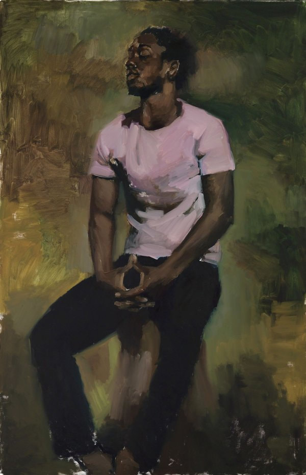
Cecily Brown works in colour and nature and has a particular gift for playing on the slightly hidden. Of her two works Teenage Wildlife was the best in my view. You have bright colourful foliage obscuring, but not entirely, two semi naked forms. Hampstead Heath in May was my immediate thought. As you exit you are flanked by Lynette Yiadom- Boakye (above). According to the blurb she can create these in a day in which case this makes her annoyingly talented and prolific. As the two I preferred the one on the left, sadly I have forgotten the name but it is three figures, each one turning slightly further away from you. They look like dancers and particularly effective is the reflection in the wet pavement. This is a seriously seriously good show. This is one of the few shows I am considering going again. You should definitely go. You’ve got time as it on until 27th August. I shall sign off with some self publicity. I have a solo show (I'm very excited) at the Indo Bar in Whitechapel, starting on 4th April and running until the end of the month. Come and have a look. Tell me what you think. |
Archives
June 2024
Categories |



 RSS Feed