WJM
  • Gallery
    • Rivers of London
    • Still Life
    • London Landscapes
    • British Landscape
    • Flora and Fauna
    • Past Work
  • Blog
  • About/Contact Me
  • Gallery
    • Rivers of London
    • Still Life
    • London Landscapes
    • British Landscape
    • Flora and Fauna
    • Past Work
  • Blog
  • About/Contact Me
Blog

Summer Exhibition part 2 - architecture

7/31/2016

0 Comments

 
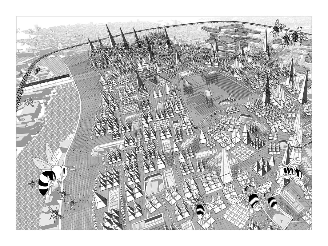
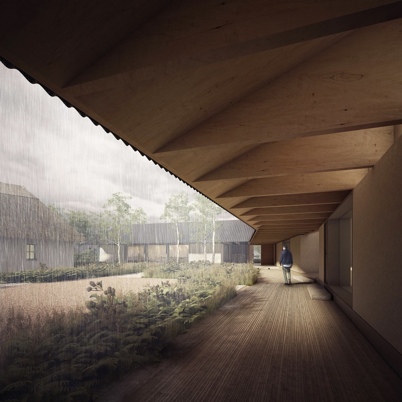
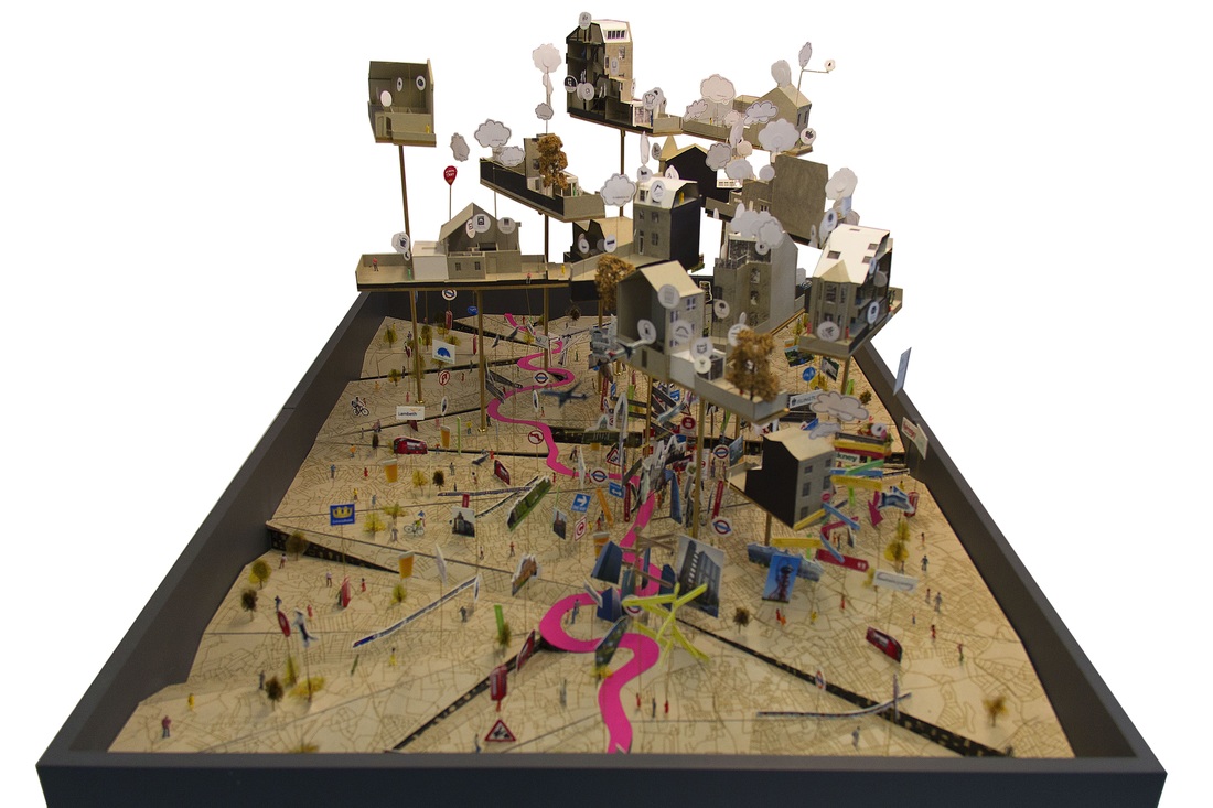
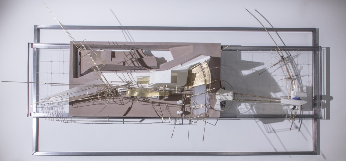
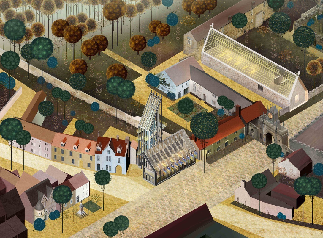
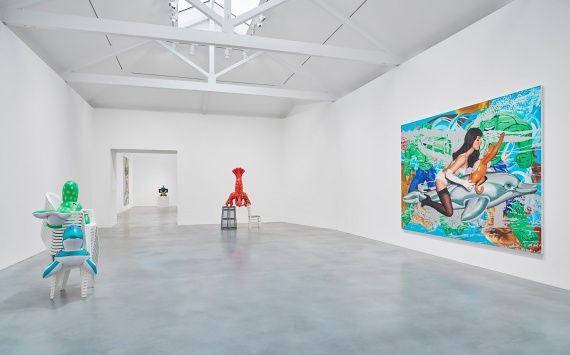
This is the 2nd part (of what I have now decided will be three) blogs about the Royal Academy Summer Exhibition. This blog will talk about the architecture exhibits.  Sort of anyway.  It will cover those and vaguely related pieces.

I am, not that interested in architecture as a subject. I like pretty buildings, I like drawing them but the subject of architecture is not something that particularly grips me. It was my impression last year, re-iterated this year, that the architectural exhibits at the Summer Exhibition are among some of the most artistically interesting, well conceived and technically excellent pieces in the whole show.  You have good drawings, paintings, photographs, plans and sculpture. Here are some of my favourites.  
Picture
Left is Anja Kempa's Library of Memories.  This is an interesting piece because it is an example of a great work of art enhanced both by its title and the context in which it is exhibited.
It is a giclee print of what was presumably originally an etching.  The edition of 25 is sold out, evidenced by the savage array of red dots at the base of the piece. 
As you can see it is a very complicated fantasy landscape in Japanese style with mysterious hanging objects and a scaffold like super structure that makes me think the whole thing is contained within some large atrium.  It is a piece that grabs you from a distance and rewards concentrated examination as more and more detail appears.  It had made my pre-list from perusing of the RA Website  and was much, much more impressive in person.
The fact it is in the architecture section and its name conjours up thoughts of some strange superstructure in which memories can be accessed and displayed.  It is a beguiling thought.  
It is called Pleasure by Annie Cattrell and is primarily resin.   The picture here is quite good but these are three dimensional objects and reveal different things as you wonder round looking at them from different angles.  I like very much the suspended golden amberish globules.  I also like the refracted light and views you can see (and the photograph shows quite well) through the pieces. They seem very tactile and it is a shame you cannot handle them.  You will have to fork out £20,000 (for 1) for that pleasure.
Picture
Picture
Avocado Coconut Egg by El Anatsui is not actually in the architecture section.  It is a sculpture made of aluminum and cooper wire and is in my view one of the best sculptures.  I put it in this section because it seems to me to have a very architectural quality.  It reminds me of an upside down city or a certain type of sci-fi floating city.
What the photograph doesn't convey of course is the textural quality of the piece.  It's difference surfaces and qualities.  You cannot buy it. It's not for sale.  
CJ Lim's  Vision of Food parliament (Aerial view).  It is a digital print.  I like the bridge that stretches across and frames the whole piece and the odd square gridding and pyramid structures.  The main benefit of viewing this in person is it is much larger.  Again it is a piece enhanced by the name.  What is the food parliament? Are the wasps attacking it or is this their home we are viewing.
It is deceptively simplistic piece that rewards continued viewing.  This and conjectures as to what are going on are things I enjoy in art.  Incidentally I don't actually care what the artist intended as the interpretation and, I think, neither should you.
Picture
Picture
Picture
 I have put these two together, Callum McLure's Hobby House and Ripples (far left) and If_DO's Joseph Walsh Studio do in very different way similar things.  They present dreamy enticing images of a planned space.  One can in each one feel the atmosphere of what it would be like there.
Mobile Studio Architects' Planning Permission Granted is an excellent example of art working also as superb advertising.  The idea is very simple it is map (of London) with small models of houses for which they have received planning permission.  It says very boldly, look this is what we can do.  It is fun to look at and attracted a lot of attention with people peering at it.  This kind of thing only works when the concept is rendered as well as it is here.  It's good.  It's fun. 
Picture
Picture
This is a shit photo of what is an excellent piece of sculpture, namely Mohammed Jubri's House of Flying Optics.  Good name.  What this photo stunningly fails to show is, well frankly anything that makes the piece good.  For this reason it didn't make my pre-list but it person I love it.  Spiky gantry's brass and perspex and odd angles.
For reasons I am unable adequately to explain these two are linked in my mind.  The far right one is Neil Spiller's Longhouse Site Plan Sketch.  Gold! Close scrutiny reveals a sort of plan but it is not really a plan, it is more the idea of a plan that glows out to you across the room.
I suppose it might be the glow that links it with Will Alsop's Heliport Height.  What is not in the picture is that the actual sculpture is lit internally with small lights and this, combined with the fact that it is actually placed against a dark wall gives it a nice glowing quality that shows that purple plastic and bronzey finish to its best advantage.  I like the shape too.  Reminds me of Tracey Island somehow.
Picture
Picture
Picture
Niall Mclaughlin Architect's Bishop Palace at Auckland Castle.  Never mind an architectural rendering it works very well as just a painting.  I like the perspective and the use of colour.  I particularly like the trees, differently sized baubles on slender trunks.  I can't quite place it but there is something very familiar and comforting about the style.
It's a good design they've got there, the Palace.  Nice vaulted glass structures.  They have made it fir very well into that landscape.
Peter Cooks' Waterside workspace is a strange riot of colour and shapes.  It is a very large piece and I was surprised it was not getting more attention from the milling throng.  It is a very different offering from everything else in that architectural space. 
I enjoy the animal, bird and butterfly like shapes the romp through it.  The boats strangely almost spoil it.  The way it does work though it the whole things look like an odd iceberg that these interloping vessels have encountered.
Picture
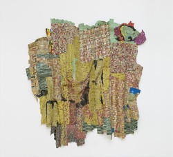
The above are all works of professional people presumably working in a sophisticated way in a sophisticated environment, many of them as part of a team of people.  It is perhaps not surprising they produce works of such quality.  There is a much more commercial feel to them, which is odd as many of the pieces are not for sale where as the rest of the exhibition are.  They say very boldly as succinctly, look, this is what we can do. Come and commission us.  They are to modern day architecture what the still life was to the dutch masters. I shall leave you now with one of my favourite pieces from the rest of the exhibition.  It is a made from wool being a work in felt, the only example of such in the whole place.  It is called Frosted Woodland and is by the very talented Bridget Karn.
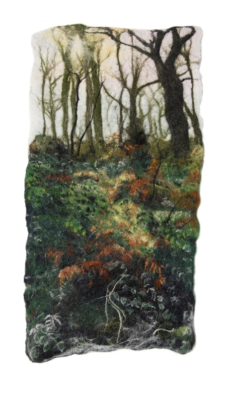
Picture
0 Comments

Summer Exhibition 2016 (part 1)

7/24/2016

0 Comments

 
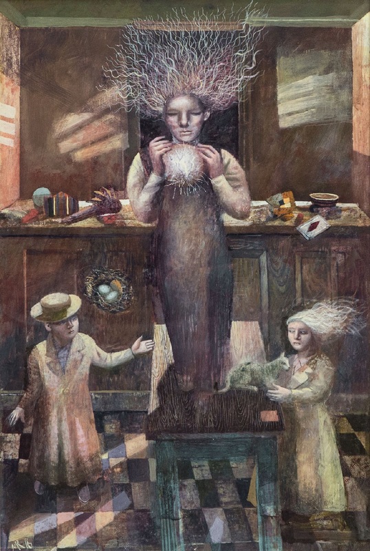
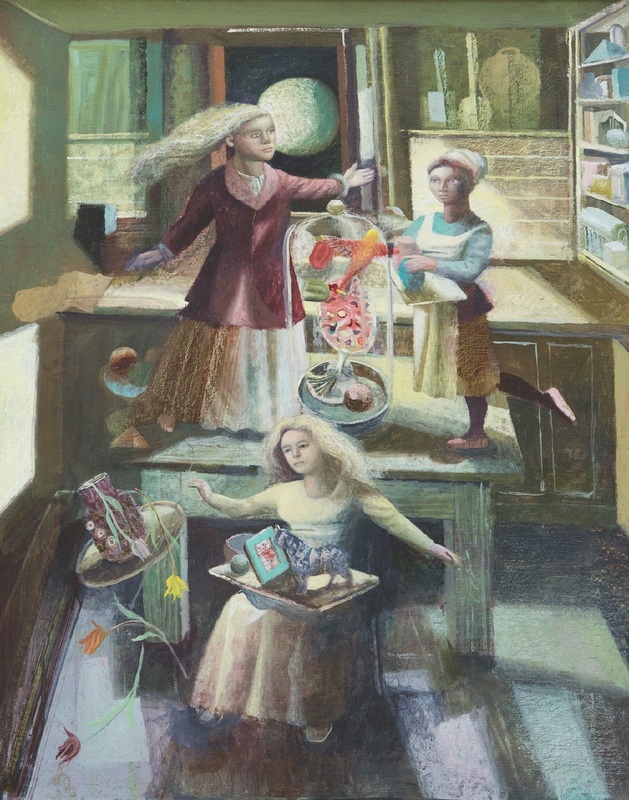
I went to the Summer Exhibition at the Royal Academy this week.  It was hot this week, very hot, and the Royal Academy had an air conditioning system.  There is no doubt this enhanced my experience.  It was a blessed relief in fact.  This is the first part of a series of blogs on the works that made an impression on me.

It has to be said that the initial impression of the exhibition is not good.  There are two reasons for this.  The first is the sheer number of exhibits is at first overwhelming. You are left with just an impression of brightly coloured nonsense.  The second is the first room, which is a rotunda from which the other rooms radiate out.  This year, as last year, it was filled with trash including the odd and garish photo of a glamour model in a frilly white dress.  After wandering around a few times though my eyes began to adjust and I could differentiate the pieces I liked from, well, everything else.

The sculpture was poor and I shall speak no more about them, particularly not the feeble sexually explicit ones. 

There is a strategy I use going round the exhibition.  The trick is to walk through a room one way then another.  Walking around in different directions and different pieces catch your eye.  Some of them reward closer examination but some of them disappoint.  Commercially speaking the show has been a success.  Red dots abound and many of the editions of prints had sold out. 

 I had also done a preliminary research.  The RA have added a very good facility to their website which allows you to peruse the paintings.  There are over 1000 but I went through the first 500 making a note of the artists I like.  Some art works are better in real life, some are worse. Ken Howard for example, good as he is, is much better in photographed form than in real life in my view.

As I went round I circled in the useful catalogue that is given out those works I liked.  It is strangely it reassuring when you keep choosing the same artist again and again.  Gave me confidence in my own taste. 

Picture
Picture
In room III (turn left off the central hall) you can find Frederick Cuming RA.  Mr Cuming was one of the people who made my list from the prior research, for Stormy Sea but both paintings, particularly the far left (Tennyson Down) are more impressive in person. They have more depth and light.
Terry Setch RA Alabaster and Lights on the Water.  Again from my pre list and again more impressive in person, waxy and three dimensional with a sort of sheen and depth that is appealing.
Picture
Picture
Picture
Picture
Bill Jacklin's works are split up in two different rooms. They both have a deep rich quality, a dreamlike view that I really like. They stand out from the works around them and draw you to them in the room. I selected both before discovering they were the same painter
Gordone Chung's El Eelkema I and II are sensibly hung together one above the other.  Chung was not someone who had made my pre-list and again an example of works that have that extra quality in real life.  I like paintings of flowers and the drippy blurred quality against the pitted metallic background really worked for me.  They also compliment each other well, working as a pair.  Both have sold and I hope to the same person.
Picture
Picture
Picture
Picture
Hughie O'Donoghue's two pieces Morning afloat (left) and Girl from Stellata (right) really got my attention,  especially the later.   I like the way the figure blurs out of the background and the striking stripe of dark mountain.  Both very good.
Mick Rooney's Bright is the Light (right) and the Kitchen Lighting Orb (left).  The photos here in no way do these justice.  The figures have a frightening fairy quality which comes across a bit in these pictures but is much more effective in the original.  Again the curators have done well and hung them together and they do well as a pair.  I prefer Kitchen Lighting Orb.  The orb has a good internal glow to it (which the photos do not show.
Picture
Picture
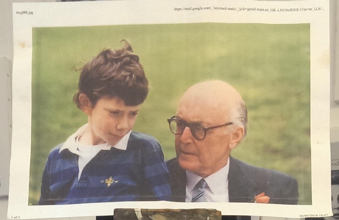
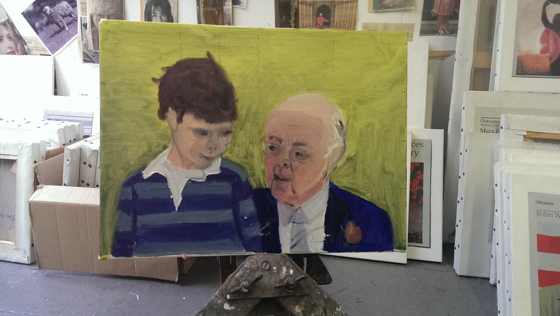
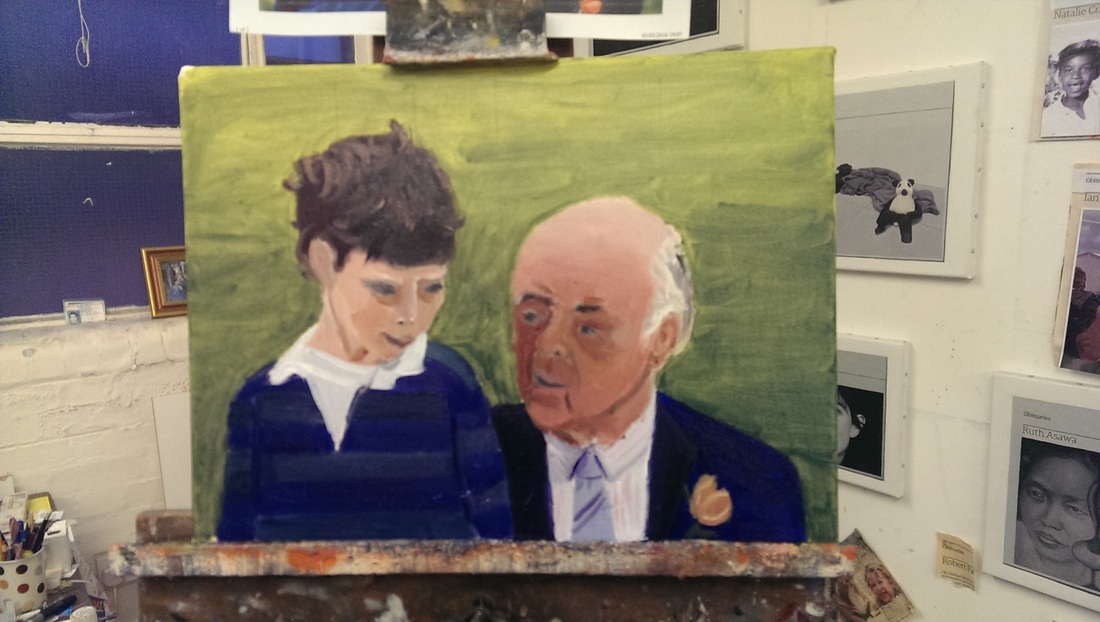
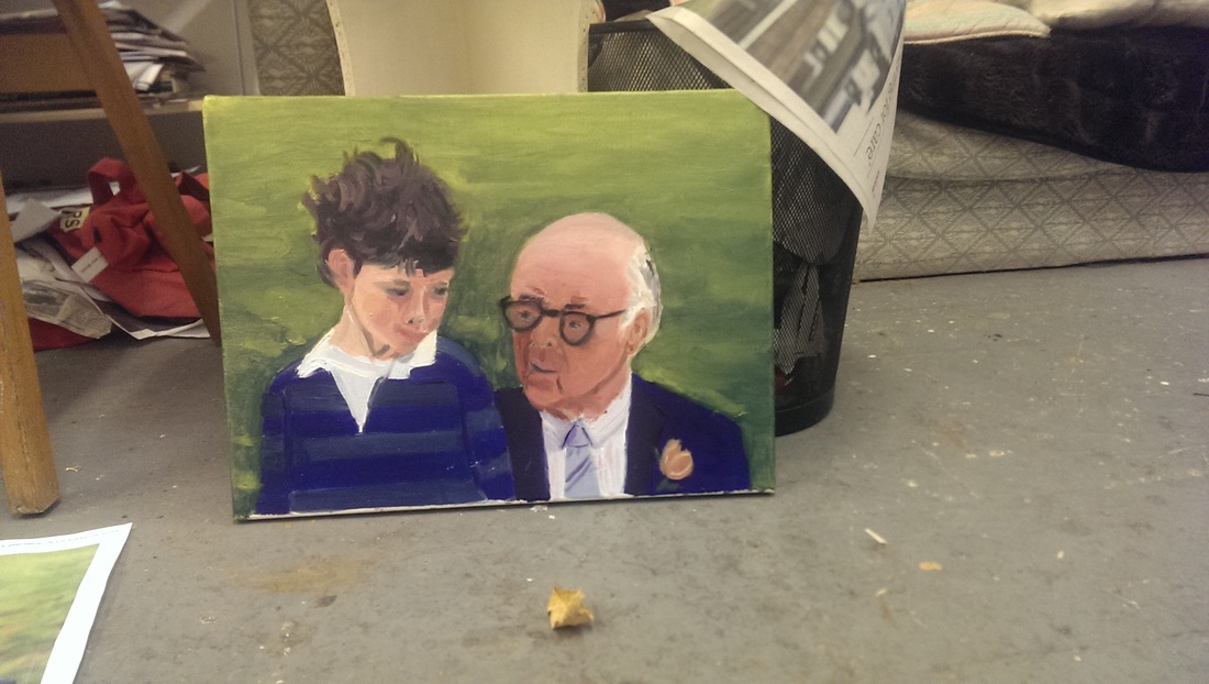
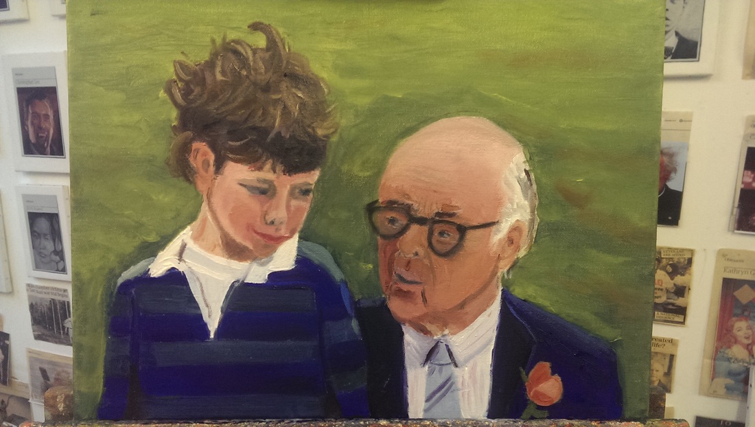
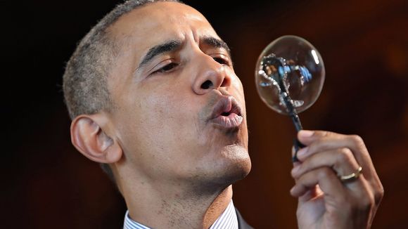
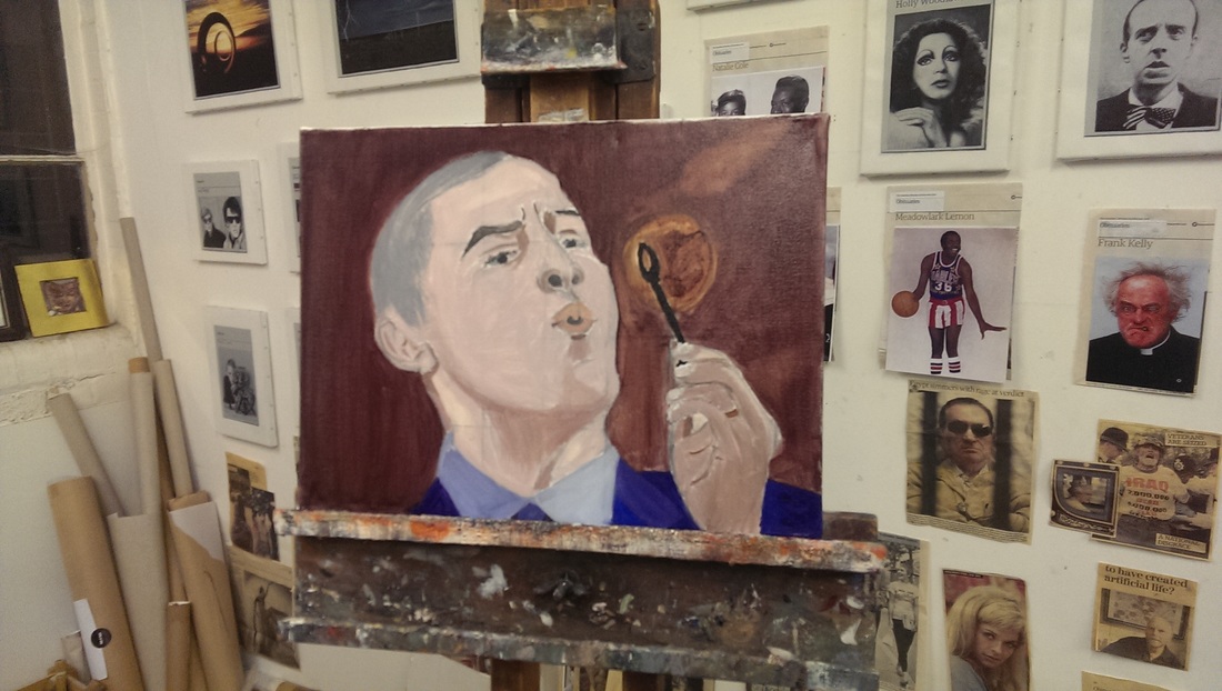
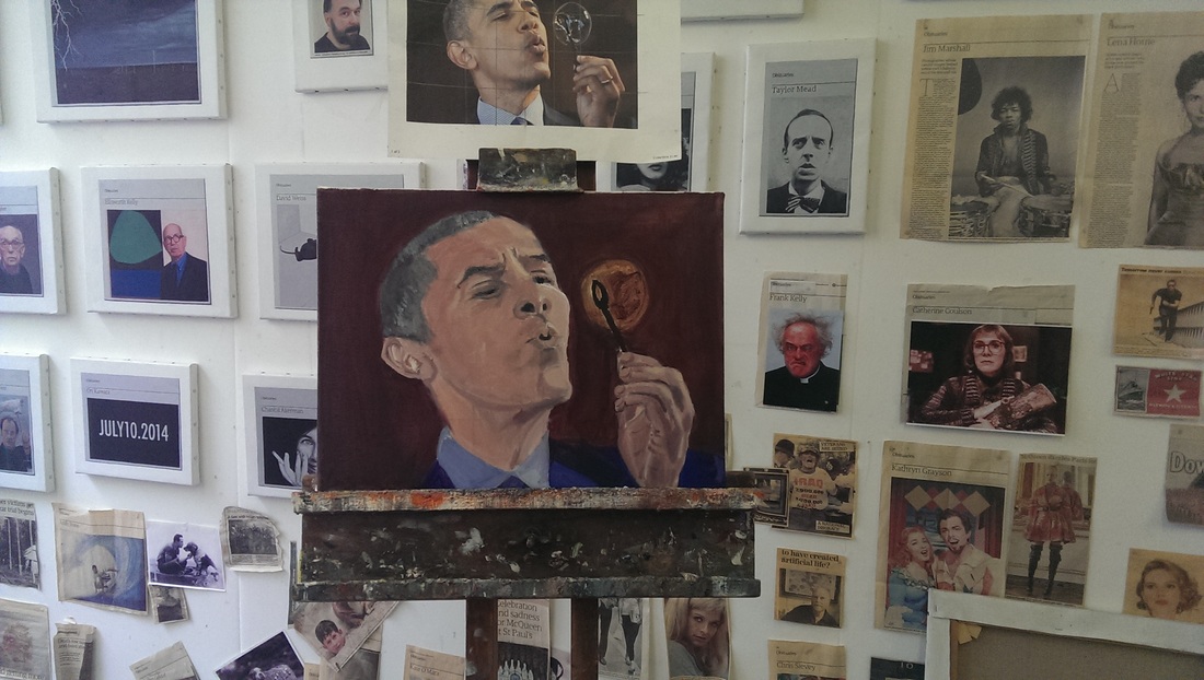
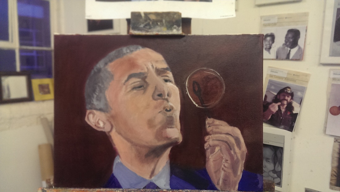
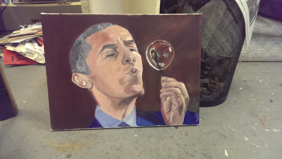
That's it for this week.  The theme I have chosen is those artists for whom more than one work caught my eye.  They are all RA which is perhaps not surprising as they can exhibit as of right and can therefore get more works in than us mere mortals. All in there own way very good works.  I will go onto architecture and others in the next couple of weeks but I will leave you now with Annie Whiles The Areoplane (Largest Dog).  It was amusing to see people do a double take of this and its partner (Smallest Dog) as they went past. I like this.
Picture
0 Comments

Portraits, harder than you think. 

7/17/2016

0 Comments

 
Drawing and painting people has always been one of the weakest parts of my art so I have tended to avoid it.  Finally though I decided to take the plunge, partly as I wanted to get better and partly because my tutor Hugh Mendes specialises in portraits and it seems foolish not to make use of this fund of knowledge.  The first task was to pick subjects and so I decided to pick 2, one personal and one not.  I picked a picture of me with my grandfather Kenneth Mackenzie (below left) and a picture of Obama blowing a bubble.

I was close with my grandfather and we got on well.  This picture is when I am about 8 and in many ways captures the quality of our relationship.  The Obama picture, is just a call image.  I admire Obama but also this is compositionally a very good image and the bubble attracted me as a painting challenge.
Picture
The key is to get the canvas covered in paint.  It makes things much psychologically easier when you come in next time. In goes the back ground and the beginning of two ghostly ill looking figures.  I was pleased with rugby shirty.  I made the decision early on not to include the gold device on the shit but leave it plain.
Picture
The next week, another layer on everything.  The background thickened up and the shadows particularly on the faces evened out.  I concentrated mainly on my grandfathers face that is beginning to look more human.  I had decided to leave the glasses near the end.  It was at this point I realised the angle in the picture is slightly more face on to the viewer than the photo.  This was not a conscious decision but I decided to work with it.
Picture
Third week, another layer on the background and the difference in tone on my grandfathers face emphasised and softened my face, particularly the zombie like blobs around the eyes were blended into the rest of the face.  I also realised my hair was not big enough, it needed to come further up the picture and so this was done.  I put on the glasses which substantially changes the tone of the picture.  I realised at this point that my grandfathers face was not thick enough, a problem generally with my portrayal of people.  
Picture
Last week,  blending in more paint to the background, adding the old blob of brown and orange.  The glasses allowed me to look again at tone.  The top of my grandfather's head needed to be blended in more and more shadow added to the left side of his face.  It is all about tonal contrast.  On me light paint added to the shoulders and a greater contrast between the top and the front of the hair. More tone in the fact, particularly shadow at the bottom of the face and under the chin.
Picture
Picture
I did both paintings at the same time.  Alternating between one and the other.  This again was a good idea and on the advice of Hugh.  What I discovered was the picture of me and my grandfather was much more emotionally difficult to paint that the Obama picture.  It was more important to me that it be right, that it come out well.  The Obama piece was light relief.  The first layer though produce a picture of a fat faced John Lithgow.
Picture
The second week the horrible line of the face was corrected and the neck cut int.  If anything I went too far and made the whole thing to thin and took the chin to high.  I couldn't see this at the time but looking back and writing this I can see it now. The hand and the bubble were becoming the focal point of the picture.  Hands are terribly difficult to get realistic, but they have this advantage over faces, they just have to look like a hand rather than someone's specific hand.
Picture
More paint and more tone. The background added to.  The hand was substantially left while I concentrated on the face.  What I was trying to do this week was to get the definition and the contrasts between the shaded and the light areas, trying to make it more three dimensional.  The hair was added in.  What is working is the interaction between the head and the bubble.  There is a convincing blowing action and they eyes are focused correctly.
Picture
Last week .  Three main things were done and again it is mainly about contrast in tone.  The highlight on the right side of the head were put in and the darker shadow was put in and blended.  More detail was added to the hair and the hand.  Finally the bubble. I am very pleased with the bubble.  It is a simple near sphere of white paint, a couple of blobs of white and smears of colour to give a sort of rainbow effect.  It is the best part of the painting and interacts well the head.
Picture
All and interesting experience.  The Obama portrait doesn't actually look like him.  The head and neck are too thin, the chin too high and the skin too light (although not that much). On the other hand it does actually look like a convincing person and looks thoroughly three dimensional.

My grandfather and me, looks more like the people they are supposed to.  Again my grandfather's head needs to be thicker and the area around the mouth needs work.  What I think I have managed to capture well is the interaction between the two.

For first attempts they are not too bad.  I am encouraged and shall do more.  One day they will actually look like the person.  That will be nice.
0 Comments

Georgia O'Keefe at Tate Modern

7/10/2016

0 Comments

 
Picture
Picture
Picture
Picture
Picture
Picture
Picture
I had of course heard of Georgia O'Keeffe prior to this exhibition but I don't think I'd ever seen her work in person before.  By reputation she is most famous for flower paintings that look, well they look like vaginas.  She always denied that this was deliberate and this exhibitions purpose was to set out that she is more than that.  And she is. And they have succeeded.

It is a good exhibition, well laid out and well curated and you should go and see it.  While still present the art speak of the labeling seems to have been dialed down a notch.   It is also a large exhibition, some 13 rooms so it is going to take you some time to go around it.  It is on until 30th October and I may very well go and see it again.

O'Keeffe is extremely talented,  on display are water colours, charcoal drawings, oil paintings and pastels.  She is masterly with all of them.   In the first room you are shown early water colour and abstract charcoal work. Both of these show elements that persist in all of her work, a deceptive simplicity, a very good use of line and a fine deployment of gradation of tone.  This is worth looking out for.  You think something (like for example Red and Orange Streak) has solid blocks of colour but in fact they are often subtly blended, flowing into another colour, or gently mottled. The style of thick, smoothly applied paint is something she seems to have arrived at early.

The second room has more abstract work.  All striking and absorbing including the distinctly yonic work to the left.  By this point though you can already see that O'Keeffe is much more than this.  The curators have done their work.  My wife made a good point about this. If O'Keeffe had been male maybe this would have been less of an issue.  Being a woman though the male dominated art world of the time (and now) decides it must all be about the vagina.  The rest of her work becomes eclipsed by this. Eclipsed no longer!

The following room had photographs of O'Keeffe by her partner.  Now it is quite interesting to see what O'Keeffe looks like.  Not sure we need to see her naked and this leads to me to a point which once I spotted it has been irritating me ever since.  There a subtle sexism at work in these exhibitions.  It was the same with the Hepworth and Delaunay exhibitions.  The all feature work by their male partners.  This is not something you see when a male artist (like Picasso for example) is displayed.  There is always a justification for their inclusion, but I haven't come to see them.  No one has.  Why are they there? These women are titans of art.  They can stand on their own.   Particularly baffling was the inclusion of some second rate paintings by some burk who was a friend of her partners.  Go away I say.

Back to the work in hand.  There were of course some flower paintings and they are amazing and extraordinary. I was particularly struck by the vivid orange of the oriental poppies painting.   However there were other genres for which she is what she is well known but which she deserves to be.

There were some good still lives, the ones of pears and eggplant (aubergine) done in pastel are sublime.  My favourite pieces though were those done in New Mexico.  In the New Mexico landscape O'Keeffe seems to find a subject that really chimes with her style. Subtle and beguiling pieces.  Then we have paintings of skulls and bones.  These are not morbid but I can see why the shapes appeal,  in the same way the shapes of flowers did, to O'Keeffe.

One of the discoveries I was very pleased to make was of her paintings of these things called Kachina which are Native American spirit totems.  Not only are they very intriguing subjects they are represented in an excellent, reverential but also humorous way.  I like them very much, particularly in fact her charcoal drawings of them.

The exhibition finishes in a room with sky/cloud pictures taken as if from an air-plane. They are large pieces and act quite well as a palette cleanser before you are released back into the real world.

This is a very good show.  There are some very good pieces in their and pieces you will not have seen before. Go and see it.

Afterwards we went around the new extension to the Tate Modern, but more on that another time.
Picture
0 Comments

Koons

7/3/2016

0 Comments

 
Picture
Picture
Picture
Picture
Picture
Picture
Damien Hirst has a gallery in Vauxhall, on Newport Street.  It is hidden away near the extremely disappointing Lambeth Walk. I went there for the first time a couple of weeks ago to see the Jeff Koons exhibition.

I am familiar with Koons, as I imagine most people are, through his very famous balloon animal like sculptures, particularly the red dog.  Incidentally the best portrayal of this piece I have seen is in the otherwise fairly poor Night at the Museum 2 where it bounces around as the protagonists walk through the Smithsonian art gallery.

Back to the subject in hand,  being only down the road from my work and being intrigued, and perhaps most important of all, it being free, I went along.

The good stuff first.  It is a nice gallery.  It has a series of very good, nicely lit spaces, including a large gallery which can be view from above by way of a mezzanine.  It is sensibly arranged and you can flow through it with ease.  It can hold some very good exhibitions.  It also houses Pharmacy 2 an achingly trendy, medium priced and garish to the point of repellent restaurant.  Having seen the decor of the restaurant I can see why Hirst likes Koons. 

Having seen the exhibition I do not like Koons (at least his work, the man himself from interviews etc seems delightful).

The first rooms is a series of hovers from the 70s (and similar gadgets) tastefully lit in Perspex boxes.  Initial impact of , huh that’s fun, then nothing.  There is only so long one can look at a hover.
The next room in the above mentioned large gallery is a huge metallic blue balloon animal, possibly a cat.  It is am imposing piece and the star of the show.  Again though it didn’t hold my attention for very long.

The next room is hard core porn.  The slightly embarrassed looking security guard warns you not to take photos before you go in.  It is explicitly and exploitative (of women) and also, dull. If you’ve been on the internet at all it is nothing you won’t have seen before except with the addition of a garish background.  There is an initial shock but I couldn’t help that this was just a social excuse for polite people to look at porn in public.  In the middle of the room there was a sort of pastelish enormous bowl with eggs in. 

Moving swiftly on and up the stairs the next room was shiny metallic objects including a model of a 1800s American train set.   This was my favourite piece, not because it was particularly interesting art, but because I wanted to play with it.  I suspect this is the point, and as I began to have a sneaking suspicion was the point of the exhibition (more on this later).

The final rooms (accessed through the mezzanine from which you gave upon the enormous cat)  included an enormous mound of playdough,  various inflatable beach toys interacting with plastic chairs and a garish picture of some lego. It seems to be a particular kitsch celebration of a certain type of children’s toys.

This then I suspect is the point of the exhibition.  Presumably the juxtaposition of the porn and the childishness of the other pieces is trying to make you think about sexuality and childhood.  It succeed in that I did just that and have now written about it, but it was sledgehammer subtlety, and also not very interesting art.  None of the pieces invite much in the way of contemplation.  A quick glance does not yield anything more than a prolonged examination.

I will say this for Koons, he has a very Koons style and one can recognise his work easily.  I however find both the style and the subject dull. 

0 Comments

    William John Mackenzie

    I am an artist with a  specialism in landscapes and still life.  My contact details are here. 

    Archives

    October 2020
    May 2020
    April 2020
    January 2020
    December 2019
    November 2019
    October 2019
    September 2019
    August 2019
    July 2019
    June 2019
    May 2019
    April 2019
    March 2019
    February 2019
    January 2019
    December 2018
    November 2018
    October 2018
    September 2018
    August 2018
    July 2018
    June 2018
    May 2018
    April 2018
    March 2018
    February 2018
    January 2018
    December 2017
    November 2017
    October 2017
    September 2017
    August 2017
    July 2017
    June 2017
    May 2017
    April 2017
    March 2017
    February 2017
    January 2017
    December 2016
    November 2016
    October 2016
    September 2016
    August 2016
    July 2016
    June 2016
    May 2016
    April 2016
    March 2016
    February 2016
    January 2016
    December 2015
    November 2015
    October 2015
    September 2015
    August 2015
    July 2015
    June 2015

    Categories

    All

    RSS Feed

Proudly powered by Weebly