|
This time of year, in London, you are spoiled for art exhibitions. There is of course the Summer Exhibition which I have yet to go to, there are various exhibitions at Mall Galleries, there is the BP Portrait award at the National Portrait Gallery. Often overlooked but quite fascinating are the Graduate shows at the various art colleagues. I have been to a number of these in the past and occasionally come away with something. There are a number of colleagues and I’ve never made it to them all. This year I went to the City & Guilds of London Art School. Full disclosure my tutor Hugh Mendes teaches there on the fine art school. He showed me round in fact. The display was well curated. City and Guilds is a funny place, consisting mainly of 4 Georgian houses knocked together. They have relatively small numbers of students each year so the show has several works from each one. They were well hung but even better you could come away with a postcard collection with a picture of each student. An excellent idea. Each student had their own space but there were also a couple of galleries displaying works from several students at once, and a gallery showing drawings and sketches from the students. I particularly liked the latter where you saw in development the style and ideas that had been more fully realised elsewhere in the show. Additionally there was a room with drawings from students at the Art college in Dresden, with whom they had taken part in a drawing exchange. There was a particularly fine drawing of 2 otters play fighting. There were though a number of people who seriously impressed me and would be worth keeping an eye on: Johanne Alvestad 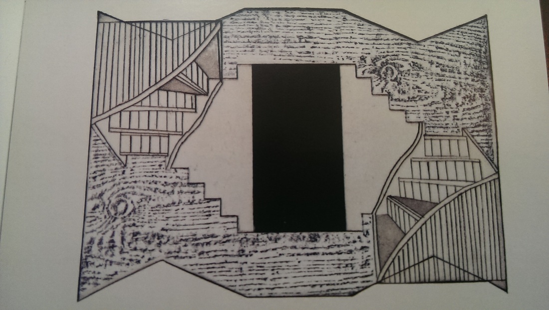 It is a shame Johanne doesn’t have a website. She has produced some fine etchings using a combination of Japanese paper and wood. They are very eye catching and have a nice simplicity to them. Emannuelle Loiselle - 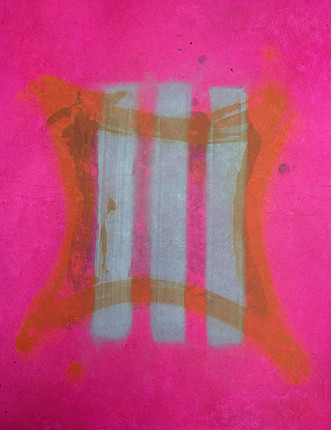 www.emmanuelleloiselle.com Emmanuelle’s work doesn’t photograph as well as it looks. It won a number of prizes and when you see it in person it is easy to see why. It grabs your attention. The main arrangement complete with fridge door and fluorescent condiments was a good example of good contemporary art. Catalina Christensen 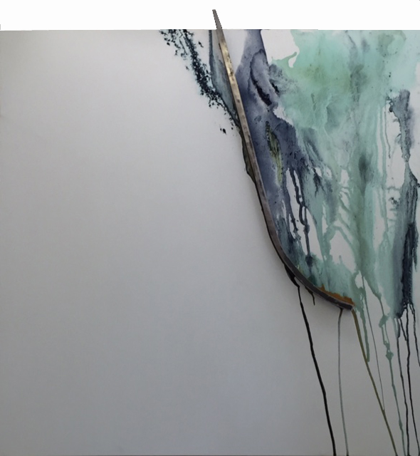 www.catalinachristensen.com Being someone who started art later in life I particularly like coming across older graduates (most of them being in their early 20s). Catalina is one of them. She is also very talented. She grinds her own metallic pigments and uses them to create these wonderful flowing, dripping pieces that interact with curving metal shapes that stick out of the canvas. They are large pieces. Catalina has I think hit that great sweet spot between good and interesting art and something that is commercially attractive. In the best possible way you could see this adorning the offices of some cultured finance institution. She was also a very engaging person to speak to (the only one of the artists on this list who I did get to speak to). Odilia Suanzes 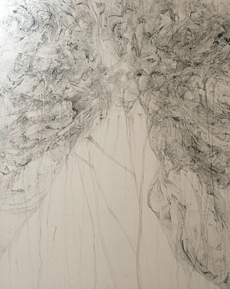 www.odiliasuanzes.com Odilia is the star of the show. She had sold all but one of her pieces, which is astonishing for a graduate show. Her pieces are enormous. Vast canvases with this clouded mysterious shapes and lines on them. It is hard to describe. One of the things that makes it intriguing is that you can’t figure out how she did them from looking at them. I know, but only because Hugh told me, however I am hording this particular piece of object. She is going to be someone to look out for. Dawn Whittle. 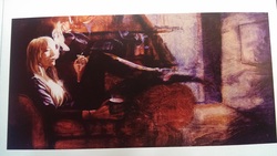 Dawn had created a very good exhibition. Good individual pieces but arranged so the whole made them better than the sum of there parts. She has painted moody (in a good way, perhaps atmospheric) smoky but cosy interiors. They are painted on wood and the wood is allowed to come through in a way that enhances the picture. There were about 10 of these arranged around the sides of the exhibition space to create this panorama, story board effect which is was very good. These are all people to look out for and I suspect have good careers in front of them. Which of them would I actually buy? Well Johanne’s because they are good, small and under £100. If money and space were no object and I could only buy one? I think Catalina. A couple of days later I went to the Chelsea Art college degree show (Or UAL Chelsea as it now is). This was a much larger show and also a much weaker one. The quality was noticeably lower. Part of the problem was the layout. You had to meander down miles of surprisingly grubby prison like corridors between small rooms of mostly tat. The exhibits were then poorly labelled so it was often impossible to work out what was by who. After about an hour I gave up and left, I’ve no idea if I’ve seen it all. A map was provided but it was unhelpful. Most of my time was spent trying to find the way out. The best part of the show was the BA in Textile design, it was also the best curated. Of the myriad of things I saw (so many poor video art installations, so many), only two have made my list Molly Smisko  (www.mollysmisko.com) from the BA Textiles course. It is a multi-sensory instillation but don’t let that put you off, it is good. There is a combination of smell, sight sound and touch. You interact with the exhibit (which is two bowls, one of water, one of sand from underneath which waft sent) through a VR headset and headset which reveal a very intriguing land and sound scape which alters depending on which bowl you move towards. Molly got a 1st apparently, you can see why. Alice Parker 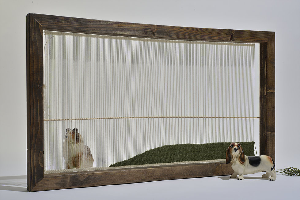 (www.aliceeparker.com)
I am a big fan of humour in art and Alice’s work immediately made me smile the moment I walked in the room. It is a series of small dog statutes in front of lattice work landscapes and you can manipulate a projector to show the self same dogs in various actual landscapes. Great stuff.
1 Comment
A blog about blogs
All art movements descend into self-referentialism eventually so I don’t see why I shouldn’t as well. In this post I am looking at what makes a good blog, specifically a good art blog. What the examples are out there and how I can improve mine. Why do I write a blog? Well there a number of reasons. I enjoy doing it. It acts a reference for me as to my thought process, experiences and art projects at any particular time, it drives traffic to my website, it makes me feel engage and perhaps most importantly it provides a key motivation to go out and try and do new things so I have something to write about. There are many art blogs out there. There are many blogs out there. In the course of the past year or so I have come across many. No doubt there are many I have missed and if you know of a good one that is not mentioned here I would be interested to hear about it. For me there are a number of elements that make a good blog:
There have been various weeks where for whatever reason I haven’t posted and I notice a marked drop in traffic in the following weeks that take a while to pick up again. Below is my hall of merit for good blogs: http://makingamark.blogspot.co.uk/ http://arthistorynews.com/ http://www.artmarketmonitor.com/ http://jennykealart.blogspot.co.uk/ http://www.creativetourist.com/top-art-blogs/ https://www.ica.org.uk/blog/ http://callumjames.blogspot.co.uk/ https://www.a-n.co.uk/blogs https://akickupthearts.wordpress.com/ |
Archives
June 2024
Categories |


 RSS Feed