|
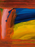
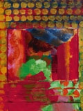
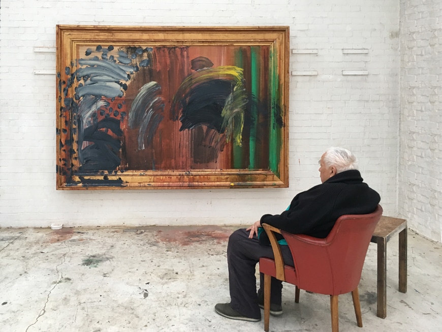
Until 18th June the National Portrait Gallery is showing a retrospective of Howard Hodgkin’s work. The man himself was involved in putting the show together but sadly died shortly after it opened. It is though, a fitting eulogy. I had heard the name before, new a couple of his pieces but beyond that I went in pretty cold. The work takes you chronologically right up to the last picture he ever painted. There is quite allot to see and like all National Portrait Gallery Exhibitions it is reasonably priced. I went in and decided only to make a note of those pieces I liked. I ended up making quite a lot of notes. In the first room there were these delicate pencil sketches. It shows the man can drawn in the classical sense well. Pretty soon though you are into abstract work. Some of them can be a bit hard to take. For example there is Girl in a Bed which is covered in these tiny coloured dots which is literally difficult to look at and provokes an almost migraineous response. Even backing a way and looking at it from a distance causes problems. But enough of the criticisms let me tell you about the work I like. I am a big fan of humour in art and there is a great deal of humour in Hodgkin’s paintings. He seems, at least it so it seems to me, to have a great affection for his subjects. This is demonstrated nicely in a painting that greatly appealed to me call the Tilsons. Hodgkin has this technique he uses a lot which is loose brush strokes setting out abstract features and the covered with and slightly obscured by dots of colour, that you have to almost look through. The Tilsons has some of these elements. They are a couple (obviously) the male figure who was apparently a surgeon, is the most beguiling with a joyful, perhaps malevolent look. The whole think made to pop by arcs of red and yellow. The portrait of Rhonda Cohen had a similar look but much more muted. In a similar vein and Mr and Mrs EJP which has the characteristic dots. It also has a very effective creation of a sense of depth in that the wall on the right hand side of the painting seems to stand proud of everything else. When I first saw it I thought it was perhaps a piece of painted board stuck onto the main picture and had to get close to see that it was not. The effect was achieved both by the use of shadow and change of colour, but also by a change in colour of the little dots that cover the painting. Next to this was a picture called Talking about Art which had bold geometric colours and sitting opposite it a picture called portrait of Mr and Mrs Burkley which has a striking strip of turquoise across the top third of the painting. As these are called portrait you find yourself looking at them as your brain struggles to identify the figures, or what could be the figures. In some paintings it is easier than others. I could see how some people would find this level of obscurity or abstraction off putting. I did not. An example if you like of the formal abstraction is the portrait of Nicholas Munro which with its intersection geometric shapes of circles and squares reminded me of Picasso or Miro. The white background to it really made the colours pop. Incidentally as many of these are large pictures they reward viewing from a distance, as well as close up, although if you step across the easy to miss wooden line on the floor an attended comes up and gently asks you to back off. Two of my favourites are on the wall next to this, and are next to each other. My preferred of the two is called simply RBK. Instead of the dots this one has green lines, or slats covering over the painting which you have to peer through, giving the impression of looking through shutters into the room beyond. Behind it is an orange floor, a blue chair and a red heart shape. The one to its left is Mr and Mrs P Caufield. This has two strong central L shape marks with two peeking figures, which despite being abstract are still somehow gendered, by playing on cultural accepted shapes and coloured. She is turquoise. This is one of the few paintings where they are so. Sometimes, as with the picture R Denny and K Digy there is a very good sense of an internal space. One of the things I got from this exhibition is how paintings can be used to reflect and also to inspire mood. Rothko does this too, rather overwhelmingly for many people. Hodgkin certainly in his later works does this to, a little more subtly. My absolute favourite painting the exhibition, which I kept coming back to does this. It is called simply Interior with figures. It is done in mainly red and pinks with the characteristic spots in green and blue. It is recognisably an interior with recognisable objects in it and a sort of smoky effect on the middle background. It is very sensual and sexual and there is a suggestion that the abstract figure in it is naked. It conveys all these things very well and I liked it very much. The smoky background plays an important part here suggested the post coital fag or perhaps merely a relaxed intimacy. Next to it and somewhat different is the First Portrait of N MciNery. This is very different. An actual balaclavared figure looms out in red and purple. Hodgkin has a habit of using active frames. What I mean by this is the paint extends from the canvas over the frame and the frame becomes part of the picture. This is such an example (many of his works have it) and it can be very effective. The figure is more recognisably one from a distance and the balaclava coalesces into a sort of empty screaming face. Good but you wouldn’t want it in your home. Amongst all this bright oil paint. Which is a fair assault on the visual senses and can be a little overwhelming and a bit much after a while, press on though you will adjust through this, is a singular Self Portrait. It is figurative but interestingly is done using makeup, the first and only time I have ever seen this. Later in his career he becomes more gestural and fluid such as in the piece Chez Stanos which has an enormous blue curve and the characteristic spots, like large blue thumb prints, or Double Portrait which shouts at you with so much orange. All of them using an active frame. He has this technique of using overlapping and underlapping colours so you can’t quite tell what is painted on top of what which gives a complexity to it all. In the last room is the last painting the man made, called Portrait of a man listening to music. It is a self portrait with sweeping arcing paint conveying a figure in wheel chair (above).
It is on the whole though a happy exhibition. Going round in different directions caused me, as always to spot different things. It is also an exhibition that rewards spending time with it. It takes a while to get used to his visual language and then, when you do, you either actually see more or think you do. Either way the effect is the same. It is on until 18th June 2017.
0 Comments
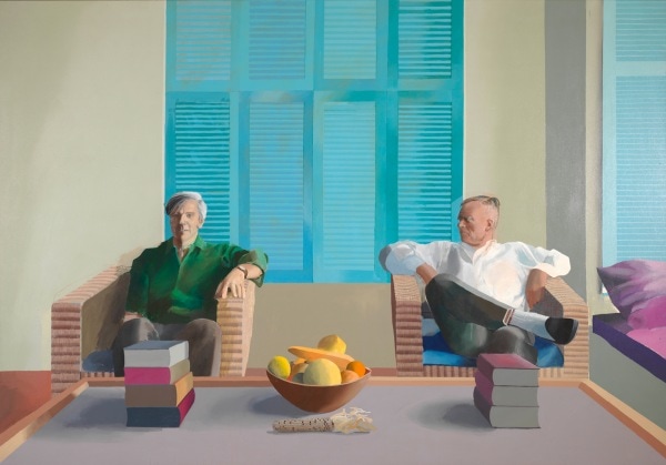
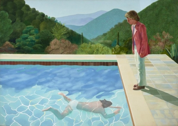
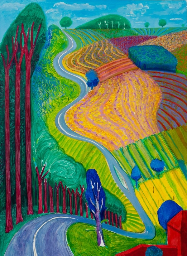
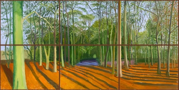
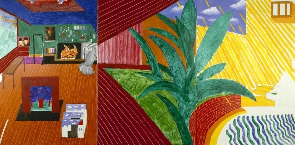
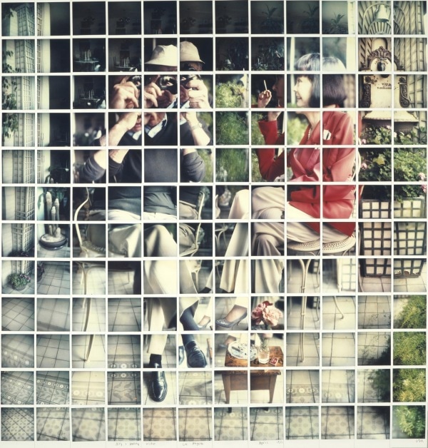
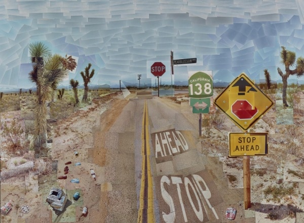
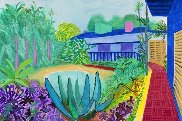
Or how to get your work in a national gallery. The current Hockney exhibition is a massive hit for the Tate. It is quite difficult to get tickets and is quite often sold out, particularly at weekends. I went on a Tuesday afternoon, having booked the night before and the earliest show I could get was 16:00 on the Tuesday. When I got there they were selling tickets for 17:30 (and usually you can buy and go straight in). I was a little bit early so went round the permanent exhibition. I found that in one room they had set up a number easels with pencil and paper, a mirror and various objects. The idea being to encourage you to draw yourself. There was also a large screen on which a looped interview of the man himself was playing. He is quite an engaging character and like allot of successful artists a good salesmen of himself. I stayed there and sketched a still life for 15 minutes. You can if you choose, pin it to the wall in that room, and so I did. I now have a work of art in Tate Britain. You can too if you wish too. The exhibition itself was quite crowded. Fortunately it is in quite a big space so unlike others I have been too you can actually move around fairly easily and as most of Hockney’s work is large you can often get to look at each piece. I have to confess I don’t like Hockney’s work much. I consider it a bit still and boring. My view is that reproductions of it are much better than the original. This preconceptions were, on the whole, sustained by going to the exhibition. Why then did I go if I don’t like him? Well I have seen few Hockney’s in the flesh and wanted to know if this preconception was justified and whether there was some of his work that I liked. On the whole it was although there was some of his work, aspects of his work that I liked. It is a retrospective exhibition and takes you through his career chronologically. The early stuff is quite raw and has lots of energy. There were a couple of early paintings that I liked. This energy goes as soon as he is in LA and gives way to the characteristic stillness and geometricness that he is perhaps best known for. Perhaps the best known example is Portrait of an Artist (Poll with Two Figures). They are technically good but I find them very rigid and unemotional. It is difficult to engage with them. There are some elements I like though for example I think the forested background in Portrait of an Artist is very good, nice play of colours and shapes and seems to have much more life to it than the pool and figures in the foreground. The next room had a number of smaller works including preparatory sketches. These often had more life to them and were of more interest. For example there was a self-portrait with Hockney leaning forward and staring straight out of the picture, done in pencil. It has motion, energy and life to it and I thought was good. There are then a couple of room of big landscapes. Big colourful landscapes. They are initially very art catching but they don’t reward long viewing, particularly not close up viewing. The paint is quite thin and quickly applied and there is no real richness or detail to them. They, again, seem quite empty. This if not a negative that appears in reproductions though and I am looking at the postcards I bought afterwards and they are more compelling than I remember the paintings being. Hawthorn Blossom Near Rudston is just such an example. In the next room are his photo collages. These are a clever idea, a series of different pictures, taken from slightly different angels to make up an odd whole composite. I am not really that interested in photography so these didn’t interest me much. Also once I had seen a couple of examples and got over the novelty of the idea (which is a good one), I thought; so what? The central room is the highlight in the show and I really enjoyed it. It is called the Four Seasons. It is set up in a square room. On each wall is a rectangle made of 9 large TV screens. Each of these rectangles shows a camera progressing slowly down a road. The person manning the camera is Hockney we are informed. It is a pretty road and each wall shows the road in different seasons; a very snowy winter, a full bloomed summer etc. Each of the 9 screens shows a view that slightly offset or overlapping with that of its neighbours so you get a video version of the collage. It is very effect, entrancing and very good. I was impressed and enjoyed it immensely. One of the videos contains a slightly humours surprise which I won’t ruin for you. Following this are more paintings, none of which I remember because I was much more interested in the charcoal drawings which cover two walls. They are A3 landscapes, mainly of Yorkshire, but they show a detail and a subtlety which I found lacking in the paintings. This is Hockney that I actually like. Of course they don’t have his characteristic brash colours that draw people to him. Finally a room containing paintings done on the I-pad. Interestingly there are also screens showing, in speeded up form, the paintings being created. They are quite interesting but suffer from the same defects as his landscapes. If you like Hockney, you will love this show as there is lots of Hockney to see. If you don’t really know Hockney then go along as it will give you a comprehensive insight into what is work is like and also what a long and successful artistic career looks like. Even though there was much I didn’t like there were a couple of suprises and I took away a lot from it. Credit has to go to the Tate for putting on such a successful show.
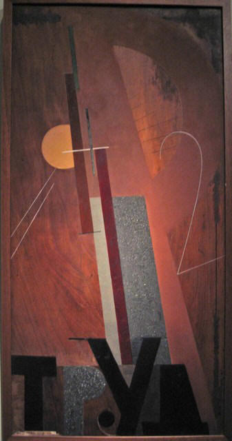
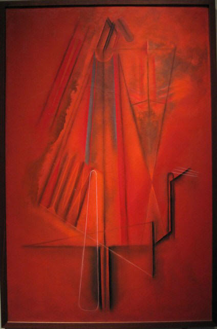
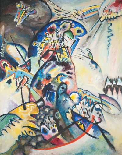
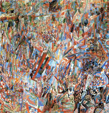
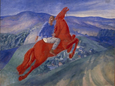
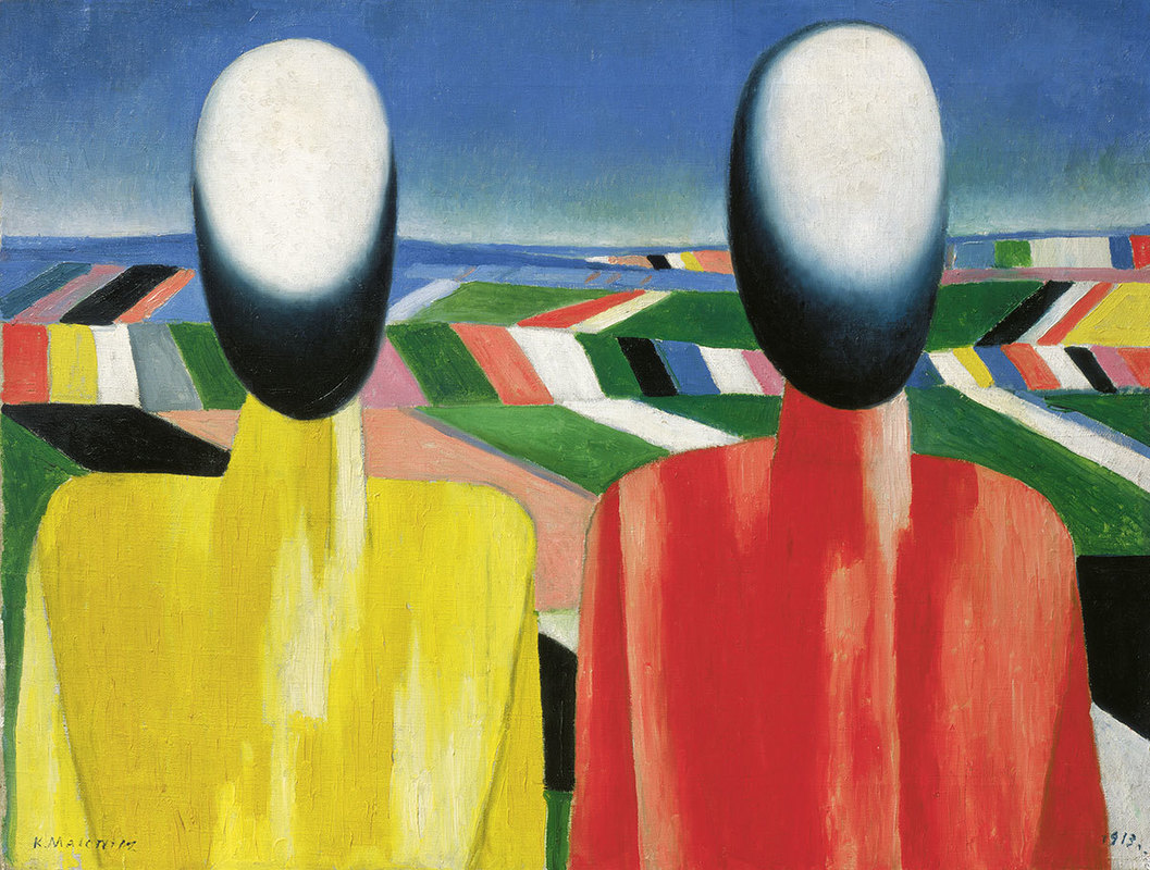
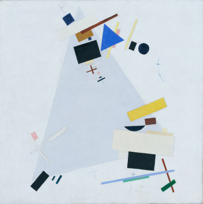
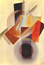
Is a very large exhibition at the Royal Academy, showing as one would expect Russian art until 1932 (after which presumably the Stalinist purges were so intense everyone was either dead or had emigrated). The show takes up substantially the same space as the summer exhibition so there is a lot to see. You will have to hurry as it closes on 17th but they have added late viewings tonight. It is arranged mainly chronologically but also by theme (such as sport), so you start off with the outset of the revolution, onto the death of Lenin, the rise of Stalin, and there it rests. As always in these shows it is the introduction to new artists and art forms are one of the draws for me to this exhibition. This one did not disappoint in that many people came to my attention. A great deal of them in fact. There were also famous names such as a film by Eisenstein. I shall trot you through the others that caught my eye. One of the pieces that grabbed me early on was called the Labourer by Nathan Altman an abstract piece done in wood, with stripes of mahogany and other strong lines with numbers and Cyrillic letters painted on it. Pleasing heafty shapes, I particularly like the soft blue square. I have an interest in this period of history so could go on for ages about the purges, shock workers, farm collectivisation and particularly the annihilation of the railway workers. This exhibition had this extra interest for me then, so there were a number of pieces that I found historically interesting even if they were not particularly artistically striking (on the five year plan for example). Some of it was also similar to an exhibition of Soviet Illustration that I went to at the House of Illustration last year. Mikhail Matyushin’s Movements in Space is in contrast entirely abstract. One doesn’t associate abstract with the earlier soviets but in fact they were nuts for the stuff. It is a simple piece. It is a series of diagonal lines from lower left to mid right, sitting on top of one another, of graded colour. The colour composition is good. It is a good example about how something that looks simple can be an effective work of art. Alexander Tyshler is a surrealist (or was rather). His rather moody looking piece is called Formal Colour Contrast of Red. The title rather says it all. It has a sort of burnished red background with differently red huge geometric shapes. Better just to show it to you. When you are going around an exhibition like this you can tell which artists are the real masters because they stand out from the rest. Roaring out of the background was a Kandinsky, called Troubled, swilring colours on a grey background looking like fighting seagulls. There is another Kandisky, later in the show, equally impressive. Standing next to Kandinsky, snapping at his heals in terms of quality are two works by Lyubov Popova. It is worth saying that there are quite a few women in this exhibition, still in the minority but a refreshing amount. Is this a choice by the curators or does it reflect the mix of soviet artists of the time? I’m sure I could find out. Anyway, two of Popova’s works stand next to the Kandinsky. My favourite had a beige/brown background covered in triangles and curves of various colours. Like Kandinsky they are never a solid block but graded colour. Pavel Filonov was another welcome discovery with his two works, Formula of Spring (below) and Formula of the Petrograd Soviet. Formula of Spring was one of my favourite works in the show. A sort of pastel shade background with intricate geometric spaces looking a little like a street lay out. The Petrograd Soviet one even more so. Kuzma Petor Vodkin, the winner of the most Russian name in the exhibition contest features a few time. His is the slightly mad red horse painting (below). Actually I much prefer his still life paintings, which feature later in the exhibition. They are intimate and interesting. He is particularly good a reflective surfaces and things refracted through glass and liquid. So there is often a glass of something with a spoon in it or similar. I really like these. I would like to own one. Kazmir Malevich is a name that was sort of in my brain before I entered the exhibition. It certainly rang distant bells and he is the father of the superbly macho named Suprematism movement. He is sort of a more dynamic Mondrian, although he also does figures (below left). I prefer those his more abstract geometric works (below right). Some of his designs and indeed novel designed were rendered into porcelain by a N. Suetin. These were covetous objects to behold. Actually I thought Malevich was outshone, in this exhibition at least by Ivan Kliun, who had two works on display. I think his works have better composition in terms of colour and geometric placement. The colours also blend a bit more (like Kandinsky) which I think is better. An example is below Runner up for the most Russian name in the exhibition is Konstandin Rozhdestvensky for whom if he were alive today, telephone banking would have been a real pain in the arse. Anyway his peasant propaganda piece called Family in a Field was all red and gold, with thick paint and was very pleaing.
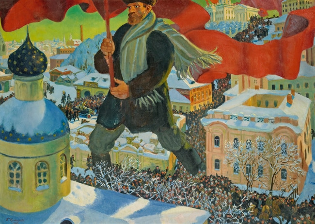
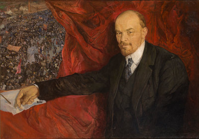
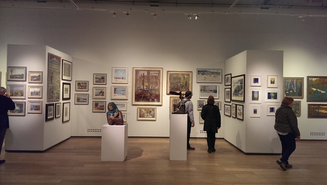
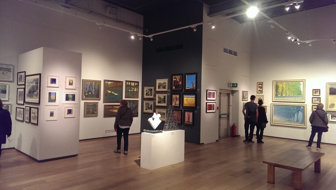
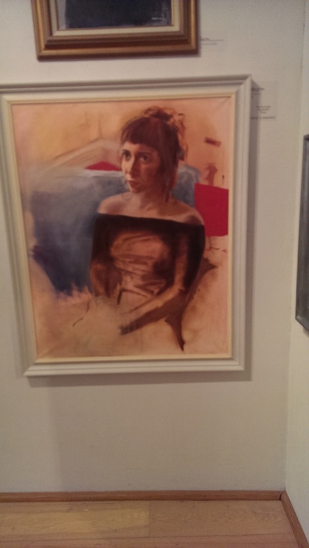
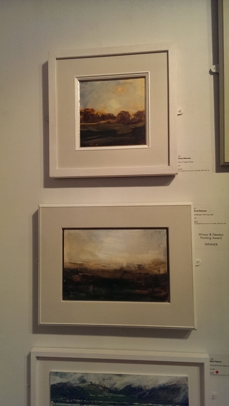
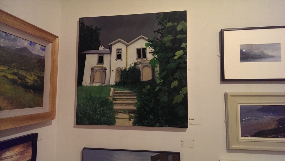
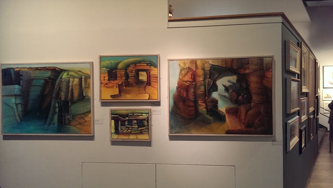
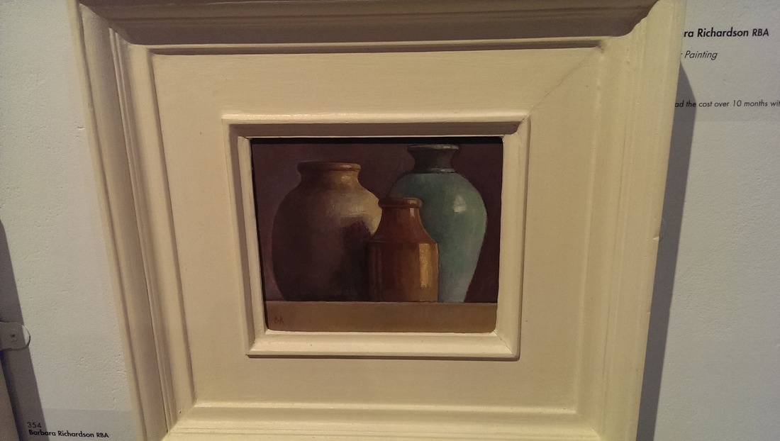
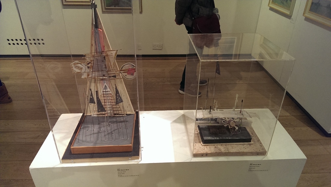
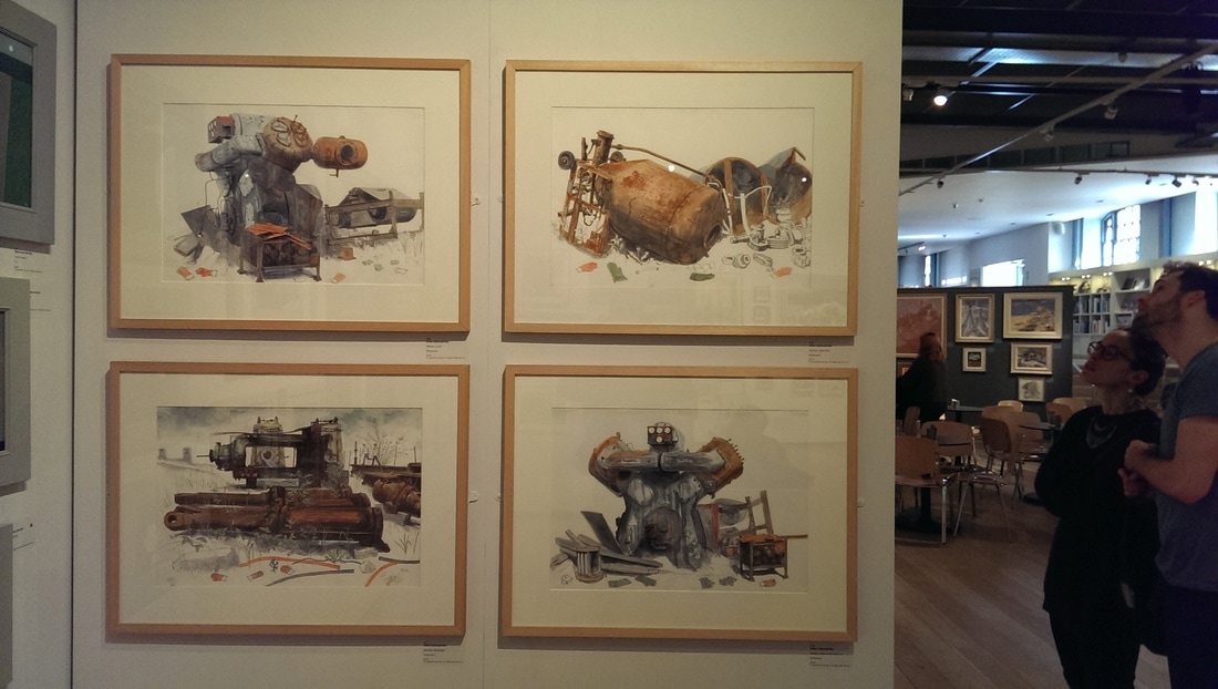
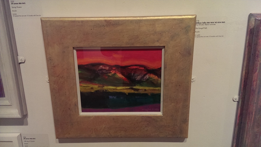
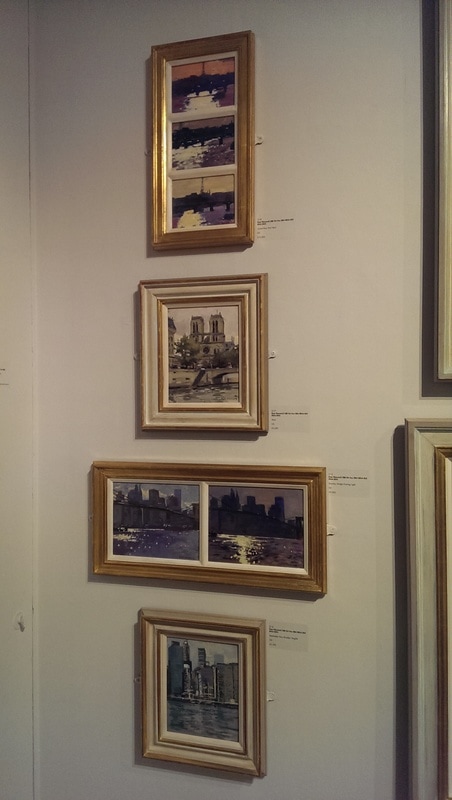
There are many more such as V Tatlin and of course Chegal (who I don’t like) and a number of others including some whose names I have noted down so badly that all I can decipher is Igor. If you search for Soviet Artists called Igor in an attempt to work out who it is the list is, well quite long. There are other good things about this show. There is a mocked up concept Russian apartment. There are posters and a surprising amount of pottery and porcelain. There are also films. It’s a big show so allow yourself plenty of time, but go before it disappears (which is tomorrow, but it is open late tonight 16th April). I will leave you with a looming portrait of Lenin by Brodsky At one of my favourite places, the Mall Galleries. A went along there one Saturday afternoon (the 1st of April in fact) and had to navigate past hordes of motorcyclists protesting against motorbike theft (which I initially took to be an April fools hoax). I had just been to see the brilliant Howard Hodgkin Absent Friends exhibition (more on that another time). It is always a mistake to go for a display of work by a master to an exhibition such as this. It can’t really compare and initially you think all is rubbish. It takes a while to adjust and begin to see the true value of things on its own terms. What I saw in fact turned out to be the 300th exhibition of the Royal Society of British Artists. Now the RSBA members are, in the main, very traditional in their tastes. So there are allot of very well rendered, but rather dull, picturesque landscapes. Modern versions of the kind of Victorian paintings you often see (well I often see anyway) in auction houses, antique shops and the more serene trendy cafes. Having been to a few Mall Galleries shows I recognised a few names that seem to pop up in a number of these views. It was quite a large show, taking up the whole place. I made my way to the back of the North Gallery where the scholarship (school children) paintings were and made my way from there. There was some annoyingly good paintings from people so young. The most prodigious of these was by William Copley (I do wonder if any relation) of Kings School and with his well rendered Portrait of Laura, a piece full of personality. Annie Boisseau had on display a couple of delightful sunset scenes, slightly Turneresque. John Whitehall’s number 15 beguiled me. This finely rendered, threatening picture of a deserted house really drew me in. It reminded me of Lee Madgwick. I particularly like the way the foliage encroaches from the right and up to the front door. Makes me wonder where the house is. This probably was my most favourite piece in the show. Julie Sorrell has gone to that friend of artists, Orkney. It has not been wasted. She has produced a quartet of fine landscapes in oil. I like the orangey rocks and the turquoise seas but particularly the way the rock is scratched over with fine black lines. The ones with sea in them are the best. Barbara Richardson has produced this quite subtle still life painting of three pots. It’s pleasing and restrained and suits it title Winter Painting. Not all of it is painting. There were a couple of sculptures by Peter Weaver. A biplane and a sort of mechanical pyramid both of which I enjoyed. Continuing the mechanical theme are these anthropomorphised bits of rubbish, done in watercolour by Arthur Lockwood. Friendly and interesting. There are a couple famous names making a surprise appearance, surprise to me anyway were the appearance of a couple of famous names, William Selby (below left) and Ken Howard (below right) being names I recognised who had entered small, and for them reasonably priced, work into the show.
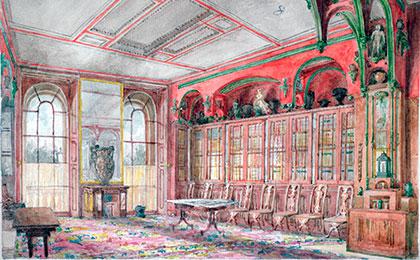
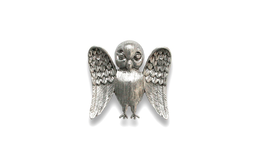
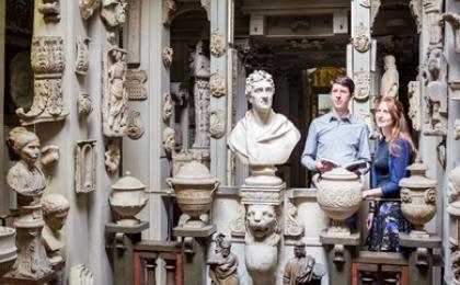
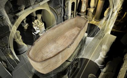
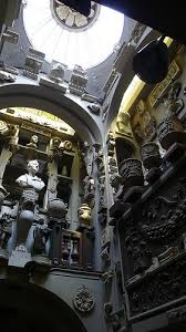
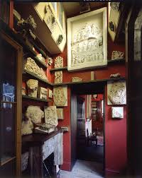
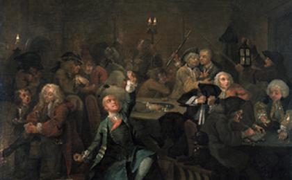
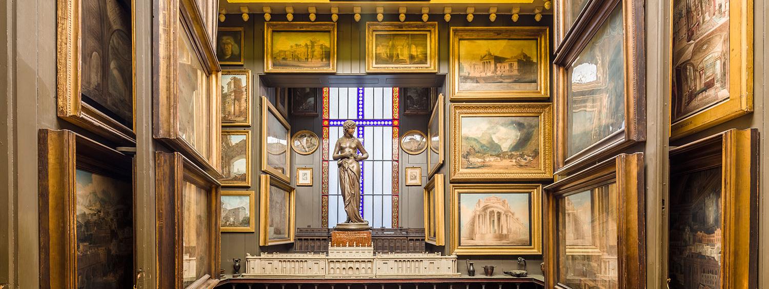
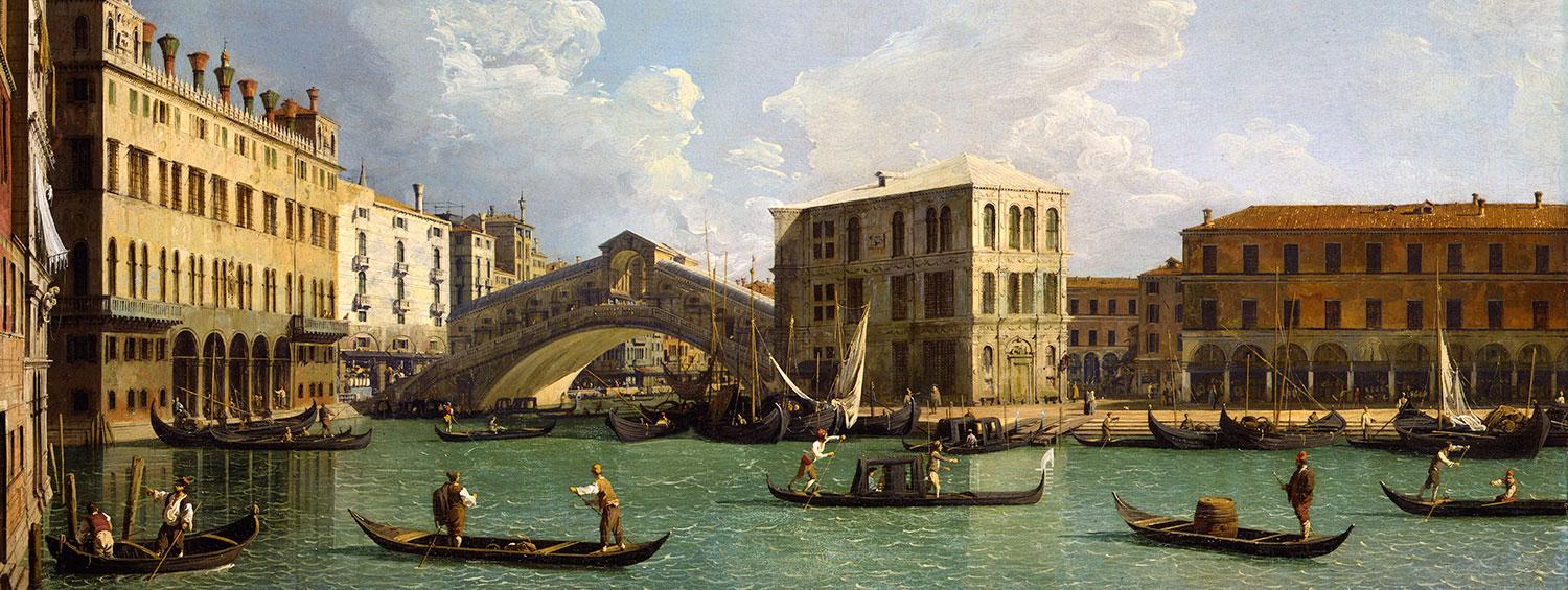
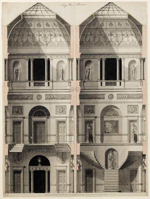
Or more fully the Sir John Soane’s museum is an odd little place, located on the north side of Lincolns Inn Field when you arrive a bevy of apparatchiks accost you, demand that you switch off your phone, take no photo and stow any bags in a clear plastic bag. Entrance is free. A contemporary picture of the breakfast room is below. Soon these precautions begin to make sense as you encounter a cornucopia of stuff (including a literal cornucopia), crammed into every space. Soane was an architect and collected a vast array of architectural pieces, columns, statues, architraves, an Egyptian sarcophagus (one of the stars of the show). My favourite thing was a small, mournful looking owl. I liked that owl. The whole place is covered by yellow glass to give the illusion of sunshine, while preserving the exhibits. So packed are the exhibits the prohibition on bags becomes logical. It is difficult to just enjoy the exhibits though, due to the conflicted space and the very keen staff in every room who if you look too interested will without warning begin to regale you with the history of what you are looking at. I don’t like this but then I do now know what a napkin press looks like and the one I was bemused by is the original one. This is justified in the painting room. Soane’s collected Hogarth and had two painting series. One is called the election and the other the rakes progress. However due to lack of space the first is displayed on the outside of cantilevered doors, which have to be opened to expose the second. A knowledgeable white gloved flunky is responsible for this and accompanies this with the history and details of the paintings. It’s quite interesting actually. Other paintings include a very good Canaletto (below) and the marvelously titled Admiral Van Trump’s at the Entrance of the Texel by Turner. Always nice to see a stormy Turner sea scape. It is a fine house (well three houses), with excellent furnishings and leather bounds book. Many windows are stained glass including some very modern looking ones. For those interested in architecture there are also several of Soane’s architectural designs and drawings on display, including his submission for the competition to rebuild the palace of Westminster.
|
Archives
June 2024
Categories |
 RSS Feed