|
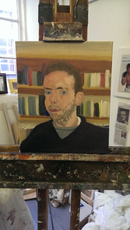
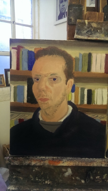
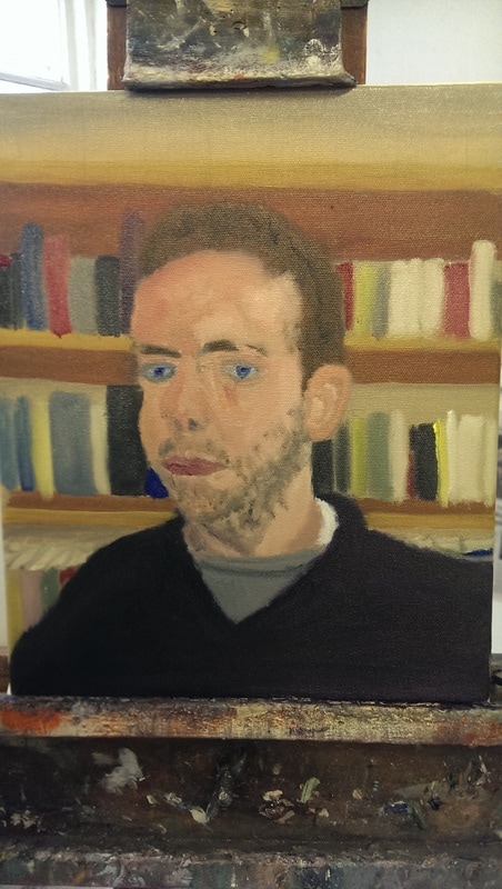
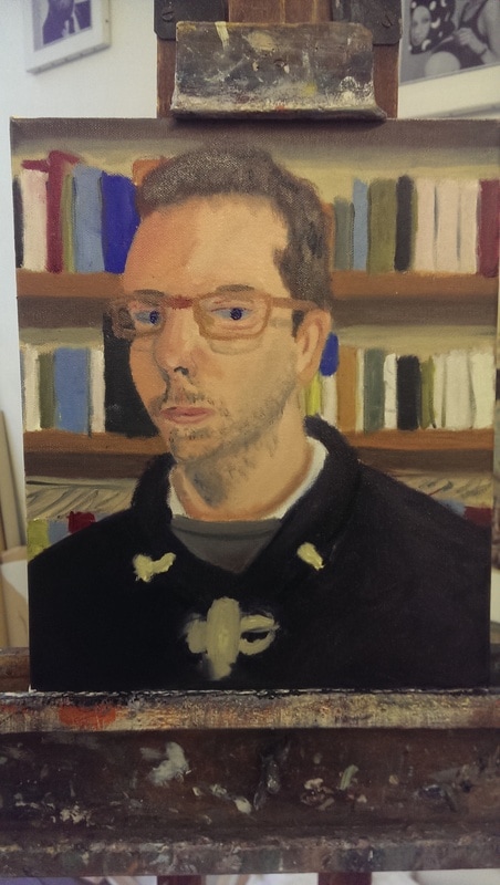
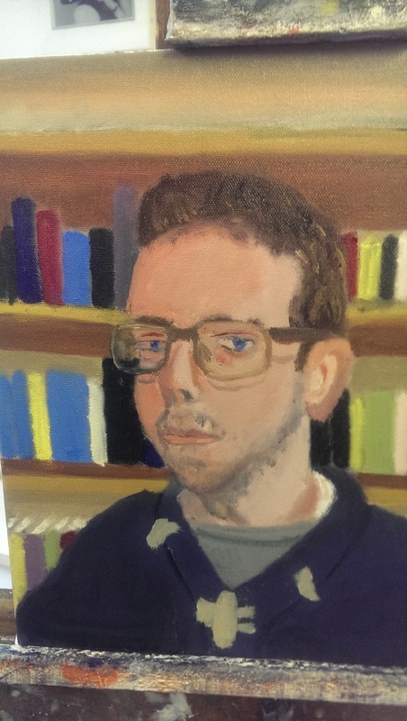
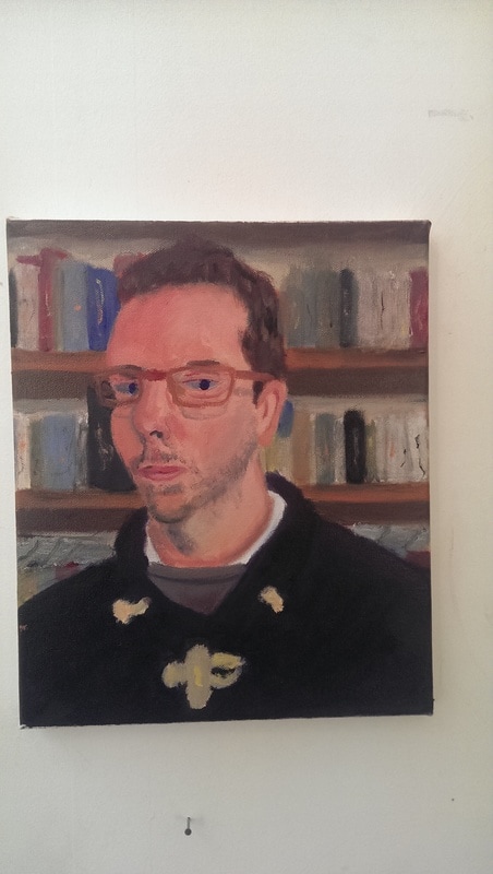
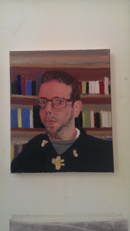
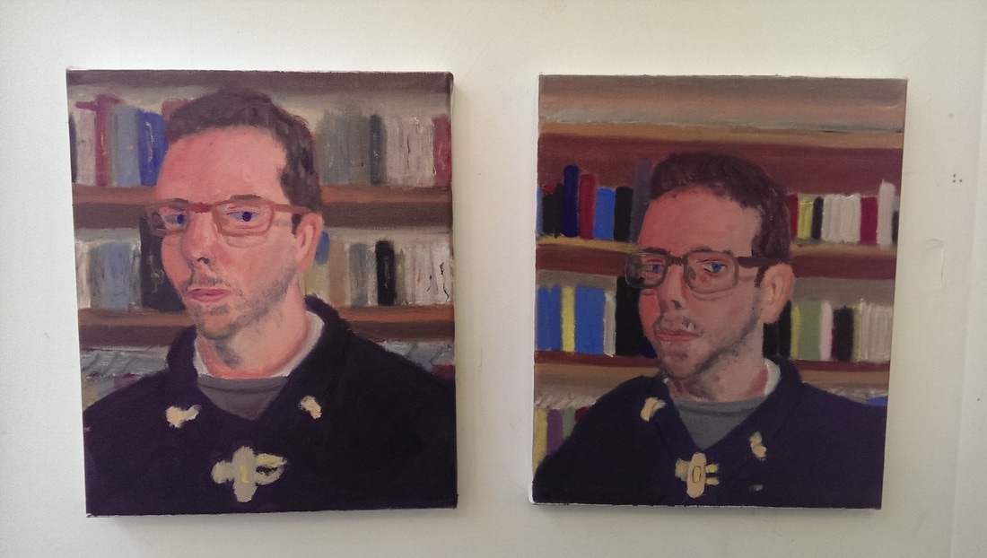
Having decided I wish to become a more venal and self centered person I decided it was high time I did a self portrait and decided to do not one, but two. There is a feeble justification to this which I shall come onto shortly. The first stage is to take a terrible photo from which to work (again there is a reason for this). I chose this shot: 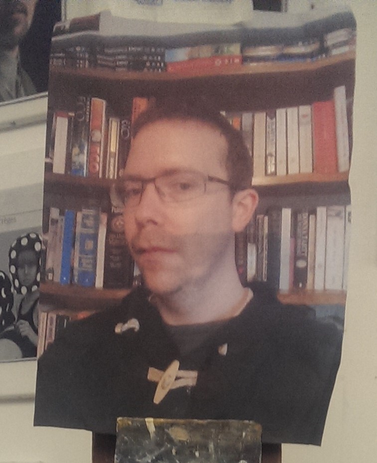 I have managed to misplace the original. Anyway, the plan was to do two versions, one girding up the picture and the canvas and sketching out the picture using the grid. The other one would be done more free-style and see what happens. Other than this they both use the same method, a pencil sketch followed by painting with oil paint. I use only five paints, titanium white, lamp black, lemon yellow, ultramarine blue and red.
Can you tell which is which? Well the one on the left is the free style one and the one on the right is the girded patterns. I like when starting these things to fill the canvas with paint as quickly as possible. It is very satisfying to do this and helps give me a sense of where I am going. I made the decision with both paintings to leave out the DVDs on the top shelf but with the free hand one I was instantly drawn to the idea of making the bust (my bust) more prominent in the picture. I guess this is what happens when you indulge your ego.
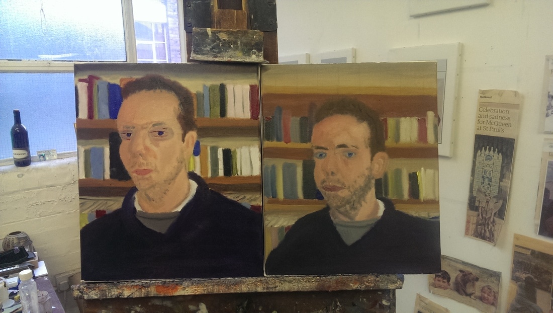 Then it is just a question of adding more paint, and more paint. Basically the same procedure was used with each one. Starting from the background and moving forward. Portraits are really tricky, particularly self portraits. The things I found most difficult are the nose, the eyes, the mouth and the chin. So basically the face, it is the face that I found most difficult. What I enjoyed though was developing the skin tones to give contrast to the face. It is interesting to see them side by side at this stage. With the free style one I decided to even up the background and make the shelves straight instead of the slight angle they are in the photo. You can tell, I think, that they are the same person but they have very different characters.
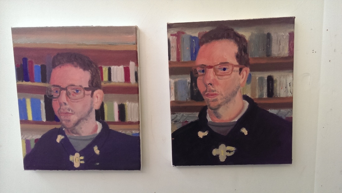
Then it was a question of adding more paint, and details such as toggles, and adding more detail to the nose and eyes. Adding the glasses made a significant difference as they help to frame the face. I though some time about whether I should add the shadow of the glasses as they could be distracting but decided to add them in. The eyes were a challenge as they are actually quite dark in the picture
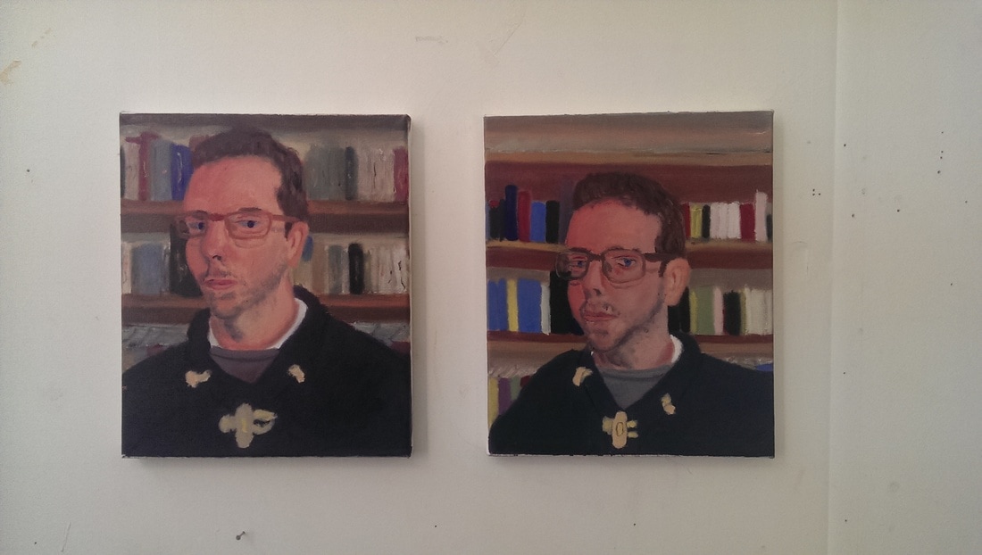 The final touches included extending the chin on both pictures, and touching up the ears. The chin was too small on both pictures. On the free style picture the background stood out to much so I knocked it back with a light brown wash and then put some squiggles to denote the titles etc. I decided not to do this with the left one. The face is generally darker so stands out better and I quite liked the effect of the blocks of colour. Other changes included highlighting the shadows at various points and putting in colour contrasts in the hair. Generally I prefer the free style one. It is also the one I enjoyed painting more. What is interesting though is seeing their relationship to each other. You switch them around on the wall and they look different. I am pleased with the result, the both, I think, look like me.
0 Comments
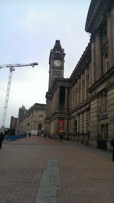
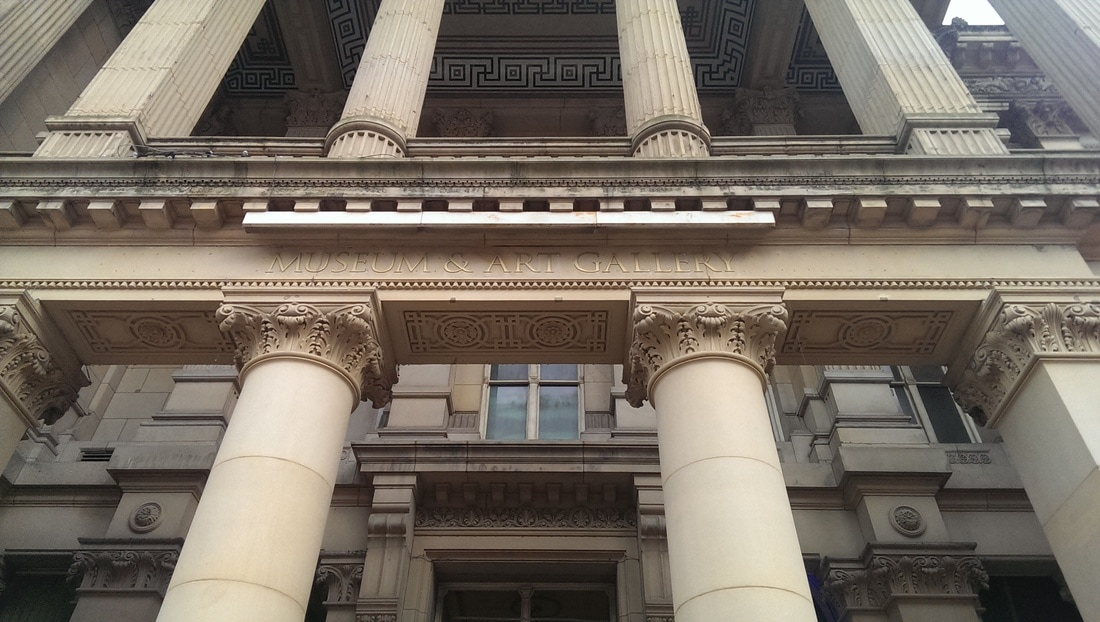
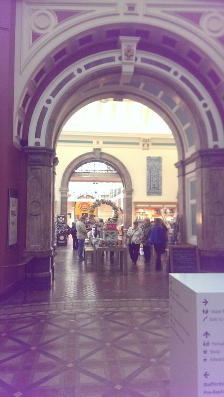
When I am dispatched to different parts of Britain, I try if possible to see some art while I am there. Earlier this week I was in Birmingham, my meeting finished early so I had 40 minutes to dash round the Birmingham Museum. Not long enough but enough to whet my appetite. The entrance can be found around the side of the impressive City hall which perches on one side of the equally impressive Victoria Square. Birmingham has benefited greatly from regeneration and is nicer every time I go there.
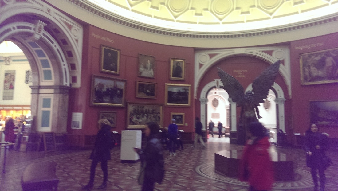
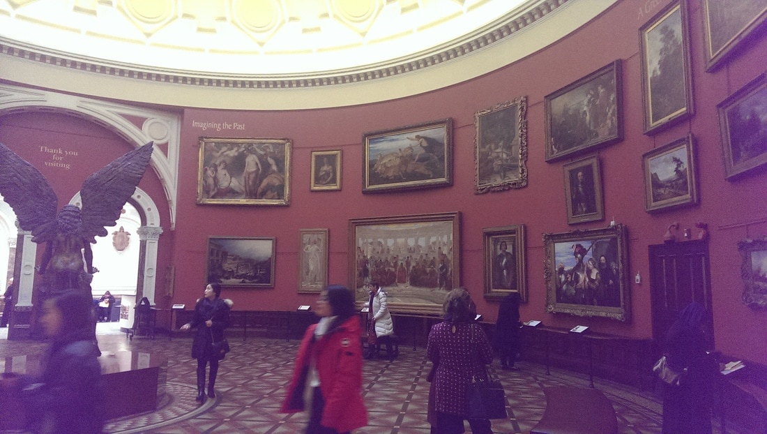
The entrance sweeps you up a marble staircase into a rotunda, with domed glassed ceiling , central angel statue and swathes of art on the wall. A grand, neigh august space and it gives you a taste of what is to come. There is a whole upstairs with Egyptian and other historical artifacts which I didn't have time to go round. Likewise the faith room attracted little of my attention.
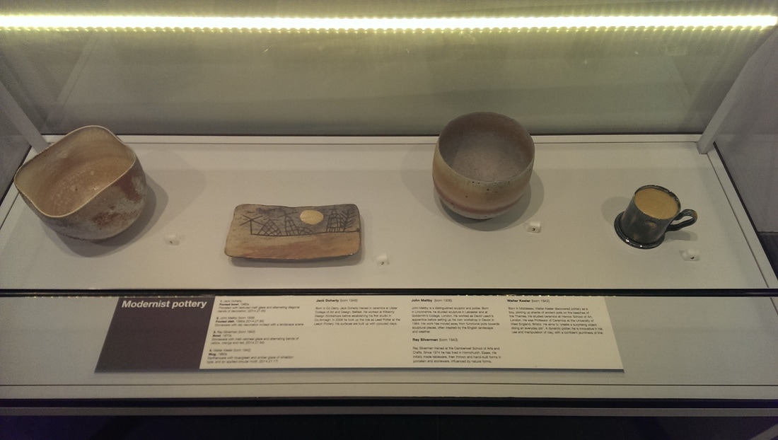
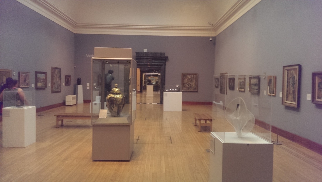
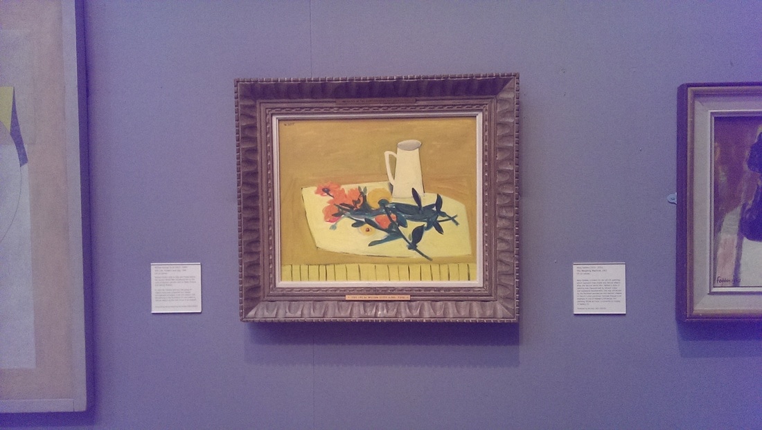
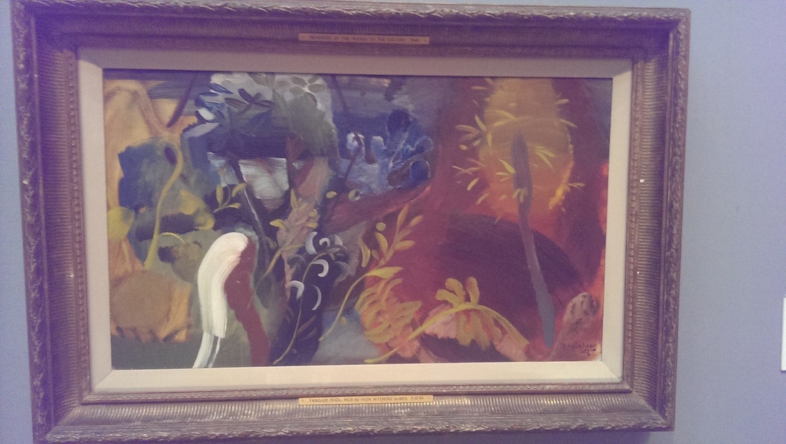
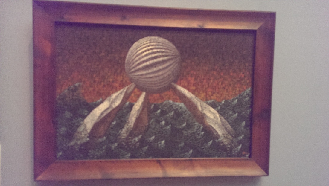
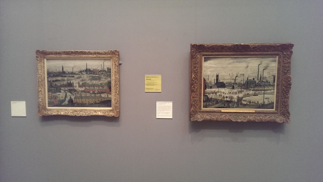
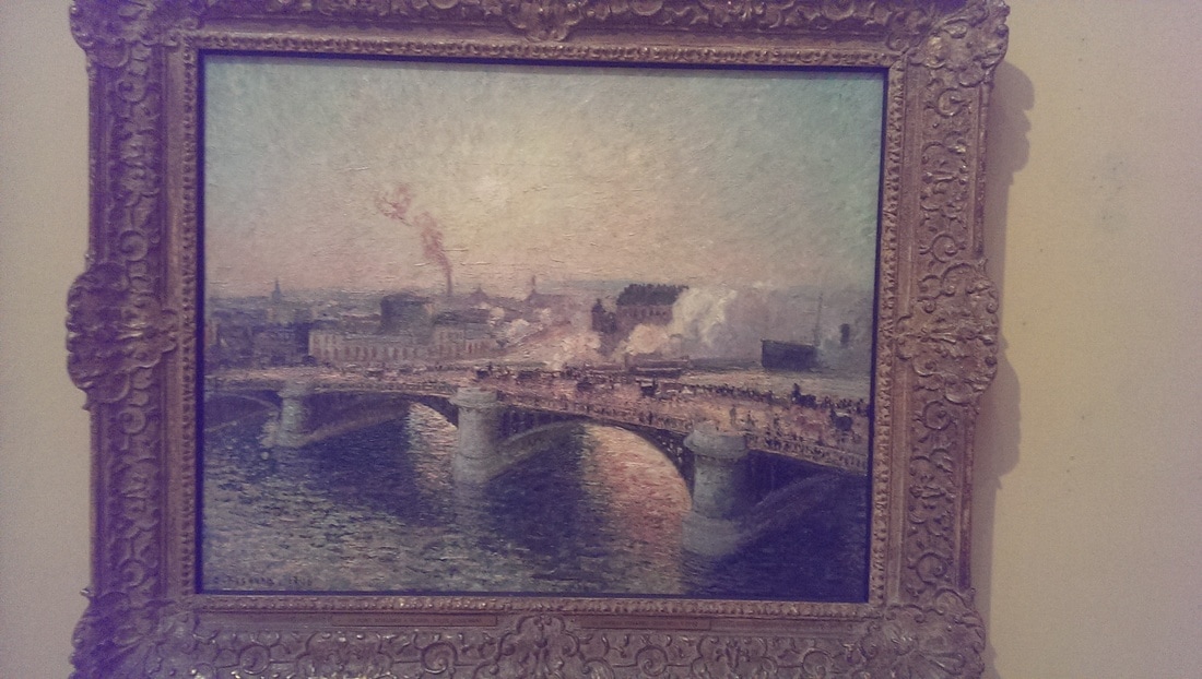
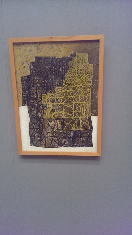
The first room I came to was a selection of modern pottery which I have illustrated with this exceptionally poor photo (above left). Bear with me though they do get better. Its a well set up museum with good sight lines (above right) and I was very pleasantly surprised particularly by the modern art collection they have. The first thing to pop out at me was this William Scott still life (below left). Very unlike the other work of his I have seen but a good strong colour composition. Sitting next to it was this very cooling, Ben Nicholson still life abstract (below right). Further on down the same wall are a fine pair of Lowrys, all stick figures and smoke (middle right) and at the end of the row a fine Pissaro, a delicate painting of a bridge in Ruen. I am glad I found this room. I spent large portion of my available 40 minutes in it. Like all good museums among the pantheon of greats it introduces you to other artists whom you may not of heard of. Middle left below is a work by a guy called Ivon Hitchens called Tangled Pool No.9. I would like to see the other 8 (if indeed they exist). I like the red segment on the right and the stripe of white pops out of you. Below it is a strange alien creature by John Armstrong, called simply Lapping Waters. It is painted in egg tempura which is a novelty and particularly effective is the strongly textured sky.
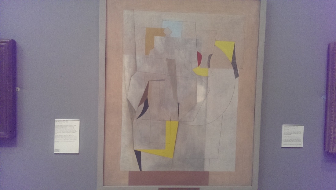
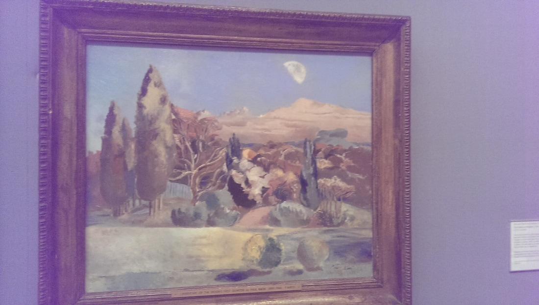
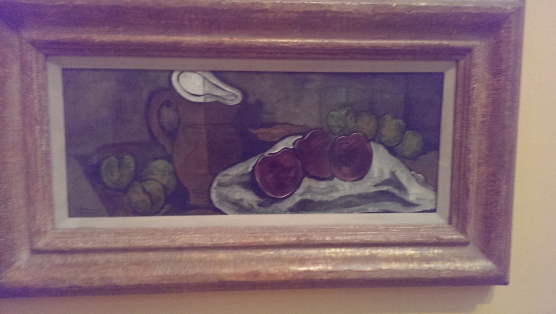
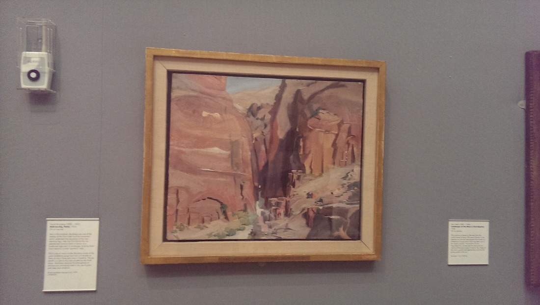
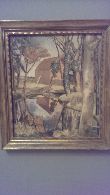
Last November I went to see the Paul Nash exhibition at Tate Britain. It was therefore a pleasant surprise to come across a couple (top left and right) with his signature muted pallet and angular trees. His mic of abstraction and figurative painting greatly appeared although there was less of the outright weirdness that appears in his later paintings. The same mix, although in stronger colours appears in what turned out to be an early Braque still life (middle left). Completing the painting highlights of this spectacular room was a David Bomberg painting of Petra, quite unlike his usual style.
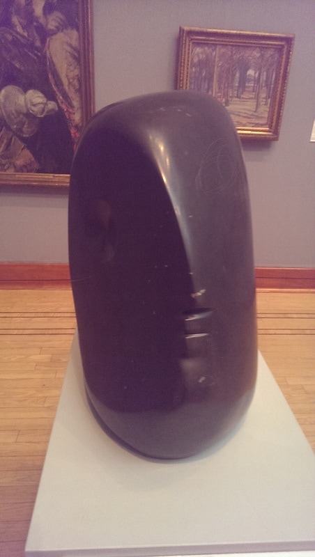
Not just paintings those there were sculptures like this enigmatic shiny Barbara Hepworth head (below right) and my first encounter with a live Grayson Perry in the form of an enormous earn with the ghastly heads painted on it and the metal plaque embossed on the side (below left).
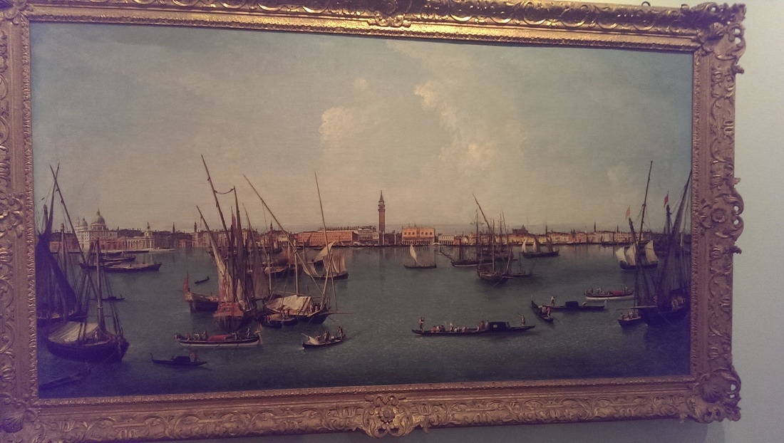
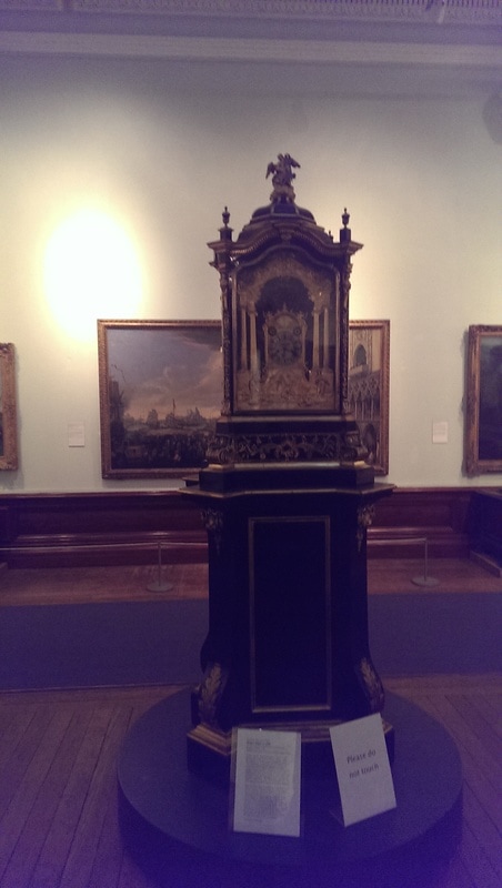
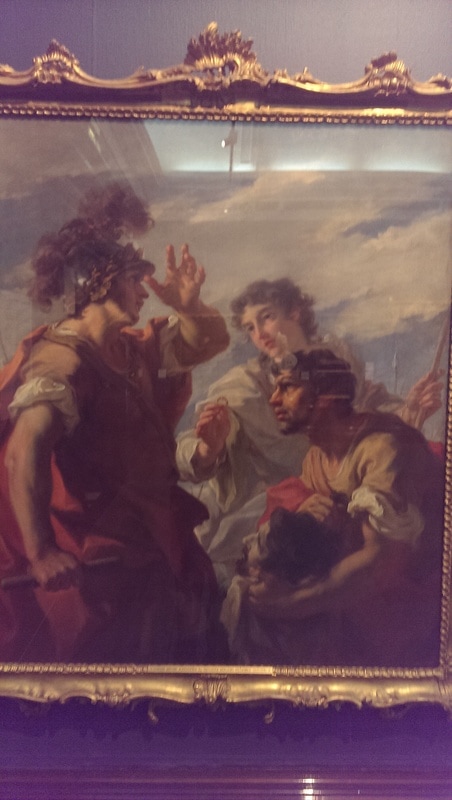
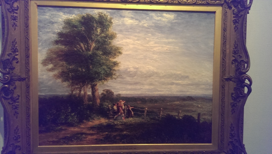
Partly because it chimes with my tastes but mostly because it has some of the best stuff I enjoyed the first room most. I had to fairly scamper round the rest (although was arrested a few times). I encountered what at first glance I thought was a Canelleto but turned out to be by a Michele Morleschi, it was hiding behind and to the left this rather fabulous ornate clock. Then, bottom right there was a restful superior landscape called the Skylark by a David someone (sorry I cannot read my notes of who). It is the sky I think, the burnished cloudscape, that most appeals. Then (below right) is a Pellegrinni one of the many great masters who also sounds like a cocktail, with Caeser before Alexandria. I like the flowing movement everything has.
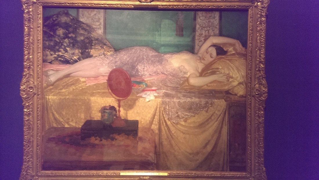
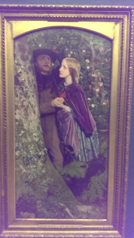
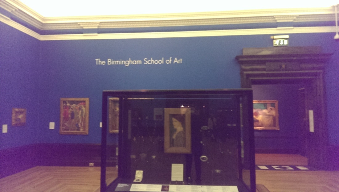
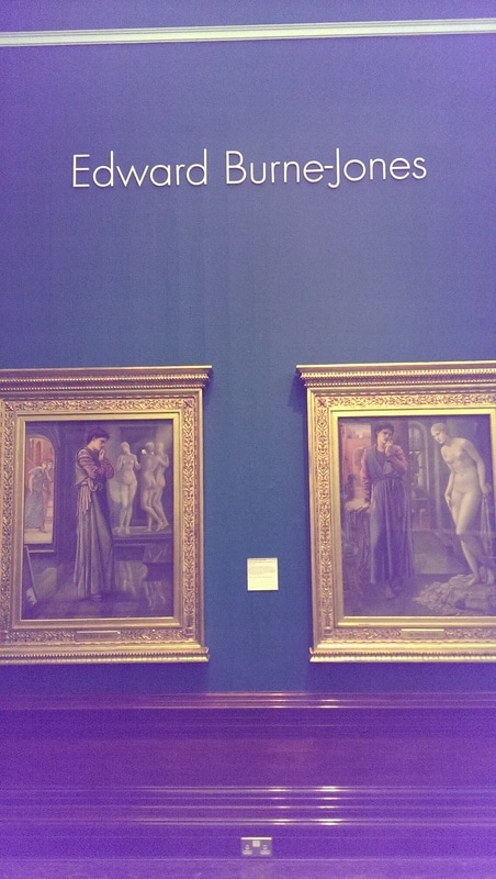
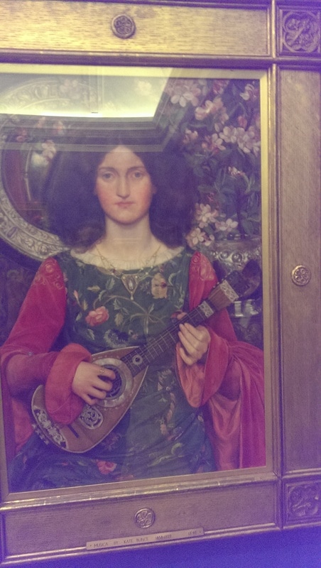
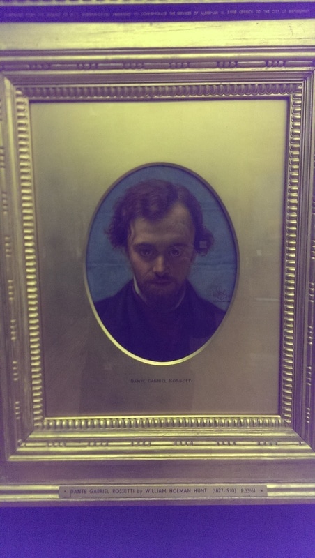
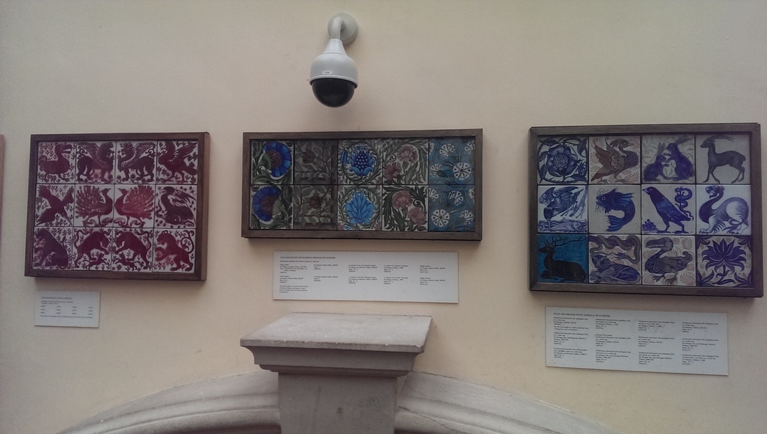
The prize of the collection, as far as the museum is concerned is their collection of Pre-Raphaelite paintings. Did you know there was a Birmingham School of Art that specialised in such things? So Rossetti and Millais all make an appearance. I was more interested in some of the other people. Before you enter the Pre-Raphaelite section proper you are hit between the eyes by the sensational Silver and Gold (below, top left) by William Russel Flint. The picture top right is called Musica by Kate Brunce, nicely giving the lie to the word Brotherhood in Pre-Raphaelite Brotherhood. The instrument is the star of the show in this piece. Then there is the winsome almost constipated people in the Long Engagement by Arthur Hughes. I particularly like the moss on the trees. Then there is the glowering portrait of Rossetti, who pleasingly looks exactly like you would imagine him to do, by William Hunt.
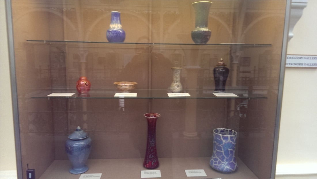
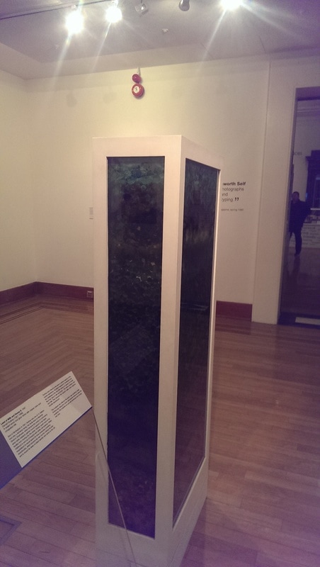
On the way back to the rotunda you pass a room dedicated to more contemporary art. There is an attractive central column called the Land of Milk and Honey II by Donald Rodney. Made of wood, congealed milk and cooper coins. The colour changes as you descend the column. It rewards circling it a few times. Back to the Rotunda and the other passage way (below right) takes you into the gift shop and beyond that the Industrial Art section, where you have things like glass and pottery. I would have particularly liked to spend more time here but sadly the minutes had nearly all drained away.
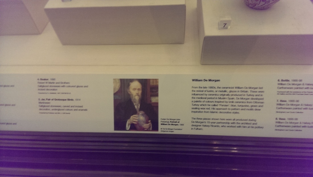
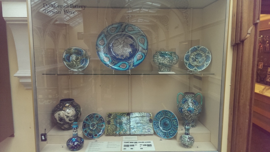
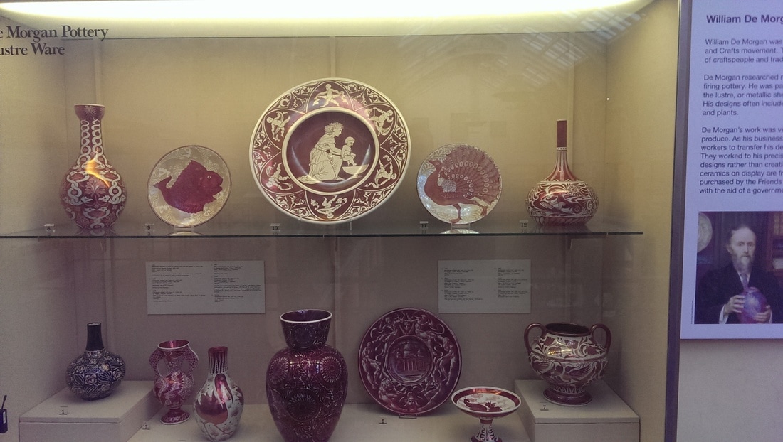
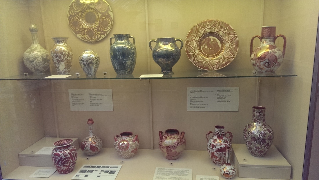
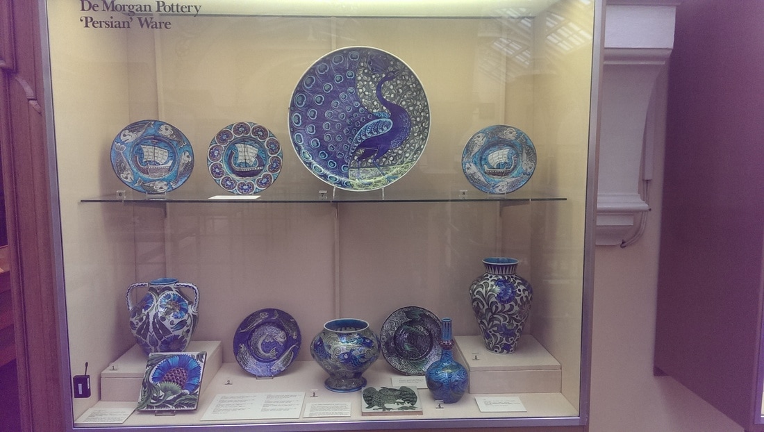
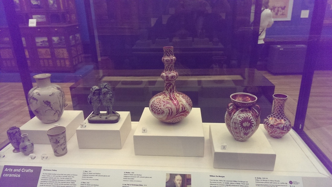
My favourite painting in the National Portrait Gallery is of William de Morgan (you can see a small version of it below) by his wife Evelyn. I was left feeling surprisingly bereft when on a recent visit I found it was not on display. Subsequent inquiries revealed it was about to go on tour. So it was with a surprising amount of joy that I found a large collection of his pottery on display in the Birmingham Museum. Fine stuff it is to. I particularly like the red and white pottery and the iridescent turquoise stuff. Chance encounters like this are one of the particularly rewarding aspects of going to a museum. I hope the portrait stops off in Birmingham on its tour.
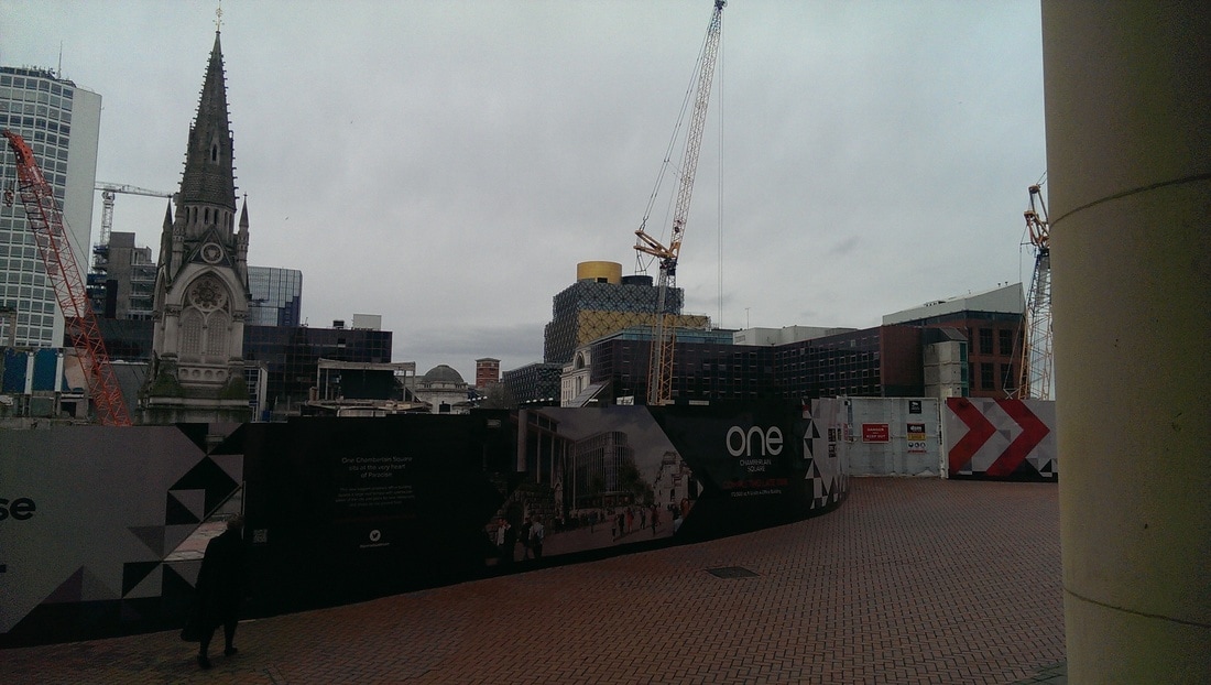
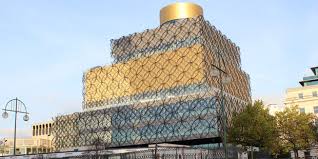
 One of the impressive new additions to Birmingham is the new library (below right). I was immediately reminded of it when I encountered this painting (below right) called the Wall by Anwar Shemza. It is in any event a good painting, the coppery background setting off the metallic scroll work in front. Currently, as you exit the museum you can see, over a construction site, the library. It is a sight line I hope they preserve. I do wonder if the designers were in any way influenced by the painting. I could find out but I prefer the mystery.
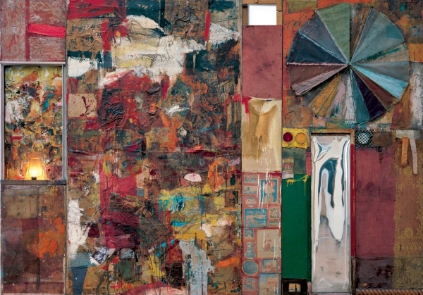
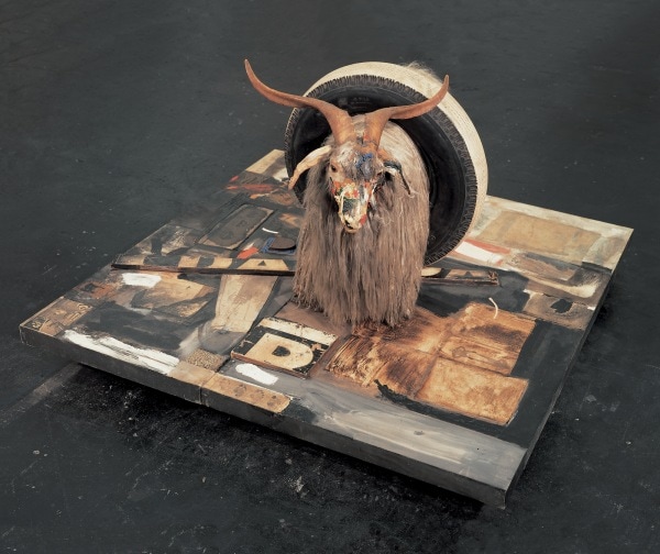
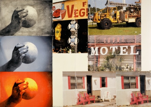
Have you heard of Rauschenberg? I hadn't really before last year but you will almost certainly have seen his stuff. The Tate Modern is currently hosting a large retrospective of his work which runs until 2nd April this year. It is well worth seeing. You will see amongst other things where so many art students rip so many of their ideas off. Indeed you can see the inspiration for many other artists. There is a large amount of energy, joy and humour in Rauschenberg's work, which appealed to me. This is a man who takes his work seriously but not himself. Before I went I had watched Alastair Sooke's really quite good documentary about him, which added to my enjoyment of the show. Watch it if you like. However what struck me is that with Rauschenberg's work looks much better in person (mostly) than it does on screen. 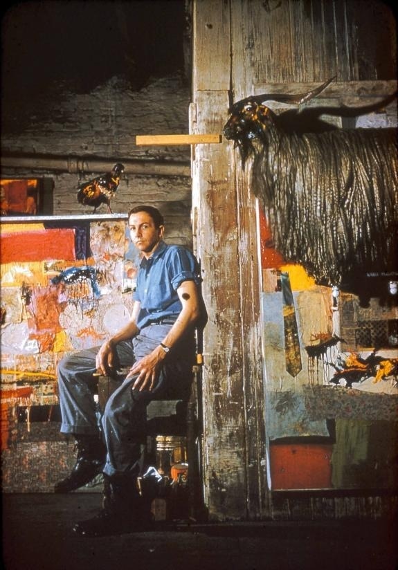 The show takes the standard form taking us through Rauschenberg's life and there is much to like from the off. He used to turn stuff he found from the streets of New York into art. I like them. Elemental Sculptures they are called. My favourite was Wood and removable stone, which is a wooden box with a large stone. The stone can be removed. It is a very friendly stone. The next room had a large red and yellow painting, alternating stripes set off with green blobs. Yoicks it was called. There was also a dirt painting which reminded me greatly of Anslem Kiefer. Opposite Yoicks was the strangely titled Cherlene which you can see below left. It is much more impressive in real life being large. To give you an idea of scale you can just make out a stained white tea shirt right of centre, which is an actual T shirt. The light flashes on and off. It is nice to stand in front of it, and simply enjoy it for what it is while playing spot the object. Next was probably my favourite room. A number of small silk screen like prints illustrating Dante's Inferno. Small, intimate and intriguing they really draw you in made better by the slightly foggy nature of them all. I think these were my favourite thing in the whole show. This and the Combines you see in the next room show you where allot of the inspiration that art students shamelessly rip off and do much worse. My theory is it is the joy they like. I am going to steal an idea from him. He adds mirrors to things. I have some copper squares lying around which I may add to things. Work like Gift for Apollo which is a sort of screen on wheels chained to a bucket remained me of Helen Marten, the recent Turner prize winner. The greatest of the combines is the goat which for reasons I can no longer remember is called Monogram (below right). Again it is much more impressive in real life. The painted surface on which it sits has much more dynamism to it and adds much more to the piece than the photo suggests.
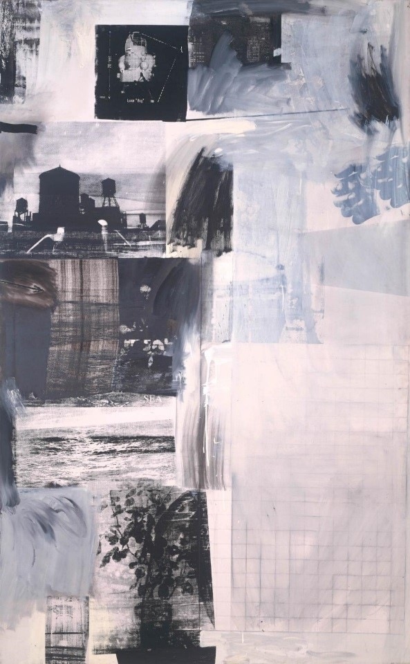
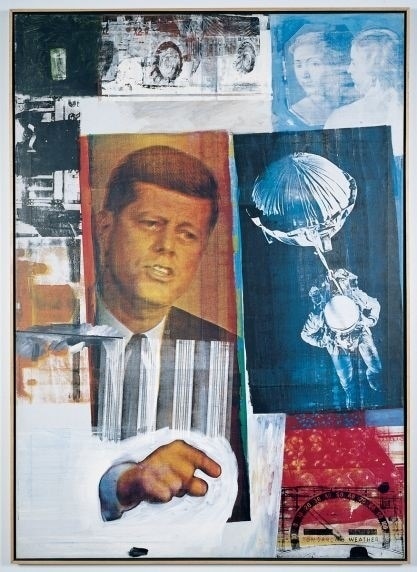
One of the things that occurred to me looking round this show, is this was one of the markers of what you might call the gallerification of art. That's not to say these pieces can't be bought and put in your home (assuming you have a home enourmous enough) but many of these pieces are designed to be seen in a gallery, to be consumed there. Gift from Apollo is an example of this. Monogram is another as is Gold Structure and the umbrella picture you can see it the bottom right of this blog (although this came from a private collection so presumably it might be displayed in someone's house, but I suspect not). This is not necessarily a bad thing. Just interesting. The most specatular example of this is large square bath of mud. Its about 5 foot square. It is controlled by a magnetic tape machine, of the kind you see controlling the traffic lights in the original Italian Job. At various intervals it causes the mud to bubble and spit mud. It has an odour to it and is great fun. Perhaps he is most famous for his silkscreens. The JFK one (below right) perhaps the most iconic of them. I have find them a bit dull and flat. I think this is because they are based on photographs and I am not that interested in photographs.
The show progresses and you get a room with boxes made, one looks like a spaceship. Opposite them large coloured pieces of cloth, inspired by a trip to India. Then there was a room about ROCI. If you don't know what ROCI is you will have to go to the show to find out (or google it). Disappointingly there were few actual ROCI pieces, just some metal sculptures that didn't really call to me. Rauschenberg continued working right to end of his life and one of my favourite pieces was untitled Scene 2006. Had a nice simplicity to it and revives the tyre track theme that appears in one of his earliest work. In addition to this there are videos of ballet and other events he was involved in, photos of John Cage, a large metal sculpture which included water running into a bath, stuff like that. Its a good show. The energy and the verve is infectious. I can see why he inspired so many people.
|
Archives
June 2024
Categories |


 RSS Feed