William Mackenzie
  • Gallery
  • Blog
  • Podcast
  • About Me & Contact

To be Frank....

11/29/2015

0 Comments

 
Picture
Picture
Picture
Picture
Picture
Picture
A review of Frank Auberch at Tate Britain

The latest in the frankly embarrassingly large crop of current exhibitions.   If you are going to see this particular exhibition then I suggest two things. 
1)      Get to know Mr Auberch’s work before you go;
2)      Don’t get too close to the paintings.
I had not done 1) although I knew of Auberch by reputation I knew little of what he had done, so I went it cold.  I’m afraid to say I didn’t like it.

The work was arrange in decade from the 50’s onwards.  My main problem with the work is frankly there is too much paint.  I find it forms a barrier rendering the paintings nonsensical and difficult to engage with.   In the first room this was particularly so where the dark brown theme that predominated and the shiny glaze on, for example, the painting of the Earls Court construction site was viscerally repulsive.  It looks like poo. Much better and more interesting, in my view are his charcoal drawings.

The next room was the 60’s. The colours have moved on and there is a little less paint but it still bulges out from the canvas.  The landscapes I found more interesting than the portraits and the first one of Mornington Crescent grew on me a little after a while.  It is an example of what I mean by 2) above in that if you get too close to the paintings it dissolves into a meaningless jumble that in fact I found very off putting.

The 70s was more interesting. Better use of colour and slightly less paint.  Again the landscapes are the more engaging and for example I found the reclining head of JYM baffling and lacking emotion.  My favourite in this room was Primrose Hill in Summer.  It was in this room that I also discovered an odd effect.  Caught out of the corner of my eye the paintings really popped out at me.  They looked really good.  Turn to look them full on though and this effect ebbs away.
On into the 80’s and again there is less paint and it ceasing to be an obstacles and a couple of pieces such as From the Studio had a nice metallic sheen.  OF much more interest to me where again, his charcoal portraits and in one, called Head of JYM he managed to achieved an interesting 3d effect.

On into the 90’s and more portraits of Mornington Crescent.  The work features large violent lines which are both integral but to me, off putting.  By the next room, the 2000s I was beginning to find this irritating. You have to work very hard with Auberch’s paintings, they are very dense and take a long time to get to know.  The effort is not often rewarded and I find them lacking something.  I became resentful.

The last room was curated by someone else (the others being done by the artist himself) and was the best.  In this I made a discovery. I greatly preferred his smaller works, and found them to be better, for example To the Studio 1993 and Hampstead High Road High Summer, I found them to be more intimate and more intelligible.  Interestingly when I brought the postcards, the paintings in this reduced form looked a look better than they did in real life.

There are some interesting things going on hid but they are hidden to often by overworking and a sort of bombast.  His best work, like the charcoal drawings are where this does not happen.  Come out from behind the paint Frank! Let us see you.

0 Comments

Transcription

11/22/2015

0 Comments

 
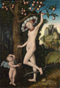
It is a very traditional way to learn how to paint. Find  painting you like and try to copy it.  For me a more interesting variation of this is transcription.  You take an element from the painting, a figure, a subject a theme and use it to compose your own work. It is this later element that appeals to me more. 

There are two main benefits.  It forces you to look closely at a painting by someone else.  You learn allot by doing this, technqiues ideas,  use of colour etc.  It also fires the imagination.  I live in London so for this excercise I like to choose paintings I can go and see in person.  You often see much more, and suprisingly so, than is shown in a postcard or picture from the interent.  The most suprising change is often the scale of the original and the colours. The colours are invariably different from those in a photo.

Below are three transcriptions I have done.  The first is a version of Lucas Cranach the Elder's Venus and Cupid.  The original is in the National Gallery.
Picture
Picture
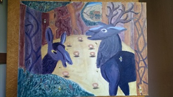
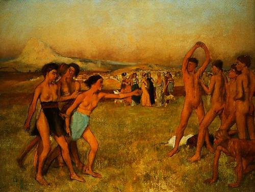
this was one of the first paintings I did, back when I started painting. It is difficult to see but in the back right of the original is a small house.  My first idea was a rendition of the house with the various characters in various windows.  My second idea and the one I went with was to expand on the malevolant looking deer in the left of the picture.  They intrigued me.  So I went with them.  I tried to incoporate the trees and bushes that surrounds them. The two main characters I rendered into tree form for the back ground and I kept in the distance, thehouse and its reflection.  The apples from the originals I put on the ground and various bees buzz around the place.  I was pleased with the result. My deer don't carry the threat of the original.  Indeed they appear to be laughing.

The next transcription I did was of Degas Spartans Excercising.  Again the original can be seen in the National Gallery.
Picture
Picture
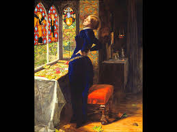
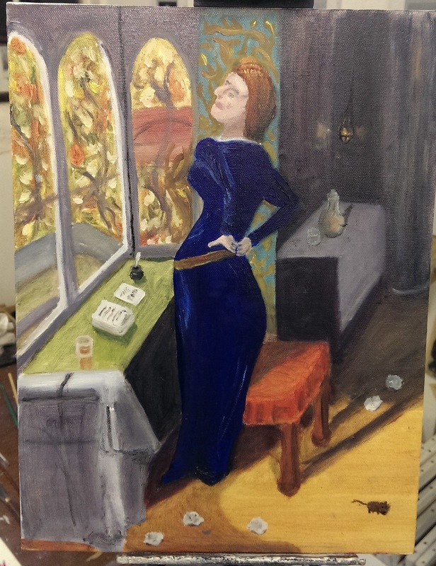
My version can also be seen in the Maxi mix page.  The original is vast and also much more light in colour than the photo above would suggest.  I was taken by the feeling of movement, and also the atmosphere of implied threat.  I decided to expand on thi in two ways. 

The first was to make it so there were only two characters, the girl and the boy, and the various poses (which I reduced by one in each case) was them moving.  Next I decided to make the threat of violence an explicit act of violence with the boy collapsing at the end.

As in the previous transcription I have rendered the people watching into trees and pusehd them into the background.  I also wanted it to be a modern setting so have added a car.  Probably the weakest part of my painting is people and this was the first time I attempted to paint figures. This painting was done in November 2014.

My latest transcription, finished just last week is of Millais called Mariana.  The original can be seen in the Tate Britain.
Picture
Picture
I was attracted to this picture by the strong colours, and particular the shape and the colour of the central figure.  And the mouse.  The story behind the original is that Mariana has been spurned by a lover and lives alone producing tapestry.  That is what she is up to in the original.  My rendition is much more faithful to the original structure than the other ones I've done, although I've changed the story of the painting.  In this one she has just finished a book.  The leaves have become scrunched up paper (or discarded leaves).  I have also simplified it because, frankly the original is very detailed and beyond me.  I am though, particularly pleased with the stool.
0 Comments

The Art in Artisan

11/15/2015

0 Comments

 
Picture
Picture
Picture
Picture
Picture
Picture
This is a review of this year's Handmade in Britain at Chelsea which is unhelpful as it finished today.  So if this inspires you to go, tough - you'll have to wait until next year.  Crafts fairs, as this essentially is, can be patchy.  Sometimes you have to put on your "craft face" and try to look enthusiastic about the weird handmade hat that is inspired by Alice in Wonderland and proffered to you by a willowy young woman who will almost certainly be called Emily.

Happily not this event, which was rather good. Jewellery, textiles, glass, wood and ceramics dominated.  The fashion at the moment in ceramics is Japenese-inspired which is much to my taste.  Kerry Hastings, of whom I a big fan and whose work appears in a number of my pictures, was present. I like seeing the work of talented people and getting to speak to those who produce them.  The list below contains some of my favourites.  I have a weakness for glass so it features prominantly.

Adam Aaronson Glass Studio
A selection of highly lustred bowls (like the one top left), coloured, shaped vases, glasses, paperweights and similar.  I came away with two tumblers.

Assenden Glass, the studio of Anne Arlidge, had two very eye-catching lines.  One was plain glass cast into the shapes of vegetables and fruit, each one individually cast from a different subject.  It was a nice idea and witty, and I especially liked the asparagus.  Entirely different to this and contemplatively excellent is her Meltwater series (2nd image). Had budget and space at home allowed I would have walked away with some.

Elin Isakson Glass
A charming Scottish woman who told me about how she makes her excellent Oval rock pools, which l covet.  In addition to these she produces elegant, tall, single-coloured vases.

Judy McKenzie Ceramics and Glass
It was her ceramics I liked best.  Imposing pieces with a drip effect down the outside.  My particular favourite was a larger beige number with a mottled finish.

Young Ran Lee Ceramics
After a while the endless saki sets and Japanese-inspired vases did begin to wear on one so Young Ran Lee's work provided a nice change.  I liked the substantial, rugged, industrial feel of her pieces. They remind me of some kind of enormous tool head.

Camila Perez Gonzalez Ceramics
Sadly her website seems not to be working, but she does a fine range of lustred vases,  about eight inches high and in a variety of shapes and colours.  I particularly liked the deep blue, and came away with one (left, apologies for the picture: I took it myself with a poor camera).  She is perhaps not the most artistically daring of these exhibitors but she has a marketable style that she produces well. 

Moth and Mirror Wood
My goodness, but these are good.  Expensive though.  Finely turned, very interesting pieces of wood, some lacquered, some not, and then inlaid or gilded in gold.  These are very pretty things.  Technically the bowls are functional but it would be a travesty to molest these objects by doing something so crass as using them.  My wife's favourite was the gold inlaid chestnut burr bowl pictured below.  Mine was a set of three lacquered cups with different coloured oxidised silver on the inside.  Something to aspire to.

Blott Works describes itself as hand-engineered, functional sculptures. An example can be seen at the very bottom. They are fascinating pieces. There are clocks and lamps all in various forms,  many reminiscent of animals, with intriguing levers, pulleys and mechanisms.  There was a fine lamp that looked like a stork or wading bird.  If you have a grand to put into desk lighting then I suggest you go here.

There were others I liked but the above are my favourites.  A complete list of the exhibitors can be found here.

Incidentally this and many other posts were edited by my wife whoses excellent book is available on Amazon.
Picture
Picture
0 Comments

Going for Goya

11/8/2015

0 Comments

 
Picture
Picture
Picture
Picture
 On Friday I attend Goya:The Portraits at the National Gallery.  The latest in a the line of heavy hitting exhibitions at the National Gallery it is, in my view well worth attending.

There is a strong historical as well as artistic interest to this particular exhibition as it moves from the 1780s and the reign of Charles III of Spain (who if the portrait Goya has done of him, and hangs in the first room is to be believed, had a striking likeness to the BFG) through to after the end of the Napolenic wars.  Epic figures of the time such as Wellington (left, second from top) are encountered.  All rendered with a brutal honesty.

The fashions change too, from colourful bright clothing to somber black coats.  Of course this may reflect the painter's deeper melancholy which is reflected in his later self portrait (bottom left).

It is well worth going.  Luminos paintings are these and the dull tepid postcards that can be purchased afterwards are a disappointing reminder.

The peices are full of personality.  One of the works that strikes you when you arrive is the one left and 2nd from bottom. What this version does not show you is the fixed stare that main subject holds you with, or that on the wall behind him is a picture of the king (the BFG again).

There is much humour in the early works.  Odd dogs peer out from behind people.  As in the peice top left enraged cats stare at a magpie on a string.  Strange injured figures leer out at you from the sides of group pictures and children gawp at jaunty angles.  It looks like a well taken photo in that there is the appearance of people suddenly frozen.

I enjoyed it very much.  I have said this before but great art conjours in me a profound sense of calm.  Possibly it is also the setting (the shrowded darkness of the National Gallery's basement exhibition space enhances this I am sure) but it was a most meditative experience.  I spent much longer in there than I realised. 

There is much iconic here to be seen.  Much that can be learnt if you paint.  Afterwards I found myself comparing it to other portrait exhibitions I have seen. Seargent or Goya? 

It is of course a silly question.  Both if preferable.  Both give different things.  The interesting thing though about the Goya exhibition was it seemed to show, by the end, a man broken by life, ground down by war and dissapointment.

Go. You'll like it.
0 Comments

Pattern Experimentation 

11/2/2015

0 Comments

 
Today something different.  A picture blog.  This is what happens when after you go and see the Sonia Delaunay and the Agnes Martin exhibitions at the tate and buy yourself goache and a pen.  Which one is your favourite?
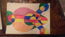
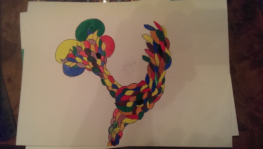
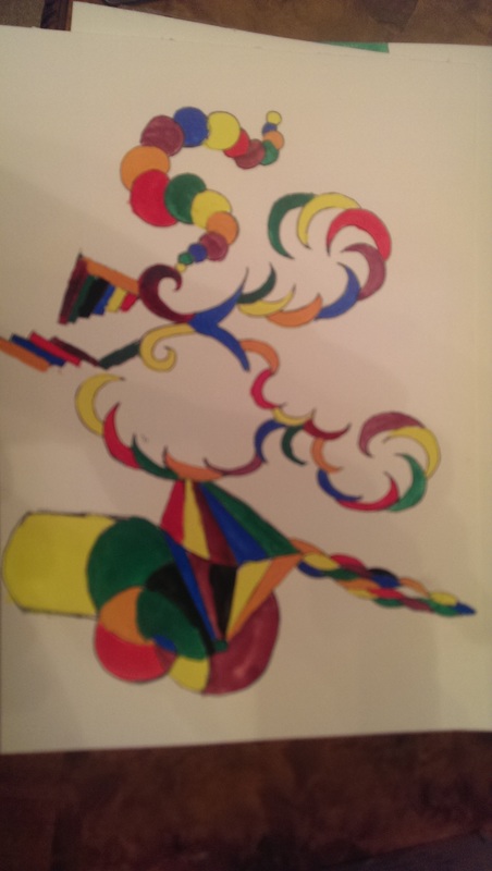
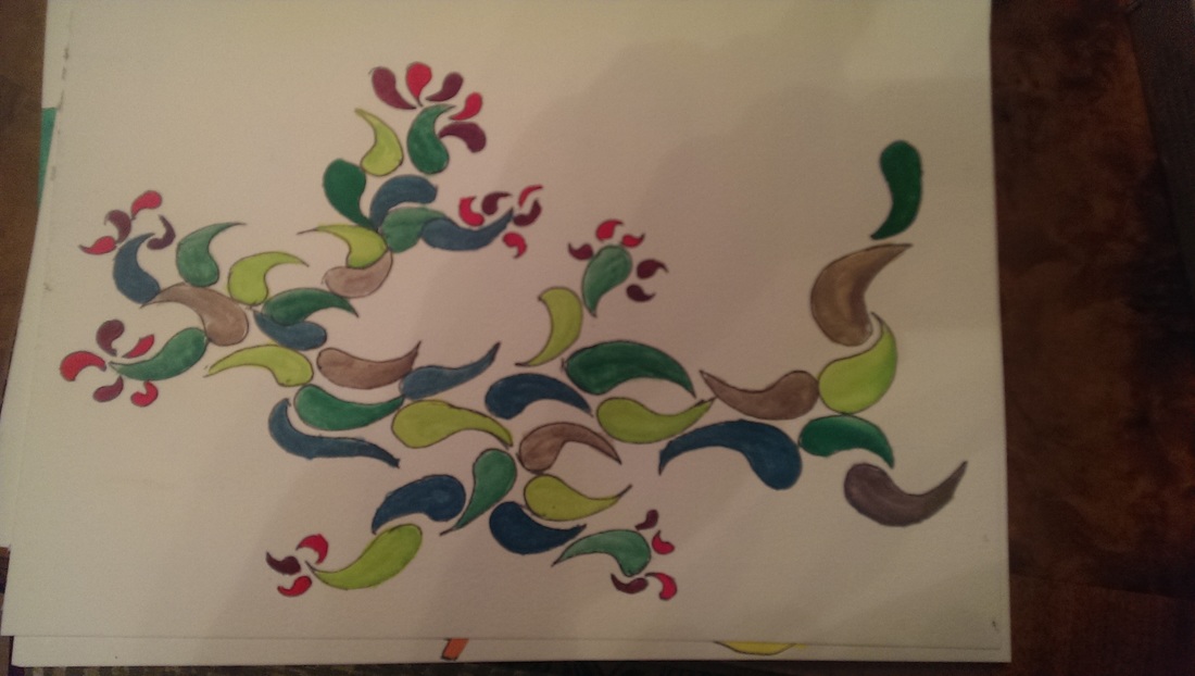
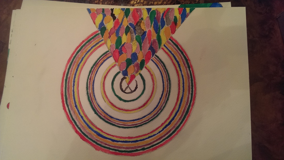
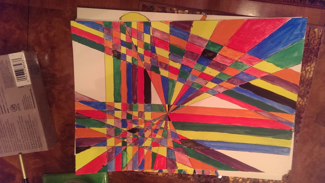
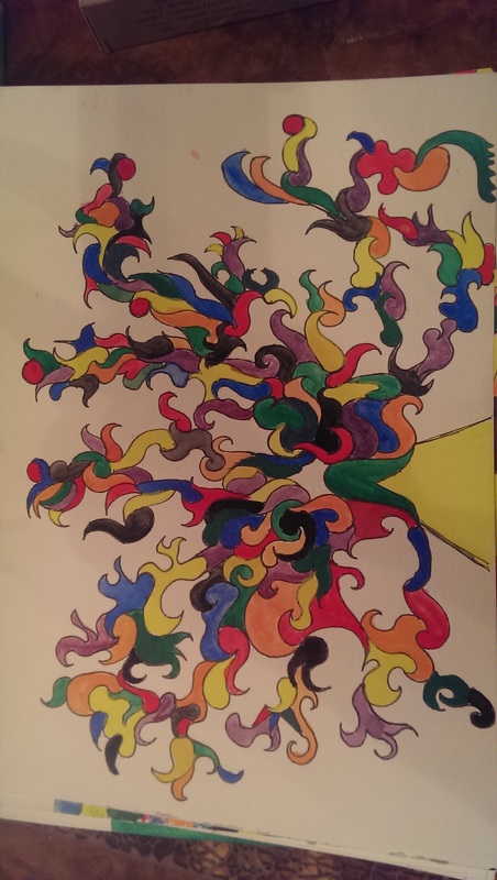
Picture
Picture
Picture
Picture
Picture
Picture
Picture
0 Comments

      Keep in Touch

    Subscribe to Newsletter

    Archives

    January 2025
    September 2024
    July 2024
    June 2024
    May 2024
    April 2024
    March 2024
    February 2024
    January 2024
    August 2023
    July 2023
    June 2023
    May 2023
    March 2023
    February 2023
    December 2022
    November 2022
    July 2022
    June 2022
    May 2022
    April 2022
    October 2021
    September 2021
    July 2021
    June 2021
    April 2021
    March 2021
    February 2021
    December 2020
    October 2020
    May 2020
    April 2020
    January 2020
    December 2019
    November 2019
    October 2019
    September 2019
    August 2019
    July 2019
    June 2019
    May 2019
    April 2019
    March 2019
    February 2019
    January 2019
    December 2018
    November 2018
    October 2018
    September 2018
    August 2018
    July 2018
    June 2018
    May 2018
    April 2018
    March 2018
    February 2018
    January 2018
    December 2017
    November 2017
    October 2017
    September 2017
    August 2017
    July 2017
    June 2017
    May 2017
    April 2017
    March 2017
    February 2017
    January 2017
    December 2016
    November 2016
    October 2016
    September 2016
    August 2016
    July 2016
    June 2016
    May 2016
    April 2016
    March 2016
    February 2016
    January 2016
    December 2015
    November 2015
    October 2015
    September 2015
    August 2015
    July 2015
    June 2015

    Categories

    All

    RSS Feed

Proudly powered by Weebly
  • Gallery
  • Blog
  • Podcast
  • About Me & Contact