 Some painters their work is much better in person than it is in photographic reproduction, Turner, Dorothea Tanning to name but two. Other painters are much better in reproduction and are frankly disappointing in person. Hockney is a prime example of this, and to this I would add Pierre Bonnard. There is a show of his work at the Tate Modern but attending in person is both expensive (£20!) and a little disappointing. Of the three shows on at the Tate Modern I would recommend you go to 1) Dorothea Tanning and the 2) Franz West, 3) Magical Realism (its free), 4) The viewing platform and look into those flats that lost that privacy case, 5) the currently empty turbine hall and then 6) Bonnard. He is one of the lesser known impressionists and while his paintings can be a riot of colour I think I can see why and I will attempt to justify this assertion in a few badly chosen and ill reasoned phrases. Here we go.
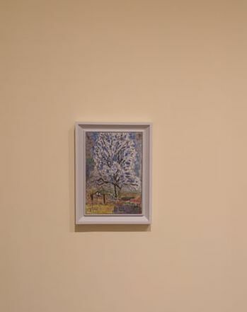
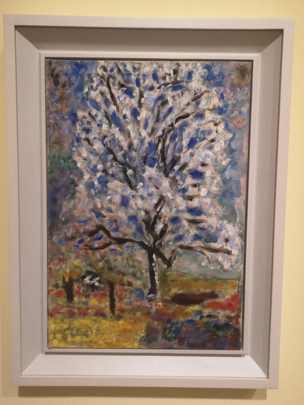
Take this picture of a tree in blossom. From a distance it is a riot of colour, with a wonderful sense of place and time. Up close though and the edges are blurred, there is no definition and I find it a bit of a mush. You don't even have to get that close. From a distance then Bonnard's picture pack quite an impact but this rapidly depletes as you get closer. What this means for me is that they don't reward contemplation. Once your senses has recovered from the assault of colour there is not much left. It is not quite the dream like quality of Monet, or the crisp violence of Van Gogh. Bonnard sits in some unfortunate halfway house.
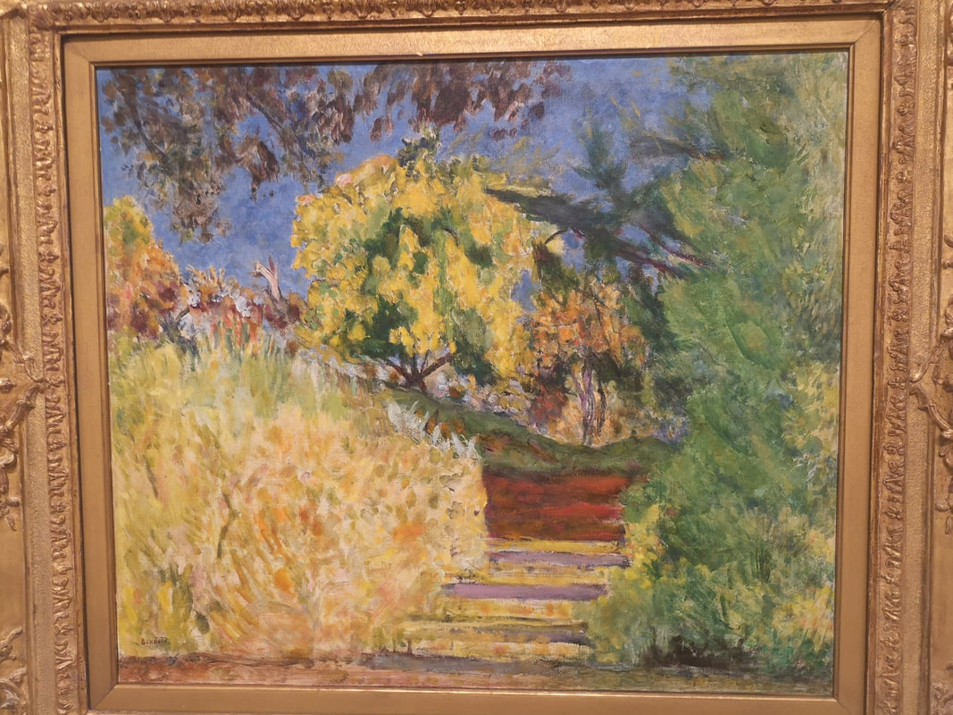
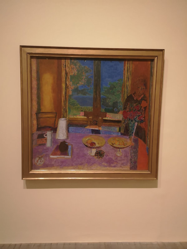
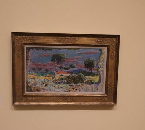
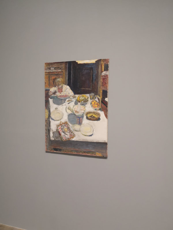
Where I think Bonnard is better is in inside contained or restricted. Like for example this red and purple number (above right). It is also with these types of picture that you can play spot the animal. There is often a cheeky dog or cat (or both) hidden somewhere in the scene. It is the fields of colour that are the most effective here, the purple of the table cloth, contrasting the red on the right, the orange on the left, and the blue through the window. The white crockery adds to it to. It is slightly let down by that odd ghostly figure and the scratchy child like foliage.
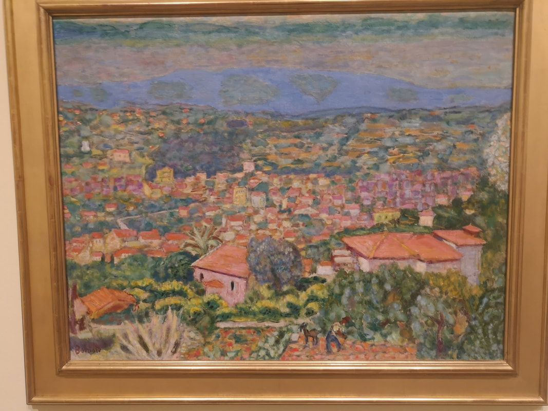
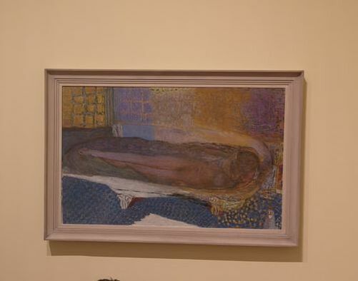
So basically what I'm saying is outside, weirdly childish with some nice colours (above left)k compared with his more accomplished indoors painting. Probably my favourite in the show is this bath scene. The colours on the wall, the way colours morph from blue to purple with that golden crackle running through it. The patterned floor is also good. The central figure is strange but that works in this context.
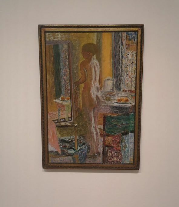
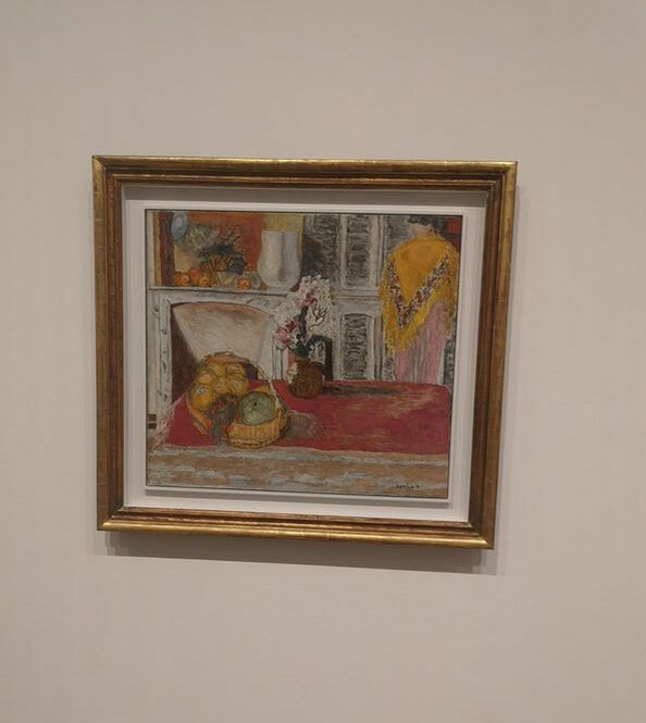
Having identified those of his paintings that I prefer I will focus on those. However this leads me onto another general problem I have with Bonnard (listen I just don't like Bonnard much, if you don't agree with that, keep reading while I painfully explain how wrong you are), is that he never really picks a side with colour. He is almost striking, almost pastel, never quite one or the other and like in the nude above left, often the central elements are too similar to the background and it doesn't stand out. All becomes a bit of a mess. There are some nice elements though, the composition is good, and I like the mirror and the green square coming on, stage right. I also like these almost Victorian indoor scene (above right), the fireplace being my favourite element.
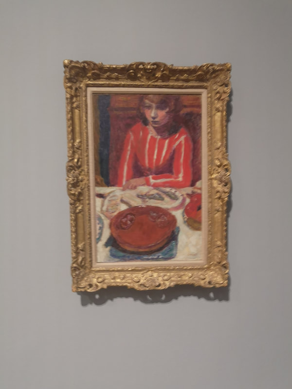
Credit to the curators though, they made a very smart move, and took some paintings out of their frames (above left). They are greatly improved by this, have more of an immediacy to them and Bonnard's more subtle (confused) colour scheme limited by the scene is much more effective. Likewise this picture of the lady in red in front of a red cake (above right). Again the limited colour pallet and again almost Victorian restrained feel makes for a more effective and interesting painting.
Tate have called the show, the colour of Memory. I am not sure why but I will leave you with two paintings that demonstrate and support my biased and selective opinion. They are initially very striking. The mottled red on the picture on the left, and the yellow wall paper on the right are very good. On the picture on the right the greenery contrasts excellent with the yellow. However when you look closely though, its all a bit messy, bit incomplete.
So there you go. Bonnard. Demolished.
0 Comments
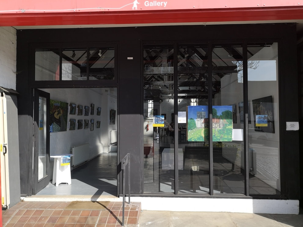
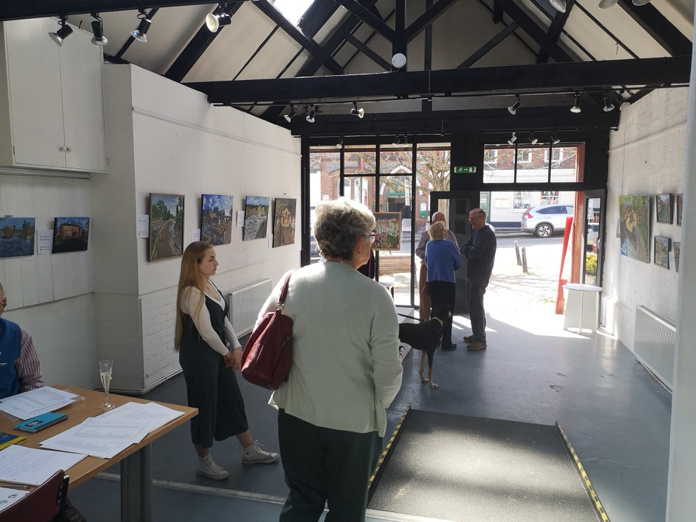
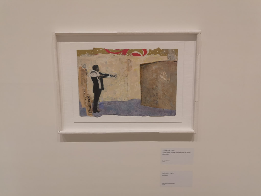
this post is likely to be on the brief and nonsensical side. The idea originated with my friend Emily who lives just across the road from said gallery. She attended one of my previous shows back in early 2018 and suggested that I exhibit here. I didn't think much of it at the time but the idea gained traction and was taken up in full force in my father. The booking went in then in November 2018 and at the same time I embarked on a series of paintings of local scenes especially for the show. These have pretty much occupied my painting time from then until a couple of weeks ago. We claimed the keys on Wednesday night and with the help of Millie, an A level art student who lives next doors to my parents (and has been acting as my Curator) hung up the show. She was very useful. Always have someone with a good eye who is not personally invested in your work to help with such things.
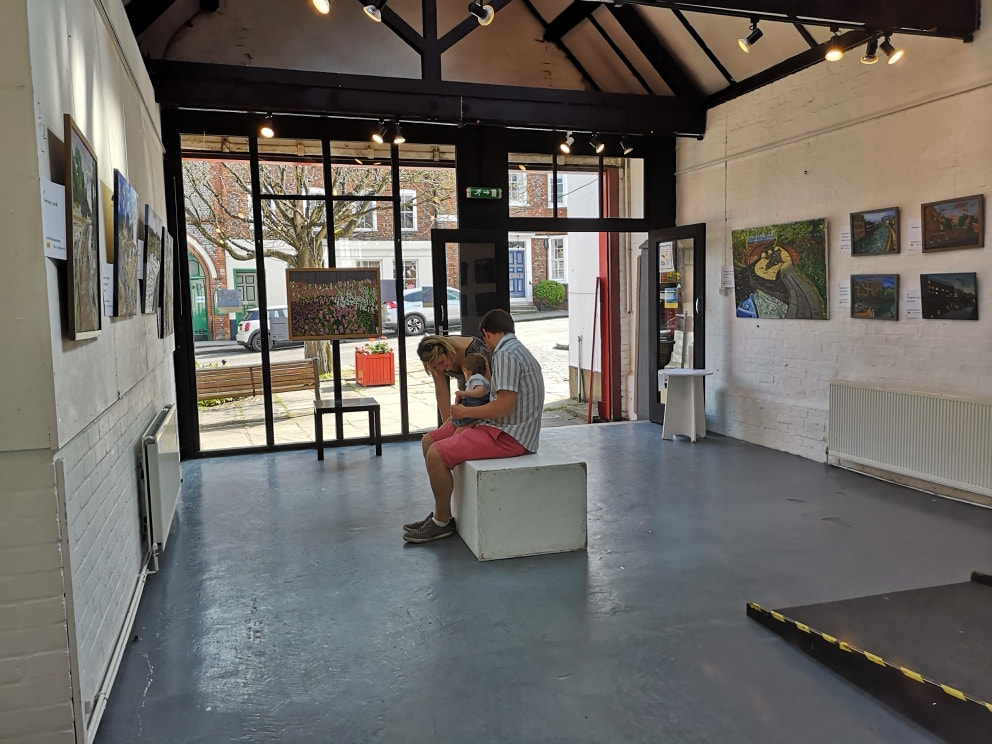
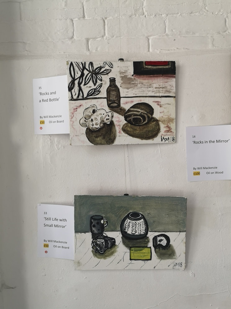
We went for having a large painting in the window to attract people in and immediately the two largest paintings on either side (above left). These were also the most expensive to anchor people's price point. Then paintings were arranged by subject matter. London on the right and Henley on the left. At the back (above right) a quartet of paintings from the north of England, the flower still lives and then off camera the rock still lives. The gallery is an excellent space as you can see from above. It is light and airy, lit both from windows at the front and back and by skylights. There are also well positioned skylights. There is plenty of hanging space and a pre-installed hanging system with adjustable wires and hooks that simplifies the whole process enormously. There is also a little kitchen with fridge and kettle, and a decent loo. It comes with plenty of furniture. Its main downfall, and this is often the case with municipal galleries, is its location. It is situation behind the town hall, away from the main foot traffic. You do not then get much in the way of passing trade. This is common and inevitable with such galleries though. If they were well located they would have long been sold as shops. Advertising then is key. I have been promoting this extensively and we have also been using the event as an excuse to reunite with family and friends. Ensuring then a fair flow through of people. 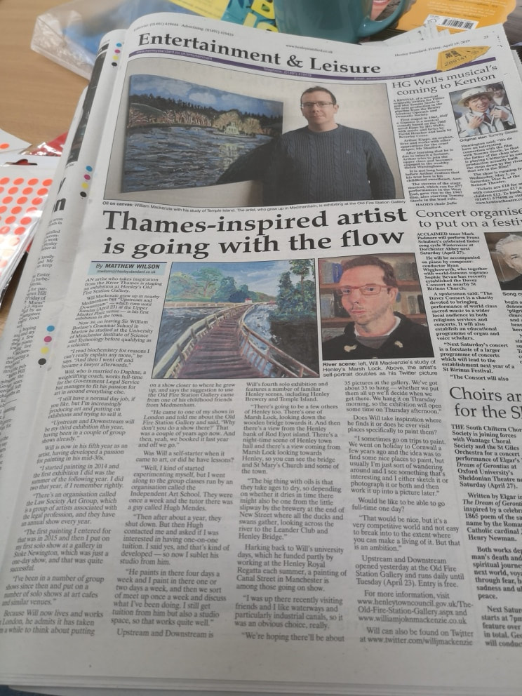 I also contacted the Henley Standard. They seemed interested and asked for a few pictures and there was also a telephone interview. i was expecting perhaps a small mention and was both gratified and pleased to get a near full page spread (see above and the link). This caused at least a few more people to attend. I was one-upped in fairly short order when my wife was mentioned in the Financial Times, a day later.
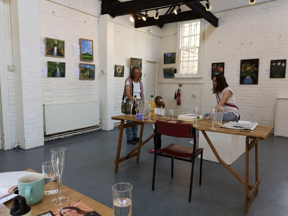
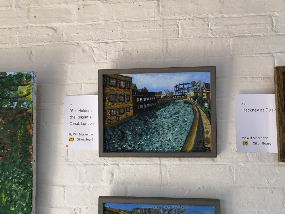
My other cunning plan was to have a red dot in place right from the start. So I told my Curator to choose a painting that she could then keep. She choose the one above left. Turns out she drew up in East London and always liked the gas holders. The co-incidences mounted when her dad came in to see the show and said that her mum had proposed to him in the white building at the right near the bridge. An excellent story. The Thursday was, well nearly dead. Few people came in and we sold nothing. Friday was allot quieter and-we had many visitors including a few dogs (above right). Sold 4 paintings on that day.
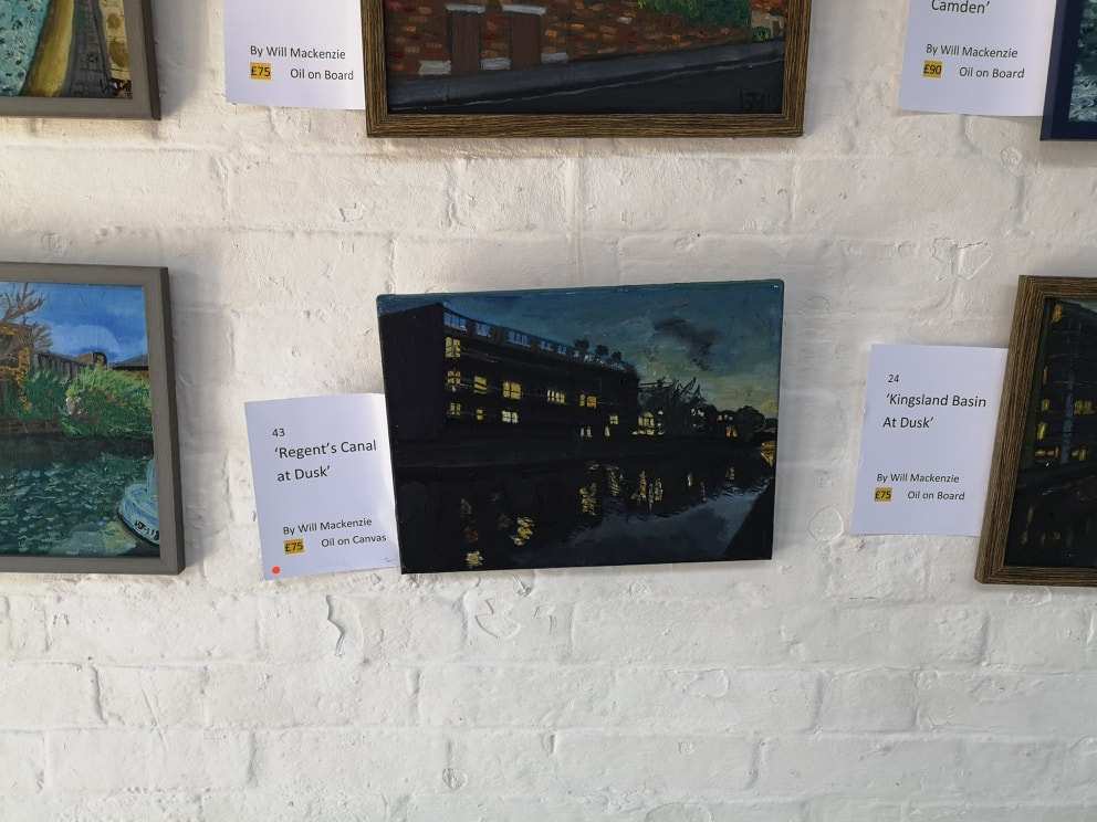
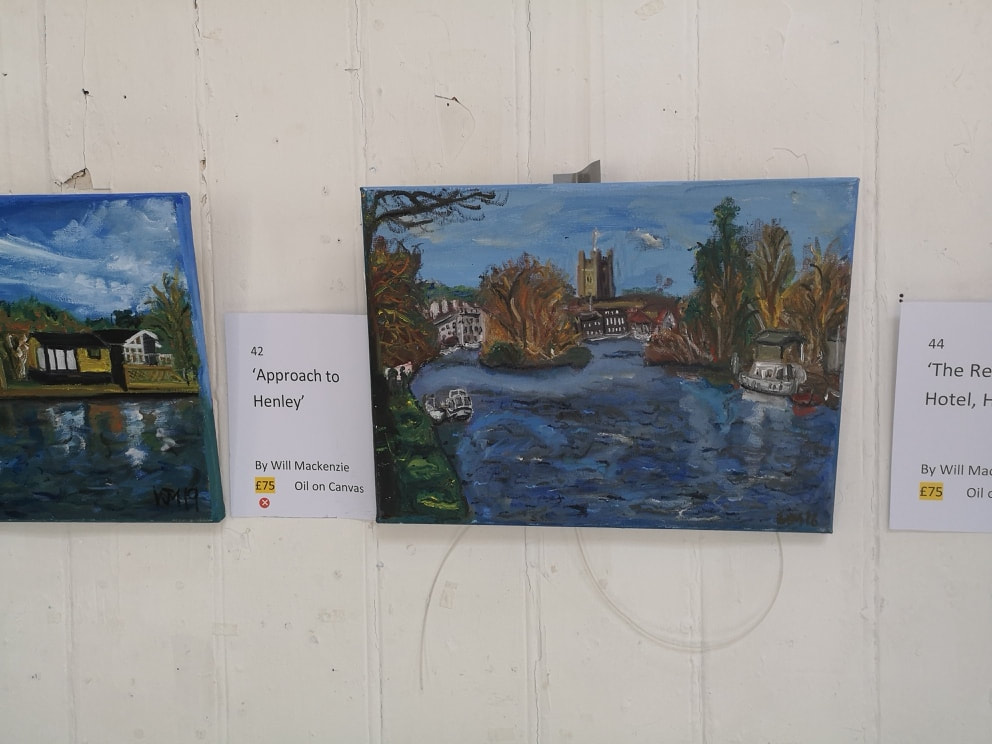
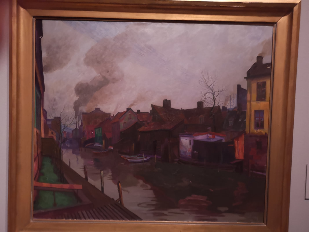
My favourite painting and the first to sell was Regent's Canal at Dusk (above left). It is always the way at shows that there are a few paintings you could sell many times over and this was one. My first painting to sell to someone I didn't already know was the approach to Henley (above right). A gentleman appeared on the bench outside the gallery. I chatted to him and stroked his dog. He re-appeared on the Saturday so I offered him a glass of prosseco. As a result of this he came into the gallery. So did his wife. They had been married in Henley church so they bought the painting. They were lovely paintings.
I have learnt a few things thought. 1) opening on Thursday was pointless we could have hired the gallery a day later and set up on Thursday. 2) Staying open until 1800 is pointless. It pretty much dries up after 1600 - 16:30. It's a long day and exhausting so we have closed at 17:00 everyday. This means we did miss one couple who turned up at 17:10 on Saturday so the lesson here- be more realistic in your opening hours. 3) More big posters, preferably in stand alone form to lead people up from the town.
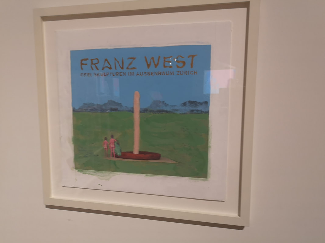
This means that we will probably start taking down the show at 14:00 on Tuesday. If then you want to see it, come before then. It's been a lot of fun though and I got to meet some lovely people. The best people come either on motor-bikes or with dogs. 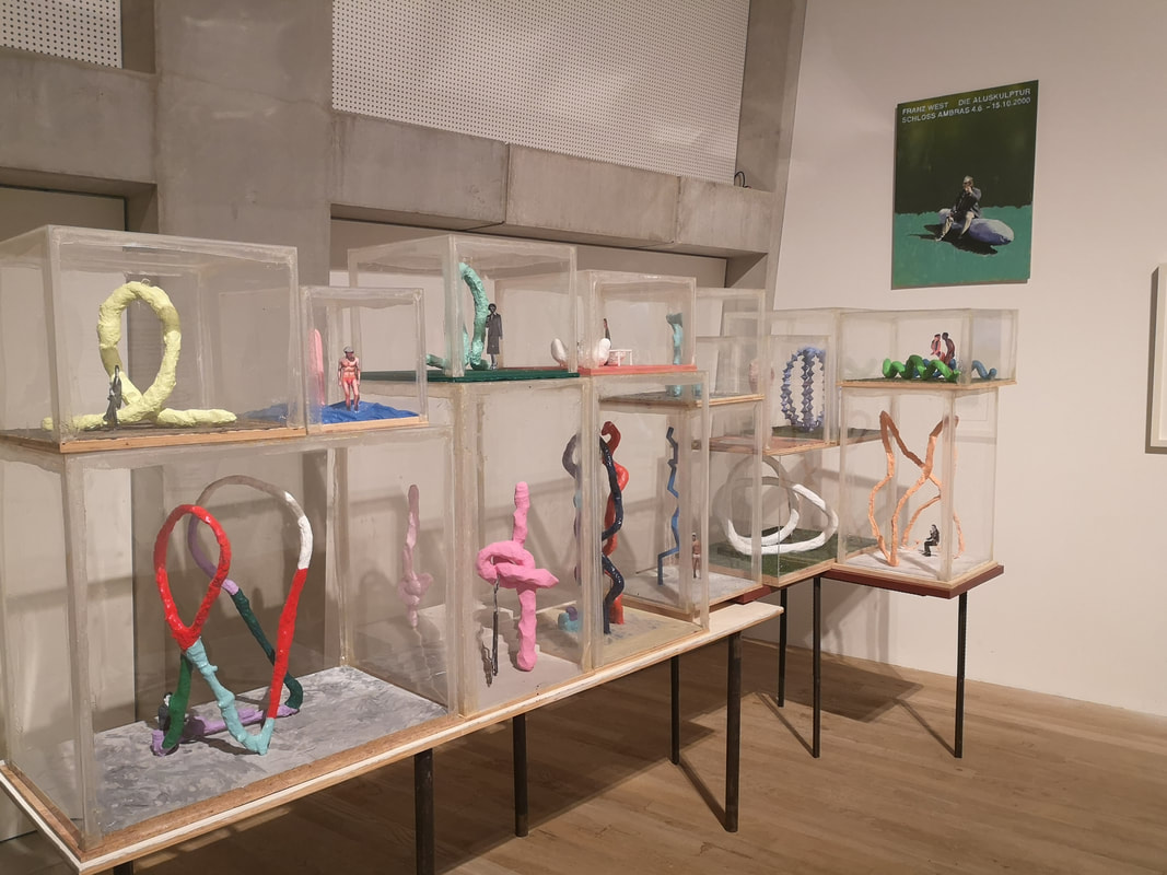 Franz West is a funny sex obsessed genius and I think I love him. There is a show of his work at the Tate Modern until 2nd June and a joyous experience but as you can see from some of the figures captured in the above vitrines there are elements of it that are not safe for work. There are several pieces that are either very phallic or just explicit depictions of sex. It is so absurdly presented though as to not have any sexual charge, but just to highlight how ludicrous the whole exercise can be. It is a shame he is dead. I would like to have met him.
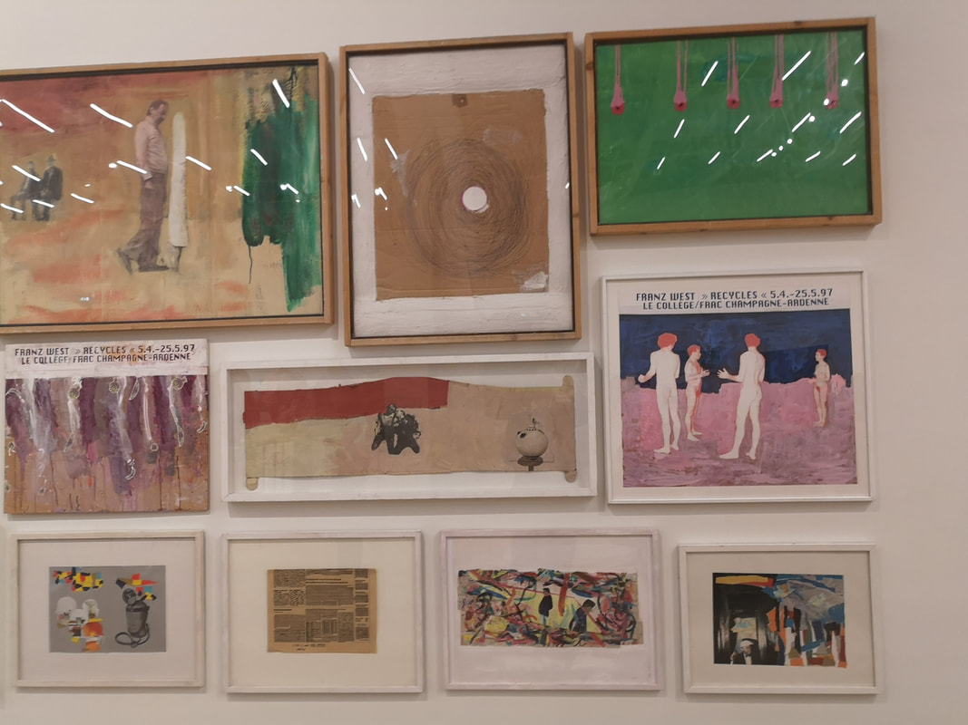
There are at various junctures throughout the show what appear to be posters from past exhibitions of Mr West as you can see in both the above pictures. They often have a sexual theme, as indeed do his collage like pictures with figures stuck on odd backgrounds in an often child like way, that clashes viscerally with the subject matter.
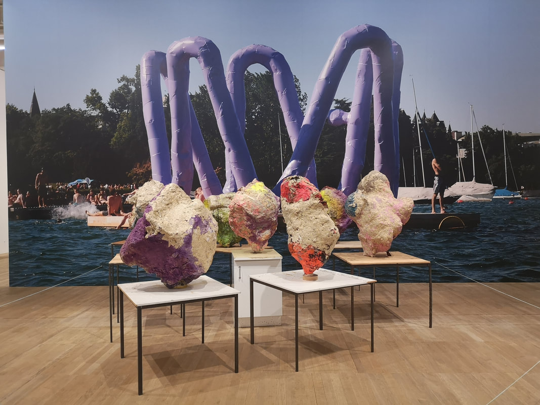
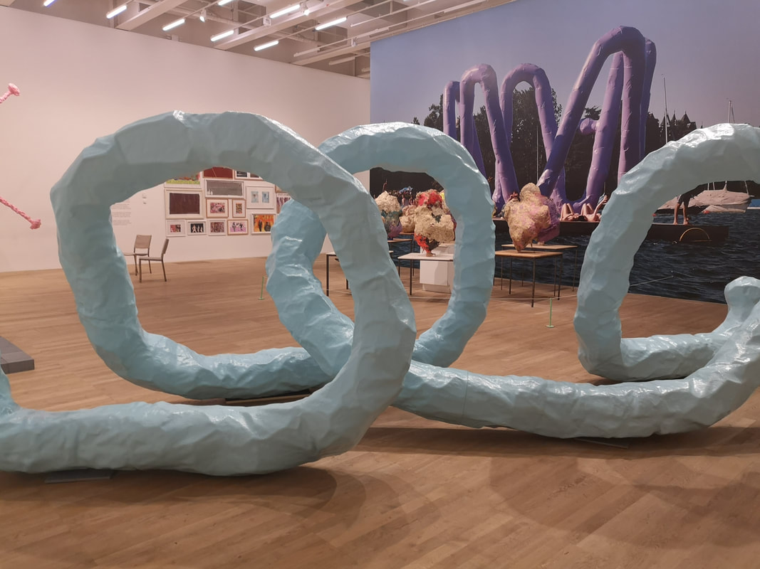
Long worm like tubular things are another feature. Indeed there is a selection of inflatable ones outside the museum itself, by the South Entrance. Others like the bright blue one above right appear to be made of plaster, and resemble some anemic bowl, or enormous worm. West has at various times done installations and some of these are displayed by photographs, in the case of the one above left very large photographs with these beguiling crystalline type structures arrange on what appear to be school tables in front of it. I really liked them. The pigment was deeper than you might expect and they had a distinct amethyst like quality.
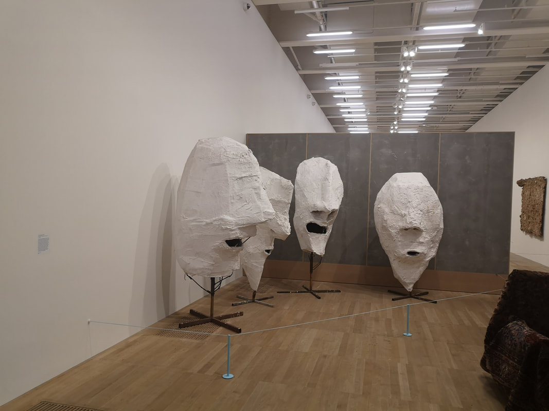
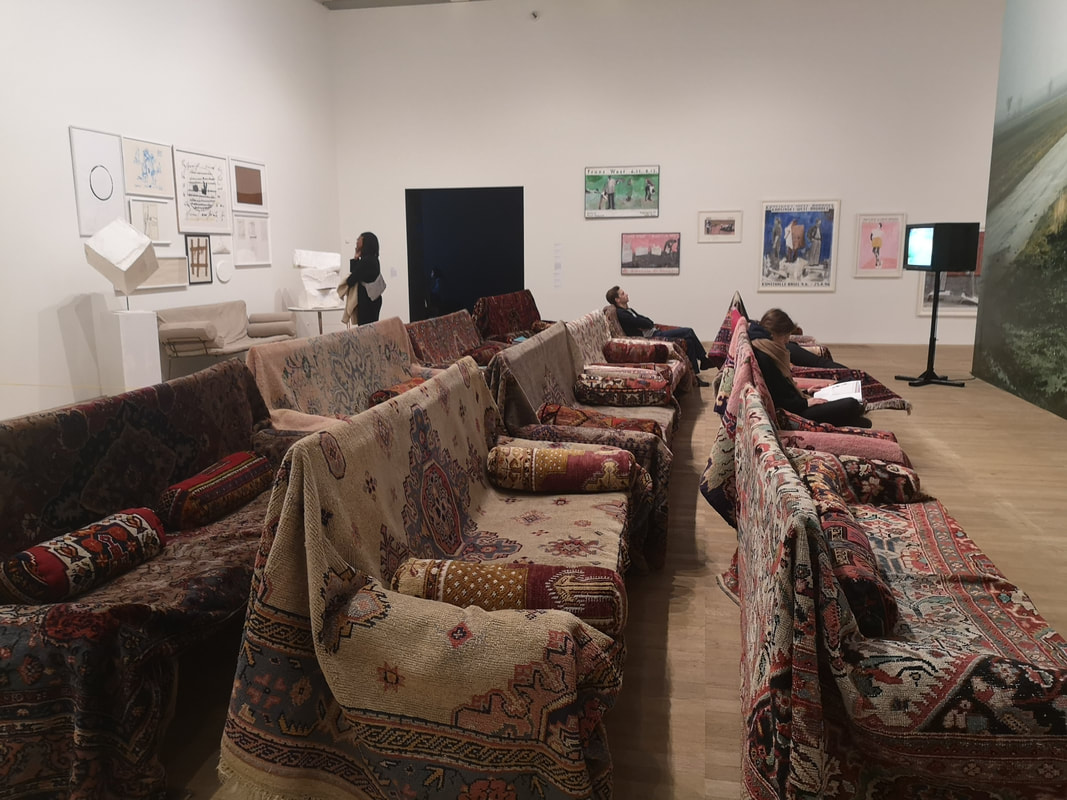
Much of the work on display made me smile but one work, these four enormous plaster heads (above left) actually made me laugh out loud. The curator has worked well here in that you round that concrete like divider you can see behind them, and suddenly there they are, like some Easter Island barber shop quartet. They do seem to be singing. Arranged in the large space in front of them are a series of sofas draped in rugs and bolsters from which you can sit, and regard a very large photo of an egg like object while two tv screens, which flank the egg, play strange and baffling videos at you. West's video art is the weakest of his elements to me, but I have a low tolerance for that particular medium.
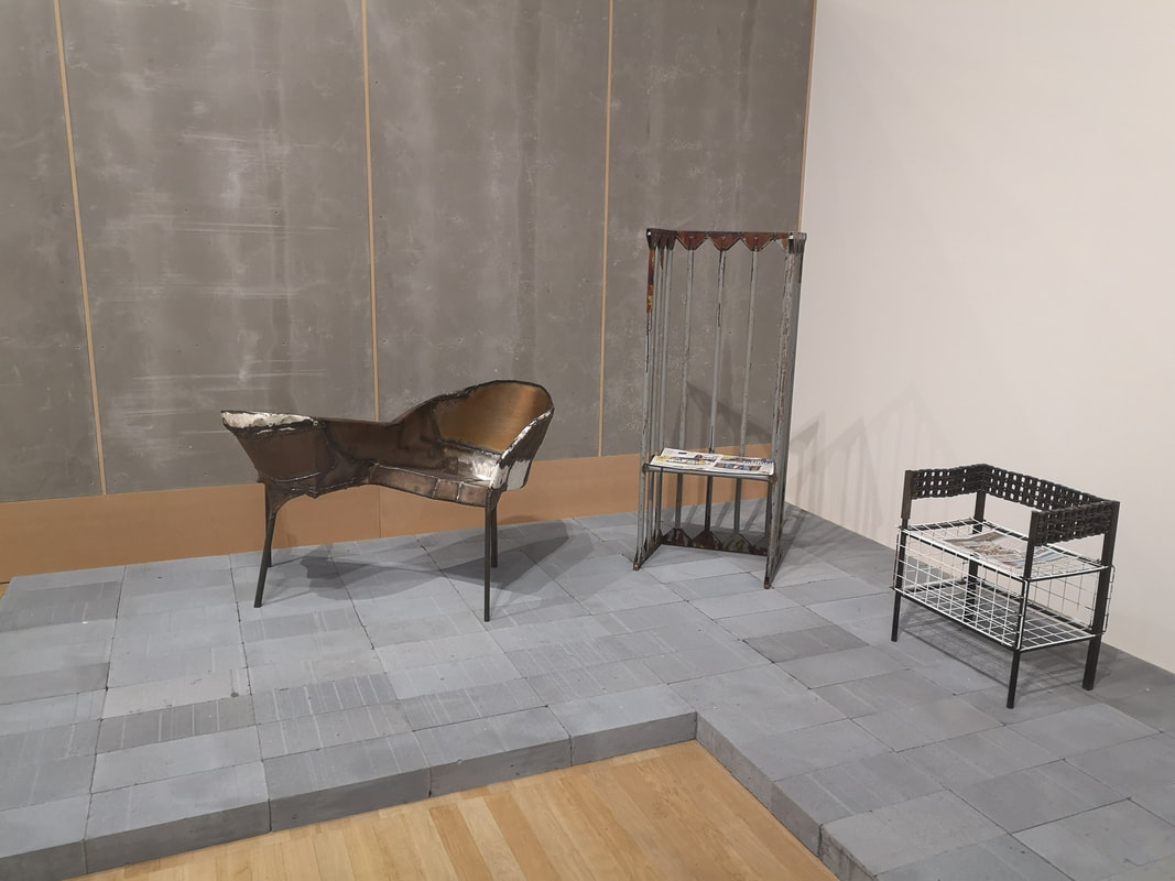
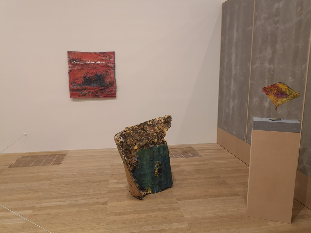
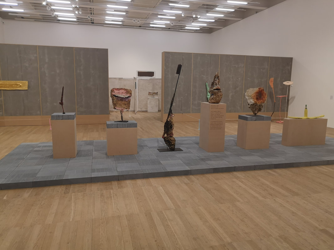
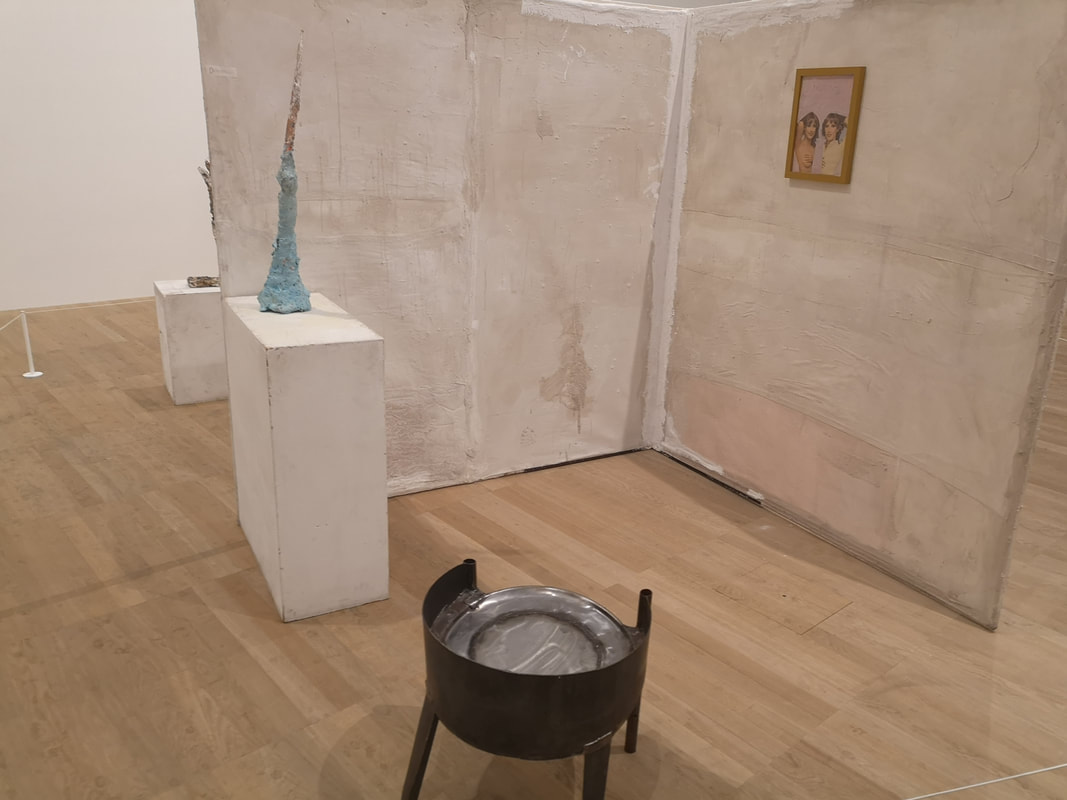
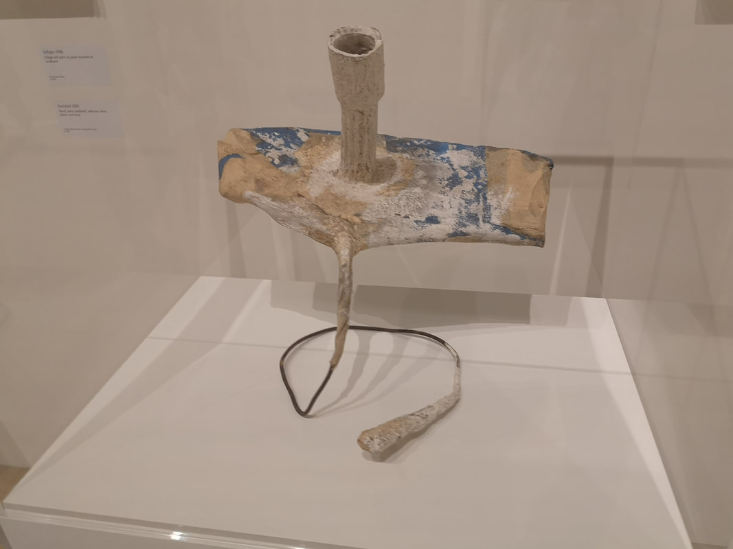
I have mentioned previously the cement textured partitions. The normal white temporary walls have been stripped away so you have quite a large cavernous space, divided up by the cement partitions. They really complement the style of the work, and make more intimate yet open, yet yeti like spaces. Good decision. It also means that like with the heads not everything can be seen from any one point allowing you to stumble on, and discover the various artefacts. Like for example the metal furniture (above left), with the hammered together love seat being a particular favourite. Or these painted lumps of concrete or third eye like pieces of wood (above right).
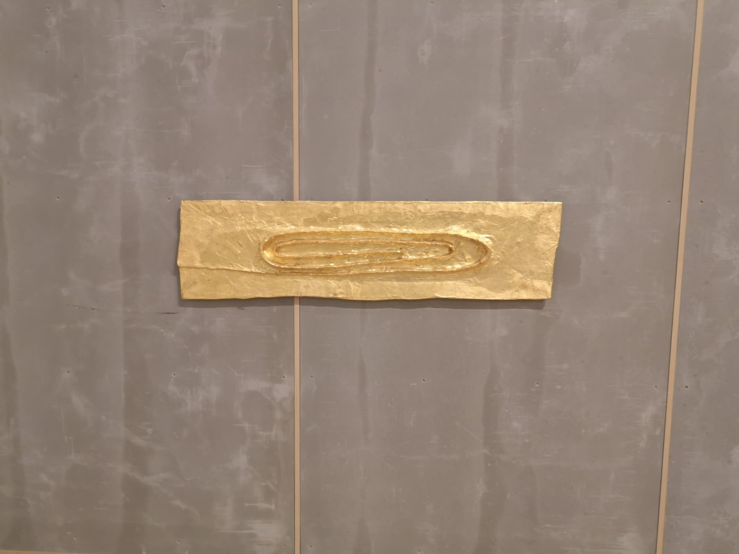
The overwhelming sensation is of fun though, quite well typified by the over-large golden paperclip (above left). Others like the collection of seemingly random collection of assemblage which are one of the main focal points of the show (above right) provoke more mixed emotions of which bafflement is among the most prevalent. What is that? Well I don't think it matters frankly.
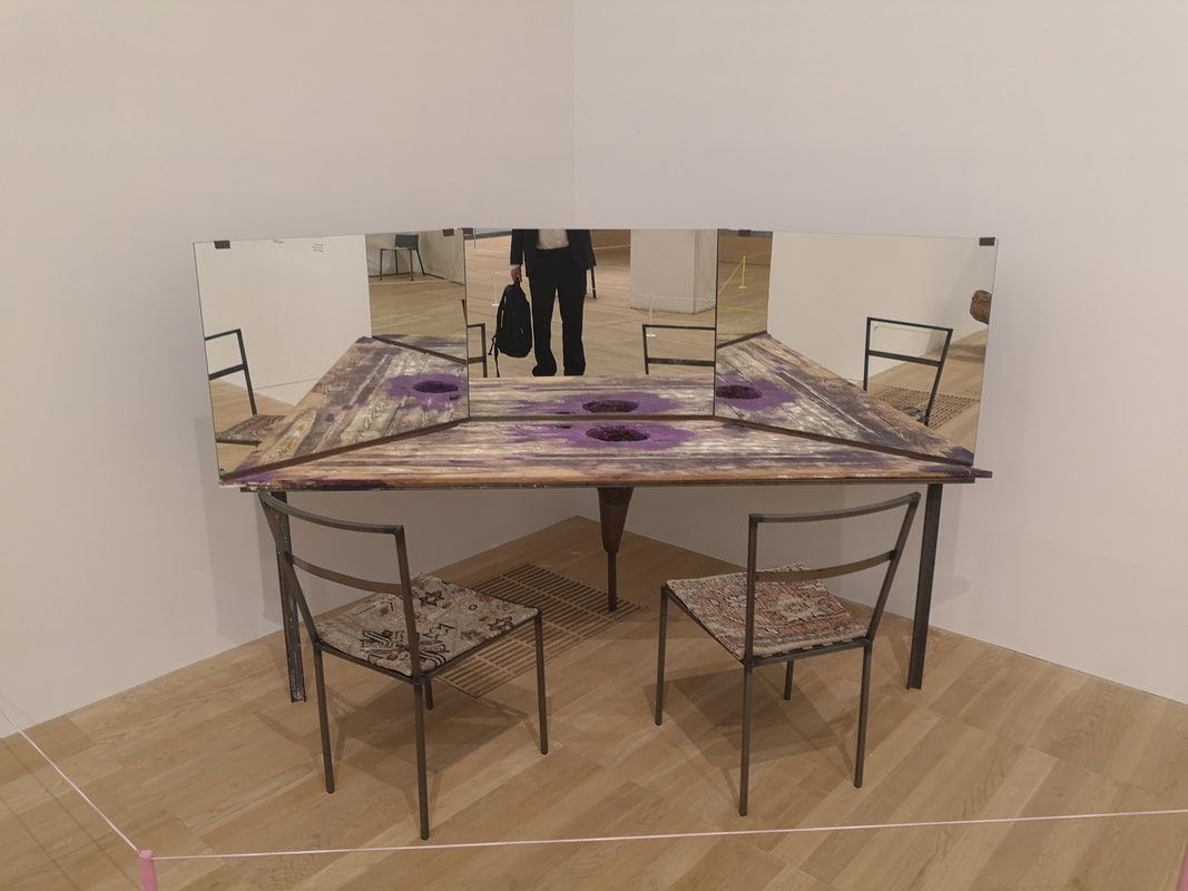
At one end of room is a series, of well they look like cells. Arranged in a quadrant The details are different but the general set up is the same, a chair (of uncertain construction, a sculpture of differing levels of phallicness and an innocuous and incongruous picture (above left). In one corner is what looks like a distressed, ney even alarmed, makeup table (above right). The hole in the middle I think is for your head. This is the great shame of art once it reaches a certain stage of "importance". This pieces was supposed to be used but is now to fragile to be used. I had the same feeling with some of Alexander Calder's immobile mobiles. These thing are made to be used even to destruction. Things have to end. That's my view anyway. 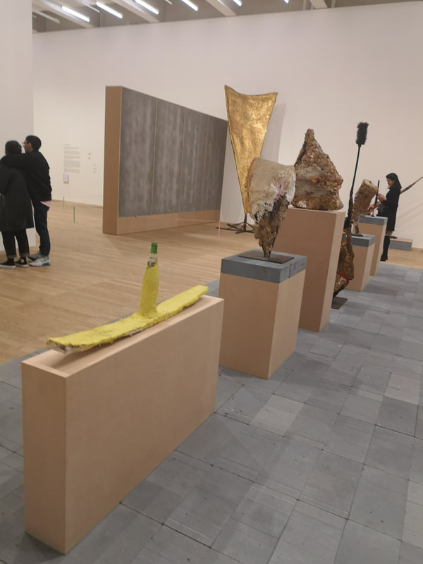 On closer inspection that row of sculptures pictured previously has more of the crusty mineralaty of the other works, or you know, is a banana. I am working backwards through the show. In the corridor on the way in a three what look like changing rooms. The curators have produced copies of some of West's pieces and you can go into these booths and interact with them. I am of course far to British to do so. The faux privacy of it all made it seem shameful and weird, not that I would have done it anyway. I slightly regret that.
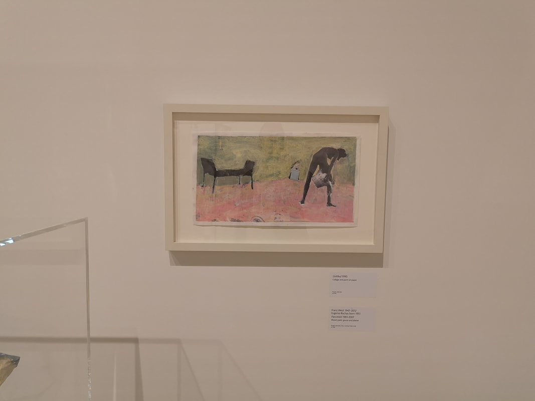
Opposite those booths are a selection of cabinets with the original objects, or if not those then ones very similar to them (above right). You see the beginnings of that graininess, that becomes encrusted in the later sculptures. There are also a number odd paintings, wash textured colours with figures in odd poses. Often pasted over the top (above left)
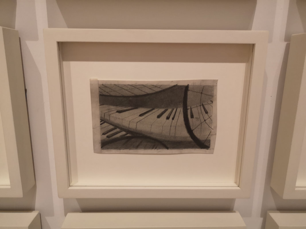
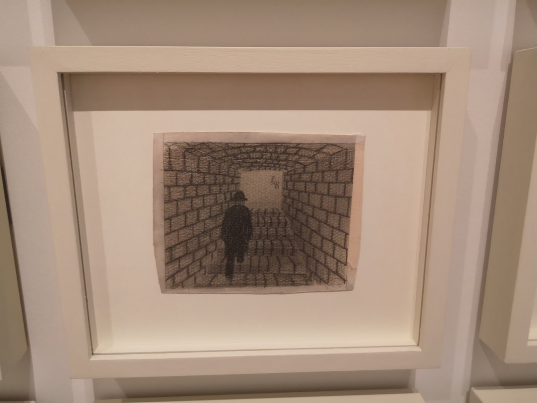
I like these paintings there are some odd things going on, I am still not sure what this guy in this adobe looking surrounding is doing (above left). They also feature the artist and his friends messing about with the odd, organic objects (above right). 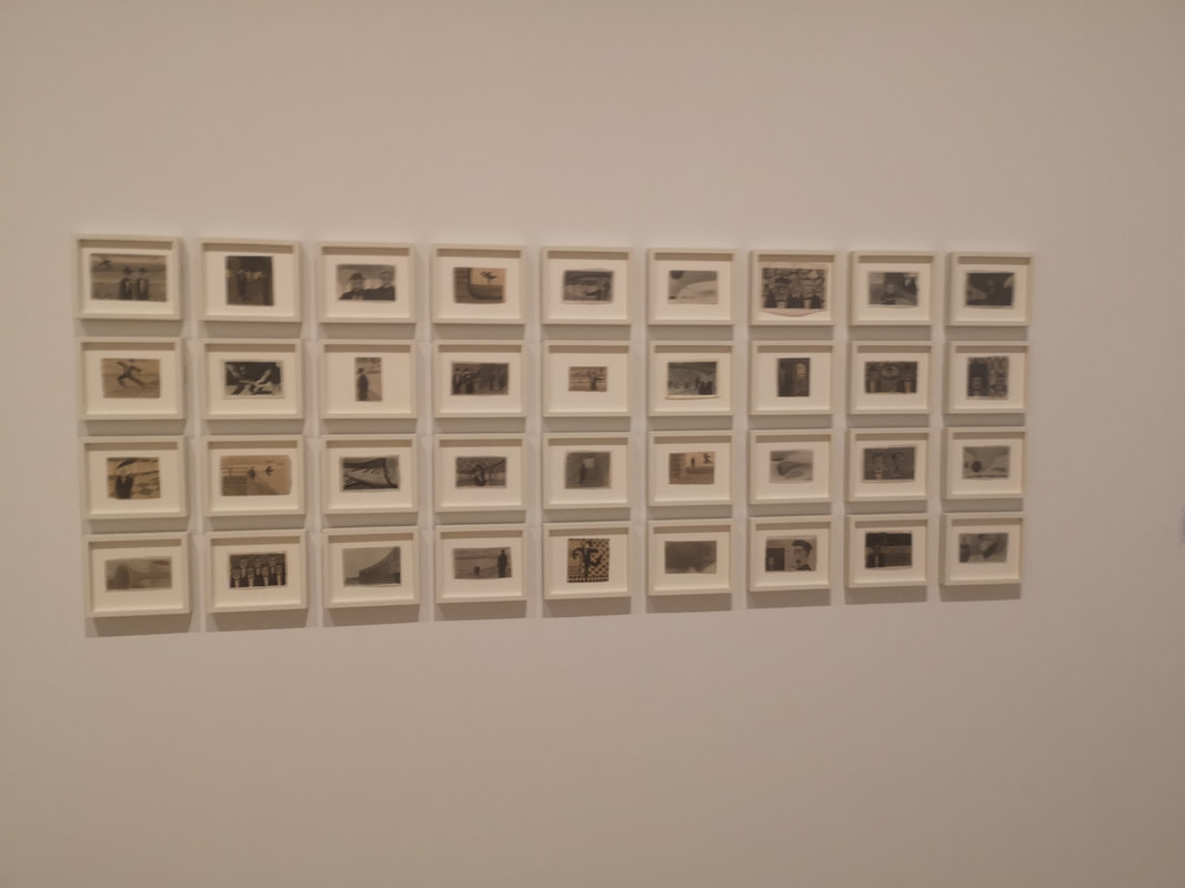 Which leads us right back to the original room. This show starts strong. On the right hand road as you come in is a grid of small charcoal paintings. They are amusing intriguing and even sweet (above).
Some of them are just sweeping shapes like this curved piano keyboard (above left), or lonely figures like this lonely man walking through a brick lined tunnel (above centre), or poignant or silly depending on how you look at it like this figure dancing with the rows (above right). Masterful simplicity.
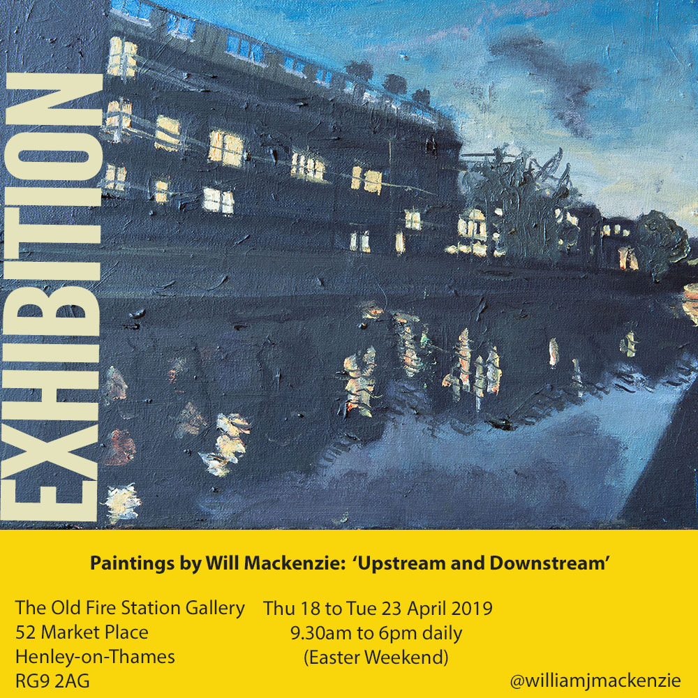
Opposite these are these almost cartoonish drawings either in colour (above left) or black on an orange background (above red). Again you have the absurdist coupled with the sexual. Its a fun show, there is a lot of space there and not many people. You can hang out there quietly and just enjoy yourself. Speaking of enjoying yourself, I have my own small show running over the Easter weekend in Henley-on-Thames. Come along.  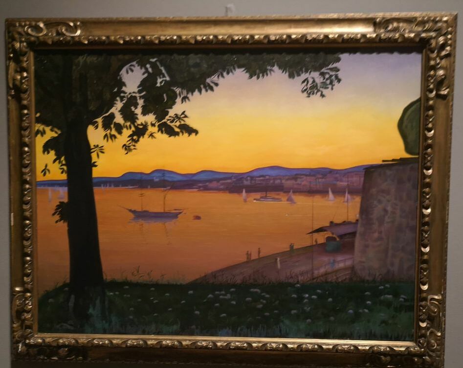 Herald Sohlberg is a new name to me or was until, at the recommendation of colleague, I journeyed down to the Dulwich Picture Gallery to see the exhibition. Sohlberg was a Norwegian painter and although he could was a fair dab hand at the old portrait but landscapes where his specialty, especially landscapes of Norway. This exhibition celebrates his 150th birthday (although he is of course dead) and runs until 2nd June 2019.
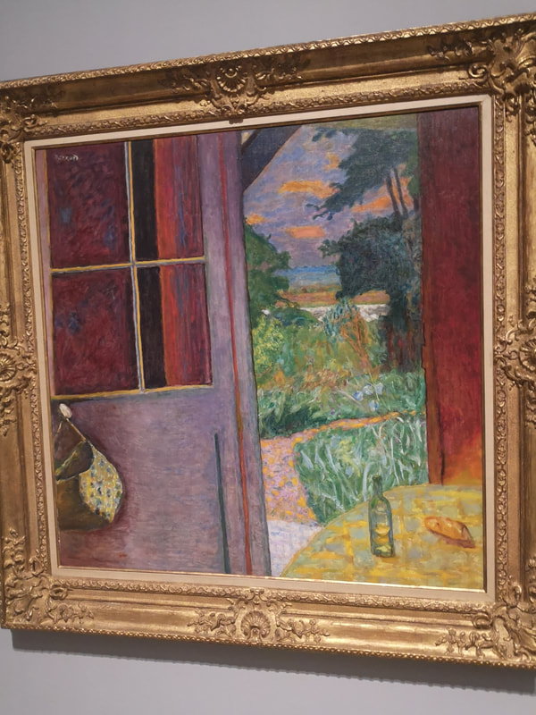
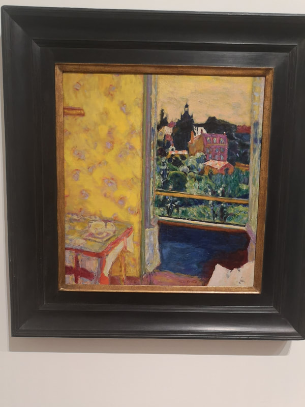
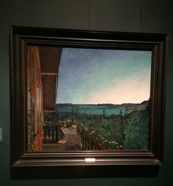
Sohlberg was a contemporary of the impressionists but eschewed France and studied in Germany but there is a definite impressionist feel to his work, but there is more of mystical air to them. Indeed some of them particularly a fine one of a fishermans shack by moonlight remind me strongly of Peter Doig. I wonder if Sohlberg is one of Doig's inspiration. Mind you I like Doig and tend to see him everyone. You get a feel for that in the picture above right, which is a view from his balcony in summer, with that lovely graded sky, contrasted by the flowery fence and the orange of the wood. What is more difficult to see in the photograph (bit not in the original) is the detail of the setting on the table. The contents of the bottles glow with that lovely deep amber that some booze have. Sohlberg here showing, off combining still life and landscape. In some of his work there is a glyph like quality as in the piece above left. The patches of sunshine are reminiscent of dancing shapes, of cave paintings. This it appears is deliberate. It does add something to a painting. I do like his trees do, his tall looming pine trees.
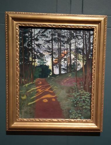
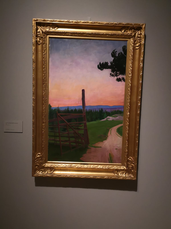
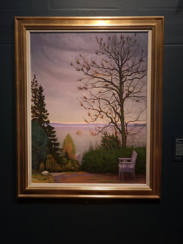
In comparison his rural scenes are much quieter, like the Country Path (above right, it is its name) which leads you off into the distance. There are a number of Country Path's on display of which the best is the largest but you will have to go there to see it and I recommend you do. Here, as in the first picture on the blog you see the development of a Sohlberg painting tick. Green foreground, blue or purple hills and burnished orange sky. If there is water, which usually sits in the middle of the composition this is usually also Orange.
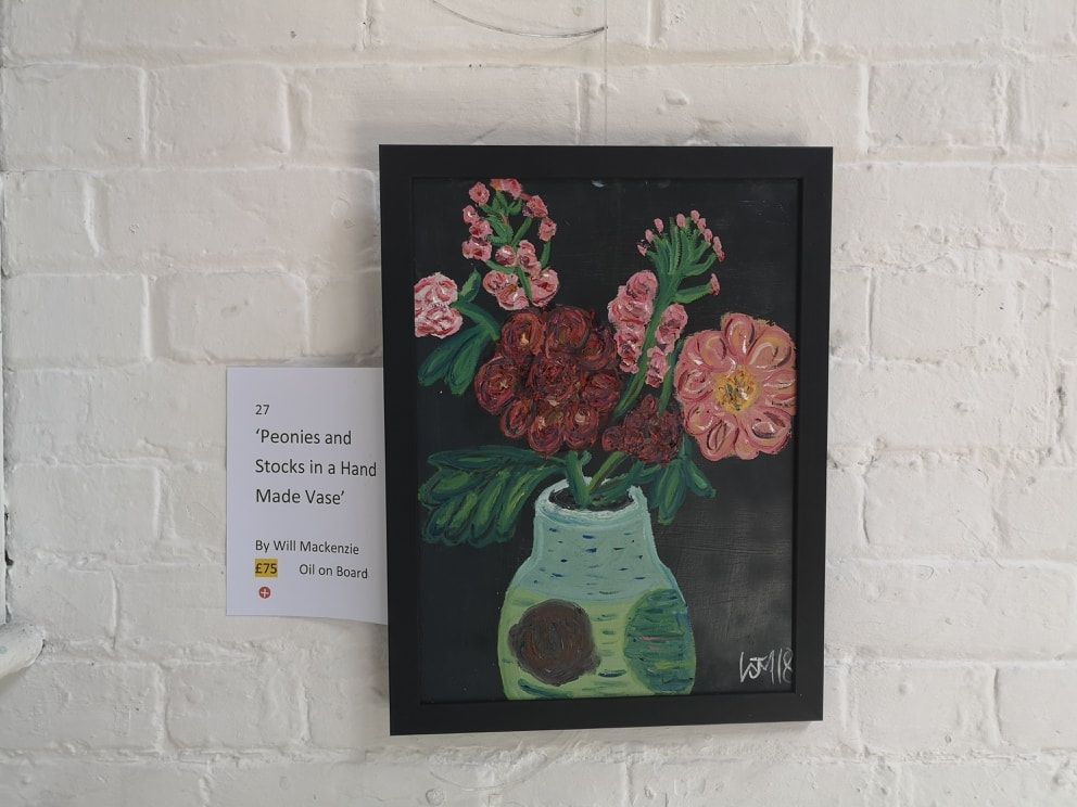
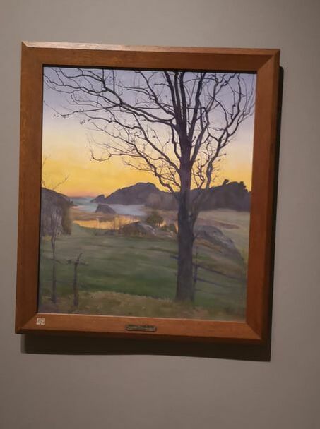
Trees on the right. Trees on the right is another common compositional element and those trees, where they are deciduous trees tend to be bare, the pines and the firs of course keep there leaves. I do like the lack of people though, it give an empty lonely feel to the landscapes which suits the general setting. On the right hand picture the few remaining leaves are made of just wispy brushes of paints. It is very effective technique and one I intend to ruthlessly steal. 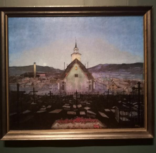 The final room though is a symphony of blue. Large sweeping blue gorgeous blue paintings. One wall dominated by a snowy mountain vista. By far the best painting though, possibly the best painting in the whole show is call the Night and there is an appalling photo that I took does it no just it at all. You have this looming church slap bang in the centre, with soft focus town dwarfed by it, the dark grave yard all set off by the red poppies in the foreground. It is a masterpiece I think and I'm glad and see it. Go and see them before they go back to Norway. After you have seen them, come and see my show. Upstream and Downstream’ at The Old Fire Station Gallery, Henley-on-Thames, 52 Market Pl, Henley-on-Thames RG9 2AG 9.30am to 6pm: Daily from Thursday 18th to Tuesday 23rd April 2019- Easter Weekend to see delights like the painting below.  |
Archives
June 2024
Categories |
 RSS Feed