WJM
  • Gallery
    • Rivers of London
    • Still Life
    • London Landscapes
    • British Landscape
    • Flora and Fauna
    • Past Work
  • Blog
  • About/Contact Me
  • Gallery
    • Rivers of London
    • Still Life
    • London Landscapes
    • British Landscape
    • Flora and Fauna
    • Past Work
  • Blog
  • About/Contact Me
Blog

Craft Face

11/20/2016

0 Comments

 
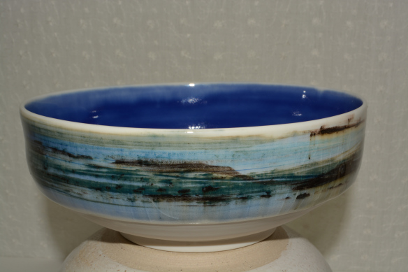
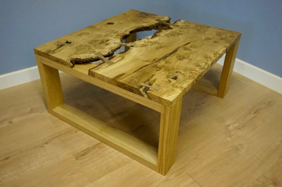
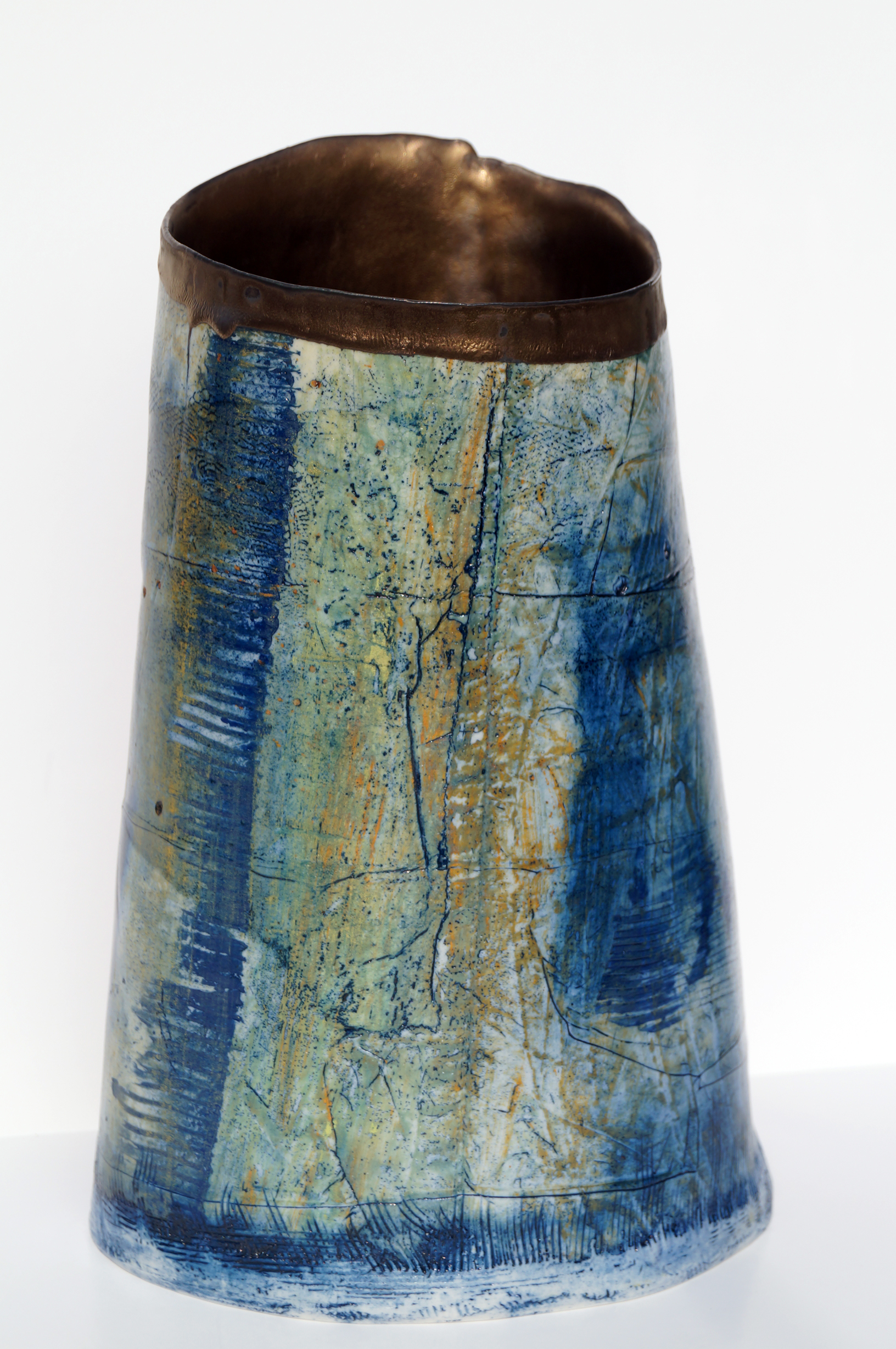
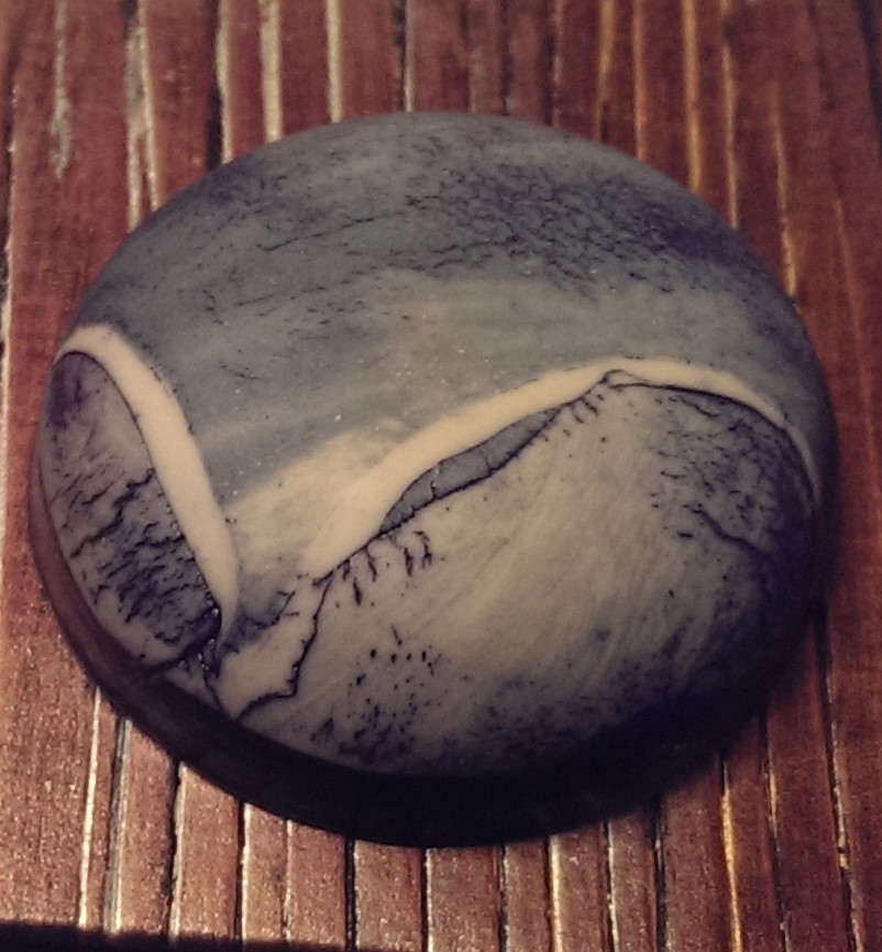
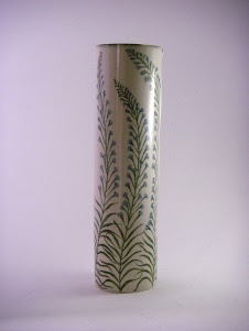
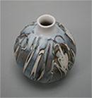
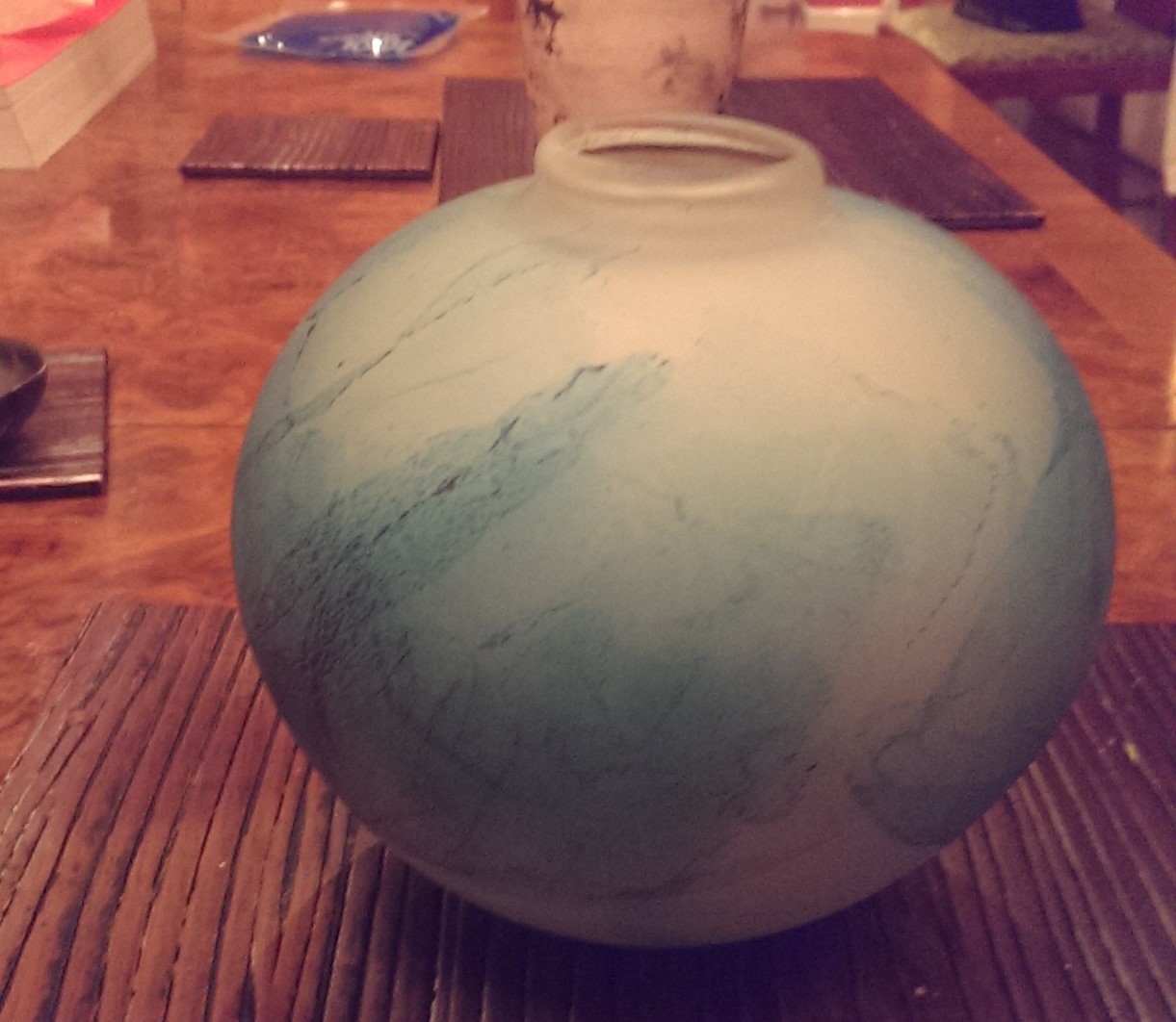
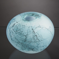
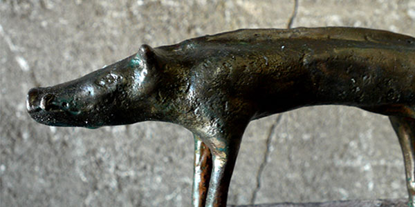
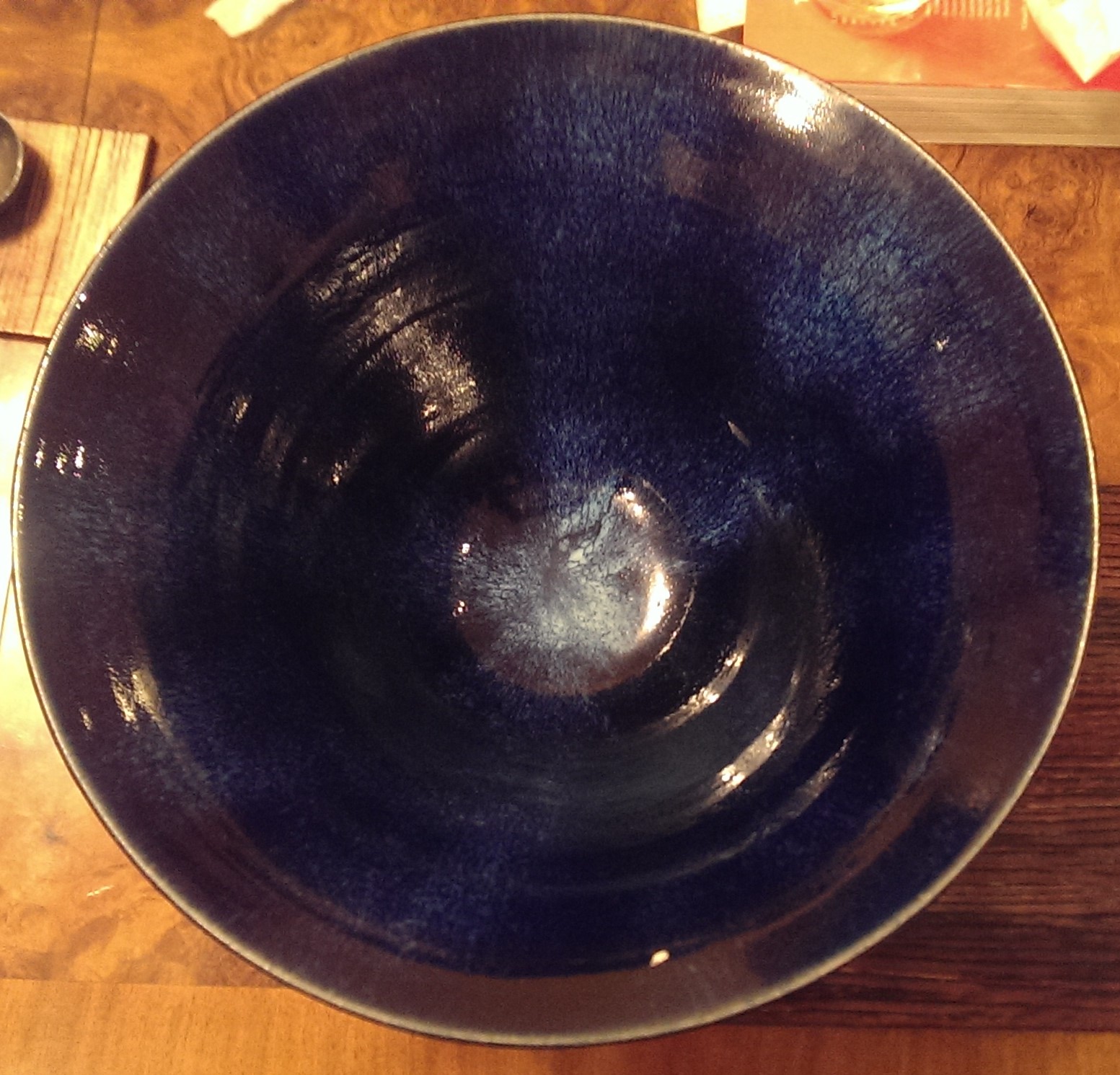
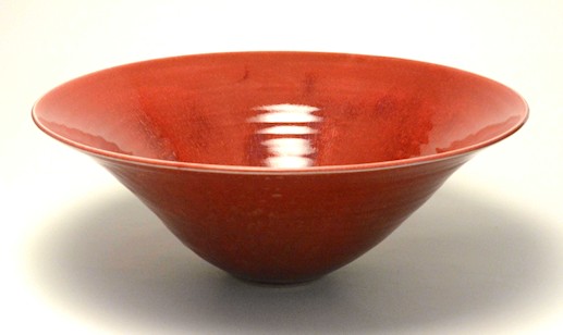
Craft face is the expression you use at craft fairs for displaying to the stall holder when there work is pretty poor.  It is usually accompanied by "thank you" as you work off and is usually reserved for tall willowy girls called Emily whose jewelry has been inspired by Alice in Wonderland. 

Fortunately at this years Handmade in Britain at Chelsea Town hall it hardly had to be deployed (other than in response to hand made hats.  No.  

There was much Jewelry that was good but this year my eye was caught by basically three things,  ceramics,  glass and wood.  These are the people I liked.  
Alison West Ceramics.  The technique is apparently to fire the pottery packed in leaves and foliage. They are burnt away but leaves these beguiling patterns scorched onto the surface of the vessels.  It looks, well it looks very nice. 
The pots have a nice sheen to them them.  Only a lack of funds and space meant I didn't buy one,  instead I contented myself with this cup.  

Picture
Picture
Picture
Chito Kuroda.   Simplicity can be a winning formula.  Classically Japenese in form,  there were a series of pastel shaded ceramic beakers and darker blended vases.   
They have  a nice luster for them and the dark vases are particularly nice.  There was one on display with a gold rim to it which set off the rest of the vase very nicely.   Unfortunately I could not find a picture of this. 
They also have the distinct advantage of being solid usable pieces.  
Emily Cross.  Blue!  At least this one is.  There are also these nice space ship shaped pots, which tend to be white glaze on the bottom and then a ribbon of colours similar in tone to the piece on the right around the top.
She uses, apparently,  sand collected from various beaches around the UK and the pieces are supposed to reflect their origin.  I am not too sure about that but they are nice, particularly the smaller ones which have an attractive delicate quality to them. 
Picture
Picture
J Griffin.  Wooden artefacts and wooden furniture are the name of the game here and the star of the show and the piece they had cunningly laid out to attract people to the store was this incredible coffee table (left).  It is a very pretty, solid looking things and I particularly like the bridges of wood connecting the two halves.  
In a similar style they had hand carved bowls,  boxes and small chest of draws.  The later of these had a very nice motion to them.  The price is a bit deep breath but then, look at it!
Jessica Jordan. The idea driving this is the pieces are basically landscape paintings in pottery forms.  
Its a good idea and its done well. The pottery has a nice organic quality to it.  The surface is more textured than lustorous.  An extra dimension to this is the metalised interior which has differrent textures and subtly different colours to it.  They are pieces that reward re-examination. They are nice to look at turn round.  I took away a small bowl on the right.  
Picture
Picture
Picture
Justine Munson.  The concept of Munson's porcelin is simple, for the most part.  Elegant tall vases, with a flower or plant pattern rising up the outside.  
There is some of her work that differs from this mottif but it is the ones that obey it that are the most effective.  
They are not, I have to say, to my taste.  However I can recognise well executed quality when I see it.  I admire someone who has a developed style that they deliver well and I can see that there is a certain section of the market to whom Munson's work would greatly appeal. 
Katalin Ceramics.  Again ceramics,  in various forms, but all with these flowing dripped motif encrusting the base.  It is apprently inspired by bark.   The raised edges give it a very pleasing tactile quality which is an important, and often underated element of pottery. 
Picture
Picture
Picture
Laura Smith.  Glass ! I am as had been said before a big fan of glass.  My main crticism of Handmade this year is there were only three glass stalls.  
These are excellent though.  A nice light blue quality and the etching on the outside reminds me of maps.  So beguiled was I that I came away with one,  a grey lustored creature that now adornes my bathroom. 
Mallon Foundry.  As with J Griffin above it is nice to see something a little out of the ordinary from the usual run of craft and the bronze sculptures produced by the Mallon Foundry were a delightful change of pace.
The board (pig?) picture right was my favourite but all the peices share this elongated slighlty emaciated aesthetic.  Prices in the thousands though. 
Picture
Picture
Picture
Ned Heywood. Mr Heywood,  a gentle old buffer produces what is described a heritage pottery. 
Basically it is solid, usable, nicely lustered pottery that is both decorative but practical. It is a useful space in the market to be able to occupy succesfully and he does this well.  I came away with this deep blue bowl (far left) that is now home to clemantines. 
This year was then a good show.  You may come away thinking it was mainly ceramics, having read this blog.  There was a large proponderance of ceramics to be sure however there were other things such as jewelery,  textiels,  shoes, interior and fashion excessories.  The above selection is strongly predjudiced by my taste. In past years jewelery has made it onto this blog, but not today.  I shall certainly be going next year.  It is always a good show. 
0 Comments

The Best of the Others

11/13/2016

0 Comments

 
It has been quite some time now but earlier in October I attended the other art fair.  I found it a difficult fair to go round.  It is very bright,  it is very crowded,  it is very nosy,  it has stark white walls.  Much of the art work is indifferent. 

​I do enjoy going though as there are always some people who shine out of the dross.  This year the select few are. 
Picture
Emma Rose.  Emma produces these nice dreamy almost Turneresq landscapes (left).  The work has a nice quite quality.  It doesn't hit you round the head with (for instance) a naked woman with an animal head.  It just quietly draws you in with subtle blending of different colour tones.  

This is good art you can actually live with. 
Charlotte E Dey.   Charlotte says she is an Illustrator.  Quite what the difference between artist and illustrator is has always been something that slightly baffles me but Charlotte is also definitely and artist in my view.

She produces this deceptively simple, quirky surreal landscapes one of my favourites can be seen right.   Her other work is in a similar style, line drawing of strange moss covered sculptures, Esher type geographies and buildings but all of it characteristically her.  

Actually this is something you can say for everyone or at the Other Art Fair is that they all have developed their own characteristic style.  The more successful ones have, in my view something that makes them a little bit more distinctive. 

She also does ceramics,  nice gold edged plates with interesting line illustrations on them.  He drawings are better though. 

Also until now I have always wondered what the point of Tumblr was.   Charlotte's website answers that question.  
Picture
Picture
Caroline Hall.   I am a fan of abstracted landscapes and this is what Caroline does and the picture on the left is a good example.  Thy have a sort of metallic sheen and smoothness to them which in her hands I really quite like.  Some of her work is a great deal more abstract than others but all of it is quite interesting and though provoking. 
Will Teather.  It is not easy to produce paintings in a non traditional format and have it look good.  It can too easily look try hard and over done.  Will Teather manages to avoid this trap.  

The picture on the right is in fact from a globe (or sphere) painted in arcylic, giving you this odd, doorknob like reflection of this seemingly normal but actually quite strange indoor scenes.    

Its an effective strategy and in the crowded art market coming up with a novelty that works is always to be welcome.  He does more classically presented pieces as well but it is the globes that are his forte.  It must take quite some skill to render the picture in the difficult perspectives required for this. 
Picture
Picture
Charlotte Black.  Charlotte Black produces this crusty, organic looking pieces that appear to be closes up of rocks, or strange alien landscapes.  

The one pictured on the left here reminds me of the sea becoming foam and washing up the beach.

The pieces on display at the art fair all had a very adept application of splashes of gold to bring a nice vivid contrast to the whole thing.  It would have been nice to see some of the black pieces in person that you can see on her website. 
Anita Ford.  The work seen on the right is one of her paperworks,  which I think are her best things.  
They are slightly three dimensional in that the layer with the holes in it stands on top of another layer.  Through the holes you can if you look close enough glimpse letters and words.  

The simplicity of the black and white married with the complexity of the covering design makes for a cohesive whole.  There is a solidity here which is appealing.  I actually managed to speak to the artist herself.  She explained that the pieces reflected her own struggles with going deaf.  

As we all art once you know this it changes your perception of the piece and I can see how the idea works and she has presented it well.  However it also works on its own without this context.  

Sitting on its own it is an attractive and mysterious piece.   She also does black and white drawings which are similar in style and have many of the same qualities but the paperworks are superior.  Again a good use of novelty. 
Picture
Picture
I have saved my favourite to last,  Sophie Zhang.  Sophie has made the basic error of not having a website.  She also presented me with a postcard, while having a nice version of one of her pieces on it has no contact details on it at all.  

This is a basic error yet someone makes it every year.  I don't understand why you would go to the effort of going to the art fair but not have a website.  Some of the sale and interest has got to come from people after the event. 

Anyway, her art is good.  She produces these lose slightly abstracted pictures.  I couldn't find a photo of my favourite of her's which is called Fish in Light Red and Blue but you can see from the picture to the left the style.   

Done in oil they are lose strong marks over and blending with the background.  They are (and you will have to trust me on this) something that looks much better than it photographs.  There is a playful energy about her work (contrasting with her shy in person demeanor).  She may be someone to watch, but then without anyway to go to find out where she will be exhibiting this may prove difficult to do. 
The above are not everyone I like.  They are everyone I like whose websites (or elsewhere) would consent to provide me with photos of their work that are compatible with this blog.  There are two more artists whose defense of their IP is more rigorous and prevents such activities.  They are:

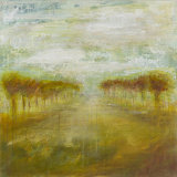
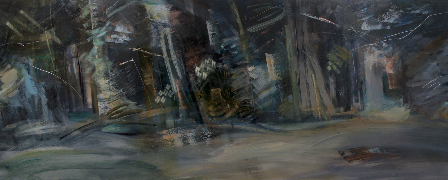
Olivier Leger:  Oliver makes this very detailed drawings of animals, such as Orcas.  They are incredibly complex and on close inspection the whole is made up of a series of smaller intricate drawings such as water spouts, fish, giraffes etc.  There is a lot of skill on display here.  His pitch was good, a massive Orca original drawing you in and more reasonably priced prints to actually sell. 

Corinne Natel;  Lovely, splashy, organic colourful paintings.  They are like different waves of colour crashing into each other,  or attractive plumes of oil mixing.  Very pretty things.  

That's it folks.  
0 Comments

Paul Nash

11/6/2016

0 Comments

 
Britain has a long tradition of war artists, producing bombastic heroic pro-British propaganda.  What makes Paul Nash different, and his contemporaries,  is he was a war artist painting a war he was actually fighting, in his case the first world war.  This understandably gives his paintings a very different and more interesting feel.  He is currently on display at Tate Britain until 5th March 2017.  The images below are from the Tate Website. 

Picture
Picture
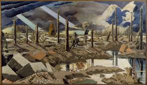
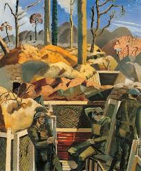
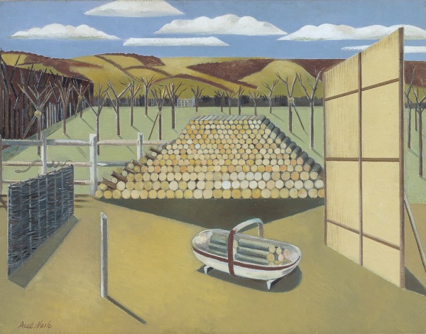
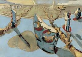
Desolation mud and death. There is nothing glorious about the warfare depicted here.  There is a particularly powerful sketch (a copy of which I could not find) showing skeletal soldiers dead on the battlefield.  Dominating this portion of the exhibition is a very large picture called the Menin Road (top left).  The blocky nature and the strong lines.  I particularly like the one the right which is called Spring in the Trenches.  The contrast between some of the bright colours and the desolation and the bored soldiers. 
Picture
Picture
Picture
Picture
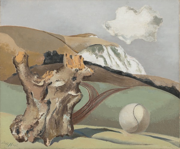
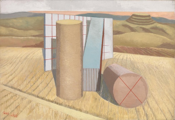
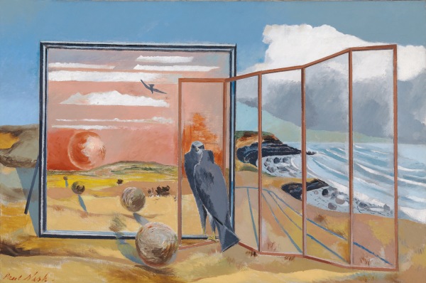
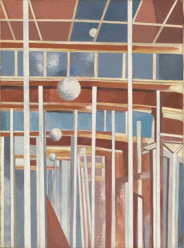
 I like painting landscapes with incongruous things in them.  I was therefore immediately attracted to Nash's post war stuff,  odd piles of wood, blocky landscapes and enormous tennis balls next to ominous blocks of wood. Mushroom like edificies.  Great stuff.  During this period he was the founder member of Unit 1 which included illustrious people such as Barbara Hepworth,  Henry Moore and others of a similar ilk.  In one of the rooms is a smattering of their work. My favourite of them who was new to me was Eileer Agar who produces abstracted landscape. 
Picture
Picture
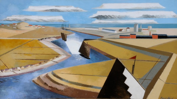
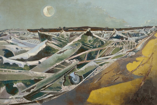
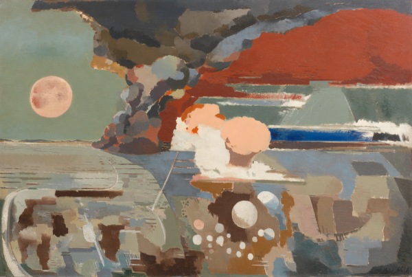
Then the 2nd world war intervenes.  This produces an interesting circularity in Nash's career in that he now becomes an official war artist,  now no longer serving and firmly part of the establishments.  One of the best things he produces from this period is a series of watercolours of crashed German planes and the stunning image of this graveyard of German bombers, deliberately abstracted to make them look like the sea.   I am less sure about the abstract depiction of the Battle of Germany (above right). 
Picture
Picture
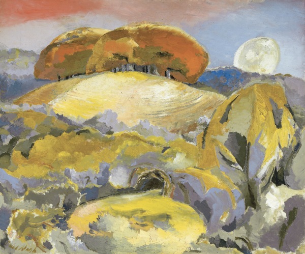
One of my other interests is archaeology and especially stone circles.  I was therefore delighted to find Nash has a similar interest producing a number of works on this theme.  The above right is called Equivalents for the Megaliths. This nicely combines the two themes of odd things in landscapes.  Above right is a version of Avesbury circle.  I quite like how he has depicted the stones. 
Picture
Picture
Picture
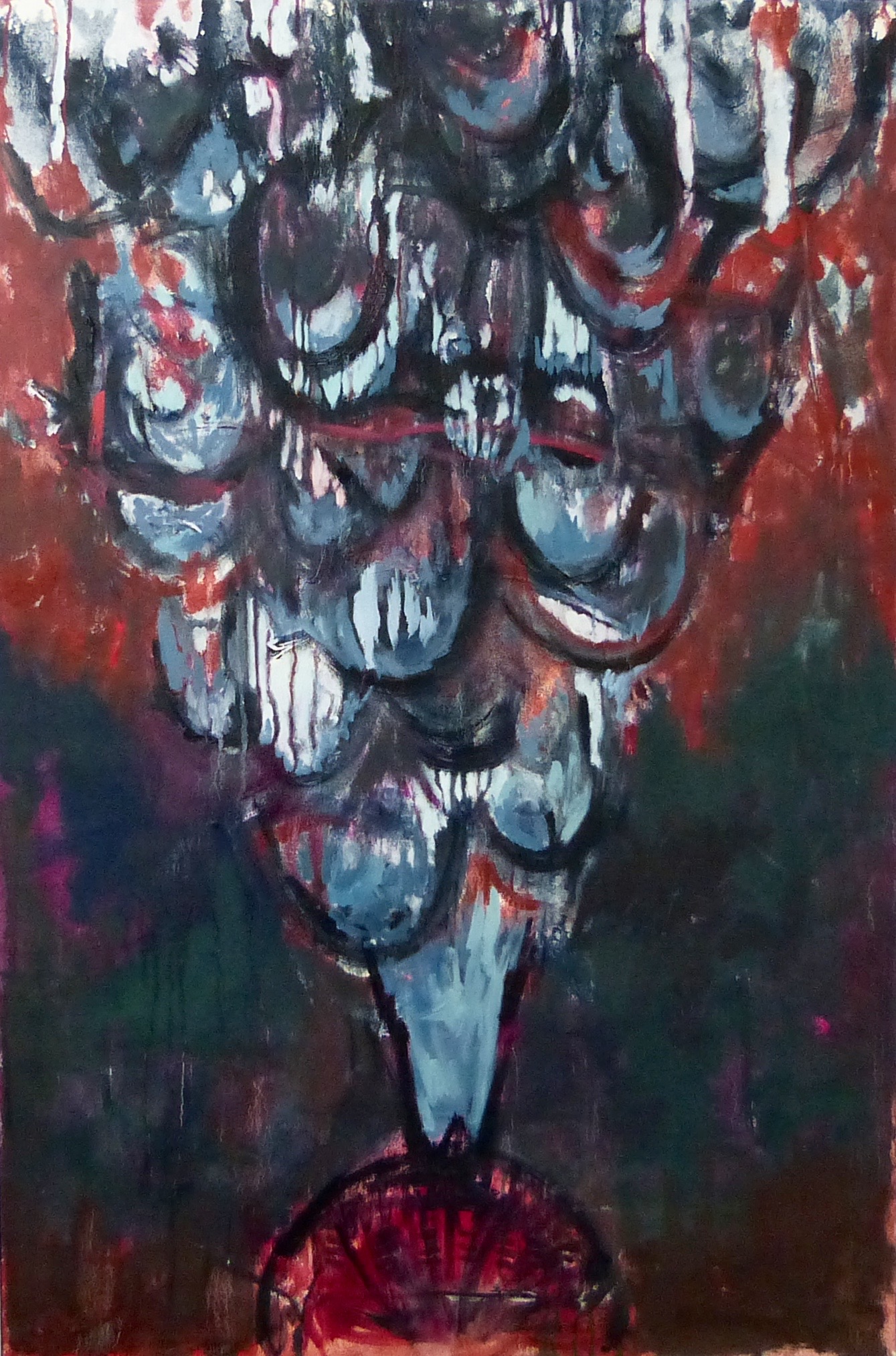
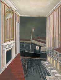
Nash developed into surrealism of which three are shown above.  My favourite of these is the top left of these.  In fact this was my favourite piece in the entire show.  It is called Harbour and Room.  I stared at it for quite some time.  I have to say it delighted me.  I like the concept of the Harbour inside a room. The ship intruding through the wall. It reminds me I think of the excellent book Weatherworks.  The strange changes in scale,  the reflection of the wallpaper in the mirror.  Smoothly quite thickly applied paint and the pastel-ish palette complete this composition. 
Picture
Picture
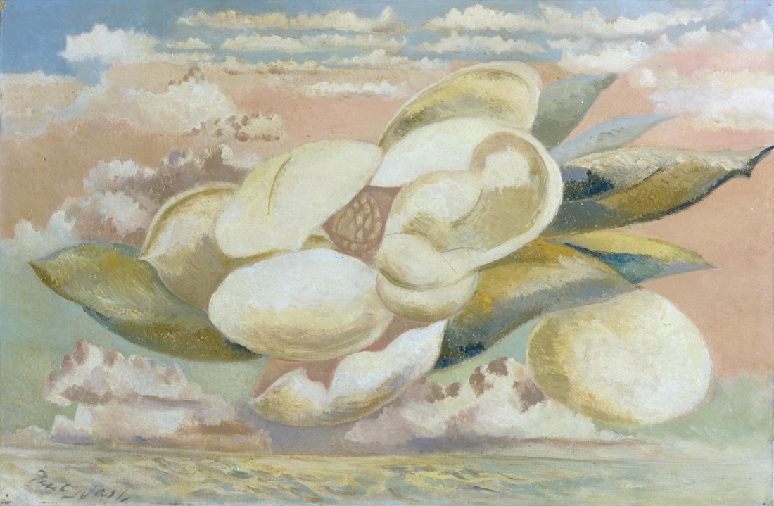
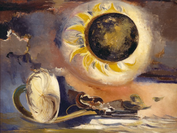
This surrealism continues and particular favourites were the Flight of the Magnolia, like a strange alien eruption flying over the sea.  There is also a pair of pictures of which the Eclipse of the Sunflower.  Black and gold is always good.  

Sorry for the slightly incoherent ramblings.  It is a good show though.  I enjoyed it.  I found it very inspiring.  
0 Comments

The Turner Prize 2016

11/6/2016

0 Comments

 
I went to see the Turner Prize exhibition for the first time in 2014 and it was shit.  I mean boringly poor.  Last year it wasn't in London (Liverpool maybe) and those architects won.  I had no intention of going this year but a friend of mine wanted to go and hey why not.  He was late so I went to see Paul Nash (more of that next week).  

If you never been then the Turner Prize exhibition is of the four artists nominated for the prize.  It is on show at Tate Britain The prize itself is given out on 5th December.  It is quite a small show, only four rooms and they charge you £12, which is too much.  If it wasn't the Turner Prize it wouldn't cost this much.  Fortunately due to the magic of the art pass, for me it is half price. 

The entry requirements are you have be an artist living or working in Britain, under 50 (why 50?) and have exhibited somewhere in the world in the last year.  Presumably then anything Tim Peake drew on the ISS station would not qualify.   From this list four people are eventually chosen and this year they are Helen Marten,  Anthea Hamilton, Josephine Pryde and Michael Dean.  This year it was actually good.  Pictures below are from the Tate Britain website. 
Picture
Picture
Picture
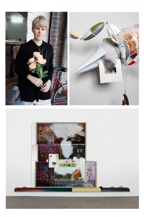
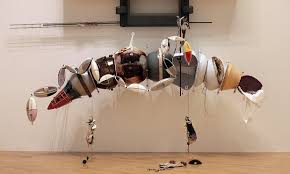
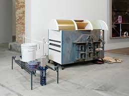
 The reason I think it is good is Helen Marten, who I will predict will win (see above).  She is the first artist you encounter when you walk through the door and sets the bar high.  None of the others clear it.  The pictures don't do it justice. 

What you encounter are these strange motionless machines.  You stand there and try and work out what it is. This apparently is the point. She is apparently encouraging us to become archaeologists.  This is a very nice idea.  You stare at these strange machines surrounded by these odd ephemera like fish skins.   That machine you see above right has a dolls house type construction on the front.  I like archaeology anyway and this idea really appealed to me.  A good idea done well.  I have no compunction in awarding Marten the Will Mackenzie Turner Prize nominee who really should win award of 2016. 
Picture
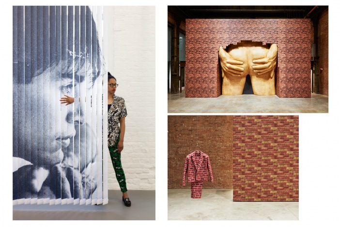
Anthea Hamilton created the image from the Turner Prize you are most likely to have seen, the enormous bottom (you can see it above).  Its a striking creation it has to be said.  More amusing than anything else.  You can take pictures of your self under the bum crack.  After a few seconds you think its just a bum.  More interesting where these small sculptures of boots with various things attached to them.  
The installation was split into two.  One half was the brick you see above and the other part was a sky and cloud-scape with underpants made of different material (metal mainly) hanging from a line.  They didn't really work and the whole didn't really hang together.  
Picture
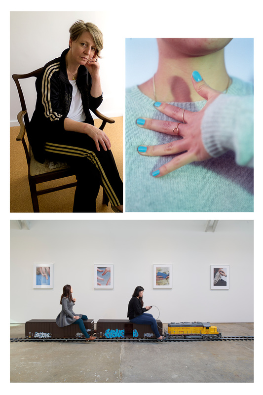
The real train was red and a bit more substantial in the actual show.  Basically there is a train track with a large toy train on it.  On one side are planks of wood dyed with different shapes and the other wall photographs of closeups of nail painted hands doing different things.   Also the train in the Turner prize exhibition doesn't seem to have controls or allow you to drive it. 

I didn't really get it.  I didn't really see how it tied all together and found all the individual elements just a bit dull, apart from the train.  
Picture
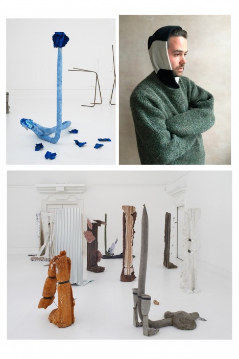
Why do you have that fucking stupid scarf around your head Michael Dean?  It makes me think less of you.    Michael Dean is the final room in the exhibition.  Having seen the scarf the blurb didn't improve my view of Dean.  I have the feeling he takes himself very seriously.  There are sculptures in a variety of different media and they are apparently abstractions of words.  There was also a pile of 1p coins.  What he did was get enough 1ps to add up to the poverty line,  and then took away 1p so it was just under.  The whole thing is set up like a construction site. 

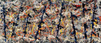
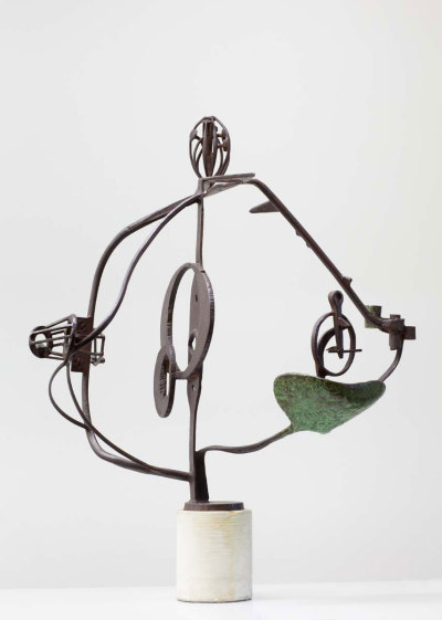
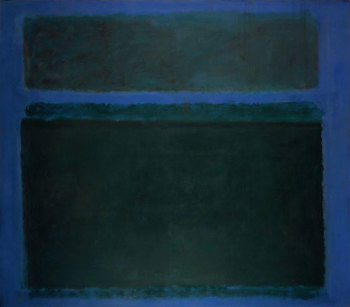
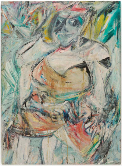
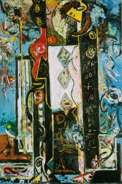
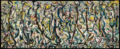
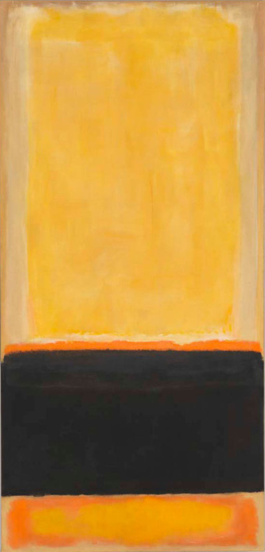
I was skeptical at first but I have to say it grew on me.  The pile of coins with their different patina was an effective thing.  Also you could wander round and in among the sculptures. Some of them have eye holes and of course if you put eye holes in things people are going to peer through them.  I have to say it worked.  Grew on me.  The exhibition started on a high and finished on a almost a high.  

Its between Marten and Dean.  I tip Marten.  As to if you should go and see it?  No don't bother.  If however Helen Marten is exhibiting near you,  go and see her.   
0 Comments

Abstract Expressionism

11/3/2016

0 Comments

 
There is a monstrous show on at the RA at the moment.  It is on until January and is called Abstract Expressionism.  Monstrous in that there are some big names,  monstrous in that there is a large number of paintings to see and monstrous in that many of the works on display are very big.  All images in this blog are from the RA web page. 

It is well worth seeing.  It is a very bombastic exhibition.  Lots of male ego on display, big paintings and lots of paint.  There are a few women artists there but it is dominated by the names you are familiar with, Rothko (top right), Pollock(top left - the famous Blue Poles, de Koonig (bottom right) and the sculptor David Smith (bottom left).  In addition some less well known and to me new names.  
Picture
Picture
The exhibition stretches over 12 rooms.  The same 12 rooms that hold the summer exhibition (told you it was monstrous).   One of the benefits  of these exhibitions is seeing people you didn't know, and unknown styles from those you do.   I won't do a review of everything in the exhibition.  It would be a little tedious and far to long,  instead I will set out those things that particularly interested me. 
Picture
Picture
Picture
Picture
Picture
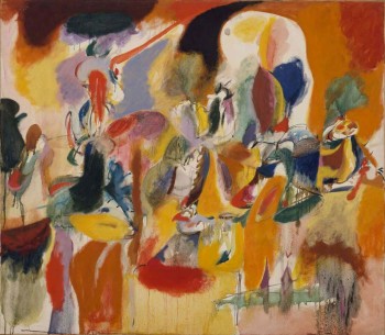
The first room contained peoples early work.  There you can early Pollocks like the one above left.  I really like this.  I like the colours and the shapes.  It is very different from his classic work.  More familiar in style to my favourite of his the enourmous Mural (above  bottom right).  The picture maybe tiny but it is massive.  I like the more organic lines to it and the swirling shapes.  Like many of the pictures in the exhibition you have to stand a long way back to appreciate it.    

The second room was entirely dedicate to someone new to me, Arshile Gorky.  Large paintings, riots of colour with shapes emerging and disappearing again out of the colour. 
Picture
The paintings on display are mainly men.  By no means all though.  There was of course Lee Krasner (above).  However a new discovery and apologies for the appalling photograph was Helen Frankenthaler's Europa (right).  I had never heard of Frankenthaler before but she achieves very interesting things but thin washes of paint sent accross the canvas.  This is true of all the paintings here but especially this one it is much better in the original.  There is a lot going on here but the wash effect has creates a strange stillness to it.  
Picture
Picture
Picture
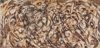
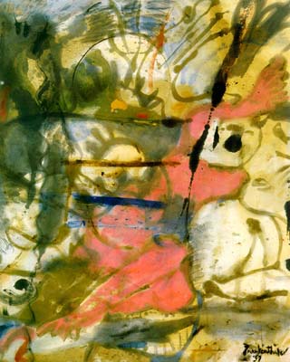
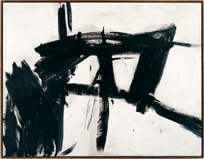
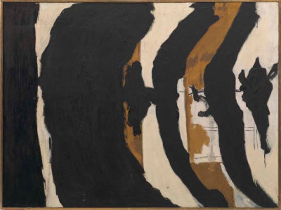
The Violent Mark was the title of the room the contained the above two, Franz Kline (left) and Robert Motherwell (right).  It is a good title because they have a great deal of energy to them. There were a number of Kline's work on display, in this room and others.  I had heard of him before, seen images even but they really appealed to me in person.  They reminded me of calligraphy which I also like.  Simple energetic dark marks on the canvas.  I found them most buigling.  Of all the works in the exhibition if I can own one, it would something by Franz Kline.  Motherell is more stately, more oozing. 
Picture
Picture
There was a room of Rothko's (like the one left which is one of my favourite) all emanating menace and a strange energy.  Rothko I think more than any other artists benefits from being displayed with other Rothko's.  The different compositions play off each other and contrast each other.   They were very well displayed (in fact it has to be said this was a superbly well curated exhibition) in a central hexagonal room.

Coming off it was a large room with very large paintings on the wall.  They were by a man called Clyfford Still.  Who you say?  So did I.  I like him now though.  Enormous simple canvases,  deceptively simple.  They struck a chord with me somehow.  I can't quite say why but I found myself grinning in that room and kept going back in to have another look.    
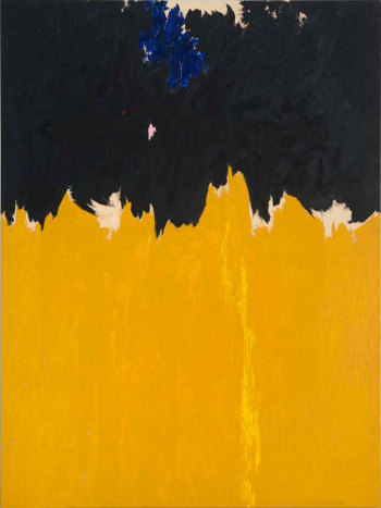
These are just some of the highlights.  There were other paintings that really struck home.  Adolph Gottlieb's Penumbra, Sam Francis' Summer No.2, Norman Lewis Metropolitan Crowd and everything by  the disturbingly serious Ad Reinhardt and Barnett Newman's large blocks of colour (see below).  There were some things I decidedly didn't like,  everything by Phillip Guston for example. Despite this go and see them.  You will not be disappointed.  I came away with much to think about. 
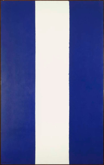
Picture
0 Comments

    William John Mackenzie

    I am an artist with a  specialism in landscapes and still life.  My contact details are here. 

    Archives

    October 2020
    May 2020
    April 2020
    January 2020
    December 2019
    November 2019
    October 2019
    September 2019
    August 2019
    July 2019
    June 2019
    May 2019
    April 2019
    March 2019
    February 2019
    January 2019
    December 2018
    November 2018
    October 2018
    September 2018
    August 2018
    July 2018
    June 2018
    May 2018
    April 2018
    March 2018
    February 2018
    January 2018
    December 2017
    November 2017
    October 2017
    September 2017
    August 2017
    July 2017
    June 2017
    May 2017
    April 2017
    March 2017
    February 2017
    January 2017
    December 2016
    November 2016
    October 2016
    September 2016
    August 2016
    July 2016
    June 2016
    May 2016
    April 2016
    March 2016
    February 2016
    January 2016
    December 2015
    November 2015
    October 2015
    September 2015
    August 2015
    July 2015
    June 2015

    Categories

    All

    RSS Feed

Proudly powered by Weebly