|
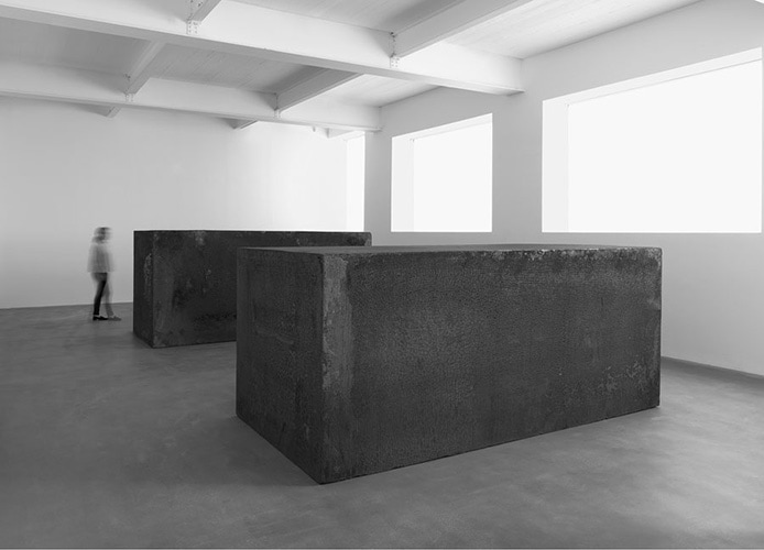
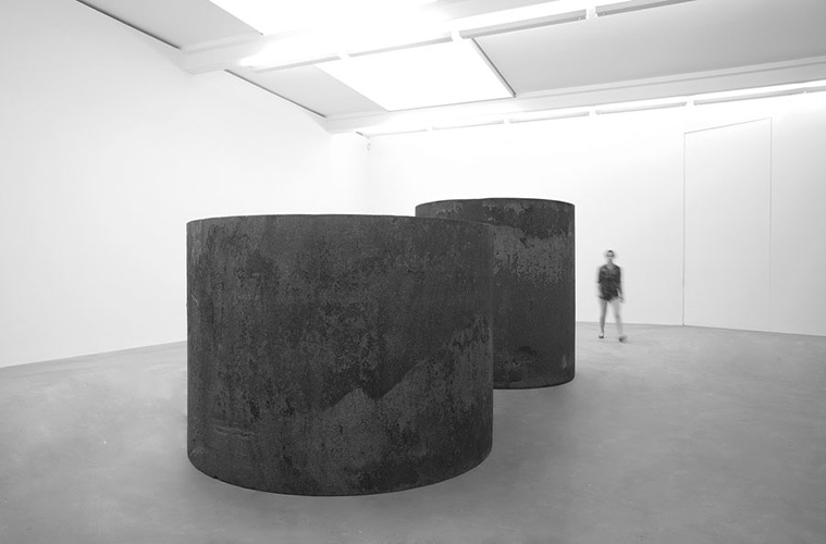
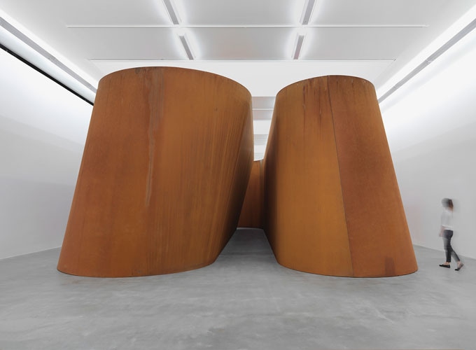
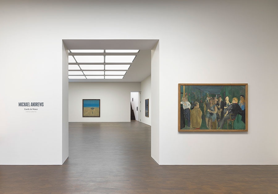
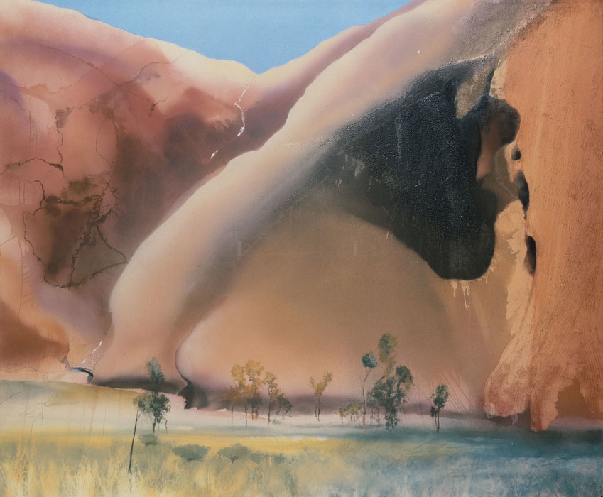
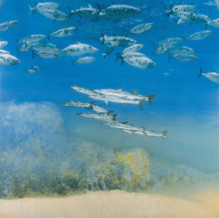
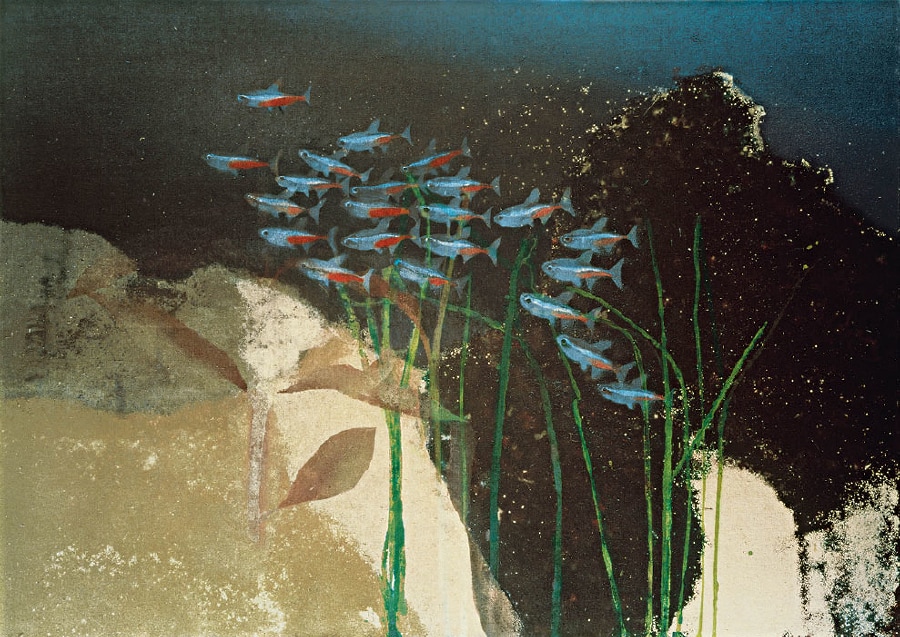
There are two Gagosian galleries in London. One in Kings Cross and a newer one in Mayfair. I have been to the Kings Cross one several times (seeing excellent things there including Henry Moore, Rachel Whiteread and Anthony Caro). I have also been to one of the branches in New York where I saw quite a poor exhibition of Bob Dylan’s art (stick to music Bob). The Mayfair branch is relatively new and until recently I had not been there. However there are two exhibitions I wanted to too see, Richard Serra at Gagosian KX (as I have decided to designate it) and Michael Andrews at Gagosian Mayfair. Richard Serra is an artist, well an artist I had not heard of until I wondered into the gallery having 45 minutes to kill before meeting a friend for lunch. Massive steel and steel like structures are his things. There were only actually 5 pieces on display but the Gagosian KX is a good space to display them in. It is large, quite and well lit. It gives these pieces a reverential air and makes it easy to wander round them all meditative from which I think they greatly benefit. How to describe them. One room was two large rectangular steel blocks, about chest height and 8 foot long. Mainly grey they have a subtly textured surface, mottled in flaky red (all photos are from the Gagosian website). Similarly textured are, in a different room, two circular steel pieces. One is larger than the other, the smaller of which you just see the top if you stand on tip toes. I figure of eighted around them feeling strangely wistful. In the centre room is a large brown structure. It looks metal but is not, is some kind of cork. It makes a sort of diagonal arch that you can work through in an S shape. The texture of the structure subtly changes as you go. Michael Andrewshttps://en.wikipedia.org/wiki/Michael_Andrews_(artist) (now deceased) is very different. Oil painting was his thing. He was a contemporary of Lucien Freud and Francis Bacon. Gagosian Mayfair is located in a back square off Berkley Square. It is an impressive place, consisting of 6 different rooms. All of it was given over to Michael Andrews. I had been recommended to go here by Hugh Mendes and before this recommendation I confess I had never heard of Michael Andrews either. Mainly figurative oilpaintings are his thing. You are greeted when you arrive by an L shaped painting called the Colony room (I think). It looks rubbish from the door but when you see it again leaving the gallery it looks much better. The works can then be divided into two types. His landscapes (which on the whole I liked) and those featuring people (which on the whole I did not). There were two groups within the collection I found the most appealing. Near the beginning is a room of paintings of Uluru (Aires rock). Particularly the first of these was very good. He has a good soft focus style and creates this sort of coppery like wash, I suspect using turps, the is effective. The first was the best because it had a good use of colour contrast. I tried to see how he had done the paintings but could not detect any brush strokes. The other group was fish portraits. Using a green and blue version of the coppery wash and the soft focus he created a very good sense of being underwater and the fish were very well rendered with flashes of iridescent. All of these are quite large, the smallest probably being about a meter square. Actually the pieces I enjoyed most were small versions, probably studies, of the other pieces and were displayed in the fish room. I found this more intimate and relatable. There are others, moors with deer on them, an airplane going over a city, a cruise ship at night and several paintings featuring hot air balloons (or their shadows). These did not chime with me as much but I could see that they were good and all the works were commercially viable. This is probably part of the reason he is not as well known as Freud and Bacon. Firstly he doesn’t seem to do people and people like people. Secondly his work is more conservative and in many ways accessible but some of them do lack depth a little. You can’t see these any more as helpfully the exhibition finished on 25th March but Richard Serra is on until 13th April.
0 Comments
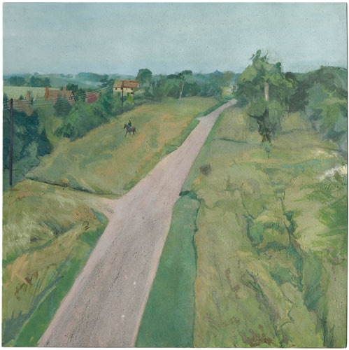
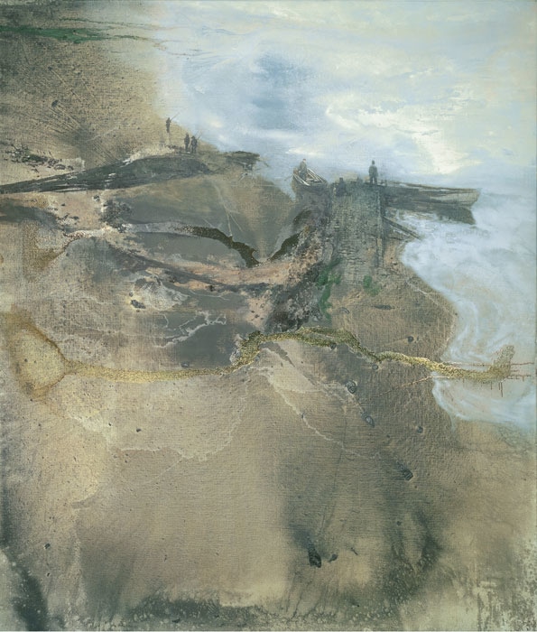
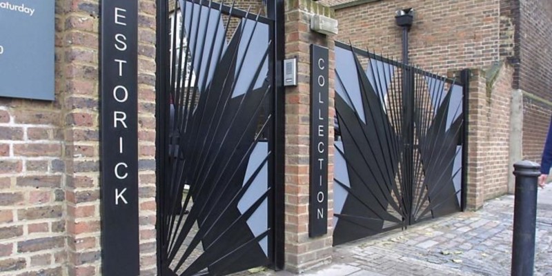
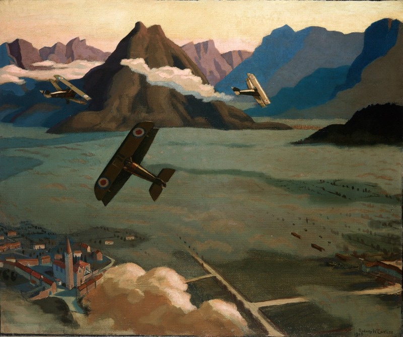
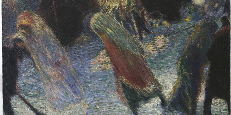
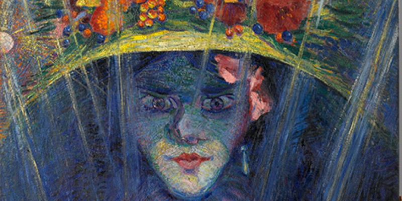
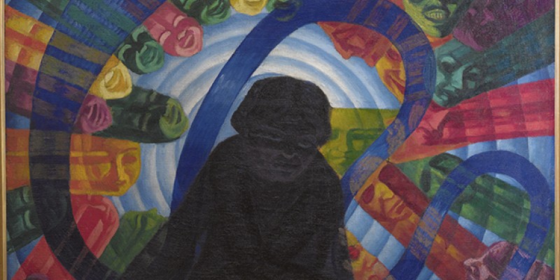
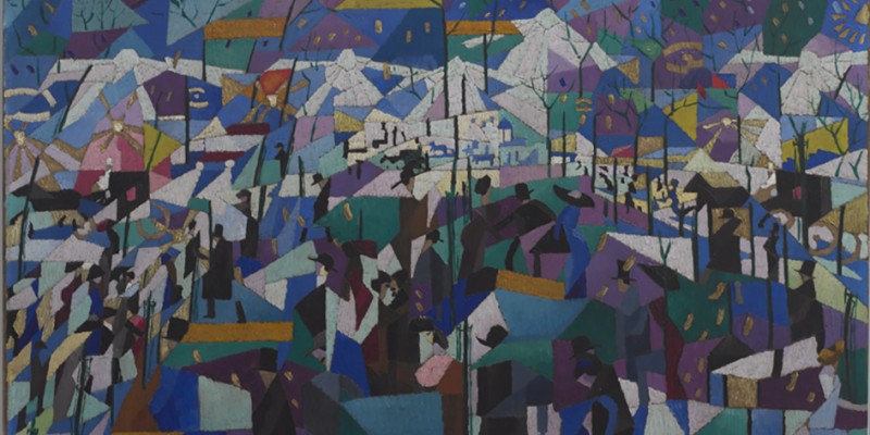
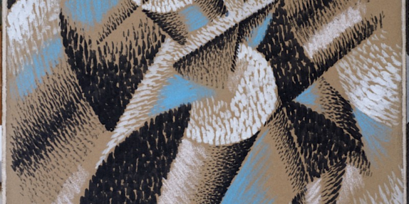
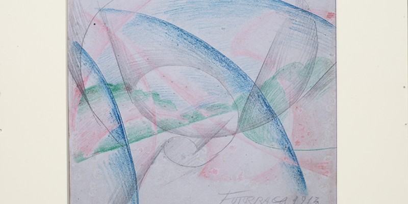
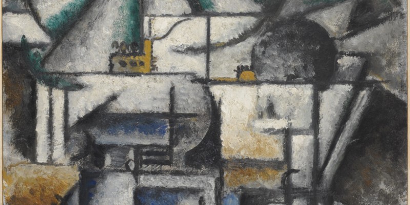
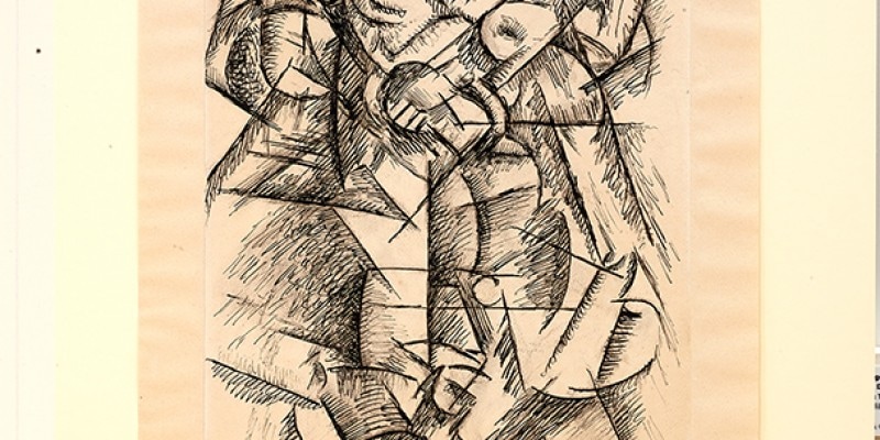
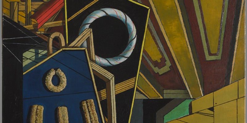
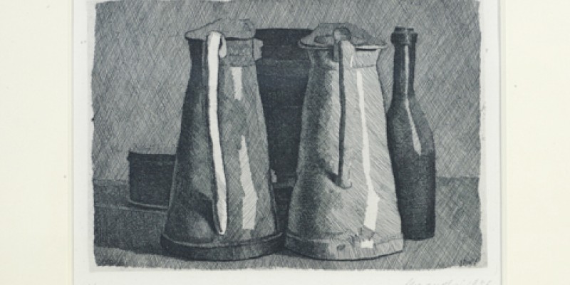
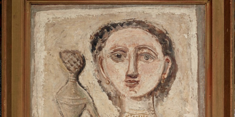
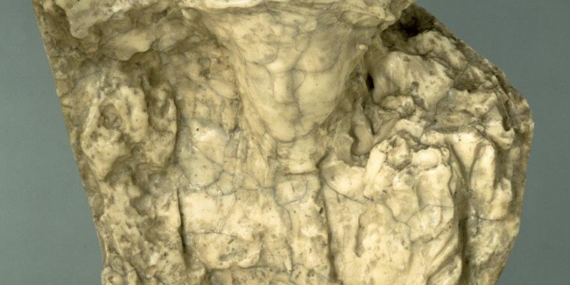
Blogs should always, where possible, be titled with a terrible pun. This one is occasioned by the Estorick Collection, a small modern Italian Art museum, located about 5 minutes walk from Highbury and Islington Tube station and which re-opened this year after a refurbishment. Despite it being very near me I have not been to the Estorick for about 5 years. I keep trying to go on Mondays and forgetting it is closed. You have to pay for entry, just under £7. The theme of the place is modern Italian art, based on the collection of the founder Mr Estorick, hence the name. There are 6 small galleries and a library. The display changes with a combination of a temporary exhibition, taking up a variable number of galleries, and the permanent collection. All have an Italian theme of some sort. Last time I went they had an excellent exhibition about the fashion designer Missoni. Currently, and helpfully by the time this blog is published it will be on its final day, there is an exhibition of British art from the Italian front in the first world war called War in the Sunshine. It was this that drew me to go to the museum in the first place although I am also looking to return for the upcoming Giacomo Balla exhibition. War in the sunshine occupied the two galleries on the ground floor. Note; the Estorick is housed in an old town house and is over 3 floors (4 if you include the library) and is not access friendly, the upper floors can only be accessed by means of a quite narrow staircase. Anyway, one of the galleries was given over to the photographs of William Brunell and Ernest Brooks. Historically interesting but I have never been that taken by photography. Much more interesting was the first gallery which included the work of Sydney Carline (who you can also see at the Imperial War Museum). There were a series of oil-paintings (like the one below) and sketches. The paintings themselves have a certain Paul Nash quality to them. As paintings, they lack a certain impact, they are not that good and a little flat. What interested me was the subject matter. Apart from the abstract work of Peter Lanyon and Richard Deibenenkorn these were one of the few examples of figurative aerial views that I had seen. Especially interesting were sketches of various scenes, including for example the strafing of an Austrian column of infantry, which were done contemporaneously while the artist was in the air (he was a pilot, flew Sopworth Camels and other aircraft). This brings an extra dimension to the work, to me at least and allows, for example when looking at the picture below, to feel yourself the fourth plane in this patrol. This is the third time of writing this as weebly has conspired to fail to save my previous drafts. Despite this vexatious occurrence I shall preserver. Ascending the stairs you encounter the permanent exhibition. The theme of the permanent exhibition is modern and modernist Italian Artists (men all, not women in this museum). The painting that hits you in the face as you enter the first gallery is Umberto Boccioni’s Modern Idol (below, bottom left). The colourful, bright flowers, and the pursed lips contrast with the dark glowering eyes and the strange alien looking globes zooming out of the centre draw you in. It is quite a piece. A particular favourite is Leaving the Theatre by Carlo Carra (below, top left). It is a beautiful piece in blues and reds with the figures rising out of the pavement and the dark carriages in the background. I like it very much. I am glad I encountered it. Opposite it is the colourful, psychedelic Music by Luigi Russolo. What you cannot see from the photo is the glowering nature of the face and the multiple hands hammering at the keyboards. It is an engaging piece in a way but also oddly flat and the orbiting faces remind me of jelly babies. Another favourite is Gino Severini’s the Boulevard. It is deceptively simple with its geometric shapes of colour, which also coalesce to form the skyline. I particularly like the way they intersect the dark figures. The colour scheme and composition give an effectively wintery theme to the piece. A more subtle genre, includes another by Severini called Dancer (below , top left) , swirling patterns in oils and pastel. It would seem that using pastels for abstract art is not as novel idea as I first thought. The elegant soft blue lines (below, bottom left) is a small but delightful piece by Giacomo Balla. Again it looks simple but is very effective. This backed up my desire to see his upcoming exhibition. It is always interesting to me when you are drawn to quite diverse styles of picture and they turn out to be by the same artists. In this case Carlo Carra’s black and white work in charcoal (below, bottom right). I like gazing at works like these, seeing the geometric shapes and trying to pick out coherent images from the picture. This is a good example of how the name of a piece changes how you perceive it. This one is called The Boxer. Once I knew this I thought I could make out eyes and a boxing glove. Ardengo Scoffici’s Planes of a Lamp (below, top right) is another such example. It is very Braque like and is displayed standing in a glass case as a few years ago another painting called the bathers was discovered on the back. I like the textures of this and the way in which each shape is not a single block of colour but the colours blend from one to another. Once of the few names that rang a feint bell was Giorgio De Chirico. He was represented by the oddly named The Revolt of the Sage (below, top left). Perhaps is I had a better knowledge of classical literature the picture would match the name in some way. Elegantly and finely rendered, it has to me a nautical feel to it. I don’t really like etching most of the time. I find them dull. Giorgio Morandi’s Still Life with Five Objects (below, bottom left) really intrigues me though. I keep coming back and back to it and it has become one of my favourite pieces in the show. The rendering of the objects and particularly the light and shadow really appeals to me. Massimo Campigli’s Two Women (below, top right; the only women in this gallery are in the paintings!) has an oddly classical, Greek or Roman like feel to it. I like the beige colour scheme and the way one woman is looking at you and one looking away. Not everything in here is painting. There is quite a bit of sculpture. My favourite is Medardo Rosso’s sculpture (below, bottom right). I like its bobbly nature and the way it uses the human capacity to shapes, and particularly human faces in things, to bring the face out in the sculpture. I enjoyed the Estorick. It is quite a small gallery and can be taken in during your average lunchtime. I intend to go again. The website shows works that weren’t on display during my visit and I hope that on future occasions the will be.
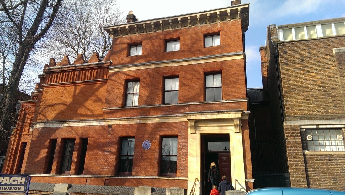
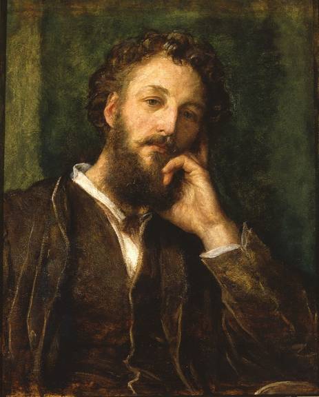
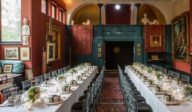
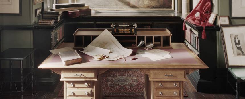
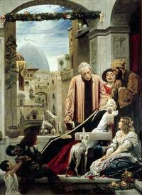
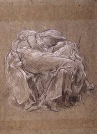
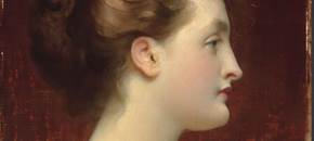
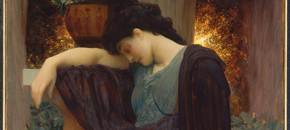
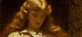
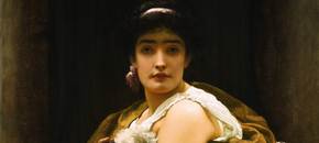
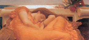
Leighton House is one of those hidden gems of London. Located just of High Street Kensington and next to Holland Park, the home of the erstwhile Lord Leighton it is slightly unprepossessing from the outside but once inside its treasures are revealed (apart from the first two the photos are all from the Leighton House Website. As you can see from the outside it is a slightly dull if intriguingly structured red brick building with a capacious garden round the back (currently closed for the winter). Inside reveals a cornucopia of splendor. You have to pay to get in but that includes the current Flaming June exhibition which is on until 2nd April. It was this exhibition that had drawn me to the house in the first place. The ground floor hallway is made up of a lusturous blue tiled hallway complete with stuffed peacock and various ornateness. It also includes the arab hall (below left). This includes a sunken pool with fountain, and stretches up to the doomed ceiling a story above. It is bedecked with ornate Arabic and Turkish tiling, ornate gold, and wooden fretwork windows, topped off with the crown-like chandelier that you can see in the photo. It is quite something and if you do you will spend quite some time standing there, head craned upwards trying to take it all in. This is a man who liked opulence it would seem. The man himself, (portrait below complete with fabulous beard), constructed his house around an enormous studio, on the first floor looking a little like a medieval banqueting hall. There are on display around the house various original letters to and from the man himself. His hand-writing is terrible though and I could barely decipher a word. This being his house there are various examples of his work around the place, very detailed high Victorian style, with sumptuous rich colours. People are his forte. There are also various sketches, delicate and elegant in style. Many of them are preparatory works for later paintings like the one below right which later becomes Flaming June. The main reason for my visit was to see Flaming June, which is on loan and on display until 2nd April. It is on display with four of the other works that were produced and first exhibited with it at the Royal Society. Only partial pictures are available on the website but I do recommend you go and see them if you can. There is Candida (below top left) and orange clad women against a velvety red background. Next is The Maid with Golden Hair (below top right) a soft focus portrait, with the red haired model that features in many of his paintings (and was his mistress in classic painter style). The miserable woman who has just realised she is not wearing deodorant is Lachrymae. My favourite though is the one next to that (bottom right) is Twixt Hope and Fear. I like it very much. The fur texture is amazing but I like the pose and facial expression and the whole composition of the piece. It was not surprised to find out that when first displayed it was thought to be a better painting than its now more famous siblng. The piece itself that is the star of the show is Flaming June (crappy cropped photo of it below). It has an interesting history in that it was found behind a plaster wall by some builders and eventually sold to a Peruvian businessman who donated it to a Peruvian museum. It is from there it is on loan.
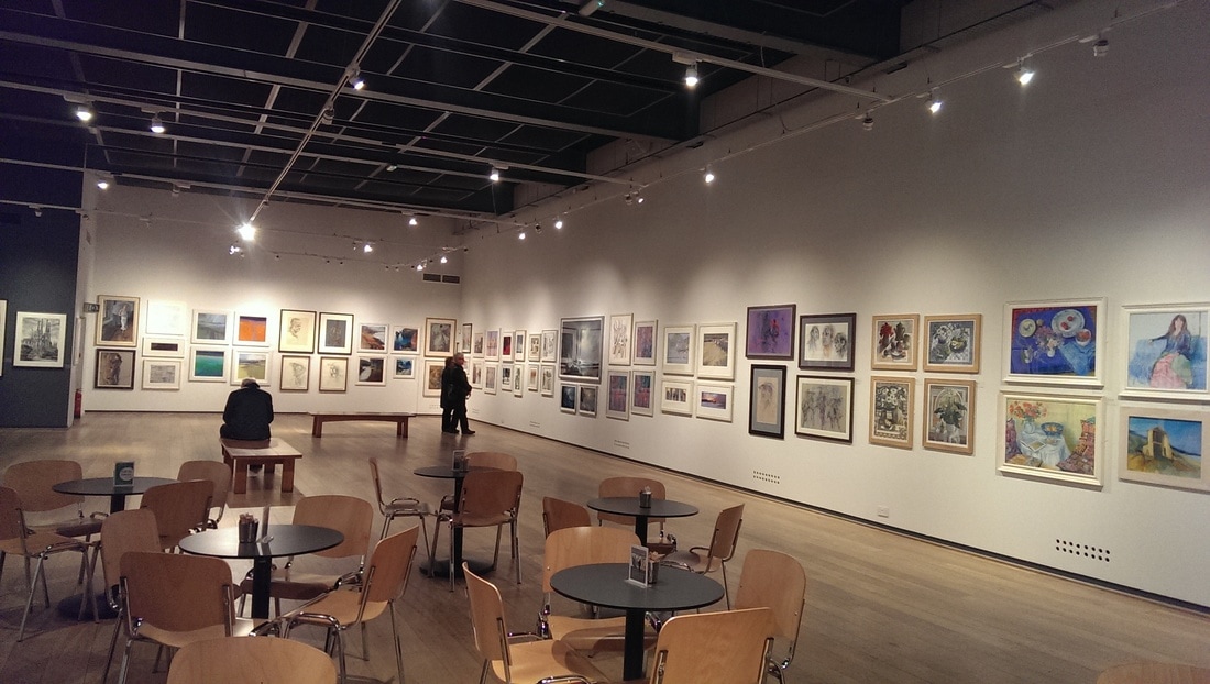
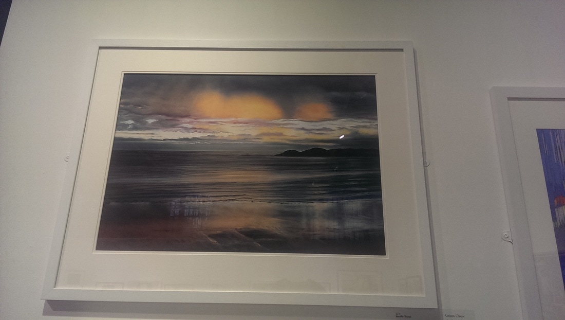
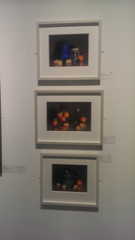
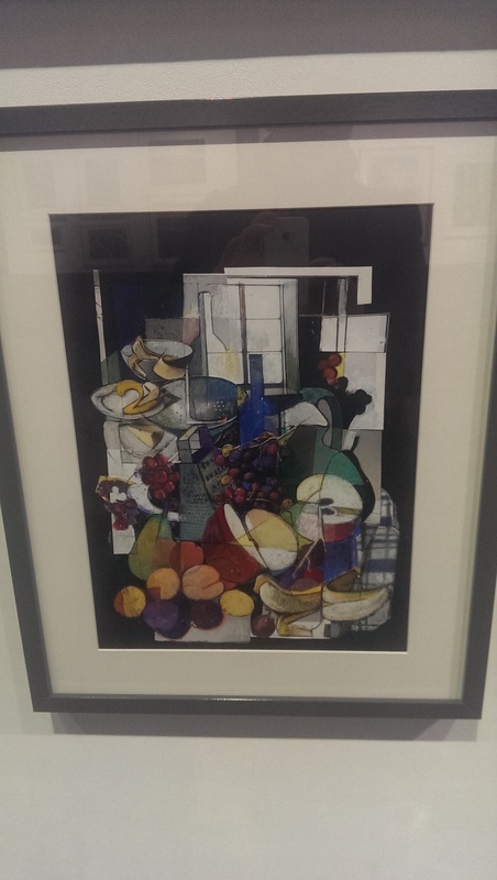
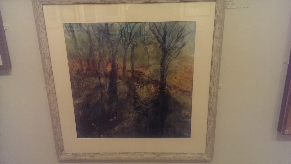
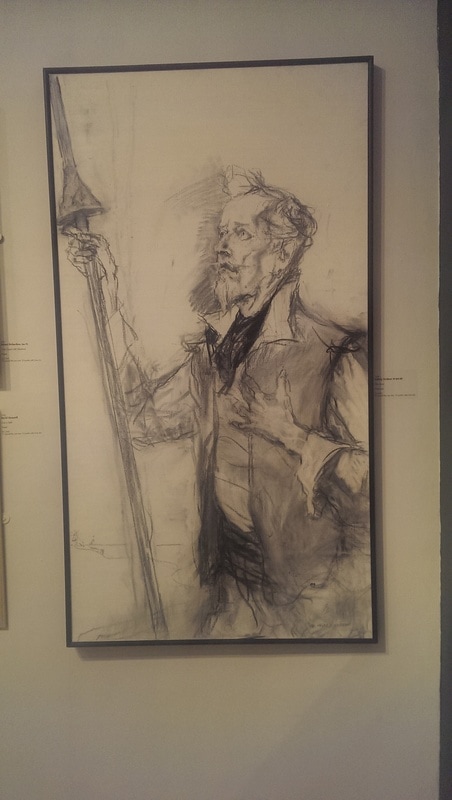
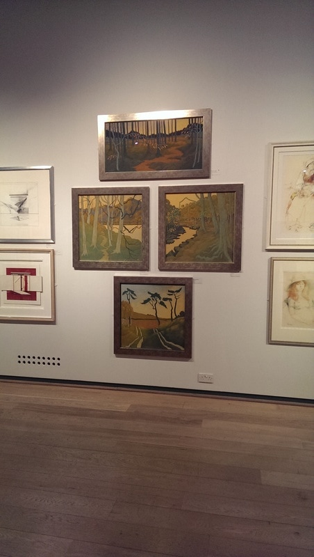
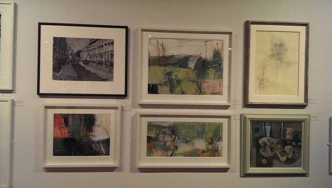
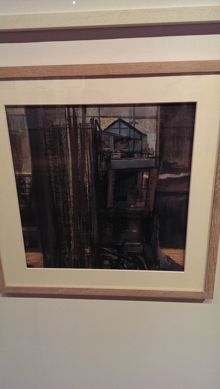
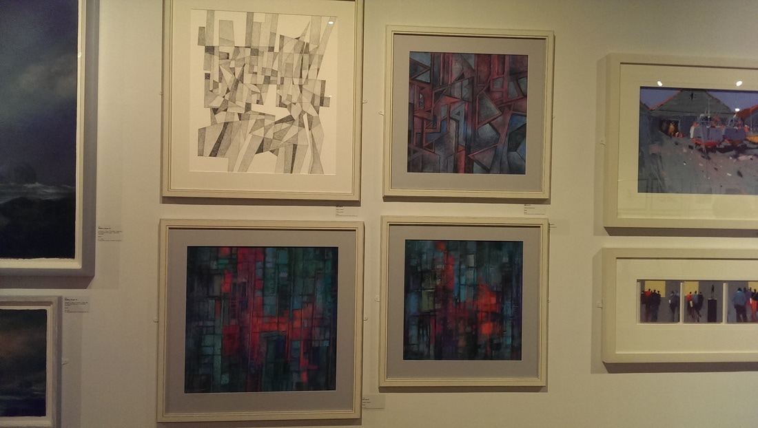
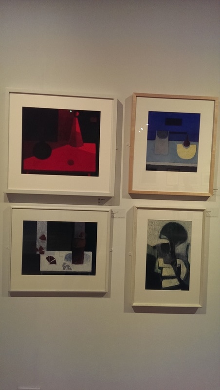
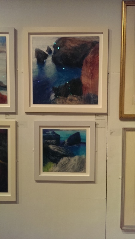
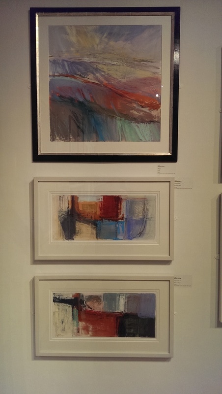
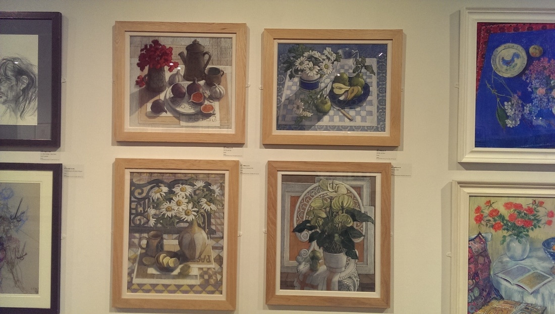
A symphony of orange and red. The sheer cloth is beautiful rendered, set of by the iridescent sea, behind it. It is well worth going to see it. I would recommend that you do. You can tell an art blog is useful when it tells you about exhibitions which have already finished. I intend fully to ignore this prescription by telling you about the Pastel Society exhibition at the Mall Galleries, which finished on 4th March. There is a good technical review of the show at Making a Mark, but this is not what I am doing here. Here I am just setting out what caught my eye. If you haven't been to Mall Galleries it is located at the top of the Mall, just past Admiralty arch. It is part of the Federation of British Artists and hosts a number of exhibitions and competitions. Inside there are basically three gallery spaces and this exhibition occupied all three. I went at 10:30 on a wet Monday morning and it was blessedly empty. It struck me as a well hung coherent exhibition, not too crowded with sensibly priced attractive works. Many had been sold. It is a nice space with good lighting, a cafe and a little shop. I was the youngest by a good few decades. When one thinks of pastels you think perhaps of twee landscapes or wispy portraits. There was a bit of that but there was allot that was very good. What I was particularly not expecting was the abstract, or semi abstract work. The pastel society is not just pastel, it is also charcoal and pencil. A number of works caught my eye, and I have highlighted the ones that did. In the first room five artists stood out, four above and one below. Top left is by Jennifer Thorpe and is called Luminosity. It had bagged the Unison Colour Product prize. It was a little difficult to see as was hung quite high but the burning sunset, executed in orange pastels, and its reflections on the choppy seas are very enticing and well executed. Top right is Jaana Fowler's Blue Bottle. You can make out the blue bottle in the centre of the picture. This too picked up a prize. It is in fact a mixture of collage and pastel. It has a certain cubic Braque like quality which I like, I particularly like the reiteration of objects, especially the banana. I'm not sure the grater works but that is being super picky. It manages to do something unexpected with pastel. Bottom left are three similar works by Liz Balkwill. They all feature very well rendered citrus fruits of various kind with a detail and subtlety that I didn't think was possible with pastel. There is a good colour contrast and the darkness of the background gives an old master feel to these painting. They work very well together and I was not at all surprised to see that all three had sold. A good show for Liz then, and a well deserved one. Bottom right is an autumnal landscape called Forest Shades by Marie Bew. I cannot find a website for her which is a shame. I like the looming, leafless tress and the shadow they throw on the foreground all over that mellow gold and yellow. The final piece (below) is an excellent charcoal portrait. It is called the Actor but in my mind is Don Quixote. It is by Valeriy Gridnev. The artist is a talented portrait artist and a member of the Royal Society of Portrait painters. You can see this skill in this characterful rendition in charcoal. I like the slightly scrubby lines. Then onto the main rooms, which mainly included works by member of the society. A wide range of styles and subjects. I am always impressed when pieces work well on their own but also compliment other works by the artist, showing a consistent style. Cheryl Culver has done this very well (below, top left). She has also chosen her frames very well. Especially effective are the middle two which could easily be a diptych. It is an almost simplistic style but this I think takes away from it. There are smart choices being made here and the autumnal palette is a nice novelty. Very different is this gritty dark piece (below, top right) by Jason Bowyer called the Old Workshop Window. The dusty nature of the pastels has been used to good effect here to given the impression of industrial grime and the murky walls and windows. There is detail to in the abandoned machinery. Jeannette Hayes (below, bottom left) produces abstracted landscapes. I particularly like the centre two which I believe are called Green lanes. I have included it with some other works around it to show a bit of the range of works available. In Jeannette's work I like the cool scrubs of green and creams complimented by flashes of orange. The final selection (below, bottom right) is by Bob Last. Bob doesn't seem to have a website. He has produced four geometric almost classically abstract works. I have seen very similar things done in oils and acrylic over the years but rendering them in pastels gives them a softness that is an interesting change. While we are talking about abstract continuing around the room another artist doing again, almost classically abstract work another artist is Robin Warnes. Again he doesn't seem to have his own website but I did find a blog, sadly abandoned in 2015. The pieces have strong geometric shapes and each work has its own colour theme. The blue lamp with its semi circular cream light ray is for me the most effective. Again the pastel gives a good texture to the work. In a rougher more patchwork style is that of Joanne Last (below, top right). I talking here about the bottom two pictures in that photo. This again takes something that other media does but the sort of scruby, stubbly nature of pastel makes these different. A distinctive style and good colour composition. I would like to see her do something on a larger scale using the same themes. Switching styles and techniques now it is the work of Sarah Bee (below, bottom right). It is the wonderful turquoise sea that really make these pictures. They lift what might have been mundane picture into something special. Again the streaky nature of pastels is used to create the wavey water effect. The top of the two pictures with the contrast between the blue sea and the red cliffs is particularly strong. Typical pastel fair might be thought to be still life and flowers. Just because it is standard doesn't mean it can't be good and I thought Ann Wilkinson's quartet of work were attractive and appealing. I like the exaggerated geometric nature of some of the elements, particularly the bottom left picture with the cloth and the vases. There is a good use of shadow here. My favourite is the one with the red flowers.
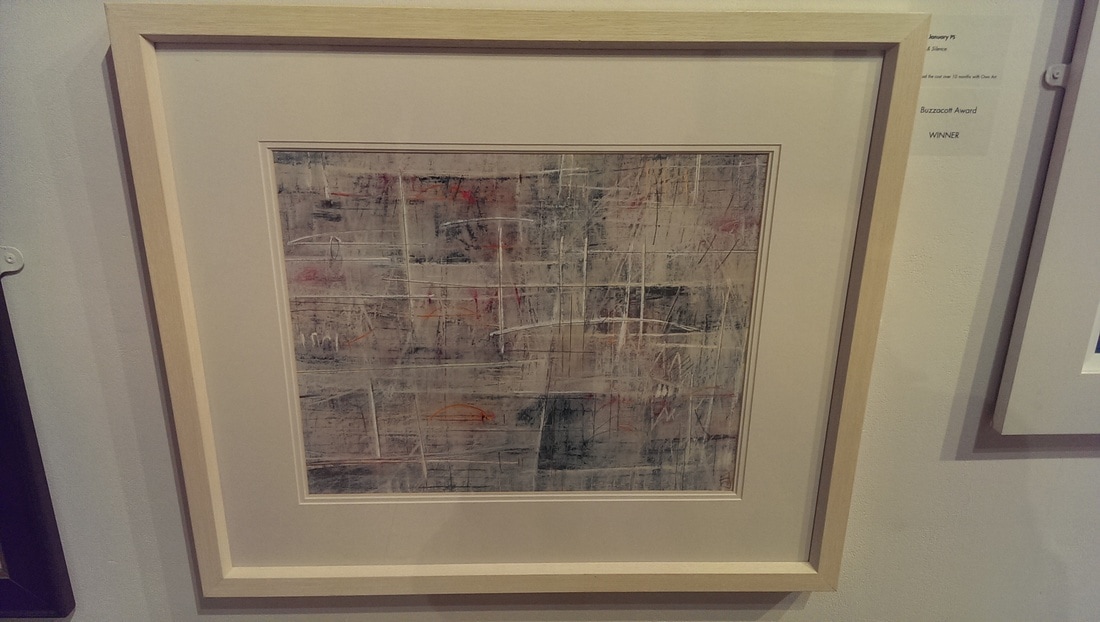
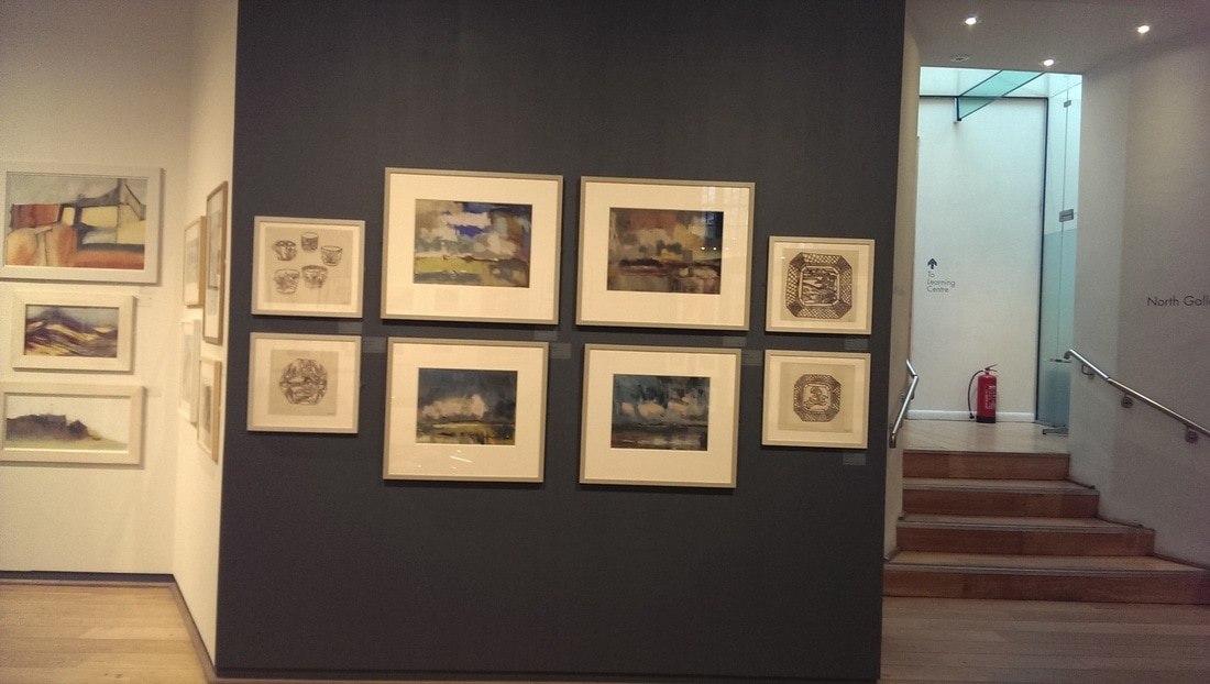
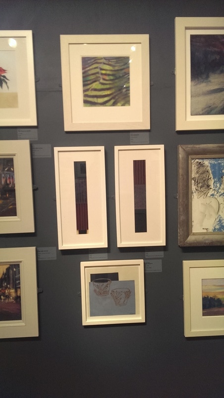
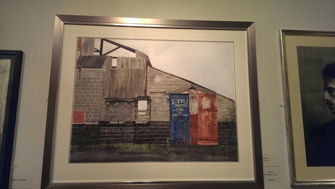
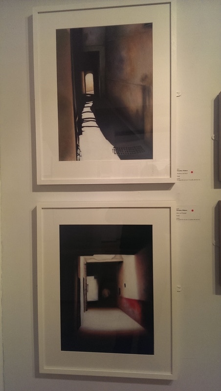
The north gallery is the final gallery. This included a mixture of smaller works by society members along with non member pieces. The four centre pieces on the gray wall are by Keith Roper. They are fine example of landscapes done in pastel. You can't really see in these photos but they are semi abstracted and make good use of pastels opaque cloudy quality. The picture next to it (below, to right) shows that in contrast to that you can produce sharp defined work which in itself impressive. This one is called Disused Workshop by Elizabeth Nast and she bagged herself a prize for it. I like the sharp diagonal but it is those two doors, the red and the blue that really drew me to the piece and then that corrugated iron that kept me there. In the picture below bottom right I have shown a few pictures, again to show a bit of the range of what was on display. The ones that caught my eye where the two narrow vertical pieces with the changing patterns and colours. These turned out to be also by Libby January whom, it would seem, produces work I like. Very different to that (below, bottom right) are these two dreamy shadowy pictures of passageways. They are by Christine Watson. The light at the end of the tunnel in both of them is a good feature but I like the way they appear as though you are looking at view without glasses or out of focus. No surprise that they are both sold. A good show. I enjoyed it. I gave serious thought to purchasing a couple of pieces and was defeated by a combination of a lack of infinite money and that many of the best pieces had been sold.
The show also had an interesting feature. There were about 10 small works all of which were available to be purchased by secret auction. You had to bid a minimum of £180, your bid sealed in an envelope and the highest bid wins the painting. The relatively low starting price and the number of works available invites you to participate and this of course puts you in a painting buying mood. Nice idea there. I shall probably go next year. |
Archives
June 2024
Categories |

 RSS Feed