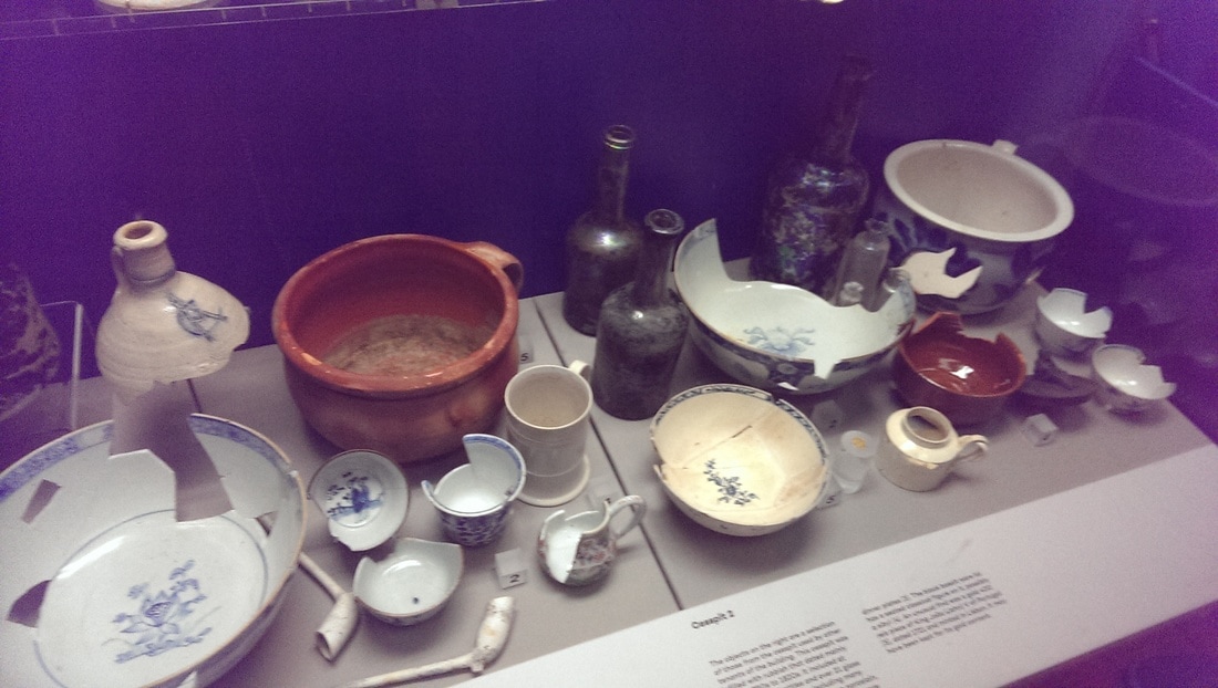
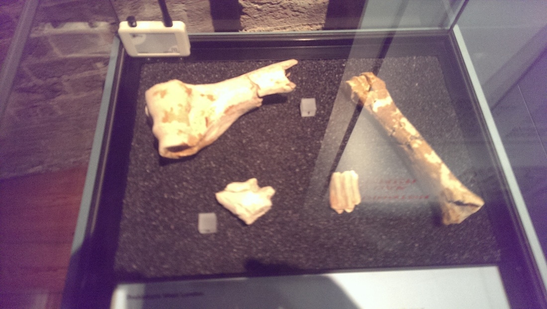
 Or how to get your work in a national museum 2. Leave it hanging around, then maybe it gets buried in the ground, dug up hundreds of years later and put in a museum. The object doesn’t have to be especially important, just historically interesting. That is one of the elements that attracts to archaeology. Much of what is found is artistically interesting or attractive, but much is mundane but the information it provides about the people and the time it came from are the thing. These things like broaches or needles from people’s everyday lives, years later become historically interesting and important and end up in museums. This is one of the reasons I went to the archaeology of cross rail exhibition at the London Docklands Museum. The other reason was that in 2015 I was involved in the dig. I spent a very interesting day in the warm sunshine, in the grounds of the Chaterhouse, digging away with a small trowel in a trench. I dug up many things, lots of animal bones and oyster shells, pottery, tiles and also parts of a human skull. I can show you no photos of the event as we were not allowed to take any but it was a very interesting and enjoyable day. There is an annual archaeological festival where you can often get involved in such things. It’s how I got involved in this and I highly recommend it.
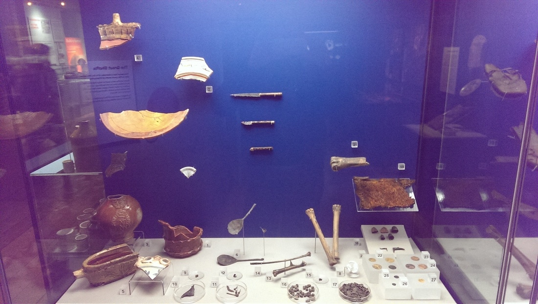
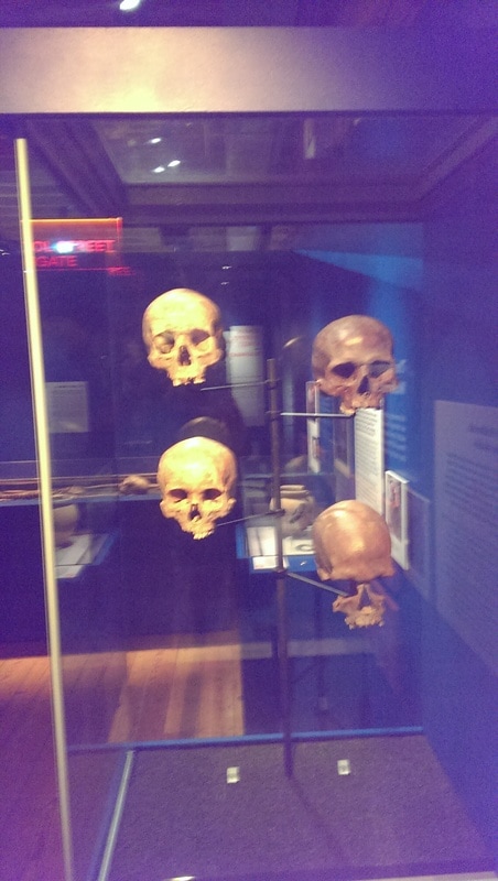
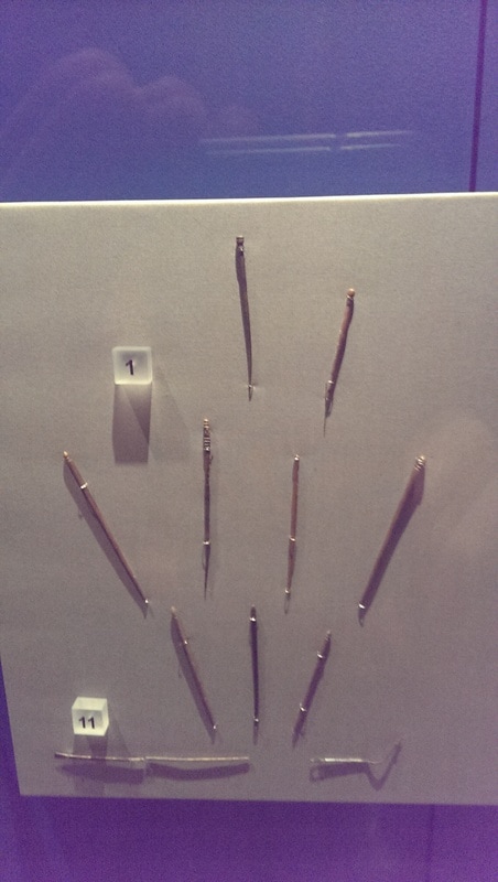
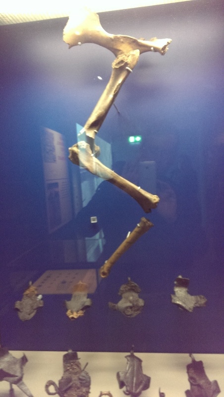
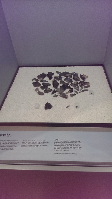
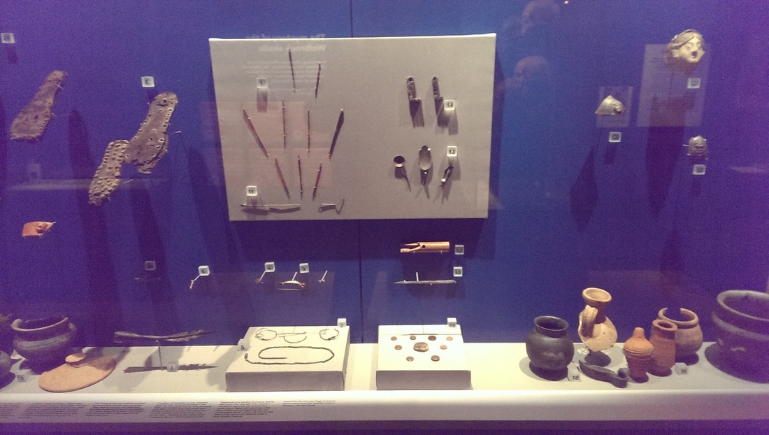
The general docklands museum deals with, as one might expect, the history of the London docks so has much in the way of shipping, trading and similar things, including the odd interesting painting. I only scampered round it quickly before heading to the ground floor to the free Crossrail exhibition. It is on until September. It shows finds from a number of different places around London and different periods. From prior to the Roman occupation on-wards. It includes things like coins and needles, a skeleton of a horse. It includes the skeletons of people, killed by the black death in the middle ages and dug up from plague pits even going back as far as flint tools.
It is quite a sobering thought to think that you might end up in a museum for a similar reason, or these are perhaps your direct ancestors on display.
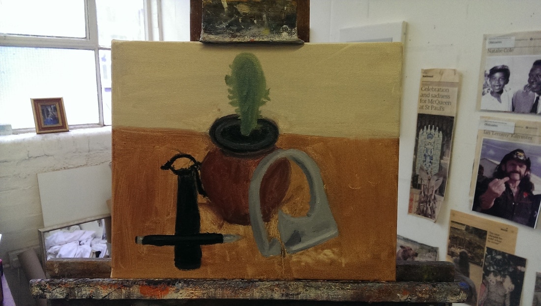
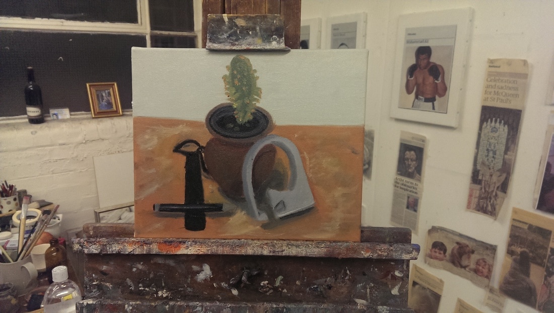
The exhibition reminded me that of an idea I have had for a number of years now of a fake archaeological or museum display as art, and my recent chagrin to find that Damien Hurst has got there first. Anyway inspired by all this, and by the recent Roschenberg exhibition, I decided to create a still life out of some found objects. I went for random crap in my house and the selection ended up being a cactus in a pot, a piece of guttering attachment, a pen and a draw string bag. 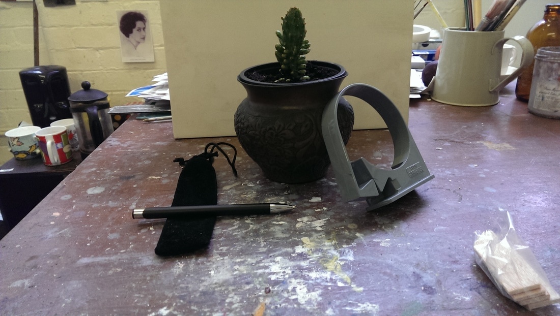 Thus arranged they were then painted. My strategy with most painting is to cover the canvas with paint as quickly as possible and get the main structure of the painting in as quickly as possible. This is what I have done in the painting below left, and this took one sitting of about two hours. This allows me to see the relationships between things on the canvas and make choices of how to change things and what to keep from the original painting. In the first painting the oval of the pot is not wide enough so I extended this in the second painting (below right). Then just add more paint, to well to everything, texture to the table top and shadow and detail on all of the pieces. Progress seems to slow down at this point and I spend much more time looking at the painting and the objects.
The final session is adding detail, such as the patina on the pot, more shadow effects on everything and sharpening the objects, particularly the piece of guttering. The main focus of this stage is building up the contrast, in terms of colour and texture between the different objects. After a total of about 8 hours the result is below. It has ended up being quite religious in feel, not something I intended when I set out. A very satisfying experience. Incidentally I will be having an exhibition on 19th August at the Gallery behind Stoke Newington Library. More detail to follow. 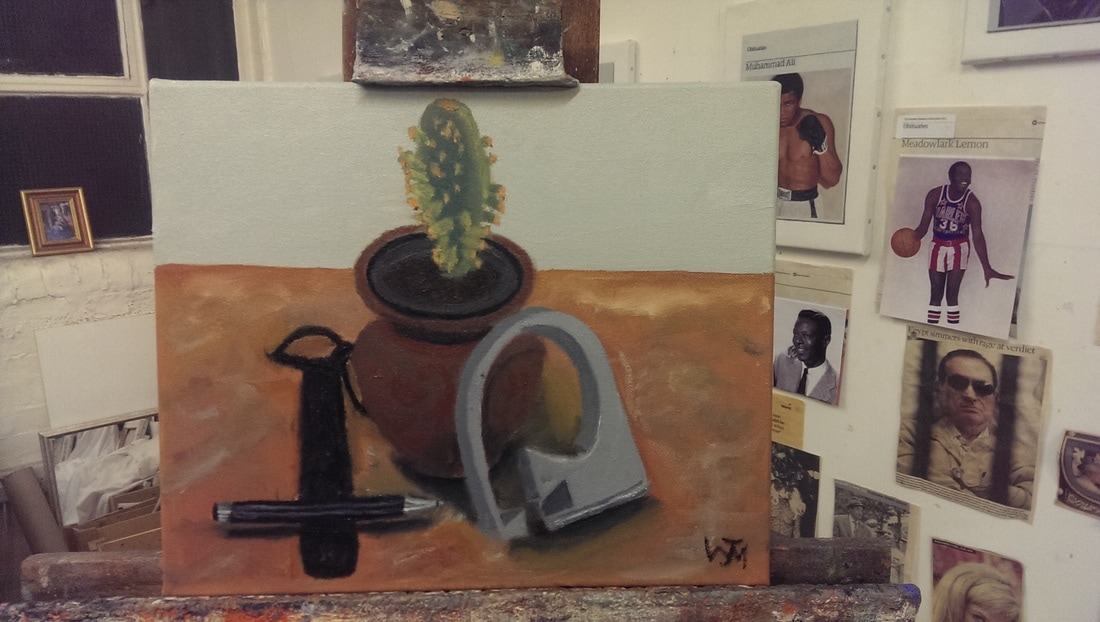
0 Comments
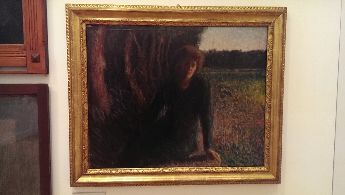
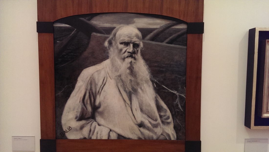
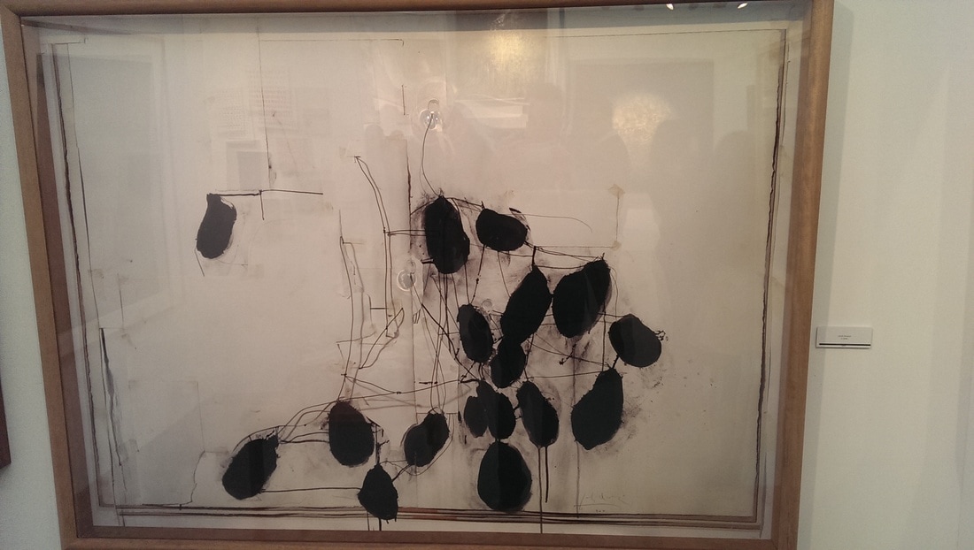
I have written about the Estorick before. A couple of weeks ago there was a power cut at my head office. All the servers and phones went down and I was left twiddling my thumbs with nothing to do. This is an occasion where living in London pays real dividends because I sauntered down the road and spent a happy hour going around this exhibition at the Estorick. Giaocomo Balla was an Italian artist who lived from 1871 to 1958. He started life as a figurative painter in sort of the impressionist tradition but transitioned to being a modernist and one of the founders of the Futurist movement. This exhibition, covering 3 rooms of the Estorick charts his life and shows the change. In the first room then you have his figurative work. It’s good stuff and he was obviously an established and successful artist before the foray into modernism. There is a portrait of a woman sewing (below) with the cloth she is producing rendered in an iridescent impressionist fashion, contrasting nicely with the slightly dull red of her clothes. 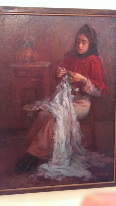 There is then a portrait of a woman at the Villa Borghese (where Balla lived, below left)). The left hand of the painting in darkness from which the figure barely emerges into the light of the field on the right. I like the slightly threatening trees and the loose quick lines of greens, purples and pinks to make up the field. Making quite an impact though is this furious frowning portrait of Leo Tolstoy (below right) which has a sort of ghostly or angelic quality to it with the black and white figure against the purpley grey background. The arc of the top of the canvas somehow adds to the whole thing too. He has rendered Tolstoy as a sort of Zeus like figure and the marks behind him are almost lightning.
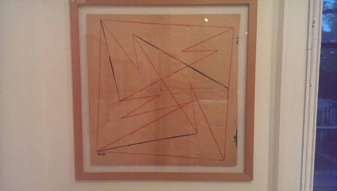
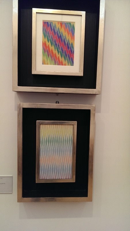
One of the interesting things (to me anyway) is the different materials Balla uses. He paints allot on cardboard. Do this now and you won’t get quite the same effect as modern cardboard is different in texture and quality. An example of this, and a good one is Portrait of Signora Cassarini (below). Interestingly this is done in pastel with the shape of the picture and the frame all adding to piece. 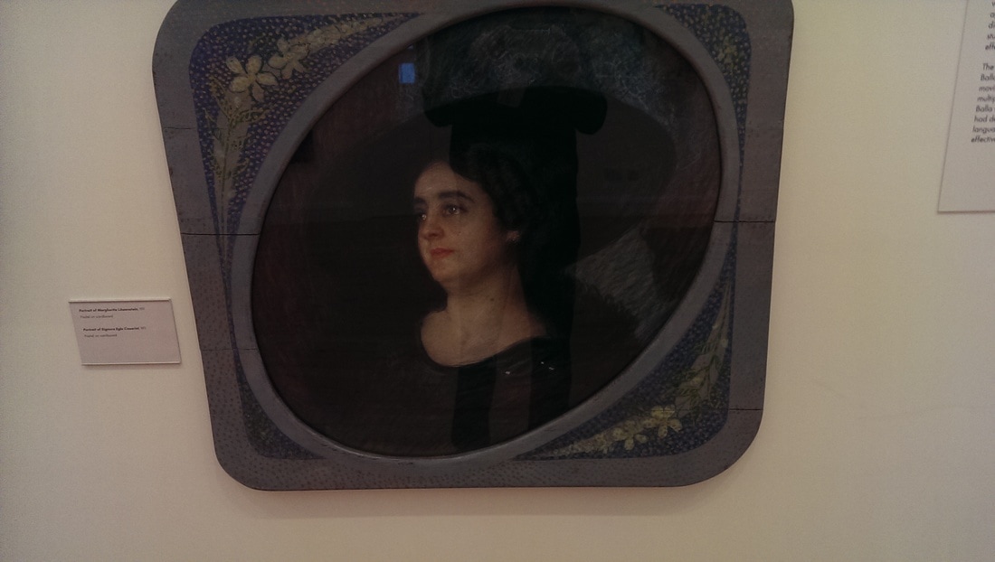 Then suddenly, bam, you are into futurism and the signature changes to Futur Balla, like some kind of super hero donning his costume. The change of style and approach is sudden and there are these brightly coloured geometric shapes. A common medium used is Tempura, which I usually associate with pre-renaissance art. It gives a sort of flat consistent approach, not unlike Gouache but softer and more pastelly (in colour not texture). The piece below right by the way is a painted studio door. 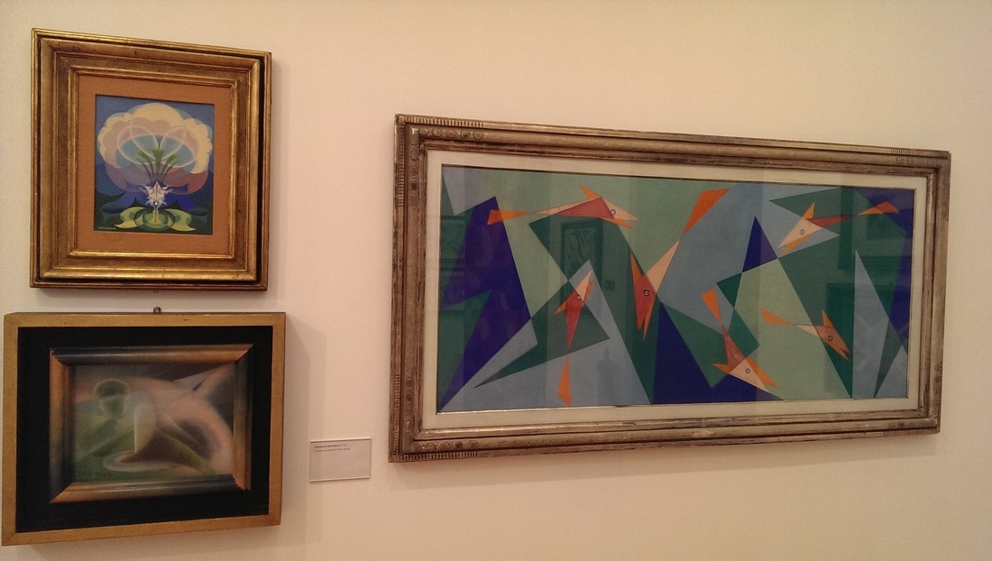
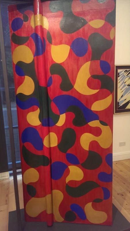
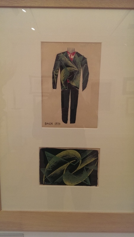
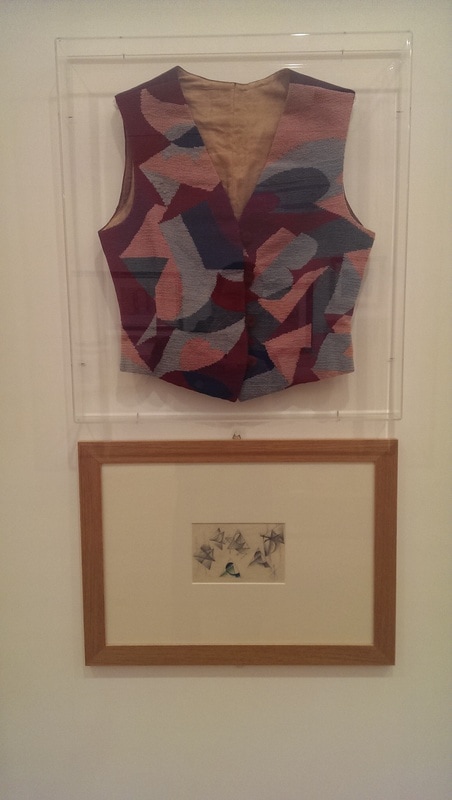
He did not abandon the figurative work though and two of my favourite pieces, Chatting and flowers are done after the change. They are very good, signed with Balla (as though returning to normal life). I like the pose and easy body language in Chatting (bellow), particularly actually of the figure on the left. I also like that it is obviously done in Balla’s studio and you can see other paintings, including obviously Futurist ones lurking in the background. 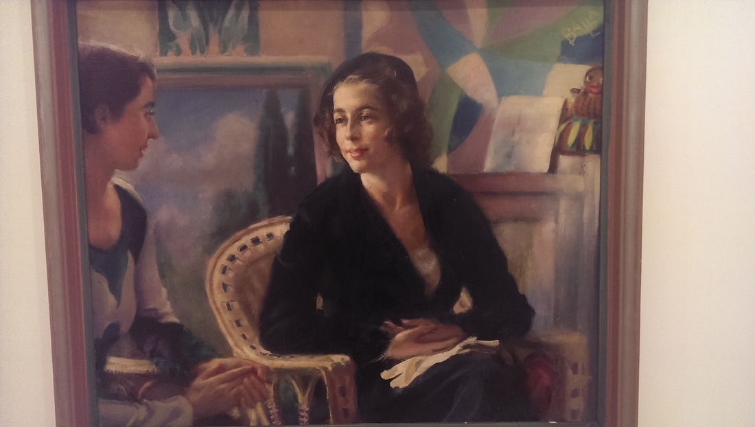 The Flower painting on the other hand (below) is all strong big brush strokes with the central flowers almost blending in, or coming out of the mesmeric background. It is one of those paintings you have to observe from a bit of a distance as it ceases to be coherent when you get close up. Possibly slightly heretically I prefer his figurative stuff. The Futurist stuff is good particularly the less angular ones, but he is a very god figurative painter and I find these more appealing. I find the Futurist paintings a little austere and impersonal. 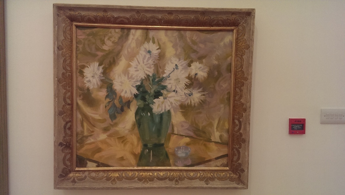 Like many artists in similar genres, such as Delauney, he designed furniture and clothing. So you have this studio door (picture above) and shop display (below) stand all done in the style. I like the door. It would make me happy going through such a door I think. Imagine what Narnia would be like if the wardrobe was designed like that.  Various designs for suits are displayed and was attracted to (and think that I would attract in) this black and green number (below left). Some finished garments were on display such as this waistcoat (below right). I am not sure about this waistcoat, but then I am suspicious of waistcoats generally. They are all too frequently associated with top hats. Never trust a man in a top hat.
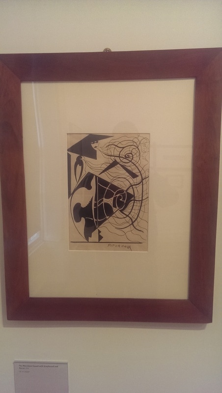
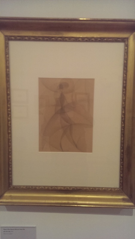
Various designs for scarves are produced, many in quite expansive format. One of my favourite designs in this part of the show is Tarscilbalbu (below), a chest and clothes stand looking very much like an impish Tiki figure of some kind. 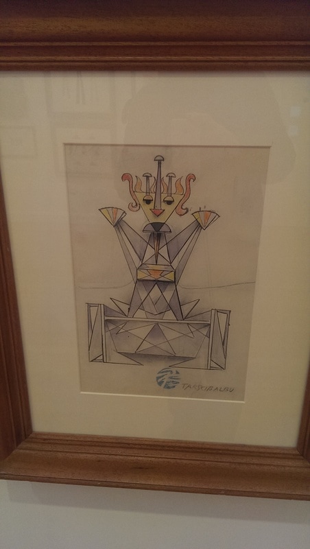 The final room, upstairs, contain later work, but also smaller more restrained things, such as extracts from note books or sketches. There were also these very simple line drawings, which almost look disposable but somehow appealed to me (bellow middle). They are a good example of what you can achieve with simplicity. I like the sketches quite a lot. They seem more intimate and accessible then some of the other works, such as this curvy faded number which is a dancer (below right).
 That then is the paid exhibition. Don’t leave straight away thought, particularly if you like Balla, have a look round the permanent exhibition. They have changed it slightly since last time I wrote about it. One of the additions is this superb piece by Balla called Violinists hands (below). It looks much better in the original. Part of the effect is the frame which is reminiscent of an opera goer’s suit and then you have these hands, with this excellent stuttering effect of movement. Very nice. 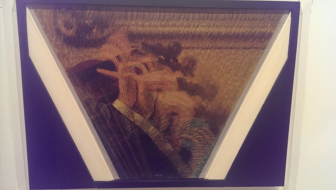 As you leave there is a pleasant little courtyard before you exit onto the street. In that courtyard I came across these odd little rocky sculptures (below). I have no idea what they are, or who they are by, but I like them. 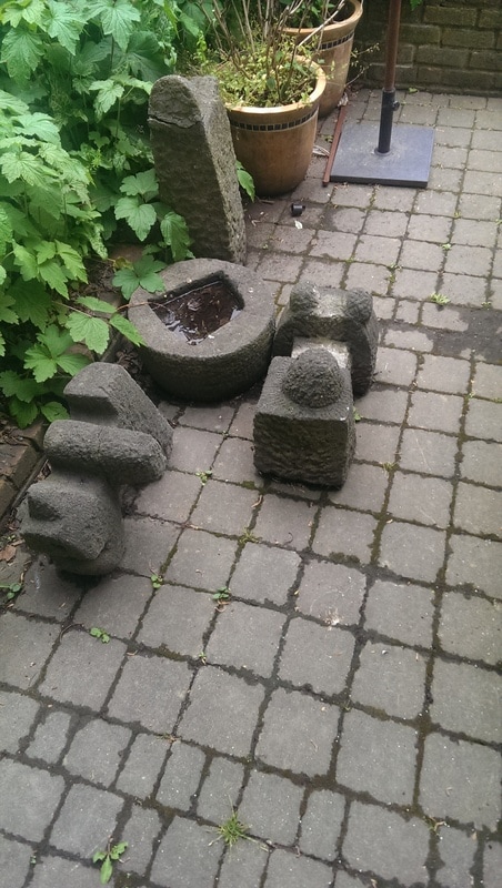 If you have made it this far to the post congratulations. I am organising a solo show of my work for 19th August in Stoke Newington. More details soon.
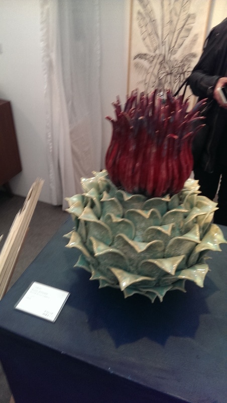
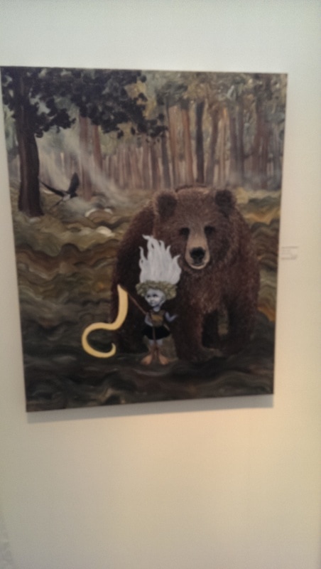
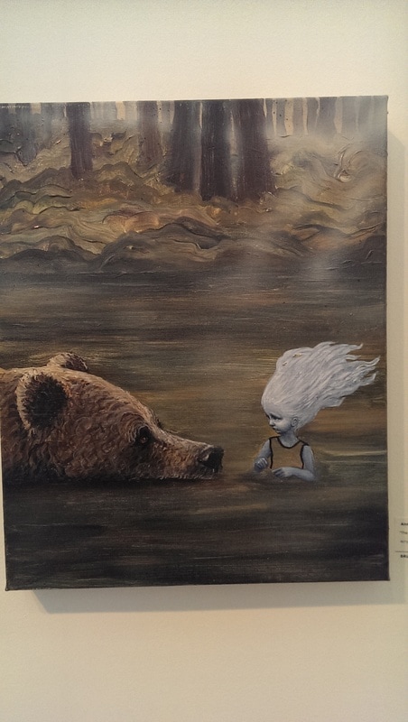
I have not been to the Affordable art fair for a number of years. Last time I think was 2008 and in Battersea. It was both not very good and not very affordable. It was with a certain amount of skepticism that I went this year, mainly to the insistence of two friends. Its last day is today but there is another one in Battersea later in the year. It was much better, and much more affordable. It was also large and there were a number of dogs wandering around (attached to their owners). My favourite was a red setter which ambled around roughly the same route we did. You crunch your way in over multi-coloured gravel which presumably at one point showed an image of some kind but by the time we got there this had been mushed into a mess. The reason for the dogs became quickly obvious when we spied a dog photo both. Onto the art. There was so much art. Lots of it was rubbish. Multicoloured posteresque modern stuff, white outlines of birds, garish nonsense, you know the sort of things. But there was much was good. There were also some galleries from outside the UK which really stole the show. I bought things. More of that later. The fair is arranged in alphabetical rows pivoting around a central roundel of a wine bar and general one upping area. Initially it seemed to be the same old show but the quality increased as we went up the alphabet. The best row is row F. One of the first things to catch my eye was this colourfull still life by Marion Thomson, a Scottish artist (see below). I really like this. I like the bold colours, the lines and the slightly abstracted shapes. The jug and its surrounding apples make for a good contrast and I particularly like the apple and bowl combo in the lower right hand corner. 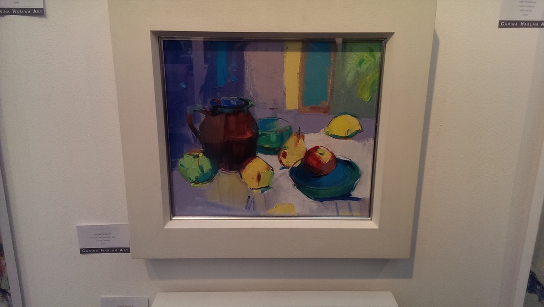 There is plenty of sculpture, ceramics, glass and various other media. A good example of one of these are the over-sized seed pod range. My favourite of these was the one you see below left. A nice luster and an excellent contrast between the red and the light green. Who is it by you ask? A fair question but unfortunately the little sign was so shiny all I see when I look at my close up photo is a bright light, so excellent question. The other two charming pictures of the bear and the sprite (below) are by the Anne Juul Chrisophersen. She is a Danish artist and her website is in Danish. They are good compositions these and I particularly like the fur and hair effects. My favourite is the one below left. She has captured excellent facial expression between the two figures.
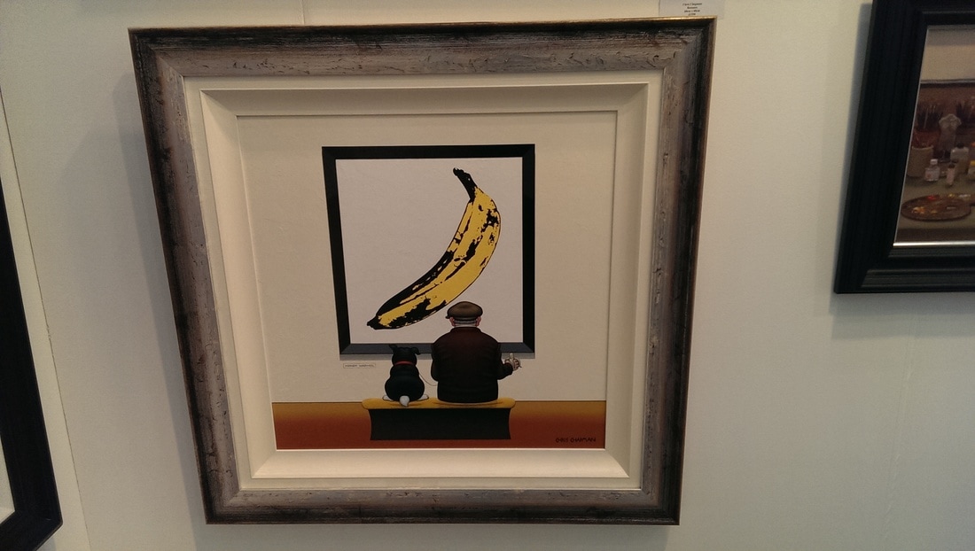
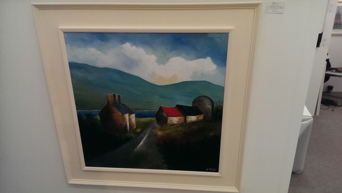
I am big fan of humour in art so I was drawn to Chris Chapman's work, particularly Bananas (below left). I has a very pop art style but that very much suits the subject matter. There is something very engaging about the man and his dog, particularly in the way they are both looking at the painting. I also enjoyed the sensation of looking of a painting of figures of looking at a painting. I think I like Mr Chapman. Going through his website I also enjoy the terrible puns of his painting titles. Apologies for the terrible photo but another picture I like was this rustic landscape by Padraig McCaul (below right). Seems simple with the white houses and the coloured roves, but of course the houses are not just white and the foreground works very well with the background, a background that road draws you towards.
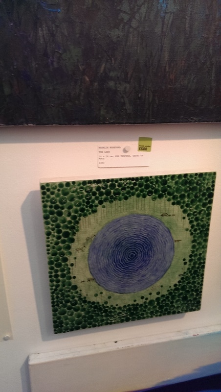
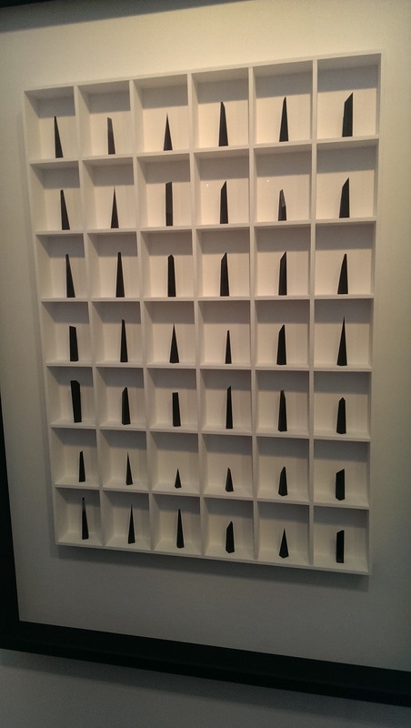
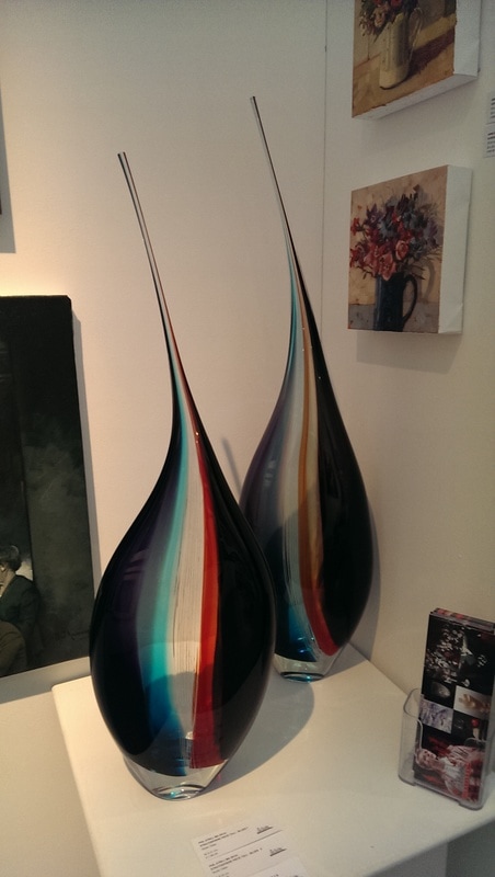
A mantra I often repeat is that some artists work look better in person than photographed, particularly when photographed by an overexcited idiot on a phone camera. The picture then does really not do justice to the work of Nataliya Rusetska (below left). Rusetska is an icon painter and you can see this influence in her work which is done in gesso and tempera. There is something very beguiling about them. The odd perspective, the geometric shapes and the little animals (which can be hard to spot amongst the trees) all contribute. One of the couple we were with bought one of her paintings. I strongly considered doing the same. I look forward to seeing more of her work in future. Everyone likes a vitrine full of things don't they? There is something very reassuring about them and this was certainly true of the 42 pieces of graphite (below middle) presented by Paul Fry. I like the angular spiky nature of them and the way that they are similar enough to work as a group but different enough to keep you interested. I could quite see this adorning the hallway of a modernist apartment. I like glass. Not now as much as used to. Ceramics weighs more in the balance these days. These long tear-dropped spiky glass sculptures (below right) with their almost candyesque colours are exemplars of good art. They are produced by Phil Atrill, who I am sure is a name I have encountered before.
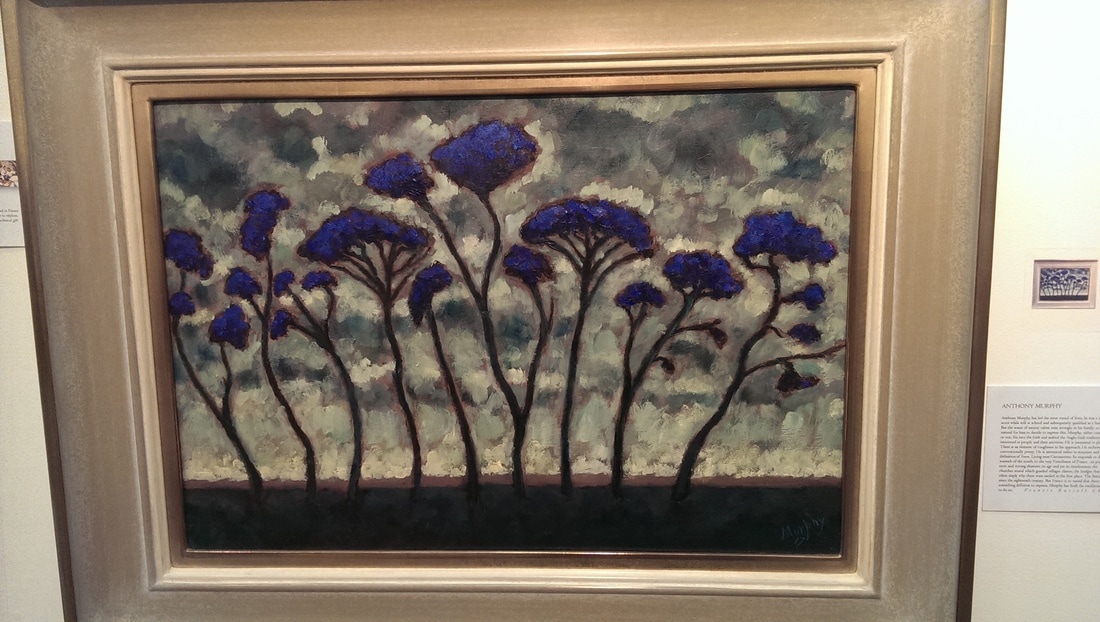
On the subject of putting things in cases I like this piece below left by Jordi Alcaraz. I don't know what it is. I don't know what it is made of. It seems to me to be some kind of strange office furniture tree. The scraggly lines join well with those leaf-life felted shapes. It pears well I think with the vivid work of Anthony Murphy with his piece Cedars of Lebanon. That intense blue of the canopy has an almost enamel quality, but it isn't, it is oil. The trees are very striking, looking out of that stormy background.
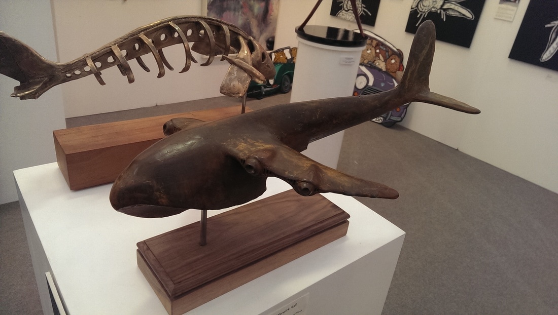
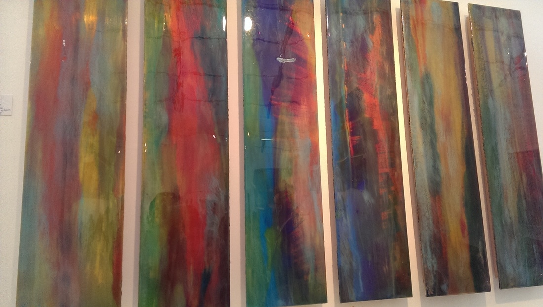
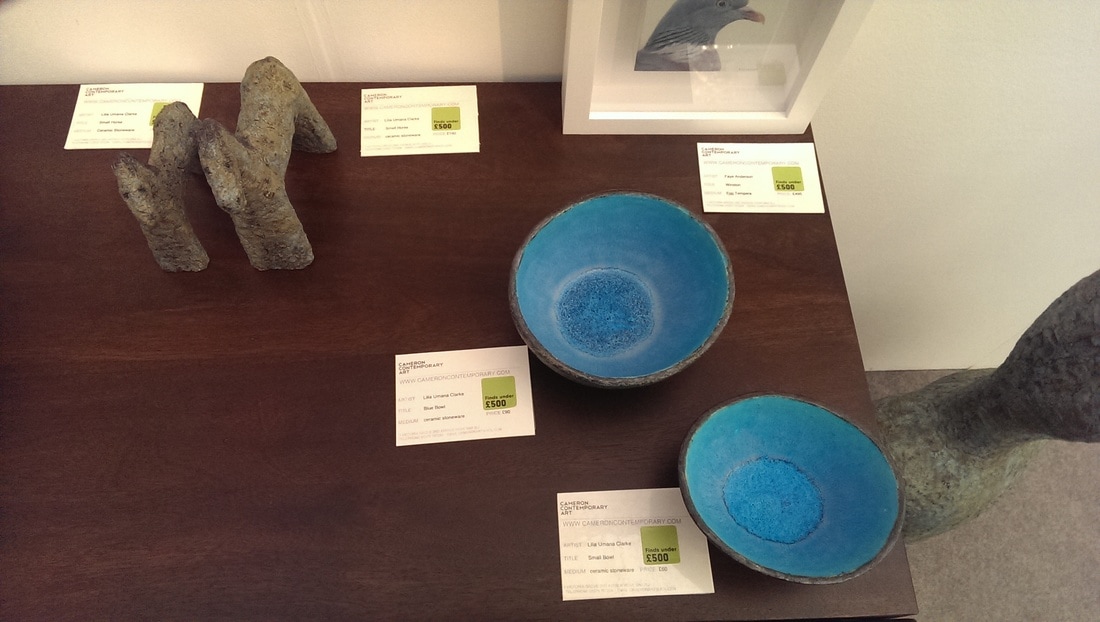
Is it a bird, is it a plane? Well sort of but it also a whale and has the honour of being the only bronze sculpture (of which there were many) to make it into my selection (below left). It is by Adam Warwick Hall and is called Whanopus, which is an excellent name. It melds, very effectively, the shape of one thing into another. Another singular entry is the only selection of colourful panels to make it into the selection (below middle) are these 6 by Christo Brown. The shimmering nature of the colours appeal, as does their interaction. I also appreciate the way that each panel works on its own but also as part of the group. Ceramics. Lovely earthen ceramics with turquoise interiors (below right). Apologies for the slightly rubbish photos but these were excellent objects by Lilia Umana-Clarke. You can also see the little horse sculptures, which I also liked.
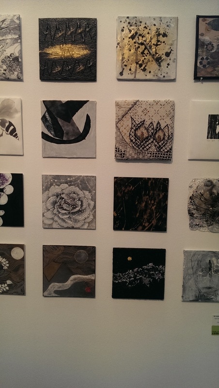
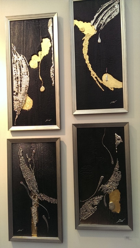
One of the best stands at the fair was that of Japanese gallery Ginza Gallery G2. They had a very good idea. They had on the back wall of their stand a grid of these very small paintings (a small sample of which are bottom left). They were all by Japanese artists in a variety of techniques and ranged from £70 - £230. A number of them were very good but they also benefited from the cheerleader effect, that is they looked much better together as a group. Doing something like this is a seriously good idea. It draws people into your exhibit and the price point, particularly of the cheaper ones is such that they can be an easy purchase. This means you have traffic to your stand, a tick-over of sales, increase in staff morale and probably, more likely to make a big sale. Some of them had already sold when we got there. Some of their bigger works were very good to, like these large black gold and white paintings by Masako Jin. I like the layers, the shapes and the drippiness of them. Elegant simplicity is a hard thing to pull off but Jin does it well.
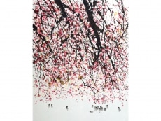
So taken was I by the above display that I returned to it at the end of the fair, and picked out two small pieces (see below). They turned out to be by the same artist which is obvious now, but was less so then, but somehow confirmed my selection. The artist is called Noriko Yamanaka, but frustratingly I can't seem to find a website for her. The mountain on the left is my particular favourite. 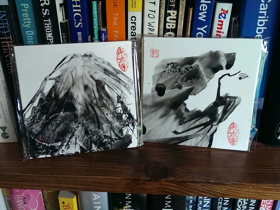 At this point in the fair my phone ran out of batteries so the rest of the photos are from the galleries websites. The following two selections are from Nine Gallery. They are a Korean gallery, and one of the great things about going these shows these days is seeing art you wouldn't usually see. The one bellow left is by Tae-hoo Park. He does these very inviting pictures with these delightful and adorable little birds in them. Both the foliage and the birds are beautifully rendered in a very print like style. The foliage is mostly presented in one main colour, giving each piece its own tone and feel. Had I much more money than I do, I would have bought one (or more than one) of these. The other one, below right is by Sul Park. Deceptively simple her work is these mountain vistas rendered with Korean ink on Korean paper. I like the different tones of black and white and the slightly watery nature of the medium. As you can see from the things I purchased above, this is a style that appeals to me. Sul Park's work is better than the stuff I bought, but also much bigger and much more expensive.
Continuing the Korean theme I was also impressed by the offerings of Gallery Tableau. Frustratingly my favourite artist of theirs is not featured on their website. He is called Yang Jong Yong and even more frustratingly I can't seem to find his website. He produces these very tranquil, very detailed floating bowls of moss (below). It is difficult to describe why but they are very good, very calming and well, just good. The moss is nicely textured and contrasts in texture to the plate. 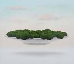 Coming closer to home is the My life in art gallery. I can't tell you where tell actual gallery is because they resolutely refuse to say on their website. By far their best artist though is Lisa Swerling who produces what she calls glass cathedrals (below). They are basically little glass fronted boxes, which contain these 3d scenes against a painted and often glittery backdrop, augmented by these tiny figures. She will do you one to your own specification. I have to say I am tempted. None of the ones on display at that fair appealed enough to come home but others from her website certainly do.  I have saved the best to last. Colin Caffell, a Cornish potter and sculpture represented by the Eleven and a Half gallery. It was his pottery they had on display and very good stuff it is too. Representing either landscapes (as in the one below) or seascapes they are combination of blues and turquoises with the base a blend of different colours, often scored with these contour type marks. They look much better in person. I particularly like the slightly pock-marked textured rim. They are very tactile pieces. I could not resist and bought one. The show finishes on 14th so you may (depending on when you read this) be able to go along. 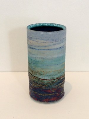 
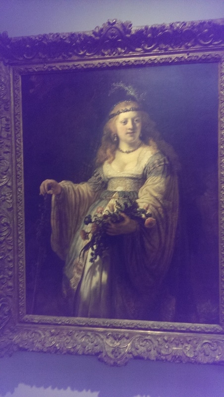
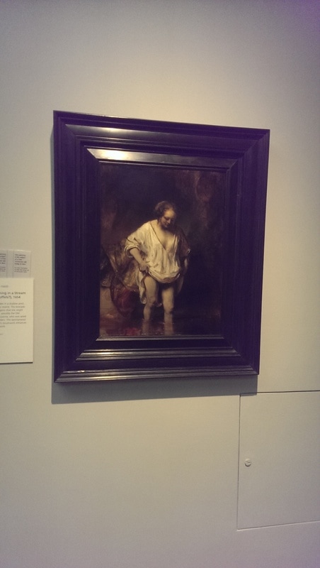
It was also interested to see the various studies and preparatory sketches, followed then by the final work. The best example of this is the raising of Lazarus which has just such sketches and then the enormous piece dominating the room on one wall, in a specially constructed frame. It is spectacular to behold. The problem is, with all this excellence, is that I do find the subject matter a little dull and find the whole thing a little samey after a while. There are only so many looming portraits of Jesus, in various stages of anger or despair, that I can absorb before the mind starts to wonder. That is not to say there is nothing I took from this exhibition I did, particularly Sebastiano’s use of colour with the classic trick of a robe of one colour (say turquoise) intersected by a sash of another (red for example). However it did bore me after a while and I find myself trotting through fairly quickly. Others no doubt, more interested in these artists or the subject matter will find themselves captivated but these pictures did not speak to me.  Elsewhere in the gallery, just to the left of the main stairs is a room. In this room is a solitary painting, Repentant Magdalene by Cagnacci. Now you main expect given my dismissal of all paintings religious above that this did not appeal to me. You are wrong. It did, very much, and I suggest you go and see it. It is free to do so and you only have until 21st May, when presumably it is returned to whence it came. It is a sumptuous and sensuous piece, finally rendered with great skill. There is a lot of movement to it. Lying on the floor is a very sexy looking (but anachronistically blond), Mary Magdalene. She is being coaxed from her position by another lady, possibly her post reformation, I am not sure. Above her a devil is being chased away by an angelic figure. Light falls on the central figures and the flesh tones have a glow to them. It is the pose of the Magdalene, half naked, next to a discarded blue dress and jewellery, that holds the attention, particularly the facial expression. Good composition and dynamism here and Cagnacci manages that great trick of bringing something new to an old subject. 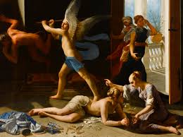 Changing tack again there is another free exhibition, also excellent but very different, Chris Ofili’s weaving magic. This exhibition shows the development, by way of sketches and watercolours of a tryptic tapestry. These sketches, particularly the final watercolour are very interesting and show a bold and imaginative use of colour. It is the final work though that packs the most punch. In a large room there are flowing designs of middle-eastern temple dancers. The kind of figures one imagines gracing an illustration of 1001 nights. These surround and frame the massive three piece tapestry. The colours in the tapestry, or weaving are more lurid and stunning than the preparatory sketches but it manages to retain the flowing nature of the watercolour. I’ve no idea how. It shows two figures, male and female, having a liaison while mystical cocktail is poured from the sky into her glasses. The surrounding panels show a male and a female figure, possibly observers but I prefer to think that they are our main characters just prior to arriving. I am very glad I have seen this, I have long been a fan of Ofili, and I suggest you do too. It is free. 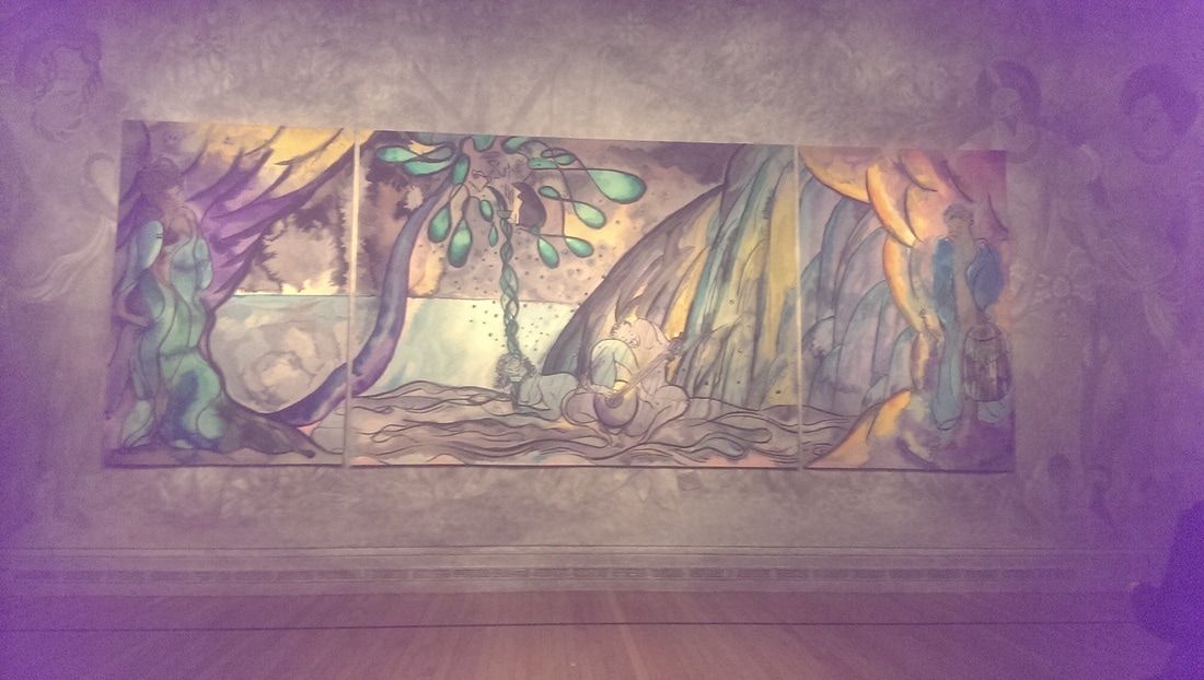 Finally another free exhibition, or rather a celebration of the opening of a new room. On the lowest floor of the gallery, accessed through the espresso bar is the first new room in the National Gallery for a number of years. Gallery B it is called. In it there is on display a collection of Rubens and Rembrandt those colossi of the Dutch school. Rembrandt used his wife as a subject it would seem. I like these and two in particular caught my eye, one of her bathing and one of her in Arcadian costume (whatever that is). They are playful, intimate and, I think, loving of the subject. They are also technically superb with the dark background highlighting the figure.
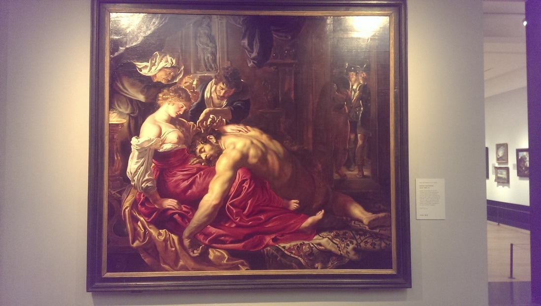
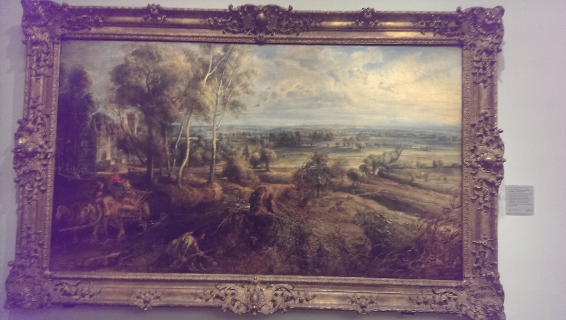
For Rubens two pictures caught my eye. One is Samson and Dehlila, she having just cut his hair presumably and of course as you do in such situations, has her tits out. Such is the way of painting, but she is a typically Rubenesque figure. I like the toothless gummy look of the old woman behind her. My other favourite was in fact in gallery C and is a landscape of some Dutch village or other. I forget the name. It has a sort of spectral quality to it, particularly the trees that I find very attractive and adds movement and interest to what can too easily be a flat subject (as many landscapes are). There are other pictures on display of course but these are my favourites. Go and have a look, its free so you might as well.
|
Archives
June 2024
Categories |
 RSS Feed