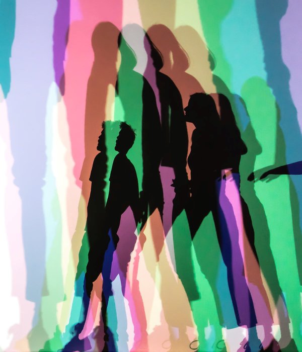
 Olafur Eliasson has a very unmemorable name, but even if you don't recognise the name you probably know the guy. Remember when there was a large sun peering through mist in the turbine hall at the Tate Modern? That was him. Anyway, he is back at the Tate Modern until 5 January 2020. I have been twice. The first time I went it was a Sunday near the start of the exhibition and it was incredibly crowded. I've never seen an art show so busy. Many of the visitors were families. I got halfway round then retreated. I returned recently on a cold Tuesday. It was substantially calmer. The first room is a large selection of his concept models. It is always interesting to see somebody's working and on a smaller scale of the work you then experience. Sadly the exhibition has now finished so you will have to take my word for it. It took me a while to figure out what the show was. It's a fairground ride. A high-spec, colourful, interesting and almost spiritual fairground ride, complete with misty tunnel, hall of mirrors, dark room and light effects, such as the one above where you are back-lit and your shadow displayed in a number of different colours. But we are leaping ahead. It is worthwhile having a careful look around. The first room contains a very impressive tactile wall of moss-like substance covering all of one wall. On the floor are four different-sized, both in length and width, tanks full of water with wave machines. They generate waves of different frequency and it is fun watching them join and destroy each other. These easily distract you and it is easy to miss things, for example the rain machine dripping onto one of the windows. 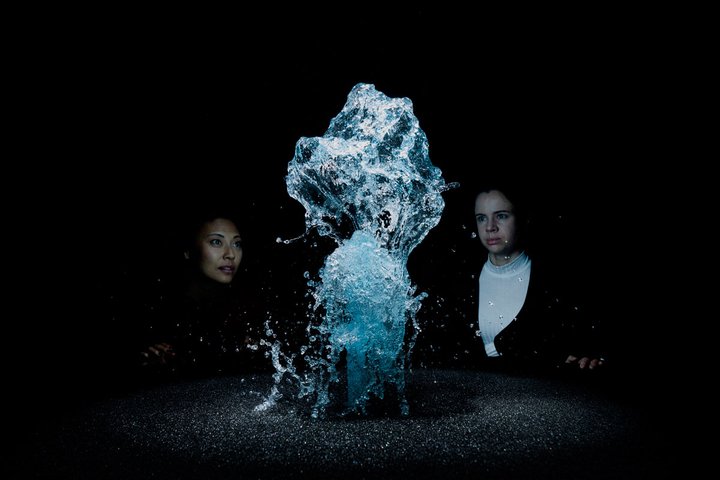 In the next room you see a convex mirror displaying an upside-down distorted view of the room you have just left, and this is what I mean about it being a high-spec fairground. You then have to queue to go down a long misty tunnel. You can barely see more than about an arms’ length in front of you and different coloured lights mean the mist changes from orange to white and yellow as you gently parade down it. I understand that you are legally allowed to murder anyone who has stopped to take a selfie while in the tunnel (there were lots, there are less now). You emerge slightly baffled to find a large sci-fiesque cylinder, which you can walk inside of. It is bedecked with mirrors that reflect and distort you. The next room has a series of light displays and then also the light effect you can see at the top of this blog post, which splits your shadow into a number of different colours. My favourite thing in the whole show though was in a very dark room. Sudden flashes of light reveal an ever-changing sculpture on top of a plinth. It shifts from looking like a pac-man ghost, to a flattened kraken and other weird shapes. It is in fact the thing pictured above. It is a fountain, and the flashes of light catch it in different shapes and imprint it onto your brain. I thought this was excellent and stayed there for quite a while enjoying it all. 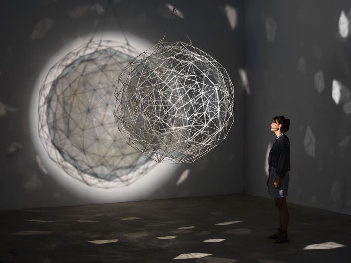 The final room contained a very pretentious and wordy wall taking the alphabet and exploring environmental themes. A large round table contains a construction set, hundreds and hundreds of different pieces that you can assemble and possibly, if you were minded, create a shape like the above. That was great fun. The exhibition continues outside where the ball-like device is. There was a display that I have seen before where yellow polarising light, here set up in a hall way and in the lifts, made everything appear black and white.
It was a great show. I enjoyed it.
0 Comments
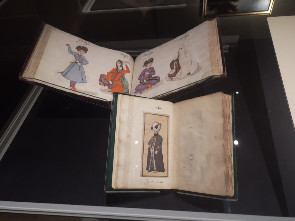
 There is a show at the British Museum right now called Inspired by the East, the Influence of Islamic Art. It is the kind of show that the British Museum does really well, an overview of something from history or art, giving you the context of how it was produced and what effect it has. You get the obvious direct influences, high Victorian Western images of the Arabic world like the above, but also other inspired pieces such as the tiles of one of my favourite artists, William De Morgan.
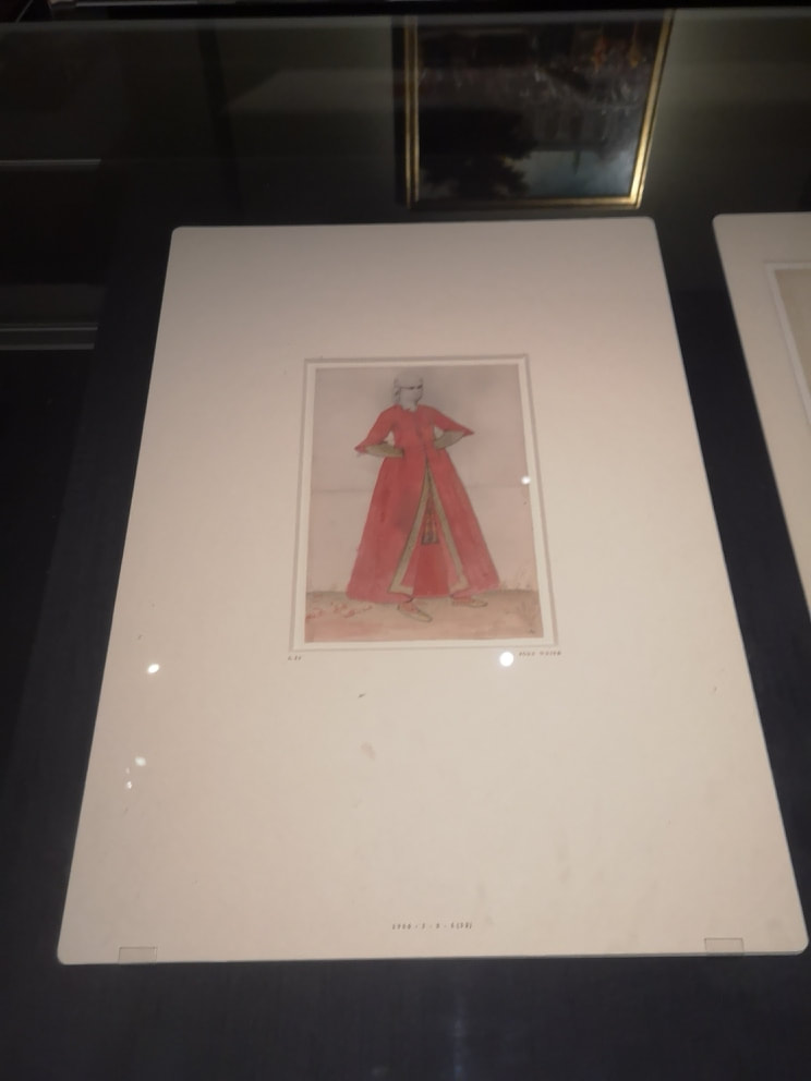
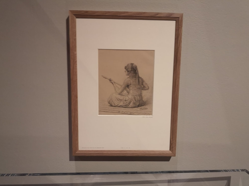
One example I really did like was this watercolour of a woman in veil and headdress (above right). It is a very striking composition, with that pyramid of red. I like her pose as well, and the general composition reminds me of a sci-fi, postapocalyptic character. I really like it when you find images that feel very contemporary in historic art. I find myself wondering about the person depicted.
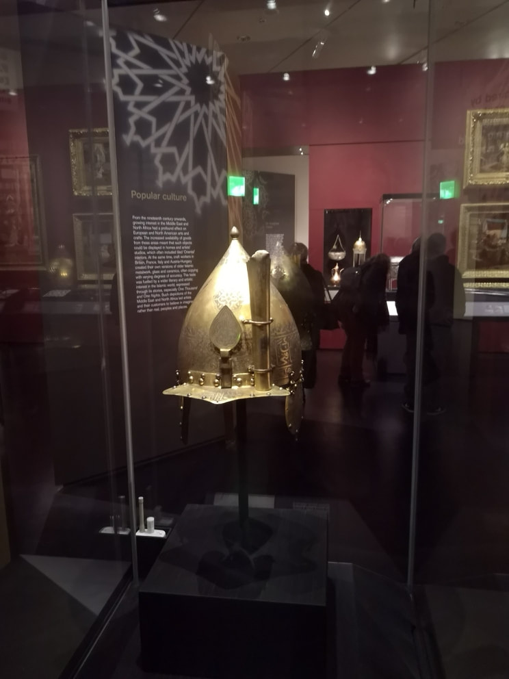
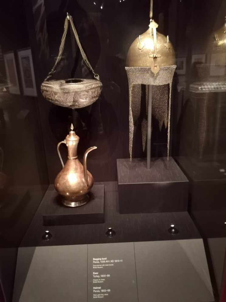
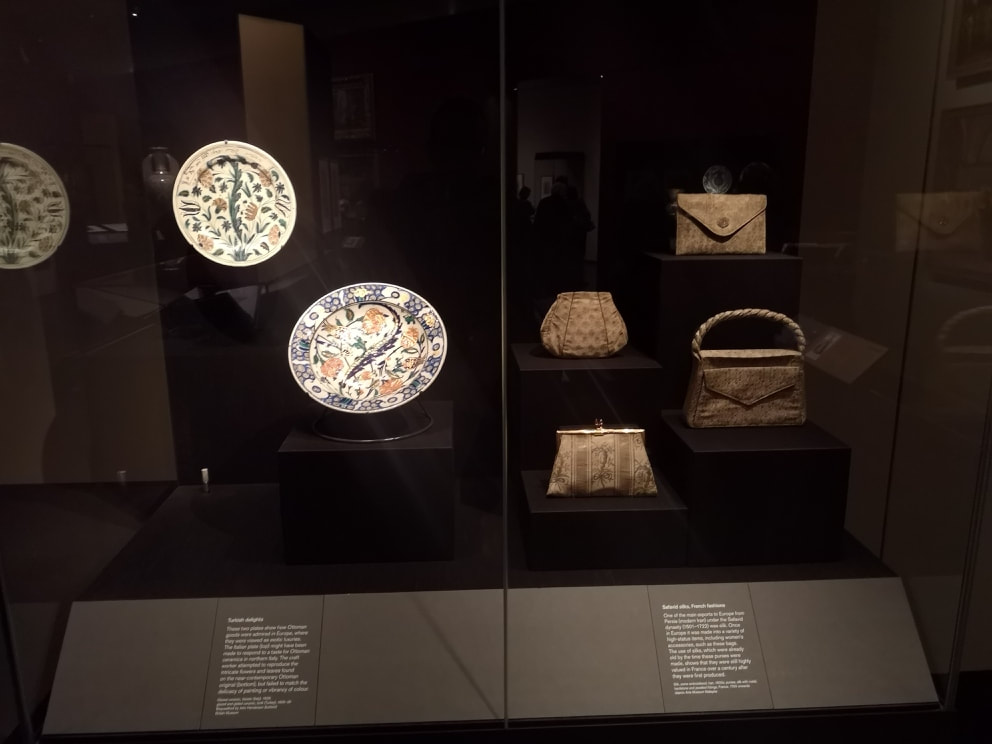
Got to have Islamic militaria. You get two helmets and a sword. I really like the helmets, both of them inscribed with intricate patterns on them. The shapes of the helmets really appeal to me, but what grabbed my attention (but was frustratingly unexplained) was the little chimney shape on the above left helmet. What the hell is that for? Presumably for holding some kind of plume. In addition, very interesting to see something different, that hanging decorative item is in fact a begging bowl. It is made of Coco-da-mer, a kind of nut. Don't google it, there is a sex shop of the same name. Again, there are wonderful Islamic writing and designs inscribed around the outside. I always like seeing things like this. To counterpoint this, in a display just near it were Western and modern pottery, and tableware that uses these designs and elements. The glassware was particularly attractive.
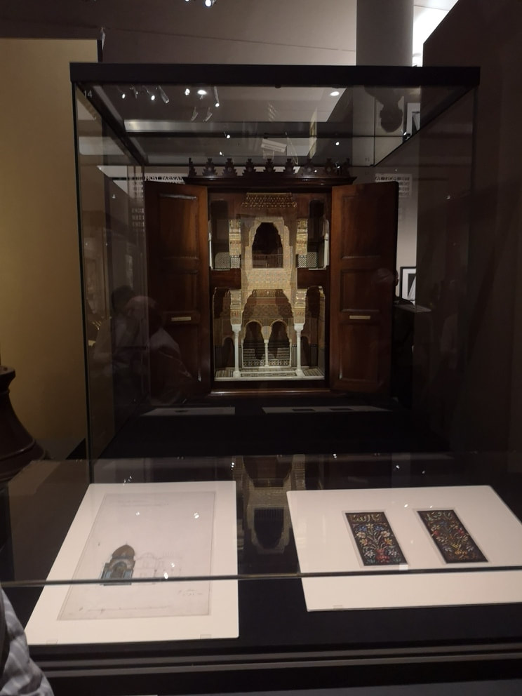
The Alhambra has long been on my list of places to visit and this rekindled my desire. I want to wander through those tiled halls. It directly inspired Lord Leighton, who had part of his house built to reflect its grandeur. You can see it, it’s call Leighton House in Kensington High Street and is well worth a visit. Underneath is its inspiration: designs for the room and the detail you can see in said room.
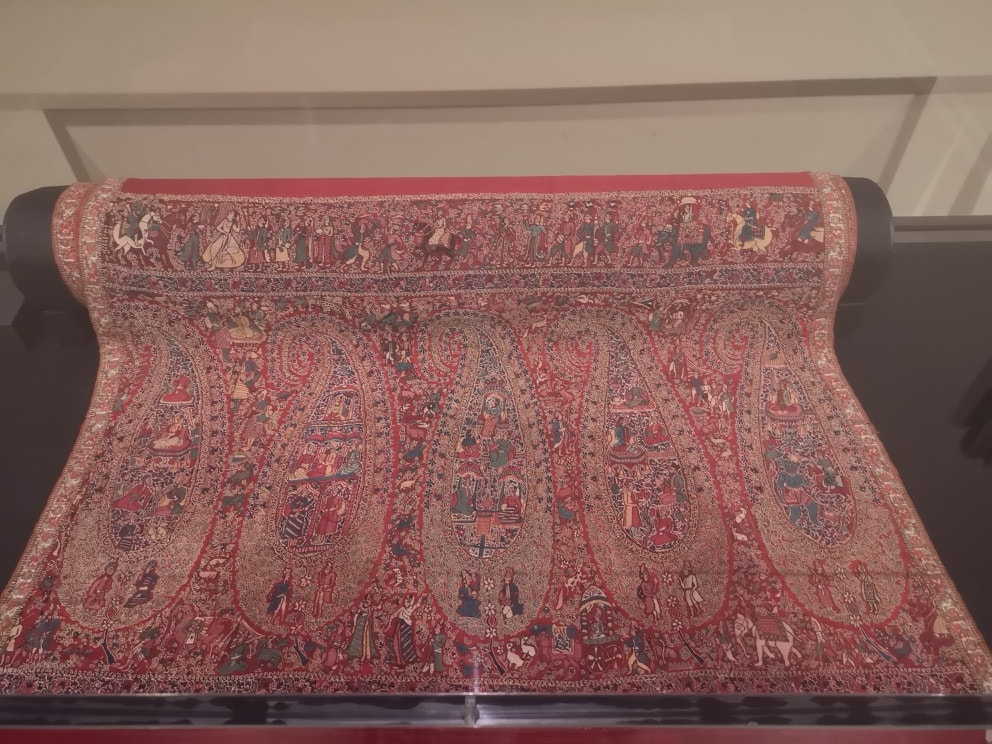
There was one actual carpet (above) and it is beautiful. A rich red with intricate detail of people bopping around in various ways. It is difficult to imagine this being walked on or even on the floor, so it may be that it was hung on a wall. I spent some time peering through its finely wrought details.
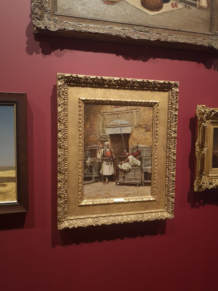
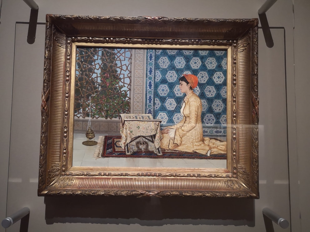
One of the things that occurred to me while wandering round this show was that there were lots of depictions of men at prayer or otherwise engaging in acts of faith, but I never saw one of an Islamic woman; then I rounded the corner and saw that someone else had realised this, over 150 years ago.
The painting is above left. The artist in question was Osman Hamdi Bay, who was described as the most Parisian of Ottomans and the most Ottoman of Parisians. A strange accolade but there you go. The painting itself is superb. The colour contrast is excellent, the way the woman pops out of the background. Then, the intricacy of the background, the lattice over the window, the turquoise of the tiles and the mother of pearl on the table. It’s lovely and I think Bay is a new favourite of mine.
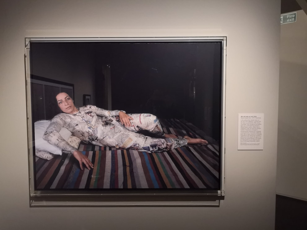
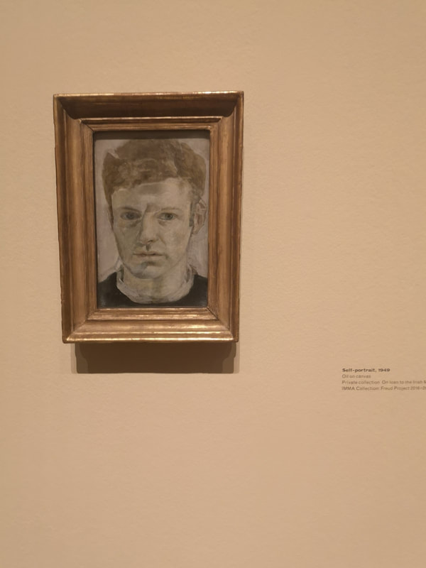
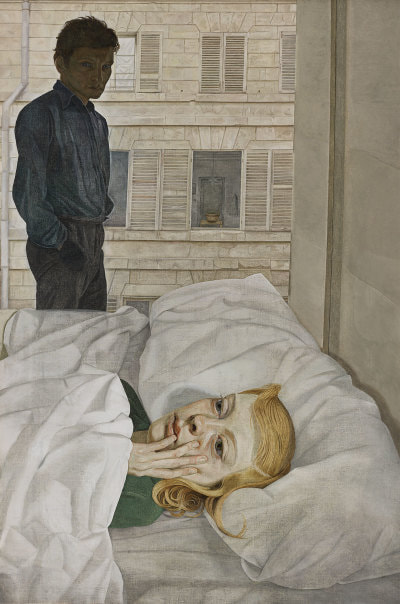
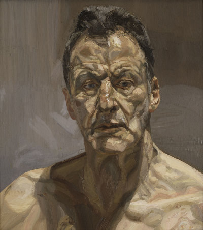
There are also some excellent modern takes on some of the classics. There is the woman above right; she references a nude, but instead she is covered in newspaper. Sadly I have failed to note both her name and the name of the painting, but it is a very striking image and I liked it very much. Similarly, there is a classic etching called the Harem of the Seigneur. The last exhibit in the show was a projected version of that picture with moving figures, castigating and criticising the original. It was done very well I thought. A show worth seeing and I really enjoyed it. 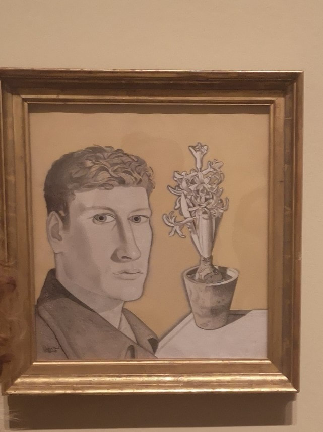 Lucian Freud's self-portraits are currently on display in the Sackler Wing at the Royal Academy. It is very interesting, showing the growth of one Britain's most famous artists both physically and artistically. He starts out looking like James Acaster, as actually quite a handsome young man. That steely look of self-regard is something that never goes away though. I like the early work particularly. This flat style with often quite a surrealist feeling of placement is something that appeals to me.
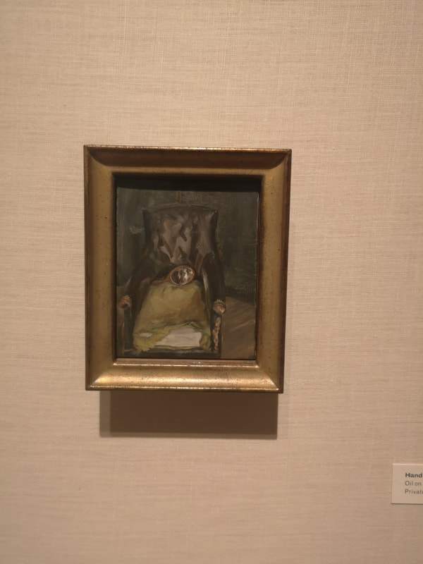
As the man develops so does his work. It becomes thicker, darker, more brooding and intense. He very quickly develops this sort of grey/blue palette, which stays until the end of his work and reminds me of the interior of a 1970s Austin. There is something somehow very 70s about Freud. Other than the direct self-portraits, of which there are many, what is in many ways more interesting is his habit of putting himself into other paintings. He apparently left random mirrors around his studio to catch different angles, and it is these accidental images that I like. Probably my favourite piece in the whole show is this dark tatty picture of a dark tatty chair. The texture and detail on the leather and the ripped upholstery, and then, to justify it being in the show, this mirror with a blurred image of the man himself.
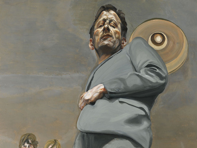
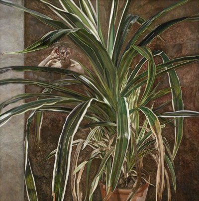
is a monstrous, looming self-portrait, with Freud in a hideous grey suit. You can feel the colossal self-regard emanating from this image. Freud is lesser-known as a botanical artist. Knocking around are a number of his plant paintings that took him years. There is a faded, battered feeling to this dying plant, which is an example of his slightly off-kilter faded elegance thing. And then, for reasons that are not obvious, there is a naked bust of the man, peeking out from between the fronds. He appears in other paintings too. There is, disturbingly, a full-length nude painting of his adult son, but with Freud himself appearing reflected in the window. Others have his feet or shadow.
For me, there is much more interest in the more dynamic, narrative paintings. Although the subject matter seems very harsh, I like the one of Freud and his then wife in a hotel room (above left). I like the narrative tension in the painting and the pensive look of horror on his wife's painting. While Freud is not my favourite painter, I find him often far too cold and distant, artistically and psychologically this is a fascinating show.
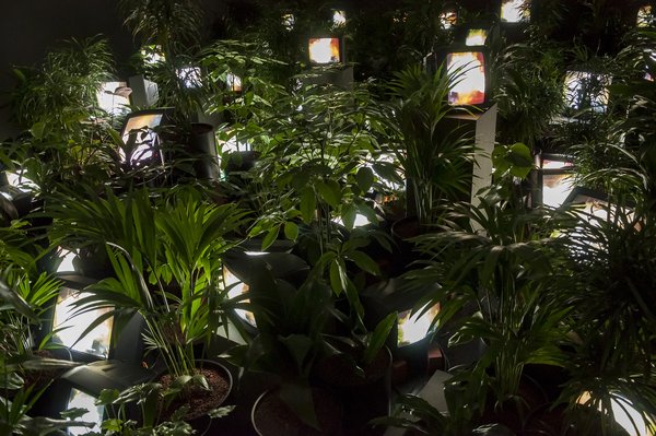 I had heard of Nam June Paik before. The Tate had exhibited a number of his joyful robot sculpture constructions over the years and I enjoyed them very much. I was therefore quite look forward to a full exhibition of his work, which is currently being shown at Tate Modern. Initially I was quite impressed. The first exhibit is the delightful jungle like affair (above). A darkened room, strewn with lush potted plants, and peaking out between them these televisions poking out from between the foliage. They show Paik characteristic, blurry indistinct colourful images.
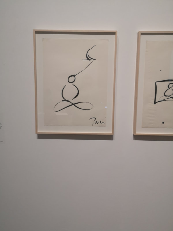
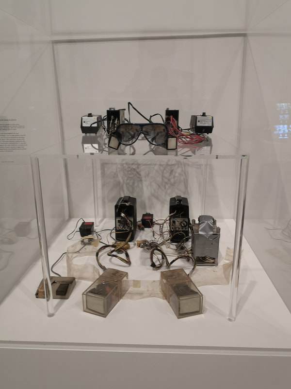
Opposite that were some very simple but strangely captivating line drawings using the classic Korean ink painting. They are bold and inviting lines. I will get onto the other highlights but I found there was a lot of heavy quite tedious typed and written manifestos. Paik was at his peak at the age of the manifesto and there were an awful lot of them. I don't like being told what the art is. Unless your philosophy is interesting and well put I am simply not going to wade through pages of typeface. No doubt this does appeal to some and there were many earnest looking people who obviously got a lot out of it. For me though art has to have above all a visual impact. And there is plenty of Paik's work that does. One of the strong things he does is constructing things out of electrical equipment. Anthorpomophising. Is that what is going on? Two excellent examples are above right where you have a pair of glasses and a bra, apparently. Anyway this 80s tech steam punk wearable tech thing really appeals to me. 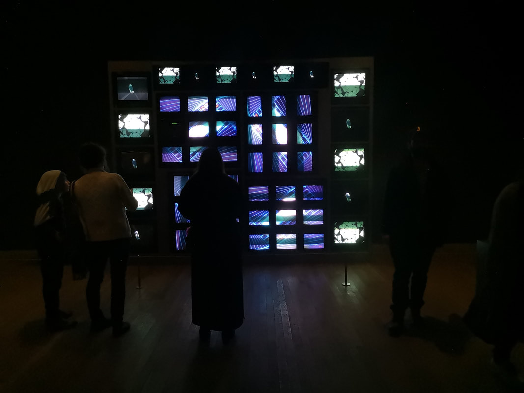 In a darkened room at the end are banks of television screens arranged both landscape and portrait. They show both composite images and separate images which engulf you from the end of the room. Its quite an experience and depending on what is being shown can be either activating or calming. Its a nice idea done well.
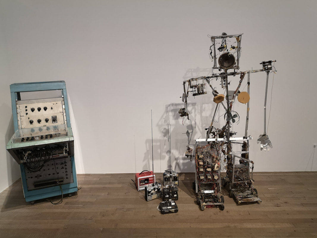
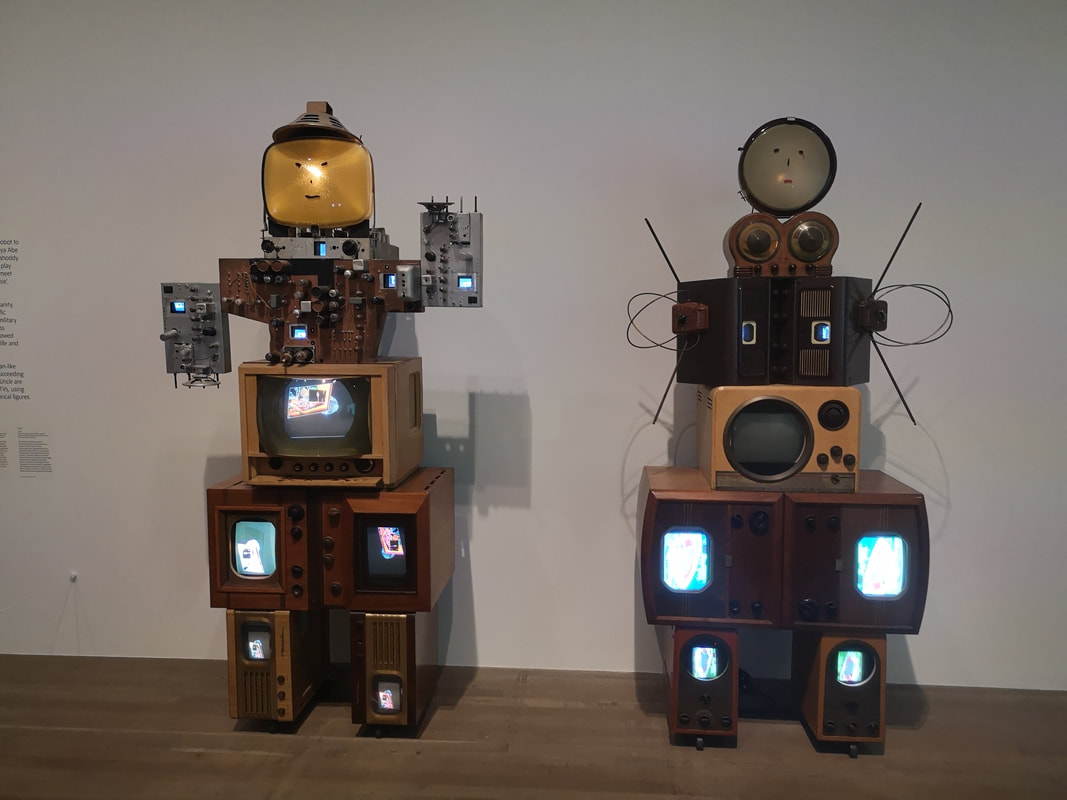
My favourite room though was the Robot room. The robot's as I said before are the elements of Paik's work I find the most engaging, the most pleasing and the most joyful. There were three (above) showing a sort of evolution of the robot and the incorporating of the TV screens is a nice touch. I spent most of my time in this room marveling at the old tech. I would, ideally have liked to have seen many more of these.
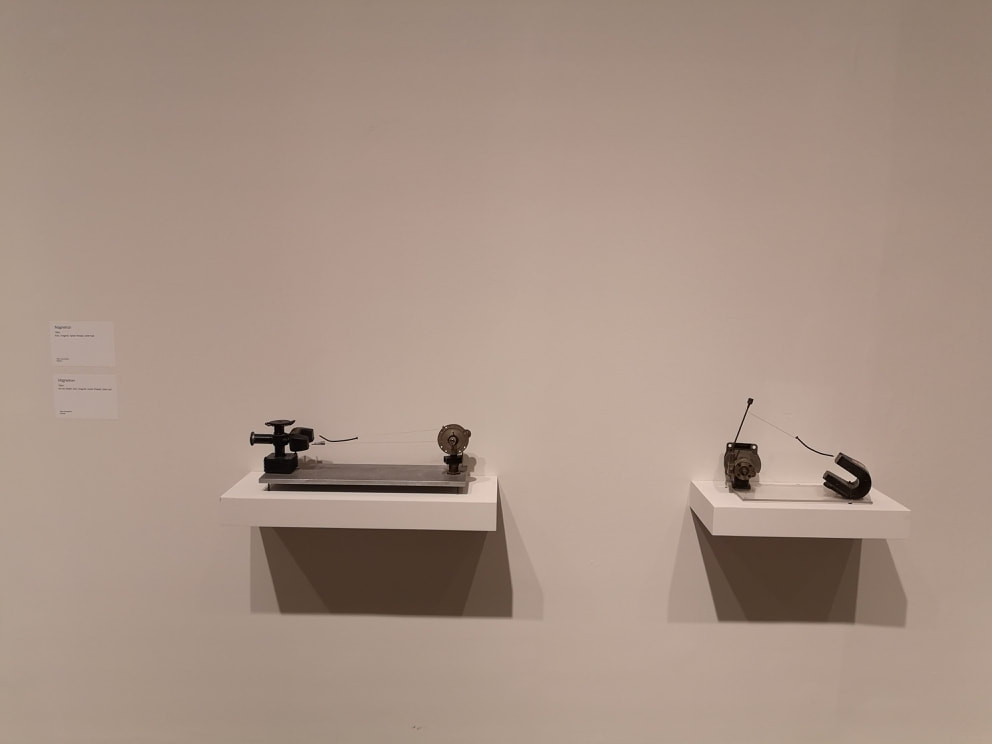
 This blog comes out on the last day of the Takis show. It is on at the Tate Modern until 27th October 2019. I had no idea who Takis was but I was at the Tate Modern for another reason today and I thought, why not and so in I popped. Lots of artists are known for just one thing. Takis is the magnet guy. Magnets feature very heavily in his sculptures. They give an extra dimension to his sculptures. If you look at the photo above at first glance it is a just a fairly pleasing assemblage of metal, but look again and you will see elements are suspended at the ends of wire. They are not touching anything. It is strong magnets that keeps them in place. Literal tension. Its a nice idea and i've not seen this done anywhere else.
Some of the pieces are kinetic, to varying degrees. When I first arrived the collection of magnets in the top left were just gently oscillating and then a security guard came in and set the large one swinging in a circle. It caused all the smaller ones to follow them round in a pleasing bobbing formation. Some of his work though is not magnets, it is just small electrical component like structures. They are quite interesting to look at but I have to say they don't do much for me.
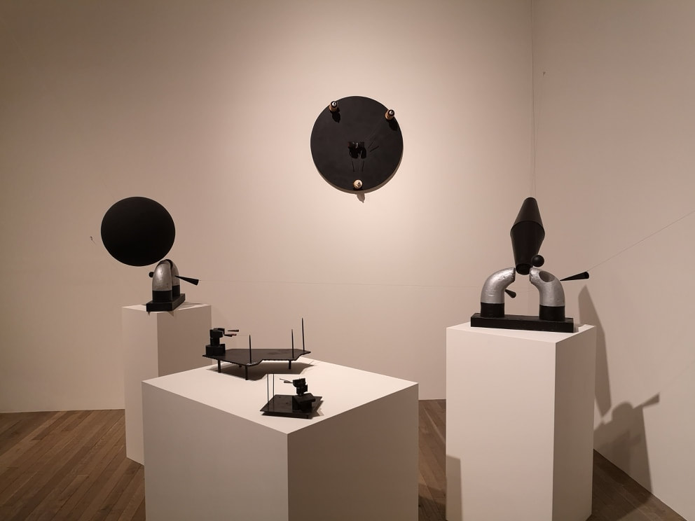
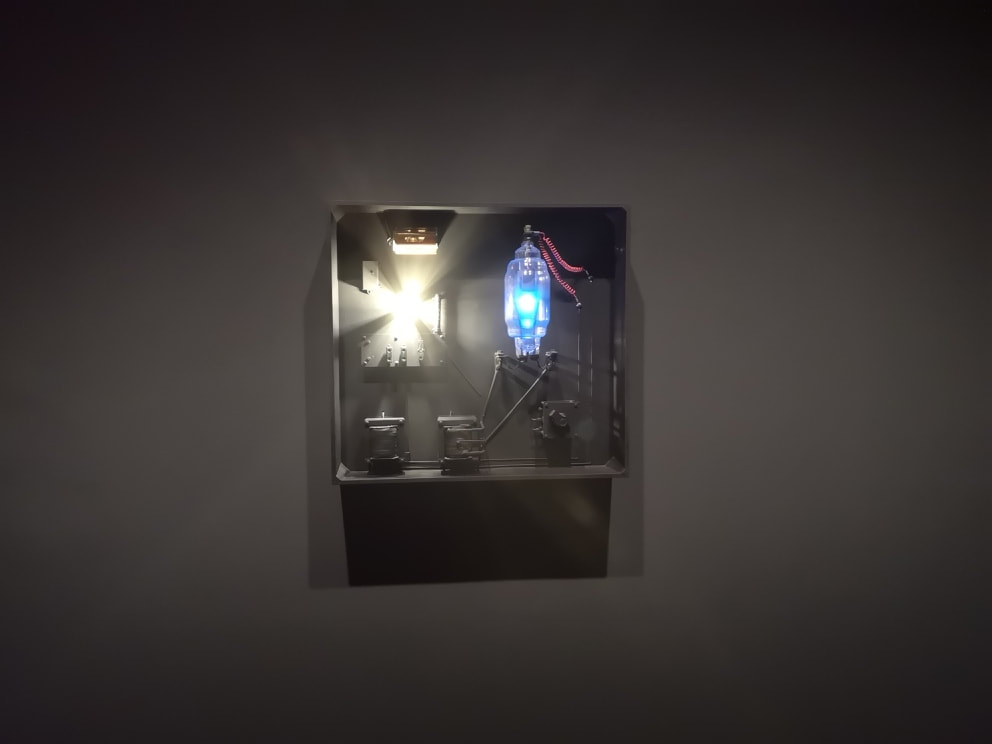
In a darkened grey coloured gallery are a number of light focused pieces, the darkened room of course emphasising the light as it appears. I like the switched based, almost steam punk feeling mechanism. Timing is often an element. So with the one above left the blue light stays on constantly but the white light flicks on and off at intervals. I particularly like the bulky blue bulbs with the red wires. More robotic and somehow anthropomorphic is the construction above right. It has a nice mechanical menace to it, and again the light illuminates at intervals, and the little balls rotates.
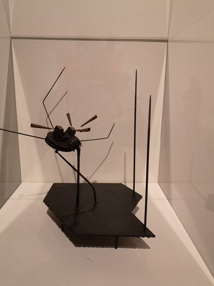
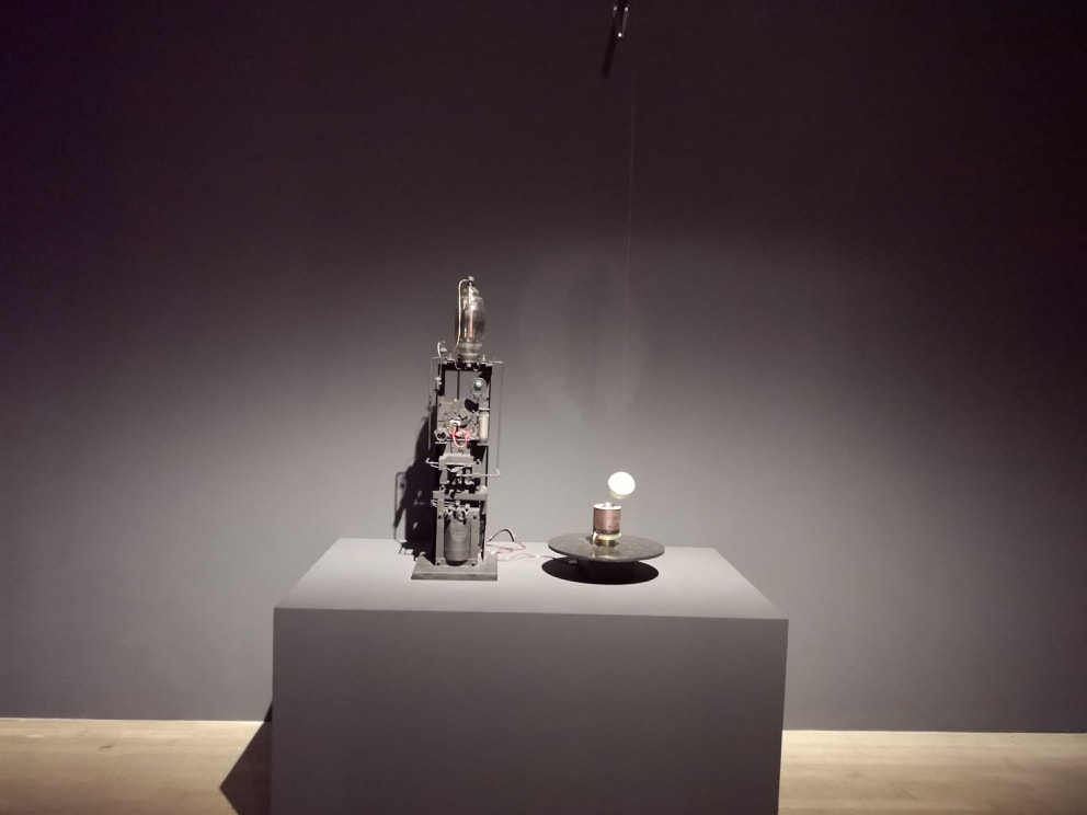
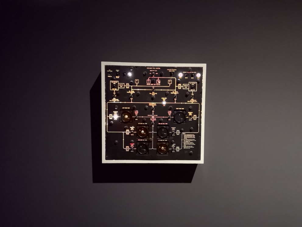
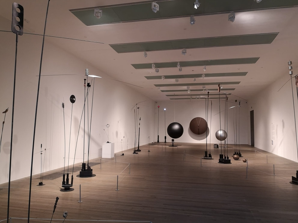
The one though that provided me with the most joy was this control panel (above left) . With its switches, flashing lights, and alarmingly swirling dials it reminded me of old sci-fi sets. I was gripped with a strong desire to flip those switches and a regret that I never became a pilot or anything similar. It is a simple concept in a way. Presumably all he has done is jury rig a control panel so it mis-behaves but it was somehow beguiling. At the end room (above right) there was a collection of tall thin sculptures on the end of metal poles. Again they had a strong mechanical or electrical component bent. I could not help comparing them unfavourably to Alexander Calder. I found them a little bit dull. Some of them had a nice scythe like quality that I enjoyed but otherwise I found them difficult to engage with. More intriguing were those three large spheres you can see at the end. The large brown one is in fact more of a shield shape, and has a oversized flatted screw hanging in front of it. The other two are actual spheres and were oscillating gently. Again as I watched a member of museum staff appear. He set the screw swinging so it banged into the shield. He set the metal sphere swinging. This caused it to twang a triplet of wire strings, connected to an amplifier which produces a noise much like when a child gets hold of a bass guitar. That was quite entertaining.
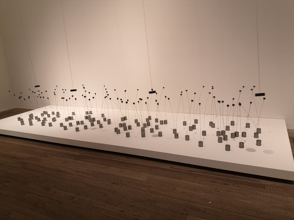
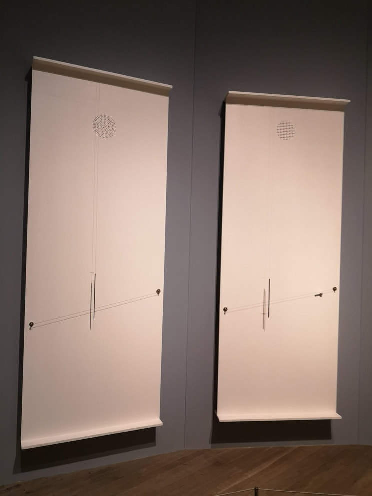
This is another theme, the production of discordant chaotic sounds. In an octagonal side room are hung about eight of these rectangular boards (see above left). On them are dangling blunted metal spikes, which intersect differently angled metal wires at different points. Every 5 minutes the magnets are activated which causes the metal spikes to jangle against the strings, producing a pleasing cacophony. After 5 minutes it stops again, at least so the signed informed me. I did not stay for the whole five minutes.
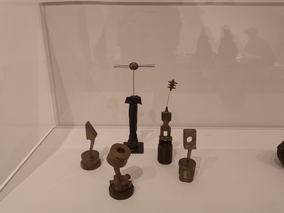
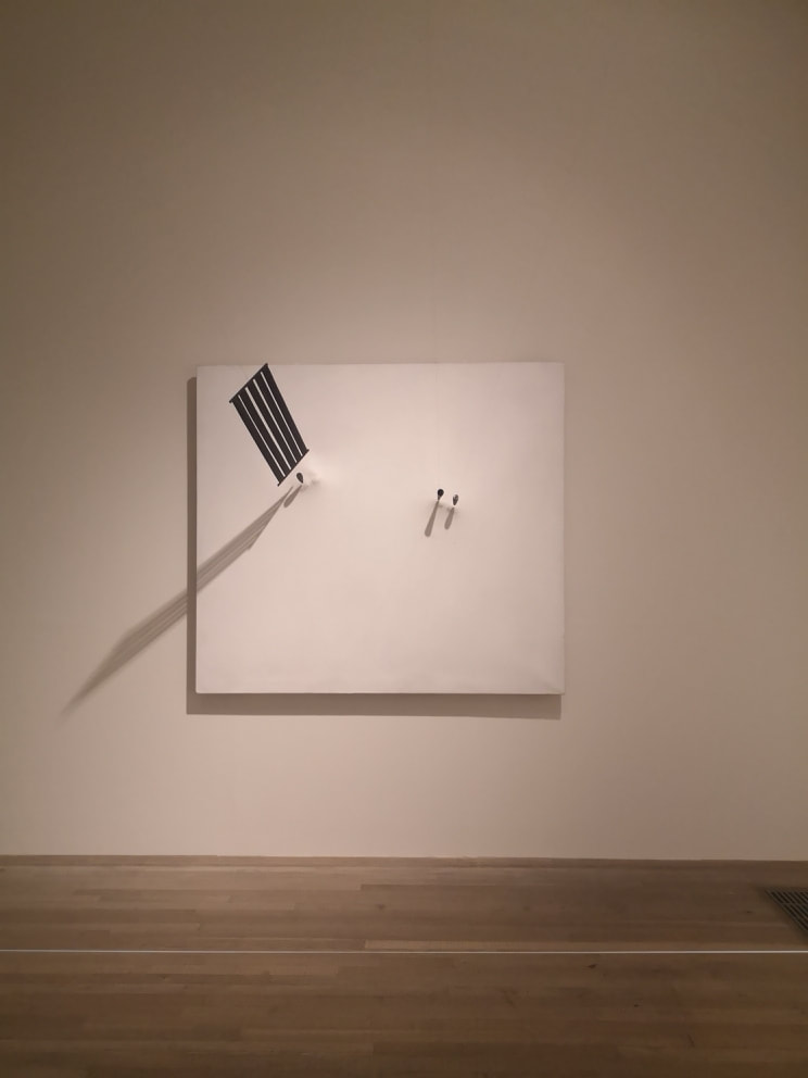
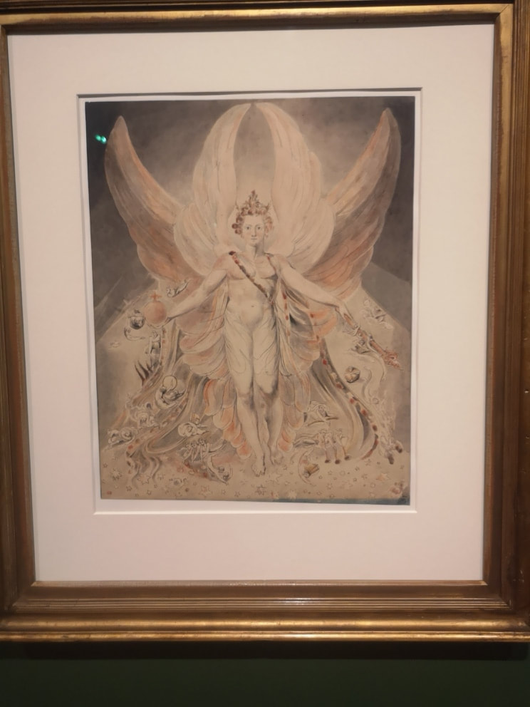
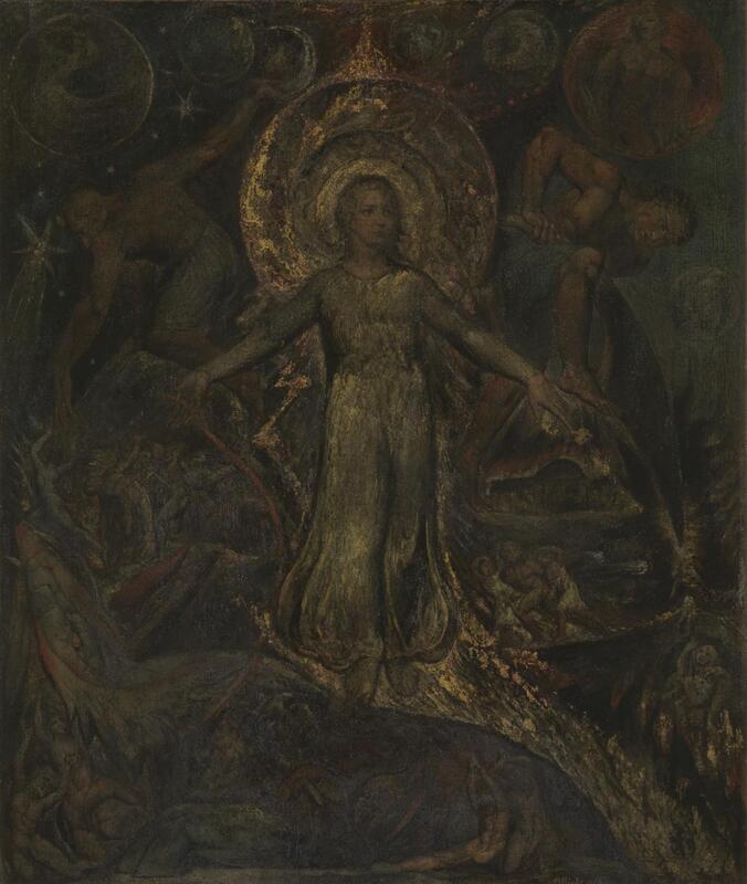
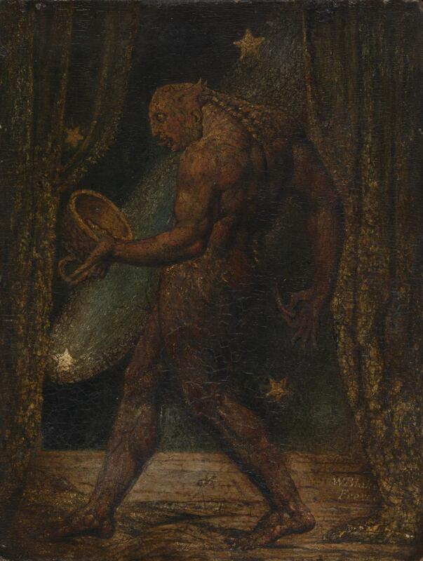
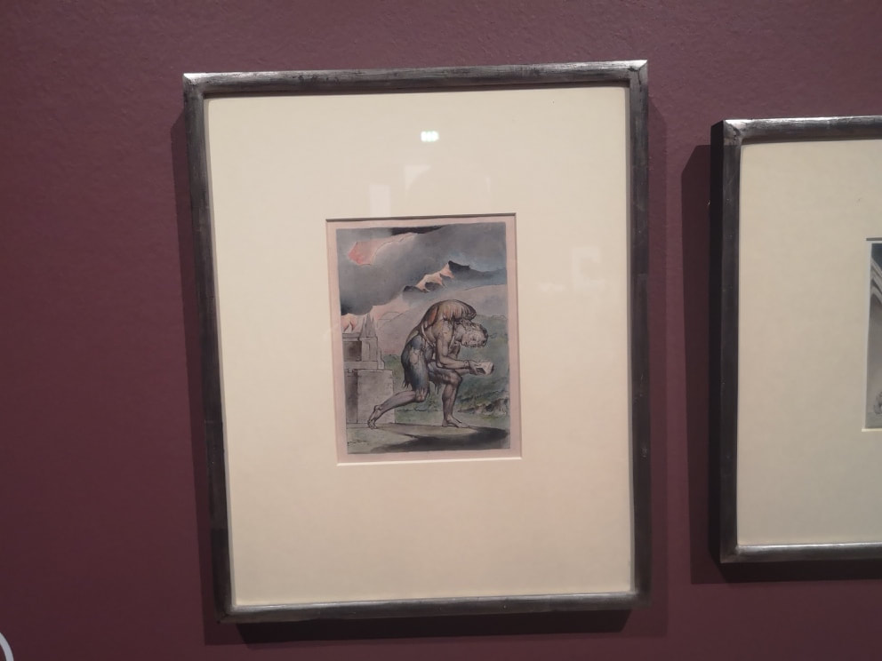
I will leave you with my favourite piece from the show,, three structures held in place by magnets against a white background (Above right). it is the 5 bar stave that particularly appeals to me here. Anyway, hope you found this interesting. Check our my paintings here  Tate Britain is showing an exhibition of William Blake at the moment. It includes portraits of Blake, by other people (although there may be self portraits there as well). He does not look like you think he does. I at least imagined a prophetic wizened bearded man as we see in so many of his paintings. Instead we have what looks like a chubby accountant. This pleased me because it is more or less how I look and one can console oneself that genius comes in unlikely packages. Most of us are unlikely packages.
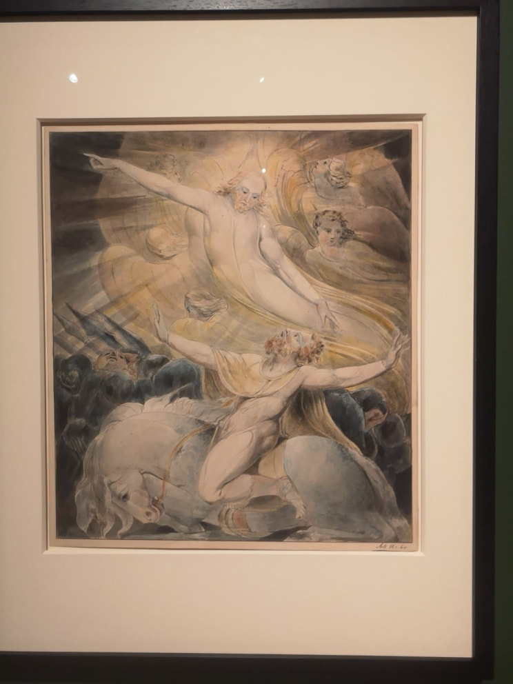
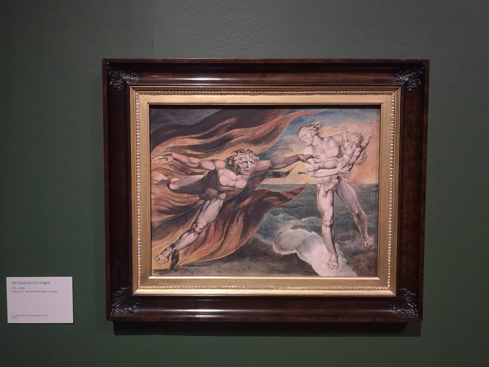
Anyway, onto the art. There is as you might expect and would be disappointed if you didn't see, lots of religious depictions. It is a very packed show and there is much to see. I will only skim the surface to give you a taste. Blake does a lot of watercolours and they have always struck me as rather monochrome and insipid. In many ways as you can see from the above they are. However it is also clear I have been doing the man a diservice. What I hadn't realised is quite how much watercolour can fade. As the clever curators (who have done a marvelous job by the way) point out. In the top left picture do you see that line of blue in the bottom right hand corner? That is a part of the painting that is usually covered by the frame and has not been subject to fading. You can see how much more vivid and bright it is than the rest of the piece. This fired my imagination and I began to try and image what the paintings would have been like in their pomp. The one above right for example with the man on the kneeling horse, I forget who he is and what he is doing. It is a striking and arresting image. Oddly modern, almost abstract in its depiction. Imagine how it would look with the blues, and yellows popping out. Would have been quite a sight.
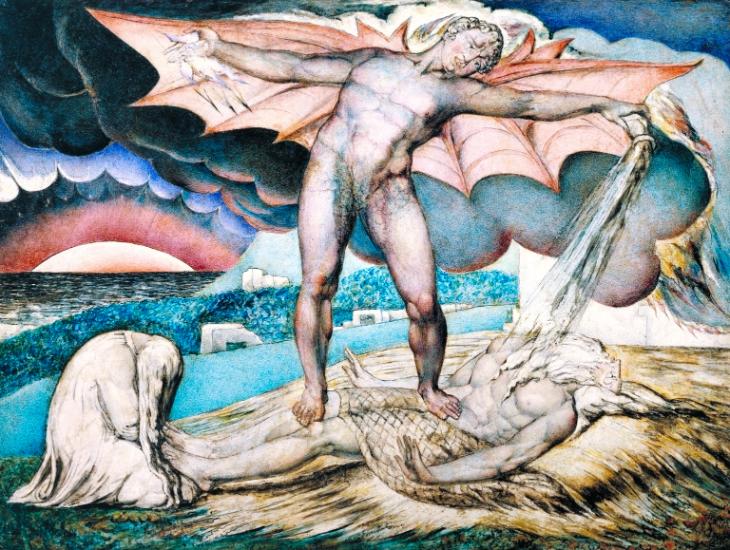
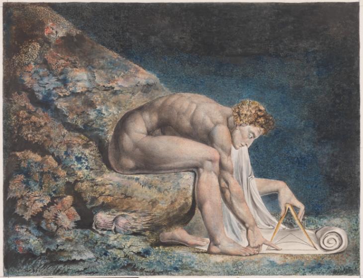
You get much more of a sense what the watercolours would have been like with some of the oils. Like the one above left with Satan afflicting Job with boils (which reminds me of my favourite religious joke; Ahh yes, the book of Job. If it wasn't in the bible then you wouldn't believe it). Very vivid blue and I particularly like the sun boiling below the horizon with that thorn like crown of dark blue sky above it. More meditative and looking slightly like he is perching on an underwater rock is a portrait of Newton (above right), although I suspect that Newton was never that buff or that naked in real life. Here is Newton risen to angelic of grecian form.
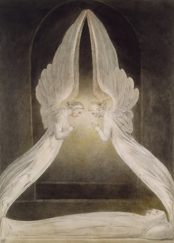
Scattered around the place are these beguiling dark paintings. They no doubt have faded, but I suspect that they were also painted this dark. Because I am foolish I have lost my notes of what some of these paintings are. No doubt if one is sufficiently religiously adept one can read them from the painting. The one above left has a haloed figure atop a dragon, St George possibly. The one above right is one of the most baffling pictures. It is small and very dark and difficult to see. It is called the Flea. Why? who knows, what was in the bowl, is he on stage? It is a painting that invites you to take your own journey, no doubt with many a visual clue for the cognoscenti.
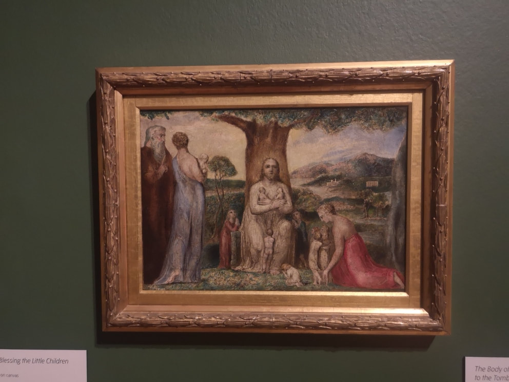
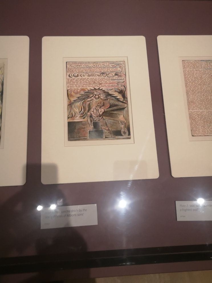
Back into the light and the religious themes that dominate Blakes output. Many of the paintings are quite small, just above A4 size and where then rendered as prints. I find him less successful when he is dealing with the New Testament era stuff like the above left. In its stilled rendering it is very reminiscent of the Renaissance artists, who frankly do it better. Where Blake is best is when he is going full Old Testament bonko like in the above right. There is always more movement, like that flowing cloak, or flames, or possibly a cloak of flames. There is more drama and the visuals are more arresting. Fortunately there is no shortage of these. These after all are probably the images you think of, when you think of Blake.
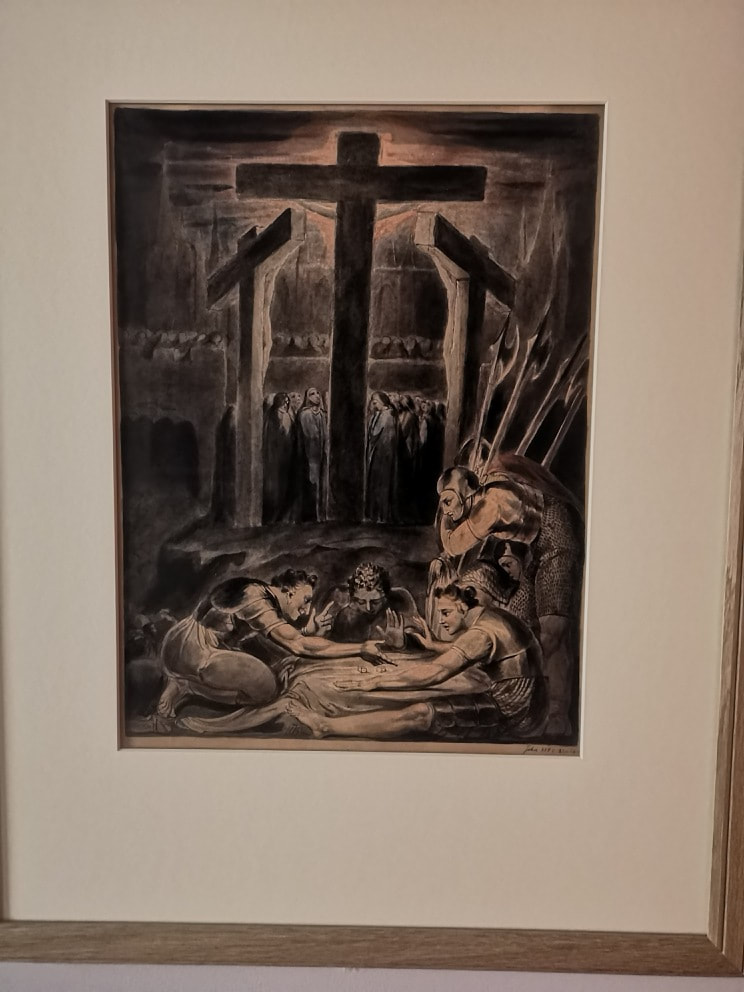
There are some prints on display and one of the neatly contradicts what I was saying about Blake and bible era. The scene above left takes a new testament scene, the Crucifixion but presents it in a more ominous and looming light. We cannot actually see Christ, just the dark shadow of the cross obscuring the sun, and then these no doubt nefarious figures in the foreground who appear to be gamboling and it would seem are destined for the Bad Place. I particularly like the way their halberds echo the lines of the cross and the shadow crown in the back ground. I also like this scratchy on velum like material depiction on the above right. It is almost like an instruction manual for how to ascend into paradise. The figures are nicely poised but there is glorious detail sitting in the background and it is easy to just blow right past it. This is what makes Blake (and indeed many artists great) is the attention to detail. Knowing when to have it and when not, when others might get it the wrong way round. Those trees at the bottom, not really needed for the subject but they almost literally ground the painting.
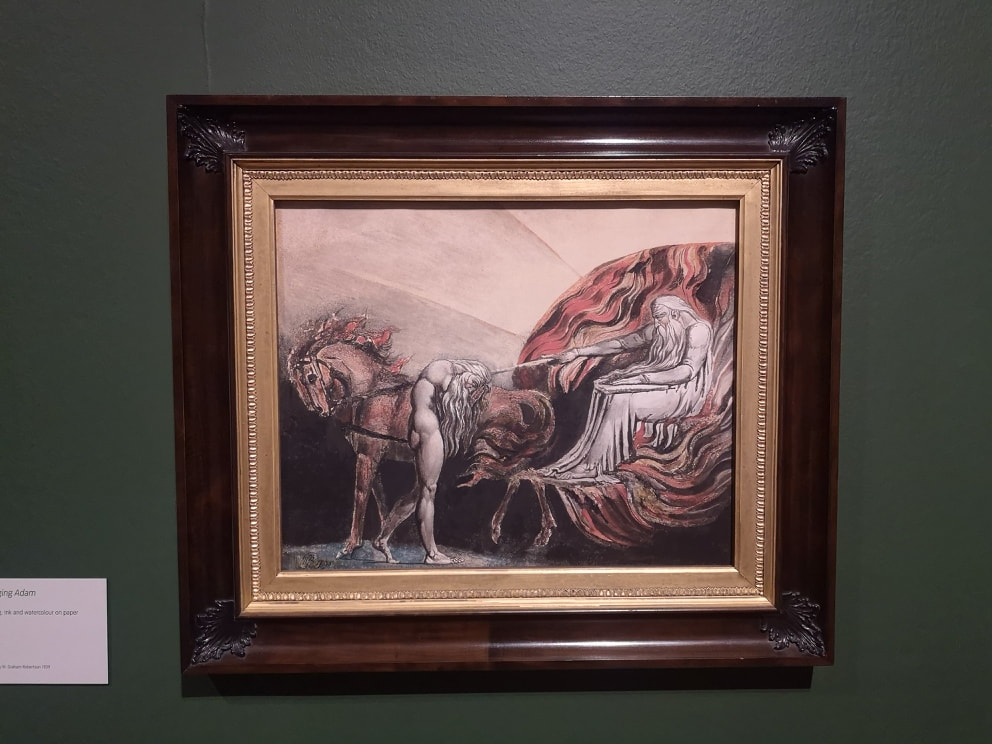
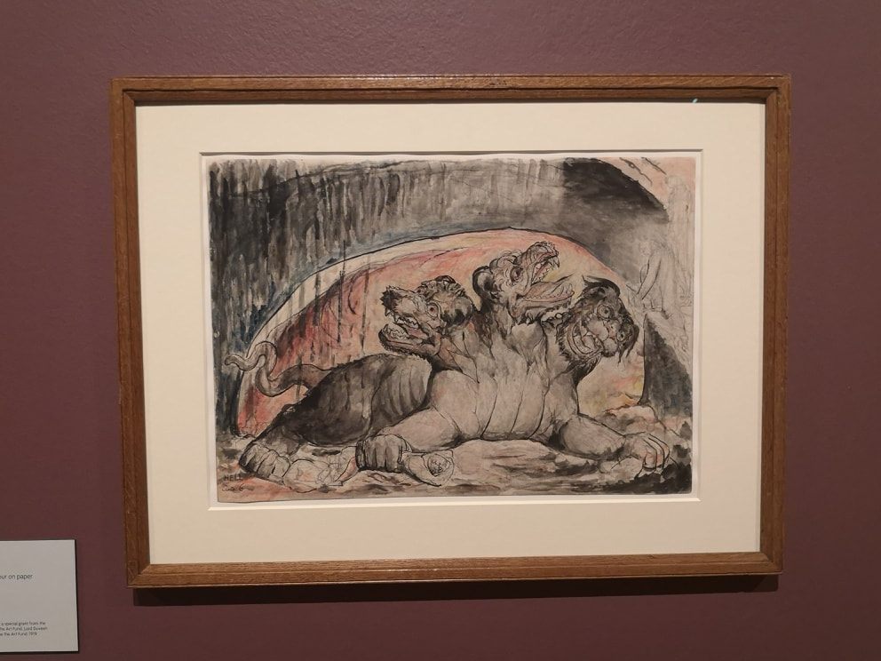
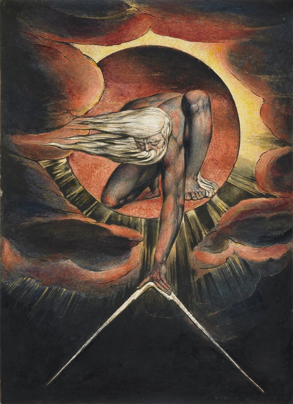
Above left we have what I think is one of my favourite pieces in the show. It is god judging Adam. Adam it would appear is not coming off well. But I love the composition. The background with the triangle of light and then blackness. The circle of flame and then the figure pointing which, it seems to me at any rate, is a Sistine Chapel ceiling reference. What I really like are the pair of insane looking horses and the hunched posture of the figures as though they have both been utterly defeated. God, presumably is disappointed. Blake also produced illustrations for various pieces, including Dante's Inferno. There are a number of scenes from throughout the poem but by far my favourite is of Cerebus. Mashing up your Greek myth with your Christianity and you get what is to my mind, quite a cute looking three headed guardian of the underworld (above right). He looks as though he is relaxing in front of the fire.
Where Blake is at his most eye-catching though is where his work has this strong structural elements. Triangles he does best and so I will leave you with two excellent examples of this. The show is quite something, I would recommend you go and see it.
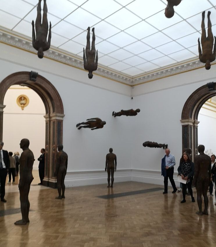 I have very fond memories of in the early 2000s seeing Gormley's figures standing like extras from City of Angels on the top of various buildings across London, some of them were at street level. I was looking forward to seeing them and see them I did at a exhibition of his work at the Royal Academy. We might as well start with them. They were assembled in the middle room, all of them the same dimensions, varying in amounts of rust on them. They face in different directions, some of them perched on the wall (as seen above), some standing on the ceiling. It is oddly calming and there was one brilliant period of time when a man was standing next to a statue in exactly the pose of the statue. I suspect the statues are hollow. Incidentally when Gormley portrays figures, he only portrays men. Why is that? I suspect in fact he only portrays himself.
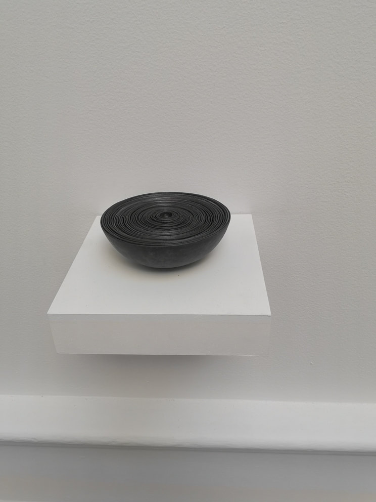
There is then a room of early work,. You are greeted as you enter this room by a long rectangular plank, on which in slowly increasing sizes are chesnut like pieces made of metal. It is very pleasing. There were two other pieces in this room I also really liked. Once called mothers pride was the outline of a figure made out of cut pieces of white bread, preserved in wax. A powerful and humorous image. However my favourite piece was this bowl (above right). It is called Filled Bowl, or something like that and as you can see it is just a series of concentric bowls, made out of a lead like material. It appeals to me. I wanted to pick it up, sadly you cannot. I like its solidity, its uniformity and its decreasing size.
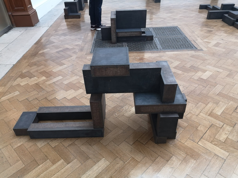
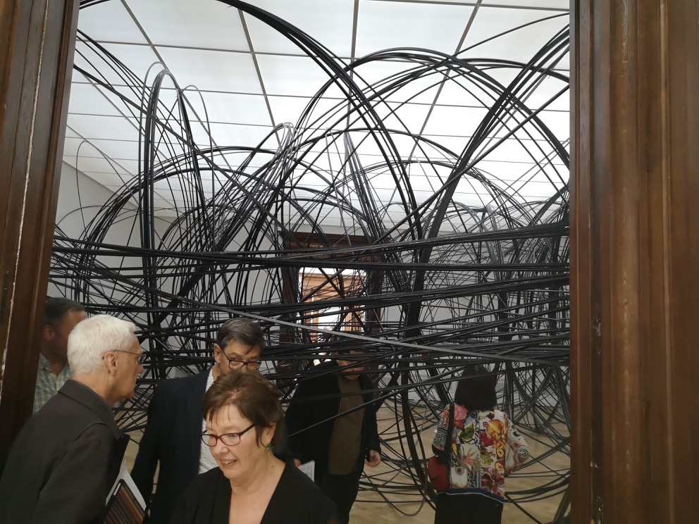
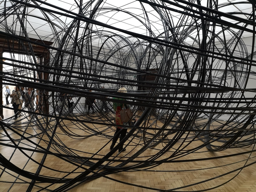
Then you turn left and the madness starts. Occupying almost the entire inside of one room, with just enough space around the side for the squeemish to avoid it is a tangle of metal rods (above). They are in fact a series of metal circles, arranged like the orbits of electrons in several colliding atoms. You have if you wish, and I suggest that you do, to scramble through the assemblage. The metal makes a clanging sound if you hit it, and this cacophany resounds throughout the room. I choose to treat it like the scene from Entrapment where they are avoiding the lasers, and tried to get through with no bongs being sounded. You can if you are suitable nubile, which it appears I am. Your reward is a far room, with one sculpture, a figure of a man seemingly made of metal jenga bricks. He is a very huncy man. After a few minutes of contemplation/recovery you can make your way back out through the maze.
Sitting mostly alone in a room is a very large series of metal square fencing (above left). What is that horizontal wire you ask. Well that you will have to go and find out for yourself. As with many of this show, this sculpture which I believe is called Matriz rewards viewing from many angles. As you can perhaps see, there are different densities of fencing arranged in interlocking squares. Differing lights and density of wire. Now a word about drawings. There is a room of lots of drawings. Intriguingly there are four glass cases showing, suspiciously neat pages from many, many of Gormley's note and sketch books. Some of them are very good art in their own right, but all of them are interesting in terms of his process. There is what appears to be an early idea for what became the Angel of the North. Anyway as light digression. There are a series of intriguing black and white paintings (above right). They are done using Charcoal and Casein (what is casein, please tell us). They are quite simple pieces but riff on Gormley familiar themes of what is a man/figure of me.
Other more subtle pictures make an appearance (above left) and I like the more shadowy blurred figures. Particularly creepy is the sort of flying man in the top picture and the one below and to the right of that has a distinct resemblance to the angel of the north. It is nice seeing the genesis of an idea knocking around in someones brain. Just off this room , in a circular room, are two giant rusted metal conkers, one larger than the other, gently oscillating on the end of stout ropes. It is very pleasing.
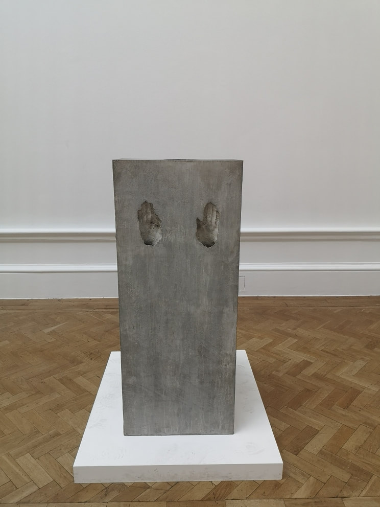
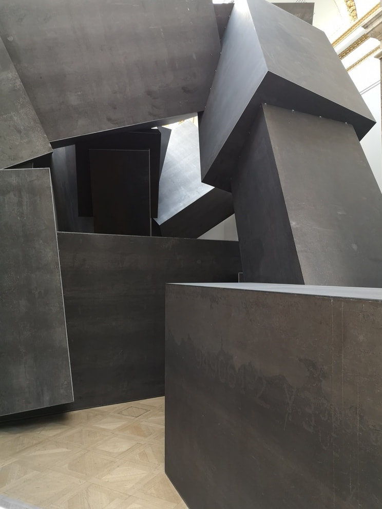
Following this are a series of cement slabs with hand or foot prints, impressed into the cement. These were a bit dull to be frank, probably the weakest thing in the show and made me want to see Rachael Whiteread who is much more interesting with her cement casting. They while away the time though while you briefly queue. What are you briefly queening for you ask. Well occupying the next room is a large series of metal square tubes, arranged like some slumbering transformer. Again you can skirt around the outside, or you can if you wish choose to crouch down and enter the tubes.
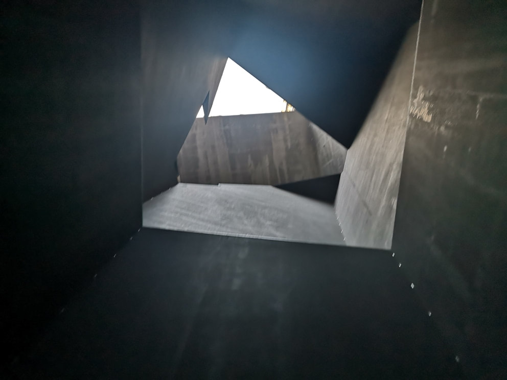
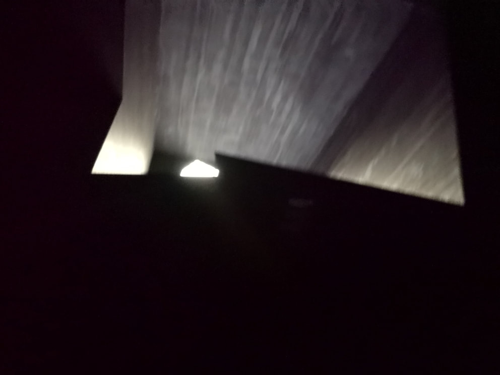
It is like being in the film alien and it brings you into a large cathedral like atrium, with light streaming down from high up apertures. The atrium is not regularly shaped and some of the angular protuberances resound with different tones if you strike them. After you have had your fill of this you can emerge into the final room.
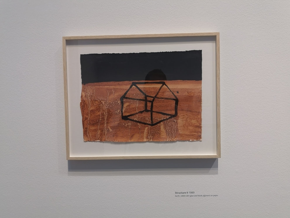
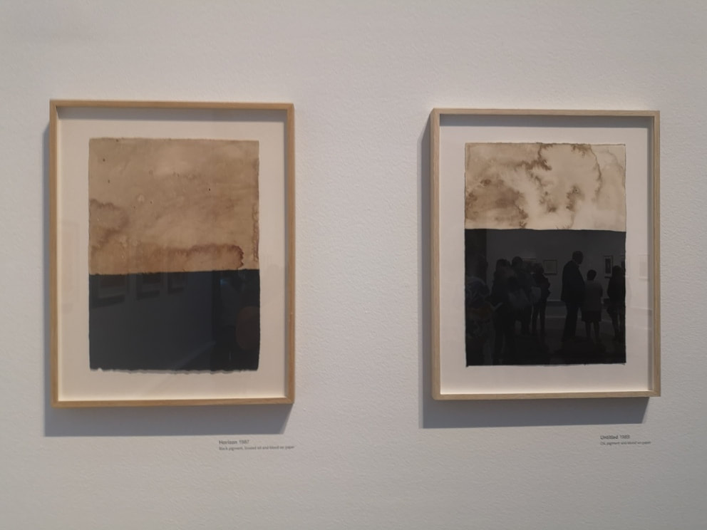
More paintings with strange materials. There are a series of red and black paintings like the one above left. The red is made by a combination of earth and rabbit skin glue (and yes it is made from rabbits). Some of them are very disturbing and the red earth produces a very striking effect. My favourite paintings though were these two of cream and black (above right). The black is just black pigment, but the cream is rendered with the return of linseed oil, which gives this stained cloud like effect. I like these very much and find them very calming.
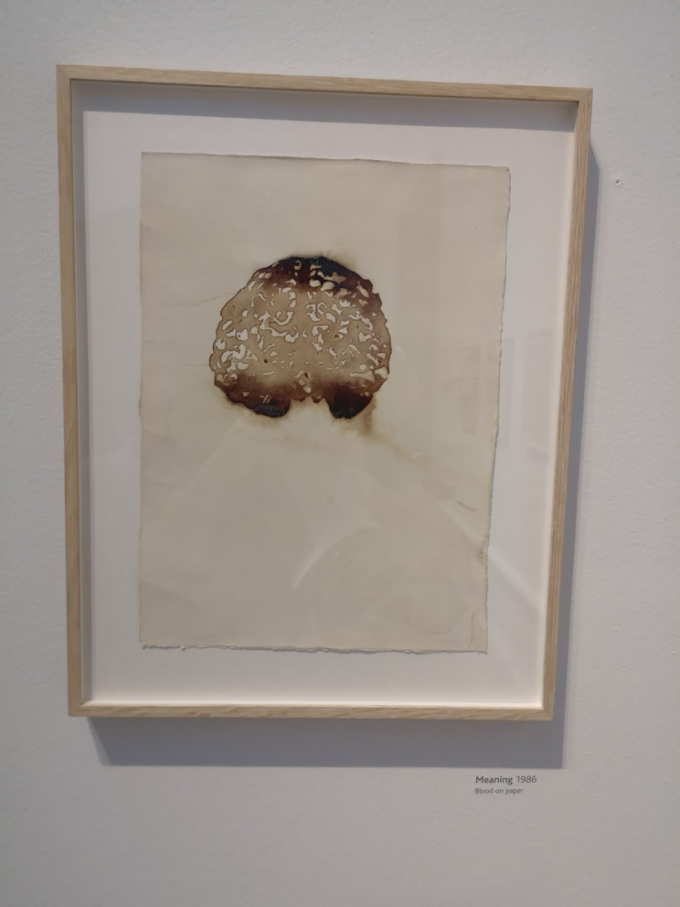
Taking materials to more extreme now we have blood. Whose blood is not specified, or indeed the species that the blood is from. The immediate assumption I made is that it was Gormley's but of course it could simply be pigs blood from a passing kidney. The best of the blood paintings is the one above left. Brains! The shift in tones is very effective.
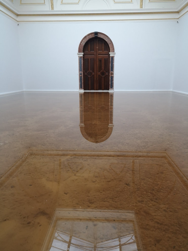
I have left until last, my favourite piece/installation of the whole show. There is a room. The floor is covered in earth and clay and then the room has been flooded with water up to a depth of about half a meter. A surprising cold seeps out of the room. I often have dreams of flooded buildings and this reminded me of that. It had a profound calming and mediative effect and I liked it very much. I may go back just to see this. It is worth going just to see this. 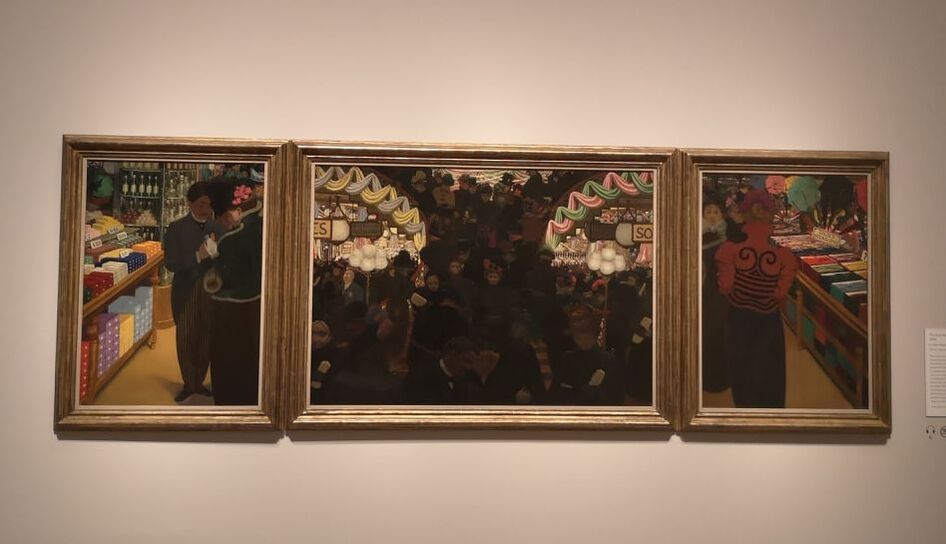 Not so much a review as a retrospective as it closed on 29th September, but this week I am talking about the Felix Vallotton exhibition that recently finished at the Royal Academy and had the slightly over ominous subtitle of a painter of disquiet. So who is Vallotton. Swiss, moved to France, 19th Century, part of a group of painters not cool enough to hand with the impressionists, or Matisse and those lot. On the surface Vallotton' paintings have the appearance of being boringly factual, if well done and highly colourful. The above painting, a triptych of a department store is just such an example. As I was photographing it, I was altered by a guard that this was the one painting with a sign saying no photographs. Too late though, and I'm not sure why and I am fairly sure Mr Vallotton's copyright in this painting has lapsed so I present it for your view anyway. On one level this is a very pleasing highly coloured painting of a department store. It is slightly more interesting than that as triptych's are almost always religious in some way, and this is one of few examples I have seen that departs from that. I also like the way he has in the flanking paintings, extracted the individual, from the bustling crowd in the centre. This slightly off kilter way of depicting and looking at things makes Vallotton interesting, and if you were to stretch it, could justify the title of the show.
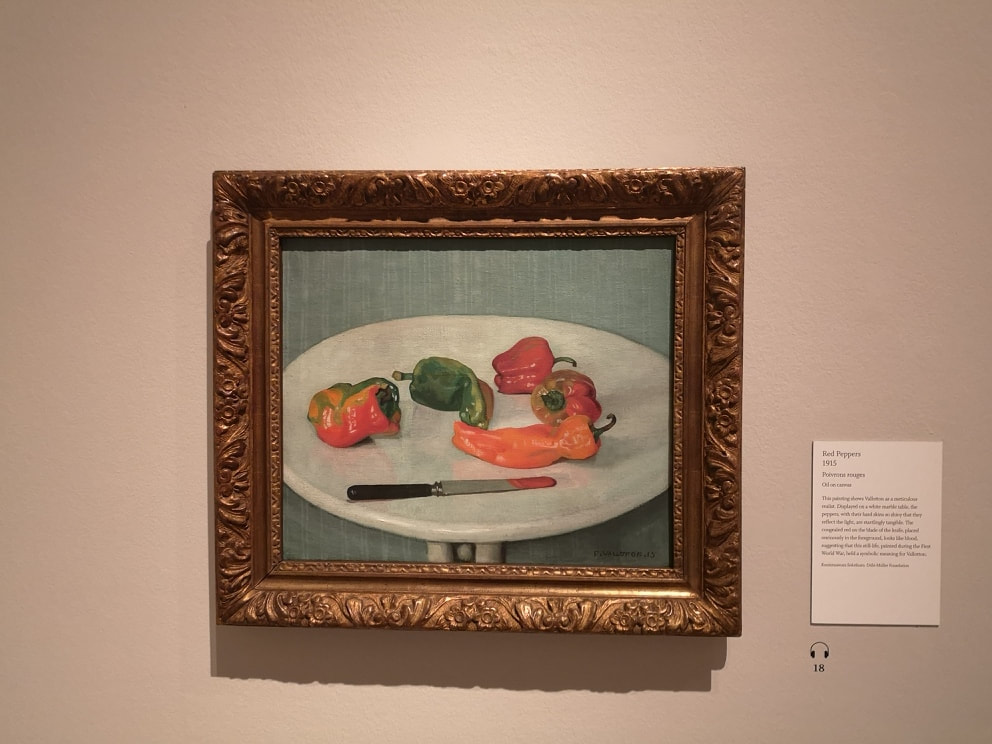
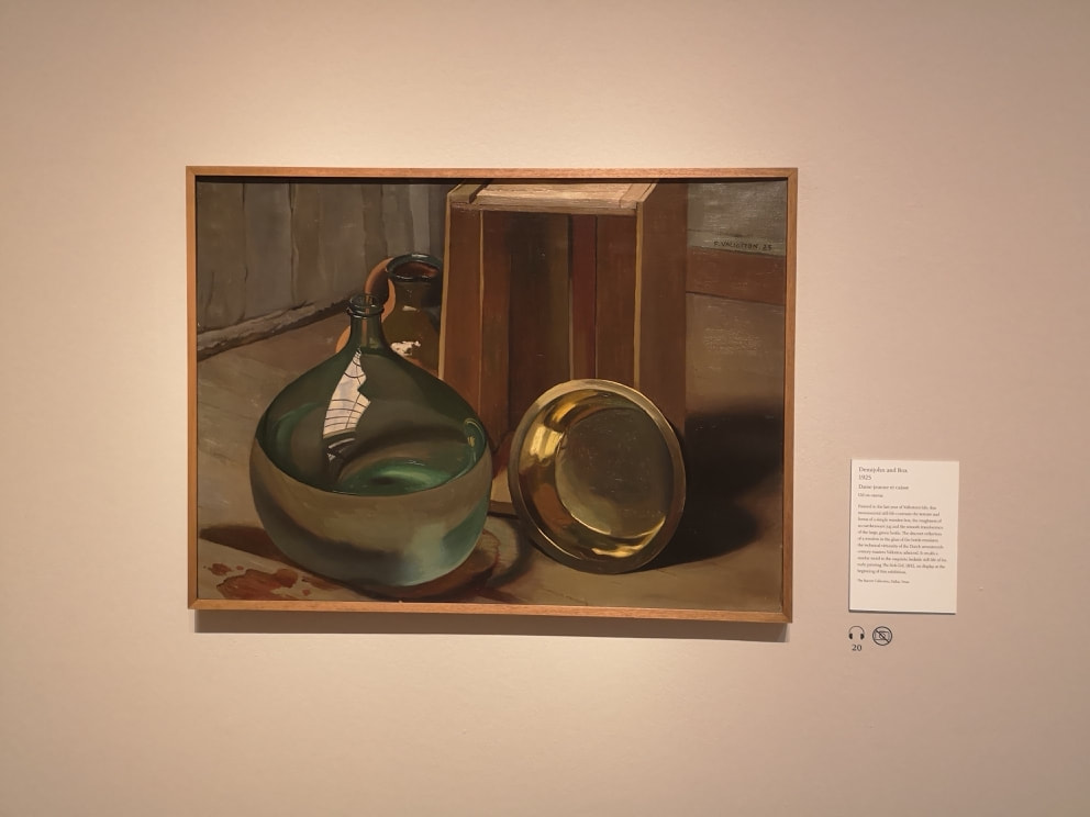
I don't think that a painter, to be good and interesting, has to be doing anything particularly radical or subversive. The very famous ones often are (Turner, Monet, Picasso etc) often are but sometimes you just have to be good (Constable) or have a slightly different way of looking at things to make it art worth seeing. Indeed I think the, I like that but I don't know why, or, that's pretty reactions are prime examples of art being successful. Which is a long winded way of saying that I like Vallotton's still life paintings (above) just because they are good. Let me tell you why. With the peppers (above left), well they look delicious. They arranged well to get a nice negative space, and they are painted with strong vibrant colours, with a supreme level of accuracy. The way the light catches them is very effective. Putting them on the, by the way very detailed, marble table which slightly reflects back the colours, and the over the gray background really lifts them. The final touch though that makes this very good is the knife, with its slab of red on the end. This could be one of two things. It is either a reflection of the pepper above it, or it has been used as a pallette knife and has just been left, with a slab of paint, sitting in the picture. Of course it could be both. The other purpose of still life is to show off. Traditionally how they were often used, and Vallotton does the classic, look at the surfaces I can do spiel with his carafe of water and box ensemble (above right). The way the different textures of light and shade are captured, particularly in the water is very impressive.
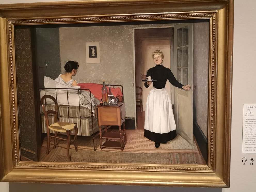
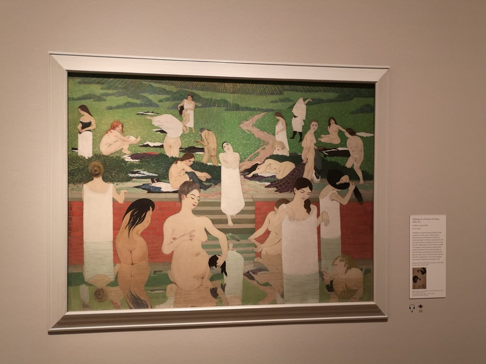
The show is arranged more or less chronological but I am not going, but now we deal with people. He does a good interior does Vallotton and he always put a slight spin on it. A prime example of this is the Sick Girl (top left) . Vallotton is quite good at doing in motion poses, which are not easy to do. He used photography to paint from later in life but I wonder if he did it here, or made it up. It gives a sense of dynamism, of a scene interrupted. And of course there is a bottle of water and elements from the still life that he does so well. Much more staged and replete with classical illusion is this painting of women bathing (above right) it is very different in style to the other interior and has some very strange elements such a the central figure is holding a green shriveled head. The shaft of red across the centre makes for a good contrast to the greens and breaks up the foreground to the background. While I was there a very tall serious looking woman dressed all in white was taking close up shots of all of the boobs. It is, to a certain extent, that kind of painting. There are some very sexy nudes later in the show, but you can't include everything in a blog and a post mainly of boobs would be a bit weird.
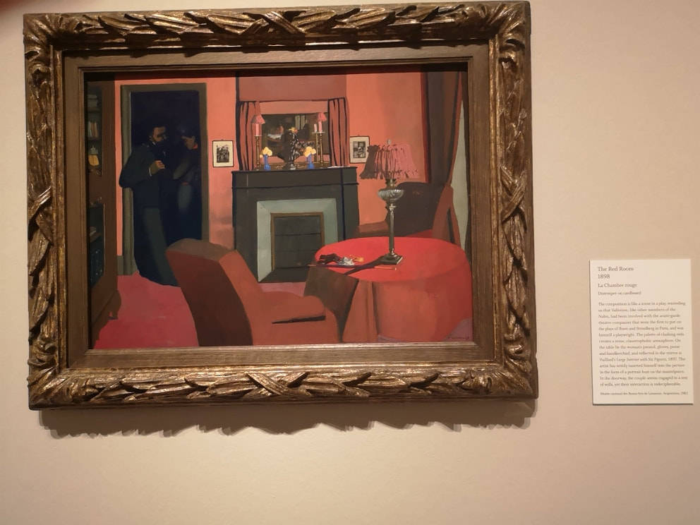
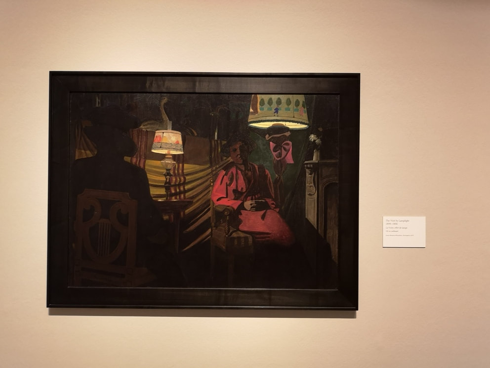
Sexual mores appear frequently in this show. There is a whole series of prints dedicated to them, although I have to say I find the prints some what un-engaging. More interesting are these series of paintings, often with a dominating colour, with some dubious sexual encounter heavily implied. As in the one above left, where you have these shadowy figures, clutched in an awkward embrace, at the threshold to this clashing red room. It is very odd, made particularly so with the well placed flashes of other colour such as the yellow flowers in their blue post on the mantle piece. It is painted in distemper on cardboard. Now then, a note to curators. Instead of waffling on about what the picture shows us, we can see that by you know looking at the picture, perhaps tell us about how it was painted. I had never heard of distemper before. A quick google search revealed it is a canine disease, which is an odd thing to paint with. In a similar style but going heavy on the shadow are a couple of by lamplight paintings which appear in the next room. They are beguiling but they are bit like too moody tv programmes in that you can see so little its a bit off putting. Nice lampshades though.
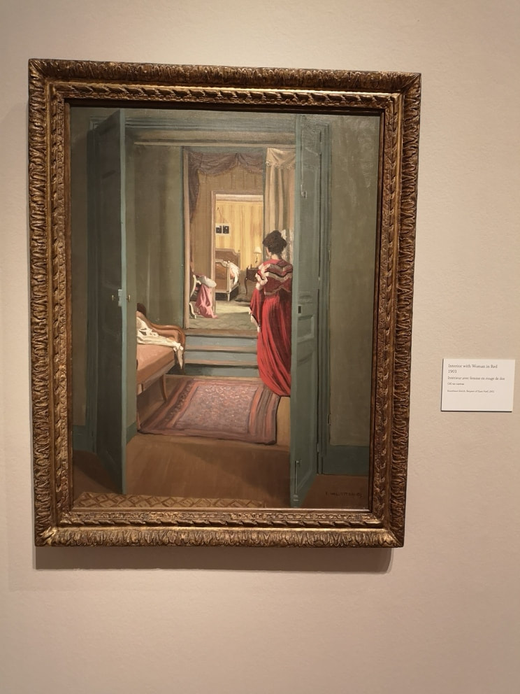
A nice trick with paintings is having the action framed by an internal device, and doorways are excellent at this. They give you the viewer more of the sense that you are there looking in on the action. There are two excellent examples of this, one bathed in light (above left) and the other darkness (above right). The fact that the figure has their back to us helps emphasise the peeping tom aspect of the whole thing. As does the dishevled sheets in the one on the left. As with the other paintings the level of detail and rendering is superb, and again you have people in motion.
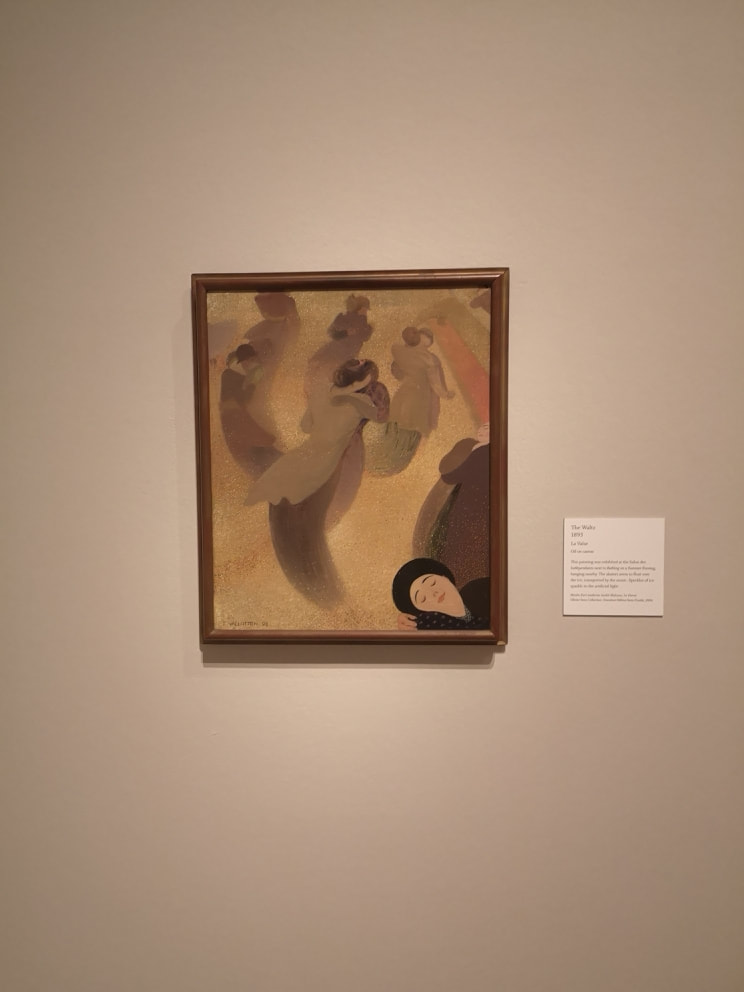
It is however an interesting image. A much more delicate usage of gold is in these dancing figures (Above left). Swirling around in this field of gold. I particularly like the face in the bottom left. She gives the feeling that you are one of the dancers. There is a tremendous sense of motion, and I like the fading of the figures into the ground. I really like this painting.
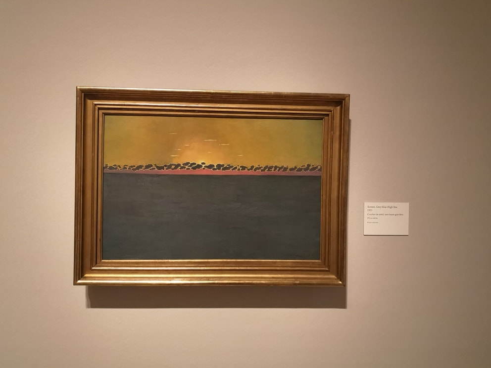
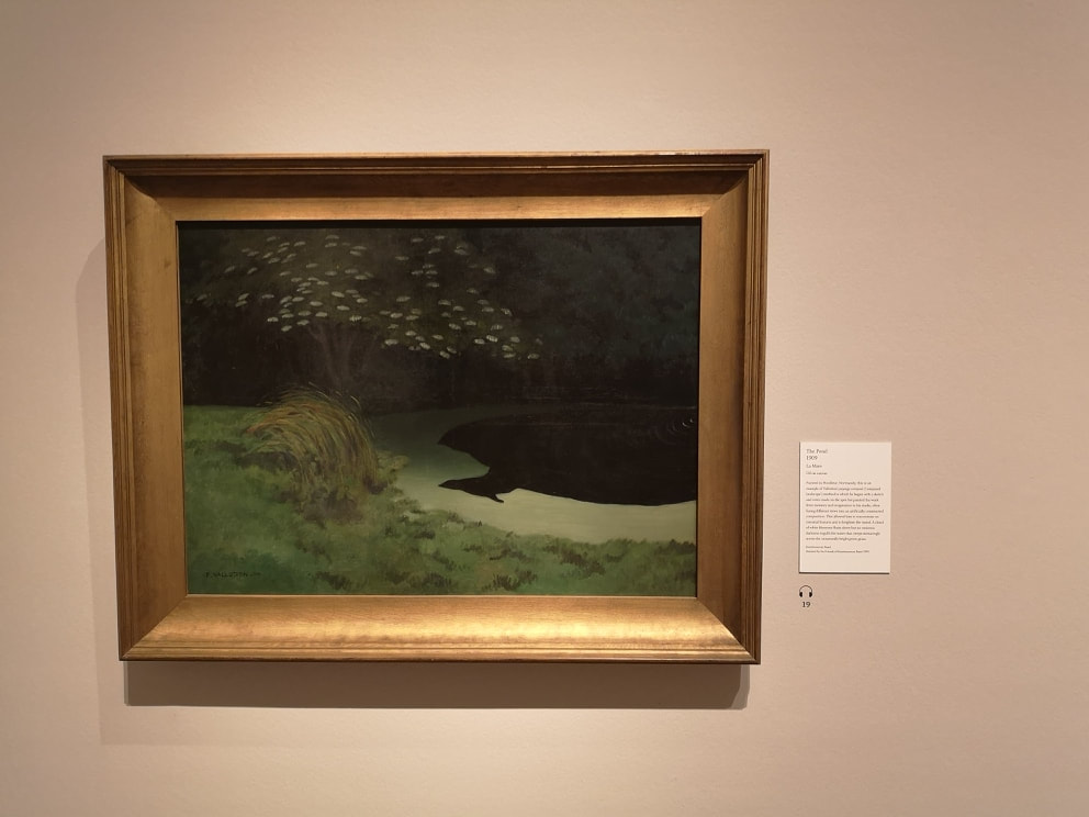
Odd landscapes make a reappearance but these last two are much more effective. Again there is an apparent simplicity to them with these ribbons of colour, and having landscapes at night. You don't see them very much, dawn and dusk sure but not at night. This allows the two elements that I really like in these paintings. In the one above left it is the blossom on the tree, catching and reflecting the light. In the one on the right it is the golden glow on the clouds and reflected in the ribbon of water underneath. Very nice.
We are back in the RA next week for Anthony Gormley.
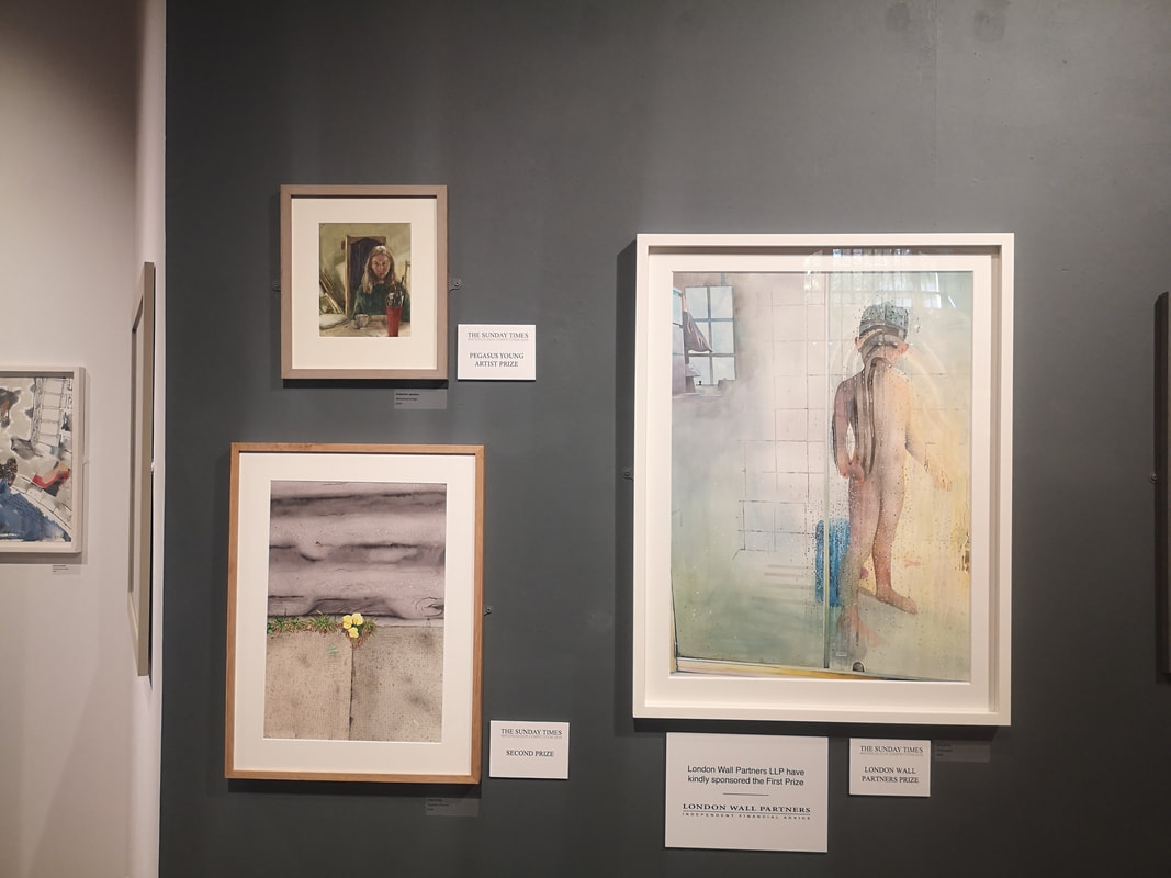
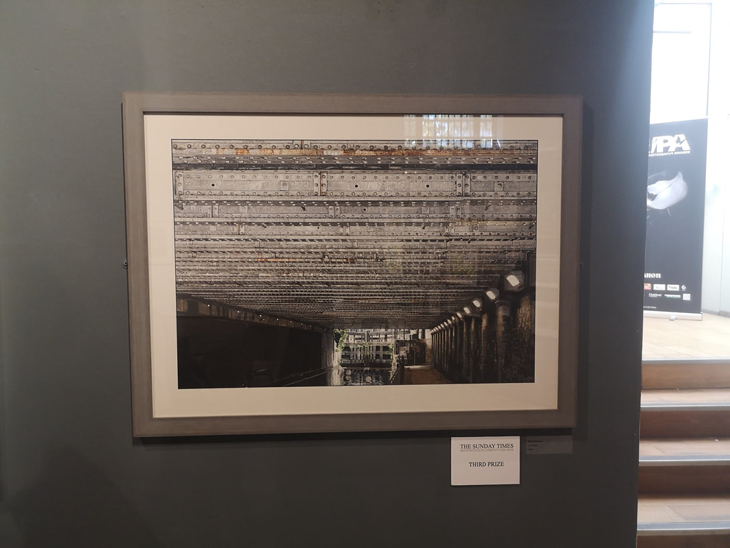
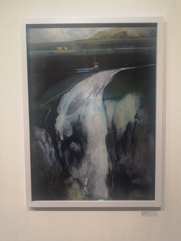
The excellent Mall Galleries is currently showing the Sunday Times Watercolour Competition. It is on until 13:00 on Sunday 22nd September so chances are you have missed it, but let me give you a run down on what was best in the show, at least what appealed to me most, which as our current political leaders have taught us, is the same thing. The prize itself has its own website where some of the exhibitors and their art is shown. Above we have the winners board. Of these I actually really like the one in the bottom left which is a picture of a small yellow plant growing out of the pavement. Primrose Pavement its called and is the work of Aidan Potts. The plant itself and the pavement itself is super detailed whereas the road that forms the upper half of the painting is almost abstract and river like. I have as you may know a fondness for canals. Third prize, or Iron Mighty by Mark Elsmore as it is otherwise known (above right) fits right into the wheelhouse and there is a sense of weighty claustrophobia that entirely fits the brief. Technically impressive, I can see why it ranked but for me though, it is a little too constrained.
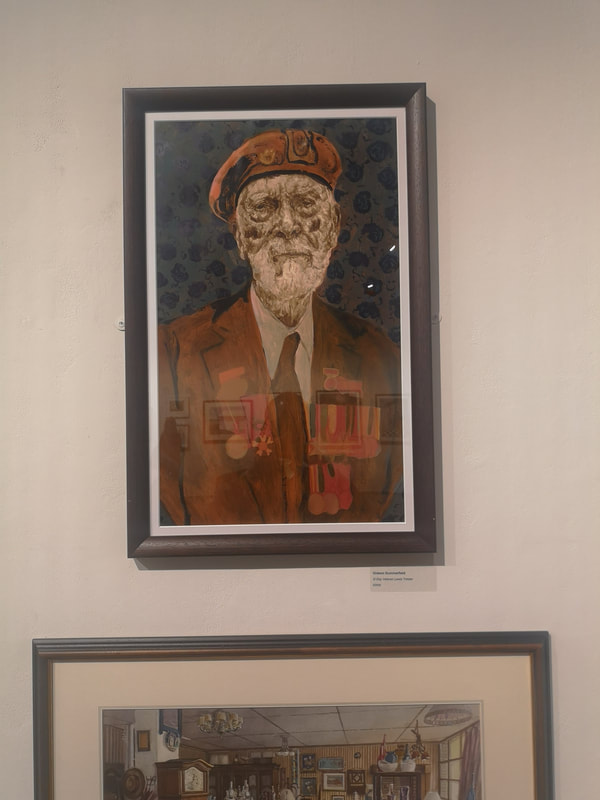
Having in a few sentences dispatched the winners I shall now do the same for the other highlights of the show starting with the excellent portrait of D - Day Veteran Lewis Trinder by Gideon Summerfield (above left). There is an excellent sense of fading heroism about the picture with that wonderful craggy face and the uniform and medals all slowly merging in a brownish red, the whole figure contrasting nicely with the blue and gray background. Maybe its projection by the dark blue shapes make me think of poppies. One of the things you can do particularly effectively with watercolours is use the imperfections of washes of paint, the dripping of paint and having the white paper peeking through to create striking images. It works especially well in landscapes and Linda Saul has pulled it off marvelously in her work Pendeen Clifftops (above right). The result is a very cold feeling, wintery blustery landscape with a real sense of the craggy eroded nature of the cliffs.
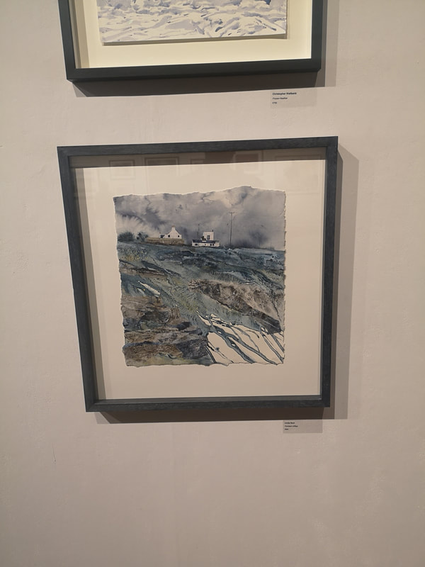
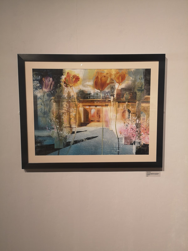
What I also like is when people blend the abstract with the figurative, which is what appears to be happening in David Firmstone's Scottish Harbour (above left). This piece is actually more impressive in person. That emerging and expanding ribbon of water has much more colour depth to it, and much more of a glow to it than the picture suggests. What the painting does do very well is take your brain on a journey from the ordered straight lines of the harbour wall and the boat to the swirling chaose of the water running into the sea. In watercolours I have a strong preference for pieces where you can see the paint, and the brush marks. It is a medium in which photo-realism works less wells and seems a bit pointless (other than in botanical art but that is a whole separate thing). There is a surreal dreamlike quality that watercolour lends itself well to and I respond well when an artist plays to these strengths, as with Julian Bray's piece (above right) which has an improbably long and unwieldly title. The strong use of orange and pinks, contrasting with the dark blues and grays is very good, as are the oversized flowers in the foreground.
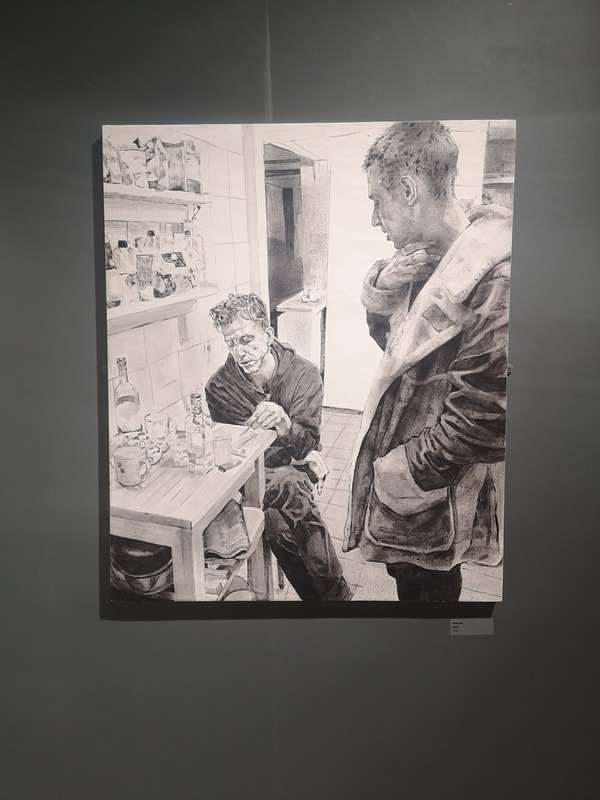
Having now dismissed watercolour as a medium to avoid photorealism, I shall now subvert that point by having two paintings which are nearly there in presentation, but I shall forgive as being excellent and evocative. Firstly we have Aidan Potts again (above left) riffing further on his theme of urban, cheeky flowers. This one lacks the contrast between swirling and realism that the top one has but the colour contrast, between the wall and the flowers, and wall and the pavement is much stronger so it makes for a more eye catching piece. You don't get much social realism in watercolour, you also don't get much monochrome (although there were a few examples in the show). A striking exemplar of both of these things is Kitchen by Peter Busa (above right). Credit to the curator for hanging it against a dark wall which makes it sing and glow in a way it might not of done otherwise. The different tones in this painting, like the way the coat is rendered is superb as is the attention to detail. There is real drama here to between the two figures.
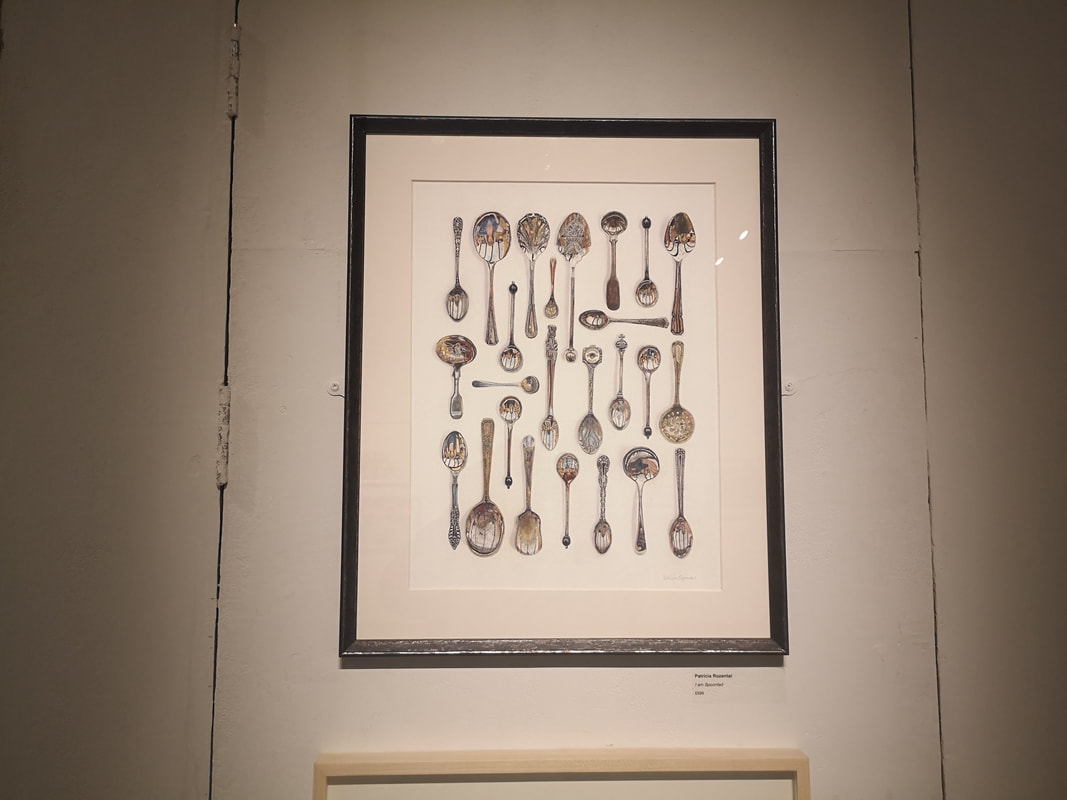
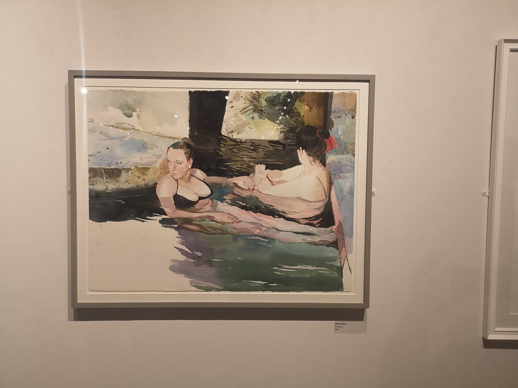
They are not just spoons. You can't really see it in the photo and it takes a while looking at the painting until you realise but within each of the spoons of Patricia Rozental's I am Spoonfed (above left) is reflected the face of a person, motled and distorted by the surface of the spoon. Some of them are barely visible beneath the tarnish she has put on the spoons. An excellent idea well done. Mark Entwistle's Primavera II (above right), plays to all of the strengths of watercolour that I was talking about previous. What is particularly impressive here, and is obviously a strength of his as he does it again in Primavera I which is also in the show, is the way he depicts people under water. It is very good. This painting has a nice, intimate, dreamlike quality that really sucked me in. The contrast between the solid dark wood, the pinkness of the skin and then the, frankly very cold looking, blues of the water. Very nice.
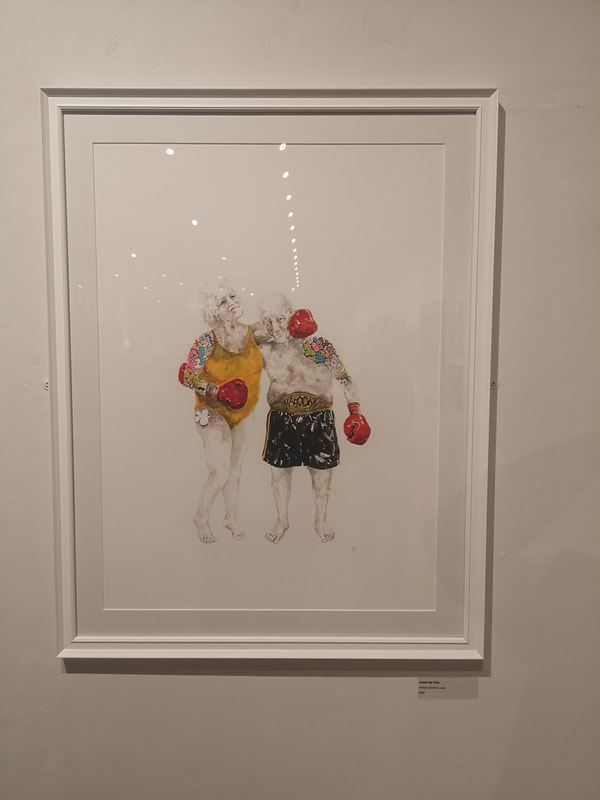
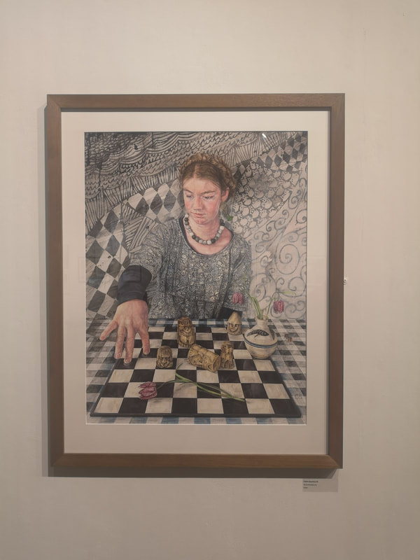
I have said it before and I will say it again until you listen is that comedy in art is very difficult to do and very effective when you pull it off. Punch Drunk in Love by Adam De Ville (above left) made me, and most other people at the show, laugh as soon s they saw it. The absurdity of the figures, the swim suit, the colours, their age, the overhyped highlighted tattoos all play off the sweetness and cuteness of the message. It is also very simple, just these two people against a white background, and the more effective for it. I like it. Much more maximalist and repleat with symbolism is Claire Sparkes piece (above right) which has an unpronounceable German name. I like the way the various elements of the piece reflect and blend into each other. Foreshortening is difficult to day and I therefore really like the way her hand reaches out onto the board. Sometimes though art speaks to you simply because it sparks associations. I am very fond of the the Lewes Chessmen for reasons that are too long and difficult to explain now. This painting reminds me strongly of those chess pieces and therefore I like it, frankly, mainly for that.
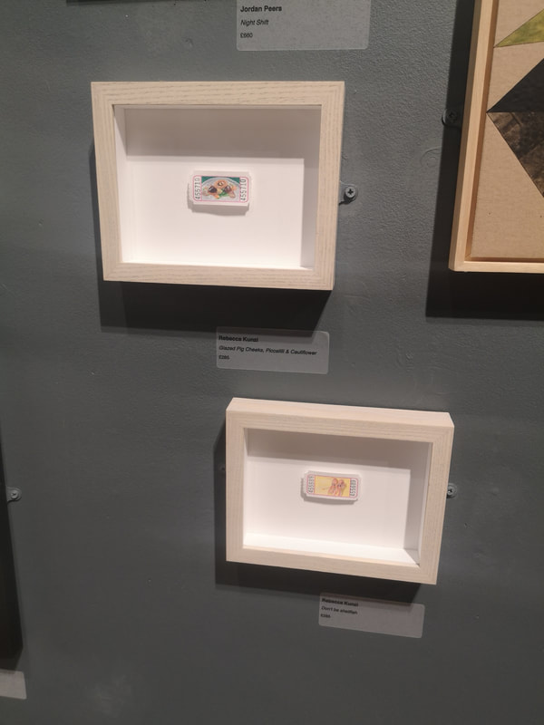
Last two, well last three. Two though are by the same artist. They are by Rebecca Kunzi (above left). It is very difficult to see from this photo but they are food stuffs painted on tiny tickets. I particularly appreciate the bottom of the two, which is a picture of two prawns and is called Don't be Shellfish. You don't get nearly enough puns in art, or in life for that matter. Nice idea, done well.
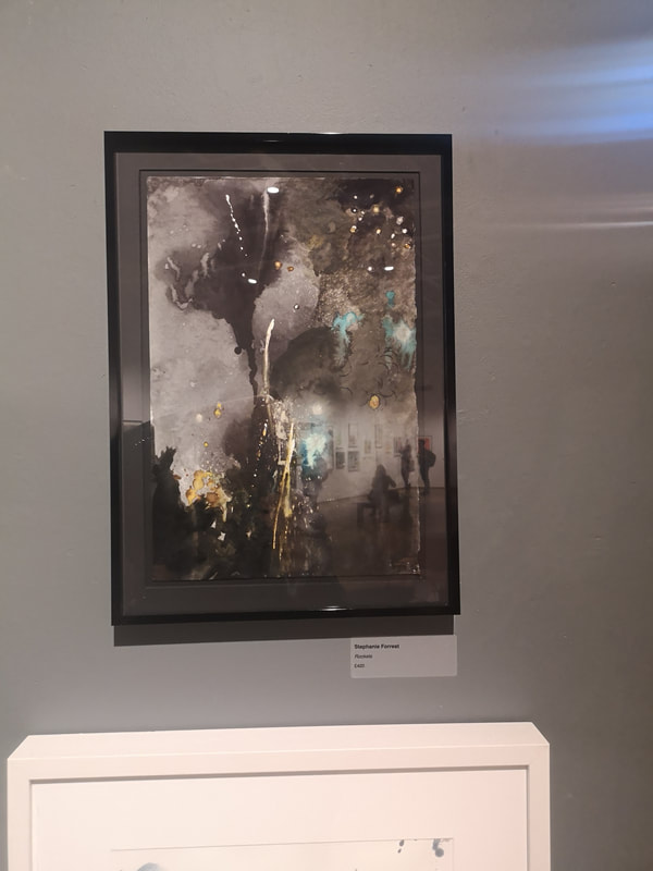
Let us sign off with a celebration. Stephanie Forrest's piece (above right) is one of those pieces that is initially slightly baffling but the coalesces into something else one you know the title. Right so, look at it. Have you done that? It is called Fireworks. Now look at it a again. See? Once you know you can see that she has actually caught really well the smoke and light of a firework display. The exhibition is on until Sunday. I am posting this on Saturday to partly make up for missing a blog post last week. Go if you can, enjoy it. 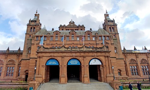 I was recently in Glasgow and despite it being August, perpetual and ferocious rain, which was swelling the river Kelvin at an alarming rate caused me to scurry into Kelvingrove Art Gallery. It is one of those high Victoria reddish buildings that are scattered around Glasgow with a sturdy solemnity. I think they have the function of stopping the city being washed away. I am being a bit mean, partly because getting soaked gave me a cold but it is a good gallery and worth a visit in its own right.
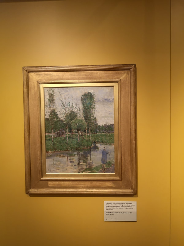
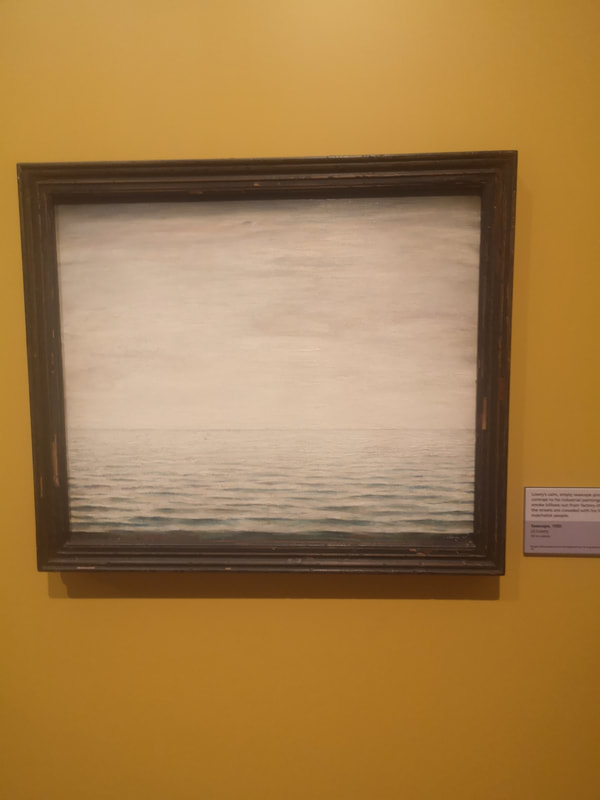
So lets get cracking. There is a non-part of the museum which includes dinosaurs, social history etc but the bit I enjoyed most was the pre-history part. Stone axes and so on. However onto the art. There is a fair collection of paintings by John Pringle. There was a particularly good selection of oil sketches in a glass case but the reflection off the glass rather ruined the picture. They were very interesting to see. Of the other paintings on display this one on the top left, the River Saint-Gertrude. It is charming. Charming can be something that some people use as damning with feint praise but I think it is difficult to make something charming. I like my river scenes and the sky and the river are excellent. I like the way he uses horizontal strokes of paint for the water, giving a different texture to the surface of the water. I am coming increasingly to the view that landscapes need a figure to make them really work, context and interest. Not all the time obviously but certainly the figure in this painting gives an idea of scale. There were a couple of Lowry's on display and I will show you both of them but the first of them (above right) is extraordinary. I have never seen a Lowry without figures, without buildings before. It is just an empty seascape but I love it. Empty and mesmeric. It must have been difficult to overcome the urge to add something to it. The receding dark tones gives a great sense of perspective to the piece.
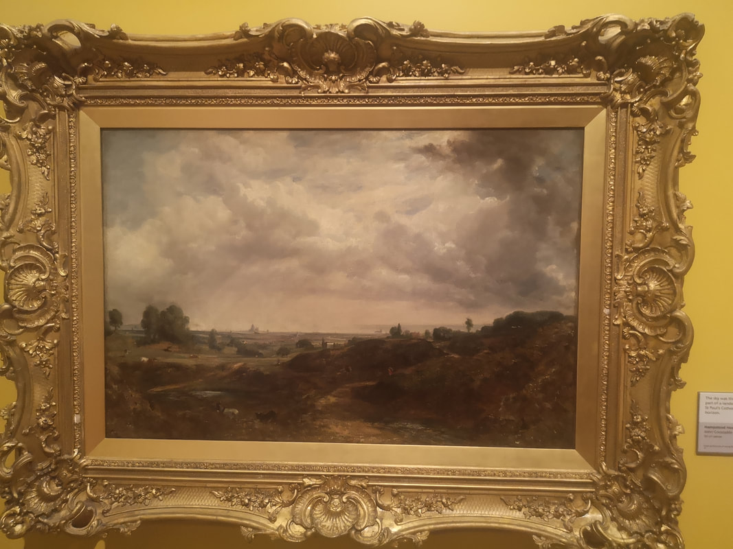
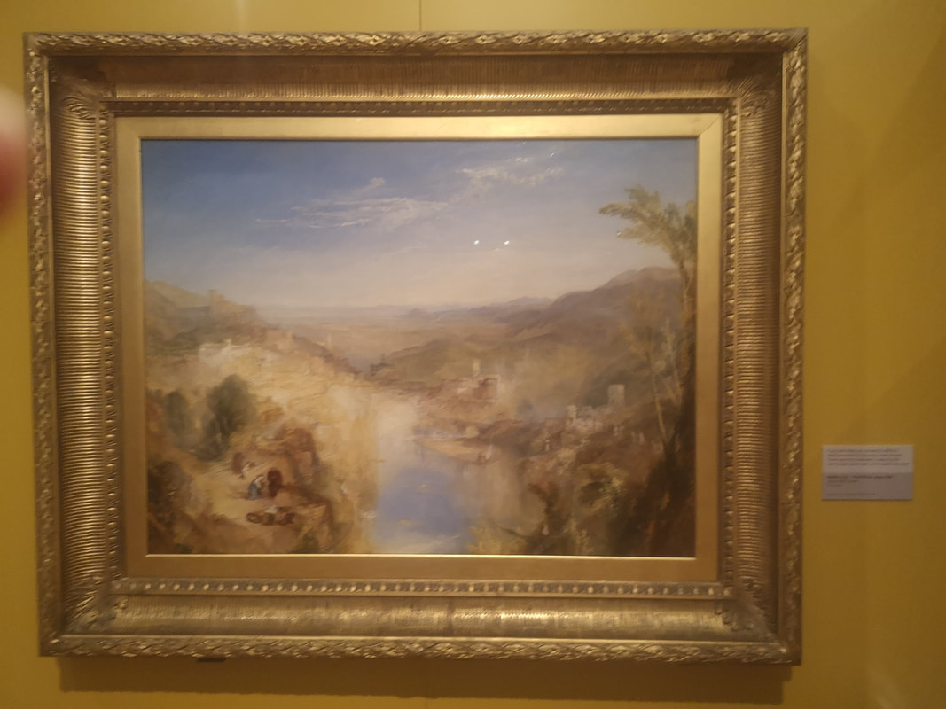
Constable and Turner sit next to each other in this gallery, the dark super detail and moodyness of Constable landscape and sky, a real autumnal scene. Then sitting next to it the golden light of a Turner ethrealness, a real summer view.
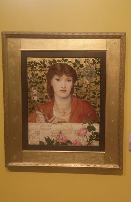
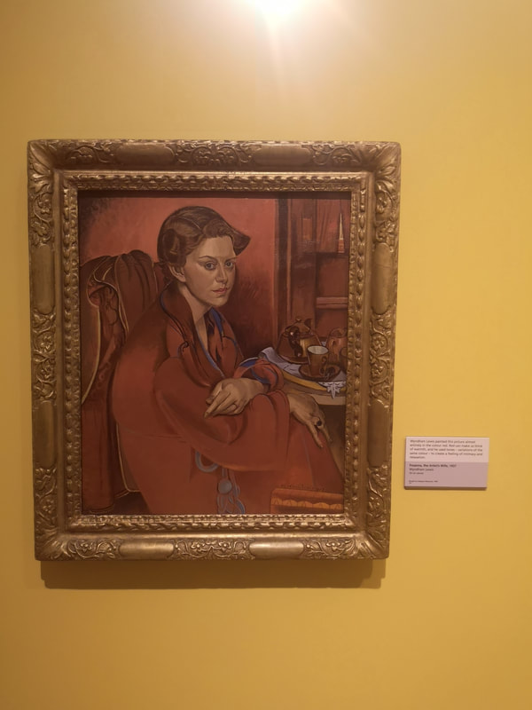
Portraiture now an a symphony in red and gold, firstly mainly red with an actually iconic Rossetti painting (above left) showing his classic red headed, ice maiden. Gold wall, gold frame, golden backdrop making the reds of the hair and shawl stand out from the backdrop. full of symbolism with all those flowers. Then more red than gold, is Wyndham Lewis' wife Froanna (above right). I really like it when artists riff on one colour, as Lewis has done here with red, all different shades of red. She doesn't look very happy though does she? A feeling that is emphasised by the distorted slightly twisted figure. There make a great pair these two paintings and credit to the curators for putting them next to each other.
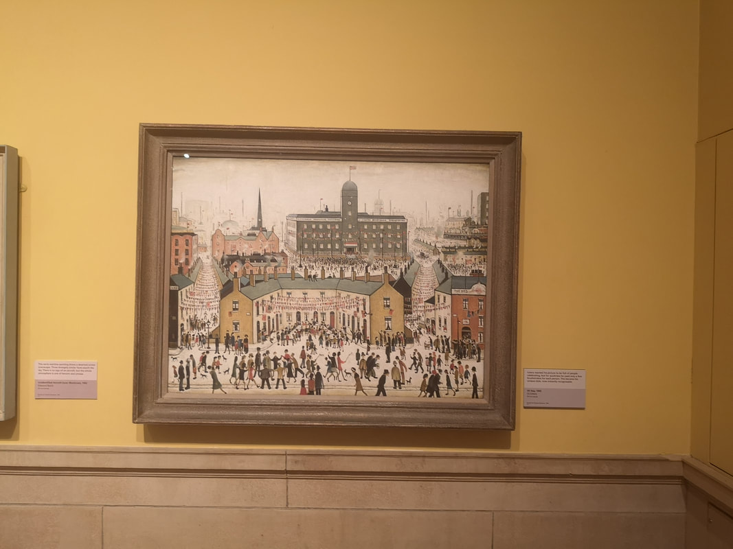
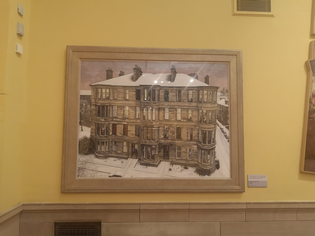
Buildings now and a Lowry and more what we come to think of as a Lowry (above left) a scampering of figures. The painting is called VE days and bunting scores across between the streets. There is never any greenery in Lowry paintings, it is all people and buildings, these odd perspectives and those very recognisable figures. The other one I have failed to record either the name of the painting or the painter but I really like it. It is a large apartment block (above right). There are lots of buildings like this in Glasgow and it has an architectural drawing or painting. In a number of the rooms are different scenes from just solitary cats to a fat man holding court at a party. I like the fact that it is set in winter too.
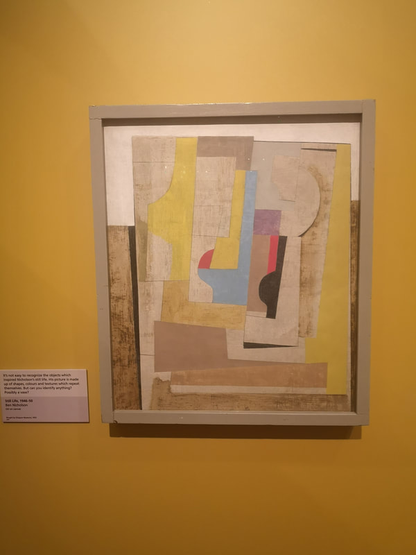
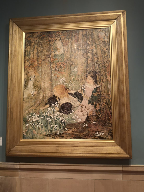
Before we leave the gold room is a Ben Nicholson Still Life (above left) with is a deconstructed vase. I reminds me again of an architecture design or drawing. The colours are quite restrained and cooling, giving a scientific air to the whole thing. I would not be surprised to find out that there was some complex formula behind the whole thing. Into the green room, which focuses on the Glasgow Boys. There were various paintings by the various members of that particular groupings but my favourite of them with this bitty barky style was E A Hornel. He seems to specialise in children in fairy type settings and my faovurite of those is the one above right. I particularly like the snow drops.
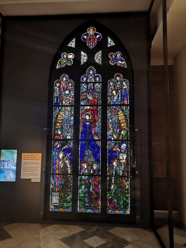
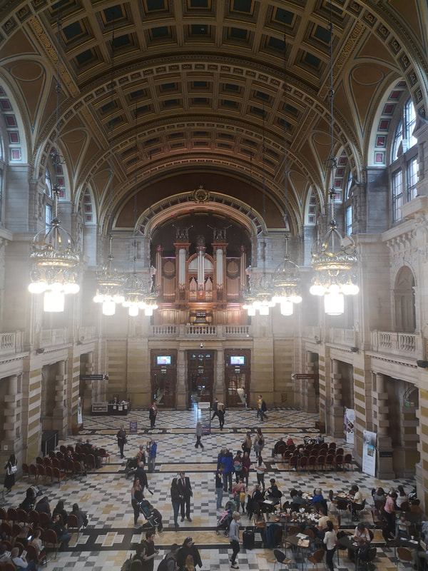
If you then ascend upstairs then there is a picture gallery running the length of the southern end of the Gallery, from it you can see the main hall (above right) which while I was there was being set up for an afternoon's organ recital. As well as paintings it contains a rather fine stained glass panel (above left).
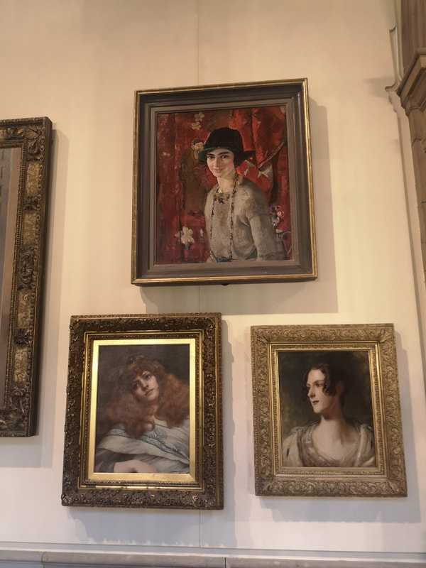
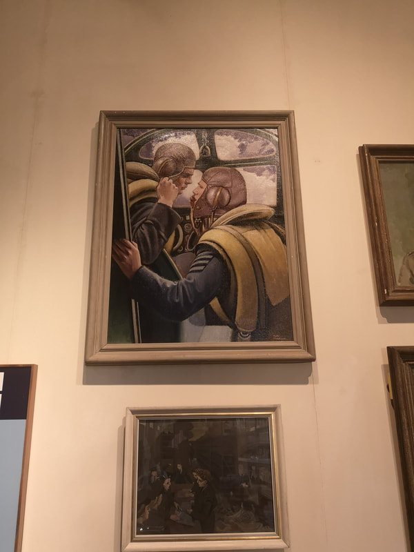
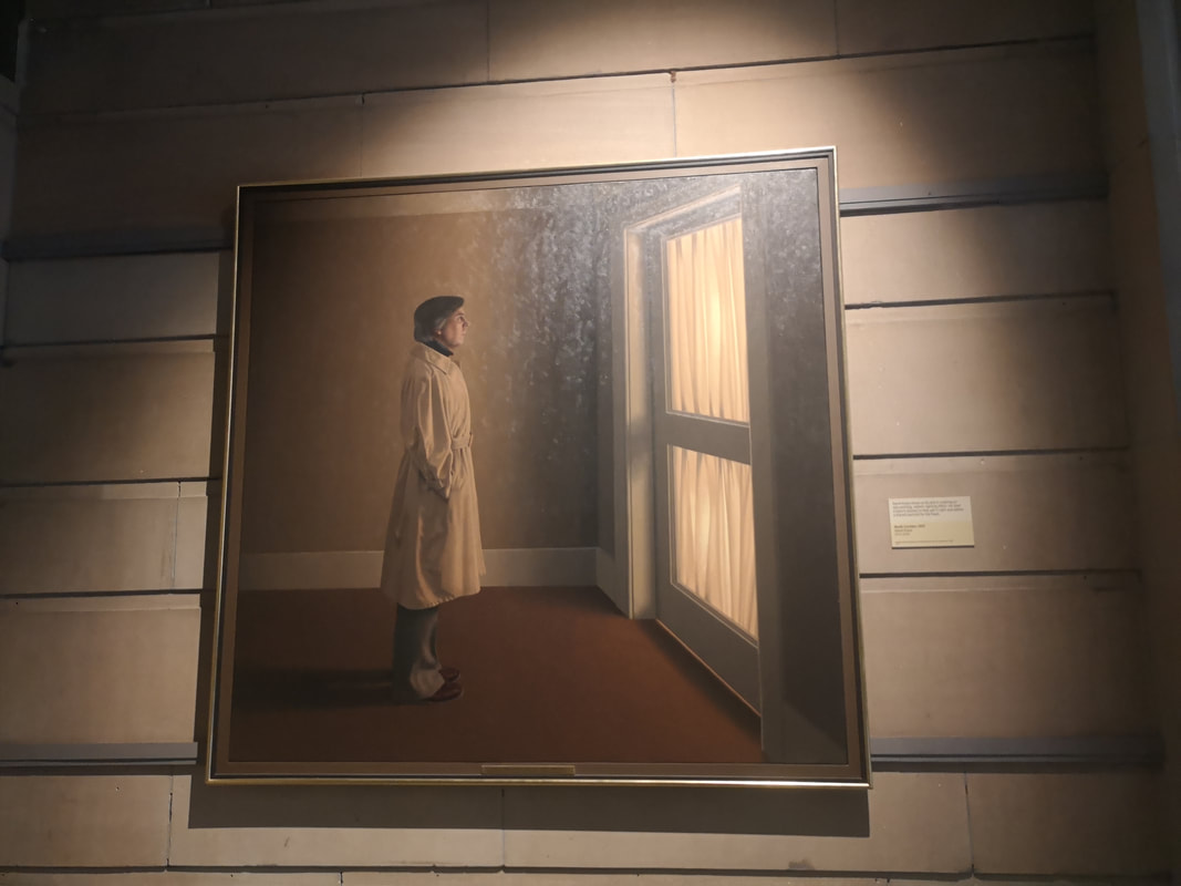
In said picture gallery there were a number of pictures that peaked my interest. These three pictures of women piqued my interest (above left). They are in clockwise from the top, the Artist's wife by William Hutchinson, A Lady by John Godward and Chritsina Mitchell McNeill by Thomas Duncan. It is the first of these I like, her somehow relaxed and intimate smile. It's a very warm picture and placing her against the folded red curtain makes her stand out. Pilot and Navigator Confer (above right) by Keith Henderson is an excellent war painting. Often the best war paintings don't actually show any violence. They show either the build up or the aftermath. The ones that actually show action tend to be far to propagandaish. Henderson's one is good. I like the intimacy between the two main figures.
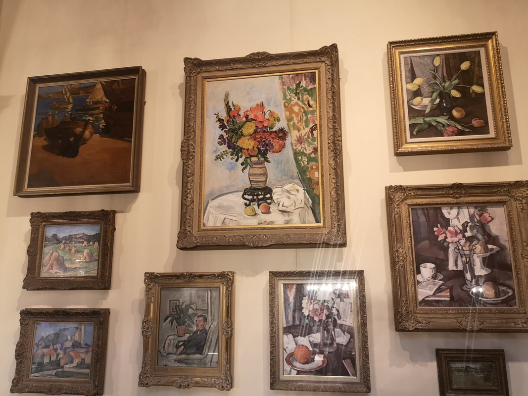
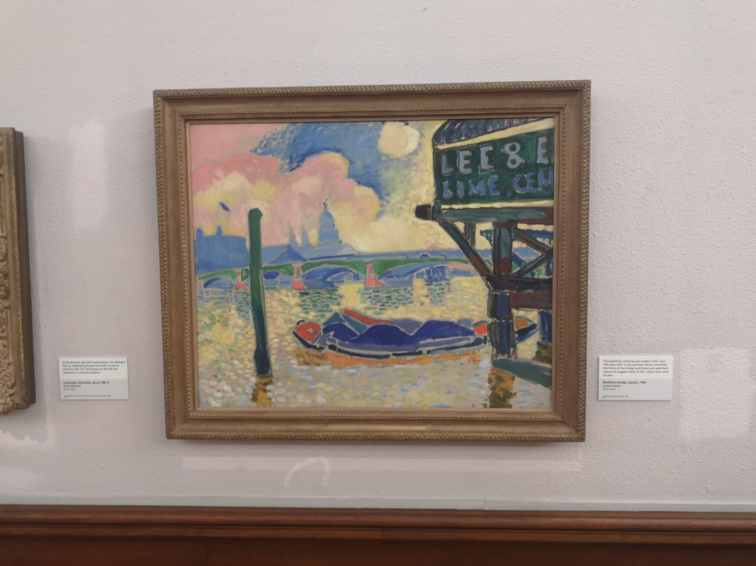
An array of still lives makes for a fine conurbation of painting above left). A combination of classical and more abstract. The top right one and the one below are by S J Peploe, one of the Glasgow boys. The spray of yellow tulips is particularly fine. Intricate and detailed and very eye catching is by Leslie Hunter. The way the curtain pattern reflects the central flower picture works well. As you circulate around the picture gallery you eventually end up in an impressive end gallery, packed full of Impressionists. Includes Monet, Pissaro, Matisse and various others. It is an eye catching bunch. I could do a whole post on just them, but they are also the kind of thing you could see in any gallery in the world. Instead I shall focus on one of my favourite and slightly lesser known Impressionists, Andre Dorain's Blackfriars Bridge (above right). The bridge itself barely features, instead you have that looming edifice in the foreground. I like that kind of thing and the way it plays against the luminous river is very good.
Is the figure waiting for someone to arrive or trying to muster the courage to go out. It is very good.
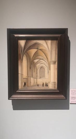
I have jumped ahead some what as there is a gallery of Dutch Masters (as well as a gallery of Scottish Colourists none of whom really grabbed me). This one (above left) is unusual for a Dutch Master being all light and interior. The arcs and the way they are rendered gives it an abstract air and the whole edifice dwarfs those tiny figures. It is called A Baptism in Saint Bavo's Haarlem by Pieter Saenredam, who I have to confess is a name new to me. There is of course much much more to be seen. It is well worth a visit. |
William John MackenzieI am an artist with a specialism in landscapes and still life. My contact details are here. Archives
April 2024
Categories |
 RSS Feed