|
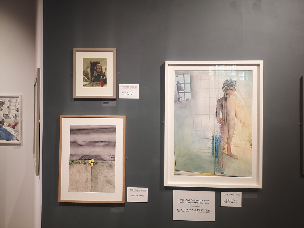
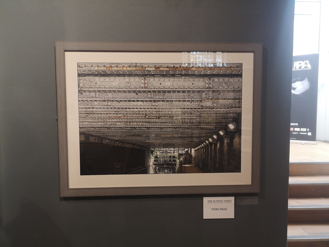
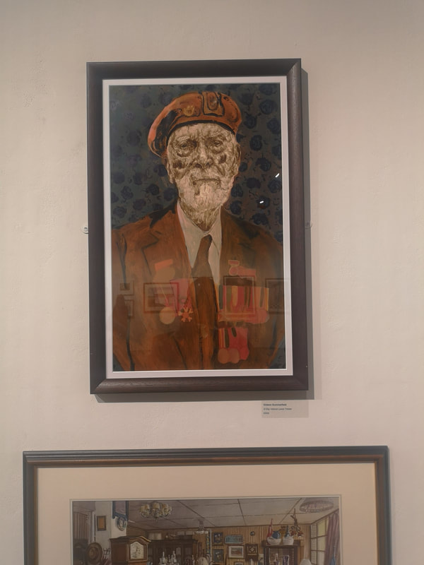
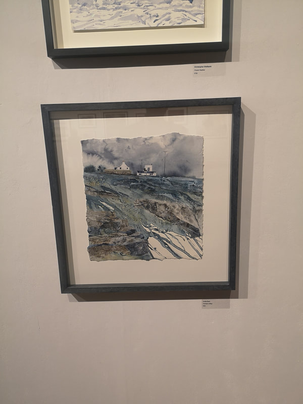
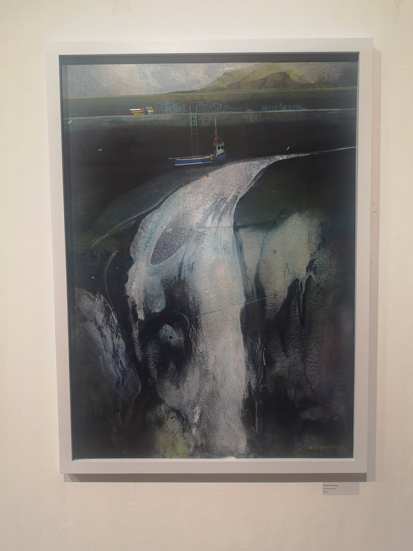
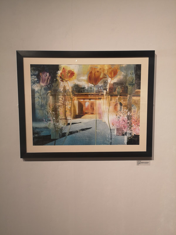
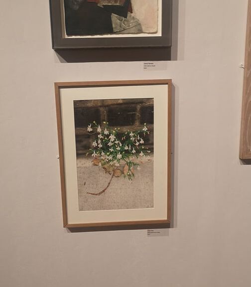
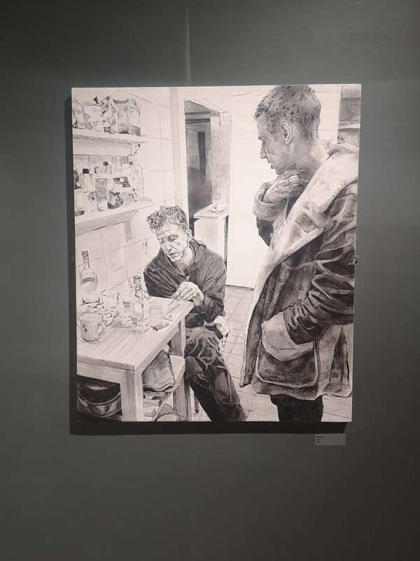
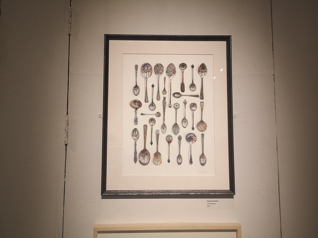
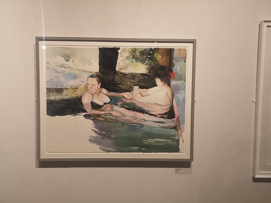
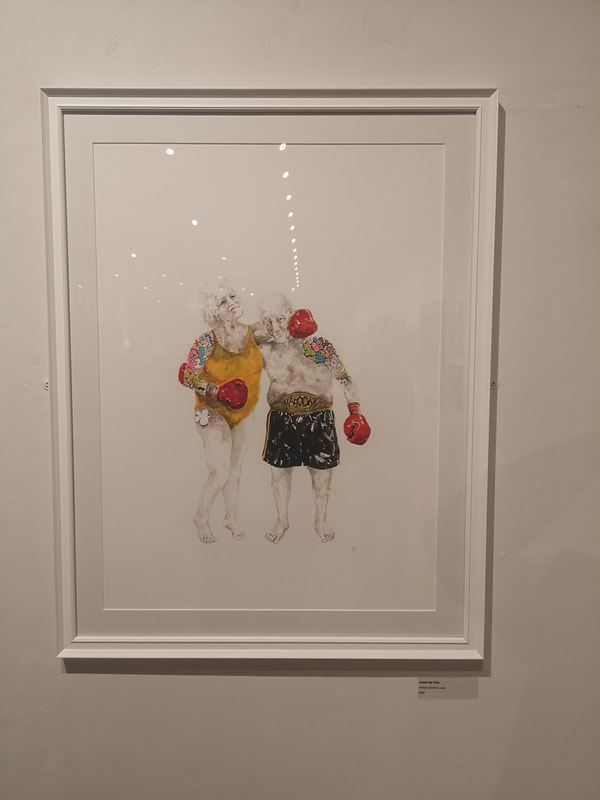
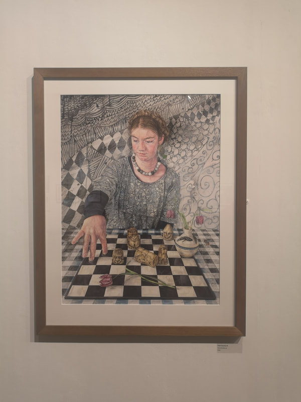
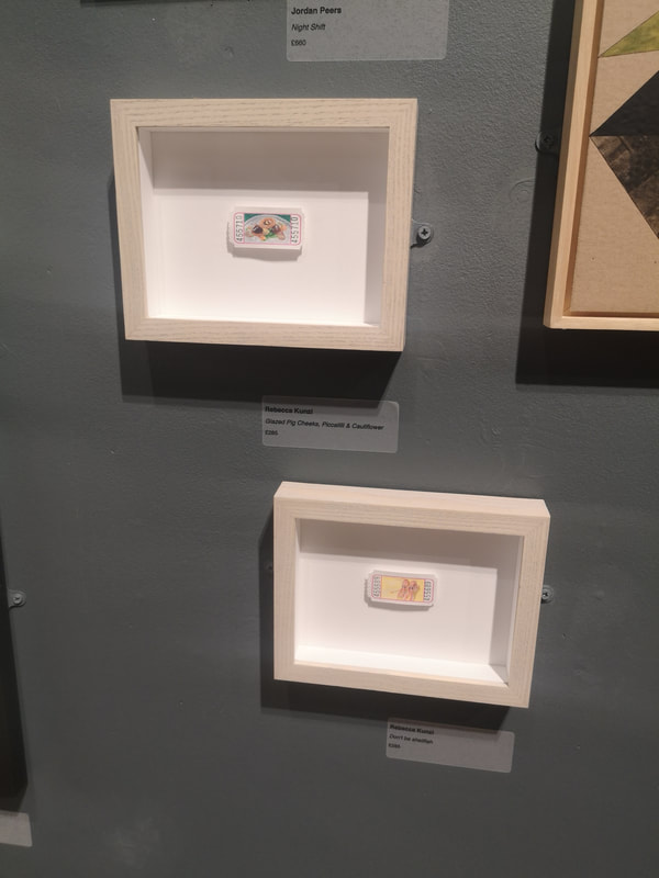
The excellent Mall Galleries is currently showing the Sunday Times Watercolour Competition. It is on until 13:00 on Sunday 22nd September so chances are you have missed it, but let me give you a run down on what was best in the show, at least what appealed to me most, which as our current political leaders have taught us, is the same thing. The prize itself has its own website where some of the exhibitors and their art is shown. Above we have the winners board. Of these I actually really like the one in the bottom left which is a picture of a small yellow plant growing out of the pavement. Primrose Pavement its called and is the work of Aidan Potts. The plant itself and the pavement itself is super detailed whereas the road that forms the upper half of the painting is almost abstract and river like. I have as you may know a fondness for canals. Third prize, or Iron Mighty by Mark Elsmore as it is otherwise known (above right) fits right into the wheelhouse and there is a sense of weighty claustrophobia that entirely fits the brief. Technically impressive, I can see why it ranked but for me though, it is a little too constrained. Having in a few sentences dispatched the winners I shall now do the same for the other highlights of the show starting with the excellent portrait of D - Day Veteran Lewis Trinder by Gideon Summerfield (above left). There is an excellent sense of fading heroism about the picture with that wonderful craggy face and the uniform and medals all slowly merging in a brownish red, the whole figure contrasting nicely with the blue and gray background. Maybe its projection by the dark blue shapes make me think of poppies. One of the things you can do particularly effectively with watercolours is use the imperfections of washes of paint, the dripping of paint and having the white paper peeking through to create striking images. It works especially well in landscapes and Linda Saul has pulled it off marvelously in her work Pendeen Clifftops (above right). The result is a very cold feeling, wintery blustery landscape with a real sense of the craggy eroded nature of the cliffs. What I also like is when people blend the abstract with the figurative, which is what appears to be happening in David Firmstone's Scottish Harbour (above left). This piece is actually more impressive in person. That emerging and expanding ribbon of water has much more colour depth to it, and much more of a glow to it than the picture suggests. What the painting does do very well is take your brain on a journey from the ordered straight lines of the harbour wall and the boat to the swirling chaose of the water running into the sea. In watercolours I have a strong preference for pieces where you can see the paint, and the brush marks. It is a medium in which photo-realism works less wells and seems a bit pointless (other than in botanical art but that is a whole separate thing). There is a surreal dreamlike quality that watercolour lends itself well to and I respond well when an artist plays to these strengths, as with Julian Bray's piece (above right) which has an improbably long and unwieldly title. The strong use of orange and pinks, contrasting with the dark blues and grays is very good, as are the oversized flowers in the foreground. Having now dismissed watercolour as a medium to avoid photorealism, I shall now subvert that point by having two paintings which are nearly there in presentation, but I shall forgive as being excellent and evocative. Firstly we have Aidan Potts again (above left) riffing further on his theme of urban, cheeky flowers. This one lacks the contrast between swirling and realism that the top one has but the colour contrast, between the wall and the flowers, and wall and the pavement is much stronger so it makes for a more eye catching piece. You don't get much social realism in watercolour, you also don't get much monochrome (although there were a few examples in the show). A striking exemplar of both of these things is Kitchen by Peter Busa (above right). Credit to the curator for hanging it against a dark wall which makes it sing and glow in a way it might not of done otherwise. The different tones in this painting, like the way the coat is rendered is superb as is the attention to detail. There is real drama here to between the two figures. They are not just spoons. You can't really see it in the photo and it takes a while looking at the painting until you realise but within each of the spoons of Patricia Rozental's I am Spoonfed (above left) is reflected the face of a person, motled and distorted by the surface of the spoon. Some of them are barely visible beneath the tarnish she has put on the spoons. An excellent idea well done. Mark Entwistle's Primavera II (above right), plays to all of the strengths of watercolour that I was talking about previous. What is particularly impressive here, and is obviously a strength of his as he does it again in Primavera I which is also in the show, is the way he depicts people under water. It is very good. This painting has a nice, intimate, dreamlike quality that really sucked me in. The contrast between the solid dark wood, the pinkness of the skin and then the, frankly very cold looking, blues of the water. Very nice. I have said it before and I will say it again until you listen is that comedy in art is very difficult to do and very effective when you pull it off. Punch Drunk in Love by Adam De Ville (above left) made me, and most other people at the show, laugh as soon s they saw it. The absurdity of the figures, the swim suit, the colours, their age, the overhyped highlighted tattoos all play off the sweetness and cuteness of the message. It is also very simple, just these two people against a white background, and the more effective for it. I like it. Much more maximalist and repleat with symbolism is Claire Sparkes piece (above right) which has an unpronounceable German name. I like the way the various elements of the piece reflect and blend into each other. Foreshortening is difficult to day and I therefore really like the way her hand reaches out onto the board. Sometimes though art speaks to you simply because it sparks associations. I am very fond of the the Lewes Chessmen for reasons that are too long and difficult to explain now. This painting reminds me strongly of those chess pieces and therefore I like it, frankly, mainly for that. Last two, well last three. Two though are by the same artist. They are by Rebecca Kunzi (above left). It is very difficult to see from this photo but they are food stuffs painted on tiny tickets. I particularly appreciate the bottom of the two, which is a picture of two prawns and is called Don't be Shellfish. You don't get nearly enough puns in art, or in life for that matter. Nice idea, done well.
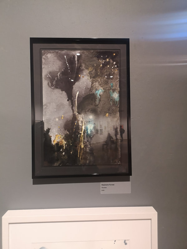
Let us sign off with a celebration. Stephanie Forrest's piece (above right) is one of those pieces that is initially slightly baffling but the coalesces into something else one you know the title. Right so, look at it. Have you done that? It is called Fireworks. Now look at it a again. See? Once you know you can see that she has actually caught really well the smoke and light of a firework display. The exhibition is on until Sunday. I am posting this on Saturday to partly make up for missing a blog post last week. Go if you can, enjoy it.
0 Comments
Leave a Reply. |
Archives
June 2024
Categories |
 RSS Feed