William Mackenzie
  • Gallery
  • Blog
  • Podcast
  • About Me & Contact

Abstract Expressionism

11/3/2016

0 Comments

 
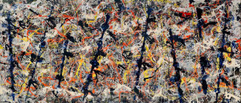
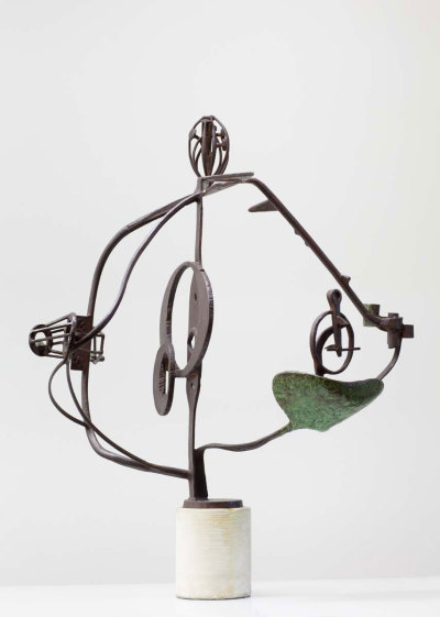
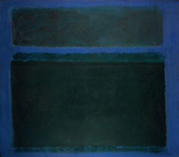
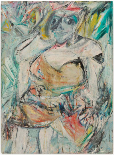
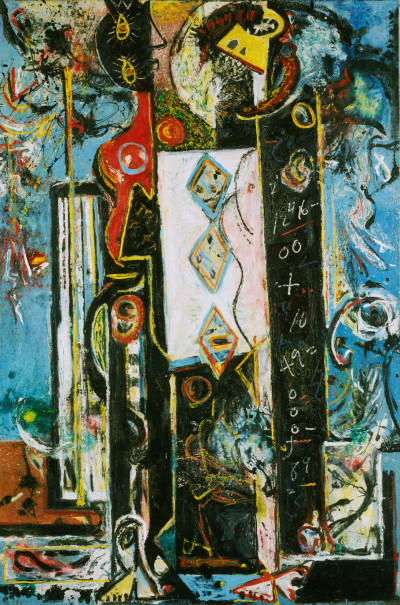
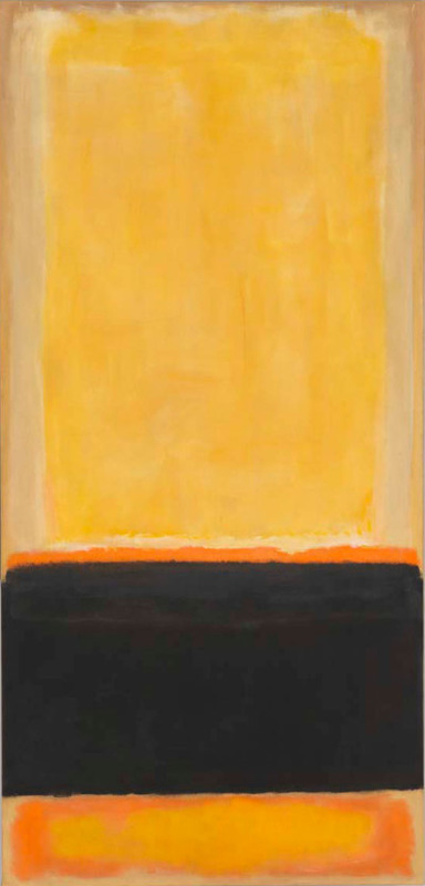
There is a monstrous show on at the RA at the moment.  It is on until January and is called Abstract Expressionism.  Monstrous in that there are some big names,  monstrous in that there is a large number of paintings to see and monstrous in that many of the works on display are very big.  All images in this blog are from the RA web page. 

It is well worth seeing.  It is a very bombastic exhibition.  Lots of male ego on display, big paintings and lots of paint.  There are a few women artists there but it is dominated by the names you are familiar with, Rothko (top right), Pollock(top left - the famous Blue Poles, de Koonig (bottom right) and the sculptor David Smith (bottom left).  In addition some less well known and to me new names.  
Picture
Picture
The exhibition stretches over 12 rooms.  The same 12 rooms that hold the summer exhibition (told you it was monstrous).   One of the benefits  of these exhibitions is seeing people you didn't know, and unknown styles from those you do.   I won't do a review of everything in the exhibition.  It would be a little tedious and far to long,  instead I will set out those things that particularly interested me. 
Picture
Picture
Picture
Picture
Picture
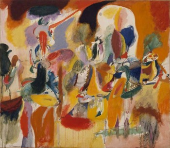
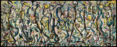
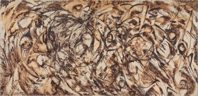
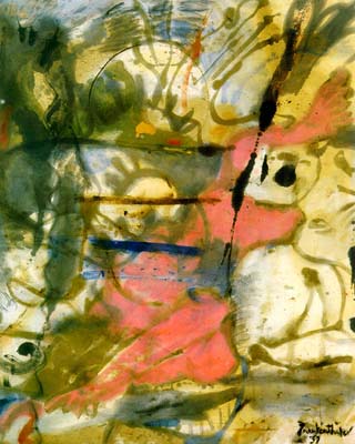
The first room contained peoples early work.  There you can early Pollocks like the one above left.  I really like this.  I like the colours and the shapes.  It is very different from his classic work.  More familiar in style to my favourite of his the enourmous Mural (above  bottom right).  The picture maybe tiny but it is massive.  I like the more organic lines to it and the swirling shapes.  Like many of the pictures in the exhibition you have to stand a long way back to appreciate it.    

The second room was entirely dedicate to someone new to me, Arshile Gorky.  Large paintings, riots of colour with shapes emerging and disappearing again out of the colour. 
Picture
The paintings on display are mainly men.  By no means all though.  There was of course Lee Krasner (above).  However a new discovery and apologies for the appalling photograph was Helen Frankenthaler's Europa (right).  I had never heard of Frankenthaler before but she achieves very interesting things but thin washes of paint sent accross the canvas.  This is true of all the paintings here but especially this one it is much better in the original.  There is a lot going on here but the wash effect has creates a strange stillness to it.  
Picture
Picture
Picture
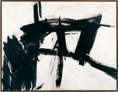
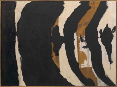
The Violent Mark was the title of the room the contained the above two, Franz Kline (left) and Robert Motherwell (right).  It is a good title because they have a great deal of energy to them. There were a number of Kline's work on display, in this room and others.  I had heard of him before, seen images even but they really appealed to me in person.  They reminded me of calligraphy which I also like.  Simple energetic dark marks on the canvas.  I found them most buigling.  Of all the works in the exhibition if I can own one, it would something by Franz Kline.  Motherell is more stately, more oozing. 
Picture
Picture
There was a room of Rothko's (like the one left which is one of my favourite) all emanating menace and a strange energy.  Rothko I think more than any other artists benefits from being displayed with other Rothko's.  The different compositions play off each other and contrast each other.   They were very well displayed (in fact it has to be said this was a superbly well curated exhibition) in a central hexagonal room.

Coming off it was a large room with very large paintings on the wall.  They were by a man called Clyfford Still.  Who you say?  So did I.  I like him now though.  Enormous simple canvases,  deceptively simple.  They struck a chord with me somehow.  I can't quite say why but I found myself grinning in that room and kept going back in to have another look.    
These are just some of the highlights.  There were other paintings that really struck home.  Adolph Gottlieb's Penumbra, Sam Francis' Summer No.2, Norman Lewis Metropolitan Crowd and everything by  the disturbingly serious Ad Reinhardt and Barnett Newman's large blocks of colour (see below).  There were some things I decidedly didn't like,  everything by Phillip Guston for example. Despite this go and see them.  You will not be disappointed.  I came away with much to think about. 
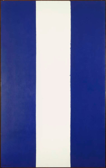
Picture
0 Comments


Leave a Reply.

      Keep in Touch

    Subscribe to Newsletter

    Archives

    January 2025
    September 2024
    July 2024
    June 2024
    May 2024
    April 2024
    March 2024
    February 2024
    January 2024
    August 2023
    July 2023
    June 2023
    May 2023
    March 2023
    February 2023
    December 2022
    November 2022
    July 2022
    June 2022
    May 2022
    April 2022
    October 2021
    September 2021
    July 2021
    June 2021
    April 2021
    March 2021
    February 2021
    December 2020
    October 2020
    May 2020
    April 2020
    January 2020
    December 2019
    November 2019
    October 2019
    September 2019
    August 2019
    July 2019
    June 2019
    May 2019
    April 2019
    March 2019
    February 2019
    January 2019
    December 2018
    November 2018
    October 2018
    September 2018
    August 2018
    July 2018
    June 2018
    May 2018
    April 2018
    March 2018
    February 2018
    January 2018
    December 2017
    November 2017
    October 2017
    September 2017
    August 2017
    July 2017
    June 2017
    May 2017
    April 2017
    March 2017
    February 2017
    January 2017
    December 2016
    November 2016
    October 2016
    September 2016
    August 2016
    July 2016
    June 2016
    May 2016
    April 2016
    March 2016
    February 2016
    January 2016
    December 2015
    November 2015
    October 2015
    September 2015
    August 2015
    July 2015
    June 2015

    Categories

    All

    RSS Feed

Proudly powered by Weebly
  • Gallery
  • Blog
  • Podcast
  • About Me & Contact