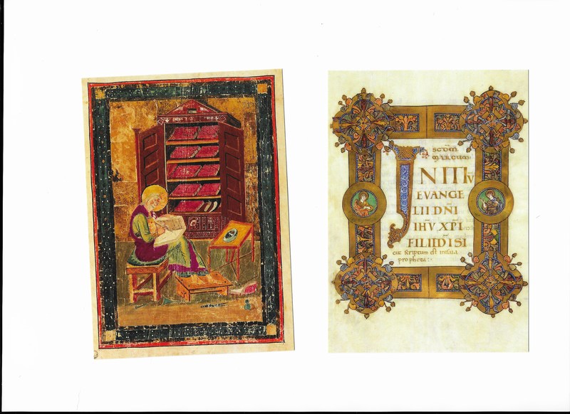
 Unlike the excellent British Museum exhibition I went to and wrote about recently, the British library is stingy as hell at giving you access to images of the exhibits on displays. You are not allowed to photograph, which I understand given the light sensitive nature of much on display, but there are also few scant pictures on their website. it can't be copy right reasons. So instead I have plundered the postcards they sell. Unlikely to be a breach of copyright give a) the subject matter and b) this is a review so fair use. Seriously though, why no images? It's a good show, if you like illuminated books, which fortunately I do, there is allot of things like the above. This also means there is allot of bending to peer at cabinets. 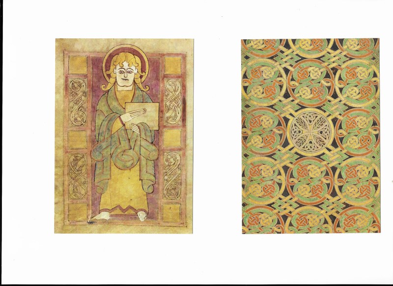 One of the things these shows always bring home to me is the sense of their being nothing new in this world. In a slightly silly vein this slightly puzzled St Luke (or possibly Mark above left) looks very much like a South park character, but it is the folded design of this cloak the interested me. It is quite abstract in a way, you can imagine it in a Picasso painting. That and the designs you see around the side of the illustration and indeed as entire motives themselves look very familiar. The knots for example (above right), seem very celtic and is a motif that has a revival of late and something I see allot of on the arms of hipsters as they serve me single origin coffee. That design is one my favourites. I imagine in its pomp the reds yellow and greens where allot more vivid, having faded over time, but I like the alternation of the circular knotted roundels with those zig zag squares. It is incidentally a page from the Book of Durrow, and the original is much better. Go and see it before it returns to Dublin. 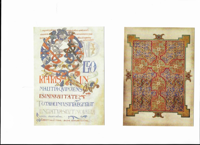 These themes of interweaving different strands of colour occur again and again in this show as in what is possibly a contender for the worlds most ornate Q (above left) from which is in fact, as those ecclesiastical latin readers amongst you will all ready know, the opening of Psalm 51 from the Bosworth Psalter. Much more ornate and flecked with gold is the appropriately named Carpet page from the Lindesfarne Gospels (above right). I don't know about you but I always get a smug, very radio 4 thrill, seeing things like this that I have actually heard of in the flesh, and marveling at their preservation for over 1300 years. Pitches you right back there. 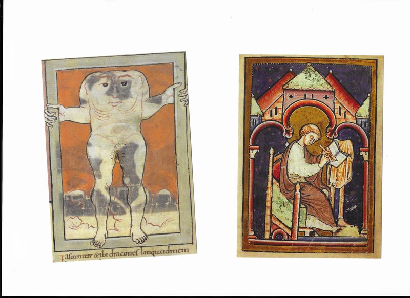 Strange an mythic creatures pop up a few times, like this grump looking headless creature, upset presumably at the absence of genitals (above left). It is a Blemmya and is apparently 8 feet tall and 8 feet wide from an 11th Century book called the Marvels of the east. I particularly like the way his (and it is apparently a he) is gripping the frame of the picture, with his feet over the edge of it, as though he is about to step out. It is the kind of things art students do and think they are doing something terribly clever and innovative about the breaching of the frame, when in fact it would appear the idea is at least 1000 years old. There are more than a few illustrations of men (and the illustrations of people are almost all men, kings scribes, apostles, the only woman I can recall getting a look in was Mary) scribbling away. The one above right particularly caught my eye for two reasons. Firstly it might be an illustration of the Venerable Bede (my favourite Bede) from whose quill much of this era seems to have flown. The other is the colour and composition of the piece. Those red angled buildings and the red arch, form a very effective contrast to that lovely dark blue background. 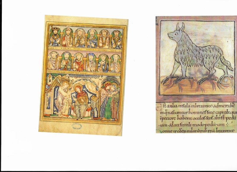 You see? Religious scenes covered in gold (above left) and monsters (above right). This leads me to one of the slight draw backs of this show. It is almost all books. And you have to lean over, as though bowing to a minor royal, in order to look at them. The illustrations are wonderful but many of them are ancient text. If like me you cannot read latin or greek (the Lertices which the creature is, again from Marvels of the East is described in Latin), you are a little non-plussed. Although it has to be said the penmanship is exquisite. On a side note I was hoping from some interesting or rude marginalia but was left disappointed. 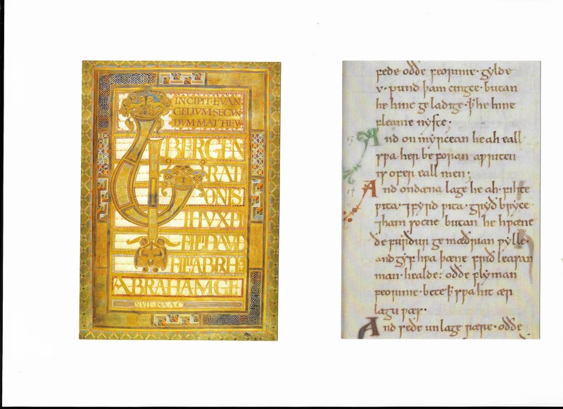 On the issue of text there are some truly epic examples. From an illustrative and artistic standpoint you get what I imagine most people think of (I certainly do) when they think of medieval books which is stunning calligraphy covered in designs and gold. The Beginning of the Gospel of St Matthew from the appropriately named Harley Golden Gospels (above left) is just a stunning thing. The gold still shines after all these year, and you could look at it for ages, or until you back aches. Then from a literary point of view you get interesting things like the first gospel in English, or one of the first written versions of Beowulf (which inspired me to buy the Shamus Heaney version on the way out). The example above right are the laws of King Cnut. Beautifully written and apparently in English but in an English one would struggle to recognise or even read. If you read it out it makes more sense but much of it baffles. What is a flyman? Anyone? 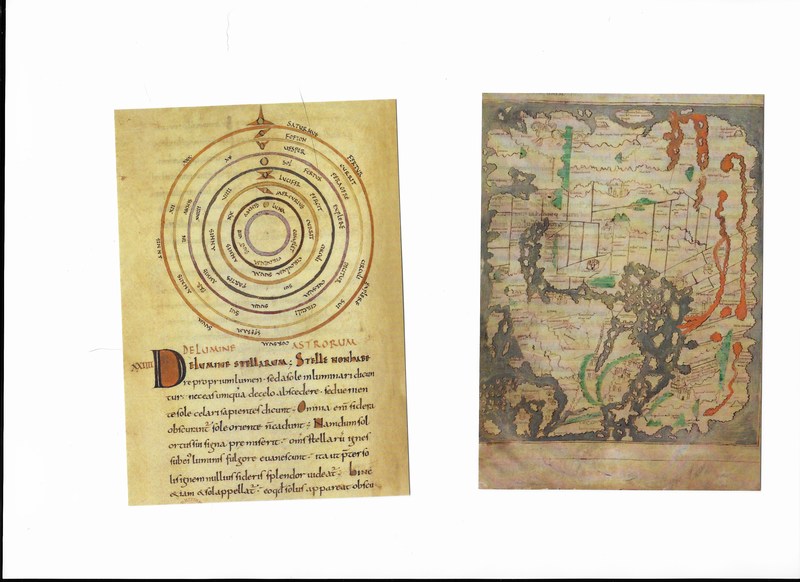 The last thing I shall talk about is cartography. There is obviously much more in this really quite large show than I have covered here. Go and have a look it is very interesting from several angles. If you are interested in Arthurian legend then there is for example and early version of Sir Gawain and the Green knight on display. If like me you are drawn to maps then you won't be disappointed as there are several on display. Incidentally I will pause here to note that like all people for pretty much all of recorded history the Anglo-Saxons knew the world was round. Anyway, back to maps, they are lovely. So you get the Celestial like the above left which is a diagram of the planents from Isidore "On the Nature of Things". A beautiful document which places earth at the centre and Sol beyond Venus (called Lucifer here, the morning star you see). Then you get the more explicitly cartographic with this world map from the 11th Century (above right). It is orientated East, West, presumably so Jerusalem is at the centre. The rivers are in red and the long one is the nile. What did they think happened if you sailed west? I imagine they thought you drowned, and they were probably right. It's a good show, go and have a look but mobilise your back before you do. If anything it is a bit too big and I found myself towards the end thinking, not another book and marching past a copy of original Domesday book before realising what I had done and scuttling pack to peer at the indecipherable entries. Anyway I a final word on me! I have two shows going on at the moment. One at Beans Love Greens which ends on 18th December (so may well have ended by the time you read this) and I am in a group show at the Indo bar which is on until 2nd January. Go to them, eat drink, get carried away and buy my art.
0 Comments
Leave a Reply. |
Archives
June 2024
Categories |
 RSS Feed