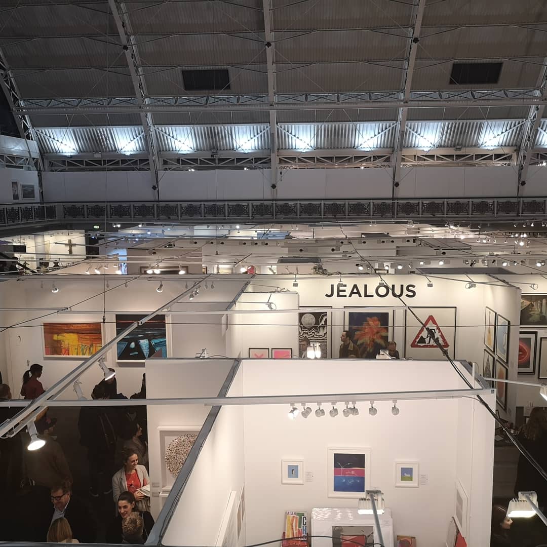
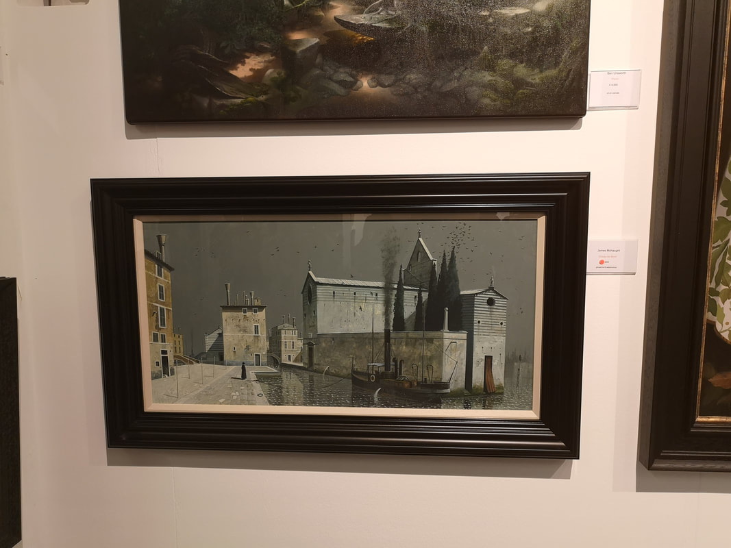
 The horror of a cold and miserable January is punctured by the London Art Fair. It only runs for a week and closes on the 20th so chances are you've missed it. It is a show I enjoy. It is one of the few places where you can see allot of Modern British art in one place. It allows me to chart both how my taste is changing but also how fashions in the art market are changing. This year the vogue for slightly weird fantastical art has gained ground on previous years. None of it particularly grabbed me though. As I entered I made a decision not to photograph artists I had covered in previous years, a vow I broke almost immediately.
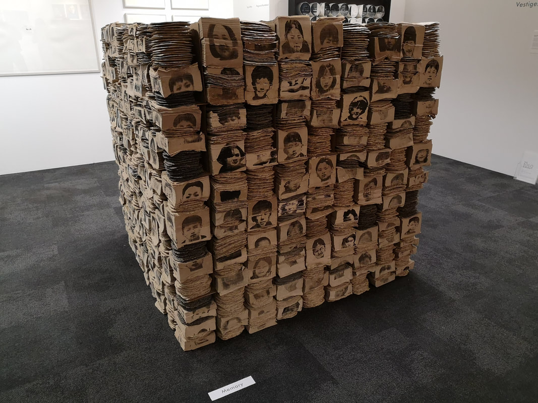
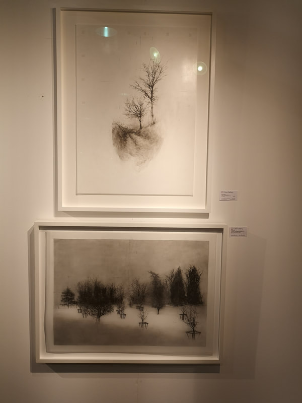
If you don't know the London Art Fair, it is a mammoth exhibition centre called the business design centre, a large central atrium surrounded by a balcony and leading off the north side a smaller exhibition hall. In the smaller hall there is what is called the project space, for newer works and more avant guard stuff. I started there and moved down into the main hall then out the door. So lets go with the first one, which is pretty much the was this installation Ilkwoon Youn. Firstly there is pile of burnt looking paper (above left) which I enjoyed but better where these section black and white logs which make a city scape when you step back from them. It messes with your eyes but I like it.
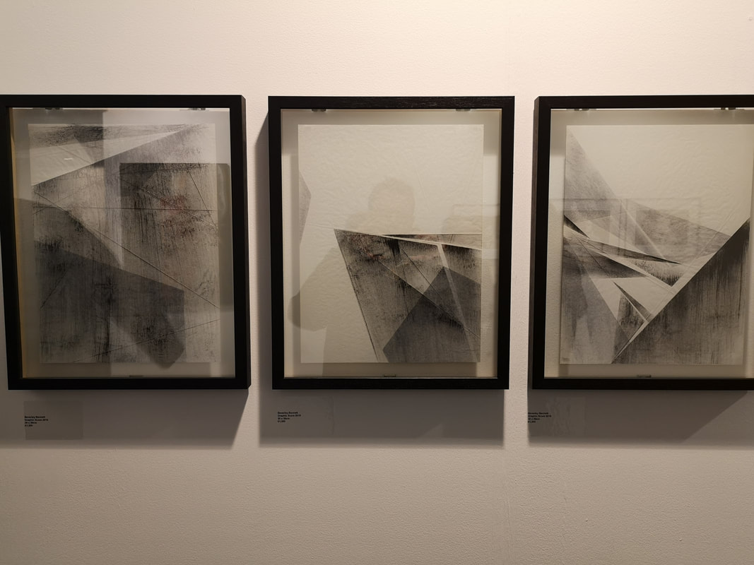
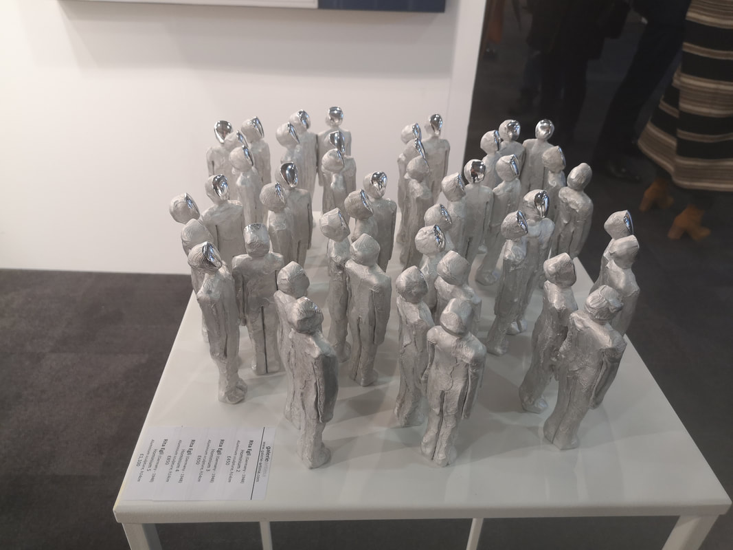
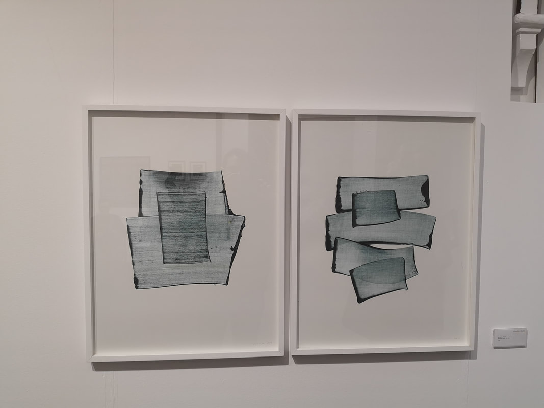
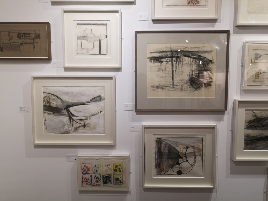
About left Beverley Bennett's trio of charcoal geometric compositions that she has called Graphic Score's. I like them they are very contemplative pieces, with these intersecting tonally varying shapes. This pretty much typifies where my tastes are moving towards, simpler, starker black and white pieces. Above right Rita Egli's Hominium figures, which come in groups of 2, 3 or 4, fused together at the shoulder. They are like space age figures, with their blank shiny faces, all peering up at you. 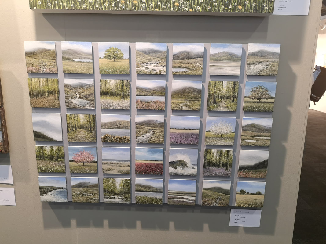 Garry Pereira (above) is someone who I featured in previous posts and he was here again with finally painted landscapes in wooden box lids, but what really attracted me with this grid of small landscapes. They are superbly detailed with much charm and character to them. They could be quite cliche but both the composition of the pieces and Pereira's unique way of presenting them lifts them. They are very good.
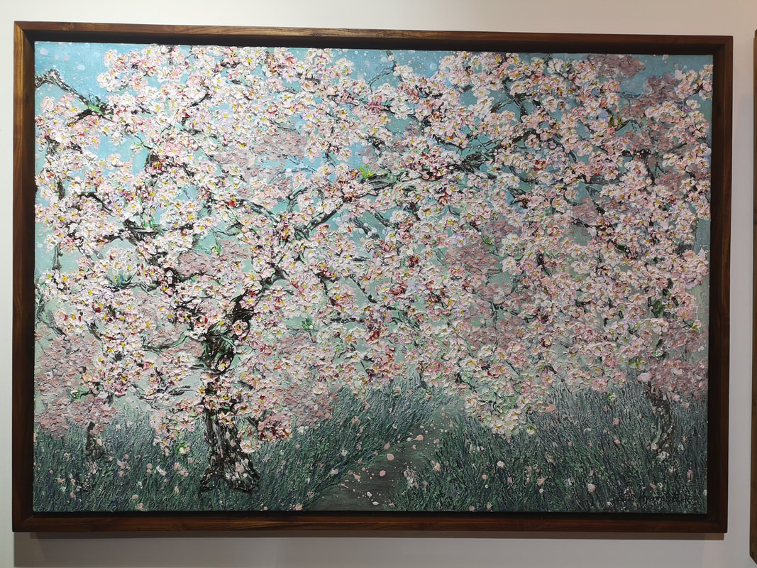
Do you like flowers then you will like these two paintings? Then I have something for you. Above left you have two paintings called Flower Garden by the excellently named Rinring Wang. They are simply coloured paper glued onto canvas but they have a lovely field quality to them. Bringing blossom brilliantly to life is Hyun Ok Park's Spring Afternoon. The lovely impasto blossom works spectacularly well. 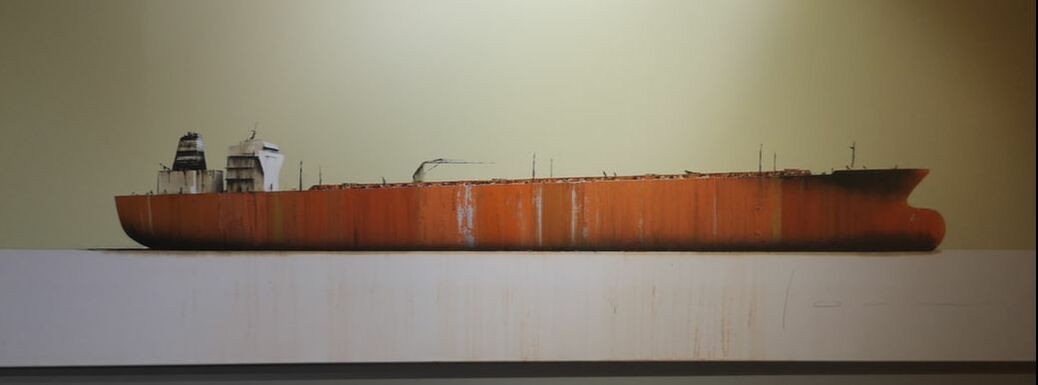 Its a photo-realistic oil tanker (above). Sitting alone, rusting and stranded on this gray background. The canvas is very long making for a piece that packs a punch. I like the detail, particularly the blue and rusting staining down the side of the ship. It is the work of Stephane Joannes.
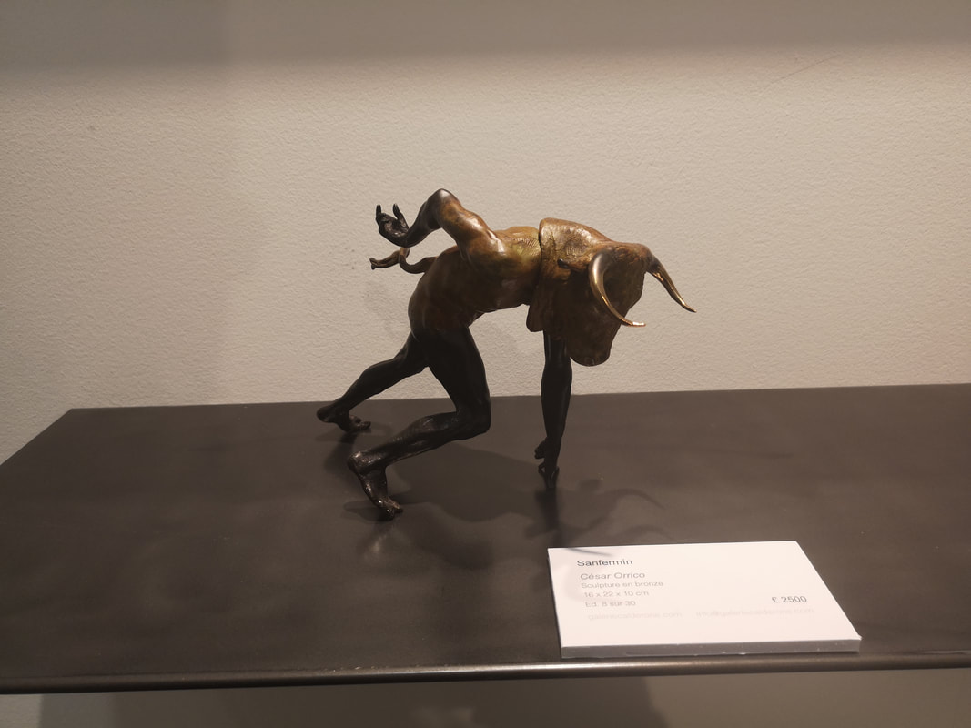
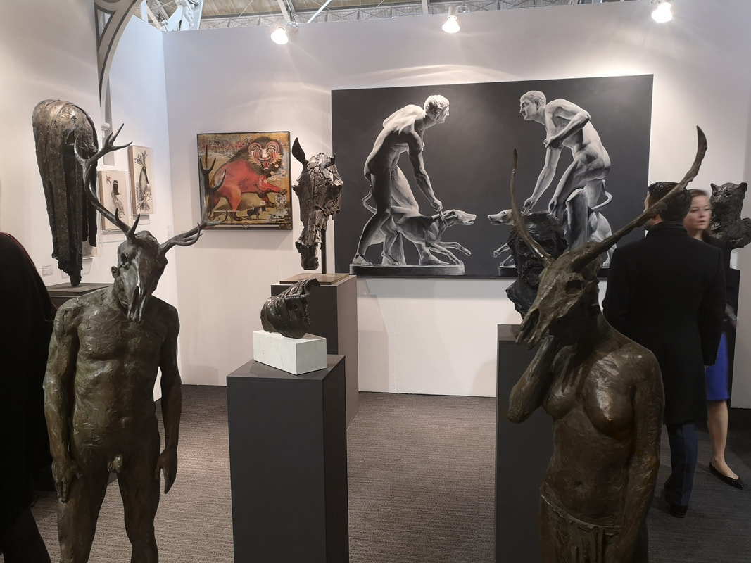
The vogue for the surreal and the fantastic was also present in sculptural form as you can see by these full length skull headed figures (above right). Very well done though, in a appalling way. Much more interesting to me is the Minotaur (above, above right) who is either setting off in a sprint or stumbling to the ground. It is bronze and is the work of Cesar Orrico.
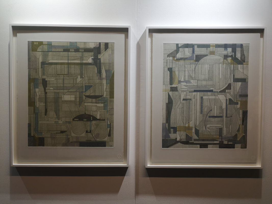
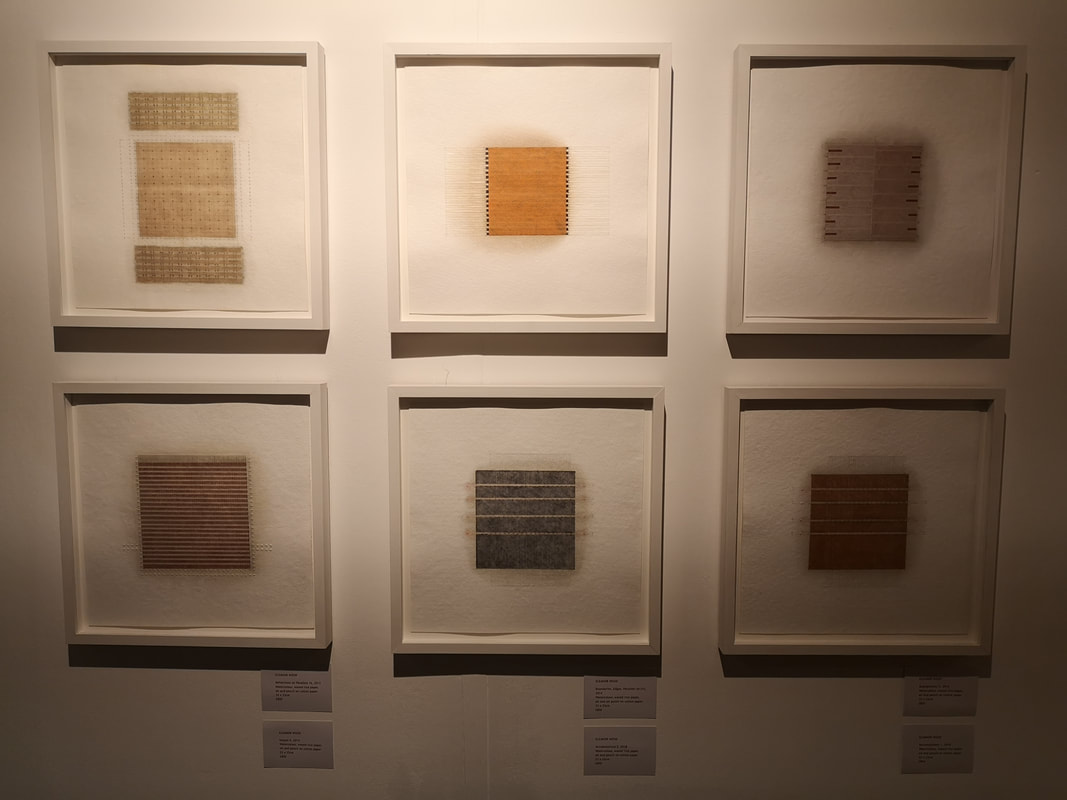
Above left we have James Kennedy's Transpositions, using the intriguingly named process of Intaglio (which is a printing process). It is a series of intersecting geometric shapes giving the appearance of buildings or a cityscape from above. I like it. Agnes Martin is one of my inspirations so I have a soft spot for work that echoes her style particularly when it is done well. The artist is called Eleanor Wood and I do like her squares of colour.
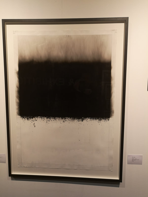
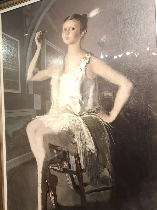
Its made of soot! And water. Nigel Bird's Horizon (above left) delivers on its title in a novel way. That solid thick layer of black like the mantel of the earth, and the drifting lines above it that could be smoke (which is what the medium makes you think), but also could be fog bound trees. The framing of the piece is interesting but I think it work even better with white above, as well as below the image. Completely different, and vastly more expensive at a cool £35,000 is David Donaldson's Young Dancer (above right). Technically superb with the rendering of the dress and the central figure. What particularly draws me to this the sass of the pose and the slightly strange, chubby face. Its almost like she is puffing out her cheeks, or holding in a draft from the cigarette. It has what I like about portraiture, there is an actual person there.
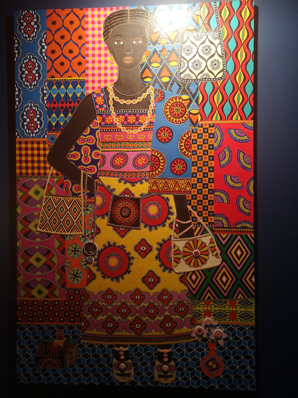
Carla Kranendonk, a very close contender for most excellent name in the show changes both subject and style for us completely with her joyous portrait Fifi (above left). It is riot of colour with the figure almost lost in the patterned background. You also have those nice 3d touches with the button on the bag and the flowers, coming out and enhancing what is otherwise a flat perspective piece. I like her pose to, and despite the simplicity of the depiction of the person you still get a sense of personality there. 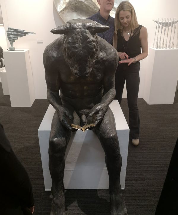 Minotaur! Full sized bronze sculpture, tackle out, but it is of course the bookish pose that really makes this superb sculpture. Its a nice contrast subject and positioning. Sadly I completely neglected to find out who this was by. If you are reading this blog on Sunday 21st and you live anywhere near Angel then you could maybe scamper along and find out for yourself and who know, if you have the no doubt tens of thousands necessary, this magnificent creature could be yours.
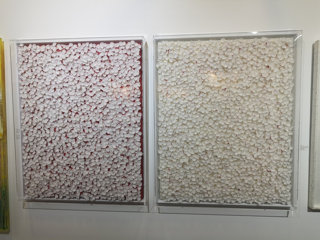
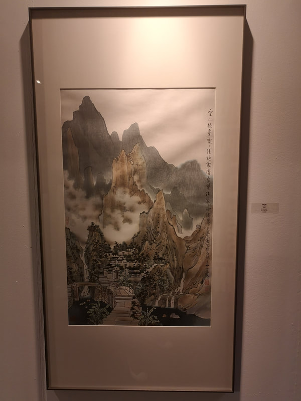
Fang Jun (above left) gives us a fairly traditional misty brown mountainscape. I like these. They very much invite me into the picture to be part of the world and the technique of hiding the landscape in clouds or fog is one that really appeals to me. Craggyness of the mountains is always a must. There are many of these types of paintings around but this was the only one in this show. Nice isn't it? 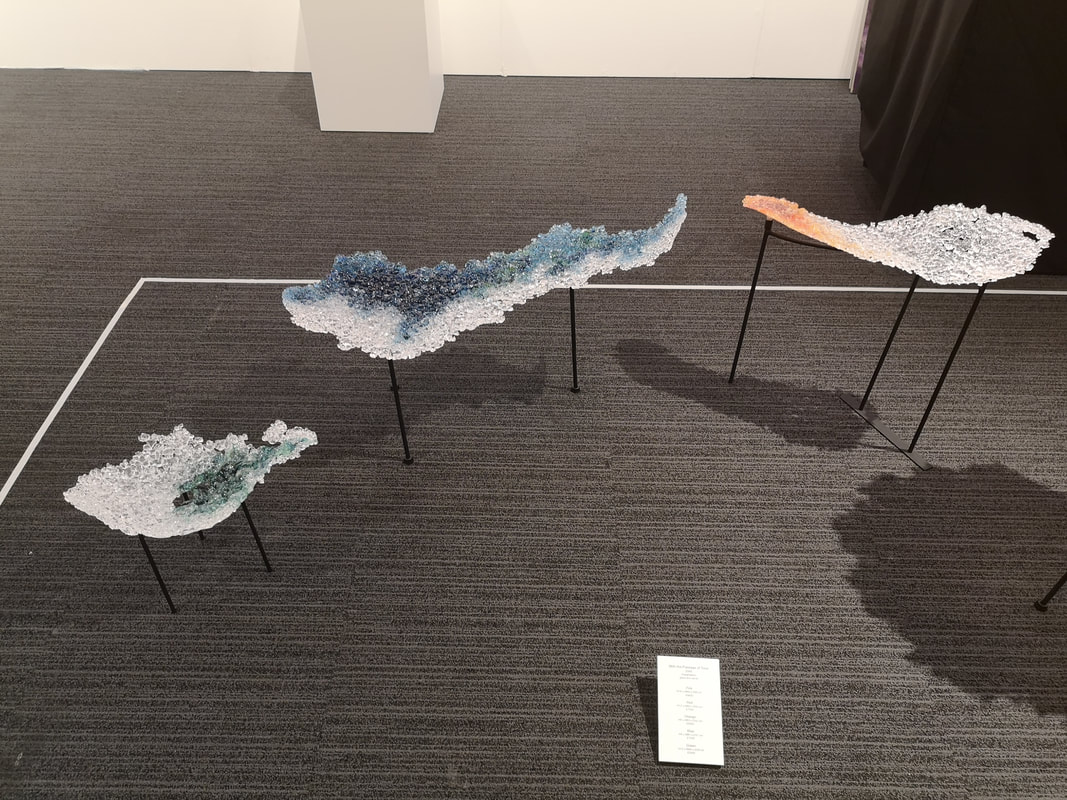 Glass. I do like some glass. The work of Akido Noda is something that has attracted me before and would be purchased would it not be for the fact that you know, I need to eat and heat my house etc. This year there was a frankly lovely installation of pieces of coloured glass called With the Passage of time (above). They are delicate whispy things like clouds or islands on a violent see. They are lovely and I would wish to have them. Sadly they start at £3800 (for the one on the left) and go up from there. Also I suspect that just one would look lonely and you would have to Pokemon them (got to catch them all for those over the age of, actually scratch that because a few months ago I was behind an elderly woman in the cue at the RA who was playing Pokemon on her phone while we waited).
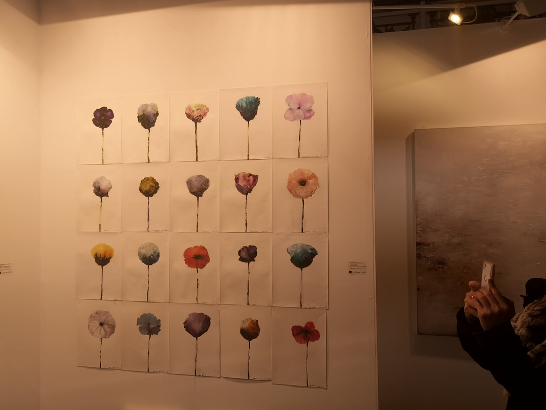
The shifts of shading within the pieces given them a feeling of depth and draw you in. At £900 they are also the more affordable end of the show. I really like these.
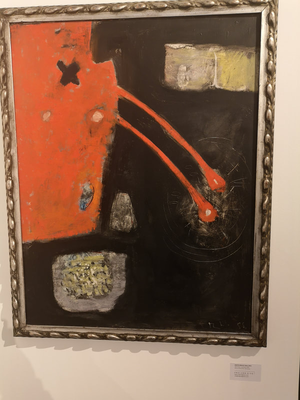
Frankly it looks like people pissing in the river and I wonder if that in fact what it is by the artist, or maybe the gallery had a fit of embarrassment and changed the name. I do like an abstracted landscape though. I like the darkness of the mirror with the splash lines scratched into it and the violent red, pouring into the river. Then there are those odd patches of grey and yellow. It is interesting to speculate on what those are. Little Islands? Bunches of bulrushes?
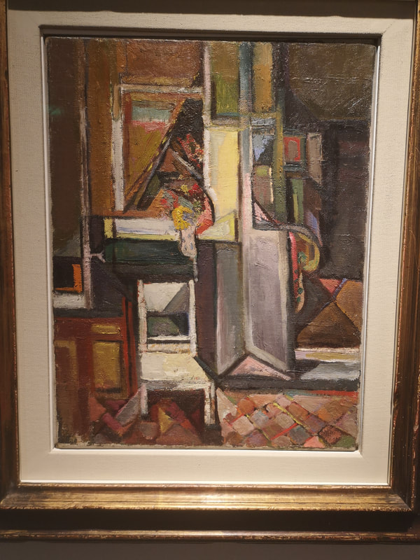
More restrained and cubist is Paul Feiler's the Green House Oxford (above right). Here there are more recognisable elements, such as a chair and a door, distorted in interesting and colourful ways to make for a fine composition.
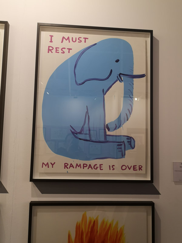
David Shrigley's My Rampage is Over (above left) is genuinely funny. I laughed when I saw it and that has been the reaction of everyone I have show it to. If you don't at least smile then you are a monster. It still makes me smile. Simple but effective the humour is done in the juxtaposition of the style and pose of the elephant with the words. Very well done.
Eileen Cooper is another inspiration for me. She is a superb example of someone who has really nailed a distinctive style. You can tell work is her at a glance. Dynamic poses with a simple line to them and exaggerated features are her calling card. The negative space often makes for interesting images too. This one, Warm Water (above) is an excellent example of her work. So that's it for this year. I will leave you with a cute picture of a dog, the work of David Remfry. 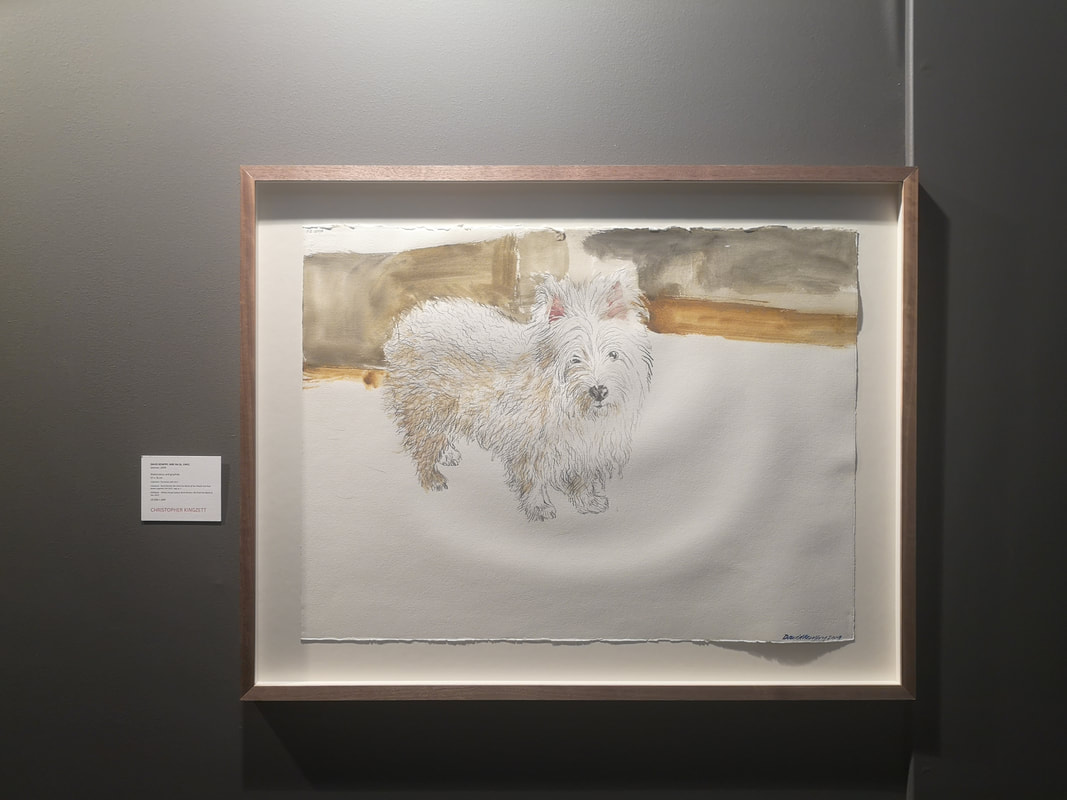
0 Comments
Leave a Reply. |
Archives
June 2024
Categories |
 RSS Feed