 I haven't been to the Mall Gallery for a while which is a shame as they have many good shows. It hosts the annual shows of many of Britain's top art societies. I happened to be in the area on Friday so made a beeline (why bee, why not crow?) straight for the gallery to see the Royal Institute of Contemporary Watercolour (or RI). Prince Charles is its patron. I believe he exhibits under a nom de brush but I am not sure what it is. If you think watercolour is stayed and boring, well you are an idiot, and wrong, and this show is an example of why. It is well laid out across the mall galleries and I have selected below some of my favourites using the vigorous criteria of I happen to like them. 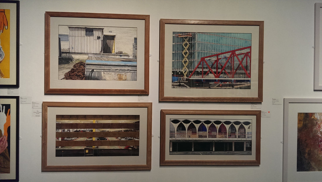 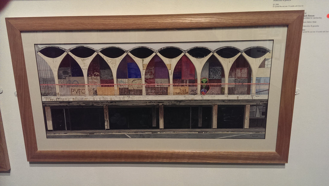 One of the vistas in life that fascinates me is the backs of buildings, the lesser seen slightly run down industrial visage. This is one of the themes in my current show. I am always struggling to find a way of presenting these images in a satisfactory way. I therefore appreciate it when I find someone who seems to have cracked it as Mark Elsmore has (above). I particularly like Space Station Stoke (the bottom image above) in all its beautiful griminess. He stays just far enough away from photo-realism to still be interesting. I am not in the least surprised it has sold and I suspect Mark will breeze through into membership. 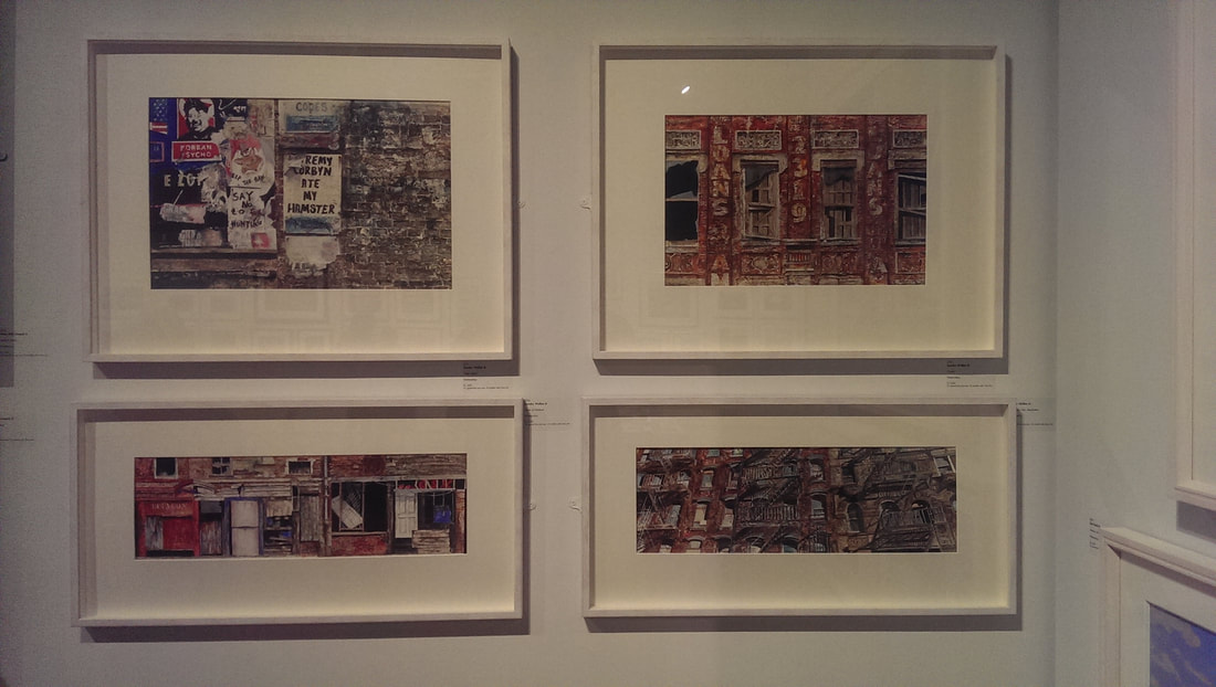 Staying on a similar theme are the urban wallscapes of Sandra Walker (above) I particularly like the one of the wall at brick lane called Fake News (above, the picture top left). These are highly textured detail paintings and I particularly like the way she renders brick. My only criticism is I think the picture takes you two close up, there is no perspective in them. This is clearly a deliberate choices though and it is choice that works best in the narrow almost claustrophobic pictures that are the bottom two. 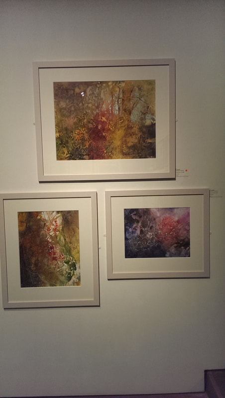 Next we have Ann Blockley (above) who has produced these three marvelous, somehow slightly threatening nature scenes. The have a sort of loose misty quality, a feeling of nature out of control which seems to be quite in vogue at the moment and which I really like. She has good colour contrast but also has an effective way of dominating each picture with a particular colour to give them each a different tone. 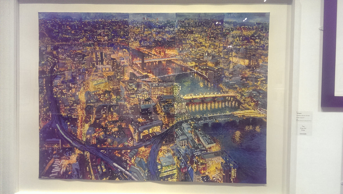 This piece (above) by the interestingly named S Z WImperis is called One hundred to one from the Shard. The picture is made of a number (presumably 100) smaller paintings on small pieces of paper, assembled to make the blue and yellow whole. It is good. Not only is it a good painting in terms of light, colour, composition, detail and so on but the idea of assembling it out of smaller parts is a good one and done well. It adds an extra dimension to the whole thing. Like you are looking at the city through a slightly distorted reflection. 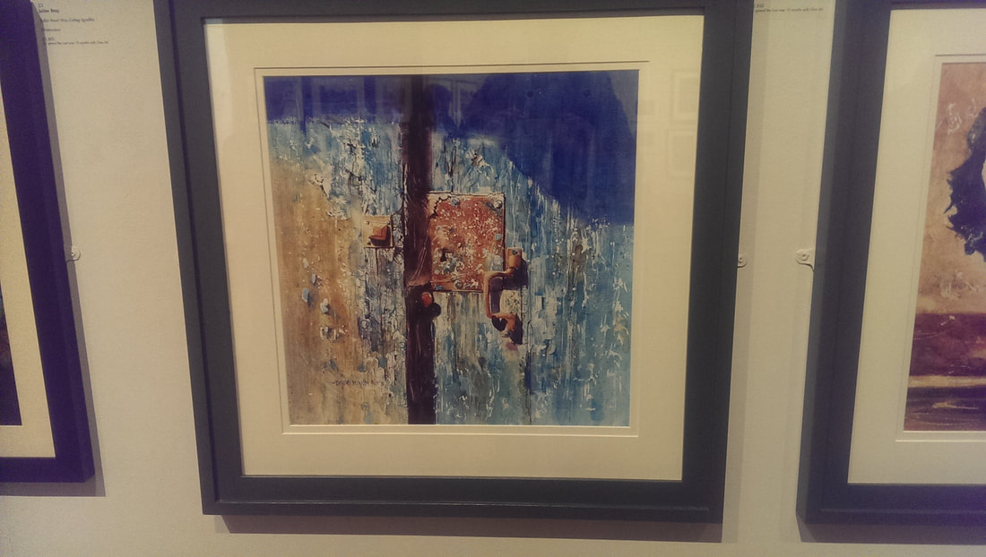 David Poxon has given this piece (above) the slightly pretentious title of Places only we know. The title spoils it a little, lock and door would have been better. The painting can speak for itself without attempting to add superfluous mystery to it. As you can see what David is particularly good at is texture. You almost feel like you could touch the battered wooden door, with its pealing paint and the rusty lock.
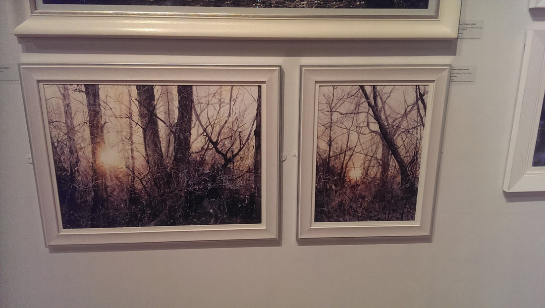 I like trees. I like pictures of trees, if they are done well, and I like these scratchy slightly skeletal tress produce by Deborah Walker. The light coming through gives a good sense of depth and you really get the sense you are stuck in a cold wintry thicket of trees. Doesn't show up terribly well in the photo but the colours are more subtle then they appear here (above). 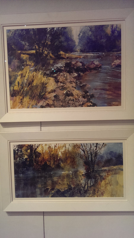 Watercolour is well disposed to a certain moody type of landscape so in a similar theme we have the paintings of Chris Forsey. Astute readers will have noticed there is a pattern to my tastes, misty slightly off kilter scenes are high up my list of ascetic sensibilities and so I like the soft silvery light of Chris' work, the reflection on the water and the scrabbly landscape. Classic use of water leading you off into the painting. 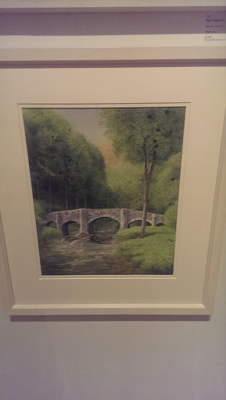 Of course it doesn't have to be wintry and dark, with foreboding mist. I also very much like the above picture of FIngle Bridge by Kevin Hughes. The whole thing is superbly rendered but what I particularly like, and I think what lifts it above a standard landscape is the mossy effect of the foliage of the trees. Gives it that something special. 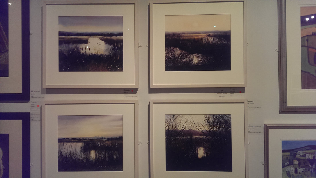 ahe of course I have to return to type with misty, autumnal watery scenes as in these four (above) by David A Parfitt. Again exquisite technique and very nice reflections but these are a good example of fine composition, particularly the bottom right one with the sliver of water framed by the bending twigs. 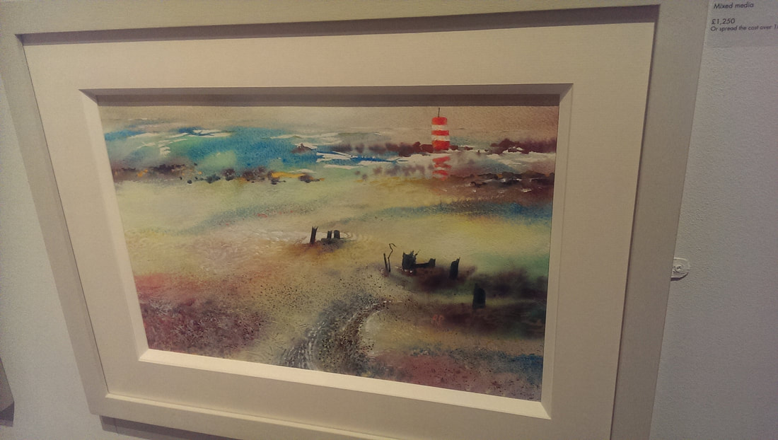 Still misty and probably autumnal but much more brightly coloured and exuberant that the others is Richard Plincke's coastal scene. It is the bright lighthouse bursting out towards the back of the picture that grabs you and then swirling colours to keep you interested.
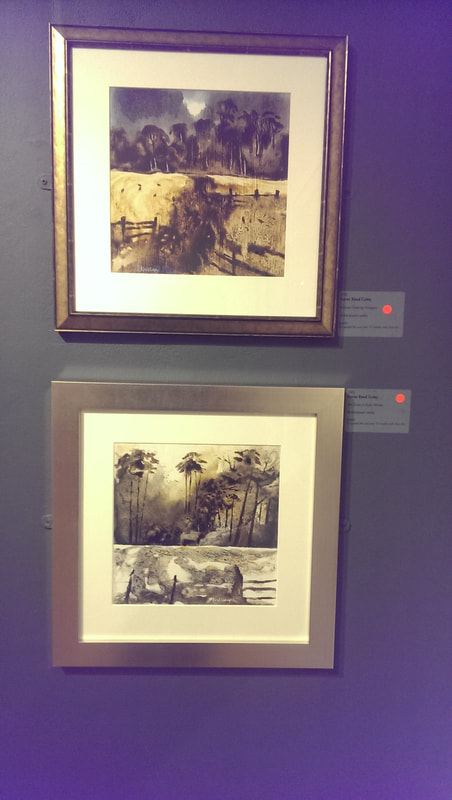 Last up and I was not surprised at all that they had sold were these two pieces by Karen Read Coley (above). I am sure there is ink in there (the label just said mixed media. They have a sort of fluid Japanese style to them and of course, chiming with my other tastes, silvery light and autumnal trees. I fear I am becoming too predictable in my tastes. If you have read this far, then just a quick reminder that I have a show on at the Indo Bar in Whitechapel. If you get a chance pop along and then tell me what you think. 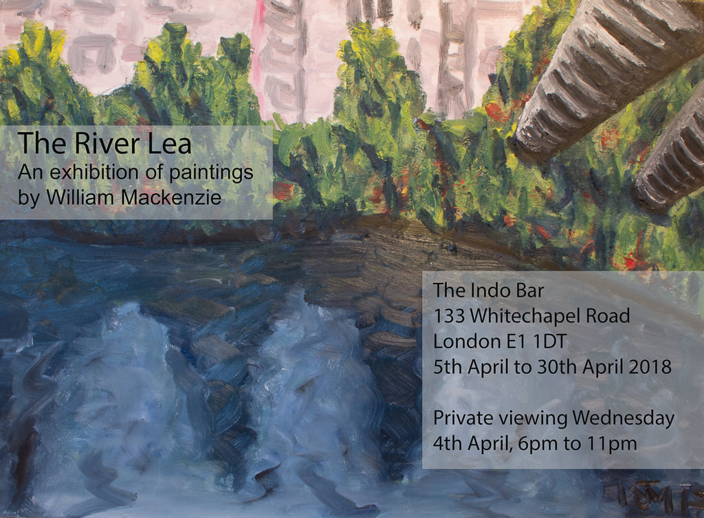
0 Comments
Leave a Reply. |
Archives
June 2024
Categories |
 RSS Feed