 Some painters their work is much better in person than it is in photographic reproduction, Turner, Dorothea Tanning to name but two. Other painters are much better in reproduction and are frankly disappointing in person. Hockney is a prime example of this, and to this I would add Pierre Bonnard. There is a show of his work at the Tate Modern but attending in person is both expensive (£20!) and a little disappointing. Of the three shows on at the Tate Modern I would recommend you go to 1) Dorothea Tanning and the 2) Franz West, 3) Magical Realism (its free), 4) The viewing platform and look into those flats that lost that privacy case, 5) the currently empty turbine hall and then 6) Bonnard. He is one of the lesser known impressionists and while his paintings can be a riot of colour I think I can see why and I will attempt to justify this assertion in a few badly chosen and ill reasoned phrases. Here we go.
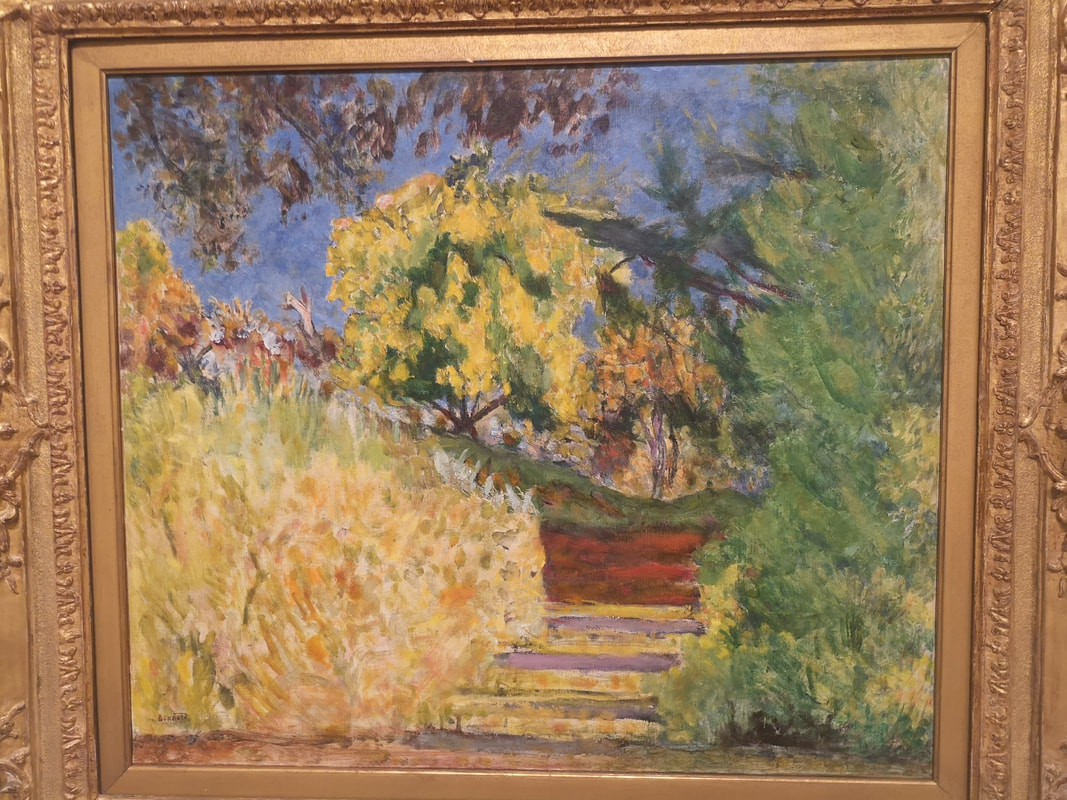
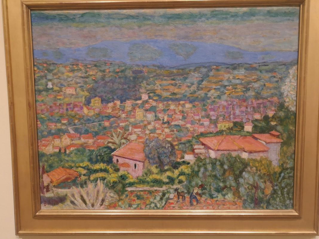
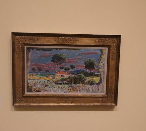
Take this picture of a tree in blossom. From a distance it is a riot of colour, with a wonderful sense of place and time. Up close though and the edges are blurred, there is no definition and I find it a bit of a mush. You don't even have to get that close. From a distance then Bonnard's picture pack quite an impact but this rapidly depletes as you get closer. What this means for me is that they don't reward contemplation. Once your senses has recovered from the assault of colour there is not much left. It is not quite the dream like quality of Monet, or the crisp violence of Van Gogh. Bonnard sits in some unfortunate halfway house.
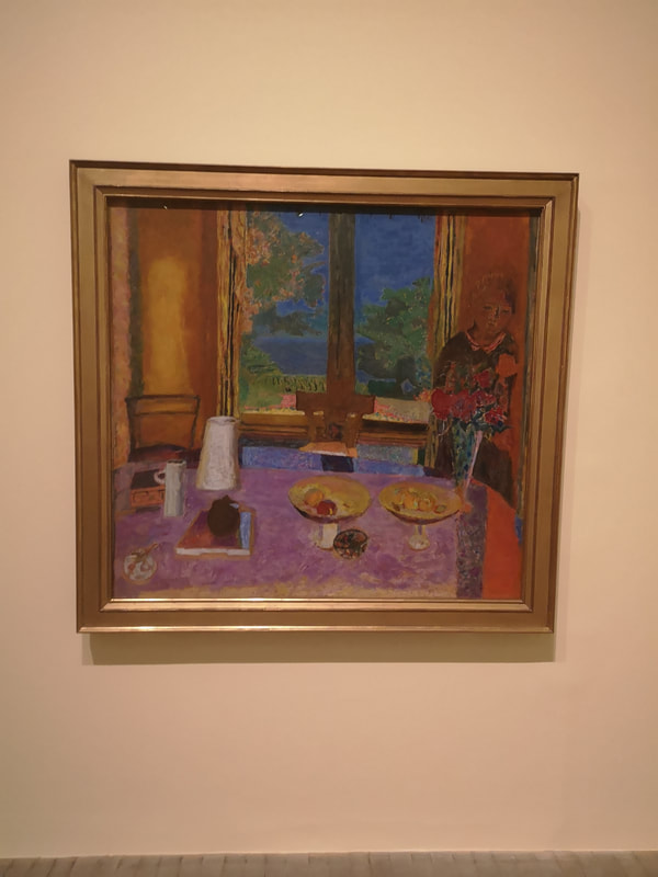
Where I think Bonnard is better is in inside contained or restricted. Like for example this red and purple number (above right). It is also with these types of picture that you can play spot the animal. There is often a cheeky dog or cat (or both) hidden somewhere in the scene. It is the fields of colour that are the most effective here, the purple of the table cloth, contrasting the red on the right, the orange on the left, and the blue through the window. The white crockery adds to it to. It is slightly let down by that odd ghostly figure and the scratchy child like foliage.
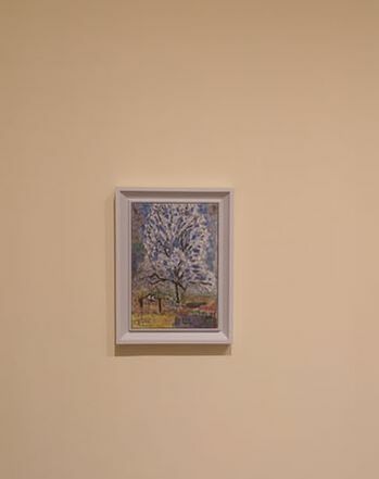
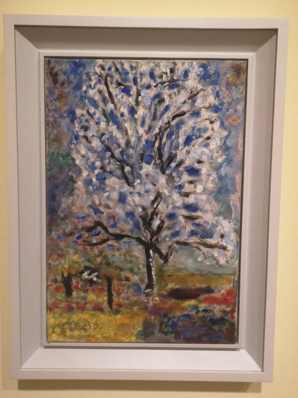
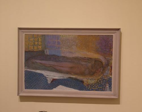
So basically what I'm saying is outside, weirdly childish with some nice colours (above left)k compared with his more accomplished indoors painting. Probably my favourite in the show is this bath scene. The colours on the wall, the way colours morph from blue to purple with that golden crackle running through it. The patterned floor is also good. The central figure is strange but that works in this context.
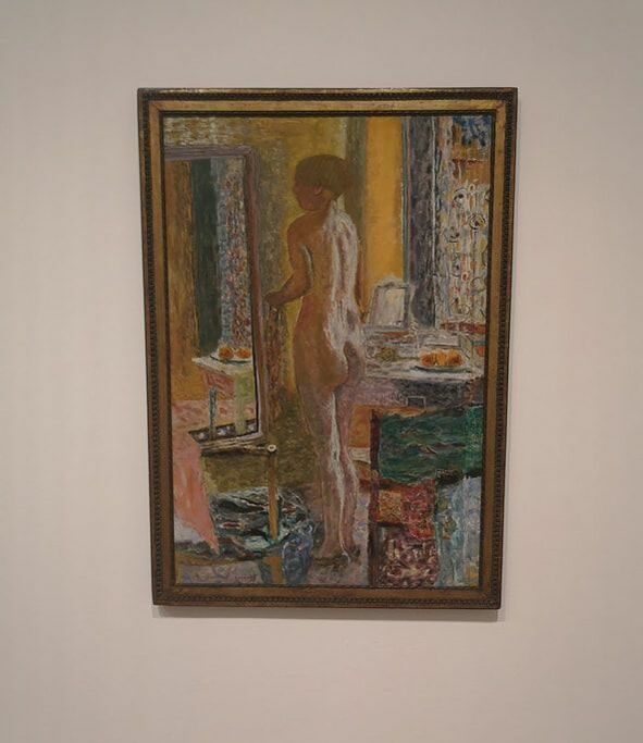
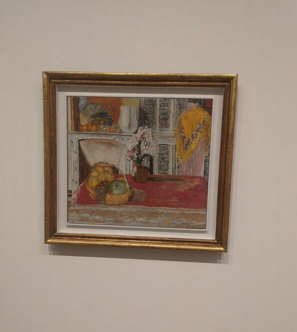
Having identified those of his paintings that I prefer I will focus on those. However this leads me onto another general problem I have with Bonnard (listen I just don't like Bonnard much, if you don't agree with that, keep reading while I painfully explain how wrong you are), is that he never really picks a side with colour. He is almost striking, almost pastel, never quite one or the other and like in the nude above left, often the central elements are too similar to the background and it doesn't stand out. All becomes a bit of a mess. There are some nice elements though, the composition is good, and I like the mirror and the green square coming on, stage right. I also like these almost Victorian indoor scene (above right), the fireplace being my favourite element.
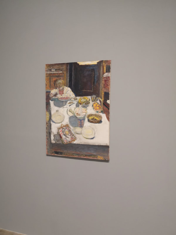
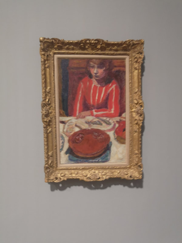
Credit to the curators though, they made a very smart move, and took some paintings out of their frames (above left). They are greatly improved by this, have more of an immediacy to them and Bonnard's more subtle (confused) colour scheme limited by the scene is much more effective. Likewise this picture of the lady in red in front of a red cake (above right). Again the limited colour pallet and again almost Victorian restrained feel makes for a more effective and interesting painting.
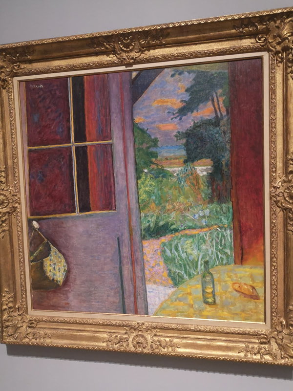
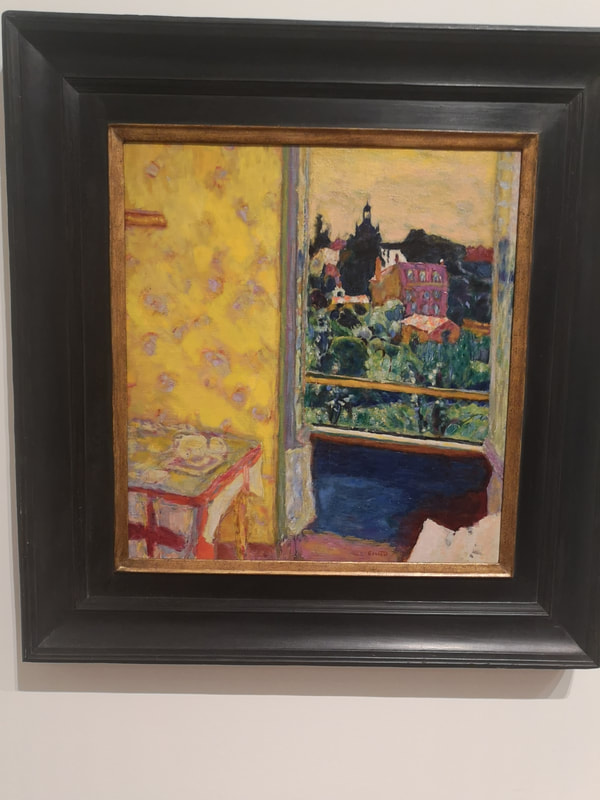
Tate have called the show, the colour of Memory. I am not sure why but I will leave you with two paintings that demonstrate and support my biased and selective opinion. They are initially very striking. The mottled red on the picture on the left, and the yellow wall paper on the right are very good. On the picture on the right the greenery contrasts excellent with the yellow. However when you look closely though, its all a bit messy, bit incomplete.
So there you go. Bonnard. Demolished.
0 Comments
Leave a Reply. |
Archives
June 2024
Categories |
 RSS Feed