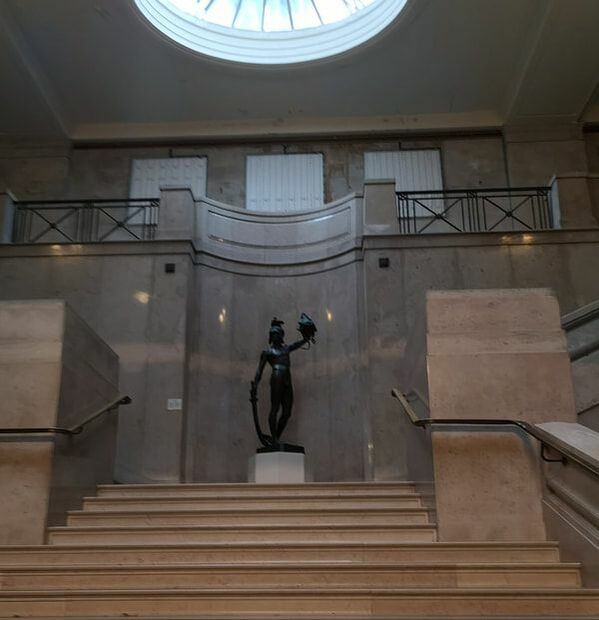
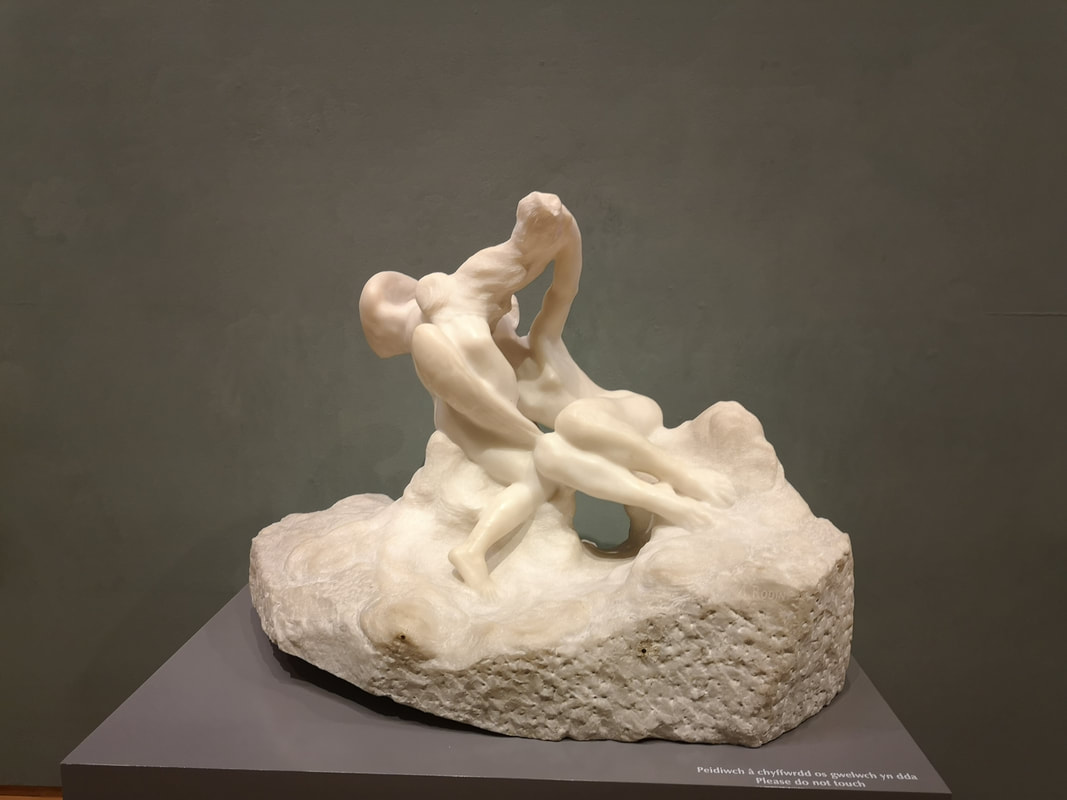
 Brace yourself people, this one is going to be a long one, about the surprisingly brilliant National Museum Cardiff. Specifically the art gallery. It is located on the upper floor of the museum (the ground floor is a natural history museum, which unfortunately I didn't have time for). You ascend these quite grand steps (above) to a balcony and then into the gallery. I only had an hour or so, which was a shame, and I deliberately missed out the Leonardo exhibition, I am saving that until it comes to London.
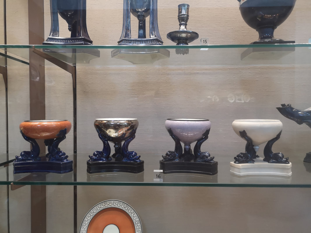
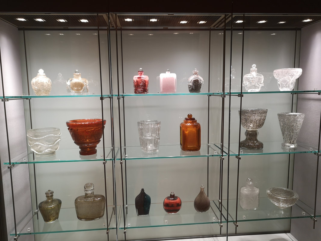
Scatted around the gallery, including in a little room of their own are various pottery and glassware. You would be wondering around the picture gallery and suddenly there would be pottery. Including hidden off in a side room was some Asian pottery. I was drawn to this collection of four pastel burners (above left) with the hand like structures rising up and cupping the burner, with the different muted colours. There is also glassware and in particular this vitrine of glass by Maurice Marinot (above right) which are these quite solid quite thick inscribed glasses. They seem very solid and satisfying.
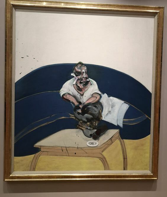
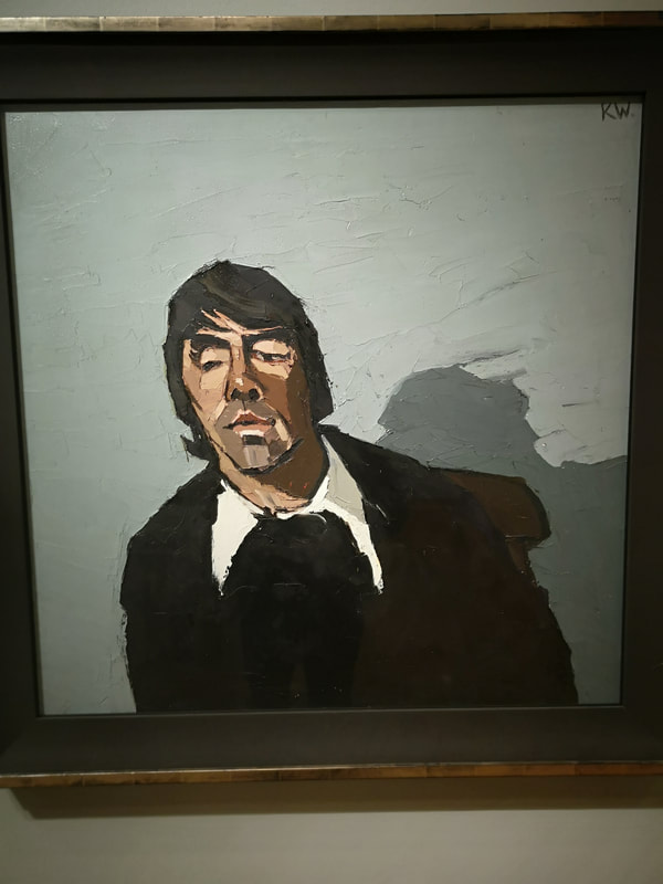
Right next to it, is this large Francis Bacon picture (above right), a self portrait I believe. I have seen another version where the back wall is coloured green like the surface of a snooker table. The white background though makes this very stark, particularly with the t shirt and cushions. Feels like he's in a doctor's surgery or something. Then of course you have this twisted body and face. I like Bacon allot but I could never have it in the house.
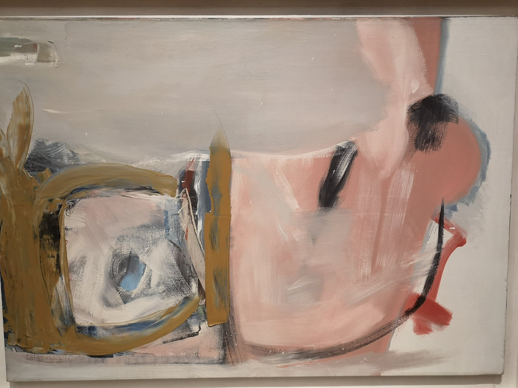
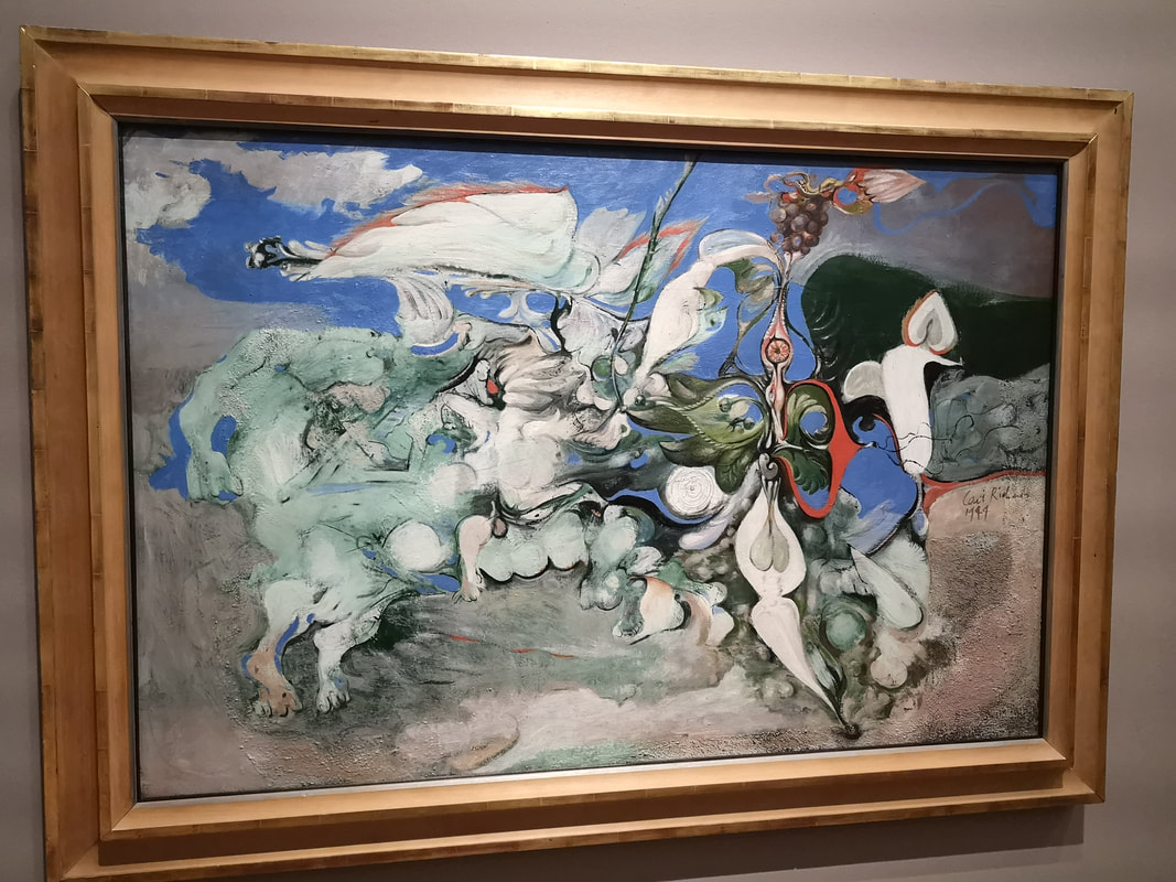
Philip Lanyon also appears with his characteristic fields of pastel colour, in this case a mainly pink and brown swirling number. One of those pieces that invites you to insert your own conscious onto the picture. Unsurprisingly it being the National Museum Cardiff (the National Museum has several branches such as the Coal Museum and they are scattered around the country) there are a number of welsh artist, some of which were new to me. One of the ones I had heard of but not seen before is Ceri Richards with Cycle of Nature (about right). I see it is as a panoply of armoured knights thundering across the landscape. Lots of energy. 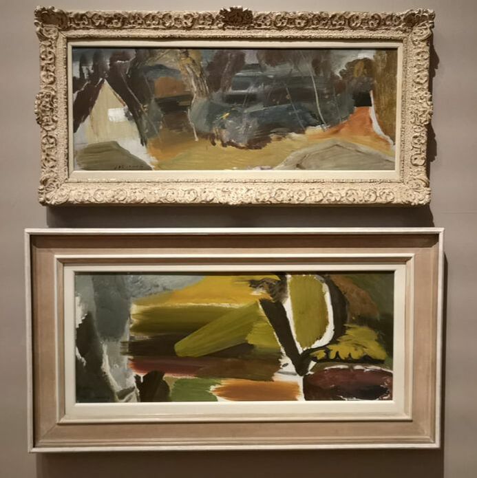 Another name who had crossed both my brain and my eyes is Ivor Hitchens (above) who has some similarity to Philip Lanyon in some respects with the fields of colour, but Hitchens is more vegetative. He is also on occasion more figurative as you can see from the top painting which you can see is a cottage with trees. There is a loose and flowing and have a speed about them.
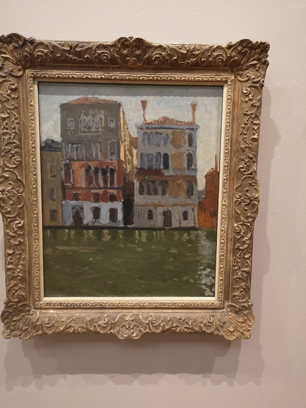
This display is housed in a couple of galleries and starts, at least for me with Walter Sickert (above) who like everyone feels they have to paint Venice. Sometimes I get sick of Venice but I can see why people paint it. I am drawn to canals and buildings. They work well together and you have this allot in Venice after all. Sickert is more muted and his buildings have a battered and dilapidated quality and the water murky and thick.
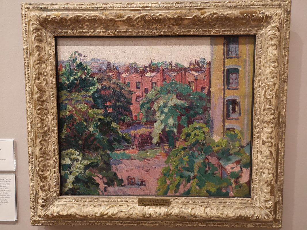
You will get to see here British impressionist painters you don't often see elsewhere, at least not very often. Having said that Harold Gilman (above left) with his painting of Mornington Crescent. These similar red/pink building with this large yellowish building holiding up the side of the building and the trees sitting in front. Spencer Gore (above right) is a name I do know but you don't see him that often. He also paints Mornington Crescent but a very different view. The buildings mainly just colour the background (I wonder if the yellow building you can see through the trees is the same as the tower in Gilman's painting). Gore's painting appeals to me more to me. I like the skeletal tree, and the grass with the shafts of sunshine across the grass.
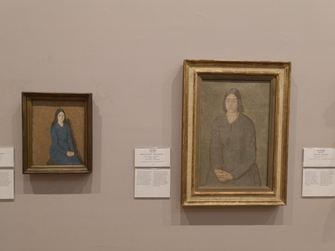
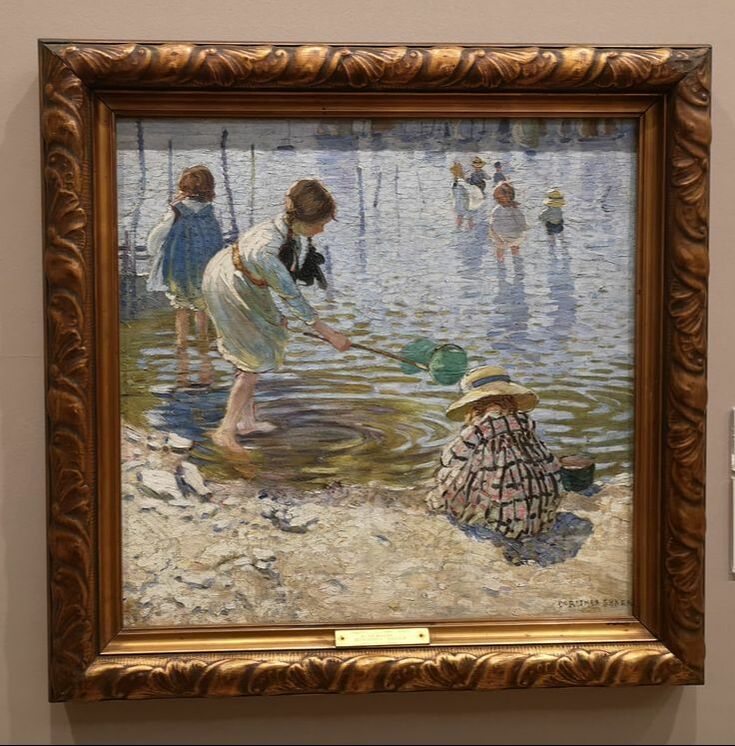
I'm sure they do exist. This painting is nice, has a quality that speaks to you across the room and doesn't come across well in the photograph. Has a nice sense of the place. The gender balance is better in this gallery than most (although of course men still dominate particularly in the more historic section) and there are women artists (life for example Gwen John) that you don't often see. Above right is Dorothea Sharp with At the Seaside. It is a delightful piece, very intimate with a good sense of place and time. The clothing has been very well done. As has the water texture and I particularly like the circles emanating from the main girls feet. 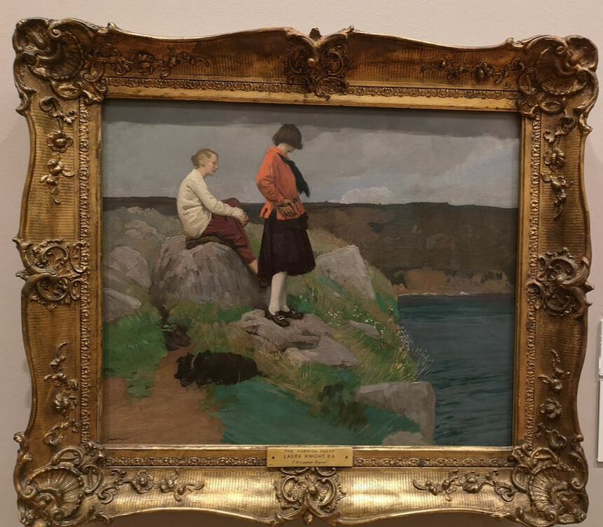 I'm a big fan of Laura Knight (above). Her self portrait in the National Portrait Gallery is one of my favourite paintings. It is also one of the sexiest paintings you are likely to see. Go and have a look and you will see what I mean. Again you don't often see her elsewhere so it was nice to see her work. I particularly like the dog and the textures on the rocks.
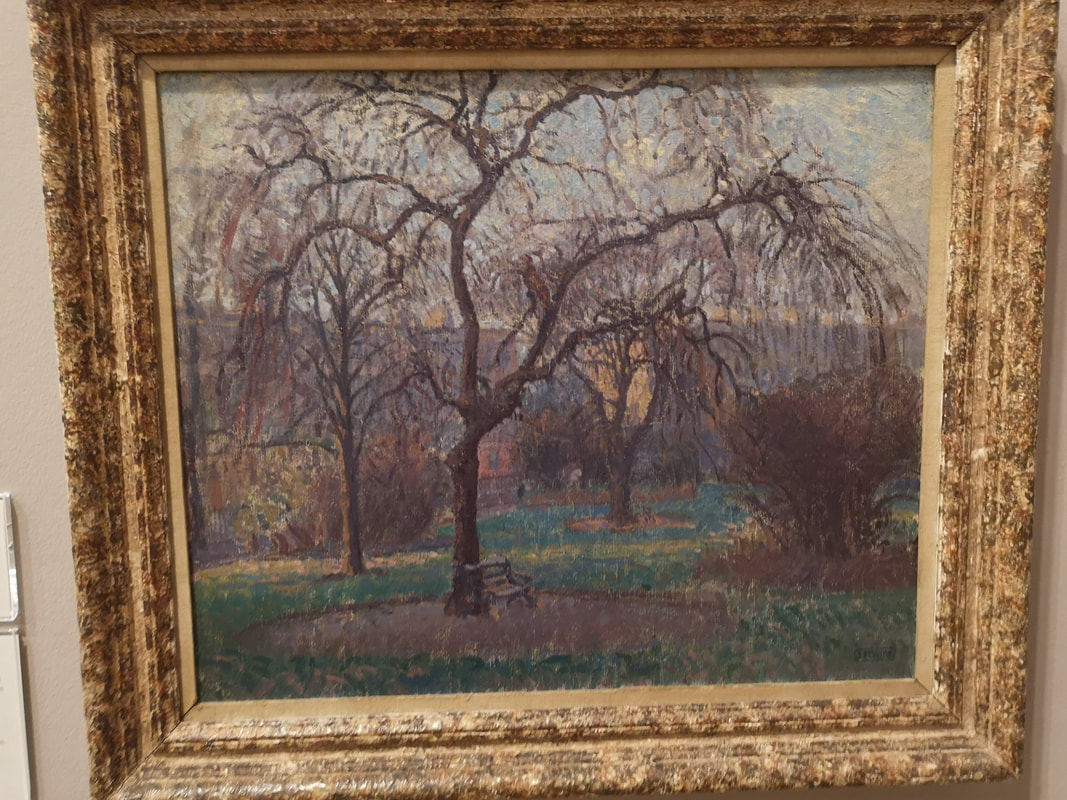
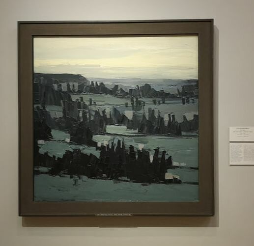
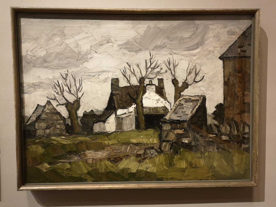
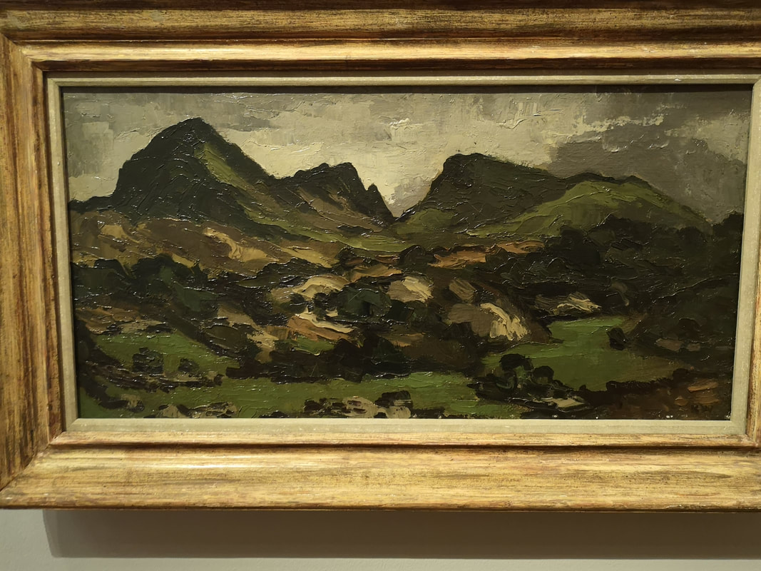
It is his landscapes though that I very much enjoy. It is not easy to see from these photographs but he paints in these large slabs of paint. He manages somehow to give the paint this oily sheen that makes the paint look wet and glow slightly. Given how damp Wales is it gives the landscape a wintery storm drenched look. The painting above right is a good example.
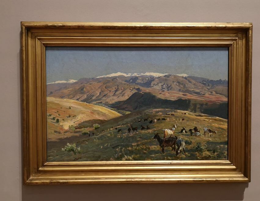
This technique is perfectly pitched to rendering the Welsh landscape. The way he uses this to make the building especially the shacks is particularly effective (above left) but it can also be turned to depict the rocky sides of Welsh mountains (above right). Earth tones is what we are seeing here and I like it. 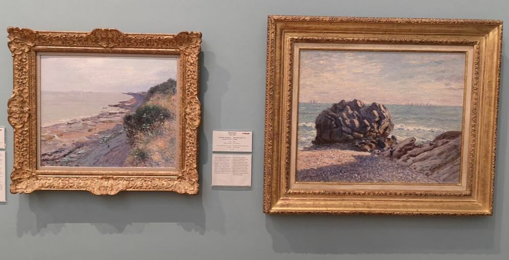 Onto the Impressionist proper and we open with two Alfred Sisley. They are both of the Welsh coast (at least I think so) with that lovely impressionist purple flecked sea and sky. I particularly like the gnarly bulbous rock on the right hand painting with its shadow and flecks of light. They set the scene for the room. 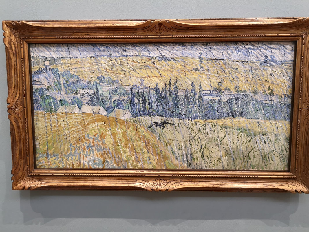 And then Boom! Van Gogh (above) and a Van Gogh I had never seen before anywhere. I have also never seen a Van Gog where it is raining before. The strikes slanting down the painting make a very impressive rain effect, you feel wet and cold just looking at it. Compositionaly the division of yellow field on the left, green on the right with this line leading to the blue and green trees. The inclusion of the crow in the middle is a stroke of genius. More muted than his usual work and interesting for that.
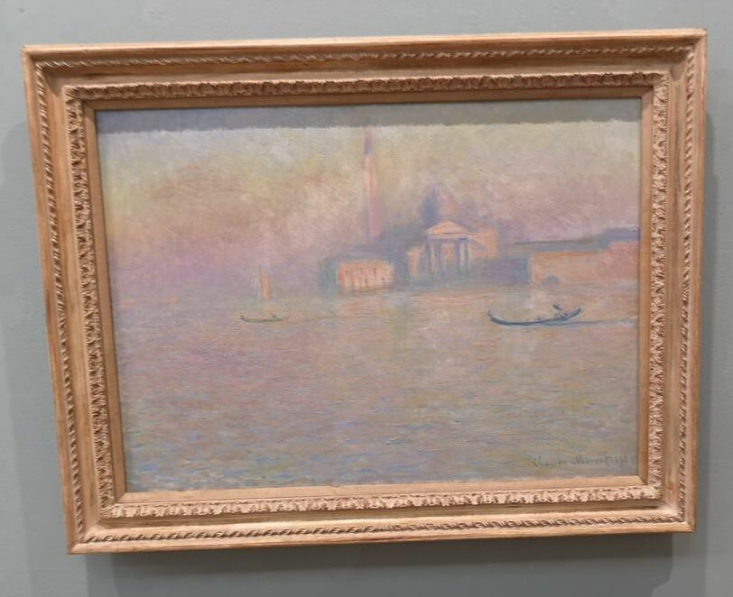
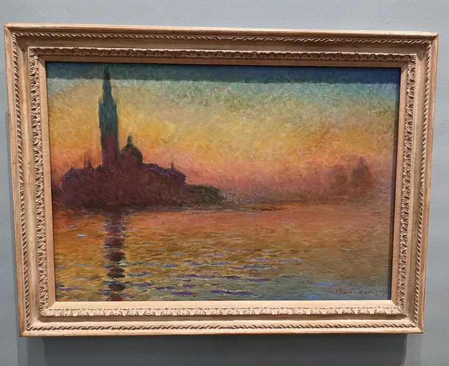
Monet, there are at about 5 of them, hanging there in there glorious colours. My two favourites are of course of Venice (although there is one of London) one in the soft pastel murkiness that Monet as famous for, contrasted with this much more bold and striking piece with its burnt oranges and blue. I particularly like the purple and moave horizon. There are more impressionist on display including others like Pissaro. I like Pissaro. 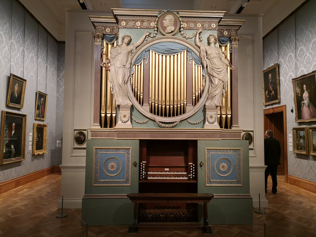 I left the room and was admiring this enormous organ (above) when the man you can just see wandering off round the corner informed me that the gallery was closing and 15 minutes and perhaps sir would like to see the Turners that we have.
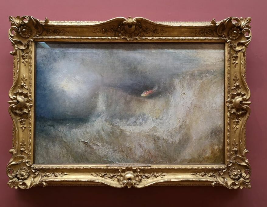
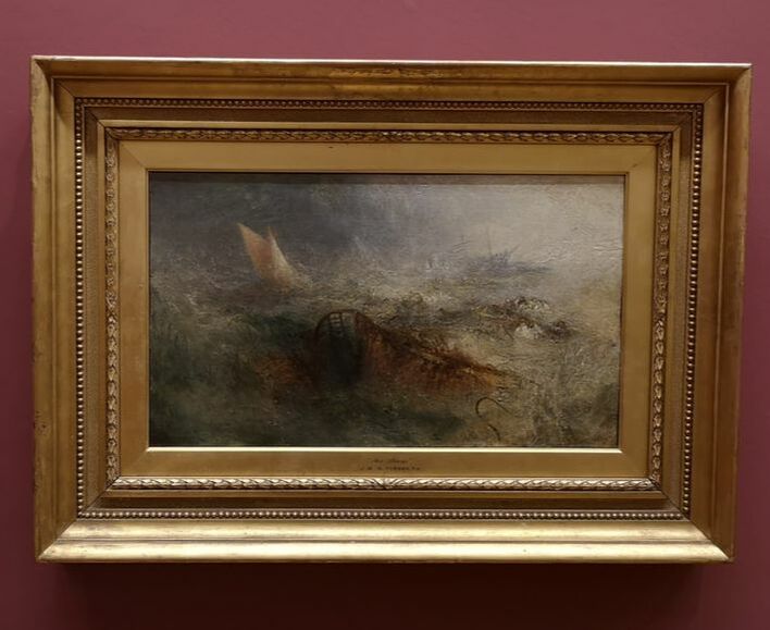
Sir would like to. And so sir did so and very impressive they were too. All glorious swirling stormy seas and sky, crashing boats and in the one on the right a burning beacon. I of course like this very much. I won't show them all go and see them. In the same gallery was a fine Rossetti.
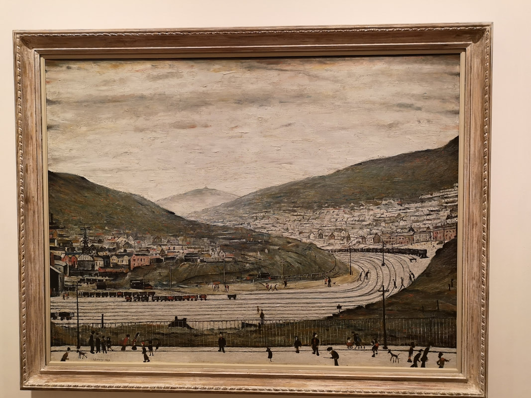
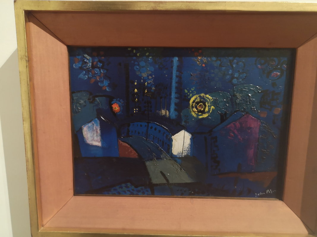
The final gallery I went round was dedicated to Welsh Landscapes. There was a number of fine pieces and again a surprising his in a Lowry (above left). It is called SIx Bells, Abertillery south Wales with his leaning stick figures scampering around, and across the railway lines! The other picture I really liked was by a name I hadn't heard before, called John Piper with Ebbw Vale at Night with these lovely blues and greens and this strange segmented yellow sun. I really like it. Other people on display include Graham Southerland and Ceri Richards. And I shall leave you with a self serving announcement. I have another show coming up: ‘Upstream and Downstream’ The Old Fire Station Gallery, Henley-on-Thames, 52 Market Pl, Henley-on-Thames RG9 2AG 9.30am to 6pm: Daily from Thursday 18th to Tuesday 23rd April 2019- Easter Weekend. Come if you can. 
0 Comments
Leave a Reply. |
Archives
June 2024
Categories |
 RSS Feed