WJM
  • Gallery
    • Pet Portraits
    • Landscape >
      • Rivers of London
      • London Landscapes
      • British Landscape
    • Still Life and Abstract >
      • Still Life
      • Flora and Fauna
      • Abstract
    • Past Work
  • Blog
  • About/Contact Me
  • Gallery
    • Pet Portraits
    • Landscape >
      • Rivers of London
      • London Landscapes
      • British Landscape
    • Still Life and Abstract >
      • Still Life
      • Flora and Fauna
      • Abstract
    • Past Work
  • Blog
  • About/Contact Me
Blog

Summer exhibition part 3 - the rest

8/7/2016

0 Comments

 
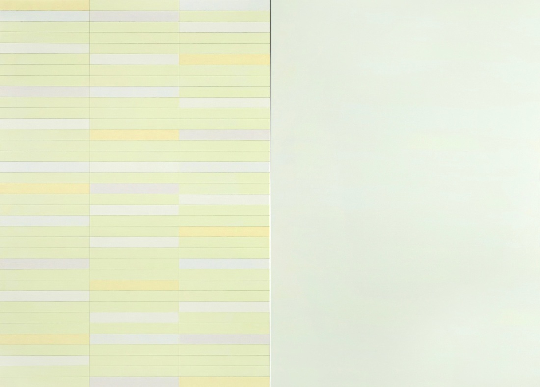
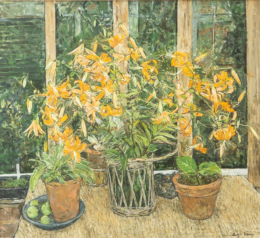
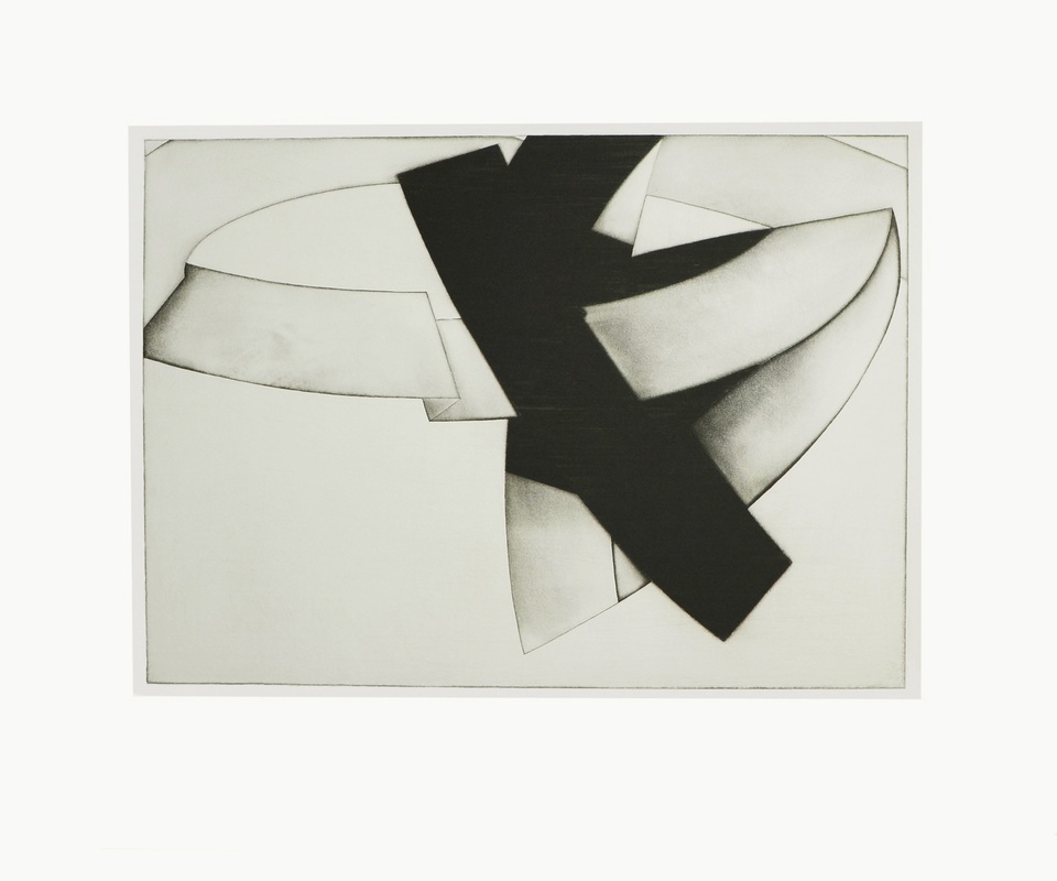
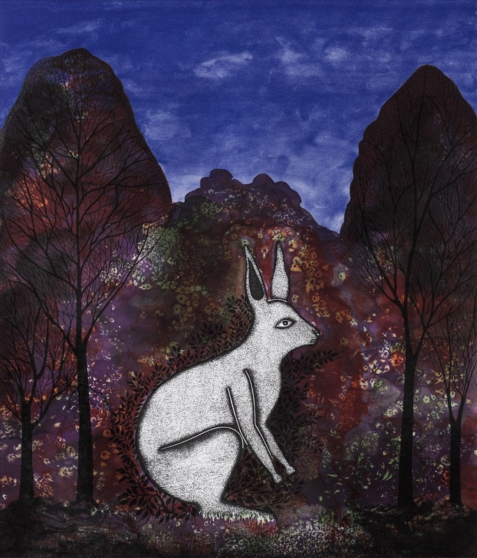
This is the last of my posts on the summer exhibition at the Royal Academy. If your interested in going to see it, and it is worth seeing, then it is on until 21st August. I haven't been back since my first visit, there are too many other interesting shows to go to, but I imagine everything else has sold.  One of the things that interest me about it though is the way art work attracts you are attention. The are some pieces that stand out as you enter the room but then disappoint on further inspection such as Paul Fernaux's Burnt Orange Earth (below) which has good shape and colour but as you get closer reveals itself to be a bit insipid and flat.
Picture
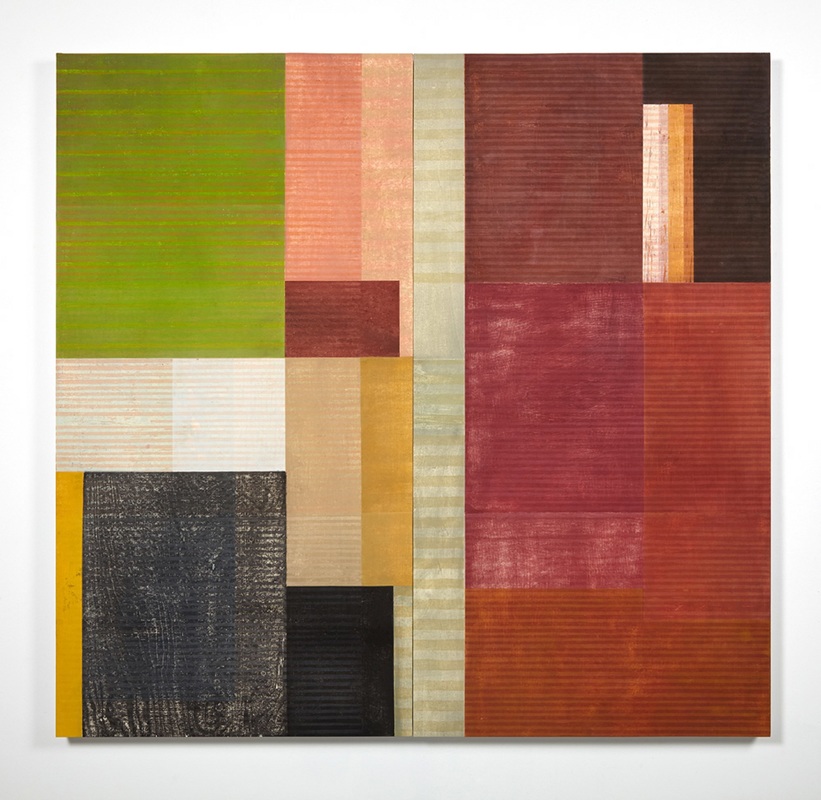
Then there are the tiny pieces that you could easily walk past but once you see them, your curiosity is intrigued and you want to see what it is and several of them like Laura Hudson's Sleepwalker (below) greatly reward this effort.  Not surprisingly all such pieces have sold being good, relatively cheap and of course easy to accommodate .
Picture
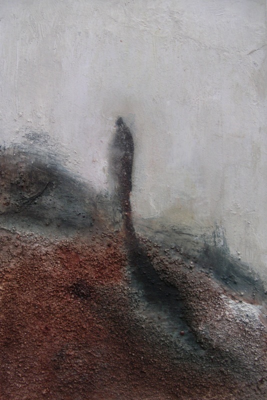
I like the granular texture she has used for the foreground and the ghostly effect of the figure. Somehow it is slightly disturbing.  I shall comment on a couple more and then present the rest.
Picture
Trevor Sutton's Yellow Snow (left) is a subtle piece.  It is quite large and photographs don't really do it justice.  It is very Agnes Martin and has the same quality of gentle calmness.  I like art like this.  It is art I could never, and have no interest in, trying to produce but the exactitude of the pastel shades and the geometric shapes is appealing.
What works much better in the original and is a bit flat in the photo is the contrast with the blank white area on the right of the painting.
I like portraits of flowers and Olwyn Bowey is good at them.  She had a couple of them on display of which the picture on the right (Tiger Lillies) was my preferred.  A liked the yellow scored onto the green and brown background.
There is a nice almost naive rustic quality to them and a depth which unfortunately this image has flattened.  I am always interested in painters who have managed to develop a distinctive style and Olwyn has. 
I like the way she has produced the wooden surface of the table and the dirt on the sides of th pots.
Picture
Picture
An excellent example of simplicity producing good art. The picture left is Snare 1 by Jula Farrer. There were other snares but this is the one that appealed to me the most.
I like the way the different shapes interact.  I like the way shading is used to produce definition to some of the shapes.  In the original the charcoal marks are much more visible (it is done in charcoal) and it is better for that but it still in the photograph a striking image.  I find it difficult to stop looking at it and like wondering whether the white areas have been ripped out of the black or form part of the same structure.  I prefer the former idea.
This is Jhuma Sharma Roy's Moonstruck.  I like this very much.  My grandparents lived in India for a while so we had a number of Indian paitings around the house and this reminds me of that style. 
It also reminds me of Ghibli films.  I do enjoy the central figure and the way it is reflecting and emanating light onto the area around it.  I also like the way in which the background Autumnal forest is represented with red and purple paint dotted in various colours.
I think this painting is a very good composition and part of the appeal is the flat lack of perspective element to it.  The clouds in the sky slightly bug me,  I don't think they quite fit but otherwise it is excellent.  One of my favourites.
Picture
 There are many others that caught my eye for various reasons, either through excellence of execution or subject matter, frequently for both and sometimes for reasons that I am not entirely sure of.  It would take to long to dissect them all and after all there is only so long one can write about one exhibition so I present the rest of my favourites to you here:
0 Comments


Leave a Reply.

    William John Mackenzie

    I am an artist with a  specialism in landscapes and still life.  My contact details are here. 

    Archives

    April 2022
    October 2021
    September 2021
    July 2021
    June 2021
    April 2021
    March 2021
    February 2021
    December 2020
    October 2020
    May 2020
    April 2020
    January 2020
    December 2019
    November 2019
    October 2019
    September 2019
    August 2019
    July 2019
    June 2019
    May 2019
    April 2019
    March 2019
    February 2019
    January 2019
    December 2018
    November 2018
    October 2018
    September 2018
    August 2018
    July 2018
    June 2018
    May 2018
    April 2018
    March 2018
    February 2018
    January 2018
    December 2017
    November 2017
    October 2017
    September 2017
    August 2017
    July 2017
    June 2017
    May 2017
    April 2017
    March 2017
    February 2017
    January 2017
    December 2016
    November 2016
    October 2016
    September 2016
    August 2016
    July 2016
    June 2016
    May 2016
    April 2016
    March 2016
    February 2016
    January 2016
    December 2015
    November 2015
    October 2015
    September 2015
    August 2015
    July 2015
    June 2015

    Categories

    All

    RSS Feed

Proudly powered by Weebly