|
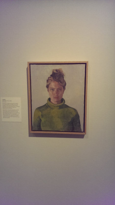
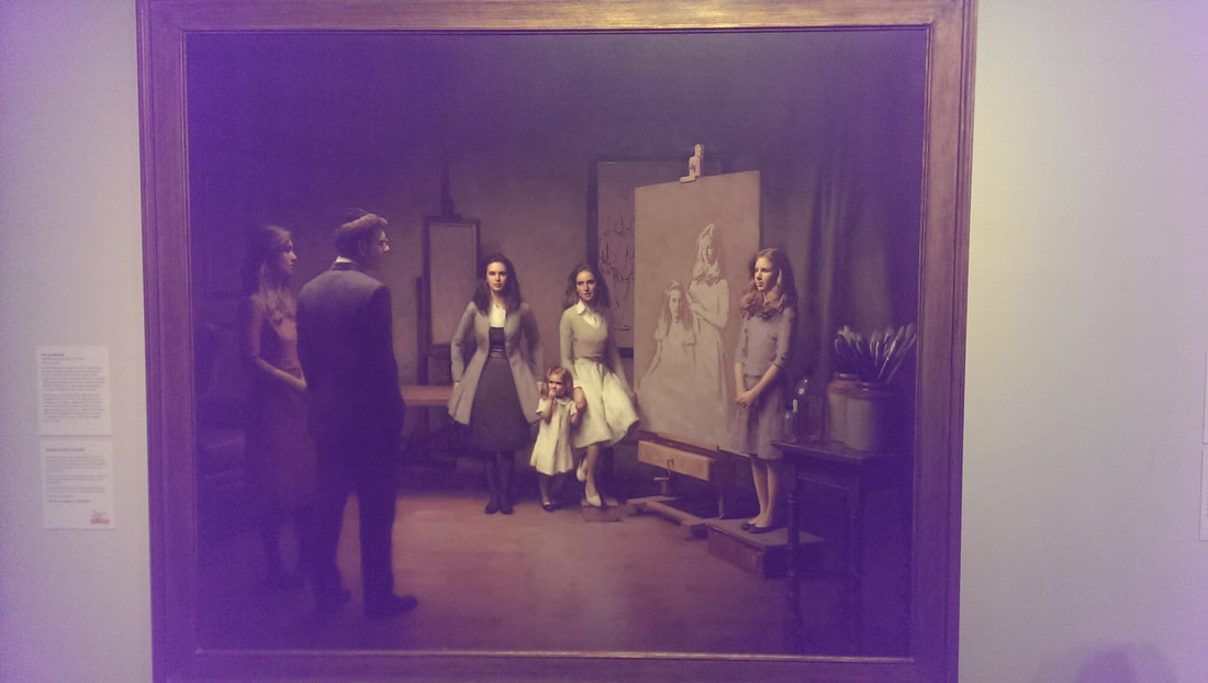
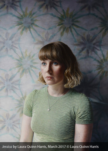
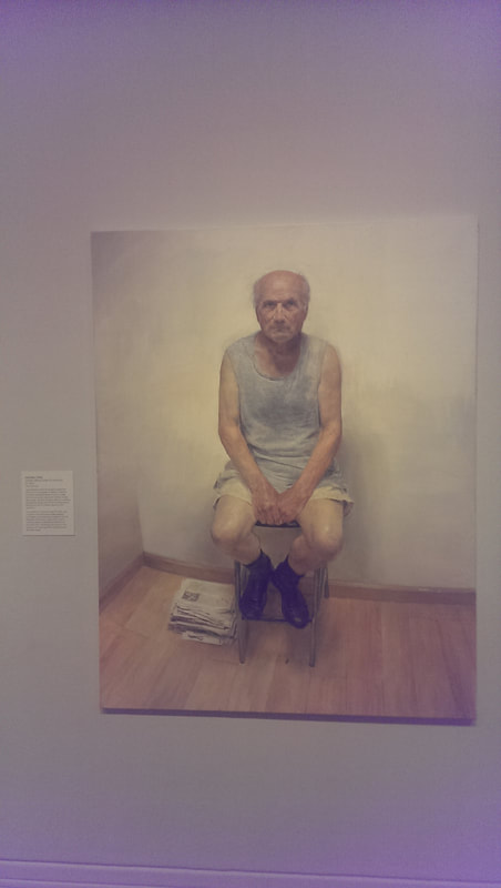
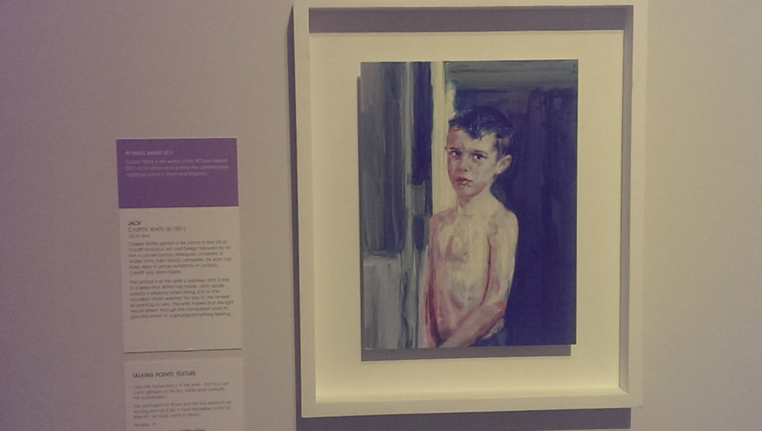
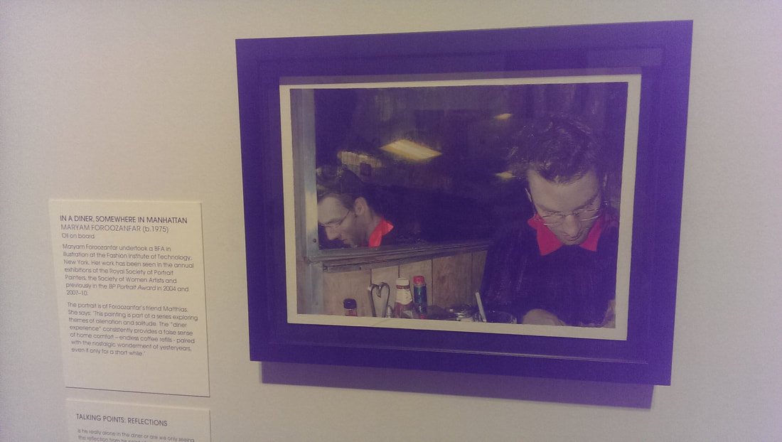
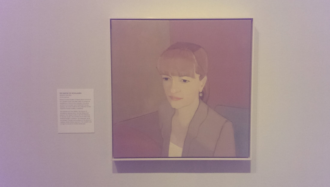
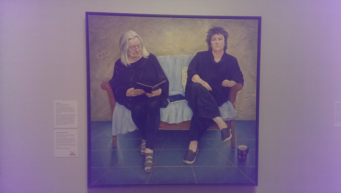
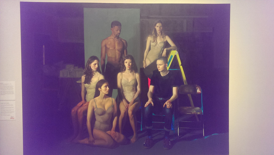
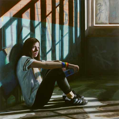
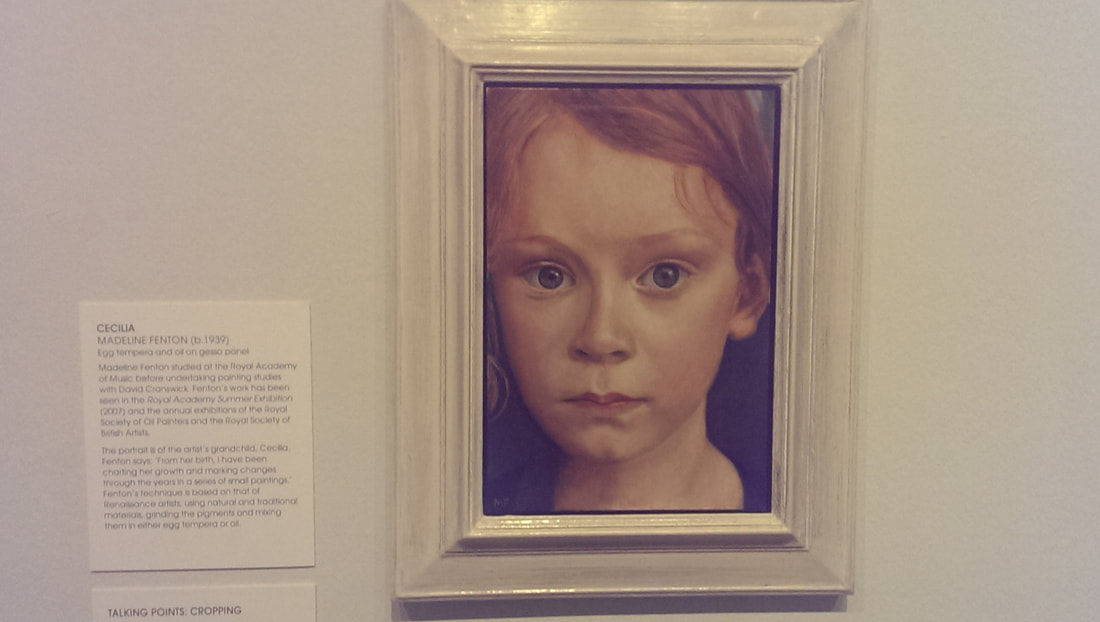
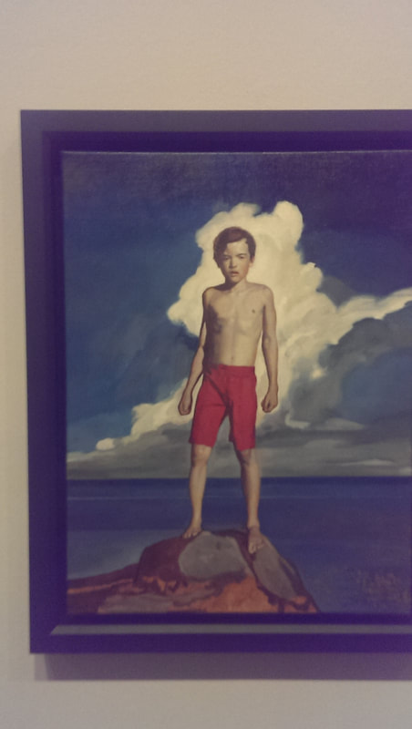
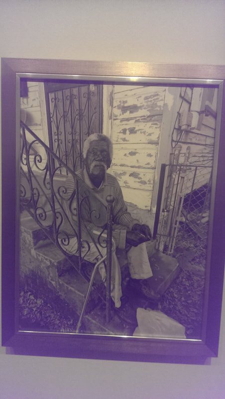
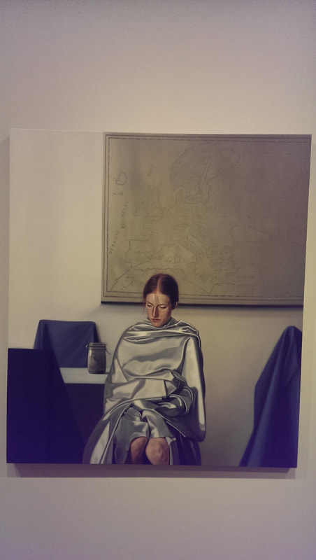
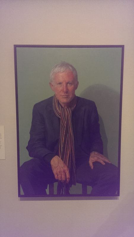
The BP portrait award is currently on at the National Portrait Gallery and runs until the 24th September 2017. Its free which is a good start, and there is usually always something good in there. It comes up for criticism for having to dull photorealistic paintings and there is a certain amount of truth to this criticism. Occasionally you look at a painting and think, what’s the point, this gives me nothing a photograph doesn’t give. Technically very impressive but portraiture needs, in my view anyway, to do more than that. There are a number of paintings in there that do that and of which I like, so in no particular order we have: Carmel by Anne Ben-Or. It is a portrait of the artists daughter. Portraits of relations or loved ones often have an edge of affection that it is difficult to get into portraits of other people. This has this. It is something about the soft slightly blurry style of this piece. There is good texture here particularly in the background and the green jumper (especially the jumper) and the sitter has a very good look. It would appear that the time of family portraits of the rich and powerful is still in vogue and the Levinsons by Rupert Alexander is a fine example of this. There is much in the style that speaks to old Victorian and older paintings but the posing of the subjects lifts is, with the parents side on or in the father’s case almost with his back to us. The interaction between the parents and particularly the youngest child is good, as is the setting in the studio. This picture is patriarchy at work though. Despite being almost hidden the father is very much the authority figure, hand in pockets surveying his kingdom. At least so it seems to me. Photorealistic paintings can still be good if they add something extra, either setting, or pose or just the facial expression. Jessica by Laura Quinn Harris is one such. I like the background very much as well as the highlights of the hair all set off nicely by the almost dispassionate pose of the sitter (stander?). Next up unusual setting, or pose is Antonio Lopez by Jorge Abbad Jaime De Avajon. Put an elderly man in his underwear on a stool. Paint it right and you have a high impact image. This one stays with you. It is not an easy image to forget. It is also slightly odd in the whole things has a sort of fish eye perspective, especially the way the wall curves away. Breach! By Benjamin Sullivan. Good title this. Also an example of how to win the BP award (which this did). You need to be technically excellent (which this is) but also the setting and the rendering has to have that extra something. Again this has that extra edge which I only seem to see in portraits of family members. The title adds to the story but art judges love art references and this painting is packed with them. Jack by Casper White. Children are difficult to paint. They don’t have the contoured face or cragy features that allow you to work a portrait around. This one is good though. Full of poise and attitude, it really looks like a young boy standing there. The green stripes of the background compliment the green shadow on the figure and the use of brush strokes to get things like the hair texture is simple looking but effective. Morgan Foroozanfar (who doesn't seem to have his own website), contender for best name of an artist produced this subtle piece called In a Diner Somewhere in Manhattan. I like the reflection and the intimacy of the piece. Also it reminds me of being in very similar diners in Manhattan. Just next to that is a portrait called The Mayor of Woollahara by Sinead Davis. The style and pose reminds me of old computer games or instructional videos. It is a very effective use of beige tones to create a very human and interesting piece. Next to that is a large portrait called the Poets by Claire Eastgate. It shows Gillian and Carol Ann-Duffy. I don’t actually like the picture that much but there are three things about it that interested me. One the people in it. I am a fan of poetry and seeing these two women depicted was interested. This is the other angel portraiture has, it can appeal to the fan in you. I also like the way words are worked into the wall behind them. This could easily have been trite but it was note. Finally I really like the shadow on the floor of the sofa legs. Dominating the far wall is a large group portrait call Society by Khushna Sulaman-Butt It shows a ground of very good looking people, scantily dressed done in a photo-realistic style but there are a number of elements that lift the picture above this. The way they are set against a dark and dull background. The hostility shown between the sitters (deliberately constructed but done very well) and then set off by these fluorescent highlights of green, blue, red and the bright yellow step ladder. That is a very neat idea and it works extremely well. A related idea is 86 by Janne Kearney. Again we have photo-realism but the setting is interesting, as is the pose of the sitter, particularly the shadow of the window frame over her face. It helps of course that she is pretty but she is poutingly so. The coloured wrist bands make a good contrast. The whole piece shows isolation, which the blurb makes clear is the point. In which case mission accomplished. Egg Tempura is a tricky medium to use but it produces a certain effect in portraiture, a sort of alien, angelic effect. So if like Madeline Fenton you are smart enough to depict a child with it, as in her portrait Celine, then provided you have the skills to back it up you are on to a winner. She does. The close up frame is a very good idea and done well, especially the hair and you are confronted by this quizzical slightly off putting child. Well done, like that. In the Shadows by Noah Buchanan is another example of making references to art works past to impress the judges. I’m fine with that if it works and here you have boy in an epic pose in the manner of some greek figure, on top of the rocks. I particularly like the way the rocks are rendered. Possibly my favourite piece in the show is Another Fine day on Elysium Fields Avenue NOLA by Eva Csanyi Hurskin. This is photo-realistic but she has made the brave choice to do this in black and white and it works. There is so much character in the face of the man in the picture, and the contrast show using black grey and white is very impressive. This is a picture that tells a story and invites you in. Like this. Again photo-realistic but with that extra punch is Blind Portrait by Daniel Coves. The sitter is not looking at you, covered in a very well done silvery blanket in front of an old map. All the chairs are covered to, in green. It is all slightly disturbing and technically excellent and makes you ask yourself what the hell is going on. Nothing good is the implication. Finally what you might call a classic portrait, Norman Lamb MP by Paul P Smith. It is a very strong pose and has captured his charisma very well. The face is done brilliantly as it the scarf which sets up an impressive contrast. Much of the battle with portraiture, as with all art, is getting an interesting and well thought out composition. If you have that, all you have to do is pull it off. All of these pieces have this.
0 Comments
Leave a Reply. |
Archives
June 2024
Categories |

 RSS Feed