|
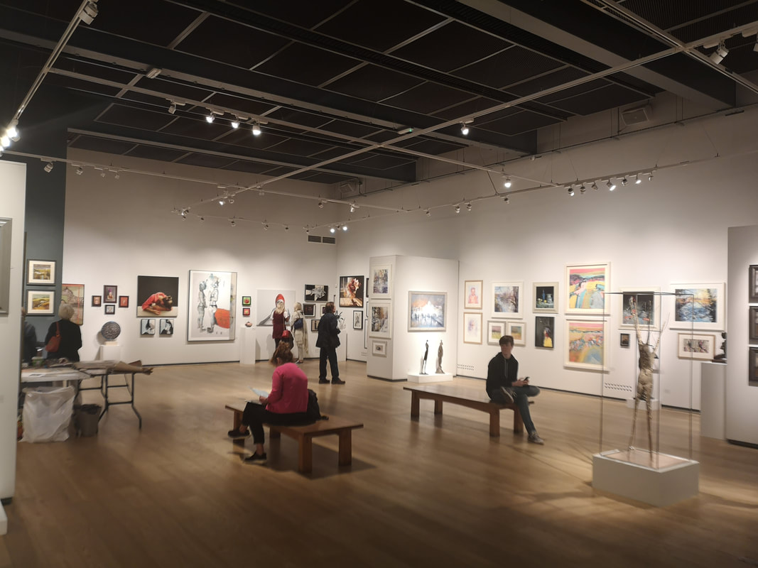
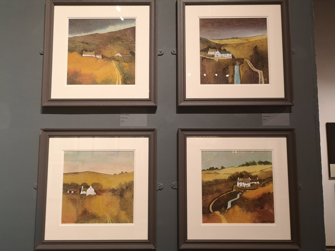
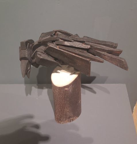
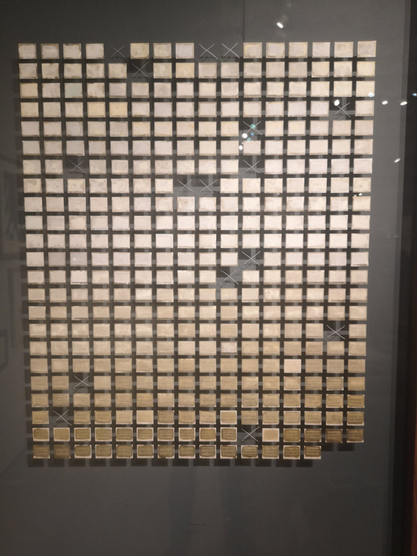
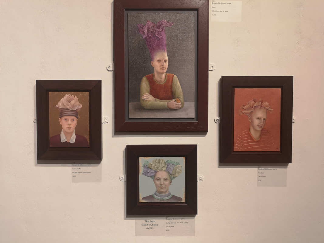
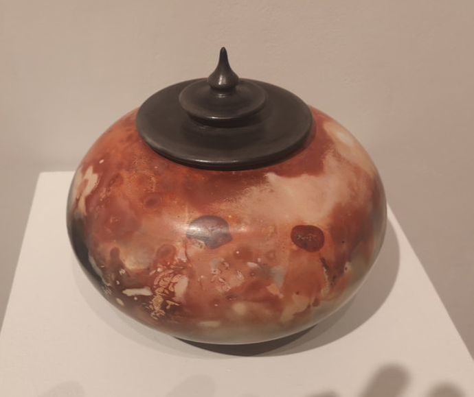
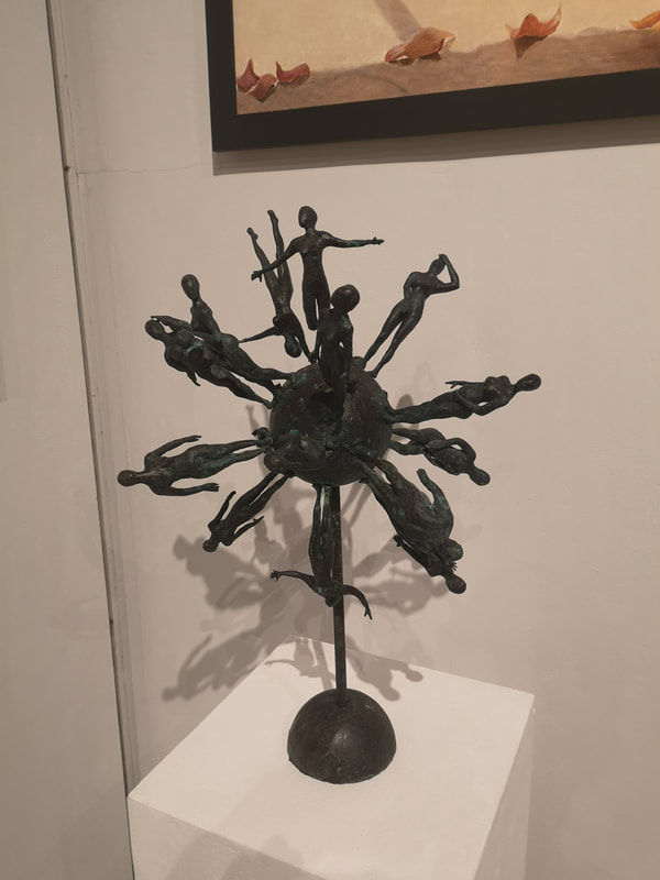
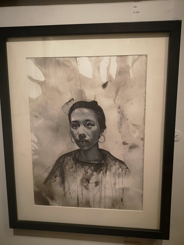
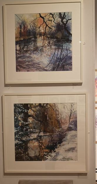
The Mall Galleries holds a number of exhibition but a strong contender for the best of them, and always consistently good is the Society of Woman Artist exhibition which ran from 25th - 30th September. My only criticism is that it is only open for a few days, never past 17:00 and then only to 13:00 to Sunday. These shows can therefore be easy to miss. I managed to miss it last year, so made a special effort this year and the effort was rewarded. Here are the works I enjoyed. Karen Charman produced these very fine four watercolours. The red, oranges and yellows are not as bright in the photo as in the originals. The composition of all of them is very good especially the way the rivers are made more geometric, cutting through the soft focus landscape, with the nestling buildings. The one at the bottom right was my favourite and I very nearly brought it, it made it to second on my list. Perhaps early to put out my favourite of the show, but I am going to do it anyway and it is the above, Crow by Vojsava Fakhro, constructed out of burnt wood and metal, resting on a log. It is a very fine piece full of verve and character with an element of abstraction. I like the slight sense of menace about is, with an interesting stance and open, crowing beak.. I liked it very much and in fact bought it. She is now peering over my shoulder as I write this. Often when in a diy shop I think that the paint charts would make a good art exhibit. Well that is exactly what Jessica Arevalo has done (above) and bagged herself the Vice President's award into the bargain, showing that there is a world between having an idea and acting on it. I like the way it softly blends into bronzey gold. What gives it that extra touch is the missing pieces, marked with a simple cross. It reminded me of the geology section in the natural history museum, where some of the exhibits have been removed and replaced with the slogan "This exhibit has been removed because it is radioactive". Marvelous. This selection of four bizarre headed portraits by Rosalind Robinson (above). with the way these vegetable like protrusions emerging from their heads. I particularly like the purple cabbage like do that elongates her head. It pops out of that graduated gray background and the strong cross armed pose. I also like the figure on the right with the different complimentary shades of orange and the slightly quirky sidelong glance. Although this is all done in oil it has a nice pastel feel to it all, a gentleness of touch which plays to the subject matter rather well. Jane Gibson's pottery (above) is something I have noticed at this show before, probably about three years ago now. She has a way with glazing and this she does again here with this burnished orange and pinks swirling round this flattened urn type shape. The pointed top to the lid is an especially good touch. Has a very malleable feel. I prefer my ceramics in a more vase like shape but nonetheless I can appreciate the skill and appeal of this piece. Dee Stanford's a Celebration of Women (above left) was one of my favourite pieces in the show. A bronze orb with a number of female figures in various poses emanating from it, it has a joyous well frankly celebratory feel to it, like a kind of trophy. Sadly budgetary constraints (it costs £9,000) prevented me from getting any where near purchasing it. Moving from celebration to subtle understatement you have the melancholic monochromatic portrait of Holly by Alison Mulroy (above right). It is done in watercolour and acrylic but has that nice washed sensation you get with ink. I particularly like the way droplets come down from the figures clothing and blend into the foliage like background. The shading on the face of the figure is superb.
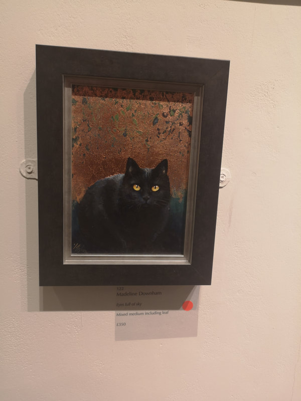
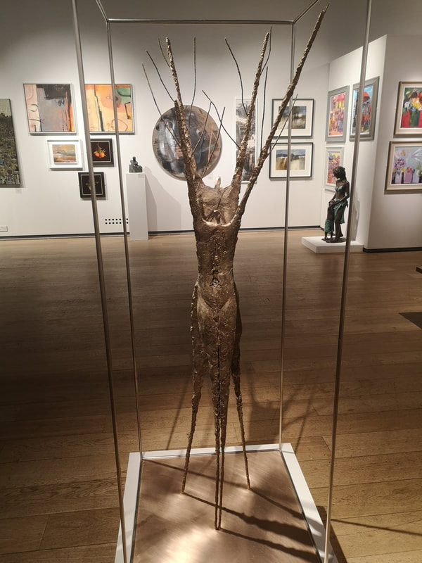
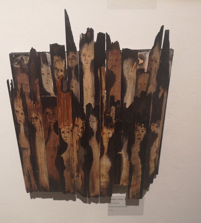
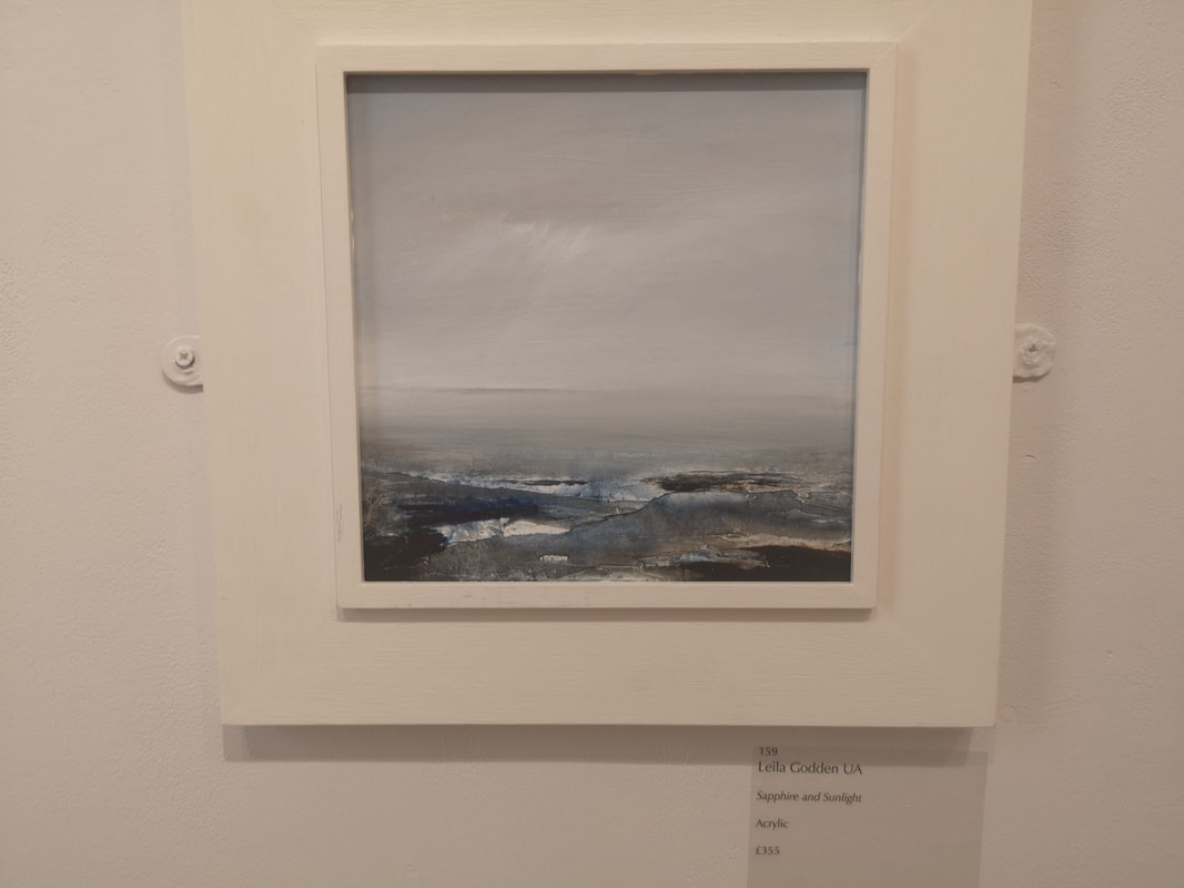
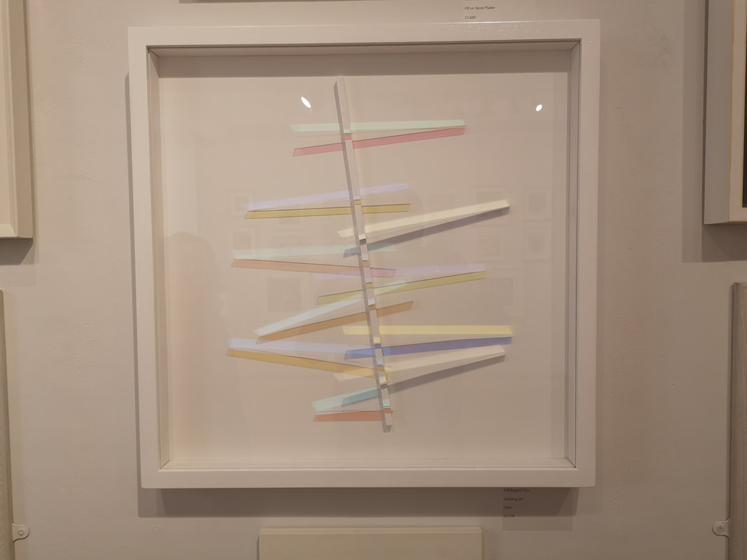
Madeline Downham has given us a cat (above left). A very finely rendered, very cute looking, almost strokeable black cat with piercing yellow eyes. The two tone background, bronze merging into blue, that descends into shadow, from which the cat emerges is a stroke of genius. At £350 this sold, l imagine almost immediately. Slightly more avaunt-guard and at the other end of the pricing scale Sue Freeborough's Becoming (above right). At £25,000 I think this was the most expensive piece in the show, and the cage it is in fact form part of the piece as a whole, with this sort of stretched butchered carcass feel, like some ancient totem that marks the edge of a sacred henge. The top though muddles this thought with a more tree like feel. Again serious budgetary constraints prevent anything more than my aesthetic approval. Very different, and a unique and impressive use of unusual materials is Heather Tobias' Burnt Women (above). By building on the natural curves and warps of the grain, emphasising these with burning and ink use have this strange choir. It is slightly like a Quentin Blake illustration. That finishes my highlights of the main gallery, off now into the North Gallery. Leila Godden's seascape (above) is called simply Sapphire and Sunlight. Subtlety is impressive when done well, and this appropriately titled with the patches of open water pocking through the ice which blends into the sky. It is a calming piece, one something to meditate in front of. Very different is the excellently named Hildegard Pax's Tumbling XVI. It is slivers of differently tinted perspex against slim rectangles of colour. I imagine a small marble running down it. Again simple but effective. This is the nice thing about this show, several of the pieces are museum quality. I could see this, perhaps on a bigger scale, adorning the wall of the Whitechapel.
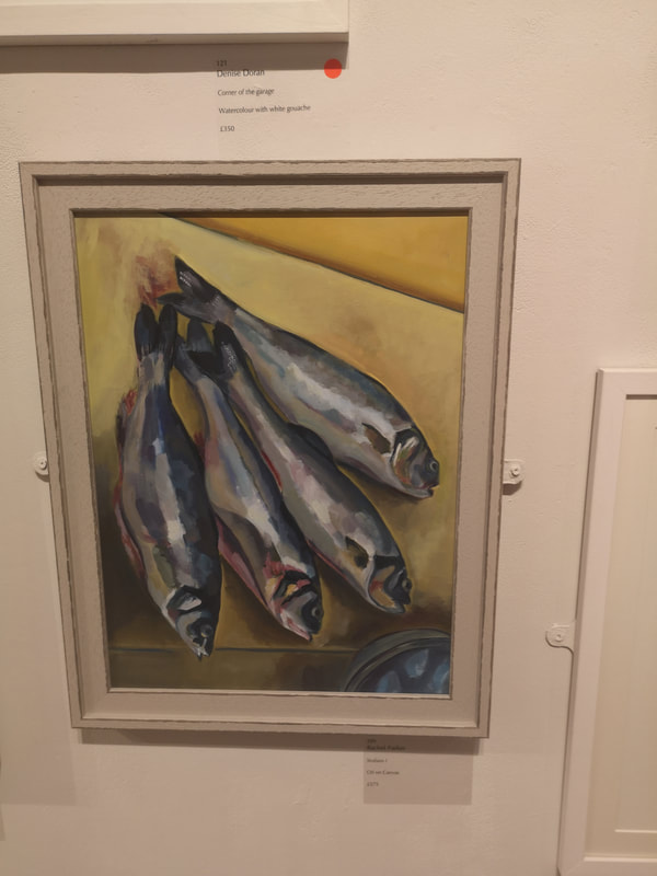
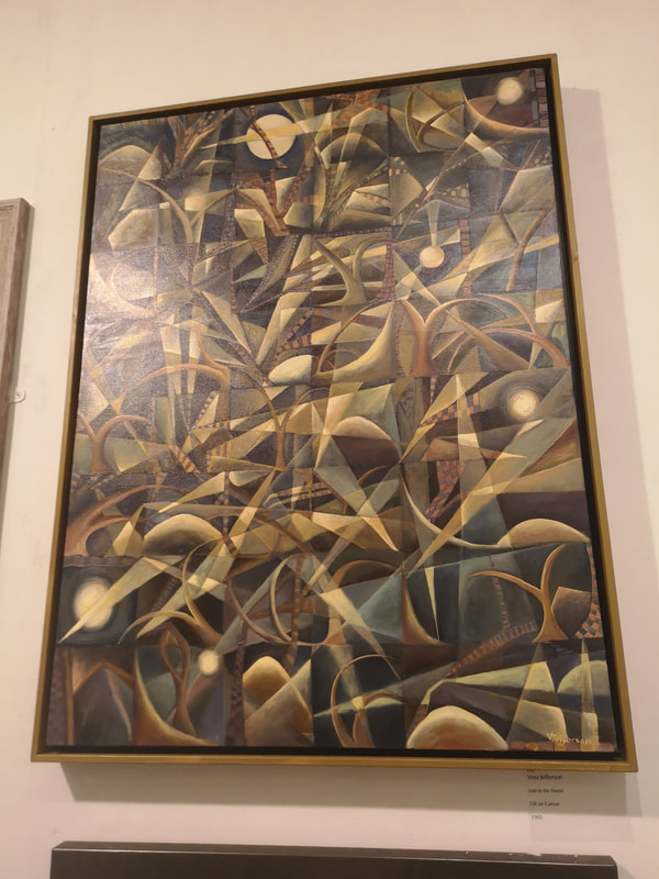
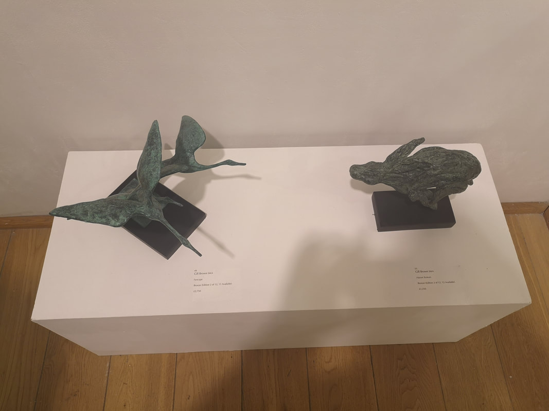
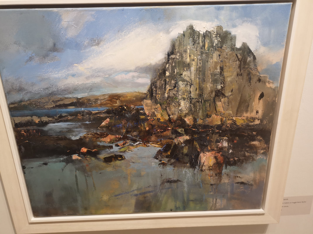
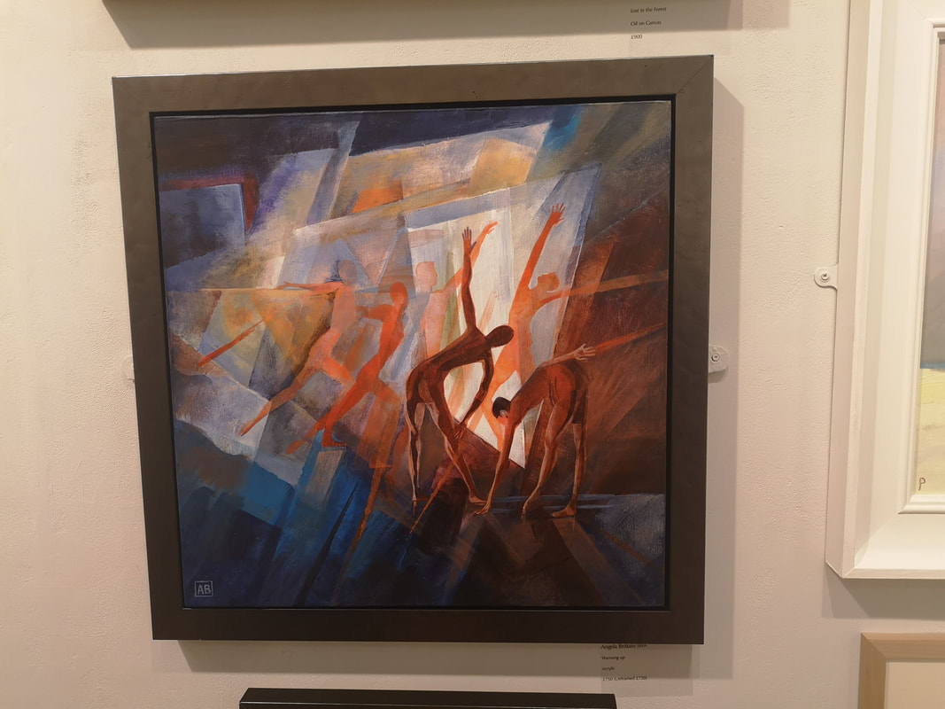
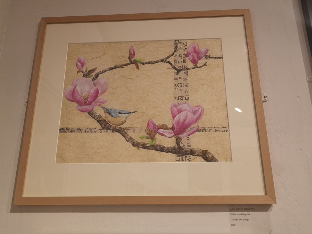
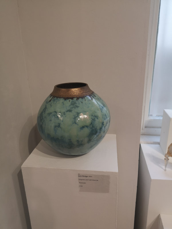
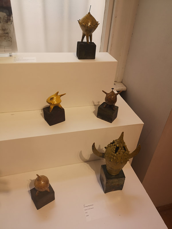
Fish are surprisingly difficult to paint, it is quite tricky to get the scales and shiny silvery quality. Rachel Parker's Seabass I (above left) look, well they look delicious. The almost geometric shades, of gray, silver, brown and purple make for a striking iridescence. Tonal contrast wielded well here. Set off well on that beige yellow background. My wife is a surfer for Braque and so her favourite in the show was Vera Jefferson's Lost in the Forrest (above right). It his heavily abstracted and geometric, and those light triangles make very convincing shafts of light, as do the blurred light dots, scattered around the painting. Bronze, often a winner, it is interesting how the different treatments of it, bring out different colours and these two green bronzes by Gill Brown (above left) are delightful. The smooth almost dance-like elegance of the flying geese and then the rough craggy, almost crazed energy of the running hare. Speaking of craggy, Kim Jarvis' Winter Solstice at Fraggle Rock is pleasingly craggy, rock standing proud of the crumped scree. This spiky wintry feel is emphasised by that lose scratchy marks at the front of the picture and the scraps of dark clouds scudding across the sky. I really like the way Jarvis has done the rock though, it really is the star of the show with those stabs of white and black on the gray face. Angela Brittain brings us Warming Up (above left). Red and blue, nice contrasting colours, and the figures become more solid and, red as they come forward into view. Warming up indeed, very good composition. I have a soft spot for oriental style and also botanical art so I was always going to be drawn to Linda Travers Smith's Nuthatch and Magnolias. I like Magnolia's, I have three of them growing in my garden. This then ticks allot of my boxes and it is beautifully composed. The simple cross of text with the curling branch of the Magnolia. The subtle yellow background sets off the pink Magnolia flowers, then the sweet little Nuthatch. Very nice. I hope it sells. Unfortunately a little above my budget. Jane Bridger Turquoise and Gold Moon Jar (above left) has a real presence. The only problem is the gold top is slightly to sparkly in a fake looking way, which distracts from the more appealing swirling blue body. It has a sort of skyscape feel to it. If we take the Moon of the Jar to form a tangential space themes we have the very witty Space Craft Launch by Morag MacInnes (above right). You have this collection of nobly little space craft, that look like a sort of 50's sci-fi creation, with several of them have a distinct sputnik feel to them. The muted colours play really well with the subject matter.
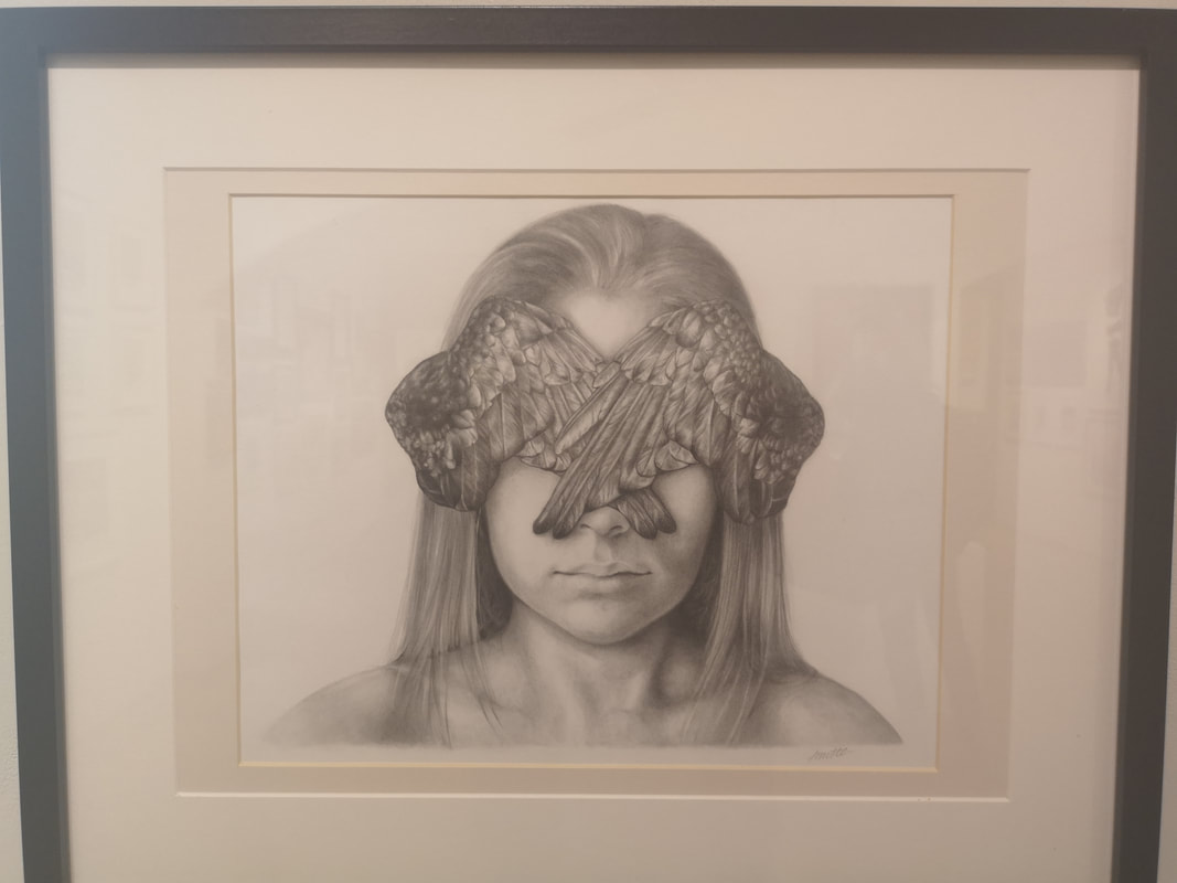
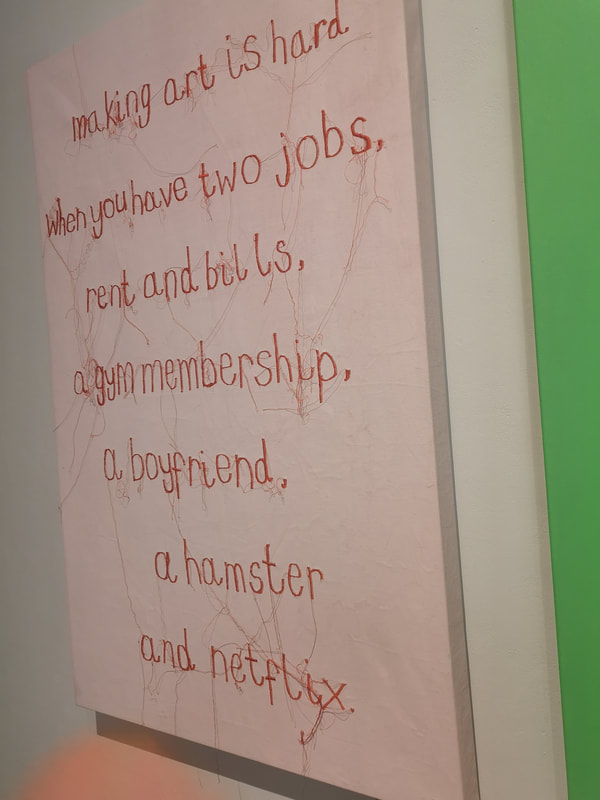
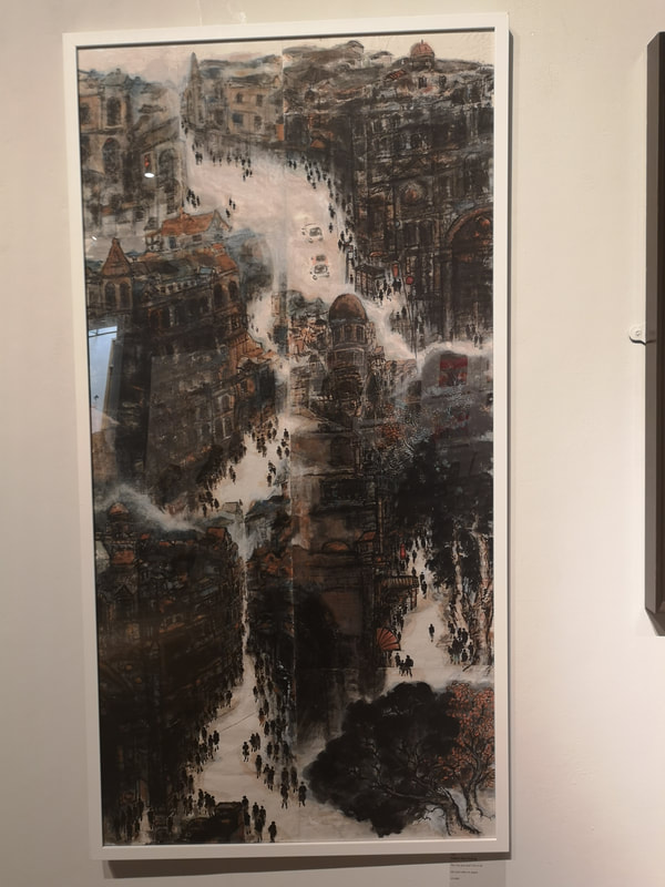
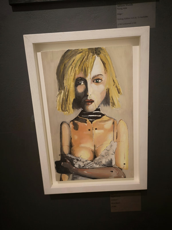
Humour in art is difficult. I mean actual humour, things that make you actually laugh rather than pieces that a certain type of awful person would describe as "witty" (you know who you are). Poppy Clover's Making Art is Hard (above right) made me laugh out loud. It still makes me smile. The medium, embroidery gives the message more of a punch than simple writing would. Yellow Ran Haung, has produced this modern take on the oriental mountain scene by making a cityscape, in her The CIty You and I live in - 8 (above left). Its a gorgeous piece, domes and dark arches with these little figures scurrying through those white, river like streets. Doing a twist on classic art, using references to ancient forms, can work well, provided you have the skill to pull it off, which I think Haung has. Strange and unnerving is the main sensations in Ingrid Lucas' Construct (above right). The elfin elongated face with the strong shadow and the way the skin is over the clothing on the torso, that odd plastic looking arm and that line from the corner of the mouth.
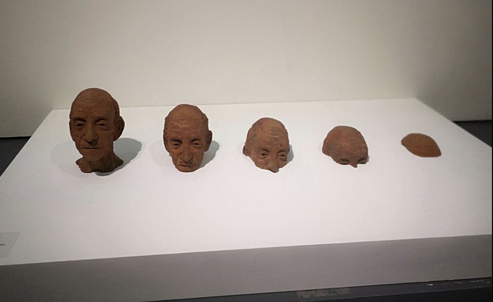
I shall leave you Bev Knowlden's Pop up Moses (above). Again I found this actually funny. Made in iron resin it is very well conceived and of course the heads, in that odd red hue, are cast very well. It is a serious expressive face, which makes the situation more ludicrous.
0 Comments
Leave a Reply. |
Archives
June 2024
Categories |
 RSS Feed